Showing posts with label Alex Ross. Show all posts

Monday, November 21, 2011

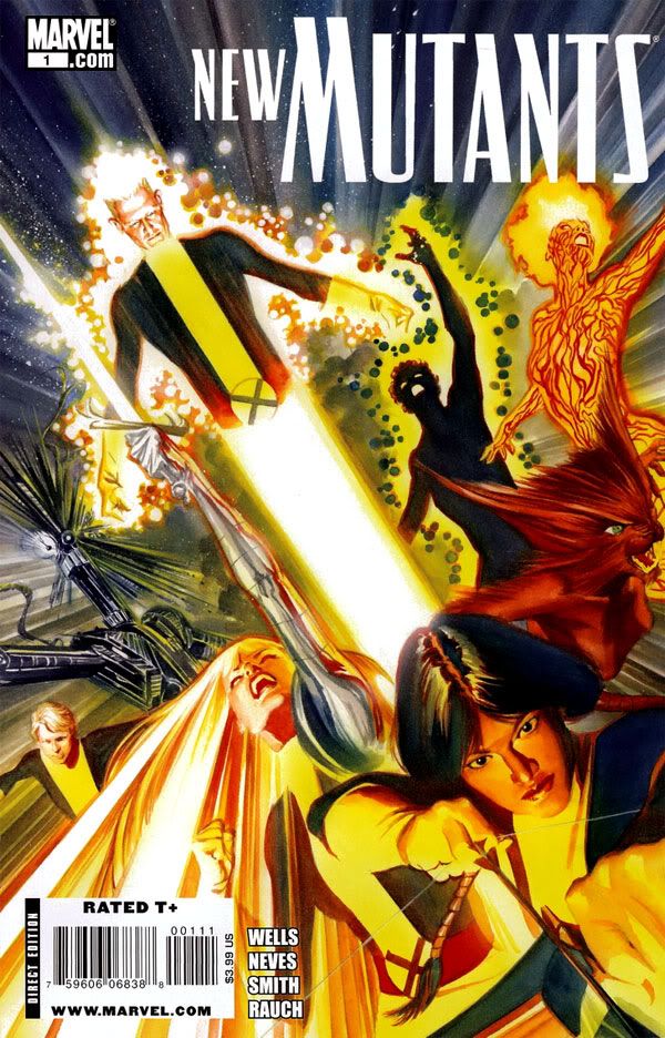
Alex Ross takes on the New Mutants!


Isn't that a nice cover?  I tend to hold Alex Ross somewhat responsible for the death of storytelling in modern comics, probably unfairly.  His rise to popularity seems to have coincided with an era of too much emphasis on photorealism, an over-reliance on photo reference or outright tracing, too many people getting hung up on cool individual images rather than thinking a page through as a sequence of panels arranged to express mood, movement and action.  I say "seems" because I might have the chronology completely wrong.

But even if I'm right, it's not really Ross's fault so many young artists start their careers telling themselves, "Hey, Ross does it and it looks amazing and sells even better than it looks, so why can't I?"  Blaming Ross is like blaming the Beatles for Strawberry Alarm Clock.  And yet I sort of do...  I just can't help it.

The static, awkward results probably also have a lot to do with artists using tools like Poser and various digital paint programs-- not that these things are in and of themselves negatives.  In the past, greats like Russ Heath, Al Williamson and Wally Wood used photo-reference-- Wood even advocated tracing.  According the Mark Schultz in his amazing and indispensable book Al Williamson's Flash Gordon:  A Lifelong Vision of the Heroic, Williamson relied on tracing at times during the middle stages of his career.  Photo reference, Poser, Photoshop, tracing.  These are useful tools, and artists shouldn't necessarily shy away from their use.   Mis-using might be a better term for what today's artists frequently do.

Williamson didn't just trace-- he would then adjust the drawing to match the heroic proportions of his original images and to fit the scene.  He achieved consistency in this way, something one frequently mocked comic book photorealist would do well to remember when he's so intent on making things "real" he forgets to make them believable.  Not that he gives a rip.

But I digress.  Whatever else you can say about the Alex Ross, he knows how to respect characters and put together an iconic image, then render the heck out of it.

Oh sure, Ross might have taken some photos to get a sense of the poses, to nail the anatomy and stage the lighting, but he manages here to sublimate the photo referencing and stay true to the classic look of the characters.  Dani Moonstar-- right up front, dominating the image where she belongs-- looks a lot like Bob McLeod's version, rather than a model in a bodysuit from a photoshoot in Ross's living room.  Unfortunately, the under-lit Sam "Cannonball" Guthrie looks disconcertingly middle aged.  Life must have been hard on him in the coal-mining regions of Kentucky before he met Charles Xavier.  This is the work of an artist moving away from duplicating photographs towards an artist justifiably confident in his ability to draw and paint anything he can imagine.  An artist who has finally put technique at the service of the artwork, rather than the other way around.

There's also the possibility Ross just made this all up out of his head.  I do believe he's just that good.

Well, however he achieved this cover, it's quite excellent.  A fitting tribute to my favorite of Marvel's super adventure teams.

Friday, March 25, 2011

Steve Rude talks process

There are a lot of art books about comic book artists. Most of them-- even the very best ones-- tend to dwell on biography, which is not something I'm all that interested in. Unless it's Jack Kirby who grew up in a rough part of New York City, co-created Captain America and then fought in WWII and then partnered with Stan Lee to invent almost the entire Marvel Universe. Even if his line had been insurance sales, Kirby would've still had a pretty incredible life.

What I want to know more about from my favorite artists are their process and tools. How do the greats make the art we love to look at so much and what do they use to make it? One of the great moments of my life was when I got to talk shop with another Jack-- none other than Jack Davis. He let me in on the kind of paper he uses, the brushes and little insightful tidbits such as how his initial sketches are a lot of "scribble-scrabble." That kind of info can be hard to find, probably because most books on comic book artists aren't written by artists but by fans who experience the work from an audience's perspective. Recently, Steve Rude completed a commission to recreate the splash to Captain America #34 from way back in 1944.

According to the Dude, the original is by Kirby himself, but the The Jack Kirby Museum website blog attributes it to Syd Shores. I have no idea what the truth is. Maybe it's Shores working over a Kirby layout. Or vice versa. The Museum says it was done "well after S[imon] & K[irby] departed Timely," and I have no reason to doubt their expertise-- but do you want to tell Steve Rude he's mistaken? I sure as hell don't!

Artist controversy aside, what's important here is Rude didn't merely copy the splash. He zoomed in the plane of vision, tightening the composition, and he gave it more depth of field. In Shore's original, everything takes place along the same plane, which flattens the perspective. Rude pushes the background farther back in layers. This means his version isn't as jumbled and frenetic, but no less action-packed. He also changed Bucky's pose from running along beside Captain America to leaping from the sky above him. Rude's colors are more naturalistic rather than the crude yet vibrant primary-and-secondary color scheme the original comic uses. Yellow sky, Nazis in yellow or green uniforms with purple helmets!

The resulting painting is fun. It captures the spirit of early Captain America without being a mechanical recreation. Whoever commissioned it is getting a beauty. And the rest of us are lucky enough to have been able to follow along as Rude posted his initial sketches, washes and the finished piece as he completed them. He's also posted a short step-by-step on working on this painting as well, complete with a mention of Alex Ross-- who, as Rude notes, "has made a career working in this method."

This is the kind of stuff that fascinates me. Rude goes into his thought process-- the things that go on inside the mind before an artist even touches pencil to paper. He had the original, but he says he's not one of those guys "who get off on this historical stuff." And besides, the image in his head and the one from the comic didn't quite jibe. So he gathered up all the photo reference he would need for uniforms, weaponry and the like. Then Rude started drawing.

Here's where Ross and Albert Dorne enter the story and I abruptly die and float away to art heaven.

The finished artwork looks like this
.