I dropped some mega-bucks on DC's Silver Age Teen Titans Archives volumes 1 and 2, Showcase Presents Ghosts and Dark Horse's Star Wars Omnibus: A Long Time Ago... volume 4. These four massive books are on their way to me as I type this, through wind and rain. Yeah, it's a dark day here in Japan with changeable weather threatening to wash out any weekend activities people may have planned now that the temperatures are easing off from the sauna range they stayed in all summer long. Of course, with dengue fever closing Yoyogi Park in Tokyo, it's probably just as well. Yet within my heart is a bright, warm light and its source is anticipation of some classic comic book reading material.
The Silver Age Teen Titans Archives books particularly delight me, since this is one of those series I've fallen madly in love with. I just cannot seem to get enough of Bob Haney's socially aware writing or Nick Cardy's art. Most especially the latter. I've bought this material both in digital form and in Showcase format. The digitals, on Comixology, never seem to advance past the five or so comics available in Silver Age Titans Archives volume 1. The relatively inexpensive Showcase Titans books seem to be going out of print now. I have copies of both volumes stored back in the US, I only have one here in Japan. No luck getting the other one for a reasonable price. So my unreasonable solution was to complete my Haney-Cardy-Neal Adams-and-others Teen Titans collection by paying even more for hardcover full-color stories I already own in multiples.
Teen Titans is no mere comic book series. It is a way of life.
And since I was on a classic DC kick, what better choice to complement the superheroics than yet another Showcase Presents book featuring a horror anthology? The artist line-up in DC's old horror books reads like a list of my favorites: Cardy, Alfredo Alcala, Frank Redondo, Nestor Redondo, Sam Glanzman, Ramona Fradon, Jerry Grandenetti, Wally Wood, George Tuska, Gerry Talaoc and so many more. And with Halloween coming up, I need some fun and spooky reading material.
Finally, my addiction to Al Williamson inspired my purchase of the Dark Horse Star Wars Omnibus: A Long Time Ago... book. I have the first three, which means I have Williamson's The Empire Strikes Back adaptation. It also means I need his Return of the Jedi work. And I certainly am not going to complain about having to look at stories by Carmine Infantino, Walter Simonson and Ron Frenz with inks by Tom Palmer. This book also contains Star Wars #74, "The Iskalon Effect" (August 1983), with art by Frenz and Palmer. It's one of the few non-Al Williamson Star Wars comics I bought during Marvel's original run of books.

Showing posts with label Al Williamson. Show all posts
Showing posts with label Al Williamson. Show all posts
Thursday, September 4, 2014


Wednesday, July 16, 2014
Marvel's Marvelous Movies #4: The Empire Strikes Back (Marvel Super Special #16, Spring 1980)
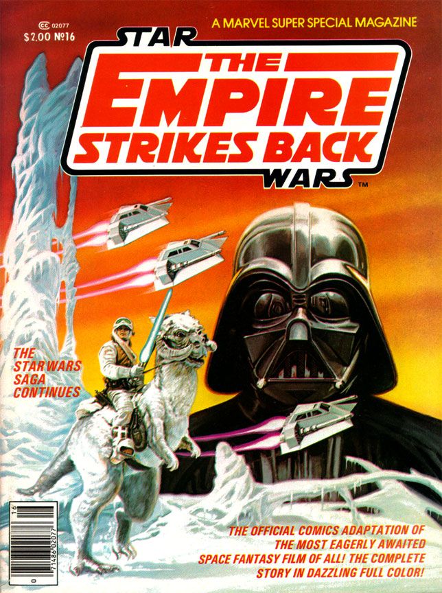
I reached the highwater mark of my Star
Wars love in 1980. I
turned 12 that first year of the Reagan and Alex P. Keaton decade, which was
about the time other things began occupying my mind. But I was still childish enough to play with
the toys and create my own Star Wars fantasy adventures with the Kenner figures
and Millenium Falcon playset in the yard.
And I was adult enough to have become interested in the film making
process itself, able to enjoy movies not just for their stories, but also for
the craft and artistry behind the scenes.
Reading magazines like Starlog and Fantastic Films and learning the
names of people like Ralph McQuarrie, John Dykstra and Richard Edlund, plus
terms like “go-motion” and “blue screen,” I began to have a growing
appreciation for the mechanics of its creation as well.
This, then, was the perfect time to discover Al Williamson and, to certain extent, Archie Goodwin. These are two names I've come to associate with all things Star Wars as much as I do George Lucas, Mark Hamill and John Ratzenberger. It may seem crazy to you reading this now-- at least as crazy as any dumbass thing I've written in this blog-- but I’d
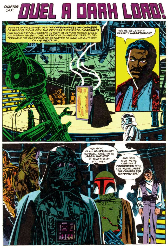
never even heard of Williamson or Goodwin before I saw their names in the credits of Marvel Super Special #16. While Goodwin's script hits all the right story points at the ideal pace for a comic with this page count, with terse narrative captions to help move things along, Williamson's art literally changed my life. My appreciation of comic book art consists of pre-Williamson and post-Williamson eras.
All of his EC and most Warren work came before I was even born, and our local newspaper tended more towards Beetle Bailey and Garfield than adventure strips. Or paper did run Alley Oop, Steve Canyon and Dick Tracy, the three non-gag strips they did choose to run, plus my dad got me into Gasoline Alley (not an adventure strip but still one with a narrative like those others). So I didn’t know anything about Secret Agent X-9, or, as it came to be called, Secret Agent Corrigan. Where would I have learned about Al Williamson? He didn't draw the Hulk or Spider-Man, for crying out loud!
So when this book hit, as far as 12-year-old me could tell, Al Williamson came into our banal world from some magical extra-dimensional wonderland where romantic adventure and heroic action were as part of life as blood itself and made this comic just for me.
Williamson’s art was more than a revelation. It was a rebirth.
All of his EC and most Warren work came before I was even born, and our local newspaper tended more towards Beetle Bailey and Garfield than adventure strips. Or paper did run Alley Oop, Steve Canyon and Dick Tracy, the three non-gag strips they did choose to run, plus my dad got me into Gasoline Alley (not an adventure strip but still one with a narrative like those others). So I didn’t know anything about Secret Agent X-9, or, as it came to be called, Secret Agent Corrigan. Where would I have learned about Al Williamson? He didn't draw the Hulk or Spider-Man, for crying out loud!
So when this book hit, as far as 12-year-old me could tell, Al Williamson came into our banal world from some magical extra-dimensional wonderland where romantic adventure and heroic action were as part of life as blood itself and made this comic just for me.
Williamson’s art was more than a revelation. It was a rebirth.
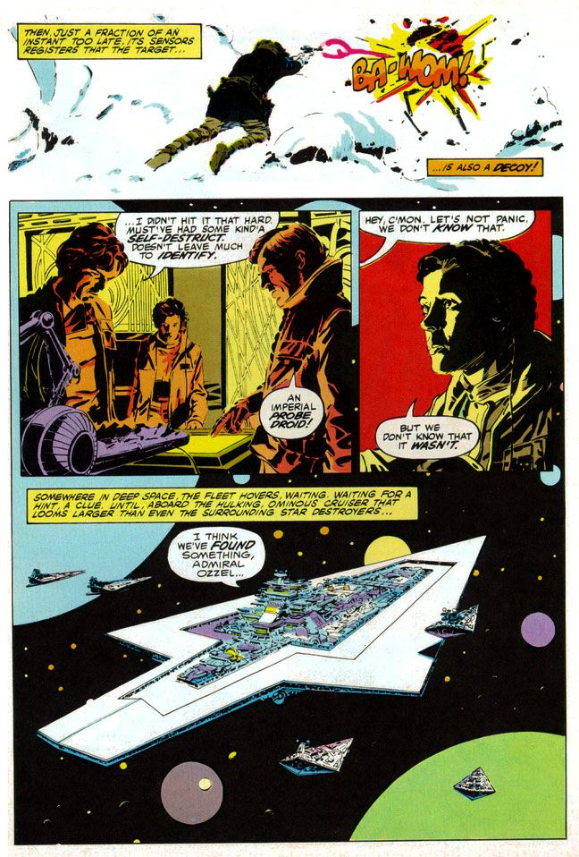 |
| Script: Archie Goodwin/Art: Al Williamson and Carlos Garzon |
The man painted with ink. To create the effect of reflections on metal, Williamson used blobby black strokes of varying pressure. For atmosphere and depth in the backgrounds of different scenes, he used thin parallel lines for a sfumato-like effect. He spotted blacks throughout, emulating the film’s cinematography, as many scenes take place inside the frozen rebel base or the industrial back-rooms of Cloud City where light comes from computer screens or from behind machinery. He expanded on the film’s planetscapes and made them imaginatively otherworldly in a way location shooting on a glacier in Norway just couldn’t match (and Larkin wisely copies him on the cover). Obviously, Lucas couldn't spirit his cast and crew away to Hoth in another galaxy. But Williamson could and did.
And best of all, not only did Williamson's star warriors look like the actual actors rather than their stunt doubles or stand-ins (as had the characters in many of Marvel’s previous movie adaptations, Star Trek the Motion Picture aside), but the way he posed them and placed them within all those wild environments exactingly duplicates mood and feel of the movie itself every time you read this comic.
I’d seen movie comics full of pretty art, some of which I've praised in this blog (and justly so; they're fantastically fun) with dazzling light effects and plenty with storytelling that perfunctorily or even adequately reproduced a movie’s action without that feel, without that authenticity of experience. Goodwin, Williamson and Garzon put all the genuine excitement of the real The Empire Strikes Back right in our hands, in the medium best suited for George Lucas’ epic. Star Wars came full circle back to the halcyon days of Flash Gordon in the funny pages, one of its prime inspirations.
The only odd note-- and I find it charming and story-book like-- is Williamson's version of Yoda, who looks his familiar, chubby self in closeups and then becomes a tiny gnome-like creature with spindly legs in wide-angle shots. Williamson never quite figured out Yoda's scale, but at least he made everyone's favorite sentence-reversing Jedi puppet more ambulatory than even a genius performer like Frank Oz could holding him up from underneath the swamp sets. And more wizardly. Merlinesque.
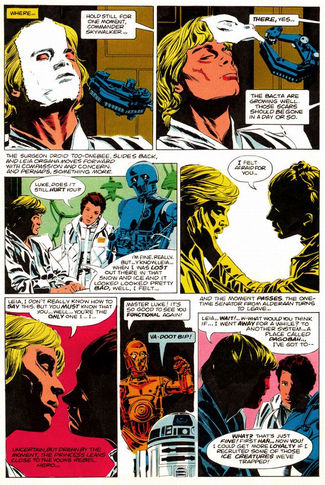 |
| Script: Archie Goodwin/Art: Al Williamson and Carlos Garzon |
You can look at the artwork and see Williamson used quite a bit of photo reference. In lesser hands, this can freeze a comic story, especially when an artist chooses to draw from studio portrait shots rather than action scene stills. Williamson expertly blends these images onto the page so each is like a fabulous collage when looked at as a whole, but flow naturally when read panel-to-panel. Williamson gives us carefully crafted moments like the two-panel sequence where medical droid 2-1B pulls the pharmaceutical mask off Luke's wampa-ravaged face. He could have rendered it as a single panel, with all of 2-1B's dialogue carrying the action, but instead he chose to give it a bit of animation.
Notice I'm talking only about Williamson, but there's also Carlos Garzon. To be honest, I can't tell where one ends and the other begins. I just see this Williamson-esque art job that matches pretty much all the other ones I've seen. Many of which probably were in collaboration with Garzon. Anyway, whichever artist did whatever part of the artwork, it's seamless and I like it. So let's give Garzon his props, even if I'm too ignorant and unschooled in his contributions to point out any specific examples. There are probably other blogs for that. I should be reading them. So should you. Probably a better use of our comics-loving time, right? Let's go! Go! Go! Go!
Okay, he's gone. I'll join him after I finish gushing about The Empire Strikes Back like a dizzy fool drunk on love.
Oh, and at this point I should also make mention of Glynis Wein's superb coloring job. Wein used a screen-accurate palette that enhances the comic experience rather than making you smirk at oddball choices like the red lenses in Darth Vader's mask and the strange orange mottling in Chewbacca's fur from the first Marvel Star Wars comic. Wein would make entire figures two shades of orange to recreate the spacey glow of Rebel Alliance technology when our heroes conferred in control rooms and on spaceships, and apply appropriately chilly blue shadows to the snowy exteriors of Hoth or give the swamps of Dagobah a slimy look in greens and pale oranges. Wein's pastel planets and moons help give depth to the imagery of mighty space fleets lumbering along, but where her work really shines is during the light sabre duel between Darth Vader and Luke Skywalker. The film bathes their battle largely in oranges and blues, at least when the two fight in the "carbon freezing chamber" where Han Solo gets encased in a block of metal. Wein follows suit but she also adds some nice greens and yellows to make it work better in two dimensions.
The very day I read The Empire Strikes Back, I immediately stopped copying every other artist and became simply a Williamson imitator, in as much as my clumsy hands could make me so. Any one of my comic book art idols represents an impossible standard to which an artist can hold himself or herself, but even more so with Williamson.
I doggedly spent the next three or four years laboriously filling sketchbook after sketchbook with really shitty Star Wars drawings, thinking all the time I was getting somewhere with my art. While I later found other artists to fail at emulating, whenever I had a sketchbook and a pen or brush, I’d still find myself pulling out some Williamson stuff and doodling away, futilely trying to match his supreme figure construction and posing, and lush, sinuous line quality. Even in my graphic design program days at the University of Georgia my professors would look at my homework and occasionally come across something that looked as if Al Williamson had drawn it with the brush held in his teeth, or sticking out of one ear.
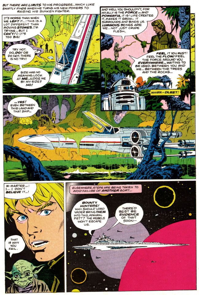 |
| Script: Archie Goodwin/Art: Al Williamson and Carlos Garzon |
The very day I read The Empire Strikes Back, I immediately stopped copying every other artist and became simply a Williamson imitator, in as much as my clumsy hands could make me so. Any one of my comic book art idols represents an impossible standard to which an artist can hold himself or herself, but even more so with Williamson.
I doggedly spent the next three or four years laboriously filling sketchbook after sketchbook with really shitty Star Wars drawings, thinking all the time I was getting somewhere with my art. While I later found other artists to fail at emulating, whenever I had a sketchbook and a pen or brush, I’d still find myself pulling out some Williamson stuff and doodling away, futilely trying to match his supreme figure construction and posing, and lush, sinuous line quality. Even in my graphic design program days at the University of Georgia my professors would look at my homework and occasionally come across something that looked as if Al Williamson had drawn it with the brush held in his teeth, or sticking out of one ear.
Even now, Williamson remains one of those go-to guys whose work I feel compelled to collect. Williamson, Alex Toth, Jack Kirby and Steve Rude. Whenever their stuff appears in purchasable form, I will be there. Right now Dark Horse keeps much of Williamson's Star Wars work with Goodwin in print both in paper form and digitally. With the license reverting to Marvel in the wake of Disney's massive Lucasfilm purchase and upcoming new trilogy, I'm not sure how long this will be the case. Fortunately, I've got it all.
And you know what? I’m not even a huge Star Wars nut anymore. The intense, religious-like fervor of its fans and the oversaturation of all things Star Wars on the Internet and on the shelves in book and toy stores across the world (and also the law of diminishing returns as it applies to the film story’s recent, tragic extension) have all tarnished the brand for me. And brand is the right word. McSkywalker, now serving number two billion.
But it seems all I have to do is pull out the Al Williamson The Empire Strikes Back and I’m 12 years old again and everything is suddenly wonderful in a way it had never been before, although there had certainly been wonderment. With Al Williamson, there's a purity to the work that ensures there will always be wonderment.
 |
| Script: Archie Goodwin/Art: Al Williamson and Carlos Garzon |
Even now, Williamson remains one of those go-to guys whose work I feel compelled to collect. Williamson, Alex Toth, Jack Kirby and Steve Rude. Whenever their stuff appears in purchasable form, I will be there. Right now Dark Horse keeps much of Williamson's Star Wars work with Goodwin in print both in paper form and digitally. With the license reverting to Marvel in the wake of Disney's massive Lucasfilm purchase and upcoming new trilogy, I'm not sure how long this will be the case. Fortunately, I've got it all.
And you know what? I’m not even a huge Star Wars nut anymore. The intense, religious-like fervor of its fans and the oversaturation of all things Star Wars on the Internet and on the shelves in book and toy stores across the world (and also the law of diminishing returns as it applies to the film story’s recent, tragic extension) have all tarnished the brand for me. And brand is the right word. McSkywalker, now serving number two billion.
But it seems all I have to do is pull out the Al Williamson The Empire Strikes Back and I’m 12 years old again and everything is suddenly wonderful in a way it had never been before, although there had certainly been wonderment. With Al Williamson, there's a purity to the work that ensures there will always be wonderment.
Wednesday, June 18, 2014
Marvel's Marvelous Movie Adaptations #1: An overview of those colorful Marvel Super Specials!
Before they started putting out their
graphic novels and Epic Illustrated magazine, the Super Special series was Marvel’s
most visually arresting product. Their
black and white magazines usually featured attractively lurid covers by Bob
Larkin, Earl Norem and, occasionally, guys like Neal Adams and Grey
Morrow. But face it—the interiors varied
wildly in quality from the knock-out gorgeous or even thrillingly bizarre (John
Buscema, Alfredo Alcala, Rudy Nebres, Mike Ploog, Tom Sutton) to the
serviceable and even the slap-dash (I won’t name names, but I have my
suspects).
The Super Specials, on the other hand, featured fully-painted color jobs, at least on many of the earlier issues. Regular monthly comics came printed cheaply on grayish newsprint. But a Super Special came on slick, white paper. A Super Special was more than a comic. It was an event unto itself. It was super. And special. There'd be a painted cover, or one featuring photos or artwork from whatever movie the comic was adapted from. It would have a full-length comic book story and then a few breathlessly informative articles or interviews related to the magazine's subject matter. All this... and a higher price tag!
The very first Marvel Super Special, which was officially a Marvel Comics Super Special, stars rock group Kiss and word on the street is the group contributed some of their blood to be mixed in with the ink. It's hard to get more super or special than actual rock star bodily fluids inside your comic! But no thanks. The second issue features tried-and-true fan favorite Conan in adventures too epic for his regular monthly.
Then Marvel adapted Close Encounters of the Third Kind, the first of many Marvel Super Special film adaptations. A Wiki check shows Close Encounters penciller Walt Simonson complaining about working on that book. Worst experience of his career. If so, I sympathize, but you can’t tell he was unhappy by looking at the finished product. He and Klaus Janson turned in a spectacular effort, making the story work in a Marvelized format even though the conflict is largely internal—Roy Neary thinks he’s going crazy for most of the movie before he figures it all out and goes UFO-hunting—and co-stars every lightbulb in California. They invented so many ways of depicting lighting effects I’m surprised they didn’t go blind from staring at them too long. This was the first Marvel Super Special I bought, and it came to me via mail order. It would not be the last, as these magazines quickly became one of my favorite Marvel purchases.
The Super Specials, on the other hand, featured fully-painted color jobs, at least on many of the earlier issues. Regular monthly comics came printed cheaply on grayish newsprint. But a Super Special came on slick, white paper. A Super Special was more than a comic. It was an event unto itself. It was super. And special. There'd be a painted cover, or one featuring photos or artwork from whatever movie the comic was adapted from. It would have a full-length comic book story and then a few breathlessly informative articles or interviews related to the magazine's subject matter. All this... and a higher price tag!
The very first Marvel Super Special, which was officially a Marvel Comics Super Special, stars rock group Kiss and word on the street is the group contributed some of their blood to be mixed in with the ink. It's hard to get more super or special than actual rock star bodily fluids inside your comic! But no thanks. The second issue features tried-and-true fan favorite Conan in adventures too epic for his regular monthly.
Then Marvel adapted Close Encounters of the Third Kind, the first of many Marvel Super Special film adaptations. A Wiki check shows Close Encounters penciller Walt Simonson complaining about working on that book. Worst experience of his career. If so, I sympathize, but you can’t tell he was unhappy by looking at the finished product. He and Klaus Janson turned in a spectacular effort, making the story work in a Marvelized format even though the conflict is largely internal—Roy Neary thinks he’s going crazy for most of the movie before he figures it all out and goes UFO-hunting—and co-stars every lightbulb in California. They invented so many ways of depicting lighting effects I’m surprised they didn’t go blind from staring at them too long. This was the first Marvel Super Special I bought, and it came to me via mail order. It would not be the last, as these magazines quickly became one of my favorite Marvel purchases.
And this is where we come in. Marvel’s other movie adaptations. Jaws 2 swam up next, accompanied by a musical
motif ripped off from Stravinsky. This
one was the first Super Special drawn by Tomb of Dracula team supreme Gene
Colan and Tom Palmer. They’d do a few
more, each time absolutely rocking the results.
Colan had already done underwater horror in black and white for Warren Publications, but
here Palmer adds vivid colors that make the book both gorier than you might
expect in a comic and, strangely enough, also more attractive. Jaws 2 is one of those shitty movies that are
actually pretty fun, eschewing the Steven Spielberg original’s emphasis on
characterization and suspense for schlocky, unintentionally hilarious setpieces
(the shark eats a helicopter!) that do nothing to help its ludicrous premise—essentially
shark-shaped lightning striking twice. While
not nearly as dire as subsequent films in the series, the movie suffers from
diminishing returns. The comic book
holds things together by simply giving the material a more lavish treatment
than it deserves. I would have loved to
see the same team go back and re-tell the first film. That’s a real missed opportunity for a
matched set.
While the Super Specials had already given
us a bowdlerized Beatles biography, their adaptation of the infamous
BeeGees-starring musical flop Sgt. Pepper’s Lonely Hearts Club Band never saw
print. This meant Marvel’s next offering
was actually of a TV movie that similarly cribbed from a superior source and suffered
from comparisons. We knew it as
Battlestar Galactica. I had the Marvel
Treasury Edition because it was huge and therefore caught my notice. This one has art by Ernie Colon of Richie
Rich and Jackie Jokers fame, and while his linework is looser than the
Colan/Palmer stuff, and the colors flat rather than richly painted, it’s an
energetic retelling. It differs from the
televised movie in some respects. A
villain gets a bloody comeuppance here, which would make his reappearance a bit…
er… unlikely. And yet there he was, on
our TV screens every Sunday evening until ABC punched not only his ticket but
everyone’s via cancellation. And broke
my heart.
The next film adaptation to see print? Crappy sci-fi disaster film Meteor, a major
flop with Sean Connery as an astronomer fighting an oncoming… well, you
know. A meteor. What else?
The movie, which co-stars an unhappy Natalie Wood, forces Brian Keith to
speak with a fake Russian accent (a few years after playing a small-town cop comedically contending with
“invading” commie submariners in The Russians Are Coming, the Russians Are
Coming, and not long before using this accent again for one of those WWIII TV
movies the kids used to love so much back in the 1980s), with Henry Fonda as
the President, putting it kindly, is complete dogshit. On your shoe, after you stepped in it. The comic, with Colan/Palmer art, is
not. In fact, it’s quite a visual
treat. There’s even a double-page spread
of a massive tidal wave destroying Hong Kong.
Palmer not only handpainted the colors, but there’s also what appear to
be Craft-Tint tones involved as well. I’m
not sure what their lead-time was for the artwork, but nothing looks rushed,
especially towards the end when the meteor unleashes hell on New York. Once again the Marvel comic proves better
than the film on which it’s based.
From here out the Super Specials would
consist almost entirely of movie material, with one exception-- Tarzan of the Apes.
Because they generally went for blockbusters and had to prepare the
comics in advance of the films’ release dates, Marvel took on hits and misses
alike.
The adaptations of misses are a
lot more fun than the ones of hits as far as I’m concerned. How could you not love mondo-strange-o comics
like Xanadu (#17, Summer 1980), Annie (#23, Summer 1982, with Win Mortimer
pencils and lots of crossed eyes courtesy the Vinnie Colletta inks, no less), Rock
& Rule (#25, 1983 with art consisting of stills from the movie itself)? And sometimes the results would be miracles
both major and minor, like Marvel’s lovely Dragonslayer (#20 , 1981), the storybook-like
Santa Claus: The Movie (#39, 1985, richly drawn by Frank Springer and adapting
one of the lousiest movies ever made) and the beautiful Labyrinth
(#40, October 1986, with breakdowns by John Buscema and finishes by Romeo
Tanghal, an unlikely pairing on this fairy tale material and killing on it).
And then there’s Bill Sienkiewicz’s Dune
(#36, 1984), the perfect meshing of artist and subject matter. Space princesses, screaming magical messiahs,
bloated barons with skin diseases and desert warriors dressed in skin-tight
black rubber are visuals tailor made for Sienkiewicz’s “Neal Adams drops acid
and hangs out with Ralph Steadman too much” artwork with its heavy blacks. And giant penis monsters. I mean worms.
Yeah. Shai-hulud. Those spice worms look nothing like a bunch
of dicks springing up out of the sand.
Sure. Seinkiewicz brilliantly
translates into two dimensions the general weirdness of David Lynch’s fever-dream
take on Frank Herbert’s novel. And you
get the added benefit of not suffering through the pacing problems created by
trying to chop a huge novel down into a manageable running time, from not being
able to tell all the spaceships are obviously teeny-tiny miniatures and not having
to endure the repetitive, whispered voiceovers.
And dumb additions like the “weirding modules.”
Occasonally, though, Marvel would adapt a
hit and blow it. Raiders of the Lost Ark
(#18, 1981). What the hell happened
there? John Buscema and Klaus Janson
provide curiously unfinished-looing and flat artwork, with none of the film’s
retro-romance. Dull, off-model colors
add nothing to the art and the final product is lackluster at best.
That’s not to say the rest of the hits aren’t
pretty sweet. There are three Al
Williamson/Carlos Garzon jobs—The Empire Strikes Back (#16, Spring 1980 and my personal choice for best movie adaptation of all time), Blade
Runner (#22, September 1982) and Return of the Jedi (#27, 1983). Much like with Seinkiewicz and Dune,
Williamson was the perfect choice to adapt the second and third Star Wars
films. He seems an odd choice for Ridley
Scott’s downbeat sci-fi noir, but he, Garzon, Dan Green and Ralph Reese generate
all the film-accurate rainy cityscapes you could hope for, even if a number of
panels seem a bit too photo reference-heavy and static. They reproduce the film’s atmosphere to a
startling degree, sort of making up for that lack in the Raiders book. Should have put them on that one, too.
Buscema pencils and inks himself on the two
Conan movie adaptations, too, both for John Milius’ Conan the Barbarian (#21,
1982) and the lighter, less boob-filled Conan the Destroyer (#35, 1984). He doesn’t try to make his barbarian look
anything like Arnold Schwarzeneggar, which is a good thing. Although the Destroyer Conan sports Arnold’s
headband. You can never go wrong with
Buscema inking himself on a Conan story, whether or not you appreciate Milius’
heavy-handed philosophizing and libertarian politics (I actually kinda dig it,
even if I don’t agree with it) or director Richard Fleischer’s duller, less
edgy and politicized take.
I’ve skipped around a lot. What about the rest? Well, there are two crappy and then crappier Roger
Moore-era James Bond flicks (For Your Eyes Only achieves mediocrity by pairing
otherwise appropriate Howard Chaykin with a disinterested Vince Colletta and
then dumping a dull, standard monthly-comic-type color job on the results,
totally wasting the format’s color possibilities); the tragically doomed Dark
Crystal; another Indiana Jones flick with improved art but a sillier story; a nicely
cartooned version of The Muppets Take Manhattan; desultory passes at clunkers
like Krull, The Last Starfighter and 2010; the ahead-of-its-time Buckaroo
Banzai (#33, 1984), all hip and tongue-in-cheek, makes a bow and turns immediately
into a cult film; and Marvel even attempted both Sheena (#34, 1984, decent
artwork by great Gray Morrow wasted on dreck) and Red Sonja (#38, 1985, a worthy
effort by Louise Simonson and Mary Wilshire, with surprisingly deft Colletta
inks, doomed from the start by its source material but finally sunk by the decision
to go the cheap route yet again with a standard color palette).
The best, however, they saved for
last. The final Marvel Super Special,
lucky #41 (November 1986) adapts George Lucas’ long-neglected masterwork Howard
the Duck. No knock on writer Danny Fingeroth
or artist Kyle Baker, but this comic fairly cried out for some Gene Colan or
Val Mayerik artwork. Only they could
have possibly salvaged this one.
It has
an appropriate cover date, though, doesn’t it?
November, towards the end of fall.
An inbetween time, a neither-nor time, a waiting time. The happy Halloween graveyard ghost-dance past,
the joys of Christmas, Hanukah, Kwanzaa and New Year’s yet to come. Despite Thanksgiving, which I really conflate
with the Christmas holidays, November is a dull, gray month. Too bleak to be tedious, too tedious to be
fun. The first cold rains come, and we’re
given our initial glimpse of the dying of the year and the bleak winter that
comes after our holiday revelry. That’s
all that November means to me. The
promise that, after the gifts and pretty lights, winter will be hard. Long and hard and dead. And with this, with the arrival of Howard, our
symbol of the death of everything summer-bright in the world, Marvel Super
Special was no more.
What I'm hoping to do with this series is take on each of these books, probably in order, and try to find some nice things to say about them. We've already looked at two of these in detail, so we don't have to worry about them again! Whew! Some of the rest will be easy, even if the movies they're based on were complete stinkers. Some won't be so easy. But therein lies what I hope will be the fun.
Tuesday, June 17, 2014
Coming soon: a look at Marvel's movie adaptations!
Hola, amigos. I know it's been a long time since I last rapped at ya, but things have been pretty crazy around here lately. It's not as if I'm not reading comics. I am. I'm reading some fantastic old comics with art by cats like John Buscema and John Romita, Al Williamson, Jim Aparo and Alex Toth. But, as I've told you, I'm also working on my own comic. Plus I'm married and have a regular job that takes up about ten hours a day (if I'm lucky). Man, I get home, all I want to do is read the comics, not write about them. Or work on my own.
Anyway, what I'm here to tell you is I have a few posts coming up. They're largely finished but I need to tweak a few things here and there, check a fact or two so they live up to the high standards for comic journalism you've come to expect from When Comic Books Ruled the Earth. You deserve no less.
Comixology and DC just released the first two issues of Batman and the Outsiders by Mike W. Barr and Jim Aparo. That's one of my favorite series, and features Katana, a character I've dug for the longest time. Well, ever since I bought Batman and the Outsiders #1 when it first came out way back in August 1983. I've written about Katana here before, but it's time to do a closer reading of her first appearance. DC and Comixology have made that possible, and for that, I'm happy and thankful.
I'm also very excited about one set of posts in particular. I was writing a bit about Williamson's artwork for the Marvel Blade Runner comic when I realized Marvel has a lot of other cool movie adaptations we could pick apart and have some fun with. Others have written beautifully about Gene Colan's killer work on Jaws 2, and I've already covered Close Encounters of the Third Kind and Dragonslayer. You can even find a few funny articles here and there about things like Xanadu. Well, now I'm going to take them all on, one by one, and in no particular order. I won't be mocking them, although I'm sure there will be a few attempts at humorous deconstruction, because I'm stuck in post-modern mode and will probably never change. Mostly I just want to appreciate some of the odder ones for attempting something different, for introducing new genres to comics even if those genres don't really translate into the format very well or comfortably.
You know, like musicals.
I'm not sure when the first post will appear, nor can I say for certain when we'll finally see the last of them. All I can tell you is they are coming. And maybe, down the road a ways, I'll make an official announcement of some kind about my own comic and let you know a little bit about it. I just want to get enough done to make it more of a real thing rather than just a dream I'm chasing. Consider that a promise. Or a warning. Or both. I hope you enjoy the upcoming posts. I think you will.
Anyway, what I'm here to tell you is I have a few posts coming up. They're largely finished but I need to tweak a few things here and there, check a fact or two so they live up to the high standards for comic journalism you've come to expect from When Comic Books Ruled the Earth. You deserve no less.
Comixology and DC just released the first two issues of Batman and the Outsiders by Mike W. Barr and Jim Aparo. That's one of my favorite series, and features Katana, a character I've dug for the longest time. Well, ever since I bought Batman and the Outsiders #1 when it first came out way back in August 1983. I've written about Katana here before, but it's time to do a closer reading of her first appearance. DC and Comixology have made that possible, and for that, I'm happy and thankful.
I'm also very excited about one set of posts in particular. I was writing a bit about Williamson's artwork for the Marvel Blade Runner comic when I realized Marvel has a lot of other cool movie adaptations we could pick apart and have some fun with. Others have written beautifully about Gene Colan's killer work on Jaws 2, and I've already covered Close Encounters of the Third Kind and Dragonslayer. You can even find a few funny articles here and there about things like Xanadu. Well, now I'm going to take them all on, one by one, and in no particular order. I won't be mocking them, although I'm sure there will be a few attempts at humorous deconstruction, because I'm stuck in post-modern mode and will probably never change. Mostly I just want to appreciate some of the odder ones for attempting something different, for introducing new genres to comics even if those genres don't really translate into the format very well or comfortably.
You know, like musicals.
I'm not sure when the first post will appear, nor can I say for certain when we'll finally see the last of them. All I can tell you is they are coming. And maybe, down the road a ways, I'll make an official announcement of some kind about my own comic and let you know a little bit about it. I just want to get enough done to make it more of a real thing rather than just a dream I'm chasing. Consider that a promise. Or a warning. Or both. I hope you enjoy the upcoming posts. I think you will.
Wednesday, May 14, 2014
Look! It's Luke! (and then I gush about Al Williamson)
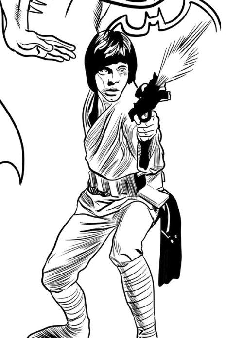
I tried giving this drawing an Al Williamson feel. I didn't succeed, but why would I even try such a thing given the gap in our skill levels? I'll tell you... at length...
So many wonderful artists have worked on
the Star Wars property over the years. Start
with the movie posters themselves, painted by the likes of Tom Chantrell, Tom
Jung (with droids by one of my faves, Nick Cardy), the Brothers Hildebrandt and
Drew Struzan. There are others, but
those pop into my head at the moment.
And in the comics and comic strips we’ve seen art from Howard Chaykin,
Russ Manning, Carmine Infantino, Michael Golden, Cam Kennedy, Jan Duursema, Chris
Sprouse, Alfredo Alcala, Dave Gibbons, P. Craig Russell and many more I can’t
think of right now.
They’ve all contributed mightily to George
Lucas’ universe, but the guy who best captured the spirit of the enterprise (crossover!)
is Al Williamson. Probably because he
was the most naturally in-tune artist for Star Wars. Influenced as it was by the works of Alex
Raymond and film serials, Star Wars was perfect for Al Williamson, the foremost
artist coming out of the Raymond tradition, and himself a big fan of the same
serials.
Williamson didn’t do photo-realism. He just treated Star Wars as it was meant to
be treated, as if it was a classic old comic strip itself, and he gave it a
lush, rich, illustrative look with his mastery of figure drawing,
black-spotting and linework. His Star
Wars strips and comics are gorgeously drawn versions of the films, timeless and
classic at the same time. No one needs
to go back and fix the special effects or add creatures and background
elements. The Williamson Star Wars
universe is fully-realized and already perfect.
Idealized, even. In many respects
I find it superior to the films themselves.
Whenever I try to draw Star Wars
characters, I can’t help but turn into the 12-year-old kid I was when I bought
the Marvel paperback adaptation of Empire Strikes Back and first saw Williamson’s
art and then had to copy it as best he could, line-for-line. Williamson’s art exerted that kind of magical
appeal immediately. There’s no way I can
overemphasize its impact on my sense of comic book aesthetics. Earlier that day I had one idea about what I
wanted to see and how I wanted to draw, I read Empire Strikes Back and by that
night I had a new idea. I enjoyed the
more sketchy approach from Chaykin with its rushed energy and the slick,
stylized caricatures of Infantino (especially when cleanly inked by Terry
Austin), but Williamson finally gave me the Star Wars comic I had been longing
for and hadn’t even known it. I was,
like many kids my age, already a confirmed Star Wars fanatic, but Williamson,
more than the toys and novelizations and eventual TV movies and cartoons and
very nearly as much as the films themselves, cemented my love for this stuff.
Shoot, Williamson gave me the COMIC I’d
been longing for without knowing it. I
already liked Joe Kubert, Jack Kirby, Alex Toth and Alcala, and my appreciation
of their work possibly primed me for Williamson. But I might have been locked into a Neal
Adams/John Byrne kind of mindset as the “correct” approach, bar none, had I not
encountered Williamson and had I not been more of a sci-fi/fantasy fan than a
superhero fan (actually, I was more into comedy than any of those, but you don’t
see a lot of comic books based on sketch comedy or SCTV).
From Star Wars, Williamson (and Jack Davis
to an extent) also provided my entry point to the world of comic artists like
Wally Wood, Frank Frazetta, George Evans, Joe Orlando, Reed Crandall, Roy
Krenkel, Angelo Torres, Gray Morrow, then further into the past with Raymond and Hal Foster and
all the way back to the present with Mark Schultz.
Now I know there’s not one true approach to
drawing. It take less time to point out the
artist I think who are doing it wrong than it does to list the ones I think do
it right because there are so few of the former and so many of the latter. On any given day I might be more
Kirby-oriented or more Tothian in my thinking, I never get tired of Steve Rude,
spent last week imitating John Buscema while trying to teach myself to ink, love
Adams, dig on some Byrne, think Michael Golden needed to do a long run on Star
Wars himself, find Walt Simonson’s work looking better and better all the time,
Bob McLeod remains a big influence and I am in love with the beauty of Colleen
Doran’s characters. I’m way into Mike
Mignola, Paul Pope, Bruce Timm and Mike Allred, probably too much so for my own
good. Misako Rocks! just kills me, as do
Matt Groening, Peter Bagge and Evan Dorkin. John
Severin, Nick Cardy, Los Bros Hernandez, Lynda Barry, check, check and
check! Oh, and let's not forget Rumiko Takahashi, Goseki Kojima, Ai Yazawa and Junji Ito. And, as I said, all those other Star
Wars artists who aren’t Al Williamson have done sterling work, stuff I also
admire.
It’s just when it comes to Star Wars, they’re
various planets and moons and satellites while Williamson is the bright center
of the galaxy and when you see his take on it, you’re no longer on the planet
it’s farthest from. You’re right there
with him, in the middle of adventure and magic and everything fun and good in
the world of comics.
Wednesday, May 29, 2013
Artists I've tried to imitate...
Copying can be a good thing. At least during your learning process. Rod Serling admitted he was a Hemingway copier when he first started writing, and said everything he wrote began, "It was hot." So imitation is a thing people do when they're learning to express themselves. And it works for comic book art, too. You learn how the greats do things and you eventually develop your own (fairly) distinct mode of expression*.
And yeah, there might be a few geniuses who spring forth fully formed and owe no debt to anyone. But I'd be willing to bet even Picasso started off drawing and painting like someone else he admired. He was probably six years old at the time.
I probably have no business discussing this stuff, but I have been studying art practically my entire life-- even now, when I have approximately 5 minutes a week to devote to it. Obviously I'm no Picasso and I'm not even a Hacky H. Hackerson or a J. Jonah Journeyperson yet. But what I have in common with practically any comic book artist you can name is I spent a lot of that time looking at other artists and trying to draw like them. Even established pros do this from time to time. Check out some of Alex Toth's work when he's obviously channeling Jean Giraud with those little parallel hatch lines.
Here, then, is a list of a lucky fourteen artists I've copied from over the years!
1) Alex Toth. He wasn't the first, but out of all the artists on this list-- other than possibly Al Williamson-- he's the guy whose art I want mine to look exactly like. I should get over that because at this point it's doing more harm than good, but if I'd discovered this when I was ten years old instead of in my mid-thirties, I might have learned a thing or two from him. I have to add anyone working in the "Toth School" to this entry. David Mazzucchelli's work on Batman Year One was a revelation as well. The story didn't do much for me-- crazed Batman, all lawful authorities are irredeemably stupid/corrupt so a man must act outside the law, lots of prostitutes (you know, Frank Miller)-- but the art made it work. The same goes for all the artists Toth openly admired. I'm working my way towards primary sources now, too. I think Toth would want it that way.
2) Al Williamson. He probably was the first to really blow my mind completely. I drew before I discovered Williamson, and I read comics before I ever saw one with his art and I sometimes copied art. But after seeing his work for the first time-- the Marvel adaptation of Empire Strikes Back-- I got serious about it. And kind of like I am with Toth, I'm working my way towards Williamson's influences as well. Another artist I admire, Mark Schultz, has seen to that.
3) Michael Golden. Like I wrote above, I copied artists before I found Williamson. Golden was one of them. I used to sit at our kitchen bar and meticulously copy panel after panel and cover after cover of his Micronauts work. The detail amazed me, but I think I was mostly taken with how real it seemed even if the figures themselves were slightly cartooned (look at the big eyes, for example). Oh yeah, and the way he rendered light sources on faces-- double lighting!-- and metal armor and spaceships.
4) Doug Wildey. His animation work on Jonny Quest. I went through a whole period where everything I drew I tried to make look like a Jonny Quest animation cell. The simplicity of it, plus the heavy black spotting. I suppose that's kind of Tothian, but the fixation was purely on that Jonny Quest look. I didn't know Wildey's name until years later, but he gets his own entry because of how important the Jonny Quest visuals were to me at the time.
5) The people behind Speed Racer. I conflated this with Jonny Quest, and it had a similar impact. I could look up the main artist but I'm lazy and there are too many other names to check on this list.
6) Jack Kirby. Kirby is the antithesis of Toth in a lot of ways. Steve Rude can synthesize the two; I can't. But I love Kirby's work with a passion equal to my love of Toth's and Williamson's. Plus, he's my all-time favorite guy in comics as a human being. I mean it; I'm saddened I never got to meet him and buy him a slice of chocolate cake. Kirby is one of the most comic book distinctive artists, with a look that's more immediately identifiable than just about anyone else you could name. It's almost bigger than comics themselves and very nearly elevates itself above the form. A blown-up panel of just about any mid-60s through mid-70s Kirby comic would look splendid on the walls of any museum of modern art in the world. As fun as Kirby is to read, he's just as much fun to imitate when you're drawing. If you haven't tried it, you should-- I did a side-by-side reconstruction of a Fantastic Four panel for a color theory class I had in college. We had to match the yellowed newsprint appearance of an old comic, then create how it would look printed on pure white with no competition from cheap paper and age. One of the most fun little assignments I ever had.
7) Jack Davis. Having attended the University of Georgia to study art and graphic design, I found Davis's influence inescapable. Not that I would ever want to escape it. The GD program director's appreciation of cartooning began and ended with Davis. In fact, if I didn't try to imitate Davis when I did my own little cartoons, he grunted at me. Grunt, grunt, grunt. While I had a broader sense of who I wanted to be at the time, I'd long admired Jack Davis for both his horror and funny stuff. I wanted to caricature just like him. And he did it in vivid watercolor or gouache or something. Sorry, I can't remember what, and I even got to interview the man. Unfortunately, this was about the time my hopes at being a comic book artist or commercial illustrator crashed and burned. The graphic design program was more geared towards typography and magazine design, disciplines at which I had no native talent and little interest in learning. I wanted to draw. Despite getting to work with some great illustration professors, I foolishly bucked the system and came away from this program with my confidence wrecked and unable to complete a drawing for years. I don't think I've completely recovered and probably never will.
8) John Byrne. I think just about every kid with dreams of comic book glory back in the early 80s wanted to draw like Byrne.
9) Neal Adams. Byrne always seemed to be talking about Adams. That is, when he wasn't talking about Jose Luis Garcia-Lopez, another awesome DC artist. I knew Adams from some Batman reprints that kept turning up during my childhood. For a time in the late 80s I copied as many Adams Batman drawings as I could find time to do.
10) Mike Allred. Super cool art and a really nice guy. His work made me think I could possibly do comics again after my disaster at UGA. Not that I thought I'd be as good. It's just that looking at his fun work made me want to draw again. And his love for the medium is infectious. Also inspiring is the way he buckles down and turns out pages. His runs on The Atomics and Marvel's X-Force/X-Statix are freaky good and all the more impressive for their consistency and Kirby-like work ethic. Can you imagine a guy who draws like this able to turn around a monthly book? I mean this is following years of self-indulgent lesser artists constantly blowing deadlines. And a few years ago, Allred suddenly took his art to a higher level and left a lot of people in the dust. What an amazing cat!
11) Steve Rude. The Dude. There is nothing more need be said.
12) Rumiko Takahashi. Her art is the very definition of appeal. It reminds me a bit of Walt Kelly's in that you just want to hug it as much as you want to look at it. I'd give anything to produce art with this much appeal.
13) Mike Mignola. Deceptively simple. Geometric, stripped down to basic lines and areas of black. Easy to copy line-for-line, difficult to produce on your own. He has a unique way of putting together lower bodies. What's happening there with that anatomy? When I look at it, I see. When I look away, I can't.
14) Gene Colan. He should have come earlier on this list. Man, even now I would give anything to be able to draw like Colan. He always chose the most interesting angles and while later in his career his anatomy sometimes came apart as a result-- check out Batman's birthin' hips-- Colan in his prime was a true master of mood. Shadow and mood. Drama. Reading a Colan comic was like watching one of the better Hammer Studio films. Drawing from one was difficult. But even now when I draw a face wearing glasses, I'm thinking Colan.
Okay, there are a number of others I should do full entries on-- John Buscema, Alfredo Alcala, Goseki Kojima, Ai Yazawa, Bob McLeod, P. Craig Russell, plus a whole lot more I'm forgetting at the moment. But I'm tired of writing about drawing. I'd rather be drawing. Too bad I'm at work.
*I can't stress this enough-- this has to be in conjunction with actually learning how to draw. You need a full education in art basics like composition, perspective and figure construction, which are just some of the universal underpinnings of an artist's methods, plus a LOT of life-drawing!
And yeah, there might be a few geniuses who spring forth fully formed and owe no debt to anyone. But I'd be willing to bet even Picasso started off drawing and painting like someone else he admired. He was probably six years old at the time.
I probably have no business discussing this stuff, but I have been studying art practically my entire life-- even now, when I have approximately 5 minutes a week to devote to it. Obviously I'm no Picasso and I'm not even a Hacky H. Hackerson or a J. Jonah Journeyperson yet. But what I have in common with practically any comic book artist you can name is I spent a lot of that time looking at other artists and trying to draw like them. Even established pros do this from time to time. Check out some of Alex Toth's work when he's obviously channeling Jean Giraud with those little parallel hatch lines.
Here, then, is a list of a lucky fourteen artists I've copied from over the years!
1) Alex Toth. He wasn't the first, but out of all the artists on this list-- other than possibly Al Williamson-- he's the guy whose art I want mine to look exactly like. I should get over that because at this point it's doing more harm than good, but if I'd discovered this when I was ten years old instead of in my mid-thirties, I might have learned a thing or two from him. I have to add anyone working in the "Toth School" to this entry. David Mazzucchelli's work on Batman Year One was a revelation as well. The story didn't do much for me-- crazed Batman, all lawful authorities are irredeemably stupid/corrupt so a man must act outside the law, lots of prostitutes (you know, Frank Miller)-- but the art made it work. The same goes for all the artists Toth openly admired. I'm working my way towards primary sources now, too. I think Toth would want it that way.
2) Al Williamson. He probably was the first to really blow my mind completely. I drew before I discovered Williamson, and I read comics before I ever saw one with his art and I sometimes copied art. But after seeing his work for the first time-- the Marvel adaptation of Empire Strikes Back-- I got serious about it. And kind of like I am with Toth, I'm working my way towards Williamson's influences as well. Another artist I admire, Mark Schultz, has seen to that.
3) Michael Golden. Like I wrote above, I copied artists before I found Williamson. Golden was one of them. I used to sit at our kitchen bar and meticulously copy panel after panel and cover after cover of his Micronauts work. The detail amazed me, but I think I was mostly taken with how real it seemed even if the figures themselves were slightly cartooned (look at the big eyes, for example). Oh yeah, and the way he rendered light sources on faces-- double lighting!-- and metal armor and spaceships.
4) Doug Wildey. His animation work on Jonny Quest. I went through a whole period where everything I drew I tried to make look like a Jonny Quest animation cell. The simplicity of it, plus the heavy black spotting. I suppose that's kind of Tothian, but the fixation was purely on that Jonny Quest look. I didn't know Wildey's name until years later, but he gets his own entry because of how important the Jonny Quest visuals were to me at the time.
5) The people behind Speed Racer. I conflated this with Jonny Quest, and it had a similar impact. I could look up the main artist but I'm lazy and there are too many other names to check on this list.
6) Jack Kirby. Kirby is the antithesis of Toth in a lot of ways. Steve Rude can synthesize the two; I can't. But I love Kirby's work with a passion equal to my love of Toth's and Williamson's. Plus, he's my all-time favorite guy in comics as a human being. I mean it; I'm saddened I never got to meet him and buy him a slice of chocolate cake. Kirby is one of the most comic book distinctive artists, with a look that's more immediately identifiable than just about anyone else you could name. It's almost bigger than comics themselves and very nearly elevates itself above the form. A blown-up panel of just about any mid-60s through mid-70s Kirby comic would look splendid on the walls of any museum of modern art in the world. As fun as Kirby is to read, he's just as much fun to imitate when you're drawing. If you haven't tried it, you should-- I did a side-by-side reconstruction of a Fantastic Four panel for a color theory class I had in college. We had to match the yellowed newsprint appearance of an old comic, then create how it would look printed on pure white with no competition from cheap paper and age. One of the most fun little assignments I ever had.
7) Jack Davis. Having attended the University of Georgia to study art and graphic design, I found Davis's influence inescapable. Not that I would ever want to escape it. The GD program director's appreciation of cartooning began and ended with Davis. In fact, if I didn't try to imitate Davis when I did my own little cartoons, he grunted at me. Grunt, grunt, grunt. While I had a broader sense of who I wanted to be at the time, I'd long admired Jack Davis for both his horror and funny stuff. I wanted to caricature just like him. And he did it in vivid watercolor or gouache or something. Sorry, I can't remember what, and I even got to interview the man. Unfortunately, this was about the time my hopes at being a comic book artist or commercial illustrator crashed and burned. The graphic design program was more geared towards typography and magazine design, disciplines at which I had no native talent and little interest in learning. I wanted to draw. Despite getting to work with some great illustration professors, I foolishly bucked the system and came away from this program with my confidence wrecked and unable to complete a drawing for years. I don't think I've completely recovered and probably never will.
8) John Byrne. I think just about every kid with dreams of comic book glory back in the early 80s wanted to draw like Byrne.
9) Neal Adams. Byrne always seemed to be talking about Adams. That is, when he wasn't talking about Jose Luis Garcia-Lopez, another awesome DC artist. I knew Adams from some Batman reprints that kept turning up during my childhood. For a time in the late 80s I copied as many Adams Batman drawings as I could find time to do.
10) Mike Allred. Super cool art and a really nice guy. His work made me think I could possibly do comics again after my disaster at UGA. Not that I thought I'd be as good. It's just that looking at his fun work made me want to draw again. And his love for the medium is infectious. Also inspiring is the way he buckles down and turns out pages. His runs on The Atomics and Marvel's X-Force/X-Statix are freaky good and all the more impressive for their consistency and Kirby-like work ethic. Can you imagine a guy who draws like this able to turn around a monthly book? I mean this is following years of self-indulgent lesser artists constantly blowing deadlines. And a few years ago, Allred suddenly took his art to a higher level and left a lot of people in the dust. What an amazing cat!
11) Steve Rude. The Dude. There is nothing more need be said.
12) Rumiko Takahashi. Her art is the very definition of appeal. It reminds me a bit of Walt Kelly's in that you just want to hug it as much as you want to look at it. I'd give anything to produce art with this much appeal.
13) Mike Mignola. Deceptively simple. Geometric, stripped down to basic lines and areas of black. Easy to copy line-for-line, difficult to produce on your own. He has a unique way of putting together lower bodies. What's happening there with that anatomy? When I look at it, I see. When I look away, I can't.
14) Gene Colan. He should have come earlier on this list. Man, even now I would give anything to be able to draw like Colan. He always chose the most interesting angles and while later in his career his anatomy sometimes came apart as a result-- check out Batman's birthin' hips-- Colan in his prime was a true master of mood. Shadow and mood. Drama. Reading a Colan comic was like watching one of the better Hammer Studio films. Drawing from one was difficult. But even now when I draw a face wearing glasses, I'm thinking Colan.
Okay, there are a number of others I should do full entries on-- John Buscema, Alfredo Alcala, Goseki Kojima, Ai Yazawa, Bob McLeod, P. Craig Russell, plus a whole lot more I'm forgetting at the moment. But I'm tired of writing about drawing. I'd rather be drawing. Too bad I'm at work.
*I can't stress this enough-- this has to be in conjunction with actually learning how to draw. You need a full education in art basics like composition, perspective and figure construction, which are just some of the universal underpinnings of an artist's methods, plus a LOT of life-drawing!
Thursday, May 9, 2013
On Dan Adkins and weird rumblings in the comic book world
I learned this morning via P. Craig Russell's Facebook feed Dan Adkins passed away. He was one of those artists I knew by name even when I was a kid, but I never really caught onto his visual style the way I did others whose work I could pick out from the angle of a face (John Buscema, Gil Kane), the set of a jaw (Carmine Infantino) or a certain lean, muscular phsyical type (Neal Adams). I just associated his name with solid craftsmanship. This was before I ever heard of a guy named Wally Wood or knew what was up with those scary Creepy and Eerie magazines I always avoided at the convenience store while looking for Sgt. Rock.
Adkins was Wood's assistant, which couldn't have been easy, back in the 1960s. Thanks to Dark Horse's Creepy Archives, I'd been getting into Adkins-- things he did with Wood, things he did solo. His "The Doorway" in Creepy #11 (October 1966) is a six-page visual knockout with an Archie Goodwin script. While its neat-o concept involving science and black magic at a government research lab anticipates some of Stephen King's stories (especially his novella The Mist) the narrative reads a bit clunky. The real draw is Adkins's clean, Woodsian artwork and his supremely controlled use of gray tones. He painted the cover for Creepy #12 (December 1966), but the cramped design doesn't do him any favors, especially following a spectacular Frazetta ape on the previous cover, a full bleed image with room to rampage.
They also compressed Gray Morrow's graveyard werewolf into a small box on the following cover-- what were they thinking?
He went on to draw a ton of stuff like a run of Dr. Strange tales starting in... wait for it... Strange Tales and continuing in the first two issues of Dr. Strange: Master of the Mystic Arts for Marvel. He inked all over the place for them, too. But I'm most familiar with Adkins from this era as Virgilio Redondo's inker on a story in Giant-Size Dracula #5 (June 1975) because I read it in the second Essential Tomb of Dracula reprint book.
The greatest impact Adkins had on my personal fandom came when he gave career starts to three guys you may have heard of-- namely Paul Gulacy, Val Mayerik and Russell himself.
In other comic book artist news, there's a cool little debate on the Al Williamson Fans Facebook feed, too. What was Williamson's last published comic book work? One guy says Williamson told him one thing, J. David Spurlock says another and it goes back and forth from there. Both men knew Williamson and that makes me jealous.
Adkins was Wood's assistant, which couldn't have been easy, back in the 1960s. Thanks to Dark Horse's Creepy Archives, I'd been getting into Adkins-- things he did with Wood, things he did solo. His "The Doorway" in Creepy #11 (October 1966) is a six-page visual knockout with an Archie Goodwin script. While its neat-o concept involving science and black magic at a government research lab anticipates some of Stephen King's stories (especially his novella The Mist) the narrative reads a bit clunky. The real draw is Adkins's clean, Woodsian artwork and his supremely controlled use of gray tones. He painted the cover for Creepy #12 (December 1966), but the cramped design doesn't do him any favors, especially following a spectacular Frazetta ape on the previous cover, a full bleed image with room to rampage.
They also compressed Gray Morrow's graveyard werewolf into a small box on the following cover-- what were they thinking?
He went on to draw a ton of stuff like a run of Dr. Strange tales starting in... wait for it... Strange Tales and continuing in the first two issues of Dr. Strange: Master of the Mystic Arts for Marvel. He inked all over the place for them, too. But I'm most familiar with Adkins from this era as Virgilio Redondo's inker on a story in Giant-Size Dracula #5 (June 1975) because I read it in the second Essential Tomb of Dracula reprint book.
The greatest impact Adkins had on my personal fandom came when he gave career starts to three guys you may have heard of-- namely Paul Gulacy, Val Mayerik and Russell himself.
In other comic book artist news, there's a cool little debate on the Al Williamson Fans Facebook feed, too. What was Williamson's last published comic book work? One guy says Williamson told him one thing, J. David Spurlock says another and it goes back and forth from there. Both men knew Williamson and that makes me jealous.
Wednesday, April 3, 2013
William Stout also knew Alex Toth...
While we're on the subject of Alex Toth-- one that never seems to exhaust my interest-- another masterful artist you may have heard of who goes by the name of William Stout recently held forth (actually fifth; there are five parts) on his friendship with Toth. Which, like so many others', was a bit... oh... fragile. It's somewhat in response to the first two volumes in the Dean Mullaney-Bruce Canwell epic overview of Toth's life. It's just fascinating stuff and, as Stout takes pains to point out, Toth could be incredibly charming and kind as well. And Stout ends up validating the same sad conclusion I made after finishing Genius, Illustrated. Anyway, I'm hooked.
Speaking of-- this is my first time visiting Stout's page, but it won't be the last. I've liked his artwork ever since I read Dinosaur Tales (Bantam Books, 1983), a collection of Ray Bradbury book with some Stout illustrations in it. Some Stout illustrations. As if they were trifles. William Stout is one of the big dinosaur artists of all time. Yeah, there are other artists who paint paleontological reconstructions and whatnot, and Stout's done lots of other wonderful things in his career (like storyboarding Raiders of the Lost Ark, for cryin' out loud!) but to me he's the Dinosaur King.
Anyway, Stout's recollections are kind of harrowing to read, so be warned. Especially the entry about "The Letter." Pro Mike Vosburg turns up with one of his very own after part five. And if you feel your chest tightening, you can always scroll down to the comments where people discuss with Stout some of the more pleasant and beloved personalities in comics-- like the late Jeffrey Catherine Jones and another of my all-time heroes, Al Williamson. And Sergio Aragones, yet another one!
Speaking of-- this is my first time visiting Stout's page, but it won't be the last. I've liked his artwork ever since I read Dinosaur Tales (Bantam Books, 1983), a collection of Ray Bradbury book with some Stout illustrations in it. Some Stout illustrations. As if they were trifles. William Stout is one of the big dinosaur artists of all time. Yeah, there are other artists who paint paleontological reconstructions and whatnot, and Stout's done lots of other wonderful things in his career (like storyboarding Raiders of the Lost Ark, for cryin' out loud!) but to me he's the Dinosaur King.
Anyway, Stout's recollections are kind of harrowing to read, so be warned. Especially the entry about "The Letter." Pro Mike Vosburg turns up with one of his very own after part five. And if you feel your chest tightening, you can always scroll down to the comments where people discuss with Stout some of the more pleasant and beloved personalities in comics-- like the late Jeffrey Catherine Jones and another of my all-time heroes, Al Williamson. And Sergio Aragones, yet another one!
Sunday, December 23, 2012
Sorry I didn't get to those Isis posts!
The week before winter vacation proved busier than I anticipated, with longer days. Circumstances didn't leave much time for watching The Secrets of Isis, much less blogging about it. I'm on vacation now so once again let me offer you a hollow promise of fun and frivolity to come. But it will have to wait. I'm about to spend a few days in Tokyo. I'll do some comic book buying while I'm there, but most of what I find will be posted on my new blog about being an American comic book fan in Japan. That's where I plan to talk about the latest books and news, leaving this blog for the good old stuff we all love so much. Jack Kirby, Alex Toth, Al Williamson, Dani Moonstar, classic Marvel, Dell and EC and that sort of thing.
Happy Holidays, True Believers!
Happy Holidays, True Believers!
Thursday, August 2, 2012
Xenozoic Tales coming back in a big way!
Literally. Next June (2013 for those counting the years), IDW will release Mark Schultz's Xenozoic Tales Artist's Edition, 144 pages printed at a whopping 14" x 20" size. It's their latest in a series that's seen big ol` versions of Walt Simonson's The Mighty Thor, Dave Stevens' The Rocketeer and others. You get to see blue lines and all that jazz, almost as if you were holding the original art in your hands. It should prove as instructive as it is aesthetically pleasing. As both an artist and an art junkie, I'm going to buy this book when it hits the streets, probably leaving a massive crater. Mark Schultz is just amazing. I've already read these stories dozens of times each, but I never get tired of looking at his pages. If you can get the regular comics or one of the many reprint books it's more than worth a lazy afternoon charting the Schultz's growth as a writer and artist. You can actually see him working through various techniques and influences, starting with Wally Wood, then Al Williamson, Roy Krenkel and Frank Frazetta plus others whose work I'm actually not familiar with until he emerges as a unique synthesis of all these classic elements, his personal style as easily recognized as that of any of those other giants. The plot itself goes from EC-inspired vignettes to something more epic as Schultz gains confidence as a writer, too. It's a super cool progression.
IDW must love huge books because I've got their Genius Isolated: The Life and Art of Alex Toth book and that crazy thing must way thirty or forty tons. We had to hire a special heavy lifting crane to winch it into my apartment and it's left the floor permanently depressed. Not only that, but it's the first of a trilogy of books. I'm going to have to build a special annex with some sort of carefully engineered load-bearing elements and perhaps a shock-absorbing system installed in the floor to handle them. I find these kinds of books worth the expense, though.
You'd have to be some kind of nut not to be excited about this next piece of news. You're not a nut, are you? No? Great! Then, let's celebrate because it's official! At the Flesk Publications panel during this year's San Diego Comic Con, Schultz promised when he finishes his book Storms at Sea, he's going to do another issue of Xenozoic Tales. Finally! It's been something like 16 years since he left us hanging with mechanic-shaman Jack Tenrec ousted from City in the Sea and planning to head back to Fessenden's Station where the story began. The last few issues of Xenozoic Tales raised a lot of questions and its hiatus left them hanging in the air. What are the reptilian grith? What's their relationship with Hannah Dundee and how much do they know about her mysterious origins as a foundling? Can the sometimes bull-headed Tenrec maintain his tenuous new alliances, retake City in the Sea, reinstate the Machinato Vitae and restore the balance between humans and nature before destructive elements in control of his home cause another catastrophe? These questions drive me to distraction at times!
It may take a while for Schultz to get around to it, but in the meantime, here's a cartoon version. You know, for kids...
IDW must love huge books because I've got their Genius Isolated: The Life and Art of Alex Toth book and that crazy thing must way thirty or forty tons. We had to hire a special heavy lifting crane to winch it into my apartment and it's left the floor permanently depressed. Not only that, but it's the first of a trilogy of books. I'm going to have to build a special annex with some sort of carefully engineered load-bearing elements and perhaps a shock-absorbing system installed in the floor to handle them. I find these kinds of books worth the expense, though.
You'd have to be some kind of nut not to be excited about this next piece of news. You're not a nut, are you? No? Great! Then, let's celebrate because it's official! At the Flesk Publications panel during this year's San Diego Comic Con, Schultz promised when he finishes his book Storms at Sea, he's going to do another issue of Xenozoic Tales. Finally! It's been something like 16 years since he left us hanging with mechanic-shaman Jack Tenrec ousted from City in the Sea and planning to head back to Fessenden's Station where the story began. The last few issues of Xenozoic Tales raised a lot of questions and its hiatus left them hanging in the air. What are the reptilian grith? What's their relationship with Hannah Dundee and how much do they know about her mysterious origins as a foundling? Can the sometimes bull-headed Tenrec maintain his tenuous new alliances, retake City in the Sea, reinstate the Machinato Vitae and restore the balance between humans and nature before destructive elements in control of his home cause another catastrophe? These questions drive me to distraction at times!
It may take a while for Schultz to get around to it, but in the meantime, here's a cartoon version. You know, for kids...
Thursday, May 17, 2012
The Phony Return: Senses-Shattering!!
No, I'm not back, True Believers! I'm posting this from my desk at work while I'm waiting to do... more work. According to my contract, I get off at 4:30pm (kind of weird mandating something so personal in a legally binding contract, but there you have it) but I usually have to stay for an hour or two post-time for meetings and plannings and all that kind of fun stuff.
At lunch today I decided to look up the phrase "senses-shattering," which was a particular favorite of Marvel hypesters back in the 1960s and 70s. Why would anyone in his or her right mind want his or her senses shattered? Why was sense shattering considered a draw? There are no answers to these and other idiotic questions, but my random interest in "senses-shattering" led me to a hilarious blog where someone named Tom the Bomb deconstructed classic Marvel books before disappearing into the desert like a mirage or an Oliver Stone hallucination of something Jim Morrison would have hallucinated sometime around May 2009. Our loss.
A senses-shattering loss.
In other news, the kindly Sagawa Transport gentleman delivered a couple of boxes to my apartment last night. One contained Al Williamson Archives Volume 1 and 2 from Flesk Publications. Wow! Flesk (with the help of Mark Schultz, who also compiled their hefty and impressive Al Williamson's Flash Gordon: A Lifelong Vision of the Heroic and wrote the most informative and ultimately heart-breaking overview of Williamson's art career to provide context for all the gorgeous art) presents full-color reproductions of Williamson's sketchbook pages, unfinished artwork, completed works unpublished elsewhere. If you love the masters of comic book illustration these slender books are a must-have. If you just love art, you need to at least look at them sometime. Sorry, but no one touches mine.
The other box contained one of those Dark Horse Star Wars books, the ones with all the old Marvel stories. By no coincidence, this book features some Williamson artwork, too-- the first part of Star Wars #50, "The Crimson Forever."
It was a very Al Williamson kind of day.
At lunch today I decided to look up the phrase "senses-shattering," which was a particular favorite of Marvel hypesters back in the 1960s and 70s. Why would anyone in his or her right mind want his or her senses shattered? Why was sense shattering considered a draw? There are no answers to these and other idiotic questions, but my random interest in "senses-shattering" led me to a hilarious blog where someone named Tom the Bomb deconstructed classic Marvel books before disappearing into the desert like a mirage or an Oliver Stone hallucination of something Jim Morrison would have hallucinated sometime around May 2009. Our loss.
A senses-shattering loss.
In other news, the kindly Sagawa Transport gentleman delivered a couple of boxes to my apartment last night. One contained Al Williamson Archives Volume 1 and 2 from Flesk Publications. Wow! Flesk (with the help of Mark Schultz, who also compiled their hefty and impressive Al Williamson's Flash Gordon: A Lifelong Vision of the Heroic and wrote the most informative and ultimately heart-breaking overview of Williamson's art career to provide context for all the gorgeous art) presents full-color reproductions of Williamson's sketchbook pages, unfinished artwork, completed works unpublished elsewhere. If you love the masters of comic book illustration these slender books are a must-have. If you just love art, you need to at least look at them sometime. Sorry, but no one touches mine.
The other box contained one of those Dark Horse Star Wars books, the ones with all the old Marvel stories. By no coincidence, this book features some Williamson artwork, too-- the first part of Star Wars #50, "The Crimson Forever."
It was a very Al Williamson kind of day.
Wednesday, March 7, 2012
Uncle Creepy introduces the faces of fear!
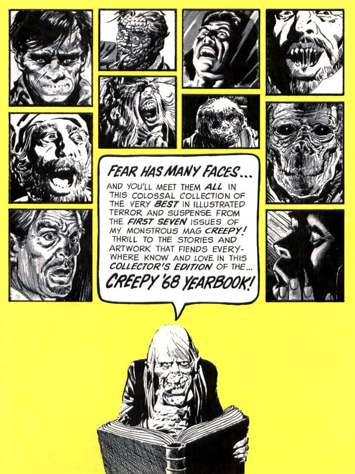
You can't go wrong with a little Uncle Creepy in your day. These Warren house ads are the best. Can you recognize the artists represented here? I see Gray Morrow, Al Williamson, Angelo Torres, Frank Frazetta...
The rest is up to you, my friend.
Monday, February 13, 2012
And meanwhile, as an art form, comics have never been better!
You know what? Screw both DC and Marvel. All the talk about the health of the industry centers around whatever those two companies are doing. Well, logically so because they're the big players. And they do put out some good books here and there. They've got some great talent working for them. But screw them. I'm sick to death of discussing the future of the medium as if it totally hinges on whether or not the New 52 brought in new readers (it didn't) or The Avengers will make millions that will be forever denied Jack Kirby's family (it will).
The form itself is stronger than ever. You don't have to be concerned with whatever new books come out this month and how they sell. Step back and look at comics as a whole. You can draw from the entire history of comics for your entertainment. You can cross oceans and experience comic culture in Europe and Asia. There are millions of comic book stories out there we haven't even read yet. Dark Horse puts out some amazing books, both new and reprinted, American and international. Fantagraphics publishes all kinds of amazing titles like Love and Rockets, Buddy Does Seattle/Jersey, Wandering Son and huge books containing entire years worth of Peanuts strips. Don't forget Charles Burns's Black Hole from Pantheon. Have you read that yet? Dan Clowes's Ghost World.
There's a new book on Alex Toth coming out, but in the meantime there's Torpedo and Zorro. Viz puts out some fantastic Japanese comics like Nana to name only one. People are putting out their own comics online or through print-on-demand publishers. If you must-- and you know where to look-- you can download practically every comic ever printed for free. People are spending their free time scanning entire runs of books and putting them online and they're not charging anything for this! Others are translating and localizing Asian comics and making them available totally for free, too!
Flesk recently printed an incredible book collecting Al Williamson's entire Flash Gordon-related output, compiled and edited by Mark Schultz. There are Alex Raymond reprints. There are Creepy and Eerie archive books (or even Vampirella if that's your taste), Vanguard Productions has a massive book of Frank Frazetta strips, Fantagraphics put out a softcover version of their Blazing Combat book, there are Hal Foster books, Carl Barks books, books like the amazing Skim by Mariko and Jillian Tamaki, Wendy and Richard Pini have their entire Elfquest saga online for free, Image has tons of stuff available, Drawn and Quarterly with Kate Beaton's Hark! A Vagrant (one of the best things ever to exist in this world or any other) plus books by Lynda Barry, Oni Press, Slave Labor Graphics, Top Shelf Productions, Knockabout Comics, Archie Comics and Checker Book Publishign Group with their Gold Key Star Trek reprints and more.
And more and more and more. I'm just tossing out some things off the top of my head. I love comics. If DC and Marvel went away today, I'd still love comics and I'd still have plenty of comics to read.
The form itself is stronger than ever. You don't have to be concerned with whatever new books come out this month and how they sell. Step back and look at comics as a whole. You can draw from the entire history of comics for your entertainment. You can cross oceans and experience comic culture in Europe and Asia. There are millions of comic book stories out there we haven't even read yet. Dark Horse puts out some amazing books, both new and reprinted, American and international. Fantagraphics publishes all kinds of amazing titles like Love and Rockets, Buddy Does Seattle/Jersey, Wandering Son and huge books containing entire years worth of Peanuts strips. Don't forget Charles Burns's Black Hole from Pantheon. Have you read that yet? Dan Clowes's Ghost World.
There's a new book on Alex Toth coming out, but in the meantime there's Torpedo and Zorro. Viz puts out some fantastic Japanese comics like Nana to name only one. People are putting out their own comics online or through print-on-demand publishers. If you must-- and you know where to look-- you can download practically every comic ever printed for free. People are spending their free time scanning entire runs of books and putting them online and they're not charging anything for this! Others are translating and localizing Asian comics and making them available totally for free, too!
Flesk recently printed an incredible book collecting Al Williamson's entire Flash Gordon-related output, compiled and edited by Mark Schultz. There are Alex Raymond reprints. There are Creepy and Eerie archive books (or even Vampirella if that's your taste), Vanguard Productions has a massive book of Frank Frazetta strips, Fantagraphics put out a softcover version of their Blazing Combat book, there are Hal Foster books, Carl Barks books, books like the amazing Skim by Mariko and Jillian Tamaki, Wendy and Richard Pini have their entire Elfquest saga online for free, Image has tons of stuff available, Drawn and Quarterly with Kate Beaton's Hark! A Vagrant (one of the best things ever to exist in this world or any other) plus books by Lynda Barry, Oni Press, Slave Labor Graphics, Top Shelf Productions, Knockabout Comics, Archie Comics and Checker Book Publishign Group with their Gold Key Star Trek reprints and more.
And more and more and more. I'm just tossing out some things off the top of my head. I love comics. If DC and Marvel went away today, I'd still love comics and I'd still have plenty of comics to read.
Monday, November 21, 2011
Alex Ross takes on the New Mutants!
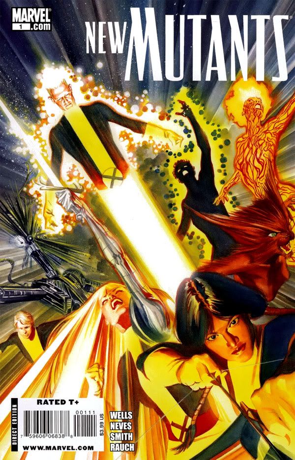
Isn't that a nice cover? I tend to hold Alex Ross somewhat responsible for the death of storytelling in modern comics, probably unfairly. His rise to popularity seems to have coincided with an era of too much emphasis on photorealism, an over-reliance on photo reference or outright tracing, too many people getting hung up on cool individual images rather than thinking a page through as a sequence of panels arranged to express mood, movement and action. I say "seems" because I might have the chronology completely wrong.
But even if I'm right, it's not really Ross's fault so many young artists start their careers telling themselves, "Hey, Ross does it and it looks amazing and sells even better than it looks, so why can't I?" Blaming Ross is like blaming the Beatles for Strawberry Alarm Clock. And yet I sort of do... I just can't help it.
The static, awkward results probably also have a lot to do with artists using tools like Poser and various digital paint programs-- not that these things are in and of themselves negatives. In the past, greats like Russ Heath, Al Williamson and Wally Wood used photo-reference-- Wood even advocated tracing. According the Mark Schultz in his amazing and indispensable book Al Williamson's Flash Gordon: A Lifelong Vision of the Heroic, Williamson relied on tracing at times during the middle stages of his career. Photo reference, Poser, Photoshop, tracing. These are useful tools, and artists shouldn't necessarily shy away from their use. Mis-using might be a better term for what today's artists frequently do.
Williamson didn't just trace-- he would then adjust the drawing to match the heroic proportions of his original images and to fit the scene. He achieved consistency in this way, something one frequently mocked comic book photorealist would do well to remember when he's so intent on making things "real" he forgets to make them believable. Not that he gives a rip.
But I digress. Whatever else you can say about the Alex Ross, he knows how to respect characters and put together an iconic image, then render the heck out of it.
Oh sure, Ross might have taken some photos to get a sense of the poses, to nail the anatomy and stage the lighting, but he manages here to sublimate the photo referencing and stay true to the classic look of the characters. Dani Moonstar-- right up front, dominating the image where she belongs-- looks a lot like Bob McLeod's version, rather than a model in a bodysuit from a photoshoot in Ross's living room. Unfortunately, the under-lit Sam "Cannonball" Guthrie looks disconcertingly middle aged. Life must have been hard on him in the coal-mining regions of Kentucky before he met Charles Xavier. This is the work of an artist moving away from duplicating photographs towards an artist justifiably confident in his ability to draw and paint anything he can imagine. An artist who has finally put technique at the service of the artwork, rather than the other way around.
There's also the possibility Ross just made this all up out of his head. I do believe he's just that good.
Well, however he achieved this cover, it's quite excellent. A fitting tribute to my favorite of Marvel's super adventure teams.
Monday, October 3, 2011
Dracula: Marvel's Merriest Misanthrope (2nd Annual Spookey Month)
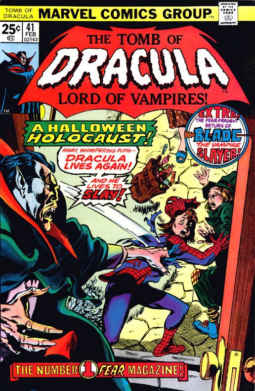 My favorite Marvel monster by far is Dracula, Lord of Vampires. Not because of his redeeming qualities; he doesn't have any. Dracula is far too hateful to identify with, or to like as a person. Every so often, writer Marv Wolfman attempted to establish a little sympathy for Dracula.
Dracula loses his powers, he eviscerates himself in his blog, he drinks too much and cries at a sad clown movie. Then you remember he also murdered his wife, alienated his daughter and son, drove a young woman to suicide through emotional abuse, bullies anyone he perceives as weaker than himself-- nearly everyone-- and murders without remorse in order to feed his vampiric blood-thirst. And that's in between long monologues where he tells you how great he used to be when he was alive, and how awesome he is even now that he's dead. But he does exude charisma as star of his own comic. He's sickly fascinating, like the snake that kills you or a YouTube video of a car crash. You can't take your eyes off him, even while you deplore his very existence.
In Bram Stoker's novel, Dracula is the antagonist and what we learn of him comes second-hand from various diaries and letters; for Marvel's Tomb of Dracula series, Wolfman cleverly reversed the formula and Marvel ended up with a comic that exhaustively examined the sociopathic tendencies of its lead character, a completely reprehensible killer whose egotism buries the needle on the ego-ometer, easily topping 10,000 kilo-Trumps. Imagine a Fantastic Four where they not only fight Dr. Doom every single issue, but the writers seem more interested in him than in the good guys.
At least Victor von Doom has a kind of tragic nobility resulting from his being more misguided than actively evil. Despite his protests to the contrary, Dracula's nobility drizzled away with his blood the moment he died, only to have a kind of nihilism replace it. But just like Dr. Doom as infamously written by Brian Michael Bendis, Dracula loves to put people down. Let's look at some of Dracula's insults, shall we? And then we'll cleanse ourselves through the healing power of music.
Dracula's hate is universal, but there is no one among the masses he hates more than Frank Drake, his descendent. Drake's very existence is an insult to Dracula, so he repays the poor schlub at every opportunity. It starts as early as Tomb of Dracula #1 (1972).
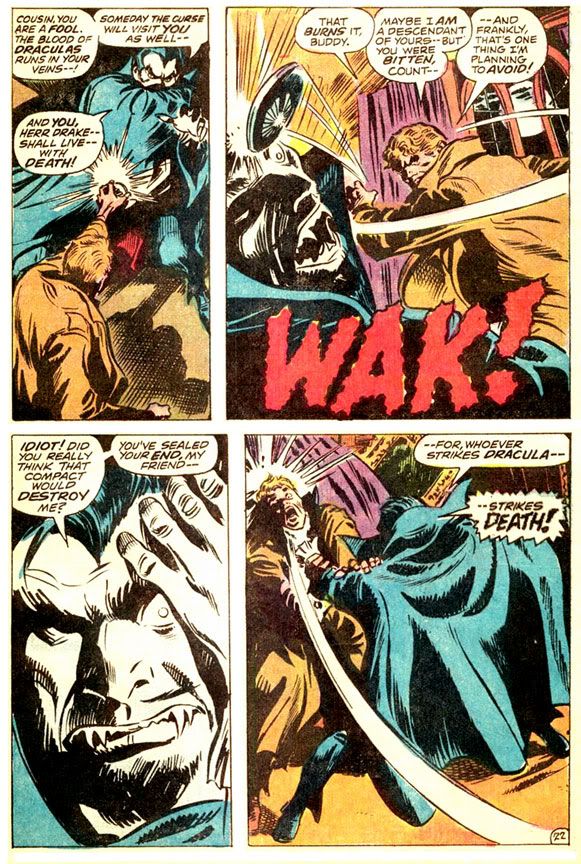
Dracula relies heavily on old favorites such as "fool" and "idiot." "Scum" seems to be his favorite epithet, though. All through the series, it's "scum this" and "scum that." While he's not shy about expressing his displeasure with humanity, he's also something of a culinary critic, a skill he displays in #9 (1973).

It's amazing a guy who died hundreds of years before the invention of indoor plumbing knows enough to dump stew into a sink. On the other hand, depending on how greasy or oily it was, that might not have been the best idea. What am I saying? Of course Dracula would want to clog your pipes!
Occasionally, Dracula gets a little more clever with his insults. After charming a group of hoity-toity ship passengers, he suddenly shows his true colors in this scene from #10 (1973).
Well, he does call them fools before working a bit more baroque than usual. If you want a torrent of angry verbiage from Dracula, few topics get him worked up like religion. As a foul undead creature aligned with Satan, Dracula-- as you might imagine-- isn't too keen on God, as we see in this tender, sensitive moment from #27 (1974).
Even after months of hanging out among us mortals, he's not shy about expressing his dislike for people. In #29 (1975), he really lets his feelings show.

Comparing us to vegetables is kind of odd, since Dracula is a hardcore carnivore who love nothing better than reducing all of humanity to docile food stock. Dracula never orders salads in restaurants. He's also not content to decry food, deities and people. In #60 (1977), we also learn that Dracula has it in for inanimate objects.

Yes, even chairs aren't safe from Dracula's wrath. But given his towering ego, Dracula must reserve praise for himself, right? He has to be a narcissist-- the kind of guy who would gaze lovingly into a mirror and practice his various smiles, if he still had a reflection. Yeah, I thought so too, until I read #66 (1978).
Well, this is after he's had a huge argument with none other than Satan (later determined to be lame-o wannabe Mephisto, which is a major cop-out on Marvel's part), who removed Dracula's powers and reverted him to mortality but left him with his snazzy cape. Later, however, we learn there are few things Dracula despises more than his fellow vampires. Check out this heartwarming moment from #70 (1979).
Tomb of Dracula #70 was a double-sized issue abruptly ending with his death, and so Dracula disappeared from the Marvel universe for a year or two. Like his Hammer Studios counterpart, the comic book vampire kept returning from each seemingly final destruction. While Wolfman and company wisely kept Dracula's involvement with Marvel's costumed heroes to a minimum-- with genre-appropriate appearances from Brother Voodoo, Dr. Strange and Werewolf by Night-- other writers would try to fold the character into the mainstream superhero continuity. This resulted in incredibly silly moments such as Dracula trying to vampirize Storm of the X-Men.
Possibly sensing the ridiculous nature of such tales, the powers-that-be at Marvel had Dr. Strange eliminate all vampires via something called the Montesi Formula. No more vampires. Just mutants and spider-people, please, and metallic guys who fly around on surfboards. But Dracula was and remains too good a public domain villain not to use even if you're just going to have him battle super-people in their colorful underwear and/or BDSM outfits. In 1991, Wolfman and original series artist Gene Colan teamed up with inker Al Williamson for Tomb of Dracula: Day of Blood! Night of Redemption! which sees Dracula returning from the grave and ignoring all that X-Men nonsense between the final issue of his own series and the first of the new.
And he's no happier with humanity, although he has learned to express himself with a bit more eloquence. Gone are the generic references to "scum" and "cretins," replaced by a more definitive explanation of Dracula's misanthropy.
Well, that's what Dracula gets for hanging out in a seedy strip club. Of course you're going to learn cynicism when you choose only to see the worst society has to offer. Dracula responds by tearing off a security guard's face-- Colan and Williamson make it look like a rubber Halloween mask trailing red streamers-- then slaughtering the club's dancers. See those cops in the last panel? They come upon a crime scene so horrifying it affects even their jaded sensibilities. One of them vomits. But what about the hoi-poloi? I'm sure Dracula, having been ruler of Transylvania in his younger days, would find the upper crust more suitable company.
Guess not. Once again, he doesn't just offer a tongue lashing. When one young woman makes a pass at him, Dracula responds by casually murdering her and throwing her body off an ocean-side cliff where she goes SPLAT! on the rocks below.
One of the worst things you can do is try to use Dracula for your own means, even if it helps him in the short term. Here he mocks Dr. Smirnoff, a college professor whose dalliance with the supernatural has resulted in his torso becoming transparent. Smirnoff wants Dracula to turn him into a vampire so he can avoid a Lovecraftian doom, but Dracula prefers to string him along and humiliate him at every opportunity.
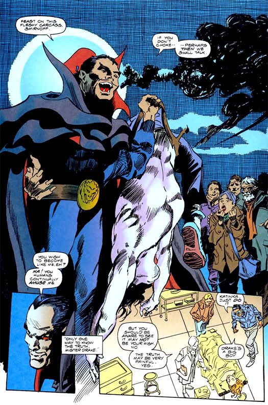
I'm not sure when Dracula gave up his suit and tie for this pro wrestler's attire, but he's apparently won the Intercontinental Tag-Team Championship, if I'm recognizing that belt buckle. Later, Dracula adds injury to insult when he pokes out Smirnoff's eyes and rips off his head.

At least Dracula's finally learned to loosen up and enjoy himself. Let's do the same! Once again, it's Hamamatsu's completely awesome Spookey!
Subscribe to:
Posts (Atom)