Showing posts with label Esteban Maroto. Show all posts

Monday, October 7, 2013

October is Spookey Month: Uncle Creepy meets (and possibly eats) the NBC peacock... in color! (Part One)

I don't know how or why this went down, but in 1973, when William DuBay went from art director to managing editor on Warren's Creepy magazine, he introduced full-color comics to its formerly black and white pages.  Creepy had already featured spot color on the inside front and back covers, but this was to be the real four-color deal, trumpeted by house ad copy as "full spectrum" color.

Why end the streak of consecutive black and white issues?  Maybe it had something to do with the company's big roll-out of Dracula, the "horror art magazine," which would feature color (and that's the extent of my Dracula knowledge).  Or DuBay just wanted to freshen up the décor inside Creepy manor, the structure of which had already been under renovation by a group of highly-talented Spanish artists and our old friend Richard Corben.  Or maybe he needed to goose sales in the face of competition from Marvel-- the House of Idea released six magazines that year, five of which were horror, a direct challenge to Warren-- and CarToons.


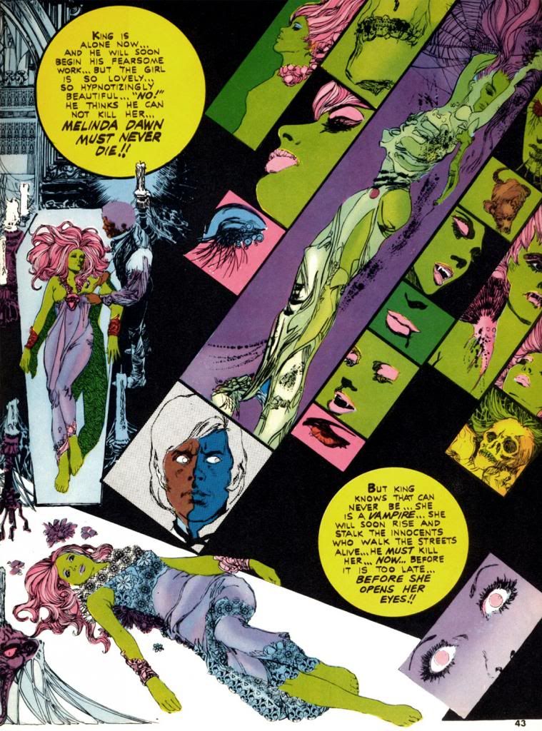
Whatever DuBay's reason (and in the interest of full disclosure, I actually don't even care why he did this; I just love these comics for simply existing in the first place), Esteban Maroto provides "Viyi," five pages of story and art in Creepy #51 (March 1973), DuBay's second issue as editor.  Here, Maroto puts one of his Brigitte Bardot-like females on display, and she's a livid green.  Amazingly, it suits her.  Maroto also wrote the story, but for Creepy's purposes "Viyi" amounts to a glorified house ad for Dracula.  We don't get the complete tale, just a couple of teaser pages telling us all about the new magazine.  The colors in "Viyi" are more subjective than representational and suit Maroto's gorgeous, emotionally-charged linework.  It certainly looks nothing like the monthly four-color superhero fare showing up on the spinner racks.  It hardly resembles the Creepy we'd come to know and love.  Perhaps that was the whole point.

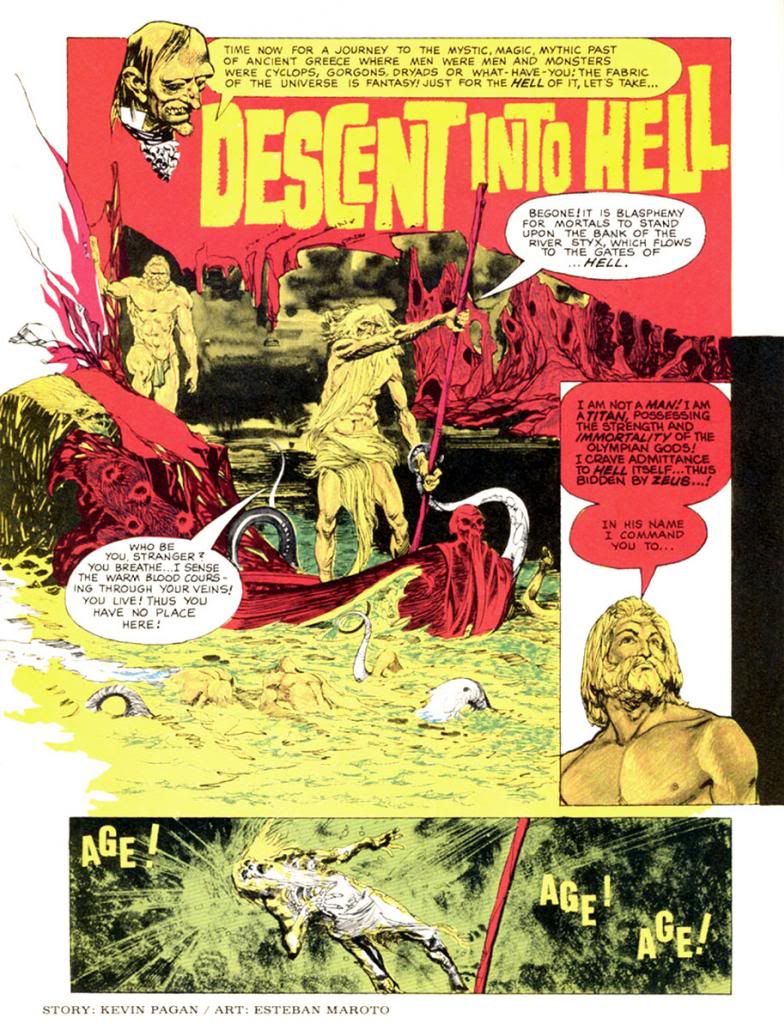
The next color story, "Descent Into Hell," again by Maroto, ran in Creepy #54 (July 1973), which also features Corben's infamous "Slipped Mickey Click-Flip."  Only a black and white story as outrageous as that could hope to compete with Maroto's journey straight to hell in lurids red and yellows.  And some blues.  By then the company must have been jazzed about where this was headed because the cover copy fairly screams, "Now!  Full Color Comics!"  The next issue consists entirely of black and white reprints but does toss in a neat-o full color board game with movement squares made up of a number of the magazine's classic cover paintings.  The credit for it reads, "Game conceived by:  Bill DuBay."


I'm beginning to sense a pattern here...

Corben finally gets his chance to produce some color pages in Creepy #56 (October 1973), where we find his classic "Lycanklutz."  A few issues before this a reader wrote in to complain that horror and comedy don't mix, but I beg to differ.  Corben's story of a flea-plagued werewolf is not only beautifully drawn, it's absolutely hilarious.  It's full of winking references to Universal Studios' Wolf Man movies and some anachronistic humor that anticipates The Princess Bride over a decade later.  Corben's palette is more naturalistic than Maroto's.  Modeled and painterly as opposed to flat and graphic.  Very different looks, but both please me immensely. 

Corben strikes again in #57 (November 1973), this time partnered with write Doug Moench for a story seemingly inspired by the title of Traffic's 1971 album, which zoomed to #7 on the Billboard pop chart.  Do you think Moench owned a copy?  Maybe?  Whatever the title's source, "The Low Spark of High Heeled Noise" kind of strains to make its pun work, but ends up a grisly, effective murder in an old house tale.  Corben's color palette is more idiosyncratic this time out as he experiments with complementary color schemes in the blue/violet-yellow/orange areas of our ever-helpful color wheel.  I write "experiment," but I'm pretty sure the guy knew exactly what he was doing.  I'm not too conversant on what was happening in color magazines around this time, but compared to the still-primitive color printing in typical monthlies this is incredibly sophisticated stuff from color choice to use of subtle gradations in tone.  This wasn't possible in standard news-rack comics in 1973 and it shows Corben's mastery of color reproduction and effects.


Color takes a break until the Christmas-themed #59 (January 1974).  This time DuBay himself writes for Corben and they come up with a holiday story split between two perspectives that come together for a tragic finale.  It's both gruesome and sentimental, no small trick.  In this story, Corben employs a restrained, naturalistic palette for a timeless look.  Kind of like one of those Coca-Cola Santa paintings.  Or Norman Rockwell suffering a psychotic episode.  In #60 (February 1974), Corben teams with Steve Skeates for a story that seems somewhat inspired by the artist's own "Den."  It's a disquieting tale of a squeamish kid who finds a magic rock, turns into some kind of space-barbarian ape on another planet, then comes to a rather pathetic end.  Poor little guy.  More relatively restrained colors on display here in the early going, with some sweet autumnal atmospherics on the first page giving way to otherworldly hues during the fantasy sequence.

In #61 (April 1974), Corben provides his own script again for another comedy-horror turn.  This time, it's "Terror Tomb," with a character named Hardoff Bey and a clumsy mummy tripping the lunkheaded human cast to their doom.  Corben's dispensing of these dopes that way provides a nice chuckle amongst the more nihilistic horrors of the surrounding stories.  If I have one complaint about the guy's work, it's every so often there's a panel so packed with dialogue the balloon obscures most of a face, squeezing the art into a tiny corner.

You may be starting to notice a theme here as Richard Corben really makes the most of the opportunities DuBay provides for him, as we'll see in part two of this epic, rambling and altogether pointless overview.  My favorite of the whole bunch is coming up!

Tuesday, October 1, 2013

October is Spookey Month... again!

And that means horror, horror and more horror here at When Comic Books Ruled the Earth.  Also, I might write something about horror comics.  First up is what I plan as a multi-part look at Creepy's color comics.  That means some Esteban Maroto, a bit of Bernie Wrightson and a whole lotta Richard Corben.  Corben practically owned the color pages in Creepy.  Then, for a change of pace, we're going to take a look at Sugar and Spike's Halloween-themed covers.  I love Halloween-themed covers in general and Sugar and Spike's in specific, even though I have to admit I've read exactly one Sugar and Spike story in my life and it had nothing to do with Halloween.

About Spookey-- they're an all-girl "bubblegum-garage-power-pop-punk" trio from my hometown here in Japan.  A few years back, I wanted to do a Halloween-themed month of my own across all my blogs and they seemed like the perfect hook.  Their music is upbeat and energetic, and they even did a Halloween-themed live performance, which is immortalized on YouTube and linked here numerous times.  I think of October as the most fun of months and Halloween as the most fun of holidays, so linking the whole thing to the most fun of local bands seemed like the most fun thing to do.  It's been a while since Spookey put out any new music, but you should check them out anyway.  Do a Google search.  If you can find their last CD release, by all means buy it.

Sunday, December 11, 2011

Don't you just love Esteban Maroto's artwork?


I know I do!  I've been really getting into Creepy and Eerie and so I've rediscovered my love for Esteban Maroto's artwork.

When I was a kid back before you were born, I was very into those Lancer/Ace Conan paperback collections. I'd either buy one of those or a Choose Your Own Adventure book with my allowance each week. Most of the Conan covers featured teensy Frazetta paintings, but I remember some of them contained a few Maroto illustrations.  I could be mistaken, but I'm pretty certain I first encountered Maroto's work in the context of Conan's world.

Yeah, the mind plays tricks on you and all that kind of thing.  Well, whatever.  The point is, I liked what I saw and I copied his style in my school notebooks every day for a while. Badly, of course. Maroto never seemed to lift the pen or brush off the paper until he completed the image, leaving one sinuous, amazingly attractive line that formed-- usually-- some lush-lashed (yes, they had Maybelline before the dawn of time) princess or queen naked except for lavish jewelery Conan would probably steal from her after they made savage, prehistoric love or whatever it was barbarians did back in the Hyborean Age when they weren't killing giant snakes, trampling thrones beneath their sandaled feet or hanging out with Sandahl Bergman or Wilt Chamberlain.

According to Maroto's website, he also designed Red Sonja's metal bikini armor. Not the most practical battle-wear, but it's served to make her a fairly popular character over the years. I can understand Maroto's motivation for drawing her that way, but I can't figure out why the character herself would go around dressed like that. She must be a mass of scar tissue.  Then again, in Marvel's Conan the Barbarian comics our favorite barbarian did his sword thing wearing a fur loincloth and some boots, so he probably wasn't much better off.  They were made for each other, these two legendary warriors, disfigured as they were because they dressed stupidly for battle.  Put some clothes on, fictional people!

The page above is what re-sparked my Maroto interest.  It's a lovely pastoral scene from "Wings of Vengeance" (Creepy #81, July 1976), which he also co-wrote with Bill DuBay.  I'm very into Art Nouveau, and Maroto's compositions here and his controlled use of negative space and "designy" plant life recall another fave of mine, Aubrey Beardsley.  Specifically, the first four panels.  The single female figure, the framing, the poses are all ultra-Beardsley-esque.  Any of them could be blown up into a poster worthy of adorning an undergraduate's dorm room wall.  This page shares with Beardsley's art the same sense of romantic decadence within a kind of fairy tale atmosphere.  The draped and folded gown the woman wears seems very inspired by Alphonse Mucha as well.  I love the subtle gray tone on their skin, which helps separate them from the from the white backgrounds.  Enjoy this lovely young couple while you can.  She's later tortured to death and he has his face cut off.

If you happened to open a Warren magazine in the 1970s (something I rarely did because the covers were enough to scare me into insomnia), you stood a very good chance of finding Maroto's work.  He was one of their most prolific artists during that period.  Now imagine finding it beside some full-color Richard Corben nightmare, a Russ Heath axe-murder tale, an Al Williamson story with a space hero fighting alien dragons in a jungle, John Severin bringing horror to the Old West and maybe something drawn by Luis Bermejo.  There might even be something set in the 1930s by Alex Toth!  Don't forget Bernie Wrightson's frontispiece!  All packaged by genius editor Louise Jones, who is now Louise Simonson and who also happened to edit and write some nifty comics for DC and Marvel-- including New Mutants.

Which brings us full circle, I suppose.  Anyway, Esteban Maroto!