I don't know how or why this went down, but in 1973, when William DuBay went from art director to managing editor on Warren's Creepy magazine, he introduced full-color comics to its formerly black and white pages. Creepy had already featured spot color on the inside front and back covers, but this was to be the real four-color deal, trumpeted by house ad copy as "full spectrum" color.
Why end the streak of consecutive black and white issues? Maybe it had something to do with the company's big roll-out of Dracula, the "horror art magazine," which would feature color (and that's the extent of my Dracula knowledge). Or DuBay just wanted to freshen up the décor inside Creepy manor, the structure of which had already been under renovation by a group of highly-talented Spanish artists and our old friend Richard Corben. Or maybe he needed to goose sales in the face of competition from Marvel-- the House of Idea released six magazines that year, five of which were horror, a direct challenge to Warren-- and CarToons.
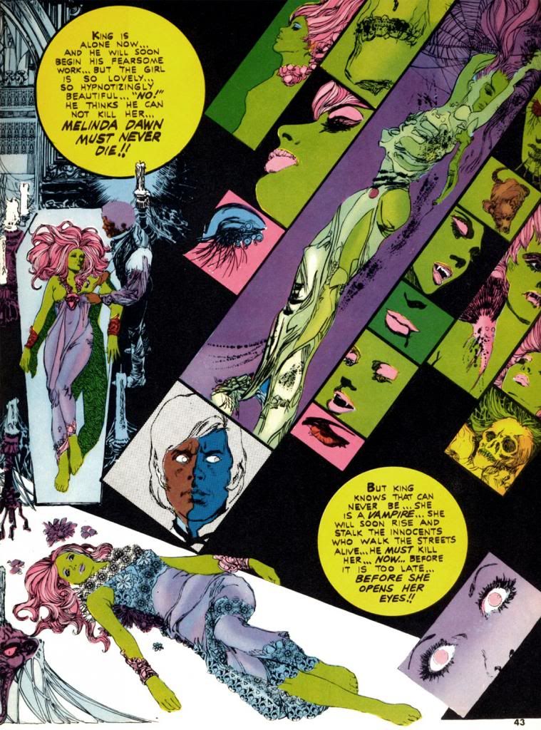
Whatever DuBay's reason (and in the interest of full disclosure, I actually don't even care why he did this; I just love these comics for simply existing in the first place), Esteban Maroto provides "Viyi," five pages of story and art in Creepy #51 (March 1973), DuBay's second issue as editor. Here, Maroto puts one of his Brigitte Bardot-like females on display, and she's a livid green. Amazingly, it suits her. Maroto also wrote the story, but for Creepy's purposes "Viyi" amounts to a glorified house ad for Dracula. We don't get the complete tale, just a couple of teaser pages telling us all about the new magazine. The colors in "Viyi" are more subjective than representational and suit Maroto's gorgeous, emotionally-charged linework. It certainly looks nothing like the monthly four-color superhero fare showing up on the spinner racks. It hardly resembles the Creepy we'd come to know and love. Perhaps that was the whole point.
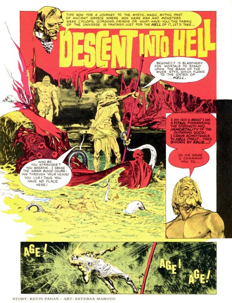
The next color story, "Descent Into Hell," again by Maroto, ran in Creepy #54 (July 1973), which also features Corben's infamous "Slipped Mickey Click-Flip." Only a black and white story as outrageous as that could hope to compete with Maroto's journey straight to hell in lurids red and yellows. And some blues. By then the company must have been jazzed about where this was headed because the cover copy fairly screams, "Now! Full Color Comics!" The next issue consists entirely of black and white reprints but does toss in a neat-o full color board game with movement squares made up of a number of the magazine's classic cover paintings. The credit for it reads, "Game conceived by: Bill DuBay."
I'm beginning to sense a pattern here...
Corben finally gets his chance to produce some color pages in Creepy #56 (October 1973), where we find his classic "Lycanklutz." A few issues before this a reader wrote in to complain that horror and comedy don't mix, but I beg to differ. Corben's story of a flea-plagued werewolf is not only beautifully drawn, it's absolutely hilarious. It's full of winking references to Universal Studios' Wolf Man movies and some anachronistic humor that anticipates The Princess Bride over a decade later. Corben's palette is more naturalistic than Maroto's. Modeled and painterly as opposed to flat and graphic. Very different looks, but both please me immensely.
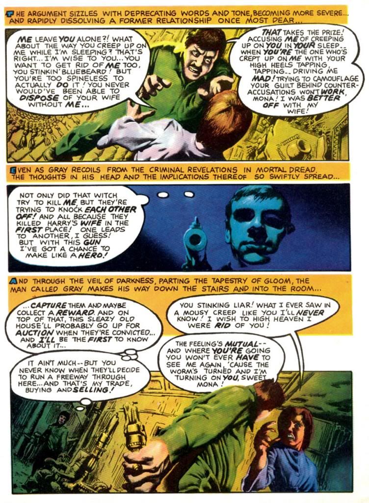
Corben strikes again in #57 (November 1973), this time partnered with write Doug Moench for a story seemingly inspired by the title of Traffic's 1971 album, which zoomed to #7 on the Billboard pop chart. Do you think Moench owned a copy? Maybe? Whatever the title's source, "The Low Spark of High Heeled Noise" kind of strains to make its pun work, but ends up a grisly, effective murder in an old house tale. Corben's color palette is more idiosyncratic this time out as he experiments with complementary color schemes in the blue/violet-yellow/orange areas of our ever-helpful color wheel. I write "experiment," but I'm pretty sure the guy knew exactly what he was doing. I'm not too conversant on what was happening in color magazines around this time, but compared to the still-primitive color printing in typical monthlies this is incredibly sophisticated stuff from color choice to use of subtle gradations in tone. This wasn't possible in standard news-rack comics in 1973 and it shows Corben's mastery of color reproduction and effects.
Color takes a break until the Christmas-themed #59 (January 1974). This time DuBay himself writes for Corben and they come up with a holiday story split between two perspectives that come together for a tragic finale. It's both gruesome and sentimental, no small trick. In this story, Corben employs a restrained, naturalistic palette for a timeless look. Kind of like one of those Coca-Cola Santa paintings. Or Norman Rockwell suffering a psychotic episode. In #60 (February 1974), Corben teams with Steve Skeates for a story that seems somewhat inspired by the artist's own "Den." It's a disquieting tale of a squeamish kid who finds a magic rock, turns into some kind of space-barbarian ape on another planet, then comes to a rather pathetic end. Poor little guy. More relatively restrained colors on display here in the early going, with some sweet autumnal atmospherics on the first page giving way to otherworldly hues during the fantasy sequence.
In #61 (April 1974), Corben provides his own script again for another comedy-horror turn. This time, it's "Terror Tomb," with a character named Hardoff Bey and a clumsy mummy tripping the lunkheaded human cast to their doom. Corben's dispensing of these dopes that way provides a nice chuckle amongst the more nihilistic horrors of the surrounding stories. If I have one complaint about the guy's work, it's every so often there's a panel so packed with dialogue the balloon obscures most of a face, squeezing the art into a tiny corner.
You may be starting to notice a theme here as Richard Corben really makes the most of the opportunities DuBay provides for him, as we'll see in part two of this epic, rambling and altogether pointless overview. My favorite of the whole bunch is coming up!
Showing posts with label Bill DuBay. Show all posts
Monday, October 7, 2013
Sunday, October 28, 2012
October is Spookey Month: John Severin's zombie soldiers
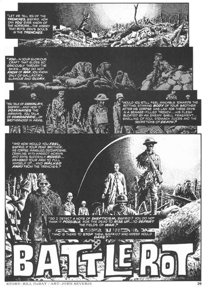
Personally, I'm sick of zombies. Well, I thought I was, anyway. Turns out I'm sick of zombies unless they're WWI soldier zombies drawn by John Severin. Severin could draw anything. Zombies, war comics, westerns, horror. Horror-war. This is the first page of "Battle Rot," a genre-bending tale from Creepy #81 (July 1976). Written by Bill DuBay, it's the story of a German flyer who holds his ground-based fellow officers in contempt, especially when one of them starts rambling on about undead soldiers wandering around the trenches at the front. Later, while villainously attempting to bomb a hospital, the arrogant pilot learns this story has its basis in fact.
"Battle Rot" would fit right in with DC's similarly themed Weird War Tales anthology comic. The final page packs a wallop, and I was tempted to share it. But I prefer the title page because it's just so haunting, evoking the climaxes of both versions of J'Accuse, the pacifist films French director Abel Gance (later a Petain supporter, unfortunately) made and re-made in 1919 in 1937 in which the war dead return; the earlier film features actual war footage and both have maimed veterans as the walking corpses, back to lay the blame for war on everyone equally. All war is terrible, but WWI with its rolling artillery barrages, frontal assaults into fortified positions bristling with machine guns, mass gassings, filthy, diseased-ravaged trenches, No Man's Land full of unburied corpses and satiated rats must have been a special level of Hell unto itself. Its mechanized, technology-based slaughter convinced a number of artists and writers life itself was absurd, was without no meaning and gave rise to Dadaism, an anti-art movement that's had a profound impact on my own sensibilities (I believe life is very meaningful, yet still absurd). It would inform the horror genre in film and literature throughout the 1920s and 1930s as well, and we can extrapolate a similar reaction to the atomic bomb in the giant bug and lizard monster films of the 1950s.
Especially here in Japan.
Friday, October 21, 2011
2nd Annual Spookey Month: Bernie Wrightson!
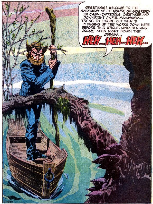
How about that, eh? It's Cain, poling his little boat through a swamp-- a haunted swamp, no doubt. Or basement. Haunted basement. Well, wherever it takes place, it's a very nice splash page drawing by Bernie Wrightson, published in House of Mystery #205. Wrightson's career began at DC the same year I was born so I've had a lifetime to associate him with the finest in horror comics illustration. Over that time, I've dug many artists who've excelled at horror: Richard Corben, Nestor Redondo, Umezu Kazuo, Ito Junji, Michael Wm. Kaluta, Joe Orlando, Jack Davis, John Bolton to name a very few. All those EC cats who worked for Warren Publications. Then there are all those Italian guys who drew those bizarre and erotic comics where characters are often naked or rotten or both covered (so to speak) over at The Goovy Age of Horror.
You can find horror artists better at anatomy and with slicker finishes, but few who match Wrightson's ability to concoct instantly iconographic horror images, with gobs of chilling atmosphere and sinister mood to spare. Throughout, Wrightson has used varying approaches to his finishes-- from feathering and modeling in ink resembling the classic works of Graham "Ghastly" Ingels and Frank Frazetta, to etching-like fine lined hatching to rich ink washes. Whatever his approach, Wrightson kills. Figuratively.
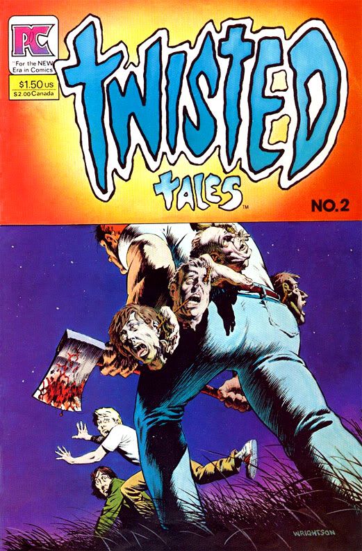
My first encounter with Wrightson was his work on Swamp Thing, no doubt in some house ad or other. I didn't read that comic until DC released the second volume when I was a teen. By then, I'd seen this choice Wrightson image:
EEP!! The worst tricks or treats ever! And it's the kind of thing that sticks with you when you're an imaginative and impressionable young doofus looking for the latest Hulk and Spider-Man stories. Now I think what a good thing for that axe murderer he's so beefy-- he's wearing about 40 pounds worth of human heads. He's going to need those powerful leg muscles if he ever hopes to add those two kids' noggins to his collection.
That came out about the time I read Creepshow. Soon after that I contaminated my brain with the issue of Bernie Wrightson: Master of the Macabre containing the infamous "Jenifer," one of the sickest stories I've ever read. It affected me so badly I had to give the comic away the same afternoon I read it to a less-squeamish friend, and yet I still lost sleep over it that night. Of course, its hold on my imagination proved too strong over the years. Every so often, I'd get the urge to draw Jenifer's twisted face in the margin of my notebook page, and I'm pretty sure I drunkenly described the story to various people whenever we started talking about things that frightened us as kids. I finally tracked it down again and it proved every bit as disturbing as I remembered. When a story does that to you, someone, somewhere, has done his or her job!
In this case, that person is Bernie Wrightson. Well, Wrightson and writer Bruce Jones.
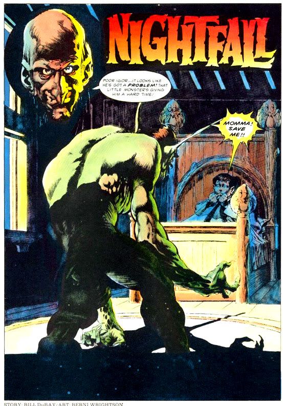
Here's another wicked Wrightson splash:
Much like Jones's tales, Bill DuBay's scripts gave Wrightson the opportunity to make our nightmares come to life on the magazine page. "Nightfall" first appeared in Creepy #60 (1974), and features a kid bedeviled by sinister goblins who come into his room at night, only to retreat whenever his increasingly exasperated parents come in to check on him. DuBay's script accurately captures the way a child's imagination transforms shadows into malicious monsters, and the impossibility of getting this across to well-meaning but lunk-headed adults who just want a peaceful night's sleep. Wrightson's creatures cavort and caper in the moonlit bedroom in a way that's dreamlike yet completely convincing.
Reminds me a lot of those nights I grew up experiencing thanks to Bernie Wrightson's art! And speaking of disturbing, here's Hanatarashi's legendary 1985 "Bulldozer Gig" in slideshow form:
Eye, that's what I call music!
Wednesday, March 30, 2011
Alex Toth and the Pie
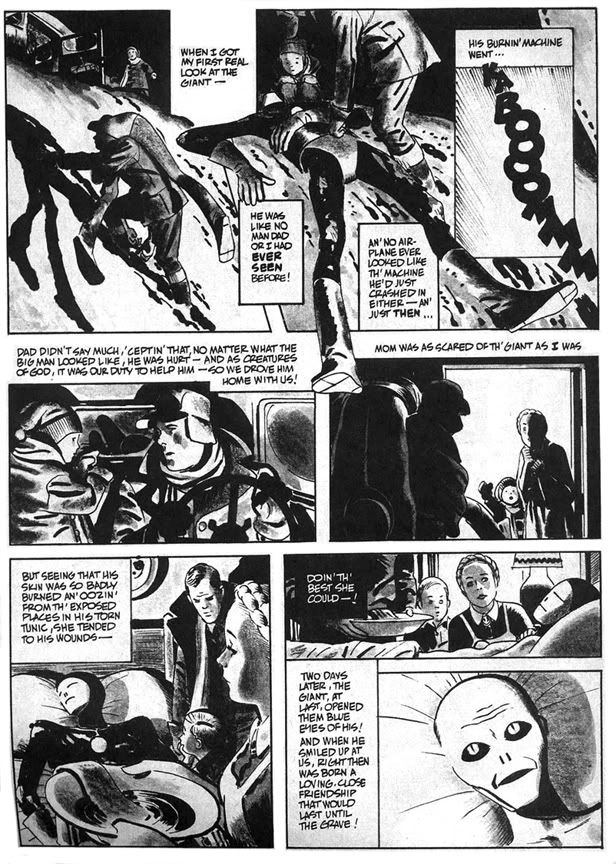
"Daddy and the Pie" hearkens back to those message stories EC used to run where they'd sucker you in with gloriously drawn gore and freaky octopus-like creatures then teach you some kind of life lesson, like in that one tale about the little mutant girl who was so misunderstood. "Daddy and the Pie" also has a distinct Ray Bradbury feel in its mix of small town nostalgia, the melancholy truth of just how crappy we humans can be to each other and science fiction. The moralizing doesn't overwhelm the plot, thanks in no small part to Toth's beautiful drawings. He evokes a sense of mystery and wonder on each page, and the heavy use of blacks along with ink washes make this one of his finest pieces. I was all set to write enthusiatically about how brilliant DuBay is for having the boy narrate the story in a kind of naive voice and how that contrasts with the action to give us a more complete understanding of what really happened with Daddy and the Pie-- then I re-read it and realized the narration is pretty spot-on, with Toth's images merely amplifying DuBay's script.
Oh well. DuBay does tell the story from the boy's limited perspective and it's a script worthy of Toth's best efforts. The kid learns that heroism isn't beating up bad guys the way the two-fisted ruffians in the movie serials and radio adventures do. It's also quietly helping others and accepting them for who they are. Just doing the right thing and asking nothing in return.
He learns this not only because of the Pie's influence on his life, but also because the example his father sets. As DuBay has him tell us, "I was lucky to have two heroes all my own... ...Two of the biggest, bravest legends ever to walk God's green earth. Daddy and the Pie." Children need parents they can look up to in the absence of saintly blue aliens. When kids inevitably encounter various forms of hate and prejudice they need strong role models within their own families to teach them open-mindedness and acceptance of differences.
Ultimately, however, "Daddy and the Pie" also reminds me of that Kenny Rogers song, "The Coward of the County." Some people-- and blue giants from other worlds-- can only be pushed so far before they have to give up pacifism and counter aggression with mysterious glowing orbs that focus mental power to wreak retribution. DuBay and Toth wisely keep the action offscreen, making us imagine its horrors, rather than fully depicting and and possibly glorifying it in the way comics and films frequently do. The Pie is fully benign but he, like the less evolved people who finally drive him to reaction, is capable of destructive acts. In some ways his sacrifice and victory in the town is the most human moment in the story. By not showing it-- by confining it to a couple of small, dark panels with flame on the horizon and ominous "BOOM! BLAAMM! KA-BAAMMM! BOOM!" sound effects, DuBay and Toth tell us this is also the least heroic thing the Pie does. This capacity for meeting violence with violence-- even when justified-- is perhaps a universal failing of all sentient beings. That we even bother to try and overcome this is a much more heroic act than burning down a town, even if it is full of bigots.
This story is also similar thematically and in plot to the 1953 Western classic Shane, starring Alan Ladd.
Subscribe to:
Posts (Atom)