As a teen she favored striped tops, loved her father and two sisters and was quite fond of cats. Lonnie Loomis, middle child extraordinaire, caught between the bossy, demanding eldest Stacy and the irrepressible, attention-seeking, somewhat psychotic, baby Michana. I don't get to read many psychological or psychiatric studies (just the abstracts and second hand articles), but from what I can gather Alfred Adler came up with this idea the order of your birth determines your personality
The first born is special, doted upon, grows up feeling closer to authority figures such as parents, becomes a leader. In the Loomis family, it's Stacy. She starts her siblings down the path of vengeance, then burns out. Literally. The youngest gets even more attention and sometimes ends up spoiled rotten. They become class clowns and show-offs. In Michana's case, they become child assassins for Ursula X.X. Imada, then head teen gangs on multi-planet crime sprees. What about the middle child? They make do. That's how you get a Lonnie Loomis. In any event, this is the simple version.
Poor Lonnie. Although her sisters love her, she's the only one among them to doubt their mission. She adored her father as much as Stacy and Michana ever did, but killing a lot of strangers for the alien weirdo the Merk in exchange for the fusion casting power of Nexus doesn't appeal to her. She's too compassionate and uncertain. Her attention wanders because she wants something of a normal life.
Introduced in Nexus #25 (First Comics, 000, 198-) alongside Stacy and Michana, Lonnie mourns the murder of her beloved father, General Loomis. They later learn his killer was the orginal Nexus, in Nexus #3- (000, 198-), and Lonnie is the one who spits in his face. Here's the sequence as illustrated by Mike Mignola, with inks by John Nyberg.
Soon, Lonnie begins actively voicing her doubts and opposition to Stacy's leadership as they risk Michana's life and sanity by holding a seance that allows the young girl to host what's apparently a demon in hopes of learning where to gain enough power to kill Nexus. From this moment on, Lonnie begins to drift from her sisters.
She's still involved enough to accompany them on their visit to the Merk. They arrive on --- in Nexus #3- (000, 198-), but it's in Next Nexus #1 where they actually confront the whimsical extra-dimensional alien and demand Nexus abilities for themselves. The gigantic Merk immediately chooses Michana to invest with these powers. It's a terrifying scene reminiscent of some of the darker elements from the 1971 children's film Willy Wonka and the Chocolate Factory starring Gene Wilder as Wonka. As we all know, the movie is all about obnoxious kids tempting fate and paying the price. And as powerful a figure as Willy Wonka is, he's also just a candy-maker. The Merk is beyond our reckoning. For a moment, one can only imagine what unspeakable horrors the Merk will visit upon fragile human child Michana.
What he does is casually toss her into one of the strange globular tanks Nexus bathes in to have his dreams and recharge his seemingly unlimited powers. Lonnie objects and this causes the Merk to punish her and Stacy with intense headaches. Michana saves her sisters by rebuking the Merk even as he holds her aloft by her ponytail. Lonnie then attempts to reject the Merk's gift outright, and he reacts by lashing out at her again. Michana defends Lonnie again, and the Merk transforms them into fusionkasters.
In the Nexus books, "fusionkasting" is the technical name for Nexus' superpowers, and what a Nexus does is kill mass murderers. This never sits well with Lonnie. Even series hero Horatio Hellpop himself alternates between acceptance and avoidance of his appointed task, and there's the question-- voiced by Lonnie-- of whether or not an alien such as the Merk has the right to judge humanity. Michana argues his alien nature makes him more objective and therefore more qualified for this than humans themselves. Stacy and Michana accept their charge and perform their first killing. They are in effect assassins in the hire of the Merk, a creature whose behavior is erratic at best, and their new powers corrupt them almost at once.
Lonnie adopts a cat against her sisters' wishes and refuses to join them on their vendetta. In a chilling scene, the pair confront Lonnie and cajole her into throwing the cat out the window. At this point, the break between siblings becomes inevitable. While Lonnie pursues a questionable relationship as a way out, the other two court disaster by confronting Nexus himself. With this, Lonnie drops from the narrative until ---- (Dark Horse, --- 199-).
Michana, now a murderous teen and gang leader (after having served an apprenticeship as an assassin under the tutelage of arch-villain Ursula X.X. Imada), ends up arrested and it's Lonnie who assumes custody of the wayward girl. What follows is a hilarious romantic misadventure in which a Tom Cruise lookalike named Tom Zeus (just to make it plain just who Mike Baron and Steve Rude are satirizing) puts some all-too-smooth moves on Lonnie. Feeling protective of her more naïve older sister, the more worldly Michana does her thing.
Her thing involves dressing like a ninja and using a paralyzing poison on Zeus.
What next for good ol' Lonnie? As far as I know, she hasn't reappeared in Nexus, which ended a long hiatus to reappear first as an offering from Rude's own Rude Dude Productions and then as a recurring feature in the new Dark Horse Presents ongoing. Baron and Rude haven't seen fit to update readers on all things Loomis, but it's only a matter of time. Let's hope she finds some kind of happiness.
But not too much.

Showing posts with label vintage comics. Show all posts
Showing posts with label vintage comics. Show all posts
Friday, January 30, 2015


Friday, October 31, 2014
October is Spookey Month: Happy Halloween from the Twilight Zone!

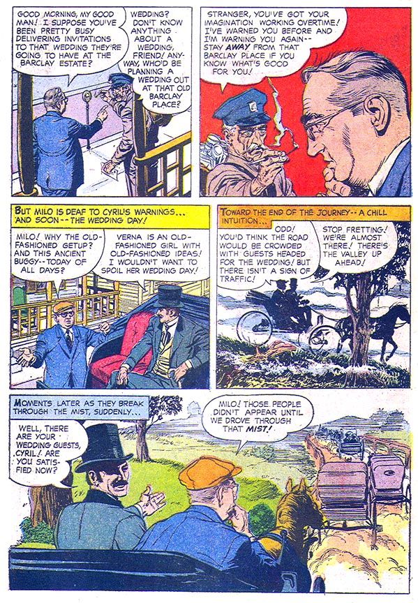
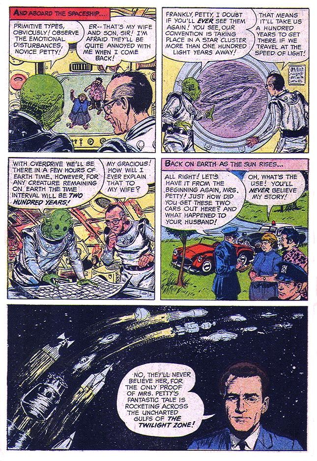
The best thing about it is George Wilson's painted cover, a fairly accurate rendition of "The Joiner," which is also the book's strongest tale. And that's saying a lot when one of the stories is about a renegade Nazi who's used his shrinking gas to turn Hitler and his cronies into suspended animation figurines waiting in a glass case for their time to come around again. In "The Joiner," we meet Alvah Petty, a harassed and pathetic bookkeeper by day and all-powerful Grand Poobah of any number of men's organizations by night. The crazier the headgear and more esoteric rituals the more he likes it, all the better to keep him away from home where his wife and middle-aged beatnik son treat him like dirt. They conspire to humiliate Petty so he'll stay home nights and they can abuse him more but it backfires on them when the fake club the son comes up with-- "Knights of the Galaxy"-- improbably turns out to be the real thing and its alien members spirit a not very reluctant Petty away for a 200 year club meeting in another solar system.
The lead story is a yawner of a ghost story about a conman and his partner (who looks amazingly like great character actor Edward Andrews, who co-starred in The Twilight Zone episode "Third From the Sun") hiding out in a small town. The conman ends up engaged to a woman who may or may not be from the Other Side. You know, where the poltergeists live.
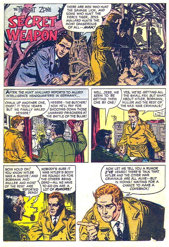
The second tale, "Secret Weapon," otherwise known as "The One with Doll Hitler," features a protagonist who might have been worthy of his own book, one Jess Mallard. Don't let his stupid, duck-like name fool you. The guy is a dogged Nazi hunter who will stop at nothing to capture his prey including offering to pay an exorbitant amount for strangely heavy carved figurines of Adolf Hitler, Martin Bormann and some joker known only as "Muller." Muller, the generic top Nazi. They should have given Mallard a better name then spun him off into his own book. Something like Duke Stone, Nazi-Hunter. It's appropriate because Serling occasionally set up Nazi characters for deserved comeuppances, as in The Twilight Zone episode "Death's-Head Revisited" and in the November 1969 Night Gallery pilot segment "Escape Route." Oh, and don't forget "He's Alive," a The Twilight Zone episode where Dennis Hopper plays a neo-Nazi would-be Hitler who runs afoul of the ghost of the real one with tragic consequences. That episode is kind of muddled and turns campy with its big reveal (don't put your pseudo-Hitler in front of a photo of the actual one, please), but it's still more gripping than the tepid "Secret Weapon," Jess Mallard aside. Mallard would have kicked Hopper's ass two minutes into his story, though, and saved everyone a lot of trouble later. Mallard may look like Leslie Howard by way of William Shatner, but he's all Robert Stack.
And then "The Joiner." The slobby beatnik who appears almost the same age as his dad, friendly green aliens and the final panel with Serling superimposed over what appears to be a highway among the stars are a few more elements that make this one a fun standout.
By now you realize none of these stories will chill you the way Serling's show did at its very best, but the art, which is apparently by EC alums Reed Crandall and/or George Evans solid enough, with caricatures of Serling that look a lot like him. Except for the one that inexplicably resembles a post-auto accident Montgomery Clift leading off "Secret Weapon." I don't know if anyone considers this book an example of either artists' A-level material, but it's easy to look at and occasionally-- especially in "The Joiner"-- has a little bit of that ol' EC magic. I would never begrudge either guy an art job in the lean days between Dr. Wertham and Warren Publications. For the history buff in me they even manage to work in a short recounting of a story I once heard about Abraham Lincoln possibly having a prescient dream about his assassination and for the skeptic who scoffs at such ridiculous notions in me, a back cover that dabbles in something that's almost science fact. All in all, Dell Four Color #1288 The Twilight Zone is a neat little package that probably has its origins more in stuff the contributors had lying around in their studios or offices than anything Serling or guys like Richard Matheson and Charles Beaumont might have come up with.

And that's it for this year's Spookey Month. I hope you enjoyed it as much as I did.
Tuesday, October 28, 2014
October is Spookey Month: Wally Wood brings you a new path to a life of peace and love in Creepy #38 (March 1971)
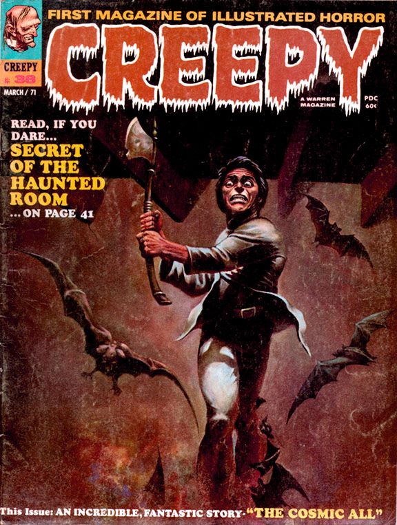
Sometime in earth's future, we've sent an intrepid mixed-gender exploratory mission led by a bearded captain (along with Don! And Sue!) to Alpha Centauri, which is now, more than 40 years after this story's publication, a popular tourist destination. In those days, it was the distant frontier of outer space. After finding bones on their first planetary stop, the explorers anticipate a possible meeting with intelligent life. Which is kind of ironic. I mean, they do meet it. It's just not the kind they were hoping for.
You know how
the hierarchy of space aliens goes—in order from least to most objectionable,
it’s generally humanoids, reptilians, insectoids, cephalopods, non-tentacled
mollusks, blobs and, finally, slimes.
The further its appearance gets from the human template, the more
repulsive the alien. And usually, the
more likely to have philosophies contrary to the kinds we find comforting. So Wood’s slime terrifies the space
explorers by trying to absorb Sue.
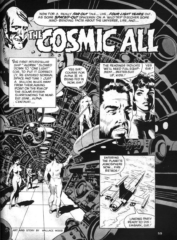 |
| Wally Wood |
In familiar comic book sci-fi fashion, Don shoots the slime with his phallic laser zapper gun, then everyone flees in their retro-finned rocket ship, only to find the slime on yet another planet. Having achieved what they believe is their due quota of slime-based encounters, they orbit a comfortably earth-like planet that gives them a very rude greeting in the form of more laser beams. In response, the human explorers (And Don! And Sue!) blast through planetary shields and receive a series of puzzling messages. The civilization below no longer seem angry, but rather depressed and resigned to first contact. They invite the astronauts to land, then ambush them in a suicidal rush.
And, ironically enough, they're comfortably humanoid in appearance. Bulbous, bald heads (like my own) and large black eyes notwithstanding. A
recording reveals this was their deliberate self-extinction and a cleaner death
than the one that awaits the astronauts.
Who stand around puzzled, as anyone would be, but the next day all but
two of them are skeletons as well. And those two are Don and Sue!
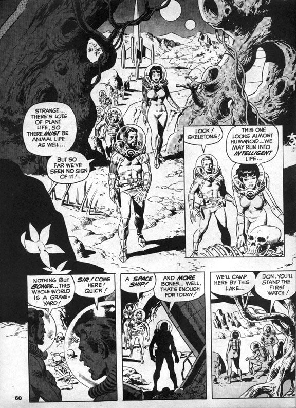 |
| Wally Wood |
Which is probably just as well. After all, even if it was a case of suicide-by-human-astronaut, these men and women did commit genocide. Are they any less monstrous than the slime? Perhaps they're precisely as monstrous, as we soon discover. Don and Sue make for earth where they suddenly experience a strange elation and crash the rocket into the ocean.
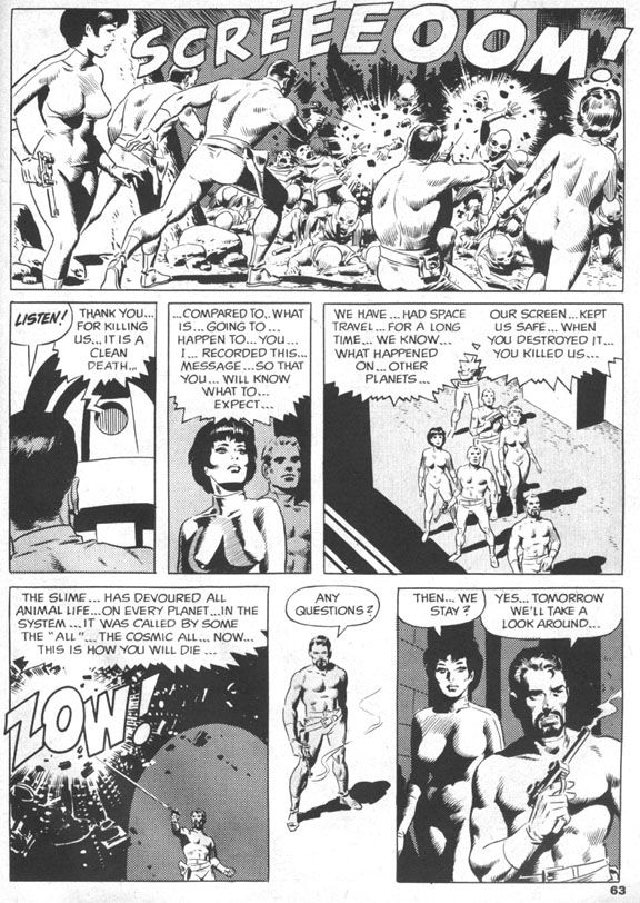 |
| Wally Wood |
There Don and Sue slough off their skins and mutate into the now-familiar slime. Everything becomes clear. The humanoid aliens chose to die as a group with each individual’s self-awareness intact because the slime infects other beings and absorbs them into the titular cosmic all, a vast collective without individual thought. The two space travelers become one with the intent of spreading their all-ness to every living thing on earth. Starting with all sea life, I suppose. Uncle Creepy appears at the end and tells us the ultimate twist—they’re glad to be this way, so it’s technically a happy ending. I’m not going to argue with him. It certainly made me happy!
 |
| Wally Wood |
The ending is one reason. The ambiguity of it lingers. So many deaths, but no escape for Don and Sue, just the loss of humanity both physical and mental, a blending of their minds with the vastness of the alien slime, all-knowing and unstoppable. Is their joy at the becoming genuine, or simply an effect the slime has on their minds?
The other is Wood’s artwork. The splash page is a spectacular image, the kind of Woodian spaceship interior he drew regularly during EC’s heyday. Round vents, layers of exposed pipes like the veins in a human arm. Similarly exciting scenes follow, with the explorers trudging across a planetary landscape, the slime attacking like a huge ocean wave and then a space battle followed by an alien-wave attack and the intimate concluding sequence which is equal parts bleak and elating, an uneasy mix that elevates this story to legendary status. It has the feel of a particularly memorable EC tale, but with an expansiveness the larger page size affords.
And that ending! That ending!
Friday, October 17, 2014
October is Spookey Month: How EC ruined America's pasttime in Haunt of Fear #19 (May-June 1953)
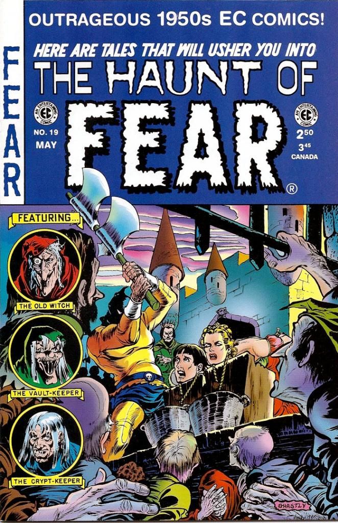
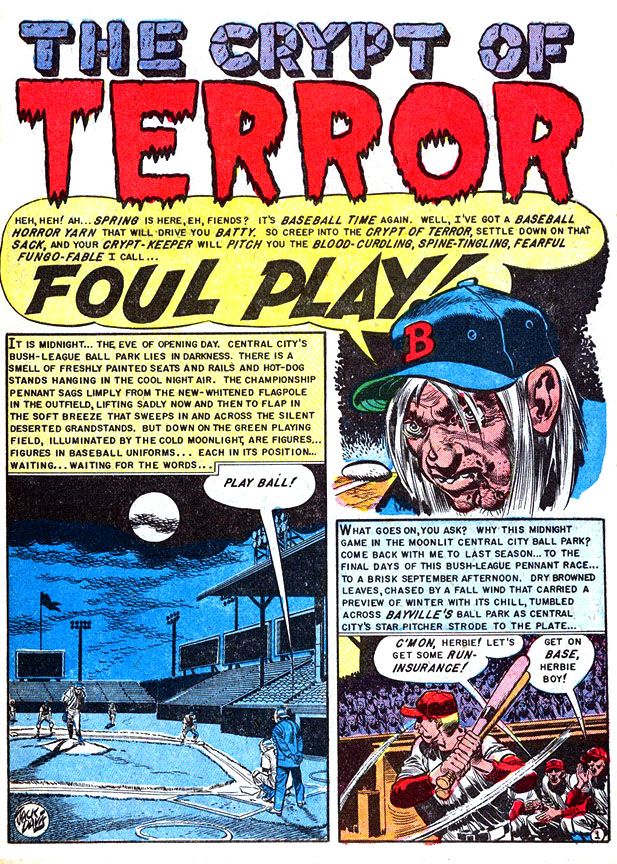
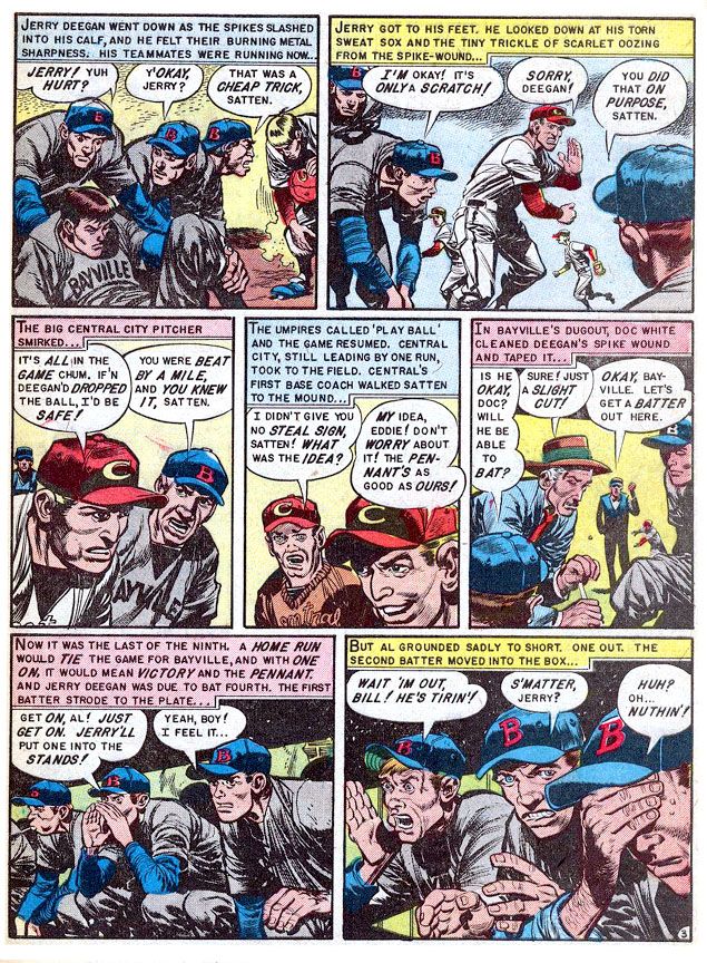
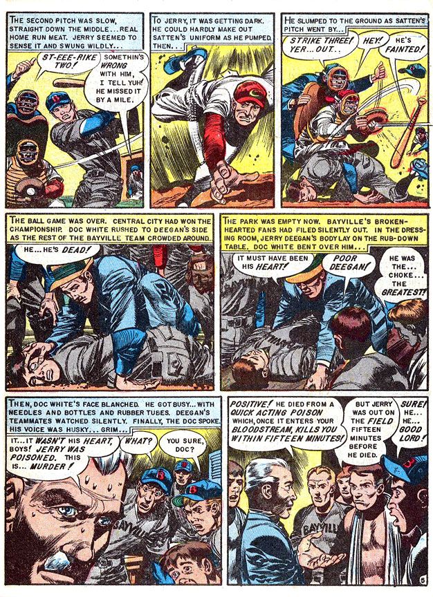
The story is about Central City's Herb Satten, an unscrupulous pitcher who wants to help his team win the pennant by murdering the Bayville's star second baseman, Jerry Deegan. After all, this Deegan slugger led the league in home runs all season and he's up the next inning in a tight game. It stretches credulity a bit. Satten kills Deegan by poisoning his spikes, then allowing himself to get hit with an inside pitch so he can get on first, attempt a steal then slide spikes-high and slash his victim. He's thrown out and it looks like a bonehead play, but it all works out. Satten kills his man and Central City wins. This leads to the pitcher's grisly comeuppance the night before the next season's opening day.
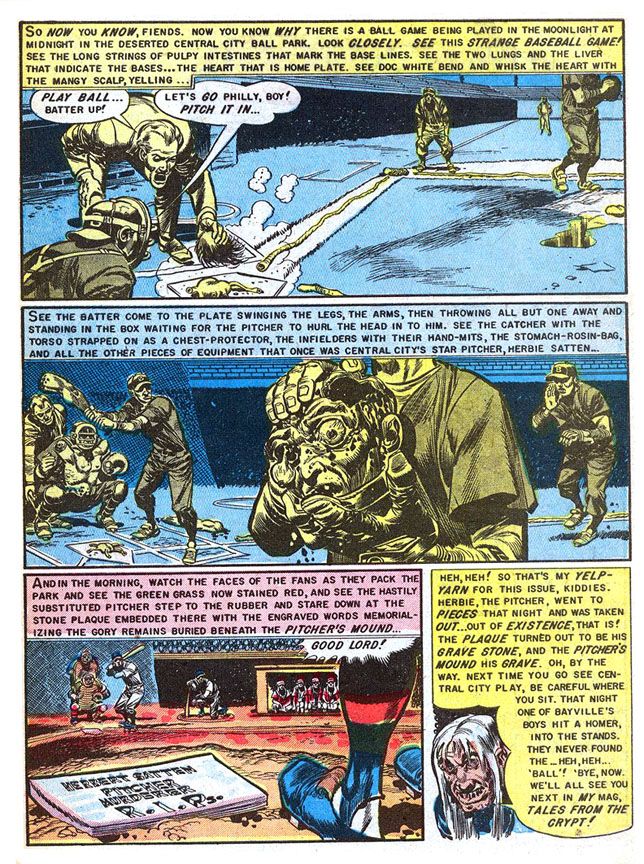
And one of the all-time great gross-out scenes in horror comics history. The murdered man's teammates literally rip Satten apart late one night and use his body parts to play a moonlit intrasquad game. Complete with a complicit umpire. That also stretches believability, but not so far as the poor pitcher's intestines, which serve as foul lines up the first and third base paths. The grisliest detail is the catcher's using the Satten's chest as his own chest protector. You wanna wear part of a human body even if he is a sorry murdering cheat? What is this, the Ed Gein League?
They also incriminate themselves by burying him under the pitcher's mound and inscribing the rubber there with "Herbert Satten. Pitcher. Murderer. R.I.P."
Rest in pieces, baby. Rest in pieces.
 |
| Writer: Al Feldstein/Artist: Jack Davis |
Well, they were angry ballplayers and probably didn't think through the consequences. The ironic thing about "Foul Play" is, it may have been notorious at the time but the guy who drew it is one of the nicest, most gentlemanly people you'll ever have the privilege of meeting. If you're so lucky. I had a chance to phone interview him way back in 1996 for a class project and I came away in such a good mood because he was so jolly and generous. He answered even my stupidest questions with patience and good cheer.
 |
| Writer: Al Feldstein/Artist: Jack Davis |
I'm talking Jack Davis, the dean of American caricaturists. This story is right in his wheelhouse, so to speak. Davis is a master of sports cartooning, able to twist his loose-limbed figures into whatever pose necessary to show the physicality of sports. Baseball, basketball, football, late night murder, these are things Davis visualizes so well. Obviously made a huge impact on Dr. Wertham and the guys up on Capitol Hill, huh?
 |
| Writer: Al Feldstein/Artist: Jack Davis |
I loved Davis' work before I ever read this story (although I'd heard rumors of it for years and they always chilled me to the bone). He drew magazine covers, movie posters. His art came into our house on television in the form of character designs for the Jackson 5ive Saturday morning cartoon. As a University of Georgia graduate, I've seen dozens, if not hundreds, of Davis-drawn Bulldog athletes in motion, with his characteristic lanky body language and large, articulated hands. Gorgeously rendered in loose, appealing brushstrokes and then watercolored to pop from the page of whatever book, calendar or postcard they adorn. His 1950s horror work benefits from the Davis approach, one that exaggerates reality for comic effect. So when you see a Davis severed head, it's not grotesque no matter how decayed it might be. It's sick... but in a tasteful way.
 |
| Writer: Al Feldstein/Artist: Jack Davis |
The Senate Subcommittee Hearing people must not have felt that way, although I believe William Gaines explained it quite well in his testimony. This is gore in just the right amount. There's nothing gratuitous about it, but it has to have impact. If you'll notice, too, colorist Marie Severin gives those panels a blue-yellow complementary color scheme rather than one that emphasizes its fleshy or bloody qualities. This makes it explicit without going over the top. Not for the squeamish, certainly. But it's right in my wheelhouse, too. Jack Davis is an American treasure, baby. And so is Marie Severin. No doubt about that.
Thursday, October 9, 2014
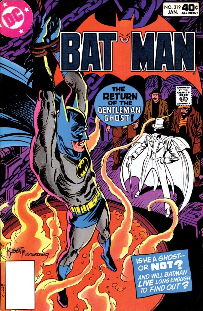
October is Spookey Month: Batman #319 (January 1980)
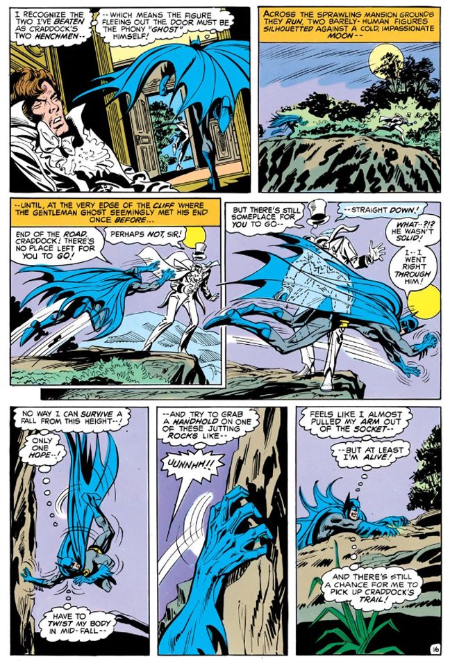
The story starts in mid-action, just like the previous Gentleman Ghost appearance. Batman once again interrupts the Ghost and his henchpeople in mid-heist and ends up hoisted by his own cape. While starting stories like this instantly ups the energy level and leads us to expect something rapid-fire and thrilling, there's a danger of this approach devolving into formula. But Batman's dilemma-- which writer Len Wein points out is self-inflicted due to Batman's cape being rip-resistant, a helpful quality in most situations but not when you need it to tear so you can free yourself from a dangling hook-- proves startling and original in its details. Wein also uses it to show that Batman, while fallibly human, is also resourceful and dangerous even when apparently helpless. Never count out the Caped Crusader, as Gentleman Ghost finds before cleverly making his own escape.
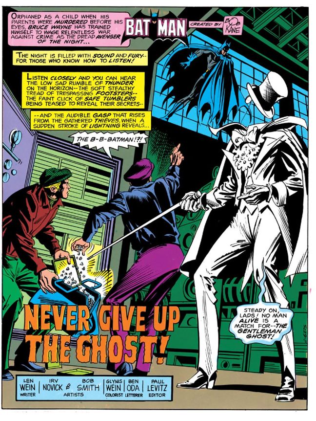 |
| Script: Len Wein/Pencils: Irv Novick/Inks: Bob Smith |
From there we find Batman setting a trap for the Ghost, with a Halloween-appropriate setting. He plans a costume ball at Wayne Manor with jewels on display as bait. Gentleman Ghost finds this irresistible, and once again Batman ends up dangling from a hook. This time over boiling soup. I mean acid. It's not tomato soup. It's a vat of acid, a wicked comic book convention. This time Wein shows us the mechanics of a Batman escape. The story has the feel of someone working through all those classic Batman tropes. The death traps, the fist fights, goofy henchpeople (somehow the very British Gentleman Ghost has found a couple of very British oafs to help him, one named, fittingly enough, Alfie) and another ambiguous ending.
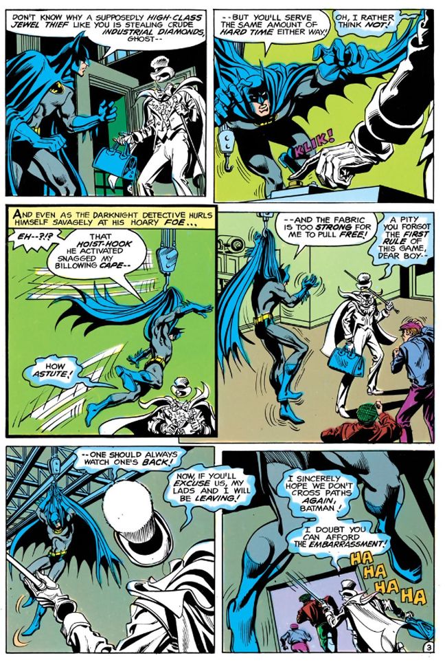 |
| Script: Len Wein/Pencils: Irv Novick/Inks: Bob Smith |
We still never learn if Gentleman Ghost is a real ghost or not. His lackies disguise themselves as the Ghost as a distraction and Wein suggests the headless quality is mere fakery when one of them is revealed to be merely hunching down. That doesn't explain the floating top hats or monacles. Later there's a bit with a convenient hologram projector which also seems to tell us the Ghost is more technological trick than supernatural treat, but Wein leaves the truth of the matter hanging, kind of like his Batman this issue. You can have it either way. He's a clever illusionist with a creepy gimmick or he's a creepy ghost with a penchant for high-tech chicanery.
 |
| Script: Len Wein/Pencils: Irv Novick/Inks: Bob Smith |
It's up to you!
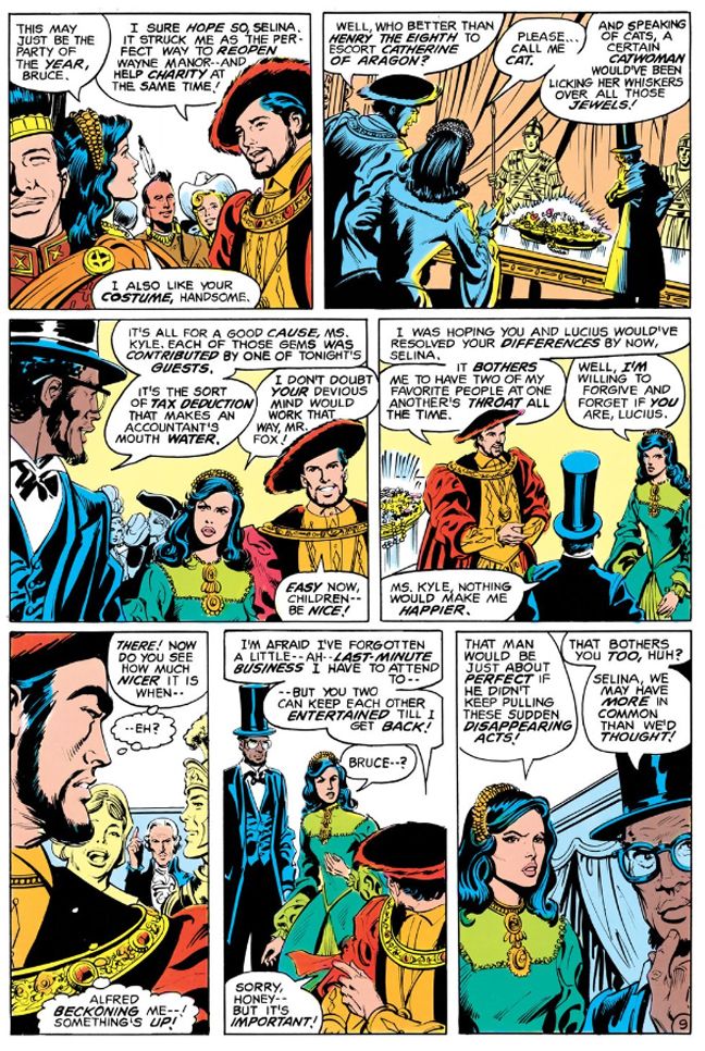
Irv Novick once again pencils, but this time Bob Smith inks. Smith's line is thinner, sharper, more angular than Giordano's. Well-defined figures and clarity of action make this issue very appealing throughout. Batman is almost always on the left side of the panels, inciting things in the proper reading order so you get this forward thrust and momentum that carries through all the way to the end. With Novick and Smith the crowded costume party has focus and detail, with one wide panel that's a treat to linger on. Batman comes as Henry VIII, Selina Kyle as Catherine of Aragon ("Please... call me Cat," she quips) and Lucius Fox is Abraham Lincoln. You can make out a plethora of other historical personages surrounding them and even when the Gentleman Ghost and friends gate-crash, Novick and Smith maintain a clear sense of where everyone is relative to each other. Even when Selina Kyle and Lucius Fox abruptly switch sides so Fox can occupy the foreground with his thoughtful countenance you're not likely to freak out with the change and fall out of the story. Good, solid stuff.
 |
| Script: Len Wein/Pencils: Irv Novick/Inks: Bob Smith |
The issues I've read of this Wein run are sleekly enjoyable reads. He drops exposition into dialogue and gives us meaty narrative captions to chew on while we enjoy the visual banquet Novick and Smith provide. Very tasty stuff, the kind that satisfies.
Sunday, September 7, 2014
This was back when we atom-bombed the shit out of the Nevada desert and all those Pacific atolls we had lying around after beating Japan, when all those old school European imperialists were licking their wounds and going soft on the commie menace. Or else turning Red themselves. Nothing like a balmy tropical paradise for testing hydrogen bombs. Or T-bombs, whatever those are. Canyon could tell you, but he's not talking because you might be a mole or a fellow traveler and a guy can't be too careful.
Looking back, I have no idea what we were thinking. Sure, you'd find magazine articles on how the domino theory would lead to Southeast Asia becoming a Marxist staging point for invading Japan, then Hawaii and then Boise, Idaho. But there had to be a better way to protect and preserve our way of life than blasting our obsolete battle fleets with nuclear bombs and polluting the atmosphere with fallout. I wonder why these damned things had to be tested so often anyway. Once you have a trigger mechanism that works, why do you need another? And if it's the fissile material that's in doubt, you can't un-blow a proven sample and use it again. I think all these Pentagon brass hats and physicist types were more or less like kids with really big firecrackers-- the largest-- and some really super keen model ships they couldn't help blowing up for kicks.
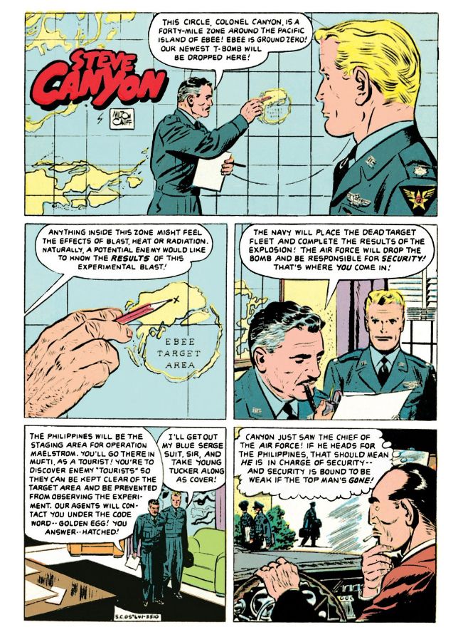
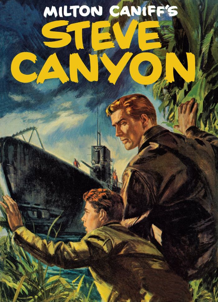
These happy images with their subtext of promised global apocalypse are from Dell Four Color Comics #641 (October 1955), reprinted in Hermes Press' new-to-digital offering Milton Caniff's Steve Canyon: The Complete Series Volume 1. This one stands out for me because I find myself reading accounts of weapons testing in my downtime.
And who would dare argue with that swanky painted cover, which has a "Hardy Boys/Nancy Drew meets James Bond" charm about it? I'm not a big proponent of painted interior art because it tends to look more like a collage of pretty still images rather than a sequence of events, but give me painted covers anytime. One of this book's strengths is its full-page reproduction of these beautiful paintings. The front cover itself features a dramatic image of Canyon and his enlisted driver gritting out a rocket launchpad fire that's too close for comfort. You can almost feel the heat and the frenzied background action gives the scene a sense of urgency that's only helped by Canyon's raised arm and grimace-creased face. The interior art may have a few Caniff touches, but it's largely by Ray Bailey and William Overgard, two names with which I'm not familiar. I will be getting acquainted as I dig into this book.
The point is, here's some sweet 1950s espionage action that falls right in my wheelhouse. My dad and I used to follow the daily Steve Canyon strip in its latter years, but I've neglected Caniff and people like Noel Sickles for far too long. I'm not just a student of comic book art filling in the gaps in my education, I'm a student of this historical era, and comics like these give us a feel for time, when we Americans felt ourselves surrounded by danger and locked in a death struggle with a diametrically opposed ideology. Our good guys sometimes wore white cowboy hats and sometimes they wore blue service caps with eagles pinned to them.
BOOM!
Thursday, September 4, 2014
Things to be excited about: Silver Age Teen Titans, Ghosts and Dark Horse's reprints of Marvel Star Wars...
I dropped some mega-bucks on DC's Silver Age Teen Titans Archives volumes 1 and 2, Showcase Presents Ghosts and Dark Horse's Star Wars Omnibus: A Long Time Ago... volume 4. These four massive books are on their way to me as I type this, through wind and rain. Yeah, it's a dark day here in Japan with changeable weather threatening to wash out any weekend activities people may have planned now that the temperatures are easing off from the sauna range they stayed in all summer long. Of course, with dengue fever closing Yoyogi Park in Tokyo, it's probably just as well. Yet within my heart is a bright, warm light and its source is anticipation of some classic comic book reading material.
The Silver Age Teen Titans Archives books particularly delight me, since this is one of those series I've fallen madly in love with. I just cannot seem to get enough of Bob Haney's socially aware writing or Nick Cardy's art. Most especially the latter. I've bought this material both in digital form and in Showcase format. The digitals, on Comixology, never seem to advance past the five or so comics available in Silver Age Titans Archives volume 1. The relatively inexpensive Showcase Titans books seem to be going out of print now. I have copies of both volumes stored back in the US, I only have one here in Japan. No luck getting the other one for a reasonable price. So my unreasonable solution was to complete my Haney-Cardy-Neal Adams-and-others Teen Titans collection by paying even more for hardcover full-color stories I already own in multiples.
Teen Titans is no mere comic book series. It is a way of life.
And since I was on a classic DC kick, what better choice to complement the superheroics than yet another Showcase Presents book featuring a horror anthology? The artist line-up in DC's old horror books reads like a list of my favorites: Cardy, Alfredo Alcala, Frank Redondo, Nestor Redondo, Sam Glanzman, Ramona Fradon, Jerry Grandenetti, Wally Wood, George Tuska, Gerry Talaoc and so many more. And with Halloween coming up, I need some fun and spooky reading material.
Finally, my addiction to Al Williamson inspired my purchase of the Dark Horse Star Wars Omnibus: A Long Time Ago... book. I have the first three, which means I have Williamson's The Empire Strikes Back adaptation. It also means I need his Return of the Jedi work. And I certainly am not going to complain about having to look at stories by Carmine Infantino, Walter Simonson and Ron Frenz with inks by Tom Palmer. This book also contains Star Wars #74, "The Iskalon Effect" (August 1983), with art by Frenz and Palmer. It's one of the few non-Al Williamson Star Wars comics I bought during Marvel's original run of books.
The Silver Age Teen Titans Archives books particularly delight me, since this is one of those series I've fallen madly in love with. I just cannot seem to get enough of Bob Haney's socially aware writing or Nick Cardy's art. Most especially the latter. I've bought this material both in digital form and in Showcase format. The digitals, on Comixology, never seem to advance past the five or so comics available in Silver Age Titans Archives volume 1. The relatively inexpensive Showcase Titans books seem to be going out of print now. I have copies of both volumes stored back in the US, I only have one here in Japan. No luck getting the other one for a reasonable price. So my unreasonable solution was to complete my Haney-Cardy-Neal Adams-and-others Teen Titans collection by paying even more for hardcover full-color stories I already own in multiples.
Teen Titans is no mere comic book series. It is a way of life.
And since I was on a classic DC kick, what better choice to complement the superheroics than yet another Showcase Presents book featuring a horror anthology? The artist line-up in DC's old horror books reads like a list of my favorites: Cardy, Alfredo Alcala, Frank Redondo, Nestor Redondo, Sam Glanzman, Ramona Fradon, Jerry Grandenetti, Wally Wood, George Tuska, Gerry Talaoc and so many more. And with Halloween coming up, I need some fun and spooky reading material.
Finally, my addiction to Al Williamson inspired my purchase of the Dark Horse Star Wars Omnibus: A Long Time Ago... book. I have the first three, which means I have Williamson's The Empire Strikes Back adaptation. It also means I need his Return of the Jedi work. And I certainly am not going to complain about having to look at stories by Carmine Infantino, Walter Simonson and Ron Frenz with inks by Tom Palmer. This book also contains Star Wars #74, "The Iskalon Effect" (August 1983), with art by Frenz and Palmer. It's one of the few non-Al Williamson Star Wars comics I bought during Marvel's original run of books.
Wednesday, September 3, 2014
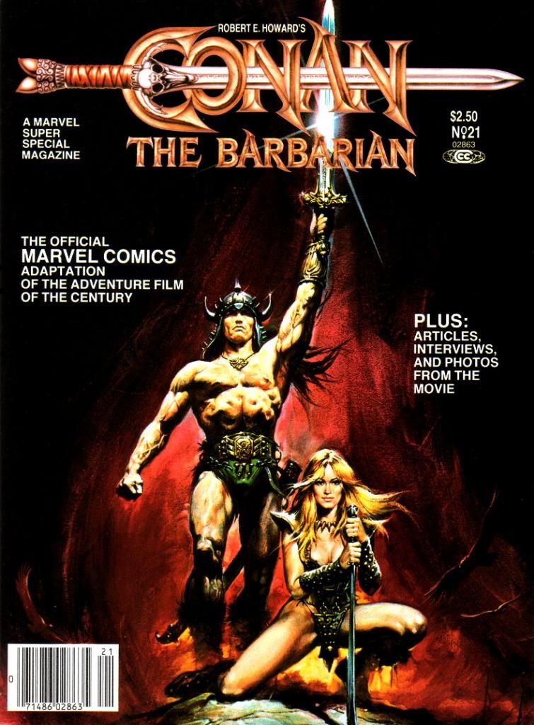
Marvel's Marvelous Movies #9: Conan the Barbarian (Marvel Super Special #21, August 1982)
On his own, Milius has made a number of romantic adventure films laced with a lot of his personal philosophy, which is somewhere to the right of right wing. He's got kind of a sketchy commercial record, but he's never bored me with his movies. At its best, his work achieves a kind of powerful macho poetry and beauty, and I find myself exalted by themes and moments I wouldn't ordinarily celebrate. The Wind and the Lion, Big Wednesday and Rough Riders come to mind.
Sometimes his movies are just sort of silly. Red Dawn.
Or poetic and silly at the same time. Which brings us to Conan the Barbarian (Marvel Super Special #21, August 1982).
Other than the rough outlines of its fantasy setting and few names and incidents here and there, this movie has little to do with Robert E. Howard's most famous creation. Milius and co-screenwriter Oliver Stone (yes, THAT Oliver Stone; Milius doesn't seem to let ideology affect his choice in collaborators, which is another reason I respect him) reinvent Conan to suit their revenge story and also because of Arnold Schwarzenegger, in just his second dramatic role (his first being as Hercules in a low-budget comedy with Arnold Stang), didn't have the acting chops to carry the film's narrative. This reduces the title barbarian himself to kind of a passive meathead thoroughly out-charismaed by his partner-in-crime and lover Valeria, played with scene-stealing verve by Sandahl Bergman.
 |
| Script: Michael Fleisher/Story and art: John Buscema |
But Arnold as Conan-- Schwarzenegger, not Stang-- probably contributes the largest portion of the public's perception of the character. Thick accent, not a lot to say, and most of that borrowed from Genghis Khan. The rest more than likely comes from Marvel's comic book series starring Conan, which hews closer to Howard's version without quite getting it right, either. And since Marvel was also in the business of adapting movies, their doing a Conan the Barbarian film comic was inevitable.
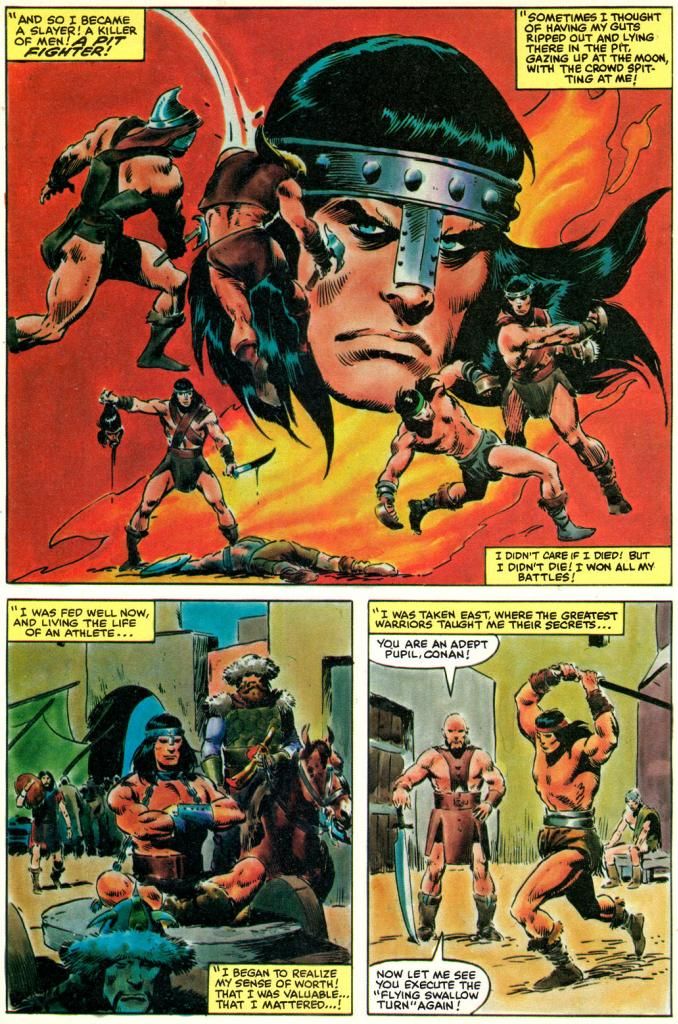
Who better to adapt and draw it than John Buscema, the top Conan comic artist of the day? As a geek, I tend to associate Buscema with the character almost as much as I do Robert E. Howard himself. Buscema has Michael Fleisher provide the words for his adaptation, which may or may not have been a smart move. I say this only because I wish we could have read something even more purely Buscema just to experience what his word choices and tone might have been like. Together, Buscema and Fleisher reduce the naked sex and sexy naked parts and expurgate most of the gore to produce a newsstand-ready Conan magazine that's Marvel and Milius at the same time.
 |
| Script: Michael Fleisher/Story and art: John Buscema |
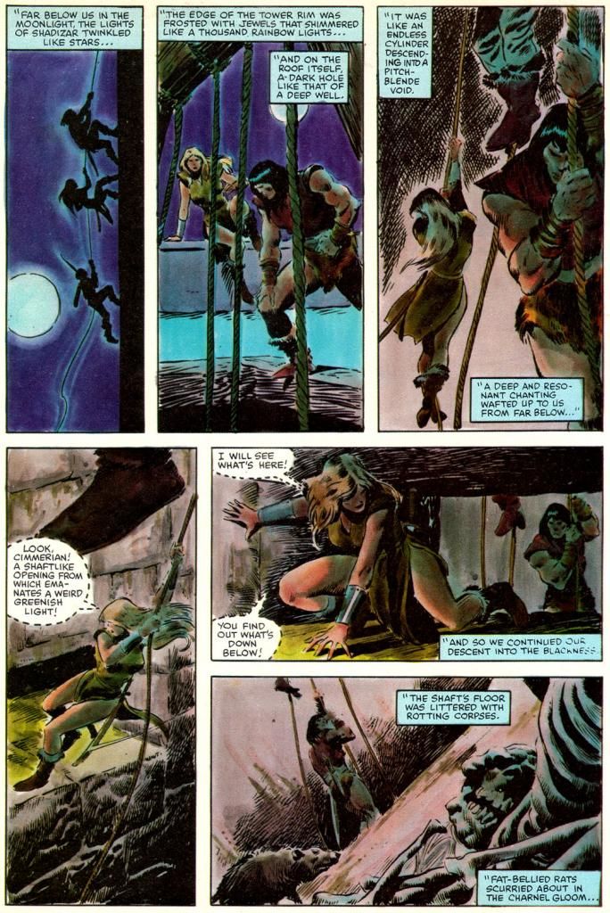
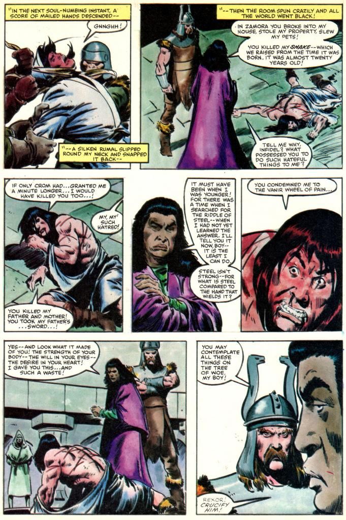
Buscema draws Conan how he was used to drawing him in the Marvel comics rather than try to depict him as Arnold. In fact, Buscema makes no attempt to caricature anyone other than James Earl Jones as villainous Thulsa Doom. And even his Doom is more or less a general likeness, aided by Jones' distinct look as the character.
Doom is a mean guy with a Bettie Page hairdo and a pack of horseback raiders who follow him around in search of money and murder. They slaughter everyone in Conan's village and then Doom hypnotizes Conan's mom and chops off her head. The orphaned Conan spends a number of years pushing a stone wheel around until he's as big as a bodybuilder. Sold as a gladiator, he learns swordplay and Nietschean philosophy while also providing stud services. Freed, he sexes up a werewolf witch, meets pro surfer Gerry Lopez and soon learns Doom has reinvented himself as head of a cult that sells snake-worship franchises throughout the land. Conan also meets Valeria, who doesn't dominate the story in the comic quite as much as she does in the movie. Buscema draws Valeria as the standard Buscema beauty, with thick eyelashes and high cheekbones. Like Bergman, she's statuesque and blond, but that's where the resemblance ends.
And that's really enough. If I wanted the characters to look exactly like the actors, I'd just watch the movie again or look at some photos. I love when an artist does caricatures or likenesses, but it's not always necessary. If likeness is an artist's strength, then he or she should focus on that. If not, then filling the pages with a lot of off-model faces poorly copied from stills and publicity material is simply a distraction. Some can do both, but either way the storytelling is much more important. Things like pacing and clarity of sequence. Vigor. You don't find many storytellers more vigorous than John Buscema in sword-and-sorcery mode.
 |
| Script: Michael Fleisher/Story and art: John Buscema |
And in contrast with the disappointing Raiders of the Lost Ark, Buscema inks himself this time. He's well within his comfort zone, and, as with Al Williamson on Empire Strikes Back, we've got an artist perfectly matched to the material. Whoever made the decision to return to the painted color style of some of the earlier Super Specials needs singling out for praise, too. D. Pedler (sorry, I don't know who this is, but I wish I did) and the legendary Lynn Varley do a sensational job here, giving Buscema's already gorgeous art a luminous quality, giving each location a rich look full of depth and atmosphere. Snowy woods look cold, the barren wastes look hot and dry. This Super Special is a visual treat with a richness a few of the preceding issues sorely needed. The result? It's classic Buscema Conan guest-starring in the Milius movie
The writing preserves many of the movie's best lines except for my favorite part, which is Conan's prayer, which it truncates to get to more action. Conan's prayer is probably the most bad-ass prayer ever capture on film next to the ones for George Bailey at the beginning of It's a Wonderful Life.
And I must quote the film here:
Crom, I have never prayed to you before. I have no tongue for it. No one, not even you, will remember if we were good men or bad. Why we fought, or why we died. All that matters is that two stood against many. That's what's important! Valor pleases you, Crom... so grant me one request. Grant me revenge! And if you do not listen, then to HELL with you!
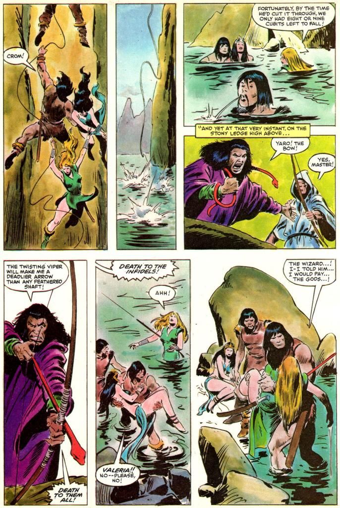
Before we toddle off to Crom's mountain where we'll laugh at the four winds, here's a page with a funny panel a Buscema group I'm in on Facebook hashed over recently. Look at the middle panel of the bottom tier:
 |
| Script: Michael Fleisher/Story and art: John Buscema |
"Valeria! No-- please no!"
Neither Howard's nor Milius' Conans spend half a second begging like that. Where the word balloon arrow points is to the rescued princess, but considering her ungrateful characterization the rest of the way (and the fact she didn't know who the hell Valeria even was) make me believe this is Conan speaking. Hardly the stuff of the guy who tells his own god to grant him revenge or go to hell.
Who gets the blame for this?
Fuck it, Dude. Let's go bowling.
Wednesday, August 27, 2014
Marvel's Marvelous Movies #8: For Your Eyes Only (Marvel Super Special #19, June 1981)
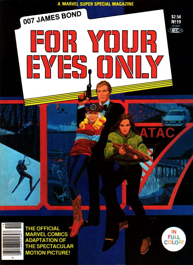
For your eyes only, I never need to hide
You can see so much in me, so much in me that's new
I never felt until I looked at you
--Sheena Easton
Bond. James Bond. I've read many of Ian Fleming's books, I own Sean Connery's films on Blu-Ray (except the silly Diamonds Are Forever, which has never appealed to me beyond a few moments here or there involving Wint and Kidd) and I even own a 12-inch Connery doll. He's in a nice black pullover sweater and matching slacks, the way he appeared in Goldfinger, a film many (myself included) consider the series' 1960s apex, although I'm slowly being swayed by the growing From Russia With Love heresy and I get my biggest kick from Thunderball.
Roger Moore was the big screen Bond when I was a kid and teenager, and looking back, I don't remember being as excited about a Bond flick as I was for For Your Eyes Only, which promised to bring James Bond back to earth after his over-the-top space adventure in Moonraker. It was supposed to mark a return to the series' earlier, glory days when Bond relied on his physicality more than Q's inventions and those of the special effects team. A more "realistic" Bond.
Of the two, I still prefer the over-the-top Moonraker. It was the reason I was so excited about this new Bond, because Moonraker had blown me away when I saw it with my parents one New Year's Eve. Wow! Zow! Moonraker has space! John Barry! Shirley Bassey! Jaws in love!
 |
| Script: Larry Hama/Pencils: Howard Chaykin/Inks: Vince Colletta |
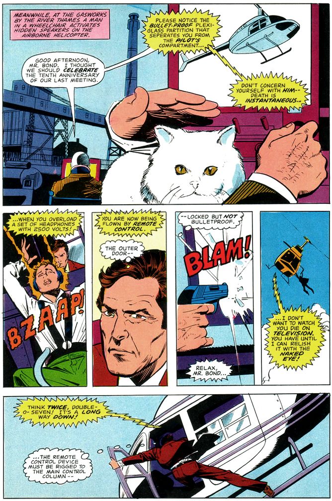
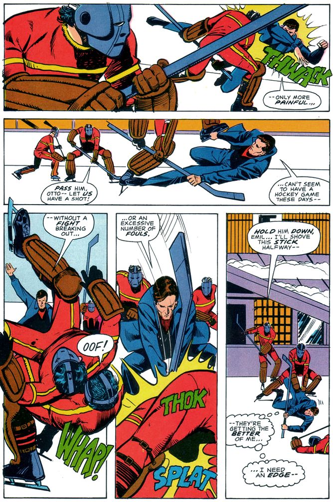
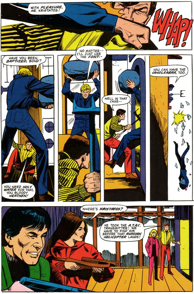
What does For Your Eyes Only have? A visual style on par with a particularly well-made episode of Magnum, P.I. A creepy subplot where an underage ingénue makes moves on a Bond who appears positively grandfatherly by contrast. Carole Bouquet, a woman I consider the most glacially lovely Bond girl, but completely lacking in chemistry with Moore. Their low-energy romance comes across as something both actors have to endure rather than the cheerful hedonism we've come to expect from Bond couplings. Slapstick fights and chase scenes, the former featuring a hockey team, the latter on skis. The reliance on so much comedy really undermines the supposed return to realism, especially with Moore's increasingly detached portrayal of the famed super spy as a character content merely to stroll onto the set after his stunt double takes a pounding then offer a quip or a pun. At this point, Moore seems to have settled on the idea Bond's role is to point out for the audience in as placid a manner as possible the absurdity of all these busy little people putting forth so much effort over some preposterous gadget or other. And then to get a manicure or a relaxing massage.
But it also has Marvel Super Special #19 (June 1981), written by Larry Hama and penciled by Howard Chaykin.
 |
| Script: Larry Hama/Pencils: Howard Chaykin/Inks: Vince Colletta |
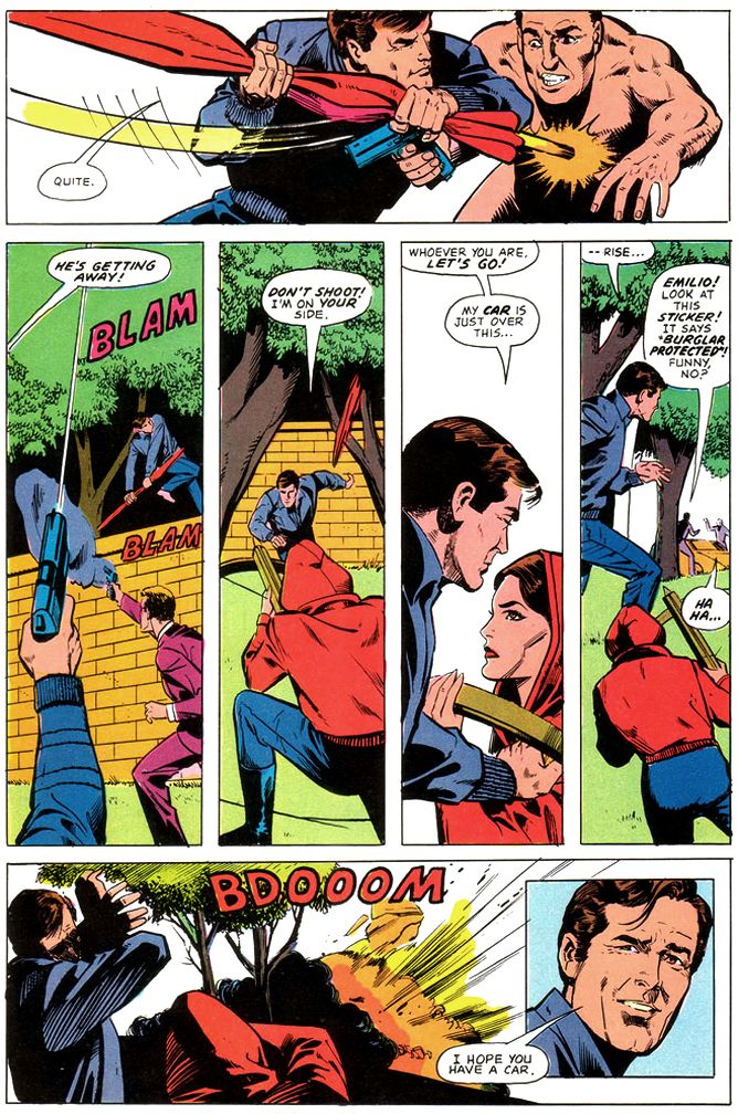
These two make an ideal team for doing James Bond's more "realistic" escapade chasing after a lost code machine wanted by everyone's favorite Cold War enemies, the Soviets. Remember them? They're still around, just under a different name.
 |
| Script: Larry Hama/Pencils: Howard Chaykin/Inks: Vince Colletta |
Hama largely eschews the caption-heavy approach of previous film adapters for a tighter focus on action and dialogue. Hama even includes Moore's little quips, with Chaykin emphasizing most of them with inset close-ups that match Moore's tongue-in-cheek Bond portrayal. This makes for a fast-paced read that provides some much-needed energy to the familiar Bond schtick. Chaykin draws some mean fight scenes, too, chopping the action into small vertical panels within pages opening and closing with larger establishing shots and you don't have to worry about spotting a stunt-Bond. This gives them added verisimilitude. Chaykin's page designs are top-notch throughout. Bursts of panels that read fast when Bond leaps into action, then large panels that allow us to savor the ritzy locales and beautiful people. Roger Moore in particular appears made to become a Chaykin hero, and while the artist doesn't spend a lot of time with the bikini girls in the early going, his Carole Bouquet is worth spending time with as you zip along between the chases and underwater fights.
If ever I wanted a late period Moore Bond transferred from the big screen to the pages of a comic book magazine-- and I did and still do-- I'd pick Hama and Chaykin to do the honors once again.
 |
| Script: Larry Hama/Pencils: Howard Chaykin/Inks: Vince Colletta |
Ah, and Vince Colletta. His inks here are adequate, the comic book equivalent of director John Glen's workmanlike take on the movie's James Bond festivities. Glen's lack of visual panache means there's nothing distinctive about the look of the films in this Bond era (the films are in focus, they're clearly lit and the camera doesn't jitter all over the place, so there's that), and Colletta similarly gives us some clean lines if little else, and still allows some of Chaykin's distinct eyebrows and facial constructions to bleed through. Without having seen Chaykin's original pencils, I can't tell if Colletta used his eraser more than he did his brushes this time out, but some of the backgrounds remain featureless voids, and others are rendered minimally. This in itself isn't a necessarily wrong, because simplicity in art can be a virtue, but with the colorist simply leaving so much of it white-- you know, possibly because there's so much ice and snow due to the ski resort setting-- there's something a little skimpy about the finishes. So, much like director Glen's bland framing of events and the movie's photography, the inks and colors do the job, if not in an especially memorable way.
After reading this, I think it would have been an entertaining book if Marvel had sprung for the license and had Hama pen a monthly Bond. As it stands, Marvel would take one more crack at Bond and we'll be taking a look at that one as well. Of course I bought it despite my disappointment with For Your Eyes Only, because, as you now know, I'm a Bond enthusiast.
Monday, August 25, 2014
Rare copy of first Superman comic book fetches $3.2 mil at auction
Rare copy of first Superman comic book fetches $3.2 mil at auction
Yeah, that's a lot of money. I guess. I've always daydreamed about finding a mint copy of Action Comics #1 in the attic or basement. Actually, where I find it is the least important part of the daydream. The having it is the main thing. Comic book dealers Stephen Fishler and Vincent Zurzolo found their copy in an eBay auction, but they had to pay for it. Paying for it was never part of my daydreams. Before the auction, the comic resided comfortably in a cedar chest in West Virginia where it was protected from wear, tear, sunlight and moths. Comic book-eating moths. Some of the $3.2 million goes to the Christopher and Dana Reeve Foundation, which adds a further bit of niceness to this tale.
We're not yet certain how Fishler and Zurzolo will handle their joint ownership. Early reports suggest Fishler will have the comic Mondays, Wednesdays and Fridays, while Zurzolo will have it Tuesdays, Thursdays and Saturdays. For Sundays, possession will be determined by a random number generator. Zurzolo will take digits 1 through 5 and Fishler will take 6 through 10. In the unlikely event of a zero, possession will be determined by a rock, paper, scissors competition, best three out of five.
Yeah, that's a lot of money. I guess. I've always daydreamed about finding a mint copy of Action Comics #1 in the attic or basement. Actually, where I find it is the least important part of the daydream. The having it is the main thing. Comic book dealers Stephen Fishler and Vincent Zurzolo found their copy in an eBay auction, but they had to pay for it. Paying for it was never part of my daydreams. Before the auction, the comic resided comfortably in a cedar chest in West Virginia where it was protected from wear, tear, sunlight and moths. Comic book-eating moths. Some of the $3.2 million goes to the Christopher and Dana Reeve Foundation, which adds a further bit of niceness to this tale.
We're not yet certain how Fishler and Zurzolo will handle their joint ownership. Early reports suggest Fishler will have the comic Mondays, Wednesdays and Fridays, while Zurzolo will have it Tuesdays, Thursdays and Saturdays. For Sundays, possession will be determined by a random number generator. Zurzolo will take digits 1 through 5 and Fishler will take 6 through 10. In the unlikely event of a zero, possession will be determined by a rock, paper, scissors competition, best three out of five.
Sunday, August 17, 2014
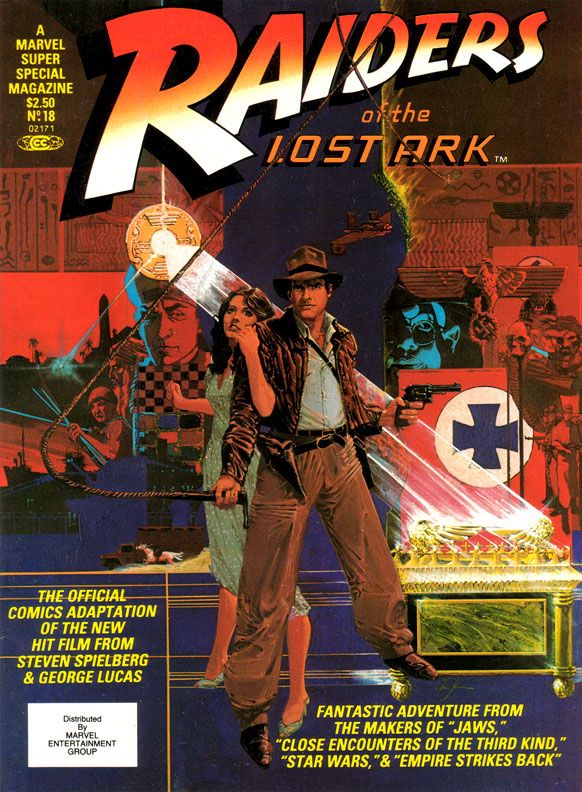
Marvel's Marvelous Movies #6: Raiders of the Lost Ark (Marvel Super Special #18, June 1981)
Why didn’t they kick us out?
When I bought this at the convenience store where I generally bought comics back in those days, my overwhelming impression was disappointment with Marvel Super Special
#18: Raiders of the Lost Ark. Maybe The Empire Strikes Back spoiled me by equaling or even surpassing its source material in many ways. Raiders seemed lackluster, kind of a knock-off product more than a celebration. Reading it again recently, I
like it a bit more.
And that like is based largely on Walt Simonson's smart and witty writing. I'm not sure what form of Raiders he was working from, some earlier version or the shooting script, but Simonson takes us through all the famous set pieces, condensing some to fit in as much of the film's action in swift strokes. There's no swordsman in the bazaar, and Indy's fight with that bald brawler of a Nazi lacks the original's grisly denouement. But even with the cuts, Simonson enriches our beloved archaeologist by filling us in on his wry thoughts. It's fun to see Indy run away from the natives, but Simonson gives us a little mental wisecrack to go along with it. Adapting isn't simply the cutting and pasting of the movie to fit on comic book pages. It helps if the writer, like Simonson, also shows a flare for language. Simonson does this not only with the quips and clever extrapolation of character, but also in the aftermath of the face-melting "wrath of God" sequence, where he drops a line that's reminiscent of Stephen King back when King was hungry, before he became a brand name. This is the kind of thing I love in a comic book adaptation of a movie, rather than an action-only, surface approach.
 |
| Script: Walt Simonson/Pencils: John Buscema/Inks: Klaus Janson |
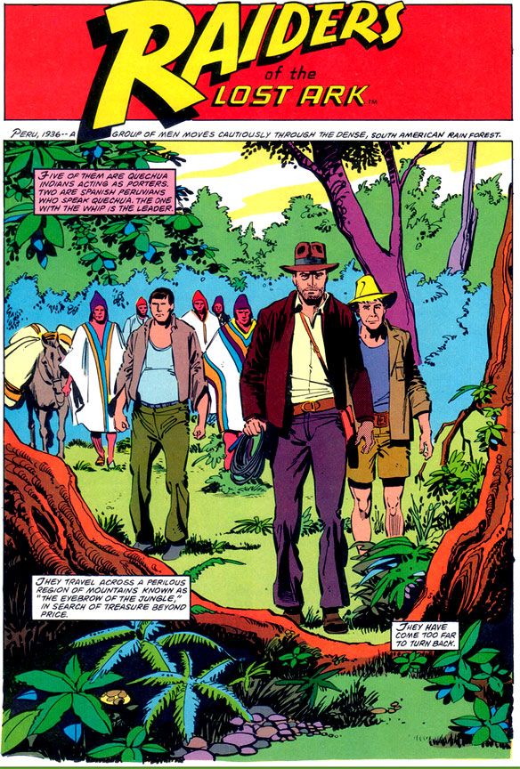
Unfortunately, the art doesn't provide the same kick. It was a big letdown when I opened this book outside the convenience store where I bought it despite its extravagant retail price, and I like it only slightly more these days. Make no mistake-- I'm a huge John Buscema fan, and despite the results here, I'm convinced he was a prime choice for penciling Raiders. If he'd had the time to do complete pencils or ink himself.
Here, Buscema provides breakdowns for Klaus Janson's finishes. Right off I'm not loving it, because this is not one of my favorite team-ups. Janson's inks superbly complement stylists like Simonson, and his work with Frank Miller is the stuff of comic book legend. I've never cottoned to his work with Buscema, especially loose Buscema. There's a clash of sensibilities and from that we don't get a charge of energy but simply awkwardness. Alfredo Alcala or Rudy Nebres would take these same pages and turn them into something akin to classic adventure book or pulp magazine illos. You'd lose a great deal of the Buscema surface while retaining the basic structure and it would look lush and refined, opulent like some of their crazy collaborations in Savage Sword of Conan. These are some of the few times one of Marvel's black and white magazines even comes close to competing with the best of Warren's gorgeous books.
Buscema-Janson would work fine in the pages of The Amazing Spider-Man or on a Daredevil annual. Here, the edgy, ultra-modern finishes turn what should be a visual treat into a rather generic 80s superhero comic. From the opening splash where Indy and company just seem to be standing like mannequins in the jungle despite the best efforts of Simonson's captions, to the rather stark and uninvolving desert setting, there's a distinct lack of detail and texture.
 |
| Script: Walt Simonson/Pencils: John Buscema/Inks: Klaus Janson |
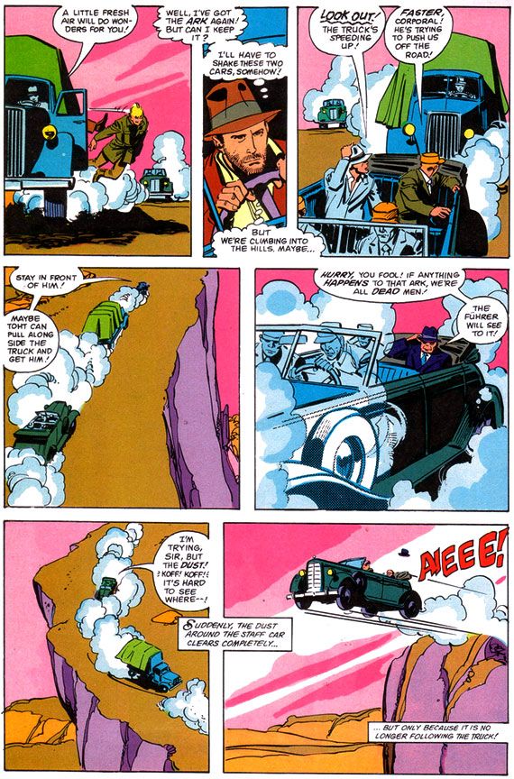
Janson’s edgy inks simply lack the retro, Saturday matinee feel a Raiders comic absolutely demands. And when a scene calls for a little modest gore-- your odd impaled corpse here, your melting Nazi there-- Janson restrains himself and what we get is drab. Other panels seem strangely empty, even unfinished, with little detailing. Nazis wear uniforms devoid of badges, Captain Katanga's tramp steamer-- piratical in the film-- looks alarmingly clean. Blacks indicate light sources but do nothing for mood.
From what I understand, the people at Lucasfilm were pretty unhappy with this book as well.
After all, when you watch the movie, you feel the love both George Lucas and Steven Spielberg share for old serials, B-movies and even A-movie adventures with guys like Errol Flynn, Tyrone Power and Douglas Fairbanks, Jr. And classics like Casablanca and Treasure of the Sierra Madre with Humphrey Bogart. They add a contemporary self-awareness to genre thrills and of course, this approach paid off in gold. So much so, they ended up sparking a revival of the genre and I ended up watching all kinds of Raiders knock-offs in search of the same all-day thrills my friends and I stole from the Martin Four that summer day. High Road to China, Romancing the Stone, TV's Tales of the Gold Monkey, Bring 'Em Back Alive, Rubiks the Amazing Cube, Jake and the Fatman, Mama's Family, Pink Lady and Jeff...
Instead of something similar, something recalling adventure strips by the likes of Noel Sickles, Roy Crane and Milt Caniff, we get flourish-free late 70s/early 80s Marvel finishes that evoke nothing of the visual qualities or romance of either Raiders or those old movies. Where’s Charlton Heston or Cornel Wilde? There’s barely even any Harrison Ford. Marvel's Raiders has incident, but lacks atmosphere.
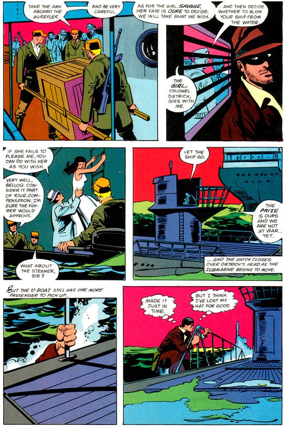 |
| Script: Walt Simonson/Pencils: John Buscema/Inks: Klaus Janson |
I’m left wondering what might have been if someone said, “Let’s do this in the spirit of the film. There’s no way we can get Milton Caniff himself, but let’s at least see if Alex Toth or Doug Wildey might want to take a crack at it.” Imagine the opening sequence with Toth's black-spotting and way with draping figures in heavy, moody shadows and evoking time and place. Toth probably would have turned Marvel down flat because of Indy’s rather ambiguous morality (or for some other reason peculiar to Toth’s outlook), but Wildey could have done something approximating the romanticism of classic adventure strips in his own style. Gray Morrow also would have gotten it. Marvel would later waste him on their Sheena adaptation, of all things, but a Raiders by Morrow with this Simonson script have been an instant classic.
And what about Al Williamson? There was a guy who could draw jungles and deserts. What about Howard Chaykin, who provides a wonderful painted Bob Peak-style cover?
 |
| Script: Walt Simonson/Pencils: John Buscema/Inks: Klaus Janson |
Ultimately, however, I'm going to blame the book's lack of visual flare less on the artists and more on Marvel double-dipping on the artwork. My best guess is Buscema and Janson drew this based on the idea this would be printed as a regular monthly (check out Gene Day's killer Paul Gulacy-esque cover on Raiders monthly #1 for yet another example of how this comic should have rocked us), and when it came time to run the art larger for the Super Special format, it didn't translate. And Marvel cheaped out on the color job, too. These aren't the dreamy modeled or airbrushed tones we'd gotten used to in many of the previous Super Specials, even on movies that were outright stinkers. Jaws 2, Meteor and even poor Xanadu got lush painterly coloring. These colors read clean and they provide some nice contrast between foreground and background, but they're obviously meant to grace the garbage paper Marvel's books came printed on. A little heavy on the purples, pinks and magentas. A lot of Marvel monthlies around this time looked similar.
This should have looked different. Yes, I praised Janson's work with Dave Cockrum on their adaptation of Star Trek the Motion Picture (Marvel Super Special #15), and that had monthly book coloring and ran as regular format comic as well. But there the art is dense and detailed and provides a lot more of its own depth and atmosphere. The same is true of the Archie Goodwin/Williamson/Carlos Garzon Empire Strikes Back. Those books manage to feel deluxe when this feels knocked out in a hurry.
Reading it today, I find Raiders isn't as bad as I remembered. It's probably even better than I'm making out here, and I'm sure you can find its defenders online without much effort. It’s just we're talking a comic book based on Raiders of the Lost Ark. And it's a visual bore when it really cries out for some deluxe treatment or a little pre-production product conceptualizing. You know, "Hey, this material is pure joy! Here's our chance to do our own version of Terry and the Pirates!"
Sunday, July 6, 2014
Marvel's Marvelous Movies #3: Star Trek: the Motion Picture (December 1979)
It almost didn't. The movie, directed by two-time Academy Award winner Robert Wise and based on a premise written by series creator Gene Roddenberry, made money, but it was expensive to produce and wasn't as big a hit as Paramount had hoped for. It certainly looked fantastic, with a sleeker, updated Enterprise and everyone in pajamas for a sweet slumber party atmosphere. But it suffers from endless shots of the Enterprise slowly drifting along set to repetitive music cues and people staring in awe at light shows. It's like watching the audience at Laser Floyd: Dark Side of the Moon. The film allows its characters to ask existential questions, but when it comes to answering them, the result is akin to a 2001: A Space Odyssey where, after boring you for more than two hours, Stanley Kubrick has the astronauts explain to each other (and the audience) exactly what the monolith represents and why it does what it does. The cheaper, more action-oriented Star Trek II: The Wrath of Khan turned out to be the franchise's salvation, not this glacially-paced epic. But in 1979, for me, it was enough seeing Kirk, Spock, McCoy, Scotty, Uhura, Sulu and Chekov (along with Janice Rand, for cripe's sake!) back in action.
And, after watching this movie again on Blu-Ray recently, I've decided I'll take it with all of its flaws and dull stretches over either of the terminally stupid "reboot" flicks any day of the week. Star Trek The Motion Picture at least has ideas and something to say about the basic human dilemma ("Is this all there is? Is there nothing more?"), things it takes very seriously. Can you imagine a major studio nowadays dropping this kind of money on a sci-fi flick starring a lot of middle-aged people and without any meta-humor or product placement? There's not even a sky-diving sequence! There's barely any sex!

But let's talk about the comic.
It must have been a daunting challenge to adapt into an entertaining comic a story that consists mostly of long sequences of nothing more than the Enterprise gliding over the giant V’Ger ship and then small groups of characters conversing about it in staff rooms and small corridors. The comic really benefits from the deft way Marv Wolfman condenses scenes. Wolfman ruthlessly edited down long scenes into a few panels, quickening the pace and generally tightening things up. Wolfman uses his narrative captions-- always a strength of his writing-- to clarify character motivation and add descriptions and exposition to guide readers along. We're engaged throughout.
For the art team, which consists of Dave Cockrum on pencils and Klaus Janson on inks, the problems are finding ways to make all the conversations work visually and reproducing the movie’s many, many special effects shots. Cockrum, a master of crowded team compositions and action-packed superhero action, comes through with strong "acting" from the principals, downplaying the usual Marvel dynamics but upping the emotional content of various scenes. His Commander Decker in particular comes alive with various angry faces and hand-chop poses emphasizing his frustration. The likenesses are consistent throughout, a real plus when dealing with familiar, iconic characters. The results aren't photographic, but Cockrum never confuses the readers. Kirk has his poofy hair, McCoy his sharply arched eyebrows and drooping, lived-in face. Of course Spock is easy to get right, but even more conventionally good-looking people like Uhura, Sulu and Chekov look pretty much the way you expect. Every so often there's a dead face, but they never become a distraction.

What an ink job Janson provides, too. While he and Walt Simonson outdid themselves on innovative lighting effects in Close Encounters, here he and colorist Marie Severin use color holds to reproduce Douglas Trumbull's lightning balls and wormholes. This kind of stuff is easy to do these days with digital inking and coloring. It's nothing to isolate an element and change the color channels to whatever you want. But when Janson and Severin tackled Star Trek, they had to rely on acetate or vellum overlays. It must have been a tedious, time-consuming process because they use one or more on practically every page. The results are nothing less than astounding.

For all its pacing flaws, the film is effective at making space seem like an infinite frontier full of dangers. It's not just that there are Klingons and V'Gers out there ready to zap unfortunate astronauts and Starfleet personnel. Space itself is dark and perilous. For one thing, the ships have to provide their own exterior lighting. None of that Star Wars stuff where everything in space is brightly lit no matter how far away it is from an actual light source. To the human mind, space appears largely empty, dark and vast. Even the vaunted technology its space explorers count on for survival turns on them. The transporter goes awry in a shocking incident and, later, the warp drive throws the ship into what the characters call a “wormhole.” Contending with these, the Enterprise crew truly seems to be going boldly. This isn't sailing along to some cute world where you find 1920s gangsters or the White Rabbit out of Lewis Carroll. You could end up a data stream in a godlike machine's memory banks or transformed into a robotic copy of yourself with a lighted jewel embedded in your throat. Or merge with the overmind into a stream of light. Wolfman’s script reproduces each of these episodes faithfully and Cockrum, Janson and Severin provide some spectacular visuals to match them, with all the production design details faithfully reproduced. Ultimately, this is an extremely accurate recreation of the film's look and mood, minus its shambolic tendencies.

The story also appeared in three monthly issues (Star Wars, a much shorter but action-oriented film, ran in four, which is further evidence of how Trek should have been pared down a bit) which led to a short-lived Marvel Star Trek comic. I never read a single issue of that. After all this time, I'm not sure why, especially considering how much I enjoyed this one. Maybe it was enough for me Wolfman, Cockrum, Janson and Severin had already provided fabulous glimpse of what a Star Trek comic could be, one-upping its cinematic source material. Too bad they didn't get a chance to take on Khan.

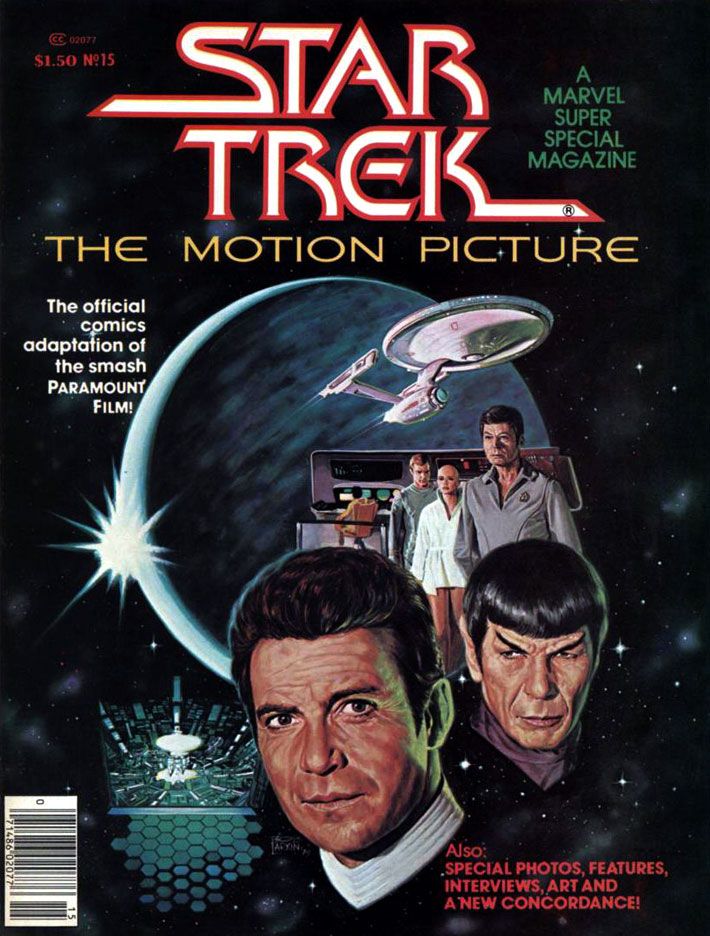
Looks like I forgot to talk about the Bob Larkin fully-painted cover. That's just as well. I'd have written a paragraph consisting only of superlatives. I look at it kind of like Kirk, McCoy, Decker, Ilia and the rest gaze at Laser Floyd.
Subscribe to:
Posts (Atom)