Showing posts with label Warren Publications. Show all posts

Tuesday, October 28, 2014

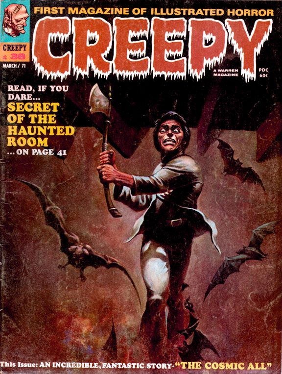
October is Spookey Month: Wally Wood brings you a new path to a life of peace and love in Creepy #38 (March 1971)

Behind a lurid and appealing Ken Kelly ax-maniac cover (Kelly's Creepy debut), you'll find a late career gem in the EC Comics mode written and illustrated by Wally Wood.  James Warren, who was not only publishing Creepy at this point but also editing it (along with associate editor Archie Goodwin), must have been particularly happy with Wood's "The Cosmic All," because he gives it a cover spotlight and the honor of closing out an issue that also includes work by Rich Buckler, Mike Royer and Ernie Colon.  Warren would also reprint the story just over a year later in Creepy #48, a special, all-reprint issue.

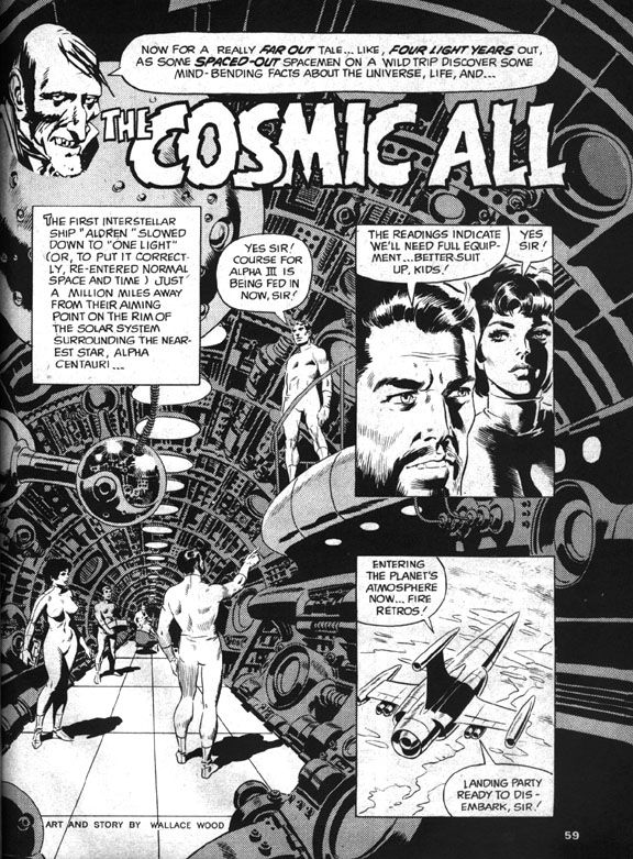
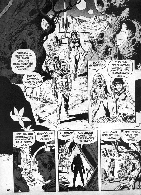
Sometime in earth's future, we've sent an intrepid mixed-gender exploratory mission led by a bearded captain (along with Don!  And Sue!) to Alpha Centauri, which is now, more than 40 years after this story's publication, a popular tourist destination.  In those days, it was the distant frontier of outer space.  After finding bones on their first planetary stop, the explorers anticipate a possible meeting with intelligent life.  Which is kind of ironic.  I mean, they do meet it.  It's just not the kind they were hoping for. 

You know how the hierarchy of space aliens goes—in order from least to most objectionable, it’s generally humanoids, reptilians, insectoids, cephalopods, non-tentacled mollusks, blobs and, finally, slimes.  The further its appearance gets from the human template, the more repulsive the alien.  And usually, the more likely to have philosophies contrary to the kinds we find comforting.  So Wood’s slime terrifies the space explorers by trying to absorb Sue.
 
Wally Wood

In familiar comic book sci-fi fashion, Don shoots the slime with his phallic laser zapper gun, then everyone flees in their retro-finned rocket ship, only to find the slime on yet another planet.  Having achieved what they believe is their due quota of slime-based encounters, they orbit a comfortably earth-like planet that gives them a very rude greeting in the form of more laser beams.  In response, the human explorers (And Don!  And Sue!) blast through planetary shields and receive a series of puzzling messages.  The civilization below no longer seem angry, but rather depressed and resigned to first contact.  They invite the astronauts to land, then ambush them in a suicidal rush. 
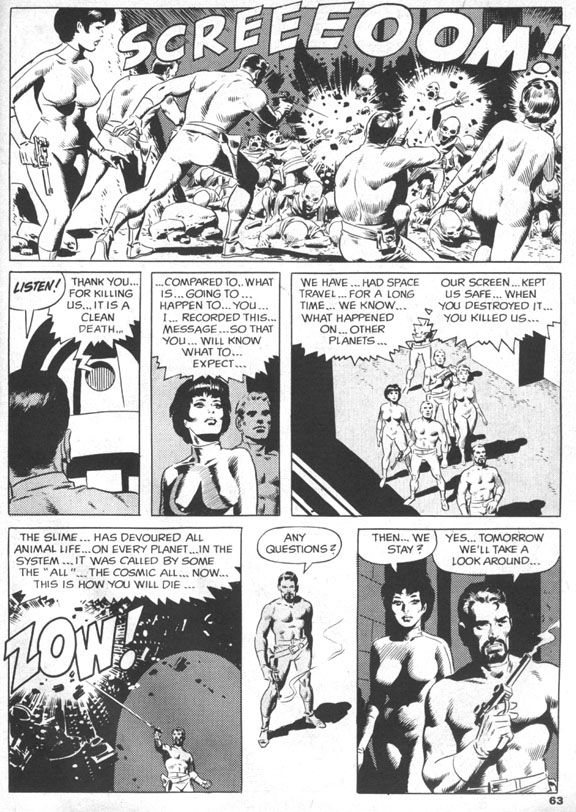
And, ironically enough, they're comfortably humanoid in appearance.  Bulbous, bald heads (like my own) and large black eyes notwithstanding.  A recording reveals this was their deliberate self-extinction and a cleaner death than the one that awaits the astronauts.  Who stand around puzzled, as anyone would be, but the next day all but two of them are skeletons as well.  And those two are Don and Sue!
 
Wally Wood

Which is probably just as well.  After all, even if it was a case of suicide-by-human-astronaut, these men and women did commit genocide.  Are they any less monstrous than the slime?  Perhaps they're precisely as monstrous, as we soon discover.  Don and Sue make for earth where they suddenly experience a strange elation and crash the rocket into the ocean.
 
Wally Wood

There Don and Sue slough off their skins and mutate into the now-familiar slime.  Everything becomes clear.  The humanoid aliens chose to die as a group with each individual’s self-awareness intact because the slime infects other beings and absorbs them into the titular cosmic all, a vast collective without individual thought.  The two space travelers become one with the intent of spreading their all-ness to every living thing on earth.  Starting with all sea life, I suppose.  Uncle Creepy appears at the end and tells us the ultimate twist—they’re glad to be this way, so it’s technically a happy ending.  I’m not going to argue with him.  It certainly made me happy!
 
Wally Wood

The ending is one reason.  The ambiguity of it lingers.  So many deaths, but no escape for Don and Sue, just the loss of humanity both physical and mental, a blending of their minds with the vastness of the alien slime, all-knowing and unstoppable.  Is their joy at the becoming genuine, or simply an effect the slime has on their minds?

 The other is Wood’s artwork.  The splash page is a spectacular image, the kind of Woodian spaceship interior he drew regularly during EC’s heyday.  Round vents, layers of exposed pipes like the veins in a human arm.  Similarly exciting scenes follow, with the explorers trudging across a planetary landscape, the slime attacking like a huge ocean wave and then a space battle followed by an alien-wave attack and the intimate concluding sequence which is equal parts bleak and elating, an uneasy mix that elevates this story to legendary status.  It has the feel of a particularly memorable EC tale, but with an expansiveness the larger page size affords. 
 
And that ending!  That ending!

Wednesday, October 31, 2012

October is Spookey Month: Let Doug Moench and Richard Corben show you how to trick-or-treat!


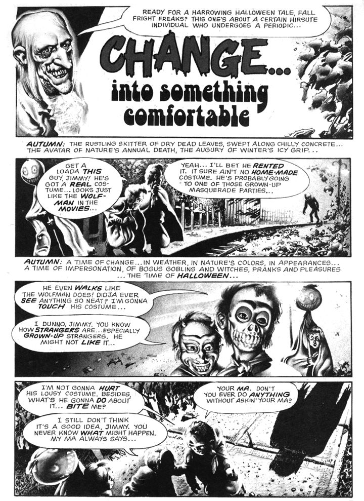
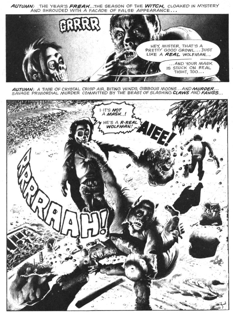
Yes, Halloween is a fun holiday, but you should exercise at least a little caution when out trick-or-treating.  Go in a group, wear a costume with reflective tape so motorists can spot you, go only to well-lit houses.  And most importantly-- don't pull on a werewolf's lip.  These are a few simple safety tips brought to you by Doug Moench and Richard Corben in their horror-comedy classic, "Change... into Something Comfortable," which appeared in Creepy #58 (December 1973), a "special Halloween horror issue" (so it says right there on the cover).  While I didn't particulary enjoy "The Slipped Mickey Click-Flick," I'm a huge fan of this little seasonal-flavored gem.

It starts with a real werewolf ripping some smart ass kids to shreds and ends with a sweet twist I find both irresistible and hilarious.  I mean if you've ever wondered what creatures of the night disguise themselves as on Halloween, here's your chance to find out.  "Comfortable" is sort of a companion piece to Corben's even more hilarious "Lycanklutz" from Creepy #56 (September 1973).  That earlier full-color romp features a somewhat luckier werewolf in a medieval setting with some surprisingly anachronistic products available for sale.  By contrast, our contemporary, kid-killing monster in "Comfortable" strays into EC territory with tragic results.  I could have hit you with "Lycanklutz," but this one is all about Halloween and disguises and has those melodramatic Moench narrative captions.  You can read it in the Dark Horse Creepy Archive Volume Twelve.

Come to think of it, you can read them both in that book.

Monday, October 22, 2012

October is Spookey Month: "The Slipped Mickey Click-Flip"


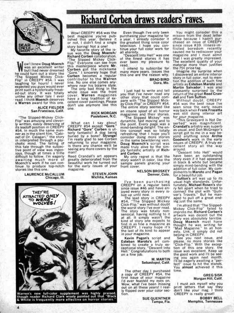
"The Slipped Mickey Click-Flip" by Doug Moench and Richard Corben first appeared in Creepy #54 (July, 1973) and readers seemed either to love it or hate it, if the letters pages for the next two issues are any indication.  And they must be; they're the letters pages for Creepy, which printed the story, for corn's sake.

But I have to admit I don't love this story.  It's a pretty good story, but I don't think it works as well as it could have.


A twisted mutant named Diment (as in "dementia") takes offense at a certain Dr. Nugent for trying to cure him of his insanity.  He takes over Creepy magazine and marginalizes poor, innocent Uncle Creepy himself to punish the doctor.  Diment does this by way of his "Click-Lick" device, the workings of which we never truly learn; he keeps turning away from us before using it.


I'm a fan of both Moench and Corben, and I admire them for their audacity in breaking the fourth wall-- and especially Corben for visually interpreting Moench's feverish, hallucinatory script.  They playfully push the boundaries of good taste-- even by the admittedly lax standards of mid-70s black and white horror magazines-- with gruesome images like eyeball-sucking butterflies and crazy-eyed trains that decapitate people.  Oh, and a woman who explodes into maggots.  I mean, if you like people who explode into maggots, you really need to buy Dark Horse's Creepy Archives #10 so you can experience this singular event rendered by Corben in full loving detail.  Never before have maggots looked so full-fleshed as they explode out of a comic book character's torso.  Gorgeous, gorgeous maggots.  Still, I thank my Uncle Creepy this story wasn't one of their color sections, which the magazine experimented with during this era, usually with Corben's art.

Unfortunately, a lot of the non sequitor dialogue seems forced and ham-fisted, sometimes repetitious ("idiot" is over-worked and begs for a week off in the Bahamas), Nugent and his wife are little more than puppets to the story and we never learn enough about them to develop any sympathy for them or become overly concerned with their plight.  But Diment himself is no prize, either.  I find him repulsive and off-putting.  I could see myself settling down on some moldy divan to listen to Uncle Creepy spin many a yarn, but once is enough with Diment.  More than enough.

Of course, "Slipped Mickey" is psimply a psick psychedelic romp, not meant to be taken seriously by any means, but as a supposedly enlightened 21st century citizen of the world, I can't help but find the depiction Diment's mental illness troubling and retrograde even for its time.  But I have to admit I apply this standard inconsistently.  What bothers me here might not in another story.


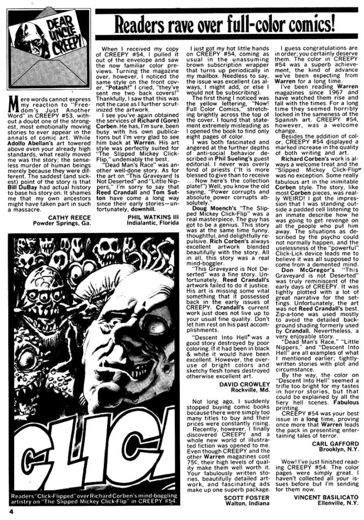
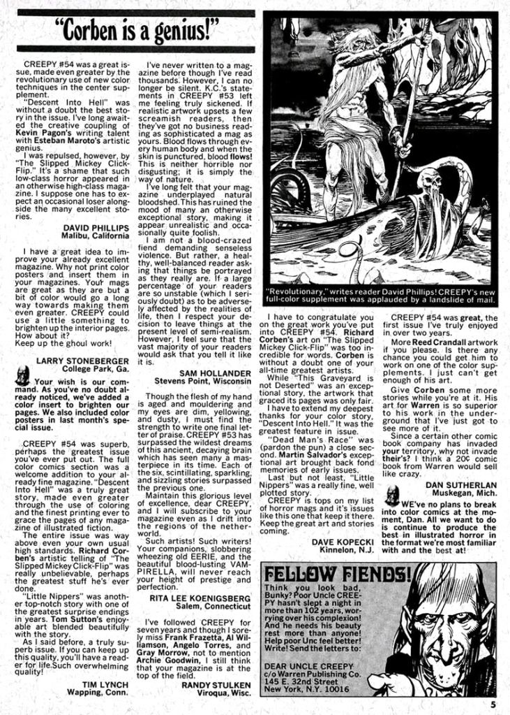
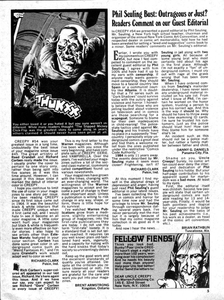
It's memorable as all get out, enough so you can find it in its entirety posted online and a few reminisces about it from fans who read it back in the day or in the years since and fell in love.  After all, for a horror story the only true mark of failure is boring readers to sleep, and "Slipped Mickey" definitely avoids that.  As you can see, the Creepy letters page in issue #56 (September, 1973) features nothing but praise for the story, with one reader calling it a masterpiece and Moench a genius and another praising it before opining it takes place entirely in Diment's mind (which is a comforting reading, I have to admit).  Negative reaction slips into the mix with a lone dissenter, who declares it "low class horror," then intensifies ever so slightly for Creepy #57 (November, 1973) when seven letters (out of 14) mention the months-old story, five praising it and two criticizing it.

One thing I enjoy about reading the Creepy letters pages-- even though we're now years past the point their relevancy died like poor ol' Dr. Nugent, his wife and even their dog-- is the editors weren't afraid to allow some nay-saying, and in this case actually spotlighted it with a sidebar box.  There's a feeling of some real give-and-take and that someone actually read the letters and put some thought into it, but also that the letters page is largely a forum for reader opinion without a lot of defensiveness from the Creepy staff, as if dare the readers to form their own opinions instead of just joining a praise-pack, that it was just as much the fans' comic as it was theirs.  You can imagine what the message boards would have been like had this taken place in today's Internet-savvy comic book society.

Oh, and before I leave you to Google search for this story and read it for yourselves-- to make up your own minds about it, just like Uncle Creepy would have it-- let me tell you this is exactly the kind of story that would have sent me off the rails for a few days if I'd read it as a child.  I had this stupid over-imaginative reaction to horror comics, especially stories as whimsically arbitrary as this one.  I can imagine little-me trying not to think much about Diment for fear of his being real, or somehow making him emerge from the comic book into our world and wreaking havoc on me specifically.  You just do not want to piss Diment off, and disapproving of him would probably be more than enough to earn his wrath

So I would have been sleeping with the lights on in my bedroom, picturing the happy little crazy train running over my head or killing my dog.  DC's House of Secrets and Weird War Tales were bad enough, Marvel's black and white Planet of the Apes magazines scared me as often as they thrilled me with adventure (especially with their house ads for Tales of the Zombie and even Unknown Worlds of Science Fiction, the latter featuring a Michael Moorcock story that crosses the border into blasphemy for those of us in the Bible Belt deep South).  I'm a little nervous even now, writing about it.

Saturday, October 13, 2012

October is Spookey Month: "The Coffin of Dracula"

Dracula didn't really cry out for a sequel, but for over a century now Bram Stoker's vampire character has proven so appealing writers have been unable to leave the poor, exhausted bastard  undead, the end result being he's so ingrained in our pop culture his image has even been used to sell chocolatey breakfast cereal.  You can imagine, if you will, his staked, beheaded bones lying in his coffin still somewhere in the mountains of Transylvania, just as he was at the end of the original novel.  Or you allow any of the later incarnations where the vampire comes back to unlife into your personal Dracula canon.  Or you can be like me and just separate them all and not really care if one is a continuation or a side story or parody or whatever.

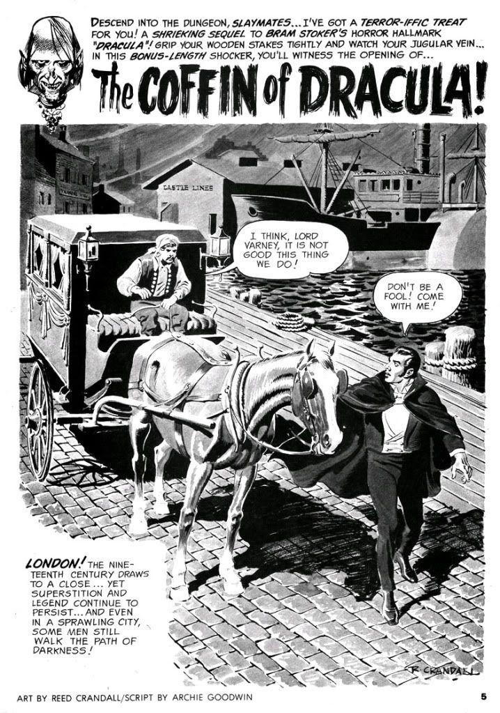
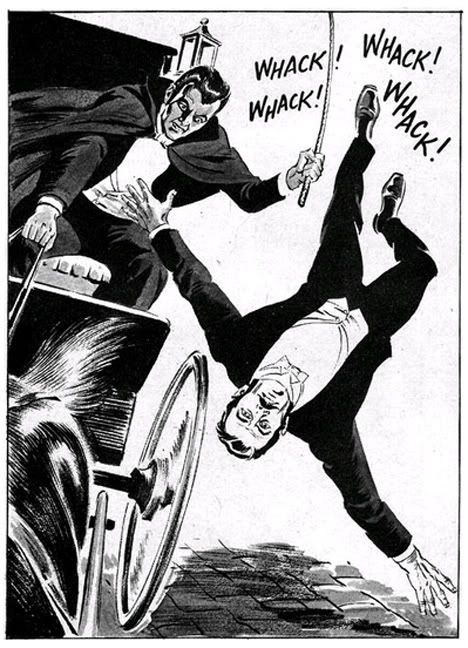
For Warren's Creepy magazine, Archie Goodwin and Reed Crandall created a two-part sequel centering on one Lord Varney (his name borrowed from one of Dracula's vampire antecedents) and his stupid misadventures with Dracula's coffin.  Not that the story is stupid.  It's not exactly a classic-- although Warren thought highly enough of it to reprint it in one of their best-of issues-- but Varney's the idiot here.  What kind of fool buys Dracula's coffin and climbs into it?  It's a bonehead move by an arrogant jackass and actually one of the most bizarre ways I've yet seen of contracting the dread disease we know as gingivitis.  I mean, vampirism.

Seriously, if you must become a vampire, have the common decency to drink the blood of one of the undead.  Get your own coffin.  Sharing coffins isn't sanitary, anyway.  And it's not true vampirism.  It's more like possession at first.  Varney can't even get that right.  Man, I hate this Varney guy!


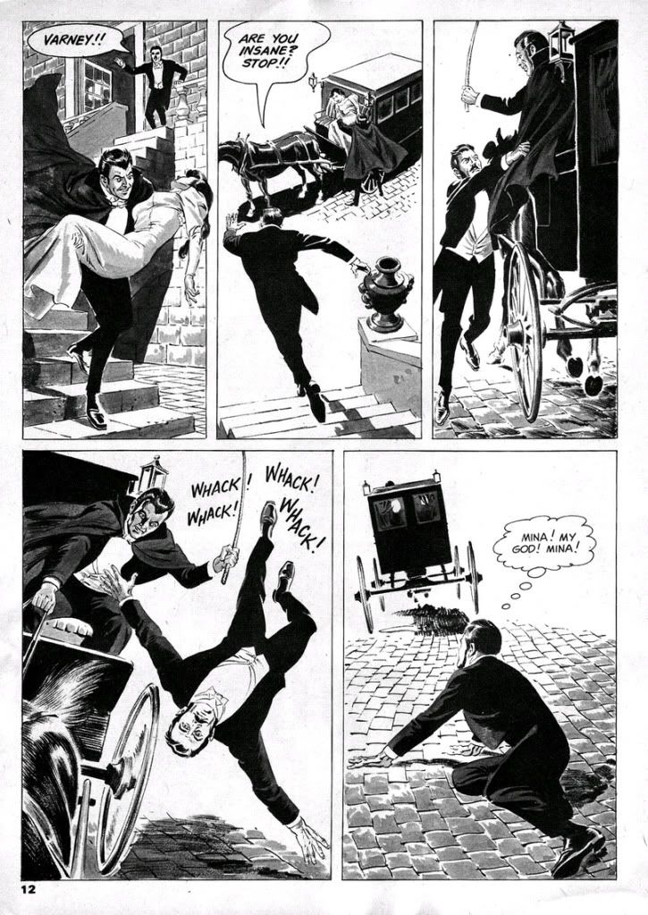
Part one clawed its way out of the crypt in time to anchor Creepy #8 (April 196), while part two coalesced from swirling ash in #9 (June 1966).  Both segments are gorgeously illustrated by Crandall at the height of his artistic powers, "Coffin" plays like an overly abridged adaptation of the Stoker original, with Dracula more a presence than a character.  Dopey, delusional Varney kidnaps Mina, Jonathan, van Helsing and Dr. Steward pursue him back to Whitby, one of the central settings in the novel and where Dracula began his reign of terror by vamping virginal young aristocrat Lucy Westenra.  The heroes hope to kill a vampire left over from the novel and prevent Varney from truly becoming one of them.  After that, they plan to save Mina.  The plan doesn't sit too well with Harker, but he's too dim to argue with van Helsing's logic.

There's some decent violence and fully-rendered vampire-staking (tastefully sans outright gore), but Varney is a vamp-come-lately, a pale imitation of the great one and lacks charisma.  Once fully vampirized, he doesn't even have any dialogue.  Ultimately, gorgeous art or not, the story is mainly mild fun for fans of books like Alan Moore's League of Extraordinary Gentlemen, itself an extension of Dracula through the character Mina.  If you finished Dracula and hoped for more story, then here's your chance and you don't have to know 19th and 20th century literary references and pop culture to fully appreciate it.


At least Moore picked up on the nascent feminist aspects of Mina, given that ultimate compliment by van Helsing in the book of having a "man's brain."  The novel's Mina is a schoolteacher with a strong empiricist bias before she encounters the supernatural.  Moore really ran with the notion and made her a lot steelier than Stoker's Mina, but Goodwin goes the opposite route and reduces Mina to your standard damsel in distress, kind of a dishrag.  She barely has any dialogue, and none at all in the second part where we only see her unconscious before we follow Harker as he pursues Varney.

Well, Stoker puts Mina in jeopardy and in need of rescuing by men as well, but she does get in a few shots of her own, and because it's an epistolary novel, she at least had the privilege of speaking for herself.  Goodwin shifts his focus exclusively to those menfolk, here rendered as a a dull crew of stick-up-their-asses types.  When Varney kidnaps Mina, she disappears for the bulk of the story, which diminishes her plight.  Goodwin does a wonderful job of recreating Abraham van Helsing's stilted Continental dialogue, though.  Van Helsing is like a Dutch Yoda.  "Friend Jonathan," indeed.


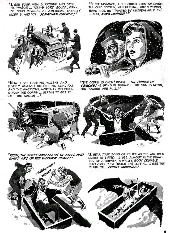
 My favorite page is the collage-like recapitulation of Dracula's climax.  I wish Goodwin and Crandall had done a full-fledged adaption of Stoker rather than this rehash, pretty as it is.

Poor Reed Crandall.  While I immediately loved what I saw when I encountered his color jobs for EC in those early 1990s Gladstone reprints (I sorely miss those), his black and white art in the Creepy archives books from Dark Horse is a revelation.  I can only describe it as beautiful, like those illustrated plates you encounter in ancient, heavy tomes from the darker corners of a library collection.  Finely proportioned and posed figures, beautiful contour lines and modeling, depth of field, absolute control and mastery of individual panels and the page as a whole.  And yet he seems to have been in competition with Wally Wood for "most tragic former EC great."  Alcohol dependency and failing eyesight robbed him of his talent and sent his output into a shockingly steep decline in quality, so much so his last few jobs seem more the work of a talented amateur trying to do a Crandall impression.  Reading them is like viewing a slow motion film of a ship sinking with a man still visible on the deck.  On the other hand, he did leave behind an impressive body of work, especially in these early issues of Creepy.

And now it's time for one of my all-time favorite videos starring Spookey:


Wednesday, March 7, 2012

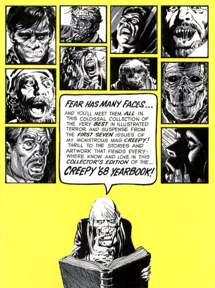
Uncle Creepy introduces the faces of fear!


You can't go wrong with a little Uncle Creepy in your day.  These Warren house ads are the best.  Can you recognize the artists represented here? I see Gray Morrow, Al Williamson, Angelo Torres, Frank Frazetta...

The rest is up to you, my friend.

Sunday, December 11, 2011

Don't you just love Esteban Maroto's artwork?


I know I do!  I've been really getting into Creepy and Eerie and so I've rediscovered my love for Esteban Maroto's artwork.

When I was a kid back before you were born, I was very into those Lancer/Ace Conan paperback collections. I'd either buy one of those or a Choose Your Own Adventure book with my allowance each week. Most of the Conan covers featured teensy Frazetta paintings, but I remember some of them contained a few Maroto illustrations.  I could be mistaken, but I'm pretty certain I first encountered Maroto's work in the context of Conan's world.

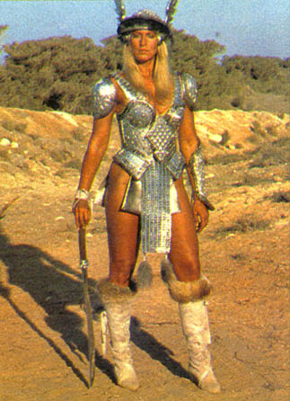
Yeah, the mind plays tricks on you and all that kind of thing.  Well, whatever.  The point is, I liked what I saw and I copied his style in my school notebooks every day for a while. Badly, of course. Maroto never seemed to lift the pen or brush off the paper until he completed the image, leaving one sinuous, amazingly attractive line that formed-- usually-- some lush-lashed (yes, they had Maybelline before the dawn of time) princess or queen naked except for lavish jewelery Conan would probably steal from her after they made savage, prehistoric love or whatever it was barbarians did back in the Hyborean Age when they weren't killing giant snakes, trampling thrones beneath their sandaled feet or hanging out with Sandahl Bergman or Wilt Chamberlain.

According to Maroto's website, he also designed Red Sonja's metal bikini armor. Not the most practical battle-wear, but it's served to make her a fairly popular character over the years. I can understand Maroto's motivation for drawing her that way, but I can't figure out why the character herself would go around dressed like that. She must be a mass of scar tissue.  Then again, in Marvel's Conan the Barbarian comics our favorite barbarian did his sword thing wearing a fur loincloth and some boots, so he probably wasn't much better off.  They were made for each other, these two legendary warriors, disfigured as they were because they dressed stupidly for battle.  Put some clothes on, fictional people!

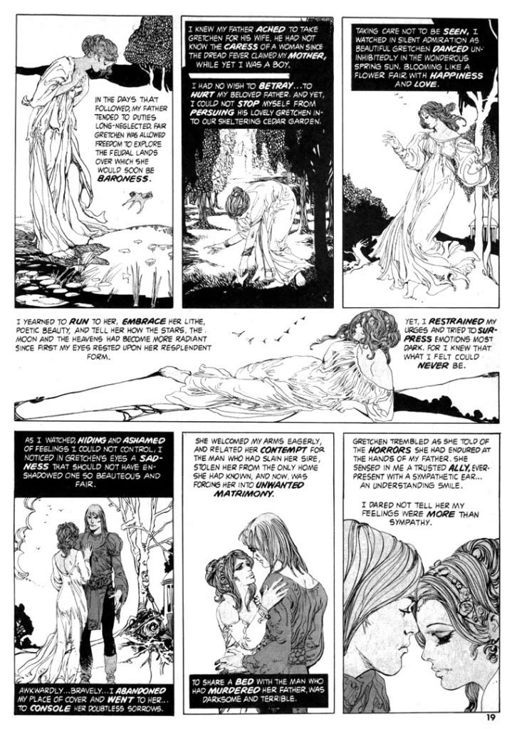
The page above is what re-sparked my Maroto interest.  It's a lovely pastoral scene from "Wings of Vengeance" (Creepy #81, July 1976), which he also co-wrote with Bill DuBay.  I'm very into Art Nouveau, and Maroto's compositions here and his controlled use of negative space and "designy" plant life recall another fave of mine, Aubrey Beardsley.  Specifically, the first four panels.  The single female figure, the framing, the poses are all ultra-Beardsley-esque.  Any of them could be blown up into a poster worthy of adorning an undergraduate's dorm room wall.  This page shares with Beardsley's art the same sense of romantic decadence within a kind of fairy tale atmosphere.  The draped and folded gown the woman wears seems very inspired by Alphonse Mucha as well.  I love the subtle gray tone on their skin, which helps separate them from the from the white backgrounds.  Enjoy this lovely young couple while you can.  She's later tortured to death and he has his face cut off.

If you happened to open a Warren magazine in the 1970s (something I rarely did because the covers were enough to scare me into insomnia), you stood a very good chance of finding Maroto's work.  He was one of their most prolific artists during that period.  Now imagine finding it beside some full-color Richard Corben nightmare, a Russ Heath axe-murder tale, an Al Williamson story with a space hero fighting alien dragons in a jungle, John Severin bringing horror to the Old West and maybe something drawn by Luis Bermejo.  There might even be something set in the 1930s by Alex Toth!  Don't forget Bernie Wrightson's frontispiece!  All packaged by genius editor Louise Jones, who is now Louise Simonson and who also happened to edit and write some nifty comics for DC and Marvel-- including New Mutants.

Which brings us full circle, I suppose.  Anyway, Esteban Maroto!

Friday, October 21, 2011

2nd Annual Spookey Month: Bernie Wrightson!


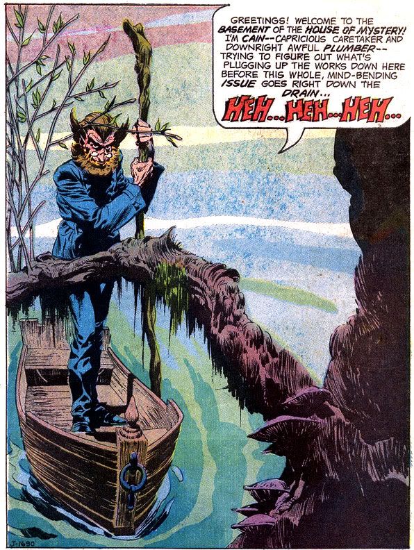
How about that, eh? It's Cain, poling his little boat through a swamp-- a haunted swamp, no doubt.  Or basement.  Haunted basement.  Well, wherever it takes place, it's a very nice splash page drawing by Bernie Wrightson, published in House of Mystery #205.  Wrightson's career began at DC the same year I was born so I've had a lifetime to associate him with the finest in horror comics illustration.  Over that time, I've dug many artists who've excelled at horror:  Richard Corben, Nestor Redondo, Umezu Kazuo, Ito Junji, Michael Wm. Kaluta, Joe Orlando, Jack Davis, John Bolton to name a very few.  All those EC cats who worked for Warren Publications.  Then there are all those Italian guys who drew those bizarre and erotic comics where characters are often naked or rotten or both covered (so to speak) over at The Goovy Age of Horror.

You can find horror artists better at anatomy and with slicker finishes, but few who match Wrightson's ability to concoct instantly iconographic horror images, with gobs of chilling atmosphere and sinister mood to spare.  Throughout, Wrightson has used varying approaches to his finishes-- from feathering and modeling in ink resembling the classic works of Graham "Ghastly" Ingels and Frank Frazetta, to etching-like fine lined hatching to rich ink washes.  Whatever his approach, Wrightson kills.  Figuratively.

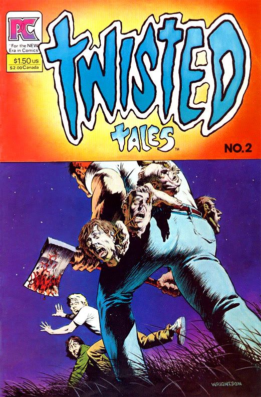
My first encounter with Wrightson was his work on Swamp Thing, no doubt in some house ad or other.  I didn't read that comic until DC released the second volume when I was a teen.  By then, I'd seen this choice Wrightson image:


EEP!!  The worst tricks or treats ever!  And it's the kind of thing that sticks with you when you're an imaginative and impressionable young doofus looking for the latest Hulk and Spider-Man stories.  Now I think what a good thing for that axe murderer he's so beefy-- he's wearing about 40 pounds worth of human heads.  He's going to need those powerful leg muscles if he ever hopes to add those two kids' noggins to his collection.

That came out about the time I read Creepshow.  Soon after that I contaminated my brain with the issue of Bernie Wrightson:  Master of the Macabre containing the infamous "Jenifer," one of the sickest stories I've ever read.  It affected me so badly I had to give the comic away the same afternoon I read it to a less-squeamish friend, and yet I still lost sleep over it that night.  Of course, its hold on my imagination proved too strong over the years.  Every so often, I'd get the urge to draw Jenifer's twisted face in the margin of my notebook page, and I'm pretty sure I drunkenly described the story to various people whenever we started talking about things that frightened us as kids.  I finally tracked it down again and it proved every bit as disturbing as I remembered.  When a story does that to you, someone, somewhere, has done his or her job!

In this case, that person is Bernie Wrightson. Well, Wrightson and writer Bruce Jones.

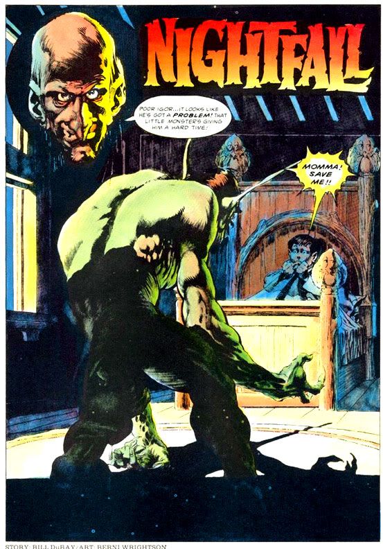
Here's another wicked Wrightson splash:


Much like Jones's tales, Bill DuBay's scripts gave Wrightson the opportunity to make our nightmares come to life on the magazine page.  "Nightfall" first appeared in Creepy #60 (1974), and features a kid bedeviled by sinister goblins who come into his room at night, only to retreat whenever his increasingly exasperated parents come in to check on him.  DuBay's script accurately captures the way a child's imagination transforms shadows into malicious monsters, and the impossibility of getting this across to well-meaning but lunk-headed adults who just want a peaceful night's sleep.  Wrightson's creatures cavort and caper in the moonlit bedroom in a way that's dreamlike yet completely convincing.

Reminds me a lot of those nights I grew up experiencing thanks to Bernie Wrightson's art!  And speaking of disturbing, here's Hanatarashi's legendary 1985 "Bulldozer Gig" in slideshow form:


Eye, that's what I call music!

Tuesday, May 24, 2011

Happy Birthday Carmine Infantino!

Carmine Infantino turns 86 today. One of the all-time greats, Infantino helped launch the Silver Age of comics with his work on a more sci-fi based Flash with Robert Kanigher at DC, but eventually drew for both Marvel and Warren as well. He's one of those guys it'd be easier to list the characters he didn't draw during his career. Wolverine. The end. Heck, Infantino probably drew Wolverine. I'm just clowning around here.

But I'm being very serious when I say that it's great to know Infantino's still around, and these days I'm really enjoying his work on the Marvel Star Wars series as reprinted by Dark Horse in their Star Wars Omnibus books. I also think his re-designed costume for the Flash is one of the most visually appealing costumes worn by any superhero. It's bold, bright, simple and conveys exactly what the character is all about-- he's fast as lightning.

Friday, April 1, 2011

Alex Toth aerial combat stories from two different wars


I think it's pretty obvious Alex Toth loved drawing stories about aviation. After all, that was the hook of his best-known Batman tale, "Death Flies the Haunted Skies" (Detective Comics #442) and also of his Bravo for Adventure series-- which needs a reprinting, somebody, anywhere! For someone as important to the development of American comic book art as Toth, examples of his work can be frustratingly difficult to find.

That's why I'm eternally thankful to Image for publishing Zorro, Dark Horse for doing those Creepy and Eerie archive books and Fantagraphics for their gorgeous Blazing Combat volume. While the Zorro book is a bargain-- roughly 248 pages of prime Toth for under 15 bucks at Amazon-- culling his stories from hardcover artsy books means collecting Toth can be financially draining but spiritually uplifting, if you're that into the finest in sequential illustration. Which I am.

While there are a few books about Toth due out this year, I want big, fat trade paperback black and white reprints of everything he did in his career all in one place, or two or three. What I'm saying is... DC definitely needs to do a Toth book or two with all the western, romance, superhero, science fiction and horror stories he did for them. And we need more of his Gold Key work, mostly movie or TV adaptations like Darby O'Gill and the Little People, The Land Unknown, 77 Sunset Strip, The Wings of Eagles and... The Danny Thomas Show.

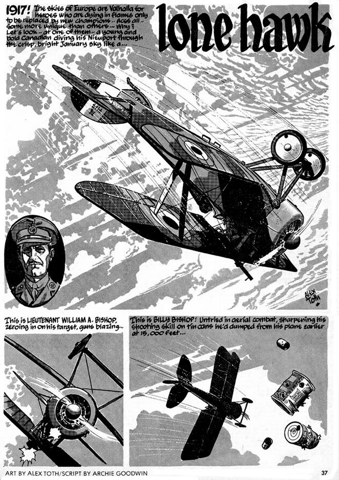
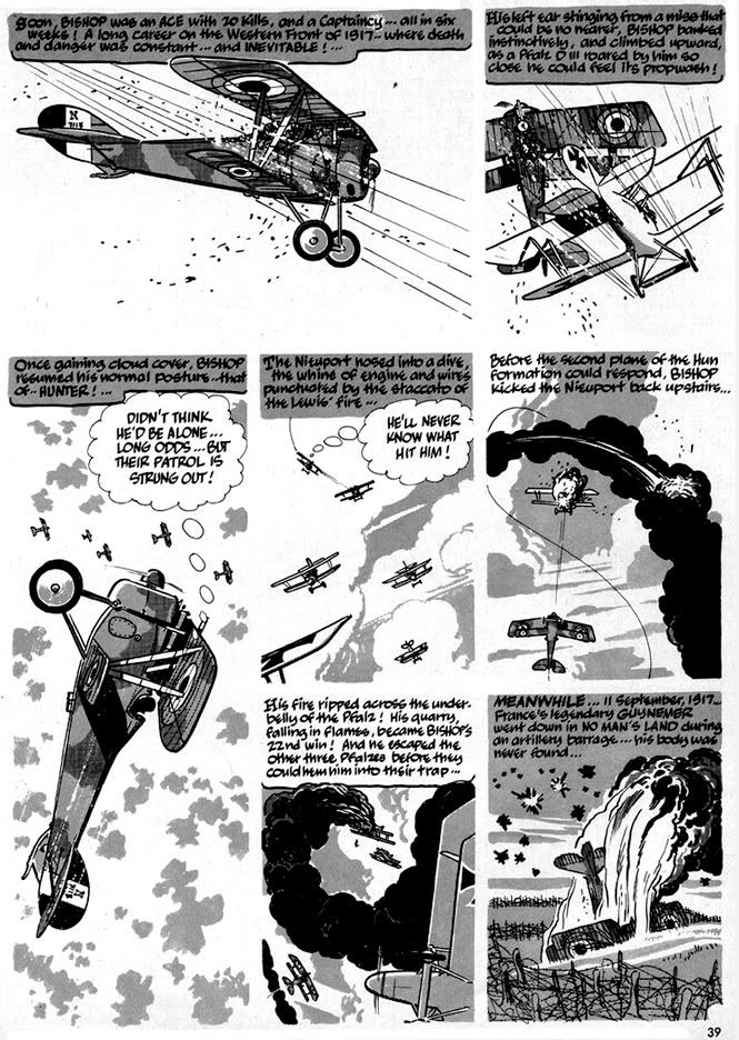
Anyway, airplanes. Toth and airplanes. That's what we're here to talk about today. Here's Toth drawing WWI flying action from Warren's Blazing Combat #2. It's "Lone Hawk," the non-fiction story of top Canadian ace Billy Bishop. Bishop downed 72 enemy aircraft (planes and balloons), making him the Allies' third highest scorer. Archie Goodwin's script plays to Toth's love affair with all things winged and powered by starting in the sky and staying there for the most part. Toth gets to draw all kinds of primitive fighters/scouts while Goodwin contrasts Bishop's victories with the deaths of other top aces such as France's Georges Guynemer and Germany's Manfred von Richthofen.


It's a powerful script showing that the price of martial glory is usually horrific death. Prose and art come together to hammer home this point in a singularly effective panel where Goodwin's caption introduces us to American Raoul Lufbery (French-American, actually) as he leaps without a parachute from his burning plane. That's how terrified even these ostensibly fearless men were of burning to death. Toth's art depicts the plane as a streaking fireball and Lufbery as a tiny, fragile figure falling away from it to his doom.

For this story, Toth uses what appears to be Craftint doubletone paper for his grays rather than washes. These planes flew and fought at relatively low altitudes, so there are masses of clouds made up of a single tone framing them and the panels themselves-- Toth eschews panel outlines. The mechanical look of the Craftint halftones gives the work a kind of antiqued, etching-like quality. All this with just two values of gray, plus black and white. And, of course, the visual storytelling is superb. Each action is clearly delineated and the aerial sequences are dramatic and dynamic but easy to follow and understand. Toth is in his element.


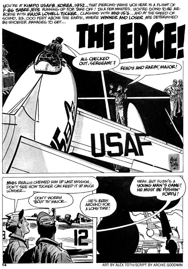
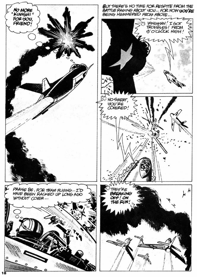
Flash forward a couple of generations and these creaking box-kite fighters have been replaced by streaking metal jets. This time Goodwin and Toth take us to the skies over the Korean peninsula. Planes now swirl around in deadly spirals in a cloudless, high altitude realm of startlingly bright sunlight, so Toth uses ruling lines to separate panels. But within these his work becomes almost abstract. F-86 Sabers and MiG-15s don't offer as much surface detail as the Sopwith Camels and Fokker Triplanes of the Great War. The fighter jet is like a steel knife in the sky, sleek and speedy with simpler lines. A quick stab and it's all over for you, as this North Korean fighter jock soon learns:


"No more 'kimshi' for you, friend!"? Hey, how do you even know that guy liked kimchi, you stereotyping jerk? Maybe he was allergic. No more kimchi for you, my friend, or taco salad or cheeseburgers for that matter! No more anything because BLAM!

Billy Bishop's primitive acrobatics over mud have evolved into the cold precision of high-tech, near-supersonic murder so Toth adjusts his art accordingly with a more contemporary approach borrowing elements from fine art. He reduces the planes and their cockpits to geometry, silhouettes surrounded by speedlines and stark white backdrops. Even the few landscapes seem abstracted to mere designs. The effect is thoroughly modern, plastic and alloy rather than wood and canvas and bereft of any lingering sense of romance. The human element, so stunningly depicted in the burning plane panel of "Lone Hawks" is almost completely absent here. We don't even see a frontal view of a face until the final panel.

I have to wonder if Toth's approach here doesn't also evince a distaste for this era. Goodwin could easily have written into his script this de-emphasis on the human element. Visually, both "Lone Hawks" and "The Edge" focus on the machines of war. I'm not about to count it up, but both more than likely feature the same number of panels devoted to airplanes. But Goodwin in the former repeatedly personalizes the various aces' deaths even if Toth doesn't draw the men all that often. The latter draws you in with that second person narration, but Toth's art keeps you effectively outside with its sleekness and finally presents you with a face that so obviously isn't your own.

I feel the WWI aerial combat and its purer contesting of man against man plus all that "knights of the air" chivalric stuff would appeal to Toth's sensibilities more so than the push-button nature of the Korean War version. Perhaps it's just Toth taking into account the differing eras, but while I admire the technical aspects of "The Edge" in a dispassionate way, I'm moved by "Lone Hawk."

There's a tension between words and pictures in "The Edge," though, that I can't leave alone. Perhaps it's also the result of an ambivalence on Archie Goodwin's part, as well. Goodwin's second-person narration isn't exactly pro-war, but it is more in the "our boys are the good guys doing a dirty but necessary job" mode rather than the more empathetic "death takes us all indiscriminately" feel of "Lone Hawk." Addressed as "you," the reader gets to be the protagonist, seemingly admired by both the writer and the ground crew characters for his prowess and hard-won expertise. Yet we know little of the enemy other than they're part of the collective horde of Communist aggressors and therefore less than human. Lessons learned fighting the Nazis must be applied against this new threat as well. Goodwin seems to suggest with this comparison while we might deplore having to kill, sometimes we must to thwart greater evils.

Or something like that. The American pilot is little more than a cipher himself.  What personal details we learn about him are completely in service to the story's final gag.  It's kind of an odd note to strike in the context of Blazing Combat (given its reputation) and seems a better fit as back-up in one of DC's slightly more jingoistic war books. Our Army at War, maybe.

Two creators taking on two different wars.

Thursday, March 31, 2011

And a Gene in Every One: A Look at Some Gene Colan Horror Stories

One of the neatest surprises about Dark Horse's Eerie Volume One hardcover archive monstrosity is how many Gene Colan stories it contains. I hadn't realized Colan did any work for Warren Publications. I mean, I knew he had to have done something before Tomb of Dracula at Marvel. He obviously didn't just magically appear out of nowhere, or descend in a silver orb-like spacecraft from another planet or emerge from some pocket dimension, hand Stan Lee some samples, lift his Rayban Wayfarers and say, "Dig this and dig it good, Daddy-O, I wanna draw Dracula for you cats."

What the heck am I babbling about?

Colan has always been a master of extreme foreshortening, able to twist and turn the human figure in any direction. Very useful because he isn't the kind of artist who draws simple eye-level panel compositions. No, he likes to use high "camera" positions or his patented "worm's eye view" low angle shot. And then he breaks up the page with all kinds of crazy panel shapes, the results frequently looking like shards of broken glass arranged on the paper. Tom Palmer laid down some impressive inks on Colan's Tomb of Dracula pages, but here in Eerie, we get unfiltered Colan with his characteristic heavy shadowing-- but also marvelous ink washes where he creates an illusion of value and depth with just a few well-chosen gray tones.

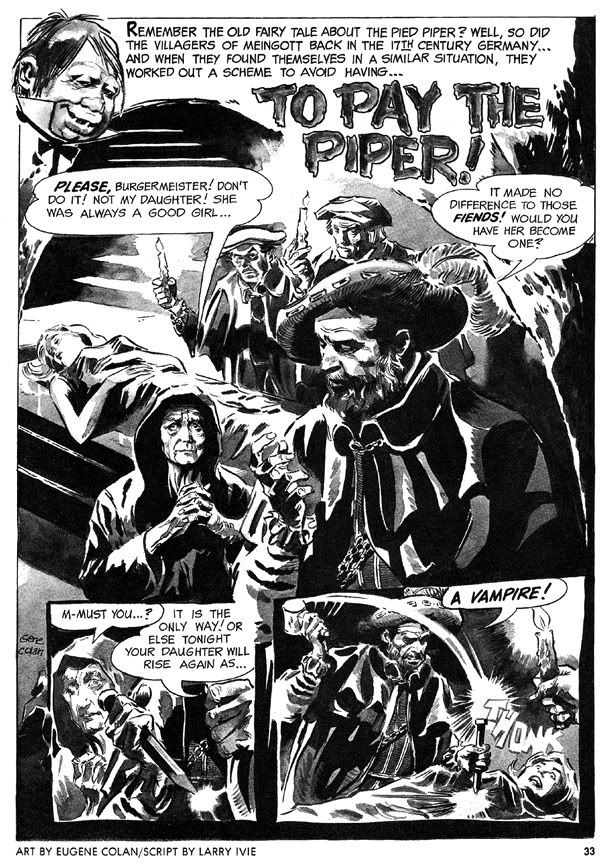
His first Eerie story is a twisted retelling of the old Pied Piper legend, "To Pay the Piper," which substitutes vampires for rats. This time, the cheapskate villagers are as familiar with the story as we are, so they resort to outright murder so they don't have to pay, only to suffer yet another twist involving werewolves. The final panel-- the punchline-- is a bit too crowded to be fully effective (or as horrific as it should be) but the story's creepy European setting prefigures Colan's depictions of Marvel Universe Transylvania.

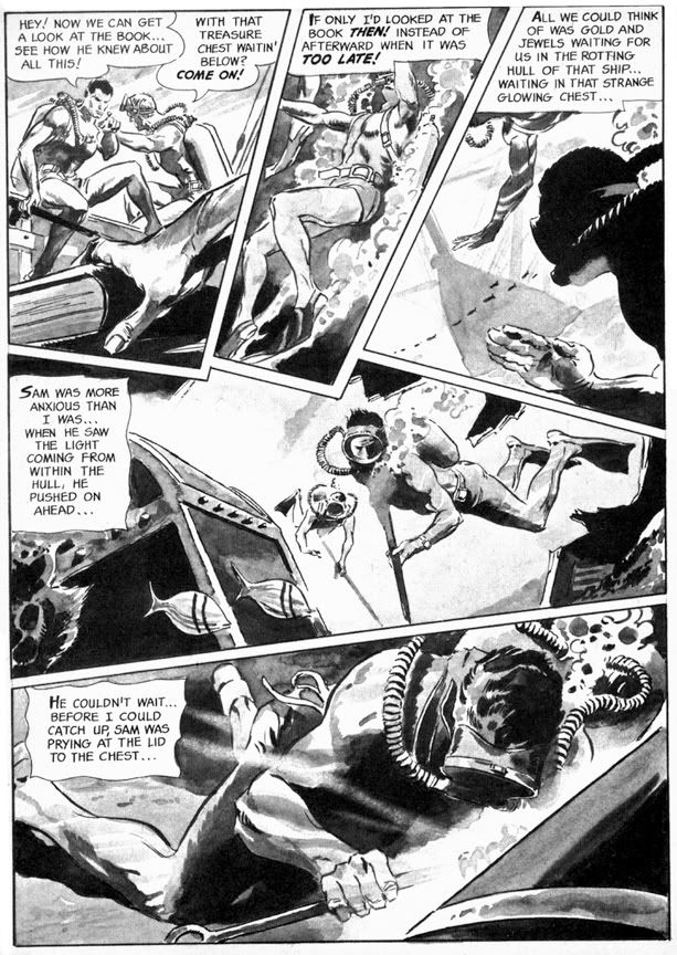
More original is "Full Fathom Fright" (Eerie #3), this time with a script by Archie Goodwin that allows Colan to go bonkers with the fractured panel shapes. This story goes from the booby hatch to Davy Jones' Locker as we first see a mental patient throwing a monster hissy fit, then learn all about the undersea misadventure that made him that way. Goodwin puts Colan's storytelling and rendering skills to their fullest. The undersea sequence is particularly nice, with Colan creating a real sense of weightlessness, with deep water shadows and lighting effects. And the final gag panel with its Lovecraftian conclusion is nice and large and much more effective this time.

Eerie #4 features "Hatchet Man," a grisly Goodwin-Colan take on that horror comic evergreen, the deranged axe murderer. As opposed to the polite, mild-mannered axe murderer, I suppose. What is it about geeks with axes that so fascinates horror writers and readers? The blunt simplicity of the weapon? We've seen it a billion times on EC covers alone, but for some reason we never quite grow tired of these Lizzie Borden-style "forty whacks" antics. This effective little story has an obvious psychological element that's slightly reminiscent of the movie Psycho but features some startling action sequences where Colan chops the action itself into wedge-shaped panels that showcase his ability to depict bodies in motion and in pieces. And if you ever wanted to see Bob Newhart totally lose his shit and go on a killing rampage, then this is the story for you.

The final story, "A Matter of Routine" (Eerie #5) seems a little rushed. The figures are simpler and the ink washes read a bit flatter than in the previous shorts. It's kind of a nightmare version of the Mad Men era-- a fedora-wearing flannel-suited commuter type (he's even got a 1960s George Grizzard buzz cut) gets off his afternoon train, slips the key in the door at home and steps quite literally into Hell itself. Goodwin's narrative captions are in breathless second person: "You fall to the scorched black cinders of earth, your only escape route banished..." and the denouement is an extremely lame "Was it all a daydream or do I dare open this door after all?" type cop-out. Not the finest work by either gentleman, but still an interesting cultural relic of a bygone era.

It also features axes.

Wednesday, March 30, 2011

Alex Toth and the Pie

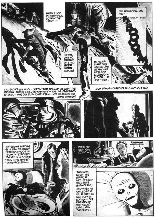
In 1977, Alex Toth illustrated "Daddy and the Pie," from a Bill DuBay script. It appeared in Warren Publications' UFO and Alien Comix #1, dated January 1978. People were going crazy for all this space alien stuff about that time. Probably had something to do with Star Wars and Close Encounters of the Third Kind setting box office records. Or maybe it was because Zontarr, ambassador from the planet Horvis VII, was all over TV in the mid-70s during his futile campaign to convince the people of earth to give up their dangerous nuclear weapons programs-- which threatened galactic civilization-- and his more successful efforts to popularize John Travolta via the sitcom Welcome Back, Kotter and disco music. Poor Ambassador Zontarr. Today he teaches political science at a community college and smokes way too much pot.

"Daddy and the Pie" hearkens back to those message stories EC used to run where they'd sucker you in with gloriously drawn gore and freaky octopus-like creatures then teach you some kind of life lesson, like in that one tale about the little mutant girl who was so misunderstood. "Daddy and the Pie" also has a distinct Ray Bradbury feel in its mix of small town nostalgia, the melancholy truth of just how crappy we humans can be to each other and science fiction. The moralizing doesn't overwhelm the plot, thanks in no small part to Toth's beautiful drawings. He evokes a sense of mystery and wonder on each page, and the heavy use of blacks along with ink washes make this one of his finest pieces. I was all set to write enthusiatically about how brilliant DuBay is for having the boy narrate the story in a kind of naive voice and how that contrasts with the action to give us a more complete understanding of what really happened with Daddy and the Pie-- then I re-read it and realized the narration is pretty spot-on, with Toth's images merely amplifying DuBay's script.

Oh well. DuBay does tell the story from the boy's limited perspective and it's a script worthy of Toth's best efforts. The kid learns that heroism isn't beating up bad guys the way the two-fisted ruffians in the movie serials and radio adventures do. It's also quietly helping others and accepting them for who they are. Just doing the right thing and asking nothing in return.

He learns this not only because of the Pie's influence on his life, but also because the example his father sets. As DuBay has him tell us, "I was lucky to have two heroes all my own... ...Two of the biggest, bravest legends ever to walk God's green earth. Daddy and the Pie." Children need parents they can look up to in the absence of saintly blue aliens. When kids inevitably encounter various forms of hate and prejudice they need strong role models within their own families to teach them open-mindedness and acceptance of differences.

Ultimately, however, "Daddy and the Pie" also reminds me of that Kenny Rogers song, "The Coward of the County." Some people-- and blue giants from other worlds-- can only be pushed so far before they have to give up pacifism and counter aggression with mysterious glowing orbs that focus mental power to wreak retribution. DuBay and Toth wisely keep the action offscreen, making us imagine its horrors, rather than fully depicting and and possibly glorifying it in the way comics and films frequently do. The Pie is fully benign but he, like the less evolved people who finally drive him to reaction, is capable of destructive acts. In some ways his sacrifice and victory in the town is the most human moment in the story. By not showing it-- by confining it to a couple of small, dark panels with flame on the horizon and ominous "BOOM! BLAAMM! KA-BAAMMM! BOOM!" sound effects, DuBay and Toth tell us this is also the least heroic thing the Pie does. This capacity for meeting violence with violence-- even when justified-- is perhaps a universal failing of all sentient beings. That we even bother to try and overcome this is a much more heroic act than burning down a town, even if it is full of bigots.

This story is also similar thematically and in plot to the 1953 Western classic Shane, starring Alan Ladd.