Monday, October 7, 2013
October is Spookey Month: Uncle Creepy meets (and possibly eats) the NBC peacock... in color! (Part One)
Why end the streak of consecutive black and white issues? Maybe it had something to do with the company's big roll-out of Dracula, the "horror art magazine," which would feature color (and that's the extent of my Dracula knowledge). Or DuBay just wanted to freshen up the décor inside Creepy manor, the structure of which had already been under renovation by a group of highly-talented Spanish artists and our old friend Richard Corben. Or maybe he needed to goose sales in the face of competition from Marvel-- the House of Idea released six magazines that year, five of which were horror, a direct challenge to Warren-- and CarToons.
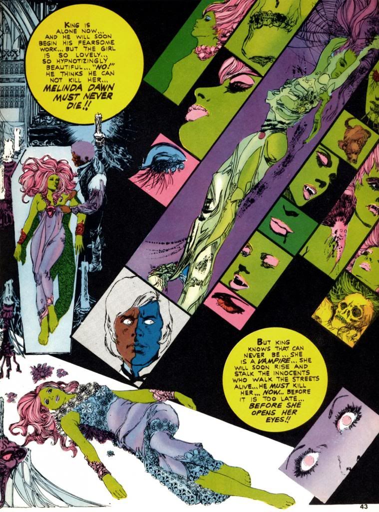
Whatever DuBay's reason (and in the interest of full disclosure, I actually don't even care why he did this; I just love these comics for simply existing in the first place), Esteban Maroto provides "Viyi," five pages of story and art in Creepy #51 (March 1973), DuBay's second issue as editor. Here, Maroto puts one of his Brigitte Bardot-like females on display, and she's a livid green. Amazingly, it suits her. Maroto also wrote the story, but for Creepy's purposes "Viyi" amounts to a glorified house ad for Dracula. We don't get the complete tale, just a couple of teaser pages telling us all about the new magazine. The colors in "Viyi" are more subjective than representational and suit Maroto's gorgeous, emotionally-charged linework. It certainly looks nothing like the monthly four-color superhero fare showing up on the spinner racks. It hardly resembles the Creepy we'd come to know and love. Perhaps that was the whole point.
The next color story, "Descent Into Hell," again by Maroto, ran in Creepy #54 (July 1973), which also features Corben's infamous "Slipped Mickey Click-Flip." Only a black and white story as outrageous as that could hope to compete with Maroto's journey straight to hell in lurids red and yellows. And some blues. By then the company must have been jazzed about where this was headed because the cover copy fairly screams, "Now! Full Color Comics!" The next issue consists entirely of black and white reprints but does toss in a neat-o full color board game with movement squares made up of a number of the magazine's classic cover paintings. The credit for it reads, "Game conceived by: Bill DuBay."
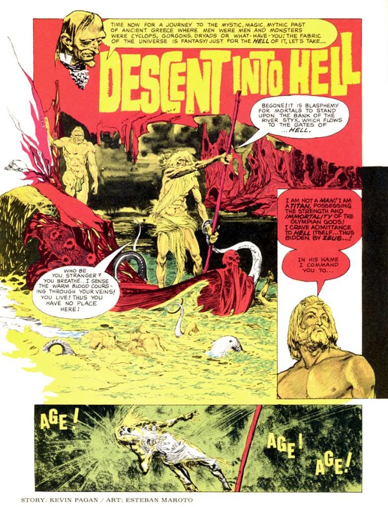
I'm beginning to sense a pattern here...
Corben finally gets his chance to produce some color pages in Creepy #56 (October 1973), where we find his classic "Lycanklutz." A few issues before this a reader wrote in to complain that horror and comedy don't mix, but I beg to differ. Corben's story of a flea-plagued werewolf is not only beautifully drawn, it's absolutely hilarious. It's full of winking references to Universal Studios' Wolf Man movies and some anachronistic humor that anticipates The Princess Bride over a decade later. Corben's palette is more naturalistic than Maroto's. Modeled and painterly as opposed to flat and graphic. Very different looks, but both please me immensely.
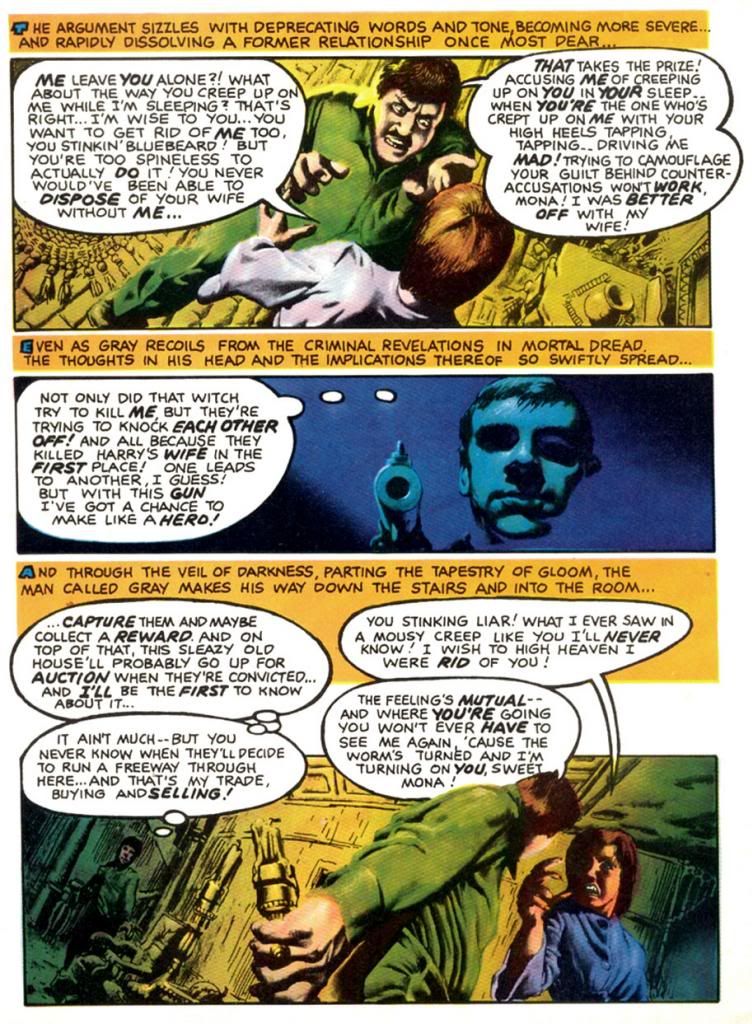
Corben strikes again in #57 (November 1973), this time partnered with write Doug Moench for a story seemingly inspired by the title of Traffic's 1971 album, which zoomed to #7 on the Billboard pop chart. Do you think Moench owned a copy? Maybe? Whatever the title's source, "The Low Spark of High Heeled Noise" kind of strains to make its pun work, but ends up a grisly, effective murder in an old house tale. Corben's color palette is more idiosyncratic this time out as he experiments with complementary color schemes in the blue/violet-yellow/orange areas of our ever-helpful color wheel. I write "experiment," but I'm pretty sure the guy knew exactly what he was doing. I'm not too conversant on what was happening in color magazines around this time, but compared to the still-primitive color printing in typical monthlies this is incredibly sophisticated stuff from color choice to use of subtle gradations in tone. This wasn't possible in standard news-rack comics in 1973 and it shows Corben's mastery of color reproduction and effects.
Color takes a break until the Christmas-themed #59 (January 1974). This time DuBay himself writes for Corben and they come up with a holiday story split between two perspectives that come together for a tragic finale. It's both gruesome and sentimental, no small trick. In this story, Corben employs a restrained, naturalistic palette for a timeless look. Kind of like one of those Coca-Cola Santa paintings. Or Norman Rockwell suffering a psychotic episode. In #60 (February 1974), Corben teams with Steve Skeates for a story that seems somewhat inspired by the artist's own "Den." It's a disquieting tale of a squeamish kid who finds a magic rock, turns into some kind of space-barbarian ape on another planet, then comes to a rather pathetic end. Poor little guy. More relatively restrained colors on display here in the early going, with some sweet autumnal atmospherics on the first page giving way to otherworldly hues during the fantasy sequence.
In #61 (April 1974), Corben provides his own script again for another comedy-horror turn. This time, it's "Terror Tomb," with a character named Hardoff Bey and a clumsy mummy tripping the lunkheaded human cast to their doom. Corben's dispensing of these dopes that way provides a nice chuckle amongst the more nihilistic horrors of the surrounding stories. If I have one complaint about the guy's work, it's every so often there's a panel so packed with dialogue the balloon obscures most of a face, squeezing the art into a tiny corner.
You may be starting to notice a theme here as Richard Corben really makes the most of the opportunities DuBay provides for him, as we'll see in part two of this epic, rambling and altogether pointless overview. My favorite of the whole bunch is coming up!
Tuesday, October 1, 2013
October is Spookey Month... again!
About Spookey-- they're an all-girl "bubblegum-garage-power-pop-punk" trio from my hometown here in Japan. A few years back, I wanted to do a Halloween-themed month of my own across all my blogs and they seemed like the perfect hook. Their music is upbeat and energetic, and they even did a Halloween-themed live performance, which is immortalized on YouTube and linked here numerous times. I think of October as the most fun of months and Halloween as the most fun of holidays, so linking the whole thing to the most fun of local bands seemed like the most fun thing to do. It's been a while since Spookey put out any new music, but you should check them out anyway. Do a Google search. If you can find their last CD release, by all means buy it.
Wednesday, October 31, 2012
October is Spookey Month: Let Doug Moench and Richard Corben show you how to trick-or-treat!
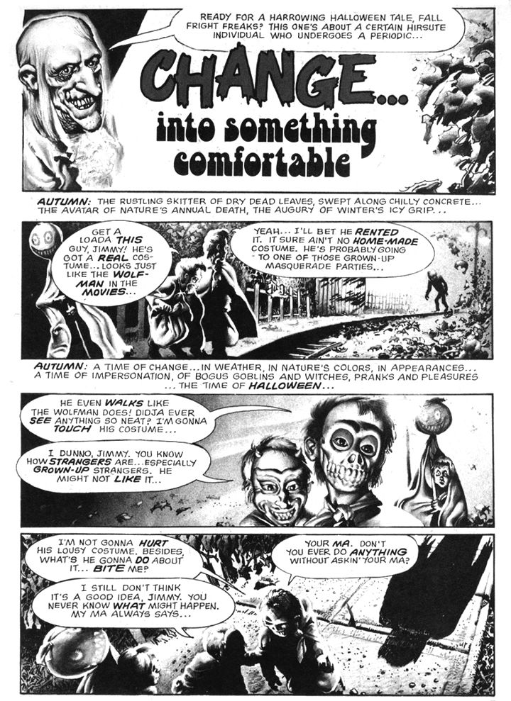
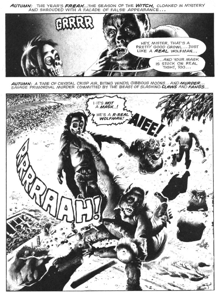
Yes, Halloween is a fun holiday, but you should exercise at least a little caution when out trick-or-treating. Go in a group, wear a costume with reflective tape so motorists can spot you, go only to well-lit houses. And most importantly-- don't pull on a werewolf's lip. These are a few simple safety tips brought to you by Doug Moench and Richard Corben in their horror-comedy classic, "Change... into Something Comfortable," which appeared in Creepy #58 (December 1973), a "special Halloween horror issue" (so it says right there on the cover). While I didn't particulary enjoy "The Slipped Mickey Click-Flick," I'm a huge fan of this little seasonal-flavored gem.
It starts with a real werewolf ripping some smart ass kids to shreds and ends with a sweet twist I find both irresistible and hilarious. I mean if you've ever wondered what creatures of the night disguise themselves as on Halloween, here's your chance to find out. "Comfortable" is sort of a companion piece to Corben's even more hilarious "Lycanklutz" from Creepy #56 (September 1973). That earlier full-color romp features a somewhat luckier werewolf in a medieval setting with some surprisingly anachronistic products available for sale. By contrast, our contemporary, kid-killing monster in "Comfortable" strays into EC territory with tragic results. I could have hit you with "Lycanklutz," but this one is all about Halloween and disguises and has those melodramatic Moench narrative captions. You can read it in the Dark Horse Creepy Archive Volume Twelve.
Come to think of it, you can read them both in that book.
Monday, October 22, 2012
October is Spookey Month: "The Slipped Mickey Click-Flip"
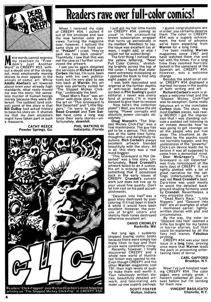
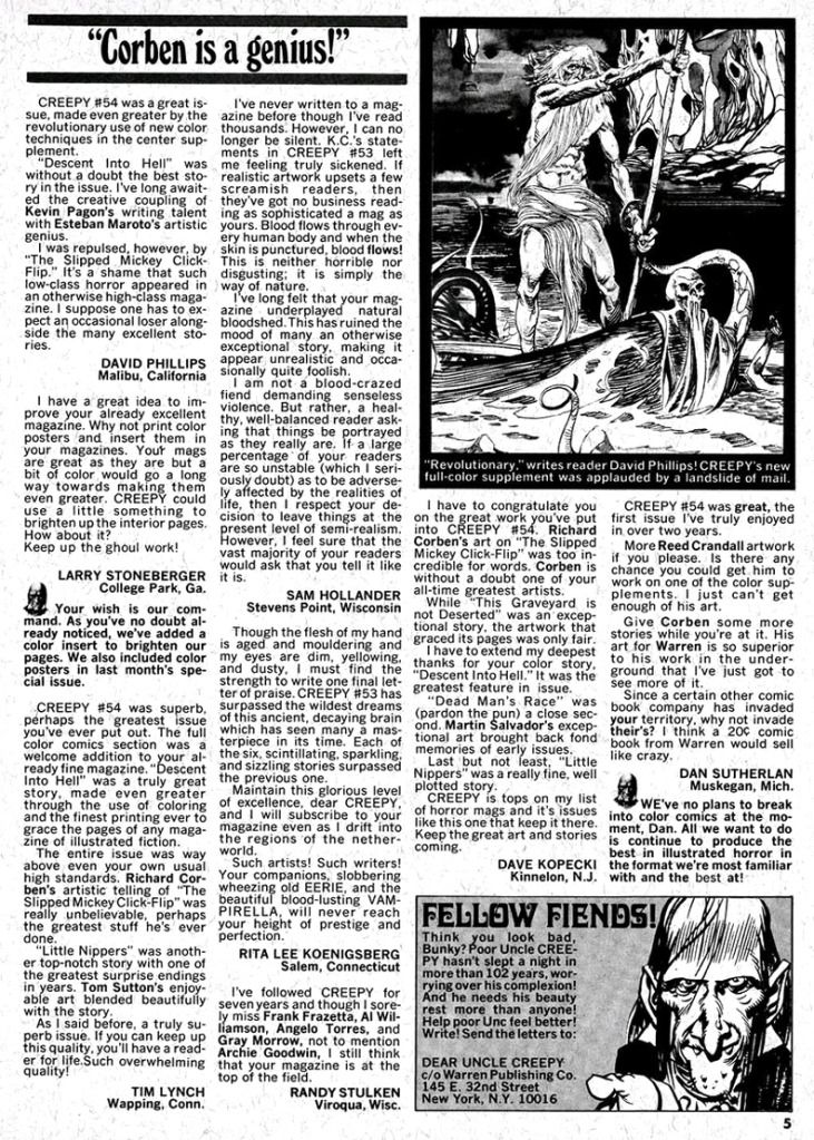
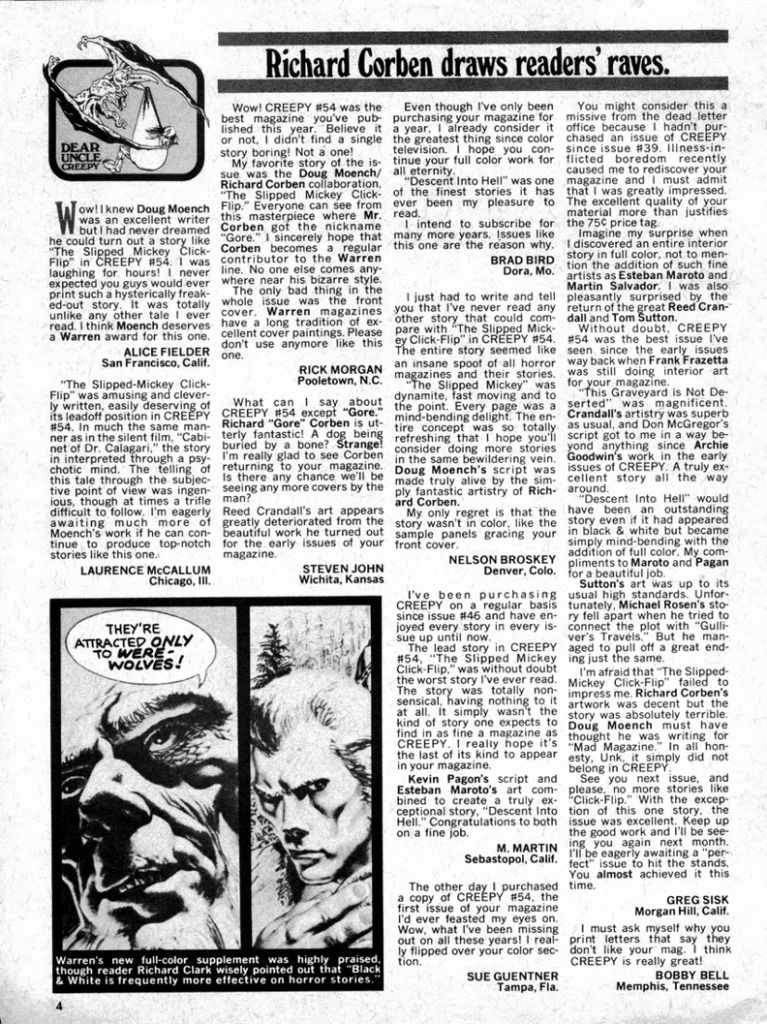
"The Slipped Mickey Click-Flip" by Doug Moench and Richard Corben first appeared in Creepy #54 (July, 1973) and readers seemed either to love it or hate it, if the letters pages for the next two issues are any indication. And they must be; they're the letters pages for Creepy, which printed the story, for corn's sake.
But I have to admit I don't love this story. It's a pretty good story, but I don't think it works as well as it could have.
I'm a fan of both Moench and Corben, and I admire them for their audacity in breaking the fourth wall-- and especially Corben for visually interpreting Moench's feverish, hallucinatory script. They playfully push the boundaries of good taste-- even by the admittedly lax standards of mid-70s black and white horror magazines-- with gruesome images like eyeball-sucking butterflies and crazy-eyed trains that decapitate people. Oh, and a woman who explodes into maggots. I mean, if you like people who explode into maggots, you really need to buy Dark Horse's Creepy Archives #10 so you can experience this singular event rendered by Corben in full loving detail. Never before have maggots looked so full-fleshed as they explode out of a comic book character's torso. Gorgeous, gorgeous maggots. Still, I thank my Uncle Creepy this story wasn't one of their color sections, which the magazine experimented with during this era, usually with Corben's art.
Unfortunately, a lot of the non sequitor dialogue seems forced and ham-fisted, sometimes repetitious ("idiot" is over-worked and begs for a week off in the Bahamas), Nugent and his wife are little more than puppets to the story and we never learn enough about them to develop any sympathy for them or become overly concerned with their plight. But Diment himself is no prize, either. I find him repulsive and off-putting. I could see myself settling down on some moldy divan to listen to Uncle Creepy spin many a yarn, but once is enough with Diment. More than enough.
Of course, "Slipped Mickey" is psimply a psick psychedelic romp, not meant to be taken seriously by any means, but as a supposedly enlightened 21st century citizen of the world, I can't help but find the depiction Diment's mental illness troubling and retrograde even for its time. But I have to admit I apply this standard inconsistently. What bothers me here might not in another story.
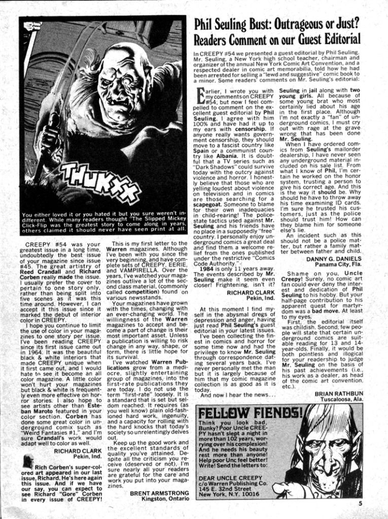
It's memorable as all get out, enough so you can find it in its entirety posted online and a few reminisces about it from fans who read it back in the day or in the years since and fell in love. After all, for a horror story the only true mark of failure is boring readers to sleep, and "Slipped Mickey" definitely avoids that. As you can see, the Creepy letters page in issue #56 (September, 1973) features nothing but praise for the story, with one reader calling it a masterpiece and Moench a genius and another praising it before opining it takes place entirely in Diment's mind (which is a comforting reading, I have to admit). Negative reaction slips into the mix with a lone dissenter, who declares it "low class horror," then intensifies ever so slightly for Creepy #57 (November, 1973) when seven letters (out of 14) mention the months-old story, five praising it and two criticizing it.
One thing I enjoy about reading the Creepy letters pages-- even though we're now years past the point their relevancy died like poor ol' Dr. Nugent, his wife and even their dog-- is the editors weren't afraid to allow some nay-saying, and in this case actually spotlighted it with a sidebar box. There's a feeling of some real give-and-take and that someone actually read the letters and put some thought into it, but also that the letters page is largely a forum for reader opinion without a lot of defensiveness from the Creepy staff, as if dare the readers to form their own opinions instead of just joining a praise-pack, that it was just as much the fans' comic as it was theirs. You can imagine what the message boards would have been like had this taken place in today's Internet-savvy comic book society.
Oh, and before I leave you to Google search for this story and read it for yourselves-- to make up your own minds about it, just like Uncle Creepy would have it-- let me tell you this is exactly the kind of story that would have sent me off the rails for a few days if I'd read it as a child. I had this stupid over-imaginative reaction to horror comics, especially stories as whimsically arbitrary as this one. I can imagine little-me trying not to think much about Diment for fear of his being real, or somehow making him emerge from the comic book into our world and wreaking havoc on me specifically. You just do not want to piss Diment off, and disapproving of him would probably be more than enough to earn his wrath
Wednesday, June 22, 2011
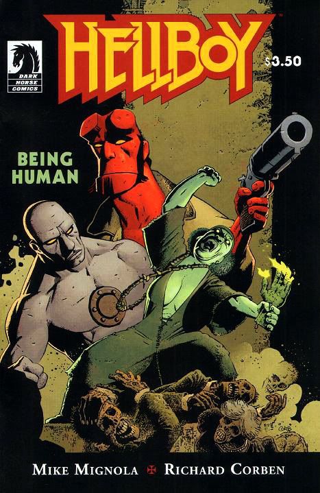
Hellboy: Being Human: Comic Review
Publisher: Dark Horse Comics
Writer: Mike Mignola
Artist: Richard Corben
Mike Mignola and Richard Corben team up for the sixth time* for this touching and gruesome tale in which Hellboy takes his despondent pal Roger to South Caroline so they can investigate a haunted mansion. Roger has every reason to be down—he’s a “15th century homunculus,” which apparently means he’s a big, rock-like naked guy with gray skin, an iron cap riveted into the center of his chest and some kind of block and chain chastity device covering his crotch. Roger appears to be and acts more or less a man, but he’s still figuring out what it means to be human. Hellboy, the human/demon hybrid with a blue collar attitude towards his job of punching folkloric creatures and Lovecraftian space demons, is the perfect guy to give Roger advice on the topic.
The haunting involves animated corpses, a witch and long-held family grudges. Mignola balances the weirdness with an affecting portrayal of a confused Roger, who despite his strange origins possesses an innate decency. He desperately wants to do the right thing, if only he knew what that was. As with "Makoma" and "The Crooked Man," Richard Corben proves to be an ideal match for this kind of moody, dark Hellboy story. He’s not the kind of artist who gets hung up on classical anatomy, but he gives his stumpy characters solidity and presence with his unique method of modeling, a kind of mottling or stippling. Whether it’s Roger’s stonelike skin or the mossy corpses and fungi-covered walls of the mansion, Corben is your go-to guy for sickening textures and miasmic atmospheres. Looking at these pages you can almost smell the damp plant-life and epic decay surrounding Hellboy and Roger. Corben's characters wear facial expressions that are frequently borderline comedic, but then he treats you to a stark panel where someone’s had a hole blown through her chest with gore draining out in a big red gusher. Yeah, unique. There’s not another Corben out there and we should treasure the one we have.
While I certainly don’t begrudge Mignola his forays into comedy, these uneasy tales of generational crimes and identity questions are the ones that stick with me long after I’ve closed the comic. It’s nice to revisit the tragic Roger and find Mignola amplifying those themes by exploring his character. Knowing Roger’s fate makes this story all the more poignant. "Being Human" is touching, grotesque and altogether memorable, the kind of stand-alone issue that's as rich if not richer than most multi-parters. It makes me long for the days when creators knew how to craft a story in one perfect, self-contained unit.
*Correction. Someone pointed out this isn't the third collaboration between Mignola and Corben. With the economy being the way it is and all, I've had to let go a lot of my staff. The fact checkers were the first to get pink-slipped. And while corrections are welcome and appreciated, for future reference only I am allowed to be snotty in this blog.
Friday, May 27, 2011
Today's lesson: Buying comics is an expensive habit!
But I spent close to 40 bucks. They had stuff there I didn't even know I wanted until I saw it on the shelves. Here's what I ended up buying:
Batman: Gates of Gotham #1: Cass in civilian clothes, towards the end of the issue, just as promised. The way artist Kyle Higgins draws Cass-- her anatomy, her clothing, her body language-- and the way writer Scott Snyder handles her mode of speech do nothing to define her as anything more than just another generic superhero person, which lead to something of an anti-climax. Here's hoping a closer reading proves me wrong.
Batman Incorporated #5: No discernible traces of Cass in civvies or otherwise, but lots of Batwoman. I like Yanick Paquette's art with these Michel Lacombe inks. Solid figurework, nice facial expressions.
Batman Incorporated #6: Chris Burnham's art combines the thin, scribbly lines of Frank Quitely with the deranged facial expressions of Ito Junji. I'm not sure I like Bruce Wayne looking kind of crazed, but there's Cass as Blackbat more than making up for it with a nearly silent action sequence. Leave it to Grant Morrison to give us Cass doing what she does best-- whomping on people and leaving no room for discussion. Liking the pointy little mask and cape, can't tell much else about her costume.
Conan: Road of Kings #5: I passed on King Conan to pick this up. No Cass whatsoever, just Conan in his warrior prime as written by Roy Thomas. Which reminds me-- I need to turn to the back for "The Adventures of Two-Gun Bob," the biographical Robert E. Howard strip by Jim & Ruthe Keegan. It's always excellent. Cass's appearance in this book cancelled due to licensing difficulties between Dark Horse, Time-Warner and Conan Properties International. Too bad. Thomas's take on her would have been interesting, to say the least.
Hellboy: Being Human: Mike Mignola script, Richard Corben art, complete story in one issue. Of course I bought this! No Cass appearance, Cass not referenced in dialogue.
John Byrne's Next Men #6: The return of one of my favorite-- yet somehow frustrating-- titles from years past. Byrne's telling a convoluted time travel mystery but the story feels somehow beefy. I get that same full-belled satisfaction from reading it I used to get from comics, rather than the sense I've eaten a single cookie a lot the flimsy, underwritten books give me these days. Not saying Next Men is gourmet fare so far, but it does hit the spot. Will I be able to keep it down? Cass appears briefly disguised as a Union soldier. Sure, the figure's tiny and consists of just a couple of ink swirls, but I'd recognize her anywhere.
New Mutants #25: "New Direction!" huh? How about A direction? This is a book I've stuck with because I like Dani and Xi'an so much, but it's been nothing but fragments of crossover stories, frequently with the New Mutants team barely appearing on the pages of their own book. And it got off to such a decent start before being consumed by the needs of modern epic storytelling. I'm not quite ready to give up on it yet, but if this book is just going to be a bump on the ass of the greater X-franchise with no stories to tell of its own, then I'll be bailing soon. Very soon. Rumors of Cass taking over as team leader in this issue prove unfounded.
Red Robin #23: Another false alarm. No Cass.
The Rocketeer Adventures #1: The lead story is all about Cass and explains how she came to choose "Blackbat" as her new super-name. Yeah. I didn't make that up. It's... really... I bought "cover 8," the Dave Stevens variant. I also hate multiple covers. But this one is a beauty. And inside there are stories by Mike Allred, John Cassaday and Kurt Busiek. Busiek's just happens to be illustrated by Michael Kaluta. Are there really people who have to collect each and every variant cover of a single issue? Do those kinds of stunts really help publishers? Or do readers just choose their favorite one and go with that? If it's the latter, I'm all for it because it's kind of interactive. If it's the former-- YUCK. But what a gorgeous book! John CASSaday, but no Cass Cain.
X23 #10: I've always hated this X23 character. Well, not the character, just the concept. To me, you need one Wolverine, one Batman, one Superman, one Wonder Woman, one Spider-Man. Not clones and extras. Which may sound strange coming from someone who bought a bunch of comics based on the erroneous assumption a former Batgirl would be in each and every one of them. And I've always been indifferent towards Jubilee. Then a funny thing happened. One day the comic store had nothing I particularly wanted so I picked up the first issue of the Wolverine and Jubilee miniseries. Jubilee as a vampire? DOUBLE YUCK. DOUBLE SURPRISE! It turned out to be a pretty compelling story, quite well-written by Kathryn Immonen and nicely drawn by Phil Noto. It made me care about Jubilee for the first time. So when I saw a comic featuring vampire Jubilee fighting X23 with art by Sana Takeda? I felt perfectly willing to climb off my high horse and--
Cassandra Cain is back in action!
I'm happy with all these purchases, and I'd openly shill for JJ's Comics & Cards because of the royal treatment the owners have always given me-- and they're just so nice-- but these books cost me around 36 dollars. Actually, if I want to keep up my comic book reading habit, I'm probably going to have to give up a lot of other little things. Like electricity, clothing and food. Or I may have to resolve once again to stick only to collections, trades and archives, and then only very selectively.
But there's that Cass factor. Yes, there is.