Showing posts with label Larry Hama. Show all posts

Wednesday, August 27, 2014

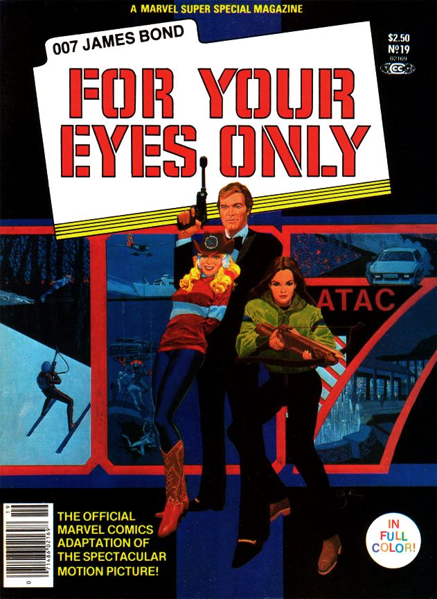
Marvel's Marvelous Movies #8: For Your Eyes Only (Marvel Super Special #19, June 1981)

For your eyes only, can see me through the night
For your eyes only, I never need to hide
You can see so much in me, so much in me that's new
I never felt until I looked at you 

--Sheena Easton

Bond.  James Bond.  I've read many of Ian Fleming's books, I own Sean Connery's films on Blu-Ray (except the silly Diamonds Are Forever, which has never appealed to me beyond a few moments here or there involving Wint and Kidd) and I even own a 12-inch Connery doll.  He's in a nice black pullover sweater and matching slacks, the way he appeared in Goldfinger, a film many (myself included) consider the series' 1960s apex, although I'm slowly being swayed by the growing From Russia With Love heresy and I get my biggest kick from Thunderball.

Roger Moore was the big screen Bond when I was a kid and teenager, and looking back, I don't remember being as excited about a Bond flick as I was for For Your Eyes Only, which promised to bring James Bond back to earth after his over-the-top space adventure in Moonraker.  It was supposed to mark a return to the series' earlier, glory days when Bond relied on his physicality more than Q's inventions and those of the special effects team.  A more "realistic" Bond. 

Of the two, I still prefer the over-the-top Moonraker.  It was the reason I was so excited about this new Bond, because Moonraker had blown me away when I saw it with my parents one New Year's Eve.  Wow!  Zow!  Moonraker has space!  John Barry!  Shirley Bassey!  Jaws in love!
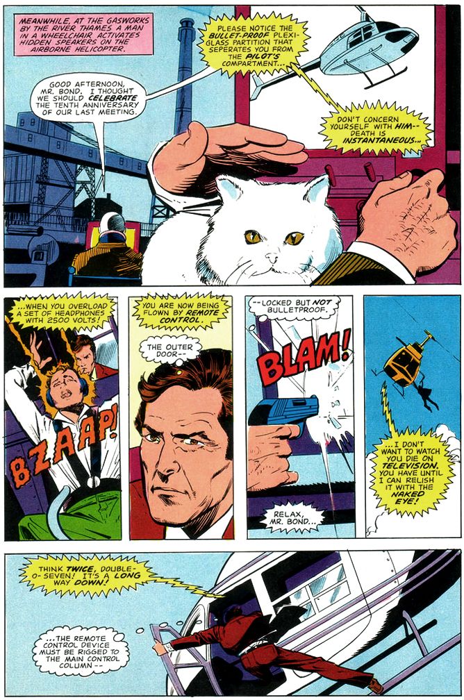
Script: Larry Hama/Pencils: Howard Chaykin/Inks: Vince Colletta

What does For Your Eyes Only have?  A visual style on par with a particularly well-made episode of Magnum, P.I.  A creepy subplot where an underage ingĂ©nue makes moves on a Bond who appears positively grandfatherly by contrast.  Carole Bouquet, a woman I consider the most glacially lovely Bond girl, but completely lacking in chemistry with Moore.  Their low-energy romance comes across as something both actors have to endure rather than the cheerful hedonism we've come to expect from Bond couplings.  Slapstick fights and chase scenes, the former featuring a hockey team, the latter on skis.  The reliance on so much comedy really undermines the supposed return to realism, especially with Moore's increasingly detached portrayal of the famed super spy as a character content merely to stroll onto the set after his stunt double takes a pounding then offer a quip or a pun.  At this point, Moore seems to have settled on the idea Bond's role is to point out for the audience in as placid a manner as possible the absurdity of all these busy little people putting forth so much effort over some preposterous gadget or other.  And then to get a manicure or a relaxing massage.

But it also has Marvel Super Special #19 (June 1981), written by Larry Hama and penciled by Howard Chaykin.
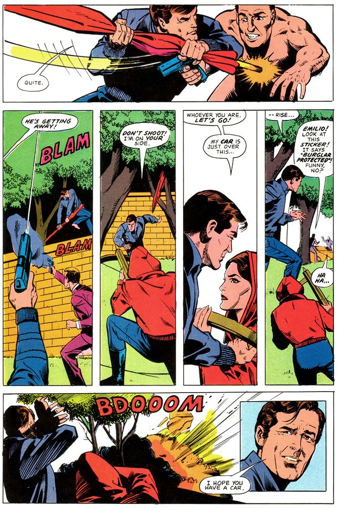
Script: Larry Hama/Pencils: Howard Chaykin/Inks: Vince Colletta

These two make an ideal team for doing James Bond's more "realistic" escapade chasing after a lost code machine wanted by everyone's favorite Cold War enemies, the Soviets.  Remember them?  They're still around, just under a different name. 
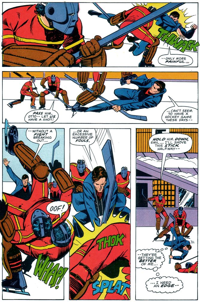
Script: Larry Hama/Pencils: Howard Chaykin/Inks: Vince Colletta

Hama largely eschews the caption-heavy approach of previous film adapters for a tighter focus on action and dialogue.  Hama even includes Moore's little quips, with Chaykin emphasizing most of them with inset close-ups that match Moore's tongue-in-cheek Bond portrayal.  This makes for a fast-paced read that provides some much-needed energy to the familiar Bond schtick.  Chaykin draws some mean fight scenes, too, chopping the action into small vertical panels within pages opening and closing with larger establishing shots and you don't have to worry about spotting a stunt-Bond.  This gives them added verisimilitude.  Chaykin's page designs are top-notch throughout.  Bursts of panels that read fast when Bond leaps into action, then large panels that allow us to savor the ritzy locales and beautiful people.  Roger Moore in particular appears made to become a Chaykin hero, and while the artist doesn't spend a lot of time with the bikini girls in the early going, his Carole Bouquet is worth spending time with as you zip along between the chases and underwater fights. 

If ever I wanted a late period Moore Bond transferred from the big screen to the pages of a comic book magazine-- and I did and still do-- I'd pick Hama and Chaykin to do the honors once again.
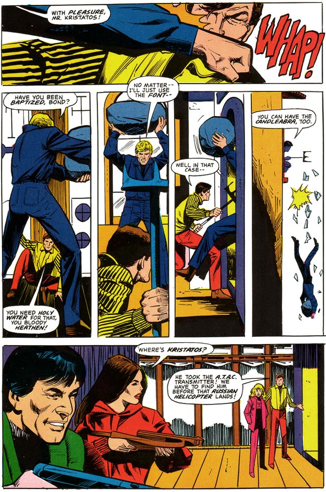
Script: Larry Hama/Pencils: Howard Chaykin/Inks: Vince Colletta

Ah, and Vince Colletta.  His inks here are adequate, the comic book equivalent of director John Glen's workmanlike take on the movie's James Bond festivities.  Glen's lack of visual panache means there's nothing distinctive about the look of the films in this Bond era (the films are in focus, they're clearly lit and the camera doesn't jitter all over the place, so there's that), and Colletta similarly gives us some clean lines if little else, and still allows some of Chaykin's distinct eyebrows and facial constructions to bleed through.  Without having seen Chaykin's original pencils, I can't tell if Colletta used his eraser more than he did his brushes this time out, but some of the backgrounds remain featureless voids, and others are rendered minimally.  This in itself isn't a necessarily wrong, because simplicity in art can be a virtue, but with the colorist simply leaving so much of it white-- you know, possibly because there's so much ice and snow due to the ski resort setting-- there's something a little skimpy about the finishes.  So, much like director Glen's bland framing of events and the movie's photography, the inks and colors do the job, if not in an especially memorable way.

After reading this, I think it would have been an entertaining book if Marvel had sprung for the license and had Hama pen a monthly Bond.  As it stands, Marvel would take one more crack at Bond and we'll be taking a look at that one as well.  Of course I bought it despite my disappointment with For Your Eyes Only, because, as you now know, I'm a Bond enthusiast.

Monday, September 5, 2011

Micronauts #8: What do you get the comic book that has everything?

I'm Facebook friends with artist Bob McLeod, co-creator of one of my all-time favorite super-teams, the New Mutants. McLeod has been doing a series of photo album posts he calls "When the Inker Really Made a Difference," where he showcases some of his work from the good ol' days at Marvel and talks a little bit about the artistic decisions he made, what it was like doing finishes for various artists and working with the editors. Did you know pencillers used to work a lot looser than they do today, giving the inker more room for interpretation? And editors would keep an inker on a book to keep it looking consistent from issue to issue, rather than a penciller?

News to me! But I've long known McLeod as one of the ace inkers. Many of his recent posts have been of his tonal work over Michael Golden's breakdowns for the Howard the Duck black and white magazine. A Michael Golden breakdown features all the little details of his full pencils, only mostly in outline form. There's a leafy tree in one panel Golden has rendered as simply the exterior holding line and he's taken the time to outline practically every individual leaf. Historically accurate models of WWII airplanes hang from the ceiling in another panel, which also features caricatures of several of Golden's friends. McLeod, working in ink, markers and airbrush, later added all the shadows and blacks, rounding out the figures and giving the pages depth and atmosphere through the addition of rich gray tones-- it's almost as if he's painted the finished artwork. Two masters. Comic book art seldom gets any better than Michael Golden with Bob McLeod finishes.


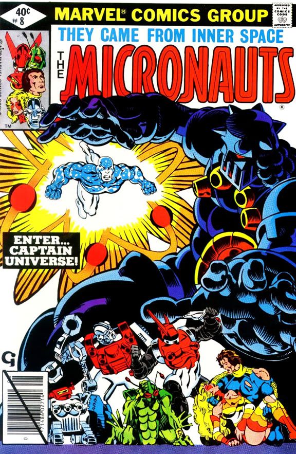
I asked McLeod if he'd ever inked Golden's color work. He said yes, he inked page 1 and 22 of The 'Nam #7, working from Golden's breakdowns again. What about Golden's full pencils? Check out Micronauts #8, the comic that has everything you could possibly want in an action-adventure book.

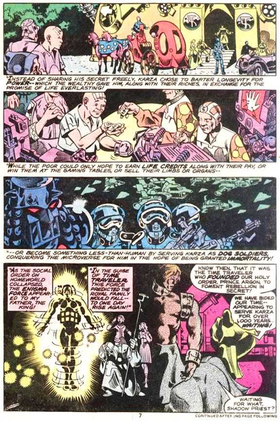
When they produced it way back in the 1970s, Golden and writer Bill Mantlo were just about to wrap up a space opera epic. As the issue begins, villain Baron Karza has emerged from the "Prometheus Pit" in a secret NASA laboratory and is wreaking havoc. Back in the subatomic reality known as the Microverse, Prince Argon (the guy with a horse's ass-- literally) decides to don some sacred white armor and lead the rebellion against Karza. And while this is happening, a retired astronaut who's fallen into the Prometheus Pit meets up with mystical magical Time Traveller and turns into the superhero Captain Universe-- "The Hero That Could Be You!"*

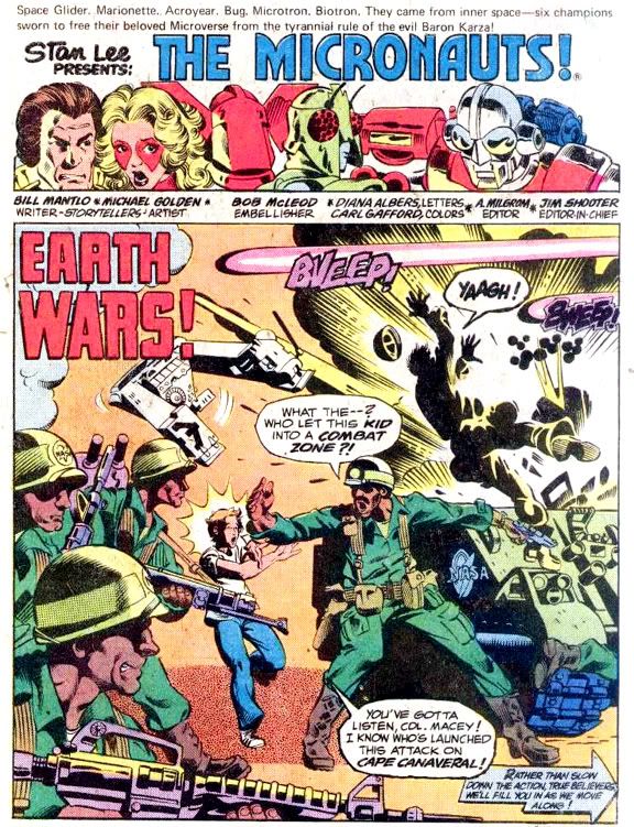
So not only do we have Golden's gorgeous rendering of a fire fight at the Kennedy Space Center in Florida featuring dozens of heavily-armed combatants and armored vehicles, we also get about 1000 years of Microversian history as Argon learns Karza's backstory. To round off these events, Golden, McLeod and Mantlo toss in all the spaceships and superhero fist-fighting a Star Wars geek with a Spider-Man fetish can handle.

Last Friday, McLeod posted a page from this issue and talked about it, with Joe Rubinstein and Larry Hama adding their perspectives. As McLeod recalls, Rubinstein inked the first few issues of Micronauts, but McLeod replaced him because the editors didn't particularly like Golden's artwork because it "looked 'weak'" and the book wasn't selling as well as they wanted. They were after Golden to draw it more like Jack Kirby.

According to McLeod, Rubinstein would have done been truer to the original pencils, which were bolder and featured more blacks this go around. That's interesting enough, but it gets better!

Rubinstein soon responds in the comments and backs up McLeod's point about the pressure to Kirby-ize the art, and describes how the editor asked him to change Golden's pencils by simplifying them and adding more blacks, although he argued against it. He also talks about visiting the Marvel offices and seeing a stat of the cover to #3 with a crude "improvement." Rubinstein convinced them to let him fix whatever Marvel considered a problem on the original art, but he makes the whole thing sound like a struggle an artist could never win. After finishing #7 with guest-star Man-Thing, he quit. Which is how McLeod came to ink this single issue.

Hama then explains it wasn't so much the editors themselves as it was their response to pressure from the fans, a group he characterizes as "solidly anti-Golden at the time." It may seem strange to comic book art aficionados today-- when Golden is recognized as a major influence on top talents and favorites like Art Adams and Jim Lee-- but apparently his stuff didn't go over with the readers in the 1970s. That the book wasn't selling very well helps prove Hama's point, although that may have also been due to its being based on a toy line and its awkward relationship to the superhero monthlies dominating sales. Continuity! How do Bug and Spider-Man relate to each other? What does Acroyear feel about anti-mutant hysteria? That's important stuff to some people!

Hama further points out that Al Milgrom, editor of Micronauts at the time, actually championed Golden's work to the higher ups. McLeod concurs, saying he didn't feel the art was something Milgrom would complain about. Hama also recalls DC stalwarts Murray Boltinoff and Julie Schwarz initially rejecting Golden's art, with himself and Al Milgrom giving him his first jobs there. Hindsight being what it is, this is practically inconceivable, huh? Thankfully, there were people like Hama and Milgrom around.

Despite fan objections and editorial demands, Micronauts #8 is quite the artistic tour de force. I'd say Golden achieved a bolder, more dynamic look without sacrificing his characteristic eye for teensy-tiny detail, and McLeod inked with a sympathetic line that didn't overwhelm.

Milgrom took over inks on Micronauts starting with #9, and he did ink with a bolder, simpler line. Hama maintains the fans felt Golden's work was "too cartoony," but Milgrom's inks look cartoonier than either Rubinstein's or McLeod's. I'm not sure how telling the inkers to make the art look more like Jack Kirby would have alleviated that particular complaint, either. Especially considering how Kirby himself was no longer in fashion with the fans at the time and subject to a certain amount of disrespect at the Marvel offices during this period as well. At least that's how I've always heard it told.

I wonder if sales improved. They must have been acceptable, since the book continued for several more years. In retrospect, Golden was the perfect choice for this book, much more appropriate for its milieu than Howard Chaykin, who took over pencils with #13. And as fine an inker as Milgrom is, he and Chaykin don't mesh very well. The art appears clumsy and rushed compared even to the work Golden and Milgrom produced in the previous issue. Chaykin really needs to ink himself. Why did Marvel keep plugging him into these space opera type books? It's not that he can't handle science fiction or action-- check out American Flagg. It's just this type of spaceship-and-heavy-equipment storytelling and Marvel-style inking never did him justice. His perfect fit would have been Marvel's The Further Adventures of Indiana Jones, but that's a post for another day. This one's already ridiculously rambling and prolix enough!

As much as I love this series, I sometimes wish Mantlo and Golden had just stopped after #12, the aftermath of the anti-Karza rebellion. Everyone except Karza (of course) has done what he or she set out to do. They've made new friends, freedom has been restored, Acroyear and his embittered albino brother Shaitan have fought to the death. The first twelve issues form a self-contained epic, much better than any comic based on a toy line needs to be.

As the title continued, it began to suffer from repetitive storytelling. Karza comes back from the dead, reconquers his domain, invades the Earth, has his butt kicked. Repeatedly. And the Microverse-- being an entire universe unto itself-- would seem to offer a limitless backdrop for any number of original plots, but because it's in the back pocket of the Marvel universe, the Micronauts fight Doctor Doom, Plant Man and Molecule Man while teaming up with the Fantastic Four and Ant-Man. Eventually, they join forces with the X-Men while Karza and Kitty Pryde switch bodies. That's where I break with most fandom-- I would have preferred Marvel's Dracula not fight Brother Voodoo or vampirize Storm, for example. Luke Skywalker didn't have to team-up with Nick Fury and Dum Dum Dugan; why should Commander Rann? Don't get me wrong-- quite a few of these individual stories are a lot of fun to read, but they're standard comic book fare without the grandeur of title's first dozen issues.

Throughout, Golden-esque artists like Pat Broderick and Jackson Guice-- kind of ironic, huh?-- maintain a high level of gloss and gleam. Despite the the deja vu-inducing plots, Mantlo continues to develop his cast-- especially the lead, Rann, who starts to feel his age, grows a beard and loses his hand. But there's a sense they'd told the tale and then succumbed to the inherent weaknesses of open-ended serialized storytelling.

While I was reading this, one of the best ideas I've ever had suddenly came to me. Sit down. You really need to be sitting before I share it with you. Comfortable? Good. Imagine this: Chris Claremont scripting a New Mutants flashback issue featuring the original team with Michael Golden and Bob McLeod providing the art!

Oh baby!

*Restrictions may apply. Offer not valid in every state. Marvel and When Comic Books Rule the Earth do not mean to imply you actually could be Captain Universe and make no claims-- legal or otherwise-- that are to be considered binding contracts.