Sunday, December 29, 2013

Uncanny X-Men #118 (February 1979): Bad New Mutants Go To Japan!

Script: Chris Claremont; Art:  John Byrne and Ric Villamonte

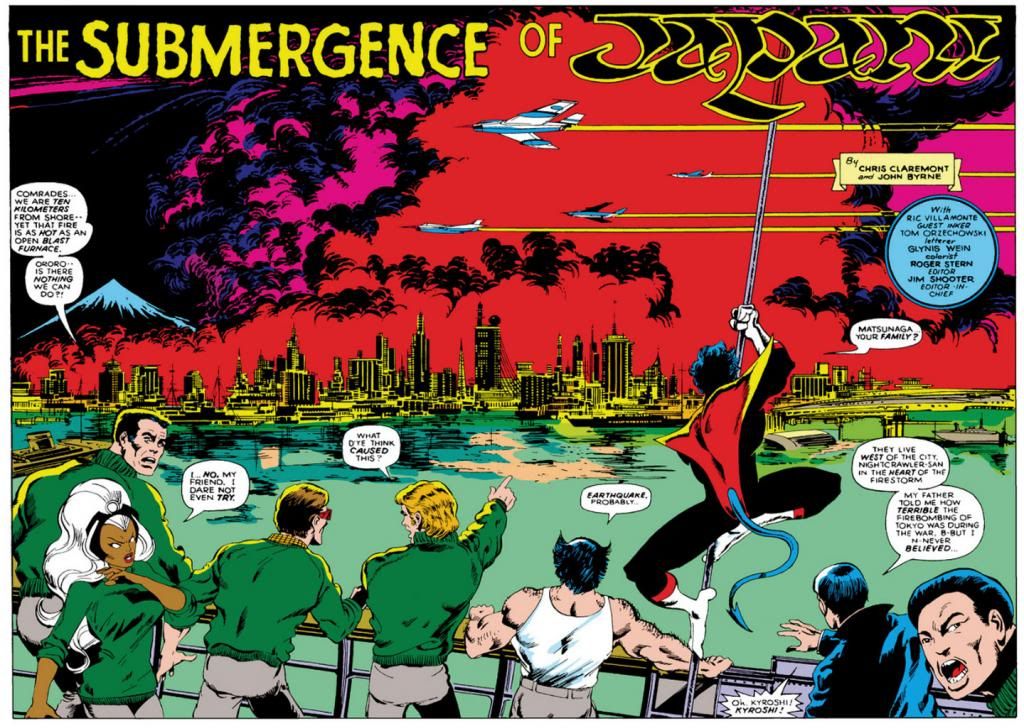
Enjoy this spectacular double-page spread from Uncanny X-Men #118 (February 1979), pencilled by John Byrne and inked by Ric Villamonte.  Maybe Terry Austin was off that month.  Agarashima, the city on fire here, is completely fictional but the visible architecture in Byrne's rendition is plausible enough.

Except for Mt. Fuji in the background.  An online source tells me Agarashima is in Miyagi prefecture, which is way up north along the eastern coast of Honshu.  Actually, that same source reports the city to be "300 kilometers north of Tokyo" and misspells the prefectural name as  "Miyago."  This may be a fictionalized flourish on Chris Claremont's part, freeing him to use his imagination and create a fanciful Marvelized Japan.

Fake Miyago or very real Miyagi, it's a likely location for a medium-sized port city, which is what Agarashima appears to be here.  Mt. Fuji is much farther west, so there's no way if this city resides 300 kilometers north of Tokyo you would see it looming that large in the background because it would be about 500 kilometers away.  I live in a city in the same prefecture as Mt. Fuji, about 116 kilometers away, and even when we can see it from here (it's visible from several vantage points on clear winter days when it's wearing its snow cap), it's only about the same size as my thumb.  So this is more than likely a little artistic license on Byrne's part as well.  We just need some cherry blossoms blown out to sea by the conflagration to achieve perfection.

So, with all that in mind (or better yet, out of it), let's just admire this glorious drawing, huh?  Unfortunately, after this image, there's not a lot of travelogue imagery in this story.  Much smaller panels, and a lot of the action confined to interiors.  By the next issue, the X-Men are on a volcanic island off the coast where they fight a pissed-off nutjob named Moses Magnum, who wants to sink Japan, so we're denied more John Byrne-drawn vistas of late 1970s Japan.  Think what he might have done with Tokyo.  I would love to have seen it.

You know, not on fire.

Wednesday, December 25, 2013

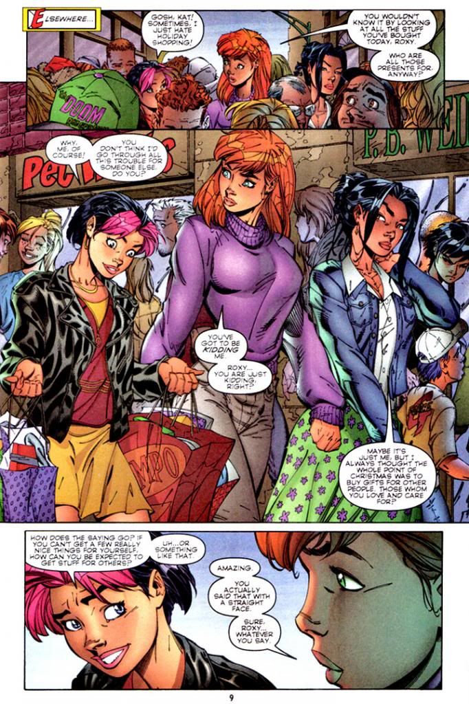
The Roxy "Freefall" Spaulding philosophy of holiday getting...

Gen13 #16; words by Brandon Choi, J. Scott Campbell and Jim Lee; art by Campbell and Alex Garner with Tim Townsend and Tom McWeeney; colors by Joe Chiodo


Season's greetings!  Actually, when I suddenly remembered this moment existed, I was hoping it was within the context more of a holiday-themed Gen13 I could toss at you, but this is the only part of the story in Gen13 #16-17 (January-February 1997) that directly references Christmas.  The rest involves the Roxy, Caitlin and Sarah being captured by a fellow "Gen-active," a genius toy company magnate who happens to look and dress like Max from Where the Wild Things Are and will never grow up.  So he can mate with them.  I'd... uh... forgotten that part.

No, Roxy does not learn a seasonal lesson about how it's wrong to be selfish or that it's the "thought that counts."  She doesn't find out what life would have been like for her friends if she'd never been born.  She doesn't fly off to the North Pole to save Christmas by rescuing jolly ol' St. Nick from his evil twin brother.  She doesn't help recover a small town's presents from the anti-Christmas troglodyte who lives just north of there on the top of a mountain with his put-upon animal companion.

She learns she doesn't like wearing teddies.

Monday, December 23, 2013

New Mutants Winter Holiday Extravaganza starring Dani Moonstar!

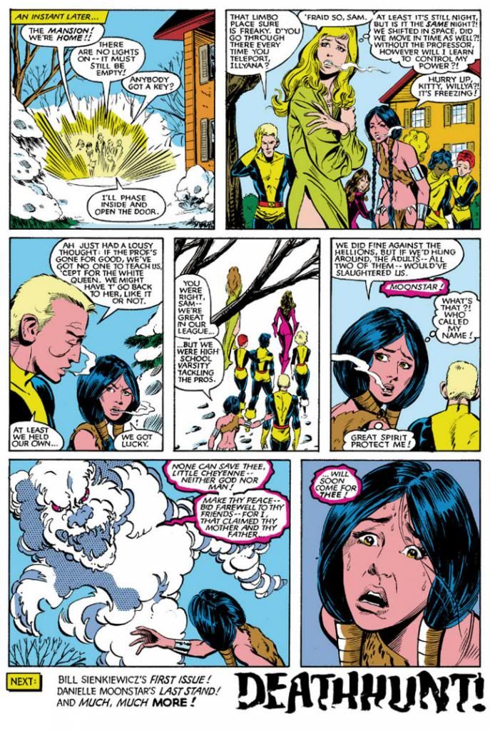
If there's anything the New Mutants love more than ostracizing Kitty Pryde or cuddling up together on the sofa with some popcorn to watch Magnum, P.I., it's enjoying seasonal hijinks in the snow.  Let's take a moment to share a few holiday memories with Dani, Sam, Roberto, Rahne, Xi'an and all the rest.

The snow love starts as early as New Mutants #4:

New Mutants #4 (June 1983); words: Chris Claremont; art: Sal Buscema and Bob McLeod

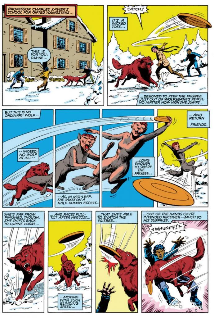
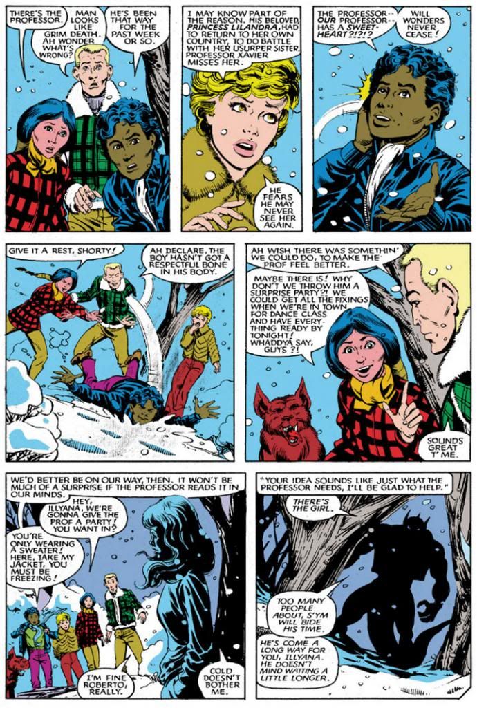
These sequences are useful for showcasing each kid's powers or personality, and for comedic relief.  Outdoor frolicking later helps the team quickly recover from the apparent death of leader Xi'an Coy Manh and welcome new additions Amara Juliana Olivians Aquilla and Illyana Rasputin to the team roster.  Amara shows her holiday spirit by helping plan a surprise party for a moping Professor Xavier.  Did you realize the Xavier School for Gifted Youngsters allows its students to get out of class early during inclement winter weather, even though they both live and study inside the school itself?  I didn't, either.  Here's proof, though:

New Mutants #14 (April 1984); words: Claremont; art: Buscema and Tom Mandrake

We all know how Dani shuns clothing in favor of what Xi'an jokingly calls l'aventures naturelles.  Leave it to the coolest mutant around to don a winter ensemble consisting of assless chaps and a loincloth even as the mercury dips below zero...

New Mutants #17 (July 1984); words: Claremont; art: Buscema and Mandrake

As someone who grew up in the Colorado mountains, Dani has probably developed a greater tolerance for low temperatures, but this is a bit much even for her.  After a quick hallucination as frostbite sets in, it's time to repair to the mansion to warm up with some hot cocoa and possibly a long inner monologue about recent events. 

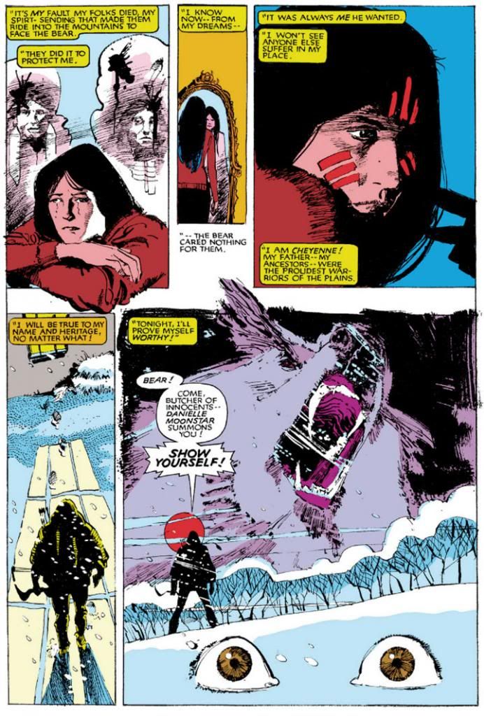
This next example isn't so much fun and festive as it is moody and menacing.  For Dani, snow isn't just about having fun and walking around half (or wholly) naked.  It's also about undertaking spirit quests.  Here's a dark and troubling page by Bill Sienkiewicz from New Mutants #18, where Dani goes solo against the demon bear that consumed her parents.

New Mutants #18 (August 1984); words: Claremont; art: Bill Sienkiewicz

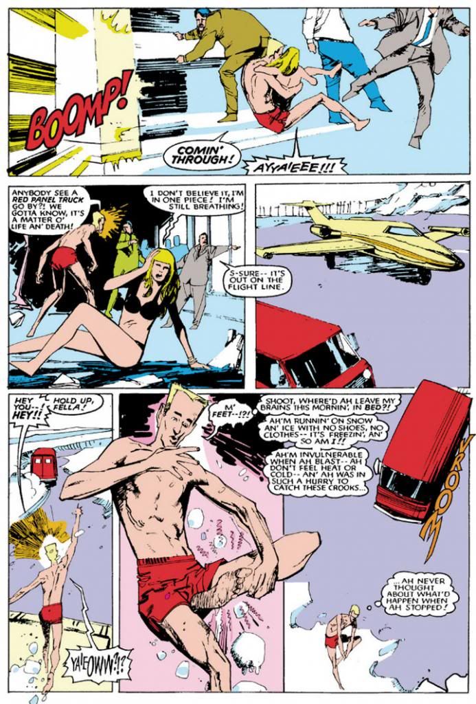
With Chris Claremont's genius for involving characterization, New Mutants rarely goes wrong when the story focuses on Dani, the best of all its characters.  But what's this?  Looks like Dani's not the only New Mutant trying for a membership in the Polar Bear Club.  Check out Sam Guthrie and Illyana in this slapstick sequence set at a local airport.

New Mutants #29 (July 1985); words: Claremont; art Sienkiewicz

Okay, so they're not just flying around in swimsuits because they enjoy it.  They do.  But more importantly, they're chasing after kidnappers who have just spirited away Roberto and Amara.  This happens while Dani and the others are fighting for their lives in a wartorn dreamscape inside a kid's mind.  No snow there, though, which is why I left it out.

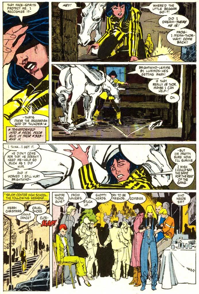
I'd hoped to find an issue with the team decorating a Christmas tree, lighting Chanukah or Kwanzaa candles, with Rahne doing her best Tiny Tim impression and Amara sharing a few Saturnalia traditions, but the only overt reference to a winter holiday comes in New Mutants #38, where the kids attend a party at Salem Center High School.  Dani, despite wearing a sweet party-appropriate black and yellow striped winter coat, decides to hang out in the Xavier school stables with Brightwind, her winged horse from Asgard.  Instead of the ghosts of Jacob Marley and Christmases Past, Present and Future, she gets a visit from what I believe is Thor in the guise of a frog.

New Mutants #38 (April 1986); words: Claremont; art Rick Leonardi and Sienkiewicz

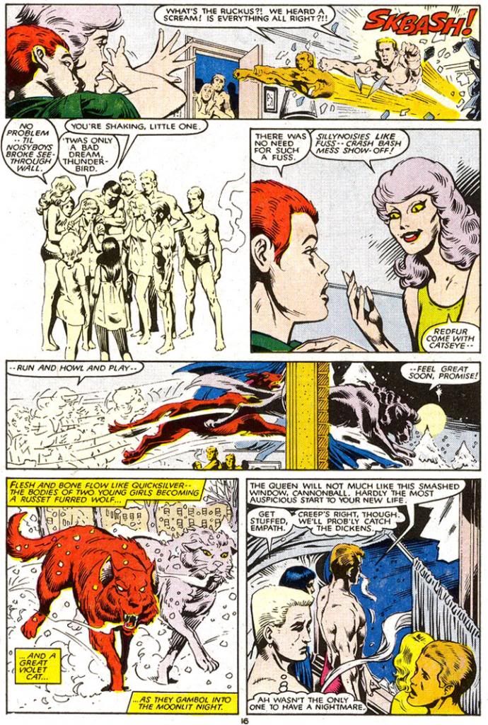
While Dani proves largely impervious to cold due to her upbringing and frequent nudity, her young pal Rahne Sinclair has the natural advantage of being able to transform into a wolf.  Each time she and Catseye (a member of the Hellfire Club's off-brand version of our heroes they call the Hellions), meet, they shapeshift into their "furforms" and go do lord knows what together.

New Mutants #39 (May 1986); words: Claremont; art: Keith Pollard and Del Barras

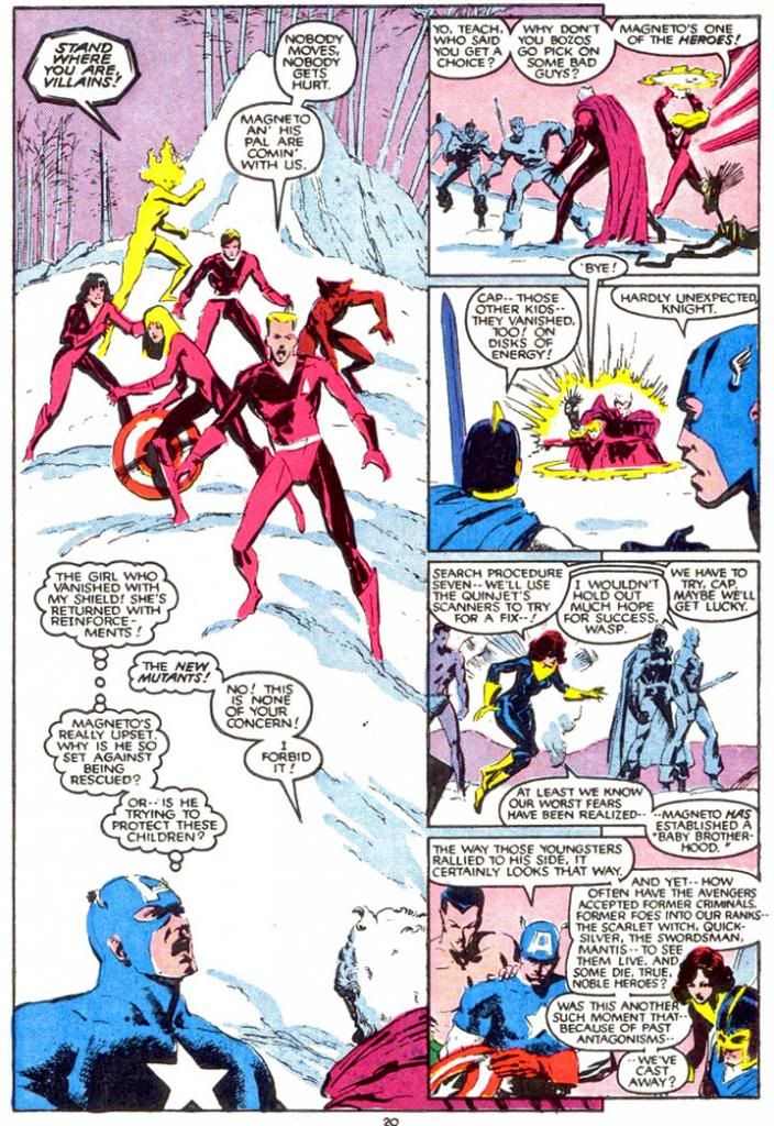
Around this time, new school headmaster Magneto decides it's better for his charges to become Hellions themselves, which leads to an extended run of issues where practically everyone wears magenta costumes.  And also to conflict with some of the Avengers.  Which, appropriately enough for today's theme, takes place in a scenic snow-frosted wilderness.

New Mutants #40 (June 1986); words: Claremont; art: Jackson Guice and Kyle Baker

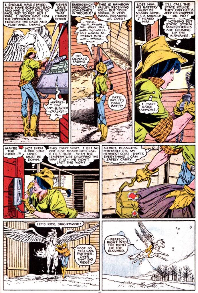
But what of the most important of all the kids, Dani Moonstar?  Not wanting any part of this magenta nightmare, she bugs out for her hometown in Colorado where she spends a lot of time...  you guessed it... in a stable with Brightwind.

New Mutants #41 (July 1986); words: Claremont; art: Guice and Terry Austin

I've never been, but I imagine with the Rocky Mountains being right there and all Colorado must have some beautiful winters.  During this particular story, a would-be boyfriend from Dani's past turns up and she has to engage in a fast draw duel with the personification of Death itself to save the guy's life (even though he's a complete creep).  It's your typical "guy likes girl, girl wants to be just friends, guy gets drunk and crashes his truck then goes into insulin shock, girl gunfights Death to save guy's life" story.

As if the Hellions costumes weren't bad enough, the team received their "graduation" uniforms soon after.  Poor Sam gets stuck in a purple and white jumpsuit with some kind of rejected prototype helmet left over from the Robocop pre-production phase and kneepads and Dani, much to her horror, has to wear a top that seems to have been woven from an old carpet Professor X had stored in the mansion's attic.

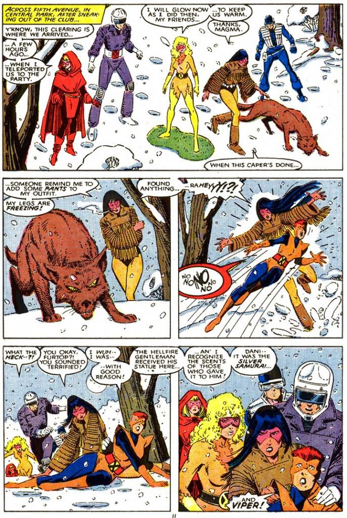
New Mutants #54 (August 1987); words: Claremont; art: Buscema and Austin

Amara looks like she just came from the Jem and the Holograms concert, or else she's splitting the visual difference between Spider-Man's animated friend Firestar and one of Santa's elves.  But with Rahne providing the perfect fifty-issue bookend by once again knocking over one of her teammates in the snow we've reached an appropriate stopping point.

Happy Holidays and a joyous 2014 to our reader!

Tuesday, December 17, 2013

Fun with search keywords

I'm working on a few new posts, but the holiday season is really kicking my butt so it's slow going.  In the meantime, here are this month's search keywords that tumble my blog on Google, plus the number of views they generated:

1. planet of the apes ape with rifle (5 views)
2. alex toth "bravo for adventure" (3 views)
3. tomb of Dracula comic book (3)
4. alex toth (2)
5. andy grittith cartoon (2)
6. barber shop hair (2)
7. girls from hopey locas (2)
8. golden key star trek comic covers (2)
9. mary blair (2)
10. photos of man sobbing (1)

Interesting.  We've discussed Planet of the Apes a few times here, but never with a particular emphasis on the apes' rifles.  Alex Toth is another popular subject for me, as is Marvel's Tomb of Dracula comic.  The spelling of Andy Griffith is unfortunate, but apparently Google understood.  I love Jaime Hernandez's Locas stories, and Hopey is my favorite character in them.  Mary Blair was a genius and my belief in her genius gained reinforcement from a Disney museum show we went to a few years back that featured a heapin' helpin' of Blair's preliminary designs for different movies, heavy on the Alice in Wonderland.  I don't write about her very often because this is a book about comic books.  Gold Key Star Trek remains a fave.  And the photos of a man sobbing are probably of me every time DC reboots its universe or stumbles into some horrific, self-inflicted public relations disaster.

Since we're approaching year's end, here are my all-time search keywords.

1. cassandra cain (346)
2. batgirl porn (206)
3. alicia Silverstone batgirl (189)
4. roddy mcdowall (169)
5. batgirl boobs (113)
6. claude akins (106
7. dani moonstar (81)
8. harlem globetrotters cartoon (80)
9. cassandra cain tim drake (73)
10. thomas magnum (69)

Lots of Batgirl-related searches.  Two Planet of the Apes searches, unless one is for The Misadventures of Sheriff Lobo.  Did I write anything about that show?  I should do a fake comic book cover for it sometime.  Of course we have Dani Moonstar on the list.  She's my all-time favorite comic book character and I probably reference her once a month.  Even that "thomas magnum" search relates to her.  I'm shocked Isis and Cindy Lee haven't made this list.

Wednesday, December 11, 2013

Heroes on buildings and differing looks/Fighting some tentacles/webbing some crooks/These are few of my favorite Spidey things (artists)...

Editor's Note:  I've really neglected Spider-Man in this blog, and I apologize for that.  I'm about to make up for it with one giant post!  Here we go!

Spider-Man has gone through a lot of artists over the decades, and while his costume basics have remained the same, some artists have taken it upon themselves to tweak the details.  For some people, the Todd McFarlane version of Spider-Man is their favorite.  Huge eyes, lots of weblines on the red parts, really exaggerated insect-like poses and fingers that resemble circumcised penises and feet made out of garden spades.  Some may be into the black costumed Spider-Man.  Or the Ultimate Spider-Man.  Or that guy who dresses like Spider-Man and climbs skyscrapers.  Whatever your taste, Spider-Man has been around long enough there's probably one for you, and that one is more than likely the one by whatever artist handled the character when you first got into him.

I'm pretty damned old, so my first Spidey crush was on what was probably a John Romita Spider-Man on a Mead Trapper-Keeper I had in elementary school back in the late 1970s.  Given the era, it could also have been a John Buscema or Gil Kane drawing.  Actually, it may not have been a Trapper Keeper at all, but a folder or even a notebook.  There's a chance it's the one with the cover to Amazing Spider-Man #135 (which means Romita), but I remember it more as a collage of cover images, which means it could be any combination of artists.

Whichever one it was, and however vague my memory of its specifics, what I definitely remember is how it imprinted in my brain a certain vision of what the ideal Spider-Man looked like.  After all, that Spidey matched up well with the Mego Spider-Man, the Spider-Man on the The Amazing Spider-Man TV series, the one on The Electric Company, the bodybuilder who dressed like Spider-Man at the mall we had our photos taken with and, most importantly, the Spider-Man still appearing in Marvel comics like The Amazing Spider-Man, Peter Parker the Spectacular Spider-Man, Spidey Super Stories and even in the Hostess Fruit Pie ads.  Spider-Man de rigueur for the 1970s.

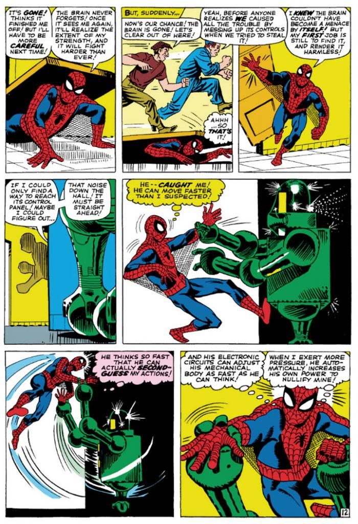
Then I learned of Steve Ditko from a Dr. Strange story collection. That he was the original Spidey artist meant I had to give his rendition careful consideration in light of its preeminence in Spider-Man history.  Well, it didn't take long for Ditko's vision to take over my imagination.  Here's a typical Ditko Spider-Man.

Amazing Spider-Man #8 (January 1964) Art by Steve Ditko

This is from Amazing Spider-Man #8 (January 1964), touted on the cover as a "Special 'Tribute to Teen-Agers' Issue!!"  Since the character himself is a teen-ager, Ditko's Spider-Man is muscular in a youthful, long-distance-runner way, but isn't quite as classically proportioned as some later versions.  While this isn't particularly a good example of it, Ditko also tends to put heavier shadows in the costume's blue areas, which makes me think his intention is for that part to be navy blue rather than the royal blue the subsequent Spideys sport, or even black.  But given the way comic books treated colors back then, and with all the recoloring and touch-ups in the years since, it's hard to say.  What we can see is Ditko favors larger eyes with heavier black outlines, to emphasize the insect-like aspect of Spidey's mask.  He aso gives Spidey more underarm webbing than most artists-- and it runs from his belt all the way to his gloves!

Using the three-tier page format, Ditko chops action into small increments, which makes sequences more movie-like and easy to follow.  But he also uses mostly medium shots, which keeps the action at arm’s length.  It’s simple storytelling at its finest, and reduces events to something approaching the comic book version of documentary-like as opposed to the heightened or epic.  Spider-Man’s powers may be the one fantastic element in a world Ditko means to represent our own, but he’s hindered by the same things we deal with ourselves and so we identify with him even if we’re not right in his face masking ourselves as him.  With his funky take on facial expressions and body language—with his rough-hewn finishes few of Ditko’s people are blatantly gorgeous—this makes Spidey’s adventures just a bit larger-than-life rather than massive.  There’s our trod-upon hero (literally) coming out from under a door, in the confines of some functional corridor rather than high above a cityscape.

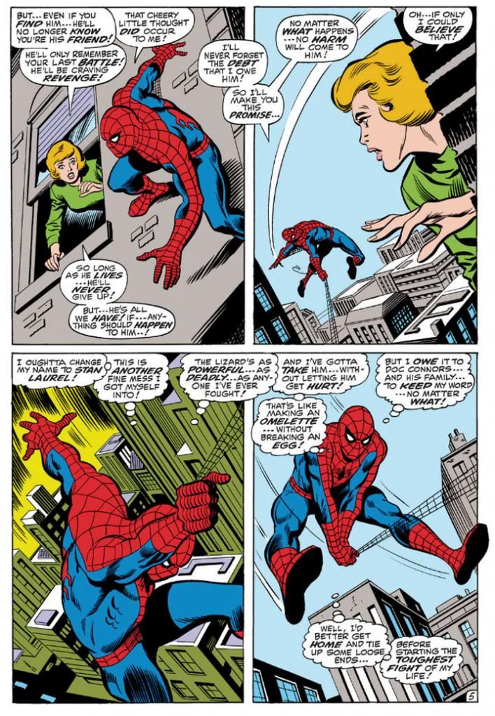
John Romita took over the title when Ditko left, but we'll look at him later because we're doing this in order of what I own.  So keeping that in mind, here's John Buscema's version, inked by Jim Mooney, from a few years later.  We have to acknowledge the influence of Romita's slight revision of the costume, but the rest is Buscema all the way.

Amazing Spider-Man #76 (September 1969) Art by John Buscema and Jim Mooney

Buscema’s Spider-Man (from an issue actually printed within my lifetime!) is muscled like some gorgeous Renaissance sculpture come to life, a full nine heroic heads tall.  Spider-Man, not Spider-Teen.  Buscema puts us inside the action and this time, the entire thing is made up of fantastic elements—other than the (fairly) realistic buildings, but even they’re skewed with deep perspective shots.  By varying panel size and shape, changing point-of-view and enlarging the images so he can fit only four on a page, Buscema creates a heightened dynamism that’s at odds with Ditko’s reductionism.  This isn’t to say one is right and one is wrong.  They may represent differing philosophies or thought processes on what constitutes heroism.  Or maybe Buscema just liked big takes.  Both are totally valid approaches, but I like how Ditko's Spider struggles a bit more.  On the other hand, Marvel tended to push Buscema’s powerful approach to storytelling on us through things like How to Draw Comics the Marvel Way.  This had a huge influence on my tastes as a teenager.
 
I don't see any armpit webbing on this page, but that may be because Jim Mooney forgot to ink it.  They include it on other pages, but it's subtler than Ditko's.
 
As much as I love both Ditko and Buscema, these days my preferred Spider-Man artist is his second penciller, none other than the aforementioned John Romita.  Let's take a look at his Spidey.

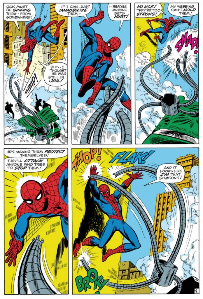
Amazing Spider-Man #88 (September 1970) Art by John Romita and Mooney

This is a clever sequence from the September 1970 story, "The Arms of Doctor Octopus!," where, true to its title, Spider-Man fights Doctor Octopus' arms.  Only the arms.  The good Doctor controls them from his prison cell.  Romita's Spider-Man is slightly slenderer than Buscema's, but they share body language.  Romita also brings us inside the action with this two-tier layout.  In the Buscema page, we have three Spideys roughly the same size with a smaller one for variety.  Romita gives us three Spidey sizes:  small, medium and large.  It's not quite as bombastic as Buscema's, but it's still bold.  Romita's characters tend towards the pretty, maybe due to his romance comics background.  I don't think anyone handled the soap opera stuff in Amazing Spider-Man better than Romita.  Slick Mooney finishes keep some surface consistency with line weights and the treatment of Spidey's blue areas.  I haven't seen the pencils for this page or the Buscema one, but I'm going to guess Mooney has a great deal to do with the near-identical eye and web pattern treatments.  The color choices here interest me, but I'm not sure how much is due to the original colorist and what might have been changed in the years since.  Anyway, it works.  Since Doc Ock's arms are gray and wouldn't have popped in the foreground otherwise, notice how the buildings on the Buscema page are gray, but the colorist here used a lot of yellow and yellow-orange.

Also, THOP!  FLAK!  BROK!  And the return of the armpit webbing.  It's finer than Ditko's and only reaches Spidey's elbows.

While I've stated my preference for Romita, I wouldn't care to meet the fan who finds fault in Gil Kane's interpretation.

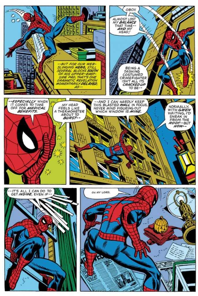
Amazing Spider-Man #121 (June 1973) Art by Gil Kane and Tony Mortellaro

Here's our first extreme close-up!  It appears in Amazing Spider-Man #121 (June 1973), in a story you may have heard of called "The Night Gwen Stacy Died."  Not sure what happens in that one, and with an obscure title like that, your guess is as good as mine.

But I am pretty sure Ditko, Buscema and Romita all used close-ups before Kane.  But Kane, like Ditko, excelled at facial expressions.  Look at some of his cover work with those giant screaming heads.  Kane puts extreme close-ups to effective use throughout this issue.  Yeah, Peter Parker's face is hidden under a mask most of the time, but the idea's basically the same.  This is an important little moment Kane chooses to emphasize with a cutaway to Spider-Man holding his head because it "feels like a thermometer is about to burst--"  Spidey on this page isn't feeling well, and in his one high-flying moment of web-swinging, Kane gives him wonky body language, then confines him to wall-crawling and slipping in windows and crouching on newspapers.  I like the last panel especially, with the high angle from-behind shot giving us both Spider-Man and the pumpkin bomb he's reacting to all in one shot.  There's a nice use of a missing panel here, with Spidey on the windowsill cutting to Spidey in the room in such a way the omitted leap is implied.  It's almost animated.

No armpit webbing.

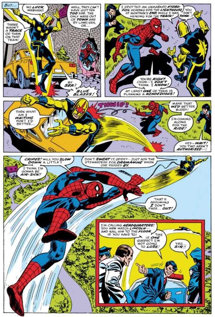
Ross Andru, who drew Amazing Spider-Man for five years (impressive!) gives us two superheroes for the price of one, but we're going to ignore Nova and his golden bullet-helmet.

Amazing Spider-Man #171 (August 1977) Art by Ross Andru and Mike Esposito

Once again, we have medium shots and three panels in a row with high angle views, the last with a larger foreground Spider-Man inducing vertigo as Nova drags him through the air.  And then an inset panel with the two of them so high they're tiny to the cops left behind on the ground.  Andru's Spider-Man retains the crouching body language of Kane's, but is noticeably chunkier than any of the ones we've looked at previously.  He's got the Ditko-style dark shadowing on his blue uniform areas (maybe inker Mike Esposito contributed that part), but again, none of the armpit webbing.  Did Marvel abandon that look, or was that an Andru flourish?  It's not as if the armpit webbing has any real function and it wouldn't have worked in the panel with the largest Spidey anyway-- it would have obscured his chest and been a challenging artistic exercise for Esposito, like when a penciller puts speedlines in front of an object.  How do you look through those?  Do they distort the background image?  Just how much of that should remain for clarity's sake, or for simplicity?

Andru came over from DC where he worked on war comics and Wonder Woman.  Can you see any of those elements informing his work here?  I know he did a classic take on Wonder Woman and he's giving us a clean, house-style Spider-Man on these pages.

Oh, and the yellow sky in the inset panel.  That was originally the work of Glynis Wein, who colored a pile of Marvel books.  It reminds me of Harvey Comics.  For some reason, colorists at Harvey seemed to love making the sky yellow.  Here it makes a good depth contrast for the figures heavy on the blue side in the foreground. In fact, whoever colored this seems to have put some extra effort into popping figures by contrasting cool colors on top of warm (although you still have to put up with Nova's yellow arms).  I'd love to see the original printed page to see how accurate Marvel has recreated Wein's colors here.

And there you have it.  Ditko, Buscema, Romita, Kane and Andru.  They're in my Spider-man Hall of Fame.  Yeah, I like the way Ron Frenz and John Romita, Jr. and even John Byrne-- to name three more-- draw the character, but when I think Spidey, I think Ditko, Buscema, Romita, Kane and Andre.  Their versions combine into my platonic ideal of Spider-Man.

Tuesday, December 10, 2013

Wednesday, December 4, 2013

The Worm of Thrace That Makes Things Worse or the Art by Marie Severin That Makes Everything Better

First we're going to talk about 1981's Dragonslayer and the Marie Severin-illustrated comic book based on it, and then I'm going to tell you why I'm including Eddie Deezen (who had nothing to do with the making of either) in this sentence

Dragonslayer is, I suppose, a cult favorite these days.  Maybe it was a little too obvious the spawn of Star Wars (naïve young man on a hero's quest, spunky love interest, old mentor, pre-dating George Lucas but owned by him after May 1977) ever to strike box office riches.  But ten of us like it.  We don't have any cultish rites as yet, but we're working all that out at our monthly meetings that always take place at the stroke of midnight during the new moon period. 

Dragonslayer has so many wonderful qualities, it's long overdue for nostalgia-hungry Internet people to brave its shadowy, flame-scorched lair and bring it forth into the dawn of its new age of popularity.  There are winning performances from Peter MacNicol (later one of the best things about Ghostbusters 2, and an absolute riot as an enthusiastically boneheaded camp counselor in Addams Family Values), Caitlin Clarke and, in the role of wise wizard, Sir Ralph Richardson (doing that Obi-Wan thing Star Wars made a requirement of older British actors in the 70s and 80s).  It has a powerful score by Alex North (a movie music master who also scored Stanley Kubrick's Spartacus and worked on the director's 2001: A Space Odyssey before Kubrick decided to use classical pieces).  Not the least among all these estimable qualities is its dragon, the mighty Vermithrax Pejorative, brought to fierce, fiery life by Phil Tippett and a lot of talented special effects geniuses at ILM through the magic of their "go motion" process and some full-sized body parts.  Vermithrax Pejorative is the movie dragon by which all others must be judged and found wanting.

The story takes place in the Dark Ages (which weren't really as dark as modern myth makes out; we prefer to call those days the early Middle Ages).  A kid named Galen is a sorcerer's apprentice and Urland, a nearby kingdom, has a nasty dragon infestation consisting of our friend Vermithrax and her babies.  The king there has instituted a lottery whereby they randomly choose a maiden to dress like a bride and feed the dragon.  As in, the dragon feeds on her.  A deputation from Urland comes to visit Galen's boss, the renowned wizard Ulrich.  A mouthy boy Valerian in the party turns out to be a spunky girl in disguise and it's not long before she and Galen are making goo-goo eyes at each other.  Eventually, the youngsters have to confront Vermithrax and put an end to the death and destruction even if it means also eliminating the last vestiges of magic and fun in the world.

Let's wait for a minute or two while pop culture rights itself and this movie gets the acclaim it deserves.  There.  Now Dragonslayer has ascended to its rightful place as one of the great films.

After striking riches Jed Clampett-style with its Star Wars adaptation, Marvel wasn't about to let any other comic company join in the fun and profit so they started licensing practically every sci-fi or fantasy movie out there and releasing them in deluxe magazine format they called the Marvel Super Special.  The bigger, prettier print jobs favored instant classics like my beloved Close Encounters of the Third Kind and the lushly beautiful Archie Goodwin-Al Williamson adaptation of The Empire Strikes Back


This also led to some really strange and wonderful comic freakshows like Marvel Super Special #17:  Xanadu, the Illustrated Story.  Imagine that-- a whimsical Olivia Newton-John musical as a comic book!  I guess having missed out on the Grease lucre really burned Marvel's collective bums.  Too bad Xanadu became a notorious flop as a film and an oddity of a comic book. 

Dragonslayer, on the other claw (whoa, steady there, boy, don't get too stupid too fast), was a natural choice to make into a comic.  For one thing, it has few, if any, song and dance numbers to translate into pen and ink and scattered prose.  And for another, witness Marvel's success with fantasy properties like Conan the Barbarian, Kull the Conqueror and Red Sonja.  Conan was making semi-regular appearances in Marvel Super Special and Marvel had previously devoted three whole issues to their homegrown Doug Moench fantasia Warriors of the Shadow Realm, also known as Weirdworld.

Denny O'Neil's charming script hits the proper story beats, as expected.  But what O'Neil also does so well is illuminate the film's underlying themes of changing ages.  He doesn't miss the subtle tragedy of both Ulrich and Vermithrax being the last of their respective kinds.

But here's the best part.  Marie Severin is an absolutely inspired choice for art duties on Dragonslayer.  Among her many scattered Marvel art jobs penciling and inking characters like Namor and Spider-Man, Severin had already provided interiors for Marvel's Kull comics, and covers for that series and Conan the Barbarian.  Strong prep for Dragonslayer.

This art is pure joy.  Maybe it's due to her humor comics background, but Marie Severin absolutely aces the "acting," which I find many artists ignore or else botch completely.  In comics, true masters of acting are rare.  Comic book artists tend to pose their characters in weird, inhuman ways with every muscle tensed rather than develop unique body language.  And blank expressions when nothing much is happening, or downcast eyes when characters feel sad, or clenched teeth with neck tendons and veins bulging to the point of bursting for every other emotion.  Big, simplistic takes on big, simplistic feelings.  There are action scenes and plenty of screams and curses in Dragonslayer, but there are also a lot of moments where quirky people simply talk to each other.  If the characters turn into blank-faced nothings seemingly reproduced from clothing store mannequins, readers miss out on the mood and character personalities.  An artist is responsible for this stuff, too, not just the punches and kicks.

On Dragonslayer, Severin takes time to draw individual expressions and well-observed poses for every character on the page and really brings them to life.  Especially vivid is the unearned cockiness Galen displays right before the king tosses him in a dungeon as a big phony.  But even the kids Galen entertains at a celebration each have unique facial expressions that tell us what they're thinking and enrich the moment.  Some are delighted, some are a bit more dubious.  Are they important?  Maybe not, but Severin apparently felt it was necessary to go above and beyond, and I applaud.


She also does a lot to build the world these people inhabit.  Aided by some ornate inking by John Tartaglione, Severin packs the pages with images that recreate in two dimensions the film's funky, lived-in production design.  Dragonslayer's Dark-- er-- early Middle Ages were not those of fairy tale or chivalrous legend, despite the scaly menace of Vermithrax and the magical story elements.  It's more like the one from Monty Python and the Holy Grail:  dirty and smoky, with tumble-down castles falling to ruin.  Especially spectacular are the pages inside Vermithrax's lair-- Severin colored the book as well, and the lighting effects she manages on these pages raise the room temperature.  You can almost feel the heat and smell the stink of burning oil and sulphur. 

The only flaw in her storytelling is she tends to minimize Vermithrax.  We get one massive head as the dragon glares at Galen but for the most part Severin confines the great beast to smaller panels.  A full-page panel of Vermithrax in flight, spewing flame, would have been perfection.  As if to make up for that, Severin and Tartaglione do a knock out job on Vermithrax's baby dragons.  Valerian calls them basilisks, but I prefer the term kittens.  Dragon young should be called kittens.  The artists render the dragon kittens in loving close up so we get to see every bump and scale. 

Anyway, it's a good looking book.  The Earl Norem triptych cover pretty much sums up the magic that is Dragonslayer.  Maybe if they'd used it as the movie's one sheet it might have fared better at the box office.  Or not.  Such visual riches shouldn't be hoarded and hidden away by dragons-- it needs a reprinting at once.  Casiordorus Rex demandeth it!  Snap to it, people!  Chop chop and lickety-split!  Handle it, Roy, handle it!  Handle it!   As long as there isn't a joyless, rote, CGI-heavy remake with Sam Worthington as Galen and Megan Fox as Valerian.  Or some CW Network refugees.  There's no way some sullen-faced former underwear models could compete with the charms of MacNicol and Clarke.

Okay, back to Eddie Deezen.  Dragonslayer director Matthew Robbins also directed 1978's Corvette Summer, the movie where Mark Hamill builds a custom Corvette Stingray only to lose it to a sleazy auto shop owner/car theft ringleader played by Kim Milford, who essayed lead schlub Billy Duncan in Laserblast, a low-budget sci-fi revenge flick (mocked impressively by Mystery Science Theater 3000 at the end of its seventh season).  Laserblast is where Eddie Deezen made his film debut. 

Marvel Super Special #4 The Beatles Story is a comic book biography of those four lads from Liverpool.  Eddie Deezen knows more about the Beatles than you and I put together ever will.  Eddie Deezen turned down a role in the Bill Murray-starring hit Meatballs for a part in the John Belushi-and-Dan Akyroyd-starring flop 1941.  Eddie Deezen voiced Mandark on Dexter's Laboratory


The Beatles, Marvel Comics, Laserblast, Corvette Summer, Dragonslayer, Dexter's Laboratory:  they all come around in the end to Eddie Deezen.  We like Eddie Deezen as much as we like Marie Severin.