Friday, April 29, 2011

Hi, Crystal! My totally random appraisal of Fantastic Four #82

It's Fantastic Four #82 here to entertain us with jokes and repartee and perhaps some juggling and then some name-dropping anecdotes about meeting John and Yoko at a gallery opening, staying in a hotel suite next door to Mick and Bianca, guest-hosting The Tonight Show during the Carson Era before feuding with Johnny and being banned for life, growing a long beard and attempting to oil paint in the south of France...

Yes, Fantastic Four #82 has seen it and done it all. What a life it's lived! Oh, Fantastic Four #82! If only you'd finish those memoirs.

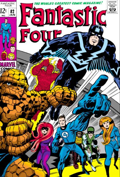
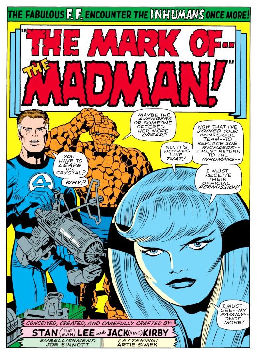
I've forgotten why I found these images from Fantastic Four #82. The story inside is titled "The Mark of-- The Madman!," which is pretty generic for something by Stan Lee. Little bombast, other than the exclamation point. Sue Richards has left the team and Crystal of the Inhumans has joined to replace her. We all know Sue as the Invisible Girl/Woman, with powers of invisibility. But what of Crystal? She can control the basic elements-- fire, air, earth and water. While invisibility has some obvious uses in terms of stealth and defense (especially Sue's famous invisible force fields), Crystal can move water and earth, combine elements to create weather. And she's stronger and more resilient than a normal human. Pretty useful as well. And yes, I know Sue later learned to use her invisible force field offensively as well. My point is, if you can't have one, the other will suffice.

I'm not sure I understand the whole "four elements" limitation. Why would her command of molecules stop merely with the ones that make up those particular things? Probably due to some literary reason haphazardly borrowed from Greek myth or something, but one wishes Stan Lee had thought through the implications of Crystal's powers. She might be more formidable than anyone-- including herself-- even suspects. Forgive me if some clever writer eventually worked this idea into Crystal's narrative. I haven't read a story with Crystal as a major player in it in years. But I do know Crystal also has a cool black headband.

Unfortunately, as a subject of Black Bolt, king of the Inhumans, Crystal isn't free to choose her own life. So despite the FF's kind membership offer, she has to run back to the Hidden Land to ask her monarch for permission. As for me, I prefer democracy. And since there's a madman promised in the story's title, of course the whole gang has to tangle with Maximus. This is a Fantastic Four issue from late in Stan's and Jack Kirby's run where they were recycling ideas that once seemed so fresh. Imagine how mindblowing the Inhumans were when they were introduced in Fantastic Four #45, "Among Us Hide... the Inhumans!"

Even the title is cooler, slightly ominous. Sinister, even! They're inhuman. They're among us. And they're hiding, no doubt for some nefarious purpose. Your neighbors might be one of them! Or a family member. This is why you must do as I do and call the Department of Homeland Security every day at 10pm and report any and all suspicious activity you might have observed in your workplace, your school, your church and even your very home.

Here we are, almost 40 issues later and the Inhumans are still having to deal with Maximus the Mad. This time he's got a gun that can hypnotize the entire earth and make slaves of everyone. In the next issue, it ends as lamely as you might imagine. Seems like Stan at the time was losing interest.

But Jack Kirby's art is still pretty sweet. Joe Sinnott is not my favorite Kirby inker, though.

Don't get me wrong. I like Sinnott's finishes a lot. They're super slick and they really pretty up Kirby's pencils. This is how comics tend to look in my mind when I'm making up my own (then when I try to draw them they look exactly like Alex Toth and Al Williamson got together and drew them holding pencils with their feet). It's just that I prefer the "purer" Kirby that resulted when Mike Royer inked him and followed his pencils more closely, without "fixing" things. I also love Chic Stone on Kirby. Stone-inked Kirby is a lot of visual fun, with thick contour lines around the characters and thinner interior lines for contrast-- not a lot of feathering or those zig-zag Kirby shadows Royer so ably brought out, but a funky, low-tech Kirby.

So it's more a matter of my own peculiar sense of what's appealing. If I had to rank Kirby inkers, I'd list Royer first, then Stone and then Sinnott. I believe Kirby once said he liked Wally Wood best among his inkers. I hate to disagree with the King, but I find too much Wood there and not enough Kirby. I'd rather see Wally Wood inks on Wally Wood pencils than an awkward melding of two different approaches to figure construction and lighting. Kirby's figures are more lit from within, they provide their own light. Not exactly conducive to Wood's "double lighting" feathered chiaroscuro work.

Thursday, April 28, 2011

The new "X-Men: First Class" trailer... talky but kinda neat!


I used to love The Uncanny X-Men. I don't buy the title itself anymore. Just got out of the habit. I still enjoy checking in on the characters, although I admit a lot of storylines and mumbo-jumbo have passed me by. Jubilee is a vampire now? Wolverine owns a chain of Toyota dealerships across the southwestern states? I can't follow all that stuff, and it doesn't help that there are hundreds of characters in every book and they keep doing these huge crossover storylines where they all run around fighting anti-mutant armies and reality-changing freaks from the future. Ah, but there was a time...

The new X-Men: First Class takes a lot of X-lore from my era-- the Chris Claremont/John Byrne/Dave Cockrum/Paul Smith years-- and ladles it onto a crust made of the Stan Lee/Jack Kirby/Werner Roth/Roy Thomas/Neal Adams, sprinkles on some Grant Morrison New X-Men tomato sauce, then bakes it in an oven with the most ridiculous pizza-based metaphor I've ever belabored.

And I've belabored many a pizza-based metaphor, spinning them out the way a college-town stoner spins out his Domino's deliveries until your pizza is stone cold and then he asks to use your phone to get his girlfriend to come pick him up because his '96 Ford Taurus just died in front of your house... and could he wait in your living room because you've got Halo 3 on X-Box 360, dude, and man, this job sucks ass.

The three X-Men movies didn't do much for me, though. I've never considered them particularly good. Decent enough time-wasters. The first was kind of formal and cold but-- most unfortunately-- never generated any chemistry between its characters beyond Patrick Stewart's Professor X and Ian McKellen's Magneto. You have to have chemistry. The X-Men have long had a kind of extended family vibe. The second was a bit of an improvement but had a kind of "best of" hodge-podge effect and a little too busy. The less said about the third one the better. This is the first X-Men trailer that actually makes me want to see the movie it's advertising. The teaser trailer excited me, too. Probably due to the nostalgia factor. Maybe because I just think it looks cool.

Monday, April 18, 2011

Creepy #7: Comic Nirvana has been achieved!

Let's take a moment and appreciate the wonderful thing known as Creepy #7, published in 1965, back before even I was born. The levels of artistry and fun register off the scale with this one. It starts with this the Frank Frazetta painted cover. There is nothing more you could ask of a horror comic cover. The Universal Studios-style Wolfman versus Dracula. If you're anything of a horror comic aficionado or just a fan of great funnybook art, I defy you to resist this cover's allure. Frazetta's color palette here is amazingly controlled. Cool neutrals dominate, contrasted with subdued warm reds along Dracula's cape. Wolfman's back is incredible-- gray flecked with brown and green, with subtle blue and pinkish underlighting. It's early morning light. At first glance it may seem as if Wolfman is kicking Dracula's ass, but check out the wounds on that hairy arm, visible through the misty sfumato characteristic of Frazetta's paintings-- these monsters have doomed themselves.

If only they could've put aside their differences!

Even the Creepy logo is wonderful. Lurid red, oozing, dripping typeface. But what lurks inside? Do Wolfman and Dracula actually fight? Kind of. The lead story is "The Duel of the Monsters" by editor Archie Goodwin, with some sweet, sweet Angelo Torres art. The half-splash features a rooftop werewolf on the prowl-- what a hook!-- and we're already involved in the story.

Goodwin's story delivers. It's 1811 Spain, and the vampire is a sergeant on the city's night watch who uses his position to cover his murderous un-lifestyle. When competition rears its furry, fanged head in the form of a werewolf, the sergeant will stop at nothing to destroy the interloper. He soon identifies his prime suspect, but things go badly for the vampire. The twist ending is a little abrupt, but appropriately nasty. Torres's art at this time is sometimes difficult to differentiate from Al Williamson's, which is a high compliment indeed. Here he creates plenty of mood and atmosphere with sophisticated lighting effects, but doesn't allow the story's nocturnal setting to obscure his storytelling or draftsmanship.

The second story is "Image of Bluebird," by Bill Pearson. It's about Monica and Brian, newlyweds who move to an isolated house deep in the woods. Thanks to some grisly murders, Monica becomes convinced she's married a Bluebeard. No, not a pirate. His beard was black. The infamous Bluebeard, killer of wives. Joe Orlando does all he can to make her suspicions valid with his ambiguous portrayal of Brian. One moment he's literally sweeping Monica off her feet, the next he's brandishing a knife and looking positively demonic. Fortunately for Monica, it's all a case of mistaken identity. Brian, however, is not so lucky. Pearson's crafted a tightly plotted tale and Orlando provides some fun moments with axes and one truly spectacular panel where a character screams "AAAAARRRRGGHH!" with a knife sticking out of his chest. Hard to go wrong with bloody stabbings.

For you folklore fans, there's the beautifully Frazetta-illustrated "Creepy's Loathsome Lore!" Here we learn that people not only turn into wolves but also into tigers, jaguars and foxes. According to Uncle Creepy (and Frank Frazetta), "Both China and Japan abound with legends of fox-women... beautiful girls said to entice male victims, then change into a snarling, attacking fox!" And dress like Vampirella while doing so, apparently. I'm not so sure about China and its legends, but I'm pretty sure kitsune never dressed this way in Japan. Still, this little info page tantalizes with the thought of what the Warren staffers might have done if they'd tapped into Japanese horror stories like the kuchisake-onna or rokurokubi instead of constantly drawing on pulp fiction versions of voodoo curses and 19th century European settings.

Then it's time for Alex Toth and Archie Goodwin's "Rude Awakening," one of those stories where the protagonist keeps slipping in and out of horrific nightmares until he can no longer separate fantasy from reality. And by the end of this , neither can we. It's the weakest story in the issue, and suffers from an over-familiar concept, a variation on the old wheezy "Coachman's Warning" tale, substituting the more menacing figure of a knife-wielding geek in glasses for the coachman. Rod Serling did his own take with a modern setting in a Twilight Zone episode called "Twenty-Two," which aired way back in 1961. Toth evidences a fine control with ink washes, and something about Goodwin's script really inspired him to lay down the lines because he isn't working in his more characteristic minimalist mode. A few of the faces are exaggerated and comical-- almost as if Toth were experimenting with a Jack Davis-inspired style.

Eando Binder and John Severin invite us to "Drink Deep" with a very EC-esque story of a rich jerk (is there any other kind in horror comics?) who treats everyone like shit (do they do anything but?) but makes the mistake of doing so on a yacht richly appointed with gold stolen by his pirate ancestor. If horror comics have taught us anything, it's being a jerk leads to ironic comeuppance at the hands of the undead. What's fun about this story-- besides the rotten seamen who stagger around, no doubt leaving a trail of salty slime all over the yacht's hardwood decks-- is seeing Severin's slightly caricatured figures in the service of terror rather than humor. I first encountered John Severin as the key artist for Cracked magazine, where he drew their parodies of things like the 1976 King Kong remake starring Jeff Bridges, Charles Grodin and Jessica Lange, plus Rick Baker in an ape suit. Here he employs slightly exaggerated facial expressions and that distinctly Severin-ish cross-hatching to wonderful effect, elevating a somewhat predictable (but no less fun) tale.

Goodwin and Reed Crandall score with their adaptation of Robert Louis Stevenson's "The Body Snatcher." I haven't read the original, but Crandall's etching-like linework is ideal for the story's setting. It has a "Classics Illustrated" feel to it, very ornate and a joy to behold. Goodwin's script affords Crandall the chance to try all kinds of lighting effects, like the radiating lines around a single candle and the slanting streaks of rain on a gloomy evening. Mr. Gray is a thoroughly repulsive fellow, but you're left wondering just who is worse-- the loudmouthed body snatcher who provides goods a little too fresh for his clients, or the doctors themselves.

"Blood of Krylon" has a goofy title, but a killer concept. What do you do if you're a vampire in a future where the entire surface is now covered with ultra-modern skyscrapers and law-enforcement agencies use infallible robots to control crime? You take off for the space colonies in search of fresh prey, that's what. But you'd better study up on extrasolar planets-- particularly their rotational periods. The vampire thought of everything in this story except that. Yes, the ending is quite predictable (but it's a fun ride getting there) and I'm not sure why our future vampire has to dress like a Dracula reject complete with high-collared cloak, but Gray Morrow's creamy art truly impresses. These aren't ink drawings with just washes, but fully realized monochromatic paintings.

But the best is last. The most visually spectacular story in the magazine is "Hot Spell," written by Goodwin and once again illustrated by Crandall. It begins with a wash-painted flashback to "17th century New England," where warlock Rapher Grundy meets his flaming death at the hands of some pissed-off Puritans. Never mind that the preferred method of executing witches was hanging-- a good old fashioned burning at the stake provides more time for Grundy to scream, "My curse is on this village!! Let each generation feel it and suffer!" Then comes the splash page:

Kind of heartwarming, huh? Unless you're that guy in the intersection. He's warm all over. It doesn't take long for the townsfolk to pin the blame on the newcomer-- some kind of Bohemian artist type. You know, the kind of Commie degenerate who goes around sporting an untucked polo shirt, pinstriped pants and... gasp... pennyloafers! Goodwin's script foreshadows some of the themes Stephen King would work with in some of his short stories and the novel Salem's Lot. The evil we do lives on, hidden behind the banal facade of small town life and all that. It may be good enough for John Mellencamp, but Goodwin finds finds prejudice and urge to mob violence just below the seemingly tranquil surface of this particular one-pick up truck burg. And no little pink houses, as far as I can tell. Crandall's fine-lined art makes it certainly a pretty how town with up so floating many bells down! It also gives the fisticuffs and destruction an ironic Norman Rockwell feel. The comeuppance is a bit abrupt and too literal, but who can argue with a story as gorgeously drawn as this?

Wow. When I read Creepy #7 the first time, I just could not get over what I was seeing on each page. Even though the writing quality is a bit up and down, the stories are never less than fun. And it's difficult to imagine a more beautifully illustrated comic than this. Pure joy in print form.

Saturday, April 16, 2011

The Rising of the Planet of Apes That Rose


Ah, the teaser trailer. It looks like it's condensing the entire backstory of how the Planet of the Apes... er... planet came to be into a single James Franco-heavy film. In the original series, some kind of plague kills off the dogs and cats and over the next few years, people turn to chimpanzees, orangutans and gorillas for animal companionship. Which is an incredibly stupid idea, given what we now know about chimps. They make lousy pets, unless you think having your eyeballs gouged out and your genitals ripped off is fun stuff. And yet pets they become. A generation or two later, the apes are smarter yet enslaved by a bunch of fascists living in Los Angeles's Century City development. Then talking chimp Caesar shows up and leads the apes in a great rebellion, which sparks a nuclear war. In the new movie, it looks as though the planet rises in a matter of weeks.

Cool stuff, though, and I doubt many in the audience will care about this movie's continuity disconnect with an old film series that frequently couldn't keep its own story straight. Plus, it already looks to be a massive improvement over the bone-headed version told in Tim Burton's dopey "re-imagining."

But it's so gloomy. You know why bad things happen at companies like James Franco's Famous Farmaceuticals (NYSE: FFF)? Because they're all glass and steel and blue-tinted mood lighting. If they'd brightened things up with some warm colors, maybe Franco would've smiled a bit more and none of these genius apes would've gone on murderous rampages-- which I'm assuming they do based on some of the creepy images here. Unless they stalk people and leap at helicopters only to present them with Edible Arrangements gift bouquets.

Lesson learned: If you make your workplace look like a haunted house, evil will befall it.

Friday, April 15, 2011

Give Cassandra Cain a mulligan: I second that emotion!

A mulligan. Not a mullet. I did a little "who's reading my crappy comics blog" search today and found that way back in November of last year, DC Women Kicking Ass linked to an entry I wrote about DC's big plans for Cassandra Cain in 2010. Wow, DCWKA, we see how well that turned out, eh?

Thanks to that link, I found this essay, where the same author runs down all the various re-bootings and re-startings of different charactes DC has tried over the years and applies that argument in favor of giving Cassandra Cain the same treatment. A mulligan. A do-over. I don't have anything to add other than to agree wholeheartedly. Get on it, DC!

This is a CBS News Special Report
: Perhaps they have. This reporter just learned (several weeks behind the news curve) writer Scott Snyder will feature Cassandra Cain in the first issue of his Gates of Gotham miniseries. Which Cass will show up? The talkative, mopey one from the past few years courtesy of Adam Beechen... or the taciturn, ass-kicking one from the recent Red Robin #17? Will Snyder dump all the nonsensical "I wanna be a normal girl" emotional baggage writers (Beechen again) have had Cass lugging around in favor of the stripped-down fighting machine we're all hoping for?

Looks like we'll find out in May!

Coincidentally, I got Eerie Archives Volume Two today

Yes, strangely enough on the very same day I learned Dark Horse had laid off editor Shawna Gore, I received a copy of one of the very books she shepherded to market, Eerie Archives Volume Two. These books are big, heavy and, with a suggested retail price of 49.99, kinda expensive. But listen, kids, I didn't pay full retail for it. No, I ordered it from an Amazon seller for a mere 22.24 plus 3.99 shipping.

Unfortunately, it took almost 2 weeks to get here and the dust jacket looked like someone carried it around in his or her back pocket for a few days before slipping it back on the book. I'm disappointed. Next time I order one of these, I'll just pay a little more and get it straight from Amazon. They shrinkwrap books and ship them in sturdy boxes.

The book itself, however, is beautiful. The cover image isn't one of my favorite Frazetta paintings, but everything else about this book says, "Treasure me, you fool!" Okay, so it's kind of a rude book with a haughty attitude and doesn't seem to like me much. But it's so very pretty! The book reprints the covers in color-- and they're painted by Frazetta and Gray Morrow, along with a truly bizarre one by Dan Adkins. Artists contributing to the interiors include Adkins, Angelo Torres, Gene Colan, Steve Ditko, Neal Adams, John Severin, Johnny Craig (as both himself and Jay Taycee again), Jerry Grandenetti, Roy G. Krenkel and Reed Crandall just knocking himself out with drybrush.

You also get a Frazetta interview from 1985 where he discusses turning down "upwards of $100,000" for certain paintings, working with Ralph Bakshi and why an Austrian bodybuilder made a poor choice for a certain barbarian role and painting Clint Eastwood looking like a barbarian in front of a bus for The Gauntlet. Frazetta seems like he was a prickly sort of guy, by the way. Also included are letter pages and house ads that will probably make you want to send in money for products that are no longer available. Towards the end of the book there are a few stories that hint at a coming emphasis on weird sci-fi and sword and sorcery rather than horror. To differentiate the magazine from Creepy, I suppose.

The only things missing are stories by Alex Toth and Al Williamson. Not that Dark Horse dropped any material. Neither artist appears to have illustrated anything in these issues, although Toth and Williamson (Wally Wood, too) remain listed on the masthead. The next few archive books don't seem to be worth the money-- Warren suffered some kind of financial/aesthetic crisis around this time and I don't want to pay big bucks for lesser efforts. I'll continue collecting these when the good stuff rolls around again. In fact, I can't wait!

Tough times at Dark Horse?

I hope not, despite the story I just read on Comic Book Resources that informed me Dark Horse Comics has laid off a number of staffers. Well, I'm not qualified to comment on industry economics or business decisions, but I want to wish all involved the best of luck. I know all too well what it feels like to stress over job hunting and financial insecurity, so I'm offering my sincere hopes and wishes that at least some-- if not all-- of you had some advance warnings and were able to get some paying gigs lined up in time! And as a fan of Warren's horror titles, I especially want to single out Shawna Gore for her work bringing us the Creepy and Eerie Archives books and the new Creepy magazine. I can't thank her enough for being part of the move that enabled me to buy these crazy things!

It makes me nervous for the company's future as well. It seems they've launched a lot of titles recently-- the Doctor Solar and Magnus books, the new Dark Horse Presents, Dollhouse, Let Me In, plus all those traditional favorites-- Star Wars, Hellboy, Buffy and Robert E. Howard comics. And the digital comics. I thought they were doing pretty well with all that product expansion. Just goes to show how much I know. Maybe they need to bring back Dr. Giggles.

Monday, April 11, 2011

Showcase Presents The Witching Hour Volume 1: A Comic Review

Showcase Presents The Witching Hour
Publisher: DC
Script: Various
Pencils: Various
Inks: Various

Mordred, Mildred and Cynthia can’t get along. It’s more or less a generational thing. Mordred and Mildred are old fashioned witches who’ve outlived their era and find themselves in the Age of Aquarius, while Cynthia is very much a witch of her time. She has a massive bouffant hairdo (to go along with her cat-eyes), wears minidresses and go-go boots and thinks nothing of using frozen pig feet from a supermarket instead of cloven hooves from Satan knows where in her brews—which she allows to “simmer” rather than “bubble and boil,” much to the dismay of poor Mordred and Mildred.

In DC’s The Witching Hour, each issue starts with an introduction where the three witches comically argue over some trivial issue—Cynthia’s mod taste in lairs, messes made by unseen monster Egor-- and then narrate a trilogy of horror stories. Mildred and Mordred prefer tales of a classical nature. You know, haunted houses, ghost marriages and possessed or living objects. Cynthia likes more modern fare, sometimes with a sci-fi twist. Her first story features a young surfer couple right out of one of those Frankie and Annette frolics. And while they bicker over style and aesthetics, none of the stories the trio tell are particularly frightening. Occasionally clever, yes. But thanks to their friends at the Comics Code Authority who were determined to shield readers from anything that might cause them to turn to crime and Communism, always pretty tame. It doesn’t help so many end with the narrating witch having to explain what the heck happened while cackling gleefully—and desperately—sort of like Count Floyd on SCTV trying his damnedest to convince us that an Ingmar Bergman film was scary.

The Comics Code restrictions did lead to some creative work-arounds. If you can’t show blood or even classic monsters such as vampires, you tend to focus on the psychological effects of horror. In “The Maze,” drawn by Gray Morrow in a style I can only dub "psychedelic realism," the protagonist finds himself trapped in an Escher-like dimension that dishevels his mind and his comb-over. It ends with an EC-acknowledging denouement. “Fingers of Fear,” reprinted from an even earlier comic, has a murderous Indiana Jones type swim the “River of Black Death,” only to suffer the fingers of his left hand (symbolic!) turning into tiny versions of his victims, with oversized heads and skinny arms. And they can talk! I imagine them with teensy high-pitched voices. Fortunately for the Comics Code, this jerk offed four of his buddies. Otherwise, he might have killed only one, who would then occupy his middle finger (even more symbolic!). "... And in a Far Off Land" by Steve Skeates and Bernie Wrightson borrows heavily from Edgar Rice Burroughs and seems very much a tame versions of Richard Corben's Den, with a Code-friendly conclusion. Cynthia tells a frenetic story called “Once Upon a Surprise Ending” where a cute, hyper fashion model (drawn winningly by Jack Sparling) dares steal a golden record from a giant called—dig this, fright fiends—“Corporation” because she’s lust-struck over a handsome young photographer in a turtleneck, jacket, pegged pants and Beatle boots.

So while The Witching Hour was never going to compete with Warren’s Creepy or Eerie magazines, it does share with them lovely artwork by the likes of Neal Adams, Alex Toth, Morrow, Al Williamson (inks by Carlos Garzon), Wally Wood and Jerry Grandenetti. Actually, this Showcase Presents volume has quite a lot of Toth work, self-inked as well as by Vince Colletta and Dick Giordano. This is a boon for Toth geeks like myself. The much-maligned Colletta even manages to aquit himself fairly well here on Toth's "Turn of the Wheel," despite a tendency to make everything-- castle walls, wagons, trees, people-- look as though they were made of crumbly concrete. This book also includes a number of Nick Cardy covers, moody and atmospheric, usually featuring unsuspecting norms about to walk into trouble with demons or witches waiting to ambush them. Seeing these covers in house ads back in the day used to scare the bejeezus out of me.

I wish DC would bring back Cynthia, Mildred and Mordred to star in their own title, something along the lines of The Munsters or The Addams Family where they move into a suburban neighborhood and cause all sorts of trouble for their straight-laced neighbors. Yikes. On second thought, something not so shitty. But not the "horror hosts introduce short stories" format thing which was getting as moldy as Egor even when The Witching Hour debuted. Of course Neil Gaiman brilliantly tied the three in with ancient goddesses in his Sandman series, but I want to get to know them as individuals, not as manifestations of symbology or myth. Maybe I want this because their segments are much livelier than the stories. David Kaler has Cynthia introduce new design elements for groovy witches such as Pop Art paintings by Ghastly Warhol, mini-funeral shrouds from Gravenchy (with adorable bat prints and ruffled hems!) and-- gasp-- plastic spider webs that are "so easy to take care of!" Mike Friedrich, Skeates and none other than Sergio Aragones provide scripts for some of the other clever framing segments.

The Itching Hour!

Here are Cynthia, Mordred and Mildred, the three witches from DC's classic horror mag The Witching Hour, plus some surprise guests.

Friday, April 1, 2011

Alex Toth aerial combat stories from two different wars


I think it's pretty obvious Alex Toth loved drawing stories about aviation. After all, that was the hook of his best-known Batman tale, "Death Flies the Haunted Skies" (Detective Comics #442) and also of his Bravo for Adventure series-- which needs a reprinting, somebody, anywhere! For someone as important to the development of American comic book art as Toth, examples of his work can be frustratingly difficult to find.

That's why I'm eternally thankful to Image for publishing Zorro, Dark Horse for doing those Creepy and Eerie archive books and Fantagraphics for their gorgeous Blazing Combat volume. While the Zorro book is a bargain-- roughly 248 pages of prime Toth for under 15 bucks at Amazon-- culling his stories from hardcover artsy books means collecting Toth can be financially draining but spiritually uplifting, if you're that into the finest in sequential illustration. Which I am.

While there are a few books about Toth due out this year, I want big, fat trade paperback black and white reprints of everything he did in his career all in one place, or two or three. What I'm saying is... DC definitely needs to do a Toth book or two with all the western, romance, superhero, science fiction and horror stories he did for them. And we need more of his Gold Key work, mostly movie or TV adaptations like Darby O'Gill and the Little People, The Land Unknown, 77 Sunset Strip, The Wings of Eagles and... The Danny Thomas Show.

Anyway, airplanes. Toth and airplanes. That's what we're here to talk about today. Here's Toth drawing WWI flying action from Warren's Blazing Combat #2. It's "Lone Hawk," the non-fiction story of top Canadian ace Billy Bishop. Bishop downed 72 enemy aircraft (planes and balloons), making him the Allies' third highest scorer. Archie Goodwin's script plays to Toth's love affair with all things winged and powered by starting in the sky and staying there for the most part. Toth gets to draw all kinds of primitive fighters/scouts while Goodwin contrasts Bishop's victories with the deaths of other top aces such as France's Georges Guynemer and Germany's Manfred von Richthofen.


It's a powerful script showing that the price of martial glory is usually horrific death. Prose and art come together to hammer home this point in a singularly effective panel where Goodwin's caption introduces us to American Raoul Lufbery (French-American, actually) as he leaps without a parachute from his burning plane. That's how terrified even these ostensibly fearless men were of burning to death. Toth's art depicts the plane as a streaking fireball and Lufbery as a tiny, fragile figure falling away from it to his doom.

For this story, Toth uses what appears to be Craftint doubletone paper for his grays rather than washes. These planes flew and fought at relatively low altitudes, so there are masses of clouds made up of a single tone framing them and the panels themselves-- Toth eschews panel outlines. The mechanical look of the Craftint halftones gives the work a kind of antiqued, etching-like quality. All this with just two values of gray, plus black and white. And, of course, the visual storytelling is superb. Each action is clearly delineated and the aerial sequences are dramatic and dynamic but easy to follow and understand. Toth is in his element.


Flash forward a couple of generations and these creaking box-kite fighters have been replaced by streaking metal jets. This time Goodwin and Toth take us to the skies over the Korean peninsula. Planes now swirl around in deadly spirals in a cloudless, high altitude realm of startlingly bright sunlight, so Toth uses ruling lines to separate panels. But within these his work becomes almost abstract. F-86 Sabers and MiG-15s don't offer as much surface detail as the Sopwith Camels and Fokker Triplanes of the Great War. The fighter jet is like a steel knife in the sky, sleek and speedy with simpler lines. A quick stab and it's all over for you, as this North Korean fighter jock soon learns:


"No more 'kimshi' for you, friend!"? Hey, how do you even know that guy liked kimchi, you stereotyping jerk? Maybe he was allergic. No more kimchi for you, my friend, or taco salad or cheeseburgers for that matter! No more anything because BLAM!

Billy Bishop's primitive acrobatics over mud have evolved into the cold precision of high-tech, near-supersonic murder so Toth adjusts his art accordingly with a more contemporary approach borrowing elements from fine art. He reduces the planes and their cockpits to geometry, silhouettes surrounded by speedlines and stark white backdrops. Even the few landscapes seem abstracted to mere designs. The effect is thoroughly modern, plastic and alloy rather than wood and canvas and bereft of any lingering sense of romance. The human element, so stunningly depicted in the burning plane panel of "Lone Hawks" is almost completely absent here. We don't even see a frontal view of a face until the final panel.

I have to wonder if Toth's approach here doesn't also evince a distaste for this era. Goodwin could easily have written into his script this de-emphasis on the human element. Visually, both "Lone Hawks" and "The Edge" focus on the machines of war. I'm not about to count it up, but both more than likely feature the same number of panels devoted to airplanes. But Goodwin in the former repeatedly personalizes the various aces' deaths even if Toth doesn't draw the men all that often. The latter draws you in with that second person narration, but Toth's art keeps you effectively outside with its sleekness and finally presents you with a face that so obviously isn't your own.

I feel the WWI aerial combat and its purer contesting of man against man plus all that "knights of the air" chivalric stuff would appeal to Toth's sensibilities more so than the push-button nature of the Korean War version. Perhaps it's just Toth taking into account the differing eras, but while I admire the technical aspects of "The Edge" in a dispassionate way, I'm moved by "Lone Hawk."

There's a tension between words and pictures in "The Edge," though, that I can't leave alone. Perhaps it's also the result of an ambivalence on Archie Goodwin's part, as well. Goodwin's second-person narration isn't exactly pro-war, but it is more in the "our boys are the good guys doing a dirty but necessary job" mode rather than the more empathetic "death takes us all indiscriminately" feel of "Lone Hawk." Addressed as "you," the reader gets to be the protagonist, seemingly admired by both the writer and the ground crew characters for his prowess and hard-won expertise. Yet we know little of the enemy other than they're part of the collective horde of Communist aggressors and therefore less than human. Lessons learned fighting the Nazis must be applied against this new threat as well. Goodwin seems to suggest with this comparison while we might deplore having to kill, sometimes we must to thwart greater evils.

Or something like that. The American pilot is little more than a cipher himself.  What personal details we learn about him are completely in service to the story's final gag.  It's kind of an odd note to strike in the context of Blazing Combat (given its reputation) and seems a better fit as back-up in one of DC's slightly more jingoistic war books. Our Army at War, maybe.

Two creators taking on two different wars.