Monday, March 31, 2014

Superman versus the Thing and Spider-Man takes a swing! A couple of "in progress" drawings


Two of my favorite characters come into conflict with each other.  I'm pretty sure Superman could take the Thing.  The Superman figure is largely complete.  I need to fix his hands, right calf muscle and the cape, and I may adjust the line weights a bit.  Poor Ben Grimm needs a lot of work, though.  Not happy with the arm shadow.  It needs to be wider and extend down his chest a bit.  And all those rocky facets!
 
Here's Spider-Man acting more like the Spider-Man we all know and love:


The color scheme for this one is going to be more John Romita/Gil Kane era Spidey than Steve Ditko.  I have to fix the perspective (look at the wonky windows on the building under Spider-Man's right foot, just to point out something that's pretty obvious), finish the webbing on his costume (and he needs his chest emblem!) and adjust the left leg. The muscle on the outside edge near the knee isn't working for me and the foot is angled wrong. The pose itself is lacking in dynamics. I've got a rough sketch of a more exciting (I hope) one I'm going to start inking today.

These are penciled in Manga Studio 5 and inked in Adobe Illustrator.  I'm considering another work flow, though, where I print out the pencils and hand-ink them on vellum or using a lightbox or something along those lines.  Digital inking is no panacea, although it's nice for fidgety, shaky-handed fools like me.  I like being able to fiddle around with the lines and get them "just so," but the results are lacking in humanity.  I am a machine.

Other works in progress include Supergirl versus Darkseid and, for one of my other blogs, a couple of Cassandra Cain Batgirl images, one where she goes up against Wolverine and another where she takes on the Joker.

Sunday, March 30, 2014

A little Jack Kirby juxtapositioning in Silver Star #1 (February 1983)

Here is a very cinematic scene where Jack Kirby uses juxtapositioning for emotional effect you can read in Silver Star #1 (February 1983).  One can easily visualize it as a movie, complete with an actual song on the soundtrack, which is appropriate since Silver Star began as a screenplay with artwork attached in hopes of selling it to Hollywood.  I won't show you the entire thing, just the framing pages and one from the middle.  That should be enough to get across the point. 

And, I hope, cause you to buy this book.

Kirby starts with a panel-free backgroundless sequence as Tracy Coleman, a young girl with a guitar, prepares to play a birthday song she’s written.  By dispensing with both panels and backgrounds Kirby liberates this moment from the more concrete reality of the narrative-driven panel-bordered pages.  This takes place outside time, within the mental realm, and Kirby uses his imaginary camera's eye to circle the girl in a dreamy, clockwise direction and a slow zoom to close-up, and careful placement of word balloons and a kind of sparkly path to direct the reader sequentially.  The in-story reason for all these effects is Tracy isn't simply performing a song, she's also “reaching out,” or attempting telepathic contact with Morgan Miller, the titular character.  Kirby allows the readers to float ever closer to Tracy's face as if we're a ghostly presence, zooming in there in the lower right-hand corner in order to set up a spatial change with the turn of the page.
 
Kirby with Mike Royer

On the next page, we are back in the "real world," where the sequence is ordered by the traditional black panel borders and white gutter spaces.  Here we discover Morgan is in combat in Vietnam, fighting the very battle where he'll win the medal that provides him with his superhero codename and this comic its title.  Conventional narrative boxes contain the girl’s words, a simple celebratory verse.  Juxtapositioning this song and its simple, straight-forward celebration of birth and life with dynamic visuals of chaotic violence and death allows Kirby to achieve an emotional effect, with the song functioning as a critique of the adult world and its adherence to destruction.

This is the comic book equivalent of Carl Foreman's use of sentimental Christmas songs on the soundtrack while GIs are trucked through the snow to witness a prisoner’s execution by firing squad in his 1963 war film The Victors.  The tragic commentary is similar, but Kirby isn’t exploiting sentimentality to make a cynical point.  The contrast here is in complete sincerity, the girl’s wistful song representing the purity of love as only an innocent can express it, the combat displaying the worst of which we’re capable of once experienced in the ways of the world.
 
Kirby/Royer

This kind of "flesh-against-steel" pitched battle imagery strikes me as more WWII than Vietnam, though, the sort of desperate combat action Kirby was intimately acquainted with from his service as a scout in the 5th Infantry Division in 1944.  I’m not sure how often American troops came up against North Vietnamese armor in Vietnam.  I did some research today and could only find some scant references to our tanks blasting a couple of PT-76s (a Soviet-built amphibious tank) and a BTR-50 at Ben Het in early March 1969.  The enemy tanks in Silver Star appear to be a Kirby-version of the Soviet T-34, a WWII-era design which the NVA had in stock.  There’s a reason Kirby deploys enemy armor and it has to do with genetic mutation and superhuman strength, which we see as the fighting reaches its climax:  it's scary and effective!  In his most desperate moment, Morgan Miller experiences a battlefield transformation into something more than human.

I can't help but wonder if the scene where he tosses a T-34 as if it were a football had its origin in some of Kirby's own fantasies born while facing down Wehrmacht tanks.  GIs probably wished they could turn into nigh-invulnerable superman in times like that.

Note the wild special effects in the fourth panel as Morgan's mutational powers activate themselves.  This is the Kirby equivalent of solarized photographic imagery of the sort we've seen during the "psychedelic" mind-warp climax to Stanley Kubrick's 2001:  A Space Odyssey.  Only in Kirby's usage, the cosmos that create an evolutionary leap are contained within the individual, rather than as an external force.  It's worth noting Kirby adapted Kubrick's film for Marvel a few years prior to working on Silver Star.

Afterwards, Kirby cuts back to Tracy and her borderless dark space, the area of the mind.  We drift away from her, circling clockwise once more but slowly zooming out as she shrinks away in the left-hand corner to end the sequence.

Kirby/Royer

That in itself is unusual, since we're used to reading comics in a Z-pattern, left-to-right and this is an S.  The top tier proceeds along the expected direction, but then Kirby reverses flow for the lower tier.  Ending the page on the left is counter to our long-established Western reading mode.  It only adds to the dreamlike unreality of the framing pages, but Kirby keeps things under control and avoids confusion.  It's very easy to follow this flow.

Image Comics has made Jack Kirby's original Silver Star six-issue series available on Comixology.  I believe there's a print version as well.  While I had a few issues of Captain Victory and his Galactic Rangers, for some reason I don't think I ever bought Silver Star.  Very odd, since I enjoyed Captain Victory and was a big supporter of everything Pacific put out back in the 1980s.  It probably had something to do with economics, since these comics were one dollar at a time when others were half that price.  And also the ephemerality of comic book shops in my hometown.  Two came and went in just about the time it takes you to finish reading this sentence!

Thursday, March 27, 2014

Dude, let somebody else do the work for a change: Ken Parille on Jack Kirby and Alex Nino courtesy TCJ!

At The Comics Journal, Ken Parille contrasts the way Nick Cardy presents the story "The Burners" on his cover to Weird Mystery Tales #3 (November-December 1972) to its actual Jack Kirby written and drawn contents, then discusses Alex Nino's faces in the story "Captain Fear," from Adventure Comics #425 (December 1972-January 1973).  I've never read either of those tales, but the whole of the early 1970s DC output fascinates me.  From Kirby's Fourth World work to the gorgeous horror anthologies often featuring stories and art by some of my favorite creators not named Kirby, this era is a rich source of blogging material.  This is the kind of thing I enjoy reading.  And writing. 

 But since Parille has already done so, and quite well, why not just link to it here and go back to drawing silly pictures of Spider-Man?

Wednesday, March 26, 2014

A very Spidey sandwich... in color!


And... finished!  I don't want to work on it anymore and I'm already seeing things I hate about it but there it is, a silly image I've had stuck in my head for over a year now making its way inside yours!  Enjoy!

Tuesday, March 25, 2014

What's the earliest comic book you can remember owning?

Joe Kubert, August 1974
Memory.  Unless you have eidetic memory, don't trust yours, especially when it comes to tracing formative events from your early childhood.  This week I started thinking back to the first comic I could remember owning and once I started doing a little digging both in my brain and online, I came to a conclusion that's shaken my understanding of myself as a lifelong comic book fan.

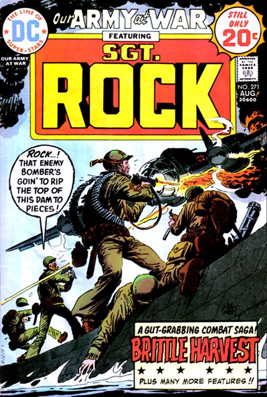
For years, I've had this persistent memory I learned to read from DC's Our Army at War #271, a book with art by the incomparable Russ Heath and a story by the inimitable Robert Kanigher. In the autobiographical film I constantly project in my mind, DC published it when I was three or four and there, on its pages, heretofore ignored ink marks inside the balloons coalesced into words, which formed into sentences and from there, the world of literacy opened to me.  Then I looked Our Army at War #271 up online and learned it has a cover date of August 1974, a mere month before I started first grade.  I was already six years old, and, according to family lore, I had already been reading for quite a while at that point.

So maybe Robert Kanigher didn't teach me mah letters, but I thought there was still a decent chance his story "Brittle Harvest," the book's Sgt. Rock-starring lead, truly was the first bit of fiction I read that didn't star a persistent weirdo with a fixation on oddly-colored breakfast foods.

But maybe it wasn't...


Jack Kirby/D. Bruce Berry, August 1974
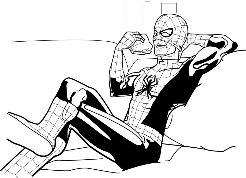
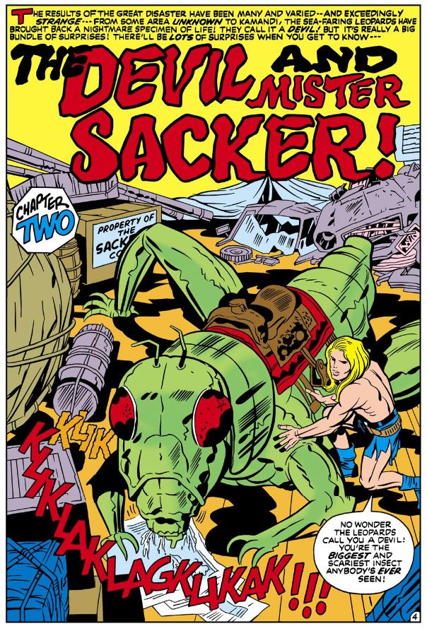
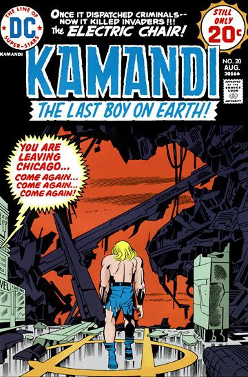
Because I also owned Kamandi #20 and Strange Sports Stories #6.  I could have sworn both of those came out a year or two later.  This week, I discovered DC published them that very same August.  August 1974 was a good month for me as far as comics go.

How did I manage to obtain three comics when my income consisted entirely of spare change I found under the sofa cushions or dove for in the deep end of the local Elks' Club pool?  Gifts, maybe.  I can't imagine what fool would give me three comics at the same time.  One, yeah.  Two is stretching it.  Three invites rumors of decadence, of profligate spending on a scale unheard of in our little clan during the Ford administration days of energy crisis and Whip Inflation Now. 

Or else I somehow managed to collect enough pennies to buy them myself.  Yet, I have trouble imagining any scenario involving either of my parents allowing me such an extravagance.  Again, one comic, maybe two if I'd been especially well-behaved.  Three would be, in my mom's words when I bought a second aluminum baseball bat during my "athletic" period years later when I actually had a job and income of my own, "Ostentatious."  My parents, both products of hardscrabble Depression-era childhoods, instilled in me a financial caution I maintain even now that I'm as rich as the guy on the Monopoly game box.  Even with their permission, buying three comics at the same time back then would have given me the same guilty feelings I get now whenever I pick up a new Rolls or sports franchise.

Whether from false memories of learning to read or from inspiring a lifelong love of Jack Kirby's work, each of these comics has stuck with me in ways I've learned are as foggy and treacherous as some jagged coast in an old sea story.  I once again own both Our Army at War and Kamandi, so I've read them recently.  In this way I've corrected a number of misconceptions I carried for years about their stories.

A physical copy of Strange Sports Stories, on the other hand, remains elusive and, therefore, its contents a jumbled mishmash of mistaken impressions. 

The cover is easy to find online, though.  Let's take a look and see what recollections it inspires.  Wow!  It's by Nick Cardy!  What a treat!  I've really underestimated myself all these years.  Kid me really had good taste in cover artists.


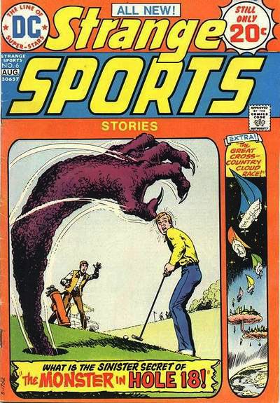
Nick Cardy, August 1974

Let's look at the cover copy.  Interesting story titles.  I thought so at the time, but I may have been alone there, since this was actually the final book in the series.  Another one of those failed DC experiments.

"The Monster in Hole 18!" inspires a vision of someone being pulled through the hole into an alternate dimension, his body grotesquely thinned and stretched in the process, leaving his midsection resembling a great noodle.  At least during the transition.  I'm pretty sure he came out the other side in whatever state for him passes as normal. 

I may be conflating this with the events of "The Great Cross-Country Cloud Race," which I believe is about a couple of young guys seriously into boating who travel into another universe where people race through the skies in little sailboats made from solidified clouds.  Perhaps these guys were the ones who went through a physically distorting transportation process of some kind. 

The cover suggests the book contains just two stories.  So why do I feel so strongly there was a third?  One about a young guy who injures his arm in such a way he can throw baseballs at ridiculous velocity, gets signed by a major league team and pitches in a game against a New York Yankees-type powerhouse club before crashing his expensive sports car and losing his magical pitching ability when the doctor re-sets his arm.  The same accident injures his hip, and there's a little matter of drop-kicking a football...

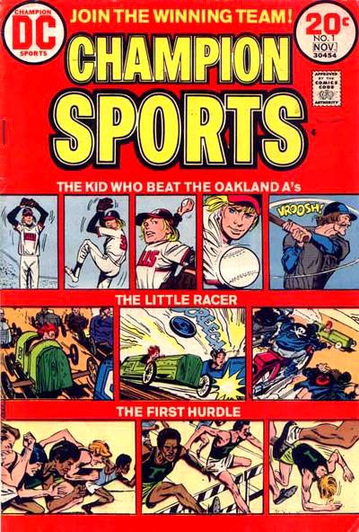
Jerry Grandenetti/Creig Flessel, July 1973
Let me see what I can find out about this.  Hey!  It turns out there is such a story, but it isn't in Strange Sports Stories #6.  We find it instead in Champion Sports #1. 

And it isn't the New York Yankees he pitches against and wins.  It's the Oakland A's.

That brings back a whole lot of memories!  The A's of the early 1970s featured a potent line-up centered around a hard-slugging clean-up hitter by the name of Reggie Jackson, and a pitching rotation starring Vida Blue, Ken Holtzman and Catfish Hunter (Rollie Fingers was on the team, too), each of whom won 20 or more games in 1973.  They beat the New York Mets in the World Series that year. 

My family hated those guys and their evil mustaches because we were National League fans and my oldest brother, a catcher himself, idolized Johnny Bench.  This meant we were Cincinnati Reds boosters, and they lost in the Series to the A's the previous year.  It didn't matter that my uncle had caught for the A's when they were the Kansas City Athletics and personally knew and greatly respected Hunter.

So, in fact, the story is called "The Kid Who Beat the Oakland A's," and I've just learned it's written by the great Joe Simon, drawn by the nifty Jerry Grandenetti, with inks by Creig Flessel.

And you can read it in all its glory on Diversions of the Groovy Kind, a super-cool website that's one of my favorites.  The Groovy Agent must be one of those people with eidetic memory.  He knows it all, baby.  He took the comic's tag line to heart and joined the winning team!

The "kid" is David Wexler, a would-be writer and sports nut.  He ends up enjoying a brief career in the Major Leagues, not as stellar as Catfish Hunter's or Vida Blue's, but still something to be proud of, especially the climactic event, which is spoiled by the title.  The most telling detail, though, is the caption towards the end, when the kid's swelled head leads to his comeuppance:  "You may have read about that game... What you didn't hear about was the dumb, wild things I did off the diamond."  It's a single sentence Simon uses to introduce the off-the-field aspect of big time sports, and gives the story a gritty background verisimilitude to help put across its rather improbable premise.  Shades of Jim Bouton's Ball Four (1970) and the stuff the newspapers didn't print about Mickey Mantle.

Which reminds me!  I could tell you a rather funny story involving my dad, my uncles, Mantle and Joe Pepitone down at spring training in Florida.  Maybe one day I will, but for now let me just tell you my dad swore me to secrecy and I've already told you too much.

What about the other stories?  Well, "The Little Racer" is about a soapbox derby kid who gets run over by a one-percenter motorcycle gang who then help him rebuild his racer with stolen parts.  He ends up with quite a hotrod, but his innate honesty causes him to revert back to his green wooden crate for the final race, which he loses but fairly and squarely.  Then the cycle dudes stomp him good, the same way the Hell's Angels did Hunter S. Thompson when they learned they weren't getting any of the money from the book he wrote about them.  Okay, I made that last one up.  The story thing, not the Hunter S. Thompson thing, which really happened.  The comic may or may not have a happier ending.  But even though our theme today is how crappy my memory is, I feel confident about its other details.

On the other hand, "The Last Hurdle" brings absolutely nothing to mind.  I'm guessing it has to do with at least one hurdle.  Perhaps a final one of some kind.  Literal?  Symbolic?  Shambolic?

No, that's this blog.

This has been a day for shocking revelations, hasn't it?  Let's conclude this mess with two more.

First, in December of 1997, the FBI investigated the possible theft of the artwork from this very comic, along with hundreds or even thousands of other pages.  The entire sequence of events found near the bottom of the document makes for some interesting (if difficult due to formatting and spelling errors) reading.  My oh my!  The things you uncover when you take a memory trip.  I'm completely flabbergasted.

And second, the answer to that nagging question that provides this post's title.  Champion Sports #1.  Look at this:  it has cover date of November 1973, same year the A's won their second World Series.  Diversions of the Groovy Kind puts its actual release date as July, which means, depending on their own street dates, it hit the stands more than a year earlier than Our Army at War #271, Kamandi #20 or Strange Sports Stories #6.

Champion Sports #1.  I was five years old when I read it.  It's now the earliest comic I can remember owning!

Spider-Man enjoys a delicious ham sandwich...


We all remember the theme to the 1960s Spider-Man show.  And some of you may have done the same thing a friend of mine and I used to do.  We made up our own verses and had Spidey doing little daily chores and other mundane activities: 

Spider-Man, Spider-Man
does whatever a spider can
takes a shower, goes to work
comes back home, takes a nap
LOOK OUT!
Here comes the Spider-Man!

We came up with approximately sixty thousand verses.  That's what inspired me to do this laid-back wallcrawler.

Wednesday, March 12, 2014

Tales to Astonish #82 (August 1966): I bought this for Gene the Dean, found Jack the King!

Tales to Astonish #82 (August 1966)  Pencils: Gene Colan,
Inks: Dick Ayers (according to Comic Vine) 
Well, that was a pleasant surprise!  I recently bought a digital handful of Marvel Comics superhero books by Gene Colan.  Some people were talking about him on Facebook the other day and I suddenly developed a hunger for his work.  And also for one of those old Marathon bars, but you can't buy those on Comixology. 

Anyway, my appetites aside, Gene Colan is one of my top five or six all-tme art heroes, a guy I've tried to imitate in my own art however futilely.  While I own a DC hardcover full of Batman stories by Colan, and I know he was responsible for a storied run on Daredevil, I tend to think of Colan as more of a horror artist because of his stellar art on Marvel's Tomb of Dracula and for Warren Publications.  After reading all that jazz from people way more knowledgeable than I about this stuff, I decided it was time to fill a gap in my education and study up on his superhero work.

Well, I already knew Colan for a horror master.  Love his moody, shadowy imagery and the extreme figure foreshortening because he chose very unusual "camera" angles.  He was incredibly cinematic, with a strong feel for intense drama and noir-ish lighting.  So I was really looking forward to reading this and seeing how he put that to use in one of those two-character long-underwear dust-ups printed before I was born.   I opened to the splash, scanned the credits to see who inked it (inking interests me lately) and got a surprise.  After the cover, there are only two pages of Colan in this book!  But we're not going to complain because after those two pages it's none other than Jack Kirby the rest of the way.
 
Tales to Astonish #82 (August 1966) has a Stan Lee plot and a Roy Thomas script, and it's a continuation of a fight started in another title, which is easy to confuse with this one, especially since their numbering runs so close together.  I'm talking about Tales of Suspense #80, which also has Lee's and Kirby's famous "He Who Holds the Cosmic Cube!"  I say it's famous because it's a Captain America story I read many years ago in the book Captain America: Sentinal of Liberty.  All the stories in that book are famous because Stan Lee says so.

Anyway, Captain America isn't in this.  It's just Iron-Man and Namor.  Their story starts over there, continues here in this one, then goes of into another comic.  I haven't had time to sit down and really give Tales to Astonish #82  a reading, but just from staring at the art, this story, called "The Power of Iron Man!," is a frenzy.  Just two characters duking it out.  I have no idea why, don't really care all that much.  I'm downloading it into the Comixology iPhone app as I type this, so I'll read it in those scant free moments I'm not shaking the earth and building a better future or whatever the hell it is I do.  I don't really wax nostalgic over things like two characters having a fight, or that this is "the first real inter-book crossover."  I'm more interested in the artwork by Colan and Kirby.

Despite Dick Ayers' inking, it would be obvious we've got two very different pencillers even if we haven't read the helpful credit boxes on the splash page which tell us Colan came down with the flu and Kirby had to take over.  I wonder if that's really the case, or if this is one of those cute jokey things Stan and Roy liked to use as an easy explanation for some other chain of events they didn't want us to know.  Seems likely enough, much more so than Kirby drawing the book then asking who the Sub-mariner is, but that's the claim here, too.

Here's where Iron Man hits Namor the Sub-Mariner so hard they both turn from Gene Colan figures...

Script:  Roy Thomas, Pencils:  Gene Colan, Inks: Dick Ayers
... into Jack Kirby figures:

Thomas, Pencils: Jack Kirby, Inks:  Ayers

Jagged purple "KRAK!" is the sound of metal-clad fist striking flesh and bone chin.  Earthquake-like yellow and blue "THOOM!" is what happens when fish-guy knocks armor-guy through a wall. 

In the Colan panel, notice how Iron-Man's weight is planted on that front foot.  Most of his body is moving towards Namor in the foreground because he's put everything into one massive hay-maker of a blow, which landed a split-second or so before Colan "photographed" this moment.  Even though he's still able to talk, Namor is flying upwards and backwards with his right foot dangling loosely.  This is follow-through, the impact completed, an interesting split-second between the moments of collision and release and much closer to the latter so the figures are opening up, becoming loose-limbed and extended, although I imagine Iron-Man's left thigh is clenched because he's planted that foot and is stopping his forward momentum with it.

Now look at Kirby's panel.  This isn't follow-through.  This is the exact moment of impact.  Namor has punched Iron-Man with a more compact body-blow.  Notice the rigidity of Kirby's figure drawing here.  Namor lowers and draws in his chin, which means his chest and abdominal muscles are clenched, tense.  He's still performing the action itself.  In Colan's, taking place nano-seconds after the action, we see Iron-Man's fist.  In Kirby's, at the moment of impact, Namor's fist has vanished in a white starburst.  And Kirby either gives us two time differentials here or else that punch is so powerful, the transfer of kinetic energy has already thrust Iron-Man through the wall in exact moment Namor landed it!  It seems impossible, two states at one time, but there you have it.  Also, like Namor before him, Iron-Man flies backwards from blow, but Kirby puts his upper body into a kind of defensive posture, arm raised to protect his face, while the other arm goes limp and he appears to be drawing his legs up so that he can land in a ball on the other side.  Or the fetal position.

Colan's is kind of athletic and even graceful, Kirby's is as hard and bone-shattering as two cars in a head-on collision.

These panels come a couple of pages apart.  I just wanted to show you one of Namor's answering blows because it wouldn't have been fair to give Iron Man two consecutive shots.  The art switch is just this abrupt, though.  You get that Iron Man punch at the end of one page-- and I find very entertaining Thomas's characterization of Namor as the kind of cool customer who can fall backwards after a sock to the jaw and still find it in himself to make a sneering speech about how Iron Man's "crushing defeat draws nearer with each fleeting heartbeat"-- then the very next page starts with a Kirby-drawn panel of Iron Man shooting his "repulsor rays" right at us, the readers! 

What gives?  Aim those things elsewhere, buddy!

Since I was born a generation later than the kids who bought these issues new off the stands, stories like these were hard to find unless they popped up as a back-up feature in an annual or else in one of those hardcover collections at the library.   The ones that were constantly checked-out and never available.  Or that Sentinel of Liberty book I was just telling you about, which I bought at Waldenbooks at our mall along with one about Dr. Strange. 

We didn't have all the archive reprints and essentials and, of course, digital comics had yet to be invented.  I didn't have the disposable income to buy swanky back issues, and I probably wouldn't have been inclined to even if I did.  There were always new comics to buy.  And living in a small southern town, I was largely isolated from fandom at large and things like fanzines and mailing lists.

This means I don't have an encyclopedic knowledge of storylines predating my interest in comics, nor do I know a whole lot about the inner workings of Marvel or DC or who drew or wrote what when or where.  It also means every time I go on a Gene Colan or Jack Kirby rampage, I'm liable to find stuff completely new to me.  I like that.  The joy of discovery!  The joy of turning a page drawn by Gene Colan and finding the next one drawn by Jack Kirby!

Oh, and there's a Bill Everett-pencilled Hulk story as the back-up feature, and that looks pretty cool, too.

Monday, March 10, 2014

I bought Mike Allred's Red Rocket 7 on Comixology last night...

Man, I remember when Red Rocket 7 came out.  1997.  It's right at the tail end of what I consider appropriate for this blog-- pre-2000 stuff.  I try to keep to stuff even earlier than that, largely the late 70s through the mid-80s when I was first following comics as a fan rather than an occasional reader.  But why not talk about some late 90s/pre-millennial stuff?  You know, if it's really funky and cool.  Like Red Rocket 7!

Anyway, I'm about to tell you a fun story about buying the original print version of Red Rocket 7.  I didn't start buying it until later, much later, than its debut.  I believe this.  I may be wrong.  I think I started buying it in the summer of 1998, after its print run concluded.  The reason I think this is I have a strong memory of buying it in Athens, Georgia, and getting into a discussion about its weird dimensions.  If I had bought it in Albany, the people there wouldn't have said boo about it.  People in Athens have opinions about things and they like to engage with you about said opinions.

I didn't move back to Athens until the summer of 1998.  I lived in a one-bedroom apartment off Baxter Street and the A/C was a wall-mounted unit in my bedroom.  It sounded as if someone had cranked up a VW Beetle in there, barely put out any cool air at all, caused me to buy two box fans which further contributed to my localized noise pollution and kept me up all night with the sweats.

My job was as a "graphic designer" at the local daily paper and I was supposed to be sort of an on-staff cartoonist as well, but mostly what I did was put together used car ads I had very little say over the design of all day then drive home and read comics and try to draw, draw and draw more at my lovely drafting table in the sweltering sauna I called an apartment. 

My salary was dismal, my career prospects even more so.  My social life consisted of crashing parties with the few friends I had and eating food out of the refrigerators or popping microwave popcorn and having fights with it in the kitchen.  These friends and I sometimes crashed tailgate parties outside Sanford Stadium during football season got on free beer and stuffing our faces with free chicken sandwiches and hamburgers, and, when everyone else had gone to watch the game, stole all the whiskey fifths we could get our hands on and passed them out to homeless people on North Campus like liquored-up, idiot Robin Hoods. My romantic life consisted of mooning over this incredibly cool and well-connected artist and her hair of ever-changing shades of red, who sometimes talked to me and sometimes ignored me depending on her mood or what drugs were influencing her that night. 

What little money I had in those days I spent on Chinese buffet, beer and comics.  Comics, especially those by Mike Allred and Mark Schultz and Los Bros Hernandez and Peter Bagge, were fast becoming an obsession with me again after years of remission.  So of course I wanted to read Red Rocket 7

But when I bought it, the guy who owned the comic book store told me it pissed him off.

"Why?  Why would it piss you off?" I asked.

"The size and shape are totally fucked up!" he told me.

I was standing there thinking what a neat little package Red Rocket 7 was.  It had these sturdy covers of some kind of thicker-than-usual stock, and both the graphics and dimensions recalled 45 RPM records, of which I still had a stack of back at my mom's house.  The comic book store guy told me he got all that and thought it was pretty clever and would always be enthusiastic about Allred's work, but at the same time, the size and shape it meant the book sat like an oddity on the shelf.

Maybe it affected sales.  I don't know.  For all I know, Red Rocket 7 sold billions of copies.  Maybe the comic book guy was upset at the idea people would reject Red Rocket 7 because they couldn't fit it in their comic book longboxes and that was a downright shame, because it deserved a much wider readership.  Maybe I destroyed my memory with a few too many drunken weekends-- god knows I can't remember much about any of them but I hear stories that fill me with shame-- and I'm making up most of this story out of bits and pieces of things that have nothing to do with Mike Allred and Red Rocket 7.

Still, nearly sixteen years later, I'm fairly certain the book's size and shape were at issue.  And for some reason, I never bought every issues.  I think I bought the first four or five, then stopped.  I have no idea how the story ends.  And I do know now that it's been digitized, its size and shape no longer matter in the least.  It fits right inside my phone and I can take Red Rocket 7 everywhere I go.

Now I do own all of it, and if I feel up to it, I'll post some thoughts about it here.  It will probably be the most recent comic we wrestle with on this blog.

Sunday, March 9, 2014

Dying is easy, inking is hard.

Okay, so I told you cool cats about the Jack Kirby FB page full of Kirby-loving fans and professionals.  You're probably a member of it now, just as I am.  Over the weekend, the first big brouhaha broke out there over people posting their inked versions of Kirby originals.  Details, smetails, we don't need to rehash the details.  I don't plan to post anything I've touched there.  That's too close to "While I have a few pros on the line here, take a look at me, give me a job!" for my taste.  The Mighty Kirby Try-Out Book.  Seriously, I think for a lot of the non-pro posters, they're doing it more from love for Kirby than any sinister, ulterior motives but I can't help the little twitch I get from it.  I fully admit this is more than likely projection on my part, but I don't want anyone to get that same idea from anything I might post there, which is yet another reason to keep my art to myself when hanging out in that crowd.

But of course as an artist, I'm curious about what it felt like to ink Jack Kirby.  And with all the pencil postings there, how could I resist giving it a go?  I couldn't and I've learned a lot from spending a big chunk of my Sunday afternoon trying to ink Jack Kirby.  The first thing I learned is I stink at inking.  Whether it's over my own pencils, or those of Jack Kirby or Jack Tatum*, it doesn't matter.  I am no inker.  Which leads me to the second thing I've learned, which is people who can ink deserve our respect and gratitude for the work they do.  Inking is a difficult job.  It requires a lot of mental effort.  A lot of thoughtfulness.  Careful consideration of not just thick and thin lines but form and lighting and mood.  And reproduction.  It helps if you're familiar with pre-press.  Only in the last do I have any measure of experience and I'm rapidly forgetting all I used to know.

*The Assassin.  I doubt he ever drew a picture in his life.

Thursday, March 6, 2014

Mike Royer and Chic Stone: My two favorite Jack Kirby inkers...

Someone asked Kirby fans their favorite inkers.  You know the usual suspects:  Joe Sinnott, Frank Giacoia, Mike Royer, Wally Wood.  I always enjoy reading those names.  They evoke the wonder and joy of discovery that comes when you're a youngster reading comics and the credits begin to mean something to you.  The writers and artists become characters in your imagination just like the superheroes whose stories they tell.  Many people gave very thoughtful, insightful responses, and there are few things more pleasing to me than people talking about art they love and giving reasons why they love it.  It puts me in a good mood.

I'm not going to complain about anyone here.  There aren't any inkers whose work on Kirby I absolutely reject.  I can think of good things to say about all of them, lots of positives.  But like anyone, I have my own favorites.  The ones that ring my bell more than others.  And I don't think my choices are particularly avant garde.  But since I have a blog and a big mouth, I'm going to share them with you right now.

Mike Royer is my top Kirby inker.  This isn't any big surprise.  He's a top pick of a lot of Kirby fans.  It's not enough simply to show fidelity to the pencil lines.  A lot of pros and amateurs can run ink over Kirby's pencils and come out with passable finishes.  But simple tracing in ink can flatten forms sometimes kills the energy and Kirby, if anything, is all about kinetics and energy.  While Royer is very true to Kirby's lines, I think he gets the intent right, and his own top-notch drawings skills means he understands the roundness of physical form and can fix little things where Kirby goes astray.


Kamandi #12 (December 1973) by Kirby and Royer
 
And face it, Kirby's take on anatomy is peculiar to Kirby.  It approaches the abstract at times, with flattened s-forms standing in for all kinds of muscle shapes and drapery folds.  Royer has the ability to make sense of it and give us something that's very Kirby on one hand, and very "readable" on the other.  I've seen some complaints about his lettering-- especially the bold, display "fonts"-- but I dig that stuff the most.  It all goes together into a complete package, very of its time but, as a result, timeless in that it's not faddish.

My second favorite is a little bit of an oddball choice, ever so slightly.  It's Chic Stone.  While Joe Sinnott slots in at #2 for a lot of people who also put Royer at #1 (and Giacoia is also a popular second choice), I find Chic Stone's cartoony interpretation of Kirby's pencils to have the most of that elusive concept we call "appeal" of any Kirby inker.  Stone's inks bring out the pop art fun inherent in Kirby's mid-60s Fantastic Four work.  He, like Royer (and Sinnott and Giacoia), could actually draw on his own, so he's not simply tracing the lines.


Fantastic Four #37 (April 1975) by Kirby and Stone

It's not that I find him "better" than Sinnott or Giacoia and I'm not trying to argue anyone out of those as their choices.  It's that my sense of aesthetics responds more joyously to Stone's interpreting Kirby through an almost animation-art lens.  So we get these thick contour lines and finer details within them, and large, open areas for color.  Stone is a master of creating depth of field this way.  It's not as slick or as pretty as Sinnott, but that only adds to its charm.  Sinnott inked my single favorite Fantastic Four issue, which is #51 with the classic "This Man, This Monster" story, but Stone inked my favorite extended run of issues.  Again, while the Stone look places the work very much in its mid-60s timeframe, it's successful both as a historical document and as something that exists outside of time. 

Like a Sean Connery Bond flick (which, along with this era's Marvel comics, are the epitome of 60s cool), or the Beatles or anything from Motown.  These are things to which artists return every generation or so for inspiration.  Each time they do, they energize their own works with the good feelings associated with these classics.  Jack Kirby is that guy for comics, especially with Stone finishes.