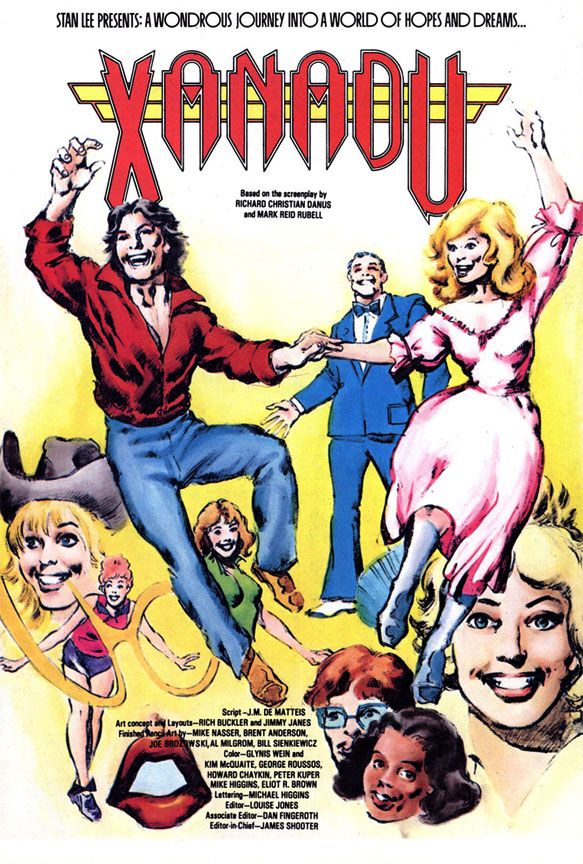
This is my pick for the best of Marvel's movie adaptations, and it's as good as mainstream comics get. First, it's an adaptation of the best of the
Star Wars movies and second, it's an adaptation of the best of the
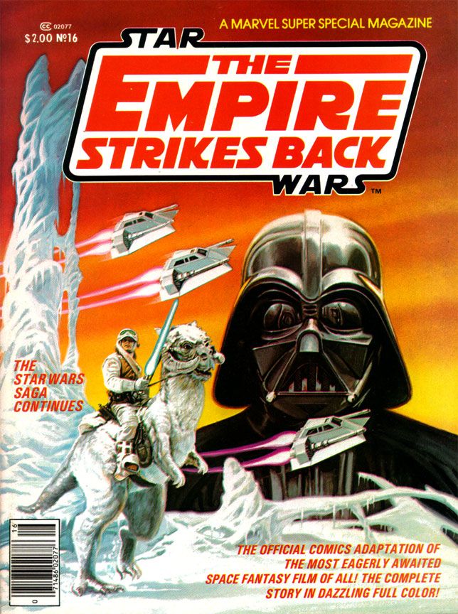
Star Wars movies written by Archie Goodwin and drawn by my all-time art dream team, Al Williamson and Carlos Garzon, and with another of those beautiful Bob Larkin cover paintings. I'd put it up there with any other comic Marvel (or DC, for that matter) has ever published. This comic should be taught in schools.
I reached the highwater mark of my Star
Wars love in 1980. I
turned 12 that first year of the Reagan and Alex P. Keaton decade, which was
about the time other things began occupying my mind. But I was still childish enough to play with
the toys and create my own Star Wars fantasy adventures with the Kenner figures
and Millenium Falcon playset in the yard.
And I was adult enough to have become interested in the film making
process itself, able to enjoy movies not just for their stories, but also for
the craft and artistry behind the scenes.
Reading magazines like Starlog and Fantastic Films and learning the
names of people like Ralph McQuarrie, John Dykstra and Richard Edlund, plus
terms like “go-motion” and “blue screen,” I began to have a growing
appreciation for the mechanics of its creation as well.
This, then, was the perfect time to discover Al Williamson and, to certain extent, Archie Goodwin. These are two names I've come to associate with all things Star Wars as much as I do George Lucas, Mark Hamill and John Ratzenberger. It may seem crazy to you reading this now-- at least as crazy as any dumbass thing I've written in this blog-- but I’d
never even heard of Williamson or Goodwin before I saw their names in the credits of Marvel Super Special #16. While Goodwin's script hits all the right story points at the ideal pace for a comic with this page count, with terse narrative captions to help move things along, Williamson's art literally changed my life. My appreciation of comic book art consists of pre-Williamson and post-Williamson eras.
All of his EC and
most Warren work came before I was even born, and our local newspaper tended more
towards Beetle Bailey and Garfield than adventure strips. Or paper did run Alley Oop, Steve Canyon and Dick Tracy, the three non-gag strips
they did choose to run, plus my dad got me into Gasoline Alley (not an
adventure strip but still one with a narrative like those others). So I didn’t know
anything about Secret Agent X-9, or, as it came to be called, Secret Agent Corrigan. Where would I have learned about Al Williamson? He didn't draw the Hulk or Spider-Man, for crying out loud!
So when this book hit, as far as 12-year-old me could tell, Al Williamson came into our banal world from some magical extra-dimensional wonderland where romantic adventure and heroic action were as part of life as blood itself and made this comic just for me.
Williamson’s art was more than a revelation. It was a rebirth.
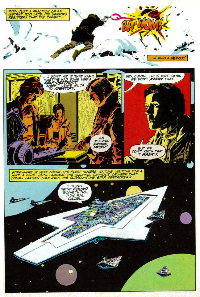 |
| Script: Archie Goodwin/Art: Al Williamson and Carlos Garzon |
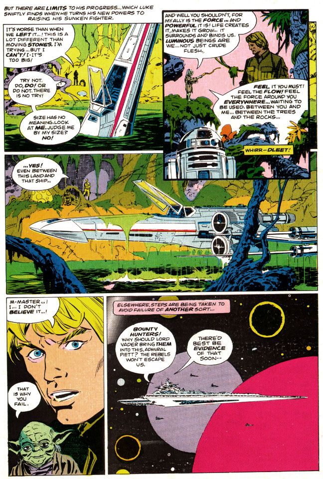
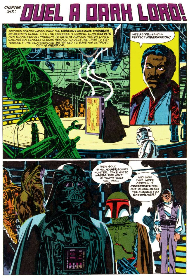
The man painted with ink. To create the effect of
reflections on metal, Williamson used blobby black strokes of varying pressure. For atmosphere and depth in the backgrounds
of different scenes, he used thin parallel lines for a sfumato-like
effect. He spotted blacks throughout,
emulating the film’s cinematography, as many scenes take place inside the frozen rebel base or the industrial back-rooms of Cloud City where light comes from computer screens or from behind machinery.
He expanded on the film’s planetscapes and made them imaginatively
otherworldly in a way location shooting on a glacier in Norway just couldn’t
match (and Larkin wisely copies him on the cover). Obviously, Lucas couldn't spirit his cast and crew away to Hoth in another galaxy. But Williamson could and did.
And best of all, not only did
Williamson's star warriors look like the actual actors rather than their stunt doubles
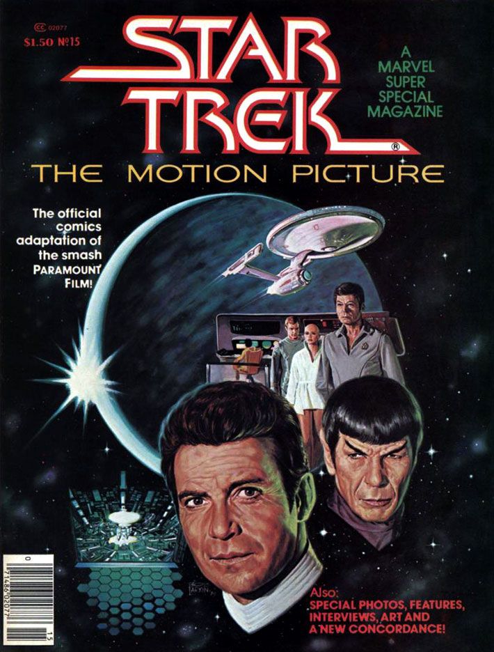
or stand-ins (as had the characters in many of Marvel’s previous movie
adaptations, Star Trek the Motion Picture aside), but the way he posed them and placed them within all those wild environments exactingly duplicates mood and feel of the movie itself every time you read this comic.
I’d seen movie comics full of pretty art, some of which I've praised in this blog (and justly so; they're fantastically fun) with dazzling light
effects and plenty with storytelling that perfunctorily or even adequately reproduced a movie’s action without that feel, without that authenticity of experience. Goodwin, Williamson and Garzon put all the genuine excitement of the real The
Empire Strikes Back right in our hands, in the medium best suited for George Lucas’
epic. Star Wars came full circle back to the halcyon days of Flash Gordon in the funny pages, one of its prime inspirations.
The only odd note-- and I find it charming and story-book like-- is Williamson's version of Yoda, who looks his familiar, chubby self in closeups and then becomes a tiny gnome-like creature with spindly legs in wide-angle shots. Williamson never quite figured out Yoda's scale, but at least he made everyone's favorite sentence-reversing Jedi puppet more ambulatory than even a genius performer like Frank Oz could holding him up from underneath the swamp sets. And more wizardly. Merlinesque.
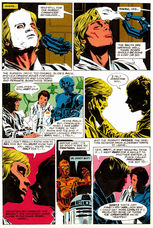 |
| Script: Archie Goodwin/Art: Al Williamson and Carlos Garzon |
You can look at the artwork and see Williamson used quite a bit of photo reference. In lesser hands, this can freeze a comic story, especially when an artist chooses to draw from studio portrait shots rather than action scene stills. Williamson expertly blends these images onto the page so each is like a fabulous collage when looked at as a whole, but flow naturally when read panel-to-panel. Williamson gives us carefully crafted moments like the two-panel sequence where medical droid 2-1B pulls the pharmaceutical mask off Luke's wampa-ravaged face. He could have rendered it as a single panel, with all of 2-1B's dialogue carrying the action, but instead he chose to give it a bit of animation.
Notice I'm talking only about Williamson, but there's also Carlos Garzon. To be honest, I can't tell where one ends and the other begins. I just see this Williamson-esque art job that matches pretty much all the other ones I've seen. Many of which probably were in collaboration with Garzon. Anyway, whichever artist did whatever part of the artwork, it's seamless and I like it. So let's give Garzon his props, even if I'm too ignorant and unschooled in his contributions to point out any specific examples. There are probably other blogs for that. I should be reading them. So should you. Probably a better use of our comics-loving time, right? Let's go! Go! Go! Go!
Okay, he's gone. I'll join him after I finish gushing about
The Empire Strikes Back like a dizzy fool drunk on love.
Oh, and at this point I should also make mention of Glynis Wein's superb coloring job. Wein used a screen-accurate palette that enhances the comic experience rather than making you smirk at oddball choices like the red lenses in Darth Vader's mask and the strange orange mottling in Chewbacca's fur from the first Marvel Star Wars comic. Wein would make entire figures two shades of orange to recreate the spacey glow of Rebel Alliance technology when our heroes conferred in control rooms and on spaceships, and apply appropriately chilly blue shadows to the snowy exteriors of Hoth or give the swamps of Dagobah a slimy look in greens and pale oranges. Wein's pastel planets and moons help give depth to the imagery of mighty space fleets lumbering along, but where her work really shines is during the light sabre duel between Darth Vader and Luke Skywalker. The film bathes their battle largely in oranges and blues, at least when the two fight in the "carbon freezing chamber" where Han Solo gets encased in a block of metal. Wein follows suit but she also adds some nice greens and yellows to make it work better in two dimensions.
 |
| Script: Archie Goodwin/Art: Al Williamson and Carlos Garzon |
The very day I read The Empire Strikes Back, I immediately stopped copying every other artist and became simply a Williamson imitator, in as much as my clumsy hands could
make me so. Any one of my comic book art idols represents an impossible standard to which an artist can hold himself or
herself, but even more so with Williamson.
I doggedly spent the next three or four years laboriously filling
sketchbook after sketchbook with really shitty Star Wars drawings, thinking all
the time I was getting somewhere with my art. While I later found other artists to fail at
emulating, whenever I had a sketchbook and a pen or brush, I’d still find myself pulling out some
Williamson stuff and doodling away, futilely trying to match his supreme figure
construction and posing, and lush, sinuous line quality. Even in my graphic design program days at the
University of Georgia my professors would look at my homework and occasionally
come across something that looked as if Al Williamson had drawn it with the
brush held in his teeth, or sticking out of one ear.
 |
| Script: Archie Goodwin/Art: Al Williamson and Carlos Garzon |
Even now, Williamson remains one of those
go-to guys whose work I feel compelled to collect. Williamson, Alex Toth, Jack Kirby and Steve Rude. Whenever their stuff appears in purchasable form, I will be there. Right now Dark Horse keeps much of Williamson's Star Wars work with Goodwin in print both in paper form and digitally. With the license reverting to Marvel in the wake of Disney's massive Lucasfilm purchase and upcoming new trilogy, I'm not sure how long this will be the case. Fortunately, I've got it all.
And you know what? I’m not even a huge Star Wars nut anymore. The intense, religious-like fervor of its
fans and the oversaturation of all things Star Wars on the Internet and on the shelves in book and toy stores across the world (and also the law of
diminishing returns as it applies to the film story’s recent, tragic extension)
have all tarnished the brand for me. And
brand is the right word. McSkywalker,
now serving number two billion.
But it
seems all I have to do is pull out the Al Williamson The Empire Strikes Back and
I’m 12 years old again and everything is suddenly wonderful in a way it had
never been before, although there had certainly been wonderment. With Al Williamson, there's a purity to the work that ensures there will always be wonderment.

 Aren't you supposed to go from the ridiculous to the sublime? Well, here we are going in the opposite direction.