Thursday, January 27, 2011

DC Draws the Line!


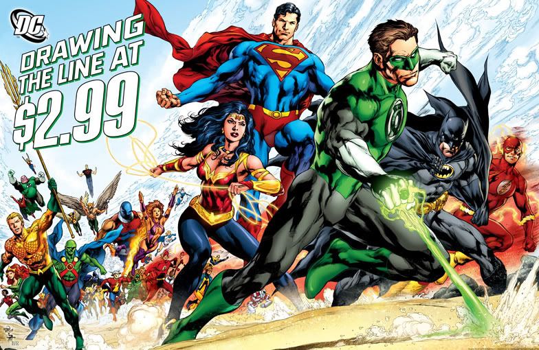
And you can tell they're serious about it because all their heroes showed up to watch Green Lantern actually draw that line in the sand! The last time anybody was this fired up about lines in the sand, we got a whole bunch of commemorative bubblegum cards, belt buckles and the inciting event in The Big Lebowski, man!

What is this line? Why is it in the sand? Could Green Lantern pull a similar trick with his name in the snow? What's this all about? DC has vowed to hold their titles at 2.99 rather than 3.99.

"This announcement reaffirms DC Comics' commitment to both our core fans and to comic book store retailers," said Jim Lee, DC Comics Co-Publisher. "For the long term health of the industry, we are willing to take a financial risk so that readers who love our medium do not abandon the art form."

According to Dan Didio, some people said 3.99 for a 32-page comic book is too expensive-- and when the accountants finished crunching the numbers, he agreed. I think 2.99 is too expensive for most comics, but I'm also willing to shell out about 10 bucks for a copy of Yazawa Ai's Nana, or 14.99 for Love and Rockets New Stories. It's a matter of perceived value.

I regularly buy Dark Horse's Conan the Cimmerian, and while it has 22 pages of story, same as any DC monthly, it feels more substantial. Some of this comes from the heavier paper stock Dark Horse seems to use for the covers-- but I also derive the feeling of a "cheaper" 2.99 book from the overall quality. Timothy Truman's writing is pulpy and substantial, the interior art is gorgeous to behold, there's a letters page in the back and even fan art and pin-ups. Plus, that "The Adventures of Two-Gun Bob" comic strip feature.

I applaud DC for drawing this price line, but I also want to see them one-up my beloved Dark Horse and pack in the perception that I'm getting a bargain for my 2.99 via better storytelling. Cover price aside, I've rarely bought DC books over the past few years because I haven't enjoyed the darker storyline direction or the way they've abruptly discarded characters I've forged emotional connections to. I've long thought Identity Crisis was a rotten piece of crap (other than the artwork, that is) and all these Crises and Identities and Countdowns and whatnot have just seemed to entrench that kind of off-putting storytelling. I wouldn't pay .29 for those books, much less 3 bones.

They should also take another cue from Dark Horse and also from Robert Kirkman's Walking Dead series over at Image, which retails for the same 2.99 minus the color but is still more than worth it not only for the compelling story but also for the heavy-duty letters page and the creator-fan give and take. It's participatory. Even though I haven't written a letter, I feel my involvement in the characters is being validated by Kirkman's recognition of his readers' concerns. He might occasionally give a smart ass answer to said concerns, but it's all in good fun.

Anyway, thanks for the (kinda) price break, DC. Now let's see you build on this by making the contents of those books more fun and involving. That's how you keep fans like me from "abandoning titles and characters" we've read for years. I might also remind you that I didn't abandon my favorite title-- Batgirl. You took that away from me.

Oh, and try to avoid killing anyone off for a while. That's been done to death.

Wednesday, January 19, 2011

Is this your idea of Spider-Man?

Go ahead, click on it and check it out. Spidey won't bite you. It's the first official image of new Spider-Man/Peter Parker Andrew Garfield in costume-- and in deep emo mode, apparently.

It looks like a modified version of Tobey Maguire's costume; all textured in the modern movie tradition. Plus, Puny Parker looks like he's been dumpster diving or installing big block V8 engines all day and now he's heading home for a much-needed shower. Long and lean Spider-Man, huh? I won't know how much I like this look until I see the movie.

But for now, slap some corporate branding and a title logo on it and this image looks like it could be the cover right off a Marvel monthly-- the work of some hotshot Photoshop jockey artist-of-the-moment who eschews dynamism in favor of photorealism. Garfield's mopey face looks very Parkeresque, and the mood's right. Spidey's stories have always had ample portions of soap opera-style melodrama. I just hope he cleans himself up and starts mocking his enemies like a gymnastic Ricky Gervais at some point. I prefer my Spider-Men in pristine condition and in full-on smartass mode. And imagine what the poor guy smells like right now!

Monday, January 10, 2011

Saturday, January 8, 2011

More Judge Dredd!

I could really get rolling on Joe Dredd (and his tragically corrupt twin brother), and maybe I will. I was such a fan of Eagle Comics' Judge Dredd reprint book at one point, I talked my dad's best friend's wife-- she was a native of the UK and a naturalized US citizen-- ask her relatives to send me issues of 2000 A.D. I was the only kid in south Georgia in the early-t0-mid 80s who was a regular reader of the "Galaxy's Greatest Comic!" They didn't put out issues, the released "progs."

Unfortunately, the writing was in a kind of moribund phase and I didn't find any of the storylines particularly compelling. Nothing came close to matching the classic "Judge Cal" storyline, or the "Judge Child Quest" or the time Dredd had to drive this huge armored vehicle across the Cursed Earth-- a post-apocalyptic wasteland full of poisonous rats, horrible mutants and malfunctioning technology left over from previous eras-- to deliver medicine to Mega City Two out on the west coast. I did have the Special with "Block Out at the Crater Bowl," with art by none other than John Byrne, though. That was a pleasant surprise, because I was a big Byrne fan then, too.

The point of all this rambling is-- here's a cool blog review of Medicom's Stallone-as-Dredd figure from 1995. 1/6th scale action figures weren't as popular in 1995 as they are today. Assuming they're still popular; I dropped out of that racket a few years ago when I stopped being able to afford them. I do know some of the stuff Hot Toys puts out looks almost museum quality, though!

Friday, January 7, 2011

Is this your idea of Judge Dredd?


I'm sure the fans have already picked over this carcass, but here I am a couple of months later to offer my completely valueless opinion on the new Judge Dredd movie, which apparently is called Dredd and stars Karl Urban as the title character and Juno's best friend Olivia Thrilby as Dredd's... best friend, Judge Anderson.

Do you like Dredd's new law-togs? I think they're a vast improvement over Sylvester Stallone's ridiculous outfit from 1995's justifiably-maligned Judge Dredd. The new suit isn't comic-perfect but it does have that Euro sci-fi styling, a kind of Moebius-lite the early Dredd strips had in 2000 A.D. Reminiscent of his production design work on Luc Besson's The Fifth Element, too. I know Moebius didn't have a damned thing to do with the Judge Dredd comics, but I've always gotten a similar vibe from his costumes with their funky helmets and knee-pads and those in Dredd. And in my mind, they've conflated into this concept of "Euro sci-fi," which had its greatest cinematic expression in Besson's movie. And this image. Which I like.

Take a deep breath, Justification Boy!

And yes, I've seen some of the Photoshop jobs floating around where dedicated Dredd-heads have slapped Urban's mug under a helmet of almost 100% comic book accuracy, along with a uniform to match-- and those look pretty stupid. Even stupider, in fact, than Stallone's ridiculous garb.

Thursday, January 6, 2011

The only Six Million Dollar Man comic book I ever owned!


Here's the cover, courtesy of Comic Vine. The Six Million Dollar Man #5, published by Charlton Comics Group. You just couldn't find these in my hometown. And while all the boys at my elementary school were hardcore fans of Col. Steve Austin and his various cyborgian body parts, we never really warmed up to his four-color adventures. That was probably at least partially due to our prejudice against Charlton's magazines, which were considered vastly inferior to those from DC, Marvel and even Gold Key.

The cover art is pretty dynamic, it does give away a large portion of the composition to some generic motorcycle guy with little or no charisma-- hunting rifle notwithstanding-- while foolishly relegating the star of the book to the lower left hand corner where he suffers the further indignity of having his torso stamped over with a UPC code. Even the cycle jockey in the background can't believe his eyes! Far freakin' out! The Bionic Man should be the central design element on the cover of his own title, man! Even if he did just clobber me and trash my bike!

Charlton's cover typography was never all that attractive, nor was their use of conjoined circles in kind of a full-bleed configuration. They make a visual irritation up there, kind of a tangent you'd generally want to avoid. Frankly, it makes the book look cheap compared to the big publishers. Charlton books always looked sheepish in the spinner racks, as if they knew they couldn't quite cut the mustard alongside Batman, Superman, The Amazing Spider-Man and Fantastic Four.

I'm sure Sgt. Rock told them to "Buck up, mister. It's a long war and the fella in the foxhole next to you needs to know he can count on you." But as a longtime veteran of the war for readership-- a vicious, bloody struggle of attrition that continues to this day-- Rock knew the score. Charlton just wasn't going to make it. Sooner or later, it would break under the strain and either do something foolish like bolt during an artillery barrage and get itself killed or else just start sobbing and wetting its pants and have to be evacuated to the aid station for combat fatigue. Poor Charlton. They never should've drafted it into this man's comic book army.

What the hell am I talking about? Oh yeah, The Six Million Dollar Man #5. The interior art by Jack Sparling was pretty sweet and I remember especially admiring how he drew these incredibly lush eyelashes on the female characters. Col. Austin resembled Lee Majors, which was a plus. The plot had something to do with invisibility and a Las Vegas showgirl and there were a few moments of wry humor but, overall, it just didn't have that much of an impact on me as a kid. It remained just an oddity in my collection, along with those freaky Spire Archie comics the youth minister at our church gave me when I had my tonsils out.

I never saw another issue of Charlton's The Six Million Dollar Man after this one-- and despite its being labeled #5, I felt pretty sure at the time it had to be a one-off thing and any indication otherwise was some kind of con job or mail fraud or something. Then again, I never looked all that hard for this book. I was too busy reading Sgt. Rock.

But after all this time, I'd love to snag another copy of The Six Million Dollar Man #5 and see if the mental images I'm experiencing while writing this bear any relationship whatsoever to what's really inside its pages. I'm usually so wrong about these things!