That's the best news I've had all day. Granted, it's still early and this is pretty easy to top. My favorite quote:
I pushed Batman as far as he can go and after a while he stops being Batman.
True. But that was around 1985 or so when you first started writing Batman as a twisted, fascistic psychopath, Mr. Miller.
Really, this idea was horrifically misguided in the first place. As Miller says, having the Riddler running around is "silly compared to what's going on out there," but how less silly is it for a DC superhero to take on a real-life situation that doesn't seem to lend itself to any kind of heroic, climactic solution? I also think a story where Batman cleans up our mess is pretty disrespectful to the actual men and women attempting to do it with their own very real blood and tears, through their own sacrifice of life and limb.
Generally speaking, unless your superhero character can handle existing in a setting full of nuance and survive open-ended, inconclusive narratives, you need to stay away from real-life social issues. The occasional "stay in school, stay off drugs, racism is a terrible thing" moral is perfectly okay within the rather limited realm of the mainstream heroic story, but if you have Superman, Batman and Wonder Woman around-- well, how in the hell would there have been a "War on Terrorism" in the first place? Before you've even set down word one, you're already operating from a seriously flawed premise. These kinds of heroes deal in solutions, the slap on the back for a job well-done at the end of the day. Their milieu demands clean resolutions, or if not, a follow-up story a few years later where some continuity-minded scripter ties up the loose threads.
Imagine DC's biggest fictional asshole-- made that way by Miller himself-- running around in his gray underwear grinding his teeth, spewing "gritty" first-person narration where he makes Frank Miller's simplistic political points for him and punches out symbolic strawmen. And when you close the book feeling all badass by extension, you still have to turn on the evening news or check your email and see what went down and who continued to fight and die in the time it took you to read this silly Bat-bullshit.
Because meanwhile, in the real world, people continue to be raped and murdered, drugs are cheaper and more available than ever before, the Gulf of Mexico is full of oil, and bombs still explode in Afghanistan and Iraq. Tossing Batman into that kind of quagmire can only serve to remind us that there are no Batmen or Supermen in real life. Solutions don't come easy and some problems don't have faces to punch and make go away. It's better for DC's superheroes to stick to what they do best: beating the shit out of equally ridiculous villains and thwarting their inane schemes for world domination. To present a clean fantasy escape where the heroic ideal holds true and has value.
So I'm extremely glad Miller belatedly came to his senses... somewhat. I really can't see the original story doing much more for the rest of us than letting DC cynically generate sales via controversy and ultimately trivializing this ongoing conflict. I don't know what the new, non-Batman version will do and I don't really care.
Saturday, July 31, 2010


Wednesday, July 28, 2010
I'm Stupidly Working on a Graphic Novel...
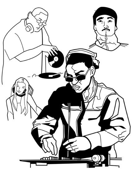 And I have been for a while. I'm working on the script, sketching the characters over and over, trying to decide on an art look for the finished work. My first plan was to draw it myself and do my damnedest to make it look as if Alex Toth had returned from the Great Beyond and forgotten all his philosophical objections to illustrating crapola, but only a few of his artistic chops.
The drawing here is something I did while exploring that option. It was also meant to show John Kricfalusi what djs circa 2005 looked like.
Wow. What an ambitious plan that was! What a monstrous ego I must have to think I could pull that off! And yet I got as far as two pencilled pages before I realized I was just kidding myself. It's good for your reach to exceed your grasp, or so I'm told.
After that failure, I thought I might do it in a more cartoony style, kind of Spumco-ish. But I'm not really that type of artist. Since the story is inspired somewhat by Love and Rockets, I even experimented with both Jaime's slick style and Gilberto's loose one. Not copying them outright, but trying to do my own personalized versions of what Los Bros Hernandez do with such seeming effortlessness (of course, I've seen their self-rejected pages in various places so it's not as if they don't struggle at times).
Daunted and rapidly bleeding that overweening self-confidence, I then decided to concentrate on the script and maybe find someone else to do the finished artwork from my character designs and suggestions. I'd already produced a first draft using Sergio Aragones's "thumbnail" script technique: I laid out some three-tier pages, roughed in the characters and backgrounds as I went, added dialogue and there it was. A story. Now I'm working on the second draft.
And what was supposed to be a simple twenty-four page work has expanded as I write. This is because my aim is a kind of cinematic storytelling inspired by various Japanese mangaka. I want the story to be naturalistic, as well. While I don't go for photorealism in art (I like it, but it's far from a requirement), I do want to thoroughly deconstruct "real" lives in all their ugly glory. Smart, funny characters but no overly witty remarks a la Juno; plenty of screwed up situations where they make mistakes and hurt each other but no soap opera; and what I hope will be full of accurate sociological detail.
Now I've got a sprawling epic full of teeny-tiny little life moments and it can't be contained in one or two standard-sized comic magazines. I'm sure I'll finish the script. No problem there. Still not so certain about drawing it myself, though. If nothing else, it's a fun creative exercise and it keeps me busy while I try to find a paying gig a-larnin' them people English.
Sunday, July 25, 2010
The Most Eagerly-Awaited Comic Book Movie Event of the Summer!
The hype is building. Anticipation is reaching a fever pitch. And here's the trailer:
Oh, man, I'm so clever*... you thought I was talking about that other... but I wasn't!
Okay, enough spoofery. Yes, I'm looking forward to this documentary about Steve "The Dude" Rude, who is at the top of my rather short list of favorites. Actually, my list of favorites could stretch for about thirty miles or so down a dusty country road if I were to write it out on a continuous roll of paper, like that used for printing newspapers. But the Dude's name is one of the first I'd write, near the top. Some of the others I'd also set down on it are represented in this trailer as well. Although some other names (Jaime Hernandez, Kojima Goseki, Takahashi Rumiko, Mike Mignola) frequently creep on there from slightly lower in the count, the top five might go something like this if you were to ask me today:
1) Jack Kirby
2) Alex Toth
3) Al Williamson
4) Steve Rude
5) Mike Allred
And so on.
Rude's work has charisma-- something we also call appeal-- and it goes beyond the clean lines and perfectly proportioned anatomy, the tiny elements of Dr. Seuss and Bruce Lee and Capt. Kirk that creep into it from time to time. Maybe because each work-- sketch or comic-- shows a man who knows how to draw, has just totally aced that aspect. His work defies passing trends and superficial style choices; instead, it's something real and solid, a craftsmanship that's tangible. That's how charsimatic it is. It feels as though you could touch it.
His abandonment of sequential work is a loss to comic books, but for those who can afford it, Rude will still draw almost any character-- usually not Batman, but there have been exceptions-- in classic mode, doing something lively, life-affirming and purely heroic. He posts a lot of these to his Facebook feed, sometimes in huge batches that just thrill with their energy. How does he do this? Perfectly formed figures, balanced black-spotting-- something I have all kinds of trouble with-- and use of negative space. And when he colors them with markers? I'm out of superlatives, baby. Smack out of 'em.
I wonder why he usually won't draw Batman. Is is a choice that springs from some philosophical objection to Batman, or is he just sick of getting a billion requests a day for Batman sketches? I'm too embarrassed to ask him. I loathe Batman and yet I draw him all the time. I prefer to draw him as a maniacal jackass, though.
*Nah, I'm just a dumbass.
Rude Dude documentary Comicon trailer from ian fischer on Vimeo.
Oh, man, I'm so clever*... you thought I was talking about that other... but I wasn't!
Okay, enough spoofery. Yes, I'm looking forward to this documentary about Steve "The Dude" Rude, who is at the top of my rather short list of favorites. Actually, my list of favorites could stretch for about thirty miles or so down a dusty country road if I were to write it out on a continuous roll of paper, like that used for printing newspapers. But the Dude's name is one of the first I'd write, near the top. Some of the others I'd also set down on it are represented in this trailer as well. Although some other names (Jaime Hernandez, Kojima Goseki, Takahashi Rumiko, Mike Mignola) frequently creep on there from slightly lower in the count, the top five might go something like this if you were to ask me today:
1) Jack Kirby
2) Alex Toth
3) Al Williamson
4) Steve Rude
5) Mike Allred
And so on.
Rude's work has charisma-- something we also call appeal-- and it goes beyond the clean lines and perfectly proportioned anatomy, the tiny elements of Dr. Seuss and Bruce Lee and Capt. Kirk that creep into it from time to time. Maybe because each work-- sketch or comic-- shows a man who knows how to draw, has just totally aced that aspect. His work defies passing trends and superficial style choices; instead, it's something real and solid, a craftsmanship that's tangible. That's how charsimatic it is. It feels as though you could touch it.
His abandonment of sequential work is a loss to comic books, but for those who can afford it, Rude will still draw almost any character-- usually not Batman, but there have been exceptions-- in classic mode, doing something lively, life-affirming and purely heroic. He posts a lot of these to his Facebook feed, sometimes in huge batches that just thrill with their energy. How does he do this? Perfectly formed figures, balanced black-spotting-- something I have all kinds of trouble with-- and use of negative space. And when he colors them with markers? I'm out of superlatives, baby. Smack out of 'em.
I wonder why he usually won't draw Batman. Is is a choice that springs from some philosophical objection to Batman, or is he just sick of getting a billion requests a day for Batman sketches? I'm too embarrassed to ask him. I loathe Batman and yet I draw him all the time. I prefer to draw him as a maniacal jackass, though.
*Nah, I'm just a dumbass.
Saturday, July 17, 2010
Style School: Illustration and Instruction Vol. 1: A Book Review
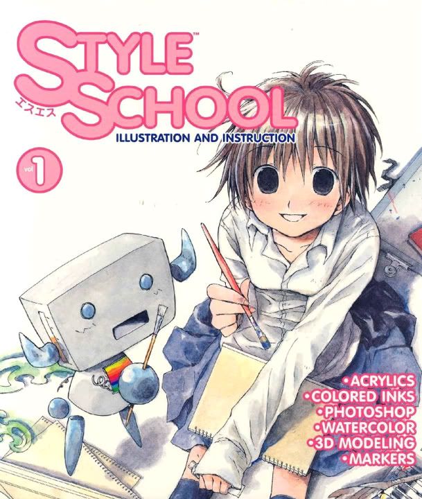 Style School: Illustration and Instruction (V. 1)
Publisher: Dark Horse
Writer: Various
Art: Various
Style? Style is an overrated thing and an overused term. Style is the last thing you should be worrying about as an artist. Once you learn the basics, once you’ve mastered the act of creating art (which is a lifetime thing), you’ll discover you have what passes for style. While I hate arguing from analogy because it’s difficult to be precise, think of it this way: jeans are perennially popular and the substance of what makes up a pair never changes, but year after year, the superficial elements do. One season, it’s boot cut or flares, two seasons later and you’re trying to squeeze into low-waisted skinny jeans.
We can extend the analogy to cover cars, motorcycles, houses, anything where function is an element along with form. Cars and houses (and possibly clothes) are built from the inside out, and so it goes especially with comic book art. Audience tastes change but the core elements remain the same, whether you’re making a picture with a pencil on paper or using a tablet and Adobe Photoshop, whether you’re trying to emulate Leonardo da Vinci or Yazawa Ai.
That’s why I can never understand why some Western comic book fans get so bent out of shape about manga-influenced style elements creeping into art. “Manga artists can’t draw!” they shout. “They don’t shade! There’s no detail!” They’re too uptight about the superficial, they’re not seeing that 1) whether you’re Japanese or American or whatever, the art fundamentals remain, 2) the percentage of “bad” artists is probably about the same in the West as it is in Japan and 3) there are a lot of Japanese artists who can flat out draw. And draw like maniacs, kitty cats. In his lifetime, Kojima Goseki was every bit the storyteller Will Eisner was, few artists can match Takahashi Rumiko for appeal, and then you have ace renderers like Urasawa Naoki, Otomo Katsuhiro and Shirow Masamune. I don't see how anyone can compare the flacid work of some of the most fashionable American pros these days and not be blown away by certain Japanese comic book artists.
Looking at the art in Style School, Dark Horse’s translation of SS Magazine, I believe we’re only scratching the surface. The artists represented here are incredibly young and many of them—working in a variety of styles—are producing work of professional quality. And the media they work in! They don’t limit themselves to just pencils and ink. They use markers, acrylics, watercolors, computers and some media defying easy categorization—paper cutouts? Oils?
Some of their illustrations have a slick air-brushed quality, while others are loose and flowing, more fine art than comic book. Grasp of anatomy varies, but many of these artists work in complex backgrounds in near-flawless perspective and show superior understanding of color theory. When you see some of these kids are only 18 years old, or even 17, it’s doubly impressive.
The book passes itself off as an instructional work, and each opening chapter allows a single artist to describe his or her (the percentage of female artists represented is heartening; American comics tend to be a boy’s club) chosen process. Babiry explains the use of Copic markers, foo* goes with Photoshop, Yoshitugi paints with colored inks. The artist named Imperial Boy uses 3D and 2D software to make a detailed illustration of a girl confessing a crush to a boy, both of them standing on a light-infused train platform full of miniscule detail. I especially like Noa's ethereal watercolor technique.
The step-by-step sections are somewhat useful, but the book assumes you already know drawing basics. There’s nothing on penciling or doing your finished inks before adding color, nothing on figure construction or placing your characters in perspective. On the other hand, you’re not told to make eyes large or noses smaller. Instead, the focus is on short descriptions of specific techniques you can adapt to your own personal drawing aesthetics, Western or Japanese. And then inspiration from your talented fellow amateur artists. If you feel confident, the book tells you how you can submit your work to SS Magazine in Japan and possibly dazzle eyes from across the Pacific. For me, the instruction level is just about right, but its usefulness will vary according to your needs. For a beginner, it’s probably too advanced with not enough building block how-to info, and for an advanced student, there’s not enough breadth. I could use an entire volume devoted solely to marker techniques.
The other thing about the manga world, though, is there are dozens of instructional books that can get you to this point. The Comickers series is probably a bit more for the hardcore manga artist wannabe, but those looking for inspiration will get a lot out of Style School.
Oh, and the final section consists of advertisements for some of Dark Horse’s manga offerings. This may or may not interest you, but DH certainly takes the best of all possible worlds and puts it in front of you without cultural snobbery or defensiveness and for that, I applaud their catholic approach. Come on, people—comics are comics, no matter where they’re from!
Thursday, July 15, 2010
Conan the Cimmerian #21: A Comic Review
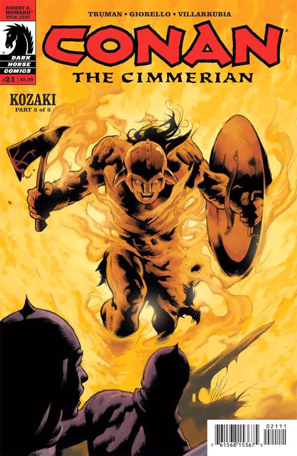 Conan the Cimmerian
Publisher: Dark Horse
Writer: Timothy Truman
Art: Tomas Giorello
Color: Jose Villarrubia
Reading Conan the Cimmerian so soon after the disappointing Kato, I couldn’t help but compare the two experiences. Maybe it’s because Conan costs 2.99 versus Kato’s 3.99. Both prices are scandalously high, but Conan the Cimmerian #21 packs a whole helluva lot more story and craft than that other book, and that makes it feel like a bargain. Actually, contrasted with the paltry stuff on display in Kato, it feels like a steal.
You know, I’ve never visited Conan’s Hyborian world—probably has something to do with it never having existed—but scripter Timothy Truman and artist Tomas Giorello create the setting thoroughly and vividly, I can certainly imagine Conan and his friends living, fighting and loving in this rich environment. On the other hand, I have been to Japan and I can’t believe for a second Kato and his daughter live there or that anyone connected with the comic’s creative team has ever so much as seen a photograph of the place. It’s kind of pathetic when a fantasy world seems more plausible than a place that actually exists.
In part three of the “Kozaki” story, Truman and Giorello show us a Conan battered and defeated yet still recognizably Conan. His dialogue as he talks to what may be a hallucination of a deceased friend (rendered by Giorello as an impossibly oversized EC-style walking corpse in battered and torn armor) matches the cadences and vocabulary of Robert E. Howard’s prose version. There’s also an epic battle sequence; it’s full of armored men with scimitars and lances, with lots of bloody decapitations and amputations, but Giorello’s superior storytelling keeps it all clear and easy to follow. No cheating close ups or other shortcuts (another stark contrast to that poor meagre thing we call Kato). Giorello illustrates the prime moments of the battle with clarity of vision and this goes a long way towards rewarding the reader. It’s a visual feast. Truman enriches the experience with expertly-written narrative captions; they’re ornate, just purple enough for that pulp sword-and-sandal feel, and add prose muscle to match Giorello’s strong illustrations.
Your enjoyment of Conan the Cimmerian may depend on your tolerance for barbarian adventures and half-naked wenches, but its superior content-- based as it is on all those classic virtues that seem to have gone largely forgotten by other creative teams-- makes it feel like a weighty slab of a magazine, just chock-full of adventuresome elements. It proves a comic that's purely fun doesn't have to be slight, or tossed-off. And if the plot eventually hinges on a somewhat implausible coincidental meeting, it still provides more entertainment and value than other comics costing a full dollar more. In fact, it seems like more than twice the comic of certain other… disappointments…
You know the ones I mean.
Monday, July 12, 2010
Kato 1 and 2: A Double Roundhouse Kick to the Wallet
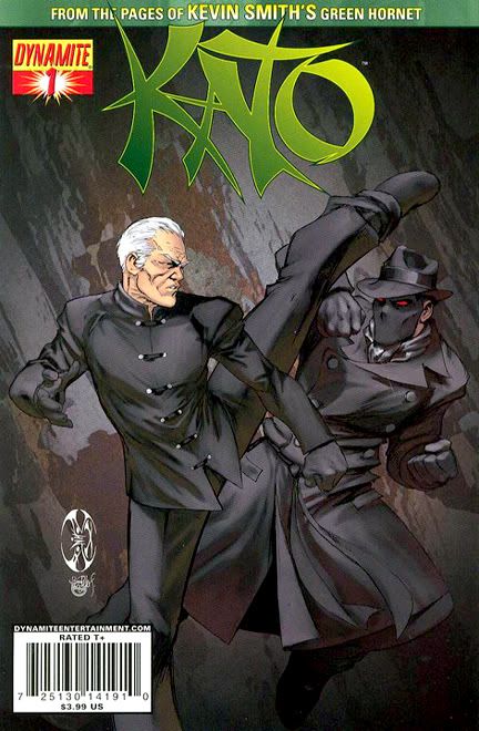 Kato 1 and 2
Publisher: Dynamite Entertainment
Writer: Ande Parks
Art: Ale Garza and Diego Bernard
The topmost text on the covers of Kato, the Dynamite Entertainment comic series, inform me it’s “from the pages of Kevin Smith’s Green Hornet,” with Smith’s name a few point sizes larger than Green Hornet’s. Whenever I hear the name, I tend to think of Bruce Lee. I wasn’t born when Lee played the role on American TV, nor did I see it in its incarnation in Hong Kong as The Kato Show. But Bruce Lee is a personal hero of mine and an ongoing source of inspiration. Kevin Smith?
Not so much. On the other hand, I’m not sure how many hardcore Kevin Smith fans really care that about this moldy oldster Green Hornet, so I can see why Dynamite chose to emphasize his involvement—my guess is his fanbase exceeds the Hornet’s. And since his Kato isn’t Bruce Lee’s, they can’t play up that angle.
So why in the hell did I spend money on not one but two comic books—at $3.99 each grotesquely overpriced even if this were from the pages of Kurt Vonnegut’s Green Hornet and drawn by Michaelangelo—with Smith as the main attraction?
It’s set in Japan. Where I just happened to have lived for six years. And, yes, I bought it because of my profound respect and admiration for Bruce Lee and his legacy. Also, I have a weakness for stories about ass-kicking women of the martial arts variety, and the cover on the second issue depicts what's apparently a female Kato in a wicked version of the original character's black chauffeur's uniform, kicking Green Hornet's arm. Some sort of violent dispute between partners? How dramatic! So I really wanted to like this series.
Unfortunately, if these two books were the first half of a Kevin Smith Green Hornet movie, I'd have walked out of the theater rather than risk further disappointment in the second.
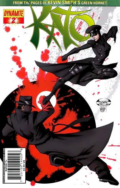 From the clichéd staccato captions: “Center City. Twenty-one years ago,” the opening shamelessly cribbed from the James Bond flick The Man With the Golden Gun-- by way of all the comics and movies have stolen it since— to the stale revenge plot, it’s a comic book so generic in every way, it might as well be set in Des Moines rather than Japan.
After a few panels, I was looking for Austin Powers and Felicity Shagwell to motor by in their Shaguar quipping, "You know, it's amazing how the Japanese countryside looks in no way like Southern California." It doesn't help that Ale Garza eschews almost all exterior establishing shots that require place-specific architecture in the first issue. When Kato's improbably-named daughter Mulan hits a dance club in Tokyo (we don't even get to learn what part of Tokyo it's in, because that might have required effort on the creative team's part), Garza cuts straight to an interior shot of a club rather than risk hand fatigue by drawing a recognizable Tokyo locale. Bernard follows his lead in the second issue, which is basically an extended fight scene playing out in front of some white squares that are supposed to indicate windows. The visual storytelling throughout is shockingly amateurish. Imagine a book without a single attempt at a simple action-to-action panel sequence, because that's what this is. Instead, Garza uses tight close ups and lets sound effects do the work Dynamite Entertainment paid him for. The result is fragmented, with baffling, almost non sequitor imagery. There are actually two panels where it appears a fist is striking someone's wrist (we can't tell whose) and a horse is kicking a pillow. Bernard actually manages a few pages of a coherent fight sequence, but it's too little, too late.

Parks's cliched stoic yakuza warrior character blathering about how in "Japan, family honor is all-important" does little to add verisimilitude. Most of the dialogue consists of overly formal declarative sentences that I suppose might convince a few readers with extremely high gullibility levels they're reading translated speech. It's approximately as Japanese as a hypothetical episode of the old G.I. Joe animated series featuring the back stories of Snake Eyes and Storm Shadow, but not up to the level of, say, that TV movie Scooby Doo and the Samurai Sword. I'd suggest the next time Parks attempts to write a story about the yakuza, he take a little time and read Tokyo Underworld: The Fast Times and Hard Life of an American Gangster in Japan by Robert Whiting and McMafia by Mischa Glenny. Both of those are exciting reads with vividly realized real-life characters and situations, elements sorely lacking in this comic. Or, if pressed for time, Parks could just rent The Yakuza with Robert Mitchum on DVD. It's ludicrous horseshit but still entertaining and several creative ticks above either issue of Kato.
It really makes me long for the days of Michael Golden’s kick-ass Jackie Chan series Spartan X. Golden meticulously creates worlds of vibrancy and believability, so when he moves his characters through them you not only know exactly what they’re doing and in what order, but where they’re doing it. He refuses to cheat. But I guess that’s too much to expect from expensive funnybook magazines these days.
On the other hand, I’m glad Kevin Smith himself didn’t script this. It would’ve been a grungy spectacle of tentacle rape and bukkake jokes broken up (or justified) by bathetic scenes of father-daughter bonding between Kato and Mulan capable of sugar-rotting the enamel right off a reader's teeth. But even a Smithian “Japan is full of perverts” take might have been more believable than what Parks, Garza and Bernard toss at us.
Sorry, Kato and Mulan, at almost four bucks a pop for this flimsy hackwork, I won’t be back to find out if your whole father-daughter vengeance team thing works out.
Let's end on a positive note:
Harvey Pekar Passes at 70
I have to admit, I'm only marginally familiar with Harvey Pekar's comics. I remember him most as a crank on Late Night with David Letterman, whose infrequent appearances filled me with dread. Great, him again. He's going to stop the flow of humor and try to turn the discussion political. Actually, I have no idea how many times he went on Letterman's show; for all I know, it may have been only twice but apparently, I was tuned in both nights and they stayed lodged in my brain like a piece of steak gristle, worrying me from between my teeth, worrying me from inside my amygdala just like that.
But studying graphic design meant exposure to Pekar's comics, and from those I learned of a different Harvey Pekar, one much easier to take. Still problematic, but with the saving graces of self-effacing-- perhaps eviscerating, even-- honesty and sharp self-awareness. Somewhere along the line I read a story of his where (if memory serves) he tried to steal some jazz records from a friend's radio station and failed miserably because of his nervousness and over-active conscience. I recognized myself in that one, and from then on I had a soft spot for Harvey Pekar.
Not enough of one, however, to do more than read a few pages out of his books in the University of Georgia bookstore, or at Waldenbooks or Books-A-Million or wherever I encountered them. Other creators eventually found their way onto my home bookshelves-- Robert Crumb, Dan Clowes, Charles Burns, Los Bros Hernandez. But not Harvey Pekar, even after I enjoyed his input during an episode of Anthony Bourdain's No Reservations where Bourdain visited Cleveland and hung out with him for part of the day. I never even watched the 2003 movie about him, American Splendor starring Paul Giamatti.
Why is that? I don't know.
But studying graphic design meant exposure to Pekar's comics, and from those I learned of a different Harvey Pekar, one much easier to take. Still problematic, but with the saving graces of self-effacing-- perhaps eviscerating, even-- honesty and sharp self-awareness. Somewhere along the line I read a story of his where (if memory serves) he tried to steal some jazz records from a friend's radio station and failed miserably because of his nervousness and over-active conscience. I recognized myself in that one, and from then on I had a soft spot for Harvey Pekar.
Not enough of one, however, to do more than read a few pages out of his books in the University of Georgia bookstore, or at Waldenbooks or Books-A-Million or wherever I encountered them. Other creators eventually found their way onto my home bookshelves-- Robert Crumb, Dan Clowes, Charles Burns, Los Bros Hernandez. But not Harvey Pekar, even after I enjoyed his input during an episode of Anthony Bourdain's No Reservations where Bourdain visited Cleveland and hung out with him for part of the day. I never even watched the 2003 movie about him, American Splendor starring Paul Giamatti.
Why is that? I don't know.
Subscribe to:
Posts (Atom)