Showing posts with label Dell. Show all posts

Friday, October 31, 2014

October is Spookey Month: Happy Halloween from the Twilight Zone!

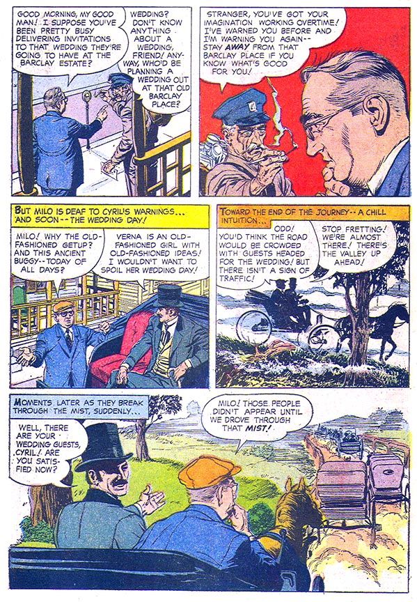
Well, Dell Four Color #1288's version of The Twilight Zone (April 1962).  It lacks the social conscience, deep insight into the darker elements of human nature and frequent ironic twist endings we all know and love the TV show for.  It has none of Serling's poetic introductions and closings so fondly parodied over the years.  The Serling voice is hardly present at all, save for a faint echo in one story.  Instead, this book is more reminiscent of DC's anthology horror books from a decade later with a comic book version of the brilliant (and much needed these days) Rod Serling as host instead of Cain or Abel or the Three Witches.  The stories themselves play out like very mild DC horror stories, too, like some of the post-Comics Code 1950s reprints they salted among the Bernie Wrightson or Alex Nino gems.

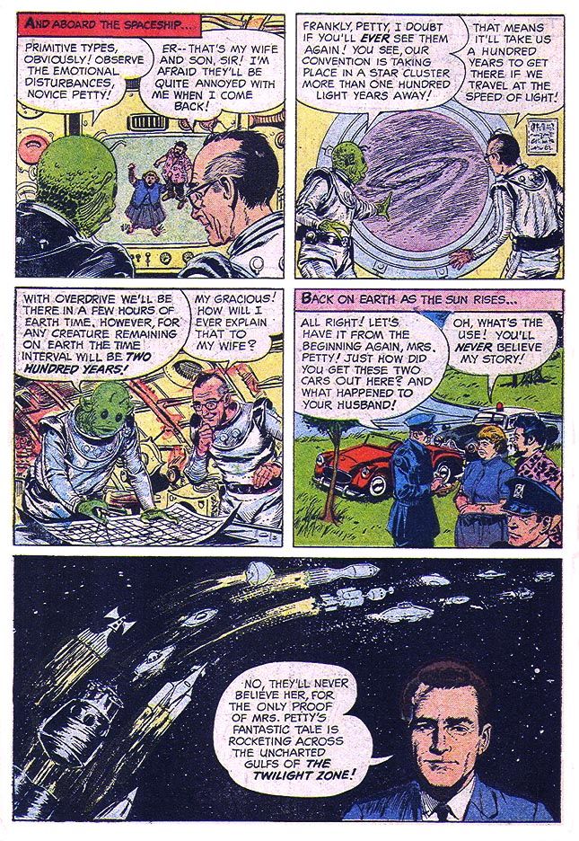
The best thing about it is George Wilson's painted cover, a fairly accurate rendition of "The Joiner," which is also the book's strongest tale.  And that's saying a lot when one of the stories is about a renegade Nazi who's used his shrinking gas to turn Hitler and his cronies into suspended animation figurines waiting in a glass case for their time to come around again.  In "The Joiner," we meet Alvah Petty, a harassed and pathetic bookkeeper by day and all-powerful Grand Poobah of any number of men's organizations by night.  The crazier the headgear and more esoteric rituals the more he likes it, all the better to keep him away from home where his wife and middle-aged beatnik son treat him like dirt.  They conspire to humiliate Petty so he'll stay home nights and they can abuse him more but it backfires on them when the fake club the son comes up with-- "Knights of the Galaxy"-- improbably turns out to be the real thing and its alien members spirit a not very reluctant Petty away for a 200 year club meeting in another solar system.

 The lead story is a yawner of a ghost story about a conman and his partner (who looks amazingly like great character actor Edward Andrews, who co-starred in The Twilight Zone episode "Third From the Sun") hiding out in a small town.  The conman ends up engaged to a woman who may or may not be from the Other Side.  You know, where the poltergeists live.


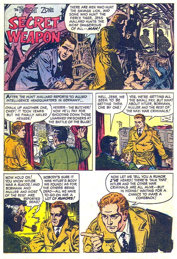
The second tale, "Secret Weapon," otherwise known as "The One with Doll Hitler," features a protagonist who might have been worthy of his own book, one Jess Mallard.  Don't let his stupid, duck-like name fool you.  The guy is a dogged Nazi hunter who will stop at nothing to capture his prey including offering to pay an exorbitant amount for strangely heavy carved figurines of Adolf Hitler, Martin Bormann and some joker known only as "Muller."  Muller, the generic top Nazi.  They should have given Mallard a better name then spun him off into his own book.  Something like Duke Stone, Nazi-Hunter.  It's appropriate because Serling occasionally set up Nazi characters for deserved comeuppances, as in The Twilight Zone episode "Death's-Head Revisited" and in the November 1969 Night Gallery pilot segment "Escape Route."  Oh, and don't forget "He's Alive," a The Twilight Zone episode where Dennis Hopper plays a neo-Nazi would-be Hitler who runs afoul of the ghost of the real one with tragic consequences.  That episode is kind of muddled and turns campy with its big reveal (don't put your pseudo-Hitler in front of a photo of the actual one, please), but it's still more gripping than the tepid "Secret Weapon," Jess Mallard aside.  Mallard would have kicked Hopper's ass two minutes into his story, though, and saved everyone a lot of trouble later.  Mallard may look like Leslie Howard by way of William Shatner, but he's all Robert Stack.


And then "The Joiner."  The slobby beatnik who appears almost the same age as his dad, friendly green aliens and the final panel with Serling superimposed over what appears to be a highway among the stars are a few more elements that make this one a fun standout.


By now you realize none of these stories will chill you the way Serling's show did at its very best, but the art, which is apparently by EC alums Reed Crandall and/or George Evans solid enough, with caricatures of Serling that look a lot like him.  Except for the one that inexplicably resembles a post-auto accident Montgomery Clift leading off "Secret Weapon."  I don't know if anyone considers this book an example of either artists' A-level material, but it's easy to look at and occasionally-- especially in "The Joiner"-- has a little bit of that ol' EC magic.  I would never begrudge either guy an art job in the lean days between Dr. Wertham and Warren Publications.  For the history buff in me they even manage to work in a short recounting of a story I once heard about Abraham Lincoln possibly having a prescient dream about his assassination and for the skeptic who scoffs at such ridiculous notions in me, a back cover that dabbles in something that's almost science fact.  All in all, Dell Four Color #1288 The Twilight Zone is a neat little package that probably has its origins more in stuff the contributors had lying around in their studios or offices than anything Serling or guys like Richard Matheson and Charles Beaumont might have come up with.


And that's it for this year's Spookey Month.  I hope you enjoyed it as much as I did.

Sunday, September 7, 2014

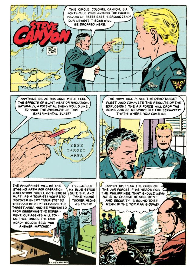
Remember back in the old days, during the Cold War, when there weren't so many nuclear-armed superpowers?  Things have gotten way out of hand with the proliferation of mass destruction.  I'm pretty sure there's plenty of weapons-grade uranium and plutonium circulating around out there thanks to the Soviet Union's collapse.  But back when they were the other potential driver of human extinction, we Americans had our atomic secrets and people like Colonel Steve Canyon of the USAF to keep them safe.

This was back when we atom-bombed the shit out of the Nevada desert and all those Pacific atolls we had lying around after beating Japan, when all those old school European imperialists were licking their wounds and going soft on the commie menace.  Or else turning Red themselves.  Nothing like a balmy tropical paradise for testing hydrogen bombs.  Or T-bombs, whatever those are.  Canyon could tell you, but he's not talking because you might be a mole or a fellow traveler and a guy can't be too careful.

Looking back, I have no idea what we were thinking.  Sure, you'd find magazine articles on how the domino theory would lead to Southeast Asia becoming a Marxist staging point for invading Japan, then Hawaii and then Boise, Idaho.  But there had to be a better way to protect and preserve our way of life than blasting our obsolete battle fleets with nuclear bombs and polluting the atmosphere with fallout.  I wonder why these damned things had to be tested so often anyway.  Once you have a trigger mechanism that works, why do you need another?  And if it's the fissile material that's in doubt, you can't un-blow a proven sample and use it again.  I think all these Pentagon brass hats and physicist types were more or less like kids with really big firecrackers-- the largest-- and some really super keen model ships they couldn't help blowing up for kicks.


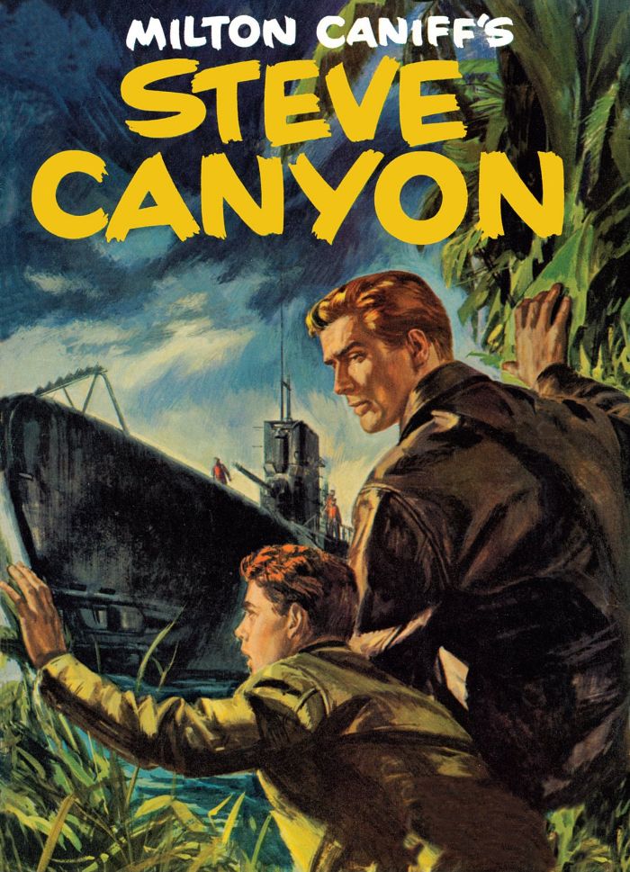
These happy images with their subtext of promised global apocalypse are from Dell Four Color Comics #641 (October 1955), reprinted in Hermes Press' new-to-digital offering Milton Caniff's Steve Canyon: The Complete Series Volume 1.  This one stands out for me because I find myself reading accounts of weapons testing in my downtime.

And who would dare argue with that swanky painted cover, which has a "Hardy Boys/Nancy Drew meets James Bond" charm about it?  I'm not a big proponent of painted interior art because it tends to look more like a collage of pretty still images rather than a sequence of events, but give me painted covers anytime.  One of this book's strengths is its full-page reproduction of these beautiful paintings.  The front cover itself features a dramatic image of Canyon and his enlisted driver gritting out a rocket launchpad fire that's too close for comfort.  You can almost feel the heat and the frenzied background action gives the scene a sense of urgency that's only helped by Canyon's raised arm and grimace-creased face.  The interior art may have a few Caniff touches, but it's largely by Ray Bailey and William Overgard, two names with which I'm not familiar.  I will be getting acquainted as I dig into this book.

The point is, here's some sweet 1950s espionage action that falls right in my wheelhouse.  My dad and I used to follow the daily Steve Canyon strip in its latter years, but I've neglected Caniff and people like Noel Sickles for far too long.  I'm not just a student of comic book art filling in the gaps in my education, I'm a student of this historical era, and comics like these give us a feel for time, when we Americans felt ourselves surrounded by danger and locked in a death struggle with a diametrically opposed ideology.  Our good guys sometimes wore white cowboy hats and sometimes they wore blue service caps with eagles pinned to them.

BOOM!

Wednesday, April 9, 2014

Dude, you're reading a Dell 1: Alex Toth versus The Real McCoys (Dell Four Color Comics #1071, January-March 1960)

Why adapt The Real McCoys into comic form?  Why anything?  Maybe there were kids all over these great United States who were really into Walter Brennan.  Maybe some suit at Dell felt the misadventures of dirt farming hicks was the coming craze like the hula-hoop or rock and roll when he handed artist Alex Toth this assignment.  The Real McCoys ran on ABC and then on CBS from 1957-1963, and it's one of those supposedly classic old television programs I've never watched.  I do a mean Walter Brennan impression, though.  That Dell executive may have been on to something, because they ended up publishing four The Real McCoys books, just two fewer than they did of Rawhide!  And Rawhide starred Clint Eastwood as ramrod Rowdy Yates!

Alex Toth produced some treasures for Dell.  There's his work on The Land Unknown (you can see a gorgeous, richly textured page from that story at The Comics Journal, illustrating their interview with Dean Mullaney and Bruce Canwell); Walt Disney's Darby O'Gill and the Little People (one of my favorite comics ever and a page from which you can find at the TwoMorrows site along with an interview with Toth himself that appeared in Comic Book Artist #10); Clint and Mac; the John Wayne airplane flick The Wings of Eagles; and the charming No Time for Sergeants, a film which starred Andy Griffith.  You remember Griffith.  He would later play Sheriff Andy Taylor on his own program for Danny Thomas Productions, the same studio that made The Real McCoys.  Those comics are all worth tracking down. 

I have no idea how Alex Toth felt about drawing Walter Brennan's bucolic sitcom misadventures, but I don't imagine it was a dream job for him by any means.  "Wild Wheels," the lead story in The Real McCoys (Dell Four Color Comics #1071, January-March 1960), the first issue, does feature elements that would play to his strengths.  Real human beings doing relatively realistic things, plus all kinds of cars.  I know Toth liked to work a bit on the minimalist side, or essentialist, if you prefer.  The drawing is in what you leave out, simplify, simplify, simplify, edit yourself ruthlessly.  Well, Toth  the hell out of these drawings!

Let's take a closer look at a few pages.

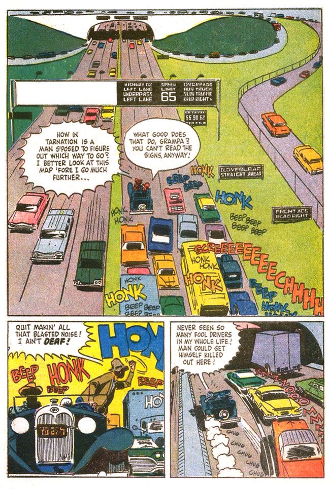
Here's, from near the start of "Wild Wheels," we see a Toth interpretation of a Walter Brennan-caused traffic jam (oh, you crazy Grampa!) on a busy freeway.  Toth, probably exceeding in a single image the entire The Real McCoys shooting budget for half a season's worth of episode production, turns the top two tiers of the page into one large panel.  Toth may not have been giving the art his all, but this page is a shows some of the storytelling techniques he uses to overcome the limitations of the Dell six-panel page format.  The eye enters the image at the usual spot, top lefthand corner where Toth places a concrete overpass in stark white, kind of crushes the cars driving along top of it, then leads us down the on-ramp (backwards!) to the busy middle-ground where suddenly we have dialogue balloons and sound effects. 


This gives us time to absorb the situation-- the same way a TV show or film might use an establishing shot, then pan along it before introducing the main characters, which Toth does when he starts to speed up the pace and inserts action by cramming all the truly important stuff in the center of the page, in the area that would be the second two-panel tier (although the large balloons break into the top tier area), and just before quick-cutting the action in the two bottom panels.

It also means Toth can fill a page with a minimum of actual drawing.  To that end, Toth leaves the grassy median and shoulders as open areas to be filled with green.  No Tothian dabs of ink spotted here or there to suggest detail.  While I'm in favor of leaving out visual noise, the rendering here feels unfinished. 

There are a lot of cars, though, on the lower half of the page.  At first, given the overhead angle and one-point perspective, the backed-up cars become an almost abstract suggestion of the typical American automobile, brightly colored rectangles lacking wheels.  As we find ourselves in the middle of the action, with a more grounded viewpoint, Toth adds sparse detailing to the vehicles, resolving them a bit more with tailfins and brakelights, but leaving the troublesome in-perspective work of the oval tires simply suggested through quick brushstrokes underneath.  Maybe we'd like to see those tires and hubcaps all worked out in proper perspective, but with Toth, even a shortcut like these inky blobs work as undercarriage shadows, as opposed to something a wannabe like I would do, where you'd see it just as ink.  Grampa's jalopy with its old-fashioned rounded shapes and circular headlights contrasts sharply with the ultra-modern boxes around it.

The fist-shaking pose isn't particularly original, but I love the skewed "beeps" and "honks," which invoke different volume levels and pitch.  One big blue "honk," probably from a truck, a smaller red one no doubt from a car.  "Beep" is probably one of those Volkswagen VWs.  The hot yellow background contrasts with the cooler blue/gray fore- and mid-ground elements to give this panel a frenetic energy even though everyone's just kind of sitting there because of Grampa.  The last panel has a great sense of movement, with the two-point perspective animating the cars into the tunnel, along with the speedlines and exhaust puffs from Grampa's car, which is badly in need of an emissions inspection.  The purple-gray highway and the light purple truck passing into shadow and the orange sky-- complementary colors-- also create deep-focus depth, and allow the primary-colored cars to pop.

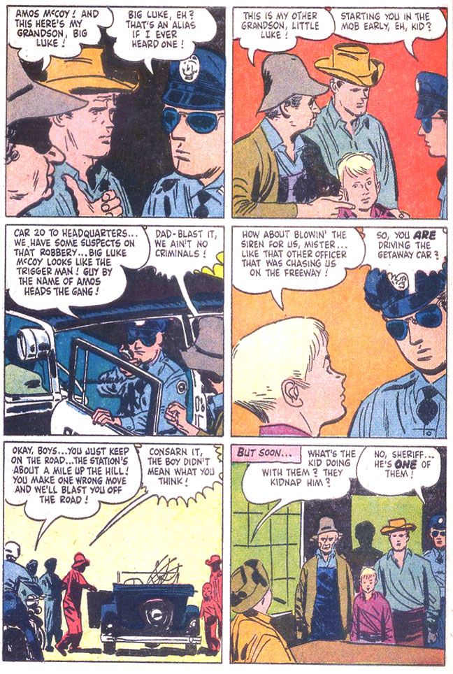
Other pages throughout show Toth rushed this one.  It's not even so much just the uninvolving groups of figures and lack of backgrounds.  The linework itself shows a certain lack of precision that comes from slapping down ink in a hurry.  It's especially evident on this page, where the cop wears some misshapen sunglasses on his indistinct face and poor Richard Crenna looks as if he's in for some serious sinus problems.


Yawn.  The script is uninspired.  In case you haven't figured it out, the guys take a fishing trip, but end up mistaken for criminals.  I don't know how idiosyncratic the TV show was, but this is the generic kind of thing you could plug any characters from any property into.  Even ramrod Rowdy Yates on a horse instead of a junk car.  There's a half-hearted attempt at slapstick, but it's borrowed-- the ol' "fish hooks catch each other under the boat" gag used in one of Our Gang's later, lesser MGM shorts, "Three Smart Guys."  If you're going to steal gags to liven up a dead story why steal from a stinker?  Or maybe they took it from another source.  It seems mighty familiar.  As if unimpressed himself, Toth doesn't bother with a lot of drawing of nature during this interlude, either.  Pine trees that are simply suggested with dabs of angular ink jut from horizontal lines indicating a landscape, but it's curiously under-grown.

Eventually, just before the readers put down The Real McCoys to re-read Darby O'Gill or else fall asleep, Grampa and family end up involved in a car chase complete with winding mountain roads and desperate bank robbers blasting away.  Only during this  sequence does Toth finally seem fully engaged with the material.  Again, this is probably more expensive-looking than The Real McCoys ever got on TV, but how should I know?  If I were going to write a script for even something like One Day at a Time for Toth to illustrate, I'd make damn sure I stuck a car chase in there at some point.

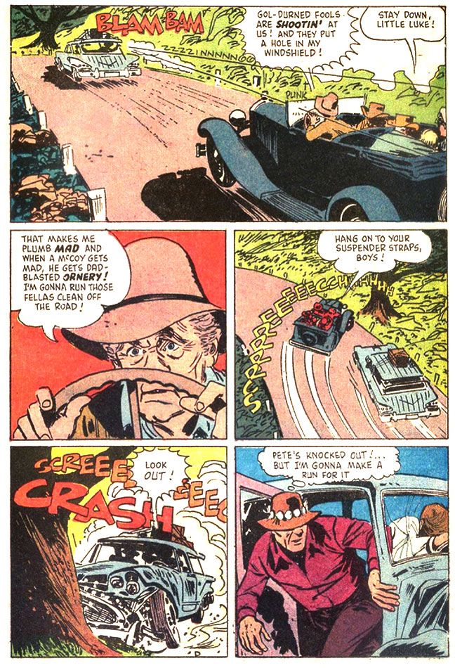
Here's a page that makes The Real McCoys as exciting as an episode of The Untouchables.


Do you buy Grampa's ancient car being able to pull off such a wicked, professional pursuit-driver level maneuver?  One wonders why the bank robbers didn't blast away at the McCoys as they passed.  This all seems like a plot contrivance, but Toth does some fine work here.  If you look at the third panel, with that improbable stunt, you see the tree the car crashes into in the fourth panel.  The tree doesn't just pop out of nowhere.  Toth thinks the action through.  Excellent placement of sound effects and dialogue, too.  It helps set the chronology of the sequence, compressing three distinct moments-- immediate pre-crash break-squealing, a character reaction and then the crash itself-- into one effective panel.  Nice Billy Jack hat on that guy in the fifth panel. 

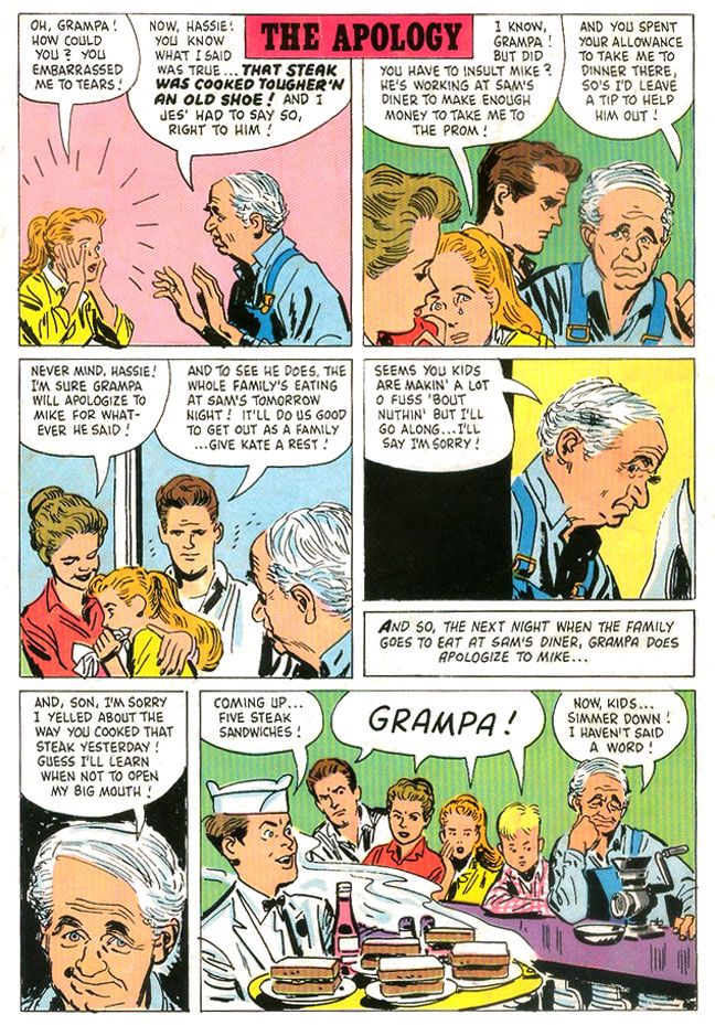
But even on some of the more inert pages, there are still little touches of Tothian brilliance.  There's some nice facial acting on Grampa in "The Apology," a one-page gag story that appears on the comic's back cover.  I absolutely love the wry expression in the fifth panel in particular.


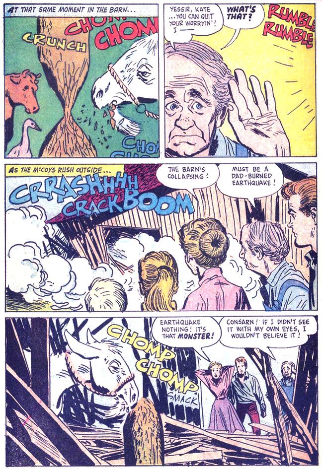
Oh, the second story is about a goat that eats the McCoys' barn.  It's not exactly prime Toth, either, but it's the only place you'll ever see him draw a goat eating a barn.

 
I love the cow and goose in the first panel.  The cow in particular wears a dismayed "What the hell?" expression, as if she can't quite process what she's seeing.  I hope they weren't injured when the barn collapsed!

Monday, July 29, 2013

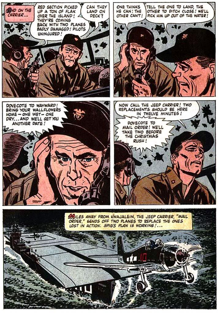
Four Color #790, "The Wings of Eagles:" Toth draws the Duke

Well, if you're doing a comic book version of a war movie about airplanes with John Wayne as the lead, you couldn't ask for a better artist than Alex Toth.  Here he tackles the 1957 John Ford film The Wings of Eagles (Dell Four Color #790, April 1957).  As far as I can remember, I haven't seen this movie, but after reading the comic, I'm thinking this is the kind of movie that doesn't innovate in an attempt to get at the inner desires and struggled of its subject, but just aims to please audiences with a rousing action story tribute to a guy who hobbled himself by accident but still went to war because he was so damned patriotic.  A guy who just happened to have been good friends with the director himself.

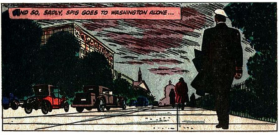
 Frank "Spig" Wead's life story kind of boggles the imagination and my first impression was, "No way."  I mean, John Wayne as a hard-brawling guy named Spig?

But I did a little reading and I was wrong.  While the photo I saw looks absolutely nothing like Wayne (a young David Strathairn comes immediately to mind),  the real Wead actually was a pioneer of Naval aviation and carrier operations and part of a Navy flight team that won the Schneider Cup in 1923.  Then he fell and broke his neck one night.  Forced to retire from the Navy, Wead turned to expressing himself through writing and scripted films, mostly having to do with the military and flying.  His film work netted him two Academy Award nominations.  During WWII, Wead returned to service, helped develop the idea of the escort carrier (called "jeep" carriers in this comic), and even managed some sea duty aboard the carriers USS Yorktown and Essex.

Still, I can't help but think John Wayne was miscast in this film, or that Ford and company altered reality just a smidge to fit it to his oversized shoulders.  While he certainly beat the drum as a patriot (despite not having actually put on a uniform in earnest), I simply can't imagine Wayne as a writer of any kind, military or not.  Or hobbling around on crutches.  If this Dell adaptation is accurate to the movie at all, it seems your typical mix of fact and Hollywood hokum... er... dramatic license, with events simplified and telescoped, secondary characters invented or composited.  There's a thinly-disguised Ford stand-in played by Ward Bond.  They call him John Dodge (clever, boys, clever!).  There's a guy apparently based on Billy Mitchell who constantly fights with Wead (Toth depicts Wayne in the aftermath of these moments with cute little bandages on his face), which probably owes more to Flagg and Quirt from What Price Glory? than either Wead's or Mitchell's lives.  There's a guy named Jughead, for chrissake!  Even the film's title is a bit of a groaner.

But, as I said, I haven't seen it and there's always the Ford factor.  Discount even a minor Ford film at your peril, and this one came in the wake of his superlative Western The Searchers.  Whatever the quality of the movie it's based on, the book itself is aces, a little slice of perfection.  Toth himself appears to have been thoroughly engaged by the material and just knocks himself out.  He gets to draw airplanes from multiple eras and even a big time Hollywood movie premiere with 1930s-style cars.  It's in the acting-- as well as the action-- that Toth really shines in this outing.

Here he pulls out the stops with unique facial expressions, really bringing the characters to life.  His Wead/Wayne may not look a whole lot like the Duke-- other than matching him for imposing size compared to everyone else on the page-- but Toth nails the man's broad acting style.  Even in scenes where the action is largely internal-- Wead struggles with writing inspiration and later, with the problem of prolonging carrier operations during invasions despite attrition in aircraft and men, Toth adds interest by choosing the right angle, the right facial expression.  He once remarked something to the effect that some talky scenes will be by their very nature pedestrian, but he avoids that trap here.  Or maybe it's just that the comedic drunken brawling and daredevil flying stuff more than make up for the internalized moments.

Despite the usual crap printing of the day, it's obvious even the coloring job is well thought-out.  It uses a muted color scheme largely in various tints of blue, probably because so much of it takes place either in the air or on the sea.  The colors don't exactly pop, but they're not garish nor do they battle Toth's line work.  Check out this moody twilight scene:


Now we've all seen 1950s-era war flicks.  They almost always save a bit of money by using stock footage.  Authentic, but it's usually so glaringly obvious it throws me right out of the story.  It also makes me wish I was simply watching a documentary so I can properly consider the millions of real people who died in pain and terror without the unfortunate context of their sacrifice serving to make John Wayne look like a great guy up on the silver screen.  War comics of this era by their very nature-- generally aimed at kids-- tend to turn it all into a grand spectacle, with manly dogfaces stoically facing death or wisecracking their way through battles depending on the story's whims, largely sanitized to suit the Comics Code.  Eagles is at least based on actual events, and Toth is untrammeled by budget considerations, so when he depicts life aboard a flattop doing its deadly business out there in the Pacific, we can imagine it's the real thing and not some rear-projected footage on a soundstage in Los Angeles.

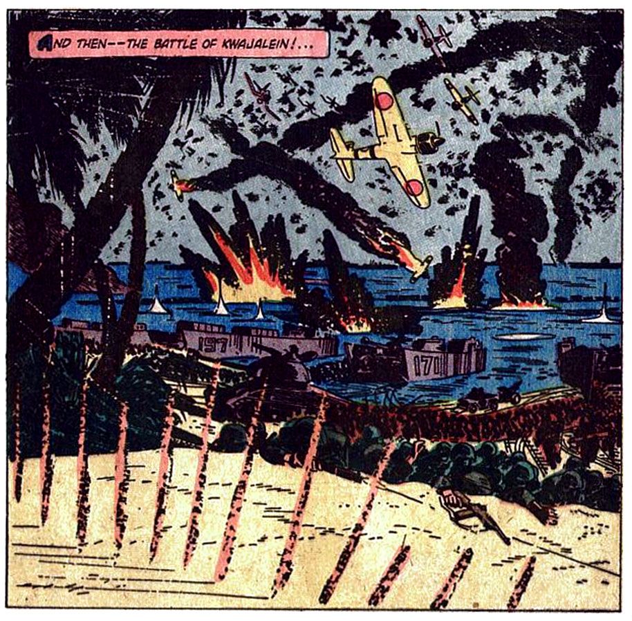
His major battle scene in the book is a single over-sized panel that's practically a whole school on controlling eye movement and presenting depth in itself.  In the foreground, there are machine gun strikes, then a middle-ground plane made up of palm trees and the invasion force itself, with troops and a tank largely suggested through silhouetting, a bright flash of a Zero overhead drawing our gaze upward into the background, a sky Toth speckles with angry ink blotches representing flak.  It's appropriately hectic and violent, certainly doesn't look like fun for Gunner and Sarge.  Toth compresses a whole day's worth of death and destruction into this single image.


This is contrasted on the next page by some talking heads which bring us back into the story proper and provide tension.  Then, another incredible panel of a Wildcat taking off, reminding us of the scope of the day's events and showing us Spig's grand idea coming to fruition.


I can't imagine Ford-- unlike Wayne, Ford knew war first-hand, having been wounded at Midway and present on Omaha Beach itself during the D-Day invasion-- reading this and feeling his cinematic vision slighted.  This is some sterling Toth, and really deserves another look. Fortunately, you can find the whole thing online at a couple of different blogs to enjoy for yourself.

Monday, July 16, 2012

Dell's Andy Griffith comics...

Aunt Bee:  not in this issue!
Andy Griffith was always a big favorite in my family.  My dad introduced me to The Andy Griffith Show when I was a small child and despite our being lifelong pals in the classic dad-kid way, our mutual love for the show was one of those few things we really had in common.  Since it came on almost every night of the week, he and I watched the series all the way through from black and white premiere to color finale five or six times and individual episodes dozens.  Ol' Dad was also pretty fond of Griffith's "What It Was, Was Football" monologue and I lost count of how many times he paraphrased the "Buddy, have a drink/Well, I believe I will have another Big Orange" exchange while pouring himself a glass of tea or whatever.

So it wasn't much of a coincidence I'd been planning to write a little bit about the Dell Andy Griffith Show comics when I heard about Griffith's death.  I think about my dad every day and if I reminisce about him long enough, it invariably leads me to thinking about Andy Griffith.  I just wrote about No Time for Sergeants, a hilarious flick that hasn't gotten its due over the years.  It helped bring about Mayberry, all its citizens and spin-off Gomer Pyle, U.S.M.C., for which we'll forgive it.  We're generous that way.

They sure move around a lot.
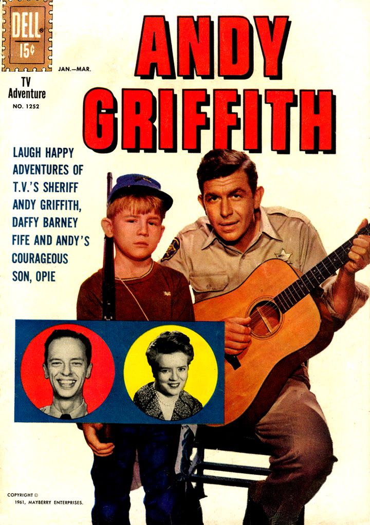
Dell published two issues of The Andy Griffith Show comic in their long-running Four Color series, the first  numbered 1252 (January-March 1962) and the second 1341 (April-June1962).  Both sport attractive full-color photo covers and some fun blurbs-- witness the anonymous copywriter's description of Opie as Andy's "courageous son."

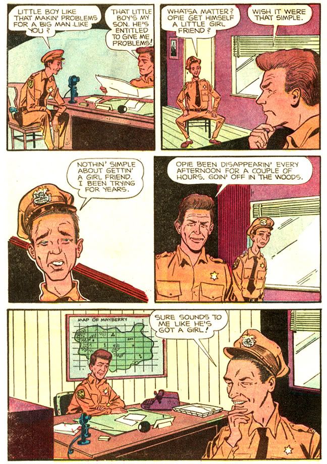
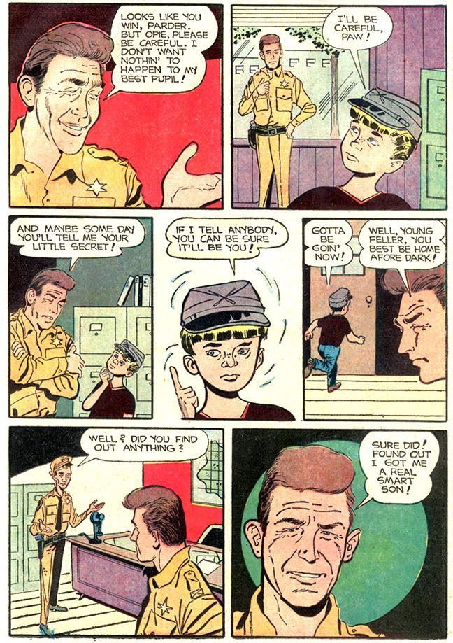
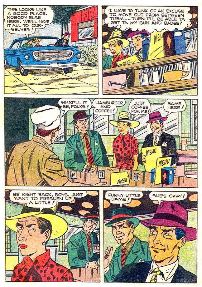
I'm not sure what makes Opie so courageous.  The story inside is called "Opie's Secret," which turns out to be pretty lame as far as secrets go.  Andy worries that the boy's spending too much time in the woods outside town, but instead of wandering off with a crinkled paper sack of porn for furtive masturbation sessions like Joaquin "Leaf" Phoenix in Ron Howard's own Parenthood, Opie's just caring for a litter of puppies.  Plus, we know the Mayberry woods are about as dangerous as a daycare center, and not one of those ones with the careless teachers who leave matches lying around and rusty knives.  The good daycare centers.

None of Opie's wholesome activities require much in the way of bravery, or, if you will, courageousness.  I tend to reserve the label "courageous" for kids who sail solo around the world, do something wonderful for the disadvantaged in the face of community disapproval, rescue their families from burning houses, inspire others with their perseverance against some fatal disease or take a stance against bullies.  But perhaps the people at Dell were mild-mannered to the extreme and in their eyes Opie was some kind of free-spirited adventurer, living life on the razor's edge of danger.

Ron Howard wore this cap in "Eat My Dust."
Andy's dialect is over-done and reminiscent of the broad, grinning way Griffith plays Sheriff Taylor in the show's early episodes-- a more sophisticated, educated variation on his Will Stockdale characterization from No Time-- before he realized he was better off as the straight man for everyone else's antics.

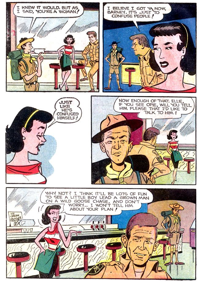
On the other hand, the writer captures quite a bit of the show's flavor, especially in the way Andy relates to Opie and Barney.

Ron Howard's Opie was one of the more "real" kid characters on TV, neither a smart-aleck nor a naif.  And unlike poor Theodore Cleaver, who seems to have been a bit slow at times (putting it politely), Opie was more than capable of handling his own problems with just a smidgen of guidance and advice from his pa.  And avoiding embarrassing scenes like getting his head stuck in iron fences or falling into giant bowls of fake soup.

In episodes like "Opie the Birdman," (which aired a year or so after these comics hit the newsstands) the show's writers give father and son a mutual respect and even allow for a little anger between them.  Opie would learn from Andy, but occasionally Andy would also learn from Opie.  The heart-to-heart talk scene between Andy and Opie in "Opie's Secret" captures this dynamic quite well and so gains its own mild emotional resonance.  I can't imagine Pa Kent talking to Clark as honestly as this in a Superboy story.  Come to think of it, Superboy is usually portrayed as a dimwit anyway.

The comic manages the other relationships with a similar steady hand.  When Barney brags of his prowess as a woodsman, Andy sarcastically declares him the "Magellan of Mayberry," a teasing monicker you can easily imagine Griffith applying to Knotts in one of those scenes where the laid-back sheriff can't help but needle his overly sensitive deputy and best friend.

This page has a "Love and Rockets" vibe.
Ellie Walker, charmingly portrayed on the show by Elinor Donahue (a Father Knows Best alum whose lengthy career after Mayberry includes a Star Trek guest spot and a role as Chris Elliot's mother in the cult TV classic Get a Life alongside Elliot's real father Bob), appears mid-story to banter with Barney.  Barney all but declares her an idiot because she's a woman, his point of view undermined not only by its sexism but also his costume-- a ludicrous Boy Scout uniform with Smokey Bear hat and short pants.  This conversation features some mild early-1960s battle-of-the-sexes dialogue reminiscent of episodes "Ellie for Council" and "Those Gossipin' Men."  Ellie justifiably sneers at Barney's braggadocio, with Andy caught uncomfortably in the middle.  There's a real sense of Ellie's anger here, even a bit sharper than what you'd find on the show without Donahue's incandescent smile to soften it a little.  Admittedly, social issues and especially gender politics were not The Andy Griffith Show's forte.

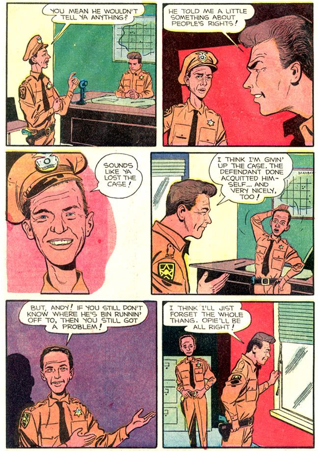
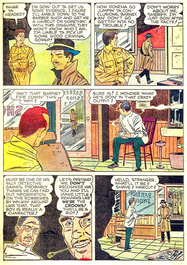
Ellie disappears from the comic after the first issue, and Opie barely appears in "Undercover Man," the story making up the second issue-- just long enough to mock Deputy Barney, who's on a crime-busting kick involving crazy disguises-- but what's really lacking in both is more of Mayberry's vividly realized citizenry.  The most glaring omission is Floyd the barber.  Floyd is a Mayberry essential.  In the show's first two or three seasons, the barber is kind of an energetic loud mouth, a bit excitable and with a wife and teenaged son (although they seem to have been dropped down the same memory hole as Ellie about the time Floyd started courting a woman via romantic letters in "Floyd, the Gay Deceiver").  When veteran comedic actor Howard McNear suffered a debilitating stroke, the show temporarily dropped the character before bringing him back as the soft-spoken, addle-pated soul so uncannily parodied by Eugene Levy on SCTV.


It's just not Mayberry without a visit to Floyd's barber shop, but the comic's version is a mean-spirited lout named either Joe or Charlie.  Barney never makes it clear which is which.  He only refers to them using both names.  Joe, or Charlie as he may be called, vaguely resembles McNear, but his physical humiliation of Barney is a step beyond something Floyd would do, not that first season Floyd was shy about dogpiling on the excitable deputy with the other Mayberrians.  Or Mayberrites.

Green, red, purple walls, orange uniforms!
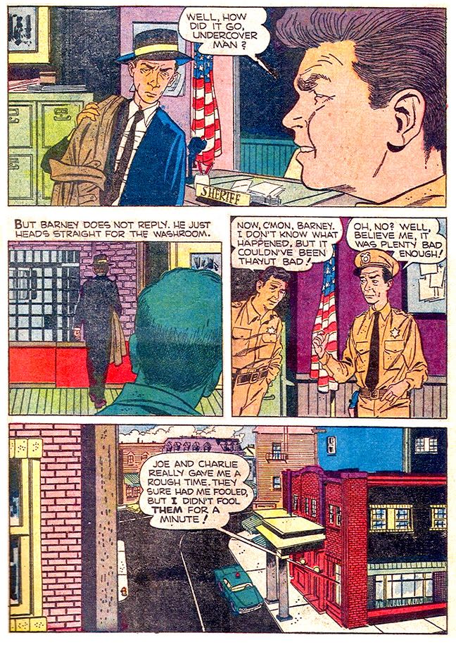
Barney claims the barber as one of his old classmates, but Floyd was at least a generation or two older.  This makes me wonder if the writer screened a few episodes featuring the Andy-Opie dynamic but absent McNear's character, while artist Henry Scarpelli had a vague idea there was supposed to be a middle-aged barber with a thin mustache somewhere in the mix, with the end result this bizarre mutation.  Whatever his origins, Joe-Charlie the Barber is a complete dick, and gets his comeuppance later when Andy threatens him with jail for obstructing a police officer-- and he walks away with his equally dickish friend talking about how attractive they find Barney in drag.

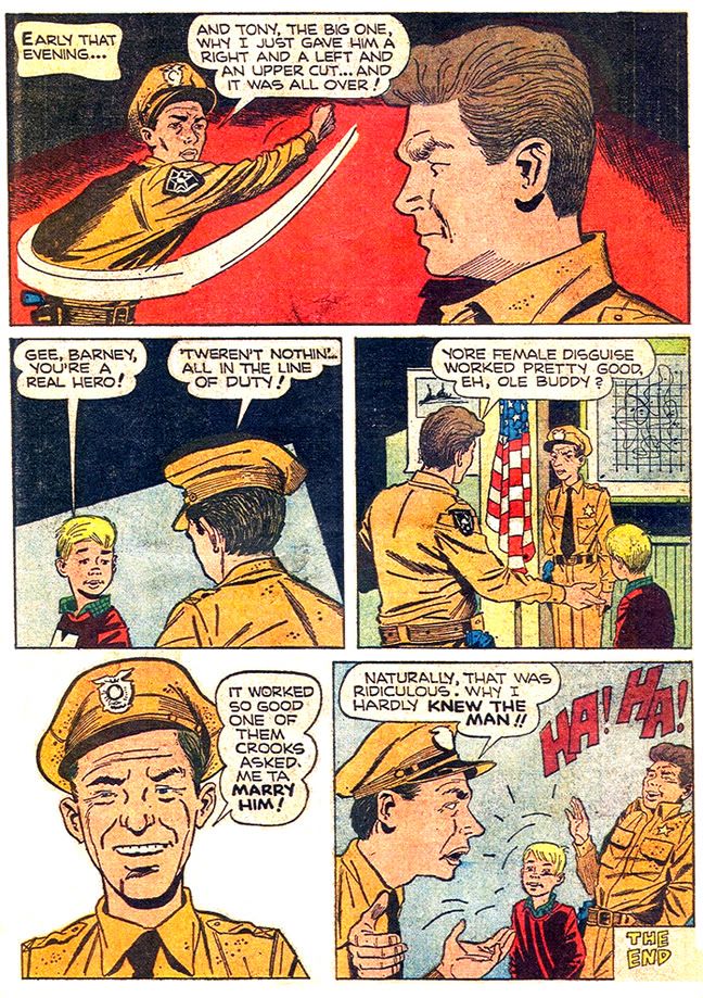
We get a token appearance from Aunt Bee, who helps Barney with his cross-gender disguise, but I can picture an entire spin-off series starring Ernest T. Bass, with the Darling family as his supporting cast or antagonists.  You know, Bass as an anti-hero, kind of like Marvel's Tomb of Dracula minus the supernatural horror, murders and misogyny but with a heapin' helpin' of bluegrass music and Denver Pyle blowing into a jug.  Speaking of, there's nary a hint of either Pyle, Gomer or Goober.  And Helen Crump had not yet made her way onto the faculty of Mayberry's elementary school.

Who are these jackasses?
Scarpelli's attempts at likenesses are acceptable, but in "Opie's Secret," he constructs figures indifferently, awkwardly at times.  Their bodies don't really hang together the way they should.  Heads seem off-center and there's a lot of variation in proportion.  Barney walks around on little pin-like legs with his feet pointing in opposite directions.  Knowing what he was capable of in strictly humor cartoon style and later in the Archie Publications house style a la Bob Montana and Stan Goldberg, I get the feeling Scarpelli hacked these out as fast as he could.  He inked a lot of Archie rip-offs for DC Comics in the late 60s before handling the genuine article; that makes me wonder if he skipped the pencil phase on some of these pages and drew them straight to ink.  I have a feeling the page rates on these comics were pretty low.  A comic book artist is a commercial artist and that means taking jobs that pay, but you have to forgive someone who might rush things a bit in an effort to keep food on the table and clothes on his or her family's back.

I have to say his acting is a strong point in "Opie's Secret."  First rate, even.  Scarpelli rarely repeats a facial expressions, and when the focus is on the faces, his drawings are absolutely fun and appealing.  Some of the faces remind me of Daniel Clowes's work, where he seems to be illustrating a specific type of human being.  There's no ironic distancing or sense of alienation in Scarpelli's drawings, just successfully adding interest to scenes that are mostly just two or three people standing around talking to each other.  I really love Ellie's pissed off looks and Andy's obvious discomfort in "Opie's Secret."

For the Barney-centric "Undercover Man," which features a lot more crime-busting action than "Opie's Secret," (i.e., some) Scarpelli adopts a more naturalistic approach.  Bodies are degrees more realistically proportioned and not nearly so exaggerated.  Scarpelli attempts caricatures more than Alex Toth did with his No Time For Sergeants adaptation and the characters are easily recognizable, despite a few lapses.  There's Barney's occasional weasel-like nose, but the lips are pure Don Knotts, even coated with bright red lipstick.  While there's plenty of Griffith in him, Andy also frequently resembles character actor Hoke Howell, who played Dud Wash on the show before being supplanted in the part by Bob Denver, TV's Gilligan.  It's still reasonably close.

Show accurate Mayberry!
What really freaks me out, however, is Scarpelli's insistence on drawing Andy with a gunbelt and pistol.  Not just in an odd panel or two the way he sometimes adds a black tie to the sheriff's uniform, but consistently and throughout both comics.  Andy did arm himself in the very few episodes where law enforcement actually plays a part in the plot, but one of the show's repeated gags was Barney's single bullet in his shirt pocket, symbolic of his failed approach at enforcing the letter of the law with depersonalized  tools and technology.  Barney wears a hat, tie, black leather gun belt and totes a service revolver in emulation of police officers far more effective than he will ever be, while the more casually-dressed, unarmed Andy takes a laid-back approach to public safety and successfully relies on his wit and understanding of human behavior.  A few years after Dell published these the show did its own meta-spin on the issue with a two-part episode in which Andy, Aunt Bee and Opie head to Hollywood to visit the set of a movie loosely based on a magazine article about Andy entitled Sheriff Without a Gun.  As an Andy Griffith Show fan, believe me, it matters!

Dick Tracy villains think Barney's cute.
In the first story, Scarpelli makes Mayberry a generic suburb.  Oddly enough, this is probably a more accurate depiction of the south in the early 60s than the show's.  The TV Mayberry was practically antiquated even in its day, closer to the nostalgic 1920s depicted in To Kill a Mockingbird.  Even today, in my own Deep South hometown, you can trace the architectural progress of the region by moving west from the Flint River bounded by houses and apartments built in the early 20th century to the Cape Cods of the immediate post-WWII to the modern red brick suburbs that sprang from the early days of urban sprawl contemporaneous with The Andy Griffith Show's first season on CBS.  By the second issue, however, Scarpelli seems to have gotten his hands on some photo reference of the show's outdoor and indoor sets and adjusts his artwork accordingly.  The courthouse, an iconic location to Griffith fans, sports the familiar portico and big plate glass window with blinds.

Of the two comics, the second is the most artistically successful and appealing.  Scarpelli is a fine choice as artist, and his work is adequate, if not quite as inspired as his later Archie strip.   I don't know who else you'd give this job to with my own first choice Jack Davis doing movie posters and covers to TV Guide, high paying, high prestige gigs and second choice Mort Drucker holding forth in Mad.  The Andy Griffith Show isn't a property that would necessarily benefit from photorealism or some of the sub-Hal Foster flourishes you find in Dell's adaptation of the Kirk Douglas epic The Vikings, for example.  Or even the kind of moody black-spotting someone like Alex Toth would have brought to it.

Nobody's perfect!
What's really nice about these is, as with all the Dells, kids got a lot of comic for their 15 cents.  Besides the lengthy main stories, the comics have these funky one-page gag strips on the inside and back covers.  They have the slapstick feel of something from Archie, and aren't as true to the show as the rest of the material.  These gag pages also rely on the simplistic idea that Barney, as the comedic relief, would be capable of any ol' ridiculous thing-- in one he challenges Andy to a shooting contest which he handily wins after substituting the sheriff's live rounds for blanks.  And then the stories themselves, where the writer or writers generally avoid outright jokes, and instead poke fun at Barney's foibles.  Occasionally there's even a little pathos, a little self-awareness on Barney's part that hint at some real potential for a continued series.  "Opie's Secret" is a bit on the bland side, and the meat of "Undercover Man" isn't about barbershop humiliations but rather Barney's female disguise as so inexplicably successful various men fall for him.  In fact, the closing joke is kind of a weaker version of the final scene of Some Like It Hot.

These are just pleasant trifles, but I'm surprised at how they generally respect their source material.  Nothing world-beating, though.  These aren't lost early efforts from creators later recognized as genius-- like coming across an Our Gang comic written and drawn by Walt Kelly-- and the world hasn't suffered due to a lack of more The Andy Griffith Show comics from Dell.  Scarpelli drew the Archie syndicated strip for fifteen years, and his art there is slick and easy on the eyes.  Here, his work on the first issue hovers uncomfortably between realism and caricature, where masters like Jack Davis and Mort Drucker excelled.  Scarpelli isn't up to their level, but that's like damning someone for being physicist without equalling Einstein.  I'd be happy if anyone thought highly enough of my art to label me "not a genius."

No geniuses involved?  Some expert will probably prove to me these were written by Jules Feiffer or a 9-year-old Alan Moore.

Given the choice-- and I often am-- I'd rather just watch an episode of the TV show.  On the other hand, I wonder what Ron Howard thought about becoming a comic book character as a boy.  No one called me "courageous" when I was ten.  "Rotten little shit?"  Oh man, all the time!

Saturday, September 4, 2010

Don Knotts Comics & Stories: A Comic Book Series Proposal!


This is what the world needs: a Dell-style comic book series devoted to beloved comedian Don Knotts. It should be an anthology book, too. Why an anthology? Because Don Knotts left us with a legacy of so many high-strung yet well-meaning characters, it's impossible to choose simply one as the focus.

And also because to match the genius of Knotts with the brilliance of this idea, we have to start with his signature portrayal. You know who I mean. After all, Knotts won 4 Emmys playing him!

Deputy Bernard Milton Fife. Or, occasionally, Barney P. Fife. Or even, in one memorable episode, Bernard Oliver Fife. Whatever his name, we can certainly call Barney Fife an incredible character, brilliantly played and certainly deserving of his own comic strip. That's why our lead feature is entitled "Andy and Barney," an 8- to 10-page strip, running bi-monthly. The main character is, of course, Knotts as Deputy Fife of Mayberry, North Carolina, with Andy Griffith's Sheriff Andy Taylor and the rest of the show's cast-- including Aunt Bee, Opie, Helen Crump, Floyd the barber, Otis the lovable alcoholic, Rafe Hollister, the Darlings and others in supporting roles.

As per the TV series The Andy Griffith Show, these stories revolve around Barney's overzealous attempts at enforcing the law, with Andy using his homespun wisdom and intelligence to restore order. In one script I've taken the liberty to prepare, Barney attempts to procure a stop light for Mayberry's main street, despite Andy's protests that not only isn't traffic heavy enough to warrant one, but also they don't even have an intersection. While trying to prove the necessity of his idea, Barney causes all sorts of traffic headaches, leading Andy to declare, "You beat everything, you know that?"

In another, Barney runs afoul of Ernest T. Bass and Andy is chosen by the town to referee a wrestling match between the two while also trying to prevent it from occurring in the first place!

The back-up stories would vary in length and in these, we'd showcase Knotts's other comedic characters-- Roy Fleming, the reluctant astronaut; Hollis Figg, the bumbling bookkeeper's assistant who constantly tangles with criminals; Dr. Jesse W. Hayward, the shakiest gun in the West; and Abner Audubon Peacock IV, the love god. If we can secure the rights, I'd love to also do some shorts featuring Tim Conway as Knotts's partner in crime, as it were.

On alternate months, when the lead doesn't run, the book would feature full-length adaptations of Don Knotts's many films, such as The Ghost and Mr. Chicken, The Incredible Mr. Limpet (I believe this was already adapted once and could simply be a reprint) and most especially-- the two Apple Dumpling Gang flicks (with Conway) and their 1981 classic, The Private Eyes. In fact, the latter might also become the lead after we've exhausted the rest of Knotts's filmography. The two characters, Inspector Winship and Dr. Tart, could easily sustain a variety of Les Aventures de Tintin-like stories, with occasional detours into horror around Halloween each year as they pursue the terrible Wookalar.


I recognize the licensing aspect of this series may be something of a deterrent to the more timid publishers. But a company with the derring-do to match my visionary creativity would jump at this idea, with me in charge-- editing and scripting-- and reap the vast profits. How about it, publishers? Any takers?