I don't know how I feel about this, mainly due to not having read the book in question. But I do own the first two volumes, and I've enjoyed the heck out of those. Does the reviewer have some solid points about them? More than likely. Do they paint Alex Toth in kind of a bad light? Probably. But at the same time, as this review notes, Dean Mullaney and Bruce Canwell wrote these books with the cooperation and support of the Toth family. Maybe something can be overly critical and yet overly sentimental about its subject at the same time. My slow brain needs time to process and comprehend the reviewer's definitions of cartoonist and illustrator, too. And you know what? You know what this review has done, which is probably opposite its intended effect?
I wasn't particularly planning to get this volume despite having enjoyed the others simply because I'm not as into Toth's animation work as I am his comics. Now I think I will, simply because it has that color Dune Patrol presentation art. As with the first two, it's full of stuff like that, examples of Toth's art that make the cover price bearable, even if this reviewer quibbles with the actual choices (and I tend to agree with those points now that he's broached them). You could spend one hundred thousand words telling me a book is the shittiest thing in human existence, then show me a few gorgeous Toth drawings included in it, and I'll start salivating to own it like I'm a starving dog.
The comment attached is something you definitely need to check out for its link to a fascinating and poignant online comic by Dylan Williams about his longterm via mail relationship with Toth himself. I wish I'd thought of mailing my art to Toth for the privilege of pissing him off and having him rip me a new asshole. The closest to that experience I've come is when I made the mistake of expressing a mild enjoyment of both Toth's and Iwao Takamoto's (and, I suppose, Doug Wildey's, though I didn't know it at the time) animation designs to John Kricfalusi on his superb blog. Kricfalusi didn't take my opinion seriously enough to blow his stack like he has with others, and like Toth did with guys like William Stout and Steve Rude, both of whom-- along with Kricfalusi, for that matter-- occupy the rare artistic elevations cats like I will never climb to. He just brusquely dismissed me as the fool I am with a comment about how dumb it is to like their "little flesh-colored eyes." His silence on the art I dared show him spoke plenty, too. I'd rather be told I suck, though. Receiving a black eye, even a figurative one, is better than being wussy enough in your skills a pro won't even fight you. Imagine what Toth would have written to me. I get goosebumps just thinking about it!
Anyway, getting back to the art choices in this Toth series. Adding non-Toth stuff without proper attribution is certainly problematic. That just seems kind of goofy, doesn't it? I love Wildey almost as much as I do Toth, but I don't want him as a substitute when what I'm really in search of perpetually are complete Toth stories rather than excerpts.
That points out just how neglected up until now Toth has been, perhaps because of the artist's mercurial nature. The reviewer mentions some of the few good books of Toth art out there, and they're absolutely indispensable. If you can get them. I own both Setting the Standard (which seems to be slipping out of print if the listing on Amazon is any indication) and the Zorro volumes (it may be going out of print now, too), and like the reviewer, I prefer them to these because they're collections of Toth's sequential work, with complete stories. The first volume of Enrique Sanchez Abuli's Torpedo has two gorgeous period tales by Toth (plus Jordi Bernet as a bonus), so that one is a must, too. But far too many books where his art exists are either out of print or inconveniently feature Toth folded in with a lot of other artists because he did so many short stories for anthologies. There's no DC Universe by Alex Toth out there with every single thing he did for that company, in the same style of their Neal Adams books or the Gene Colan Batman one. There's no big collection of his Dell work-- something titled Alex Toth in Hollywood with everything he did for Dell would be my pick for Book of the Year in whatever year some far-thinking publisher chose to put it out. Oh my stars, there was! Not one, but two volumes. Now try to track one down and possess it, though! Might as well dig for diamonds in your backyard. And, most frustrating of all, Bravo for Adventure isn't in print anywhere!
Anyway, I'm pretty happy with these giant books because they give me back some of the sketches and examples of Toth I left back in the States when I moved to Japan and for the complete stories they do contain. But what we really and truly need are some dedicated Toth volumes of just his stories. Toth's DC Horrors, Toth in Space, Toth Goes to the Movies, Toth at War, Creepy and Eerie Present Alex Toth.
We need more Toth, publishers! Let's snap it up and get on the ball here!

Showing posts with label Alex Toth. Show all posts
Showing posts with label Alex Toth. Show all posts
Thursday, June 5, 2014


Tuesday, April 29, 2014
Bizarre Dani Moonstar sketch!

Dani Moonstar is upset about something, possibly how screwed up I made her hand. Or maybe it's how oversized I drew her head. Or maybe it's that Superman-type monstrosity in the foreground. I did this as a warm-up before doing a more serious drawing. Strictly linear Sam "Cannonball" Guthrie makes an appearance with either his left arm extremely foreshortened or else his hand swollen to impossible size. Judging by his expression, the latter is very much a possibility. Bored with that, I started copying Alex Toth faces to fill in some space. I like the expression on that guy on the far left: "Why are you doing this? Is it because you hate art?"
Wednesday, April 9, 2014
Dude, you're reading a Dell 1: Alex Toth versus The Real McCoys (Dell Four Color Comics #1071, January-March 1960)
Why adapt The Real McCoys into comic form? Why anything? Maybe there were kids all over these great United States who were really into Walter Brennan. Maybe some suit at Dell felt the misadventures of dirt farming hicks was the coming craze like the hula-hoop or rock and roll when he handed artist Alex Toth this assignment. The Real McCoys ran on ABC and then on CBS from 1957-1963, and it's one of those supposedly classic old television programs I've never watched. I do a mean Walter Brennan impression, though. That Dell executive may have been on to something, because they ended up publishing four The Real McCoys books, just two fewer than they did of Rawhide! And Rawhide starred Clint Eastwood as ramrod Rowdy Yates!
Alex Toth produced some treasures for Dell. There's his work on The Land Unknown (you can see a gorgeous, richly textured page from that story at The Comics Journal, illustrating their interview with Dean Mullaney and Bruce Canwell); Walt Disney's Darby O'Gill and the Little People (one of my favorite comics ever and a page from which you can find at the TwoMorrows site along with an interview with Toth himself that appeared in Comic Book Artist #10); Clint and Mac; the John Wayne airplane flick The Wings of Eagles; and the charming No Time for Sergeants, a film which starred Andy Griffith. You remember Griffith. He would later play Sheriff Andy Taylor on his own program for Danny Thomas Productions, the same studio that made The Real McCoys. Those comics are all worth tracking down.
I have no idea how Alex Toth felt about drawing Walter Brennan's bucolic sitcom misadventures, but I don't imagine it was a dream job for him by any means. "Wild Wheels," the lead story in The Real McCoys (Dell Four Color Comics #1071, January-March 1960), the first issue, does feature elements that would play to his strengths. Real human beings doing relatively realistic things, plus all kinds of cars. I know Toth liked to work a bit on the minimalist side, or essentialist, if you prefer. The drawing is in what you leave out, simplify, simplify, simplify, edit yourself ruthlessly. Well, Toth the hell out of these drawings!
Let's take a closer look at a few pages.
Here's, from near the start of "Wild Wheels," we see a Toth interpretation of a Walter Brennan-caused traffic jam (oh, you crazy Grampa!) on a busy freeway. Toth, probably exceeding in a single image the entire The Real McCoys shooting budget for half a season's worth of episode production, turns the top two tiers of the page into one large panel. Toth may not have been giving the art his all, but this page is a shows some of the storytelling techniques he uses to overcome the limitations of the Dell six-panel page format. The eye enters the image at the usual spot, top lefthand corner where Toth places a concrete overpass in stark white, kind of crushes the cars driving along top of it, then leads us down the on-ramp (backwards!) to the busy middle-ground where suddenly we have dialogue balloons and sound effects.

This gives us time to absorb the situation-- the same way a TV show or film might use an establishing shot, then pan along it before introducing the main characters, which Toth does when he starts to speed up the pace and inserts action by cramming all the truly important stuff in the center of the page, in the area that would be the second two-panel tier (although the large balloons break into the top tier area), and just before quick-cutting the action in the two bottom panels.
It also means Toth can fill a page with a minimum of actual drawing. To that end, Toth leaves the grassy median and shoulders as open areas to be filled with green. No Tothian dabs of ink spotted here or there to suggest detail. While I'm in favor of leaving out visual noise, the rendering here feels unfinished.
There are a lot of cars, though, on the lower half of the page. At first, given the overhead angle and one-point perspective, the backed-up cars become an almost abstract suggestion of the typical American automobile, brightly colored rectangles lacking wheels. As we find ourselves in the middle of the action, with a more grounded viewpoint, Toth adds sparse detailing to the vehicles, resolving them a bit more with tailfins and brakelights, but leaving the troublesome in-perspective work of the oval tires simply suggested through quick brushstrokes underneath. Maybe we'd like to see those tires and hubcaps all worked out in proper perspective, but with Toth, even a shortcut like these inky blobs work as undercarriage shadows, as opposed to something a wannabe like I would do, where you'd see it just as ink. Grampa's jalopy with its old-fashioned rounded shapes and circular headlights contrasts sharply with the ultra-modern boxes around it.
The fist-shaking pose isn't particularly original, but I love the skewed "beeps" and "honks," which invoke different volume levels and pitch. One big blue "honk," probably from a truck, a smaller red one no doubt from a car. "Beep" is probably one of those Volkswagen VWs. The hot yellow background contrasts with the cooler blue/gray fore- and mid-ground elements to give this panel a frenetic energy even though everyone's just kind of sitting there because of Grampa. The last panel has a great sense of movement, with the two-point perspective animating the cars into the tunnel, along with the speedlines and exhaust puffs from Grampa's car, which is badly in need of an emissions inspection. The purple-gray highway and the light purple truck passing into shadow and the orange sky-- complementary colors-- also create deep-focus depth, and allow the primary-colored cars to pop.
Other pages throughout show Toth rushed this one. It's not even so much just the uninvolving groups of figures and lack of backgrounds. The linework itself shows a certain lack of precision that comes from slapping down ink in a hurry. It's especially evident on this page, where the cop wears some misshapen sunglasses on his indistinct face and poor Richard Crenna looks as if he's in for some serious sinus problems.

Yawn. The script is uninspired. In case you haven't figured it out, the guys take a fishing trip, but end up mistaken for criminals. I don't know how idiosyncratic the TV show was, but this is the generic kind of thing you could plug any characters from any property into. Even ramrod Rowdy Yates on a horse instead of a junk car. There's a half-hearted attempt at slapstick, but it's borrowed-- the ol' "fish hooks catch each other under the boat" gag used in one of Our Gang's later, lesser MGM shorts, "Three Smart Guys." If you're going to steal gags to liven up a dead story why steal from a stinker? Or maybe they took it from another source. It seems mighty familiar. As if unimpressed himself, Toth doesn't bother with a lot of drawing of nature during this interlude, either. Pine trees that are simply suggested with dabs of angular ink jut from horizontal lines indicating a landscape, but it's curiously under-grown.
Eventually, just before the readers put down The Real McCoys to re-read Darby O'Gill or else fall asleep, Grampa and family end up involved in a car chase complete with winding mountain roads and desperate bank robbers blasting away. Only during this sequence does Toth finally seem fully engaged with the material. Again, this is probably more expensive-looking than The Real McCoys ever got on TV, but how should I know? If I were going to write a script for even something like One Day at a Time for Toth to illustrate, I'd make damn sure I stuck a car chase in there at some point.
Here's a page that makes The Real McCoys as exciting as an episode of The Untouchables.

Do you buy Grampa's ancient car being able to pull off such a wicked, professional pursuit-driver level maneuver? One wonders why the bank robbers didn't blast away at the McCoys as they passed. This all seems like a plot contrivance, but Toth does some fine work here. If you look at the third panel, with that improbable stunt, you see the tree the car crashes into in the fourth panel. The tree doesn't just pop out of nowhere. Toth thinks the action through. Excellent placement of sound effects and dialogue, too. It helps set the chronology of the sequence, compressing three distinct moments-- immediate pre-crash break-squealing, a character reaction and then the crash itself-- into one effective panel. Nice Billy Jack hat on that guy in the fifth panel.
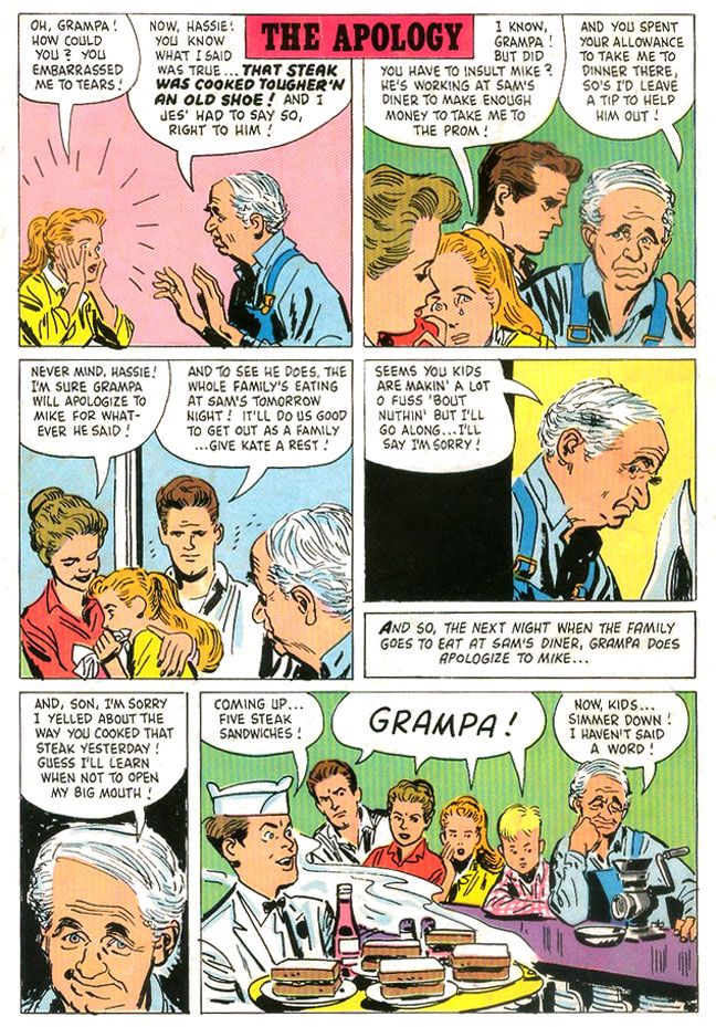
But even on some of the more inert pages, there are still little touches of Tothian brilliance. There's some nice facial acting on Grampa in "The Apology," a one-page gag story that appears on the comic's back cover. I absolutely love the wry expression in the fifth panel in particular.


Alex Toth produced some treasures for Dell. There's his work on The Land Unknown (you can see a gorgeous, richly textured page from that story at The Comics Journal, illustrating their interview with Dean Mullaney and Bruce Canwell); Walt Disney's Darby O'Gill and the Little People (one of my favorite comics ever and a page from which you can find at the TwoMorrows site along with an interview with Toth himself that appeared in Comic Book Artist #10); Clint and Mac; the John Wayne airplane flick The Wings of Eagles; and the charming No Time for Sergeants, a film which starred Andy Griffith. You remember Griffith. He would later play Sheriff Andy Taylor on his own program for Danny Thomas Productions, the same studio that made The Real McCoys. Those comics are all worth tracking down.
I have no idea how Alex Toth felt about drawing Walter Brennan's bucolic sitcom misadventures, but I don't imagine it was a dream job for him by any means. "Wild Wheels," the lead story in The Real McCoys (Dell Four Color Comics #1071, January-March 1960), the first issue, does feature elements that would play to his strengths. Real human beings doing relatively realistic things, plus all kinds of cars. I know Toth liked to work a bit on the minimalist side, or essentialist, if you prefer. The drawing is in what you leave out, simplify, simplify, simplify, edit yourself ruthlessly. Well, Toth the hell out of these drawings!
Let's take a closer look at a few pages.
Here's, from near the start of "Wild Wheels," we see a Toth interpretation of a Walter Brennan-caused traffic jam (oh, you crazy Grampa!) on a busy freeway. Toth, probably exceeding in a single image the entire The Real McCoys shooting budget for half a season's worth of episode production, turns the top two tiers of the page into one large panel. Toth may not have been giving the art his all, but this page is a shows some of the storytelling techniques he uses to overcome the limitations of the Dell six-panel page format. The eye enters the image at the usual spot, top lefthand corner where Toth places a concrete overpass in stark white, kind of crushes the cars driving along top of it, then leads us down the on-ramp (backwards!) to the busy middle-ground where suddenly we have dialogue balloons and sound effects.
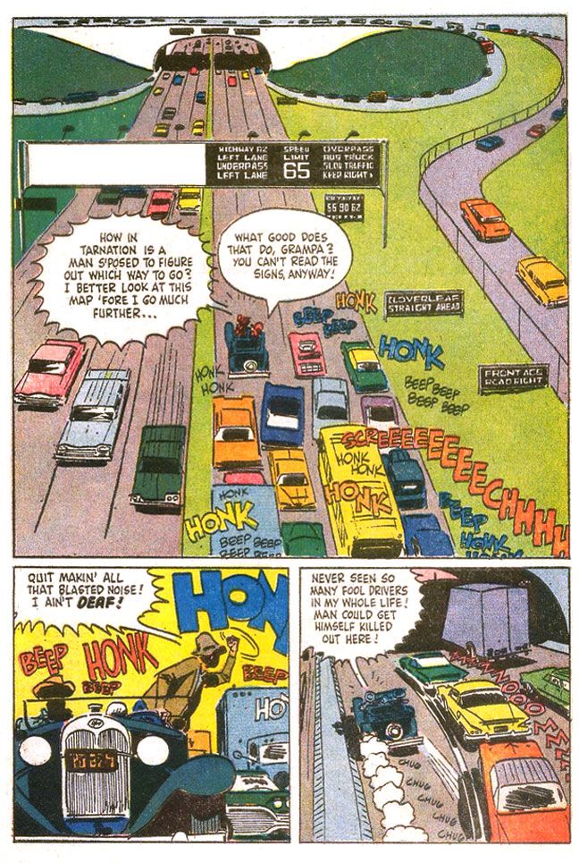
This gives us time to absorb the situation-- the same way a TV show or film might use an establishing shot, then pan along it before introducing the main characters, which Toth does when he starts to speed up the pace and inserts action by cramming all the truly important stuff in the center of the page, in the area that would be the second two-panel tier (although the large balloons break into the top tier area), and just before quick-cutting the action in the two bottom panels.
It also means Toth can fill a page with a minimum of actual drawing. To that end, Toth leaves the grassy median and shoulders as open areas to be filled with green. No Tothian dabs of ink spotted here or there to suggest detail. While I'm in favor of leaving out visual noise, the rendering here feels unfinished.
There are a lot of cars, though, on the lower half of the page. At first, given the overhead angle and one-point perspective, the backed-up cars become an almost abstract suggestion of the typical American automobile, brightly colored rectangles lacking wheels. As we find ourselves in the middle of the action, with a more grounded viewpoint, Toth adds sparse detailing to the vehicles, resolving them a bit more with tailfins and brakelights, but leaving the troublesome in-perspective work of the oval tires simply suggested through quick brushstrokes underneath. Maybe we'd like to see those tires and hubcaps all worked out in proper perspective, but with Toth, even a shortcut like these inky blobs work as undercarriage shadows, as opposed to something a wannabe like I would do, where you'd see it just as ink. Grampa's jalopy with its old-fashioned rounded shapes and circular headlights contrasts sharply with the ultra-modern boxes around it.
The fist-shaking pose isn't particularly original, but I love the skewed "beeps" and "honks," which invoke different volume levels and pitch. One big blue "honk," probably from a truck, a smaller red one no doubt from a car. "Beep" is probably one of those Volkswagen VWs. The hot yellow background contrasts with the cooler blue/gray fore- and mid-ground elements to give this panel a frenetic energy even though everyone's just kind of sitting there because of Grampa. The last panel has a great sense of movement, with the two-point perspective animating the cars into the tunnel, along with the speedlines and exhaust puffs from Grampa's car, which is badly in need of an emissions inspection. The purple-gray highway and the light purple truck passing into shadow and the orange sky-- complementary colors-- also create deep-focus depth, and allow the primary-colored cars to pop.
Other pages throughout show Toth rushed this one. It's not even so much just the uninvolving groups of figures and lack of backgrounds. The linework itself shows a certain lack of precision that comes from slapping down ink in a hurry. It's especially evident on this page, where the cop wears some misshapen sunglasses on his indistinct face and poor Richard Crenna looks as if he's in for some serious sinus problems.
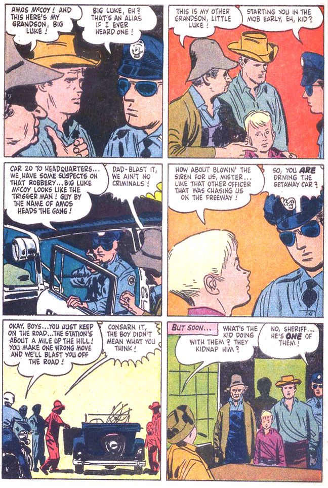
Yawn. The script is uninspired. In case you haven't figured it out, the guys take a fishing trip, but end up mistaken for criminals. I don't know how idiosyncratic the TV show was, but this is the generic kind of thing you could plug any characters from any property into. Even ramrod Rowdy Yates on a horse instead of a junk car. There's a half-hearted attempt at slapstick, but it's borrowed-- the ol' "fish hooks catch each other under the boat" gag used in one of Our Gang's later, lesser MGM shorts, "Three Smart Guys." If you're going to steal gags to liven up a dead story why steal from a stinker? Or maybe they took it from another source. It seems mighty familiar. As if unimpressed himself, Toth doesn't bother with a lot of drawing of nature during this interlude, either. Pine trees that are simply suggested with dabs of angular ink jut from horizontal lines indicating a landscape, but it's curiously under-grown.
Eventually, just before the readers put down The Real McCoys to re-read Darby O'Gill or else fall asleep, Grampa and family end up involved in a car chase complete with winding mountain roads and desperate bank robbers blasting away. Only during this sequence does Toth finally seem fully engaged with the material. Again, this is probably more expensive-looking than The Real McCoys ever got on TV, but how should I know? If I were going to write a script for even something like One Day at a Time for Toth to illustrate, I'd make damn sure I stuck a car chase in there at some point.
Here's a page that makes The Real McCoys as exciting as an episode of The Untouchables.
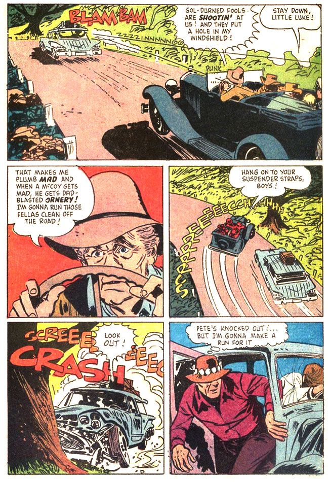
Do you buy Grampa's ancient car being able to pull off such a wicked, professional pursuit-driver level maneuver? One wonders why the bank robbers didn't blast away at the McCoys as they passed. This all seems like a plot contrivance, but Toth does some fine work here. If you look at the third panel, with that improbable stunt, you see the tree the car crashes into in the fourth panel. The tree doesn't just pop out of nowhere. Toth thinks the action through. Excellent placement of sound effects and dialogue, too. It helps set the chronology of the sequence, compressing three distinct moments-- immediate pre-crash break-squealing, a character reaction and then the crash itself-- into one effective panel. Nice Billy Jack hat on that guy in the fifth panel.
But even on some of the more inert pages, there are still little touches of Tothian brilliance. There's some nice facial acting on Grampa in "The Apology," a one-page gag story that appears on the comic's back cover. I absolutely love the wry expression in the fifth panel in particular.
Oh, the second story is about a goat that eats the McCoys' barn. It's not exactly prime Toth, either, but it's the only place you'll ever see him draw a goat eating a barn.
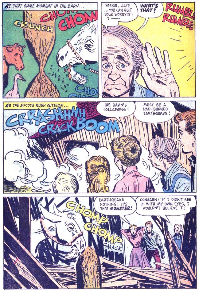
I love the cow and goose in the first panel. The cow in particular wears a dismayed "What the hell?" expression, as if she can't quite process what she's seeing. I hope they weren't injured when the barn collapsed!
Monday, July 29, 2013
Four Color #790, "The Wings of Eagles:" Toth draws the Duke
Well, if you're doing a comic book version of a war movie about airplanes with John Wayne as the lead, you couldn't ask for a better artist than Alex Toth. Here he tackles the 1957 John Ford film The Wings of Eagles (Dell Four Color #790, April 1957). As far as I can remember, I haven't seen this movie, but after reading the comic, I'm thinking this is the kind of movie that doesn't innovate in an attempt to get at the inner desires and struggled of its subject, but just aims to please audiences with a rousing action story tribute to a guy who hobbled himself by accident but still went to war because he was so damned patriotic. A guy who just happened to have been good friends with the director himself.
Frank "Spig" Wead's life story kind of boggles the imagination and my first impression was, "No way." I mean, John Wayne as a hard-brawling guy named Spig?
But I did a little reading and I was wrong. While the photo I saw looks absolutely nothing like Wayne (a young David Strathairn comes immediately to mind), the real Wead actually was a pioneer of Naval aviation and carrier operations and part of a Navy flight team that won the Schneider Cup in 1923. Then he fell and broke his neck one night. Forced to retire from the Navy, Wead turned to expressing himself through writing and scripted films, mostly having to do with the military and flying. His film work netted him two Academy Award nominations. During WWII, Wead returned to service, helped develop the idea of the escort carrier (called "jeep" carriers in this comic), and even managed some sea duty aboard the carriers USS Yorktown and Essex.
Still, I can't help but think John Wayne was miscast in this film, or that Ford and company altered reality just a smidge to fit it to his oversized shoulders. While he certainly beat the drum as a patriot (despite not having actually put on a uniform in earnest), I simply can't imagine Wayne as a writer of any kind, military or not. Or hobbling around on crutches. If this Dell adaptation is accurate to the movie at all, it seems your typical mix of fact and Hollywood hokum... er... dramatic license, with events simplified and telescoped, secondary characters invented or composited. There's a thinly-disguised Ford stand-in played by Ward Bond. They call him John Dodge (clever, boys, clever!). There's a guy apparently based on Billy Mitchell who constantly fights with Wead (Toth depicts Wayne in the aftermath of these moments with cute little bandages on his face), which probably owes more to Flagg and Quirt from What Price Glory? than either Wead's or Mitchell's lives. There's a guy named Jughead, for chrissake! Even the film's title is a bit of a groaner.
But, as I said, I haven't seen it and there's always the Ford factor. Discount even a minor Ford film at your peril, and this one came in the wake of his superlative Western The Searchers. Whatever the quality of the movie it's based on, the book itself is aces, a little slice of perfection. Toth himself appears to have been thoroughly engaged by the material and just knocks himself out. He gets to draw airplanes from multiple eras and even a big time Hollywood movie premiere with 1930s-style cars. It's in the acting-- as well as the action-- that Toth really shines in this outing.
Here he pulls out the stops with unique facial expressions, really bringing the characters to life. His Wead/Wayne may not look a whole lot like the Duke-- other than matching him for imposing size compared to everyone else on the page-- but Toth nails the man's broad acting style. Even in scenes where the action is largely internal-- Wead struggles with writing inspiration and later, with the problem of prolonging carrier operations during invasions despite attrition in aircraft and men, Toth adds interest by choosing the right angle, the right facial expression. He once remarked something to the effect that some talky scenes will be by their very nature pedestrian, but he avoids that trap here. Or maybe it's just that the comedic drunken brawling and daredevil flying stuff more than make up for the internalized moments.
Despite the usual crap printing of the day, it's obvious even the coloring job is well thought-out. It uses a muted color scheme largely in various tints of blue, probably because so much of it takes place either in the air or on the sea. The colors don't exactly pop, but they're not garish nor do they battle Toth's line work. Check out this moody twilight scene:

Now we've all seen 1950s-era war flicks. They almost always save a bit of money by using stock footage. Authentic, but it's usually so glaringly obvious it throws me right out of the story. It also makes me wish I was simply watching a documentary so I can properly consider the millions of real people who died in pain and terror without the unfortunate context of their sacrifice serving to make John Wayne look like a great guy up on the silver screen. War comics of this era by their very nature-- generally aimed at kids-- tend to turn it all into a grand spectacle, with manly dogfaces stoically facing death or wisecracking their way through battles depending on the story's whims, largely sanitized to suit the Comics Code. Eagles is at least based on actual events, and Toth is untrammeled by budget considerations, so when he depicts life aboard a flattop doing its deadly business out there in the Pacific, we can imagine it's the real thing and not some rear-projected footage on a soundstage in Los Angeles.
His major battle scene in the book is a single over-sized panel that's practically a whole school on controlling eye movement and presenting depth in itself. In the foreground, there are machine gun strikes, then a middle-ground plane made up of palm trees and the invasion force itself, with troops and a tank largely suggested through silhouetting, a bright flash of a Zero overhead drawing our gaze upward into the background, a sky Toth speckles with angry ink blotches representing flak. It's appropriately hectic and violent, certainly doesn't look like fun for Gunner and Sarge. Toth compresses a whole day's worth of death and destruction into this single image.

This is contrasted on the next page by some talking heads which bring us back into the story proper and provide tension. Then, another incredible panel of a Wildcat taking off, reminding us of the scope of the day's events and showing us Spig's grand idea coming to fruition.

I can't imagine Ford-- unlike Wayne, Ford knew war first-hand, having been wounded at Midway and present on Omaha Beach itself during the D-Day invasion-- reading this and feeling his cinematic vision slighted. This is some sterling Toth, and really deserves another look. Fortunately, you can find the whole thing online at a couple of different blogs to enjoy for yourself.
Frank "Spig" Wead's life story kind of boggles the imagination and my first impression was, "No way." I mean, John Wayne as a hard-brawling guy named Spig?
But I did a little reading and I was wrong. While the photo I saw looks absolutely nothing like Wayne (a young David Strathairn comes immediately to mind), the real Wead actually was a pioneer of Naval aviation and carrier operations and part of a Navy flight team that won the Schneider Cup in 1923. Then he fell and broke his neck one night. Forced to retire from the Navy, Wead turned to expressing himself through writing and scripted films, mostly having to do with the military and flying. His film work netted him two Academy Award nominations. During WWII, Wead returned to service, helped develop the idea of the escort carrier (called "jeep" carriers in this comic), and even managed some sea duty aboard the carriers USS Yorktown and Essex.
Still, I can't help but think John Wayne was miscast in this film, or that Ford and company altered reality just a smidge to fit it to his oversized shoulders. While he certainly beat the drum as a patriot (despite not having actually put on a uniform in earnest), I simply can't imagine Wayne as a writer of any kind, military or not. Or hobbling around on crutches. If this Dell adaptation is accurate to the movie at all, it seems your typical mix of fact and Hollywood hokum... er... dramatic license, with events simplified and telescoped, secondary characters invented or composited. There's a thinly-disguised Ford stand-in played by Ward Bond. They call him John Dodge (clever, boys, clever!). There's a guy apparently based on Billy Mitchell who constantly fights with Wead (Toth depicts Wayne in the aftermath of these moments with cute little bandages on his face), which probably owes more to Flagg and Quirt from What Price Glory? than either Wead's or Mitchell's lives. There's a guy named Jughead, for chrissake! Even the film's title is a bit of a groaner.
But, as I said, I haven't seen it and there's always the Ford factor. Discount even a minor Ford film at your peril, and this one came in the wake of his superlative Western The Searchers. Whatever the quality of the movie it's based on, the book itself is aces, a little slice of perfection. Toth himself appears to have been thoroughly engaged by the material and just knocks himself out. He gets to draw airplanes from multiple eras and even a big time Hollywood movie premiere with 1930s-style cars. It's in the acting-- as well as the action-- that Toth really shines in this outing.
Here he pulls out the stops with unique facial expressions, really bringing the characters to life. His Wead/Wayne may not look a whole lot like the Duke-- other than matching him for imposing size compared to everyone else on the page-- but Toth nails the man's broad acting style. Even in scenes where the action is largely internal-- Wead struggles with writing inspiration and later, with the problem of prolonging carrier operations during invasions despite attrition in aircraft and men, Toth adds interest by choosing the right angle, the right facial expression. He once remarked something to the effect that some talky scenes will be by their very nature pedestrian, but he avoids that trap here. Or maybe it's just that the comedic drunken brawling and daredevil flying stuff more than make up for the internalized moments.
Despite the usual crap printing of the day, it's obvious even the coloring job is well thought-out. It uses a muted color scheme largely in various tints of blue, probably because so much of it takes place either in the air or on the sea. The colors don't exactly pop, but they're not garish nor do they battle Toth's line work. Check out this moody twilight scene:
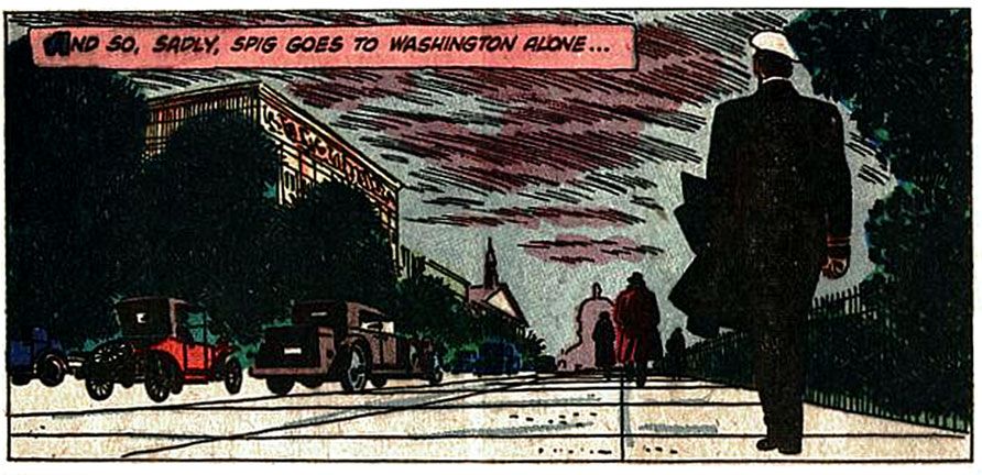
Now we've all seen 1950s-era war flicks. They almost always save a bit of money by using stock footage. Authentic, but it's usually so glaringly obvious it throws me right out of the story. It also makes me wish I was simply watching a documentary so I can properly consider the millions of real people who died in pain and terror without the unfortunate context of their sacrifice serving to make John Wayne look like a great guy up on the silver screen. War comics of this era by their very nature-- generally aimed at kids-- tend to turn it all into a grand spectacle, with manly dogfaces stoically facing death or wisecracking their way through battles depending on the story's whims, largely sanitized to suit the Comics Code. Eagles is at least based on actual events, and Toth is untrammeled by budget considerations, so when he depicts life aboard a flattop doing its deadly business out there in the Pacific, we can imagine it's the real thing and not some rear-projected footage on a soundstage in Los Angeles.
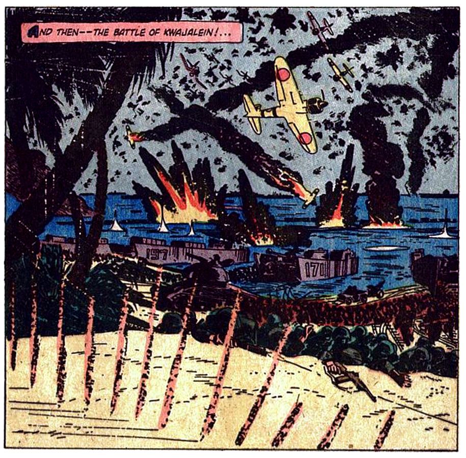
His major battle scene in the book is a single over-sized panel that's practically a whole school on controlling eye movement and presenting depth in itself. In the foreground, there are machine gun strikes, then a middle-ground plane made up of palm trees and the invasion force itself, with troops and a tank largely suggested through silhouetting, a bright flash of a Zero overhead drawing our gaze upward into the background, a sky Toth speckles with angry ink blotches representing flak. It's appropriately hectic and violent, certainly doesn't look like fun for Gunner and Sarge. Toth compresses a whole day's worth of death and destruction into this single image.
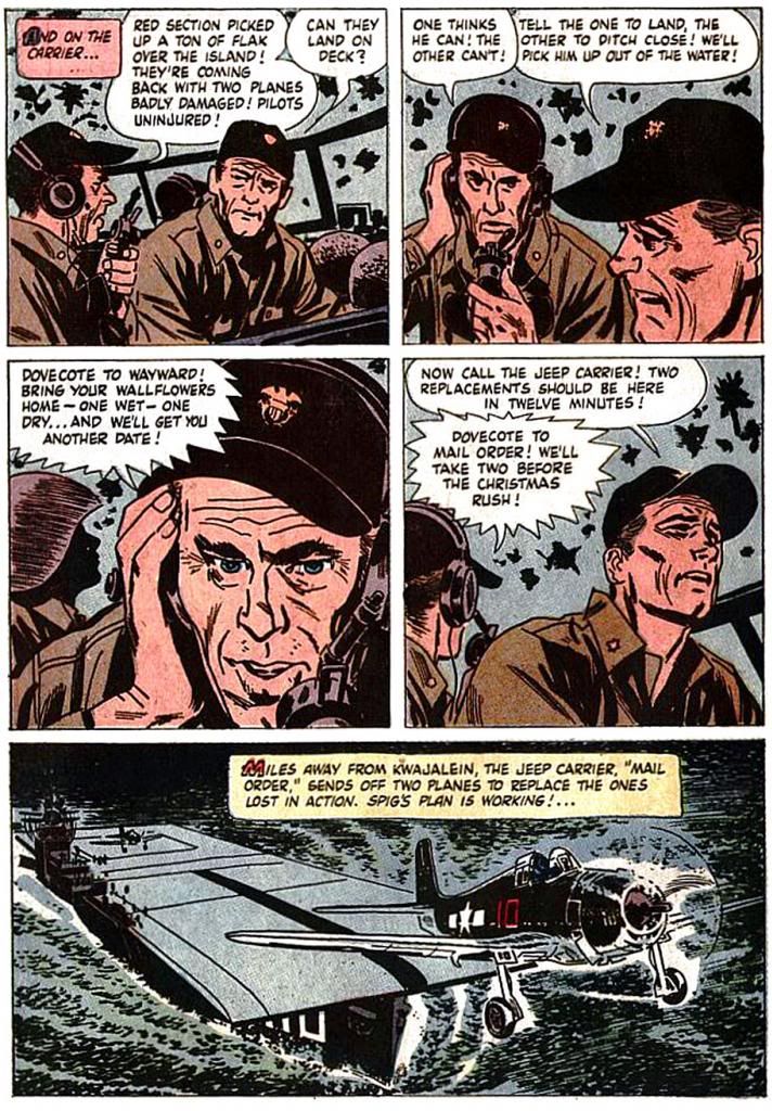
This is contrasted on the next page by some talking heads which bring us back into the story proper and provide tension. Then, another incredible panel of a Wildcat taking off, reminding us of the scope of the day's events and showing us Spig's grand idea coming to fruition.
I can't imagine Ford-- unlike Wayne, Ford knew war first-hand, having been wounded at Midway and present on Omaha Beach itself during the D-Day invasion-- reading this and feeling his cinematic vision slighted. This is some sterling Toth, and really deserves another look. Fortunately, you can find the whole thing online at a couple of different blogs to enjoy for yourself.
Friday, June 7, 2013
Jack Kirby versus Alex Toth!
We recently saw what happens when Jack Kirby and Alex Toth team up, but what about if they duked it out mano-a-mano? The very idea makes me feel like one of Bill Swerski's Superfans contemplating the outcome of a match between the Chicago Bears and the Chicago Bulls-- I'm either about to have multiple heart attacks or else the result of such a contest would be a rending of the space-time continuum itself, with the United Nations putting a stop to it before we suffer total planetary annihilation.
Fortunately for the safety of the human race we can keep this on a strictly theoretical basis-- although I understand scientists at CERN are working on a multi-dimensional viewing device where you can enter any desired parameter in a computer controlling a super-gravity variable matrix which opens a type of worm hole at any point real or imagined where we can then observe the results of a given scenario no matter how improbable. Until they complete their work, just read Hero Envy's piece pitting Jack Kirby versus Alex Toth for the title of True King of Comics. It's loaded with eye-popping artwork from both men and turns out to be a heart-filled tribute to both Kirby and Toth and their lasting legacies.
Fortunately for the safety of the human race we can keep this on a strictly theoretical basis-- although I understand scientists at CERN are working on a multi-dimensional viewing device where you can enter any desired parameter in a computer controlling a super-gravity variable matrix which opens a type of worm hole at any point real or imagined where we can then observe the results of a given scenario no matter how improbable. Until they complete their work, just read Hero Envy's piece pitting Jack Kirby versus Alex Toth for the title of True King of Comics. It's loaded with eye-popping artwork from both men and turns out to be a heart-filled tribute to both Kirby and Toth and their lasting legacies.
Wednesday, May 29, 2013
Artists I've tried to imitate...
Copying can be a good thing. At least during your learning process. Rod Serling admitted he was a Hemingway copier when he first started writing, and said everything he wrote began, "It was hot." So imitation is a thing people do when they're learning to express themselves. And it works for comic book art, too. You learn how the greats do things and you eventually develop your own (fairly) distinct mode of expression*.
And yeah, there might be a few geniuses who spring forth fully formed and owe no debt to anyone. But I'd be willing to bet even Picasso started off drawing and painting like someone else he admired. He was probably six years old at the time.
I probably have no business discussing this stuff, but I have been studying art practically my entire life-- even now, when I have approximately 5 minutes a week to devote to it. Obviously I'm no Picasso and I'm not even a Hacky H. Hackerson or a J. Jonah Journeyperson yet. But what I have in common with practically any comic book artist you can name is I spent a lot of that time looking at other artists and trying to draw like them. Even established pros do this from time to time. Check out some of Alex Toth's work when he's obviously channeling Jean Giraud with those little parallel hatch lines.
Here, then, is a list of a lucky fourteen artists I've copied from over the years!
1) Alex Toth. He wasn't the first, but out of all the artists on this list-- other than possibly Al Williamson-- he's the guy whose art I want mine to look exactly like. I should get over that because at this point it's doing more harm than good, but if I'd discovered this when I was ten years old instead of in my mid-thirties, I might have learned a thing or two from him. I have to add anyone working in the "Toth School" to this entry. David Mazzucchelli's work on Batman Year One was a revelation as well. The story didn't do much for me-- crazed Batman, all lawful authorities are irredeemably stupid/corrupt so a man must act outside the law, lots of prostitutes (you know, Frank Miller)-- but the art made it work. The same goes for all the artists Toth openly admired. I'm working my way towards primary sources now, too. I think Toth would want it that way.
2) Al Williamson. He probably was the first to really blow my mind completely. I drew before I discovered Williamson, and I read comics before I ever saw one with his art and I sometimes copied art. But after seeing his work for the first time-- the Marvel adaptation of Empire Strikes Back-- I got serious about it. And kind of like I am with Toth, I'm working my way towards Williamson's influences as well. Another artist I admire, Mark Schultz, has seen to that.
3) Michael Golden. Like I wrote above, I copied artists before I found Williamson. Golden was one of them. I used to sit at our kitchen bar and meticulously copy panel after panel and cover after cover of his Micronauts work. The detail amazed me, but I think I was mostly taken with how real it seemed even if the figures themselves were slightly cartooned (look at the big eyes, for example). Oh yeah, and the way he rendered light sources on faces-- double lighting!-- and metal armor and spaceships.
4) Doug Wildey. His animation work on Jonny Quest. I went through a whole period where everything I drew I tried to make look like a Jonny Quest animation cell. The simplicity of it, plus the heavy black spotting. I suppose that's kind of Tothian, but the fixation was purely on that Jonny Quest look. I didn't know Wildey's name until years later, but he gets his own entry because of how important the Jonny Quest visuals were to me at the time.
5) The people behind Speed Racer. I conflated this with Jonny Quest, and it had a similar impact. I could look up the main artist but I'm lazy and there are too many other names to check on this list.
6) Jack Kirby. Kirby is the antithesis of Toth in a lot of ways. Steve Rude can synthesize the two; I can't. But I love Kirby's work with a passion equal to my love of Toth's and Williamson's. Plus, he's my all-time favorite guy in comics as a human being. I mean it; I'm saddened I never got to meet him and buy him a slice of chocolate cake. Kirby is one of the most comic book distinctive artists, with a look that's more immediately identifiable than just about anyone else you could name. It's almost bigger than comics themselves and very nearly elevates itself above the form. A blown-up panel of just about any mid-60s through mid-70s Kirby comic would look splendid on the walls of any museum of modern art in the world. As fun as Kirby is to read, he's just as much fun to imitate when you're drawing. If you haven't tried it, you should-- I did a side-by-side reconstruction of a Fantastic Four panel for a color theory class I had in college. We had to match the yellowed newsprint appearance of an old comic, then create how it would look printed on pure white with no competition from cheap paper and age. One of the most fun little assignments I ever had.
7) Jack Davis. Having attended the University of Georgia to study art and graphic design, I found Davis's influence inescapable. Not that I would ever want to escape it. The GD program director's appreciation of cartooning began and ended with Davis. In fact, if I didn't try to imitate Davis when I did my own little cartoons, he grunted at me. Grunt, grunt, grunt. While I had a broader sense of who I wanted to be at the time, I'd long admired Jack Davis for both his horror and funny stuff. I wanted to caricature just like him. And he did it in vivid watercolor or gouache or something. Sorry, I can't remember what, and I even got to interview the man. Unfortunately, this was about the time my hopes at being a comic book artist or commercial illustrator crashed and burned. The graphic design program was more geared towards typography and magazine design, disciplines at which I had no native talent and little interest in learning. I wanted to draw. Despite getting to work with some great illustration professors, I foolishly bucked the system and came away from this program with my confidence wrecked and unable to complete a drawing for years. I don't think I've completely recovered and probably never will.
8) John Byrne. I think just about every kid with dreams of comic book glory back in the early 80s wanted to draw like Byrne.
9) Neal Adams. Byrne always seemed to be talking about Adams. That is, when he wasn't talking about Jose Luis Garcia-Lopez, another awesome DC artist. I knew Adams from some Batman reprints that kept turning up during my childhood. For a time in the late 80s I copied as many Adams Batman drawings as I could find time to do.
10) Mike Allred. Super cool art and a really nice guy. His work made me think I could possibly do comics again after my disaster at UGA. Not that I thought I'd be as good. It's just that looking at his fun work made me want to draw again. And his love for the medium is infectious. Also inspiring is the way he buckles down and turns out pages. His runs on The Atomics and Marvel's X-Force/X-Statix are freaky good and all the more impressive for their consistency and Kirby-like work ethic. Can you imagine a guy who draws like this able to turn around a monthly book? I mean this is following years of self-indulgent lesser artists constantly blowing deadlines. And a few years ago, Allred suddenly took his art to a higher level and left a lot of people in the dust. What an amazing cat!
11) Steve Rude. The Dude. There is nothing more need be said.
12) Rumiko Takahashi. Her art is the very definition of appeal. It reminds me a bit of Walt Kelly's in that you just want to hug it as much as you want to look at it. I'd give anything to produce art with this much appeal.
13) Mike Mignola. Deceptively simple. Geometric, stripped down to basic lines and areas of black. Easy to copy line-for-line, difficult to produce on your own. He has a unique way of putting together lower bodies. What's happening there with that anatomy? When I look at it, I see. When I look away, I can't.
14) Gene Colan. He should have come earlier on this list. Man, even now I would give anything to be able to draw like Colan. He always chose the most interesting angles and while later in his career his anatomy sometimes came apart as a result-- check out Batman's birthin' hips-- Colan in his prime was a true master of mood. Shadow and mood. Drama. Reading a Colan comic was like watching one of the better Hammer Studio films. Drawing from one was difficult. But even now when I draw a face wearing glasses, I'm thinking Colan.
Okay, there are a number of others I should do full entries on-- John Buscema, Alfredo Alcala, Goseki Kojima, Ai Yazawa, Bob McLeod, P. Craig Russell, plus a whole lot more I'm forgetting at the moment. But I'm tired of writing about drawing. I'd rather be drawing. Too bad I'm at work.
*I can't stress this enough-- this has to be in conjunction with actually learning how to draw. You need a full education in art basics like composition, perspective and figure construction, which are just some of the universal underpinnings of an artist's methods, plus a LOT of life-drawing!
And yeah, there might be a few geniuses who spring forth fully formed and owe no debt to anyone. But I'd be willing to bet even Picasso started off drawing and painting like someone else he admired. He was probably six years old at the time.
I probably have no business discussing this stuff, but I have been studying art practically my entire life-- even now, when I have approximately 5 minutes a week to devote to it. Obviously I'm no Picasso and I'm not even a Hacky H. Hackerson or a J. Jonah Journeyperson yet. But what I have in common with practically any comic book artist you can name is I spent a lot of that time looking at other artists and trying to draw like them. Even established pros do this from time to time. Check out some of Alex Toth's work when he's obviously channeling Jean Giraud with those little parallel hatch lines.
Here, then, is a list of a lucky fourteen artists I've copied from over the years!
1) Alex Toth. He wasn't the first, but out of all the artists on this list-- other than possibly Al Williamson-- he's the guy whose art I want mine to look exactly like. I should get over that because at this point it's doing more harm than good, but if I'd discovered this when I was ten years old instead of in my mid-thirties, I might have learned a thing or two from him. I have to add anyone working in the "Toth School" to this entry. David Mazzucchelli's work on Batman Year One was a revelation as well. The story didn't do much for me-- crazed Batman, all lawful authorities are irredeemably stupid/corrupt so a man must act outside the law, lots of prostitutes (you know, Frank Miller)-- but the art made it work. The same goes for all the artists Toth openly admired. I'm working my way towards primary sources now, too. I think Toth would want it that way.
2) Al Williamson. He probably was the first to really blow my mind completely. I drew before I discovered Williamson, and I read comics before I ever saw one with his art and I sometimes copied art. But after seeing his work for the first time-- the Marvel adaptation of Empire Strikes Back-- I got serious about it. And kind of like I am with Toth, I'm working my way towards Williamson's influences as well. Another artist I admire, Mark Schultz, has seen to that.
3) Michael Golden. Like I wrote above, I copied artists before I found Williamson. Golden was one of them. I used to sit at our kitchen bar and meticulously copy panel after panel and cover after cover of his Micronauts work. The detail amazed me, but I think I was mostly taken with how real it seemed even if the figures themselves were slightly cartooned (look at the big eyes, for example). Oh yeah, and the way he rendered light sources on faces-- double lighting!-- and metal armor and spaceships.
4) Doug Wildey. His animation work on Jonny Quest. I went through a whole period where everything I drew I tried to make look like a Jonny Quest animation cell. The simplicity of it, plus the heavy black spotting. I suppose that's kind of Tothian, but the fixation was purely on that Jonny Quest look. I didn't know Wildey's name until years later, but he gets his own entry because of how important the Jonny Quest visuals were to me at the time.
5) The people behind Speed Racer. I conflated this with Jonny Quest, and it had a similar impact. I could look up the main artist but I'm lazy and there are too many other names to check on this list.
6) Jack Kirby. Kirby is the antithesis of Toth in a lot of ways. Steve Rude can synthesize the two; I can't. But I love Kirby's work with a passion equal to my love of Toth's and Williamson's. Plus, he's my all-time favorite guy in comics as a human being. I mean it; I'm saddened I never got to meet him and buy him a slice of chocolate cake. Kirby is one of the most comic book distinctive artists, with a look that's more immediately identifiable than just about anyone else you could name. It's almost bigger than comics themselves and very nearly elevates itself above the form. A blown-up panel of just about any mid-60s through mid-70s Kirby comic would look splendid on the walls of any museum of modern art in the world. As fun as Kirby is to read, he's just as much fun to imitate when you're drawing. If you haven't tried it, you should-- I did a side-by-side reconstruction of a Fantastic Four panel for a color theory class I had in college. We had to match the yellowed newsprint appearance of an old comic, then create how it would look printed on pure white with no competition from cheap paper and age. One of the most fun little assignments I ever had.
7) Jack Davis. Having attended the University of Georgia to study art and graphic design, I found Davis's influence inescapable. Not that I would ever want to escape it. The GD program director's appreciation of cartooning began and ended with Davis. In fact, if I didn't try to imitate Davis when I did my own little cartoons, he grunted at me. Grunt, grunt, grunt. While I had a broader sense of who I wanted to be at the time, I'd long admired Jack Davis for both his horror and funny stuff. I wanted to caricature just like him. And he did it in vivid watercolor or gouache or something. Sorry, I can't remember what, and I even got to interview the man. Unfortunately, this was about the time my hopes at being a comic book artist or commercial illustrator crashed and burned. The graphic design program was more geared towards typography and magazine design, disciplines at which I had no native talent and little interest in learning. I wanted to draw. Despite getting to work with some great illustration professors, I foolishly bucked the system and came away from this program with my confidence wrecked and unable to complete a drawing for years. I don't think I've completely recovered and probably never will.
8) John Byrne. I think just about every kid with dreams of comic book glory back in the early 80s wanted to draw like Byrne.
9) Neal Adams. Byrne always seemed to be talking about Adams. That is, when he wasn't talking about Jose Luis Garcia-Lopez, another awesome DC artist. I knew Adams from some Batman reprints that kept turning up during my childhood. For a time in the late 80s I copied as many Adams Batman drawings as I could find time to do.
10) Mike Allred. Super cool art and a really nice guy. His work made me think I could possibly do comics again after my disaster at UGA. Not that I thought I'd be as good. It's just that looking at his fun work made me want to draw again. And his love for the medium is infectious. Also inspiring is the way he buckles down and turns out pages. His runs on The Atomics and Marvel's X-Force/X-Statix are freaky good and all the more impressive for their consistency and Kirby-like work ethic. Can you imagine a guy who draws like this able to turn around a monthly book? I mean this is following years of self-indulgent lesser artists constantly blowing deadlines. And a few years ago, Allred suddenly took his art to a higher level and left a lot of people in the dust. What an amazing cat!
11) Steve Rude. The Dude. There is nothing more need be said.
12) Rumiko Takahashi. Her art is the very definition of appeal. It reminds me a bit of Walt Kelly's in that you just want to hug it as much as you want to look at it. I'd give anything to produce art with this much appeal.
13) Mike Mignola. Deceptively simple. Geometric, stripped down to basic lines and areas of black. Easy to copy line-for-line, difficult to produce on your own. He has a unique way of putting together lower bodies. What's happening there with that anatomy? When I look at it, I see. When I look away, I can't.
14) Gene Colan. He should have come earlier on this list. Man, even now I would give anything to be able to draw like Colan. He always chose the most interesting angles and while later in his career his anatomy sometimes came apart as a result-- check out Batman's birthin' hips-- Colan in his prime was a true master of mood. Shadow and mood. Drama. Reading a Colan comic was like watching one of the better Hammer Studio films. Drawing from one was difficult. But even now when I draw a face wearing glasses, I'm thinking Colan.
Okay, there are a number of others I should do full entries on-- John Buscema, Alfredo Alcala, Goseki Kojima, Ai Yazawa, Bob McLeod, P. Craig Russell, plus a whole lot more I'm forgetting at the moment. But I'm tired of writing about drawing. I'd rather be drawing. Too bad I'm at work.
*I can't stress this enough-- this has to be in conjunction with actually learning how to draw. You need a full education in art basics like composition, perspective and figure construction, which are just some of the universal underpinnings of an artist's methods, plus a LOT of life-drawing!
Wednesday, April 3, 2013
William Stout also knew Alex Toth...
While we're on the subject of Alex Toth-- one that never seems to exhaust my interest-- another masterful artist you may have heard of who goes by the name of William Stout recently held forth (actually fifth; there are five parts) on his friendship with Toth. Which, like so many others', was a bit... oh... fragile. It's somewhat in response to the first two volumes in the Dean Mullaney-Bruce Canwell epic overview of Toth's life. It's just fascinating stuff and, as Stout takes pains to point out, Toth could be incredibly charming and kind as well. And Stout ends up validating the same sad conclusion I made after finishing Genius, Illustrated. Anyway, I'm hooked.
Speaking of-- this is my first time visiting Stout's page, but it won't be the last. I've liked his artwork ever since I read Dinosaur Tales (Bantam Books, 1983), a collection of Ray Bradbury book with some Stout illustrations in it. Some Stout illustrations. As if they were trifles. William Stout is one of the big dinosaur artists of all time. Yeah, there are other artists who paint paleontological reconstructions and whatnot, and Stout's done lots of other wonderful things in his career (like storyboarding Raiders of the Lost Ark, for cryin' out loud!) but to me he's the Dinosaur King.
Anyway, Stout's recollections are kind of harrowing to read, so be warned. Especially the entry about "The Letter." Pro Mike Vosburg turns up with one of his very own after part five. And if you feel your chest tightening, you can always scroll down to the comments where people discuss with Stout some of the more pleasant and beloved personalities in comics-- like the late Jeffrey Catherine Jones and another of my all-time heroes, Al Williamson. And Sergio Aragones, yet another one!
Speaking of-- this is my first time visiting Stout's page, but it won't be the last. I've liked his artwork ever since I read Dinosaur Tales (Bantam Books, 1983), a collection of Ray Bradbury book with some Stout illustrations in it. Some Stout illustrations. As if they were trifles. William Stout is one of the big dinosaur artists of all time. Yeah, there are other artists who paint paleontological reconstructions and whatnot, and Stout's done lots of other wonderful things in his career (like storyboarding Raiders of the Lost Ark, for cryin' out loud!) but to me he's the Dinosaur King.
Anyway, Stout's recollections are kind of harrowing to read, so be warned. Especially the entry about "The Letter." Pro Mike Vosburg turns up with one of his very own after part five. And if you feel your chest tightening, you can always scroll down to the comments where people discuss with Stout some of the more pleasant and beloved personalities in comics-- like the late Jeffrey Catherine Jones and another of my all-time heroes, Al Williamson. And Sergio Aragones, yet another one!
Tuesday, April 2, 2013
Alex Toth: Genius, Illustrated by Dean Mullaney and Bruce Canwell
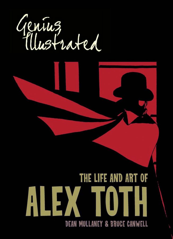
The Library of American Comics/IDW Publishing, 2013
by Dean Mullaney and Bruce Canwell
You know me as a complete Alex Toth fanatic. There are a number of comic book artists I rate high in my pantheon of gods/goddesses. I don't keep a strict numbering order. One month I'm on a Jack Kirby kick, the next I'm all about Al Williamson, the one following I'm Ai Yazawa's biggest supporter, then it's back to Jaime Hernandez or Steve Rude or Nick Cardy or Rumiko Takahashi or Mike Allred. But out of all of the artists I'm crazy about, the one I most wish I could emulate when I'm drawing is Alex Toth. Many artists add. Crosshatching, little lines here and there. Visual static. Toth subtracted. Melody. His art makes me want to get down to essentials the way he did it-- simplicity, strong silhouettes, interesting camera angles without overdoing it the "Marvel Way," a believability where each element of a plane, airplane or UFO has been thought through and yet reduced to its necessary parts. A face in four lines and a couple of dots. To know what to draw and what to leave out takes study.
The big problem with studying Toth has been the dearth of material to look at. He did a scattering of work for a number of companies and never established a singular body of work at, say, Marvel or DC with a thematic hook where one of those companies could pull it all together in a collected edition. Most of the time when you're exposed to Toth you don't even realize it-- it's on Cartoon Network or Boomerang. Kids of my generation grew up watching Toth's art in action, but crudely animated. For print, he worked at Standard, Warren, Dell, CarToons magazine, Eclipse, Red Circle. Try tracking all that down. If you're lucky, you can find a few Toth gems salted away in a Dark Horse Creepy volume-- but that's paying a lot of money if it's simply Toth you're after (luckily you get Williamson, Frank Frazetta, Gene Colan, Alex Torres, Steve Ditko and Reed Crandall, among others, too)-- or a DC Showcase Presents. But a lot of the other collections are out of print now and cost a fortune on the secondary or even tertiary market.
The two best books have long been Zorro by Alex Toth (Image Comics, 2001) and Setting the Standard: Comics by Alex Toth 1952-1954 (Fantagraphics Books, 2011). Of the two, I prefer Zorro because it's black and white-- with tones he later added himself to correct some lousy coloring provided by Dell-- and so more purely Toth, plus the art is of a somewhat later vintage than his Standard stories and much more characteristic of what I love to look at. Both, however, are required reading for the Toth addict. And now comes this huge, heavy book, the second in a three-volume set covering the entirety of the man's career, a long-overdue monumental biography in prose and art. Toth has finally gotten the examination and treatment he deserves.
Yes, I have the first book, Genius, Isolated. It justly won a Harvey Award, but Genius, Illustrated is even more visually spectacular. If you have to choose between them-- at 49.99 SRP, they're not cheap (although you can probably find a deep-discounted one online)-- then you really must have Genius, Illustrated. Illustrated features more stuff I have an affinity for than Isolated. And a good chunk of it is printed from the originals. Which means you get to see marker fading, brown tape remnants, white correction fluid, non-repro blue and stray graphite pencil marks. It's all oversized, just as before, so Toth's hand is plainly visible in the varying thicknesses of black ink and obvious brush and pen strokes. This is about as close as handling these pages as most of us are likely to come, and they're revelatory. Illustrated covers almost the entirety of Toth's animation career and later period where he created Jesse Bravo, so you'll drool over some of the artist's most personal works, plus rarities you might find surprising.
I mean, I had no idea Toth storyboarded one of my favorite films from when I was a kid, the Hanna-Barbera groaner C.H.O.M.P.S. My childhood collides with my adulthood in an explosive, Jungian way. Not that Jung explodes. I do, with enthusiasm, whenever I encounter this kind of synchronicity. Did I enjoy C.H.O.M.P.S. because I precociously detected something of Toth in it? Or do I enjoy Toth because I loved this shitty movie when I was a kid?
Illustrated contains pages of Toth's superlative Warren work-- I wish someone would do a book devoted entirely to the stories he illustrated for them, but at least you get a decent representation here. You'll also find comic book pieces for other companies strongly represented, with his classic Bob Kanigher "Gallery of War" collaboration, "White Devil...Yellow Devil!," reprinted in its entirety from the original art. Disappointed with the print version, Toth went back and reworked certain panels for clarity. That's how much of a perfectionist he was-- he was also known to rip up entire pages if something struck him as wrong.
And I almost died when I saw for happy reason the authors have included my absolue favorite single page from DC's The Witching Hour, with storyteller Cynthia holding up computer punch-chards, a strong example of Toth's elegant way with anatomy and strong page design. Oh, and in what further confirms me in my raging solipsism, there's even a Jack Kirby drawing inked by Toth which proves the unhappy result of their X-Men #12 (I've been thinking about that one a lot lately) collaboration was a mere bump in the careers of both men. The page they reprint from X-Men features car action, natch. There's also the entirety of his "Steve Bentley, Secret Agent" mock-strip, created for a George Axelrod comedy and starring Jack Lemon.
Because it covers the latter half of Toth's career, which includes multiple stints at Hanna-Barbera and one at Ruby-Spears (Thundarr, my old friend, I'm looking at you... again!), the book gifts us with reams of the master's clean, simple character designs, full-color presentation pieces and provides a master course in Tothian storytelling via his storyboards (similarly, there's an illustrated lecture in a letter to cartoonist Ken Steacy any aspiring comic book artist must read). This period also saw Toth produce an instructive but somewhat stern account of television cartoon production for a Superfriends comic. All this along with with some of his work for the US government-- most notably an anti-rape illustrated essay, the background of which gets to the heart of Toth's problematic relationships with almost everyone.
Because between the artistic glories lies a harrowing tale of a man who was truly his own worst enemy. Putting it mildly, Toth the artist was a genius; Toth the man was sometimes downright ornery.
In the first volume, Mullaney and Canwell quote from journalist/author David Halberstam's passage on Ted Williams, making a completely apt parallel between two men of equal genius in their respective fields but difficult personalities. As the authors note, Halberstam could just as easily have been describing Toth. Funny, because as I read Illustrated, Toth kept reminding me of Williams, who happens to be another hero of mine. Like Williams, Toth was a sensitive man, easily hurt, and his temper was probably a matter of self-defense. I don't know, but you might find something reminiscent about fussin' and a-feudin' Harlan Ellison about Toth. Ellison is referenced by Mullaney and Canwell, disposed of by Toth as a "son of a bitch" in a colorful encounter described in this book.
Along with all the anecdotes from friends and colleagues (cat yronwode, Louise Simonson, Mark Chiarello, John Workman and more), Mullaney and Canwell frequently allow Toth to speak for himself, and demonstrate in ample measure his ability to praise and scold (frequently at the same time!) in passages from personal letters. The most exasperating is the illustrated note he sent Jenette Kahn and Ross Andru where he slaps them around for a paragraph or two over their "inept" handling of DC's Wildcat property, then offers some backhanded praise while suggesting they hire him to do it the right way. Reading that, you're almost in tears, thinking, "Oh no, no, no! What the hell were you thinking, Alex?" Writing himself out of a job, that's what. It stings and wounds the heart.
That's the melancholy power of the story unfolding between reams breath-taking artwork that make up the bulk of Genius, Illustrated. As Toth subtracted the unnecessary from his art, he also subtracted himself from life to a great extent. Having a volcanic temper and a consummate ability to alienate friends, allies and employers certainly did nothing to help his cause, nor did his adherence to aesthetics that were no longer fashionable or trendy. Certainly he saw himself-- and not without justification-- as championing good rendering and storytelling, but there are ways to defend these timeless virtues without going to extremes and belittling the very people you're talking to. Or might hire you. People repeatedly go out of their way to seek out Toth and put him to work, only to have miscommunication and his uncompromising nature sabotage collaboration.
Case in point-- his discussion with Workman at Heavy Metal magazine about doing a comic book adaptation of the Steven Spielberg comedy 1941. The film turned into a noisy mess, and after reading the script, Toth rejected the project outright as disrespectful, but it never seems to have registered with him Workman was actually giving him carte blanche to do whatever he wanted with the characters and setting. He could have gone to to town drawing WWII-era planes and costuming with a brand new story of his own devising and Heavy Metal would have printed it sans interference. An artist's dream. Instead, Toth blew it and left Workman wistful and bemused about how it all went sour.
Temper, timing and personal trials combined to deprive Toth of work and readers of books that would have been instant classics (Simonson tried to get Toth to do an Indian Jones story for Marvel; if that doesn't make your mouth water, then you are reading the wrong blog, buster), but I couldn't help but come away liking him all the more, but sincerely wishing he could have just been a bit more political and less mercurial. But then would he have been Toth? To accept Toth's artwork, we must accept the troubled soul who created it; in this case, the two are entwined. So he wasn't avuncular. Wasn't naturally congenial. Apparently, he could be damned charming when he wanted to and even at his rantiest, there's something vulnerable there you want to embrace, at least given the passage of time. That comes through in Illustrated as well.
With these volumes, Mullaney and Canwell are doing one hell of a job rescuing Toth's life and work and giving both the lavish treatment they deserve. That the authors refuse to give into hagiography and instead present a completely human Toth makes Genius, Illustrated a powerful and heart-breaking tribute to a true genius. Along with Mark Schultz's equally exalting and tragic Al Williamson book, one of the finest volumes on comics I've ever read.
Thursday, March 7, 2013
X-Men #12: Kirby and Toth, two great tastes that don't taste great together!
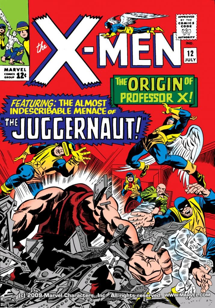
Jack Kirby and Alex Toth are tops of the pops as far as I’m concerned. When I found out Alex Toth penciled X-Men #12 (July 1965), I had to track it down. When I read he did this over Kirby layouts, I grew a little concerned.
You know, the two artists had almost diametrically opposed approaches to the page. Toth practiced an elegant minimalism, with poses largely naturalistic. Heavy black-spotting, cinematic. Kirby drew in a more expressionistic way, his figures displaying emotions and actions at their most extreme. Statue-like figures surrounded by crackling force fields and radiating forces, as if their struggles produce an energy that threatens to consume the paper they’re printed on.
But then I thought, why not combine Toth and Kirby? This kind of artistic dissonance can produce in collaboration an energy of its own, like unstable two radioactive molecules exchanging electrons and we get an artistic nuclear reaction producing a startling, never-before-thought-of beauty. Or, in this case, X-Men #12, a comic book China syndrome. A Three Mile Island in print.
Flash back to 1965. Stan Lee, always on the hunt for artists (a number of DC regulars did Marvel jobs under assumed names back then), gave Alex Toth a call-- or mailed him a letter for all I know-- and offered him an issue of X-Men. I'm no comic book historian, but I think Kirby was spread pretty thin at this point and dropping X-Men to concentrate on Marvel's better-selling titles. But as to why Lee would offer this particular book to Toth in particular-- well, that's for people who know more about the inner workings at the House of Ideas. Suffice it to say, Lee offered and Toth accepted.
So far, so good. As so many other artists had to at Marvel, Toth went to work on pages previously laid out by Kirby, the creator of the Marvel house style. Maybe this was meant to smooth the art transition for the readers. Maybe Toth asked for this arrangement himself. After all, he was used to working from full scripts, not from Stan Lee posing on his desk. To make sure Toth's work became fully Marvel-ized, Lee then assigned inker Vince Colletta, a frequent Kirby collaborator, to...
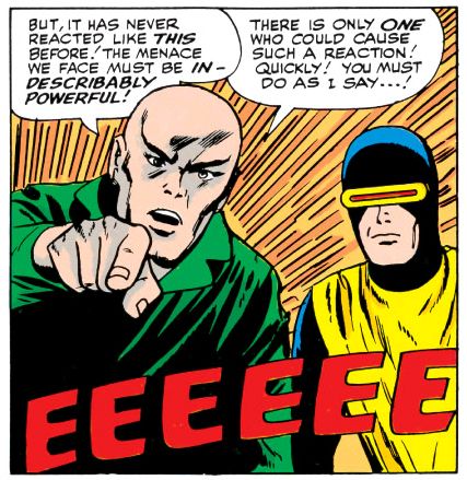
"Fix" isn't quite the word for what Colletta did. While Colletta certainly has his shortcomings-- a cursory Google search will come up with ample listings of them, especially in conjunction with his inks on Kirby-- nowhere are they more on display than in this ham-fisted job on top of Toth pencils. Gone are the smooth, graceful lines of Toth and instead, we find crinkly, crabby scrawlings, wonky faces and malformed hands galore, plus trange interpretations of light and shadow that show Colletta wasn't quite sure of what Toth was getting at. Toth was known for drawing handsome men and beautiful women. Kirby drew them as powerhouses seemingly carved from stone or molded from steel. The mutants on display in this book are the kind you find preserved in alcohol in dark closets in abandoned madhouses.
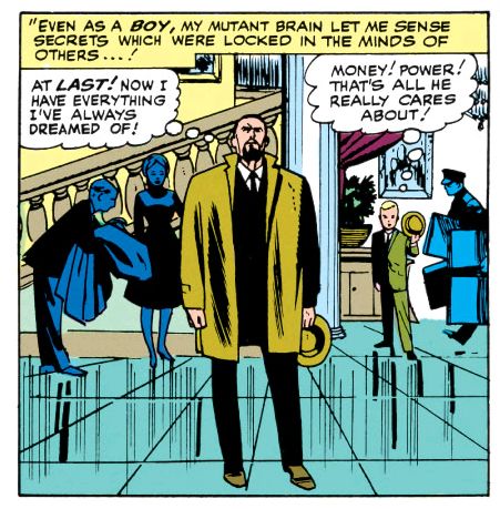
Joe Sinnott might have salvaged this job with his slick line, confident black-spotting and willingness actually to draw with ink and fix proportions, but it's pretty obvious Colletta just isn't up to the task. Check this out:
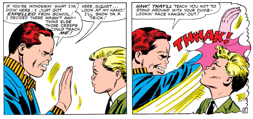
Lumpy Rutherford-- NOOOO!!! This looks like the worst comic book adaptation of a secret Leave it to Beaver episode ever. That red-haired jerk is Cain Marko, Charles Xavier's step-brother. They don't get along, as you can see. While Cain has a pert Toth-style nose, his hand looks like someone shoved sausages into a latex glove. That's neither a Toth hand nor a Kirby hand-- it's a hand no one bothered to finish drawing.
In Colletta's defense, I really doubt Toth gave him all that much to work with. They'd team together again at DC on Hot Wheels with much better results-- although Toth might dispute that if he were still around. The difference there might have been Toth being more engaged with the material than he is here and unencumbered by another artist's layouts.
Anyway, a few panels in this book look very Tothian, as if he took his time to really shape the image, but for whatever reason, throughout most of this book Toth appears to have largely traced Kirby's figures without adapting them to his own naturalistic proportions and scale. While he uses a lot of those parallel ray bursts that make the characters look as though they're exploding with strange energy-- but never seems to have reconciled the Kirby approach to these kind of abstracted effects with his own minimalism and Colletta spent about two seconds puzzling them out before slapping down the ink. There's also a chance Toth might not have drawn any of these effects and Lee, dissatisfied with too much negative space in the panels, either added those lines himself or had someone in the art department do it.
Here's another unfinished hand:
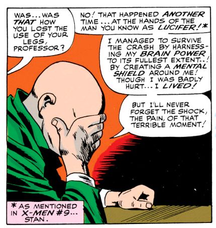
Another problem is the color reconstruction is lousy. This comic was never meant to be printed on slick, glossy paper with modern line-screens. Despite a growing serious fandom and popularity on college campuses and with the heads, comics in the mid-60s were still disposable rags printed on the cheapest paper. Lee, Kirby, Toth and Colletta all knew this. This didn't necessarily mean they hacked it out without a care, although X-Men #12 seems to stink of that. It just means they were under no illusions of creating something of lasting impact. They weren't dreaming history here or anticipating bloggers deconstructing every aspect of every panel on one page out of the hundreds they touched that month. They were working to support families or pay alimony and they knew, as professionals, how to get the most out of the shoddy materials they had to work with in the time allotted-- they didn't have the luxury of blowing deadlines like superstar artists of today do-- so the end result, there on the newsstand, would be attractive enough to tempt readers into spending their twelve cents.
People didn't preserve the original artwork-- they had paste-up jobs done on them with glue that soon yellowed or browned, people used old pages to clean brushes or tossed them in files and later shredded them when the company needed more space. I've seen some pages from this job for sale online, but I doubt Marvel spent the money necessary for full access to them in order to start from scratch. What's more likely is they scanned decent printed copies, then used Photoshop to eliminate as much of the colors and old-timey fat line-screens-- a process which also takes away the edges of the black areas and a lot of the fine line work. And, in the case of Colletta, serving to make an already sketchy line quality even sketchier. Re-colored then printed slickly, or blown up on Comixology (which is where I read this), all the original flaws become glaring and a lot of new ones show up as well.
In this case, there are pages where Cain Marko's face appears a bizarre pink as if he's suffering from extreme embarrassment or some kind of disfiguring rash. Poor guy. No wonder he went mad with power when he found the Cyttorak Ruby.
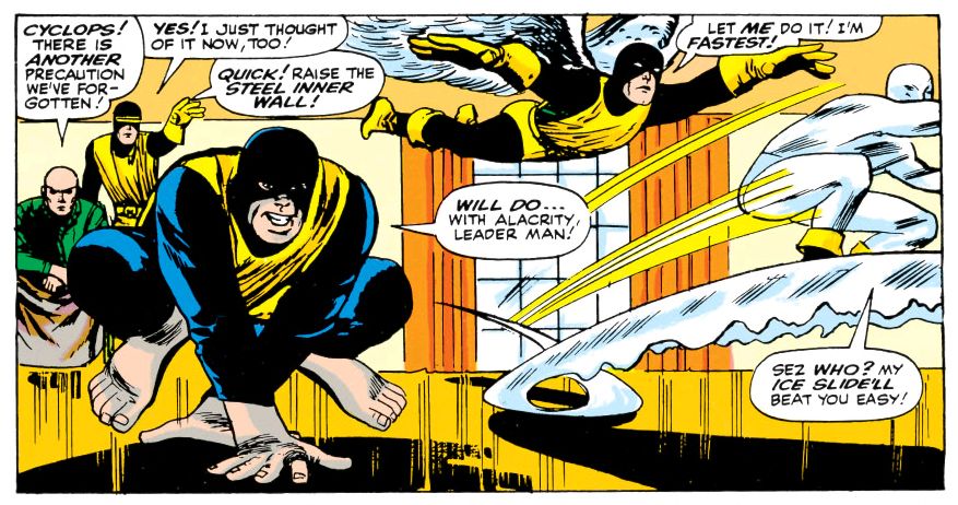
What I don't understand is why Toth took this job in the first place. If Lee wasn't shy about expressing his artistic opinions, Toth was the original let 'em have it guy. He must have looked at these layouts and thought, "Oh balls!" Plus, Xavier's backstory is cliched and melodramatic (although these guys make a pretty good case for it even while pointing out Stan Lee's apparent difficulty with psychic terminology). It's rather talky for a book so packed with characters, too. And, as part one of two, it's all build-up and no climax.
Toth liked to draw airplanes and cars and he was aces on period pieces. Portions of this story take place in flashback, but there's nothing setting it in any particular era visually, and just one sequence featuring a car that looks pretty contemporary to me, a mid-60s model in a scene that takes place sometime in the 1940s. Toth preferred classic Errol Flynn-style swashbuckling heroism, but there's not a single sword-fight anywhere in this story.
My best guess is the Warren and DC jobs weren't coming frequently enough and publishers like Dell didn't pay high enough a page rate, so he gave Marvel a shot in hopes of picking up some much-needed money. I don't know. Who can fathom genius, especially one as mercurial as Alex Toth?
He must have had his reasons because here's Toth working over Kirby layouts. It's not as if Toth never drew superheroes-- we have a classic Flash and Atom team-up from the year before which cuts X-Men #12 to shreds, a run on Black Canary and an often-reprinted Batman story, plus some other gems scattered throughout his bibiography. This should have been one of those.
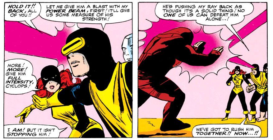
Anyway, if the lack of any other Toth Marvel work is any indication, Stan Lee wasn't too pleased with the outcome of his little science experiment. Werner Roth would pencil part two, similarly working over Kirby lay-outs with happier results, as "Jay Gavin" before becoming the regular penciller under his own name. Toth would go on to do sterling work in Warren's Blazing Combat, and for DC's horror and war titles in the 70s, but never again would he draw Marvel's heroes for comic books. For TV, yeah. A couple of years later, he did designs for Hanna-Barbera's Fantastic Four cartoon. But we never got to see Toth's take on The Avengers or Doctor Strange. I, for one, would have loved to have read a Toth Amazing Spider-Man or Daredevil. I can't help but think if Lee had just trusted Toth to do his thing-- the way he seems to have let Gene Colan-- and come up with a plot playing to his strengths rather than trying to merge him with Kirby, we might have had a stand-out issue, an oddity nonetheless, but something really special. Maybe it wouldn't have sold, though. Whatever else you can say about Lee, the man knew how to move books.
Now if someone can explain to me why Cyclops's famous ruby-red eye beam is magenta.
Sunday, December 23, 2012
Sorry I didn't get to those Isis posts!
The week before winter vacation proved busier than I anticipated, with longer days. Circumstances didn't leave much time for watching The Secrets of Isis, much less blogging about it. I'm on vacation now so once again let me offer you a hollow promise of fun and frivolity to come. But it will have to wait. I'm about to spend a few days in Tokyo. I'll do some comic book buying while I'm there, but most of what I find will be posted on my new blog about being an American comic book fan in Japan. That's where I plan to talk about the latest books and news, leaving this blog for the good old stuff we all love so much. Jack Kirby, Alex Toth, Al Williamson, Dani Moonstar, classic Marvel, Dell and EC and that sort of thing.
Happy Holidays, True Believers!
Happy Holidays, True Believers!
Thursday, August 2, 2012
Xenozoic Tales coming back in a big way!
Literally. Next June (2013 for those counting the years), IDW will release Mark Schultz's Xenozoic Tales Artist's Edition, 144 pages printed at a whopping 14" x 20" size. It's their latest in a series that's seen big ol` versions of Walt Simonson's The Mighty Thor, Dave Stevens' The Rocketeer and others. You get to see blue lines and all that jazz, almost as if you were holding the original art in your hands. It should prove as instructive as it is aesthetically pleasing. As both an artist and an art junkie, I'm going to buy this book when it hits the streets, probably leaving a massive crater. Mark Schultz is just amazing. I've already read these stories dozens of times each, but I never get tired of looking at his pages. If you can get the regular comics or one of the many reprint books it's more than worth a lazy afternoon charting the Schultz's growth as a writer and artist. You can actually see him working through various techniques and influences, starting with Wally Wood, then Al Williamson, Roy Krenkel and Frank Frazetta plus others whose work I'm actually not familiar with until he emerges as a unique synthesis of all these classic elements, his personal style as easily recognized as that of any of those other giants. The plot itself goes from EC-inspired vignettes to something more epic as Schultz gains confidence as a writer, too. It's a super cool progression.
IDW must love huge books because I've got their Genius Isolated: The Life and Art of Alex Toth book and that crazy thing must way thirty or forty tons. We had to hire a special heavy lifting crane to winch it into my apartment and it's left the floor permanently depressed. Not only that, but it's the first of a trilogy of books. I'm going to have to build a special annex with some sort of carefully engineered load-bearing elements and perhaps a shock-absorbing system installed in the floor to handle them. I find these kinds of books worth the expense, though.
You'd have to be some kind of nut not to be excited about this next piece of news. You're not a nut, are you? No? Great! Then, let's celebrate because it's official! At the Flesk Publications panel during this year's San Diego Comic Con, Schultz promised when he finishes his book Storms at Sea, he's going to do another issue of Xenozoic Tales. Finally! It's been something like 16 years since he left us hanging with mechanic-shaman Jack Tenrec ousted from City in the Sea and planning to head back to Fessenden's Station where the story began. The last few issues of Xenozoic Tales raised a lot of questions and its hiatus left them hanging in the air. What are the reptilian grith? What's their relationship with Hannah Dundee and how much do they know about her mysterious origins as a foundling? Can the sometimes bull-headed Tenrec maintain his tenuous new alliances, retake City in the Sea, reinstate the Machinato Vitae and restore the balance between humans and nature before destructive elements in control of his home cause another catastrophe? These questions drive me to distraction at times!
It may take a while for Schultz to get around to it, but in the meantime, here's a cartoon version. You know, for kids...
IDW must love huge books because I've got their Genius Isolated: The Life and Art of Alex Toth book and that crazy thing must way thirty or forty tons. We had to hire a special heavy lifting crane to winch it into my apartment and it's left the floor permanently depressed. Not only that, but it's the first of a trilogy of books. I'm going to have to build a special annex with some sort of carefully engineered load-bearing elements and perhaps a shock-absorbing system installed in the floor to handle them. I find these kinds of books worth the expense, though.
You'd have to be some kind of nut not to be excited about this next piece of news. You're not a nut, are you? No? Great! Then, let's celebrate because it's official! At the Flesk Publications panel during this year's San Diego Comic Con, Schultz promised when he finishes his book Storms at Sea, he's going to do another issue of Xenozoic Tales. Finally! It's been something like 16 years since he left us hanging with mechanic-shaman Jack Tenrec ousted from City in the Sea and planning to head back to Fessenden's Station where the story began. The last few issues of Xenozoic Tales raised a lot of questions and its hiatus left them hanging in the air. What are the reptilian grith? What's their relationship with Hannah Dundee and how much do they know about her mysterious origins as a foundling? Can the sometimes bull-headed Tenrec maintain his tenuous new alliances, retake City in the Sea, reinstate the Machinato Vitae and restore the balance between humans and nature before destructive elements in control of his home cause another catastrophe? These questions drive me to distraction at times!
It may take a while for Schultz to get around to it, but in the meantime, here's a cartoon version. You know, for kids...
Sunday, July 29, 2012
A smile is something special, but honestly, ribbons are readily available almost anywhere
Just re-reading Ghost World yesterday. The part where Enid regresses emotionally while listening to one of her childhood favorite songs is very touching. It's a very fatherly gesture for her dad to drag out her little turntable and put the single on her bed. Does anyone listen to 45s anymore? I had a stack when I was a kid, but most of them were outlaw country by guys like Waylon Jennings. I especially like the
panel when Enid wakes up in the morning still in her beanbag chair with her hair sticking up all over the place. I'm almost completely bald and look like some kind of effeminate mirror universe Ike Eisenhower, so of course I'm jealous even of someone's terrible morning hair.
Anyway, I'm doing a deep study of the way Daniel Clowes draws eyes and hands. You have your slender Alex Toth fingers with prominent fingernails, your dynamic yet claw-like Gil Kane hands that seem rippling with muscles, and then your Dan Clowes hands which are largely featureless. They're not perfunctory, though. They're typically well observed in whatever pose he chooses to place them.
Eyes vary. Weirdo comedian Joey McCobb-- is he for real, or is he simply a hack with an outsider gimmick?-- has wrinkly cartoonish eyes, kind of pointy and football shaped. Visually, he reminds me a little of Peter Lorre. Very little. Mostly just the eyes. Enid and Rebecca have more nuanced eyes, at least at the beginning of the story. Eyelids, lashes, little lines underneath to show the roundness. Eyes protude slightly. There's at least one panel later in the book where Enid's eyes are simply a curved arc above and below, but they're somewhat obscured by the drawing of her glasses frames.
I could be mistaken. I'm writing my impressions the next day, at work. It will be interesting for me to go home this evening and see if I really saw what I remember seeing, or if I'm just making things up in my head.
As an artist myself, I've never settled on a particular way to draw eyes. Sometimes I want to do sort of abstracted, simplified shapes with full outlines, but other times I go nuts with the detailing. I change frequently depending on who happens to be influencing me that day, or if I've seen someone new I want to rip off.
Jaime Hernandez has a simple yet convincing way of drawing eyes, the footballish upper and lower arcs, with rounded irises in the center. The top arc can be flattened and thickened, with a few strokes for lashes. Interestingly, in a fairly recent story arc, he chose to use the "injury to the eye" motif regarding Hopey, a character whose motivations I often think about. But prior to that, she spent the story "Election Day" (Penny Century #5, June 1999) hiding her eyes behind dark sunglasses, so much so one of the minor characters mentions thinking she's blind. At the end of the story she lifts the sunglasses while staring at herself in the mirror, revealing deep lines under them and some kind of enigmatic unhappiness. What's going on in that head of hers? Hernandez generally characterizes her as someone not given to introspection. The eyes are expressive, but they tell us nothing.
His art is slick and appealing, believable yet not exactly realistic. Steve Rude has a similar approach, but the character he's most associated with usually wears a visor. No eyes. When I picture a Rude face, I imagine narrowed eyes drawn as horizontal lines, squinting, the body straining, twisting and moving. Action eyes. Some of his aliens have big round insectoid eyes. Good for science fiction, not so much for earth-bound romance comics-- which is a genre I'm very interested in working in. I like to say "social realism," but if I'm really being honest with myself, I'm writing romance comics. They'll never see publication, but it's fun to churn out scripts full of emotional torture for my shabbily realized characters.
Alex Toth and Mort Meskin sometimes drew eyes as little slashes of black ink, or maybe a line up top and then a dab of ink below for the iris. Very simple and effective. Alex Toth is my primary influence for drawing eyes, but like Clowes, Hernandez and Rude, he employed different methods. His sketchbook pages, which are frequently just big piles of faces and heads, show all kinds of approaches. Some of them are extremely simple, just quick enclosed triangles and ovals.
Simply put, there's no one right way to draw eyes. Do what works best for you, what's appropriate for your characters. Above all, observe real emotions and learn to draw them. If you're good at acting on the page, more than likely you're rarely drawing eyes the same way twice anyway.
And work on those hands while you're at it.
panel when Enid wakes up in the morning still in her beanbag chair with her hair sticking up all over the place. I'm almost completely bald and look like some kind of effeminate mirror universe Ike Eisenhower, so of course I'm jealous even of someone's terrible morning hair.
Anyway, I'm doing a deep study of the way Daniel Clowes draws eyes and hands. You have your slender Alex Toth fingers with prominent fingernails, your dynamic yet claw-like Gil Kane hands that seem rippling with muscles, and then your Dan Clowes hands which are largely featureless. They're not perfunctory, though. They're typically well observed in whatever pose he chooses to place them.
Eyes vary. Weirdo comedian Joey McCobb-- is he for real, or is he simply a hack with an outsider gimmick?-- has wrinkly cartoonish eyes, kind of pointy and football shaped. Visually, he reminds me a little of Peter Lorre. Very little. Mostly just the eyes. Enid and Rebecca have more nuanced eyes, at least at the beginning of the story. Eyelids, lashes, little lines underneath to show the roundness. Eyes protude slightly. There's at least one panel later in the book where Enid's eyes are simply a curved arc above and below, but they're somewhat obscured by the drawing of her glasses frames.
I could be mistaken. I'm writing my impressions the next day, at work. It will be interesting for me to go home this evening and see if I really saw what I remember seeing, or if I'm just making things up in my head.
As an artist myself, I've never settled on a particular way to draw eyes. Sometimes I want to do sort of abstracted, simplified shapes with full outlines, but other times I go nuts with the detailing. I change frequently depending on who happens to be influencing me that day, or if I've seen someone new I want to rip off.
Jaime Hernandez has a simple yet convincing way of drawing eyes, the footballish upper and lower arcs, with rounded irises in the center. The top arc can be flattened and thickened, with a few strokes for lashes. Interestingly, in a fairly recent story arc, he chose to use the "injury to the eye" motif regarding Hopey, a character whose motivations I often think about. But prior to that, she spent the story "Election Day" (Penny Century #5, June 1999) hiding her eyes behind dark sunglasses, so much so one of the minor characters mentions thinking she's blind. At the end of the story she lifts the sunglasses while staring at herself in the mirror, revealing deep lines under them and some kind of enigmatic unhappiness. What's going on in that head of hers? Hernandez generally characterizes her as someone not given to introspection. The eyes are expressive, but they tell us nothing.
His art is slick and appealing, believable yet not exactly realistic. Steve Rude has a similar approach, but the character he's most associated with usually wears a visor. No eyes. When I picture a Rude face, I imagine narrowed eyes drawn as horizontal lines, squinting, the body straining, twisting and moving. Action eyes. Some of his aliens have big round insectoid eyes. Good for science fiction, not so much for earth-bound romance comics-- which is a genre I'm very interested in working in. I like to say "social realism," but if I'm really being honest with myself, I'm writing romance comics. They'll never see publication, but it's fun to churn out scripts full of emotional torture for my shabbily realized characters.
Alex Toth and Mort Meskin sometimes drew eyes as little slashes of black ink, or maybe a line up top and then a dab of ink below for the iris. Very simple and effective. Alex Toth is my primary influence for drawing eyes, but like Clowes, Hernandez and Rude, he employed different methods. His sketchbook pages, which are frequently just big piles of faces and heads, show all kinds of approaches. Some of them are extremely simple, just quick enclosed triangles and ovals.
Simply put, there's no one right way to draw eyes. Do what works best for you, what's appropriate for your characters. Above all, observe real emotions and learn to draw them. If you're good at acting on the page, more than likely you're rarely drawing eyes the same way twice anyway.
And work on those hands while you're at it.
Sunday, July 1, 2012
Alex Toth hasn't a moment to spare for noncommissioned officers...
Here's the time on this blog where we spend a few moments comparing a hilarious scene from the 1958 Andy Griffith service comedy No Time for Sergeants (directed by Mervyn LeRoy, in case you were wondering) to the Alex Toth-rendered version from Dell's Four Color #914 (July 1958). Here's the movie:
And here's Toth's take:


As you can see, Toth's staging is quite different from the film's. Toth has flipped the composition-- in the movie, the captain enters from the right, but here from the left. This has to do with directing the eye through the page. It's called storytelling, for those of you who like to simply reproduce photographs or still frames. For some reason, he's added an officer. This officer isn't present in the film, says nothing, does nothing and adds nothing to the comic book page. I think of Toth as more an artist of subtraction, so it seems uncharacteristic of him to stick some extraneous guy in a scene, but there he is.
Toth doesn't attempt perfect likenesses of the characters, either. Study the faces. Toth's Bartlett Robinson, Myron McCormick, Nick Adams and even his Andy Griffith are only approximations. I've always felt Adams resembles the later Our Gang member Froggy in No Time For Sergeants; he doesn't really, except here in the comic where he could be played by the same actor. But the important thing to note is how Toth goes for the gist rather than either a portrait or a caricature. There may have been image licensing problems, or maybe this was a conscious decsion on Toth's part. Whatever the reason, it frees Toth from the constraint of relying too much on photo reference-- although from some of the poses it's obvious he saw some or screened the film beforehand-- and allows him to manipulate his figures freely according to his needs and, more importantly, animate the faces. A good storyteller "acts" for his or her characters, and this means giving each one distinctive facial expressions and trying not to repeat them. Go read John Kricfalusi's blog where he writes extensively about acting in animation. It holds true for comics.
Because Toth was a superb storyteller and artist each of his characters has a look that remains consistent within the story and wonderfully plays each scene (the sergeant's hands upraised in dismay despite his head being cropped by the lower half of the first panel on page two, the Griffith character's happily clueless reaction in the second), and those are far more important than exact likenesses. I can't think of anything that spoils my suspension of disbelief when reading a comic than some static, overly-rendered attempt at a perfect likeness after a lot of panels where there's only a passing resemblance. Only Al Williamson could do that and get away with it. And even worse is a failed attempt at a portrait. DC's Star Trek books and the later issues of Topps' The X-Files used to just kill me with that kind of stuff. A page and a half of tiny Picards or Mulders and then a big, expressionless, crosshatched head staring straight out at you-- with crooked eyes or the cheeks too flabby.
Better just to internalize the characters and put your own vision on the page the way Toth does here-- and Charles Adlard so brilliantly did in the first issues of The X-Files. I wonder how the licensing people at 20th Century Fox Television felt about that. According to Bruce Canwell in Genius, Isolated: The Life and Art of Alex Toth, at one point while working for Dell, Toth got grief from Danny Thomas when he drew Thomas's nose too large for comfort in the comic version of The Danny Thomas Show. Zazu Pitts complained he made her look too old. She was 66 when Toth drew her in the Dell adaptation of her show Oh! Suzanna. Dealing with Hollywood must be a real bastard at times.
Licensing. Nowadays any property worth its CGI bombast has statues, toys, t-shirts and all kinds of add-on "universe-building" novels and comics. Back before I was born, movies like No Time for Sergeants got only these funky comic book adaptations-- and who the hell knows what kid this was really meant for? You have your Superman, your Batman, maybe a gruesome dog-eared EC Tales from the Crypt... and then this. What self-respecting kid would turn up at the treehouse with No Time for Sergeants rolled up in his back pocket? Pre-teen Bartlett Robinson fans? Precocious aficionados of character actors like Myron McCormick? Mervyn LeRoy fanatics? Or me? I was all of those things at one time, and while I certainly love this movie if I had my choice I'd prefer a Toth-drawn adaptation of Mr. Roberts.
Well, I'm digressing. Let's just say if you're obsessive enough to need the definitive portrait of Andy Griffith in this story, he's right there on the comic's photo cover.
For some reason, though, Toth sticks Griffith's garrison cap in his shirt epaulet, a detail conspicuously absent from the film scene. No Time for Sergeants features the first on-screen pairing of Griffith with Don Knotts (he made his Broadway debut playing the same part in 1955), who would later play Deputy Barney Fife opposite Griffith as Sheriff Andy Taylor. The No Time adaptation leaves out their brief scene in the interest of page count. But don't worry-- Knotts would get his shot at comic book immortality a few years later in Dell's adaptations of The Andy Griffith Show.
At the end of the book he gets the pony anyhow!
And here's Toth's take:
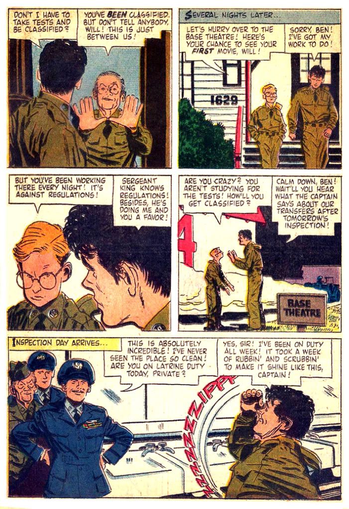
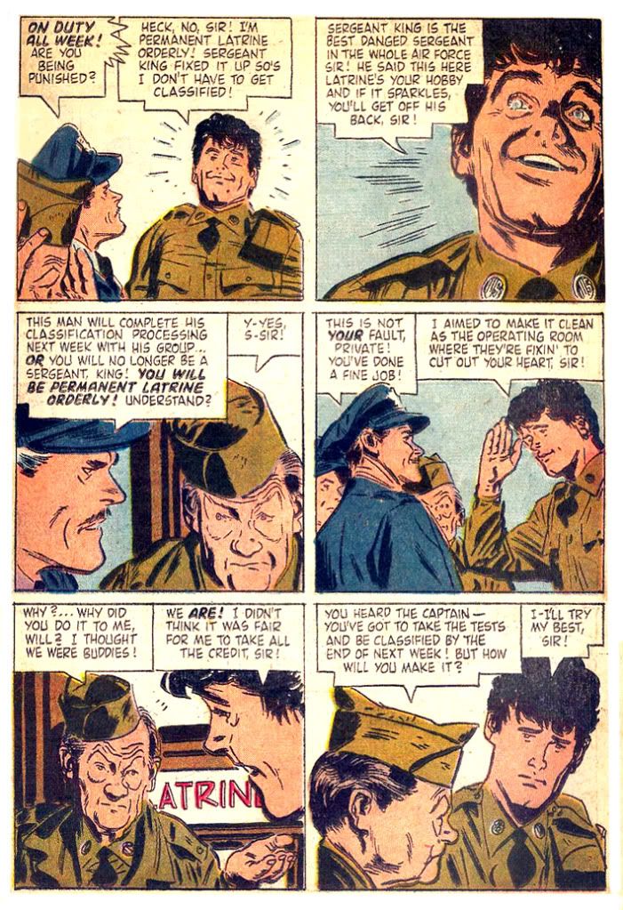
As you can see, Toth's staging is quite different from the film's. Toth has flipped the composition-- in the movie, the captain enters from the right, but here from the left. This has to do with directing the eye through the page. It's called storytelling, for those of you who like to simply reproduce photographs or still frames. For some reason, he's added an officer. This officer isn't present in the film, says nothing, does nothing and adds nothing to the comic book page. I think of Toth as more an artist of subtraction, so it seems uncharacteristic of him to stick some extraneous guy in a scene, but there he is.
Toth doesn't attempt perfect likenesses of the characters, either. Study the faces. Toth's Bartlett Robinson, Myron McCormick, Nick Adams and even his Andy Griffith are only approximations. I've always felt Adams resembles the later Our Gang member Froggy in No Time For Sergeants; he doesn't really, except here in the comic where he could be played by the same actor. But the important thing to note is how Toth goes for the gist rather than either a portrait or a caricature. There may have been image licensing problems, or maybe this was a conscious decsion on Toth's part. Whatever the reason, it frees Toth from the constraint of relying too much on photo reference-- although from some of the poses it's obvious he saw some or screened the film beforehand-- and allows him to manipulate his figures freely according to his needs and, more importantly, animate the faces. A good storyteller "acts" for his or her characters, and this means giving each one distinctive facial expressions and trying not to repeat them. Go read John Kricfalusi's blog where he writes extensively about acting in animation. It holds true for comics.
Because Toth was a superb storyteller and artist each of his characters has a look that remains consistent within the story and wonderfully plays each scene (the sergeant's hands upraised in dismay despite his head being cropped by the lower half of the first panel on page two, the Griffith character's happily clueless reaction in the second), and those are far more important than exact likenesses. I can't think of anything that spoils my suspension of disbelief when reading a comic than some static, overly-rendered attempt at a perfect likeness after a lot of panels where there's only a passing resemblance. Only Al Williamson could do that and get away with it. And even worse is a failed attempt at a portrait. DC's Star Trek books and the later issues of Topps' The X-Files used to just kill me with that kind of stuff. A page and a half of tiny Picards or Mulders and then a big, expressionless, crosshatched head staring straight out at you-- with crooked eyes or the cheeks too flabby.
Better just to internalize the characters and put your own vision on the page the way Toth does here-- and Charles Adlard so brilliantly did in the first issues of The X-Files. I wonder how the licensing people at 20th Century Fox Television felt about that. According to Bruce Canwell in Genius, Isolated: The Life and Art of Alex Toth, at one point while working for Dell, Toth got grief from Danny Thomas when he drew Thomas's nose too large for comfort in the comic version of The Danny Thomas Show. Zazu Pitts complained he made her look too old. She was 66 when Toth drew her in the Dell adaptation of her show Oh! Suzanna. Dealing with Hollywood must be a real bastard at times.
Licensing. Nowadays any property worth its CGI bombast has statues, toys, t-shirts and all kinds of add-on "universe-building" novels and comics. Back before I was born, movies like No Time for Sergeants got only these funky comic book adaptations-- and who the hell knows what kid this was really meant for? You have your Superman, your Batman, maybe a gruesome dog-eared EC Tales from the Crypt... and then this. What self-respecting kid would turn up at the treehouse with No Time for Sergeants rolled up in his back pocket? Pre-teen Bartlett Robinson fans? Precocious aficionados of character actors like Myron McCormick? Mervyn LeRoy fanatics? Or me? I was all of those things at one time, and while I certainly love this movie if I had my choice I'd prefer a Toth-drawn adaptation of Mr. Roberts.
Well, I'm digressing. Let's just say if you're obsessive enough to need the definitive portrait of Andy Griffith in this story, he's right there on the comic's photo cover.
For some reason, though, Toth sticks Griffith's garrison cap in his shirt epaulet, a detail conspicuously absent from the film scene. No Time for Sergeants features the first on-screen pairing of Griffith with Don Knotts (he made his Broadway debut playing the same part in 1955), who would later play Deputy Barney Fife opposite Griffith as Sheriff Andy Taylor. The No Time adaptation leaves out their brief scene in the interest of page count. But don't worry-- Knotts would get his shot at comic book immortality a few years later in Dell's adaptations of The Andy Griffith Show.
At the end of the book he gets the pony anyhow!
Friday, October 7, 2011
2nd Annual Spookey Month: DC's Witching Hour trio
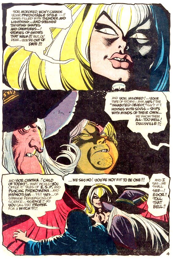
I'm not sure if EC started the tradition of having horror anthology books hosted by recurring characters but by the late 60s and early 70s, it was a pretty well established trope. The Crypt-Keeper is perhaps the most famous of all, immortalized by HBO's Tales from the Crypt series. The EC original looked somewhat more human, but the TV version had that crazy cackle, a warm, infectious laugh, as gleeful as a Christmas morn. In the comics, the Crypt-Keeper and his fellow hosts the Vault-Keeper and the Old Witch directly address readers and are playful rivals, sometimes more interesting than the stories they introduce. Warren Publications had as their presenters Uncle Creepy and Cousin Eerie. They queasily look like the results of several generations of inbreeding within some old money family sliding into decadence and disrepute; the Crypt-Keeper and friends seemed positively savory next to those two geeks. Gold Key had caricatures of real people for their comics; Rod Serling appeared in comics based on his Twilight Zone TV show while Boris Karloff headlined his own title, Boris Karloff Tales of Mystery.
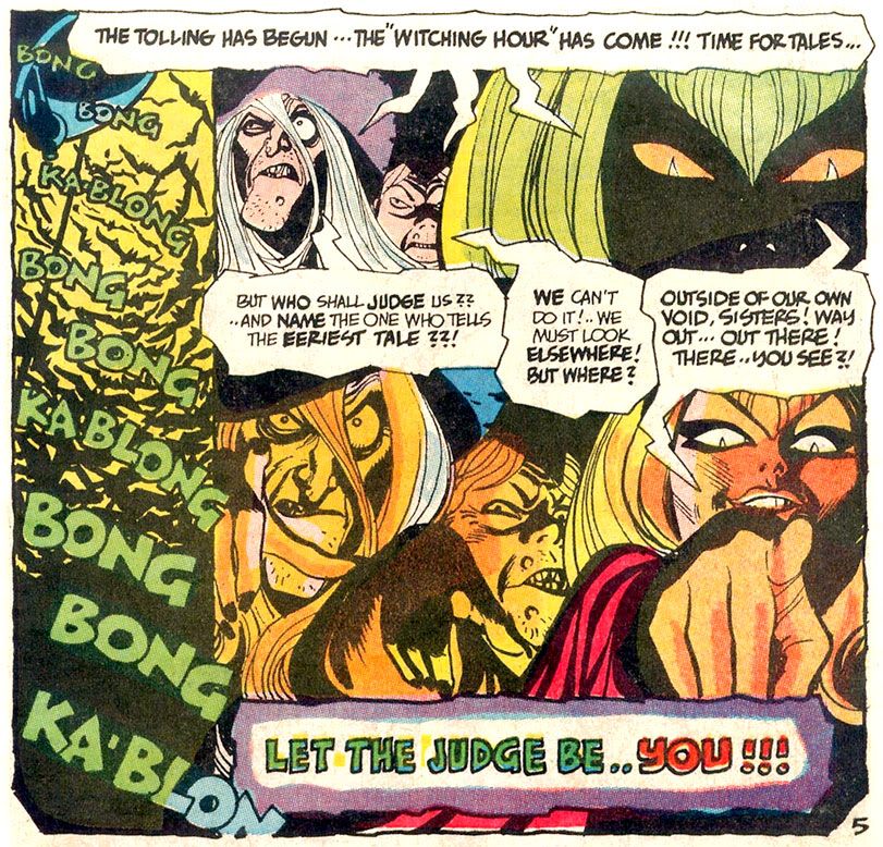
EC and Warren alumnus Joe Orlando outdid them all as an editor with DC, teaming up with Dick Giordano, Bill Draut and Gerry Conway among many others to give horror fans such memorable hosts as Cain and Abel, the ultimate pair of sibling rivals, and their books House of Mystery and House of Secrets, Eve from Secrets of Sinister House... and... Lucien the Librarian. My favorites, however, are from the Giordano-edited The Witching Hour: the three witches, Mordred, Mildred and Cynthia. I'm not sure who gets credit for creating them. Possibly William Shakespeare, although his three "weird sisters" are uniformly hideous, described in Macbeth as "withered," "wild in their attire," and, most alarmingly:
You should be women,
And yet your beards forbid me to interpret
That you are so.
And yet your beards forbid me to interpret
That you are so.
Mordred and Mildred come closest to the Shakespearian example. They're fairly standard witches, complete with a pointy hat and a hooded cloak, stringy hair and appropriately old school ideas about what constitutes a horror tale. Cynthia, however, gives the Bard a middle-finger salute. She's the very model of a modern major witch, a little Samantha Stevens and a whole lotta love. With the pouty face of a Bridget Bardot-- albeit with slitted cat-pupils-- and the voluptuous figure of a Sophia Lauren, Cynthia slinks around in a skin-tight black dress, a skull-shaped brooch at her throat. She speaks in groovy 60s slang-- she'd probably call each issue of The Witching Hour a "scare-in"-- and her bag is telling far out, contemporary stories that swing like a pendulum do.
The Witching Hour host segments have a distinct narrative flair all their own, each issue opening with some comedic vignette. Cynthia taunts the older witches, they respond in kind. Cynthia usually comes off best, with an Addams Family-esque joie de mourir. She's just more likable than her companions, too. While Mildred and Mordred gnash their teeth and verbally abuse the help, Cynthia poses vivaciously for the readers, a smile on her fleshy lips. Given the choice between two witches who seem constantly pissed and one who's on a cool trip, daddy-o, which would you choose? I'm turning on, tuning in and dropping dead with Cynthia.
Alex Toth's Cynthia has a strange widow's peak that appears to have consumed her pointy eyebrows, huge feline eyes, lashes heavy with mascara, bee-stung lips and a square-ish jaw with a pronounced chin dimple. Here's a splash page from The Witching Hour #8 (1970) where Toth has her introduce a story in a novel way:
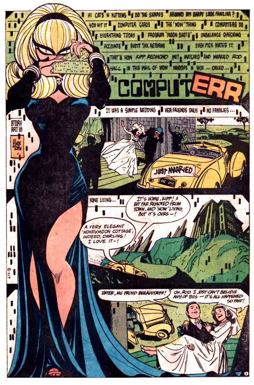
I love her cheeky, playful pose. Lots of personality in that drawing! The page layout is innovative for the time, Cynthia providing a visual frame for the first three panels and black gutters instead of the traditional white. It may be technologically dated now, but even the computer-style typeface was a little ahead of its time. The story is credited to Toth, but the DC Showcase reprint lists none other than Sergio Aragones as the writer. Maybe Toth plotted and Aragones scripted. If you're a Toth fan, the early issues of The Witching Hour are a treasure trove of his work, which makes the DC Showcase volume indispensable.
This is from Neal Adams's framing sequence for the same issue, also written by Aragones-- who was apparently on fire that month:
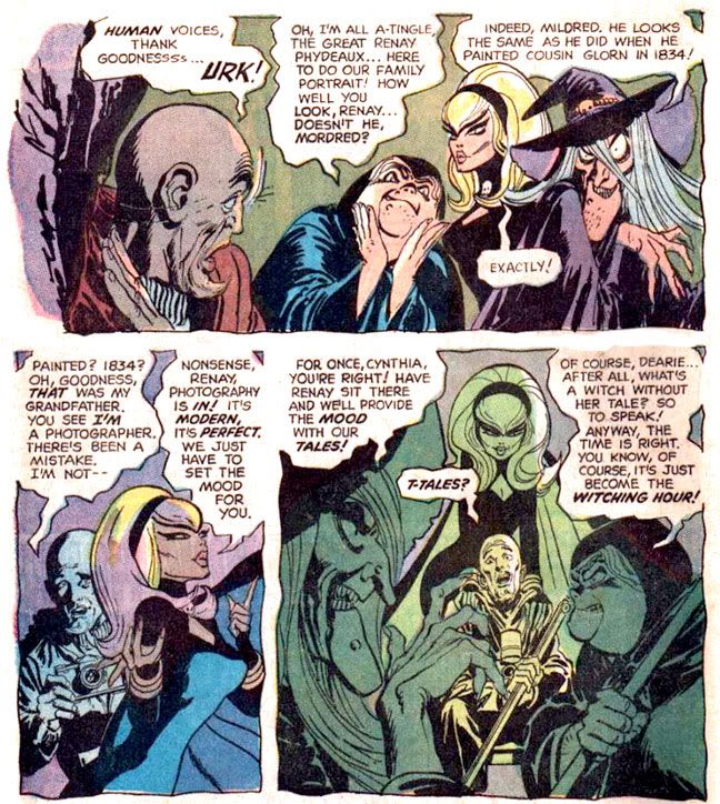
Adams makes his Witches look uncannily like Toth's. That's one of Adams's most amazing artistic abilities-- mimickry. You probably read the Batman story guest-starring Enemy Ace where Adams made the pilot look exactly as if Joe Kubert himself had drawn him.
Gray Morrow's Cynthia from #10 (1970) is more naturalistic than Toth's, but no less alluring:
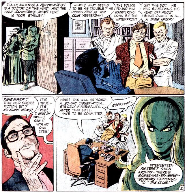
Morrow is rare among The Witching Hour artists in that he gets Cynthia out of her long Morticia dress and into a mod mini-dress, patterned tights and go-go boots. In a later issue, she sports a purple bodysuit, but Morrow was there first, drawing inspiration from the psychedelic fashions of the time. He interprets her eyebrows as separate entities from her hairline, too.
Other artists interpret her in various shades of sinister beauty, but Mildred and Mordred look pretty much the same throughout. Like the other horror titles, The Witching Hour distinguished itself as the gorgeously appointed home of a number of DC's Filipino artists. Guys like Tony DeZuniga, Alex Nino, Alfredo Alcala, Nestor Redondo and others made their way to the United States where they flooded DC's horror titles with incredibly rendered work.
Here's a nice Alcala Mordred from #27:
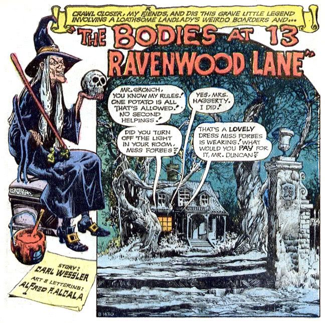
Very atmospheric and Halloween-appropriate. The buckle-shoed witch, a creepy nightscape, even a skull and the number 13.
And a Gerry Talaoc Cynthia from #28:
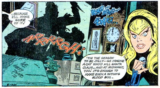
She looks a little surprised. Probably because she's talking about Santa Claus in my Halloween-themed blog entry.
From the same issue, another holiday image, this time with Mildred courtesy of Ruben Yandoc:
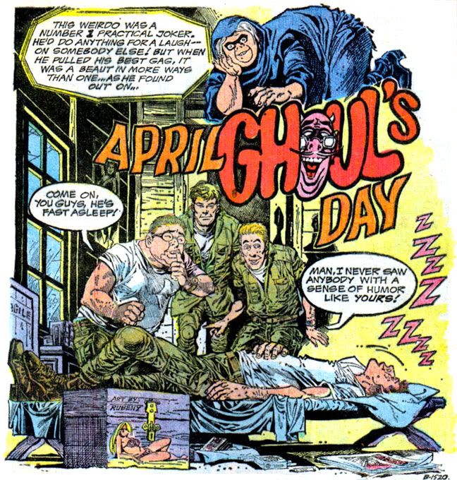
It's strange to think these three once headlined their own book and had their own little adventures. Once these horror anthologies ran their course, Mordred, Mildred and Cynthia spent some time with Cain and Abel and then fell into the clutches of Neil Gaiman, who worked them into the supporting cast of his The Sandman series. I have to give him credit for keeping them alive. Gaiman didn't do just that; he also added a lot of symbolism and mythology to the trio-- Erinyes, the Furies, maiden, mother, crone, the Kindly Ones and all that clever, clever stuff that probably didn't occur even to Shakespeare when he was writing his play. I'm only familiar with any of it from the tidbits of Greek mythology my art history professor offered when she desperately tried to fill my head with knowledge of amphora and statuary.
This is more my speed:
But why should these three play supporting roles when they're such powerful female characters, so fascinating unto themselves? All that literary and folkloric synthesis is interesting, but it seems more an exercise in author self-aggrandizement-- I should know since I'm the ruler of that junk-- rather than a true continuation of their narrative. I prefer the witches as stars of their own book, telling their quirky stories rather than as members of the background ensemble within some other character's story, no matter how dazzlingly the author enfolds them with the plot.
I'd love to see them headlining another anthology book, mocking each other, talking directly to the readers and demanding our attention. Cynthia could be updated for the current generation, a little auto-tuned to the post-modern vibe, destroying hipsters and Facebook moguls. Mordred might draw inspiration from Japanese horror comics and movies-- just like Hollywood!-- while keeping up her interest in ghosts and phantoms. She could probably teach all these ghost hunting fool on cable TV a thing or three. And Mildred might find some common ground with tech-savvy forever up-to-date Cynthia by coming up with stories about possessed iPods and Blackberries.
Or not. And now... more Japanese rock from Spookey! Yes, I've posted this one before, but it's directly related to Halloween and it's awesome:
Monday, April 18, 2011
Creepy #7: Comic Nirvana has been achieved!
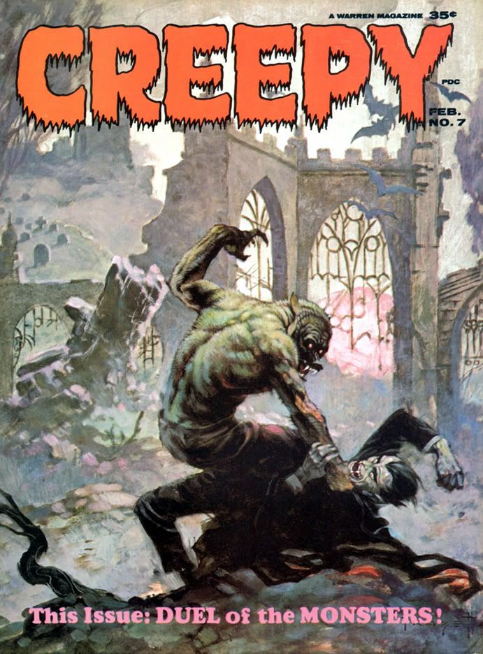 Let's take a moment and appreciate the wonderful thing known as Creepy #7, published in 1965, back before even I was born. The levels of artistry and fun register off the scale with this one. It starts with this the Frank Frazetta painted cover. There is nothing more you could ask of a horror comic cover. The Universal Studios-style Wolfman versus Dracula. If you're anything of a horror comic aficionado or just a fan of great funnybook art, I defy you to resist this cover's allure. Frazetta's color palette here is amazingly controlled. Cool neutrals dominate, contrasted with subdued warm reds along Dracula's cape. Wolfman's back is incredible-- gray flecked with brown and green, with subtle blue and pinkish underlighting. It's early morning light. At first glance it may seem as if Wolfman is kicking Dracula's ass, but check out the wounds on that hairy arm, visible through the misty sfumato characteristic of Frazetta's paintings-- these monsters have doomed themselves.
If only they could've put aside their differences!
Even the Creepy logo is wonderful. Lurid red, oozing, dripping typeface. But what lurks inside? Do Wolfman and Dracula actually fight? Kind of. The lead story is "The Duel of the Monsters" by editor Archie Goodwin, with some sweet, sweet Angelo Torres art. The half-splash features a rooftop werewolf on the prowl-- what a hook!-- and we're already involved in the story.
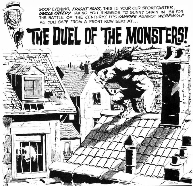 Goodwin's story delivers. It's 1811 Spain, and the vampire is a sergeant on the city's night watch who uses his position to cover his murderous un-lifestyle. When competition rears its furry, fanged head in the form of a werewolf, the sergeant will stop at nothing to destroy the interloper. He soon identifies his prime suspect, but things go badly for the vampire. The twist ending is a little abrupt, but appropriately nasty. Torres's art at this time is sometimes difficult to differentiate from Al Williamson's, which is a high compliment indeed. Here he creates plenty of mood and atmosphere with sophisticated lighting effects, but doesn't allow the story's nocturnal setting to obscure his storytelling or draftsmanship.
The second story is "Image of Bluebird," by Bill Pearson. It's about Monica and Brian, newlyweds who move to an isolated house deep in the woods. Thanks to some grisly murders, Monica becomes convinced she's married a Bluebeard. No, not a pirate. His beard was black. The infamous Bluebeard, killer of wives. Joe Orlando does all he can to make her suspicions valid with his ambiguous portrayal of Brian. One moment he's literally sweeping Monica off her feet, the next he's brandishing a knife and looking positively demonic. Fortunately for Monica, it's all a case of mistaken identity. Brian, however, is not so lucky. Pearson's crafted a tightly plotted tale and Orlando provides some fun moments with axes and one truly spectacular panel where a character screams "AAAAARRRRGGHH!" with a knife sticking out of his chest. Hard to go wrong with bloody stabbings.
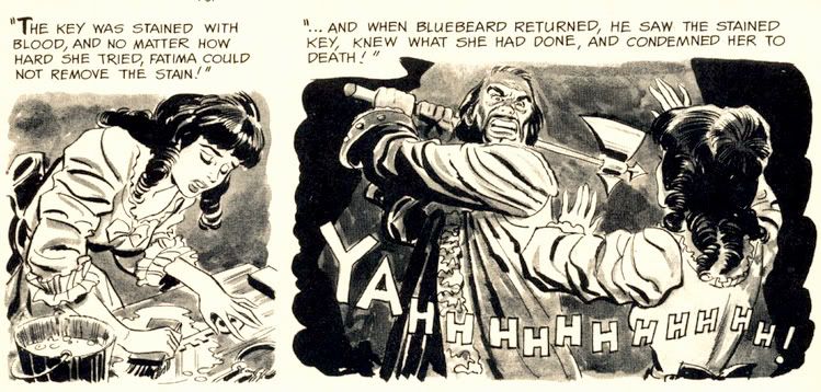 For you folklore fans, there's the beautifully Frazetta-illustrated "Creepy's Loathsome Lore!" Here we learn that people not only turn into wolves but also into tigers, jaguars and foxes. According to Uncle Creepy (and Frank Frazetta), "Both China and Japan abound with legends of fox-women... beautiful girls said to entice male victims, then change into a snarling, attacking fox!" And dress like Vampirella while doing so, apparently. I'm not so sure about China and its legends, but I'm pretty sure kitsune never dressed this way in Japan. Still, this little info page tantalizes with the thought of what the Warren staffers might have done if they'd tapped into Japanese horror stories like the kuchisake-onna or rokurokubi instead of constantly drawing on pulp fiction versions of voodoo curses and 19th century European settings.
 Then it's time for Alex Toth and Archie Goodwin's "Rude Awakening," one of those stories where the protagonist keeps slipping in and out of horrific nightmares until he can no longer separate fantasy from reality. And by the end of this , neither can we. It's the weakest story in the issue, and suffers from an over-familiar concept, a variation on the old wheezy "Coachman's Warning" tale, substituting the more menacing figure of a knife-wielding geek in glasses for the coachman. Rod Serling did his own take with a modern setting in a Twilight Zone episode called "Twenty-Two," which aired way back in 1961. Toth evidences a fine control with ink washes, and something about Goodwin's script really inspired him to lay down the lines because he isn't working in his more characteristic minimalist mode. A few of the faces are exaggerated and comical-- almost as if Toth were experimenting with a Jack Davis-inspired style.
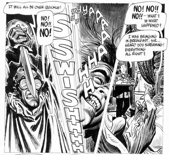 Eando Binder and John Severin invite us to "Drink Deep" with a very EC-esque story of a rich jerk (is there any other kind in horror comics?) who treats everyone like shit (do they do anything but?) but makes the mistake of doing so on a yacht richly appointed with gold stolen by his pirate ancestor. If horror comics have taught us anything, it's being a jerk leads to ironic comeuppance at the hands of the undead. What's fun about this story-- besides the rotten seamen who stagger around, no doubt leaving a trail of salty slime all over the yacht's hardwood decks-- is seeing Severin's slightly caricatured figures in the service of terror rather than humor. I first encountered John Severin as the key artist for Cracked magazine, where he drew their parodies of things like the 1976 King Kong remake starring Jeff Bridges, Charles Grodin and Jessica Lange, plus Rick Baker in an ape suit. Here he employs slightly exaggerated facial expressions and that distinctly Severin-ish cross-hatching to wonderful effect, elevating a somewhat predictable (but no less fun) tale.
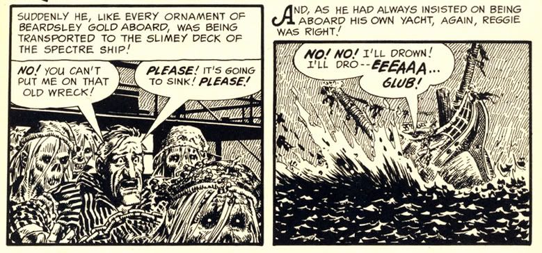 Goodwin and Reed Crandall score with their adaptation of Robert Louis Stevenson's "The Body Snatcher." I haven't read the original, but Crandall's etching-like linework is ideal for the story's setting. It has a "Classics Illustrated" feel to it, very ornate and a joy to behold. Goodwin's script affords Crandall the chance to try all kinds of lighting effects, like the radiating lines around a single candle and the slanting streaks of rain on a gloomy evening. Mr. Gray is a thoroughly repulsive fellow, but you're left wondering just who is worse-- the loudmouthed body snatcher who provides goods a little too fresh for his clients, or the doctors themselves.
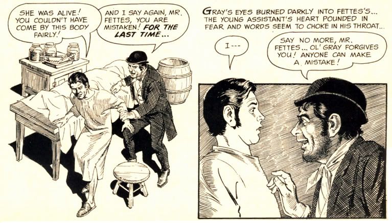 "Blood of Krylon" has a goofy title, but a killer concept. What do you do if you're a vampire in a future where the entire surface is now covered with ultra-modern skyscrapers and law-enforcement agencies use infallible robots to control crime? You take off for the space colonies in search of fresh prey, that's what. But you'd better study up on extrasolar planets-- particularly their rotational periods. The vampire thought of everything in this story except that. Yes, the ending is quite predictable (but it's a fun ride getting there) and I'm not sure why our future vampire has to dress like a Dracula reject complete with high-collared cloak, but Gray Morrow's creamy art truly impresses. These aren't ink drawings with just washes, but fully realized monochromatic paintings.
 But the best is last. The most visually spectacular story in the magazine is "Hot Spell," written by Goodwin and once again illustrated by Crandall. It begins with a wash-painted flashback to "17th century New England," where warlock Rapher Grundy meets his flaming death at the hands of some pissed-off Puritans. Never mind that the preferred method of executing witches was hanging-- a good old fashioned burning at the stake provides more time for Grundy to scream, "My curse is on this village!! Let each generation feel it and suffer!" Then comes the splash page:
 Kind of heartwarming, huh? Unless you're that guy in the intersection. He's warm all over. It doesn't take long for the townsfolk to pin the blame on the newcomer-- some kind of Bohemian artist type. You know, the kind of Commie degenerate who goes around sporting an untucked polo shirt, pinstriped pants and... gasp... pennyloafers! Goodwin's script foreshadows some of the themes Stephen King would work with in some of his short stories and the novel Salem's Lot. The evil we do lives on, hidden behind the banal facade of small town life and all that. It may be good enough for John Mellencamp, but Goodwin finds finds prejudice and urge to mob violence just below the seemingly tranquil surface of this particular one-pick up truck burg. And no little pink houses, as far as I can tell. Crandall's fine-lined art makes it certainly a pretty how town with up so floating many bells down! It also gives the fisticuffs and destruction an ironic Norman Rockwell feel. The comeuppance is a bit abrupt and too literal, but who can argue with a story as gorgeously drawn as this?
Wow. When I read Creepy #7 the first time, I just could not get over what I was seeing on each page. Even though the writing quality is a bit up and down, the stories are never less than fun. And it's difficult to imagine a more beautifully illustrated comic than this. Pure joy in print form.
Subscribe to:
Posts (Atom)