Showing posts with label my art. Show all posts
Sunday, September 28, 2014
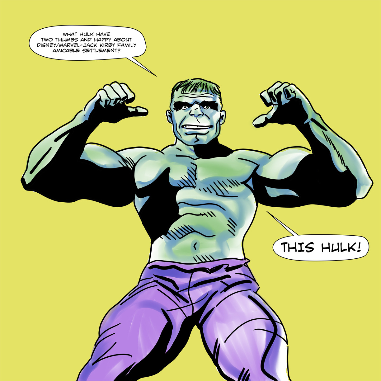
Marvel-Kirby...
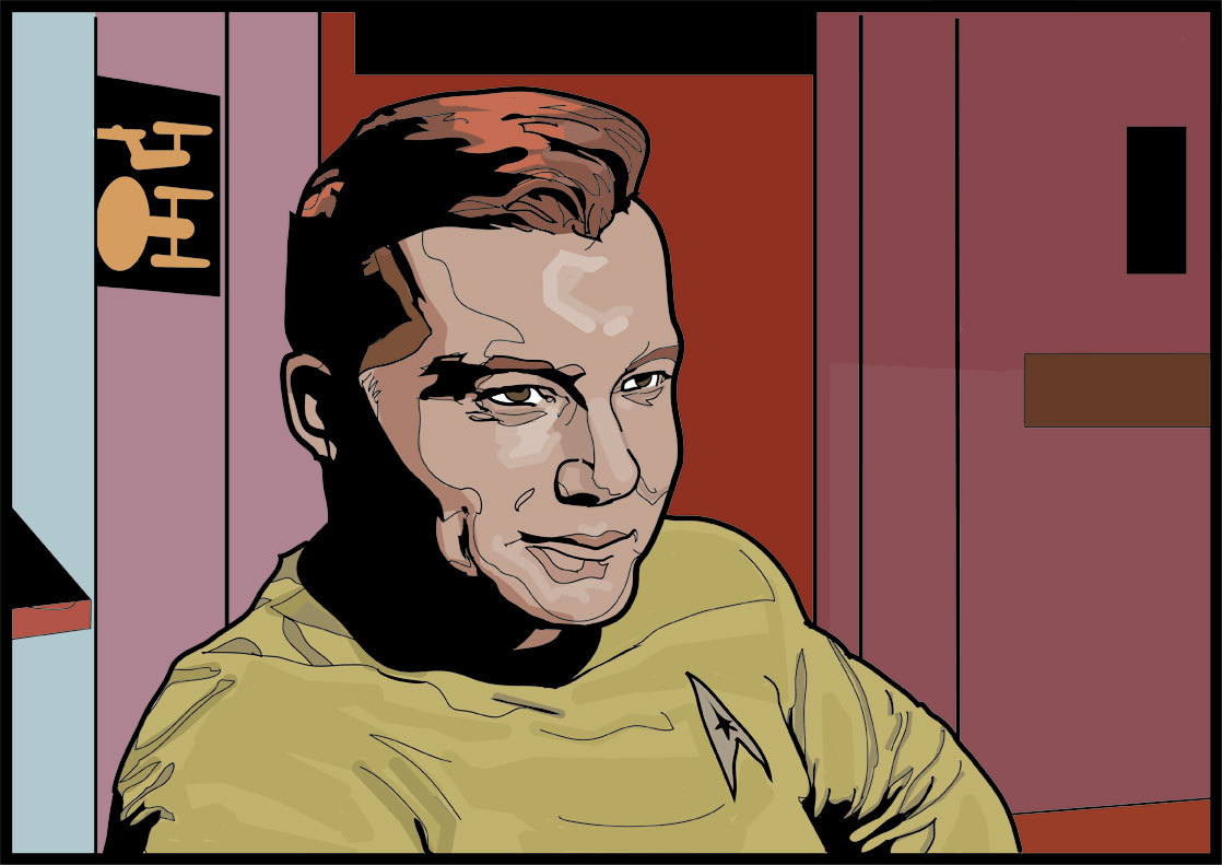
I did this crappy drawing yesterday to celebrate the best comic book-related news story to come our way in decades.
Labels:
fan art,
good news,
Jack Kirby,
Marvel Comics,
my art
Friday, September 5, 2014
"Forget it, Kitty! You're not good enough for us 'X-Babies!"
Ah, I remember New Mutants #13 (March 1984) when Kitty Pryde was like, "Oh, guys, can I hang out with you?" and Dani Moonstar was all, "Nuh uh! You called us 'X-Babies,' so you can take your sorry butt right on out of these woods we're hanging out in and suck an egg!" I was thinking about that the other day. I've always loved the cover by Tom Mandrake. Crying Kitty's in the foreground in her garish green circus costume, phasing sadly through a fallen tree, and the New Mutants are behind her looking fierce. Especially Dani, who Mandrake places in this pose of haughty dismissal.
The story inside is heavy on Amara, Kitty and Doug Ramsey, none of whom I had the least interest in back in the day. I briefly gave up reading the series right around this issue because the book seemed moribund. No more Bob McLeod art, the team's central conflict-- Dani versus a Brood-controlled Professor X-- had long been resolved and the X-Men were back from space, where everyone had believed them dead. There was really no need for a junior X-Team, unless it was to give Chris Claremont's complex narratives in Uncanny X-Men extra space to play out as a kind of main story footnote. Hardly a compelling reason for another title, although it's standard operating practice at both Marvel and DC these days.
Rather than establish a distinct identity, New Mutants in its second year tended towards dull, generic super-kid stories. It hooked me again when Bill Sienkiewicz became the regular artist and Chris Claremont re-established his unique authorial voice by taking the kids and their narrative in a darker direction. Demon bears, slumber parties, shape-shifting cyber-aliens from outer space. All classic stuff.
But I loved this conflict between Kitty and Dani. I took Dani's side, of course. Who wouldn't? Dani is only Marvel's greatest post-Jack Kirby creation. Kitty's fine, but there's no competition there. Mandrake's cover stuck with me for years after I'd forgotten Amara gets her codename in the story, long after I'd given up comic book reading for serious literature only to start in with them again, kind of the same way I did with New Mutants.
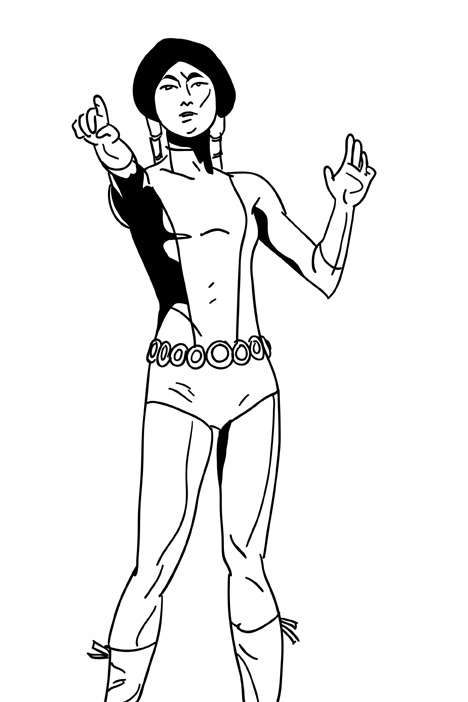
Every so often, I want to revisit that cover image, only my brain invariably turns it into something that only slightly resembles the Mandrake original. Like with this drawing, which I knocked out the other day before work. I felt like working on a foreshortened pointing pose, because I'd convinced myself Mandrake had drawn Dani that way. Actually, if you take a look at New Mutants #13, she's just sort of waving her hand at Kitty. And I really thought since Dani was establishing herself as team leader and spokesperson she was the one who let Kitty have it with the cover dialogue. How wrong I was! Well, my little sketch is poor Kitty Pryde to Mandrake's powerful Dani Moonstar.
Labels:
Chris Claremont,
Dani Moonstar,
fan art,
Kitty Pryde,
my art,
New Mutants,
Tom Mandrake
Friday, May 16, 2014
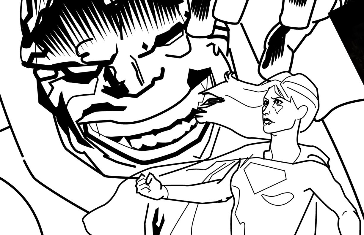
Supergirl versus Darkseid revisited...
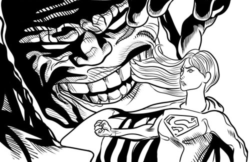
As part of my on-going self-education in comic book art making, I re-inked this image of Supergirl standing up to a symbolically over-sized Darkseid. The inspiration comes from all of those classic comic book covers where the villain looms over the heroes in exaggerated scale. The massive clutching hand as a frequent image.
I absolutely hated the way I drew the hair the first time around. I like this slightly more. Supergirl's face doesn't hold together as well as I'd like and I should have left her chest/torso well enough alone. I am just not an inker. Too fidgety, too indecisive, too forgetful of basic elements like light sources. Actually, Supergirl here is the light source, another symbolic element. But that doesn't explain the weird shadows on her cape.
A determined, heroic Supergirl. That's what I like. She'll keep fighting against all odds.
Overall it almost looks like an actual piece of comic book artwork. It shows just enough progress to keep me chugging along, working towards who knows what end.
Wednesday, May 14, 2014
Look! It's Luke! (and then I gush about Al Williamson)
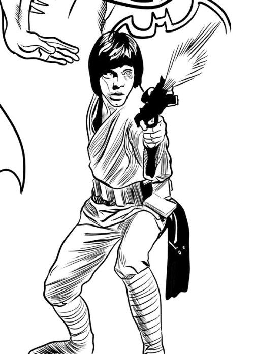
I tried giving this drawing an Al Williamson feel. I didn't succeed, but why would I even try such a thing given the gap in our skill levels? I'll tell you... at length...
So many wonderful artists have worked on
the Star Wars property over the years. Start
with the movie posters themselves, painted by the likes of Tom Chantrell, Tom
Jung (with droids by one of my faves, Nick Cardy), the Brothers Hildebrandt and
Drew Struzan. There are others, but
those pop into my head at the moment.
And in the comics and comic strips we’ve seen art from Howard Chaykin,
Russ Manning, Carmine Infantino, Michael Golden, Cam Kennedy, Jan Duursema, Chris
Sprouse, Alfredo Alcala, Dave Gibbons, P. Craig Russell and many more I can’t
think of right now.
They’ve all contributed mightily to George
Lucas’ universe, but the guy who best captured the spirit of the enterprise (crossover!)
is Al Williamson. Probably because he
was the most naturally in-tune artist for Star Wars. Influenced as it was by the works of Alex
Raymond and film serials, Star Wars was perfect for Al Williamson, the foremost
artist coming out of the Raymond tradition, and himself a big fan of the same
serials.
Williamson didn’t do photo-realism. He just treated Star Wars as it was meant to
be treated, as if it was a classic old comic strip itself, and he gave it a
lush, rich, illustrative look with his mastery of figure drawing,
black-spotting and linework. His Star
Wars strips and comics are gorgeously drawn versions of the films, timeless and
classic at the same time. No one needs
to go back and fix the special effects or add creatures and background
elements. The Williamson Star Wars
universe is fully-realized and already perfect.
Idealized, even. In many respects
I find it superior to the films themselves.
Whenever I try to draw Star Wars
characters, I can’t help but turn into the 12-year-old kid I was when I bought
the Marvel paperback adaptation of Empire Strikes Back and first saw Williamson’s
art and then had to copy it as best he could, line-for-line. Williamson’s art exerted that kind of magical
appeal immediately. There’s no way I can
overemphasize its impact on my sense of comic book aesthetics. Earlier that day I had one idea about what I
wanted to see and how I wanted to draw, I read Empire Strikes Back and by that
night I had a new idea. I enjoyed the
more sketchy approach from Chaykin with its rushed energy and the slick,
stylized caricatures of Infantino (especially when cleanly inked by Terry
Austin), but Williamson finally gave me the Star Wars comic I had been longing
for and hadn’t even known it. I was,
like many kids my age, already a confirmed Star Wars fanatic, but Williamson,
more than the toys and novelizations and eventual TV movies and cartoons and
very nearly as much as the films themselves, cemented my love for this stuff.
Shoot, Williamson gave me the COMIC I’d
been longing for without knowing it. I
already liked Joe Kubert, Jack Kirby, Alex Toth and Alcala, and my appreciation
of their work possibly primed me for Williamson. But I might have been locked into a Neal
Adams/John Byrne kind of mindset as the “correct” approach, bar none, had I not
encountered Williamson and had I not been more of a sci-fi/fantasy fan than a
superhero fan (actually, I was more into comedy than any of those, but you don’t
see a lot of comic books based on sketch comedy or SCTV).
From Star Wars, Williamson (and Jack Davis
to an extent) also provided my entry point to the world of comic artists like
Wally Wood, Frank Frazetta, George Evans, Joe Orlando, Reed Crandall, Roy
Krenkel, Angelo Torres, Gray Morrow, then further into the past with Raymond and Hal Foster and
all the way back to the present with Mark Schultz.
Now I know there’s not one true approach to
drawing. It take less time to point out the
artist I think who are doing it wrong than it does to list the ones I think do
it right because there are so few of the former and so many of the latter. On any given day I might be more
Kirby-oriented or more Tothian in my thinking, I never get tired of Steve Rude,
spent last week imitating John Buscema while trying to teach myself to ink, love
Adams, dig on some Byrne, think Michael Golden needed to do a long run on Star
Wars himself, find Walt Simonson’s work looking better and better all the time,
Bob McLeod remains a big influence and I am in love with the beauty of Colleen
Doran’s characters. I’m way into Mike
Mignola, Paul Pope, Bruce Timm and Mike Allred, probably too much so for my own
good. Misako Rocks! just kills me, as do
Matt Groening, Peter Bagge and Evan Dorkin. John
Severin, Nick Cardy, Los Bros Hernandez, Lynda Barry, check, check and
check! Oh, and let's not forget Rumiko Takahashi, Goseki Kojima, Ai Yazawa and Junji Ito. And, as I said, all those other Star
Wars artists who aren’t Al Williamson have done sterling work, stuff I also
admire.
It’s just when it comes to Star Wars, they’re
various planets and moons and satellites while Williamson is the bright center
of the galaxy and when you see his take on it, you’re no longer on the planet
it’s farthest from. You’re right there
with him, in the middle of adventure and magic and everything fun and good in
the world of comics.
Monday, May 12, 2014
The New Mutants and my artistic misadventures up to now...
This unfinished sketch began its life as just a dull portrait of Dani Moonstar (AKA the Greatest Comic Character Ever Created) I did months ago, possibly in ArtRage Studio or Sketchbook Pro. Yesterday, feeling kind of feisty, I opened it up in Manga Studio and penciled over it and, I believe, fixed one or two things that used to bother me about it.
For some reason, I felt a Hulk appropriate to the story and once I added the Jade Giant, obviously we needed a cringing Sam Guthrie doing a sort of Archie comics fear pose on the right. Such was my thought process at about 7pm, the end of a full day of drawing and self-directed art study which began around 630am. By the time I started coloring it, I was physically exhausted. I only got this far and decided to call it quits, but at that point I'd discovered oil painting and I played around with a digital piece I did a couple of years back of a screaming Captain Kirk being left behind in deep space by the Enterprise.
Yesterday's efforts included the writing, lettering and laying out of a story I call, "The Legend of Billy Jack versus Bruce Lee." I also drew Conan attacking Mickey Mouse, an image I've been toying with for the past month. The idea I could make the Conan figure look a bit like a John Buscema drawing wrecked me. Then I discovered my own line and had to re-draw it in a more personal way. In blue pencil just for fun.
I find I've developed some measure of precision to go along with the speed I've long had. I also have a tremendous amount of self-discipline where I can keep myself drawing for hours, minus a couple of rest breaks here and there, and push through blocks and frustrations to keep putting down lines. What I lack are basic storytelling skills and an appealing aesthetic quality. I don't have a particular "way" to draw eyes, or a characteristic approach to shadows and highlights. What I seek is a natural way of drawing, without getting hung up on ideas like "style."
But at the same time, I want something I can reproduce consistently that looks attractive in case people might actually come to desire my art in some financially remunerative way. The way to do this is simply to do this. Then do it again. And again. Do it a million times if necessary, or even more.
I wish I had all day every day to devote to art, but I also have to do my regular day job. So for now, I'll be getting up at 5am to draw for two hours and then maybe 4 hours on a Saturday and a Sunday each as long as my wife is cool with it. I mean, she's pretty darned important to me!
Anyway, as I've no doubt mentioned here, many years ago I had this idea I could write a 48-page graphic novel or the first two issues of an ongoing series, a kind of "slice of life" thing partially inspired by the existence of Love and Rockets, Ghost World and even Peter Bagge's Hate. Visually, I wanted it to resemble classic romance comics, but with the clothes and hairstyles all up-to-date. Then I thought, "Hey, why don't you try to draw it in as close an approximation to Alex Toth's style as you can?"
I guess I kind of had in mind Mark Schultz's first Xenozoic Tales story, titled "Xenozoic!," which he drew as an extended Wally Wood riff. Well, I quickly learned I was in no way Alex Toth or Mark Schultz. But by that time, I'd already written the whole thing. I did it Sergio Aragones-style, with the entire 48 pages thumbnailed, complete with dialogue.
Realizing I'd set the bar impossibly high for someone whose last lengthy sequential work was a three-page Jurassic Park parody done in 1993, I decided to limit myself to just writing it and getting someone else to draw it. I typed it up in what I think is standard script format, completed the forms and documents and sent the whole mess to Dark Horse Comics, the only place taking those kinds of unsolicited submissions at the time. That it then disappeared without a trace into their slush pile and then, no doubt, into a recycling bin where it eventually became an ingredient in someone's computer desk or a Blo Pop stick (I hope the latter!) let me know my writer's skill level and commercial instincts!
Rejection is just part of aspiration. I don't save them because I'm not sentimental and I have little or no ego, but I've since received some actual rejection letters for short stories I've written. That's more fun that silence, and from them I gained a feeling of accomplishment. The thing is, you can't give up. Ever. So even though I was in the process of changing from a low-paying graphic design career to a higher-paying English teaching one, I carried the layouts and script with me to Japan where I worked on them from time to time. When I bought Manga Studio 5 with my new-found education riches, the first thing I did was lay out the first half as a single comic book issue and letter it, editing and fine-tuning the dialogue throughout. Soon I'll do the other half and complete the story. I know how it ends and how to get there. I know what everyone says and does and why.
I drew here and there, but largely just spent my time bouncing around between my adopted hometown and Tokyo, checking out rock shows and living the life of a language mercenary. This left little time for the kind of dedicated study of art I'm making now. And why am I doing this? Encouragement from a pro who sent me a message on Facebook and asked me directly why I wasn't drawing. Why I had never gone for it. I thought about that for while and after I had thought about it long enough, I realized I had to start drawing again on a regular basis. I couldn't let my skills rust anymore. I then went to work drawing every single day and recently, I've been spending longer hours at it. I'm improving faster than I ever thought possible. And it's been pretty fun despite smashing headfirst into the upper limits of my capabilities, which aren't as high as I'd like.
There are some hugely talented people out there who can blow my wheels off! I mean, WOW!
Then, this past weekend, I decided that so-called graphic novel needed some new thought and a new beginning. I came up with a kind of one-page prelude to set the scene and one of the character conflicts. This leads into my original opening sequence but enables me to show, rather than tell, and opens up the possibility for more natural, less expository, dialogue from the two co-leads. They're half of a quartet of characters whose adventures and misadventures drive the story. This made me re-think another scene near the beginning that will no serve to sharpen the book's main dilemma, the one shared by all four people.
And with that, I must go teach an English conversation class. So I'm out!
Wednesday, May 7, 2014
Today's Xi'an Coy Manh and a word or two about Manga Studio 5...
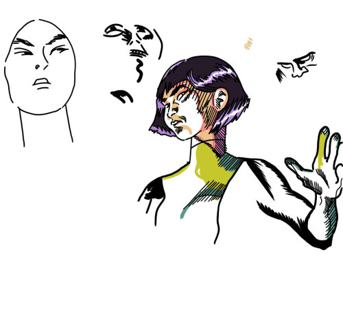
Oh, sorry. From the sublime (Steve Rude) to the ridiculous (me). This is Xi'an Coy Manh, a particular comic book character favorite of mine. As you're no doubt aware (and sick of hearing about), I've been spending hours upon hours drawing lately. Mostly teaching myself to ink.
What makes it easy to get lost in art is a little program known as Manga Studio 5. It's not cheap, but when you consider the tools you get with it, it's more than worth the asking price. Yeah, I even splurged and bought the professional level version.
The absolute best feature is the one where you can lay down a perspective ruler and draw lines that "snap" to it. You can do 1-, 2- and 3-point perspective. You still have to understand the theory to make it work properly, but Manga Studio has taken a lot of tediousness out of working in perspective. World-building is a joy. It always was, at least in the imagining stages, but then you had to make grids or find vanishing points, which is like brick-laying or putting in a concrete carport on a steamy August day in south Georgia (both of which I helped my dad do when I was a kid). Now you can just fiddle with some levers and away you go. New York City in a few minutes for Spider-Man to go a-swingin' through, or some alien megalopolis worthy of those magicians over at ILM. I recommend you do a rough sketch first, though. That helps clarify where all those levers and points go!
Another fun feature is the poseable figure/character creator thing. The proportions are a little odd and the anatomy is kind of blobby and unformed. If you make a bulky, hulky, sulky superhero with green skin and torn-up purple pants, for example, the muscle masses are not accurate at all. So it's not going to work as a lazy person's substitute for real-world observation and study, but as a lazy person's shortcut to throwing together scenes and keeping everyone the same size relative to each other, it works excellently. You can put 3D mannequins on your page, manipulate their poses and body parts (make massive heads, hands or feet, giants and little people) in just about any way you can think of, move a camera around to capture the angle you want, then click a 3-point perspective ruler based on your "camera angle" and draw away like a happy clown who likes to draw.
By the way, one thing it does is completely take away an artist's excuses for not including hands and feet in a drawing. No more demure hands-behind-the-back poses with conveniently placed boxes on the floor. Put those hands into intricate Dr. Strange spell-weaving configurations and prop at least one of those feet proudly up upon that box.
Manga Studio 5 also contains several 3D environments in which you can place your people. They're very manga-centric. Japanese high school classroom and typical Japanese residential neighborhood, for example. But with some clever adaptation, you can make them work for just about anyplace. There are even some poseable manga figures to stick in there, high school kids in uniforms. If you really want to, you could simply make up stories about them.
Finally, the most technical part. Lettering and panel borders. You can create word balloons and pointers, and toss your words all over the book before you ever draw a line. This is handy, because if you place your word balloons properly, that's less panel area you have to draw, which further saves a hurried artist time. And really, you should be planning your page layouts with the word balloons in mind for maximum readability. And Manga Studio 5 provides some manga page layouts with pre-ruled panels, but you can use the program's tools to make your own. I made a standard, old school three-tier, 9-panel layout I use a lot because I love the retro page design.
In two days, I laid out the panels and did all the lettering for a full 24-page comic book, approximately one-half of a graphic novel I hope to complete someday before I die. I started doing the actual drawings and ran into some limitations Manga Studio cannot help me with at all. But that's not a program flaw. That's my own problem I have to work on, and Manga Studio is helping me.
All of that sounds complicated (or exciting if you're more of an optimist, I suppose), but if you've used Painter, Sketchbook Pro, ArtRage Studio or Photoshop, it's easy to get started. The learning curve isn't really that steep if you're not intimidated by all the menus.
But there are some frustrations involved with the program itself and not just my inability to draw up to the impossible standards I've set for myself. The built-in drawing, painting and coloring tools-- the pens, pencils and brushes-- are okay. Just okay. You can do quite a lot with them, but they just don't mimic closely enough what it's like to make lines or blobs with real pencils, pens or brushes. I find this changes my "feel" and forces me into drawing in ways that aren't natural to me. I've never been a very skilled inker, which is why I tend to do my inks in Illustrator. But I long for the feathered look of a classic inker rather than the overly mechanical finishes I end up doing there.
Well, an incredibly talented illustrator named Ray Frenden has solved a lot of that by producing for a modest price practically every inking tool you could ever want, from Rapidograph pens to Pigma pens to ink nibs to brushes galore. Plus watercolor and oil painting brushes. The other day, I bought the equivalent of thousands of dollars worth of art supplies for about 15 bucks. Import them into Manga Studio and you've got everything you need to draw with and no excuses not to use them.
And this drawing is one of the results. It looks as close to something I might have drawn in my sketchbook there's practically no difference and yet it took less than half the time and didn't smear. The hand is wobbly, and I've forgotten what tool I used. Probably a Pigma pen. The hatched lines are definitely Pigma, as are the color areas. Then I switched to an ink nib Frenden calls "The Natural" and did those other faces and the strange feathered areas on Xi'an's arm.
I've been having a ball playing around with Manga Studio 5 and Frenden's art tools. I don't fear inking in Manga Studio anymore. In fact, I can hardly wait to get home from work every day to jump in and try different things. My skill level frustrates me, but with the handy ctrl-z function my most egregious mistakes disappear.
I mean the rendering ones. The underlying structural problems remain. But I'm working on those! Maybe one day we'll see some results.
Labels:
art,
art programs,
Manga Studio,
Marvel Comics,
my art,
New Mutants,
Xi'an Coy Manh
Saturday, May 3, 2014
A full color look at the New Mutants if they had somehow appeared on Saturday morning TV circa 1972...
Or something like that. I would have loved a New Mutants cartoon in the 80s. I used to watch that Mr. T cartoon and kind of squint at it and imagine it was Dani and company, only with Mr. T.
Thursday, May 1, 2014
Captain Kirk on NBC...
You know, "The following program is brought to you in living color on NBC." I don't think I'm any great shakes as an artist or renderer, but I do like my coloring abilities. Not so much the shapes there, but the choices. They may not be exactly accurate, but they're very rich and interesting to look at.
Don't you agree Kirk's shirt is a strange and fascinating garment? I think the originals were made of velour, which gives them a thickness and surface texture that comes across as particularly Star Trekian on TV. Nothing wrinkles exactly like a Starfleet uniform tunic. Now that we have Blu-Ray, we can see the nap more in early episodes. The third season seems to have substituted some other material for velour. Also, Kirk's tunic is longer and more tapered to his body. His hair is a little longer, too.
But the point of all this blather is what the heck color was Kirk's shirt in the first two seasons? We like to say "gold," but it's kind of a greenish-gold that sometimes appears yellower and sometimes a kind of off-green (if I can be permitted to create such a thing). The cartoon series gave him a yellow-orange shirt. I've seen art with that corrected to something closer to the live action color, but those never look quite as charming to me. My Mego Kirk definitely had a shirt much closer to yellow.
I read somewhere the Kirk shirt (and by extension, the Chekov and Sulu shirts as well) is actually a color known as tenne. This is an orange-brown that can go so far as to be quite yellow. It worries me. I'm a worrywart about color.
It's probably better to be like the colorists at Gold Key. In the early issues of their Star Trek series, they simplified their lives by making everyone's shirts green, except Spock's.
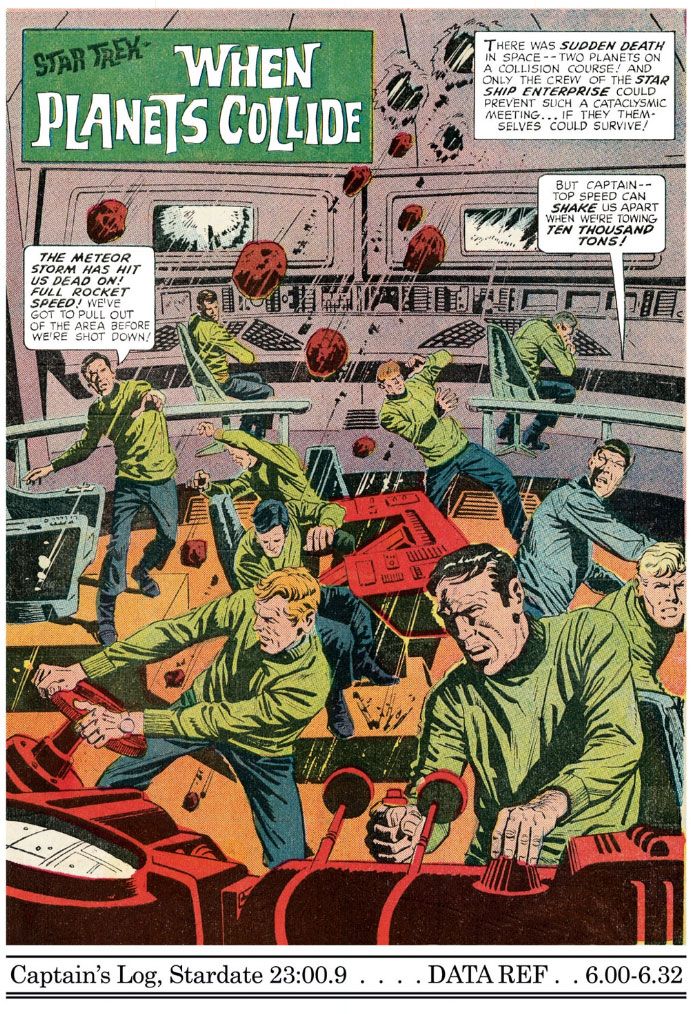
| Star Trek #6 (December 1969), art by Alberto Giolitto |
Labels:
Alberto Giolitti,
Captain Kirk,
Gold Key,
my art,
Star Trek,
vintage comics
Wednesday, April 30, 2014
First pass at interpreting the New Mutants as 60s-70s Hanna-Barbera characters!
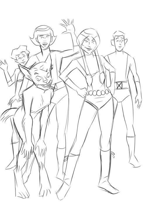
Inspiration struck yesterday and I couldn't rest until I made this image. There I was, teaching English, and I started wondering what the New Mutants characters-- my all-time fave super team-- would look like as 1960s-1970s Hanna-Barbera cartoons. Obviously, Dani Moonstar would be the central character and steal most of the screen-time, and Sam Guthrie would be the clumsy, self-doubting comedic relief, with Rahne Sinclair as Dani's cutesy-pie animal sidekick a la Scooby-Doo and various members of his family. Xi'an Coy Manh would be the mature voice of reason and Roberto da Costa the cocky muscle. Too many uncertain lines and I haven't finished designing Rahne in her half-wolf form. The doodles I did at work were a lot better than this. The first Xi'an I drew had some appealing lines in her face and along the hair flip I didn't quite capture here. That really inspired me to think I could pull this off. How wrong I was!Then again, I did this in about 15 to 20 minutes this morning while eating breakfast and drinking coffee. I'll give it another go this evening and this weekend and see if I can't improve it. Ink it and apply a wash or maybe some watercolors. I'd love for it to come out looking like something found in the HB files, forgotten for years. Again we see there is nothing my imagination can possess which my fumbling art skills cannot take away.
To end on a positive note, I largely avoided tangents (except, most glaringly, Dani's highlights meeting her eyebrows and where her boot fringe meets Xi'an's shinbone), which pleases me, and I really like Sam's body language here. Just a slight slumping of the shoulders conveys quite a bit about his lack of self-confidence without over-selling it.
Re-downloading those Gold Key Star Trek comics inspires this Captain Kirk ink drawing...
Not really. Actually, it was the other way around. I've been writing about Comixology and drawing lately and working on this drawing reminded me I needed to get those Star Treks back onto my phone. Any excuse for drawing Trek characters, though, is a good one. Grabbing the new Comixology iPhone app requires we download all our comic books again. There are a few series I absolutely cannot do without: Kamandi, New Mutants, Teen Titans and, of course, Gold Key Star Trek. I'd add New Gods and Mister Miracle if they were available. There's one more, but I blog about it elsewhere because it falls outside our mission statement here. It's nice being able to carry around entire runs of Fantastic Four, Uncanny X-Men and Amazing Spider-Man, too.
The first thing I did when I started the app is fill one very important area of it with Kamandi. Yesterday, I started the process of re-acquiring my digital Trek books from IDW. You have two options. One is to purchase the individual issues, which is my preference. Be warned, though-- for some reason the first few substitute the old Checker Publishing softcover artwork for the original comic book covers. Then they start in with the original and very lovely photo-montage covers and-- even better-- the off-model fully-painted ones! The other option is to buy them in little groups as collections. At $11.99 a pop, that's probably the cheaper of the two, but for me, money is little or no object.
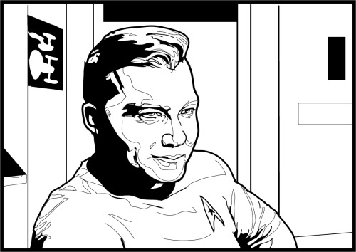
Well, even if you think I'm an ass for shilling for Comixology-- I haven't meant to; it's just worked out that way-- please enjoy Captain Kirk wearing something of a smirk. I need to fix his left eye, mouth and chin, but I'm almost as satisfied with this drawing as ol' Kirk here is with himself!
Labels:
Captain Kirk,
Comixology,
digital comics,
Gold Key,
my art,
Star Trek
Tuesday, April 29, 2014
Bizarre Dani Moonstar sketch!
Dani Moonstar is upset about something, possibly how screwed up I made her hand. Or maybe it's how oversized I drew her head. Or maybe it's that Superman-type monstrosity in the foreground. I did this as a warm-up before doing a more serious drawing. Strictly linear Sam "Cannonball" Guthrie makes an appearance with either his left arm extremely foreshortened or else his hand swollen to impossible size. Judging by his expression, the latter is very much a possibility. Bored with that, I started copying Alex Toth faces to fill in some space. I like the expression on that guy on the far left: "Why are you doing this? Is it because you hate art?"
Labels:
Alex Toth,
Dani Moonstar,
my art,
Sam Guthrie,
Zuperman
Thursday, April 24, 2014
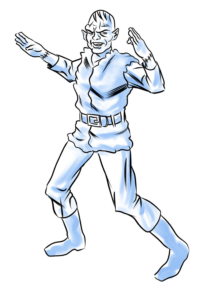
I present Kung-Fu Frankenstein!
I wrote about this guy the other day, mixed in with some other blather about Kirby knows what. I don't. I've forgotten. Anyway, this is a character I came up with at work last week. I doodled a couple of quick concept drawings, aiming for a kind of Jack Kirby-Steve Ditko-late 60s Marvel synthesis. Trust me-- he looked a lot better in my mind!
I had this idea of mocking up a comic book cover or two from a fictional bottom-feeding type company where the editor-in-chief or publisher saw what was happening at Marvel and it blew his mind. Unfortunately, his imagination wasn't up to the task, and his budget only afforded him to hire guys as talented as I am. These sad circumstances led to this character, a shoddy Hulk rip-off and eventual disaster. I was going to create a whole pseudo-history for the company complete with hack freelancer writers and artists rapidly descending the professional career ladder on their way to destitution. Which, I admit, isn't very funny when you consider this actually happened to real people back then, including some formerly top names.
Still, I was enthused enough with the idea that evening to whip out this more realized concept piece, which proved to me what a terrible idea the whole thing was in the first place. I still like the character and elements of the design, and a quick Google-search revealed there is not already a character named Kung-Fu Frankenstein. Or, if there is, it's not well-known enough to show up on Google. So just maybe I got there first for a change. (UPDATE: Yet another Google search reveals a movie of some kind called Kung Fu Frankenstein and various references to "Frankenstein's Kung Fu Monster." Yes, I know the monster is not named "Frankenstein," but rather its creator; however, I bow to childhood tradition in this matter and imagined my mythical comic book publisher would have as well.)
Which reminds me. This morning I was doing a little reading about Dan Clowes' Lloyd Llewellyn and I made a startling discovery about myself! First of all, Clowes is a legitimate genius of the form. I got into him via Ghost World, like a lot of jerks-come-lately, but when I did, I went whole-hog into his back catalog... as far back as just past Lloyd Llewellyn. Which is why I was curious about it.
Anyway, to end this shambling story, this led me to a Wikipedia search (first resort of the lazy and time-pressed; there are no others) and to the realization my genre is Lowbrow Art. Or "pop surrealism," which is too pretentious for my taste. I realize I'll never be paid to produce art, which is kind of depressing, but at the same time I'm feeling enlightened by this realization. I am affiliated with a movement and now my tongue-in-cheek, vaguely asshole-ish approach to drawing superheroes makes sense. I'm probably not capable of producing straight adventure material, so I'll just have to resign myself to admiring it.
Now this doesn't mean I won't keep trying to improve my art skills. What it means is, I'll probably become more precious and affected, without first having gone through a commercial period.
Labels:
Dan Clowes,
fandom,
Kung-Fu Frankenstein,
Lowbrow art,
my art,
pop surrealism
Tuesday, April 22, 2014
Supergirl versus Darkseid...
Sure, why not? More of my silly art. This is a detail from an early work in progress with a strangely cross-eyed Supergirl. You know, I looked at what I'd done this morning and I felt excited and energized by it.
"You're really getting somewhere with this art stuff, baby!" I told myself. "You can fix those eyes and finish Darkseid's face and body and you'll really have something to brag about!"
Then I took a look at it between classes at work and all I saw were a bunch of jumbled, randomish lines refusing to coalesce into an image. What made sense at 6am at the start of the day stood revealed as a potential disaster at 9:30. That was a real downer. Looking at it now, I see it's nowhere near as dire as I thought then, but I also see now I have plenty of work ahead of me yet. My ambition may have exceeded my abilities once again. Lots to fix in order to salvage this one.
Wednesday, April 16, 2014
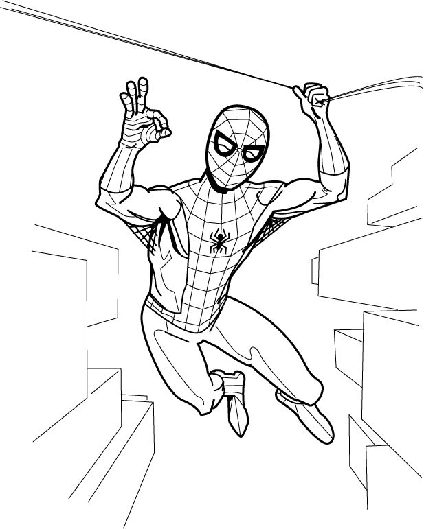
Spidey says, "Everything is A-OK!"
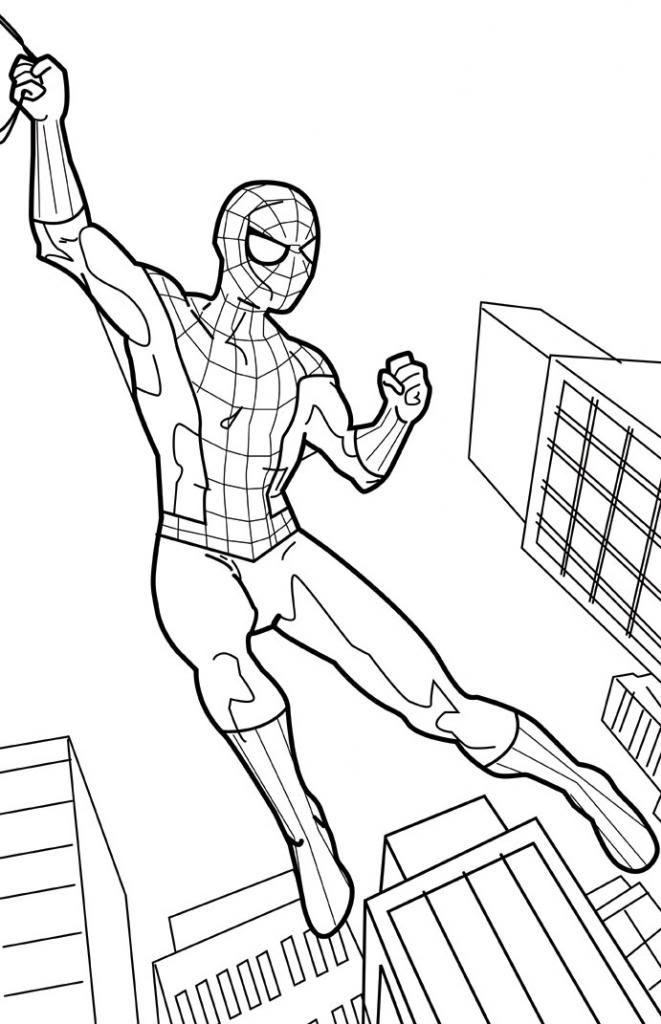
Because he's a big Mercury 7/NASA fan, I guess. This is a drawing I'm working on along with a number of other ones. I'm on fire lately! After drawing Spider-Man enjoying a sandwich, I felt like doing one where he's acting like he does in the comic books. I need to fix the webbing on Spider-Man's costume, make an adjustment to his anatomy here and there and fix the perspective and add some windows and balconies and other architectural features to the background. Then I'm going to give it a John Romita/John Buscema/Gil Kane era color job. I'll never be skilled enough to be one of those real comic book artists, but I do feel I've upped my game quite a bit lately. It's been fun and that's the most important thing.
Wednesday, April 2, 2014
Superman versus the Thing (in color)
There! Yet another ridiculous image I've had in my head for a while. I imagine after Superman and the Thing settle their difference, they'll go have a meal or share a drink or something and become really good friends.
Monday, March 31, 2014
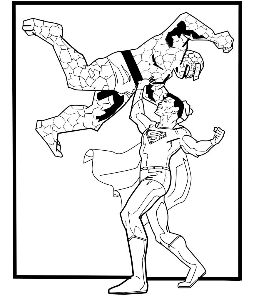
Superman versus the Thing and Spider-Man takes a swing! A couple of "in progress" drawings
Two of my favorite characters come into conflict with each other. I'm pretty sure Superman could take the Thing. The Superman figure is largely complete. I need to fix his hands, right calf muscle and the cape, and I may adjust the line weights a bit. Poor Ben Grimm needs a lot of work, though. Not happy with the arm shadow. It needs to be wider and extend down his chest a bit. And all those rocky facets!
Here's Spider-Man acting more like the Spider-Man we all know and love:
The color scheme for this one is going to be more John Romita/Gil Kane era Spidey than Steve Ditko. I have to fix the perspective (look at the wonky windows on the building under Spider-Man's right foot, just to point out something that's pretty obvious), finish the webbing on his costume (and he needs his chest emblem!) and adjust the left leg. The muscle on the outside edge near the knee isn't working for me and the foot is angled wrong. The pose itself is lacking in dynamics. I've got a rough sketch of a more exciting (I hope) one I'm going to start inking today.
These are penciled in Manga Studio 5 and inked in Adobe Illustrator. I'm considering another work flow, though, where I print out the pencils and hand-ink them on vellum or using a lightbox or something along those lines. Digital inking is no panacea, although it's nice for fidgety, shaky-handed fools like me. I like being able to fiddle around with the lines and get them "just so," but the results are lacking in humanity. I am a machine.
Other works in progress include Supergirl versus Darkseid and, for one of my other blogs, a couple of Cassandra Cain Batgirl images, one where she goes up against Wolverine and another where she takes on the Joker.
Labels:
DC Comics,
fan art,
Marvel Comics,
my art,
Spider-Man,
Superman,
the Thing
Wednesday, March 26, 2014
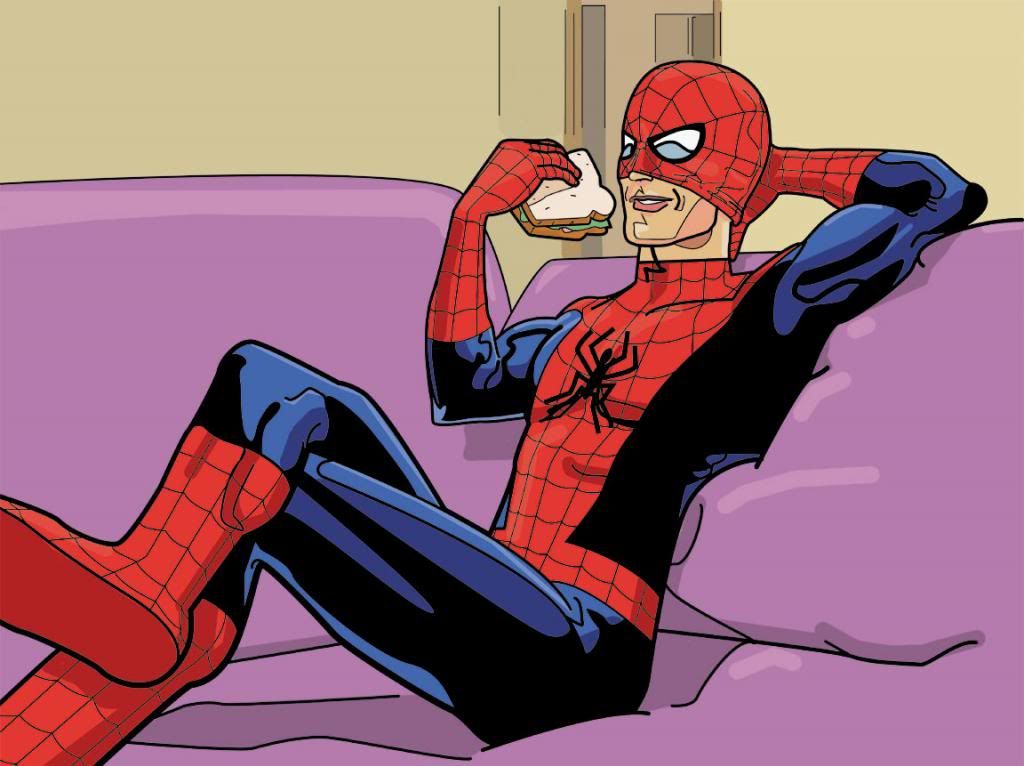
A very Spidey sandwich... in color!
And... finished! I don't want to work on it anymore and I'm already seeing things I hate about it but there it is, a silly image I've had stuck in my head for over a year now making its way inside yours! Enjoy!
Labels:
fan art,
Marvel Comics,
my art,
Spider-Man,
The Amazing Spider-Man
Tuesday, March 25, 2014
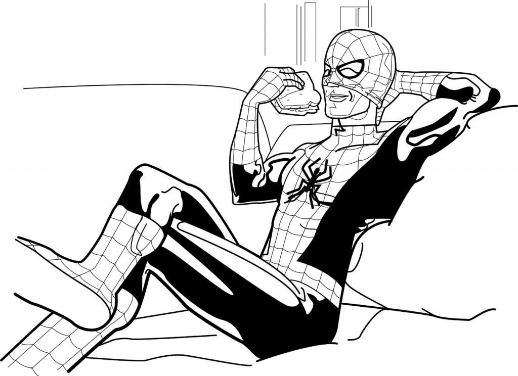
Spider-Man enjoys a delicious ham sandwich...
We all remember the theme to the 1960s Spider-Man show. And some of you may have done the same thing a friend of mine and I used to do. We made up our own verses and had Spidey doing little daily chores and other mundane activities:
Spider-Man, Spider-Man
does whatever a spider can
takes a shower, goes to work
comes back home, takes a nap
LOOK OUT!
Here comes the Spider-Man!
We came up with approximately sixty thousand verses. That's what inspired me to do this laid-back wallcrawler.
Tuesday, February 4, 2014
Tuesday, January 7, 2014
Enjoy my retro take on Don Knotts...
I'm practicing inking techniques and washes. My goal is eventually to draw something that doesn't infuriate me with its incompetence.
Subscribe to:
Posts (Atom)