Showing posts with label great art. Show all posts

Thursday, October 30, 2014

October is Spookey Month: You can't have Halloween without Bernie Wrightson!

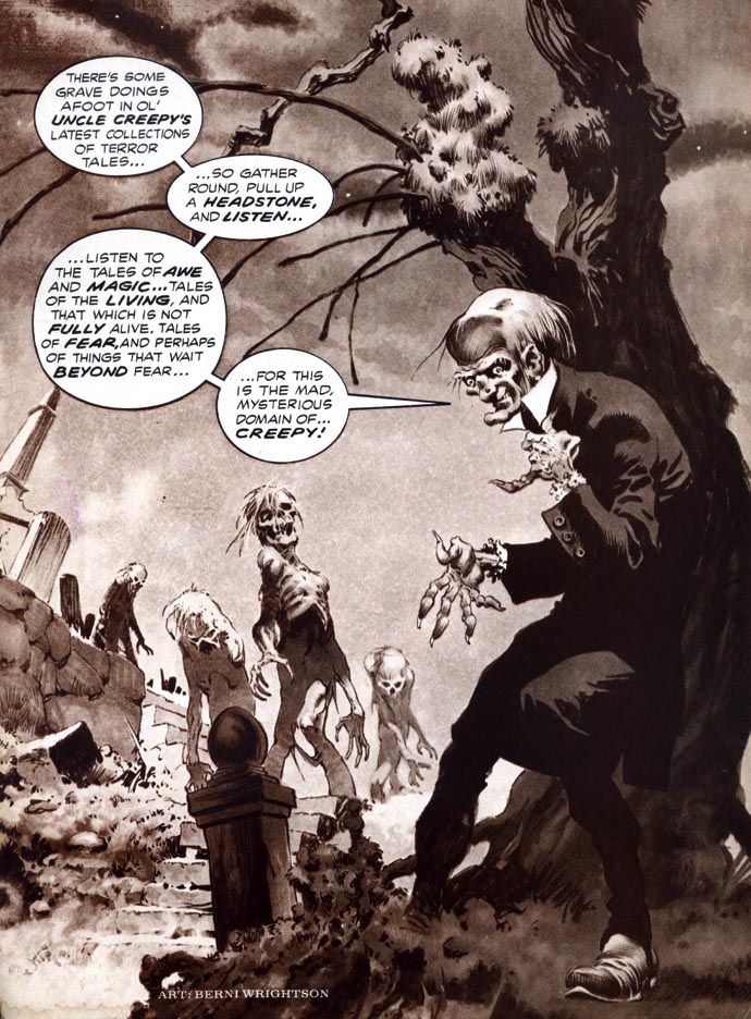
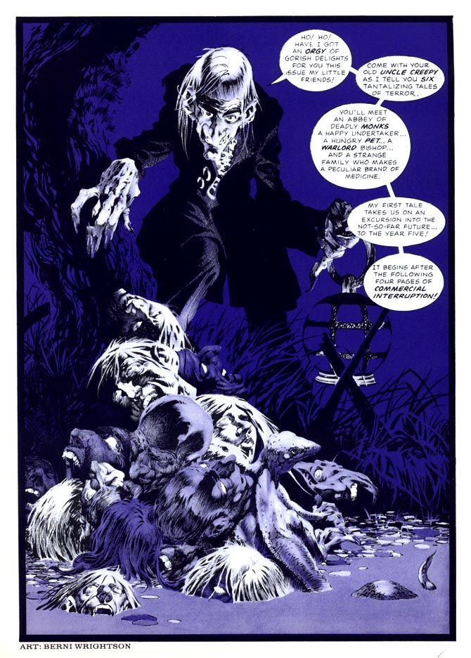
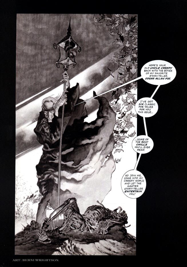
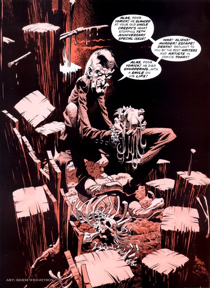
Hello, Halloween hellhounds!  Let's enjoy Bernie Wrightson's delightful Creepy magazine frontispieces.  I'm not sure when Creepy started running these, and Wrightson didn't do one for every issue.  Sometimes they'd run a full-color house ad for Vampirella or spotlight another talented artist.  But Wrightson's frontispieces are rich with spooky atmosphere.  And ghoulish good humor.  These are just a few of my fearvorites...

Creepy 66 (November 1974)


Creepy 67 (December 1974)

This next one is a particular joy to behold...


Creepy 70 (April 1975)


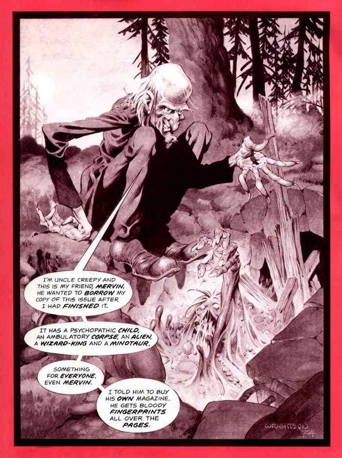
Oh wow!  Isn't that beautiful?  Okay, a few more...  This next one I like because it's one of those Wrightson "spooky stuff happens even during the day" images.  Just like in the memorable story "Jenifer" he illustrated.  It starts one magical afternoon.  Imagine hiking in the forest on a gloomy fall day and...


Creepy 71 (May 1975)

Egads!  Dare we continue?  Dare we do!


Creepy 75 (November 1975)


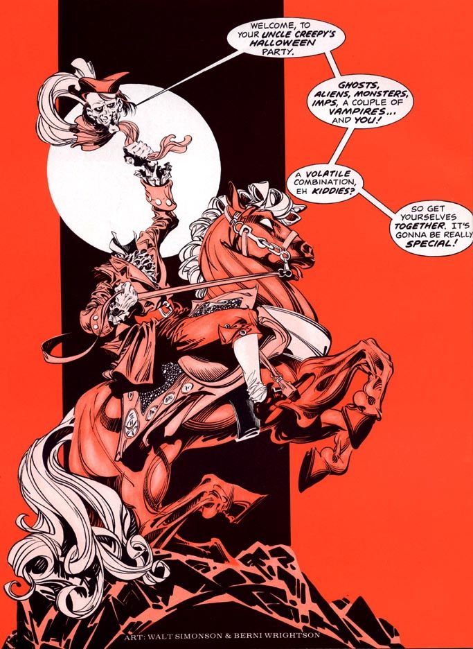
Here's my favorite, though.  It's a collaboration with Walter Simonson, a guy who's best known for Asgardian superheroes but has done a few highly effective fright jobs in his long career, too.  Plus, it's specifically Halloween-related.


Creepy 76 (January 1976)


Love those.  But to be honest, the scariest Creepy frontispiece of all wasn't drawn by Wrightson or Simonson.  It's this one.  Steady on, people.  Steady on...


Creepy 81 (July 1976)


AAAIIIIIEEEEEEEE!!!

We definitely need something to help us recover our wits after that shriek-inducing moment of terror.  All of these except the last are available in Dark Horse's gorgeous and essential Creepy Presents Bernie Wrightson hardcover.  Now I need to go clean up a little.  So calm yourselves and here's something to soothe your jangled nerves.


Tuesday, October 28, 2014

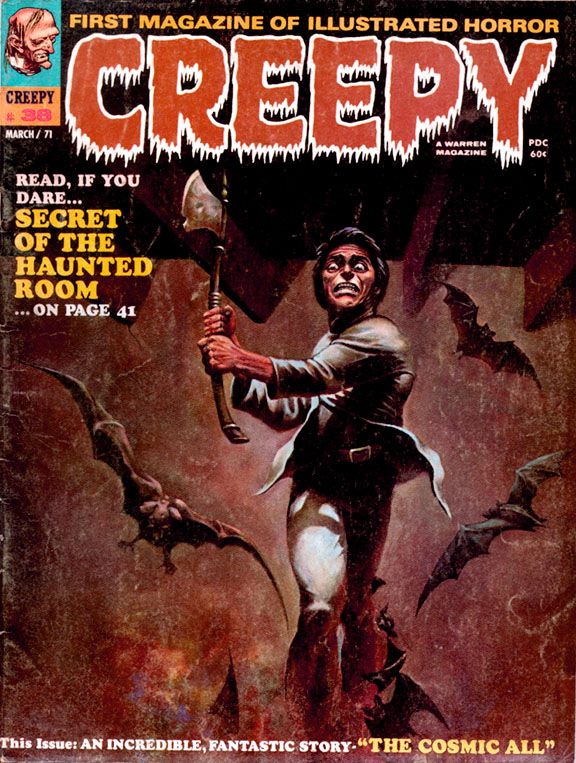
October is Spookey Month: Wally Wood brings you a new path to a life of peace and love in Creepy #38 (March 1971)

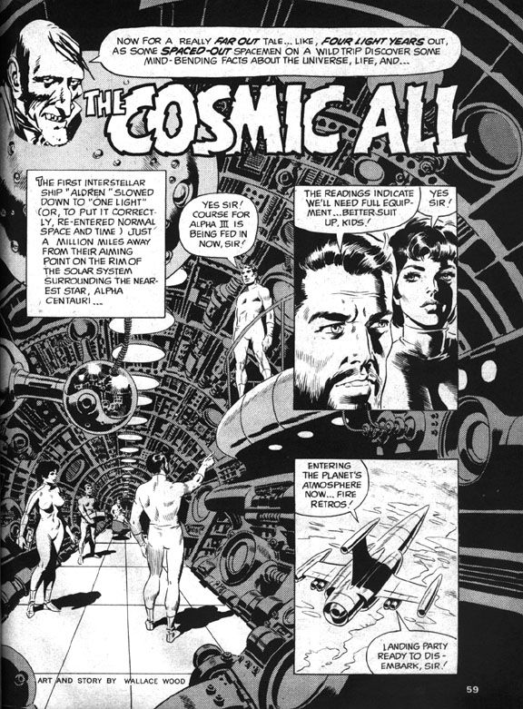
Behind a lurid and appealing Ken Kelly ax-maniac cover (Kelly's Creepy debut), you'll find a late career gem in the EC Comics mode written and illustrated by Wally Wood.  James Warren, who was not only publishing Creepy at this point but also editing it (along with associate editor Archie Goodwin), must have been particularly happy with Wood's "The Cosmic All," because he gives it a cover spotlight and the honor of closing out an issue that also includes work by Rich Buckler, Mike Royer and Ernie Colon.  Warren would also reprint the story just over a year later in Creepy #48, a special, all-reprint issue.

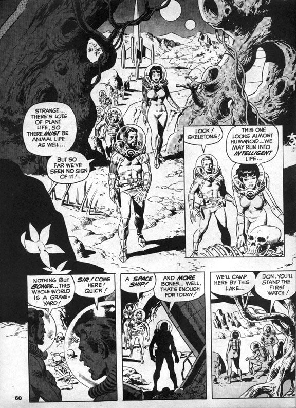
Sometime in earth's future, we've sent an intrepid mixed-gender exploratory mission led by a bearded captain (along with Don!  And Sue!) to Alpha Centauri, which is now, more than 40 years after this story's publication, a popular tourist destination.  In those days, it was the distant frontier of outer space.  After finding bones on their first planetary stop, the explorers anticipate a possible meeting with intelligent life.  Which is kind of ironic.  I mean, they do meet it.  It's just not the kind they were hoping for. 

You know how the hierarchy of space aliens goes—in order from least to most objectionable, it’s generally humanoids, reptilians, insectoids, cephalopods, non-tentacled mollusks, blobs and, finally, slimes.  The further its appearance gets from the human template, the more repulsive the alien.  And usually, the more likely to have philosophies contrary to the kinds we find comforting.  So Wood’s slime terrifies the space explorers by trying to absorb Sue.
 
Wally Wood

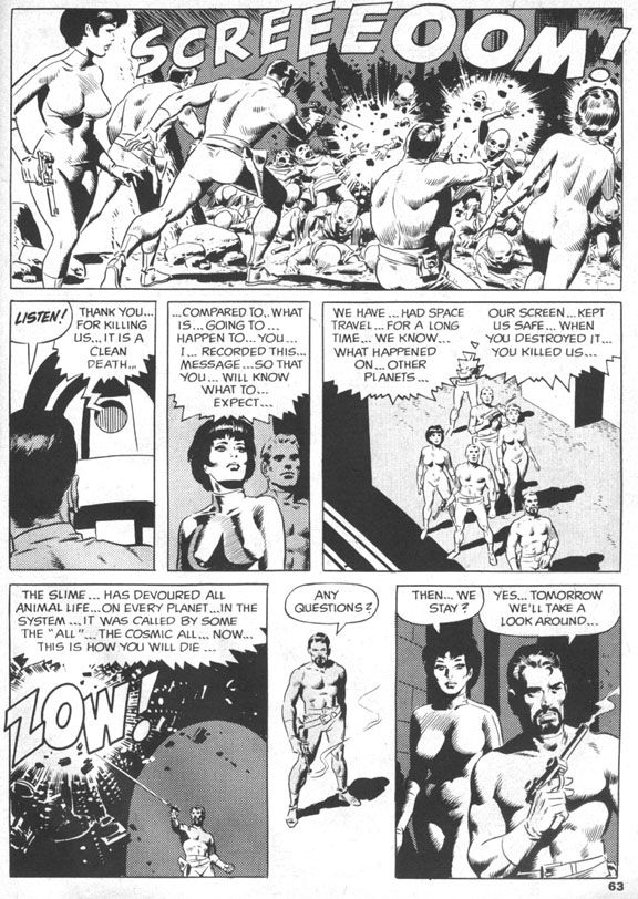
In familiar comic book sci-fi fashion, Don shoots the slime with his phallic laser zapper gun, then everyone flees in their retro-finned rocket ship, only to find the slime on yet another planet.  Having achieved what they believe is their due quota of slime-based encounters, they orbit a comfortably earth-like planet that gives them a very rude greeting in the form of more laser beams.  In response, the human explorers (And Don!  And Sue!) blast through planetary shields and receive a series of puzzling messages.  The civilization below no longer seem angry, but rather depressed and resigned to first contact.  They invite the astronauts to land, then ambush them in a suicidal rush. 
And, ironically enough, they're comfortably humanoid in appearance.  Bulbous, bald heads (like my own) and large black eyes notwithstanding.  A recording reveals this was their deliberate self-extinction and a cleaner death than the one that awaits the astronauts.  Who stand around puzzled, as anyone would be, but the next day all but two of them are skeletons as well.  And those two are Don and Sue!
 
Wally Wood

Which is probably just as well.  After all, even if it was a case of suicide-by-human-astronaut, these men and women did commit genocide.  Are they any less monstrous than the slime?  Perhaps they're precisely as monstrous, as we soon discover.  Don and Sue make for earth where they suddenly experience a strange elation and crash the rocket into the ocean.
 
Wally Wood

There Don and Sue slough off their skins and mutate into the now-familiar slime.  Everything becomes clear.  The humanoid aliens chose to die as a group with each individual’s self-awareness intact because the slime infects other beings and absorbs them into the titular cosmic all, a vast collective without individual thought.  The two space travelers become one with the intent of spreading their all-ness to every living thing on earth.  Starting with all sea life, I suppose.  Uncle Creepy appears at the end and tells us the ultimate twist—they’re glad to be this way, so it’s technically a happy ending.  I’m not going to argue with him.  It certainly made me happy!
 
Wally Wood

The ending is one reason.  The ambiguity of it lingers.  So many deaths, but no escape for Don and Sue, just the loss of humanity both physical and mental, a blending of their minds with the vastness of the alien slime, all-knowing and unstoppable.  Is their joy at the becoming genuine, or simply an effect the slime has on their minds?

 The other is Wood’s artwork.  The splash page is a spectacular image, the kind of Woodian spaceship interior he drew regularly during EC’s heyday.  Round vents, layers of exposed pipes like the veins in a human arm.  Similarly exciting scenes follow, with the explorers trudging across a planetary landscape, the slime attacking like a huge ocean wave and then a space battle followed by an alien-wave attack and the intimate concluding sequence which is equal parts bleak and elating, an uneasy mix that elevates this story to legendary status.  It has the feel of a particularly memorable EC tale, but with an expansiveness the larger page size affords. 
 
And that ending!  That ending!

Monday, October 27, 2014

October is Spookey Month: Tricks and treats with Creepy #36 (November 1970)


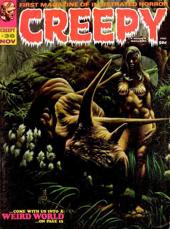
I can't decide which is the treat.  Is it the dinosaur or the cheesecake?  This is the cover to Creepy #36 (November 1970), naturally.  Nature being the operant word here.  This painting is by Kenneth Smith, who contributed a few covers to the magazine around this time.  It's an image that actually appears as a panel in the story "Weird World" inside.

Nicola Cuti wrote "Weird World" and Tom Sutton illustrated it.  It's a story about an astronaut lost on a jungle planet where this woman rides around on a triceratops.  The whole thing has a Richard Corben feel to it, and when I first saw this cover that's who I thought painted it.  But no, Kenneth Smith.  Smith painted a number of science fiction book covers and was one of the artists included in a book that's a particular favorite of mine, Ray Bradbury's Dinosaur Tales along with people like Moebius and William Stout.

Well, here's a dinosaur.  You know, because dinosaurs are such an important part of our Halloween traditions.  The story itself has a downbeat twist ending and this cover image remains popular among Creepy fans to this day.  It was probably pretty popular in 1970, too, but I was only two years old at the time and wouldn't remember anyway.

Friday, October 17, 2014

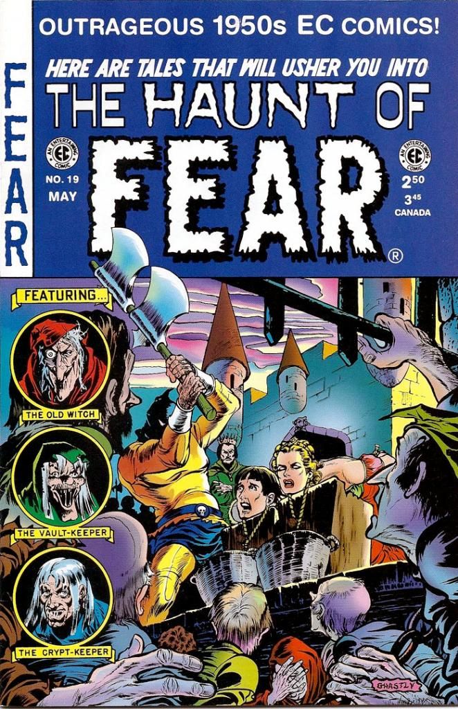
October is Spookey Month: How EC ruined America's pasttime in Haunt of Fear #19 (May-June 1953)

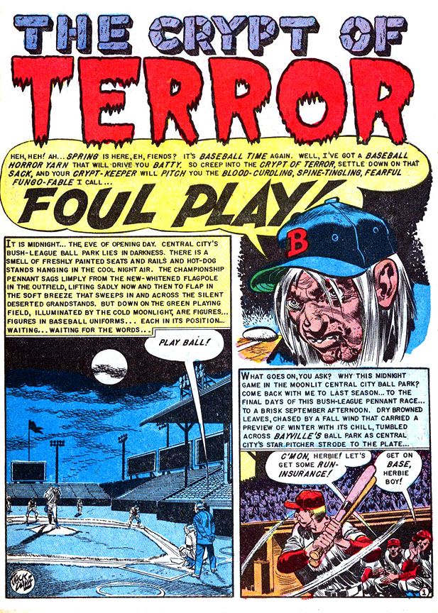
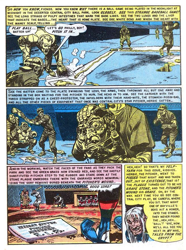
No, they didn't ruin baseball.  That's just me trying to have a little fun and shake things up a bit.  If anything, they made baseball better!  But EC did get itself into hot water with the government over "Foul Play," a story appearing in Haunt of Fear #19 (May-June 1953).  Dr. Frederic Wertham used it as an example of horror comic nastiness in his book Seduction of the Innocent and then did it again during his afternoon session testimony to the 1954 Senate Subcommittee Hearing on Juvenile Delinquency
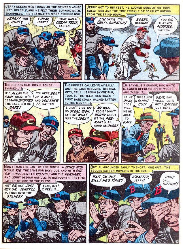
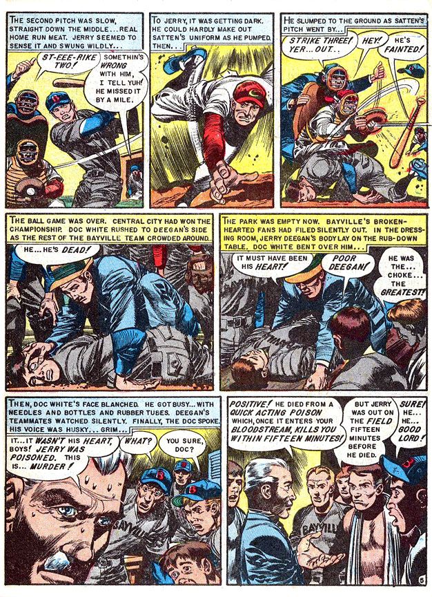
The story is about Central City's Herb Satten, an unscrupulous pitcher who wants to help his team win the pennant by murdering the Bayville's star second baseman, Jerry Deegan.  After all, this Deegan slugger led the league in home runs all season and he's up the next inning in a tight game.  It stretches credulity a bit.  Satten kills Deegan by poisoning his spikes, then allowing himself to get hit with an inside pitch so he can get on first, attempt a steal then slide spikes-high and slash his victim.  He's thrown out and it looks like a bonehead play, but it all works out. Satten kills his man and Central City wins.  This leads to the pitcher's grisly comeuppance the night before the next season's opening day.

And one of the all-time great gross-out scenes in horror comics history.  The murdered man's teammates literally rip Satten apart late one night and use his body parts to play a moonlit intrasquad game.  Complete with a complicit umpire.  That also stretches believability, but not so far as the poor pitcher's intestines, which serve as foul lines up the first and third base paths.  The grisliest detail is the catcher's using the Satten's chest as his own chest protector.  You wanna wear part of a human body even if he is a sorry murdering cheat?  What is this, the Ed Gein League?

They also incriminate themselves by burying him under the pitcher's mound and inscribing the rubber there with "Herbert Satten.  Pitcher.  Murderer.  R.I.P."

Rest in pieces, baby.  Rest in pieces.

Writer:  Al Feldstein/Artist: Jack Davis

Well, they were angry ballplayers and probably didn't think through the consequences.  The ironic thing about "Foul Play" is, it may have been notorious at the time but the guy who drew it is one of the nicest, most gentlemanly people you'll ever have the privilege of meeting.  If you're so lucky.  I had a chance to phone interview him way back in 1996 for a class project and I came away in such a good mood because he was so jolly and generous.  He answered even my stupidest questions with patience and good cheer.

Writer:  Al Feldstein/Artist: Jack Davis


I'm talking Jack Davis, the dean of American caricaturists.  This story is right in his wheelhouse, so to speak.  Davis is a master of sports cartooning, able to twist his loose-limbed figures into whatever pose necessary to show the physicality of sports.  Baseball, basketball, football, late night murder, these are things Davis visualizes so well.  Obviously made a huge impact on Dr. Wertham and the guys up on Capitol Hill, huh?

Writer:  Al Feldstein/Artist: Jack Davis

I loved Davis' work before I ever read this story (although I'd heard rumors of it for years and they always chilled me to the bone).  He drew magazine covers, movie posters.  His art came into our house on television in the form of character designs for the Jackson 5ive Saturday morning cartoon.  As a University of Georgia graduate, I've seen dozens, if not hundreds, of Davis-drawn Bulldog athletes in motion, with his characteristic lanky body language and large, articulated hands.  Gorgeously rendered in loose, appealing brushstrokes and then watercolored to pop from the page of whatever book, calendar or postcard they adorn.  His 1950s horror work benefits from the Davis approach, one that exaggerates reality for comic effect.  So when you see a Davis severed head, it's not grotesque no matter how decayed it might be.  It's sick... but in a tasteful way.

Writer:  Al Feldstein/Artist: Jack Davis

The Senate Subcommittee Hearing people must not have felt that way, although I believe William Gaines explained it quite well in his testimony.  This is gore in just the right amount.  There's nothing gratuitous about it, but it has to have impact.  If you'll notice, too, colorist Marie Severin gives those panels a blue-yellow complementary color scheme rather than one that emphasizes its fleshy or bloody qualities.  This makes it explicit without going over the top.  Not for the squeamish, certainly.  But it's right in my wheelhouse, too.  Jack Davis is an American treasure, baby.  And so is Marie Severin.  No doubt about that. 

Sunday, September 7, 2014

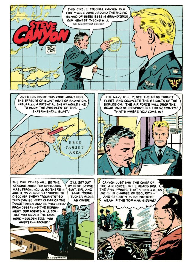
Remember back in the old days, during the Cold War, when there weren't so many nuclear-armed superpowers?  Things have gotten way out of hand with the proliferation of mass destruction.  I'm pretty sure there's plenty of weapons-grade uranium and plutonium circulating around out there thanks to the Soviet Union's collapse.  But back when they were the other potential driver of human extinction, we Americans had our atomic secrets and people like Colonel Steve Canyon of the USAF to keep them safe.

This was back when we atom-bombed the shit out of the Nevada desert and all those Pacific atolls we had lying around after beating Japan, when all those old school European imperialists were licking their wounds and going soft on the commie menace.  Or else turning Red themselves.  Nothing like a balmy tropical paradise for testing hydrogen bombs.  Or T-bombs, whatever those are.  Canyon could tell you, but he's not talking because you might be a mole or a fellow traveler and a guy can't be too careful.

Looking back, I have no idea what we were thinking.  Sure, you'd find magazine articles on how the domino theory would lead to Southeast Asia becoming a Marxist staging point for invading Japan, then Hawaii and then Boise, Idaho.  But there had to be a better way to protect and preserve our way of life than blasting our obsolete battle fleets with nuclear bombs and polluting the atmosphere with fallout.  I wonder why these damned things had to be tested so often anyway.  Once you have a trigger mechanism that works, why do you need another?  And if it's the fissile material that's in doubt, you can't un-blow a proven sample and use it again.  I think all these Pentagon brass hats and physicist types were more or less like kids with really big firecrackers-- the largest-- and some really super keen model ships they couldn't help blowing up for kicks.


These happy images with their subtext of promised global apocalypse are from Dell Four Color Comics #641 (October 1955), reprinted in Hermes Press' new-to-digital offering Milton Caniff's Steve Canyon: The Complete Series Volume 1.  This one stands out for me because I find myself reading accounts of weapons testing in my downtime.

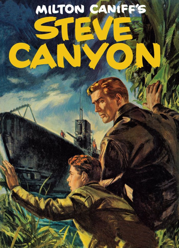
And who would dare argue with that swanky painted cover, which has a "Hardy Boys/Nancy Drew meets James Bond" charm about it?  I'm not a big proponent of painted interior art because it tends to look more like a collage of pretty still images rather than a sequence of events, but give me painted covers anytime.  One of this book's strengths is its full-page reproduction of these beautiful paintings.  The front cover itself features a dramatic image of Canyon and his enlisted driver gritting out a rocket launchpad fire that's too close for comfort.  You can almost feel the heat and the frenzied background action gives the scene a sense of urgency that's only helped by Canyon's raised arm and grimace-creased face.  The interior art may have a few Caniff touches, but it's largely by Ray Bailey and William Overgard, two names with which I'm not familiar.  I will be getting acquainted as I dig into this book.

The point is, here's some sweet 1950s espionage action that falls right in my wheelhouse.  My dad and I used to follow the daily Steve Canyon strip in its latter years, but I've neglected Caniff and people like Noel Sickles for far too long.  I'm not just a student of comic book art filling in the gaps in my education, I'm a student of this historical era, and comics like these give us a feel for time, when we Americans felt ourselves surrounded by danger and locked in a death struggle with a diametrically opposed ideology.  Our good guys sometimes wore white cowboy hats and sometimes they wore blue service caps with eagles pinned to them.

BOOM!

Sunday, July 6, 2014

Marvel's Marvelous Movies #3: Star Trek: the Motion Picture (December 1979)

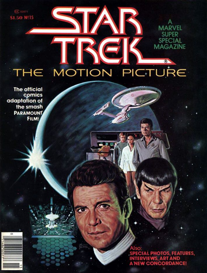
I'm going to tell you upfront this was one of my favorite individual comic book stories when I was 11 years old.  I have no idea how many times I read it.  The following year, Marvel's Empire Strikes Back adaptation would knock this one (and just about every other comic I'd ever read and loved prior to encountering Al Williamson) down a spot or two on my personal hit parade, but I still have a deep and abiding love for Marvel Super Special #15.  I'd been a Star Trek TV show fan for as long as I could remember, and this was in the wilderness years of the 1970s.  Back then, you had to find Trek at odd hours on some local station.  Ours came out of Tallahassee on Saturday afternoons, subject to atmospheric interference.  When your station dropped whatever Trek syndication package they'd licensed, you lost touch with the crew until they popped up somewhere else within antenna range.  In the interim, you could read the James Blish short story collections with episode adaptations, and the often silly Gold Key comics.  Or collect and play with the Mego action figures.  That was as Treky as we got before 1979's Star Trek: the Motion Picture came out and relaunched the franchise as a movie series.

It almost didn't.  The movie, directed by two-time Academy Award winner Robert Wise and based on a premise written by series creator Gene Roddenberry, made money, but it was expensive to produce and wasn't as big a hit as Paramount had hoped for.  It certainly looked fantastic, with a sleeker, updated Enterprise and everyone in pajamas for a sweet slumber party atmosphere.  But it suffers from endless shots of the Enterprise slowly drifting along set to repetitive music cues and people staring in awe at light shows.  It's like watching the audience at Laser Floyd: Dark Side of the Moon.  The film allows its characters to ask existential questions, but when it comes to answering them, the result is akin to a 2001: A Space Odyssey where, after boring you for more than two hours, Stanley Kubrick has the astronauts explain to each other (and the audience) exactly what the monolith represents and why it does what it does.  The cheaper, more action-oriented Star Trek II:  The Wrath of Khan turned out to be the franchise's salvation, not this glacially-paced epic.  But in 1979, for me, it was enough seeing Kirk, Spock, McCoy, Scotty, Uhura, Sulu and Chekov (along with Janice Rand, for cripe's sake!) back in action.

And, after watching this movie again on Blu-Ray recently, I've decided I'll take it with all of its flaws and dull stretches over either of the terminally stupid "reboot" flicks any day of the week.  Star Trek The Motion Picture at least has ideas and something to say about the basic human dilemma ("Is this all there is?  Is there nothing more?"), things it takes very seriously.  Can you imagine a major studio nowadays dropping this kind of money on a sci-fi flick starring a lot of middle-aged people and without any meta-humor or product placement?  There's not even a sky-diving sequence!  There's barely any sex!


But let's talk about the comic.

It must have been a daunting challenge to adapt into an entertaining comic a story that consists mostly of long sequences of nothing more than the Enterprise gliding over the giant V’Ger ship and then small groups of characters conversing about it in staff rooms and small corridors.  The comic really benefits from the deft way Marv Wolfman condenses scenes.  Wolfman ruthlessly edited down long scenes into a few panels, quickening the pace and generally tightening things up.  Wolfman uses his narrative captions-- always a strength of his writing-- to clarify character motivation and add descriptions and exposition to guide readers along.  We're engaged throughout.

For the art team, which consists of Dave Cockrum on pencils and Klaus Janson on inks, the problems are finding ways to make all the conversations work visually and reproducing the movie’s many, many special effects shots.  Cockrum, a master of crowded team compositions and action-packed superhero action, comes through with strong "acting" from the principals, downplaying the usual Marvel dynamics but upping the emotional content of various scenes.  His Commander Decker in particular comes alive with various angry faces and hand-chop poses emphasizing his frustration.  The likenesses are consistent throughout, a real plus when dealing with familiar, iconic characters.  The results aren't photographic, but Cockrum never confuses the readers.  Kirk has his poofy hair, McCoy his sharply arched eyebrows and drooping, lived-in face.  Of course Spock is easy to get right, but even more conventionally good-looking people like Uhura, Sulu and Chekov look pretty much the way you expect.  Every so often there's a dead face, but they never become a distraction.


What an ink job Janson provides, too.  While he and Walt Simonson outdid themselves on innovative lighting effects in Close Encounters, here he and colorist Marie Severin use color holds to reproduce Douglas Trumbull's lightning balls and wormholes.  This kind of stuff is easy to do these days with digital inking and coloring.  It's nothing to isolate an element and change the color channels to whatever you want.  But when Janson and Severin tackled Star Trek, they had to rely on acetate or vellum overlays.  It must have been a tedious, time-consuming process because they use one or more on practically every page.  The results are nothing less than astounding.


For all its pacing flaws, the film is effective at making space seem like an infinite frontier full of dangers.  It's not just that there are Klingons and V'Gers out there ready to zap unfortunate astronauts and Starfleet personnel.  Space itself is dark and perilous.  For one thing, the ships have to provide their own exterior lighting.  None of that Star Wars stuff where everything in space is brightly lit no matter how far away it is from an actual light source.  To the human mind, space appears largely empty, dark and vast.  Even the vaunted technology its space explorers count on for survival turns on them.  The transporter goes awry in a shocking incident and, later, the warp drive throws the ship into what the characters call a “wormhole.”  Contending with these, the Enterprise crew truly seems to be going boldly.  This isn't sailing along to some cute world where you find 1920s gangsters or the White Rabbit out of Lewis Carroll.  You could end up a data stream in a godlike machine's memory banks or transformed into a robotic copy of yourself with a lighted jewel embedded in your throat.  Or merge with the overmind into a stream of light.  Wolfman’s script reproduces each of these episodes faithfully and Cockrum, Janson and Severin provide some spectacular visuals to match them, with all the production design details faithfully reproduced.  Ultimately, this is an extremely accurate recreation of the film's look and mood, minus its shambolic tendencies.


The story also appeared in three monthly issues (Star Wars, a much shorter but action-oriented film, ran in four, which is further evidence of how Trek should have been pared down a bit) which led to a short-lived Marvel Star Trek comic.  I never read a single issue of that.  After all this time, I'm not sure why, especially considering how much I enjoyed this one.  Maybe it was enough for me Wolfman, Cockrum, Janson and Severin had already provided fabulous glimpse of what a Star Trek comic could be, one-upping its cinematic source material.  Too bad they didn't get a chance to take on Khan.


Looks like I forgot to talk about the Bob Larkin fully-painted cover.  That's just as well.  I'd have written a paragraph consisting only of superlatives.  I look at it kind of like Kirk, McCoy, Decker, Ilia and the rest gaze at Laser Floyd.

Tuesday, July 1, 2014

Marvel's Marvelous Movies #2: Meteor (August 1979)

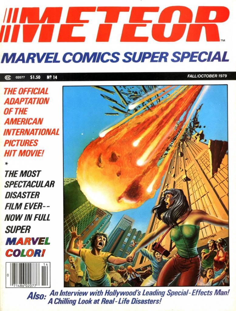
Let me start by pointing out the obvious:  Meteor shares its basic idea with Armageddon (and also Deep Impact, but screw Deep Impact for taking this material seriously, right?), but mercifully lacks both Aerosmith and dopey worship of bonehead machismo.  In both films, a giant meteor heads towards earth, and we have to blast it with nuclear weapons before it gets here.  In Armageddon, Bruce Willis, Ben Affleck and Steve Buscemi go up in a spaceship to do it themselves while Liv Tyler watches all teary-eyed from NASA headquarters, while in Meteor Sean Connery stands around a lot of blinking computers while we do try to blast the meteor by remote control.  Despite the differing approaches to meteor-smashing, the results of both are exactly the same—a really shitty movie.  But while audiences spent good money to indulge themselves in the Steven Tyler-enhanced stupidity of Armageddon, a generation before they found better things to do back in 1979 than see Meteor.  Which, once again, is a truly shitty movie.  Bad script, inept direction, a floundering cast, financial failure.  Damaged American International Pictures and possibly helped lead to the company’s demise, although they did release a few more films after Meteor bellyflopped.

Script:  Ralph Macchio/Pencils:  Gene Colan/Inks and colors:  Tom Palmer

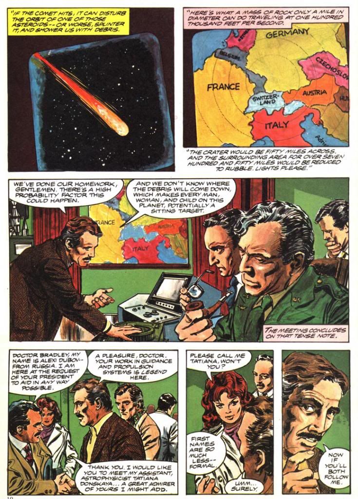
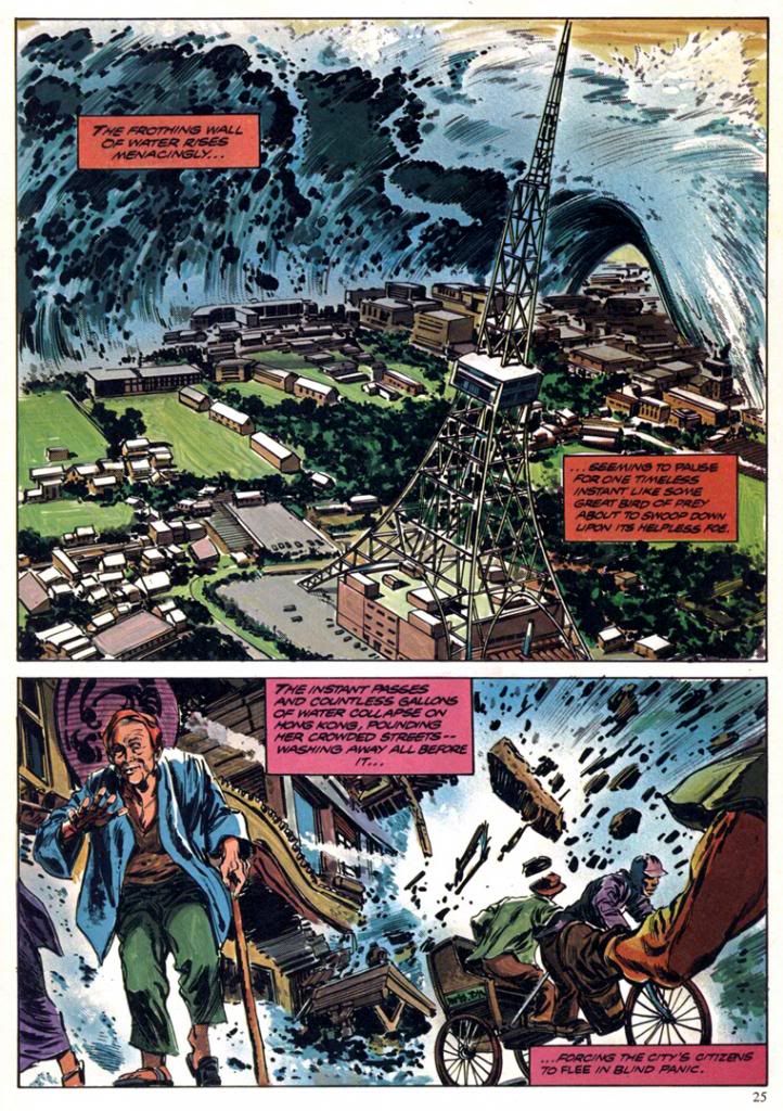
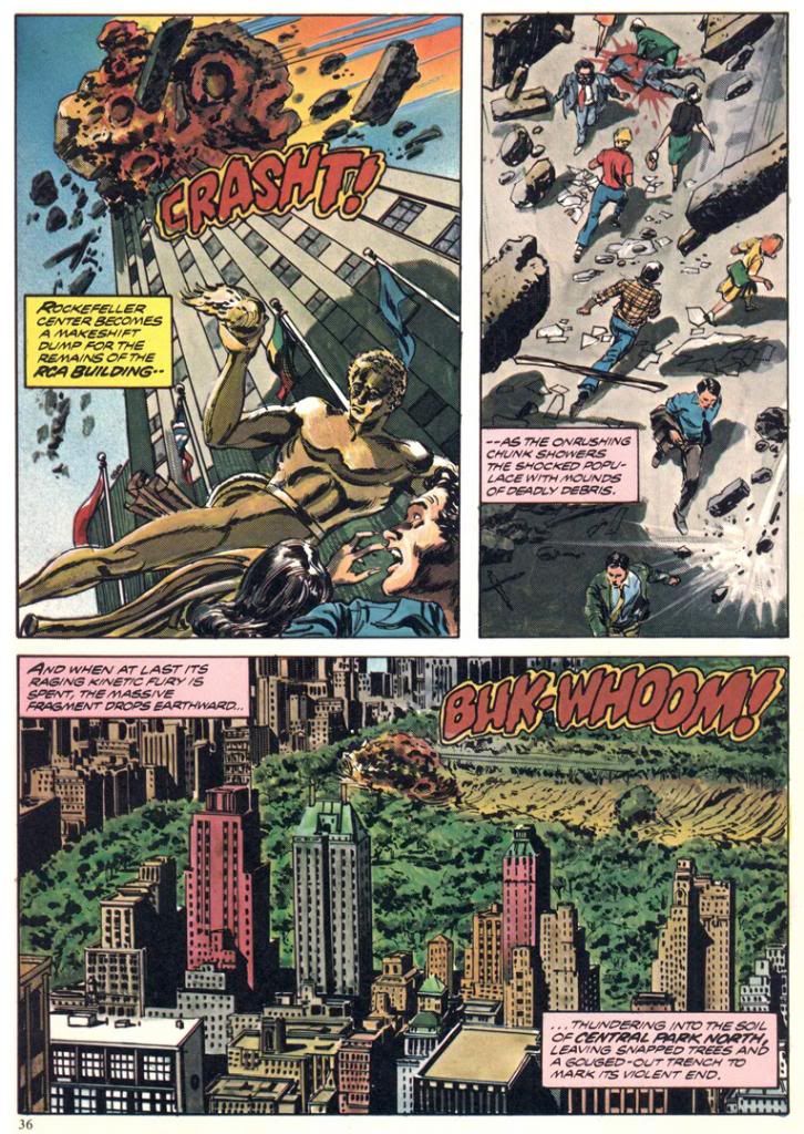
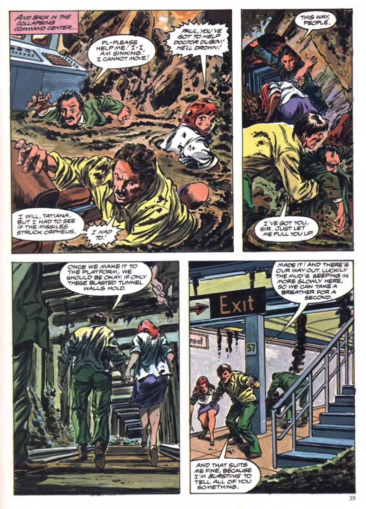
But something good did arise out the ashes.  Marvel Comics adapted Meteor for one of their Marvel Super Specials, and its genius editors assigned Gene Colan and Tom Palmer to draw it.  What Colan and Palmer turned in is nothing short of amazing.  Far from rush it even though they must have known the movie they were working on was a major turkey, they seem to have taken extreme care with the artwork, which includes globe-trotting scene changes from a Hong King suburb to New York City to a doomed Swiss ski resort and back again, detailed backgrounds in the computer command center, a double-page spread of a tsunami threatening Hawaii and another engulfing Hong Kong and—most spectacularly—two pages of rocks blasting and gouging Manhattan itself.  The detail, the realism, the scope.  It's also more than a little disturbing when you associate it with real world events from the years since, but I can’t help but think the movie Meteor might have been a Star Wars-sized blockbuster if only it had looked even half as good as what Colan and Palmer pull off in the comic.

 
Script:  Ralph Macchio/Pencils:  Gene Colan/Inks and colors:  Tom Palmer

The script is by Ralph Macchio (the comics guy, not the Karate Kid), and it’s serviceable.  He had to work from the dumb-ass movie screenplay and there’s only so much you can do with something like that.  Let’s just say he keeps the rocks rolling and benefits from this being a comic book, where our expectations for plot mechanics, dialogue and characterization are a fair bit lower than they are even for schlocky disaster films.  Occasionally, I can’t help but detect a little tongue-in-cheek tone, especially in the panel based on a scene where the movie obviously went for pathos and found only derisive laughter.


Script:  Ralph Macchio/Pencils:  Gene Colan/Inks and colors:  Tom Palmer

Also, you have to consider this is the kind of story where the falling rocks manage to obliterate a familiar ski resort and then Hong Kong, a place most of the intended middle American audience had a vague awareness of as important or large, but still far enough away they could glean a kicky thrill from it before having to confront the horror of something bad happening to their own country.  Gasp!  Not here!  Not in America, where everything of any real importance lives!  You know, the same way terrorists or Mayan disasters always scorch picturesque landmarks in Paris or Tokyo before they come after God’s Country.

Which eventually happens here.  New York City is where the bombardment climaxes, although for some reason the story confines its heroes to the same underground lair they've been stuck in throughout most of the running time and subjects them to-- of all things-- a mud bath.  When you consider how the film could have directly involved them in some of the skyscraper smashings or had them out rescuing small children and their pets then you go a long way towards explaining why Meteor flopped so badly.

Script:  Ralph Macchio/Pencils:  Gene Colan/Inks and colors:  Tom Palmer
That dramatic misstep and a lack of Darth Vader, I suppose.  By the time AIP started pissing away their fortunes on this dreck and Macchio, Colan and Palmer put their all into elevating it into sequential brilliance, the Allen era had come and gone and people no longer wanted soap opera interrupted by earthquakes, floods and other sundry acts of God.  They wanted space aliens and all kinds of crazy critters zipping about on interplanetary errands complete with laser beams and Vulcan ears.  A year later and we'd all be gaga over Yoda and a year after that, a little guy named E.T.  Meteor and its ilk would be relegated to afternoon showings on HBO, which is probably where I saw it.


Script:  Ralph Macchio/Pencils:  Gene Colan/Inks and colors:  Tom Palmer

But that isn't the weirdest thing about Meteor or its superior comic adaptation.  The weirdest thing about Meteor is the inside masthead credits Earl Norem for the cover painting, but one look at it and you know it’s not Norem.  A Norem painting would have put this book over the top as one of those lost classics.  Instead, we get something that looks more like a painting a precociously talented high school kid or community college art student would do in gouache or thin acrylics and then a quick pass with the class’ airbrush.  It’s flat and awkward and it’s boldly signed by people other than Earl Norem.  I know who they are, but mercy and niceness prevents me from naming them.  Still, poor Earl Norem.  He must have felt a bit like Enrico Palazzo did in The Naked Gun as he watched a disguised Frank Drebin sing "The Star-Spangled Banner" on TV, credited as Palazzo.  I have no idea how this editorial mistake happened.  Maybe they just lifted a pasted-up masthead from another magazine and forgot to replace Norem’s name.  Norem couldn’t do something this flat and lifeless even if he had a single lunch break to hack it out.

Friday, June 20, 2014

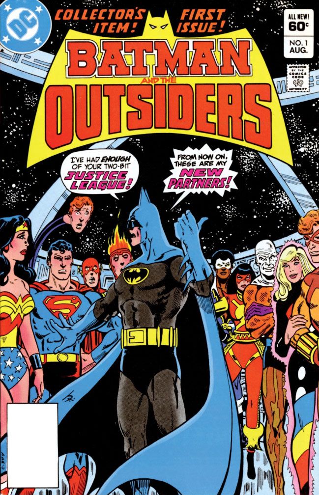
Katana's first foray: Batman and the Outsiders #1 (August 1983)

Katana’s first appearance is in the first DC Sampler giveaway comic, but for our purposes and because I no longer have that (I did all those years ago, though!), we’re going to say it was in Batman and the Outsiders #1 (August 1983).

As we've discussed before, I’ve always considered Katana a pretty cool character.  Well, except for her original ketchup and mustard color-schemed costume.  It’s really a shame what happened to her recent solo series.  Out of all the New 52 redesigns, hers is the most visually arresting and appropriate.  But we're old school hereabouts, so we're going to spend some time with the original Katana, from back in the day.  DC and Comixology just released for sale the first two issues of the 1980s Batman and the Outsiders series and, of course, I jumped at the chance to buy them again. 

The plot mechanics show through.  There's trouble brewing in made-up country Markovia, and that's where Bruce Wayne has sent trusted employee Lucius Fox (the guy played by Morgan Freeman in the Christopher Nolan Batman trilogy) there.  Rebel troops capture Fox and hold him hostage, but wouldn't you know it, Superman has told the United Nations the Justice League will sit this one out, and if you're a member of that team, his promise is legally binding.  When Batman finds out no one's going to help him rescue Fox, he flips out and quits, thus finding and exploiting the one small loophole in the United Nations charter as it relates to solemn promises made on everyone's behalf by a guy from another planet.  Even with Batman giving everyone yet another snarled recounting of his origin, this is still an all too convenient way to get Batman out of the Justice League and together with the Outsiders-- all of whom just happen to be in Markovia at the same time for their own purposes.

Well, to hell with that.  This was-- and remains-- a cool book.  You really can’t, or shouldn’t, argue with Jim Aparo’s artwork, and writer Mike W. Barr builds a strong team dynamic once he gets past the set-up.  The unique mother-daughter relationship he establishes between stone-cold killer Katana and naïve amnesiac Halo helps set this book apart from its ensemble-cast predecessors Uncanny X-Men and New Teen Titans and keeps Outsiders from becoming too generic—the DC equivalent of The Defenders.  Geo-Force is a real zero, though.  His brown costume is dull, as is his origin.  Fortunately, there’s Black Lightning and super-freak Metamorpho.  Black Lightning gives us someone badass to root for who isn’t a jerk like Batman, and Metamorpho adds visual interest.

What does Katana add besides maternal love?  Why, dead bodies by the truckload!

The all-murder-all-the-time team member element hearkens back to the early days of Uncanny X-Men and the Wolverine character arc, before he became overexposed and watered down by revealing his many origins and future demises.  I can’t get over Batman sort of standing back and letting Katana murder so many people, but it certainly makes her more interesting than blandly heroic dopes like Geo-Force.  She doesn’t have any powers to speak of, although because she’s Asian and in a comic book, she’s adept at all martial arts, and because she’s Japanese, of course she is a samurai.

Script:  Mike W. Barr/Art:  Jim Aparo


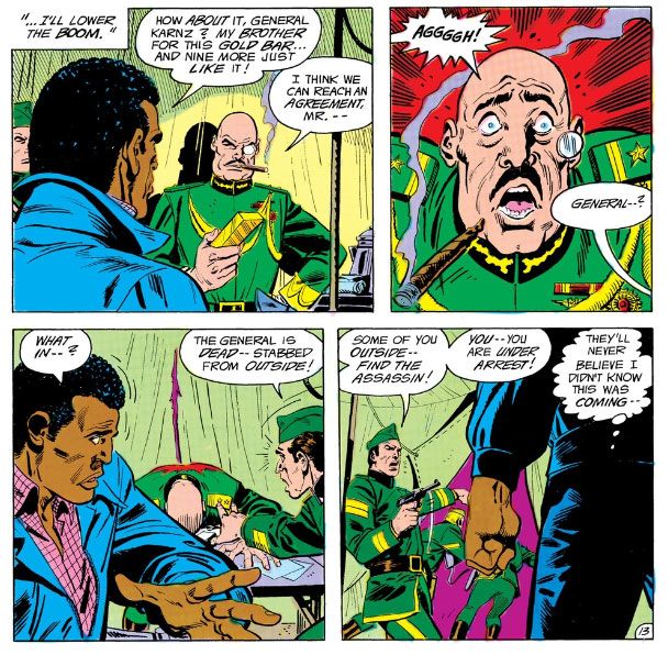
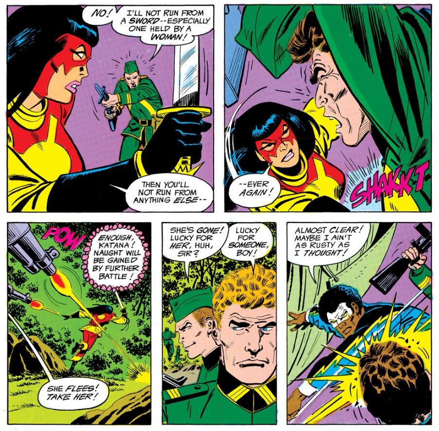
See?  The very first thing she does is kill that general, just as a disguised Black Lighting (he's not in the JLA, so he's legally allowed to help Batman all he wants) has successfully tricked him into believing he's Fox's brother and wants to trade lovely gold bars for his lovely fake brother.  Black Lightning's thought balloon and clinched fist both show he knows this ruins Batman's scheme.  He quickly strips off his civilian clothes to reveal his super-costume and starts fighting the enemy troops. 

Okay, let's take a break from all the killing to talk about the very thing from which Katana takes her codename.  What?  You thought Katana was her birth name?  No, her parents named her Tatsu Yamashiro, but only her close friends who know her in her civilian identity call her that.  And even they don't call her that.  They call her Yamashiro-san.  Or Ms. Yamashiro. 

And a katana is a type of samurai sword.  I'm far from an expert, but I do know samurai had more than one kind.  There were longer ones and shorter ones, and they all have names which I don't know.  We say "katana" when we mean the basic samurai sword.  Unless we say "samurai sword" sword instead.  This is Katana's main weapon, her version of Green Lantern's ring, Green Arrow's bow and arrows and Green Keyboard's magic computer.  Anyway, Katana uses a katana.  You know Katana talks to her katana, right?  That’s one of her “things.”

Why would anyone do that when there's a perfectly good Batman standing right there?  I'll tell you.

Like Katana herself, Katana's katana has its own special name:  The Soultaker.  It does that.  It takes souls.  If Katana kills you with it, your soul goes into the sword with all the other souls, but Michael Moorcock doesn’t sue you or anything, so don’t worry about it.  I think a cooler codename than Katana would have been the Japanese phrase for Soultaker, which is something like 魂を取る人, or “Tamashi o toru hito,” or を盗 (“to steal the soul”) according to Google Translate.  Hm.  Maybe not.  Kind of clumsy, huh?  Looks as if Barr and Aparo had a good idea all along and I'm wrong, all right?  I'm Wrong Roy.  Toby!  You are close to death!  Come out here!

So her husband's soul is inside Soultaker.  They talk a lot.  In the new series, she sleeps with the sword as well, which is all kinds of kinky especially when you consider most of her pals don't believe her husband's soul (or anyone's) is inside the sword.  But trust me, in the original series, he's in there and she talks to him and he talks back and gives her advice.

 Anyway, she--


Script:  Mike W. Barr/Art:  Jim Aparo

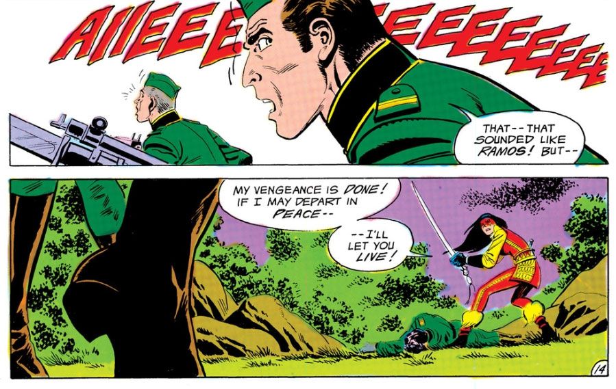
Oh, look!  Katana's second kill.

She's not really in the first issue of Batman and the Outsiders all that much, but with two kills in two pages, she's made quite an impression.  Batman hogs most of the story space, the same way he hogs the front part of the title, as if this were one of those noisy rock combos the kids like nowadays, where the lead person has their name up front and everyone else is kind of smashed into a collective to the rear.  And then the named artist quits and starts producing music that sounds just like the original group’s, only not as inspired or interesting.  As a result of Batman’s outrageous ego, Katana barely gets into the comic, but she has an impact much greater than you’d expect given the few panels in which she appears.

Another interesting aspect of the character is--

Script:  Mike W. Barr/Art:  Jim Aparo

That's our Katana!

Saturday, June 7, 2014

Flash Thompson's swingin' send-off party!

Oh, wow. Sorry I haven't been chatting up the old comics lately. I'm making one of my own and it's taking all my free time. I take a break from it only to work my day job and sleep. I eat at the drawing table (so to speak; I draw on one of those razzly-dazzly Cintiq monitors these days) just like one of those old school guys who made comics back in the day and then died of alcoholism-related complications well before their natural times. Cheerful, ain't it?

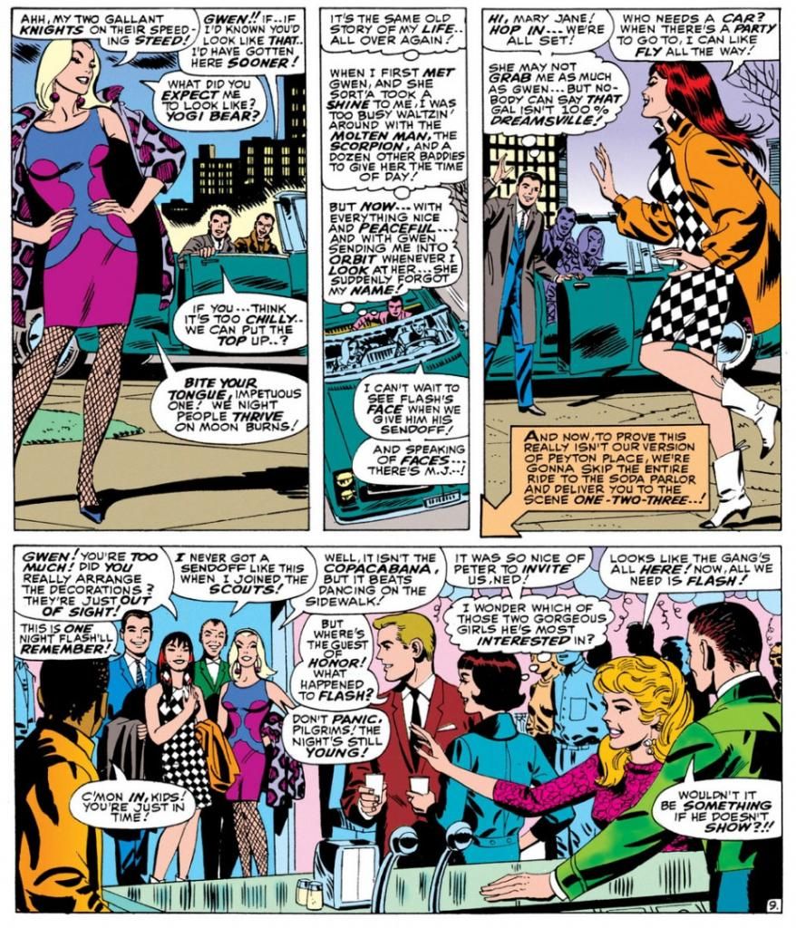
Well, here's something that will certainly lighten the mood. Remember when Flash Thompson went off to fight the Vietnam War and everyone at his party looked incredibly mod and gorgeous and they all thought it was a wonderful, happy, pleasant thing he was doing, with no negatives about it whatsoever? It happened in Amazing Spider-Man #47 (April 1967).

Here’s a largely cheerful story about a bunch of friends putting on a going-away party for Flash Thompson, who is leaving for the service, possibly to fight in a war in a jungle that pointedly avoids even the suggestion such a thing might be in any way, shape or form at least the slightest bit controversial or even worrisome.  Of course, given the time, the implication is Flash has been drafted, but the closest we get to acknowledging that is a few issues back when Pete says something about Flash’s “induction notice,” a term less loaded than “draft notice.”  Not a soul even whispers Vietnam or Southeast Asia, and no one seems to think Flash is going to have anything other than a simply fine ol’ time.  Of course, criticizing at Stan Lee and Marvel Comics for not taking sides over Vietnam or making an issue of it is kind of like condemning The Beverly Hillbillies for not doing an episode where Jethro gets drafted, loses a foot and joins an anti-war rally in Washington while banker Milburn Drysdale talks the Clampett family into investing in a napalm factory.

On the other hand, despite what you might have read otherwise in the book Spider-Man Chronicle: Celebrating 50 Years of Web-Slinging, this issue isn’t even as topical as the April 8, 1965 episode of The Munsters where Herman tries out for the majors and Leo Durocher cracks, “I don’t know whether to sign him with the Dodgers or send him to Vietnam.”  Harry’s “Only don’t bother looking for the goalposts!” joke when another guest compares the jungle to a football field does seem eerily and cleverly prescient now that we have more than forty years of hindsight on the matter, though.  And Spidey does at last obliquely reference the potential dangers of war to callow young men when he wonders in the final panel why he keeps thinking of Flash in the past tense when the guy hasn’t even left yet and will probably come through all right.  “He'll make it-- somehow! good guys always win,” he muses, before adding a little ambiguity with the tag question, “Don’t they?”

I don’t think Lee was or is particularly interested in politics, and certainly not in wading into a political Big Muddy and more than likely drowning his company there.  He didn’t mind using the Commies as bloodthirsty villains and outright creeps whenever possible, but who at the time gave a rip what a communist thought about comic books?  If they even read comics when they weren’t murdering babies, knocking over Asian dominoes or stealing our space secrets, they probably stole them off the racks anyway, and that did nothing but harm to Marvel’s bottom line.
 
Plus, there probably wasn’t a lot of readership overlap between Marvel’s magazines and The New York Review ofBooks where in February of that year Noam Chomsky published “The Responsibilityof Intellectuals.” And Dr. Martin Luther King told 3,000 people at Riverside Church in New York City that the civil rights and anti-war movements were essentially the same struggle and condemned the war in Vietnam as US imperialism in the same month Marvel cover-dated Amazing Spider-Man #47.  Check out Time magazine's reaction, and the Washington Post's.  You know, those bastions of liberal thoughtNot so surprising when you consider a Gallup poll the same month showed 50% of respondents believed our escalation in Vietnam was not a mistake versus 37% who thought it was.  The believers were down from 59% the previous year, but still represented a significant majority over the skeptics.  This is a little different than outright support for the war, but risking controversy by directly addressing Vietnam and its complexities and uncertainties wasn’t going to sell Spider-Man to the middle Americans buying this stuff for their kids and still largely assured we were doing the right thing halfway across the world.

Lee had books to move, and Warren Publishing’s Blazing Combat had recently addressed the war directly with distinct disapproval and quickly folded.  In the course of entertaining the heck out of us—its primary purpose—this story acknowledges in the vaguest and safest of terms what couldn’t be ignored and takes no sides.  No more, no less. 

In fact-- YOWZAAA! Look at Gwen Stacy's knockout outfit!


Script:  Stan Lee, Art: John Romita

I don't know who designed it.  Dormammu of Beverly Hills?  Purple and blue abstract design, with fishnets and a animal-print coat in decidedly unnatural hues of... purple again.  Jazzy John Romita was the perfect guy for this soapy stuff and he visualizes Gwen as the height of mid-60s cool.  It doesn't get any better, does it?

Yes it does!  Because here comes Mary Jane Watson in an op-art inspired checkerboard dress and some wild white boots with contrast black toes.  Shame about the orange coat, but she quickly dumps it once they hit the shindig.


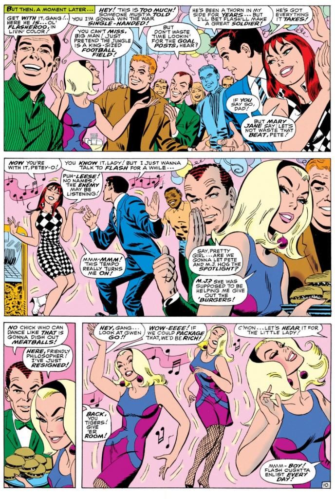
Pretty much everyone there is a sharpie.  Smart jackets and ties for the gents, ultra-modern flips and bobs for the ladies.  The guest of honor, Flash Thompson himself, sports a brown coat with a black tee for an athletically casual take on dressing up.  That guy on the left of the top panel has a Beach Boys-looking striped shirt, possibly by Gant.  The only guy who looks anachronistic is poor Harry Osborn, with his green bowtie and jacket like something he borrowed from Barney Fife down in Mayberry, NC.  And he's supposed to be a rich boy.  He looks as if he popped in from a 1949 issue of Archie's Pep Comics.  He's even got Jughead's plate of hamburgers.

Script:  Stan Lee, Art: John Romita

Gwen steals the show-- much to Mary Jane's displeasure-- with a dance that rivals the one Audrey Horne would do a generation or so later on the premiere episode of Twin Peaks.  All eyes on Gwen.  Stan's blatantly sexist catcalls crack me up.  These are just a few, but they run all through this part of the comic, with Harry and Pete congratulating themselves on having such beauties for girlfriends and Pete secretly leering at Gwen every chance he gets.

Don't you wonder what music Gwen's dancing to?  This was right as pop was going psychedelic and becoming undanceable, and I doubt anyone wriggled and swayed to folk songs or protest tunes.  If this were a TV show of the time, it would be some outdated-sounding jazzy stuff the network squares thought of as "close enough to that rock junk no one will be able to tell the difference anyway." 

You know, like when Opie needs a little background noise while sweeping the courthouse floor for his dad and flips on a little white transistor radio and upbeat guitar noodling comes blaring out.  Then Ope starts doing some kind of frantic moves with his broom still in hand says, "Gee, Pa, isn't this the most?"  And Andy's like, "The most WHAT?"  But because he's pretty open-minded for a Southern sheriff of the day, he and Helen Crump end up championing the fresh-faced kids at the high school who want to add a couple of the exact same generic rock tunes to the annual play instead of doing the same old "founding of Mayberry" junk the older teachers favor.

Anyway, beautifully drawn, hilariously written bit of scene-setting before the issue's bad guy makes an appearance.  Kraven the Hunter.  You know what?  Who really gives a rip about that jackass when you've got these kinds of lovely John Romita pages to look at?  Interestingly, Romita is doing a Steve Ditko impression throughout, and even Kraven's face in a few panels looks more Ditko than Romita.  Artistic continuity, and at times Romita's line looks so impressively close to the guy's who he's imitating, it's almost as if Ditko himself inked this book.

Well, it's a fine book and I wish Lee and Romita had spent even more time just hanging out with the kids.  But I guess the readers came for the action, but I'm more in love with the soap opera/character-building sequences during this era.  I'd hang out with all of these characters even without the superheroic spider-bite antics.  We don't even have to talk politics.

Wednesday, May 14, 2014

Curt Swan: Even his name is cool...

I miss Curt Swan.  Diversions of the Groovy Kind has a look at The Amazing World of DC Comics #7 (July 1975), with a Curt Swan interview and lots of sweet Swan artwork.  I was seven years old when that came out, and I never read it.  I'm trying to remember who my Superman artist of record was in those days.

Oh yeah, it was Curt Swan!

Curt Swan was THE Superman artist for me, the way I thought Walt Disney drew all those movie cartoons.  Sorry, Joe Shuster.  I know you were the original, so it should have been you, but you were long gone by the time I started reading.  And when I started reading, as far as I was concerned, you couldn't have a Superman unless he was drawn by Swan.  Later I got into Superman reprint books and discovered Wayne Boring, Al Plastino and Neal Adams, and while I liked and still do like their versions of Superman-- there's something really appealing about the beefy, barrel-torsoed Boring Supes-- practically every new Superman or Action Comics I bought had the familiar-looking Swan Superman.  So Swan Superman simply WAS Superman for me.

Swan had a way of drawing facial expressions that impressed younger me.  Like Superman eating the defunct kryptonite, or posing as Clark Kent doing his day job and making one of Steve Lombard's pranks backfire, startling and humiliating the would-be bully into making a really amusing facial expression, which Swan and whatever inker was handling the book that month rendered in characteristically clean, readable linework.

And I don't know if Swan took a lot of artistic shortcuts, because I don't know much-- if anything-- about his drawing methods.  I have a feeling he didn't, because his characters inhabited a solid, believable world.  Sure, it was generally neater and more squared-away than our own, but if Superman or Lois Lane happened to be tackling pollution as a social issue in that story, Swan would make that pollution look like the loveliest pollution you ever did see.  Municipalities across the land would be proud to fester in Swan-rendered pollution.  The Daily Planet offices, the Metropolis skyline, the studios of Galaxy Broadcasting, some alien spaceship-- whatever it was, Swan gave it all a solidity and reality.  He simply drew the hell out of it, without a lot of fuss and muss and fidgety crap and visual noise.  Swan didn't have to hide anything with flash because he could just flat-out draw, man, draw.

In the DC Comics interview, Swan says, "As the Superman character evolved, Mort [Weisenger] felt, at the time, that we should get a little more humanistic qualities into him.  We wanted people to relate to him better."  Swan was certainly successful at that.  From those facial expressions, to the body language, to the backgrounds, to the stories themselves, he worked on a Superman who had a down-to-earth quality about him.  Like a real dude, with real feelings, despite his godlike abilities.  When pro writers (and fans) say things about Superman being unrelatable because he's all-powerful, or boring because he can't be challenged, I get the feeling they never read a Superman story drawn by Curt Swan.

Also, it's pretty cool to watch the Swan Superman evolve from the early 60s into the 70s.  First he has that tall forehead, the slightly receding hairline of an older guy.  Even Superboy looks like he needs a little Minoxodil, or soon will.  By the time Clark Kent is anchoring the nightly news at Galaxy, his spit-curl has become a more full-bodied wave and his hair is creeping down over his ears.  But what doesn't change in all that time is the basic appeal of Curt Swan's art.  If you can look at it and not feel uplifted, then you are reading the wrong blog.

Well, you might be doing that anyway.  Go read Diversions of the Groovy Kind, you nut!

Why the devil am I thinking about Jackie Jokers all of a sudden?

A few minutes ago, I was doodling tiny vampires (with such clever names as "Count Drapula" and "Count Dropula") when the name "Ears" Muldoon suddenly popped into my mind and I made the association to the old Harvey Comics character Jackie Jokers.  If I'm remembering correctly, which I highly doubt, I once owned an issue of Richie Rich or possibly Richie Rich and Jackie Jokers where Jackie Jokers performed in a parody of Star Trek where an actor named "Ears" Muldoon played the Mr. Spock stand-in.  If this is so, his nickname suggests he won the role because he actually possessed pointed ears in real life.

Some kind of mutant, I guess.

Jackie Jokers was a child comedian who was pals with Richie and company, and huge star in his own right within their fictional world.  His friends delighted in his hijinks and gave him unconditional fan support despite the rather creaky nature of his humor.  Bad puns and lame plays on words.  Kind of like what you get here.  With his black bowlcut hair and elfin eyes, Jackie looked a lot like the Paul McCartney caricature from the TV cartoon show The Beatles, which, apparently, was some kind of Monkees rip-off popular among pre-teens back in the 1960s.  Why was Jackie such a big deal, able to reduce all comers to helpless laughter despite his weak material?  Well, his father, Jerry Jokers, was also a famous comedian, and I can only assume Jackie largely owed his career to show-biz nepotism.  I'm going to grant his otherwise mystifying ability to get honest laughs on his own because his world also includes friendly ghosts and good little witches with magical powers.

I know I owned the comic (a quick Google search reveals it most likely to be Richie Rich and Jackie Jokers #26 from April 1978, although the cover doesn't spark much of anything in my memory) where Jackie and friends parody Star Wars as "Star Bores."  Pretty clever, eh?  Jackie takes the Han Solo role, with Richie as Luke.  I forget who plays Darth Vader.  Maybe Cadbury.  The mild humor of these mags must have been aimed at kids even younger than the 10 years old I was when I read this.  At that age, I'd already been exposed to Mad Magazine, Cracked, Saturday Night Live, Richard Pryor stand-up and Mel Brooks movies.  Jackie's jokes really could not help but pale by comparison, and even Li'l Archie indulged in barf humor occasionally. 

So I'm fairly certain I found the artwork superior to the scripts even then.  Looking at odd panels online to refresh what's left of my memory, I definitely do now.  Very appealing art by the great Ernie Colon, a guy who could draw anything from superheroes to sword-and-sorcery to horror to a graphic novel adaptation of the 9/11 Commission Report.  Jackie Jokers is also superior to Richie Rich in that he wears what almost appear to be clothes an actual human being might wear.  A turtleneck shirt and a sport jacket.  That's pretty snazzy stuff.  My mom dressed me that way for Easter Sunday when I was 5 and I thought I was a funny guy even then.  A regular Mason Reese or Rodney Allen Rippy.  While Richie and his father sport unnatural, triangular bangs parted in the middle, Jackie at least has that then-stylish Beatles cut.

Or Monkees.

How strange the avenues down which our minds lead us when we draw vampires.  It would be neat if I could track down some of these comics and write about them in a more informed way rather than just making up a lot of crazy crap off the top of my head.  Someone reprint the Jackie Jokers stories, stat!

Sunday, March 30, 2014

A little Jack Kirby juxtapositioning in Silver Star #1 (February 1983)

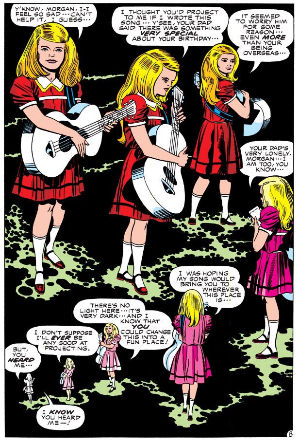
Here is a very cinematic scene where Jack Kirby uses juxtapositioning for emotional effect you can read in Silver Star #1 (February 1983).  One can easily visualize it as a movie, complete with an actual song on the soundtrack, which is appropriate since Silver Star began as a screenplay with artwork attached in hopes of selling it to Hollywood.  I won't show you the entire thing, just the framing pages and one from the middle.  That should be enough to get across the point. 

And, I hope, cause you to buy this book.

Kirby starts with a panel-free backgroundless sequence as Tracy Coleman, a young girl with a guitar, prepares to play a birthday song she’s written.  By dispensing with both panels and backgrounds Kirby liberates this moment from the more concrete reality of the narrative-driven panel-bordered pages.  This takes place outside time, within the mental realm, and Kirby uses his imaginary camera's eye to circle the girl in a dreamy, clockwise direction and a slow zoom to close-up, and careful placement of word balloons and a kind of sparkly path to direct the reader sequentially.  The in-story reason for all these effects is Tracy isn't simply performing a song, she's also “reaching out,” or attempting telepathic contact with Morgan Miller, the titular character.  Kirby allows the readers to float ever closer to Tracy's face as if we're a ghostly presence, zooming in there in the lower right-hand corner in order to set up a spatial change with the turn of the page.
 
Kirby with Mike Royer

On the next page, we are back in the "real world," where the sequence is ordered by the traditional black panel borders and white gutter spaces.  Here we discover Morgan is in combat in Vietnam, fighting the very battle where he'll win the medal that provides him with his superhero codename and this comic its title.  Conventional narrative boxes contain the girl’s words, a simple celebratory verse.  Juxtapositioning this song and its simple, straight-forward celebration of birth and life with dynamic visuals of chaotic violence and death allows Kirby to achieve an emotional effect, with the song functioning as a critique of the adult world and its adherence to destruction.

This is the comic book equivalent of Carl Foreman's use of sentimental Christmas songs on the soundtrack while GIs are trucked through the snow to witness a prisoner’s execution by firing squad in his 1963 war film The Victors.  The tragic commentary is similar, but Kirby isn’t exploiting sentimentality to make a cynical point.  The contrast here is in complete sincerity, the girl’s wistful song representing the purity of love as only an innocent can express it, the combat displaying the worst of which we’re capable of once experienced in the ways of the world.
 
Kirby/Royer

This kind of "flesh-against-steel" pitched battle imagery strikes me as more WWII than Vietnam, though, the sort of desperate combat action Kirby was intimately acquainted with from his service as a scout in the 5th Infantry Division in 1944.  I’m not sure how often American troops came up against North Vietnamese armor in Vietnam.  I did some research today and could only find some scant references to our tanks blasting a couple of PT-76s (a Soviet-built amphibious tank) and a BTR-50 at Ben Het in early March 1969.  The enemy tanks in Silver Star appear to be a Kirby-version of the Soviet T-34, a WWII-era design which the NVA had in stock.  There’s a reason Kirby deploys enemy armor and it has to do with genetic mutation and superhuman strength, which we see as the fighting reaches its climax:  it's scary and effective!  In his most desperate moment, Morgan Miller experiences a battlefield transformation into something more than human.

I can't help but wonder if the scene where he tosses a T-34 as if it were a football had its origin in some of Kirby's own fantasies born while facing down Wehrmacht tanks.  GIs probably wished they could turn into nigh-invulnerable superman in times like that.

Note the wild special effects in the fourth panel as Morgan's mutational powers activate themselves.  This is the Kirby equivalent of solarized photographic imagery of the sort we've seen during the "psychedelic" mind-warp climax to Stanley Kubrick's 2001:  A Space Odyssey.  Only in Kirby's usage, the cosmos that create an evolutionary leap are contained within the individual, rather than as an external force.  It's worth noting Kirby adapted Kubrick's film for Marvel a few years prior to working on Silver Star.

Afterwards, Kirby cuts back to Tracy and her borderless dark space, the area of the mind.  We drift away from her, circling clockwise once more but slowly zooming out as she shrinks away in the left-hand corner to end the sequence.

Kirby/Royer

That in itself is unusual, since we're used to reading comics in a Z-pattern, left-to-right and this is an S.  The top tier proceeds along the expected direction, but then Kirby reverses flow for the lower tier.  Ending the page on the left is counter to our long-established Western reading mode.  It only adds to the dreamlike unreality of the framing pages, but Kirby keeps things under control and avoids confusion.  It's very easy to follow this flow.

Image Comics has made Jack Kirby's original Silver Star six-issue series available on Comixology.  I believe there's a print version as well.  While I had a few issues of Captain Victory and his Galactic Rangers, for some reason I don't think I ever bought Silver Star.  Very odd, since I enjoyed Captain Victory and was a big supporter of everything Pacific put out back in the 1980s.  It probably had something to do with economics, since these comics were one dollar at a time when others were half that price.  And also the ephemerality of comic book shops in my hometown.  Two came and went in just about the time it takes you to finish reading this sentence!