Showing posts with label good comics. Show all posts

Thursday, October 9, 2014

October is Spookey Month: Batman #319 (January 1980)

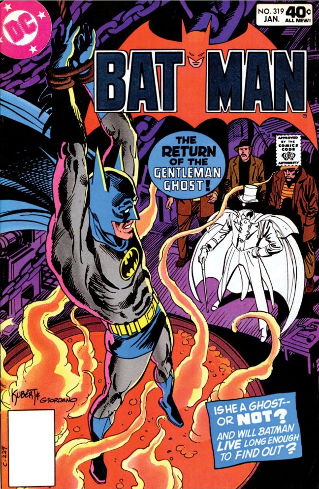
Batman #319 (January 1980) sees Batman and Gentleman Ghost battling once again.  This mean we get a Halloween treat in the form of a spectacular Joe Kubert cover with Batman in pulpy danger, suspended over a bubbling vat of wholesome Campbell's Tomato Soup with milk added.  Just like my dad loved to do!  Dick Giordano inks and the result is as rich and creamy as the soup Gentleman Ghost plans to dip Batman into.  Eerie underlighting and a line quality that's recognizably Kubert but somewhat cleaner and not as expressionistic.

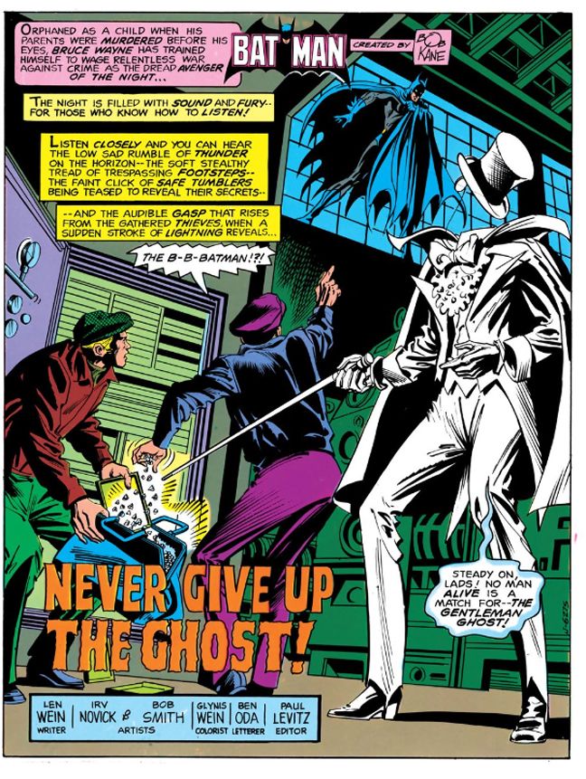
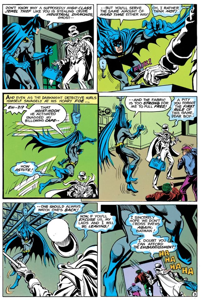
The story starts in mid-action, just like the previous Gentleman Ghost appearance.  Batman once again interrupts the Ghost and his henchpeople in mid-heist and ends up hoisted by his own cape.  While starting stories like this instantly ups the energy level and leads us to expect something rapid-fire and thrilling, there's a danger of this approach devolving into formula.  But Batman's dilemma-- which writer Len Wein points out is self-inflicted due to Batman's cape being rip-resistant, a helpful quality in most situations but not when you need it to tear so you can free yourself from a dangling hook-- proves startling and original in its details.  Wein also uses it to show that Batman, while fallibly human, is also resourceful and dangerous even when apparently helpless.  Never count out the Caped Crusader, as Gentleman Ghost finds before cleverly making his own escape.

Script: Len Wein/Pencils: Irv Novick/Inks: Bob Smith

From there we find Batman setting a trap for the Ghost, with a Halloween-appropriate setting.  He plans a costume ball at Wayne Manor with jewels on display as bait.  Gentleman Ghost finds this irresistible, and once again Batman ends up dangling from a hook.  This time over boiling soup.  I mean acid.  It's not tomato soup.  It's a vat of acid, a wicked comic book convention.  This time Wein shows us the mechanics of a Batman escape.  The story has the feel of someone working through all those classic Batman tropes.  The death traps, the fist fights, goofy henchpeople (somehow the very British Gentleman Ghost has found a couple of very British oafs to help him, one named, fittingly enough, Alfie) and another ambiguous ending.

Script: Len Wein/Pencils: Irv Novick/Inks: Bob Smith

We still never learn if Gentleman Ghost is a real ghost or not.  His lackies disguise themselves as the Ghost as a distraction and Wein suggests the headless quality is mere fakery when one of them is revealed to be merely hunching down.  That doesn't explain the floating top hats or monacles.  Later there's a bit with a convenient hologram projector which also seems to tell us the Ghost is more technological trick than supernatural treat, but Wein leaves the truth of the matter hanging, kind of like his Batman this issue.  You can have it either way.  He's a clever illusionist with a creepy gimmick or he's a creepy ghost with a penchant for high-tech chicanery.

Script: Len Wein/Pencils: Irv Novick/Inks: Bob Smith


It's up to you!

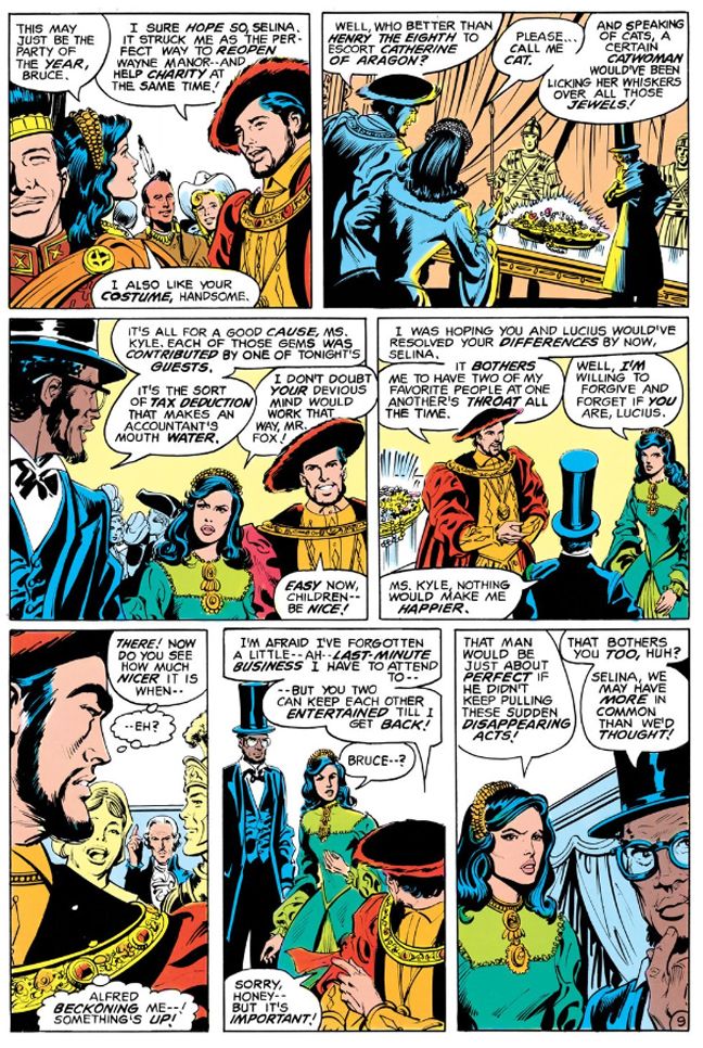
Irv Novick once again pencils, but this time Bob Smith inks.  Smith's line is thinner, sharper, more angular than Giordano's.  Well-defined figures and clarity of action make this issue very appealing throughout.  Batman is almost always on the left side of the panels, inciting things in the proper reading order so you get this forward thrust and momentum that carries through all the way to the end.  With Novick and Smith the crowded costume party has focus and detail, with one wide panel that's a treat to linger on.  Batman comes as Henry VIII, Selina Kyle as Catherine of Aragon ("Please... call me Cat," she quips) and Lucius Fox is Abraham Lincoln.  You can make out a plethora of other historical personages surrounding them and even when the Gentleman Ghost and friends gate-crash, Novick and Smith maintain a clear sense of where everyone is relative to each other.  Even when Selina Kyle and Lucius Fox abruptly switch sides so Fox can occupy the foreground with his thoughtful countenance you're not likely to freak out with the change and fall out of the story.  Good, solid stuff.

Script: Len Wein/Pencils: Irv Novick/Inks: Bob Smith

The issues I've read of this Wein run are sleekly enjoyable reads.  He drops exposition into dialogue and gives us meaty narrative captions to chew on while we enjoy the visual banquet Novick and Smith provide.  Very tasty stuff, the kind that satisfies.

Thursday, October 2, 2014

October is Spookey Month: Batman #310 (April 1979)

Batman #310 (April 1979) is a comic I bought solely for its cover.  Even back then I was a big Joe Kubert fan, and I believed the cover artist always did the interior art.  I was wrong.

Choosing Kubert as cover artist makes perfect sense because he and Robert Kanigher co-created Gentleman Ghost as a Hawkman/Hawkgirl adversary.  Gentleman Ghost debuted in Flash Comics #88 (August or October 1947, take your pick) but I’d never heard of him.  Why?  Because I never read any Hawkman comics.  Never had anything against Hawkman, just wasn’t my thing. 

Joe Kubert, on the other hand, certainly was and still is very much my thing.  Being 11 years old when this comic book came out I had no idea he’d ever done anything other than war comics and Tarzan.  A chance to see him draw a Batman story piqued my interest, but I can’t say the Irv Novick-Dick Giordano team that actually did the inside art disappoints.  They do a bang-up job.  Theirs is my ideal visual representation of Batman.  He has human proportions and he's not always gritting and grinding his teeth to the point where his molars must be just about gone.  He's a serious guy, but he has recognizably human emotions!
 
Here we are 35 years later and I’m still not particularly into Hawkman and my knowledge of Joe Kubert’s long comics career remains spotty at best.  I love his art and still adore this attractive, exciting cover, though.  I just find it odd I’d have an Irv Novick comic and never have it click with me despite coming to appreciate his solid Bat-work from all the reprints I’ve read over the years.  Maybe it’s not so odd.  I once had a Russ Heath Sgt. Rock and didn’t realize it until much later.  Same with a Rich Buckler-Bernie Wrightson Batman book.  I’m kind of an idiot.


Script: Len Wein/Pencils: Irv Novick/Inks: Dick Giordano

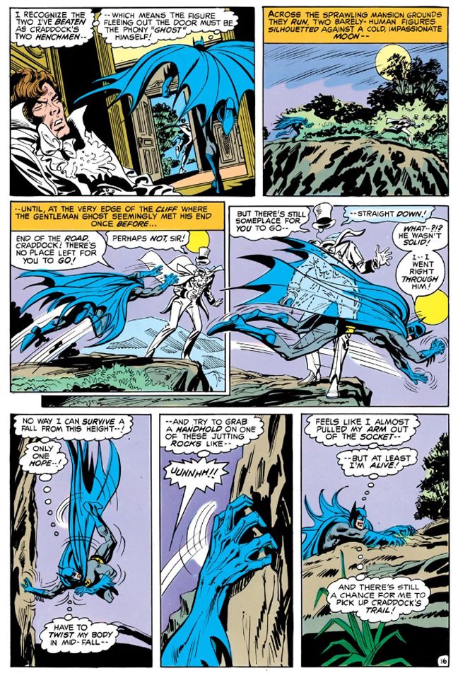
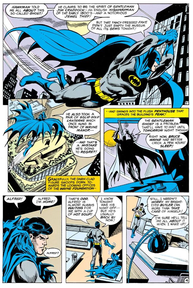
The story, titled "The Ghost Who Haunted Batman," is a jaunty, assured effort by all involved.  It would have made an excellent episode of the 1990s Batman: the Animated Adventures TV series.  Len Wein's script sets up a neat double mystery and wraps it all up in a single issue.  One one hand we want to know why is Gentleman Ghost, known for stealing jewels, suddenly after things like antique lanterns and furniture?  And on the other, where did Bruce Wayne's loyal butler Alfred Pennyworth disappear to?  Wein also plays the whole "is Gentleman Ghost a real ghost, or is he just some clever illustionist with a gimmick?" routine to great effect.  Batman remains pretty skeptical of the supernatural throughout, and when his bat-rope falls ineffectively between Gentleman Ghost's cuffs and gloves, he's disturbed.  But not enough to stop scoffing, as when he sneers, "Mister, you're about as supernatural as my shoe."

No doubt like Batman himself, I distinctly remember expecting some kind of prosaic explanation at story's end.  A special effects artist or magician revealed in an unmasking...

What I admire about this book is how every moment moves the story forward or reinforces the then-current Batman status quo.  There's no waste.  Even for a reader like me, who bought books based on whim and might go months between Batman purchases, could pick this issue up and learn all its players and how Batman relates to each of them.  There's a quick bit of Catwoman romance, a Lucius Fox appearance and even a return visit to Wayne Manor, and yet the central plot remains at the fore.  It's a quick read and certainly no gyp for being self-contained and short.

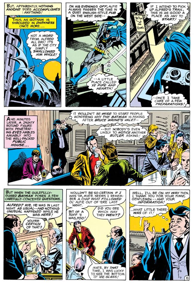
One of my favorite scenes in this book comes when Batman disguises himself as a portly fellow butler to infiltrate a UK-themed bar where Alfred likes to hang out on his nights off and brag to anyone who will listen and buy him a pint about his awesome job with the Waynes.  In the interest of blending in, Batman goes for the old school stereotype complete with bowler and crooked little pipe.  He kind of goes from one panel in his Batman jammies staring down at the pub to the next walking-- the caption tells us it's a mere few minutes later-- in all dressed up with a waistcoat and padded suit.  I'm not sure how Batman pulls this off so quickly when he doesn't even have his Batmobile around to carry things for him, but Wein doesn't let a little detail like this slow the story's pace.

Script: Len Wein/Pencils: Irv Novick/Inks: Dick Giordano

I like to imagine Batman spouting off with a Dick Van Dyke-quality accent and all the ex-pat Brits mocking him after he leaves.  For the story's purposes, Batman probably puts on an accent not only dead-perfect for some particular region of the UK, but also a specific neighborhood.  Came up with a complete biography for this one-off character and everything.  He is a master of disguise, after all.  He's right that it would be odd for Batman to go around asking about Bruce Wayne's butler-- but why doesn't he go in as Wayne?  Because subterfuge is fun!
 
Novick and Giordano lovingly create a creepy, fog-bound mood throughout, turning Gotham City into a vast haunted house.  The atmosphere compares favorably with that ultimate night-bound comic, Marvel's Tomb of Dracula.  And Gentleman Ghost makes an excellent Batman foil.  I’ve always enjoyed Batman stories where he comes up against the supernatural and he’s left a bit befuddled in the end.  Batman benefits from being depicted as vulnerable and not as hyper-competent.  Nowadays he’d anticipate Gentleman Ghost’s every move and have some kind of pre-built anti-ghost device.  In 1979, a hypnotized Alfred could sneak up behind him and knock him out with a heavy gold lamp and he could be deked by an empty suit, then try and fail to save Gentleman Ghost from a carriage crash.  The final scene certainly lives up to the story's title as Batman is left there with the Ghost’s mocking laughter ringing in his ears in one of those ambiguous “just what the heck was that guy?” endings. 
 
Batman and Gentleman Ghost would tangle again shortly and we'll talk about that one when I get the time to read it and react to it.

Wednesday, September 3, 2014

Marvel's Marvelous Movies #9: Conan the Barbarian (Marvel Super Special #21, August 1982)

John Milius and I are probably diametrical opposites politically (and in most other ways), but I have to admit I admire the hell out of him.  The guy simply fascinates me.  He's collaborated with people like George Lucas, Steven Spielberg, Robert Zemeckis and a fella name of Francis Ford Coppola on a little flick called Apocalypse Now.  Lucas based the John Milner character from American Graffiti on Milius, and he served as partial inspiration for Walter Sobchak in the Coen Brothers' Big Lebowski

On his own, Milius has made a number of romantic adventure films laced with a lot of his personal philosophy, which is somewhere to the right of right wing.  He's got kind of a sketchy commercial record, but he's never bored me with his movies.  At its best, his work achieves a kind of powerful macho poetry and beauty, and I find myself exalted by themes and moments I wouldn't ordinarily celebrate.  The Wind and the Lion, Big Wednesday and Rough Riders come to mind. 

Sometimes his movies are just sort of silly.  Red Dawn

Or poetic and silly at the same time.  Which brings us to Conan the Barbarian (Marvel Super Special #21, August 1982). 

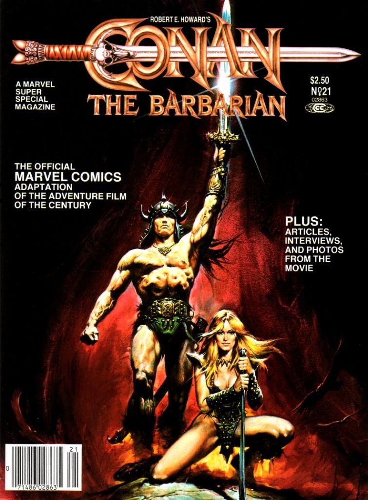
Other than the rough outlines of its fantasy setting and few names and incidents here and there, this movie has little  to do with Robert E. Howard's most famous creation.  Milius and co-screenwriter Oliver Stone (yes, THAT Oliver Stone; Milius doesn't seem to let ideology affect his choice in collaborators, which is another reason I respect him) reinvent Conan to suit their revenge story and also because of Arnold Schwarzenegger, in just his second dramatic role (his first being as Hercules in a low-budget comedy with Arnold Stang), didn't have the acting chops to carry the film's narrative.  This reduces the title barbarian himself to kind of a passive meathead thoroughly out-charismaed by his partner-in-crime and lover Valeria, played with scene-stealing verve by Sandahl Bergman.


Script:  Michael Fleisher/Story and art: John Buscema

But Arnold as Conan-- Schwarzenegger, not Stang-- probably contributes the largest portion of the public's perception of the character.  Thick accent, not a lot to say, and most of that borrowed from Genghis Khan.  The rest more than likely comes from Marvel's comic book series starring Conan, which hews closer to Howard's version without quite getting it right, either.  And since Marvel was also in the business of adapting movies, their doing a Conan the Barbarian film comic was inevitable. 

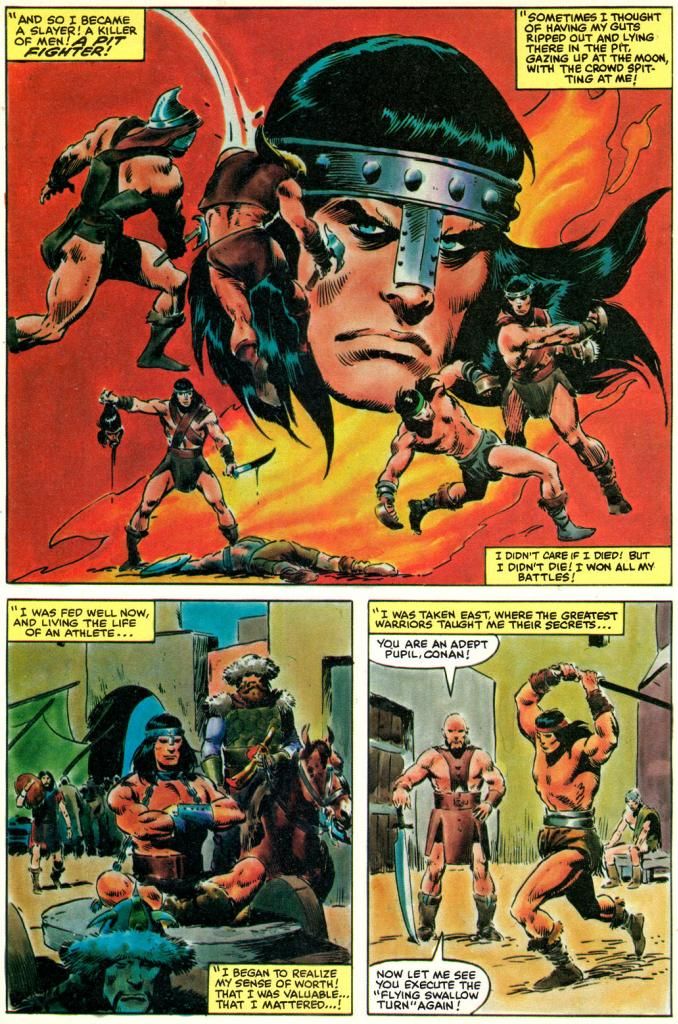
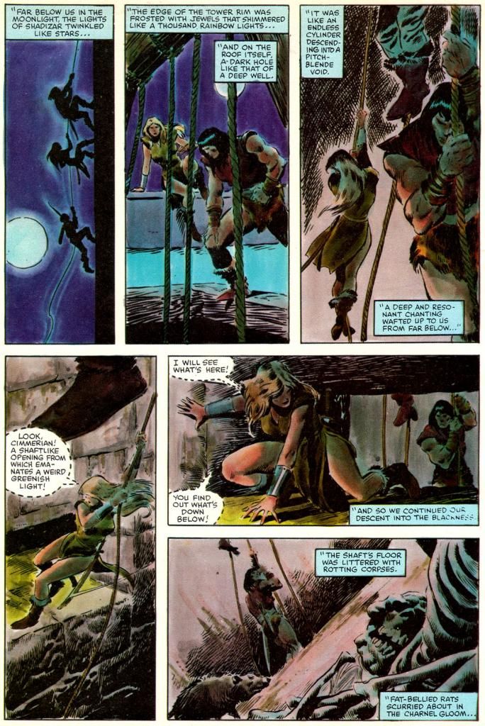
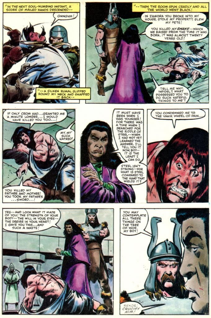
Who better to adapt and draw it than John Buscema, the top Conan comic artist of the day?  As a geek, I tend to associate Buscema with the character almost as much as I do Robert E. Howard himself.  Buscema has Michael Fleisher provide the words for his adaptation, which may or may not have been a smart move.  I say this only because I wish we could have read something even more purely Buscema just to experience what his word choices and tone might have been like.  Together, Buscema and Fleisher reduce the naked sex and sexy naked parts and expurgate most of the gore to produce a newsstand-ready Conan magazine that's Marvel and Milius at the same time.

Script:  Michael Fleisher/Story and art: John Buscema

Buscema draws Conan how he was used to drawing him in the Marvel comics rather than try to depict him as Arnold.  In fact, Buscema makes no attempt to caricature anyone other than James Earl Jones as villainous Thulsa Doom.  And even his Doom is more or less a general likeness, aided by Jones' distinct look as the character. 

Doom is a mean guy with a Bettie Page hairdo and a pack of horseback raiders who follow him around in search of money and murder.  They slaughter everyone in Conan's village and then Doom hypnotizes Conan's mom and chops off her head.  The orphaned Conan spends a number of years pushing a stone wheel around until he's as big as a bodybuilder.  Sold as a gladiator, he learns swordplay and Nietschean philosophy while also providing stud services.  Freed, he sexes up a werewolf witch, meets pro surfer Gerry Lopez and soon learns Doom has reinvented himself as head of a cult that sells snake-worship franchises throughout the land.  Conan also meets Valeria, who doesn't dominate the story in the comic quite as much as she does in the movie.  Buscema draws Valeria as the standard Buscema beauty, with thick eyelashes and high cheekbones.  Like Bergman, she's statuesque and blond, but that's where the resemblance ends.

And that's really enough.  If I wanted the characters to look exactly like the actors, I'd just watch the movie again or look at some photos.  I love when an artist does caricatures or likenesses, but it's not always necessary.  If likeness is an artist's strength, then he or she should focus on that.  If not, then filling the pages with a lot of off-model faces poorly copied from stills and publicity material is simply a distraction.  Some can do both, but either way the storytelling is much more important.  Things like pacing and clarity of sequence.  Vigor.  You don't find many storytellers more vigorous than John Buscema in sword-and-sorcery mode.

Script:  Michael Fleisher/Story and art: John Buscema

And in contrast with the disappointing Raiders of the Lost Ark, Buscema inks himself this time.  He's well within his comfort zone, and, as with Al Williamson on Empire Strikes Back, we've got an artist perfectly matched to the material.  Whoever made the decision to return to the painted color style of some of the earlier Super Specials needs singling out for praise, too.  D. Pedler (sorry, I don't know who this is, but I wish I did) and the legendary Lynn Varley do a sensational job here, giving Buscema's already gorgeous art a luminous quality, giving each location a rich look full of depth and atmosphere.  Snowy woods look cold, the barren wastes look hot and dry.  This Super Special is a visual treat with a richness a few of the preceding issues sorely needed.  The result?  It's classic Buscema Conan guest-starring in the Milius movie

The writing preserves many of the movie's best lines except for my favorite part, which is Conan's prayer, which it truncates to get to more action.  Conan's prayer is probably the most bad-ass prayer ever capture on film next to the ones for George Bailey at the beginning of It's a Wonderful Life

And I must quote the film here:

Crom, I have never prayed to you before. I have no tongue for it. No one, not even you, will remember if we were good men or bad. Why we fought, or why we died. All that matters is that two stood against many. That's what's important! Valor pleases you, Crom... so grant me one request. Grant me revenge! And if you do not listen, then to HELL with you!

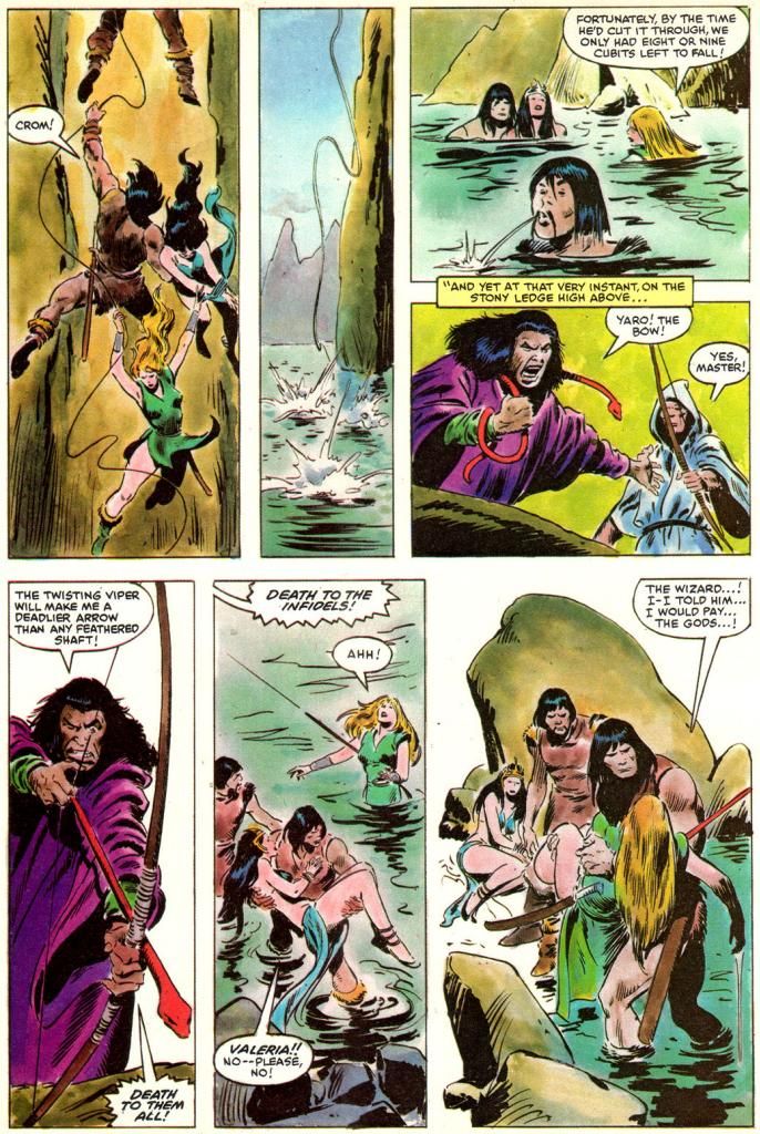
Before we toddle off to Crom's mountain where we'll laugh at the four winds, here's a page with a funny panel a Buscema group I'm in on Facebook hashed over recently.  Look at the middle panel of the bottom tier:


Script:  Michael Fleisher/Story and art: John Buscema

"Valeria!  No-- please no!" 

Neither Howard's nor Milius' Conans spend half a second begging like that.  Where the word balloon arrow points is to the rescued princess, but considering her ungrateful characterization the rest of the way (and the fact she didn't know who the hell Valeria even was) make me believe this is Conan speaking.  Hardly the stuff of the guy who tells his own god to grant him revenge or go to hell.

Who gets the blame for this?

Fuck it, Dude.  Let's go bowling.

Sunday, July 6, 2014

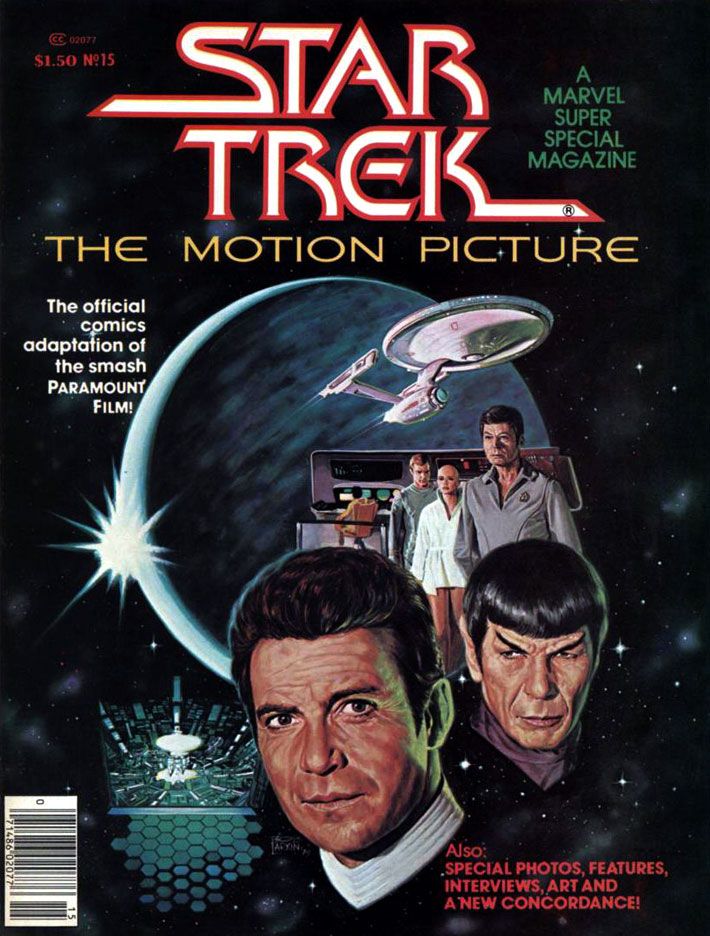
Marvel's Marvelous Movies #3: Star Trek: the Motion Picture (December 1979)

I'm going to tell you upfront this was one of my favorite individual comic book stories when I was 11 years old.  I have no idea how many times I read it.  The following year, Marvel's Empire Strikes Back adaptation would knock this one (and just about every other comic I'd ever read and loved prior to encountering Al Williamson) down a spot or two on my personal hit parade, but I still have a deep and abiding love for Marvel Super Special #15.  I'd been a Star Trek TV show fan for as long as I could remember, and this was in the wilderness years of the 1970s.  Back then, you had to find Trek at odd hours on some local station.  Ours came out of Tallahassee on Saturday afternoons, subject to atmospheric interference.  When your station dropped whatever Trek syndication package they'd licensed, you lost touch with the crew until they popped up somewhere else within antenna range.  In the interim, you could read the James Blish short story collections with episode adaptations, and the often silly Gold Key comics.  Or collect and play with the Mego action figures.  That was as Treky as we got before 1979's Star Trek: the Motion Picture came out and relaunched the franchise as a movie series.

It almost didn't.  The movie, directed by two-time Academy Award winner Robert Wise and based on a premise written by series creator Gene Roddenberry, made money, but it was expensive to produce and wasn't as big a hit as Paramount had hoped for.  It certainly looked fantastic, with a sleeker, updated Enterprise and everyone in pajamas for a sweet slumber party atmosphere.  But it suffers from endless shots of the Enterprise slowly drifting along set to repetitive music cues and people staring in awe at light shows.  It's like watching the audience at Laser Floyd: Dark Side of the Moon.  The film allows its characters to ask existential questions, but when it comes to answering them, the result is akin to a 2001: A Space Odyssey where, after boring you for more than two hours, Stanley Kubrick has the astronauts explain to each other (and the audience) exactly what the monolith represents and why it does what it does.  The cheaper, more action-oriented Star Trek II:  The Wrath of Khan turned out to be the franchise's salvation, not this glacially-paced epic.  But in 1979, for me, it was enough seeing Kirk, Spock, McCoy, Scotty, Uhura, Sulu and Chekov (along with Janice Rand, for cripe's sake!) back in action.

And, after watching this movie again on Blu-Ray recently, I've decided I'll take it with all of its flaws and dull stretches over either of the terminally stupid "reboot" flicks any day of the week.  Star Trek The Motion Picture at least has ideas and something to say about the basic human dilemma ("Is this all there is?  Is there nothing more?"), things it takes very seriously.  Can you imagine a major studio nowadays dropping this kind of money on a sci-fi flick starring a lot of middle-aged people and without any meta-humor or product placement?  There's not even a sky-diving sequence!  There's barely any sex!


But let's talk about the comic.

It must have been a daunting challenge to adapt into an entertaining comic a story that consists mostly of long sequences of nothing more than the Enterprise gliding over the giant V’Ger ship and then small groups of characters conversing about it in staff rooms and small corridors.  The comic really benefits from the deft way Marv Wolfman condenses scenes.  Wolfman ruthlessly edited down long scenes into a few panels, quickening the pace and generally tightening things up.  Wolfman uses his narrative captions-- always a strength of his writing-- to clarify character motivation and add descriptions and exposition to guide readers along.  We're engaged throughout.

For the art team, which consists of Dave Cockrum on pencils and Klaus Janson on inks, the problems are finding ways to make all the conversations work visually and reproducing the movie’s many, many special effects shots.  Cockrum, a master of crowded team compositions and action-packed superhero action, comes through with strong "acting" from the principals, downplaying the usual Marvel dynamics but upping the emotional content of various scenes.  His Commander Decker in particular comes alive with various angry faces and hand-chop poses emphasizing his frustration.  The likenesses are consistent throughout, a real plus when dealing with familiar, iconic characters.  The results aren't photographic, but Cockrum never confuses the readers.  Kirk has his poofy hair, McCoy his sharply arched eyebrows and drooping, lived-in face.  Of course Spock is easy to get right, but even more conventionally good-looking people like Uhura, Sulu and Chekov look pretty much the way you expect.  Every so often there's a dead face, but they never become a distraction.


What an ink job Janson provides, too.  While he and Walt Simonson outdid themselves on innovative lighting effects in Close Encounters, here he and colorist Marie Severin use color holds to reproduce Douglas Trumbull's lightning balls and wormholes.  This kind of stuff is easy to do these days with digital inking and coloring.  It's nothing to isolate an element and change the color channels to whatever you want.  But when Janson and Severin tackled Star Trek, they had to rely on acetate or vellum overlays.  It must have been a tedious, time-consuming process because they use one or more on practically every page.  The results are nothing less than astounding.


For all its pacing flaws, the film is effective at making space seem like an infinite frontier full of dangers.  It's not just that there are Klingons and V'Gers out there ready to zap unfortunate astronauts and Starfleet personnel.  Space itself is dark and perilous.  For one thing, the ships have to provide their own exterior lighting.  None of that Star Wars stuff where everything in space is brightly lit no matter how far away it is from an actual light source.  To the human mind, space appears largely empty, dark and vast.  Even the vaunted technology its space explorers count on for survival turns on them.  The transporter goes awry in a shocking incident and, later, the warp drive throws the ship into what the characters call a “wormhole.”  Contending with these, the Enterprise crew truly seems to be going boldly.  This isn't sailing along to some cute world where you find 1920s gangsters or the White Rabbit out of Lewis Carroll.  You could end up a data stream in a godlike machine's memory banks or transformed into a robotic copy of yourself with a lighted jewel embedded in your throat.  Or merge with the overmind into a stream of light.  Wolfman’s script reproduces each of these episodes faithfully and Cockrum, Janson and Severin provide some spectacular visuals to match them, with all the production design details faithfully reproduced.  Ultimately, this is an extremely accurate recreation of the film's look and mood, minus its shambolic tendencies.


The story also appeared in three monthly issues (Star Wars, a much shorter but action-oriented film, ran in four, which is further evidence of how Trek should have been pared down a bit) which led to a short-lived Marvel Star Trek comic.  I never read a single issue of that.  After all this time, I'm not sure why, especially considering how much I enjoyed this one.  Maybe it was enough for me Wolfman, Cockrum, Janson and Severin had already provided fabulous glimpse of what a Star Trek comic could be, one-upping its cinematic source material.  Too bad they didn't get a chance to take on Khan.


Looks like I forgot to talk about the Bob Larkin fully-painted cover.  That's just as well.  I'd have written a paragraph consisting only of superlatives.  I look at it kind of like Kirk, McCoy, Decker, Ilia and the rest gaze at Laser Floyd.

Monday, January 13, 2014

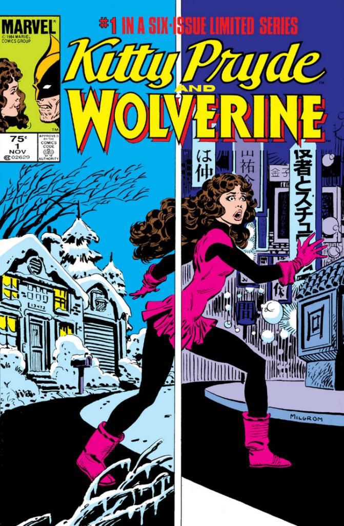
Kitty Pryde and Wolverine #1 (November 1984): Bad News Mutants Go (Back) to Japan!

When I was a much younger comic book fan Japan was mostly just that place Speed Racer and Pink Lady came from.  Then at some point, I must have gone insane because I moved there to start a new life and go to Melt-Banana shows whenever I damn well feel like it.  While it's not nearly as exciting a place as Pink Lady and Jeff would have you believe, Japan is still a pretty cool place to live.  I've had a lot of misconceptions corrected since I was a young comic book reader living in south Georgia, and I've probably formed more than a few new ones now that I'm an old comic book reader living in south Shizuoka.  This is why I love taking a look at American comics depicting my adopted home.

Marvel Japan!  I can't know for certain (since I wasn't working for them), but I get the feeling Japan was Marvel's go-to country for remaking characters back in the 1980s.  In their classic and influential 1982 Wolverine mini-series, Chris Claremont and Frank Miller sent Wolverine there, tore him apart, put him back together again and cemented his place as one of Marvel's top draws.  Along the way, they created a fabulous fantasy Japan (we've discussed this already), where the high-tech marvels of modern Tokyo form a backdrop for a lot of pseudo-mystical martial arts tough guy nonsense.  In the Marvel Japan Claremont and Miller invoked you could still encounter hordes of ninja and stoic old people still living the ways of bushido in their ancestral castles.  It's silly, but it's the best kind of silly.  I dug it, you dug it, lots of people dug it, so much so this story recently formed the basis for The Wolverine (in Japan it's called Wolverine: Samurai) starring Hugh Jackman.

In Kitty Pryde and Wolverine (November 1984-April 1985), it's Kitty Pryde's turn to visit Japan and experience life-changing events.  And you couldn't ask for a better protagonist, or one more in need of a fresh start than 1984 Kitty Pryde.  Lovingly written here by Claremont, our heartbroken yet smart'n'spunky (TM) Kitty is plenty interesting on her own to have headlined a two or three issue romp through 1980s-era Tokyo, capital of a country then enjoying a huge resurgence in economic prowess, self-confidence and cultural energy-- Shinjinrui!  Visual kei!  Para Para!  With New Wave artists already appropriating its looks and imagery, Japan's youth culture stood poised to conquer the pop culture world, and this could have provided plenty of material without anyone resorting to martial arts clichés.  Instead, in the second issue, Wolverine muscles his hairy way into the plot and the series becomes a deadly serious remake of his solo story, only with Kitty fighting ninja and yakuza for redemption.  Those aspects just don't provide the same kick or appeal the second time around. 

But rather than shoot my figurative BB gun at a comic for not doing what I want it to do, I'd rather focus a positive spotlight on the way-cool first issue, which has Kitty lost in translation all by herself, desperately in over her head.  So let's take a long, loving look at Kitty Pryde and Wolverine #1.  How do Claremont and artist Al Milgrom depict Japan?  Is it believable?  Does it make a reader feel as if he or she has been there?  That's what you're asking me right now, isn't it? 

No?  Well, okay!  I'll tell you anyway!

First, there's the trip journey itself.  To get to Tokyo, Kitty stows aboard a JAL flight from Chicago, and I can promise you there absolutely is such a flight, known as JAL Flight 9.  These days, the aircraft flying the route is a Boeing 777-300ER, but Kitty hops a 747-400 (I think).  That's the same plane I took, only I didn't phase onto it through the cargo bay.  I had a ticket, so my arrival at Narita Airport was a lot smoother (and drunker, thanks to JAL's liberal free drinks policy at the time) than Kitty's.  Not having my good luck, Kitty then spends a page or so escaping Narita.  Today's Narita doesn't look much like the one Milgrom draws, but I first visited it some twenty years after Kitty, so it probably underwent a renovation or two in the interim.  Oh, there's a funny bit where Kitty phases onto a bus and accidentally slaps a salaryman on the ass as she solidifies.  Today we're more likely to get to Tokyo proper by way of the Narita Express, because Narita is actually way out in the rice fields of rural Chiba prefecture, a fair distance from the urban neighborhoods the where the rest of the story takes place.

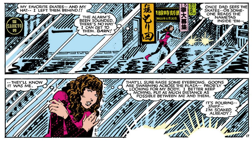
Now we come to the meat of this post:  Tokyo.  Godzilla's Stomping Ground.  Where the Bears played the Japanese Little League champs.  Kitty visits Tokyo in winter and let me tell you-- Japanese winters are cold!  Cold and windy!  Because her trip is on the spur of the moment with no time to pack or dress more appropriately, Kitty's skater costume is cute but hardly practical for running around outdoors here.  And to top it off, she gets soaked by the rain.

Script by Chris Claremont, art by Al Milgrom

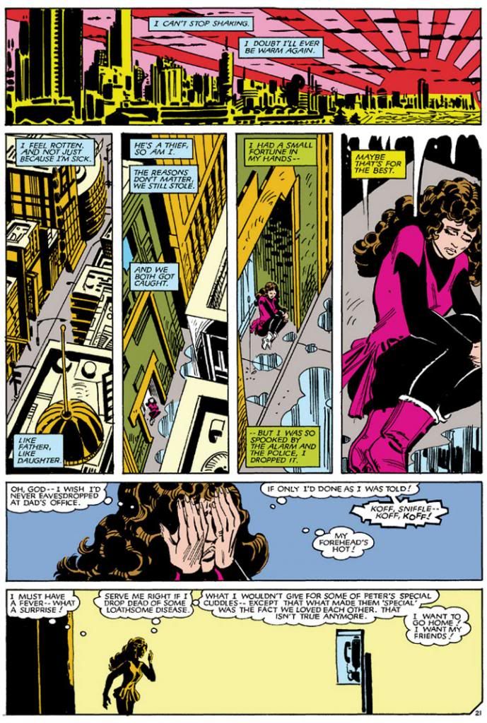
Claremont's Kitty may be impulsive at times due to her youth and naiveté, but she's also a thinker.  During this sequence, she's sizing up her situation after receiving a pretty heavy duty system shock and already figuring out not only has she made a sizable error in judgment trying to help her dad, she'll also be lucky just to stay out of jail herself.  Then the weather takes a dump on her, too.  It actually rains a lot in Japan (while Kitty can't because she lacks money, less desperate visitors should buy a cheap umbrella at a convenience store; the wind's just going to destroy an expensive one anyway), so this vaguely Blade Runner-esque cityscape looks pretty accurate.  Milgrom inks his pencils with a bold, energetic line and spends more time on the rain shower than the surroundings, but those squiggly blacks Kitty's running across are reasonable visual shorthand for the wet streets and reflective lighting of a rainy Tokyo evening.  The vertical signage creates a convincing Tokyo look as well.

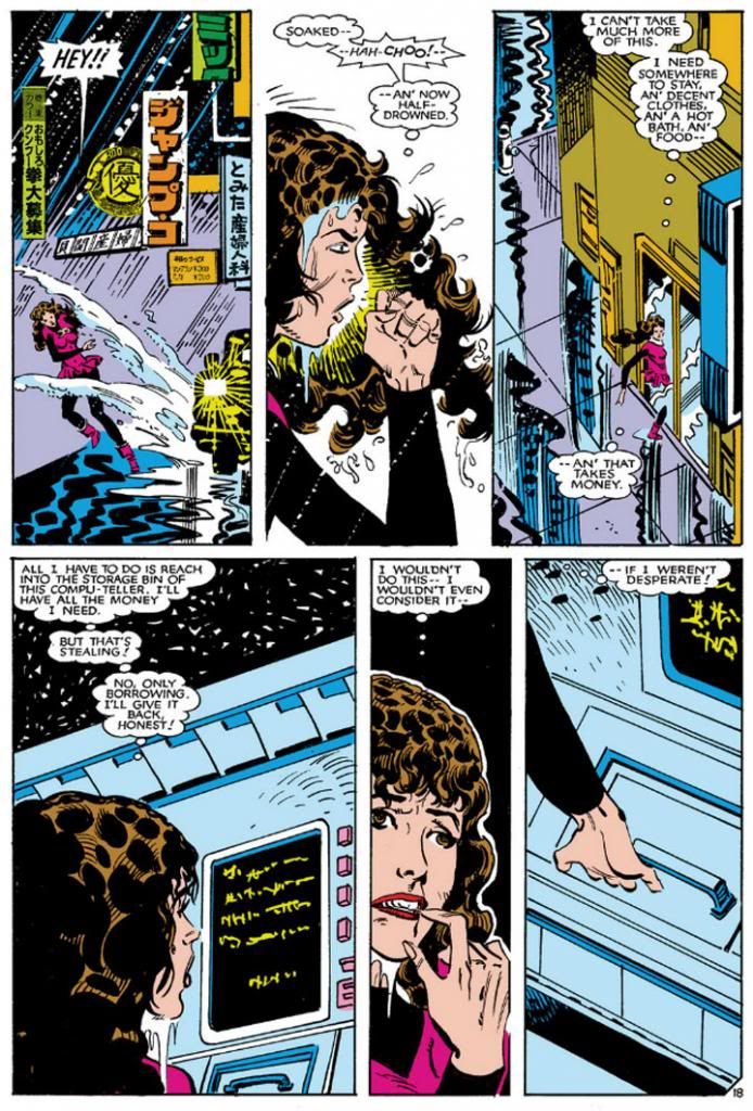
In the next sequence, the rain lets up a little so Milgrom shows us more of the city.

Claremont, Milgrom

It looks as though Milgrom uses some paste-up lettering here, possibly clipped from Japanese newspapers or magazines, or even actual photos of Tokyo.  That's a smart idea.  All that lettering would have been a pain for either him or the book's letterer to recreate, and they would have had to hire a translator to make sure they weren't just slapping down squiggles and squares or accidentally writing something rude.  Plus, Japanese comic book artists sometimes paste up entire pre-drawn backgrounds from special manga-tool artbooks, or use half-tone photographs.  Milgrom does the last, too, but I forgot to capture a screen image of it so you'll just have to take my word here.

Milgrom's version of a Japanese ATM is fun.  Since it's the 1980s, Kitty can't quite decide what to call it.  "Compu-teller," huh?  Now you find ATMs all over the place in Japan-- in banks, post offices, malls and convenience stores.  Inconveniently, some of them are not open 24 hours so sometimes you have to be prepared to wait until business hours the next day to withdraw money.  Imagine Kitty's dilemma here when she needs cash, it's after hours... and she doesn't have an ATM card or even a bank account.

Don't do it, Kitty!  Don't steal that money!  Not only is it illegal, but it's also not worth the guilty feelings and depression!

Milgrom waits until almost the end of the issue to give us a widescreen Tokyo cityscape.

Claremont, Milgrom

Ah!  The "Rising Sun" motif!  How Buckaroo Banzai, baby!  Now we really know we're in 1980s Japan.  Milgrom enjoyed this effect so much he used it again in the fourth issue, rising behind a Japanese castle.  After a spectacular overview of the big city, Milgrom zooms in on a neighborhood, finding a sick and miserable Kitty huddles in a doorway.  And she hasn't even hit bottom yet.  Kitty's back alley/sidestreet hideaway in the second panel tier looks reasonable to me.  Granted I spend most of my time in the hip, upscale districts hobnobbing with trendsetting fashionistas like Chiaki Kuriyama and Kyary Pamyu Pamyu, but I've occasionally glanced at just these kinds of lowly city spaces as we've swept by in our motorcycle-escorted limousine motorcades.  That pay phone looks pretty generic, but a phone is a phone, I guess.

"I can't stop shaking.  I doubt I'll ever be warm again."  I get the feeling Chris Claremont visited Japan himself some winter prior to writing this.  Anyway, welcome to a country where few buildings feature insulation or central heating even now.  Think how rare that must have been almost thirty years ago when Kitty came.  These days, I pile on the layers starting with Uniqlo Heat-Tech and ending with a quilted hanten, and my wife and I run an electric heater in the mornings when we get up.  I still shiver all winter.  And Kitty spent the night outdoors with only her wet skater dress and some tights to protect her.  She also swam through a sewer pipe a few hours before.  No wonder she's in no mood to enjoy the sunrise.

The rest of the mini-series stages fights inside office buildings or on rooftops (Tokyo Tower makes a background appearance as Wolverine's friend and sometimes lover Yukio dangles an unfortunate oaf over the distant street) and martial arts training sessions at secluded castles right out of Akira Kurosawa flicks.  Claremont and Milgrom score high marks on the Japan scene-setting throughout, and while I wish they had kept things Kitty-centric and lighthearted, at least she comes out of it with a spiffy new costume (a softer version of a leather outfit she wears as part of a disguise later in the story), some boss fighting skills and a grown-up codename:  Shadowcat.

She does get an ugly New Wave haircut, though.

Friday, November 1, 2013

October is Spookey Month: Swamp Thing fights male and female werewolves!

To end our month-long celebration of Halloween, horror comics and all-girl Japanese pop punkers Spookey, here are a couple of stories where Swamp Thing fights that old school monster favorite, the werewolf.  Male and female varieties.

The first one, Swamp Thing #4 (May 1973) is by Len Wein and  Bernie Wrightson.  They lean on the familiar Universal Studios style, setting their tale in the Scottish moors and within a creepy old mansion.  Their werewolf is the tragically cursed son of some very worried parents.  They're in luck when Matt Cable and Abby Arcane crashland their plane close to their ancestral home, but definitely unlucky in that Swamp Thing is also on board.  This means their plans to use Cable's blood to cure their boy of his lycanthropy (and give it to Cable; but isn't this what any concerned parents would do for their child?) is doomed from the start.

While the werewolf on the cover looks more like a satyr to me, inside the comic itself Wrightson uses heavy black silhouetting for its first appearance, which gives his beastie a very Frazetta-ian touch, almost amorphous in the night fog.  It's very reminiscent in its first appearance of Frank Frazetta's aptly-titled "Werewolf!" from Creepy #1 (1964).  Kind of impressionistic.  Shoot, why am I telling you all this when I can just shut my fool mouth and show you?  Here:


There is nothing not to like about this comic and its classical approach. 

But what a difference a decade makes!   We hear a lot of talk about the "curse of the werewolf," and writer Alan Moore and his merry art crew of Steve Bissette and John Totleben set out to explore what this means both literally and metaphorically-- because there's also this other monthly thing sometimes referred to as a curse.

In Swamp Thing #40 (September 1985), Brit Moore unspools an episode in "American Gothic," an extended story arc where Swamp Thing battles traditional horror creatures suffused darker elements of the United States' national narrative-- the unintended consequences of progress, the preponderance of gun violence, the genocide of Native Americans and the lingering effects of slavery and the Civil War.  This time, perennial fan favorite character John Constantine pits Swamp Thing against something more personal-- the perpetual state of war between the genders, specifically the daily battles waged by a typically American suburban couple.

As with the Len Wein-Bernie Wrightson werewolf tale, "The Curse" is very concerned with blood.  It's just Moore is interested in a deeper exploration of this sanguine symbolism.  Our werewolf this time is a modern woman so empathetic to the anger and resentment felt by long-ago Pennamaquot tribeswomen sequestered in a special lodge (she and her husband live in a house built on the site) while they menstruate she turns into a massive wolf creature and goes on a rampage.  Male privilege has finally loosed a beast, and after a brief fight, Swamp Thing comes to as much of an understanding of the woman's plight as a male-gendered plant elemental can.

Tragically, our tragic werewolf is a stand-in for all of womankind, so she learns there's another aspect to this blood curse-- women are bound by it to men and vice versa.  As a result, she cannot bring herself to kill her husband (even though she contemptuously notes he's "soiled himself" from fear).  Giving in completely to her primal, savage anger, she crashes through the front window of a pornography shop where a customer has just asked the cashier to show him something he euphemistically refers to as more "unusual."  Perhaps as a matter of tastefulness, we aren't permitted to see the resulting carnage.  In the end, Swamp Thing cannot offer succor and the werewolf impales herself on the knives in a supermarket display, ironically labeled, "Here's good news for housewives!"  The supermarket setting itself represents the sterilizing effect consumerism has on our lives and its place in the continuing subjugation of female power, having been referenced satirically in the same vein by Ira Levin's 1972 novel The Stepford Wives and its 1975 film adaptation.


And with our tale of two lycanthropes, we bring this year's Spookey Month to a close!

Wednesday, October 30, 2013

October is Spookey Month: The Joker versus the Scarecrow!

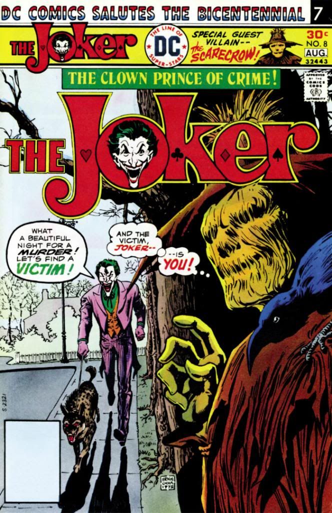
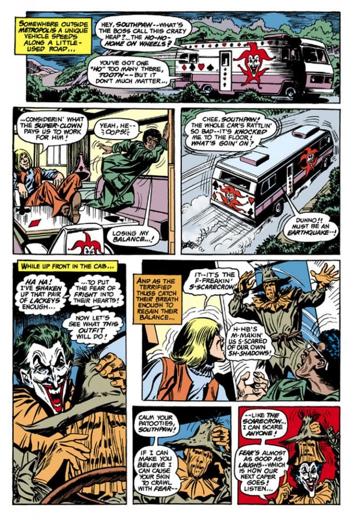
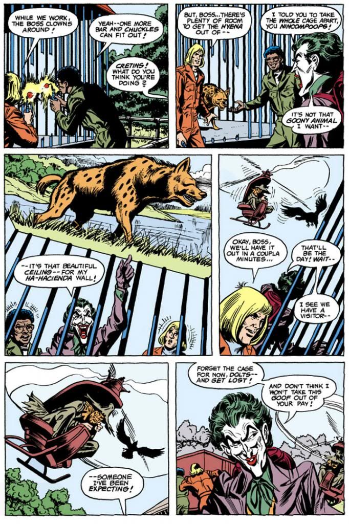
If there's a DC super-villain made for Halloween, it must be the Scarecrow.  He likes to scare people, people like to be scared on Halloween.  The Joker #8 (August 1976) pits him against our titular anti-hero over a batch of new-fangled fear gas developed by those happy-go-lucky chemical warfare specialists down at S.T.A.R. Laboratories.  What's startling about this book is despite its sunnily appealing Irv Novick-Tex Blaisdell art, there's a body count.  I'm simply fascinated by this dichotomy, which gives the book a mood of joyful nihilism.  Innocent people die, and so does a not-so-innocent.  The Joker himself says it best right there on the cover, "What a beautiful night for a murder.  Let's find a victim!"

While we're looking at it, that's a nice Ernie Chan cover.  Once again, Chan had to sign it "Chua," thanks to some kind of bureaucratic goof involving his work visa.  Whoever colored it didn't quite capture the essence of night, though.  No matter.  The lurking Scarecrow provides a lot of menace that's missing in the cheerful story itself.  I mean despite all the killing.

And now a special message to you, the reader!

Dear Reader,

How have you been?  Did you have a nice summer?

Okay, let's discuss something perhaps you can help me with.  This story brings up something that's troubled me for a long time.  I just can't imagine why your average, ordinary, work-a-day criminal would ever join the Joker's gang. 

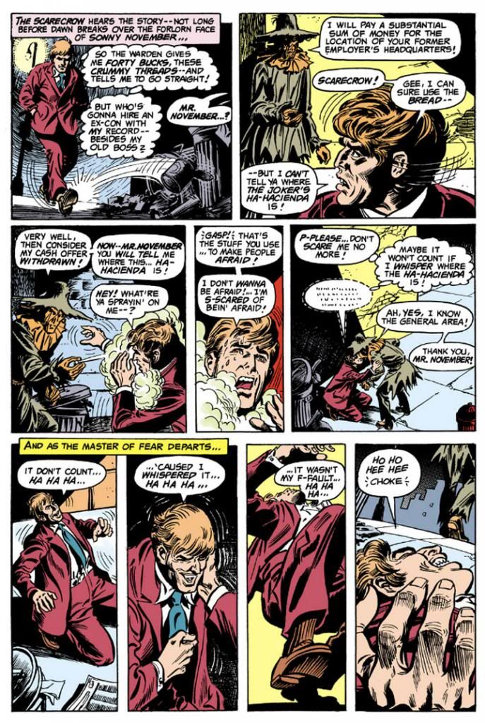
Being a Joker henchperson has such a high fatality rate.  One touch you can almost count on in any Joker story is when the writer decides to present the Joker's bona fides as a dangerous lunatic by having him off a henchman.  This time writer Eliot S. Maggin floats the clever idea the Joker instills a post-hypnotic killing suggestion in all his employees.  If any of his gang rats him out, that person laughs himself or herself to death.  Good deal for the Joker, but a terrible burden for his lackeys.

While there's no riskier occupation in the DC universe than Joker henchperson, there is virtually no reward in it.  Most of us grow up with the idea of risk versus reward.  The greater the risk, the greater the expected reward.  What's the reward for members of a Joker gang?  Even if the Joker decides to steal, say, a solid gold statue of famous clown Emmett Kelly, he's not doing it to melt the metal down and sell it off and split the profit equitably, or even to remove it from the market in hopes of increasing the value of his own stockpile (although a single statue would hardly do that) as when Auric Goldfinger colluded with communist China to irradiate the United States' gold reserves at Fort Knox.  The Joker operates whimsically.  He steals that statue because Emmett Kelly appeals to him in some personal way and he just wants to look at it.  In this story, the Joker takes the fear gas so he can use it to steal the ceiling out of a hyena cage because the painting on it would make a pretty decoration for his "Ha-Hacienda," a kind of Winnebago of crime he and his gang drive around in.  


Yet the Joker never seems to lack for lackeys, does he?  It's easy to understand why the Joker would appeal to anarchists, weirdos, cultists and anti-social types.  Even Charles Manson has fans.  But as far as I know, no writer has attempted to explain the attraction of working for the Joker to the Rockos and Leftys out there in Gotham City and Metropolis.  The blue-collar professionals-- safe-crackers, strong-arms, grifters, B&E boys (and girls) and car-thieves-- with families to feed. 

Here's where you come in, loyal reader.  Has any DC writer addressed this in a story?  I know Alan Moore had the Joker employ carnival freaks in Killing Joke-- which makes a lot of sense-- but never explained their motivation for taking part in his spree.  Every other Joker story I can think of features more conventional criminal types.  What's their attraction to the Joker?  I can only conclude lawbreakers in the DC universe must be even bigger idiots than real-world criminals.

Thanking you in advance!

Sincerely,
A Dope

Oh yeah!  I forgot all about the Scarecrow!


He flies into the comic in a teensy-tiny helicopter with his knees jutting skyward as if he's Disney's Ichabod Crane (a partial inspiration, I believe) on his horse at the end of the classic The Legend of Sleepy Hollow segment from their 1949 package film The Adventures of Ichabod and Mr. Toad.  He and the Joker engage in a duel right there in the zoo, and Scarecrow makes a complete ass of himself.  Oh well, to hell with him.  Here's Der Bingle singing about the Headless Horseman...


Here's Thurl Ravenscroft doing the same...


Happy Halloween, everyone!

Tuesday, October 29, 2013

October is Spookey Month: Jack Kirby pits Jimmy Olsen and his pal, Superman, against a vampire. The winner? Anyone who reads it!

Jack Kirby drew comics in just about every genre.  Which is a pretty conservative way of putting it when you consider he actually invented or co-invented some of them.  As a Kirby fanatic, I wanted to link him to my annual Halloween celebration here, and rather than talk about Spirit World (Kirby does the paranormal) or some of his straight-up horror work (you can find it scattered about in various reprints, Archives, Essentials and Showcases and IDW's Haunted Horror), I have decided to once again explore his early-70s DC years.  We love those book here.

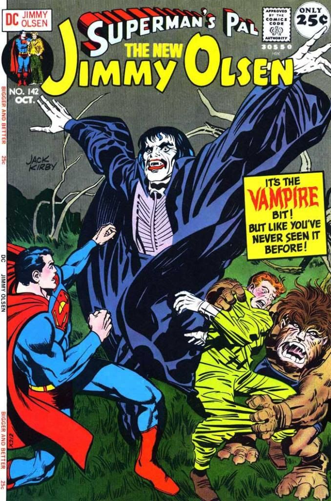
In Superman's Pal Jimmy Olsen #142 and #143 (October-November 1971), Kirby gives the then-corny vampire routine a science-fiction/superhero twist.  Nowadays we have scary vampires again, and romantic, sparkling vampires and vampires that fight werewolves with Matrix-style kung-fu, but when Kirby wrote this story, movie vampires were pretty much still tuxedo-wearing noblemen and the occasional lesbian baroness in a Victorian-style negligee.  Comics in particular had worn out the theme, despite years of a Comics Code ban on vampires.  Once EC had modern-day vampires put taps in their victims' necks and Warren saw an old school county-style vampire take a spaceship to a planet of perpetual night, the concept had been stretched past recognition, like Dick Tracy's face imprinted on Silly Putty (I used to love distorting that guy). The only things left were parody and deconstruction.  Kirby's story tends towards the latter, although the self-aware cover copy hints at the former.

That's as close to tongue-in-cheek as this story gets.  The rest of it is as sincere as Linus' pumpkin patch in It's the Great Pumpkin, Charlie Brown.  Kirby expends a lot of energy here trying to make readers buy this concept and he's not playing around or being cutesy.


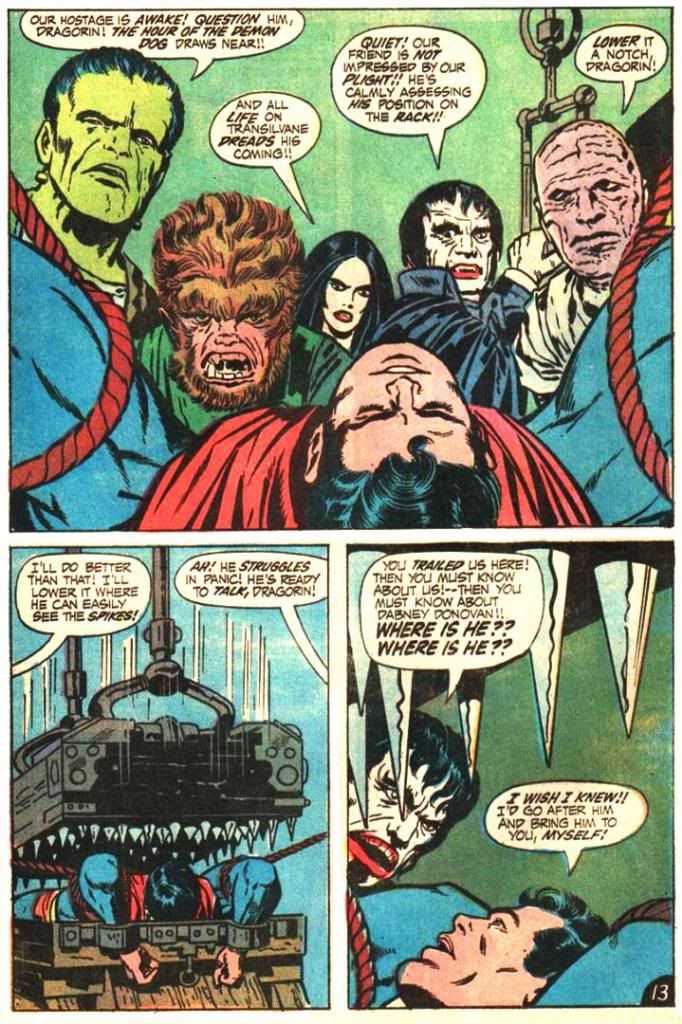
Count Dragorin, the man from Transilvane, does everything you've come to expect from a vampire, up to and including having a werewolf as a best friend.  Kirby wastes no time kickstarting the plot as Dragorin and his beastly companion slip into the city one night and put the bite on a sleeping receptionist by the name of Laura Conway.  Kirby's updated answer to the age-old vampiric transformation scene is to have Dragorin accomplish this via some kind of twin yellow power emanations from his eyes.  They leave the tradition double bite mark on the receptionist's neck and "change her body chemistry."  Within a couple of pages we have Clark Kent and Jimmy Olsen fighting Dragorin for Laura Conway's soul-- or at least her free will-- right there in broad daylight inside the GBS (Galaxy Broadcasting System) offices.  Dragorin is after a former NASA scientist named Dabney Donovan, and Conway was once Donovan's personal secretary.  Intercut with this is a subplot with the Newsboy Legion trying to escape from the Cadmus Project (they're not prisoners; their fathers work there and they're just up to their usual independent-minded mischief), so these are some really busy issues.


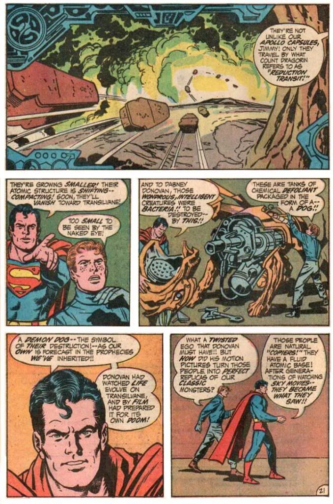
When Superman and Jimmy Olsen track down the scientist's lab (beneath a mausoleum in the pleasantly-named Bloodmoor Cemetery), they find they're not dealing only with a vampire and werewolf couple.  There are all kinds of familiar creatures.  So what does Kirby do to explain these Space Age vampires, werewolves and the like within the science fiction setting?  Well, it turns out Dragorin and company are microscopic aliens from an artificial planet.  That floats inside a room that looks like a creepy castle set where James Whale would have put Boris Karloff through his paces, or Todd Browning would have put Bela Lugosi through his.  And if that wasn't enough, the aliens on that world have developed a society based on old horror movies as well thanks to the bizarre experiments of Dr. Donovan, who must be a real piece of work himself.

For some reason known but to himself (and, I think, NASA), Donovan didn't just make a world.  He also chose those horror movies from his vast personal collection of films and projected them into its clouds.  The sentient life there turns out to have remarkable adaptive and imitative properties, kind of like those gangster guys and the Nazis the Star Trek crew dealt with on their old TV show.  Some of the people there turned into vampires, some into Frankenstein's monsters and others into mummies and werewolves.  They travel from their planet to ours by riding inside coffins that grow or shrink depending on which way they're transiting.


Kirby doesn't really bother to explain Donovan's scientific motivation.  After all, what could he have hoped to gain from such an experiment?  Certainly if he had published his results, the idea that we as a species could create an entire miniature world full of intelligent, evolving life, would result in a philosophical or even a religious sea change.  But Donovan seems to have added these rather baroque flourishes for his own personal enjoyment, and then to destroy via a robotic dog filled with a chemical defoliant.


The horror and science fiction aspects create a dissonance that's fun but, like Frankenstein's monster, reveal some of the stitching Jack Kirby did to make the story work.  Because Kirby's trying to assemble this creature in a way that gives it life and makes sense, some of the details are a bit too on-the-nose-- the space coffins compared to the Apollo re-entry process, for example-- while others remain shadowy, as if they're inexplicable.  Why did Donovan use old horror movies in the first place?  And we not only never meet the nutty scientist who did this, but he never receives a comeuppance for what amounts to attempted genocide.

I love that after all this oversized craziness-- even if it's also about miniature creatures as well-- Kirby chooses to end it on a minor note, with two pals sitting down together to watch Oklahoma!  It's just so human.  They're not even nonplussed about letting Donovan get away scot free, or having encountered human-created sentient life that could potentially affect life on earth in horrific ways, like some kind of virus escaping from a weapons lab. 

But maybe Superman is completely aware of this and downplaying it for Jimmy's sake as he renders the Transilvanians harmless in his own inimitable way.  From what I've read, writers and artists later extended the Transilvane concept and finally had Donovan make a story appearance as a full-blown villain, but a true sequel to this story would have Dragorin and friends transformed into good-natured cowboys and farm girls, and singing about a surrey with a fringe on top.

Oh, and be sure to note the Superman figure on the cover to #142.  Neal Adams re-touch.  And check out all the Al Plastino faces in the interior art.  Occasionally some Kirby comes through, but I really wish DC hadn't felt the need to do this.

Tuesday, October 15, 2013

October is Spookey Month: Tomb of Dracula #7 introduces Edith Harker

We all know how Quincy Harker's daughter Edith meets her doom-- staked by her own father in Tomb of Dracula #12, "Night of the Screaming House" (September 1973).  But how did she find her way into the pages of Tomb of Dracula in the first place?  It happens in #7 (March 1973) "Night of the Death Stalkers," (lotta "nights" going on here) with her father making his debut a page or two later.

Let's look at the cover before we get into the story.  Doesn't Dracula have a fun sense of humor here?  This is some clever copy and it hooks me immediately.  The drawing is by Larry Lieber, Stan Lee's little brother.  It gives readers a fairly accurate depiction of the story inside.  It's not nearly as dynamic as some of the series' Gil Kane covers, but Kane was one of those "gold standard" cover artists and it's not really fair to compare anyone to him.  And yet I just did, didn't I?  What I like about Lieber's cover, however, is he makes Dracula look a lot like Hammer Studios' own Christopher Lee, the finest of all screen Draculas (and tallest).  I'm going to assume Lieber agrees with me and that in itself is more than enough to recommend this cover.  I'm in favor of Gene Colan's "casting" of Jack Palance as powerhouse, intensely masculine Dracula inside the pages, but the more sinisterly refined Lee played Dracula for a longer period and emerged with dignity intact despite some increasingly silly material like Dracula, A.D. 1972 and Satanic Rites of Dracula, both of which provide prototypes for Tomb of Dracula.  You know, Dracula in the modern age, tooling around London and swingin' hippies and mods and all that.  So Lee is also very appropriate.  Anyway, the cover does its job competently if not spectacularly, but it's still fun.  The issue preceding this one had a Neal Adams cover, by the way!

Take a deep breath, because here... we... go...

In this issue, Rachel van Helsing introduces her pal Frank Drake to the Harkers and they form a vampire-fighting association the likes of which the world had never seen.  Well, not really.  It's a group similar to the one Bram Stoker came up with in his original novel, the one that started this whole Dracula business.  I've always liked vampire-fighting groups, and Tomb of Dracula's is far and away my favorite because everyone is a bit edgy and damaged.  While Marv Wolfman's core cast coalesces, their enemy, the famed count himself, self-styled Lord of the Undead, is busy making new friends of his own.  Because Tomb of Dracula #7 has a lot more going for it than just the first appearance of Edith Harker and her dad.  It also has one of Dracula's most sinister plans-- hypnotizing a bunch of kids into killers.  Kids, killers.  They both start with the letter k, and lemme tell you, there are some kids out there who would just as soon slit your throat as look at you even without a vampire master giving them hypnotic orders.  Slit your throat, then enjoy delicious Honeycombs cereal as a part of any complete breakfast.

Dracula's logic for this is while Harker and company would stop at nothing to kill vampires, they're not about to murder children, not even to save their own lives.  Turns out he's right.

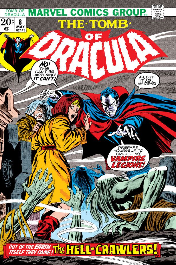
This set-up reminds me of Village of the Damned, that truly disquieting film where time stops in a quaint village and nine months later a cadre of identical blonde babies arrive.  They grow up into sinister children who delight in murder via telepathy and wearing blonde wigs.  It's also reminiscent of those Simon-Kirby kid gangs of yore.  The killer Boy Commandos in Tomb don't wear wigs and they don't engage in any witty repartee, but they do sport some eerie glowing eyes as they silently and relentlessly pursue our heroes.  They do such a good job of it, the story stretches into Tomb of Dracula #8 (April 1973), which has a John Buscema cover.

Getting back to Edith.  Since we've already covered Edith's final moments, let's take a look at her first.


I'm going to assume she works at the chemist (that's "pharmacy" or "drugstore" to us colonials) Colan draws her leaving.  Gosh, it sure is cold.  I hope she gets home all right...


Oops!  No such luck.  Yes, she is the book's jeopardy queen.  Still, a bash in the face is better than a bite on the neck when you're dealing with the undead, and it's Edith Harker's good luck to have come face-to-face with the boss of them all and come away with only a bruise.  Dracula seems kind of a quitter here, though, doesn't he?  Edith's wearing one measly little cross.  Where is Dracula's amazing hypnotic gaze to make her take it off so he can feed on her?  It takes him about two seconds to enthrall those kids.

Speaking of which, here they are:


It looks as though someone at Marvel did a really clumsy art touch-up on Dracula's head in the fourth panel.  The face is Colan/Palmer, but the wonky perspective on the forehead (the widow's peak is turned a few degrees from where it should be both vertically and horizontally and there's no foreshortening despite the slightly low-angle view of Dracula's head) and the hair texture look completely alien.  Why?  Maybe the page passed through the inking and lettering stages with the top balloon coming out too large and covering too much of Dracula.  The editor decided we needed more of Dracula's head in there, which meant reducing the balloon and getting someone on staff to touch up the missing areas.  Just speculating about a hypothesis, but it also looks as if someone mistook Dracula's left hand for one of the background trees and colored it brown as a result.

Here's one of the most disturbing aspects of vampire lore-- the corruption of innocence.  Stoker used this is a major theme in his novel, and Wolfman picks up on it.  In Stoker's book, Dracula's first victim is the virginal Lucy Westenra, the ideal of proper young womanhood in the Victorian Age.  By the time Dracula is through with her, she's feeding on babies in a parody of nurturing motherhood.  Wolfman's Dracula will stop at nothing in his quest for power or whatever he holds as his ultimate goal and a bunch of boys become his weapons.  They're very effective, surprisingly so.  They chase Frank and company right out into the night and trap them in an old-fashioned car and there's not a thing anyone can do about it.

In fact, the hypno-kids do such a fine job of taking Dracula's enemies out of the fight, he finally has a little leisure time on his hands.  The next issue (nicely inked by Ernie Chan-- credited as Chua thanks to a bureaucratic screw-up on his immigration documents) sees Dracula using this free time to recruit some even more sinister allies, a lot of moldy vampires.  I think he should have stuck with kids.  Imagine Dracula getting himself on TV, perhaps taking one of those horror movie host jobs, or showing up at a station where they do one locally and beaming his powers across a wider area, ensnaring hundreds, perhaps thousands, of children and turning them against the adults.  Kind of like Halloween 3, but without that Silver Shamrock rhyme to get into your mind and stay.  And stay.  AND STAY.

And here's where it turns out I owe Edith Harker something of an apology.  She first appears as a typical damsel in distress, and goes out that way as well.  But she gets to come to the rescue herself at least once before Dracula and dear old dad put an end to her once and for all.

And here she is:


You go, Edith!  Sorry they didn't get your hair color right in this, your shining moment.

Sunday, October 13, 2013

October is Spookey Month: Star Trek #19 in which a space criminal is frightened into incontinence...

The original Star Trek series sometimes combined science fiction with straight up horror, maybe softened a bit by a little dialogue about an "energy source" that creates whatever magic Kirk, Spock and the rest come up against.  But the idea was still using the old cliches to fill fifty minutes worth of story without being so obvious about it.  The very first episode to air, "The Man Trap" (September 8, 1966), featured a "salt vampire" that was pretty much just a version of a regular vampire story dressed up a little for a futuristic setting.  The crew met a witch in "Catspaw," written by Psycho author and H.P. Lovecraft protege Robert Bloch.  It ran just in time for Halloween (October 27, 1967, to be exact) and came complete with a black cat and a gothic castle.  And let's not forget "Wolf in the Fold" (December 22 the same year), also written by Bloch.  That's the one where we find out Jack the Ripper was possessed by some kind of immortal, incorporeal entity that feeds on fear.  When it gets into the ship's computer and starts screaming "RED JACK!  RED JACK!" over the intercom, Trek for the first time managed to scare me silly.  Even reading the James Blish short story adaptation of that particular episode frequently gave me the willies, the heebiejeebies, the whimwhams or small pox.


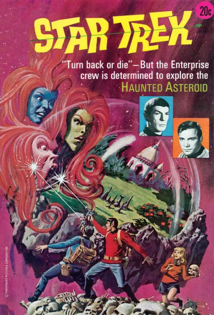
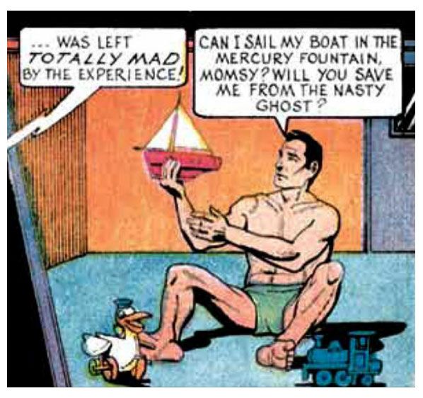
The Gold Key Star Trek comic adds ghosts to the mix in #19 (July 1973) , where (according to Comixology at least) writer Len Wein-- of all new, all different X-Men and Swamp Thing fame-- presents our daring space explorers with a supposedly haunted asteroid where something fearful dwells.  How fearful?  So fearful that after encountering it, this poor guy reverts to childhood and has to wear diapers for the rest of his life:


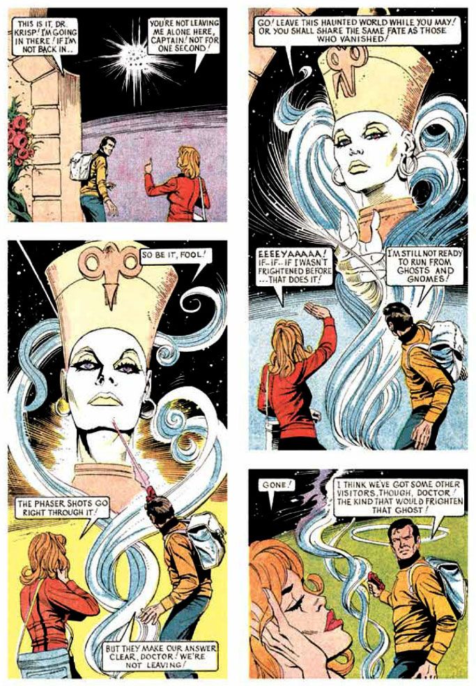
Because Starfleet favors the empirical over the metaphysical, the Enterprise warps to the asteroid for an investigation.  Kirk's old Academy pal Jay Nordyke goes down and comes back with selective amnesia.  Hypnotic regression reveals he's erased from his memory a horrifying encounter with a ghost.  At least he can still function as an adult.  Kirk, Spock, Sulu and some others beam down to check things out and gamble they're mentally tough enough to stay grown ups and in control of their bowels no matter what they face.


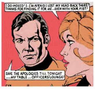
Aiding the ghostbusting is Dr. Krisp (first name Cookie) who, despite wearing a smart black skirt, proves a bit shaky in the field.  She and Kirk get down... to business (get your mind out of the gutter, please) and solve the mystery.  It turns out it's more science than supernatural, a variation on the old Scooby Doo, Where Are You? ploy of someone pretending to be a ghost to frighten people away when we all know that would only attract hordes of macho jackasses with night vision video cameras and heat signature detectors and a whole lot of pseudo-scientific bullshit to run around shouting at the walls for SyFy.


By borrowing heavily from the story of the Taj Mahal, Wein does a sweet job of setting up and then explaining the mystery.  There are some characteristically goofy moments because it's Gold Key, like hardened space travelers trained in scientific observation screaming "zombies" when what they're looking at is patently something else with which they should be very familiar given the Federation's technology.  And I love Alberto Giolitti's off-model artwork.  He sometimes all too obviously uses photo reference for some portrait-style panels, but most of the time it just seems like he had only the vaguest idea about the property he was working on.  As a result, a few things have been lost in translation, but a lot of charm has been gained.  Giolitti's art has its own Giolittian flavor, kind of fusion cuisine, some Trek, a side of Flash Gordon, a liberal dollop of European comics.  In the end, it proves a deliciously satisfying yet wild stew of different ingredients.  The exterior of the mausoleum looks Mughal, the interior gothic, the costumes strictly Ancient Egyptian.  At the same time, that's not too far from what the show itself used to do, where the set and costume designers seemed to lean on whatever was available in the prop and wardrobe departments at Desilu.

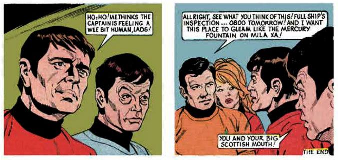
The ultimate solution is a surprise, but it fits the evidence and it's also made of stuff that's very familiar to Trek fans, so we'll accept it.  Or not.  That is to say, I'm fine with it but you'll have to make up your own mind.  This sets up a more traditional Star Trek dilemma where the crew now knows exactly what it's up against but still has to figure out how to escape an overwhelming power.  It helps that Sulu reveals himself to be a champion gymnast and Scotty a champion weightlifter.  I've always considered myself a solid Trekker, but I can't for the life of me remember either man possessing those skill sets.  I know Sulu is an expert fencer and botanist, and that Scotty can drink anyone under the table be it Klingon or godlike evolutionarily advanced super-being.  Neither of those apply here.

And what is it Kirk is good at, better than any other man?


Being a hard ass.

Sunday, October 6, 2013

October is Spookey Month: Uncanny X-Men #96 in which the X-Men meet H.P. Lovecraft or a version thereof...

What is your favorite Halloween fright creature?  Is it the ever-popular vampire?  The werewolf?  The ghost?  The demon?  How about the demon who's a riff on H.P. Lovecraft's whole "Old Ones" mythology?  I can't even pretend to understand Marvel's cosmology or theology, but if we're to believe "Night of the Demon" from X-Men #96 (December 1976), we are dealing with a universe where Lovecraftian analogues co-exist with gods and demi gods from just about every religion past and present alongside science both ordinary and extraordinary.

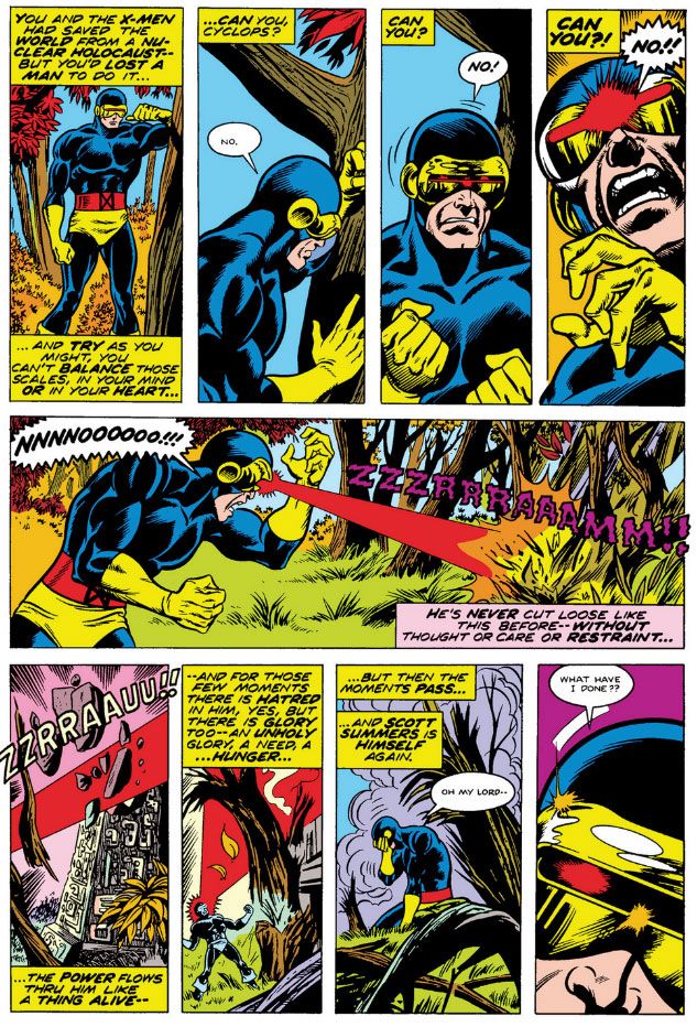
Our story opens on a lovely fall day with text-heavy narrative captions floating in the air.  This is a seasonal tradition in upstate New York, from what I understand.  They do help Chris Claremont establish mood, and the first couple of pages are all about mood.  Guilty over his role in teammate Thunderbird's death in the previous issue, Cyclops broods alone in the woods near the X-Mansion.  The setting proves aptly symbolic:  the recently deceased Thunderbird and the crunchy leaves combine to produce not a winter but an autumn in Cyclops' soul.  Also, it's September, which is close enough to Halloween for our purposes.  Penciller Dave Cockrum and inker Sam Grainger conjure up a tasty forest setting, aided by a crackerjack coloring job by Phil Rachelson.  You can almost hear the wind through those crisp red and orange leaves and feel the dry air.  Then Claremont taunts poor Cyclops so much, the man loses control of his optic blasts.  Cyclops accidentally decapitates an ancient obelisk-shaped cairn with indecipherable hieroglyphics carved on its sides.

This suave move-- I'm wondering how far Cyclops' eye-blasts travel before their energy or force dissipates enough to be harmless to anyone unlucky enough to be caught by one of his indiscriminate outbursts-- frees a demon from a type called "N'Garai" (Claremont was always fond of apostrophes in his monster/demon/alien species names).


The cairn itself is kind of an oddball element.  Sure, Claremont has to introduce this issue's enemy somehow.  It's just hard to suspend disbelief such a spectacular artifact would be undiscovered so close to the X-Mansion.  There must be county roads or even an interstate or something similar running nearby, too.  Plus, this thing is supposed to be thousands of years old.  You can't tell me a hunter, hiker, birdwatcher or Cub Scout pack hasn't stumbled across it before now, with a horde of archaeologists following soon after.  And to have Cyclops blast it open at random stretches belief to the breaking point, even for a book where we have a blue-furred teleporter running around.  But it's in the story, and we all know the gang at Marvel was simply working from reports submitted by the actual superheroes they published comics about, so it must have happened in exactly this way.


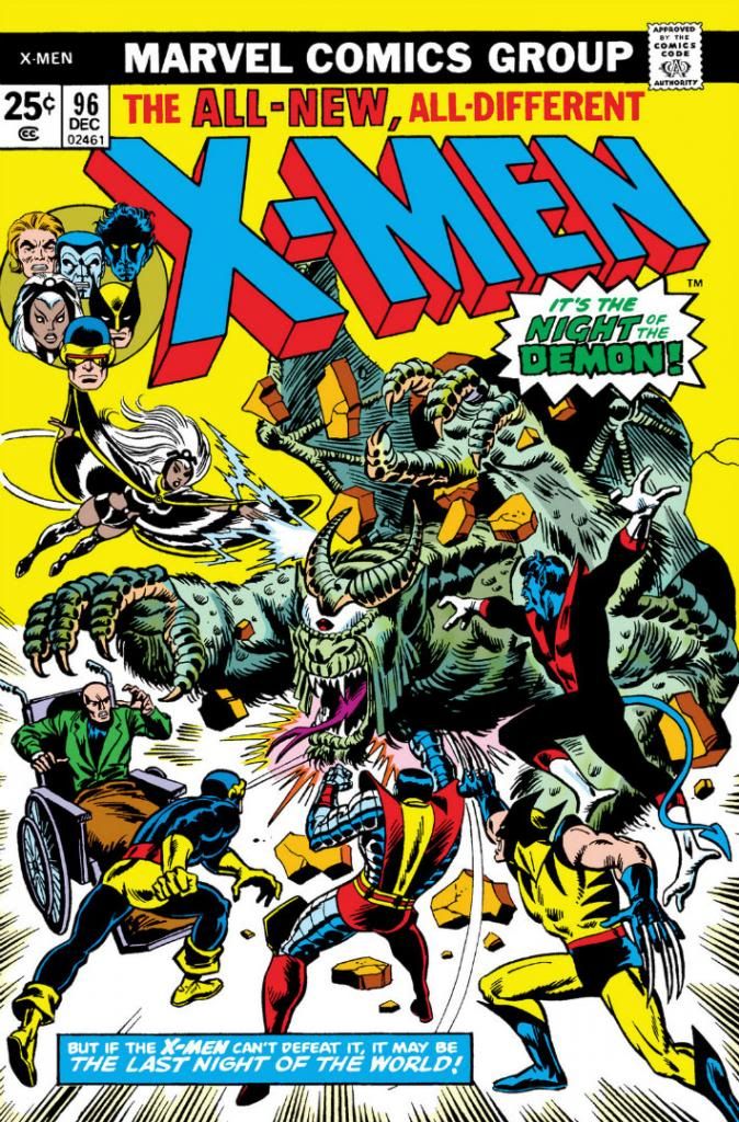
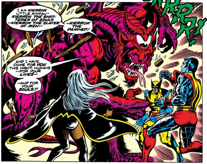
The boss N'Garai is a bat-winged, shaggy, one-eyed dude named Kierrok, and he burst through the mansion's wall like the Kool-Aid Man on a PCP rampage.  As a bit of side trivia, his name is an in-joke because he's portrayed by none other than William Shatner himself in a spectacular costume of someone's design. 

Someone?  I can't say who gets credit as creature-creator here.  Marie Severin and Sal Buscema drew the rather hectic cover instead of Cockrum, and no one has ever told me why.  I read in Comic Book Artist magazine many years ago how Stan Lee used to demand all monstrous enemies be humanoid in appearance to the point where he had Severin re-pencil a dog-like beastie originally drawn by Neal Adams, even if it meant the stupid thing was too big even to stand upright thanks the confines of the page layout.  There may have been a similar situation here, with editorial deciding not to use Cockrum's original design because it didn't fit the Marvel anthro-centric standard.  As you can see, there's also a slight continuity mistake thanks to the cover/interior art duties split.  On the cover, Kierrok is mean and green and pretty far between, but in the story he's kind of reddish or magenta.

Whoever designed him and whatever his color, inside the book Cockrum makes damned sure this nutty Kierrok creature can not only stand on a couple of muscular legs, but also flail about.  Kierrok tosses the heroes around like a big brother lumbering into a little kids' pretend wrestling match.  He also drains their powers and makes Wolverine frown as if he's an offended Sunday School teacher out of some Mark Twain book.  Tom Sawyer, perhaps.  What I love about Kierrok isn't so much that he gives the X-Men all sorts of trouble, but the way he insists in perfect English he's not likely to suffer defeat.  He's like a three-way cross between the Mugatu from Shatner's cult-fave series Star Trek, one of those body-suit Muppets and an enraged pro wrestler in an after-match interview.

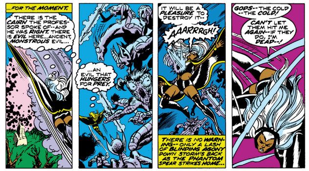
As far as I can tell, this is where Claremont starts making his reputation for writing strong women (mostly justified, with caveats extensively covered elsewhere), because Storm comes into her own in this issue.  While the X-Men first attempt to deal with Kierrok one at a time-- which really makes their team training exercises seem useless or Cyclops even a worse leader than he thinks he is-- it takes Storm to shut the magic gateway between our world and wherever it is the N'Garai come from.  While Storm braves the demon hordes alone and also fights off a flashback to her childhood, the male X-Men apparently huddle around Professor X and pray for salvation.


Oh yeah, dig those crazy demons.  They look like something out of Disney's "Night on Bald Mountain" Fantasia sequence.  Cockrum keeps the mayhem contained within some tight, narrow panels that emphasize Storm's ever-growing claustrophobia.


We all know Wally Wood and Gil Kane influenced Cockrum's art.  Well, there's one panel that I swear looks like Cockrum and Grainger channel a little Kane.  Maybe it's Cockrum's choice of camera angles and Storm's clutching hand, both of which are very Gil Kane-like, or the way Grainger inks the demon's scaly texture and Storm's face.  On the other hand, the rest of the drawing elements seem less like Kane, like the double lines on Storm's knuckles and the hatching on the demon's bicep and under Storm's arm.  If Cockrum had chosen a full-figure pose for Storm and the cairn below her in the background, we could blow this image up into a pretty cool cover for this issue.

At this point-- because we only have about a page left before the comic ends-- Storm shrugs off the smoke demons and puts the finishing touch on the events courtesy of a huge lightning bolt.  And so concludes an action-packed one-off that falls one Innsmouth denizen shy of being a full-blown "Cthulhu Mythos" tale.

Claremont and Bill Mantlo share plot credit here, so it's difficult to know who came up with all these events.  The overall characterization and quick flashback to Storm's childhood scream Claremont, but the way Kierrok lumbers into the story without any foreshadowing or much of a set-up is generic comic book stuff that could be by anybody.  I don't know if Mantlo had a Lovecraft fixation-- I can't find much evidence of it in his Micronauts work-- but if you've read Giant Size Dracula #2 (September 1974), you've already encountered Claremont's appropriation of Lovecraftian elements.  That story pits our favorite vampire against a cult led by an Elder God-worshipping demon or warlock or warlock-demon named... wait for it... Y'Garon. 

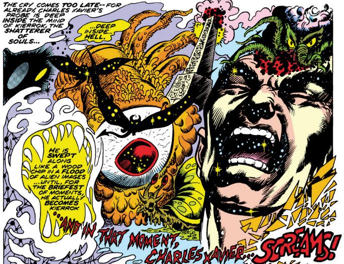
This isn't a criticism by any means.  After all, just about everyone working in creepy genre fiction, film or art cribs from Lovecraft at some point.  Robert E. Howard, Robert Bloch, Stephen King, H.R. Giger, Sam Raimi, Mike Mignola (who does it best, as far as I'm concerned), Frank Sinatra (remember his his hit song, "Fly Me to Yuggoth?"), Tony Bennett, Alan Alda.  I've read Lovecraft's stories dozens of times and enjoy them, but to paraphrase Kurt Vonnegut, "If only he could write!"  Claremont's writing might have some cloying tendencies at times (especially in his post-John Byrne Uncanny X-Men era), but even at his wordiest he's never as awkward as Lovecraft and his rhythms and modern vernacular are much more appealing.  Mix the two writers together and you get Professor X doing a mindmeld and falling straight into the Necronomicon.


Yep.  Ph'nglui mglw'nafh Cthulhu R'lyeh wgah'nagl fhtagn!  Eyeballs, tentacles, winged creatures that fly through the void between planets, geometries unknown on earth.  That's Lovecraft all over, but "... and in that moment, Charles Xavier... screams!" is pure Chris Claremont.

We're not through with the N'Garai by any means.  They make a reappearance a few years later in a story that borrows even more heavily from a more contemporaneous horror source, this time a little movie called Alien.  We'll discuss that in our next installment.

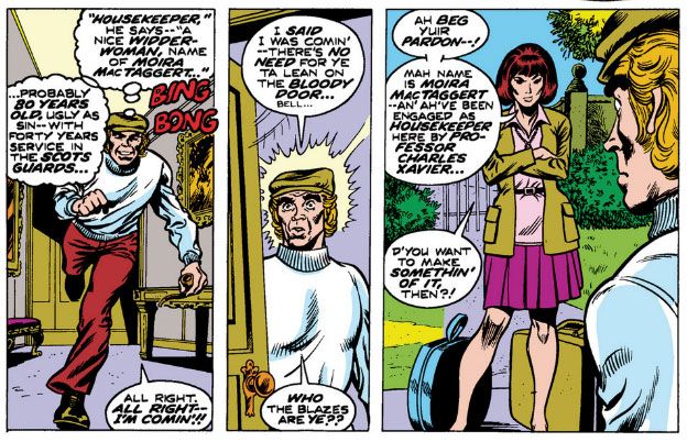
Now I'll share with you my favorite part of this comic.  It has to do with yet another of those strong women, for this is also the issue that introduces Professor X associate Moira MacTaggert, who will play an increasingly important role in stories to come.


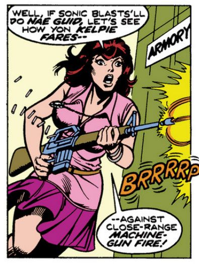
That's some advanced Irish-Scottish stereotype-speak, Marvel-style!  All that's lacking is an argument about whether or not leprechauns eat haggis.  She may not have powers, but does Dr. MacTaggart have the toughness to hang with the X-Men?  Check this out:


She does what none of those highly-trained military dudes at our Valhalla Mountain NORAD command could manage in X-Men #94, firing from the hip, no less!  And all at once we have an exciting addition to the cast and we know never to mess with her.