
Painted Amazing Fantasy, huh? What about the original line work?
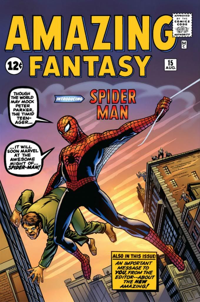
Recolored, by gum! Did they do the same for the interior art?
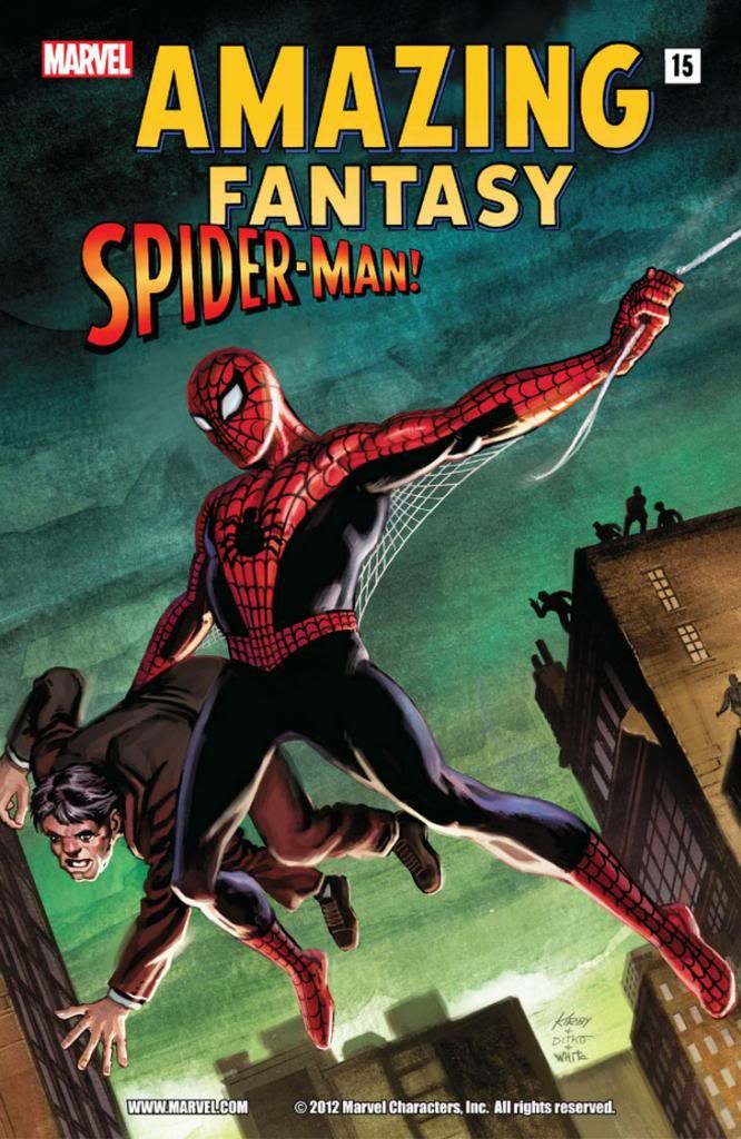
Yep! This isn't the worst recoloring job I've seen, but it's a bit too intense and the computer-generated smoothness of the gradients and color modeling (to create an illusion of roundness and depth) doesn't mesh with Steve Ditko's rough hewn finishes. Ditko's treatment of anatomy was expressionistic and unique. He wasn't trying to recreate the world in any kind of photorealistic way. It's better to just leave it alone rather than try to interpret it with a lot of extra tones where you can only conflict with it or else muddy it up. We also don't really need some latter-day color artist's impression of an artistic treatment of foliage in the trees. Big open areas were good enough for Ditko; they're good enough for you.
On the other hand, just because something was originally printed with 100% magenta/100% yellow* to make red, or 100% red (depending on the inks used-- I worked for a newspaper that ran cyan, magenta, yellow and blue in its four-color printing process, but some substitute true red in there, and you have to adjust accordingly) doesn't mean the reprint has to follow suit. When Marvel's reprints do that, on glossy, slick paper, the end results are often hideous, from the early days when color palettes relied largely on primary and secondary colors and even on material from the mid- to late-1980s, when the company's colorists apparently had a love affair with magenta, purple and big untouched areas.
The old schoolers needed that intensity because the paper was low-grade newsprint. The press workers don't seem to have put much effort into registering the plates, so you ended up with floating reds or yellows or blues and characters with apparent milk mustaches. Or pages that looked as if they were intended to be read with 3D glasses. The paper wasn't even white. It was slightly gray, and it yellowed or browned pretty quickly in direct sunlight. Marvel covers from the time tend to flake or chip, as well. These comics weren't intended as museum pieces or to compete visually with National Geographic. Steve Ditko probably had no idea people would still be reading this book more than fifty years after he drew it, much less on archival paper or digitally. Who could have foreseen that?
Well, now that we're reading comics on computers we're free from all those limitations. But companies with deep back catalogs need to balance the sweet nostalgia of the historical with the flaw-fixing capabilities of modern technology. Use naturalistic colors if you want, but mostly just try not to compete with what better artists than yourself did. If you can't match the artist's intent, at least try not to compete with it or obliterate it. You can make it look brand new to a certain extent, but above all, color restoration has to preserve the clarity of the original artwork. Don't cover it up with a lot of extraneous visual noise or someone else's interpretation of anatomy or form.
Especially avoid going nuts like with some of the Neal Adams reprints I've seen in recent years where digital painting on top of the original inks has just covered them or rendered almost all the values the same-- some of those went from gorgeous to absolute mud.
*My original 50/50 formulation would have made "pure" orange, not red. That's what being out of the game for over a decade will do to ya...
No comments:
Post a Comment