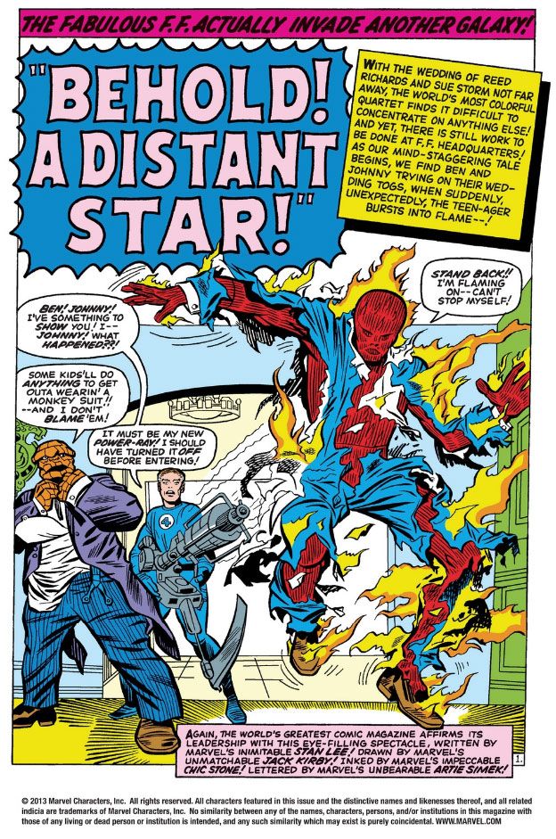
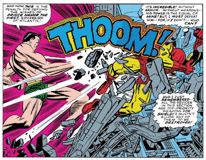
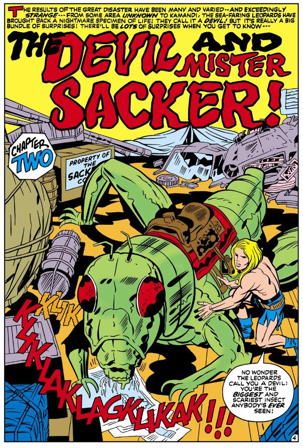
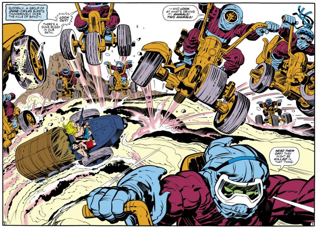
August 28th, Jack Kirby's birthday. It should be a national holiday.
Thursday, August 28, 2014
Wednesday, August 27, 2014
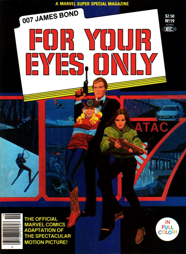
Marvel's Marvelous Movies #8: For Your Eyes Only (Marvel Super Special #19, June 1981)
For your eyes only, can see me through the night
For your eyes only, I never need to hide
You can see so much in me, so much in me that's new
I never felt until I looked at you
--Sheena Easton
Bond. James Bond. I've read many of Ian Fleming's books, I own Sean Connery's films on Blu-Ray (except the silly Diamonds Are Forever, which has never appealed to me beyond a few moments here or there involving Wint and Kidd) and I even own a 12-inch Connery doll. He's in a nice black pullover sweater and matching slacks, the way he appeared in Goldfinger, a film many (myself included) consider the series' 1960s apex, although I'm slowly being swayed by the growing From Russia With Love heresy and I get my biggest kick from Thunderball.
Roger Moore was the big screen Bond when I was a kid and teenager, and looking back, I don't remember being as excited about a Bond flick as I was for For Your Eyes Only, which promised to bring James Bond back to earth after his over-the-top space adventure in Moonraker. It was supposed to mark a return to the series' earlier, glory days when Bond relied on his physicality more than Q's inventions and those of the special effects team. A more "realistic" Bond.
Of the two, I still prefer the over-the-top Moonraker. It was the reason I was so excited about this new Bond, because Moonraker had blown me away when I saw it with my parents one New Year's Eve. Wow! Zow! Moonraker has space! John Barry! Shirley Bassey! Jaws in love!
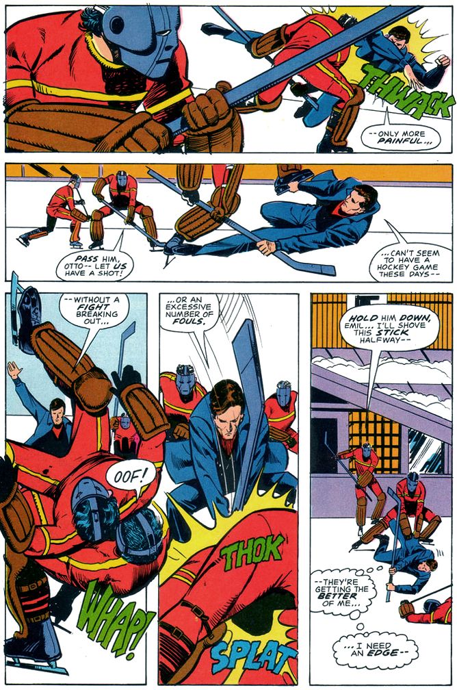
What does For Your Eyes Only have? A visual style on par with a particularly well-made episode of Magnum, P.I. A creepy subplot where an underage ingénue makes moves on a Bond who appears positively grandfatherly by contrast. Carole Bouquet, a woman I consider the most glacially lovely Bond girl, but completely lacking in chemistry with Moore. Their low-energy romance comes across as something both actors have to endure rather than the cheerful hedonism we've come to expect from Bond couplings. Slapstick fights and chase scenes, the former featuring a hockey team, the latter on skis. The reliance on so much comedy really undermines the supposed return to realism, especially with Moore's increasingly detached portrayal of the famed super spy as a character content merely to stroll onto the set after his stunt double takes a pounding then offer a quip or a pun. At this point, Moore seems to have settled on the idea Bond's role is to point out for the audience in as placid a manner as possible the absurdity of all these busy little people putting forth so much effort over some preposterous gadget or other. And then to get a manicure or a relaxing massage.
But it also has Marvel Super Special #19 (June 1981), written by Larry Hama and penciled by Howard Chaykin.
These two make an ideal team for doing James Bond's more "realistic" escapade chasing after a lost code machine wanted by everyone's favorite Cold War enemies, the Soviets. Remember them? They're still around, just under a different name.
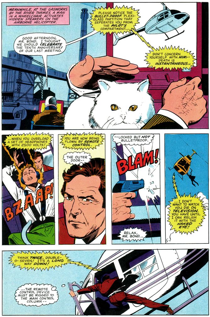
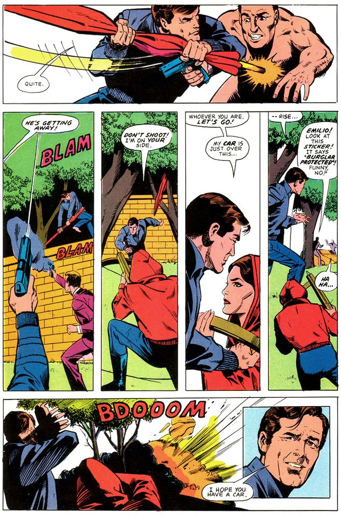
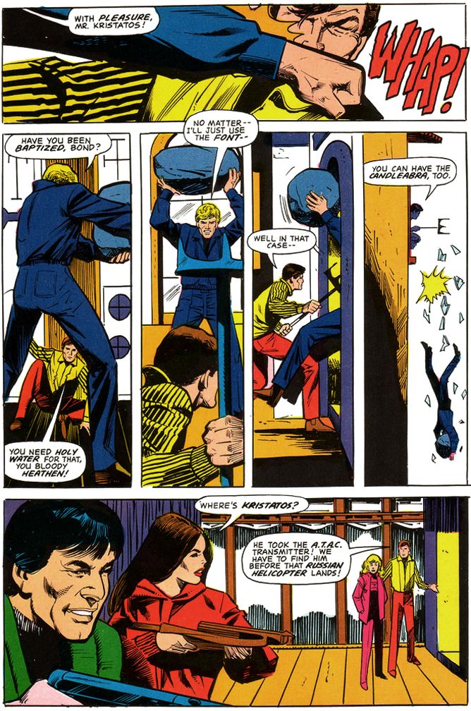
Hama largely eschews the caption-heavy approach of previous film adapters for a tighter focus on action and dialogue. Hama even includes Moore's little quips, with Chaykin emphasizing most of them with inset close-ups that match Moore's tongue-in-cheek Bond portrayal. This makes for a fast-paced read that provides some much-needed energy to the familiar Bond schtick. Chaykin draws some mean fight scenes, too, chopping the action into small vertical panels within pages opening and closing with larger establishing shots and you don't have to worry about spotting a stunt-Bond. This gives them added verisimilitude. Chaykin's page designs are top-notch throughout. Bursts of panels that read fast when Bond leaps into action, then large panels that allow us to savor the ritzy locales and beautiful people. Roger Moore in particular appears made to become a Chaykin hero, and while the artist doesn't spend a lot of time with the bikini girls in the early going, his Carole Bouquet is worth spending time with as you zip along between the chases and underwater fights.
If ever I wanted a late period Moore Bond transferred from the big screen to the pages of a comic book magazine-- and I did and still do-- I'd pick Hama and Chaykin to do the honors once again.
Ah, and Vince Colletta. His inks here are adequate, the comic book equivalent of director John Glen's workmanlike take on the movie's James Bond festivities. Glen's lack of visual panache means there's nothing distinctive about the look of the films in this Bond era (the films are in focus, they're clearly lit and the camera doesn't jitter all over the place, so there's that), and Colletta similarly gives us some clean lines if little else, and still allows some of Chaykin's distinct eyebrows and facial constructions to bleed through. Without having seen Chaykin's original pencils, I can't tell if Colletta used his eraser more than he did his brushes this time out, but some of the backgrounds remain featureless voids, and others are rendered minimally. This in itself isn't a necessarily wrong, because simplicity in art can be a virtue, but with the colorist simply leaving so much of it white-- you know, possibly because there's so much ice and snow due to the ski resort setting-- there's something a little skimpy about the finishes. So, much like director Glen's bland framing of events and the movie's photography, the inks and colors do the job, if not in an especially memorable way.
After reading this, I think it would have been an entertaining book if Marvel had sprung for the license and had Hama pen a monthly Bond. As it stands, Marvel would take one more crack at Bond and we'll be taking a look at that one as well. Of course I bought it despite my disappointment with For Your Eyes Only, because, as you now know, I'm a Bond enthusiast.
For your eyes only, I never need to hide
You can see so much in me, so much in me that's new
I never felt until I looked at you
--Sheena Easton
Bond. James Bond. I've read many of Ian Fleming's books, I own Sean Connery's films on Blu-Ray (except the silly Diamonds Are Forever, which has never appealed to me beyond a few moments here or there involving Wint and Kidd) and I even own a 12-inch Connery doll. He's in a nice black pullover sweater and matching slacks, the way he appeared in Goldfinger, a film many (myself included) consider the series' 1960s apex, although I'm slowly being swayed by the growing From Russia With Love heresy and I get my biggest kick from Thunderball.
Roger Moore was the big screen Bond when I was a kid and teenager, and looking back, I don't remember being as excited about a Bond flick as I was for For Your Eyes Only, which promised to bring James Bond back to earth after his over-the-top space adventure in Moonraker. It was supposed to mark a return to the series' earlier, glory days when Bond relied on his physicality more than Q's inventions and those of the special effects team. A more "realistic" Bond.
Of the two, I still prefer the over-the-top Moonraker. It was the reason I was so excited about this new Bond, because Moonraker had blown me away when I saw it with my parents one New Year's Eve. Wow! Zow! Moonraker has space! John Barry! Shirley Bassey! Jaws in love!
 |
| Script: Larry Hama/Pencils: Howard Chaykin/Inks: Vince Colletta |
What does For Your Eyes Only have? A visual style on par with a particularly well-made episode of Magnum, P.I. A creepy subplot where an underage ingénue makes moves on a Bond who appears positively grandfatherly by contrast. Carole Bouquet, a woman I consider the most glacially lovely Bond girl, but completely lacking in chemistry with Moore. Their low-energy romance comes across as something both actors have to endure rather than the cheerful hedonism we've come to expect from Bond couplings. Slapstick fights and chase scenes, the former featuring a hockey team, the latter on skis. The reliance on so much comedy really undermines the supposed return to realism, especially with Moore's increasingly detached portrayal of the famed super spy as a character content merely to stroll onto the set after his stunt double takes a pounding then offer a quip or a pun. At this point, Moore seems to have settled on the idea Bond's role is to point out for the audience in as placid a manner as possible the absurdity of all these busy little people putting forth so much effort over some preposterous gadget or other. And then to get a manicure or a relaxing massage.
But it also has Marvel Super Special #19 (June 1981), written by Larry Hama and penciled by Howard Chaykin.
 |
| Script: Larry Hama/Pencils: Howard Chaykin/Inks: Vince Colletta |
These two make an ideal team for doing James Bond's more "realistic" escapade chasing after a lost code machine wanted by everyone's favorite Cold War enemies, the Soviets. Remember them? They're still around, just under a different name.
 |
| Script: Larry Hama/Pencils: Howard Chaykin/Inks: Vince Colletta |
Hama largely eschews the caption-heavy approach of previous film adapters for a tighter focus on action and dialogue. Hama even includes Moore's little quips, with Chaykin emphasizing most of them with inset close-ups that match Moore's tongue-in-cheek Bond portrayal. This makes for a fast-paced read that provides some much-needed energy to the familiar Bond schtick. Chaykin draws some mean fight scenes, too, chopping the action into small vertical panels within pages opening and closing with larger establishing shots and you don't have to worry about spotting a stunt-Bond. This gives them added verisimilitude. Chaykin's page designs are top-notch throughout. Bursts of panels that read fast when Bond leaps into action, then large panels that allow us to savor the ritzy locales and beautiful people. Roger Moore in particular appears made to become a Chaykin hero, and while the artist doesn't spend a lot of time with the bikini girls in the early going, his Carole Bouquet is worth spending time with as you zip along between the chases and underwater fights.
If ever I wanted a late period Moore Bond transferred from the big screen to the pages of a comic book magazine-- and I did and still do-- I'd pick Hama and Chaykin to do the honors once again.
 |
| Script: Larry Hama/Pencils: Howard Chaykin/Inks: Vince Colletta |
Ah, and Vince Colletta. His inks here are adequate, the comic book equivalent of director John Glen's workmanlike take on the movie's James Bond festivities. Glen's lack of visual panache means there's nothing distinctive about the look of the films in this Bond era (the films are in focus, they're clearly lit and the camera doesn't jitter all over the place, so there's that), and Colletta similarly gives us some clean lines if little else, and still allows some of Chaykin's distinct eyebrows and facial constructions to bleed through. Without having seen Chaykin's original pencils, I can't tell if Colletta used his eraser more than he did his brushes this time out, but some of the backgrounds remain featureless voids, and others are rendered minimally. This in itself isn't a necessarily wrong, because simplicity in art can be a virtue, but with the colorist simply leaving so much of it white-- you know, possibly because there's so much ice and snow due to the ski resort setting-- there's something a little skimpy about the finishes. So, much like director Glen's bland framing of events and the movie's photography, the inks and colors do the job, if not in an especially memorable way.
After reading this, I think it would have been an entertaining book if Marvel had sprung for the license and had Hama pen a monthly Bond. As it stands, Marvel would take one more crack at Bond and we'll be taking a look at that one as well. Of course I bought it despite my disappointment with For Your Eyes Only, because, as you now know, I'm a Bond enthusiast.
Tuesday, August 26, 2014
Marvel's Marvelous Movies #7: Why was there never a M*A*S*H comic book, or an E.T. adaptation?
M*A*S*H aired its final episode on February 28, 1983, less than a year after Steven Spielberg's E.T. the Extra-Terrestrial opened to boffo returns on the big screen. These were both cultural phenomena at the time and yet neither inspired any comic book spin-offs beyond parodies in MAD and Cracked magazines.
Granted, a M*A*S*H comic book doesn't seem likely. Then again, the show itself didn't seem very likely, either. A thirty-minute sitcom set during the Korean War, premiering on network television as the divisive Vietnam War ground to its disappointing, confidence-shattering denouement? Gee, I hope they fired the doofus who came up with that idea!
The series began doing its best to match its big screen inspiration, Robert Altman's groundbreaking satire (at least by CBS-acceptable standards), but eventually became more serio-comic. Its position as a mainstream TV show in a time before cable meant M*A*S*H could never be quite as searing as some of us might have liked (unlike the movie, which openly and mercilessly mocked American traditional values like religion, patriotism and football). But the show still gave us pause for reflection between the laugh-track outbursts with occasional episodes where the doctors work around the clock to avoid being drowned in an ever-rising tidal flow of wounded young men then collapse, exhausted, in their bunks; in its blood-spattered operating theater (no laugh track during those scenes, remember); and even in the way Hawkeye, Trapper John and later B.J., pursue boozing and pranks as a way of maintaining at least a semblance of humanity in an inhuman situation.
War has long been an American comics staple, but I can't imagine anyone at either DC or Marvel managing to strike the balance between pathos and chuckles M*A*S*H at its finest managed, though DC seems to have given it some serious consideration. Still, in a world where Gold Key gave kids an exploding, earth-killing H-Bomb in its Beneath the Planet of the Apes one-shot, and Marvel put out comic book adaptations of movie musicals, I'm still shocked we never got a Marvel Super Special or Treasury Edition version of "Goodbye, Farewell and Amen."
After all, there were M*A*S*H dolls, for the love of Hotlips!
Okay, so maybe a M*A*S*H comic is an even worse idea than a Xanadu comic. But you can't tell me E.T. the Extra-Terrestrial didn't deserve an adaptation. With Marvel doing versions of just about every sci-fi flick out there, including ones that seem to defy your usual comic book storytelling techniques like Close Encounters of the Third Kind, which relied largely on internal conflict rather than fisticuffs and required artists Walt Simonson and Klaus Janson to come up with a new visual vocabulary for depicting photographic light effects with black linework and negative space and ordinary comic book coloring, the lack of an E.T. adaptation leaves a massive gap in the parade of Super Specials in the late 1970s and early 1980s. Its as if the Snoopy balloon burst just before the Macy's Thanksgiving Day Parade took off and they didn't know what to do without it so they just marched along and left Willard Scott and Connie Chung to fill in with banter during the dead zone.
Given their performance on Close Encounters, I'm going to stick my neck out there and declare Simonson and Janson would have done a bang-up job on E.T.
I remember searching the spinner displays and magazine racks all over town in the months following E.T.'s June 11, 1982, release date.
Nothing.
E.T. dolls, E.T. records-- including one narrated by Michael Jackson The New Rolling Stone Record Guide (1983 edition) eventually gave 5 stars (indispensable)!-- E.T. bubble gum cards, E.T. storybooks and infamous video game cartridges. E.T. everything. Except a comic book.
So confused was I that I even attempted an E.T. adaptation of my own, written in faux-Marvelese. I managed to do the first two pages. The way I remember it, there was a large top tier panel with E.T.'s spaceship descending from a starry sky. The pencil fill depicting night just about broke me, but I persevered. Beneath that were a couple of panels with E.T. and his space exploring buddies collecting samples. I partially concealed them with foliage not because I felt incompetent to draw them (obviously I felt more than capable, considering the hubris of even attempting something this idiotically grandiose), but because I made the conscious decision to ape the film's opening gambit of mystery and wonder. Quick cut on the second page to the government researchers rushing up and scattering the aliens every which way. I can't remember if I added narrative captions, but I do remember maintaining the government operatives' anonymous menace by framing their figures in such a way the panel rule lines chopped off their heads and other identifying anatomy. And I think I had one of them tersely refer to the Peter Coyote character-- the head guy with the keys-- as merely "the Man." I got as far as painstakingly copying from photo reference the image of a forlorn E.T. gazing down at the city lights, right before the film introduces Elliott and family.
That's right. It took me two pages to blast through the first five to ten minutes of the movie and I'm pretty sure most of those panels if I found them now would consist of an arm or a leg against a field of smeared graphite, and then a really large dialogue balloon with something stupid in it. Archie Goodwin I was not.
Those pages stayed in the top drawer of my desk at home (always meant to do more when I found the time) until we moved to a new house and I tossed them while trying to dump as much crap as I could to avoid having to pack it. I'd give almost anything to have them back. Maybe I'd even finish the remaining 46 pages or so.
Labels:
Alan Alda,
Archie Goodwin,
DC Comics,
E.T.,
M*A*S*H,
Marvel Comics,
Marvel Super Special
Monday, August 25, 2014
Rare copy of first Superman comic book fetches $3.2 mil at auction
Rare copy of first Superman comic book fetches $3.2 mil at auction
Yeah, that's a lot of money. I guess. I've always daydreamed about finding a mint copy of Action Comics #1 in the attic or basement. Actually, where I find it is the least important part of the daydream. The having it is the main thing. Comic book dealers Stephen Fishler and Vincent Zurzolo found their copy in an eBay auction, but they had to pay for it. Paying for it was never part of my daydreams. Before the auction, the comic resided comfortably in a cedar chest in West Virginia where it was protected from wear, tear, sunlight and moths. Comic book-eating moths. Some of the $3.2 million goes to the Christopher and Dana Reeve Foundation, which adds a further bit of niceness to this tale.
We're not yet certain how Fishler and Zurzolo will handle their joint ownership. Early reports suggest Fishler will have the comic Mondays, Wednesdays and Fridays, while Zurzolo will have it Tuesdays, Thursdays and Saturdays. For Sundays, possession will be determined by a random number generator. Zurzolo will take digits 1 through 5 and Fishler will take 6 through 10. In the unlikely event of a zero, possession will be determined by a rock, paper, scissors competition, best three out of five.
Sunday, August 17, 2014
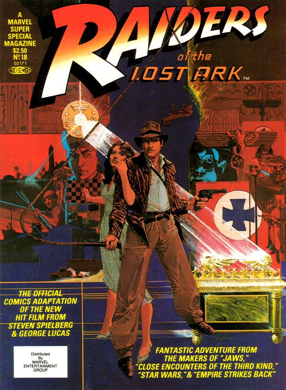
Marvel's Marvelous Movies #6: Raiders of the Lost Ark (Marvel Super Special #18, June 1981)
My friends and I were so in love with
Raiders of the Lost Ark we went to the theater one day in a group, bought
tickets for the first showing and stayed through the last. My memory says we saw Raiders six times that
day, but it may have been four. I don’t
remember feeling any viewer fatigue, just anticipation for each exciting
sequence. I knew what was going to
happen and I was thrilled to see it again.
And again.
Why didn’t they kick us out?
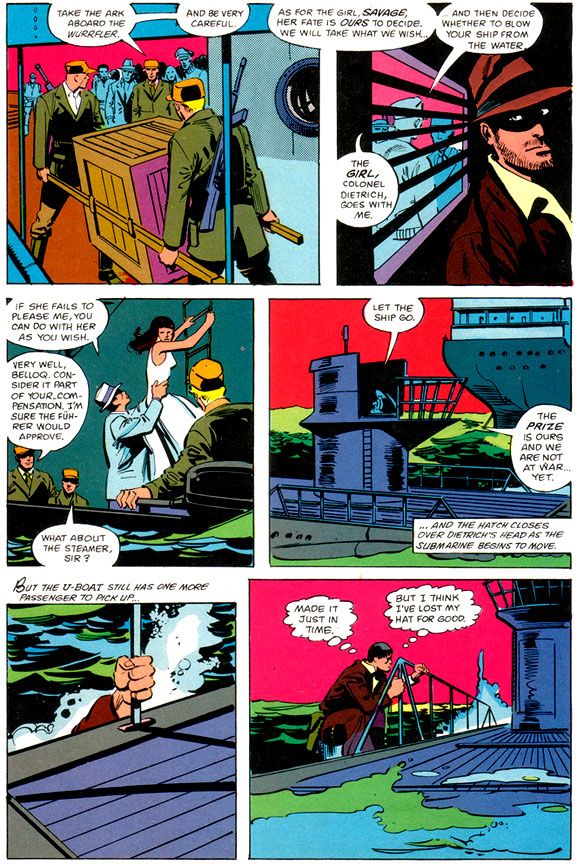
Unfortunately, the art doesn't provide the same kick. It was a big letdown when I opened this book outside the convenience store where I bought it despite its extravagant retail price, and I like it only slightly more these days. Make no mistake-- I'm a huge John Buscema fan, and despite the results here, I'm convinced he was a prime choice for penciling Raiders. If he'd had the time to do complete pencils or ink himself.
Here, Buscema provides breakdowns for Klaus Janson's finishes. Right off I'm not loving it, because this is not one of my favorite team-ups. Janson's inks superbly complement stylists like Simonson, and his work with Frank Miller is the stuff of comic book legend. I've never cottoned to his work with Buscema, especially loose Buscema. There's a clash of sensibilities and from that we don't get a charge of energy but simply awkwardness. Alfredo Alcala or Rudy Nebres would take these same pages and turn them into something akin to classic adventure book or pulp magazine illos. You'd lose a great deal of the Buscema surface while retaining the basic structure and it would look lush and refined, opulent like some of their crazy collaborations in Savage Sword of Conan. These are some of the few times one of Marvel's black and white magazines even comes close to competing with the best of Warren's gorgeous books.
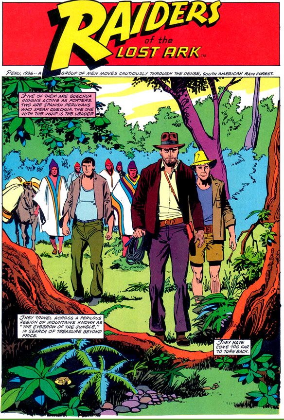
Buscema-Janson would work fine in the pages of The Amazing Spider-Man or on a Daredevil annual. Here, the edgy, ultra-modern finishes turn what should be a visual treat into a rather generic 80s superhero comic. From the opening splash where Indy and company just seem to be standing like mannequins in the jungle despite the best efforts of Simonson's captions, to the rather stark and uninvolving desert setting, there's a distinct lack of detail and texture.
Janson’s edgy inks simply lack the retro, Saturday matinee feel a Raiders comic absolutely demands. And when a scene calls for a little modest gore-- your odd impaled corpse here, your melting Nazi there-- Janson restrains himself and what we get is drab. Other panels seem strangely empty, even unfinished, with little detailing. Nazis wear uniforms devoid of badges, Captain Katanga's tramp steamer-- piratical in the film-- looks alarmingly clean. Blacks indicate light sources but do nothing for mood.
From what I understand, the people at Lucasfilm were pretty unhappy with this book as well.
After all, when you watch the movie, you feel the love both George Lucas and Steven Spielberg share for old serials, B-movies and even A-movie adventures with guys like Errol Flynn, Tyrone Power and Douglas Fairbanks, Jr. And classics like Casablanca and Treasure of the Sierra Madre with Humphrey Bogart. They add a contemporary self-awareness to genre thrills and of course, this approach paid off in gold. So much so, they ended up sparking a revival of the genre and I ended up watching all kinds of Raiders knock-offs in search of the same all-day thrills my friends and I stole from the Martin Four that summer day. High Road to China, Romancing the Stone, TV's Tales of the Gold Monkey, Bring 'Em Back Alive, Rubiks the Amazing Cube, Jake and the Fatman, Mama's Family, Pink Lady and Jeff...
Instead of something similar, something recalling adventure strips by the likes of Noel Sickles, Roy Crane and Milt Caniff, we get flourish-free late 70s/early 80s Marvel finishes that evoke nothing of the visual qualities or romance of either Raiders or those old movies. Where’s Charlton Heston or Cornel Wilde? There’s barely even any Harrison Ford. Marvel's Raiders has incident, but lacks atmosphere.
I’m left wondering what might have been if someone said, “Let’s do this in the spirit of the film. There’s no way we can get Milton Caniff himself, but let’s at least see if Alex Toth or Doug Wildey might want to take a crack at it.” Imagine the opening sequence with Toth's black-spotting and way with draping figures in heavy, moody shadows and evoking time and place. Toth probably would have turned Marvel down flat because of Indy’s rather ambiguous morality (or for some other reason peculiar to Toth’s outlook), but Wildey could have done something approximating the romanticism of classic adventure strips in his own style. Gray Morrow also would have gotten it. Marvel would later waste him on their Sheena adaptation, of all things, but a Raiders by Morrow with this Simonson script have been an instant classic.
And what about Al Williamson? There was a guy who could draw jungles and deserts. What about Howard Chaykin, who provides a wonderful painted Bob Peak-style cover?
Ultimately, however, I'm going to blame the book's lack of visual flare less on the artists and more on Marvel double-dipping on the artwork. My best guess is Buscema and Janson drew this based on the idea this would be printed as a regular monthly (check out Gene Day's killer Paul Gulacy-esque cover on Raiders monthly #1 for yet another example of how this comic should have rocked us), and when it came time to run the art larger for the Super Special format, it didn't translate. And Marvel cheaped out on the color job, too. These aren't the dreamy modeled or airbrushed tones we'd gotten used to in many of the previous Super Specials, even on movies that were outright stinkers. Jaws 2, Meteor and even poor Xanadu got lush painterly coloring. These colors read clean and they provide some nice contrast between foreground and background, but they're obviously meant to grace the garbage paper Marvel's books came printed on. A little heavy on the purples, pinks and magentas. A lot of Marvel monthlies around this time looked similar.
This should have looked different. Yes, I praised Janson's work with Dave Cockrum on their adaptation of Star Trek the Motion Picture (Marvel Super Special #15), and that had monthly book coloring and ran as regular format comic as well. But there the art is dense and detailed and provides a lot more of its own depth and atmosphere. The same is true of the Archie Goodwin/Williamson/Carlos Garzon Empire Strikes Back. Those books manage to feel deluxe when this feels knocked out in a hurry.
Reading it today, I find Raiders isn't as bad as I remembered. It's probably even better than I'm making out here, and I'm sure you can find its defenders online without much effort. It’s just we're talking a comic book based on Raiders of the Lost Ark. And it's a visual bore when it really cries out for some deluxe treatment or a little pre-production product conceptualizing. You know, "Hey, this material is pure joy! Here's our chance to do our own version of Terry and the Pirates!"
Why didn’t they kick us out?
When I bought this at the convenience store where I generally bought comics back in those days, my overwhelming impression was disappointment with Marvel Super Special
#18: Raiders of the Lost Ark. Maybe The Empire Strikes Back spoiled me by equaling or even surpassing its source material in many ways. Raiders seemed lackluster, kind of a knock-off product more than a celebration. Reading it again recently, I
like it a bit more.
And that like is based largely on Walt Simonson's smart and witty writing. I'm not sure what form of Raiders he was working from, some earlier version or the shooting script, but Simonson takes us through all the famous set pieces, condensing some to fit in as much of the film's action in swift strokes. There's no swordsman in the bazaar, and Indy's fight with that bald brawler of a Nazi lacks the original's grisly denouement. But even with the cuts, Simonson enriches our beloved archaeologist by filling us in on his wry thoughts. It's fun to see Indy run away from the natives, but Simonson gives us a little mental wisecrack to go along with it. Adapting isn't simply the cutting and pasting of the movie to fit on comic book pages. It helps if the writer, like Simonson, also shows a flare for language. Simonson does this not only with the quips and clever extrapolation of character, but also in the aftermath of the face-melting "wrath of God" sequence, where he drops a line that's reminiscent of Stephen King back when King was hungry, before he became a brand name. This is the kind of thing I love in a comic book adaptation of a movie, rather than an action-only, surface approach.
 |
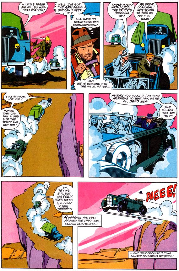
| Script: Walt Simonson/Pencils: John Buscema/Inks: Klaus Janson |
Unfortunately, the art doesn't provide the same kick. It was a big letdown when I opened this book outside the convenience store where I bought it despite its extravagant retail price, and I like it only slightly more these days. Make no mistake-- I'm a huge John Buscema fan, and despite the results here, I'm convinced he was a prime choice for penciling Raiders. If he'd had the time to do complete pencils or ink himself.
Here, Buscema provides breakdowns for Klaus Janson's finishes. Right off I'm not loving it, because this is not one of my favorite team-ups. Janson's inks superbly complement stylists like Simonson, and his work with Frank Miller is the stuff of comic book legend. I've never cottoned to his work with Buscema, especially loose Buscema. There's a clash of sensibilities and from that we don't get a charge of energy but simply awkwardness. Alfredo Alcala or Rudy Nebres would take these same pages and turn them into something akin to classic adventure book or pulp magazine illos. You'd lose a great deal of the Buscema surface while retaining the basic structure and it would look lush and refined, opulent like some of their crazy collaborations in Savage Sword of Conan. These are some of the few times one of Marvel's black and white magazines even comes close to competing with the best of Warren's gorgeous books.
Buscema-Janson would work fine in the pages of The Amazing Spider-Man or on a Daredevil annual. Here, the edgy, ultra-modern finishes turn what should be a visual treat into a rather generic 80s superhero comic. From the opening splash where Indy and company just seem to be standing like mannequins in the jungle despite the best efforts of Simonson's captions, to the rather stark and uninvolving desert setting, there's a distinct lack of detail and texture.
Janson’s edgy inks simply lack the retro, Saturday matinee feel a Raiders comic absolutely demands. And when a scene calls for a little modest gore-- your odd impaled corpse here, your melting Nazi there-- Janson restrains himself and what we get is drab. Other panels seem strangely empty, even unfinished, with little detailing. Nazis wear uniforms devoid of badges, Captain Katanga's tramp steamer-- piratical in the film-- looks alarmingly clean. Blacks indicate light sources but do nothing for mood.
From what I understand, the people at Lucasfilm were pretty unhappy with this book as well.
After all, when you watch the movie, you feel the love both George Lucas and Steven Spielberg share for old serials, B-movies and even A-movie adventures with guys like Errol Flynn, Tyrone Power and Douglas Fairbanks, Jr. And classics like Casablanca and Treasure of the Sierra Madre with Humphrey Bogart. They add a contemporary self-awareness to genre thrills and of course, this approach paid off in gold. So much so, they ended up sparking a revival of the genre and I ended up watching all kinds of Raiders knock-offs in search of the same all-day thrills my friends and I stole from the Martin Four that summer day. High Road to China, Romancing the Stone, TV's Tales of the Gold Monkey, Bring 'Em Back Alive, Rubiks the Amazing Cube, Jake and the Fatman, Mama's Family, Pink Lady and Jeff...
Instead of something similar, something recalling adventure strips by the likes of Noel Sickles, Roy Crane and Milt Caniff, we get flourish-free late 70s/early 80s Marvel finishes that evoke nothing of the visual qualities or romance of either Raiders or those old movies. Where’s Charlton Heston or Cornel Wilde? There’s barely even any Harrison Ford. Marvel's Raiders has incident, but lacks atmosphere.
 |
| Script: Walt Simonson/Pencils: John Buscema/Inks: Klaus Janson |
I’m left wondering what might have been if someone said, “Let’s do this in the spirit of the film. There’s no way we can get Milton Caniff himself, but let’s at least see if Alex Toth or Doug Wildey might want to take a crack at it.” Imagine the opening sequence with Toth's black-spotting and way with draping figures in heavy, moody shadows and evoking time and place. Toth probably would have turned Marvel down flat because of Indy’s rather ambiguous morality (or for some other reason peculiar to Toth’s outlook), but Wildey could have done something approximating the romanticism of classic adventure strips in his own style. Gray Morrow also would have gotten it. Marvel would later waste him on their Sheena adaptation, of all things, but a Raiders by Morrow with this Simonson script have been an instant classic.
And what about Al Williamson? There was a guy who could draw jungles and deserts. What about Howard Chaykin, who provides a wonderful painted Bob Peak-style cover?
 |
| Script: Walt Simonson/Pencils: John Buscema/Inks: Klaus Janson |
Ultimately, however, I'm going to blame the book's lack of visual flare less on the artists and more on Marvel double-dipping on the artwork. My best guess is Buscema and Janson drew this based on the idea this would be printed as a regular monthly (check out Gene Day's killer Paul Gulacy-esque cover on Raiders monthly #1 for yet another example of how this comic should have rocked us), and when it came time to run the art larger for the Super Special format, it didn't translate. And Marvel cheaped out on the color job, too. These aren't the dreamy modeled or airbrushed tones we'd gotten used to in many of the previous Super Specials, even on movies that were outright stinkers. Jaws 2, Meteor and even poor Xanadu got lush painterly coloring. These colors read clean and they provide some nice contrast between foreground and background, but they're obviously meant to grace the garbage paper Marvel's books came printed on. A little heavy on the purples, pinks and magentas. A lot of Marvel monthlies around this time looked similar.
This should have looked different. Yes, I praised Janson's work with Dave Cockrum on their adaptation of Star Trek the Motion Picture (Marvel Super Special #15), and that had monthly book coloring and ran as regular format comic as well. But there the art is dense and detailed and provides a lot more of its own depth and atmosphere. The same is true of the Archie Goodwin/Williamson/Carlos Garzon Empire Strikes Back. Those books manage to feel deluxe when this feels knocked out in a hurry.
Reading it today, I find Raiders isn't as bad as I remembered. It's probably even better than I'm making out here, and I'm sure you can find its defenders online without much effort. It’s just we're talking a comic book based on Raiders of the Lost Ark. And it's a visual bore when it really cries out for some deluxe treatment or a little pre-production product conceptualizing. You know, "Hey, this material is pure joy! Here's our chance to do our own version of Terry and the Pirates!"
Subscribe to:
Comments (Atom)

