
Why didn’t they kick us out?
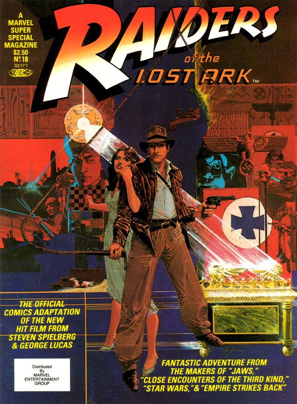
When I bought this at the convenience store where I generally bought comics back in those days, my overwhelming impression was disappointment with Marvel Super Special
#18: Raiders of the Lost Ark. Maybe The Empire Strikes Back spoiled me by equaling or even surpassing its source material in many ways. Raiders seemed lackluster, kind of a knock-off product more than a celebration. Reading it again recently, I
like it a bit more.
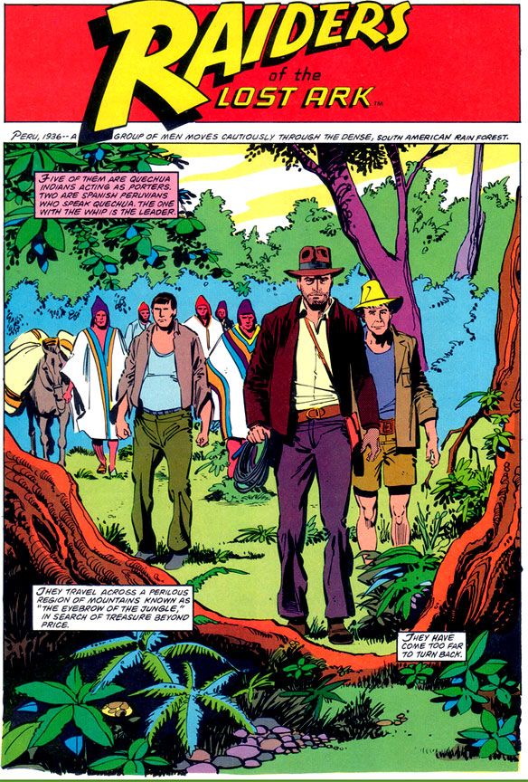
And that like is based largely on Walt Simonson's smart and witty writing. I'm not sure what form of Raiders he was working from, some earlier version or the shooting script, but Simonson takes us through all the famous set pieces, condensing some to fit in as much of the film's action in swift strokes. There's no swordsman in the bazaar, and Indy's fight with that bald brawler of a Nazi lacks the original's grisly denouement. But even with the cuts, Simonson enriches our beloved archaeologist by filling us in on his wry thoughts. It's fun to see Indy run away from the natives, but Simonson gives us a little mental wisecrack to go along with it. Adapting isn't simply the cutting and pasting of the movie to fit on comic book pages. It helps if the writer, like Simonson, also shows a flare for language. Simonson does this not only with the quips and clever extrapolation of character, but also in the aftermath of the face-melting "wrath of God" sequence, where he drops a line that's reminiscent of Stephen King back when King was hungry, before he became a brand name. This is the kind of thing I love in a comic book adaptation of a movie, rather than an action-only, surface approach.
 |
| Script: Walt Simonson/Pencils: John Buscema/Inks: Klaus Janson |
Unfortunately, the art doesn't provide the same kick. It was a big letdown when I opened this book outside the convenience store where I bought it despite its extravagant retail price, and I like it only slightly more these days. Make no mistake-- I'm a huge John Buscema fan, and despite the results here, I'm convinced he was a prime choice for penciling Raiders. If he'd had the time to do complete pencils or ink himself.
Here, Buscema provides breakdowns for Klaus Janson's finishes. Right off I'm not loving it, because this is not one of my favorite team-ups. Janson's inks superbly complement stylists like Simonson, and his work with Frank Miller is the stuff of comic book legend. I've never cottoned to his work with Buscema, especially loose Buscema. There's a clash of sensibilities and from that we don't get a charge of energy but simply awkwardness. Alfredo Alcala or Rudy Nebres would take these same pages and turn them into something akin to classic adventure book or pulp magazine illos. You'd lose a great deal of the Buscema surface while retaining the basic structure and it would look lush and refined, opulent like some of their crazy collaborations in Savage Sword of Conan. These are some of the few times one of Marvel's black and white magazines even comes close to competing with the best of Warren's gorgeous books.
Buscema-Janson would work fine in the pages of The Amazing Spider-Man or on a Daredevil annual. Here, the edgy, ultra-modern finishes turn what should be a visual treat into a rather generic 80s superhero comic. From the opening splash where Indy and company just seem to be standing like mannequins in the jungle despite the best efforts of Simonson's captions, to the rather stark and uninvolving desert setting, there's a distinct lack of detail and texture.
 |
| Script: Walt Simonson/Pencils: John Buscema/Inks: Klaus Janson |
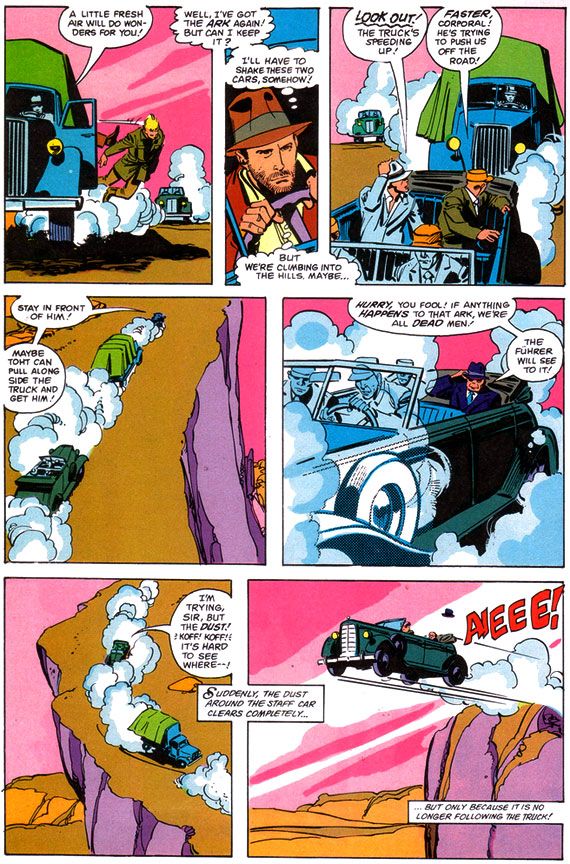
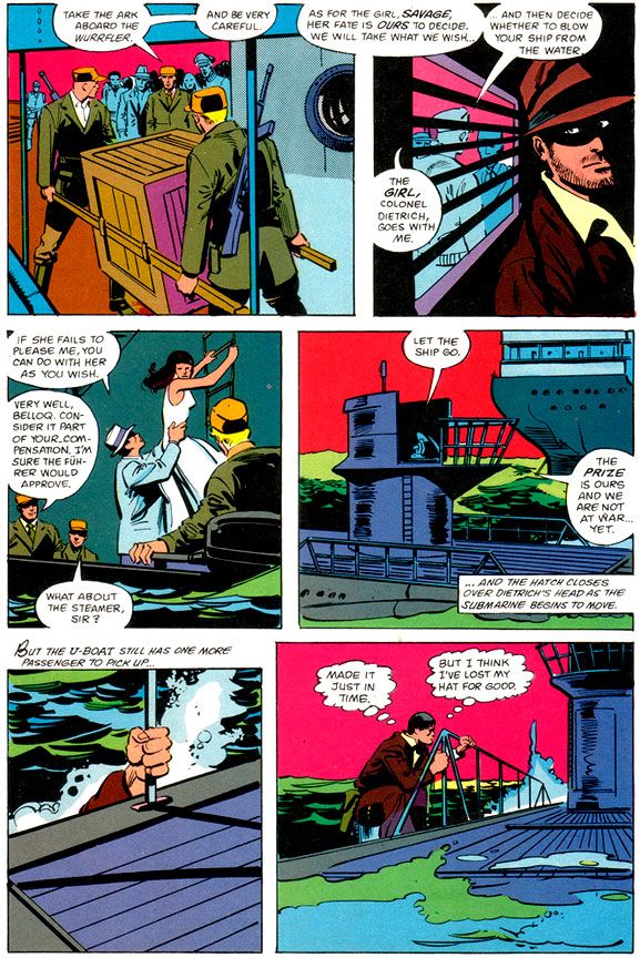
Janson’s edgy inks simply lack the retro, Saturday matinee feel a Raiders comic absolutely demands. And when a scene calls for a little modest gore-- your odd impaled corpse here, your melting Nazi there-- Janson restrains himself and what we get is drab. Other panels seem strangely empty, even unfinished, with little detailing. Nazis wear uniforms devoid of badges, Captain Katanga's tramp steamer-- piratical in the film-- looks alarmingly clean. Blacks indicate light sources but do nothing for mood.
From what I understand, the people at Lucasfilm were pretty unhappy with this book as well.
After all, when you watch the movie, you feel the love both George Lucas and Steven Spielberg share for old serials, B-movies and even A-movie adventures with guys like Errol Flynn, Tyrone Power and Douglas Fairbanks, Jr. And classics like Casablanca and Treasure of the Sierra Madre with Humphrey Bogart. They add a contemporary self-awareness to genre thrills and of course, this approach paid off in gold. So much so, they ended up sparking a revival of the genre and I ended up watching all kinds of Raiders knock-offs in search of the same all-day thrills my friends and I stole from the Martin Four that summer day. High Road to China, Romancing the Stone, TV's Tales of the Gold Monkey, Bring 'Em Back Alive, Rubiks the Amazing Cube, Jake and the Fatman, Mama's Family, Pink Lady and Jeff...
Instead of something similar, something recalling adventure strips by the likes of Noel Sickles, Roy Crane and Milt Caniff, we get flourish-free late 70s/early 80s Marvel finishes that evoke nothing of the visual qualities or romance of either Raiders or those old movies. Where’s Charlton Heston or Cornel Wilde? There’s barely even any Harrison Ford. Marvel's Raiders has incident, but lacks atmosphere.
 |
| Script: Walt Simonson/Pencils: John Buscema/Inks: Klaus Janson |
I’m left wondering what might have been if someone said, “Let’s do this in the spirit of the film. There’s no way we can get Milton Caniff himself, but let’s at least see if Alex Toth or Doug Wildey might want to take a crack at it.” Imagine the opening sequence with Toth's black-spotting and way with draping figures in heavy, moody shadows and evoking time and place. Toth probably would have turned Marvel down flat because of Indy’s rather ambiguous morality (or for some other reason peculiar to Toth’s outlook), but Wildey could have done something approximating the romanticism of classic adventure strips in his own style. Gray Morrow also would have gotten it. Marvel would later waste him on their Sheena adaptation, of all things, but a Raiders by Morrow with this Simonson script have been an instant classic.
And what about Al Williamson? There was a guy who could draw jungles and deserts. What about Howard Chaykin, who provides a wonderful painted Bob Peak-style cover?
 |
| Script: Walt Simonson/Pencils: John Buscema/Inks: Klaus Janson |
Ultimately, however, I'm going to blame the book's lack of visual flare less on the artists and more on Marvel double-dipping on the artwork. My best guess is Buscema and Janson drew this based on the idea this would be printed as a regular monthly (check out Gene Day's killer Paul Gulacy-esque cover on Raiders monthly #1 for yet another example of how this comic should have rocked us), and when it came time to run the art larger for the Super Special format, it didn't translate. And Marvel cheaped out on the color job, too. These aren't the dreamy modeled or airbrushed tones we'd gotten used to in many of the previous Super Specials, even on movies that were outright stinkers. Jaws 2, Meteor and even poor Xanadu got lush painterly coloring. These colors read clean and they provide some nice contrast between foreground and background, but they're obviously meant to grace the garbage paper Marvel's books came printed on. A little heavy on the purples, pinks and magentas. A lot of Marvel monthlies around this time looked similar.
This should have looked different. Yes, I praised Janson's work with Dave Cockrum on their adaptation of Star Trek the Motion Picture (Marvel Super Special #15), and that had monthly book coloring and ran as regular format comic as well. But there the art is dense and detailed and provides a lot more of its own depth and atmosphere. The same is true of the Archie Goodwin/Williamson/Carlos Garzon Empire Strikes Back. Those books manage to feel deluxe when this feels knocked out in a hurry.
Reading it today, I find Raiders isn't as bad as I remembered. It's probably even better than I'm making out here, and I'm sure you can find its defenders online without much effort. It’s just we're talking a comic book based on Raiders of the Lost Ark. And it's a visual bore when it really cries out for some deluxe treatment or a little pre-production product conceptualizing. You know, "Hey, this material is pure joy! Here's our chance to do our own version of Terry and the Pirates!"
No comments:
Post a Comment