Showing posts with label Creepy magazine. Show all posts

Thursday, October 30, 2014

October is Spookey Month: You can't have Halloween without Bernie Wrightson!

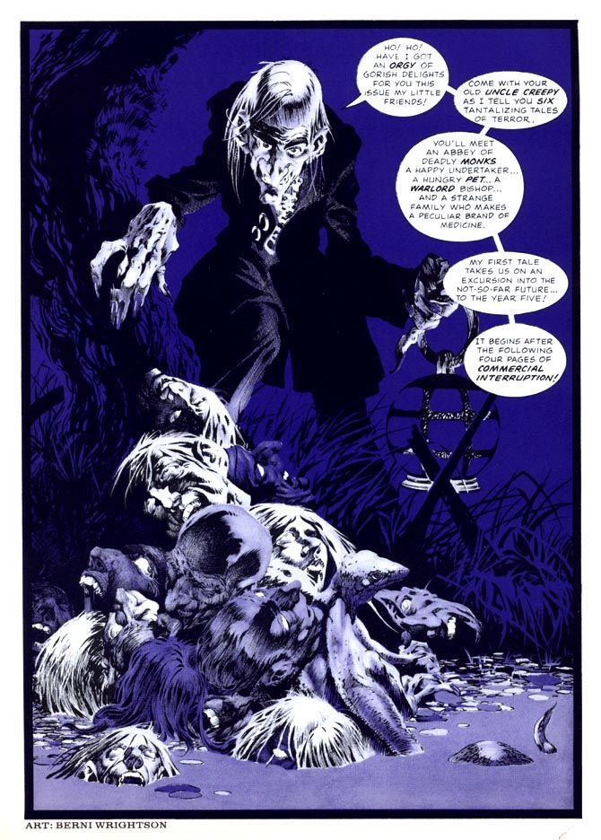
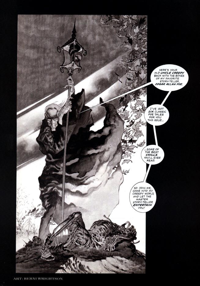
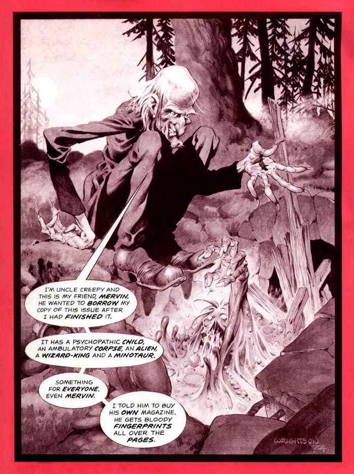
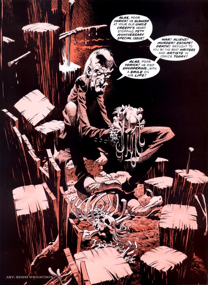
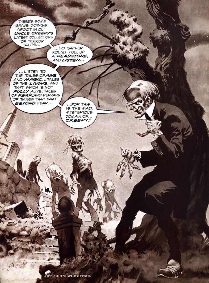
Hello, Halloween hellhounds!  Let's enjoy Bernie Wrightson's delightful Creepy magazine frontispieces.  I'm not sure when Creepy started running these, and Wrightson didn't do one for every issue.  Sometimes they'd run a full-color house ad for Vampirella or spotlight another talented artist.  But Wrightson's frontispieces are rich with spooky atmosphere.  And ghoulish good humor.  These are just a few of my fearvorites...

Creepy 66 (November 1974)


Creepy 67 (December 1974)

This next one is a particular joy to behold...


Creepy 70 (April 1975)


Oh wow!  Isn't that beautiful?  Okay, a few more...  This next one I like because it's one of those Wrightson "spooky stuff happens even during the day" images.  Just like in the memorable story "Jenifer" he illustrated.  It starts one magical afternoon.  Imagine hiking in the forest on a gloomy fall day and...


Creepy 71 (May 1975)

Egads!  Dare we continue?  Dare we do!


Creepy 75 (November 1975)


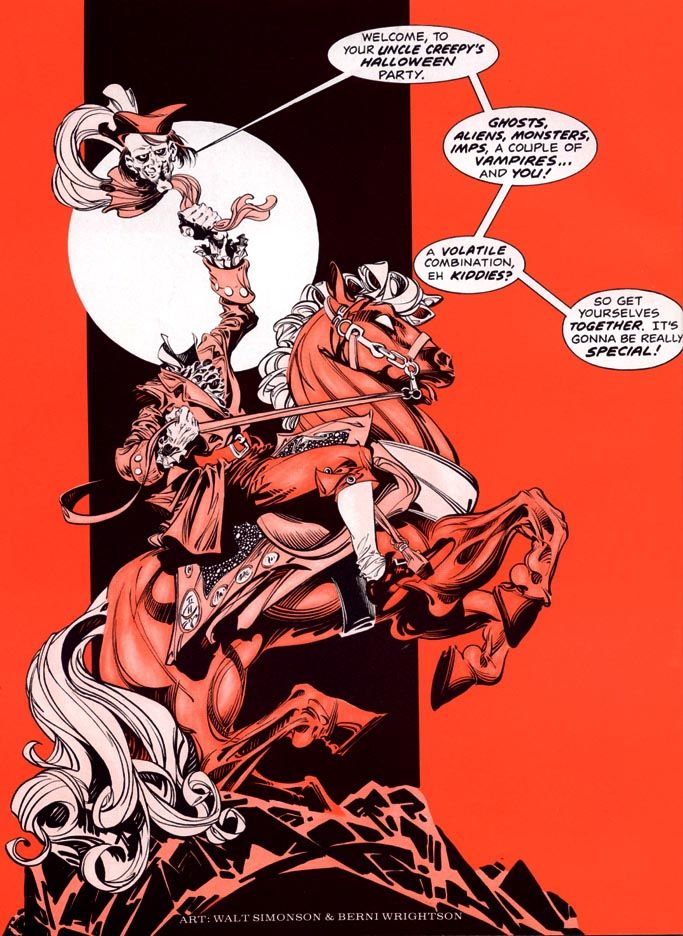
Here's my favorite, though.  It's a collaboration with Walter Simonson, a guy who's best known for Asgardian superheroes but has done a few highly effective fright jobs in his long career, too.  Plus, it's specifically Halloween-related.


Creepy 76 (January 1976)


Love those.  But to be honest, the scariest Creepy frontispiece of all wasn't drawn by Wrightson or Simonson.  It's this one.  Steady on, people.  Steady on...


Creepy 81 (July 1976)


AAAIIIIIEEEEEEEE!!!

We definitely need something to help us recover our wits after that shriek-inducing moment of terror.  All of these except the last are available in Dark Horse's gorgeous and essential Creepy Presents Bernie Wrightson hardcover.  Now I need to go clean up a little.  So calm yourselves and here's something to soothe your jangled nerves.


Tuesday, October 28, 2014

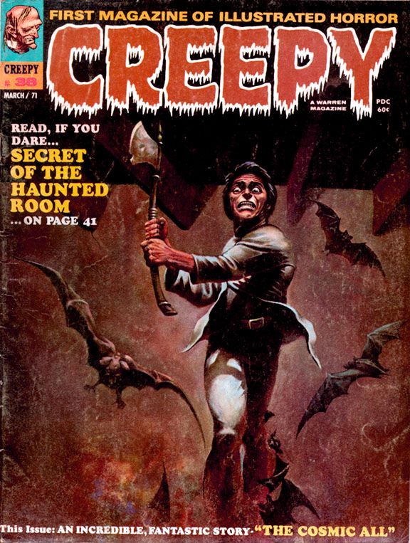
October is Spookey Month: Wally Wood brings you a new path to a life of peace and love in Creepy #38 (March 1971)

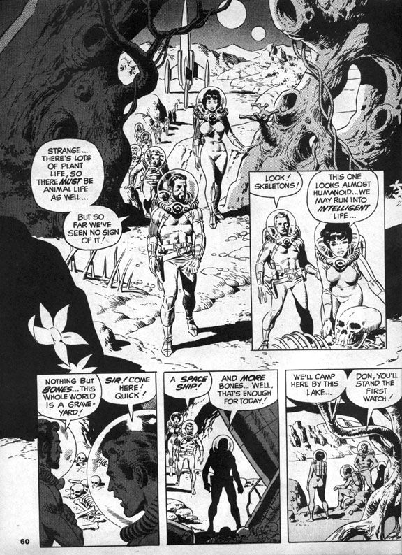
Behind a lurid and appealing Ken Kelly ax-maniac cover (Kelly's Creepy debut), you'll find a late career gem in the EC Comics mode written and illustrated by Wally Wood.  James Warren, who was not only publishing Creepy at this point but also editing it (along with associate editor Archie Goodwin), must have been particularly happy with Wood's "The Cosmic All," because he gives it a cover spotlight and the honor of closing out an issue that also includes work by Rich Buckler, Mike Royer and Ernie Colon.  Warren would also reprint the story just over a year later in Creepy #48, a special, all-reprint issue.

Sometime in earth's future, we've sent an intrepid mixed-gender exploratory mission led by a bearded captain (along with Don!  And Sue!) to Alpha Centauri, which is now, more than 40 years after this story's publication, a popular tourist destination.  In those days, it was the distant frontier of outer space.  After finding bones on their first planetary stop, the explorers anticipate a possible meeting with intelligent life.  Which is kind of ironic.  I mean, they do meet it.  It's just not the kind they were hoping for. 

You know how the hierarchy of space aliens goes—in order from least to most objectionable, it’s generally humanoids, reptilians, insectoids, cephalopods, non-tentacled mollusks, blobs and, finally, slimes.  The further its appearance gets from the human template, the more repulsive the alien.  And usually, the more likely to have philosophies contrary to the kinds we find comforting.  So Wood’s slime terrifies the space explorers by trying to absorb Sue.
 
Wally Wood

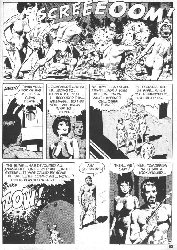
In familiar comic book sci-fi fashion, Don shoots the slime with his phallic laser zapper gun, then everyone flees in their retro-finned rocket ship, only to find the slime on yet another planet.  Having achieved what they believe is their due quota of slime-based encounters, they orbit a comfortably earth-like planet that gives them a very rude greeting in the form of more laser beams.  In response, the human explorers (And Don!  And Sue!) blast through planetary shields and receive a series of puzzling messages.  The civilization below no longer seem angry, but rather depressed and resigned to first contact.  They invite the astronauts to land, then ambush them in a suicidal rush. 
And, ironically enough, they're comfortably humanoid in appearance.  Bulbous, bald heads (like my own) and large black eyes notwithstanding.  A recording reveals this was their deliberate self-extinction and a cleaner death than the one that awaits the astronauts.  Who stand around puzzled, as anyone would be, but the next day all but two of them are skeletons as well.  And those two are Don and Sue!
 
Wally Wood

Which is probably just as well.  After all, even if it was a case of suicide-by-human-astronaut, these men and women did commit genocide.  Are they any less monstrous than the slime?  Perhaps they're precisely as monstrous, as we soon discover.  Don and Sue make for earth where they suddenly experience a strange elation and crash the rocket into the ocean.
 
Wally Wood

There Don and Sue slough off their skins and mutate into the now-familiar slime.  Everything becomes clear.  The humanoid aliens chose to die as a group with each individual’s self-awareness intact because the slime infects other beings and absorbs them into the titular cosmic all, a vast collective without individual thought.  The two space travelers become one with the intent of spreading their all-ness to every living thing on earth.  Starting with all sea life, I suppose.  Uncle Creepy appears at the end and tells us the ultimate twist—they’re glad to be this way, so it’s technically a happy ending.  I’m not going to argue with him.  It certainly made me happy!
 
Wally Wood

The ending is one reason.  The ambiguity of it lingers.  So many deaths, but no escape for Don and Sue, just the loss of humanity both physical and mental, a blending of their minds with the vastness of the alien slime, all-knowing and unstoppable.  Is their joy at the becoming genuine, or simply an effect the slime has on their minds?

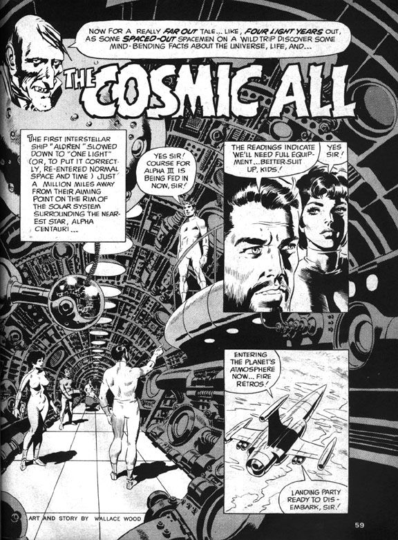
 The other is Wood’s artwork.  The splash page is a spectacular image, the kind of Woodian spaceship interior he drew regularly during EC’s heyday.  Round vents, layers of exposed pipes like the veins in a human arm.  Similarly exciting scenes follow, with the explorers trudging across a planetary landscape, the slime attacking like a huge ocean wave and then a space battle followed by an alien-wave attack and the intimate concluding sequence which is equal parts bleak and elating, an uneasy mix that elevates this story to legendary status.  It has the feel of a particularly memorable EC tale, but with an expansiveness the larger page size affords. 
 
And that ending!  That ending!

Monday, October 27, 2014

October is Spookey Month: Tricks and treats with Creepy #36 (November 1970)


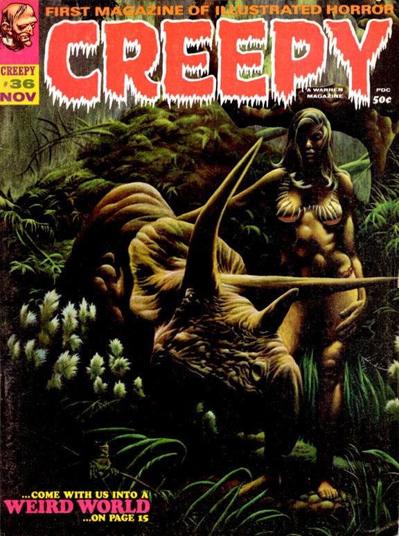
I can't decide which is the treat.  Is it the dinosaur or the cheesecake?  This is the cover to Creepy #36 (November 1970), naturally.  Nature being the operant word here.  This painting is by Kenneth Smith, who contributed a few covers to the magazine around this time.  It's an image that actually appears as a panel in the story "Weird World" inside.

Nicola Cuti wrote "Weird World" and Tom Sutton illustrated it.  It's a story about an astronaut lost on a jungle planet where this woman rides around on a triceratops.  The whole thing has a Richard Corben feel to it, and when I first saw this cover that's who I thought painted it.  But no, Kenneth Smith.  Smith painted a number of science fiction book covers and was one of the artists included in a book that's a particular favorite of mine, Ray Bradbury's Dinosaur Tales along with people like Moebius and William Stout.

Well, here's a dinosaur.  You know, because dinosaurs are such an important part of our Halloween traditions.  The story itself has a downbeat twist ending and this cover image remains popular among Creepy fans to this day.  It was probably pretty popular in 1970, too, but I was only two years old at the time and wouldn't remember anyway.

Sunday, January 5, 2014

Everything old is new again or ten things I'm excited about in 2014!

1.  Barbarella.  Humanoids, Inc. will publish a brand-new English language version of Jean-Claude Forest's sexy 1960s space adventure featuring the coolest 1960s space adventurer with updated and modernized whatchamallits by Kelly Sue DeConnick.  Dialogue?  Worldview?  I don't care.  Her adventures have been out of print in English for some time now, which is kind of ridiculous when you consider her pop culture significance.  There wouldn't be a Vampirella without Barbarella, and possibly not even a Red Sonja series.  As a character, Barbarella kicks much ass.  Despite her reputation as a sex kitten, in today's terms, she has what you would call "agency."  Therefore, she's a sextacularly retro space ace for today's on the go post-modern libertine!  Or something like that.

2.  Teen Titans.  With the publication of the long-awaited volume two in the Teen Titans DC archives hardcover series, it's just a matter of time before individual issues pop up on Comixology.  And this means more Wonder Girl with art by Nick Cardy.

3.  Pepper.  Last week I bought an Archie Comics digital exclusive containing 100 pages of gorgeous Dan DeCarlo-drawn pre-"ears for hats" She's Josie comics, which led me to discover the star's witty erstwhile best pal Pepper.  Pepper didn't make the transition to rock stardom with Josie and Melody, and that's a real shame because she's super cool with her cynical attitude and wild cat-framed glasses.  Those would have been so appropriate for the band.  Don't get me wrong-- Valerie is great.  But why couldn't the Pussycats perform as a quartet?  You know, Pepper on bass?  She could have been their Kim Deal, for crying out loud!  Anyway, 2014 is the year I bore you to tears celebrating Pepper.

4. X-Men.  Marvel has been dropping John Byrne-drawn issues on Comixology like they're on fire (that cliché worries me-- is this a good quality or a bad quality for something to have?), which means we're about one or two away from having a complete run available stretching from the initial Dave Cockrum issues (glorious) all the way to the celebrated "Days of Future Past" storyline that's being adapted into the latest film in the X-Men movie franchise (as my wife says, "I don't give a shit about that," but you might, so there!).  They'll probably get to the second Dave Cockrum run, which suffers from lackluster scripting but looms large in the early days of my initial fandom because those were the ones I bought in convenience stores and newsstands as Marvel published them.  I subscribed during the Paul Smith days, which saw Chris Claremont return to form.  Those should be on Comixology this year, too.

5. Fantastic Four #51.  Marvel and Comixology have every issue of Jack Kirby's legendary company-building stint on Fantastic Four through #50, which is the overall narrative's natural climax.  But it's in its anti-climax Kirby and Stan Lee produced the humanistic "This Man, This Monster," which is as close to superhero comic perfection as you are ever likely to find.  Kirby and Lee turned out a few solid stories and even some classics after this, but this is Marvel's 1960s apogee.

6. Samurai Executioner Omnibus.  Dark Horse is putting out a single book containing 798 pages of ultra-violent samurai slashing action from masters Kazuo Koike and Goseki Kojima.  A guy named Frank Miller would mine their stuff for his own reputation in the 1980s, but this is the 1972-76 original from a couple of legitimate geniuses.  Their Lone Wolf and Cub is essential, but Samurai Executioner is pretty darn close to necessary, with plenty of cinematic, evocative storytelling at its finest.  Oh, and it's only $19.99 for something that provides a meatier reading experience (as in the meat that Yamada Asaemon carves from his foes) than its equivalent in monetary (if not aesthetic)value-- about 5 flimsy 32-page issues of any given new monthly from Marvel or DC that will take you about 5 minutes to read and forget.  Okay, I admit I'm being unfair.  But even the best current series from either of the Big Two cannot hope to measure up to this work and you're paying less per page for it.  This should be the Event Comic of the Year.  Trust me-- you will never forget Yamada Asaemon.

7.  Lone Wolf and Cub Omnibus Volume 4.  Speaking of... here it is.  As I wrote above, these are essential.  Everything I gushed about with Samurai Executioner goes double for these.  This one is 696 pages for $19.99 and it's simply one of the greatest comics ever published.  I will be purchasing all of these in 2014.

8. The EC Archives:  Vault of Horror Volume 3.  Dark Horse does it again!  This is a very pricey book, but it's the continuation of Dark Horse's deluxe reprints of EC classics.  The Archives series started at Gemstone (I own several of them as well), but hit a rough patch.  Dark Horse re-launched the series in October 2013 with Tales from the Crypt Volume 4.  Fantagraphics is putting out books spotlighting individual artists (and those are beautiful), but here's your chance to see their work in context, with colors recreated from Marie Severin's originals.  Volume 1 of their Weird Fantasy reprints follows in April.  I'm more of a horror and Weird Science freak when it comes to EC, but any of these archives would be a welcome addition to my library.  And yours.

9. Warren horror.  Yeah, I know I'm going to sound like a Dark Horse shill, but they consistently put out products I love!  They're not only giving us EC and influential manga, but they're also continuing their long-running Creepy and Eerie Archives series this year.  I received Creepy Archives 10 for Christmas, and I'm certain 2014 will see me adding to my collection.

10. New discoveries of amazingly cool old stuff.  Like Pepper up there.  A couple of weeks ago, I had no inkling she even existed.  My knowledge of comics doesn't extend much farther than the ones I read when they were new and the artists and writers I grew up admiring, so I'm discovering wonders almost daily.  Certainly there are Jack Kirby stories out there and more I haven't read that I'm looking forward to uncovering and sharing with you, the reader of this blog!

Note:  Oh yeah, there are some new comics coming out this year that I'm also looking forward to.  Fantagraphics has Love and Rockets books coming out and their reprinting of Takako Shimura's heartbreaking Wandering Son.  Plus a whole lot more from Dark Horse, Image and even Marvel and DC I'll be checking out.  And there's a slight chance for some more Nana-related artwork from Ai Yazawa.  She revisited "Junko's Place" last year and apparently produced a Christmas card for Cookie magazine.  And even if we don't see new Nana, my big wish for Ms. Yazawa in 2014 (and in the future) is recovery, health and happiness.

Monday, October 7, 2013

October is Spookey Month: Uncle Creepy meets (and possibly eats) the NBC peacock... in color! (Part One)

I don't know how or why this went down, but in 1973, when William DuBay went from art director to managing editor on Warren's Creepy magazine, he introduced full-color comics to its formerly black and white pages.  Creepy had already featured spot color on the inside front and back covers, but this was to be the real four-color deal, trumpeted by house ad copy as "full spectrum" color.

Why end the streak of consecutive black and white issues?  Maybe it had something to do with the company's big roll-out of Dracula, the "horror art magazine," which would feature color (and that's the extent of my Dracula knowledge).  Or DuBay just wanted to freshen up the décor inside Creepy manor, the structure of which had already been under renovation by a group of highly-talented Spanish artists and our old friend Richard Corben.  Or maybe he needed to goose sales in the face of competition from Marvel-- the House of Idea released six magazines that year, five of which were horror, a direct challenge to Warren-- and CarToons.


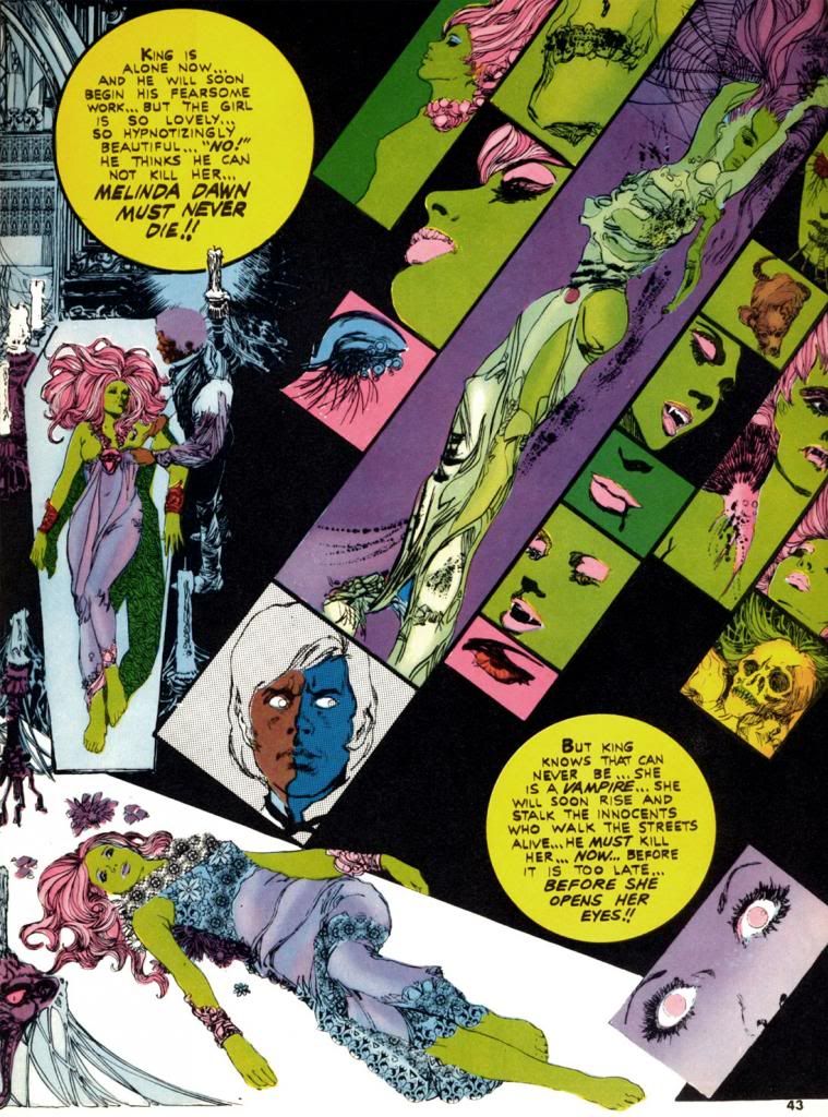
Whatever DuBay's reason (and in the interest of full disclosure, I actually don't even care why he did this; I just love these comics for simply existing in the first place), Esteban Maroto provides "Viyi," five pages of story and art in Creepy #51 (March 1973), DuBay's second issue as editor.  Here, Maroto puts one of his Brigitte Bardot-like females on display, and she's a livid green.  Amazingly, it suits her.  Maroto also wrote the story, but for Creepy's purposes "Viyi" amounts to a glorified house ad for Dracula.  We don't get the complete tale, just a couple of teaser pages telling us all about the new magazine.  The colors in "Viyi" are more subjective than representational and suit Maroto's gorgeous, emotionally-charged linework.  It certainly looks nothing like the monthly four-color superhero fare showing up on the spinner racks.  It hardly resembles the Creepy we'd come to know and love.  Perhaps that was the whole point.

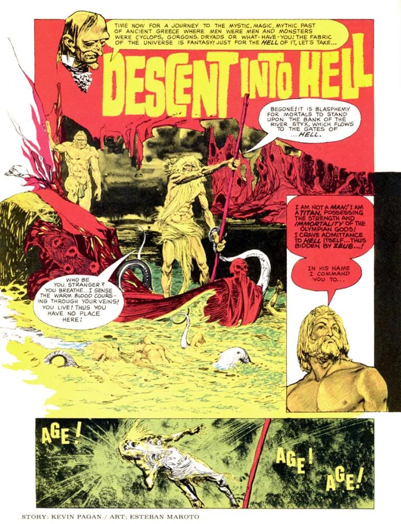
The next color story, "Descent Into Hell," again by Maroto, ran in Creepy #54 (July 1973), which also features Corben's infamous "Slipped Mickey Click-Flip."  Only a black and white story as outrageous as that could hope to compete with Maroto's journey straight to hell in lurids red and yellows.  And some blues.  By then the company must have been jazzed about where this was headed because the cover copy fairly screams, "Now!  Full Color Comics!"  The next issue consists entirely of black and white reprints but does toss in a neat-o full color board game with movement squares made up of a number of the magazine's classic cover paintings.  The credit for it reads, "Game conceived by:  Bill DuBay."


I'm beginning to sense a pattern here...

Corben finally gets his chance to produce some color pages in Creepy #56 (October 1973), where we find his classic "Lycanklutz."  A few issues before this a reader wrote in to complain that horror and comedy don't mix, but I beg to differ.  Corben's story of a flea-plagued werewolf is not only beautifully drawn, it's absolutely hilarious.  It's full of winking references to Universal Studios' Wolf Man movies and some anachronistic humor that anticipates The Princess Bride over a decade later.  Corben's palette is more naturalistic than Maroto's.  Modeled and painterly as opposed to flat and graphic.  Very different looks, but both please me immensely. 

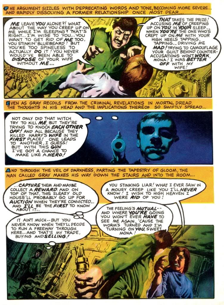
Corben strikes again in #57 (November 1973), this time partnered with write Doug Moench for a story seemingly inspired by the title of Traffic's 1971 album, which zoomed to #7 on the Billboard pop chart.  Do you think Moench owned a copy?  Maybe?  Whatever the title's source, "The Low Spark of High Heeled Noise" kind of strains to make its pun work, but ends up a grisly, effective murder in an old house tale.  Corben's color palette is more idiosyncratic this time out as he experiments with complementary color schemes in the blue/violet-yellow/orange areas of our ever-helpful color wheel.  I write "experiment," but I'm pretty sure the guy knew exactly what he was doing.  I'm not too conversant on what was happening in color magazines around this time, but compared to the still-primitive color printing in typical monthlies this is incredibly sophisticated stuff from color choice to use of subtle gradations in tone.  This wasn't possible in standard news-rack comics in 1973 and it shows Corben's mastery of color reproduction and effects.


Color takes a break until the Christmas-themed #59 (January 1974).  This time DuBay himself writes for Corben and they come up with a holiday story split between two perspectives that come together for a tragic finale.  It's both gruesome and sentimental, no small trick.  In this story, Corben employs a restrained, naturalistic palette for a timeless look.  Kind of like one of those Coca-Cola Santa paintings.  Or Norman Rockwell suffering a psychotic episode.  In #60 (February 1974), Corben teams with Steve Skeates for a story that seems somewhat inspired by the artist's own "Den."  It's a disquieting tale of a squeamish kid who finds a magic rock, turns into some kind of space-barbarian ape on another planet, then comes to a rather pathetic end.  Poor little guy.  More relatively restrained colors on display here in the early going, with some sweet autumnal atmospherics on the first page giving way to otherworldly hues during the fantasy sequence.

In #61 (April 1974), Corben provides his own script again for another comedy-horror turn.  This time, it's "Terror Tomb," with a character named Hardoff Bey and a clumsy mummy tripping the lunkheaded human cast to their doom.  Corben's dispensing of these dopes that way provides a nice chuckle amongst the more nihilistic horrors of the surrounding stories.  If I have one complaint about the guy's work, it's every so often there's a panel so packed with dialogue the balloon obscures most of a face, squeezing the art into a tiny corner.

You may be starting to notice a theme here as Richard Corben really makes the most of the opportunities DuBay provides for him, as we'll see in part two of this epic, rambling and altogether pointless overview.  My favorite of the whole bunch is coming up!

Sunday, October 28, 2012

October is Spookey Month: John Severin's zombie soldiers


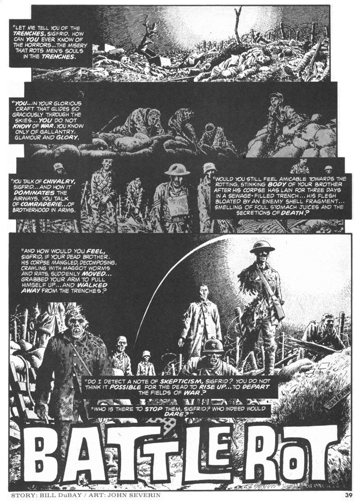
Personally, I'm sick of zombies.  Well, I thought I was, anyway.  Turns out I'm sick of zombies unless they're WWI soldier zombies drawn by John Severin.  Severin could draw anything.  Zombies, war comics, westerns, horror.  Horror-war.  This is the first page of "Battle Rot," a genre-bending tale from Creepy #81 (July 1976).  Written by Bill DuBay, it's the story of a German flyer who holds his ground-based fellow officers in contempt, especially when one of them starts rambling on about undead soldiers wandering around the trenches at the front.  Later, while villainously attempting to bomb a hospital, the arrogant pilot learns this story has its basis in fact.

"Battle Rot" would fit right in with DC's similarly themed Weird War Tales anthology comic.  The final page packs a wallop, and I was tempted to share it.  But I prefer the title page because it's just so haunting, evoking the climaxes of both versions of J'Accuse, the pacifist films French director Abel Gance (later a Petain supporter, unfortunately) made and re-made in 1919 in 1937 in which the war dead return; the earlier film features actual war footage and both have maimed veterans as the walking corpses, back to lay the blame for war on everyone equally.  All war is terrible, but WWI with its rolling artillery barrages, frontal assaults into fortified positions bristling with machine guns, mass gassings, filthy, diseased-ravaged trenches, No Man's Land full of unburied corpses and satiated rats must have been a special level of Hell unto itself.  Its mechanized, technology-based slaughter convinced a number of artists and writers life itself was absurd, was without no meaning and gave rise to Dadaism, an anti-art movement that's had a profound impact on my own sensibilities (I believe life is very meaningful, yet still absurd).  It would inform the horror genre in film and literature throughout the 1920s and 1930s as well, and we can extrapolate a similar reaction to the atomic bomb in the giant bug and lizard monster films of the 1950s.

Especially here in Japan.

Sunday, December 11, 2011

Don't you just love Esteban Maroto's artwork?


I know I do!  I've been really getting into Creepy and Eerie and so I've rediscovered my love for Esteban Maroto's artwork.

When I was a kid back before you were born, I was very into those Lancer/Ace Conan paperback collections. I'd either buy one of those or a Choose Your Own Adventure book with my allowance each week. Most of the Conan covers featured teensy Frazetta paintings, but I remember some of them contained a few Maroto illustrations.  I could be mistaken, but I'm pretty certain I first encountered Maroto's work in the context of Conan's world.

Yeah, the mind plays tricks on you and all that kind of thing.  Well, whatever.  The point is, I liked what I saw and I copied his style in my school notebooks every day for a while. Badly, of course. Maroto never seemed to lift the pen or brush off the paper until he completed the image, leaving one sinuous, amazingly attractive line that formed-- usually-- some lush-lashed (yes, they had Maybelline before the dawn of time) princess or queen naked except for lavish jewelery Conan would probably steal from her after they made savage, prehistoric love or whatever it was barbarians did back in the Hyborean Age when they weren't killing giant snakes, trampling thrones beneath their sandaled feet or hanging out with Sandahl Bergman or Wilt Chamberlain.

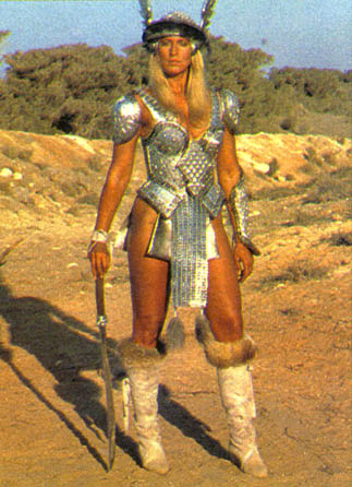
According to Maroto's website, he also designed Red Sonja's metal bikini armor. Not the most practical battle-wear, but it's served to make her a fairly popular character over the years. I can understand Maroto's motivation for drawing her that way, but I can't figure out why the character herself would go around dressed like that. She must be a mass of scar tissue.  Then again, in Marvel's Conan the Barbarian comics our favorite barbarian did his sword thing wearing a fur loincloth and some boots, so he probably wasn't much better off.  They were made for each other, these two legendary warriors, disfigured as they were because they dressed stupidly for battle.  Put some clothes on, fictional people!

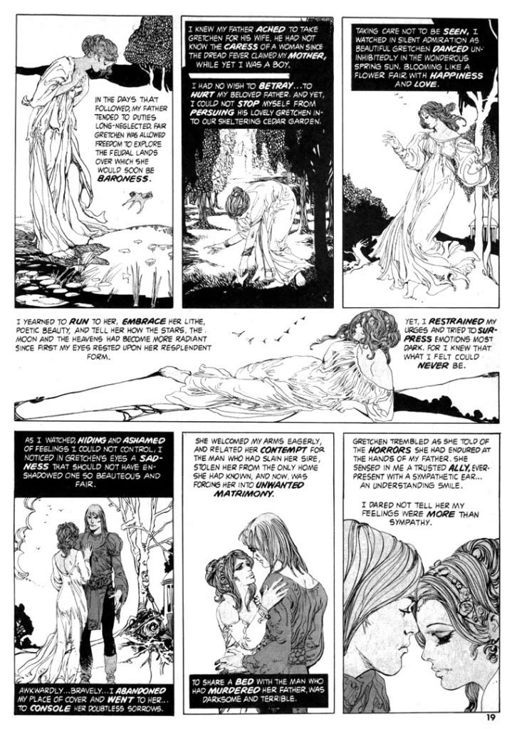
The page above is what re-sparked my Maroto interest.  It's a lovely pastoral scene from "Wings of Vengeance" (Creepy #81, July 1976), which he also co-wrote with Bill DuBay.  I'm very into Art Nouveau, and Maroto's compositions here and his controlled use of negative space and "designy" plant life recall another fave of mine, Aubrey Beardsley.  Specifically, the first four panels.  The single female figure, the framing, the poses are all ultra-Beardsley-esque.  Any of them could be blown up into a poster worthy of adorning an undergraduate's dorm room wall.  This page shares with Beardsley's art the same sense of romantic decadence within a kind of fairy tale atmosphere.  The draped and folded gown the woman wears seems very inspired by Alphonse Mucha as well.  I love the subtle gray tone on their skin, which helps separate them from the from the white backgrounds.  Enjoy this lovely young couple while you can.  She's later tortured to death and he has his face cut off.

If you happened to open a Warren magazine in the 1970s (something I rarely did because the covers were enough to scare me into insomnia), you stood a very good chance of finding Maroto's work.  He was one of their most prolific artists during that period.  Now imagine finding it beside some full-color Richard Corben nightmare, a Russ Heath axe-murder tale, an Al Williamson story with a space hero fighting alien dragons in a jungle, John Severin bringing horror to the Old West and maybe something drawn by Luis Bermejo.  There might even be something set in the 1930s by Alex Toth!  Don't forget Bernie Wrightson's frontispiece!  All packaged by genius editor Louise Jones, who is now Louise Simonson and who also happened to edit and write some nifty comics for DC and Marvel-- including New Mutants.

Which brings us full circle, I suppose.  Anyway, Esteban Maroto!

Saturday, May 7, 2011

Happy Free Comic Book Day!

Today was my third time participating in Free Comic Book Day. The first two times were during my long stay in Japan (Hi, Japan! Do you miss me? I miss you!), where it conveniently fell during my annual Golden Week trip to Tokyo (Hi, Tokyo! All my love!). So this was my big initiation into FCBD, American Style. My comic shop of record is currently JJ's Comics & Cards, a store where I'm always treated as though I'm a very special person.

And I am. And so are you!

JJ's Comics & Cards put out a snack spread, offered a lot of discounts-- 10% on new comics, 25% on graphic novels (I should've bought that New Mutants Vol. 1: The Return of Legion trade, but I was trying to keep my purchases down around 20 bucks thanks to a downturn in my personal economy), 50% on action figures-- and had Georgia-based manga pro Adam Arnold on hand to sign copies of his Vampire Cheerleaders/Paranormal Mystery Squad volume 1 book from Seven Seas Entertainment. Which I missed. The signing, not the book. Oops! But more on that in a second or two.

I did buy Arnold's book. It's sexy manga fan service type stuff of the kind I usually ignore. Not that I'm a prude. What I am is pretentious. I wanted to support a local creator, though. Because I've been totally oblivious to this Adam Arnold guy, when I first heard the title Vampire Cheerleaders and the local connection, I expected something self-published and amateurish. I've seen way too much crappy manga online and in print. In fact any crappy manga is way too much. Writers farting out nonsensically random stories, art with the big eyes but awkward figures made of sritchy-scratchy line quality betraying an unsure hand. Heaps of story and visual cliches badly presented in cheap packaging.

While the subject matter may not be my thing, I was pleasantly surprised to find Vampire Cheerleaders to be a slick little book by an actual writer and artists and in no way cheap looking, with very solid manga-style artwork of its type. Well-constructed figures, nice gray tone work. I used to see tons of this stuff at konbini (convenience stores) and magazine shops when I lived in Japan. Not your spectacular Takahashi Rumiko or Yazawa Ai level stuff, but appealing nevertheless. Just from a casual perusal, I'd say if you're into sexayyy manga and vampire vixenry, this book is probably worth your time. Now I'm stoked to give it a real reading and post a review of it later this week.

And now I'm also sorry I missed the author. It would've been fun to hear his point of view and to learn a little bit about how he got started writing and editing manga, plus a little about how these "original English language" manga come about. The pro ones, as opposed to those... others.

I know, I know. "Get to the free comics, you pseudo-intellectual jackass!" you're all screaming at me. "We're dying to know which comics you chose and we really have to pee and it's getting to the point where we can't hold it anymore so if you don't get this over with and end our suspense, we're going to damage our kidneys or burst our bladders or at the very least wet our pants and it'll be all your fault!"

We can't have that! I'd never be able to live with myself! For the love of corn, go pee and by the time you get back feeling lighter and refreshed, I'll finally be telling you yes, I did choose some free comics from the store's once well-stocked but increasingly picked over FCBD display. Here's what I selected:

1. Michael Moorcock's Elric: The Balance Lost by Chris Roberson, Francesco Biagini and Stephen Downer
2. Bongo Comics Free-For-All 2011 (my traditional choice)
3. Baltimore by Mike Mignola, Christopher Golden and Ben Stenbeck
4. Super Dinosaur Super Special! by Robert Kirkman and Jason Howard

That last one? Well, I had an issue of Walking Dead in my hand and one of the store employees pointed out Super Dinosaur is also by Robert Kirkman, so I took it just to be polite. I love Kirkman's Walking Dead, but I'm not a Kirkman fan to the point where I need to have everything the gentleman writes. This looks like a comic book adaptation of the kind of Cartoon Network show I never watch, or a toy line tie-in. Those aren't necessarily bad things, but they also don't serve to attract me as a reader. But once again, I need to read it before I pass too harsh a judgment.

Also arriving at my palatial Roman villa-style estate (heavily guarded by my personal army, so don't get any funny ideas about breaking in here and stealing my fortune in diamonds and rubies and sapphires which I keep lying about like so much bric-a-brac... perhaps I should sell some and give myself an economic stimulus, huh?) via the good people at the post office today: Creepy Volume Two from the delicious Dark Horse Archives series and the surprisingly in-color Star Wars Omnibus: A Long Time Ago... Volume 1, which collects the first twenty-seven issues of the old Marvel Comics Star Wars series, including their adaptation of the first movie by Archie Goodwin, Howard Chaykin and Marie Severin (among others).

I am loaded down with comics to read!

Monday, April 18, 2011

Creepy #7: Comic Nirvana has been achieved!

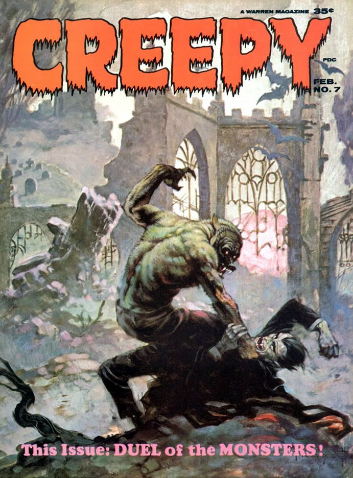
Let's take a moment and appreciate the wonderful thing known as Creepy #7, published in 1965, back before even I was born. The levels of artistry and fun register off the scale with this one. It starts with this the Frank Frazetta painted cover. There is nothing more you could ask of a horror comic cover. The Universal Studios-style Wolfman versus Dracula. If you're anything of a horror comic aficionado or just a fan of great funnybook art, I defy you to resist this cover's allure. Frazetta's color palette here is amazingly controlled. Cool neutrals dominate, contrasted with subdued warm reds along Dracula's cape. Wolfman's back is incredible-- gray flecked with brown and green, with subtle blue and pinkish underlighting. It's early morning light. At first glance it may seem as if Wolfman is kicking Dracula's ass, but check out the wounds on that hairy arm, visible through the misty sfumato characteristic of Frazetta's paintings-- these monsters have doomed themselves.

If only they could've put aside their differences!

Even the Creepy logo is wonderful. Lurid red, oozing, dripping typeface. But what lurks inside? Do Wolfman and Dracula actually fight? Kind of. The lead story is "The Duel of the Monsters" by editor Archie Goodwin, with some sweet, sweet Angelo Torres art. The half-splash features a rooftop werewolf on the prowl-- what a hook!-- and we're already involved in the story.
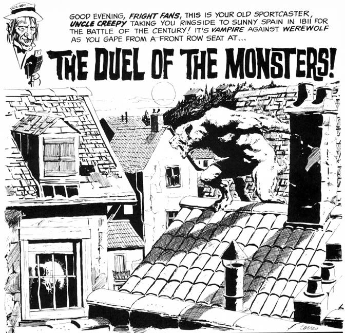
Goodwin's story delivers. It's 1811 Spain, and the vampire is a sergeant on the city's night watch who uses his position to cover his murderous un-lifestyle. When competition rears its furry, fanged head in the form of a werewolf, the sergeant will stop at nothing to destroy the interloper. He soon identifies his prime suspect, but things go badly for the vampire. The twist ending is a little abrupt, but appropriately nasty. Torres's art at this time is sometimes difficult to differentiate from Al Williamson's, which is a high compliment indeed. Here he creates plenty of mood and atmosphere with sophisticated lighting effects, but doesn't allow the story's nocturnal setting to obscure his storytelling or draftsmanship.

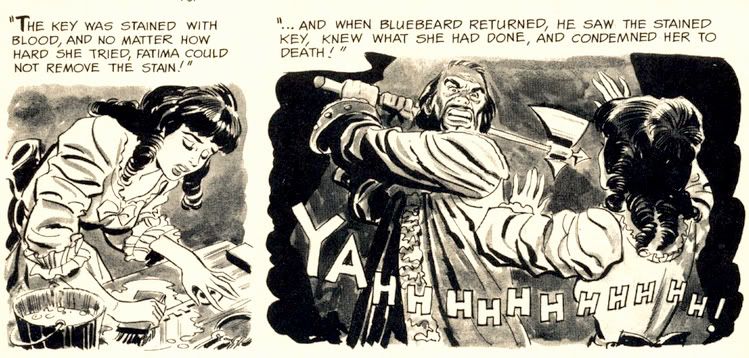
The second story is "Image of Bluebird," by Bill Pearson. It's about Monica and Brian, newlyweds who move to an isolated house deep in the woods. Thanks to some grisly murders, Monica becomes convinced she's married a Bluebeard. No, not a pirate. His beard was black. The infamous Bluebeard, killer of wives. Joe Orlando does all he can to make her suspicions valid with his ambiguous portrayal of Brian. One moment he's literally sweeping Monica off her feet, the next he's brandishing a knife and looking positively demonic. Fortunately for Monica, it's all a case of mistaken identity. Brian, however, is not so lucky. Pearson's crafted a tightly plotted tale and Orlando provides some fun moments with axes and one truly spectacular panel where a character screams "AAAAARRRRGGHH!" with a knife sticking out of his chest. Hard to go wrong with bloody stabbings.
For you folklore fans, there's the beautifully Frazetta-illustrated "Creepy's Loathsome Lore!" Here we learn that people not only turn into wolves but also into tigers, jaguars and foxes. According to Uncle Creepy (and Frank Frazetta), "Both China and Japan abound with legends of fox-women... beautiful girls said to entice male victims, then change into a snarling, attacking fox!" And dress like Vampirella while doing so, apparently. I'm not so sure about China and its legends, but I'm pretty sure kitsune never dressed this way in Japan. Still, this little info page tantalizes with the thought of what the Warren staffers might have done if they'd tapped into Japanese horror stories like the kuchisake-onna or rokurokubi instead of constantly drawing on pulp fiction versions of voodoo curses and 19th century European settings.

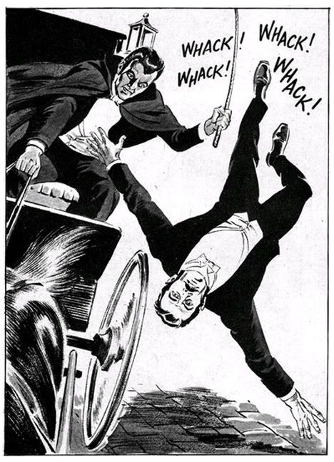
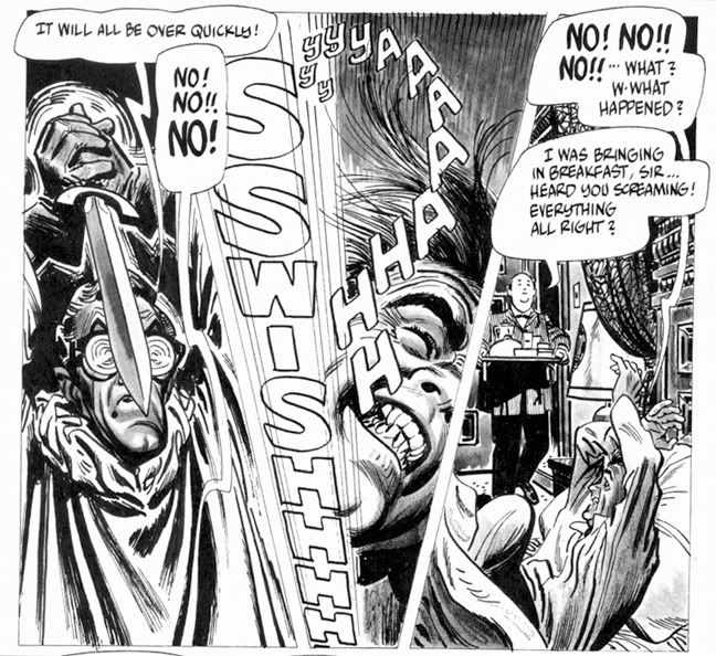
Then it's time for Alex Toth and Archie Goodwin's "Rude Awakening," one of those stories where the protagonist keeps slipping in and out of horrific nightmares until he can no longer separate fantasy from reality. And by the end of this , neither can we. It's the weakest story in the issue, and suffers from an over-familiar concept, a variation on the old wheezy "Coachman's Warning" tale, substituting the more menacing figure of a knife-wielding geek in glasses for the coachman. Rod Serling did his own take with a modern setting in a Twilight Zone episode called "Twenty-Two," which aired way back in 1961. Toth evidences a fine control with ink washes, and something about Goodwin's script really inspired him to lay down the lines because he isn't working in his more characteristic minimalist mode. A few of the faces are exaggerated and comical-- almost as if Toth were experimenting with a Jack Davis-inspired style.
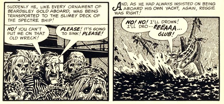
Eando Binder and John Severin invite us to "Drink Deep" with a very EC-esque story of a rich jerk (is there any other kind in horror comics?) who treats everyone like shit (do they do anything but?) but makes the mistake of doing so on a yacht richly appointed with gold stolen by his pirate ancestor. If horror comics have taught us anything, it's being a jerk leads to ironic comeuppance at the hands of the undead. What's fun about this story-- besides the rotten seamen who stagger around, no doubt leaving a trail of salty slime all over the yacht's hardwood decks-- is seeing Severin's slightly caricatured figures in the service of terror rather than humor. I first encountered John Severin as the key artist for Cracked magazine, where he drew their parodies of things like the 1976 King Kong remake starring Jeff Bridges, Charles Grodin and Jessica Lange, plus Rick Baker in an ape suit. Here he employs slightly exaggerated facial expressions and that distinctly Severin-ish cross-hatching to wonderful effect, elevating a somewhat predictable (but no less fun) tale.
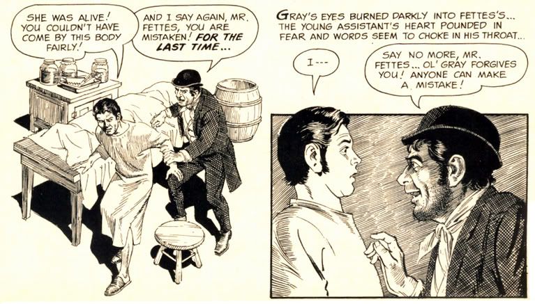
Goodwin and Reed Crandall score with their adaptation of Robert Louis Stevenson's "The Body Snatcher." I haven't read the original, but Crandall's etching-like linework is ideal for the story's setting. It has a "Classics Illustrated" feel to it, very ornate and a joy to behold. Goodwin's script affords Crandall the chance to try all kinds of lighting effects, like the radiating lines around a single candle and the slanting streaks of rain on a gloomy evening. Mr. Gray is a thoroughly repulsive fellow, but you're left wondering just who is worse-- the loudmouthed body snatcher who provides goods a little too fresh for his clients, or the doctors themselves.
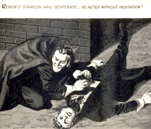
"Blood of Krylon" has a goofy title, but a killer concept. What do you do if you're a vampire in a future where the entire surface is now covered with ultra-modern skyscrapers and law-enforcement agencies use infallible robots to control crime? You take off for the space colonies in search of fresh prey, that's what. But you'd better study up on extrasolar planets-- particularly their rotational periods. The vampire thought of everything in this story except that. Yes, the ending is quite predictable (but it's a fun ride getting there) and I'm not sure why our future vampire has to dress like a Dracula reject complete with high-collared cloak, but Gray Morrow's creamy art truly impresses. These aren't ink drawings with just washes, but fully realized monochromatic paintings.
But the best is last. The most visually spectacular story in the magazine is "Hot Spell," written by Goodwin and once again illustrated by Crandall. It begins with a wash-painted flashback to "17th century New England," where warlock Rapher Grundy meets his flaming death at the hands of some pissed-off Puritans. Never mind that the preferred method of executing witches was hanging-- a good old fashioned burning at the stake provides more time for Grundy to scream, "My curse is on this village!! Let each generation feel it and suffer!" Then comes the splash page:
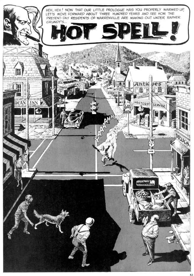
Kind of heartwarming, huh? Unless you're that guy in the intersection. He's warm all over. It doesn't take long for the townsfolk to pin the blame on the newcomer-- some kind of Bohemian artist type. You know, the kind of Commie degenerate who goes around sporting an untucked polo shirt, pinstriped pants and... gasp... pennyloafers! Goodwin's script foreshadows some of the themes Stephen King would work with in some of his short stories and the novel Salem's Lot. The evil we do lives on, hidden behind the banal facade of small town life and all that. It may be good enough for John Mellencamp, but Goodwin finds finds prejudice and urge to mob violence just below the seemingly tranquil surface of this particular one-pick up truck burg. And no little pink houses, as far as I can tell. Crandall's fine-lined art makes it certainly a pretty how town with up so floating many bells down! It also gives the fisticuffs and destruction an ironic Norman Rockwell feel. The comeuppance is a bit abrupt and too literal, but who can argue with a story as gorgeously drawn as this?

Wow. When I read Creepy #7 the first time, I just could not get over what I was seeing on each page. Even though the writing quality is a bit up and down, the stories are never less than fun. And it's difficult to imagine a more beautifully illustrated comic than this. Pure joy in print form.
Friday, April 15, 2011

Tough times at Dark Horse?

I hope not, despite the story I just read on Comic Book Resources that informed me Dark Horse Comics has laid off a number of staffers. Well, I'm not qualified to comment on industry economics or business decisions, but I want to wish all involved the best of luck. I know all too well what it feels like to stress over job hunting and financial insecurity, so I'm offering my sincere hopes and wishes that at least some-- if not all-- of you had some advance warnings and were able to get some paying gigs lined up in time! And as a fan of Warren's horror titles, I especially want to single out Shawna Gore for her work bringing us the Creepy and Eerie Archives books and the new Creepy magazine. I can't thank her enough for being part of the move that enabled me to buy these crazy things!

It makes me nervous for the company's future as well. It seems they've launched a lot of titles recently-- the Doctor Solar and Magnus books, the new Dark Horse Presents, Dollhouse, Let Me In, plus all those traditional favorites-- Star Wars, Hellboy, Buffy and Robert E. Howard comics. And the digital comics. I thought they were doing pretty well with all that product expansion. Just goes to show how much I know. Maybe they need to bring back Dr. Giggles.

Wednesday, March 30, 2011

Alex Toth and the Pie

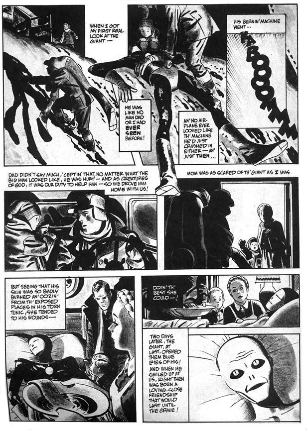
In 1977, Alex Toth illustrated "Daddy and the Pie," from a Bill DuBay script. It appeared in Warren Publications' UFO and Alien Comix #1, dated January 1978. People were going crazy for all this space alien stuff about that time. Probably had something to do with Star Wars and Close Encounters of the Third Kind setting box office records. Or maybe it was because Zontarr, ambassador from the planet Horvis VII, was all over TV in the mid-70s during his futile campaign to convince the people of earth to give up their dangerous nuclear weapons programs-- which threatened galactic civilization-- and his more successful efforts to popularize John Travolta via the sitcom Welcome Back, Kotter and disco music. Poor Ambassador Zontarr. Today he teaches political science at a community college and smokes way too much pot.

"Daddy and the Pie" hearkens back to those message stories EC used to run where they'd sucker you in with gloriously drawn gore and freaky octopus-like creatures then teach you some kind of life lesson, like in that one tale about the little mutant girl who was so misunderstood. "Daddy and the Pie" also has a distinct Ray Bradbury feel in its mix of small town nostalgia, the melancholy truth of just how crappy we humans can be to each other and science fiction. The moralizing doesn't overwhelm the plot, thanks in no small part to Toth's beautiful drawings. He evokes a sense of mystery and wonder on each page, and the heavy use of blacks along with ink washes make this one of his finest pieces. I was all set to write enthusiatically about how brilliant DuBay is for having the boy narrate the story in a kind of naive voice and how that contrasts with the action to give us a more complete understanding of what really happened with Daddy and the Pie-- then I re-read it and realized the narration is pretty spot-on, with Toth's images merely amplifying DuBay's script.

Oh well. DuBay does tell the story from the boy's limited perspective and it's a script worthy of Toth's best efforts. The kid learns that heroism isn't beating up bad guys the way the two-fisted ruffians in the movie serials and radio adventures do. It's also quietly helping others and accepting them for who they are. Just doing the right thing and asking nothing in return.

He learns this not only because of the Pie's influence on his life, but also because the example his father sets. As DuBay has him tell us, "I was lucky to have two heroes all my own... ...Two of the biggest, bravest legends ever to walk God's green earth. Daddy and the Pie." Children need parents they can look up to in the absence of saintly blue aliens. When kids inevitably encounter various forms of hate and prejudice they need strong role models within their own families to teach them open-mindedness and acceptance of differences.

Ultimately, however, "Daddy and the Pie" also reminds me of that Kenny Rogers song, "The Coward of the County." Some people-- and blue giants from other worlds-- can only be pushed so far before they have to give up pacifism and counter aggression with mysterious glowing orbs that focus mental power to wreak retribution. DuBay and Toth wisely keep the action offscreen, making us imagine its horrors, rather than fully depicting and and possibly glorifying it in the way comics and films frequently do. The Pie is fully benign but he, like the less evolved people who finally drive him to reaction, is capable of destructive acts. In some ways his sacrifice and victory in the town is the most human moment in the story. By not showing it-- by confining it to a couple of small, dark panels with flame on the horizon and ominous "BOOM! BLAAMM! KA-BAAMMM! BOOM!" sound effects, DuBay and Toth tell us this is also the least heroic thing the Pie does. This capacity for meeting violence with violence-- even when justified-- is perhaps a universal failing of all sentient beings. That we even bother to try and overcome this is a much more heroic act than burning down a town, even if it is full of bigots.

This story is also similar thematically and in plot to the 1953 Western classic Shane, starring Alan Ladd.