Showing posts with label Amazing Spider-Man. Show all posts

Saturday, June 7, 2014

Flash Thompson's swingin' send-off party!

Oh, wow. Sorry I haven't been chatting up the old comics lately. I'm making one of my own and it's taking all my free time. I take a break from it only to work my day job and sleep. I eat at the drawing table (so to speak; I draw on one of those razzly-dazzly Cintiq monitors these days) just like one of those old school guys who made comics back in the day and then died of alcoholism-related complications well before their natural times. Cheerful, ain't it?

Well, here's something that will certainly lighten the mood. Remember when Flash Thompson went off to fight the Vietnam War and everyone at his party looked incredibly mod and gorgeous and they all thought it was a wonderful, happy, pleasant thing he was doing, with no negatives about it whatsoever? It happened in Amazing Spider-Man #47 (April 1967).

Here’s a largely cheerful story about a bunch of friends putting on a going-away party for Flash Thompson, who is leaving for the service, possibly to fight in a war in a jungle that pointedly avoids even the suggestion such a thing might be in any way, shape or form at least the slightest bit controversial or even worrisome.  Of course, given the time, the implication is Flash has been drafted, but the closest we get to acknowledging that is a few issues back when Pete says something about Flash’s “induction notice,” a term less loaded than “draft notice.”  Not a soul even whispers Vietnam or Southeast Asia, and no one seems to think Flash is going to have anything other than a simply fine ol’ time.  Of course, criticizing at Stan Lee and Marvel Comics for not taking sides over Vietnam or making an issue of it is kind of like condemning The Beverly Hillbillies for not doing an episode where Jethro gets drafted, loses a foot and joins an anti-war rally in Washington while banker Milburn Drysdale talks the Clampett family into investing in a napalm factory.

On the other hand, despite what you might have read otherwise in the book Spider-Man Chronicle: Celebrating 50 Years of Web-Slinging, this issue isn’t even as topical as the April 8, 1965 episode of The Munsters where Herman tries out for the majors and Leo Durocher cracks, “I don’t know whether to sign him with the Dodgers or send him to Vietnam.”  Harry’s “Only don’t bother looking for the goalposts!” joke when another guest compares the jungle to a football field does seem eerily and cleverly prescient now that we have more than forty years of hindsight on the matter, though.  And Spidey does at last obliquely reference the potential dangers of war to callow young men when he wonders in the final panel why he keeps thinking of Flash in the past tense when the guy hasn’t even left yet and will probably come through all right.  “He'll make it-- somehow! good guys always win,” he muses, before adding a little ambiguity with the tag question, “Don’t they?”

I don’t think Lee was or is particularly interested in politics, and certainly not in wading into a political Big Muddy and more than likely drowning his company there.  He didn’t mind using the Commies as bloodthirsty villains and outright creeps whenever possible, but who at the time gave a rip what a communist thought about comic books?  If they even read comics when they weren’t murdering babies, knocking over Asian dominoes or stealing our space secrets, they probably stole them off the racks anyway, and that did nothing but harm to Marvel’s bottom line.
 
Plus, there probably wasn’t a lot of readership overlap between Marvel’s magazines and The New York Review ofBooks where in February of that year Noam Chomsky published “The Responsibilityof Intellectuals.” And Dr. Martin Luther King told 3,000 people at Riverside Church in New York City that the civil rights and anti-war movements were essentially the same struggle and condemned the war in Vietnam as US imperialism in the same month Marvel cover-dated Amazing Spider-Man #47.  Check out Time magazine's reaction, and the Washington Post's.  You know, those bastions of liberal thoughtNot so surprising when you consider a Gallup poll the same month showed 50% of respondents believed our escalation in Vietnam was not a mistake versus 37% who thought it was.  The believers were down from 59% the previous year, but still represented a significant majority over the skeptics.  This is a little different than outright support for the war, but risking controversy by directly addressing Vietnam and its complexities and uncertainties wasn’t going to sell Spider-Man to the middle Americans buying this stuff for their kids and still largely assured we were doing the right thing halfway across the world.

Lee had books to move, and Warren Publishing’s Blazing Combat had recently addressed the war directly with distinct disapproval and quickly folded.  In the course of entertaining the heck out of us—its primary purpose—this story acknowledges in the vaguest and safest of terms what couldn’t be ignored and takes no sides.  No more, no less. 

In fact-- YOWZAAA! Look at Gwen Stacy's knockout outfit!
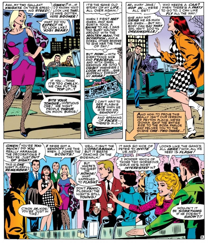

Script:  Stan Lee, Art: John Romita

I don't know who designed it.  Dormammu of Beverly Hills?  Purple and blue abstract design, with fishnets and a animal-print coat in decidedly unnatural hues of... purple again.  Jazzy John Romita was the perfect guy for this soapy stuff and he visualizes Gwen as the height of mid-60s cool.  It doesn't get any better, does it?

Yes it does!  Because here comes Mary Jane Watson in an op-art inspired checkerboard dress and some wild white boots with contrast black toes.  Shame about the orange coat, but she quickly dumps it once they hit the shindig.


Pretty much everyone there is a sharpie.  Smart jackets and ties for the gents, ultra-modern flips and bobs for the ladies.  The guest of honor, Flash Thompson himself, sports a brown coat with a black tee for an athletically casual take on dressing up.  That guy on the left of the top panel has a Beach Boys-looking striped shirt, possibly by Gant.  The only guy who looks anachronistic is poor Harry Osborn, with his green bowtie and jacket like something he borrowed from Barney Fife down in Mayberry, NC.  And he's supposed to be a rich boy.  He looks as if he popped in from a 1949 issue of Archie's Pep Comics.  He's even got Jughead's plate of hamburgers.
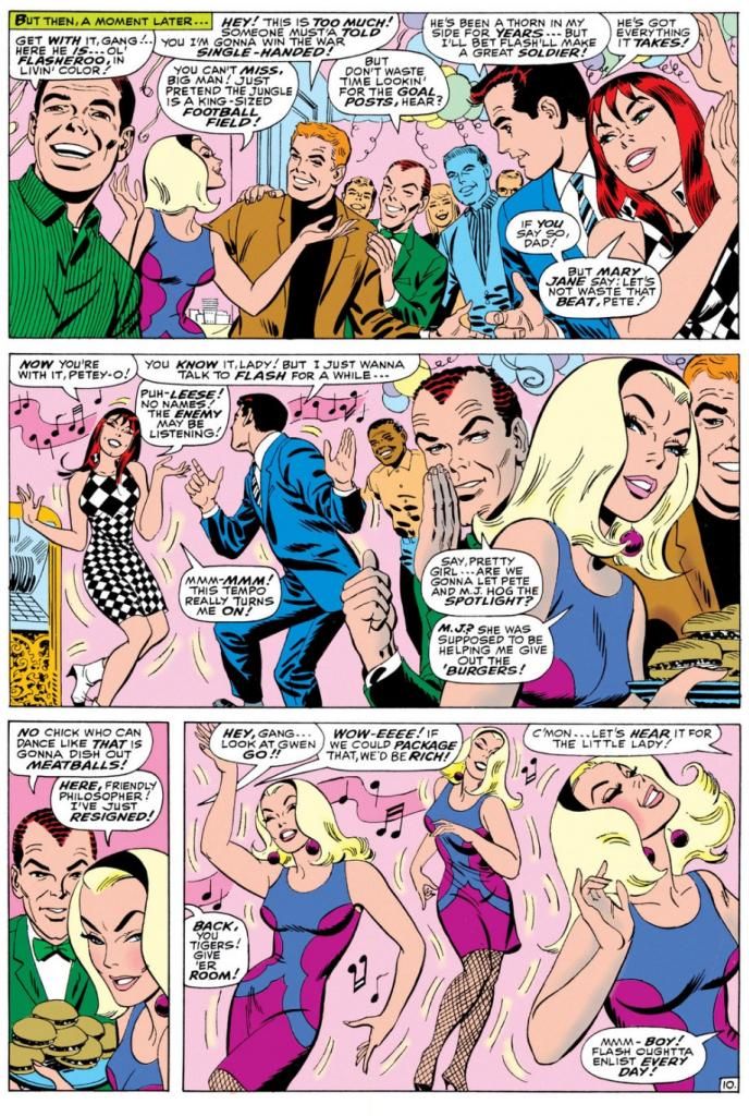
Script:  Stan Lee, Art: John Romita

Gwen steals the show-- much to Mary Jane's displeasure-- with a dance that rivals the one Audrey Horne would do a generation or so later on the premiere episode of Twin Peaks.  All eyes on Gwen.  Stan's blatantly sexist catcalls crack me up.  These are just a few, but they run all through this part of the comic, with Harry and Pete congratulating themselves on having such beauties for girlfriends and Pete secretly leering at Gwen every chance he gets.

Don't you wonder what music Gwen's dancing to?  This was right as pop was going psychedelic and becoming undanceable, and I doubt anyone wriggled and swayed to folk songs or protest tunes.  If this were a TV show of the time, it would be some outdated-sounding jazzy stuff the network squares thought of as "close enough to that rock junk no one will be able to tell the difference anyway." 

You know, like when Opie needs a little background noise while sweeping the courthouse floor for his dad and flips on a little white transistor radio and upbeat guitar noodling comes blaring out.  Then Ope starts doing some kind of frantic moves with his broom still in hand says, "Gee, Pa, isn't this the most?"  And Andy's like, "The most WHAT?"  But because he's pretty open-minded for a Southern sheriff of the day, he and Helen Crump end up championing the fresh-faced kids at the high school who want to add a couple of the exact same generic rock tunes to the annual play instead of doing the same old "founding of Mayberry" junk the older teachers favor.

Anyway, beautifully drawn, hilariously written bit of scene-setting before the issue's bad guy makes an appearance.  Kraven the Hunter.  You know what?  Who really gives a rip about that jackass when you've got these kinds of lovely John Romita pages to look at?  Interestingly, Romita is doing a Steve Ditko impression throughout, and even Kraven's face in a few panels looks more Ditko than Romita.  Artistic continuity, and at times Romita's line looks so impressively close to the guy's who he's imitating, it's almost as if Ditko himself inked this book.

Well, it's a fine book and I wish Lee and Romita had spent even more time just hanging out with the kids.  But I guess the readers came for the action, but I'm more in love with the soap opera/character-building sequences during this era.  I'd hang out with all of these characters even without the superheroic spider-bite antics.  We don't even have to talk politics.

Tuesday, April 29, 2014

A few more words on Comixology...

Okay, so I downloaded and set up the new iPhone app, downloaded a few of my comics to it and gave it a try.  Not bad, not bad.  I think it's as good a reading experience as you could expect on an iPhone with its relatively tiny screen.  Comixology seems to have addressed my main complaint-- the difficulty of getting out of a comic once you're in one so you can read another.  This was driving me crazy.  Where the heck do you press the screen?  I found it a lot easier in the new app.

One feature that's gone is the ability to buy comics within the app itself.  I found that out via IDW's website.  There's all this new Amazon.com-related info there, none of which I understand.  I have a ton of IDW comics on Comixology and I was a little concerned when I couldn't find their listings on the actual website.  The ones I've already paid for are still there, so that was a relief.  I'll say it again-- buying a license to read comics on your various devices is not the same as buying the actual comics and you're subject to losing access to a lot of books you've paid the same price for as you would a physical copy no one can come confiscate from you. 

This is why I haven't invested heavily in old school Star Wars comics on Dark Horse's website, as much as I crave Archie Goodwin-Al Williamson-Carlos Garzon magic.  And also those Carmine Infantino-drawn oddities like talking rabbits, Sergio Aragones as a space pirate and whatnot.  With the license reverting to Marvel, I have this worrisome feeling the Dark Horse issues will vanish from computers around the world. 

So not being able to find single issues of IDW's Powerpuff Girls (one of the best comics to come along in quite some time, but I don't cover it here because it's not archaeological) had me thinking along those lines.  Did something happen with the Amazon purchase?  I'm at work and can't research this further or look into whether the various parties are working through legal agreements or if I'm just an idiot who can't search Comixology properly.  I lean towards the latter.  The point is, my stuff is still there.  And I don't really care about buying comics within the iPhone app.  I can never remember my Apple password anyway!

One plus of the changeover to the new app is the $5 gift card Comixology gave me.  And lo and behold, Marvel Monday just happened to have Amazing Spider-Man for .99.  This was exactly what I was hoping for.  Well, not quite.  What I really wanted was Fantastic Four #50 and some more Nick Cardy Teen Titans, but I'm not going to complain because I picked up five classic Spidey issues, four by Steve Ditko and one by John Romita.  I love me some Ditko-Romita-John Buscema-Gil Kane Amazing Spider-Man.

Well, the next step is re-downloading everything.  You can find all your books in something called the "cloud," which makes me think of magical nonsense spaces and floating castles of pink gingerbread and blue sugar-cream where knights in gleaming armor and ladies in flowing damask fly around on winged dragons, but apparently is just a computer server somewhere.

Wednesday, December 11, 2013

Heroes on buildings and differing looks/Fighting some tentacles/webbing some crooks/These are few of my favorite Spidey things (artists)...

Editor's Note:  I've really neglected Spider-Man in this blog, and I apologize for that.  I'm about to make up for it with one giant post!  Here we go!

Spider-Man has gone through a lot of artists over the decades, and while his costume basics have remained the same, some artists have taken it upon themselves to tweak the details.  For some people, the Todd McFarlane version of Spider-Man is their favorite.  Huge eyes, lots of weblines on the red parts, really exaggerated insect-like poses and fingers that resemble circumcised penises and feet made out of garden spades.  Some may be into the black costumed Spider-Man.  Or the Ultimate Spider-Man.  Or that guy who dresses like Spider-Man and climbs skyscrapers.  Whatever your taste, Spider-Man has been around long enough there's probably one for you, and that one is more than likely the one by whatever artist handled the character when you first got into him.

I'm pretty damned old, so my first Spidey crush was on what was probably a John Romita Spider-Man on a Mead Trapper-Keeper I had in elementary school back in the late 1970s.  Given the era, it could also have been a John Buscema or Gil Kane drawing.  Actually, it may not have been a Trapper Keeper at all, but a folder or even a notebook.  There's a chance it's the one with the cover to Amazing Spider-Man #135 (which means Romita), but I remember it more as a collage of cover images, which means it could be any combination of artists.

Whichever one it was, and however vague my memory of its specifics, what I definitely remember is how it imprinted in my brain a certain vision of what the ideal Spider-Man looked like.  After all, that Spidey matched up well with the Mego Spider-Man, the Spider-Man on the The Amazing Spider-Man TV series, the one on The Electric Company, the bodybuilder who dressed like Spider-Man at the mall we had our photos taken with and, most importantly, the Spider-Man still appearing in Marvel comics like The Amazing Spider-Man, Peter Parker the Spectacular Spider-Man, Spidey Super Stories and even in the Hostess Fruit Pie ads.  Spider-Man de rigueur for the 1970s.

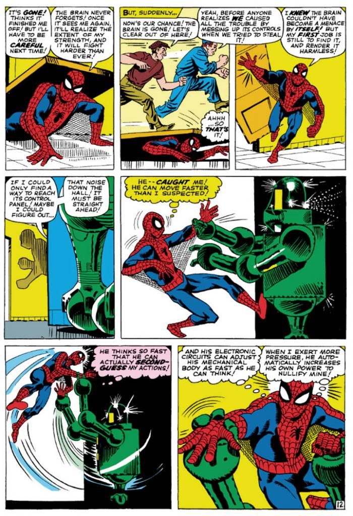
Then I learned of Steve Ditko from a Dr. Strange story collection. That he was the original Spidey artist meant I had to give his rendition careful consideration in light of its preeminence in Spider-Man history.  Well, it didn't take long for Ditko's vision to take over my imagination.  Here's a typical Ditko Spider-Man.

Amazing Spider-Man #8 (January 1964) Art by Steve Ditko

This is from Amazing Spider-Man #8 (January 1964), touted on the cover as a "Special 'Tribute to Teen-Agers' Issue!!"  Since the character himself is a teen-ager, Ditko's Spider-Man is muscular in a youthful, long-distance-runner way, but isn't quite as classically proportioned as some later versions.  While this isn't particularly a good example of it, Ditko also tends to put heavier shadows in the costume's blue areas, which makes me think his intention is for that part to be navy blue rather than the royal blue the subsequent Spideys sport, or even black.  But given the way comic books treated colors back then, and with all the recoloring and touch-ups in the years since, it's hard to say.  What we can see is Ditko favors larger eyes with heavier black outlines, to emphasize the insect-like aspect of Spidey's mask.  He aso gives Spidey more underarm webbing than most artists-- and it runs from his belt all the way to his gloves!

Using the three-tier page format, Ditko chops action into small increments, which makes sequences more movie-like and easy to follow.  But he also uses mostly medium shots, which keeps the action at arm’s length.  It’s simple storytelling at its finest, and reduces events to something approaching the comic book version of documentary-like as opposed to the heightened or epic.  Spider-Man’s powers may be the one fantastic element in a world Ditko means to represent our own, but he’s hindered by the same things we deal with ourselves and so we identify with him even if we’re not right in his face masking ourselves as him.  With his funky take on facial expressions and body language—with his rough-hewn finishes few of Ditko’s people are blatantly gorgeous—this makes Spidey’s adventures just a bit larger-than-life rather than massive.  There’s our trod-upon hero (literally) coming out from under a door, in the confines of some functional corridor rather than high above a cityscape.

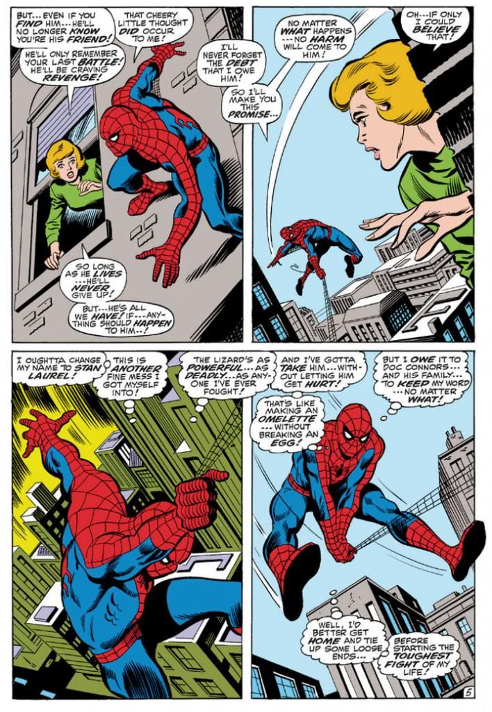
John Romita took over the title when Ditko left, but we'll look at him later because we're doing this in order of what I own.  So keeping that in mind, here's John Buscema's version, inked by Jim Mooney, from a few years later.  We have to acknowledge the influence of Romita's slight revision of the costume, but the rest is Buscema all the way.

Amazing Spider-Man #76 (September 1969) Art by John Buscema and Jim Mooney

Buscema’s Spider-Man (from an issue actually printed within my lifetime!) is muscled like some gorgeous Renaissance sculpture come to life, a full nine heroic heads tall.  Spider-Man, not Spider-Teen.  Buscema puts us inside the action and this time, the entire thing is made up of fantastic elements—other than the (fairly) realistic buildings, but even they’re skewed with deep perspective shots.  By varying panel size and shape, changing point-of-view and enlarging the images so he can fit only four on a page, Buscema creates a heightened dynamism that’s at odds with Ditko’s reductionism.  This isn’t to say one is right and one is wrong.  They may represent differing philosophies or thought processes on what constitutes heroism.  Or maybe Buscema just liked big takes.  Both are totally valid approaches, but I like how Ditko's Spider struggles a bit more.  On the other hand, Marvel tended to push Buscema’s powerful approach to storytelling on us through things like How to Draw Comics the Marvel Way.  This had a huge influence on my tastes as a teenager.
 
I don't see any armpit webbing on this page, but that may be because Jim Mooney forgot to ink it.  They include it on other pages, but it's subtler than Ditko's.
 
As much as I love both Ditko and Buscema, these days my preferred Spider-Man artist is his second penciller, none other than the aforementioned John Romita.  Let's take a look at his Spidey.

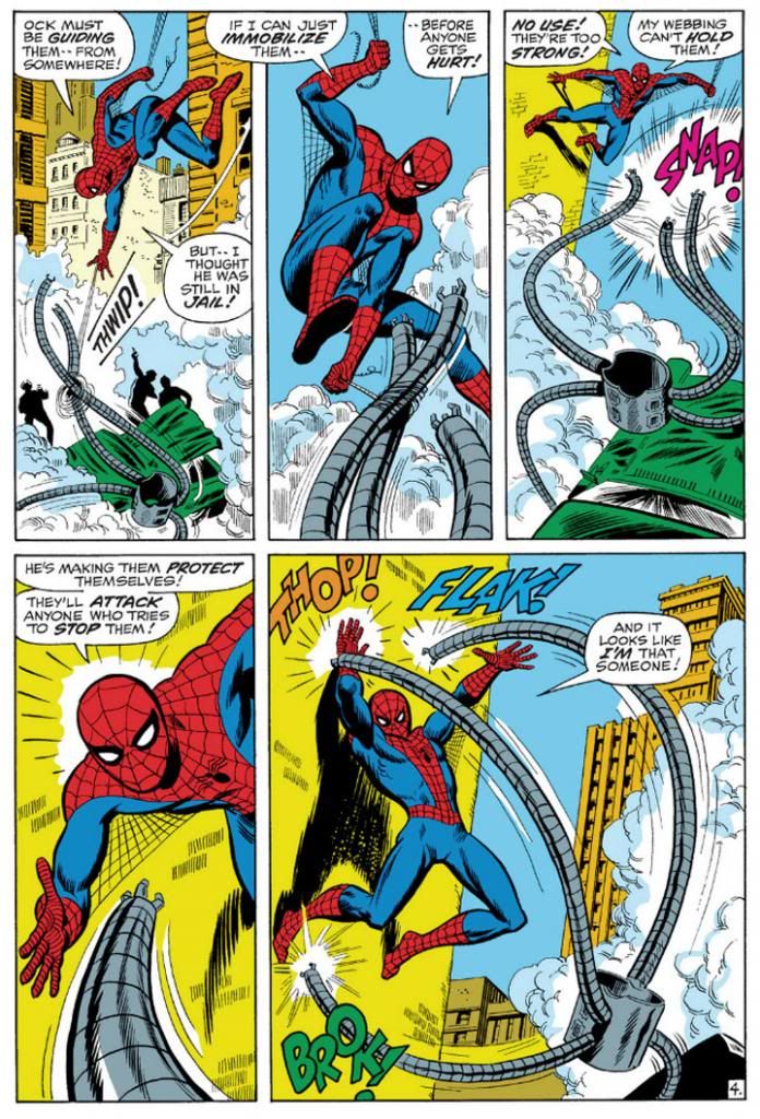
Amazing Spider-Man #88 (September 1970) Art by John Romita and Mooney

This is a clever sequence from the September 1970 story, "The Arms of Doctor Octopus!," where, true to its title, Spider-Man fights Doctor Octopus' arms.  Only the arms.  The good Doctor controls them from his prison cell.  Romita's Spider-Man is slightly slenderer than Buscema's, but they share body language.  Romita also brings us inside the action with this two-tier layout.  In the Buscema page, we have three Spideys roughly the same size with a smaller one for variety.  Romita gives us three Spidey sizes:  small, medium and large.  It's not quite as bombastic as Buscema's, but it's still bold.  Romita's characters tend towards the pretty, maybe due to his romance comics background.  I don't think anyone handled the soap opera stuff in Amazing Spider-Man better than Romita.  Slick Mooney finishes keep some surface consistency with line weights and the treatment of Spidey's blue areas.  I haven't seen the pencils for this page or the Buscema one, but I'm going to guess Mooney has a great deal to do with the near-identical eye and web pattern treatments.  The color choices here interest me, but I'm not sure how much is due to the original colorist and what might have been changed in the years since.  Anyway, it works.  Since Doc Ock's arms are gray and wouldn't have popped in the foreground otherwise, notice how the buildings on the Buscema page are gray, but the colorist here used a lot of yellow and yellow-orange.

Also, THOP!  FLAK!  BROK!  And the return of the armpit webbing.  It's finer than Ditko's and only reaches Spidey's elbows.

While I've stated my preference for Romita, I wouldn't care to meet the fan who finds fault in Gil Kane's interpretation.

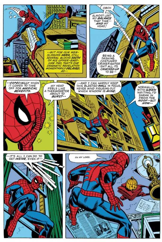
Amazing Spider-Man #121 (June 1973) Art by Gil Kane and Tony Mortellaro

Here's our first extreme close-up!  It appears in Amazing Spider-Man #121 (June 1973), in a story you may have heard of called "The Night Gwen Stacy Died."  Not sure what happens in that one, and with an obscure title like that, your guess is as good as mine.

But I am pretty sure Ditko, Buscema and Romita all used close-ups before Kane.  But Kane, like Ditko, excelled at facial expressions.  Look at some of his cover work with those giant screaming heads.  Kane puts extreme close-ups to effective use throughout this issue.  Yeah, Peter Parker's face is hidden under a mask most of the time, but the idea's basically the same.  This is an important little moment Kane chooses to emphasize with a cutaway to Spider-Man holding his head because it "feels like a thermometer is about to burst--"  Spidey on this page isn't feeling well, and in his one high-flying moment of web-swinging, Kane gives him wonky body language, then confines him to wall-crawling and slipping in windows and crouching on newspapers.  I like the last panel especially, with the high angle from-behind shot giving us both Spider-Man and the pumpkin bomb he's reacting to all in one shot.  There's a nice use of a missing panel here, with Spidey on the windowsill cutting to Spidey in the room in such a way the omitted leap is implied.  It's almost animated.

No armpit webbing.

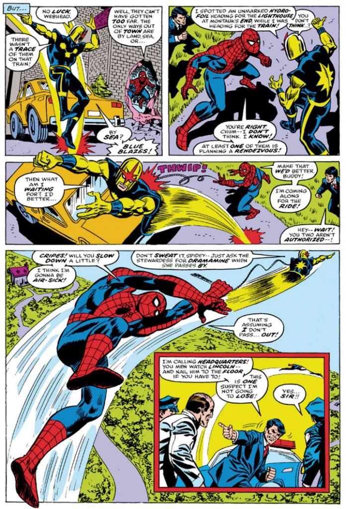
Ross Andru, who drew Amazing Spider-Man for five years (impressive!) gives us two superheroes for the price of one, but we're going to ignore Nova and his golden bullet-helmet.

Amazing Spider-Man #171 (August 1977) Art by Ross Andru and Mike Esposito

Once again, we have medium shots and three panels in a row with high angle views, the last with a larger foreground Spider-Man inducing vertigo as Nova drags him through the air.  And then an inset panel with the two of them so high they're tiny to the cops left behind on the ground.  Andru's Spider-Man retains the crouching body language of Kane's, but is noticeably chunkier than any of the ones we've looked at previously.  He's got the Ditko-style dark shadowing on his blue uniform areas (maybe inker Mike Esposito contributed that part), but again, none of the armpit webbing.  Did Marvel abandon that look, or was that an Andru flourish?  It's not as if the armpit webbing has any real function and it wouldn't have worked in the panel with the largest Spidey anyway-- it would have obscured his chest and been a challenging artistic exercise for Esposito, like when a penciller puts speedlines in front of an object.  How do you look through those?  Do they distort the background image?  Just how much of that should remain for clarity's sake, or for simplicity?

Andru came over from DC where he worked on war comics and Wonder Woman.  Can you see any of those elements informing his work here?  I know he did a classic take on Wonder Woman and he's giving us a clean, house-style Spider-Man on these pages.

Oh, and the yellow sky in the inset panel.  That was originally the work of Glynis Wein, who colored a pile of Marvel books.  It reminds me of Harvey Comics.  For some reason, colorists at Harvey seemed to love making the sky yellow.  Here it makes a good depth contrast for the figures heavy on the blue side in the foreground. In fact, whoever colored this seems to have put some extra effort into popping figures by contrasting cool colors on top of warm (although you still have to put up with Nova's yellow arms).  I'd love to see the original printed page to see how accurate Marvel has recreated Wein's colors here.

And there you have it.  Ditko, Buscema, Romita, Kane and Andru.  They're in my Spider-man Hall of Fame.  Yeah, I like the way Ron Frenz and John Romita, Jr. and even John Byrne-- to name three more-- draw the character, but when I think Spidey, I think Ditko, Buscema, Romita, Kane and Andre.  Their versions combine into my platonic ideal of Spider-Man.