Showing posts with label Spider-Man. Show all posts

Wednesday, April 16, 2014

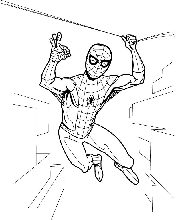
Spidey says, "Everything is A-OK!"


Because he's a big Mercury 7/NASA fan, I guess.  This is a drawing I'm working on along with a number of other ones.  I'm on fire lately!  After drawing Spider-Man enjoying a sandwich, I felt like doing one where he's acting like he does in the comic books.  I need to fix the webbing on Spider-Man's costume, make an adjustment to his anatomy here and there and fix the perspective and add some windows and balconies and other architectural features to the background.  Then I'm going to give it a John Romita/John Buscema/Gil Kane era color job.  I'll never be skilled enough to be one of those real comic book artists, but I do feel I've upped my game quite a bit lately.  It's been fun and that's the most important thing.

Monday, March 31, 2014

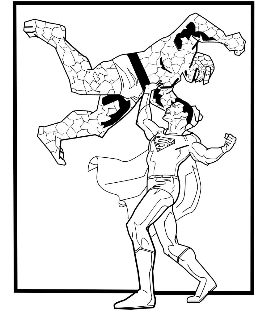
Superman versus the Thing and Spider-Man takes a swing! A couple of "in progress" drawings


Two of my favorite characters come into conflict with each other.  I'm pretty sure Superman could take the Thing.  The Superman figure is largely complete.  I need to fix his hands, right calf muscle and the cape, and I may adjust the line weights a bit.  Poor Ben Grimm needs a lot of work, though.  Not happy with the arm shadow.  It needs to be wider and extend down his chest a bit.  And all those rocky facets!
 
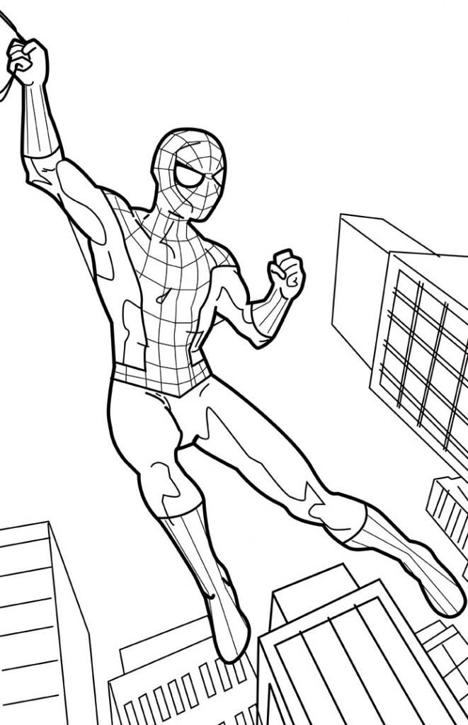
Here's Spider-Man acting more like the Spider-Man we all know and love:


The color scheme for this one is going to be more John Romita/Gil Kane era Spidey than Steve Ditko.  I have to fix the perspective (look at the wonky windows on the building under Spider-Man's right foot, just to point out something that's pretty obvious), finish the webbing on his costume (and he needs his chest emblem!) and adjust the left leg. The muscle on the outside edge near the knee isn't working for me and the foot is angled wrong. The pose itself is lacking in dynamics. I've got a rough sketch of a more exciting (I hope) one I'm going to start inking today.

These are penciled in Manga Studio 5 and inked in Adobe Illustrator.  I'm considering another work flow, though, where I print out the pencils and hand-ink them on vellum or using a lightbox or something along those lines.  Digital inking is no panacea, although it's nice for fidgety, shaky-handed fools like me.  I like being able to fiddle around with the lines and get them "just so," but the results are lacking in humanity.  I am a machine.

Other works in progress include Supergirl versus Darkseid and, for one of my other blogs, a couple of Cassandra Cain Batgirl images, one where she goes up against Wolverine and another where she takes on the Joker.

Wednesday, March 26, 2014

A very Spidey sandwich... in color!


And... finished!  I don't want to work on it anymore and I'm already seeing things I hate about it but there it is, a silly image I've had stuck in my head for over a year now making its way inside yours!  Enjoy!

Tuesday, March 25, 2014

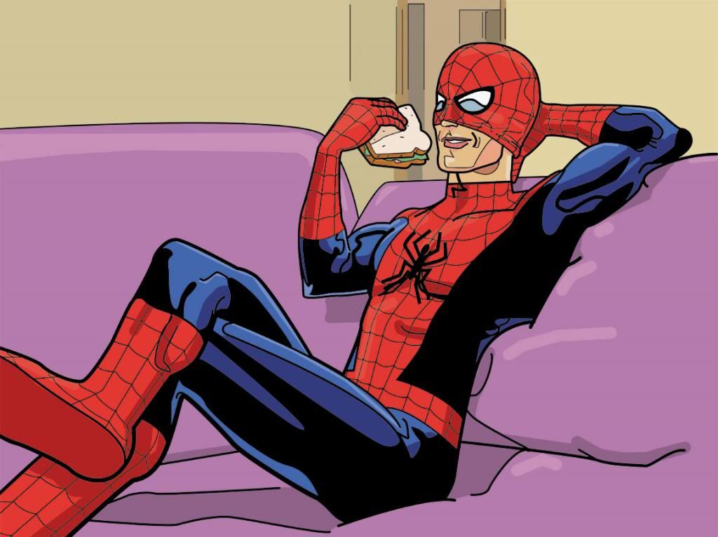
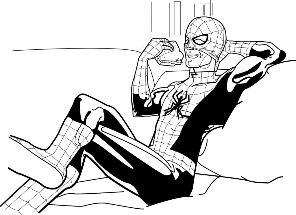
Spider-Man enjoys a delicious ham sandwich...


We all remember the theme to the 1960s Spider-Man show.  And some of you may have done the same thing a friend of mine and I used to do.  We made up our own verses and had Spidey doing little daily chores and other mundane activities: 

Spider-Man, Spider-Man
does whatever a spider can
takes a shower, goes to work
comes back home, takes a nap
LOOK OUT!
Here comes the Spider-Man!

We came up with approximately sixty thousand verses.  That's what inspired me to do this laid-back wallcrawler.

Wednesday, December 11, 2013

Heroes on buildings and differing looks/Fighting some tentacles/webbing some crooks/These are few of my favorite Spidey things (artists)...

Editor's Note:  I've really neglected Spider-Man in this blog, and I apologize for that.  I'm about to make up for it with one giant post!  Here we go!

Spider-Man has gone through a lot of artists over the decades, and while his costume basics have remained the same, some artists have taken it upon themselves to tweak the details.  For some people, the Todd McFarlane version of Spider-Man is their favorite.  Huge eyes, lots of weblines on the red parts, really exaggerated insect-like poses and fingers that resemble circumcised penises and feet made out of garden spades.  Some may be into the black costumed Spider-Man.  Or the Ultimate Spider-Man.  Or that guy who dresses like Spider-Man and climbs skyscrapers.  Whatever your taste, Spider-Man has been around long enough there's probably one for you, and that one is more than likely the one by whatever artist handled the character when you first got into him.

I'm pretty damned old, so my first Spidey crush was on what was probably a John Romita Spider-Man on a Mead Trapper-Keeper I had in elementary school back in the late 1970s.  Given the era, it could also have been a John Buscema or Gil Kane drawing.  Actually, it may not have been a Trapper Keeper at all, but a folder or even a notebook.  There's a chance it's the one with the cover to Amazing Spider-Man #135 (which means Romita), but I remember it more as a collage of cover images, which means it could be any combination of artists.

Whichever one it was, and however vague my memory of its specifics, what I definitely remember is how it imprinted in my brain a certain vision of what the ideal Spider-Man looked like.  After all, that Spidey matched up well with the Mego Spider-Man, the Spider-Man on the The Amazing Spider-Man TV series, the one on The Electric Company, the bodybuilder who dressed like Spider-Man at the mall we had our photos taken with and, most importantly, the Spider-Man still appearing in Marvel comics like The Amazing Spider-Man, Peter Parker the Spectacular Spider-Man, Spidey Super Stories and even in the Hostess Fruit Pie ads.  Spider-Man de rigueur for the 1970s.

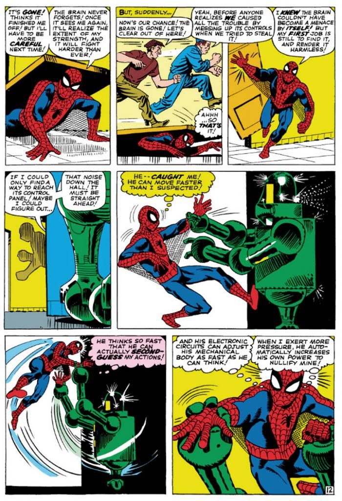
Then I learned of Steve Ditko from a Dr. Strange story collection. That he was the original Spidey artist meant I had to give his rendition careful consideration in light of its preeminence in Spider-Man history.  Well, it didn't take long for Ditko's vision to take over my imagination.  Here's a typical Ditko Spider-Man.

Amazing Spider-Man #8 (January 1964) Art by Steve Ditko

This is from Amazing Spider-Man #8 (January 1964), touted on the cover as a "Special 'Tribute to Teen-Agers' Issue!!"  Since the character himself is a teen-ager, Ditko's Spider-Man is muscular in a youthful, long-distance-runner way, but isn't quite as classically proportioned as some later versions.  While this isn't particularly a good example of it, Ditko also tends to put heavier shadows in the costume's blue areas, which makes me think his intention is for that part to be navy blue rather than the royal blue the subsequent Spideys sport, or even black.  But given the way comic books treated colors back then, and with all the recoloring and touch-ups in the years since, it's hard to say.  What we can see is Ditko favors larger eyes with heavier black outlines, to emphasize the insect-like aspect of Spidey's mask.  He aso gives Spidey more underarm webbing than most artists-- and it runs from his belt all the way to his gloves!

Using the three-tier page format, Ditko chops action into small increments, which makes sequences more movie-like and easy to follow.  But he also uses mostly medium shots, which keeps the action at arm’s length.  It’s simple storytelling at its finest, and reduces events to something approaching the comic book version of documentary-like as opposed to the heightened or epic.  Spider-Man’s powers may be the one fantastic element in a world Ditko means to represent our own, but he’s hindered by the same things we deal with ourselves and so we identify with him even if we’re not right in his face masking ourselves as him.  With his funky take on facial expressions and body language—with his rough-hewn finishes few of Ditko’s people are blatantly gorgeous—this makes Spidey’s adventures just a bit larger-than-life rather than massive.  There’s our trod-upon hero (literally) coming out from under a door, in the confines of some functional corridor rather than high above a cityscape.

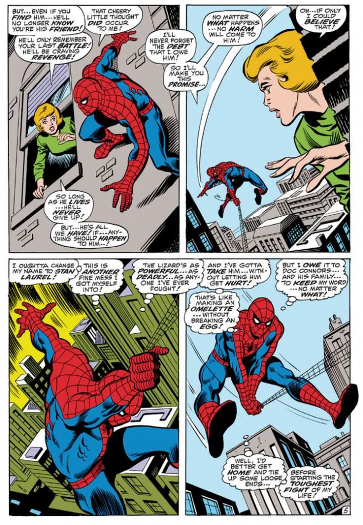
John Romita took over the title when Ditko left, but we'll look at him later because we're doing this in order of what I own.  So keeping that in mind, here's John Buscema's version, inked by Jim Mooney, from a few years later.  We have to acknowledge the influence of Romita's slight revision of the costume, but the rest is Buscema all the way.

Amazing Spider-Man #76 (September 1969) Art by John Buscema and Jim Mooney

Buscema’s Spider-Man (from an issue actually printed within my lifetime!) is muscled like some gorgeous Renaissance sculpture come to life, a full nine heroic heads tall.  Spider-Man, not Spider-Teen.  Buscema puts us inside the action and this time, the entire thing is made up of fantastic elements—other than the (fairly) realistic buildings, but even they’re skewed with deep perspective shots.  By varying panel size and shape, changing point-of-view and enlarging the images so he can fit only four on a page, Buscema creates a heightened dynamism that’s at odds with Ditko’s reductionism.  This isn’t to say one is right and one is wrong.  They may represent differing philosophies or thought processes on what constitutes heroism.  Or maybe Buscema just liked big takes.  Both are totally valid approaches, but I like how Ditko's Spider struggles a bit more.  On the other hand, Marvel tended to push Buscema’s powerful approach to storytelling on us through things like How to Draw Comics the Marvel Way.  This had a huge influence on my tastes as a teenager.
 
I don't see any armpit webbing on this page, but that may be because Jim Mooney forgot to ink it.  They include it on other pages, but it's subtler than Ditko's.
 
As much as I love both Ditko and Buscema, these days my preferred Spider-Man artist is his second penciller, none other than the aforementioned John Romita.  Let's take a look at his Spidey.

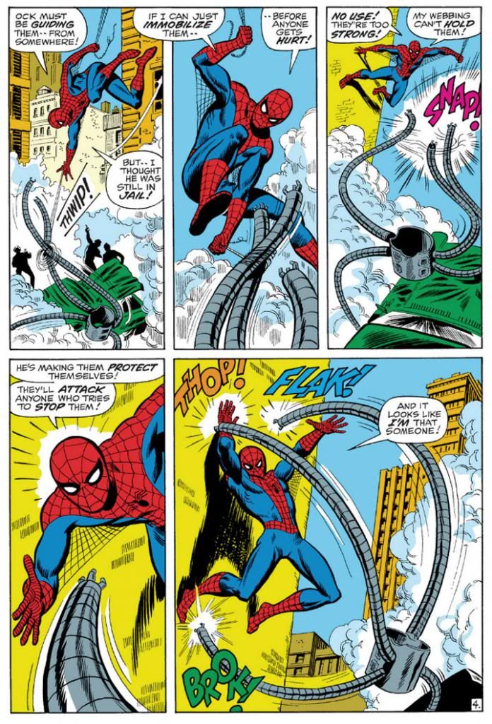
Amazing Spider-Man #88 (September 1970) Art by John Romita and Mooney

This is a clever sequence from the September 1970 story, "The Arms of Doctor Octopus!," where, true to its title, Spider-Man fights Doctor Octopus' arms.  Only the arms.  The good Doctor controls them from his prison cell.  Romita's Spider-Man is slightly slenderer than Buscema's, but they share body language.  Romita also brings us inside the action with this two-tier layout.  In the Buscema page, we have three Spideys roughly the same size with a smaller one for variety.  Romita gives us three Spidey sizes:  small, medium and large.  It's not quite as bombastic as Buscema's, but it's still bold.  Romita's characters tend towards the pretty, maybe due to his romance comics background.  I don't think anyone handled the soap opera stuff in Amazing Spider-Man better than Romita.  Slick Mooney finishes keep some surface consistency with line weights and the treatment of Spidey's blue areas.  I haven't seen the pencils for this page or the Buscema one, but I'm going to guess Mooney has a great deal to do with the near-identical eye and web pattern treatments.  The color choices here interest me, but I'm not sure how much is due to the original colorist and what might have been changed in the years since.  Anyway, it works.  Since Doc Ock's arms are gray and wouldn't have popped in the foreground otherwise, notice how the buildings on the Buscema page are gray, but the colorist here used a lot of yellow and yellow-orange.

Also, THOP!  FLAK!  BROK!  And the return of the armpit webbing.  It's finer than Ditko's and only reaches Spidey's elbows.

While I've stated my preference for Romita, I wouldn't care to meet the fan who finds fault in Gil Kane's interpretation.

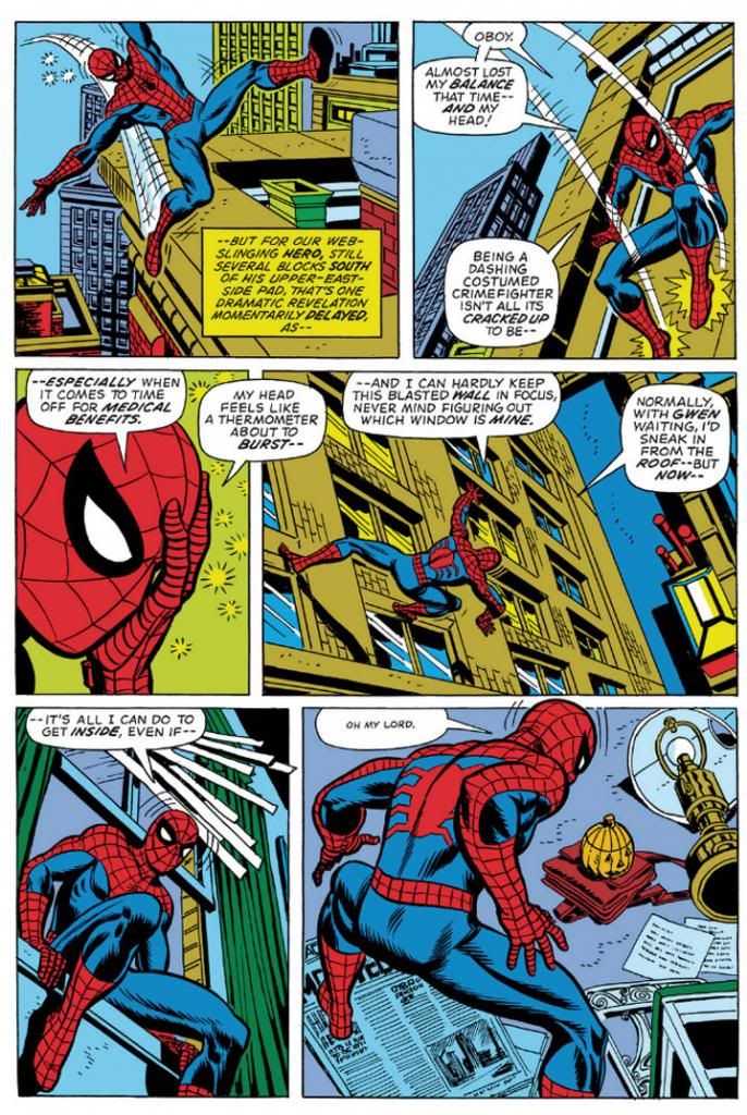
Amazing Spider-Man #121 (June 1973) Art by Gil Kane and Tony Mortellaro

Here's our first extreme close-up!  It appears in Amazing Spider-Man #121 (June 1973), in a story you may have heard of called "The Night Gwen Stacy Died."  Not sure what happens in that one, and with an obscure title like that, your guess is as good as mine.

But I am pretty sure Ditko, Buscema and Romita all used close-ups before Kane.  But Kane, like Ditko, excelled at facial expressions.  Look at some of his cover work with those giant screaming heads.  Kane puts extreme close-ups to effective use throughout this issue.  Yeah, Peter Parker's face is hidden under a mask most of the time, but the idea's basically the same.  This is an important little moment Kane chooses to emphasize with a cutaway to Spider-Man holding his head because it "feels like a thermometer is about to burst--"  Spidey on this page isn't feeling well, and in his one high-flying moment of web-swinging, Kane gives him wonky body language, then confines him to wall-crawling and slipping in windows and crouching on newspapers.  I like the last panel especially, with the high angle from-behind shot giving us both Spider-Man and the pumpkin bomb he's reacting to all in one shot.  There's a nice use of a missing panel here, with Spidey on the windowsill cutting to Spidey in the room in such a way the omitted leap is implied.  It's almost animated.

No armpit webbing.

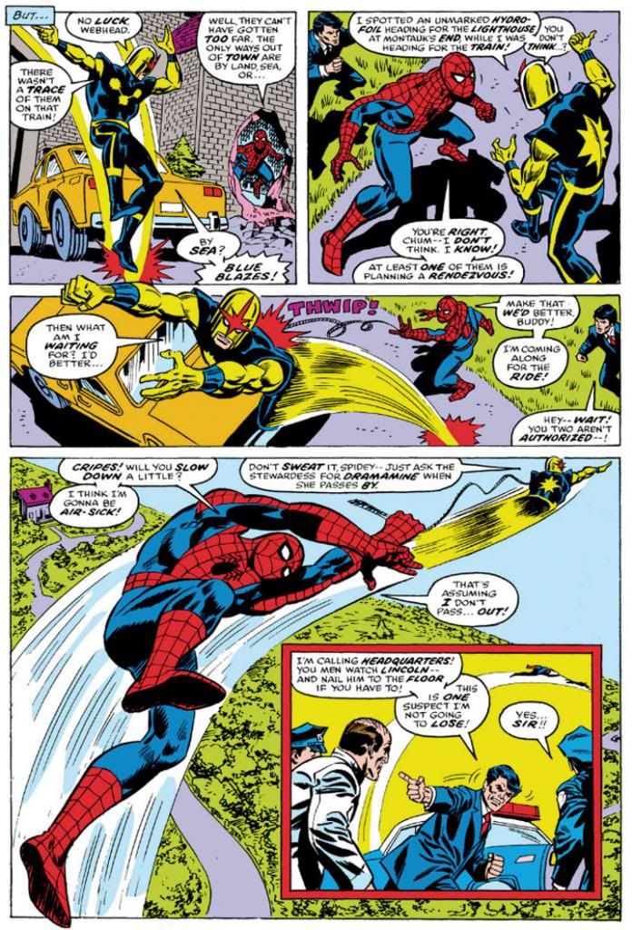
Ross Andru, who drew Amazing Spider-Man for five years (impressive!) gives us two superheroes for the price of one, but we're going to ignore Nova and his golden bullet-helmet.

Amazing Spider-Man #171 (August 1977) Art by Ross Andru and Mike Esposito

Once again, we have medium shots and three panels in a row with high angle views, the last with a larger foreground Spider-Man inducing vertigo as Nova drags him through the air.  And then an inset panel with the two of them so high they're tiny to the cops left behind on the ground.  Andru's Spider-Man retains the crouching body language of Kane's, but is noticeably chunkier than any of the ones we've looked at previously.  He's got the Ditko-style dark shadowing on his blue uniform areas (maybe inker Mike Esposito contributed that part), but again, none of the armpit webbing.  Did Marvel abandon that look, or was that an Andru flourish?  It's not as if the armpit webbing has any real function and it wouldn't have worked in the panel with the largest Spidey anyway-- it would have obscured his chest and been a challenging artistic exercise for Esposito, like when a penciller puts speedlines in front of an object.  How do you look through those?  Do they distort the background image?  Just how much of that should remain for clarity's sake, or for simplicity?

Andru came over from DC where he worked on war comics and Wonder Woman.  Can you see any of those elements informing his work here?  I know he did a classic take on Wonder Woman and he's giving us a clean, house-style Spider-Man on these pages.

Oh, and the yellow sky in the inset panel.  That was originally the work of Glynis Wein, who colored a pile of Marvel books.  It reminds me of Harvey Comics.  For some reason, colorists at Harvey seemed to love making the sky yellow.  Here it makes a good depth contrast for the figures heavy on the blue side in the foreground. In fact, whoever colored this seems to have put some extra effort into popping figures by contrasting cool colors on top of warm (although you still have to put up with Nova's yellow arms).  I'd love to see the original printed page to see how accurate Marvel has recreated Wein's colors here.

And there you have it.  Ditko, Buscema, Romita, Kane and Andru.  They're in my Spider-man Hall of Fame.  Yeah, I like the way Ron Frenz and John Romita, Jr. and even John Byrne-- to name three more-- draw the character, but when I think Spidey, I think Ditko, Buscema, Romita, Kane and Andre.  Their versions combine into my platonic ideal of Spider-Man.

Monday, August 26, 2013

The Amazing Re-colored Spider-Man!

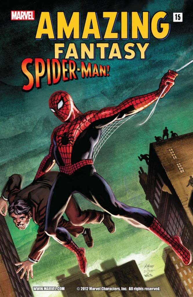
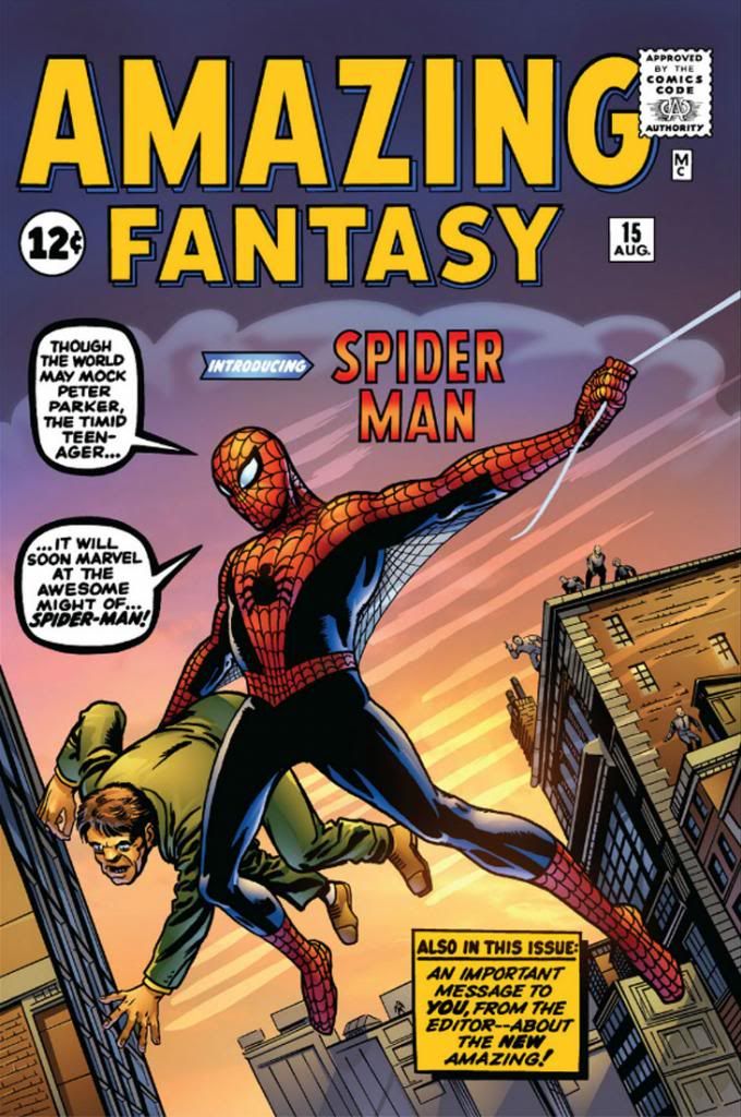
Here's the book that started it all. Sort of. While Fantastic Four was the book that inaugurated the "Marvel Age" of comics, Spider-Man was the character that became the company's Mickey Mouse. As we all know, Spidey bowed in Amazing Fantasy #15 (August 1962), which had formerly been titled Amazing Adult Fantasy, which sounds like a shop that sells sex toys and latex lingerie. Weirdly, #15 wasn't merely the debut of Spider-Man; it was also the final issue. The Amazing Spider-Man came next and ran for decades until Marvel killed it in favor of whatever it is they're doing now. I don't know, I don't wanna know. I do know this...


Painted Amazing Fantasy, huh? What about the original line work?


Recolored, by gum!  Did they do the same for the interior art?


Yep!  This isn't the worst recoloring job I've seen, but it's a bit too intense and the computer-generated smoothness of the gradients and color modeling (to create an illusion of roundness and depth) doesn't mesh with Steve Ditko's rough hewn finishes.  Ditko's treatment of anatomy was expressionistic and unique.  He wasn't trying to recreate the world in any kind of photorealistic way.  It's better to just leave it alone rather than try to interpret it with a lot of extra tones where you can only conflict with it or else muddy it up.  We also don't really need some latter-day color artist's impression of an artistic treatment of foliage in the trees.  Big open areas were good enough for Ditko; they're good enough for you.

On the other hand, just because something was originally printed with 100% magenta/100% yellow* to make red, or 100% red (depending on the inks used-- I worked for a newspaper that ran cyan, magenta, yellow and blue in its four-color printing process, but some substitute true red in there, and you have to adjust accordingly) doesn't mean the reprint has to follow suit.  When Marvel's reprints do that, on glossy, slick paper, the end results are often hideous, from the early days when color palettes relied largely on primary and secondary colors and even on material from the mid- to late-1980s, when the company's colorists apparently had a love affair with magenta, purple and big untouched areas.

The old schoolers needed that intensity because the paper was low-grade newsprint.  The press workers don't seem to have put much effort into registering the plates, so you ended up with floating reds or yellows or blues and characters with apparent milk mustaches.  Or pages that looked as if they were intended to be read with 3D glasses.  The paper wasn't even white.  It was slightly gray, and it yellowed or browned pretty quickly in direct sunlight.  Marvel covers from the time tend to flake or chip, as well.  These comics weren't intended as museum pieces or to compete visually with National Geographic.  Steve Ditko probably had no idea people would still be reading this book more than fifty years after he drew it, much less on archival paper or digitally.  Who could have foreseen that?

Well, now that we're reading comics on computers we're free from all those limitations.  But companies with deep back catalogs need to balance the sweet nostalgia of the historical with the flaw-fixing capabilities of modern technology.  Use naturalistic colors if you want, but mostly just try not to compete with what better artists than yourself did.  If you can't match the artist's intent, at least try not to compete with it or obliterate it.  You can make it look brand new to a certain extent, but above all, color restoration has to preserve the clarity of the original artwork.  Don't cover it up with a lot of extraneous visual noise or someone else's interpretation of anatomy or form.

Especially avoid going nuts like with some of the Neal Adams reprints I've seen in recent years where digital painting on top of the original inks has just covered them or rendered almost all the values the same--  some of those went from gorgeous to absolute mud.

*My original 50/50 formulation would have made "pure" orange, not red.  That's what being out of the game for over a decade will do to ya...

Tuesday, September 18, 2012

Identifying with Batman and Spider-Man makes you feel good about yourself...

What do you think of this report?  Apparently, some men who identify with Batman or Spider-Man feel better about their bodies when they look at pictures of their heroes, but if they're indifferent, the pictures make them feel worse.  A previous study found a similar effect in women who viewed celebrity photos.

I love this stuff.  I'm a psychology buff, and I know just enough about it to use its jargon to make bizarre, counter-factual claims and asinine pronouncements that can't withstand close scrutiny with facts.  To me, this report actually raises more questions than provides answers.  Here are a few.

1) What if you identify with Dani Moonstar or Cassandra Cain?  What effect does looking at drawings of Spider-Man and Batman have on your self-confidence?

2) What if you identify with Buddy Bradley?

3) Or the Crypt-Keeper?

4) Have they done this study specifically with female comic book fans?

5) Would doing the above study produce similar results?  Or, given the sexualized or fetishistic nature of how many female characters are presented, would they be opposite?  I'd be very interested in seeing how this plays out, because while their numbers aren't as great as with male fans, female comic fans are incredibly passionate about their favorite characters.

6) What is the nature of identification with characters involving female comic book fans?  Is it the same or different than with male fans?

7) What about fans with other gender identities?

8) Related to number one, how much cross-gender identification is there?  Is this common, or isolated?

9) In the study of women and celebrities, what kind of photos were used?  Were they candid shots, photos from public events or sexualized photo-spreads from men's magazines?  And would any of those affect the results?

10) Is identification with characters-- in effect, the reader "masking" himself or herself with certain characters-- important to creating a fan base or readership?

BONUS 11) What about fans who identify with villains?

I'm seriously interested in someone doing a study on these, and some in-depth surveying of women who read superhero comics.  Isn't it a fairly common belief male characters are idealized and more inviting of identification while female characters are objectified and more involving the reader in the male gazed based on an assumption that the readership is almost exclusively male?  And yet women who are into superhero comics really latch onto these characters and they're extremely vocal with their opinions.  Well, maybe that's just part of being a superhero comic fan.  But you know... Stephanie Brown.  Oracle.  Huntress.  Lois Lane. You dismiss or degrade these characters at your peril.

I'm also keenly interested in the gender dynamics.  As someone who easily identifies with female characters-- I have my entire life and probably pretended to be Wonder Woman, the Bionic Woman or any one of Charlie's Angels and even Cindy Lee from The Secrets of Isis as often as I portrayed Superman, the Incredible Hulk, Sgt. Rock, Batman or Spider-Man as a child, and Dani Moonstar quickly became my masking character of choice in New Mutants-- and responds strongly to their positive and negative portrayals, I'm guessing I fall somewhere outside the control group or whatever the heck they used here.  So I also want to know how other fans who view gender and sexuality in ways that aren't traditionally accepted.

And, strangely enough, I also identify quite a bit with characters with ambiguous morality-- in fictional, comic book dichotomous terms, not real life.  I find we have to go outside the mainstream to find these kinds of richly drawn, troublesome characters.  When I read Nexus, I tend to mask myself with Horatio Hellpop, but I find myself drawn to Ursula X.X. Imada whenever she appears on the scene.  Outside of genre fiction, I find Hopey Glass and Terry Downe from Love and Rockets have always fascinated me more than Maggie, the star.  And I have much more in common with Buddy Bradley from Peter Bagge's Hate than I'm comfortable admitting.

When I see drawings of them, how do I feel about myself?  Pretty good, I guess.

Thursday, May 17, 2012

The Phony Return: Senses-Shattering!!

No, I'm not back, True Believers!  I'm posting this from my desk at work while I'm waiting to do... more work.   According to my contract, I get off at 4:30pm (kind of weird mandating something so personal in a legally binding contract, but there you have it) but I usually have to stay for an hour or two post-time for meetings and plannings and all that kind of fun stuff.

At lunch today I decided to look up the phrase "senses-shattering," which was a particular favorite of Marvel hypesters back in the 1960s and 70s.  Why would anyone in his or her right mind want his or her senses shattered?  Why was sense shattering considered a draw?  There are no answers to these and other idiotic questions, but my random interest in "senses-shattering" led me to a hilarious blog where someone named Tom the Bomb deconstructed classic Marvel books before disappearing into the desert like a mirage or an Oliver Stone hallucination of something Jim Morrison would have hallucinated sometime around May 2009.  Our loss.

A senses-shattering loss.

In other news, the kindly Sagawa Transport gentleman delivered a couple of boxes to my apartment last night.  One contained Al Williamson Archives Volume 1 and 2 from Flesk Publications.  Wow!  Flesk (with the help of Mark Schultz, who also compiled their hefty and impressive Al Williamson's Flash Gordon:  A Lifelong Vision of the Heroic and wrote the most informative and ultimately heart-breaking overview of Williamson's art career to provide context for all the gorgeous art) presents full-color reproductions of Williamson's sketchbook pages, unfinished artwork, completed works unpublished elsewhere.  If you love the masters of comic book illustration these slender books are a must-have.  If you just love art, you need to at least look at them sometime.  Sorry, but no one touches mine.

The other box contained one of those Dark Horse Star Wars books, the ones with all the old Marvel stories.  By no coincidence, this book features some Williamson artwork, too-- the first part of Star Wars #50, "The Crimson Forever."

It was a very Al Williamson kind of day.

Sunday, November 13, 2011

More Cass Cain Batgirl fun times!


I drew this with my trusty Kuretake Fudegokochi brush pen. When I moved back to the United States from Japan, I brought a few of these with me because they're very fun to use. If all went well and we landed safely last Friday, I'm back in Japan but lack an Internet connection. So this was actually posted Wednesday before I left. Confusing, isn't it?

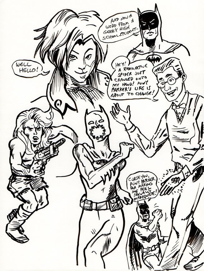
The clumsily constructed Kamandi figure is based on a panel from one of Jack Kirby's comics, but I added the wonky body and really went off-model on the futuristic pistol.  Peter Parker is fun to mock.  I love the character, especially during his glasses-wearing phase.  I based the Cassandra Cain Batgirl figure on a photo of a Japanese pop singer/actor.  And once again, I make fun of Batman.

I'm not sure when I'll have regular net access.  So talk amongst yourselves while I sort things out.

Wednesday, November 9, 2011

Another Batgirl-based sketchbook page...


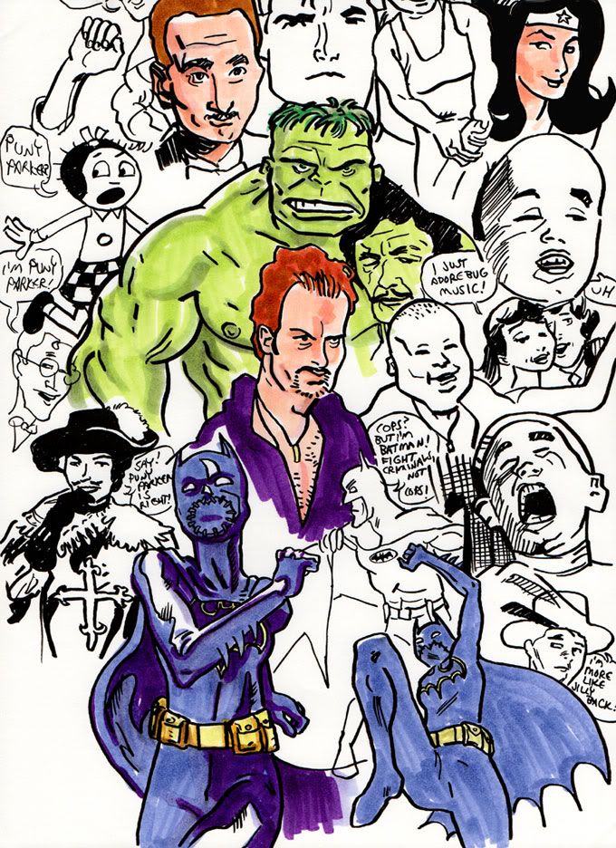
I drew this with that same Kuretake Fudegokochi brush pen I used for the previous Cassandra Cain/Batgirl sketchbook pages, but I colored it with Copic Ciao art markers.  The paper didn't fit on the scanbed, so Batgirl's legs got cut off.  But the Hulk still has his Charles Bronson pec/shoulder tattoo.  That's something, isn't it?

Friday, August 5, 2011

And now a belated look at Andrew Garfield in the new Spider-Man costume

It seems like the Sam Raimi/Tobey Maguire/Kirsten Dunst Spider-Man movies were too recent-- and the second one too awesome-- for a complete reconfiguring, but I'm not the person who makes these decisions. If Hollywood had listened to me, the Fantastic Four movies would have been Cold War period pieces stylistically akin to Mad Men, with the Thing in place of Don Draper, instead of product-placement-heavy sitcoms. This year, the producers of X-Men: First Class took the retro approach and I didn't bother to see it. So what do I know?

Okay, Andrew Garfield in his Spidey suit
. The guy looks the part. In some of the poses-- if that's actually him and not a stunt double-- he's got the body type and language down perfectly. He looks as though he stepped right out of a Steve Ditko page. That's a good thing. The costume's texture works for me-- but why does it look so dirty? How does that material stand up to an ordinary household washing machine and why hasn't Peter Parker attempted to find out? He is a would-be scientist, after all. Or perhaps it requires dry cleaning and he's too afraid of giving away his secret identity. Whatever the reason, it seems a shame Marvel's most amazing character has to run around in duds that look as if they smell of sweat and accumulated city grime.

Even as a hardcore old school Spider-Man fan, I can live with the American Chopper-style detailing around the gloves and the on the spider emblem. I only wish they'd used the belt motif from the comic book costume. There's too much of a "slingshot" swimsuit effect going on here, and it makes Spidey look a little crunched.

I'm not exactly waiting with clenched fists for this movie. I do like the cast. Garfield seems an excellent choice, Emma Stone impressed me in Zombieland, I love me some Sally Field (go Norma Rae!) and I respect Martin Sheen. But Marc Webb is an unknown quantity-- while his surname seems to qualify him, I haven't seen (500) Days of Summer. A Spider-Man movie could plausibly have a lot of thematic overlap with a romantic comedy-drama. I need more data!

Sunday, May 22, 2011

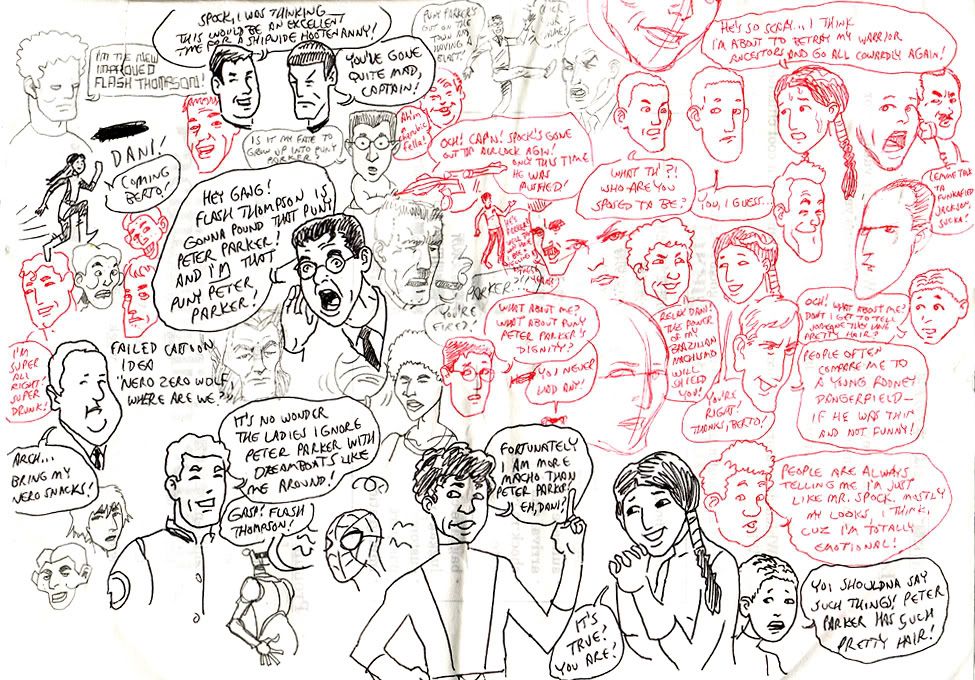
This one has everyone in it!


This is something I drew a few years ago. A little doodle done between English conversation classes. I like to imagine it's some sort of revolutionary post-modern comic book story told in a single page. See if you can figure out who's who and what's what!

Wednesday, November 26, 2008

Happy Thanksgiving from the NBC Saturday Morning Cartoon Superstars!

NBC’s Saturday Morning Thanksgiving Holiday Feast!

Join us this Saturday at 8am (EST) on your local NBC channel for a Thanksgiving dinner with all the trimmings, featuring all of your favorite NBC Saturday Morning stars!

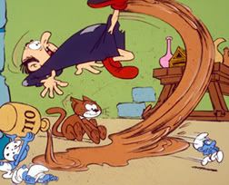
The Smurfs (8:00am EST/7:00am CT)- When that dastardly Gargamel destroys the smurfberry bushes, can Papa Smurf find the magic spell to set things right in time for the Smurfberry Harvest Feast? And what happens when the Smurflings help Brainy mis-use Mother Nature’s Horn of Plenty? Guest-starring Johan and Peewit!

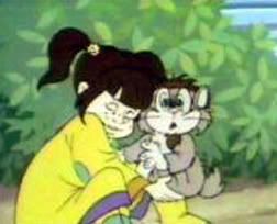
It’s Punky Brewster (9:00am EST/8:00am CT)- When Glomer goofs up again, it’s up to Punky, Margaux, Cherie, and Allen to fix the holiday turkey before Henry gets home! Will Punky and pals learn a Thanksgiving Day lesson in caring and sharing?

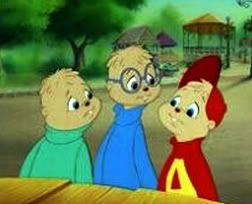
Alvin and the Chipmunks (9:30 EST/8:30 CT)- Alvin, Simon and Theodore compete with the Chipettes for a spot on a Spacy’s Thanksgiving Day Parade float. Will Alvin’s dirty tricks ruin Thanksgiving for everyone, or will he learn the true meaning of friendship and giving thanks?

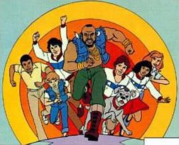
Mister T (10:00 am EST/9:00 am CT)- Mr. T and his daring yet caring gymnastics team volunteer at an inner city youth center on Thanksgiving Day. When a gang of mean punks try some rough stuff, it’s a cranberry bet that Mr. T and the kids will show them the error of their ways in time for pumpkin pie!

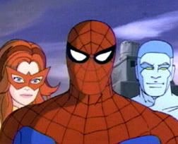
Spider-Man and His Amazing Friends (10:30am EST/9:30am CT)- Spidey, Iceman and Firestar fight the Juggernaut. Guest-starring those uncanny mutants, the X-Men!