Showing posts with label great comics. Show all posts

Wednesday, July 16, 2014

Marvel's Marvelous Movies #4: The Empire Strikes Back (Marvel Super Special #16, Spring 1980)

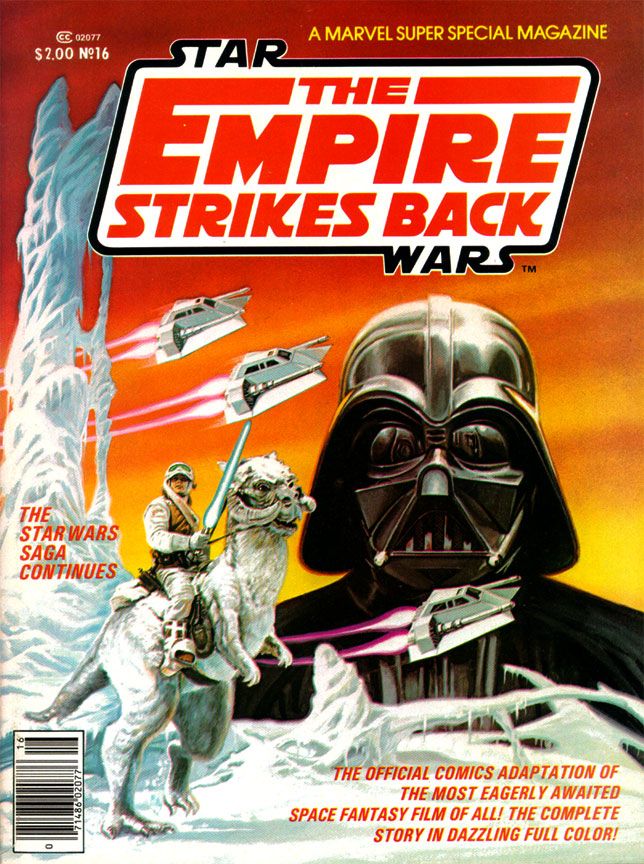
This is my pick for the best of Marvel's movie adaptations, and it's as good as mainstream comics get.  First, it's an adaptation of the best of the Star Wars movies and second, it's an adaptation of the best of the Star Wars movies written by Archie Goodwin and drawn by my all-time art dream team, Al Williamson and Carlos Garzon, and with another of those beautiful Bob Larkin cover paintings.  I'd put it up there with any other comic Marvel (or DC, for that matter) has ever published.  This comic should be taught in schools.

I reached the highwater mark of my Star Wars love in 1980.  I turned 12 that first year of the Reagan and Alex P. Keaton decade, which was about the time other things began occupying my mind.  But I was still childish enough to play with the toys and create my own Star Wars fantasy adventures with the Kenner figures and Millenium Falcon playset in the yard.  And I was adult enough to have become interested in the film making process itself, able to enjoy movies not just for their stories, but also for the craft and artistry behind the scenes.  Reading magazines like Starlog and Fantastic Films and learning the names of people like Ralph McQuarrie, John Dykstra and Richard Edlund, plus terms like “go-motion” and “blue screen,” I began to have a growing appreciation for the mechanics of its creation as well. 

This, then, was the perfect time to discover Al Williamson and, to certain extent, Archie Goodwin.  These are two names I've come to associate with all things Star Wars as much as I do George Lucas, Mark Hamill and John Ratzenberger.  It may seem crazy to you reading this now-- at least as crazy as any dumbass thing I've written in this blog-- but I’d never even heard of Williamson or Goodwin before I saw their names in the credits of Marvel Super Special #16.  While Goodwin's script hits all the right story points at the ideal pace for a comic with this page count, with terse narrative captions to help move things along, Williamson's art literally changed my life.  My appreciation of comic book art consists of pre-Williamson and post-Williamson eras. 

All of his EC and most Warren work came before I was even born, and our local newspaper tended more towards Beetle Bailey and Garfield than adventure strips.  Or paper did run Alley Oop, Steve Canyon and Dick Tracy, the three non-gag strips they did choose to run, plus my dad got me into Gasoline Alley (not an adventure strip but still one with a narrative like those others).  So I didn’t know anything about Secret Agent X-9, or, as it came to be called, Secret Agent Corrigan.  Where would I have learned about Al Williamson?  He didn't draw the Hulk or Spider-Man, for crying out loud!

So when this book hit, as far as 12-year-old me could tell, Al Williamson came into our banal world from some magical extra-dimensional wonderland where romantic adventure and heroic action were as part of life as blood itself and made this comic just for me. 

Williamson’s art was more than a revelation.  It was a rebirth.
 
Script:  Archie Goodwin/Art:  Al Williamson and Carlos Garzon

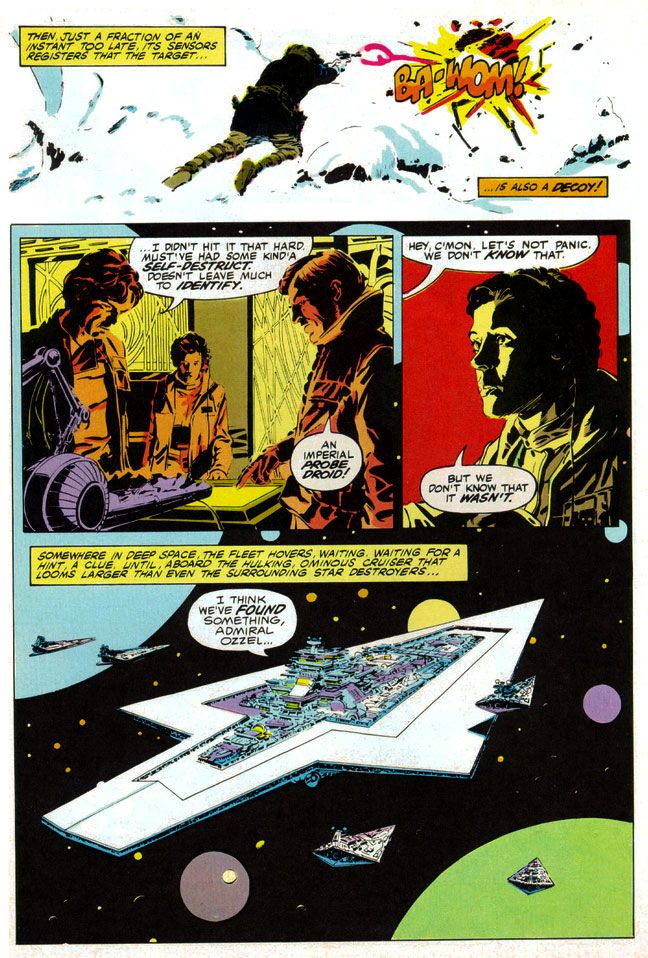
The man painted with ink.  To create the effect of reflections on metal, Williamson used blobby black strokes of varying pressure.  For atmosphere and depth in the backgrounds of different scenes, he used thin parallel lines for a sfumato-like effect.  He spotted blacks throughout, emulating the film’s cinematography, as many scenes take place inside the frozen rebel base or the industrial back-rooms of Cloud City where light comes from computer screens or from behind machinery.  He expanded on the film’s planetscapes and made them imaginatively otherworldly in a way location shooting on a glacier in Norway just couldn’t match (and Larkin wisely copies him on the cover).  Obviously, Lucas couldn't spirit his cast and crew away to Hoth in another galaxy.  But Williamson could and did.

And best of all, not only did Williamson's star warriors look like the actual actors rather than their stunt doubles or stand-ins (as had the characters in many of Marvel’s previous movie adaptations, Star Trek the Motion Picture aside), but the way he posed them and placed them within all those wild environments exactingly duplicates mood and feel of the movie itself every time you read this comic. 

I’d seen movie comics full of pretty art, some of which I've praised in this blog (and justly so; they're fantastically fun) with dazzling light effects and plenty with storytelling that perfunctorily or even adequately reproduced a movie’s action without that feel, without that authenticity of experience.  Goodwin, Williamson and Garzon put all the genuine excitement of the real The Empire Strikes Back right in our hands, in the medium best suited for George Lucas’ epic.  Star Wars came full circle back to the halcyon days of Flash Gordon in the funny pages, one of its prime inspirations.

The only odd note-- and I find it charming and story-book like-- is Williamson's version of Yoda, who looks his familiar, chubby self in closeups and then becomes a tiny gnome-like creature with spindly legs in wide-angle shots.  Williamson never quite figured out Yoda's scale, but at least he made everyone's favorite sentence-reversing Jedi puppet more ambulatory than even a genius performer like Frank Oz could holding him up from underneath the swamp sets.  And more wizardly.  Merlinesque.
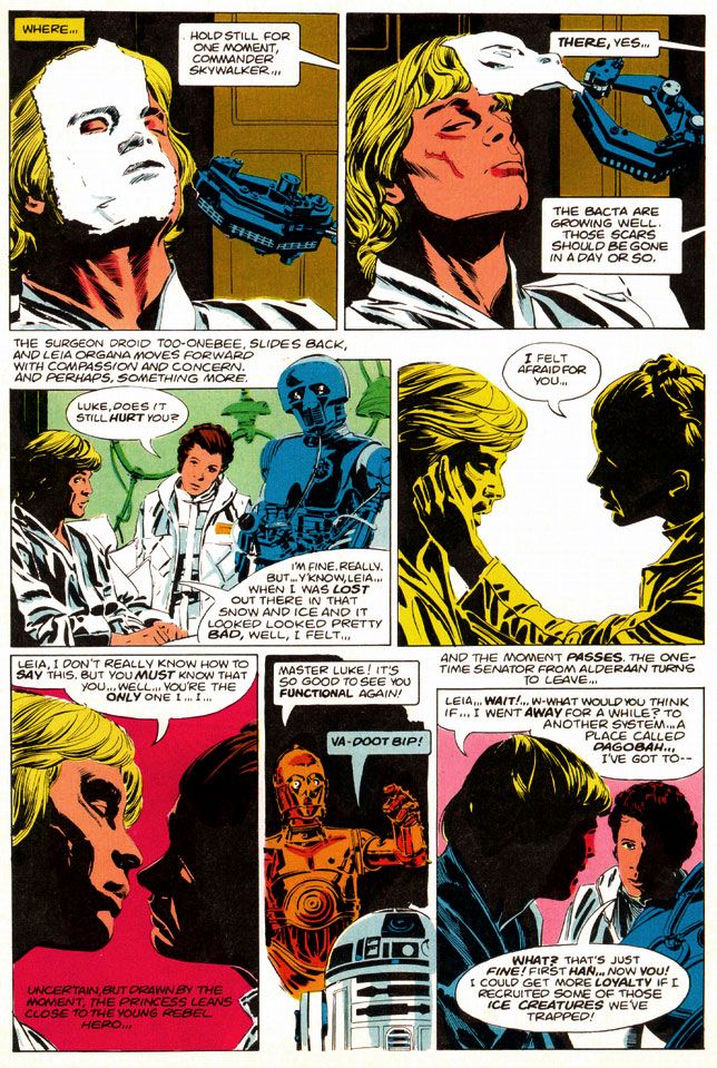

Script:  Archie Goodwin/Art:  Al Williamson and Carlos Garzon

You can look at the artwork and see Williamson used quite a bit of photo reference.  In lesser hands, this can freeze a comic story, especially when an artist chooses to draw from studio portrait shots rather than action scene stills.  Williamson expertly blends these images onto the page so each is like a fabulous collage when looked at as a whole, but flow naturally when read panel-to-panel.  Williamson gives us carefully crafted moments like the two-panel sequence where medical droid 2-1B pulls the pharmaceutical mask off Luke's wampa-ravaged face.  He could have rendered it as a single panel, with all of 2-1B's dialogue carrying the action, but instead he chose to give it a bit of animation.  

Notice I'm talking only about Williamson, but there's also Carlos Garzon.  To be honest, I can't tell where one ends and the other begins.  I just see this Williamson-esque art job that matches pretty much all the other ones I've seen.  Many of which probably were in collaboration with Garzon.  Anyway, whichever artist did whatever part of the artwork, it's seamless and I like it.  So let's give Garzon his props, even if  I'm too ignorant and unschooled in his contributions to point out any specific examples.  There are probably other blogs for that.  I should be reading them.  So should you.  Probably a better use of our comics-loving time, right?  Let's go!  Go!  Go!  Go!

Okay, he's gone.  I'll join him after I finish gushing about The Empire Strikes Back like a dizzy fool drunk on love.

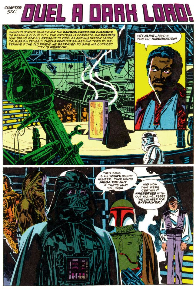
Oh, and at this point I should also make mention of Glynis Wein's superb coloring job.  Wein used a screen-accurate palette that enhances the comic experience rather than making you smirk at oddball choices like the red lenses in Darth Vader's mask and the strange orange mottling in Chewbacca's fur from the first Marvel Star Wars comic.  Wein would make entire figures two shades of orange to recreate the spacey glow of Rebel Alliance technology when our heroes conferred in control rooms and on spaceships, and apply appropriately chilly blue shadows to the snowy exteriors of Hoth or give the swamps of Dagobah a slimy look in greens and pale oranges.  Wein's pastel planets and moons help give depth to the imagery of mighty space fleets lumbering along, but where her work really shines is during the light sabre duel between Darth Vader and Luke Skywalker.  The film bathes their battle largely in oranges and blues, at least when the two fight in the "carbon freezing chamber" where Han Solo gets encased in a block of metal.  Wein follows suit but she also adds some nice greens and yellows to make it work better in two dimensions.

Script:  Archie Goodwin/Art:  Al Williamson and Carlos Garzon

The very day I read The Empire Strikes Back, I immediately stopped copying every other artist and became simply a Williamson imitator, in as much as my clumsy hands could make me so.  Any one of my comic book art idols represents an impossible standard to which an artist can hold himself or herself, but even more so with Williamson.

I doggedly spent the next three or four years laboriously filling sketchbook after sketchbook with really shitty Star Wars drawings, thinking all the time I was getting somewhere with my art.  While I later found other artists to fail at emulating, whenever I had a sketchbook and a pen or brush, I’d still find myself pulling out some Williamson stuff and doodling away, futilely trying to match his supreme figure construction and posing, and lush, sinuous line quality.  Even in my graphic design program days at the University of Georgia my professors would look at my homework and occasionally come across something that looked as if Al Williamson had drawn it with the brush held in his teeth, or sticking out of one ear.
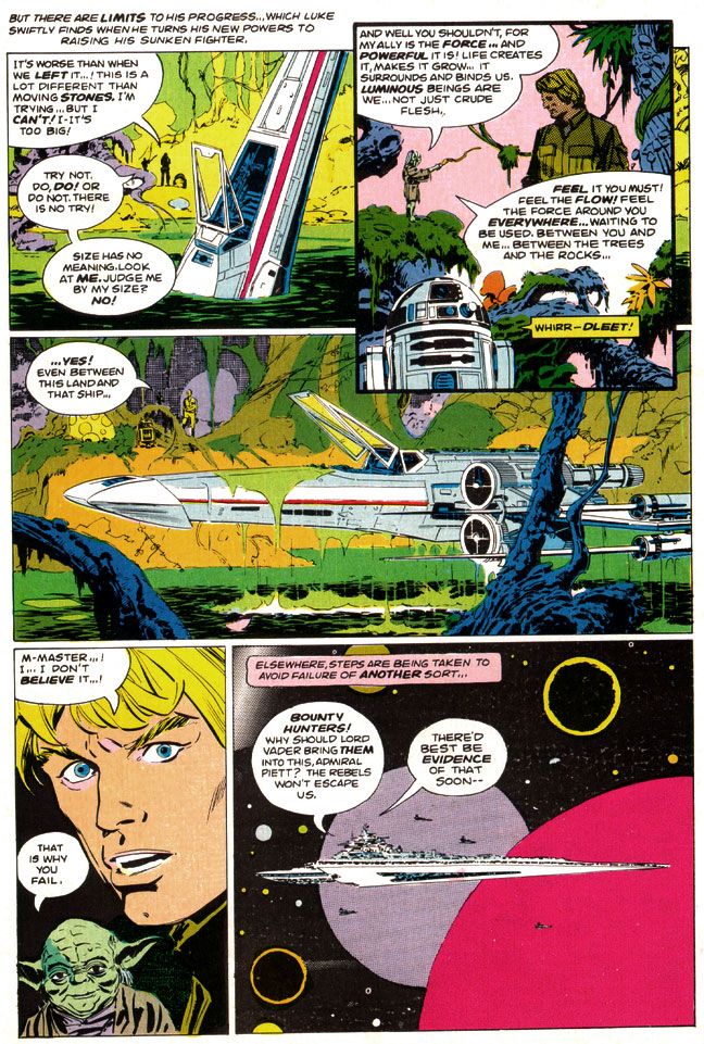
Script:  Archie Goodwin/Art:  Al Williamson and Carlos Garzon

Even now, Williamson remains one of those go-to guys whose work I feel compelled to collect.  Williamson, Alex Toth, Jack Kirby and Steve Rude.  Whenever their stuff appears in purchasable form, I will be there.  Right now Dark Horse keeps much of Williamson's Star Wars work with Goodwin in print both in paper form and digitally.  With the license reverting to Marvel in the wake of Disney's massive Lucasfilm purchase and upcoming new trilogy, I'm not sure how long this will be the case.  Fortunately, I've got it all.

And you know what?  I’m not even a huge Star Wars nut anymore.  The intense, religious-like fervor of its fans and the oversaturation of all things Star Wars on the Internet and on the shelves in book and toy stores across the world (and also the law of diminishing returns as it applies to the film story’s recent, tragic extension) have all tarnished the brand for me.  And brand is the right word.  McSkywalker, now serving number two billion. 

But it seems all I have to do is pull out the Al Williamson The Empire Strikes Back and I’m 12 years old again and everything is suddenly wonderful in a way it had never been before, although there had certainly been wonderment.  With Al Williamson, there's a purity to the work that ensures there will always be wonderment.
Wednesday, June 18, 2014

Marvel's Marvelous Movie Adaptations #1: An overview of those colorful Marvel Super Specials!

Before they started putting out their graphic novels and Epic Illustrated magazine, the Super Special series was Marvel’s most visually arresting product.  Their black and white magazines usually featured attractively lurid covers by Bob Larkin, Earl Norem and, occasionally, guys like Neal Adams and Grey Morrow.  But face it—the interiors varied wildly in quality from the knock-out gorgeous or even thrillingly bizarre (John Buscema, Alfredo Alcala, Rudy Nebres, Mike Ploog, Tom Sutton) to the serviceable and even the slap-dash (I won’t name names, but I have my suspects). 

The Super Specials, on the other hand, featured fully-painted color jobs, at least on many of the earlier issues.  Regular monthly comics came printed cheaply on grayish newsprint.  But a Super Special came on slick, white paper.  A Super Special was more than a comic.  It was an event unto itself.  It was super.  And special.  There'd be a painted cover, or one featuring photos or artwork from whatever movie the comic was adapted from.  It would have a full-length comic book story and then a few breathlessly informative articles or interviews related to the magazine's subject matter.  All this... and a higher price tag! 

The very first Marvel Super Special, which was officially a Marvel Comics Super Special, stars rock group Kiss and word on the street is the group contributed some of their blood to be mixed in with the ink.  It's hard to get more super or special than actual rock star bodily fluids inside your comic!  But no thanks.  The second issue features tried-and-true fan favorite Conan in adventures too epic for his regular monthly.

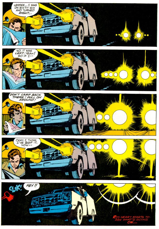
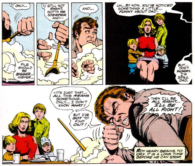
Then Marvel adapted Close Encounters of the Third Kind, the first of many Marvel Super Special film adaptations.  A Wiki check shows Close Encounters penciller Walt Simonson complaining about working on that book.  Worst experience of his career.  If so, I sympathize, but you can’t tell he was unhappy by looking at the finished product.  He and Klaus Janson turned in a spectacular effort, making the story work in a Marvelized format even though the conflict is largely internal—Roy Neary thinks he’s going crazy for most of the movie before he figures it all out and goes UFO-hunting—and co-stars every lightbulb in California.  They invented so many ways of depicting lighting effects I’m surprised they didn’t go blind from staring at them too long.  This was the first Marvel Super Special I bought, and it came to me via mail order.  It would not be the last, as these magazines quickly became one of my favorite Marvel purchases.

And this is where we come in.  Marvel’s other movie adaptations.  Jaws 2 swam up next, accompanied by a musical motif ripped off from Stravinsky.  This one was the first Super Special drawn by Tomb of Dracula team supreme Gene Colan and Tom Palmer.  They’d do a few more, each time absolutely rocking the results.  Colan had already done underwater horror in black and white for Warren Publications, but here Palmer adds vivid colors that make the book both gorier than you might expect in a comic and, strangely enough, also more attractive.  Jaws 2 is one of those shitty movies that are actually pretty fun, eschewing the Steven Spielberg original’s emphasis on characterization and suspense for schlocky, unintentionally hilarious setpieces (the shark eats a helicopter!) that do nothing to help its ludicrous premise—essentially shark-shaped lightning striking twice.  While not nearly as dire as subsequent films in the series, the movie suffers from diminishing returns.  The comic book holds things together by simply giving the material a more lavish treatment than it deserves.  I would have loved to see the same team go back and re-tell the first film.  That’s a real missed opportunity for a matched set.

While the Super Specials had already given us a bowdlerized Beatles biography, their adaptation of the infamous BeeGees-starring musical flop Sgt. Pepper’s Lonely Hearts Club Band never saw print.  This meant Marvel’s next offering was actually of a TV movie that similarly cribbed from a superior source and suffered from comparisons.  We knew it as Battlestar Galactica.  I had the Marvel Treasury Edition because it was huge and therefore caught my notice.  This one has art by Ernie Colon of Richie Rich and Jackie Jokers fame, and while his linework is looser than the Colan/Palmer stuff, and the colors flat rather than richly painted, it’s an energetic retelling.  It differs from the televised movie in some respects.  A villain gets a bloody comeuppance here, which would make his reappearance a bit… er… unlikely.  And yet there he was, on our TV screens every Sunday evening until ABC punched not only his ticket but everyone’s via cancellation.  And broke my heart.

The next film adaptation to see print?  Crappy sci-fi disaster film Meteor, a major flop with Sean Connery as an astronomer fighting an oncoming… well, you know.  A meteor.  What else?  The movie, which co-stars an unhappy Natalie Wood, forces Brian Keith to speak with a fake Russian accent (a few years after playing a small-town cop comedically contending with “invading” commie submariners in The Russians Are Coming, the Russians Are Coming, and not long before using this accent again for one of those WWIII TV movies the kids used to love so much back in the 1980s), with Henry Fonda as the President, putting it kindly, is complete dogshit.  On your shoe, after you stepped in it.  The comic, with Colan/Palmer art, is not.  In fact, it’s quite a visual treat.  There’s even a double-page spread of a massive tidal wave destroying Hong Kong.  Palmer not only handpainted the colors, but there’s also what appear to be Craft-Tint tones involved as well.  I’m not sure what their lead-time was for the artwork, but nothing looks rushed, especially towards the end when the meteor unleashes hell on New York.  Once again the Marvel comic proves better than the film on which it’s based.

From here out the Super Specials would consist almost entirely of movie material, with one exception-- Tarzan of the Apes.  Because they generally went for blockbusters and had to prepare the comics in advance of the films’ release dates, Marvel took on hits and misses alike. 
 
The adaptations of misses are a lot more fun than the ones of hits as far as I’m concerned.  How could you not love mondo-strange-o comics like Xanadu (#17, Summer 1980), Annie (#23, Summer 1982, with Win Mortimer pencils and lots of crossed eyes courtesy the Vinnie Colletta inks, no less), Rock & Rule (#25, 1983 with art consisting of stills from the movie itself)?  And sometimes the results would be miracles both major and minor, like Marvel’s lovely Dragonslayer (#20 , 1981), the storybook-like Santa Claus: The Movie (#39, 1985, richly drawn by Frank Springer and adapting one of the lousiest movies ever made) and the beautiful Labyrinth (#40, October 1986, with breakdowns by John Buscema and finishes by Romeo Tanghal, an unlikely pairing on this fairy tale material and killing on it). 
 
And then there’s Bill Sienkiewicz’s Dune (#36, 1984), the perfect meshing of artist and subject matter.  Space princesses, screaming magical messiahs, bloated barons with skin diseases and desert warriors dressed in skin-tight black rubber are visuals tailor made for Sienkiewicz’s “Neal Adams drops acid and hangs out with Ralph Steadman too much” artwork with its heavy blacks.  And giant penis monsters.  I mean worms.  Yeah.  Shai-hulud.  Those spice worms look nothing like a bunch of dicks springing up out of the sand.  Sure.  Seinkiewicz brilliantly translates into two dimensions the general weirdness of David Lynch’s fever-dream take on Frank Herbert’s novel.  And you get the added benefit of not suffering through the pacing problems created by trying to chop a huge novel down into a manageable running time, from not being able to tell all the spaceships are obviously teeny-tiny miniatures and not having to endure the repetitive, whispered voiceovers.  And dumb additions like the “weirding modules.”

Occasonally, though, Marvel would adapt a hit and blow it.  Raiders of the Lost Ark (#18, 1981).  What the hell happened there?  John Buscema and Klaus Janson provide curiously unfinished-looing and flat artwork, with none of the film’s retro-romance.  Dull, off-model colors add nothing to the art and the final product is lackluster at best.

That’s not to say the rest of the hits aren’t pretty sweet.  There are three Al Williamson/Carlos Garzon jobs—The Empire Strikes Back (#16, Spring 1980 and my personal choice for best movie adaptation of all time), Blade Runner (#22, September 1982) and Return of the Jedi (#27, 1983).  Much like with Seinkiewicz and Dune, Williamson was the perfect choice to adapt the second and third Star Wars films.  He seems an odd choice for Ridley Scott’s downbeat sci-fi noir, but he, Garzon, Dan Green and Ralph Reese generate all the film-accurate rainy cityscapes you could hope for, even if a number of panels seem a bit too photo reference-heavy and static.  They reproduce the film’s atmosphere to a startling degree, sort of making up for that lack in the Raiders book.  Should have put them on that one, too. 
 
Buscema pencils and inks himself on the two Conan movie adaptations, too, both for John Milius’ Conan the Barbarian (#21, 1982) and the lighter, less boob-filled Conan the Destroyer (#35, 1984).  He doesn’t try to make his barbarian look anything like Arnold Schwarzeneggar, which is a good thing.  Although the Destroyer Conan sports Arnold’s headband.  You can never go wrong with Buscema inking himself on a Conan story, whether or not you appreciate Milius’ heavy-handed philosophizing and libertarian politics (I actually kinda dig it, even if I don’t agree with it) or director Richard Fleischer’s duller, less edgy and politicized take.

I’ve skipped around a lot.  What about the rest?  Well, there are two crappy and then crappier Roger Moore-era James Bond flicks (For Your Eyes Only achieves mediocrity by pairing otherwise appropriate Howard Chaykin with a disinterested Vince Colletta and then dumping a dull, standard monthly-comic-type color job on the results, totally wasting the format’s color possibilities); the tragically doomed Dark Crystal; another Indiana Jones flick with improved art but a sillier story; a nicely cartooned version of The Muppets Take Manhattan; desultory passes at clunkers like Krull, The Last Starfighter and 2010; the ahead-of-its-time Buckaroo Banzai (#33, 1984), all hip and tongue-in-cheek, makes a bow and turns immediately into a cult film; and Marvel even attempted both Sheena (#34, 1984, decent artwork by great Gray Morrow wasted on dreck) and Red Sonja (#38, 1985, a worthy effort by Louise Simonson and Mary Wilshire, with surprisingly deft Colletta inks, doomed from the start by its source material but finally sunk by the decision to go the cheap route yet again with a standard color palette).

The best, however, they saved for last.  The final Marvel Super Special, lucky #41 (November 1986) adapts George Lucas’ long-neglected masterwork Howard the Duck.  No knock on writer Danny Fingeroth or artist Kyle Baker, but this comic fairly cried out for some Gene Colan or Val Mayerik artwork.  Only they could have possibly salvaged this one. 
 
It has an appropriate cover date, though, doesn’t it?  November, towards the end of fall.  An inbetween time, a neither-nor time, a waiting time.  The happy Halloween graveyard ghost-dance past, the joys of Christmas, Hanukah, Kwanzaa and New Year’s yet to come.  Despite Thanksgiving, which I really conflate with the Christmas holidays, November is a dull, gray month.  Too bleak to be tedious, too tedious to be fun.  The first cold rains come, and we’re given our initial glimpse of the dying of the year and the bleak winter that comes after our holiday revelry.  That’s all that November means to me.  The promise that, after the gifts and pretty lights, winter will be hard.  Long and hard and dead.  And with this, with the arrival of Howard, our symbol of the death of everything summer-bright in the world, Marvel Super Special was no more.
 
What I'm hoping to do with this series is take on each of these books, probably in order, and try to find some nice things to say about them.  We've already looked at two of these in detail, so we don't have to worry about them again!  Whew!  Some of the rest will be easy, even if the movies they're based on were complete stinkers.  Some won't be so easy.  But therein lies what I hope will be the fun.

Saturday, June 7, 2014

Flash Thompson's swingin' send-off party!

Oh, wow. Sorry I haven't been chatting up the old comics lately. I'm making one of my own and it's taking all my free time. I take a break from it only to work my day job and sleep. I eat at the drawing table (so to speak; I draw on one of those razzly-dazzly Cintiq monitors these days) just like one of those old school guys who made comics back in the day and then died of alcoholism-related complications well before their natural times. Cheerful, ain't it?

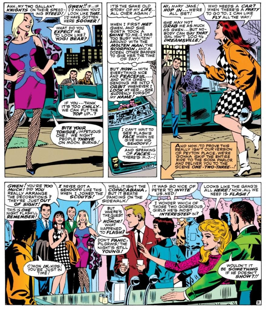
Well, here's something that will certainly lighten the mood. Remember when Flash Thompson went off to fight the Vietnam War and everyone at his party looked incredibly mod and gorgeous and they all thought it was a wonderful, happy, pleasant thing he was doing, with no negatives about it whatsoever? It happened in Amazing Spider-Man #47 (April 1967).

Here’s a largely cheerful story about a bunch of friends putting on a going-away party for Flash Thompson, who is leaving for the service, possibly to fight in a war in a jungle that pointedly avoids even the suggestion such a thing might be in any way, shape or form at least the slightest bit controversial or even worrisome.  Of course, given the time, the implication is Flash has been drafted, but the closest we get to acknowledging that is a few issues back when Pete says something about Flash’s “induction notice,” a term less loaded than “draft notice.”  Not a soul even whispers Vietnam or Southeast Asia, and no one seems to think Flash is going to have anything other than a simply fine ol’ time.  Of course, criticizing at Stan Lee and Marvel Comics for not taking sides over Vietnam or making an issue of it is kind of like condemning The Beverly Hillbillies for not doing an episode where Jethro gets drafted, loses a foot and joins an anti-war rally in Washington while banker Milburn Drysdale talks the Clampett family into investing in a napalm factory.

On the other hand, despite what you might have read otherwise in the book Spider-Man Chronicle: Celebrating 50 Years of Web-Slinging, this issue isn’t even as topical as the April 8, 1965 episode of The Munsters where Herman tries out for the majors and Leo Durocher cracks, “I don’t know whether to sign him with the Dodgers or send him to Vietnam.”  Harry’s “Only don’t bother looking for the goalposts!” joke when another guest compares the jungle to a football field does seem eerily and cleverly prescient now that we have more than forty years of hindsight on the matter, though.  And Spidey does at last obliquely reference the potential dangers of war to callow young men when he wonders in the final panel why he keeps thinking of Flash in the past tense when the guy hasn’t even left yet and will probably come through all right.  “He'll make it-- somehow! good guys always win,” he muses, before adding a little ambiguity with the tag question, “Don’t they?”

I don’t think Lee was or is particularly interested in politics, and certainly not in wading into a political Big Muddy and more than likely drowning his company there.  He didn’t mind using the Commies as bloodthirsty villains and outright creeps whenever possible, but who at the time gave a rip what a communist thought about comic books?  If they even read comics when they weren’t murdering babies, knocking over Asian dominoes or stealing our space secrets, they probably stole them off the racks anyway, and that did nothing but harm to Marvel’s bottom line.
 
Plus, there probably wasn’t a lot of readership overlap between Marvel’s magazines and The New York Review ofBooks where in February of that year Noam Chomsky published “The Responsibilityof Intellectuals.” And Dr. Martin Luther King told 3,000 people at Riverside Church in New York City that the civil rights and anti-war movements were essentially the same struggle and condemned the war in Vietnam as US imperialism in the same month Marvel cover-dated Amazing Spider-Man #47.  Check out Time magazine's reaction, and the Washington Post's.  You know, those bastions of liberal thoughtNot so surprising when you consider a Gallup poll the same month showed 50% of respondents believed our escalation in Vietnam was not a mistake versus 37% who thought it was.  The believers were down from 59% the previous year, but still represented a significant majority over the skeptics.  This is a little different than outright support for the war, but risking controversy by directly addressing Vietnam and its complexities and uncertainties wasn’t going to sell Spider-Man to the middle Americans buying this stuff for their kids and still largely assured we were doing the right thing halfway across the world.

Lee had books to move, and Warren Publishing’s Blazing Combat had recently addressed the war directly with distinct disapproval and quickly folded.  In the course of entertaining the heck out of us—its primary purpose—this story acknowledges in the vaguest and safest of terms what couldn’t be ignored and takes no sides.  No more, no less. 

In fact-- YOWZAAA! Look at Gwen Stacy's knockout outfit!


Script:  Stan Lee, Art: John Romita

I don't know who designed it.  Dormammu of Beverly Hills?  Purple and blue abstract design, with fishnets and a animal-print coat in decidedly unnatural hues of... purple again.  Jazzy John Romita was the perfect guy for this soapy stuff and he visualizes Gwen as the height of mid-60s cool.  It doesn't get any better, does it?

Yes it does!  Because here comes Mary Jane Watson in an op-art inspired checkerboard dress and some wild white boots with contrast black toes.  Shame about the orange coat, but she quickly dumps it once they hit the shindig.


Pretty much everyone there is a sharpie.  Smart jackets and ties for the gents, ultra-modern flips and bobs for the ladies.  The guest of honor, Flash Thompson himself, sports a brown coat with a black tee for an athletically casual take on dressing up.  That guy on the left of the top panel has a Beach Boys-looking striped shirt, possibly by Gant.  The only guy who looks anachronistic is poor Harry Osborn, with his green bowtie and jacket like something he borrowed from Barney Fife down in Mayberry, NC.  And he's supposed to be a rich boy.  He looks as if he popped in from a 1949 issue of Archie's Pep Comics.  He's even got Jughead's plate of hamburgers.

Script:  Stan Lee, Art: John Romita

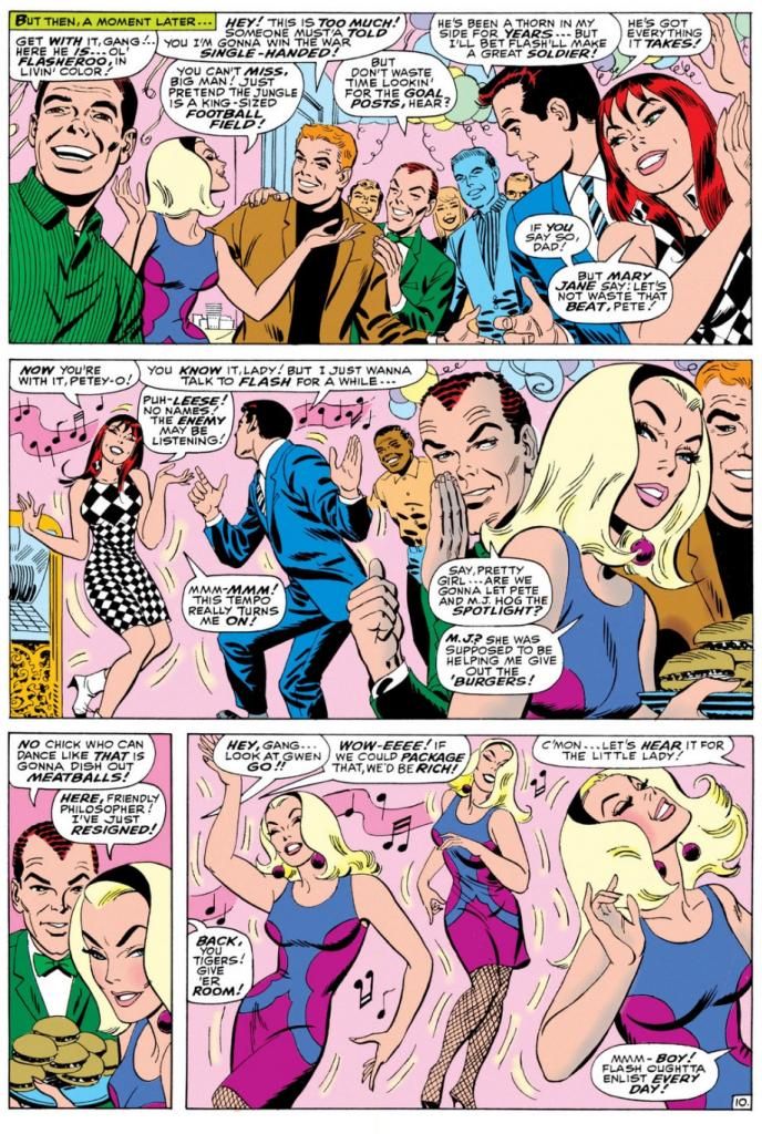
Gwen steals the show-- much to Mary Jane's displeasure-- with a dance that rivals the one Audrey Horne would do a generation or so later on the premiere episode of Twin Peaks.  All eyes on Gwen.  Stan's blatantly sexist catcalls crack me up.  These are just a few, but they run all through this part of the comic, with Harry and Pete congratulating themselves on having such beauties for girlfriends and Pete secretly leering at Gwen every chance he gets.

Don't you wonder what music Gwen's dancing to?  This was right as pop was going psychedelic and becoming undanceable, and I doubt anyone wriggled and swayed to folk songs or protest tunes.  If this were a TV show of the time, it would be some outdated-sounding jazzy stuff the network squares thought of as "close enough to that rock junk no one will be able to tell the difference anyway." 

You know, like when Opie needs a little background noise while sweeping the courthouse floor for his dad and flips on a little white transistor radio and upbeat guitar noodling comes blaring out.  Then Ope starts doing some kind of frantic moves with his broom still in hand says, "Gee, Pa, isn't this the most?"  And Andy's like, "The most WHAT?"  But because he's pretty open-minded for a Southern sheriff of the day, he and Helen Crump end up championing the fresh-faced kids at the high school who want to add a couple of the exact same generic rock tunes to the annual play instead of doing the same old "founding of Mayberry" junk the older teachers favor.

Anyway, beautifully drawn, hilariously written bit of scene-setting before the issue's bad guy makes an appearance.  Kraven the Hunter.  You know what?  Who really gives a rip about that jackass when you've got these kinds of lovely John Romita pages to look at?  Interestingly, Romita is doing a Steve Ditko impression throughout, and even Kraven's face in a few panels looks more Ditko than Romita.  Artistic continuity, and at times Romita's line looks so impressively close to the guy's who he's imitating, it's almost as if Ditko himself inked this book.

Well, it's a fine book and I wish Lee and Romita had spent even more time just hanging out with the kids.  But I guess the readers came for the action, but I'm more in love with the soap opera/character-building sequences during this era.  I'd hang out with all of these characters even without the superheroic spider-bite antics.  We don't even have to talk politics.

Friday, May 16, 2014

Comixology has 45 old school Uncanny X-Men issues on sale for .99 each right now...

I can't help shilling for Comixology from time to time.  But sometimes I have to.  I really, really do.  I mean, I run a blog largely dedicated to old comics-- which I liberally define as "anything published prior to the year 2000"-- and a big part of that includes yakking at length about Uncanny X-Men back when Chris Claremont was writing it and Wolverine was but a hairy, beer-swilling pup.  Or whatever it is you call baby wolverines.  Right now they're selling 45 classic issues of Uncanny X-Men for .99 each.  I already bought them all for 1.99 apiece, and I considered that a bargain at the time.  If you haven't experienced the foundation of practically everything people love about Marvel Comics these days, this is your big chance to catch up.

The art is outstanding throughout, with Dave Cockrum and John Byrne pencilling most of the issues and a few guest art teams here and there.  And wow, beyond the visual treats, these are fun comics to read.  They're occasionally goofy, but they have all the theatrics and high drama you could possibly want in a superhero comic, with in-depth characterization of even the least-loved and lowliest of cast-offs.  You know, like Banshee.  Poor guy.  And the long-simmering "Dark Phoenix" storyline is one of those seminal comic book events, an era-defining tale, as is "Days of Future Past," which seems to have inspired a movie recently with a lot of familiar characters.  Where have we seen them before?

Anyway, Marvel can't seem to leave this stuff alone.  They must have retold all of Claremont's stories more times than DC has redone "Crisis on Infinite Earths."  Even Marvel movie guru Joss Whedon couldn't resist dipping into the Claremont well when he wrote his own much-lauded run not so long ago.

Monday, May 12, 2014

Twenty Years of Hellboy...

I don't write a great deal about Hellboy, because I tend to think of it and its related titles as "new" comics.  That's how fresh it is.  But the first issue came out way back in March, 1994, which is well within the timeframe for this particular nostalgia-leaning blog.  And I'm a big fan of the property and a lot of the people who've worked on it, creator Mike Mignola foremost among them.  Man, I dig that cat's art and the weird pacing and tone of his writing.

Mignola is the reason I picked up a Hellboy book in the first place-- and it was the Seed of Destruction collection.  At the time, I really didn't care what the story was about or the characters in it.  I just wanted to look at Mignola's drawings.

Mignola first entered my particular radar through his work on the Topps comic book adaptation of Francis Ford Coppola's overwrought vampire flick Bram Stoker's Dracula.  I picked it up out of curiosity because I'd enjoyed the movie in a campy kind of way and I've always appreciated a Dracula story, any Dracula story.  I didn't realize I was actually about to encounter a new artist with whose work I'd become obsessed in the way I had with people like Jack Kirby, Joe Kubert, Al Williamson, Alex Toth and Mark Schultz over the years.  The comic book, written by Roy Thomas and drawn by Mignola and inker John Nyberg, blew the movie away, not the least reason being you don't have to deal with the hammy acting and outrageously bad accents when you read it.  Hooked on Mignola from that point, I started copying his art and looking for his other comics.  But I went about it in a kind of leisurely fashion, because I didn't buy Seed of Destruction until probably around 1999 or 2000...

And wow, oh wow, when I finally got around to it, I found it was full of stuff that fired up the endorphin-receptors in my brain for a full-on rush of pleasure and good feelings.  And from then on, I had to buy every single Hellboy and Hellboy-related comic book I could get my hands on.  Nowadays there are so many to choose from, too.  The cast has grown over the years and there are spin-offs and off-shoots and even "other world" type, out-of-continuity stories.  Two movies, a cartoon.  Toys.  Other people are involved in the writing and drawing of Hellboy and his friends, but it's still Mignola's world.  He has the knack of choosing the best and most appropriate collaborators, too.  There are stories I've enjoyed more than others, but I can't think of one that's a real misfire or mistake.  Twenty years of quality entertainment.

I think this is the ideal model for how to handle comic book characters, creators and publications.  Kudos to Dark Horse for letting Mignola run with this and not trying to screw it up and put their imprint on it the way some other companies might have.  When you think of what could have happened to Hellboy if Mignola had been more successful pitching it to a certain other company before landing at Dark Horse... YIKES.

I should have blown up this blog with a major Hellboy write-up back in March, and I should definitely write more about the 1990s-era Hellboy books here.  And post some art from them because it's so damned cool to look at.

Tuesday, March 25, 2014

What's the earliest comic book you can remember owning?

Joe Kubert, August 1974
Memory.  Unless you have eidetic memory, don't trust yours, especially when it comes to tracing formative events from your early childhood.  This week I started thinking back to the first comic I could remember owning and once I started doing a little digging both in my brain and online, I came to a conclusion that's shaken my understanding of myself as a lifelong comic book fan.

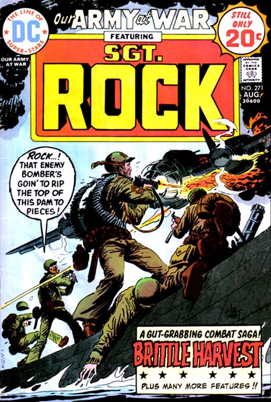
For years, I've had this persistent memory I learned to read from DC's Our Army at War #271, a book with art by the incomparable Russ Heath and a story by the inimitable Robert Kanigher. In the autobiographical film I constantly project in my mind, DC published it when I was three or four and there, on its pages, heretofore ignored ink marks inside the balloons coalesced into words, which formed into sentences and from there, the world of literacy opened to me.  Then I looked Our Army at War #271 up online and learned it has a cover date of August 1974, a mere month before I started first grade.  I was already six years old, and, according to family lore, I had already been reading for quite a while at that point.

So maybe Robert Kanigher didn't teach me mah letters, but I thought there was still a decent chance his story "Brittle Harvest," the book's Sgt. Rock-starring lead, truly was the first bit of fiction I read that didn't star a persistent weirdo with a fixation on oddly-colored breakfast foods.

But maybe it wasn't...


Jack Kirby/D. Bruce Berry, August 1974
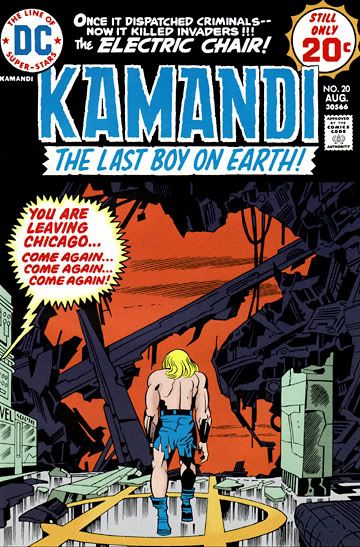
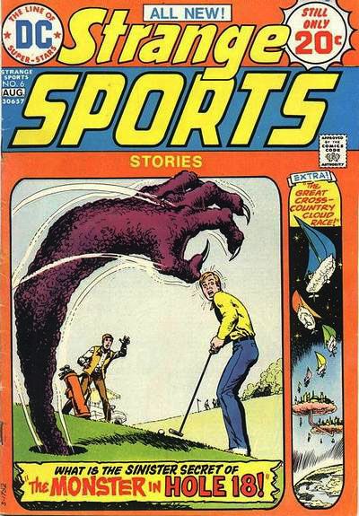
Because I also owned Kamandi #20 and Strange Sports Stories #6.  I could have sworn both of those came out a year or two later.  This week, I discovered DC published them that very same August.  August 1974 was a good month for me as far as comics go.

How did I manage to obtain three comics when my income consisted entirely of spare change I found under the sofa cushions or dove for in the deep end of the local Elks' Club pool?  Gifts, maybe.  I can't imagine what fool would give me three comics at the same time.  One, yeah.  Two is stretching it.  Three invites rumors of decadence, of profligate spending on a scale unheard of in our little clan during the Ford administration days of energy crisis and Whip Inflation Now. 

Or else I somehow managed to collect enough pennies to buy them myself.  Yet, I have trouble imagining any scenario involving either of my parents allowing me such an extravagance.  Again, one comic, maybe two if I'd been especially well-behaved.  Three would be, in my mom's words when I bought a second aluminum baseball bat during my "athletic" period years later when I actually had a job and income of my own, "Ostentatious."  My parents, both products of hardscrabble Depression-era childhoods, instilled in me a financial caution I maintain even now that I'm as rich as the guy on the Monopoly game box.  Even with their permission, buying three comics at the same time back then would have given me the same guilty feelings I get now whenever I pick up a new Rolls or sports franchise.

Whether from false memories of learning to read or from inspiring a lifelong love of Jack Kirby's work, each of these comics has stuck with me in ways I've learned are as foggy and treacherous as some jagged coast in an old sea story.  I once again own both Our Army at War and Kamandi, so I've read them recently.  In this way I've corrected a number of misconceptions I carried for years about their stories.

A physical copy of Strange Sports Stories, on the other hand, remains elusive and, therefore, its contents a jumbled mishmash of mistaken impressions. 

The cover is easy to find online, though.  Let's take a look and see what recollections it inspires.  Wow!  It's by Nick Cardy!  What a treat!  I've really underestimated myself all these years.  Kid me really had good taste in cover artists.


Nick Cardy, August 1974

Let's look at the cover copy.  Interesting story titles.  I thought so at the time, but I may have been alone there, since this was actually the final book in the series.  Another one of those failed DC experiments.

"The Monster in Hole 18!" inspires a vision of someone being pulled through the hole into an alternate dimension, his body grotesquely thinned and stretched in the process, leaving his midsection resembling a great noodle.  At least during the transition.  I'm pretty sure he came out the other side in whatever state for him passes as normal. 

I may be conflating this with the events of "The Great Cross-Country Cloud Race," which I believe is about a couple of young guys seriously into boating who travel into another universe where people race through the skies in little sailboats made from solidified clouds.  Perhaps these guys were the ones who went through a physically distorting transportation process of some kind. 

The cover suggests the book contains just two stories.  So why do I feel so strongly there was a third?  One about a young guy who injures his arm in such a way he can throw baseballs at ridiculous velocity, gets signed by a major league team and pitches in a game against a New York Yankees-type powerhouse club before crashing his expensive sports car and losing his magical pitching ability when the doctor re-sets his arm.  The same accident injures his hip, and there's a little matter of drop-kicking a football...

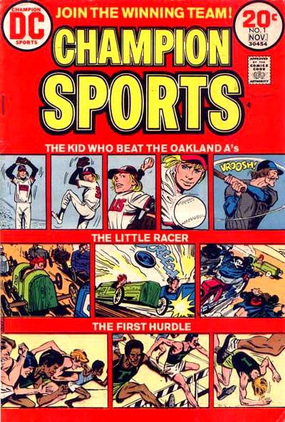
Jerry Grandenetti/Creig Flessel, July 1973
Let me see what I can find out about this.  Hey!  It turns out there is such a story, but it isn't in Strange Sports Stories #6.  We find it instead in Champion Sports #1. 

And it isn't the New York Yankees he pitches against and wins.  It's the Oakland A's.

That brings back a whole lot of memories!  The A's of the early 1970s featured a potent line-up centered around a hard-slugging clean-up hitter by the name of Reggie Jackson, and a pitching rotation starring Vida Blue, Ken Holtzman and Catfish Hunter (Rollie Fingers was on the team, too), each of whom won 20 or more games in 1973.  They beat the New York Mets in the World Series that year. 

My family hated those guys and their evil mustaches because we were National League fans and my oldest brother, a catcher himself, idolized Johnny Bench.  This meant we were Cincinnati Reds boosters, and they lost in the Series to the A's the previous year.  It didn't matter that my uncle had caught for the A's when they were the Kansas City Athletics and personally knew and greatly respected Hunter.

So, in fact, the story is called "The Kid Who Beat the Oakland A's," and I've just learned it's written by the great Joe Simon, drawn by the nifty Jerry Grandenetti, with inks by Creig Flessel.

And you can read it in all its glory on Diversions of the Groovy Kind, a super-cool website that's one of my favorites.  The Groovy Agent must be one of those people with eidetic memory.  He knows it all, baby.  He took the comic's tag line to heart and joined the winning team!

The "kid" is David Wexler, a would-be writer and sports nut.  He ends up enjoying a brief career in the Major Leagues, not as stellar as Catfish Hunter's or Vida Blue's, but still something to be proud of, especially the climactic event, which is spoiled by the title.  The most telling detail, though, is the caption towards the end, when the kid's swelled head leads to his comeuppance:  "You may have read about that game... What you didn't hear about was the dumb, wild things I did off the diamond."  It's a single sentence Simon uses to introduce the off-the-field aspect of big time sports, and gives the story a gritty background verisimilitude to help put across its rather improbable premise.  Shades of Jim Bouton's Ball Four (1970) and the stuff the newspapers didn't print about Mickey Mantle.

Which reminds me!  I could tell you a rather funny story involving my dad, my uncles, Mantle and Joe Pepitone down at spring training in Florida.  Maybe one day I will, but for now let me just tell you my dad swore me to secrecy and I've already told you too much.

What about the other stories?  Well, "The Little Racer" is about a soapbox derby kid who gets run over by a one-percenter motorcycle gang who then help him rebuild his racer with stolen parts.  He ends up with quite a hotrod, but his innate honesty causes him to revert back to his green wooden crate for the final race, which he loses but fairly and squarely.  Then the cycle dudes stomp him good, the same way the Hell's Angels did Hunter S. Thompson when they learned they weren't getting any of the money from the book he wrote about them.  Okay, I made that last one up.  The story thing, not the Hunter S. Thompson thing, which really happened.  The comic may or may not have a happier ending.  But even though our theme today is how crappy my memory is, I feel confident about its other details.

On the other hand, "The Last Hurdle" brings absolutely nothing to mind.  I'm guessing it has to do with at least one hurdle.  Perhaps a final one of some kind.  Literal?  Symbolic?  Shambolic?

No, that's this blog.

This has been a day for shocking revelations, hasn't it?  Let's conclude this mess with two more.

First, in December of 1997, the FBI investigated the possible theft of the artwork from this very comic, along with hundreds or even thousands of other pages.  The entire sequence of events found near the bottom of the document makes for some interesting (if difficult due to formatting and spelling errors) reading.  My oh my!  The things you uncover when you take a memory trip.  I'm completely flabbergasted.

And second, the answer to that nagging question that provides this post's title.  Champion Sports #1.  Look at this:  it has cover date of November 1973, same year the A's won their second World Series.  Diversions of the Groovy Kind puts its actual release date as July, which means, depending on their own street dates, it hit the stands more than a year earlier than Our Army at War #271, Kamandi #20 or Strange Sports Stories #6.

Champion Sports #1.  I was five years old when I read it.  It's now the earliest comic I can remember owning!

Wednesday, January 22, 2014

Steve Rude announces the end of Nexus

That's tough news to take, but every story has to end sometime.  According to the latest Steve Rude newsletter, jauntily titled "Old Year, New Year, Easy on the Cold Beer-- It's Still Rock and Roll to Me," when Rude and writer Mike Baron finish the Nexus story currently running in Dark Horse Presents, they will "suspend things for now."  Or, as Rude writes, "[We feel] our finest work is yet to come, as represented with the upcoming climax of the Nexus/Clayborn saga in Dark Horse Presents comics."

Baron will continue writing novels, and Rude will do some mysterious project for DC West, then jump back into his personal, creator-owned properties with the return of The Moth.  You may remember a certain 5-issue miniseries Rude worked up with Gary Martin a while back for Dark Horse.  I liked it a lot.  The circus setting, the diverse cast of characters, the old-fashioned heroic virtues on display and all that kind of thing.  Right in my comics-enjoying wheelhouse, as it were.  This won't be self-published; it's coming out under the Flesk Publications banner.

So here comes the end of about thirty years of exciting and provocative space adventuring.  I'm not sure what more Baron and Rude could have done with Nexus and Sundra.  Nexus has quit being Nexus, come back again, killed more mass murderers than any handful of Wolverines, Ursula X. X. Imada met her long-fated demise, other characters have died and lived and aged, and now there's a newborn child in the mix.  While I don't know how Baron and Rude will leave their little family and cast of thousands, I have a feeling there will be a fitting valediction that will leave us satisfied.

And yet still wanting more.

At least they have the opportunity to conclude Nexus where they want, unlike with "Nightmare in Blue" where economic factors forced them to leave things kind of hanging.  That was truly heartbreaking in a way this latest announcement isn't.  I wanted to weep at the time.  Similar causes seem to have crashed Rude's attempt at self-publishing, too.  Hey, I forget that story and it's too cold here to spend a lot of time looking it up.  You probably know more about it than I do.  We Nexus fans were definitely lucky Mike Richardson at Dark Horse acted the way I wish all comics publishers did: making sure Baron and Rude got their character and story rights back, then giving them a place to tell more Nexus stories when they felt it was time.

One thing I really regret about this is, they had just introduced long-anticipated character Origami into the storyline.  I don't think the character is exactly as they intended.  My guess is they took the concept and folded (ha ha, aren't I clever) it into the Nexus universe just to make sure the name and costume didn't go to waste.  I would love for them to revisit her sometime.  Or someone under their supervision!  It's hard to resist a character whose catchphrase is, "I like to fold things" as she zips away from the mayhem she's caused.

Well, I'm looking forward to more Baron and Rude.  And The Moth!

Thursday, November 28, 2013

Close encounters of the mail order kind starring Marvel Super Special #3: Close Encounters of the Third Kind

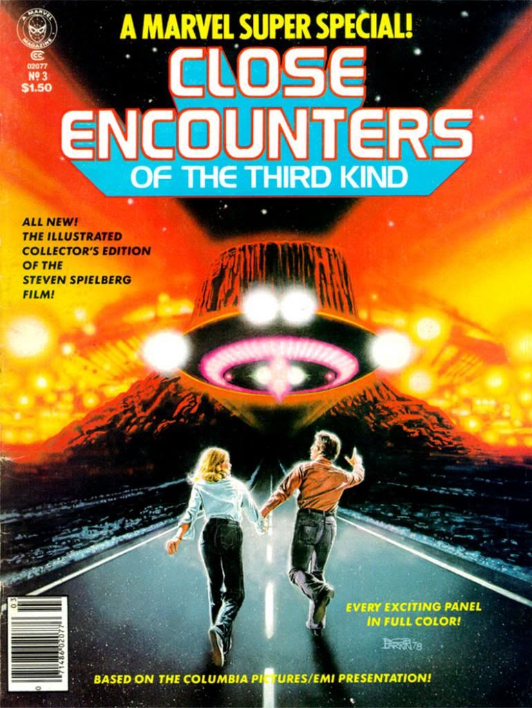
Bob Larkin painted the cover for Marvel Super Special #3: Close Encounters of the Third Kind (1978) and it's typically gorgeous work.  Larkin worked in bold, vivid colors.  Larkin wasn't painterly or as dynamic as as his stable-mate, Earl Norem (they both contributed memorable covers to Marvel's Planet of the Apes black and white magazine).  Larkin favored a sharper finish, not quite photorealistic, but startlingly close enough for a kid in the 1970s who wanted to see what his favorite superheroes would look like if they came to life. 

I don't know who the key figures on this cover are.  Let's call them Not Quite Richard Dreyfuss and Sort of Melinda Dillon.  I seem to remember in those days you couldn't always get the licensing rights to do exact likenesses of actors, so Larkin flexed his screen-accurate art muscles on the UFOs and the cosmic light show around the Devil's Tower in the background, which they apparently could get the likeness rights to.  Just kidding.  Everyone knows the Devil's Tower is in the public domain.  No wait, actually I own it.  I'd forgotten momentarily, but I'm pretty sure I have the papers around here to prove it.  Please send my back payments, Mr. Spielberg and the new ownership of Marvel.  Thank you.

The point is, when you find a copy of Marvel Super Special #3 for yourself, you end up with this Bob Larkin painting that will knock out your eyeballs with its startling beauty even if he had to settle for brushing in a couple of stand-ins for the movie's real stars.  And inside the book, you get an Archie Goodwin adaptation of one of the prime 1970s blockbusters-- second in our youthful instant-classics pantheon in those days to a little flick called Star Wars (and Close Encounters is in every way the superior work of art even if its pop culture cachet has never equaled that of its cinematic big brother)-- over Walt Simonson pencils and Klaus Janson inks.

Script: Archie Goodwin/Pencils: Walter Simonson/Inks: Klaus Janson/Colors: Marie Severin

Think about that for a moment and ask yourself, "Was this magazine worth the $1.50 they charged for it back in 1978?"  Admittedly, it's a silly question we can only answer in the affirmative.  Resoundingly so.  I paid slightly more for mine and now I'm going to bore the hell out of you by telling why.  First, we have to time travel back to 1979 or 1980.  We either had Jimmy Carter or Ronald Reagan in the White House, or maybe in some alternate universe, both fused into a two-headed creature that could never come to an ideological agreement with itself, and so ran around in circles before collapsing exhausted in the Lincoln bedroom, panting and begging for an end to its misery. 

In our reality, this was before the direct market, or at least its earliest days, and before my town had anything resembling a comic book store.  We had to get our comics at bookstores, convenience stores, pharmacies and the occasional gas station.  None of those places would reliably stock oversized comic book magazines.  And back issues?  Back issues were what your big brothers or their friends gave you when they were finished with them, and my brothers and their buddies were all sports playing guys into muscle cars, funk music and girls, not comic books.  I once received a hand-me-down Weird War Tales from one of these cool dudes-- instead of a beating-- and it was one of the happiest days of my life.

Script: Goodwin/Pencils: Simonson/Inks: Janson/Colors: Severin
So I didn't even know a Close Encounters comic existed until almost a year or so after they printed it.  There used to be this mail order outfit called Heroes World.  Marvel eventually took them over, but in the 1970s and early 1980s, they put ads in comics for things like Mego action figures and those huge "Treasury Edition" magazines both Marvel and DC used to put out.  One day I was reading some comic or other-- probably Micronauts-- and my eyes landed on a list of Marvel Super Specials and there it was, a comic based on one of my favorite movies at the time. 

We didn't have DVDs or even VHS then, so the only way to repeat the experience of movies you loved when it left the theaters was to buy comic book adaptations, or novelizations (or the occasional Foto-Novel), then wait for ABC to buy the broadcast rights.  I already had scattered issues of Planet of the Apes, Star Wars, Battlestar Galactica and this huge King Kong magazine from either Gold Key or Whitman.  This meant I had to add Close Encounters to my film comic library.  You're looking at me as if I had a choice.  Trust me.  I didn't.  I can't remember how I got the money, or the exact price (although $2.25 plus shipping and handling comes to mind), but I do remember it took forever to come in the mail.  So long I assumed I'd been ripped off, which happened to kids sending money to companies that advertised in comic books from time to time.  Then it came in a cardboard envelope and I was not disappointed.  In fact, it not only impressed me as a story but it also changed the way I thought about comics.

First of all, it accurately recreated the movie experience in a way no film adaptation had for me before.  Star Wars was fun, Battlestar Galactica adequate.  Close Encounters topped both.

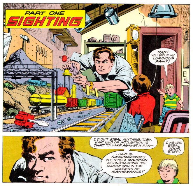
It didn't matter that the inside wasn't photo-realistic, or that we wouldn't have Dreyfuss, Dillon, Teri Garr or even Francois Truffaut going through their motions.  Despite Marvel's inability to score the license for the actors' likenesses, Simonson and Janson occasionally came litigiously close enough as far as I was concerned.  I can imagine other kids reeling in disappointment when they first laid eyes on the off-model Roy Neary carving his mashed potatoes into a lumpy hill while his stunned family looks on in panel designed specifically by Simonson to showcase their growing emotional distance from their troubled husband and father by isolating them in a flat black space.

I was relieved Simonson and Janson at least got his "type" right.  After all, George Tuska's Taylor in Planet of the Apes looked more like screen Hercules Steve Reeves than screen Ben-Hur Charlton Heston.  At least the comic book Dreyfuss wasn't nine heads tall with a physique out of a Renaissance fresco.  The Truffaut character, on the other hand?  I still don't know who that hawk-nosed guy resembles, but it's not the man who directed The 400 Blows.  But he is a relatively minor part of the story and on-panel just a few times in the comic, so I gave Simonson and Janson a pass there, too.

Script: Goodwin/Pencils: Simonson/Inks: Janson/Colors: Severin

As far as the other visual elements go, Simonson's panel layouts and sequential moments are some of his most cinematic storytelling in a career full of the stuff.  You can tell he was just as enthralled with the material as anyone buying this book would have been and he gives it his all, what one of my brothers' baseball coaches would have called "110 percent." I say it's more around 150 percent.  Simonson exaggerates body language a bit striving to match the film's emotional beats, but he also does these action-to-action panel sequences that transpose Spielberg's framing and pacing to a static page as well as any artist I've seen.  I wanted my usual superhero fare to duplicate these kinds of panel-to-panel action transitions as well, because it meant something closer to the way we perceive time than the usual dynamics and poses with speedlines.  This was my introduction to that sort of comic storytelling years before I ever heard of guys named Eisner, Krigstein, Steranko or Kojima.

Sometimes I'm not so keen on Klaus Janson's heavy-handed inks, but he and Simonson are matched well here, and the way he treats lighting in this book hasn't been equaled, at least not in any comic I've seen.  This is of utmost importance when dealing with Close Encounters, because light is practically a character in the movie.  People mock J.J. Abrams and his supposed lens flare addiction, but Steven Spielberg had cinematographer Vilmos Zsigmond practically paint the screen with light, and Janson follows suit, especially in the climactic encounter where he manages to do something I would have considered possible-- make static drawings look not simply like dazzling lights, but moving ones as well.  Seriously.  Janson manages to mimic moving lights with inked lines.

In his afterward (which I read as often as I did the comic part), Goodwin cheerfully explains some of the concerns a writer has when adapting from one medium to another.  You don't get a soundtrack when you read a comic, so Simonson came up with all kinds of innovative ideas for full-bleed artwork and panel arrangements to try and capture a bit of the John Williams magic.  There's also a problem with timing jokes.  In the movie there's a funny bit involving gas masks and Goodwin and team duplicate it, eliciting almost as much laughter from me reading it as the movie did when I was watching it.  Goodwin also takes time to praise Marie Severin's coloring job, and it is indeed first rate.  She really shows what a colorist can do with the limited and flat palette available in those days.  And so Goodwin gave me my first lesson in writing for comics as a craft, and the kinds of things pencillers, inkers and colorist do as well. 

Up to that moment, I had been used to experiencing a comic as simply a thing unto itself.   Words, pictures, colors make a story as if by magic.  I knew artists' names because I loved to draw, and had a vague idea of what went on behind the scenes because I read Marvel's Bullpen Bulletins and the editor's messages in DC's books, too.  But in an essay probably shorter than the one you're reading now, Goodwin educated me on a writer's responsibilities and how the artists actually thought about what they were doing and planned images for effect.  I also learned the word "onomatopoeia."  A comic didn't just poof itself into existence.  People like Goodwin, Simonson, Janson, Larkin and Severin made them with their minds, their hands, their talents.  Knowing that didn't take away any of the wonder of reading a comic book.  It added to it. 

More than thirty years later, it still does-- no matter who the writer or artist or colorist is-- and I will always have Archie Goodwin to thank for that.

Sunday, November 10, 2013

Part Two: "Kirby’s Unfinished Opera" by Gary Chapin (another guest essay!)

(Here's the second part of Gary Chapin's epic look at Jack Kirby's Fourth World...er... epic.  Part one is here.  You're really going to enjoy this!)

Now’s the Time

Mark Evanier, in the closing essay for Volume 3 of the Kirby’s Fourth World Omnibus, points out the critical reaction to Kirby’s treatment of Deadman. Kirby, said this critic (I paraphrase), clearly did not get the Neal Adams Memo. Graceful lines, art school realism, and noir subtlety “were” the way of “now.” Kirby represented “the past.” Adams and company represented the future. This is a point of view I would have heartily, and stupidly, embraced at the time.  “The future” is not a fixed point, however. And even the present is a bit slippery.  My “now” is different from your “now.” There’s a joke that says, “The golden age of music is 12.” My golden age of Kirby is 45. This is my “now.”

But Then Was Not

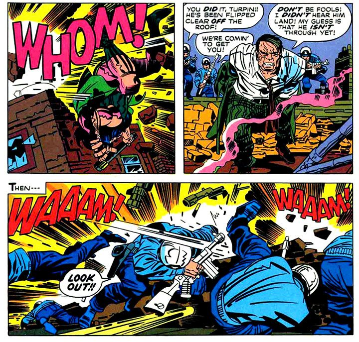
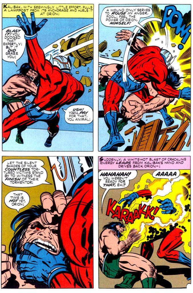
After around a year, the wheels came off the bus (or super cycle) of the Fourth World. Sales dipped, and books were canceled. The remarkable achievements that were “The Pact” (New Gods #7) and “Himon” (Mister Miracle #9) and “The Death Wish of Terrible Turpin” (New Gods #8) were not seen as masterpieces at the time.  The combat between Orion and Kalibak in the Turpin story will remind you what sort of glory can be found in a slugfest. 

New Gods #7, March 1972 (Jack Kirby with inks by Mike Royer)
 
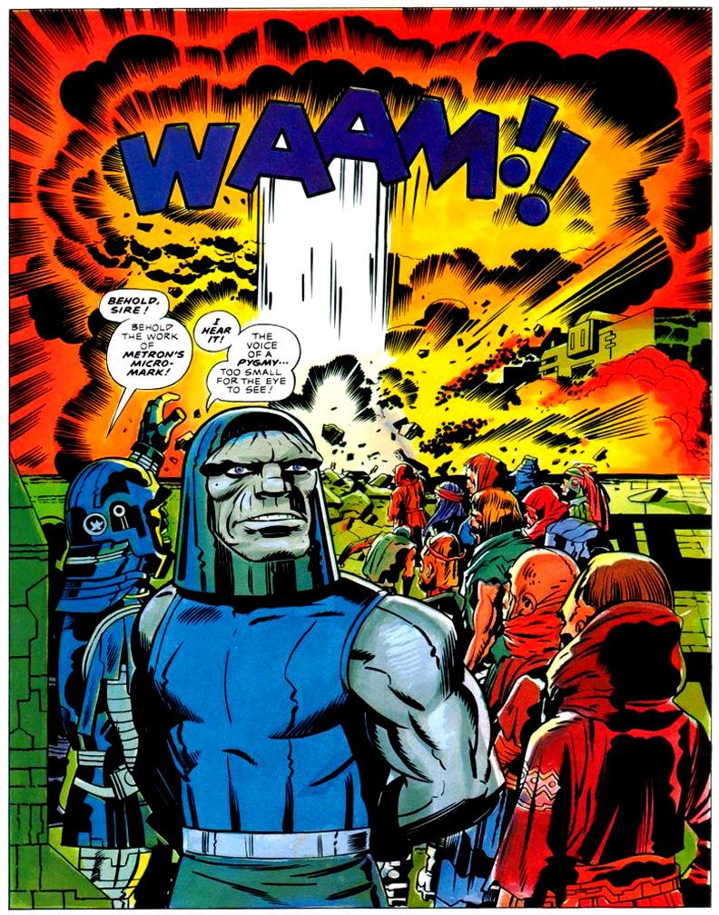
But then it ended. The last issue of the New Gods (“Darkseid and Sons,” #11) was, in fact, brilliant (the run from #7 through the end is worth everyone’s time). The story didn’t end as Kirby wanted it to, but it was a very effective stopping point with a lot of “What?? What just happened???” moments. It was very satisfying. The end of the Forever People was much more of a mess, possibly because their action was always peripheral to the New Genesis/Apokolips story being told in NG and Miracle.  “The Kids” end up stranded on a paradise planet in a faraway dimension when the Pursuer’s lance blows up, “destroying” the Infinity Man. While it technically makes sense, the pretext is as weak as it sounds.

Mister Miracle lasts a bit longer than the other two, but when the Big Story falls away, it becomes a series of one-off monster stories. This didn’t have to be a problem. Kirby spent the ‘50s being the master of one-off monster stories.

New Gods #8, May 1972 (Jack Kirby with inks by Mike Royer)

According to Evanier’s essay, though, Kirby was feeling demoralized and his heart wasn’t quite in it. You only have to notice that one of the stories begins with Miracle and Barda stumbling on a “haunted” house while walking in the woods near their house. Yeah, time for a new direction (which took him to the Demon, Kamandi, et many al., so one can’t entirely complain).

The Problem with Endings

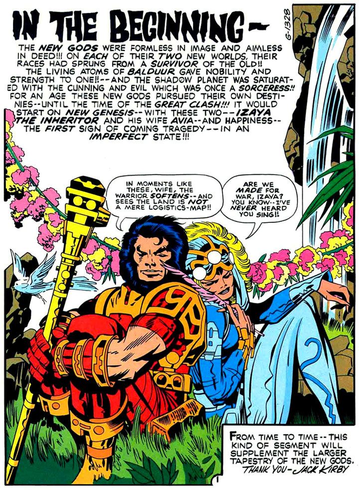
Kirby’s vision from the beginning of the Fourth World was an enclosed story that reached through a number of books and ended in a Fourth World Ragnarok, closing the book on these characters for good. I don’t know how he ever thought that was going to happen. 

New Gods #11, November 1972 (Kirby with inks by Mike Royer)
 
It seems almost quaint, looking back from the other side of the graphic novel naissance, but in 1972, DC Comics was not going to let Kirby develop amazing properties – which is what he was brought in for – and then have them succumb to irrevocable destruction.

This may have been the one place where Kirby – a man preternaturally in synch with comic book aesthetic – may have had an ambition for something that can never exist in the superhero-comic book medium: an ending. This wasn’t a function of the times Kirby was writing in, but a function of the medium. Just consider the New Gods. We’ve had The Hunger Dogs, Kirby’s own imperfect – but beautiful! – attempt at an ending. We’ve had Death of the New Gods. We’ve had Final Crisis, where Darkseid is “finally” killed. 
 
Wait, who was that who was featured in the new Justice League 23.1?
 
To butcher Fitzgerald, “There are no last acts in comic book superhero lives.” Even characters who are never brought back, are constantly being brought up (e.g., Jor-El, Gwen Stacy). I wouldn’t be the first to suggest that while Crisis of This, That, and the Other Thing had all the hallmarks of a Ragnarok, they lacked the one key element:  the end of the world. They weren’t resetting the DC universe, they were resetting the DC stylebook.

DC Graphic Novel #4: The Hunger Dogs, January 1985 (Kirby with inks by D. Bruce Berry)

I think Kirby really wanted the end of the world for his characters. He had the Wagnerian urge. But like so many great creators he was an inventor, not a destroyer. He began things. He began great things. And not a single one of them – not Cap, not the FF, not the New Gods – has ended. And even if they fall into a space where they seem to have ended – books get cancelled – there is always a new issue coming down the line.

But this is not the problem with endings. The problem with endings is that our experience of the work is shaped by “how things turn out.” Forget how things turned out. These are astonishingly rich stories, executed to a ridiculously high degree; the creation of a visual aesthetic that’s analogous to Tolkien’s linguistic aesthetic. This will always be true, no matter how things turn out. Kirby could not achieve his operatic ambition, but that’s irrelevant. I love these books.

Gary Chapin usually blogs about French accordion music over at www.accordeonaire.blogspot.com.

Saturday, November 9, 2013

Fantastic Four Annual #3: Stan and Jack can't catch a break

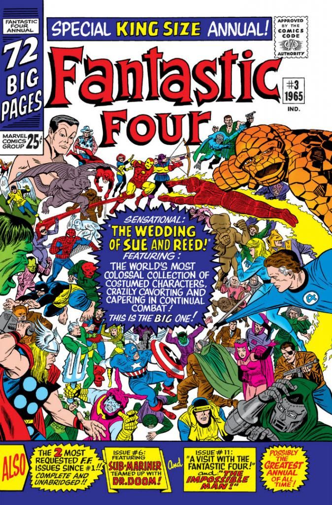
I've always felt ambivalent about annuals.  The best are the ones where the regular creatives use the extra room to tell an epic story that's either too large an idea for an ordinary issue or else climaxes a storyline, or someone you've wanted to see handle the characters shows up to write or draw the book.  The worst are when some ill-suited guest team butts in with crap that's essentially filler or else it's simply part of a storyline from some other book.  Back in the 1960s, the gang at Marvel really knew how to put together an annual, although Fantastic Four Annual #3 (October 1965) consists of a regular-length story and some "most requested" reprints.  It's just the main story is nothing less than the long-awaited wedding of Reed Richards and Sue Storm.

And lemme tell ya, brothers and sisters, everyone who is everyone shows up and it is fun, fun, fun from panel one!  Captain America, Thor, Iron Man, Spider-Man, Daredevil, Dr. Strange and all the X-Men, plus Patsy and Hedy, (at least rumor has it) Millie the Model and possibly Irving Forbush headline a stellar guest list, with Nick Fury and SHIELD providing security.  The only problem is, with such a major event there are bound to be crashers.  The Puppet Master, the Red Ghost and his apes, Mole Man and the Super-Skrull all cause problems, because Dr. Doom himself has some kind of crazy emotion ray controlling their minds.

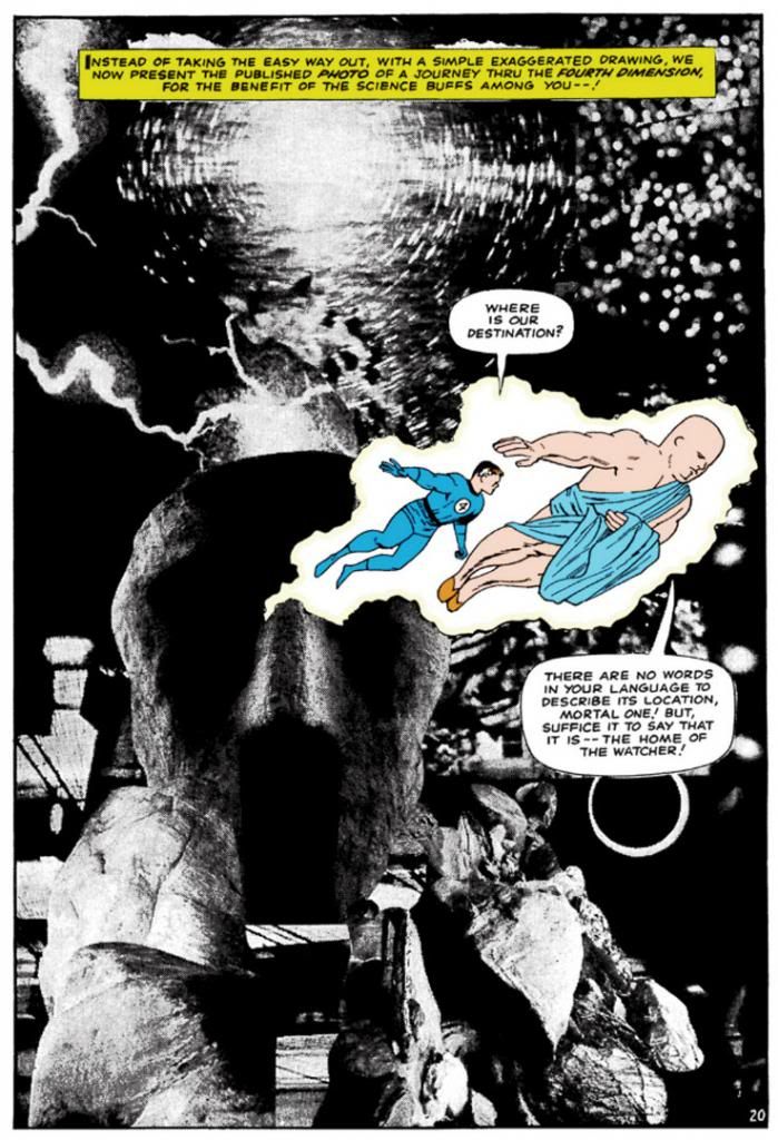
The heroes prove capable of handling the initial wave, but more and more villains attack so we get the like of the Mandarin and Hydra plus a lot of other clowns whose names escape me barging in and smashing up the place (kind of like Owen Wilson's mescaline-addled Eli Cash in The Royal Tenenbaums only without the death of a single Buckley), giving Fury a raging headache.  When Attuma and his Atlantean armies emerge from the harbor (Doom meant to call Namor, but the King himself was on some deeper quest according to Stan Lee's little editor's note; he also tells us why the Hulk isn't there) and Richards puzzles out what's behind it all, even the Watcher has to take a hand.  He takes Richards on a dazzling yet possibly superfluous trip through the "fourth dimension" (isn't that time?) to retrieve a device that beams all the baddies backwards in time to a moment where they would forget the whole thing happened.

Kirby uses one of his patented collages to depict the dimensional trip and we have to take a moment to gaze upon its wonders.


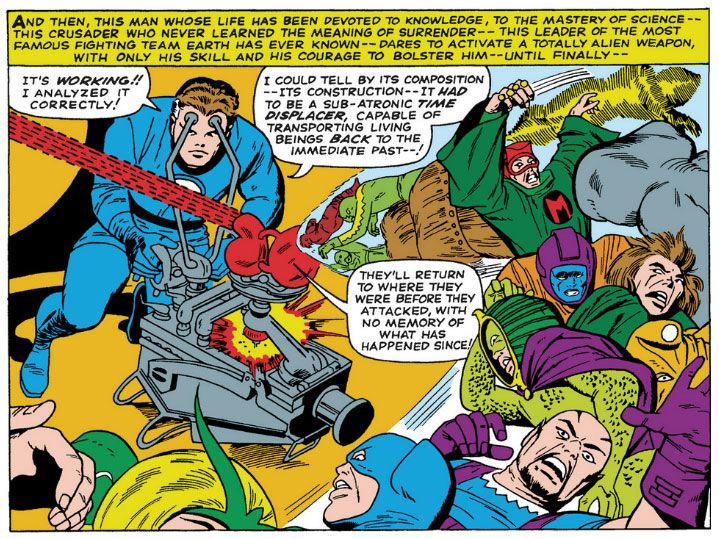
And here's that aforementioned device in action.


My god, Reed Richards is so smart, he could tell just by looking at it what it is and what it's used for!  I'm looking at it and all I can think is maybe I could use it to project transparencies onto some kind of fabric screen or perhaps even the wall itself as a visual aid for one of my classes.

This panel sums up the whole of the rather jangled plot, which is almost entirely given over to fight scenes, as you can imagine.  Kirby's on fire with some incredibly energetic poses as he presents practically an encyclopedia of Marvel's contemporaneous characters and we get a lot of villainous monologues and heroic wise-cracks from Lee.  Vince Colletta's inks are typically scratchy and rushed-looking, but I also recognize the herculean task faced by the art team here in working with this many characters on deadline.  They're serviceable finishes and a few odd figures and faces actually have a becoming elegance (others look kinda haphazardly slapped together), but certainly this book would have looked slicker with Chic Stone doing the honors, or Joe Sinnott.  Then again, Reed and Sue might have had to delay their ceremony another year or two waiting for this issue.

Another thing to consider is we're looking at restored art here.  I'm not sure what process Marvel puts their back catalog through to produce these color reprints, but I doubt they used the original inked pages or old separations (if any of that still exists).  I'm guessing they cleaned up some stats or decent-quality printed books as best they could,  retouched things here and there but said, "Eh, good enough" at the loss of finer lines after the digital coloring.  And these lines look like they were thin enough to begin with.

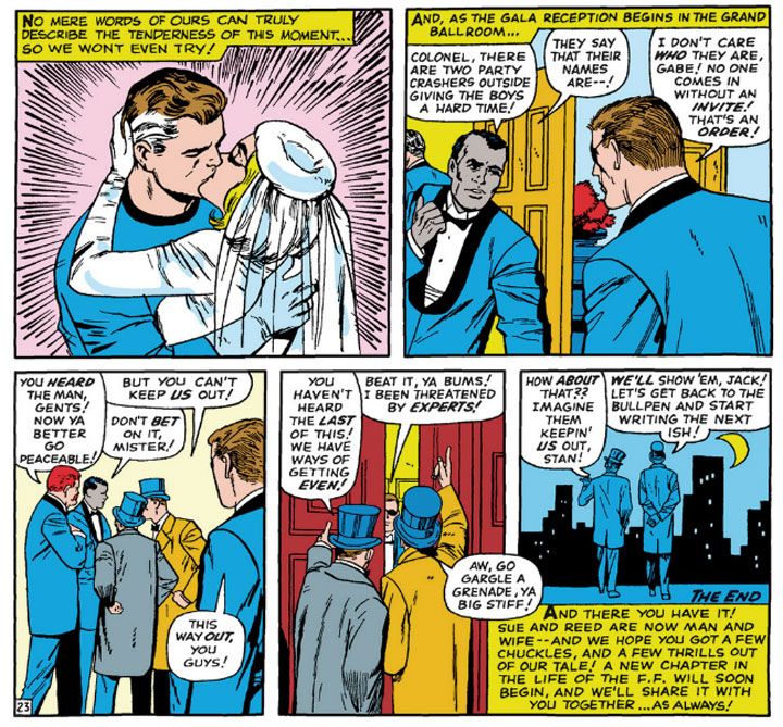
On with the wedding!  Here comes the--

Stop the music!  Stop the music!  Hold the sub-atronic time displacer!  What's this?  Two more wedding crashers?


In the immortal words of a certain bashful, blue-eyed boy, "Wotta revoltin' development!"