Showing posts with label Gil Kane. Show all posts

Wednesday, December 11, 2013

Heroes on buildings and differing looks/Fighting some tentacles/webbing some crooks/These are few of my favorite Spidey things (artists)...

Editor's Note:  I've really neglected Spider-Man in this blog, and I apologize for that.  I'm about to make up for it with one giant post!  Here we go!

Spider-Man has gone through a lot of artists over the decades, and while his costume basics have remained the same, some artists have taken it upon themselves to tweak the details.  For some people, the Todd McFarlane version of Spider-Man is their favorite.  Huge eyes, lots of weblines on the red parts, really exaggerated insect-like poses and fingers that resemble circumcised penises and feet made out of garden spades.  Some may be into the black costumed Spider-Man.  Or the Ultimate Spider-Man.  Or that guy who dresses like Spider-Man and climbs skyscrapers.  Whatever your taste, Spider-Man has been around long enough there's probably one for you, and that one is more than likely the one by whatever artist handled the character when you first got into him.

I'm pretty damned old, so my first Spidey crush was on what was probably a John Romita Spider-Man on a Mead Trapper-Keeper I had in elementary school back in the late 1970s.  Given the era, it could also have been a John Buscema or Gil Kane drawing.  Actually, it may not have been a Trapper Keeper at all, but a folder or even a notebook.  There's a chance it's the one with the cover to Amazing Spider-Man #135 (which means Romita), but I remember it more as a collage of cover images, which means it could be any combination of artists.

Whichever one it was, and however vague my memory of its specifics, what I definitely remember is how it imprinted in my brain a certain vision of what the ideal Spider-Man looked like.  After all, that Spidey matched up well with the Mego Spider-Man, the Spider-Man on the The Amazing Spider-Man TV series, the one on The Electric Company, the bodybuilder who dressed like Spider-Man at the mall we had our photos taken with and, most importantly, the Spider-Man still appearing in Marvel comics like The Amazing Spider-Man, Peter Parker the Spectacular Spider-Man, Spidey Super Stories and even in the Hostess Fruit Pie ads.  Spider-Man de rigueur for the 1970s.

Then I learned of Steve Ditko from a Dr. Strange story collection. That he was the original Spidey artist meant I had to give his rendition careful consideration in light of its preeminence in Spider-Man history.  Well, it didn't take long for Ditko's vision to take over my imagination.  Here's a typical Ditko Spider-Man.
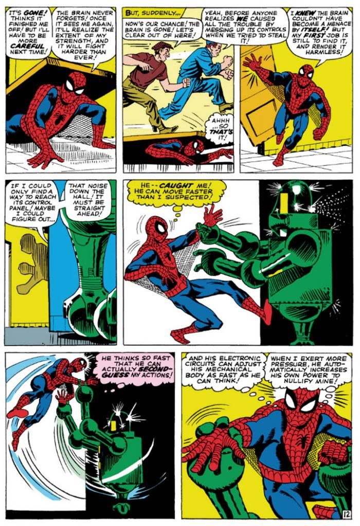
Amazing Spider-Man #8 (January 1964) Art by Steve Ditko

This is from Amazing Spider-Man #8 (January 1964), touted on the cover as a "Special 'Tribute to Teen-Agers' Issue!!"  Since the character himself is a teen-ager, Ditko's Spider-Man is muscular in a youthful, long-distance-runner way, but isn't quite as classically proportioned as some later versions.  While this isn't particularly a good example of it, Ditko also tends to put heavier shadows in the costume's blue areas, which makes me think his intention is for that part to be navy blue rather than the royal blue the subsequent Spideys sport, or even black.  But given the way comic books treated colors back then, and with all the recoloring and touch-ups in the years since, it's hard to say.  What we can see is Ditko favors larger eyes with heavier black outlines, to emphasize the insect-like aspect of Spidey's mask.  He aso gives Spidey more underarm webbing than most artists-- and it runs from his belt all the way to his gloves!

Using the three-tier page format, Ditko chops action into small increments, which makes sequences more movie-like and easy to follow.  But he also uses mostly medium shots, which keeps the action at arm’s length.  It’s simple storytelling at its finest, and reduces events to something approaching the comic book version of documentary-like as opposed to the heightened or epic.  Spider-Man’s powers may be the one fantastic element in a world Ditko means to represent our own, but he’s hindered by the same things we deal with ourselves and so we identify with him even if we’re not right in his face masking ourselves as him.  With his funky take on facial expressions and body language—with his rough-hewn finishes few of Ditko’s people are blatantly gorgeous—this makes Spidey’s adventures just a bit larger-than-life rather than massive.  There’s our trod-upon hero (literally) coming out from under a door, in the confines of some functional corridor rather than high above a cityscape.

John Romita took over the title when Ditko left, but we'll look at him later because we're doing this in order of what I own.  So keeping that in mind, here's John Buscema's version, inked by Jim Mooney, from a few years later.  We have to acknowledge the influence of Romita's slight revision of the costume, but the rest is Buscema all the way.
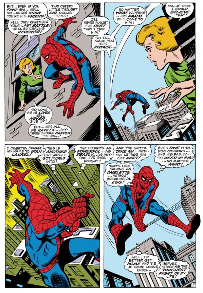
Amazing Spider-Man #76 (September 1969) Art by John Buscema and Jim Mooney

Buscema’s Spider-Man (from an issue actually printed within my lifetime!) is muscled like some gorgeous Renaissance sculpture come to life, a full nine heroic heads tall.  Spider-Man, not Spider-Teen.  Buscema puts us inside the action and this time, the entire thing is made up of fantastic elements—other than the (fairly) realistic buildings, but even they’re skewed with deep perspective shots.  By varying panel size and shape, changing point-of-view and enlarging the images so he can fit only four on a page, Buscema creates a heightened dynamism that’s at odds with Ditko’s reductionism.  This isn’t to say one is right and one is wrong.  They may represent differing philosophies or thought processes on what constitutes heroism.  Or maybe Buscema just liked big takes.  Both are totally valid approaches, but I like how Ditko's Spider struggles a bit more.  On the other hand, Marvel tended to push Buscema’s powerful approach to storytelling on us through things like How to Draw Comics the Marvel Way.  This had a huge influence on my tastes as a teenager.
 
I don't see any armpit webbing on this page, but that may be because Jim Mooney forgot to ink it.  They include it on other pages, but it's subtler than Ditko's.
 
As much as I love both Ditko and Buscema, these days my preferred Spider-Man artist is his second penciller, none other than the aforementioned John Romita.  Let's take a look at his Spidey.
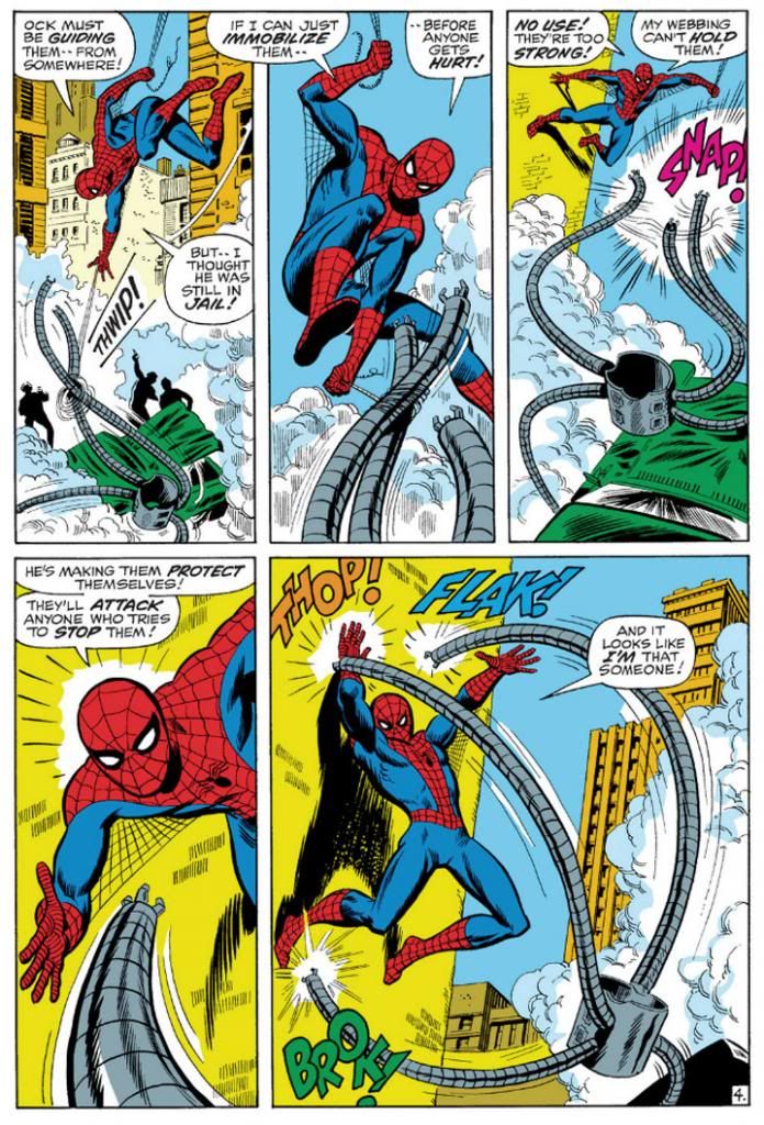
Amazing Spider-Man #88 (September 1970) Art by John Romita and Mooney

This is a clever sequence from the September 1970 story, "The Arms of Doctor Octopus!," where, true to its title, Spider-Man fights Doctor Octopus' arms.  Only the arms.  The good Doctor controls them from his prison cell.  Romita's Spider-Man is slightly slenderer than Buscema's, but they share body language.  Romita also brings us inside the action with this two-tier layout.  In the Buscema page, we have three Spideys roughly the same size with a smaller one for variety.  Romita gives us three Spidey sizes:  small, medium and large.  It's not quite as bombastic as Buscema's, but it's still bold.  Romita's characters tend towards the pretty, maybe due to his romance comics background.  I don't think anyone handled the soap opera stuff in Amazing Spider-Man better than Romita.  Slick Mooney finishes keep some surface consistency with line weights and the treatment of Spidey's blue areas.  I haven't seen the pencils for this page or the Buscema one, but I'm going to guess Mooney has a great deal to do with the near-identical eye and web pattern treatments.  The color choices here interest me, but I'm not sure how much is due to the original colorist and what might have been changed in the years since.  Anyway, it works.  Since Doc Ock's arms are gray and wouldn't have popped in the foreground otherwise, notice how the buildings on the Buscema page are gray, but the colorist here used a lot of yellow and yellow-orange.

Also, THOP!  FLAK!  BROK!  And the return of the armpit webbing.  It's finer than Ditko's and only reaches Spidey's elbows.

While I've stated my preference for Romita, I wouldn't care to meet the fan who finds fault in Gil Kane's interpretation.
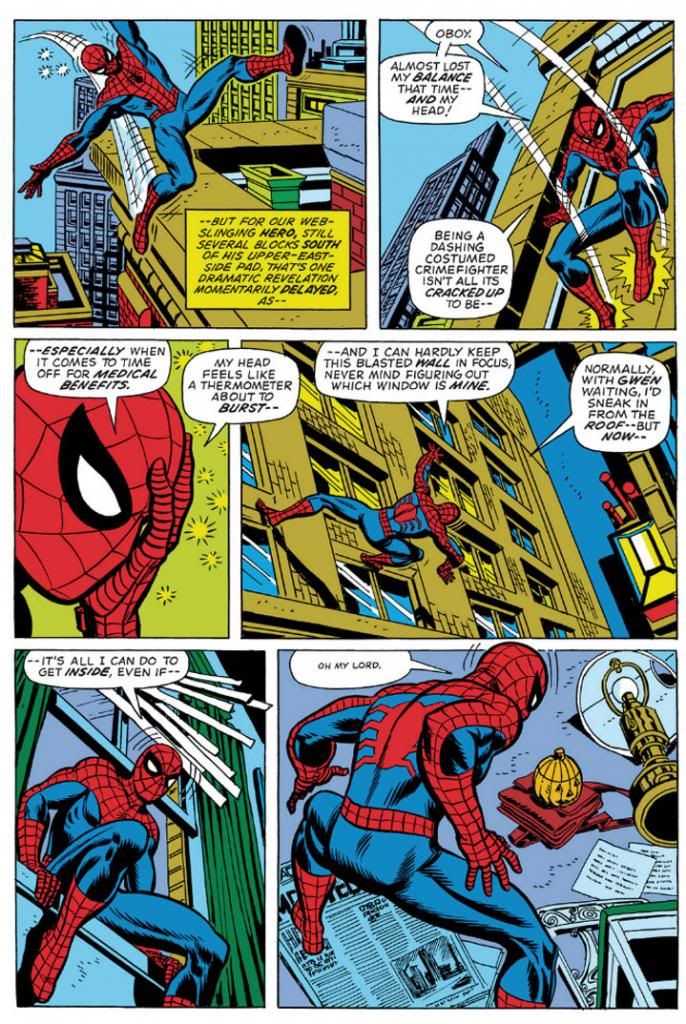
Amazing Spider-Man #121 (June 1973) Art by Gil Kane and Tony Mortellaro

Here's our first extreme close-up!  It appears in Amazing Spider-Man #121 (June 1973), in a story you may have heard of called "The Night Gwen Stacy Died."  Not sure what happens in that one, and with an obscure title like that, your guess is as good as mine.

But I am pretty sure Ditko, Buscema and Romita all used close-ups before Kane.  But Kane, like Ditko, excelled at facial expressions.  Look at some of his cover work with those giant screaming heads.  Kane puts extreme close-ups to effective use throughout this issue.  Yeah, Peter Parker's face is hidden under a mask most of the time, but the idea's basically the same.  This is an important little moment Kane chooses to emphasize with a cutaway to Spider-Man holding his head because it "feels like a thermometer is about to burst--"  Spidey on this page isn't feeling well, and in his one high-flying moment of web-swinging, Kane gives him wonky body language, then confines him to wall-crawling and slipping in windows and crouching on newspapers.  I like the last panel especially, with the high angle from-behind shot giving us both Spider-Man and the pumpkin bomb he's reacting to all in one shot.  There's a nice use of a missing panel here, with Spidey on the windowsill cutting to Spidey in the room in such a way the omitted leap is implied.  It's almost animated.

No armpit webbing.

Ross Andru, who drew Amazing Spider-Man for five years (impressive!) gives us two superheroes for the price of one, but we're going to ignore Nova and his golden bullet-helmet.
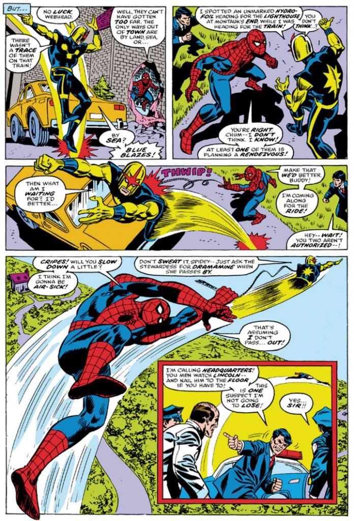
Amazing Spider-Man #171 (August 1977) Art by Ross Andru and Mike Esposito

Once again, we have medium shots and three panels in a row with high angle views, the last with a larger foreground Spider-Man inducing vertigo as Nova drags him through the air.  And then an inset panel with the two of them so high they're tiny to the cops left behind on the ground.  Andru's Spider-Man retains the crouching body language of Kane's, but is noticeably chunkier than any of the ones we've looked at previously.  He's got the Ditko-style dark shadowing on his blue uniform areas (maybe inker Mike Esposito contributed that part), but again, none of the armpit webbing.  Did Marvel abandon that look, or was that an Andru flourish?  It's not as if the armpit webbing has any real function and it wouldn't have worked in the panel with the largest Spidey anyway-- it would have obscured his chest and been a challenging artistic exercise for Esposito, like when a penciller puts speedlines in front of an object.  How do you look through those?  Do they distort the background image?  Just how much of that should remain for clarity's sake, or for simplicity?

Andru came over from DC where he worked on war comics and Wonder Woman.  Can you see any of those elements informing his work here?  I know he did a classic take on Wonder Woman and he's giving us a clean, house-style Spider-Man on these pages.

Oh, and the yellow sky in the inset panel.  That was originally the work of Glynis Wein, who colored a pile of Marvel books.  It reminds me of Harvey Comics.  For some reason, colorists at Harvey seemed to love making the sky yellow.  Here it makes a good depth contrast for the figures heavy on the blue side in the foreground. In fact, whoever colored this seems to have put some extra effort into popping figures by contrasting cool colors on top of warm (although you still have to put up with Nova's yellow arms).  I'd love to see the original printed page to see how accurate Marvel has recreated Wein's colors here.

And there you have it.  Ditko, Buscema, Romita, Kane and Andru.  They're in my Spider-man Hall of Fame.  Yeah, I like the way Ron Frenz and John Romita, Jr. and even John Byrne-- to name three more-- draw the character, but when I think Spidey, I think Ditko, Buscema, Romita, Kane and Andre.  Their versions combine into my platonic ideal of Spider-Man.

Tuesday, August 20, 2013

The nutty things you learn when you're a comic book fan: Gil Kane inked with markers

Lately Gil Kane has been on my mind.  I've always liked Kane's art.  Very distinctive anatomy, instantly recognizable unless deliberately inked not to be so.  Few things I love more in comics than a Kane self-inked cover.  Today I learned he inked a lot of his own late-period work with markers.  So a number of different blogs tell me, anyway.

It makes me respect Kane even more.  When you check out the lines-- the actual strokes-- on the printed covers there's little that indicates he worked with markers.  Maybe a little bit of same-width quality in the diagonal lines he used sometimes for tone.  Or maybe I just never really considered the tools Kane used for his finishes, which are crisp and altogether pleasing to the eye.  If I ink with a marker, it looks like a fool used a marker.  Lengthy moves, such as the curve along a character's thigh, for example, sometimes appear shaky or are too obviously made up of two arcs poorly joined.  With Gil Kane, the same areas just look...

Gil Kane-ish.

Sunday, July 28, 2013

In Which We Sing of Slug


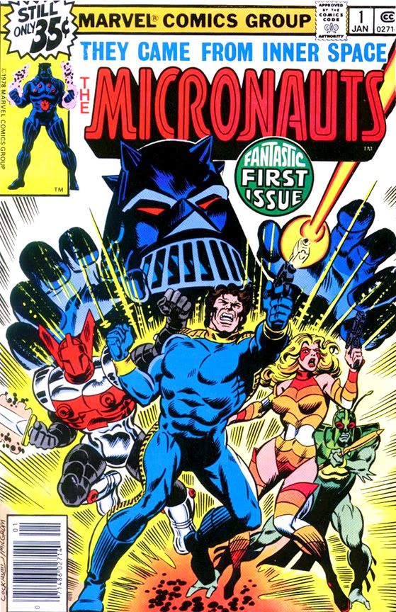
In writing Marvel's Micronauts series, Bill Mantlo took a toy line with no narrative and gave it one, set in a sub-atomic universe filled with all sorts of settings and characters.  As the toys touted their "interchangeability," so too did Mantlo assemble the comic out of various parts-- a little Flash Gordon, some Kirby Fourth World, a bit of Star Wars (which I think is obvious and certainly no crime, though Mantlo denied it forcefully in a letter page response to a reader who pointed it out-- to be fair, let's just say Mantlo and Lucas drew from the same source material).  To this rich mix he added some cool flourishes that give Micronauts its own identity. Acroyear, for example, was merely the name of two of the toy bad guys, but Mantlo created an entire race of honorable warrior Acroyear, led by a noble outcast who became a major player on the Micronauts team.  This innovation came a few years before Star Trek:  The Next Generation reconfigured the Klingons from crudely-motivated space cossacks into a clan-and-honor-based culture drawing from Japanese martial tradition.  Mantlo also came up with a lot of interesting little supporting characters, too—characters like rebel leader Slug.

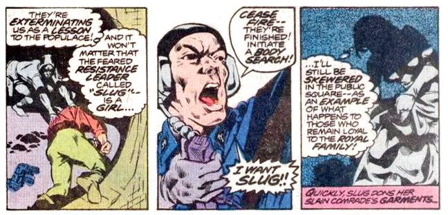
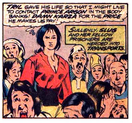
Slug.  Not her real name, yet not exactly a nickname.  A nom de guerre, if you will, but more than that.  Slug debuts in the story "A Hunting We Will Go" from the second issue I bought fresh off the spinner rack, Micronauts #4 (April 1979).  The book features splendid art by Michael Golden and Josef Rubinstein and I can't figure out why this team wasn't used on Marvel's Star Wars title.  Right from the splash they delight readers with high-tech vehicles, a chaotic firefight and lots of everyday type slobs caught in the middle as minor villain Major D'Ark commands an assault on "Sector 7" of Homeworld, the comic's main planet (other than earth, of course).  Dodging lasersonics, laser bolts or beams or blaster shots or whatever, Slug jumps into a hole in the wall and changes clothes with a dead man for no apparent reason.  After all, it's not as if the rebels wear uniforms or that she wouldn't tip off the bad guys with her defiant eye-squint among a bunch of stunned, gape-mouthed goobers.  Somehow this clothes-swap makes someone known only by name and reputation completely anonymous.  From there she goes to the worst possible place on Homeworld.  By design.

Where did this woman come from?  In her brief, violent life, we don't learn a whole lot about her or her motivations, and precious little biography.  Mantlo wouldn’t even reveal the story behind her humble handle for another three years, in Micronauts #48 (December 1982).  This is when we learn doomed, defiant Slug was born to a prisoner of Baron Karza, the science-mad dictator of the Microverse.  She became Slug via one of Karza’s offhand insults as soldiers drag her mother away.  With whatever name her parents gave her left unsaid, it's Slug she remains for the rest of her life.  The only question is, who told her she was a Slug?

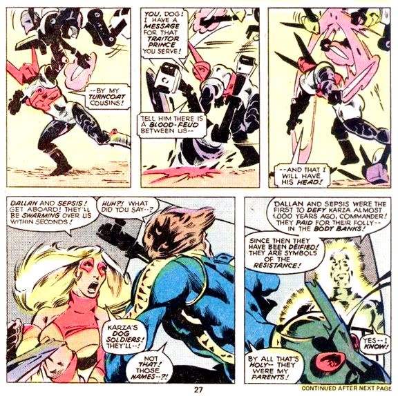
Because she's a secondary character rather than main cast, Mantlo never fills us in on what Slug does between birth and rebellion.  This means we're free to imagine the hardscrabble life Slug must have lived from that day. Homeworld hosts a hierarchical society with Karza on top, followed by the wealthy elite who support his tyranny. At the bottom, the poor, mostly used by Karza as a recruiting pool for his Dog Soldier armies or for experiments in his Body Banks, the genetic madhouse where Karza dissects and maims at will.  It's obviously a dehumanizing system.  An orphan among its lowest class, Slug probably learned to steal and hide at first, and later to fight.

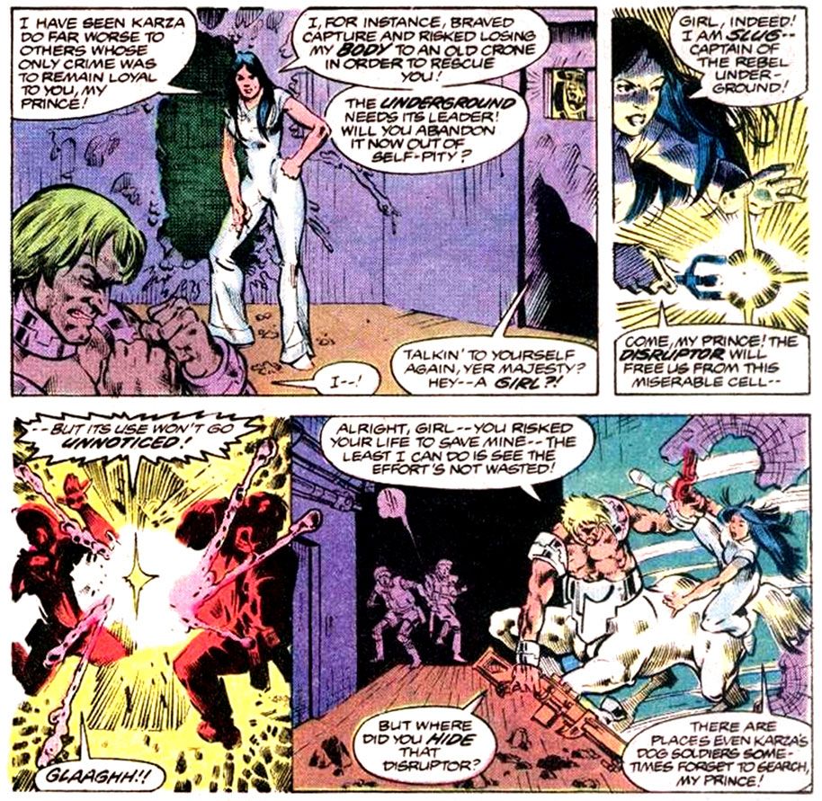
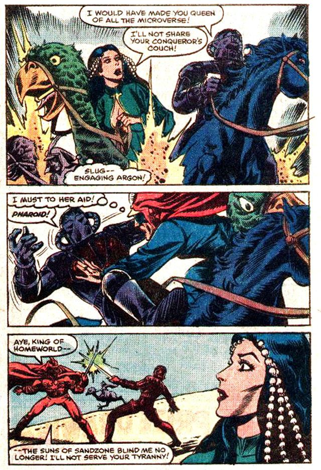
Emphasis on the fighting, because when she first appears Slug is already the semi-legendary leader of the anti-Karza rebellion, no doubt using her street smarts and toughness to plan and survive running street battles with the Dog Soldiers—until she allows herself to be captured. Locked away inside the Body Banks herself, Slug faces the potential horror of having her body taken from her and given to a loyalist. But before that can happen, she uses an energy weapon (I don’t even care to speculate where she hid it, because in on scene she’s forced to disrobe completely in front of Karza’s men) and breaks into the cell of Prince Argon, who’s already suffered the indignity of having his upper body surgically grafted to his horse’s lower body. You know it could’ve been worse: if Karza had more of a sense of humor, he might have done it the other way around.  I would have.  Look into your heart and you may find you would have, too.  Since he didn't, we're free to imagine somewhere in the unseen sections of the Body Banks, there's a horse head running around on human legs.

Flights of horse-ass based fantasy aside, Slug quickly convinces the despairing Argon to fight for his life and they blast their way out of the Body Banks. With Slug riding on Argon’s back.  Which is pretty sensible, when you think about it.  After all, it is a horse's body which means it has horse's legs.  Strong and fast enough for both Slug and Argon to make good their escape.

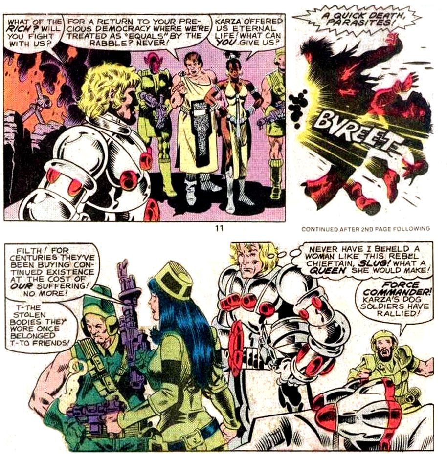
After that, Slug doesn’t contribute a whole lot to the fight against Karza, at least not on-panel. But when Mantlo and Golden do depict Slug in action, it’s to gun down some rich jerks who won’t join the rebellion. That’s pretty hardcore. Che Girlvera.


This happens in Micronauts #7 (July 1979).  Yes, Argon, what a queen Slug would make.  The queen of summary executions.

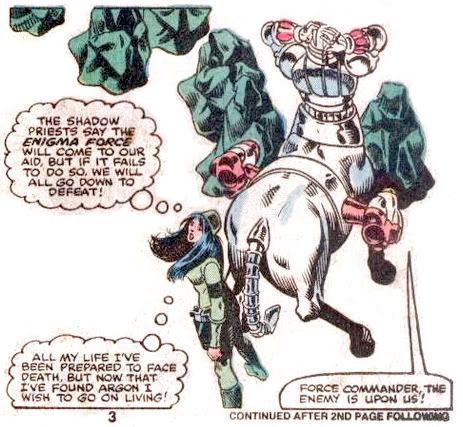
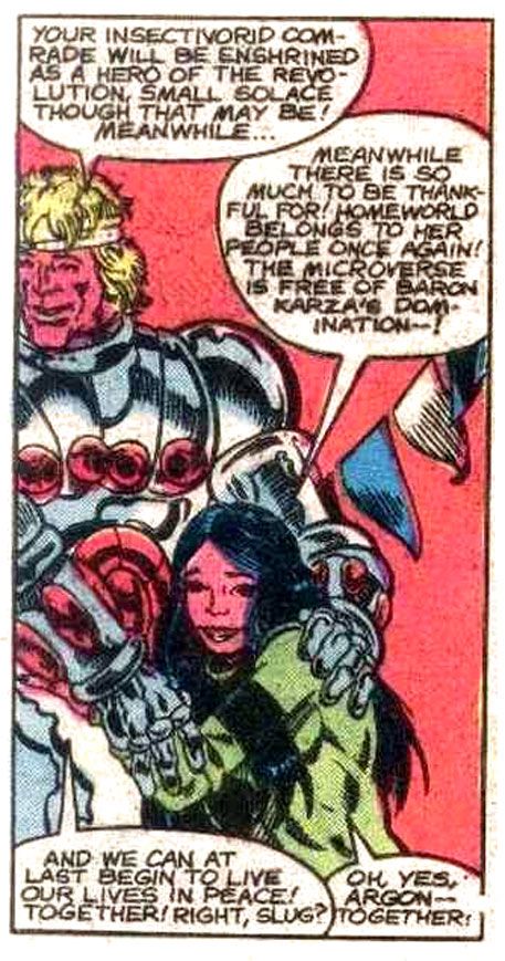
Fighting for freedom side-by-side (the freedom to be ruled by a king instead of a baron), the two fall madly in love. Under Slug's influence, Argon dons King Dallan’s holy armor, which looks like the negative version of Karza’s unholy armor.  Despite being something of a dumbass as it turns out, Argon takes charge of the rebellion, no doubt coached at every turn by the more-capable Slug.  At least I hope that's the subtext Mantlo intends as he relegates Slug to a more supporting role in the conflict.  But despite lacking Slug's brains, Argon does have four hooves and a couple of rockets on his back, and so proves himself every bit as gutsy as his girlfriend.

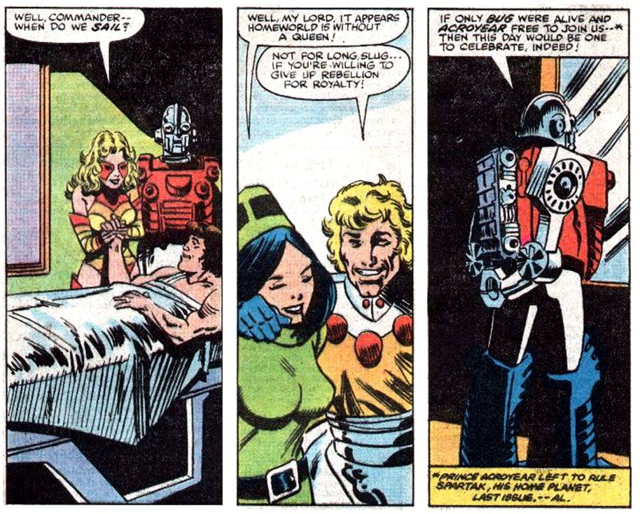
By Micronauts #12 (December 1979), with the war against Karza apparently finished, Slug prepares to hang up her guns and start exploring the softer side of life.  The very same young woman who once blew the upper class away with a laser-blaster coquettishly melts into the arms of the heir apparent.   You can’t help but think Slug feels a little pang of guilt when Argon asks her in #13 (January 1980) if she’s ready to trade rebellion for royalty.  Or not.  Her politics are more than a little odd when you consider her rebellion wasn't a democratic one by any means.  It was more of a pro-monarchist insurrection.  She fought to replace an autocratic regime with an aristocratic one, not to give the people a voice in their government, unless revolution counts as a voice.  Now that I think it over, I'm sure it does.  I prefer elections to violence, however, but with a monster like Karza in charge, Slug and her fellow rebels didn't have that choice.  Whatever her former beliefs, Slug seems happy to hint at a new role for herself.  She's to marry into royalty as her reward.

Life afterwards doesn't go as smoothly as Slug might have hoped, despite being drawn for a few issues by Howard Chaykin, with inks by series editor Al Milgrom.  Chaykin was penciller on Marvel's Star Wars movie adaptation, so he might have seemed a natural fit for Micronauts, just as Golden would have been for that other property.  Unfortunately, Milgrom's inks are far from sympathetic and give the book a rushed look.  Which it may very well have been-- Micronauts features a lot of complex machinery and a massive cast so it must have been a chore for art teams to meet deadlines.  And even when matched with ideal material, Chaykin never had much luck with inkers at Marvel.  He fared much better doing his own finishes in his American Flagg series at First Comics.

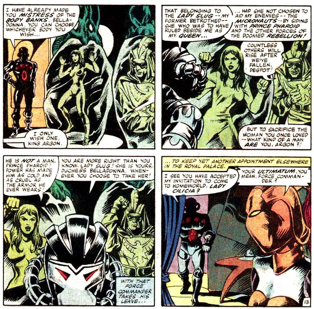
Possibly as disappointed by the art as I was at the time, Slug slinks away until Micronauts #22 (October 1980), and when she reappears, she's still a fiesty one.  And more than a little strident, a trait she hadn't evidenced before despite having been a fine leader.  Guess success does that to a person.  New artist Pat Broderick with his Michael Golden-esque style has Slug ditch her tomboyish green fez and functional pantsuit look for space lingerie and strands of pearls in her hair.


This choice seems a little off given Slug's rough-and-tumble origins, but as a character look it has precedents.  Maybe it's because of Dejah Thoris, Edgar Rice Burroughs's original space queen.  From what I understand, Martians of her tribe generally run around naked but for some jewelry (they think clothes are weird, which, from a quick Google search for new Dejah Thoris comics, proves convenient for today's comic book artists whose only exposure to female anatomy seems to have come from porn magazines).  Alex Raymond contributed Princess Aura and Queen Azura.  They're pretty modest by Barsoomian standards but like leisure Slug, they favor mid-drift exposure in jeweled bras and diaphanous skirts.  No doubt directly inspired by those two creations, Al Williamson and Wally Wood favored this look for their female characters in various EC titles.  Broderick's Slug is very much drawn in this tradition.

While we're on the topic of costumes, I'm going to challenge artists of our next generation of space princesses and guerilla-girls-turned-space-princesses to draw some inspiration from the Renaissance, or even the Baroque or Rococo periods.  Not because I'm against skin (check out some Francois Boucher paintings), but because this kind of finery has regality and offers ample opportunities for sumptuous drawings of lace and folds and printed patterns, plus differing fabric textures.  Your Dejahs and Auras are fine and dandy, but my image of the ideal space princess is Virginia Madsen as Irulan in David Lynch's 1984 adaptation of Dune.  We just don't see this kind of thing often enough, but we have plenty barbarian-queens-in-silk-or-metal-bikinis imagery.

And whatever Slug's new fashion sense, it doesn't prevent her from finding a world of trouble.  Argon abruptly kidnaps her to Aegypta, a desert-like zone of Homeworld-- more Flash Gordon influence; Homeworld is made up of different zones each with its own distinct ecosystem, much like Mongo-- where men are men and women are women and everyone rides green ostriches.  There she's rescued by Pharoid, the leader of the ostrich-riders.  Like Argon before him, Pharoid falls madly in love with Slug but unlike his romantic rival, he spends the rest of his days trying to prove worthy of her.

But why does Slug's fiance drag her against her will into the desert in the first place?  Well, it has to do with the nature of mainstream comics where a good villain can never stay dead and a popular story has to repeat itself.  Even with an entire micro-galaxy possibly full of all kinds of heretofore never-seen-in-comics stories to explore, the Micronauts still end up fighting massive space wars against Karza, twice after he's possessed or otherwise transformed poor, stupid Argon.

The first plot redux renders Argon the mindless slave under the influence of Karza's mind control.  After Mantlo thoroughly sets the stage for it, Argon jumps into a live volcano and comes out transformed into the arch-villain.  Once again it's our heroes against Karza, and Slug does her part largely off-panel.  The main fighting takes place in a pseudo-Disneyland between the forces of Karza and those of SHIELD, led by good ol' Nick Fury.

Actually, after her kidnapping, Slug's major contribution to the war is to stand by Prince Argon at the mass funerals that conclude the storyline.  Given the circumstances, they make an appropriately downbeat pair, but at least Argon has his human legs back.

The next time Karza rears his ugly mind, Slug watches as her beloved dimwitted Argon lowly goes insane, first bringing back the Dog Soldiers as his personal guard in Micronauts #34 (October 1981) and then declaring his rule absolute.  To have your Argon transform into Baron Karza once is unfortunate; twice smacks of carelessness.  As for Slug, she finally starts to rethink her commitment to a man who can't decide who he is today-- nice king in white or totally different guy in black.  When Argon dons Karza's armor and declares the Micronauts outlaws while ranting and raving like a loony, Slug has had enough.  Now riding her very own green desert ostrich, she attacks her fiance, only to have Pharoid jump in and reduce her to an observer.  At this point it's been quite a while since Slug actually did much of anything, but this desultory attempt at reclaiming her "action girl" is her next-to-last attempt at reclaiming agency.  And she does so while wearing her pearls and bra look again.  Does she own only the one outfit?


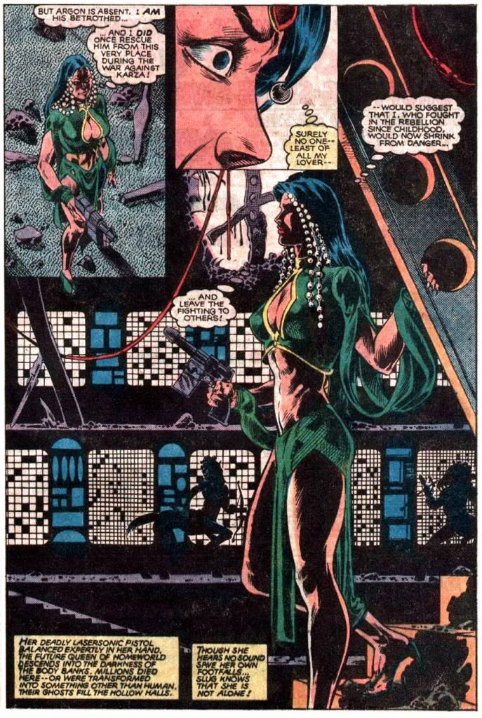
You probably wonder yourself what kept Slug attached to the increasingly pathetic Argon for so long.  Perhaps it's the chance to have herself drawn by the legendary Gil Kane, who takes up the pencils with Micronauts #40 (April 1982), inked by Danny Bulanadi, who transforms him into a pseudo-Broderick.


With his slick feathered modeling and heavy black-spotting, the stalwart Bulanadi provided visual continuity on a book that must have been hell on pencillers to judge by the turnover on art.  In those days, pencillers usually didn't do the tight rendering they do now and it was up to inkers to finish the art and make things look more or less the same from issue to issue.  Bulanadi was a master at this-- Val Mayerik breakdowns, a short run of Keith Pollard pencils, even a single issue by as unique a stylist as Steve Ditko look almost identical apart from differing approaches to page layouts and character dynamics.  Along came Kane, who was born for this book despite having a more linear approach and a surer hand with the storytelling than either Golden or Broderick.  Bulanadi knocks himself out on the finishes, but we lose a lot that's essentially Gil Kane.

Maybe longtime readers would have balked at such a radical departure on the interiors, but at least Kane was able to ink his own covers.  Eventually, the massive workload of Micronauts ground down Kane, who switched to supplying only breakdowns, with Bulanadi maintaining the book's look.  I don't know about you, but those pure Kane covers make my mouth water for something more characteristic of his work.


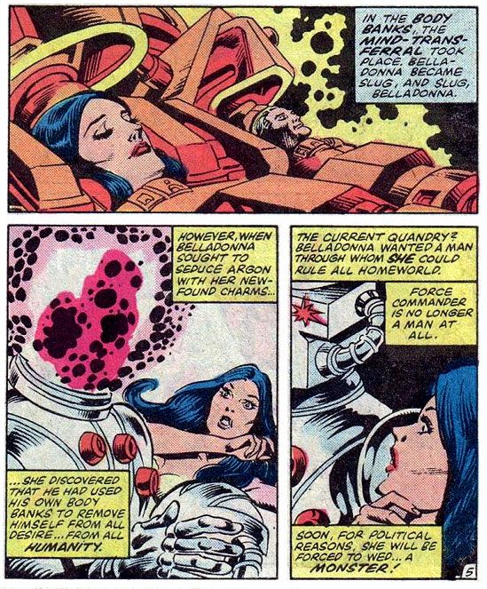
In the end, Argon has Slug's soul switched into the body of Lady Belladonna, a dessicated old poop and Karza loyalist.  The plan is for Argon to wed Belladonna in Slug's body and not tell the people of Homeworld.  That way they'll see that no matter how much of a tyrant he becomes, at least one of the great anti-tyrants of our time loves him enough to marry him.  That's suppose to shut up any protests.  Here at the bitter end of her career as rebel and royal, Slug gets a few panels hobbling around with a gun.  Then the body-switched women team up to infiltrate the Body Banks in a desperate bid to fix themselves, but it's too little, too late for Slug.  She's been reduced to complete ineffectuality.


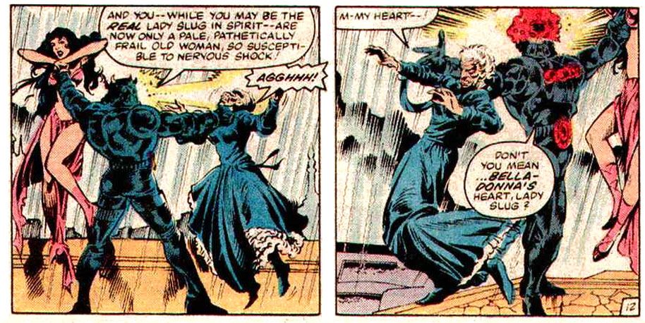
In Micronauts #49 (January 1983), as pencilled this time by Jackson "Butch" Guice, Argon literally rips himself in half and out steps a fully-formed Karza, which should have surprised no one.  Well, the tearing himself in half might have been a shocker, but the re-emergence of Karza wouldn't have been for anyone with a brain.  In the rain, while everyone engages in a massive comic book fist fight, Belladonna's aged body simply gives out from the strain with Slug still inside it and then Karza throws her younger form against a wall, breaking its neck and killing Belladonna as well.  That happens in Micronauts #50 (February 1983).  The series went on for another two years, but among the various deaths and resurrections, there's nothing remaining for a character introduced with a bang and disposed of with a whimper.  Poor Slug.


The Microverse is kind of a dark place, isn't it?  Makes Macbeth seem sort of cheerful by comparison.  Characters die all the time, heroic Commander Rann suffers all kinds of torments and loses his hand, Karza commits genocide on a planetwide scale.  So maybe it's thematically fitting Slug's infancy was so harsh, her life full of conflict and tragedy, her attempts at fighting for life and freedom abortive, her death abrupt and anti-climactic.

Sunday, July 29, 2012

A smile is something special, but honestly, ribbons are readily available almost anywhere

Just re-reading Ghost World yesterday.  The part where Enid regresses emotionally while listening to one of her childhood favorite songs is very touching.  It's a very fatherly gesture for her dad to drag out her little turntable and put the single on her bed.  Does anyone listen to 45s anymore?  I had a stack when I was a kid, but most of them were outlaw country by guys like Waylon Jennings.  I especially like the
panel when Enid wakes up in the morning still in her beanbag chair with her hair sticking up all over the place.  I'm almost completely bald and look like some kind of effeminate mirror universe Ike Eisenhower, so of course I'm jealous even of someone's terrible morning hair.

Anyway, I'm doing a deep study of the way Daniel Clowes draws eyes and hands.  You have your slender Alex Toth fingers with prominent fingernails, your dynamic yet claw-like Gil Kane hands that seem rippling with muscles, and then your Dan Clowes hands which are largely featureless.  They're not perfunctory, though.  They're typically well observed in whatever pose he chooses to place them.

Eyes vary.  Weirdo comedian Joey McCobb-- is he for real, or is he simply a hack with an outsider gimmick?-- has wrinkly cartoonish eyes, kind of pointy and football shaped.  Visually, he reminds me a little of Peter Lorre.  Very little.  Mostly just the eyes.  Enid and Rebecca have more nuanced eyes, at least at the beginning of the story.  Eyelids, lashes, little lines underneath to show the roundness.  Eyes protude slightly.  There's at least one panel later in the book where Enid's eyes are simply a curved arc above and below, but they're somewhat obscured by the drawing of her glasses frames.

I could be mistaken.  I'm writing my impressions the next day, at work.  It will be interesting for me to go home this evening and see if I really saw what I remember seeing, or if I'm just making things up in my head.

As an artist myself, I've never settled on a particular way to draw eyes.  Sometimes I want to do sort of abstracted, simplified shapes with full outlines, but other times I go nuts with the detailing.  I change frequently depending on who happens to be influencing me that day, or if I've seen someone new I want to rip off.

Jaime Hernandez has a simple yet convincing way of drawing eyes, the footballish upper and lower arcs, with rounded irises in the center.  The top arc can be flattened and thickened, with a few strokes for lashes.  Interestingly, in a fairly recent story arc, he chose to use the "injury to the eye" motif regarding Hopey, a character whose motivations I often think about.  But prior to that, she spent the story "Election Day" (Penny Century #5, June 1999) hiding her eyes behind dark sunglasses, so much so one of the minor characters mentions thinking she's blind.  At the end of the story she lifts the sunglasses while staring at herself in the mirror, revealing deep lines under them and some kind of enigmatic unhappiness.  What's going on in that head of hers?  Hernandez generally characterizes her as someone not given to introspection.  The eyes are expressive, but they tell us nothing.

His art is slick and appealing, believable yet not exactly realistic.  Steve Rude has a similar approach, but the character he's most associated with usually wears a visor.  No eyes.  When I picture a Rude face, I imagine narrowed eyes drawn as horizontal lines, squinting, the body straining, twisting and moving.  Action eyes.  Some of his aliens have big round insectoid eyes.  Good for science fiction, not so much for earth-bound romance comics-- which is a genre I'm very interested in working in.  I like to say "social realism," but if I'm really being honest with myself, I'm writing romance comics.  They'll never see publication, but it's fun to churn out scripts full of emotional torture for my shabbily realized characters.

Alex Toth and Mort Meskin sometimes drew eyes as little slashes of black ink, or maybe a line up top and then a dab of ink below for the iris.  Very simple and effective.  Alex Toth is my primary influence for drawing eyes, but like Clowes, Hernandez and Rude, he employed different methods.  His sketchbook pages, which are frequently just big piles of faces and heads, show all kinds of approaches.  Some of them are extremely simple, just quick enclosed triangles and ovals.

Simply put, there's no one right way to draw eyes.  Do what works best for you, what's appropriate for your characters.  Above all, observe real emotions and learn to draw them.  If you're good at acting on the page, more than likely you're rarely drawing eyes the same way twice anyway.

And work on those hands while you're at it.

Sunday, May 29, 2011

MIcronauts: Perfect summer comic book reading

Summer is upon us and that means school's out, big-budget/small-brained blockbusters dominate the nation's movie screens, there's nothing on TV but reality shows and dramas too lame to make the regular season and people are putting down their hefty copies of James Joyce's Ulysses and picking up lighter reading fare. My suggestion?

Marvel's Micronauts series. It's kind of like the Star Wars comic that never was, only there was a Star Wars comic that was also kind of like Micronauts. Actually, the first Star Wars artist Howard Chaykin later illustrated a few issues of Micronauts, which is a neat overlapping of similar summer fun fare. While Bill Mantlo filled the Arthur Digby Sellers role and wrote the bulk of the series (all 59 issues of the first volume), superstar artist Michael Golden illustrated the first 12 issues and its classic storyline, a dimension-spanning epic featuring a hero with a connection to a mysterious cosmic force, a couple of plucky robots, a spunky space princess and their rebellion against a black-armored mastermind and his Nazi-like army. Which reminds me of something or other. Battlestar Galactica?

In the first issue, Commander Rann, a bold explorer, returns to his home planet after centuries in deep space only to find himself something of a legend and his parents-- the former king and queen-- worshiped as gods. And their science adviser Baron Karza ruling the place with an iron fist. Sensing a threat to his regime, Karza has Rann imprisoned. This proves to be a mistake, because it isn't long before Rann makes friends with the stoic warrior Acroyear, his comedic relief insectoid buddy Bug and Princess Mari, sister of the deposed Prince Argon. Together, they become a team of freedom fighters. But first they have to escape Karza's dungeons.

Script by Bill Mantlo, art by Michael Golden and Josef Rubinstein: Welcome home, Commander Rann!

Mantlo quickly sketches his world and its central conflict, filling his story with action sequences and little snippets of characterization. Princess Mari is so spirited she has to be convinced by her self-sacrificing brother to flee and fight another day, Rann conquers his initial confusion and takes charge of his own destiny, Bug cracks jokes and Acroyear provides muscle. And it's all gloriously illustrated by Golden and inker Josef Rubenstein. Taking as his inspiration a line of Japanese toys imported by the Mego company, Mantlo grafts on a few elements of Flash Gordon, the first Star Wars movie (there wasn't a second in those days) and Jack Kirby's Fourth World. Golden has always excelled at this kind of material-- armored warriors, sci-fi weaponry ever so slightly exaggerated from real-world examples, starships and fire-fights.

Hot Acroyear-on-Acroyear action! Notice how Golden makes the character Acroyear look "real," but the anonymous enemy version looks like one of the Mego toys, complete with metal joints!

Mantlo's script really turns him loose. I remember looking at issue #2 and being completely enthralled with Golden's artwork. The way he seemed to draw every nut and bolt on the robots and the starships, the lighting effects that reminded me so much of the movies-- rather than the fairly flat figures I'd been used to from coloring books and Super Friends cartoons.

Where else would they go? How else are they going to meet the ever lovin' blue-eyed Thing?

And, of course, the Micronauts end up on earth, where they're exactly the same size as the action figures my friends and I were so crazy about that year. Yeah, my best friend owned practically every Micronauts toy, no matter how complex or expensive. He never particularly cared for the comic book, but I was hooked, at least initially. The only problem was, it was so difficult to find. I never saw #1, didn't find another issue until #4 (introducing my favorite 'Naut, the valiant guerrilla leader Slug), managed to get #5 (the Micronauts invade NASA) and #6 (they fight Man-Thing in a swamp) and then nothing until #12 (the post-climactic battle between estranged brothers Acroyear and Shaitan, a traitor). And yet thanks to Mantlo's ability briefly recapitulate the action from previous issues, I never felt lost or left behind.

If the series had ended there, it would've been the first maxi-series, I suppose. Or a pioneering graphic novel. But it was popular and financially lucrative enough to continue. So Golden handed off the interior art chores to Chaykin-- something I didn't discover for months. I honestly thought the story was over. Imagine my surprise when I found Micronauts #17 (guest-starring the Fantastic Four) and #18 at a convenience store in Florida. Same awesome Golden covers, but with Chaykin story art inked by Al Milgrom that, frankly, left me appalled. Later I came to appreciate and admire Chaykin when he inked himself, but I dropped the title in dismay for a while. It wasn't until I came across #20 with pencils by Pat Broderick and inks by Armando Gil that I became a re-confirmed Micronauts fan and stuck with the book through all the repetitive Karza returns-- how many times can this guy take over Argon's mind and re-conquer over the Microverse?-- and laborious trips back and forth through time and space, Nick Fury and Timothy Aloysius Cadwallader "Dum Dum" Dugan and the X-Men showing up, visits to increasingly familiar locales like the same NASA laboratory they'd already escaped from. Gil Kane provided some memorable covers but had his distinctive look on the pages inside all but obliterated by some heavy-handed Dan Bulanadi inks; hey, I just told you I like Pat Broderick's stuff, but I don't think Gil Kane's art needs to look anything like it. There were still plenty of fun moments, but Mantlo really seemed to be writing stories in circles. Maybe that's what Marvel wanted-- those amazing first twelve issues repeated endlessly.

Well, that's hindsight. At the time, that's what I wanted too! That and more Slug.

I recently found #3 and #4 in practically mint condition at my local comic book shop, and re-reading those I can feel those summer breezes and see the cool morning grass still wet with dew. It's like being 10 years old again, only now I no longer have my lush, androgynous 70s hair and I fart more frequently. If you can find the first 12, you really need to buy them and read them this summer. They're a lot better than that John Grisham book with the wrinkled spine and the cookie crumbs flattened against some of the pages you're going to find in the magazine basket in your beach condo and probably no more expensive than that braindead 3D robot movie that's going to leave your ears ringing and your head pounding from lost IQ points.