I spent a great deal of time over the weekend on Facebook reading Kurt Busiek's responses to another Jack Kirby fan's skepticism over the Disney/Marvel-Jack Kirby family amicable settlement. I couldn't read the fan's comments (he earned a block for excessive negativity a while back), only Busiek's replies. Which were lengthy and not in the least combative. He just explained-- much more patiently than I ever could, and certainly more cogently-- why the fan was badly mistaken this is somehow a bad thing. Or at the very least why someone with zero stakes involved would get upset about it when both Disney/Marvel and the Kirby family, with major stakes involved, both seem so pleased with the outcome.
Late in the game another fan added some commentary. Busiek jousted with him as well and knocked him off his horse more than once. Each time the game fan remounted and took up his lance, only to have it blunted and knocked aside no matter what attack he chose. Greedy heirs*. WHACK. Stick to a contract, even a lousy one. WHOMP. Copyright law was meant to do something else. KRACK. If I pay you to build a house... THUMP.
The last I saw before averting my eyes the fan was hurtling himself down the tilting lane, this time without even a horse. The horse had long since retired to the clubhouse for some hot toddies and a massage. I believe the fan had armed himself with the only weapon he had left in his arsenal, a wet noodle, which he was waving around while shouting, "Now we'll never have a New Gods movie!"
I just couldn't watch any longer.
So I started drawing. I drew all day and into the night. I drew that lousy Hulk you see below. That version is number four of four. The first three suffered fates more ignominious than the naysaying arguments in the Facebook thread. When you consider how many outright shitty drawings I've posted here over the last few months or even years, you can imagine just how bad something must be if I don't even try to post it. Pretty bad.
But what's pretty good is this settlement between Disney/Marvel and Jack Kirby's family. I can't see anything negative about it for either party, cannot fathom why anyone would naysay it. I see it as a major win-win situation for both the big corporation and the little family that could. The Kirbys get to enjoy some of the fruits of Jack Kirby's decades-long labor, Disney/Marvel can add the Kirbys to their marketing plans for all their future movie and multi-media extravaganzas along with Stan Lee.
After all, Kirby's fantastic creations aren't the only things marketable here. The man himself is an amazing story of unrelenting creativity and hard work spanning generations. The guy co-created Captain America with Joe Simon then went off and fought in the last good war, for Thor's sake. You want to show him off, and Stan, too: "Look at what these plucky, grandfatherly guys did for all of us. Enjoy their work and buy a lot of our licensed stuff, which we will produce at a record-breaking pace, relatively guilt-free for a change."
Disney/Marvel may be paying out to his family, but they're going to cash in on this, too. I've never been opposed to that. I just wanted the guy who made that possible for them to get a little more than the kick in the pants he got way back when. Since he's not around anymore, giving it to his children and grandchildren is the best of all possible things. If you can't grasp that, you are an alien to me. Or I am to you. Norin Radd, at your service.
Settling like this makes good business sense. And it feels good to this fan, too. Thanks to this and the things I've heard about Marvel's relationship with Bill Mantlo (the guy who made that little Guardians of the Galaxy movie possible in the first place), I have warm, gooshy feelings about Disney/Marvel I've never had before!
*In the interest of accuracy, if not engaging storytelling and myth-making, this point may have come from someone else, in another thread or even on another site entirely.

Showing posts with label Marvel Comics. Show all posts
Showing posts with label Marvel Comics. Show all posts
Sunday, September 28, 2014


Marvel-Kirby...
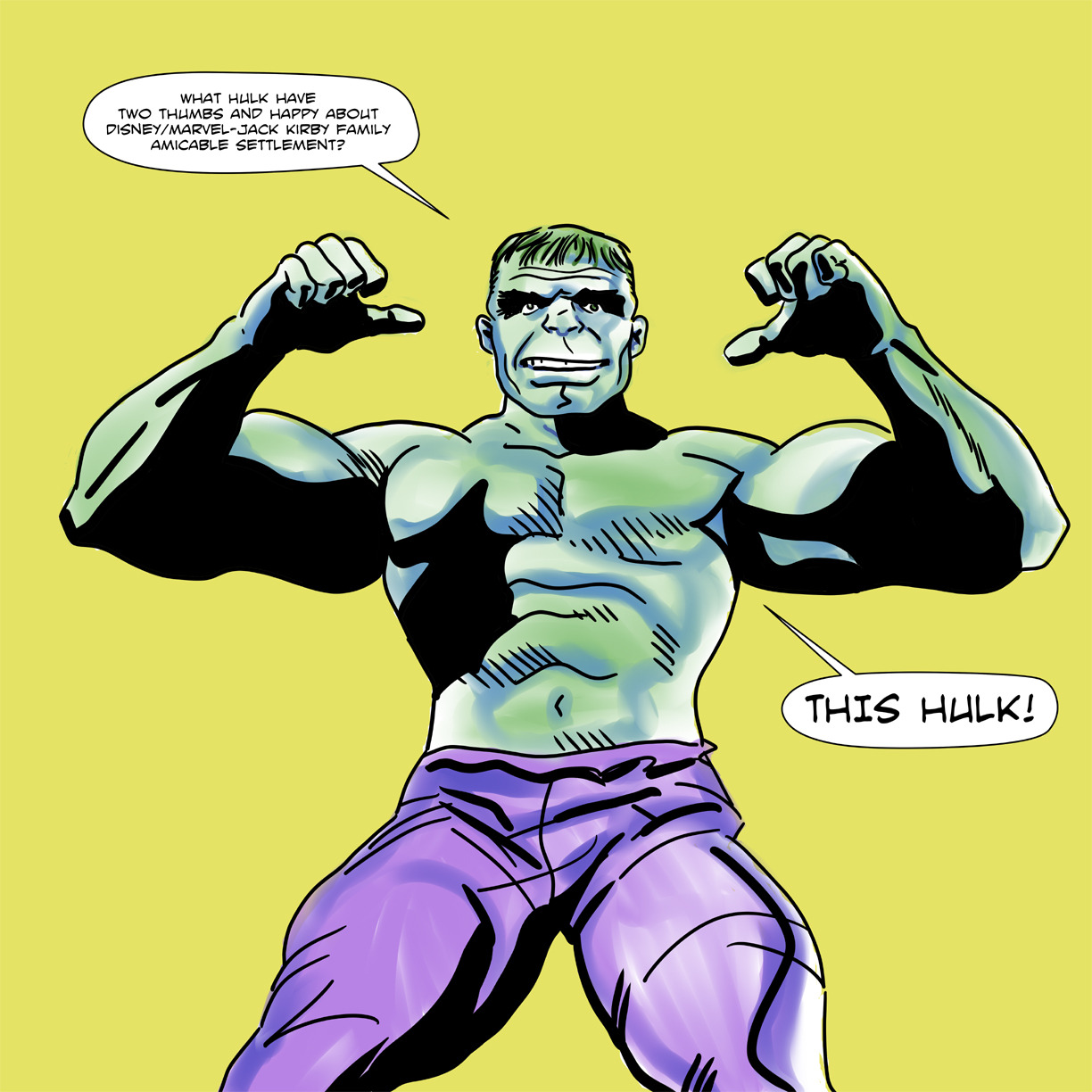
I did this crappy drawing yesterday to celebrate the best comic book-related news story to come our way in decades.
Thursday, September 4, 2014
Things to be excited about: Silver Age Teen Titans, Ghosts and Dark Horse's reprints of Marvel Star Wars...
I dropped some mega-bucks on DC's Silver Age Teen Titans Archives volumes 1 and 2, Showcase Presents Ghosts and Dark Horse's Star Wars Omnibus: A Long Time Ago... volume 4. These four massive books are on their way to me as I type this, through wind and rain. Yeah, it's a dark day here in Japan with changeable weather threatening to wash out any weekend activities people may have planned now that the temperatures are easing off from the sauna range they stayed in all summer long. Of course, with dengue fever closing Yoyogi Park in Tokyo, it's probably just as well. Yet within my heart is a bright, warm light and its source is anticipation of some classic comic book reading material.
The Silver Age Teen Titans Archives books particularly delight me, since this is one of those series I've fallen madly in love with. I just cannot seem to get enough of Bob Haney's socially aware writing or Nick Cardy's art. Most especially the latter. I've bought this material both in digital form and in Showcase format. The digitals, on Comixology, never seem to advance past the five or so comics available in Silver Age Titans Archives volume 1. The relatively inexpensive Showcase Titans books seem to be going out of print now. I have copies of both volumes stored back in the US, I only have one here in Japan. No luck getting the other one for a reasonable price. So my unreasonable solution was to complete my Haney-Cardy-Neal Adams-and-others Teen Titans collection by paying even more for hardcover full-color stories I already own in multiples.
Teen Titans is no mere comic book series. It is a way of life.
And since I was on a classic DC kick, what better choice to complement the superheroics than yet another Showcase Presents book featuring a horror anthology? The artist line-up in DC's old horror books reads like a list of my favorites: Cardy, Alfredo Alcala, Frank Redondo, Nestor Redondo, Sam Glanzman, Ramona Fradon, Jerry Grandenetti, Wally Wood, George Tuska, Gerry Talaoc and so many more. And with Halloween coming up, I need some fun and spooky reading material.
Finally, my addiction to Al Williamson inspired my purchase of the Dark Horse Star Wars Omnibus: A Long Time Ago... book. I have the first three, which means I have Williamson's The Empire Strikes Back adaptation. It also means I need his Return of the Jedi work. And I certainly am not going to complain about having to look at stories by Carmine Infantino, Walter Simonson and Ron Frenz with inks by Tom Palmer. This book also contains Star Wars #74, "The Iskalon Effect" (August 1983), with art by Frenz and Palmer. It's one of the few non-Al Williamson Star Wars comics I bought during Marvel's original run of books.
The Silver Age Teen Titans Archives books particularly delight me, since this is one of those series I've fallen madly in love with. I just cannot seem to get enough of Bob Haney's socially aware writing or Nick Cardy's art. Most especially the latter. I've bought this material both in digital form and in Showcase format. The digitals, on Comixology, never seem to advance past the five or so comics available in Silver Age Titans Archives volume 1. The relatively inexpensive Showcase Titans books seem to be going out of print now. I have copies of both volumes stored back in the US, I only have one here in Japan. No luck getting the other one for a reasonable price. So my unreasonable solution was to complete my Haney-Cardy-Neal Adams-and-others Teen Titans collection by paying even more for hardcover full-color stories I already own in multiples.
Teen Titans is no mere comic book series. It is a way of life.
And since I was on a classic DC kick, what better choice to complement the superheroics than yet another Showcase Presents book featuring a horror anthology? The artist line-up in DC's old horror books reads like a list of my favorites: Cardy, Alfredo Alcala, Frank Redondo, Nestor Redondo, Sam Glanzman, Ramona Fradon, Jerry Grandenetti, Wally Wood, George Tuska, Gerry Talaoc and so many more. And with Halloween coming up, I need some fun and spooky reading material.
Finally, my addiction to Al Williamson inspired my purchase of the Dark Horse Star Wars Omnibus: A Long Time Ago... book. I have the first three, which means I have Williamson's The Empire Strikes Back adaptation. It also means I need his Return of the Jedi work. And I certainly am not going to complain about having to look at stories by Carmine Infantino, Walter Simonson and Ron Frenz with inks by Tom Palmer. This book also contains Star Wars #74, "The Iskalon Effect" (August 1983), with art by Frenz and Palmer. It's one of the few non-Al Williamson Star Wars comics I bought during Marvel's original run of books.
Tuesday, August 26, 2014
Marvel's Marvelous Movies #7: Why was there never a M*A*S*H comic book, or an E.T. adaptation?

M*A*S*H aired its final episode on February 28, 1983, less than a year after Steven Spielberg's E.T. the Extra-Terrestrial opened to boffo returns on the big screen. These were both cultural phenomena at the time and yet neither inspired any comic book spin-offs beyond parodies in MAD and Cracked magazines.
Granted, a M*A*S*H comic book doesn't seem likely. Then again, the show itself didn't seem very likely, either. A thirty-minute sitcom set during the Korean War, premiering on network television as the divisive Vietnam War ground to its disappointing, confidence-shattering denouement? Gee, I hope they fired the doofus who came up with that idea!
The series began doing its best to match its big screen inspiration, Robert Altman's groundbreaking satire (at least by CBS-acceptable standards), but eventually became more serio-comic. Its position as a mainstream TV show in a time before cable meant M*A*S*H could never be quite as searing as some of us might have liked (unlike the movie, which openly and mercilessly mocked American traditional values like religion, patriotism and football). But the show still gave us pause for reflection between the laugh-track outbursts with occasional episodes where the doctors work around the clock to avoid being drowned in an ever-rising tidal flow of wounded young men then collapse, exhausted, in their bunks; in its blood-spattered operating theater (no laugh track during those scenes, remember); and even in the way Hawkeye, Trapper John and later B.J., pursue boozing and pranks as a way of maintaining at least a semblance of humanity in an inhuman situation.
War has long been an American comics staple, but I can't imagine anyone at either DC or Marvel managing to strike the balance between pathos and chuckles M*A*S*H at its finest managed, though DC seems to have given it some serious consideration. Still, in a world where Gold Key gave kids an exploding, earth-killing H-Bomb in its Beneath the Planet of the Apes one-shot, and Marvel put out comic book adaptations of movie musicals, I'm still shocked we never got a Marvel Super Special or Treasury Edition version of "Goodbye, Farewell and Amen."
After all, there were M*A*S*H dolls, for the love of Hotlips!
Okay, so maybe a M*A*S*H comic is an even worse idea than a Xanadu comic. But you can't tell me E.T. the Extra-Terrestrial didn't deserve an adaptation. With Marvel doing versions of just about every sci-fi flick out there, including ones that seem to defy your usual comic book storytelling techniques like Close Encounters of the Third Kind, which relied largely on internal conflict rather than fisticuffs and required artists Walt Simonson and Klaus Janson to come up with a new visual vocabulary for depicting photographic light effects with black linework and negative space and ordinary comic book coloring, the lack of an E.T. adaptation leaves a massive gap in the parade of Super Specials in the late 1970s and early 1980s. Its as if the Snoopy balloon burst just before the Macy's Thanksgiving Day Parade took off and they didn't know what to do without it so they just marched along and left Willard Scott and Connie Chung to fill in with banter during the dead zone.
Given their performance on Close Encounters, I'm going to stick my neck out there and declare Simonson and Janson would have done a bang-up job on E.T.
I remember searching the spinner displays and magazine racks all over town in the months following E.T.'s June 11, 1982, release date.
Nothing.
E.T. dolls, E.T. records-- including one narrated by Michael Jackson The New Rolling Stone Record Guide (1983 edition) eventually gave 5 stars (indispensable)!-- E.T. bubble gum cards, E.T. storybooks and infamous video game cartridges. E.T. everything. Except a comic book.
So confused was I that I even attempted an E.T. adaptation of my own, written in faux-Marvelese. I managed to do the first two pages. The way I remember it, there was a large top tier panel with E.T.'s spaceship descending from a starry sky. The pencil fill depicting night just about broke me, but I persevered. Beneath that were a couple of panels with E.T. and his space exploring buddies collecting samples. I partially concealed them with foliage not because I felt incompetent to draw them (obviously I felt more than capable, considering the hubris of even attempting something this idiotically grandiose), but because I made the conscious decision to ape the film's opening gambit of mystery and wonder. Quick cut on the second page to the government researchers rushing up and scattering the aliens every which way. I can't remember if I added narrative captions, but I do remember maintaining the government operatives' anonymous menace by framing their figures in such a way the panel rule lines chopped off their heads and other identifying anatomy. And I think I had one of them tersely refer to the Peter Coyote character-- the head guy with the keys-- as merely "the Man." I got as far as painstakingly copying from photo reference the image of a forlorn E.T. gazing down at the city lights, right before the film introduces Elliott and family.
That's right. It took me two pages to blast through the first five to ten minutes of the movie and I'm pretty sure most of those panels if I found them now would consist of an arm or a leg against a field of smeared graphite, and then a really large dialogue balloon with something stupid in it. Archie Goodwin I was not.
Those pages stayed in the top drawer of my desk at home (always meant to do more when I found the time) until we moved to a new house and I tossed them while trying to dump as much crap as I could to avoid having to pack it. I'd give almost anything to have them back. Maybe I'd even finish the remaining 46 pages or so.
Sunday, August 17, 2014
Marvel's Marvelous Movies #6: Raiders of the Lost Ark (Marvel Super Special #18, June 1981)
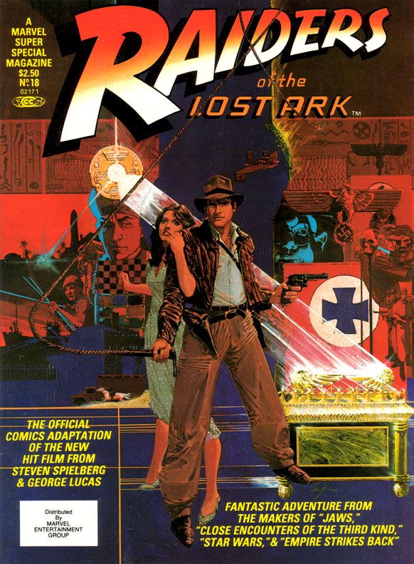
Why didn’t they kick us out?
When I bought this at the convenience store where I generally bought comics back in those days, my overwhelming impression was disappointment with Marvel Super Special
#18: Raiders of the Lost Ark. Maybe The Empire Strikes Back spoiled me by equaling or even surpassing its source material in many ways. Raiders seemed lackluster, kind of a knock-off product more than a celebration. Reading it again recently, I
like it a bit more.
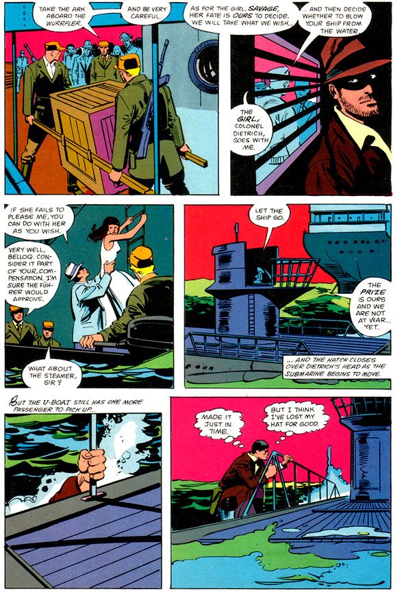
And that like is based largely on Walt Simonson's smart and witty writing. I'm not sure what form of Raiders he was working from, some earlier version or the shooting script, but Simonson takes us through all the famous set pieces, condensing some to fit in as much of the film's action in swift strokes. There's no swordsman in the bazaar, and Indy's fight with that bald brawler of a Nazi lacks the original's grisly denouement. But even with the cuts, Simonson enriches our beloved archaeologist by filling us in on his wry thoughts. It's fun to see Indy run away from the natives, but Simonson gives us a little mental wisecrack to go along with it. Adapting isn't simply the cutting and pasting of the movie to fit on comic book pages. It helps if the writer, like Simonson, also shows a flare for language. Simonson does this not only with the quips and clever extrapolation of character, but also in the aftermath of the face-melting "wrath of God" sequence, where he drops a line that's reminiscent of Stephen King back when King was hungry, before he became a brand name. This is the kind of thing I love in a comic book adaptation of a movie, rather than an action-only, surface approach.
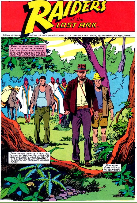 |
| Script: Walt Simonson/Pencils: John Buscema/Inks: Klaus Janson |
Unfortunately, the art doesn't provide the same kick. It was a big letdown when I opened this book outside the convenience store where I bought it despite its extravagant retail price, and I like it only slightly more these days. Make no mistake-- I'm a huge John Buscema fan, and despite the results here, I'm convinced he was a prime choice for penciling Raiders. If he'd had the time to do complete pencils or ink himself.
Here, Buscema provides breakdowns for Klaus Janson's finishes. Right off I'm not loving it, because this is not one of my favorite team-ups. Janson's inks superbly complement stylists like Simonson, and his work with Frank Miller is the stuff of comic book legend. I've never cottoned to his work with Buscema, especially loose Buscema. There's a clash of sensibilities and from that we don't get a charge of energy but simply awkwardness. Alfredo Alcala or Rudy Nebres would take these same pages and turn them into something akin to classic adventure book or pulp magazine illos. You'd lose a great deal of the Buscema surface while retaining the basic structure and it would look lush and refined, opulent like some of their crazy collaborations in Savage Sword of Conan. These are some of the few times one of Marvel's black and white magazines even comes close to competing with the best of Warren's gorgeous books.
Buscema-Janson would work fine in the pages of The Amazing Spider-Man or on a Daredevil annual. Here, the edgy, ultra-modern finishes turn what should be a visual treat into a rather generic 80s superhero comic. From the opening splash where Indy and company just seem to be standing like mannequins in the jungle despite the best efforts of Simonson's captions, to the rather stark and uninvolving desert setting, there's a distinct lack of detail and texture.
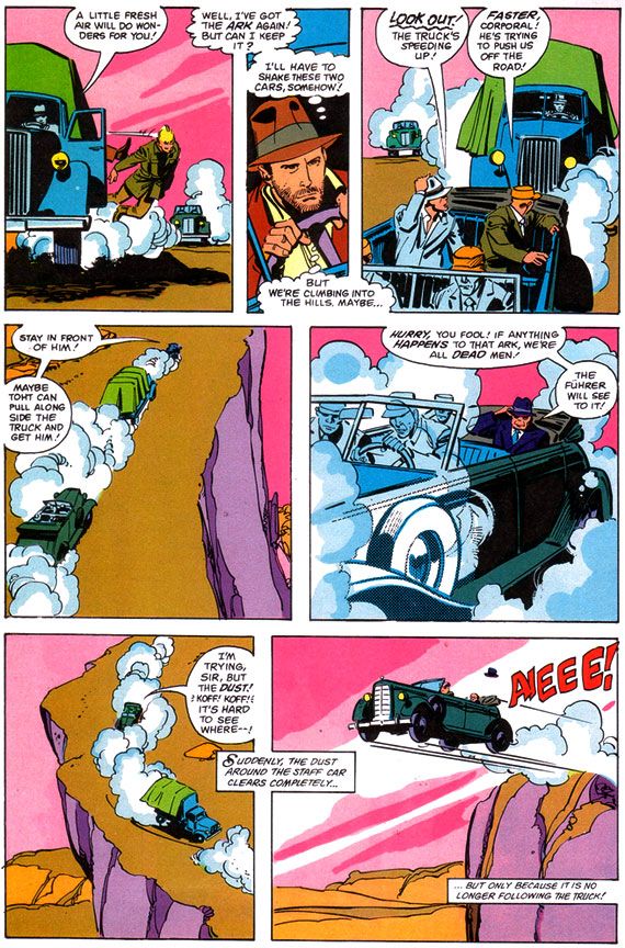 |
| Script: Walt Simonson/Pencils: John Buscema/Inks: Klaus Janson |
Janson’s edgy inks simply lack the retro, Saturday matinee feel a Raiders comic absolutely demands. And when a scene calls for a little modest gore-- your odd impaled corpse here, your melting Nazi there-- Janson restrains himself and what we get is drab. Other panels seem strangely empty, even unfinished, with little detailing. Nazis wear uniforms devoid of badges, Captain Katanga's tramp steamer-- piratical in the film-- looks alarmingly clean. Blacks indicate light sources but do nothing for mood.
From what I understand, the people at Lucasfilm were pretty unhappy with this book as well.
After all, when you watch the movie, you feel the love both George Lucas and Steven Spielberg share for old serials, B-movies and even A-movie adventures with guys like Errol Flynn, Tyrone Power and Douglas Fairbanks, Jr. And classics like Casablanca and Treasure of the Sierra Madre with Humphrey Bogart. They add a contemporary self-awareness to genre thrills and of course, this approach paid off in gold. So much so, they ended up sparking a revival of the genre and I ended up watching all kinds of Raiders knock-offs in search of the same all-day thrills my friends and I stole from the Martin Four that summer day. High Road to China, Romancing the Stone, TV's Tales of the Gold Monkey, Bring 'Em Back Alive, Rubiks the Amazing Cube, Jake and the Fatman, Mama's Family, Pink Lady and Jeff...
Instead of something similar, something recalling adventure strips by the likes of Noel Sickles, Roy Crane and Milt Caniff, we get flourish-free late 70s/early 80s Marvel finishes that evoke nothing of the visual qualities or romance of either Raiders or those old movies. Where’s Charlton Heston or Cornel Wilde? There’s barely even any Harrison Ford. Marvel's Raiders has incident, but lacks atmosphere.
 |
| Script: Walt Simonson/Pencils: John Buscema/Inks: Klaus Janson |
I’m left wondering what might have been if someone said, “Let’s do this in the spirit of the film. There’s no way we can get Milton Caniff himself, but let’s at least see if Alex Toth or Doug Wildey might want to take a crack at it.” Imagine the opening sequence with Toth's black-spotting and way with draping figures in heavy, moody shadows and evoking time and place. Toth probably would have turned Marvel down flat because of Indy’s rather ambiguous morality (or for some other reason peculiar to Toth’s outlook), but Wildey could have done something approximating the romanticism of classic adventure strips in his own style. Gray Morrow also would have gotten it. Marvel would later waste him on their Sheena adaptation, of all things, but a Raiders by Morrow with this Simonson script have been an instant classic.
And what about Al Williamson? There was a guy who could draw jungles and deserts. What about Howard Chaykin, who provides a wonderful painted Bob Peak-style cover?
 |
| Script: Walt Simonson/Pencils: John Buscema/Inks: Klaus Janson |
Ultimately, however, I'm going to blame the book's lack of visual flare less on the artists and more on Marvel double-dipping on the artwork. My best guess is Buscema and Janson drew this based on the idea this would be printed as a regular monthly (check out Gene Day's killer Paul Gulacy-esque cover on Raiders monthly #1 for yet another example of how this comic should have rocked us), and when it came time to run the art larger for the Super Special format, it didn't translate. And Marvel cheaped out on the color job, too. These aren't the dreamy modeled or airbrushed tones we'd gotten used to in many of the previous Super Specials, even on movies that were outright stinkers. Jaws 2, Meteor and even poor Xanadu got lush painterly coloring. These colors read clean and they provide some nice contrast between foreground and background, but they're obviously meant to grace the garbage paper Marvel's books came printed on. A little heavy on the purples, pinks and magentas. A lot of Marvel monthlies around this time looked similar.
This should have looked different. Yes, I praised Janson's work with Dave Cockrum on their adaptation of Star Trek the Motion Picture (Marvel Super Special #15), and that had monthly book coloring and ran as regular format comic as well. But there the art is dense and detailed and provides a lot more of its own depth and atmosphere. The same is true of the Archie Goodwin/Williamson/Carlos Garzon Empire Strikes Back. Those books manage to feel deluxe when this feels knocked out in a hurry.
Reading it today, I find Raiders isn't as bad as I remembered. It's probably even better than I'm making out here, and I'm sure you can find its defenders online without much effort. It’s just we're talking a comic book based on Raiders of the Lost Ark. And it's a visual bore when it really cries out for some deluxe treatment or a little pre-production product conceptualizing. You know, "Hey, this material is pure joy! Here's our chance to do our own version of Terry and the Pirates!"
Monday, July 28, 2014
Marvel's Marvelous Movies #5: Xanadu (Marvel Super Special #17, Summer 1980)
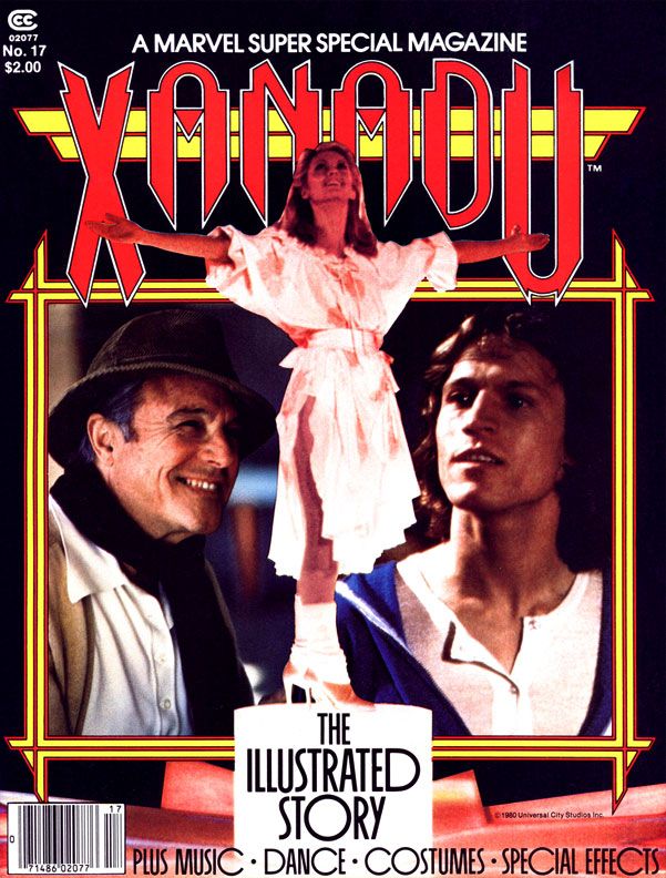 Aren't you supposed to go from the ridiculous to the sublime? Well, here we are going in the opposite direction.
Xanadu is a would-be romantic magical musical fantasy starring Olivia Newton-John as a muse who leaps to life out of a mural and changes the lives of Michael Beck and Gene Kelly for the better courtesy the blending of old and new forms of pop entertainment. That is, Big Band swing and Jeff Lyne's ELO and its Beatle-esque power pop and also... because it was sorta popular at the time... roller disco.
While playing a muse in a musical fantasy might seem the perfect follow-up to her turn in 1978's Grease (where she and John Travolta, then largely known for demanding people stick rubber hoses up their noses on television, generate an amazing amount of electricity together), Olivia Newton-John at the height of her soft balladeering powers could not rescue this movie. I doubt starring in Xanadu as a lovelorn album cover artist did Michael Beck any favors, either, although it did showcase the guy's musical theater talents in a way playing Swan in The Warriors, Walter Hill's cult gang flick, never could.
Wow! I'm inspired! I truly believe a musical version of The Warriors with a kind of The Wiz feel to it is a movie project that must happen. Producers, agents of the world-- give me a call. Let's put a project together. Starlight Express meets West Side Story with a heapin' helpin' of Battle Royale. I'd like to thank the Academy. Film is a collaborative art and I wouldn't be standing here with the hard work of a lot of...
 |
| Art by everyone you've ever heard of |
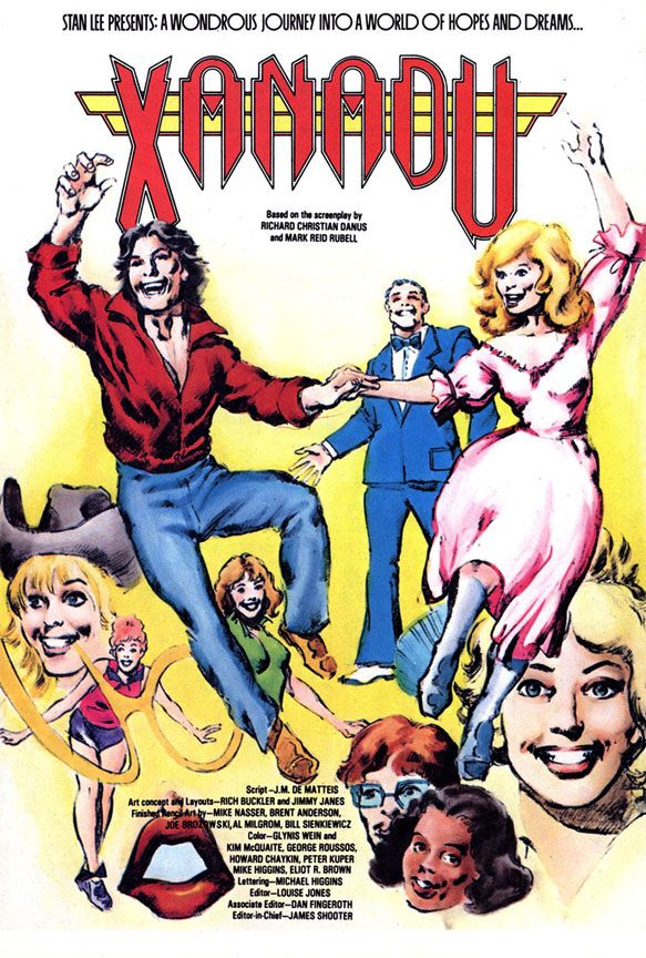
Oh wow. Oh wow. Oh wow, oh wow, oh wow. I think I'm in love. They're dancing as Beck's crotch melts. Gene Kelly approves from within the comforting wrinkle-free confines of his blue bell-bottomed leisure suit. Several severed heads gaze wide-eyed yet sightlessly into the unspeakable horrors visited upon them by a serial killer, their mouths forever stretched into the rictus grins of death. Mick Jagger's lips have torn loose from his face and now hunt for human prey.
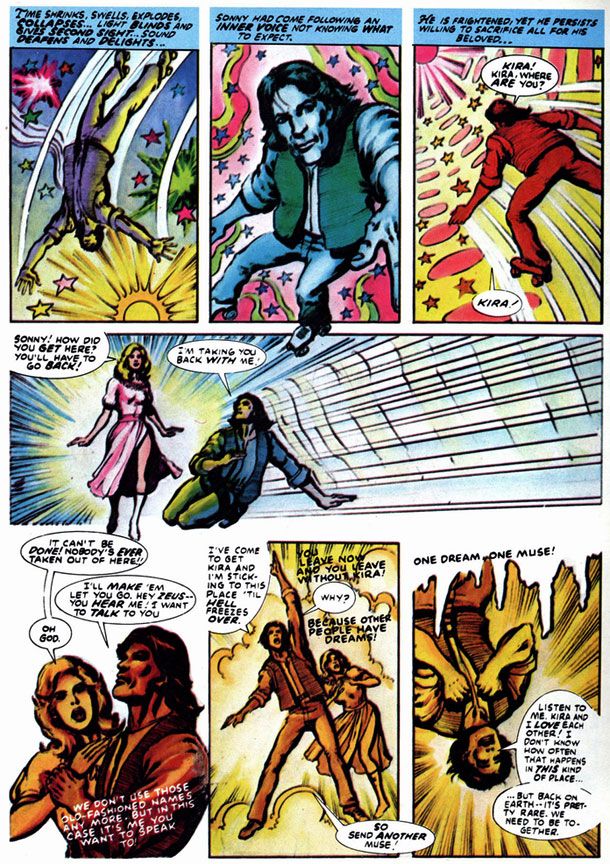
A misfire of a movie becomes a very strange comic with lovely colors but kind of slapdash, neo-psychedelic artwork. It bears the hallmarks of a rush job, with a number of talented hands giving it a go, but ultimately there’s a futility about Xanadu. You start with a truly wretched idea—ironically, a movie about inspiration lacking any—and there’s nowhere to go but down.
A misfire of a movie becomes a very strange comic with lovely colors but kind of slapdash, neo-psychedelic artwork. It bears the hallmarks of a rush job, with a number of talented hands giving it a go, but ultimately there’s a futility about Xanadu. You start with a truly wretched idea—ironically, a movie about inspiration lacking any—and there’s nowhere to go but down.
Right?
Let's take a little deeper look. I mean, we came all this way, so it would be stupid not to.
 |
| Art by all the artists |
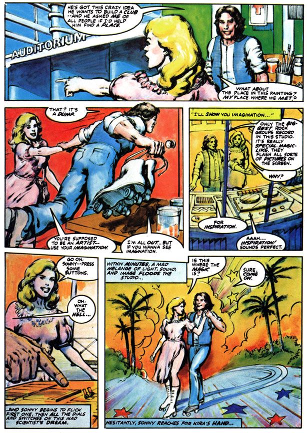
It's bright and colorful, but despite the huge mob of art talent involved, there's not much in the way of storytelling in this book. Here, Beck's character grabs a pair of rollerskates in one panel, but in the next he's standing in front of a big electronics mixing board explaining to Newton-John how it works with not a skate to be seen. They're actually in a different location entirely. Could you tell? I had to read this dozens of times to understand that. The page ends with an abrupt cut to the pair couple skating in star-addled sunset framed by indifferently drawn palm trees poking out of a world gone wonky, kind of like a flashback to Richard Corben's reality-twisting artwork "The Slipped Mickey Click-Flip."
 |
| Art by many wonderful people who deserve better |
Say! Inspiration strikes again! A horror version of Xanadu. Imagine this movie with the Erinyes instead of the muses…
Wait a minute. I'm having so many grand ideas while thinking about Xanadu. Maybe I was wrong about the movie and the comic all along. Marvel Super Special #17: Xanadu, I brand you a lost classic. Who knew this would happen when I first saw it in the local Family Mart for months on end as it languished there, ignored by everyone but me and forgotten by the manager who should have sent it back to whatever magical Olympian realm from which it sprang? I certainly never dreamed I would one day fall in love with a vibrant young woman named Kira and turn upside down and yellow while Elmer's Glue dripped all over my genitals...
Tuesday, July 1, 2014
Marvel's Marvelous Movies #2: Meteor (August 1979)
 | ||||||
| Script: Ralph Macchio/Pencils: Gene Colan/Inks and colors: Tom Palmer |
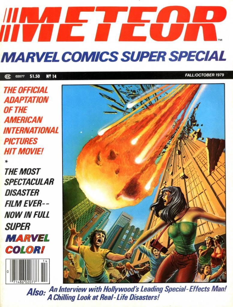
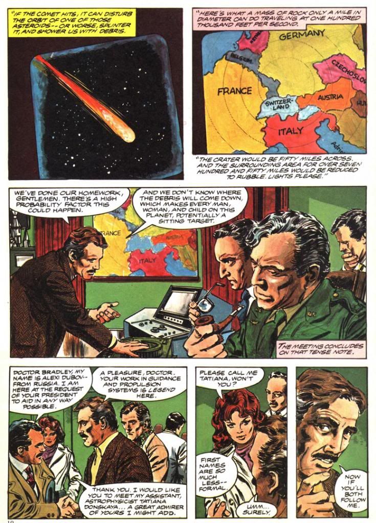
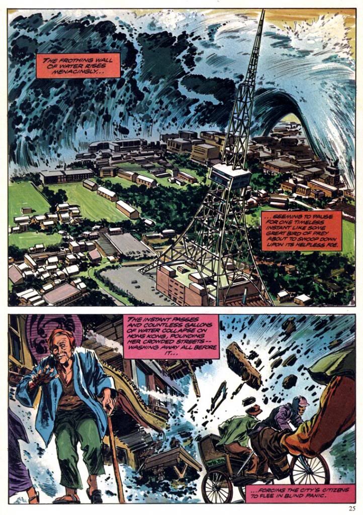
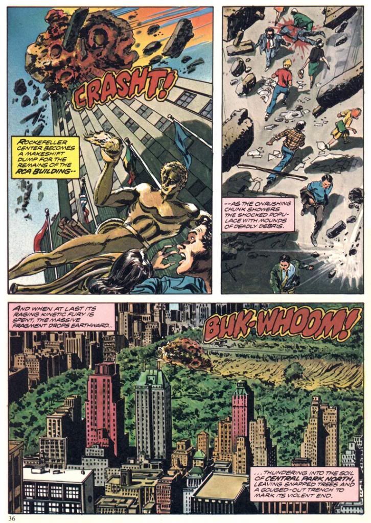
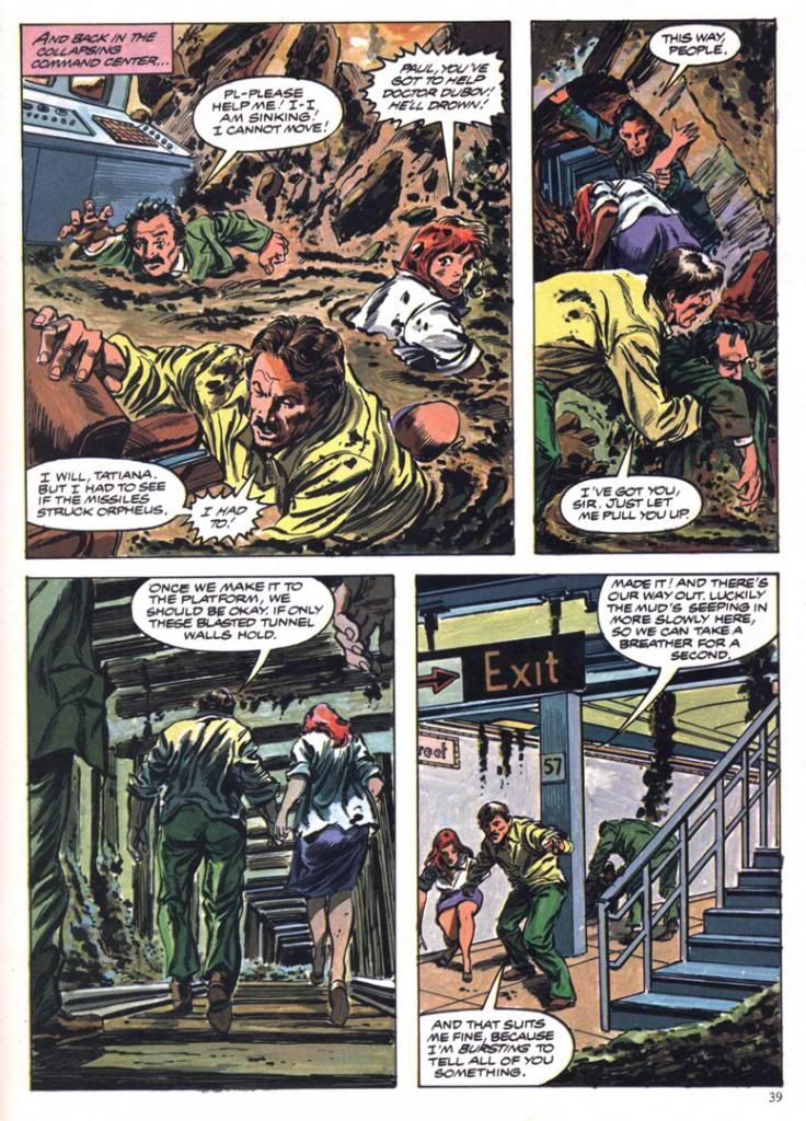
But something good did arise out the ashes. Marvel Comics adapted Meteor for one of their Marvel Super Specials, and its genius editors assigned Gene Colan and Tom Palmer to draw it. What Colan and Palmer turned in is nothing short of amazing. Far from rush it even though they must have known the movie they were working on was a major turkey, they seem to have taken extreme care with the artwork, which includes globe-trotting scene changes from a Hong King suburb to New York City to a doomed Swiss ski resort and back again, detailed backgrounds in the computer command center, a double-page spread of a tsunami threatening Hawaii and another engulfing Hong Kong and—most spectacularly—two pages of rocks blasting and gouging Manhattan itself. The detail, the realism, the scope. It's also more than a little disturbing when you associate it with real world events from the years since, but I can’t help but think the movie Meteor might have been a Star Wars-sized blockbuster if only it had looked even half as good as what Colan and Palmer pull off in the comic.
 | ||
|
The script is by Ralph Macchio (the comics guy, not the Karate Kid), and it’s serviceable. He had to work from the dumb-ass movie screenplay and there’s only so much you can do with something like that. Let’s just say he keeps the rocks rolling and benefits from this being a comic book, where our expectations for plot mechanics, dialogue and characterization are a fair bit lower than they are even for schlocky disaster films. Occasionally, I can’t help but detect a little tongue-in-cheek tone, especially in the panel based on a scene where the movie obviously went for pathos and found only derisive laughter.
 | |||
|
Also, you have to consider this is the kind of story where the falling rocks manage to obliterate a familiar ski resort and then Hong Kong, a place most of the intended middle American audience had a vague awareness of as important or large, but still far enough away they could glean a kicky thrill from it before having to confront the horror of something bad happening to their own country. Gasp! Not here! Not in America, where everything of any real importance lives! You know, the same way terrorists or Mayan disasters always scorch picturesque landmarks in Paris or Tokyo before they come after God’s Country.
Which eventually happens here. New York City is where the bombardment climaxes, although for some reason the story confines its heroes to the same underground lair they've been stuck in throughout most of the running time and subjects them to-- of all things-- a mud bath. When you consider how the film could have directly involved them in some of the skyscraper smashings or had them out rescuing small children and their pets then you go a long way towards explaining why Meteor flopped so badly.
 | ||
|
 | ||
|
But that isn't the weirdest thing about Meteor or its superior comic adaptation. The weirdest thing about Meteor is the inside masthead credits Earl Norem for the cover painting, but one look at it and you know it’s not Norem. A Norem painting would have put this book over the top as one of those lost classics. Instead, we get something that looks more like a painting a precociously talented high school kid or community college art student would do in gouache or thin acrylics and then a quick pass with the class’ airbrush. It’s flat and awkward and it’s boldly signed by people other than Earl Norem. I know who they are, but mercy and niceness prevents me from naming them. Still, poor Earl Norem. He must have felt a bit like Enrico Palazzo did in The Naked Gun as he watched a disguised Frank Drebin sing "The Star-Spangled Banner" on TV, credited as Palazzo. I have no idea how this editorial mistake happened. Maybe they just lifted a pasted-up masthead from another magazine and forgot to replace Norem’s name. Norem couldn’t do something this flat and lifeless even if he had a single lunch break to hack it out.
Wednesday, June 18, 2014
Marvel's Marvelous Movie Adaptations #1: An overview of those colorful Marvel Super Specials!
Before they started putting out their
graphic novels and Epic Illustrated magazine, the Super Special series was Marvel’s
most visually arresting product. Their
black and white magazines usually featured attractively lurid covers by Bob
Larkin, Earl Norem and, occasionally, guys like Neal Adams and Grey
Morrow. But face it—the interiors varied
wildly in quality from the knock-out gorgeous or even thrillingly bizarre (John
Buscema, Alfredo Alcala, Rudy Nebres, Mike Ploog, Tom Sutton) to the
serviceable and even the slap-dash (I won’t name names, but I have my
suspects).
The Super Specials, on the other hand, featured fully-painted color jobs, at least on many of the earlier issues. Regular monthly comics came printed cheaply on grayish newsprint. But a Super Special came on slick, white paper. A Super Special was more than a comic. It was an event unto itself. It was super. And special. There'd be a painted cover, or one featuring photos or artwork from whatever movie the comic was adapted from. It would have a full-length comic book story and then a few breathlessly informative articles or interviews related to the magazine's subject matter. All this... and a higher price tag!
The very first Marvel Super Special, which was officially a Marvel Comics Super Special, stars rock group Kiss and word on the street is the group contributed some of their blood to be mixed in with the ink. It's hard to get more super or special than actual rock star bodily fluids inside your comic! But no thanks. The second issue features tried-and-true fan favorite Conan in adventures too epic for his regular monthly.
Then Marvel adapted Close Encounters of the Third Kind, the first of many Marvel Super Special film adaptations. A Wiki check shows Close Encounters penciller Walt Simonson complaining about working on that book. Worst experience of his career. If so, I sympathize, but you can’t tell he was unhappy by looking at the finished product. He and Klaus Janson turned in a spectacular effort, making the story work in a Marvelized format even though the conflict is largely internal—Roy Neary thinks he’s going crazy for most of the movie before he figures it all out and goes UFO-hunting—and co-stars every lightbulb in California. They invented so many ways of depicting lighting effects I’m surprised they didn’t go blind from staring at them too long. This was the first Marvel Super Special I bought, and it came to me via mail order. It would not be the last, as these magazines quickly became one of my favorite Marvel purchases.
The Super Specials, on the other hand, featured fully-painted color jobs, at least on many of the earlier issues. Regular monthly comics came printed cheaply on grayish newsprint. But a Super Special came on slick, white paper. A Super Special was more than a comic. It was an event unto itself. It was super. And special. There'd be a painted cover, or one featuring photos or artwork from whatever movie the comic was adapted from. It would have a full-length comic book story and then a few breathlessly informative articles or interviews related to the magazine's subject matter. All this... and a higher price tag!
The very first Marvel Super Special, which was officially a Marvel Comics Super Special, stars rock group Kiss and word on the street is the group contributed some of their blood to be mixed in with the ink. It's hard to get more super or special than actual rock star bodily fluids inside your comic! But no thanks. The second issue features tried-and-true fan favorite Conan in adventures too epic for his regular monthly.
Then Marvel adapted Close Encounters of the Third Kind, the first of many Marvel Super Special film adaptations. A Wiki check shows Close Encounters penciller Walt Simonson complaining about working on that book. Worst experience of his career. If so, I sympathize, but you can’t tell he was unhappy by looking at the finished product. He and Klaus Janson turned in a spectacular effort, making the story work in a Marvelized format even though the conflict is largely internal—Roy Neary thinks he’s going crazy for most of the movie before he figures it all out and goes UFO-hunting—and co-stars every lightbulb in California. They invented so many ways of depicting lighting effects I’m surprised they didn’t go blind from staring at them too long. This was the first Marvel Super Special I bought, and it came to me via mail order. It would not be the last, as these magazines quickly became one of my favorite Marvel purchases.
And this is where we come in. Marvel’s other movie adaptations. Jaws 2 swam up next, accompanied by a musical
motif ripped off from Stravinsky. This
one was the first Super Special drawn by Tomb of Dracula team supreme Gene
Colan and Tom Palmer. They’d do a few
more, each time absolutely rocking the results.
Colan had already done underwater horror in black and white for Warren Publications, but
here Palmer adds vivid colors that make the book both gorier than you might
expect in a comic and, strangely enough, also more attractive. Jaws 2 is one of those shitty movies that are
actually pretty fun, eschewing the Steven Spielberg original’s emphasis on
characterization and suspense for schlocky, unintentionally hilarious setpieces
(the shark eats a helicopter!) that do nothing to help its ludicrous premise—essentially
shark-shaped lightning striking twice. While
not nearly as dire as subsequent films in the series, the movie suffers from
diminishing returns. The comic book
holds things together by simply giving the material a more lavish treatment
than it deserves. I would have loved to
see the same team go back and re-tell the first film. That’s a real missed opportunity for a
matched set.
While the Super Specials had already given
us a bowdlerized Beatles biography, their adaptation of the infamous
BeeGees-starring musical flop Sgt. Pepper’s Lonely Hearts Club Band never saw
print. This meant Marvel’s next offering
was actually of a TV movie that similarly cribbed from a superior source and suffered
from comparisons. We knew it as
Battlestar Galactica. I had the Marvel
Treasury Edition because it was huge and therefore caught my notice. This one has art by Ernie Colon of Richie
Rich and Jackie Jokers fame, and while his linework is looser than the
Colan/Palmer stuff, and the colors flat rather than richly painted, it’s an
energetic retelling. It differs from the
televised movie in some respects. A
villain gets a bloody comeuppance here, which would make his reappearance a bit…
er… unlikely. And yet there he was, on
our TV screens every Sunday evening until ABC punched not only his ticket but
everyone’s via cancellation. And broke
my heart.
The next film adaptation to see print? Crappy sci-fi disaster film Meteor, a major
flop with Sean Connery as an astronomer fighting an oncoming… well, you
know. A meteor. What else?
The movie, which co-stars an unhappy Natalie Wood, forces Brian Keith to
speak with a fake Russian accent (a few years after playing a small-town cop comedically contending with
“invading” commie submariners in The Russians Are Coming, the Russians Are
Coming, and not long before using this accent again for one of those WWIII TV
movies the kids used to love so much back in the 1980s), with Henry Fonda as
the President, putting it kindly, is complete dogshit. On your shoe, after you stepped in it. The comic, with Colan/Palmer art, is
not. In fact, it’s quite a visual
treat. There’s even a double-page spread
of a massive tidal wave destroying Hong Kong.
Palmer not only handpainted the colors, but there’s also what appear to
be Craft-Tint tones involved as well. I’m
not sure what their lead-time was for the artwork, but nothing looks rushed,
especially towards the end when the meteor unleashes hell on New York. Once again the Marvel comic proves better
than the film on which it’s based.
From here out the Super Specials would
consist almost entirely of movie material, with one exception-- Tarzan of the Apes.
Because they generally went for blockbusters and had to prepare the
comics in advance of the films’ release dates, Marvel took on hits and misses
alike.
The adaptations of misses are a
lot more fun than the ones of hits as far as I’m concerned. How could you not love mondo-strange-o comics
like Xanadu (#17, Summer 1980), Annie (#23, Summer 1982, with Win Mortimer
pencils and lots of crossed eyes courtesy the Vinnie Colletta inks, no less), Rock
& Rule (#25, 1983 with art consisting of stills from the movie itself)? And sometimes the results would be miracles
both major and minor, like Marvel’s lovely Dragonslayer (#20 , 1981), the storybook-like
Santa Claus: The Movie (#39, 1985, richly drawn by Frank Springer and adapting
one of the lousiest movies ever made) and the beautiful Labyrinth
(#40, October 1986, with breakdowns by John Buscema and finishes by Romeo
Tanghal, an unlikely pairing on this fairy tale material and killing on it).
And then there’s Bill Sienkiewicz’s Dune
(#36, 1984), the perfect meshing of artist and subject matter. Space princesses, screaming magical messiahs,
bloated barons with skin diseases and desert warriors dressed in skin-tight
black rubber are visuals tailor made for Sienkiewicz’s “Neal Adams drops acid
and hangs out with Ralph Steadman too much” artwork with its heavy blacks. And giant penis monsters. I mean worms.
Yeah. Shai-hulud. Those spice worms look nothing like a bunch
of dicks springing up out of the sand.
Sure. Seinkiewicz brilliantly
translates into two dimensions the general weirdness of David Lynch’s fever-dream
take on Frank Herbert’s novel. And you
get the added benefit of not suffering through the pacing problems created by
trying to chop a huge novel down into a manageable running time, from not being
able to tell all the spaceships are obviously teeny-tiny miniatures and not having
to endure the repetitive, whispered voiceovers.
And dumb additions like the “weirding modules.”
Occasonally, though, Marvel would adapt a
hit and blow it. Raiders of the Lost Ark
(#18, 1981). What the hell happened
there? John Buscema and Klaus Janson
provide curiously unfinished-looing and flat artwork, with none of the film’s
retro-romance. Dull, off-model colors
add nothing to the art and the final product is lackluster at best.
That’s not to say the rest of the hits aren’t
pretty sweet. There are three Al
Williamson/Carlos Garzon jobs—The Empire Strikes Back (#16, Spring 1980 and my personal choice for best movie adaptation of all time), Blade
Runner (#22, September 1982) and Return of the Jedi (#27, 1983). Much like with Seinkiewicz and Dune,
Williamson was the perfect choice to adapt the second and third Star Wars
films. He seems an odd choice for Ridley
Scott’s downbeat sci-fi noir, but he, Garzon, Dan Green and Ralph Reese generate
all the film-accurate rainy cityscapes you could hope for, even if a number of
panels seem a bit too photo reference-heavy and static. They reproduce the film’s atmosphere to a
startling degree, sort of making up for that lack in the Raiders book. Should have put them on that one, too.
Buscema pencils and inks himself on the two
Conan movie adaptations, too, both for John Milius’ Conan the Barbarian (#21,
1982) and the lighter, less boob-filled Conan the Destroyer (#35, 1984). He doesn’t try to make his barbarian look
anything like Arnold Schwarzeneggar, which is a good thing. Although the Destroyer Conan sports Arnold’s
headband. You can never go wrong with
Buscema inking himself on a Conan story, whether or not you appreciate Milius’
heavy-handed philosophizing and libertarian politics (I actually kinda dig it,
even if I don’t agree with it) or director Richard Fleischer’s duller, less
edgy and politicized take.
I’ve skipped around a lot. What about the rest? Well, there are two crappy and then crappier Roger
Moore-era James Bond flicks (For Your Eyes Only achieves mediocrity by pairing
otherwise appropriate Howard Chaykin with a disinterested Vince Colletta and
then dumping a dull, standard monthly-comic-type color job on the results,
totally wasting the format’s color possibilities); the tragically doomed Dark
Crystal; another Indiana Jones flick with improved art but a sillier story; a nicely
cartooned version of The Muppets Take Manhattan; desultory passes at clunkers
like Krull, The Last Starfighter and 2010; the ahead-of-its-time Buckaroo
Banzai (#33, 1984), all hip and tongue-in-cheek, makes a bow and turns immediately
into a cult film; and Marvel even attempted both Sheena (#34, 1984, decent
artwork by great Gray Morrow wasted on dreck) and Red Sonja (#38, 1985, a worthy
effort by Louise Simonson and Mary Wilshire, with surprisingly deft Colletta
inks, doomed from the start by its source material but finally sunk by the decision
to go the cheap route yet again with a standard color palette).
The best, however, they saved for
last. The final Marvel Super Special,
lucky #41 (November 1986) adapts George Lucas’ long-neglected masterwork Howard
the Duck. No knock on writer Danny Fingeroth
or artist Kyle Baker, but this comic fairly cried out for some Gene Colan or
Val Mayerik artwork. Only they could
have possibly salvaged this one.
It has
an appropriate cover date, though, doesn’t it?
November, towards the end of fall.
An inbetween time, a neither-nor time, a waiting time. The happy Halloween graveyard ghost-dance past,
the joys of Christmas, Hanukah, Kwanzaa and New Year’s yet to come. Despite Thanksgiving, which I really conflate
with the Christmas holidays, November is a dull, gray month. Too bleak to be tedious, too tedious to be
fun. The first cold rains come, and we’re
given our initial glimpse of the dying of the year and the bleak winter that
comes after our holiday revelry. That’s
all that November means to me. The
promise that, after the gifts and pretty lights, winter will be hard. Long and hard and dead. And with this, with the arrival of Howard, our
symbol of the death of everything summer-bright in the world, Marvel Super
Special was no more.
What I'm hoping to do with this series is take on each of these books, probably in order, and try to find some nice things to say about them. We've already looked at two of these in detail, so we don't have to worry about them again! Whew! Some of the rest will be easy, even if the movies they're based on were complete stinkers. Some won't be so easy. But therein lies what I hope will be the fun.
Tuesday, June 17, 2014
Coming soon: a look at Marvel's movie adaptations!
Hola, amigos. I know it's been a long time since I last rapped at ya, but things have been pretty crazy around here lately. It's not as if I'm not reading comics. I am. I'm reading some fantastic old comics with art by cats like John Buscema and John Romita, Al Williamson, Jim Aparo and Alex Toth. But, as I've told you, I'm also working on my own comic. Plus I'm married and have a regular job that takes up about ten hours a day (if I'm lucky). Man, I get home, all I want to do is read the comics, not write about them. Or work on my own.
Anyway, what I'm here to tell you is I have a few posts coming up. They're largely finished but I need to tweak a few things here and there, check a fact or two so they live up to the high standards for comic journalism you've come to expect from When Comic Books Ruled the Earth. You deserve no less.
Comixology and DC just released the first two issues of Batman and the Outsiders by Mike W. Barr and Jim Aparo. That's one of my favorite series, and features Katana, a character I've dug for the longest time. Well, ever since I bought Batman and the Outsiders #1 when it first came out way back in August 1983. I've written about Katana here before, but it's time to do a closer reading of her first appearance. DC and Comixology have made that possible, and for that, I'm happy and thankful.
I'm also very excited about one set of posts in particular. I was writing a bit about Williamson's artwork for the Marvel Blade Runner comic when I realized Marvel has a lot of other cool movie adaptations we could pick apart and have some fun with. Others have written beautifully about Gene Colan's killer work on Jaws 2, and I've already covered Close Encounters of the Third Kind and Dragonslayer. You can even find a few funny articles here and there about things like Xanadu. Well, now I'm going to take them all on, one by one, and in no particular order. I won't be mocking them, although I'm sure there will be a few attempts at humorous deconstruction, because I'm stuck in post-modern mode and will probably never change. Mostly I just want to appreciate some of the odder ones for attempting something different, for introducing new genres to comics even if those genres don't really translate into the format very well or comfortably.
You know, like musicals.
I'm not sure when the first post will appear, nor can I say for certain when we'll finally see the last of them. All I can tell you is they are coming. And maybe, down the road a ways, I'll make an official announcement of some kind about my own comic and let you know a little bit about it. I just want to get enough done to make it more of a real thing rather than just a dream I'm chasing. Consider that a promise. Or a warning. Or both. I hope you enjoy the upcoming posts. I think you will.
Anyway, what I'm here to tell you is I have a few posts coming up. They're largely finished but I need to tweak a few things here and there, check a fact or two so they live up to the high standards for comic journalism you've come to expect from When Comic Books Ruled the Earth. You deserve no less.
Comixology and DC just released the first two issues of Batman and the Outsiders by Mike W. Barr and Jim Aparo. That's one of my favorite series, and features Katana, a character I've dug for the longest time. Well, ever since I bought Batman and the Outsiders #1 when it first came out way back in August 1983. I've written about Katana here before, but it's time to do a closer reading of her first appearance. DC and Comixology have made that possible, and for that, I'm happy and thankful.
I'm also very excited about one set of posts in particular. I was writing a bit about Williamson's artwork for the Marvel Blade Runner comic when I realized Marvel has a lot of other cool movie adaptations we could pick apart and have some fun with. Others have written beautifully about Gene Colan's killer work on Jaws 2, and I've already covered Close Encounters of the Third Kind and Dragonslayer. You can even find a few funny articles here and there about things like Xanadu. Well, now I'm going to take them all on, one by one, and in no particular order. I won't be mocking them, although I'm sure there will be a few attempts at humorous deconstruction, because I'm stuck in post-modern mode and will probably never change. Mostly I just want to appreciate some of the odder ones for attempting something different, for introducing new genres to comics even if those genres don't really translate into the format very well or comfortably.
You know, like musicals.
I'm not sure when the first post will appear, nor can I say for certain when we'll finally see the last of them. All I can tell you is they are coming. And maybe, down the road a ways, I'll make an official announcement of some kind about my own comic and let you know a little bit about it. I just want to get enough done to make it more of a real thing rather than just a dream I'm chasing. Consider that a promise. Or a warning. Or both. I hope you enjoy the upcoming posts. I think you will.
Saturday, June 7, 2014
Flash Thompson's swingin' send-off party!
Oh, wow. Sorry I haven't been chatting up the old comics lately. I'm making one of my own and it's taking all my free time. I take a break from it only to work my day job and sleep. I eat at the drawing table (so to speak; I draw on one of those razzly-dazzly Cintiq monitors these days) just like one of those old school guys who made comics back in the day and then died of alcoholism-related complications well before their natural times.
Cheerful, ain't it?
Well, here's something that will certainly lighten the mood. Remember when Flash Thompson went off to fight the Vietnam War and everyone at his party looked incredibly mod and gorgeous and they all thought it was a wonderful, happy, pleasant thing he was doing, with no negatives about it whatsoever? It happened in Amazing Spider-Man #47 (April 1967).
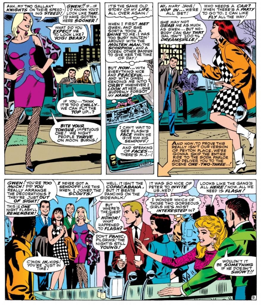
In fact-- YOWZAAA! Look at Gwen Stacy's knockout outfit!
I don't know who designed it. Dormammu of Beverly Hills? Purple and blue abstract design, with fishnets and a animal-print coat in decidedly unnatural hues of... purple again. Jazzy John Romita was the perfect guy for this soapy stuff and he visualizes Gwen as the height of mid-60s cool. It doesn't get any better, does it?
Yes it does! Because here comes Mary Jane Watson in an op-art inspired checkerboard dress and some wild white boots with contrast black toes. Shame about the orange coat, but she quickly dumps it once they hit the shindig.
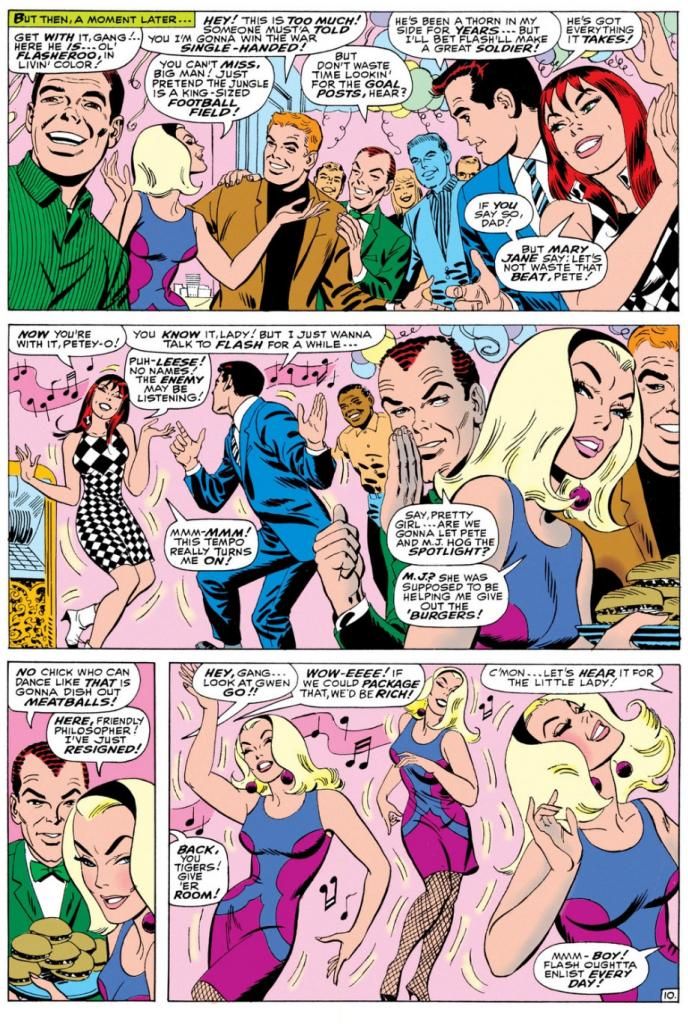
Pretty much everyone there is a sharpie. Smart jackets and ties for the gents, ultra-modern flips and bobs for the ladies. The guest of honor, Flash Thompson himself, sports a brown coat with a black tee for an athletically casual take on dressing up. That guy on the left of the top panel has a Beach Boys-looking striped shirt, possibly by Gant. The only guy who looks anachronistic is poor Harry Osborn, with his green bowtie and jacket like something he borrowed from Barney Fife down in Mayberry, NC. And he's supposed to be a rich boy. He looks as if he popped in from a 1949 issue of Archie's Pep Comics. He's even got Jughead's plate of hamburgers.
Gwen steals the show-- much to Mary Jane's displeasure-- with a dance that rivals the one Audrey Horne would do a generation or so later on the premiere episode of Twin Peaks. All eyes on Gwen. Stan's blatantly sexist catcalls crack me up. These are just a few, but they run all through this part of the comic, with Harry and Pete congratulating themselves on having such beauties for girlfriends and Pete secretly leering at Gwen every chance he gets.
Don't you wonder what music Gwen's dancing to? This was right as pop was going psychedelic and becoming undanceable, and I doubt anyone wriggled and swayed to folk songs or protest tunes. If this were a TV show of the time, it would be some outdated-sounding jazzy stuff the network squares thought of as "close enough to that rock junk no one will be able to tell the difference anyway."
You know, like when Opie needs a little background noise while sweeping the courthouse floor for his dad and flips on a little white transistor radio and upbeat guitar noodling comes blaring out. Then Ope starts doing some kind of frantic moves with his broom still in hand says, "Gee, Pa, isn't this the most?" And Andy's like, "The most WHAT?" But because he's pretty open-minded for a Southern sheriff of the day, he and Helen Crump end up championing the fresh-faced kids at the high school who want to add a couple of the exact same generic rock tunes to the annual play instead of doing the same old "founding of Mayberry" junk the older teachers favor.
Anyway, beautifully drawn, hilariously written bit of scene-setting before the issue's bad guy makes an appearance. Kraven the Hunter. You know what? Who really gives a rip about that jackass when you've got these kinds of lovely John Romita pages to look at? Interestingly, Romita is doing a Steve Ditko impression throughout, and even Kraven's face in a few panels looks more Ditko than Romita. Artistic continuity, and at times Romita's line looks so impressively close to the guy's who he's imitating, it's almost as if Ditko himself inked this book.
Well, it's a fine book and I wish Lee and Romita had spent even more time just hanging out with the kids. But I guess the readers came for the action, but I'm more in love with the soap opera/character-building sequences during this era. I'd hang out with all of these characters even without the superheroic spider-bite antics. We don't even have to talk politics.
Well, here's something that will certainly lighten the mood. Remember when Flash Thompson went off to fight the Vietnam War and everyone at his party looked incredibly mod and gorgeous and they all thought it was a wonderful, happy, pleasant thing he was doing, with no negatives about it whatsoever? It happened in Amazing Spider-Man #47 (April 1967).
Here’s a largely cheerful story about a bunch of friends
putting on a going-away party for Flash Thompson, who is leaving for the
service, possibly to fight in a war in a jungle that pointedly avoids even the
suggestion such a thing might be in any way, shape or form at least the
slightest bit controversial or even worrisome.
Of course, given the time, the implication is Flash has been drafted, but
the closest we get to acknowledging that is a few issues back when Pete says
something about Flash’s “induction notice,” a term less loaded than “draft
notice.” Not a soul even whispers
Vietnam or Southeast Asia, and no one seems to think Flash is going to have
anything other than a simply fine ol’ time.
Of course, criticizing at Stan Lee and Marvel Comics for not taking
sides over Vietnam or making an issue of it is kind of like condemning The
Beverly Hillbillies for not doing an episode where Jethro gets drafted, loses a
foot and joins an anti-war rally in Washington while banker Milburn Drysdale
talks the Clampett family into investing in a napalm factory.
On the other hand, despite what you might
have read otherwise in the book Spider-Man Chronicle: Celebrating 50 Years of Web-Slinging, this issue isn’t even
as topical as the April 8, 1965 episode of The Munsters where Herman tries out
for the majors and Leo Durocher cracks, “I don’t know whether to sign him with
the Dodgers or send him to Vietnam.”
Harry’s “Only don’t bother looking for the goalposts!” joke when another
guest compares the jungle to a football field does seem eerily and cleverly
prescient now that we have more than forty years of hindsight on the matter,
though. And Spidey does at last
obliquely reference the potential dangers of war to callow young men when he
wonders in the final panel why he keeps thinking of Flash in the past tense
when the guy hasn’t even left yet and will probably come through all
right. “He'll make it-- somehow! good guys always
win,” he muses, before adding a little ambiguity with the tag question, “Don’t they?”
I don’t think Lee was or is particularly
interested in politics, and certainly not in wading into a political Big Muddy
and more than likely drowning his company there. He didn’t mind using the Commies as
bloodthirsty villains and outright creeps whenever possible, but who at the
time gave a rip what a communist thought about comic books? If they even read comics when they weren’t
murdering babies, knocking over Asian dominoes or stealing our space secrets, they
probably stole them off the racks anyway, and that did nothing but harm to
Marvel’s bottom line.
Plus, there probably
wasn’t a lot of readership overlap between Marvel’s magazines and The New York Review ofBooks where in February of that year Noam Chomsky published “The Responsibilityof Intellectuals.” And Dr. Martin Luther King told 3,000 people at Riverside
Church in New York City that the civil rights and anti-war movements were
essentially the same struggle and condemned the war in Vietnam as US
imperialism in the same month Marvel cover-dated Amazing Spider-Man #47. Check out Time magazine's reaction, and the Washington Post's. You know, those bastions of liberal thought. Not so surprising when you consider a Gallup poll the same month showed 50% of respondents believed
our escalation in Vietnam was not a mistake versus 37% who thought it was.
The believers were down from 59% the previous year, but still represented a significant
majority over the skeptics. This is a little different
than outright support for the war, but risking controversy by directly
addressing Vietnam and its complexities and uncertainties wasn’t going to sell
Spider-Man to the middle Americans buying this stuff for their kids and still
largely assured we were doing the right thing halfway across the world.
Lee had books to move, and Warren Publishing’s Blazing Combat had recently addressed the war directly with distinct disapproval and quickly folded. In the course of entertaining the heck out of us—its primary purpose—this story acknowledges in the vaguest and safest of terms what couldn’t be ignored and takes no sides. No more, no less.
Lee had books to move, and Warren Publishing’s Blazing Combat had recently addressed the war directly with distinct disapproval and quickly folded. In the course of entertaining the heck out of us—its primary purpose—this story acknowledges in the vaguest and safest of terms what couldn’t be ignored and takes no sides. No more, no less.
In fact-- YOWZAAA! Look at Gwen Stacy's knockout outfit!
 |
| Script: Stan Lee, Art: John Romita |
I don't know who designed it. Dormammu of Beverly Hills? Purple and blue abstract design, with fishnets and a animal-print coat in decidedly unnatural hues of... purple again. Jazzy John Romita was the perfect guy for this soapy stuff and he visualizes Gwen as the height of mid-60s cool. It doesn't get any better, does it?
Yes it does! Because here comes Mary Jane Watson in an op-art inspired checkerboard dress and some wild white boots with contrast black toes. Shame about the orange coat, but she quickly dumps it once they hit the shindig.
Pretty much everyone there is a sharpie. Smart jackets and ties for the gents, ultra-modern flips and bobs for the ladies. The guest of honor, Flash Thompson himself, sports a brown coat with a black tee for an athletically casual take on dressing up. That guy on the left of the top panel has a Beach Boys-looking striped shirt, possibly by Gant. The only guy who looks anachronistic is poor Harry Osborn, with his green bowtie and jacket like something he borrowed from Barney Fife down in Mayberry, NC. And he's supposed to be a rich boy. He looks as if he popped in from a 1949 issue of Archie's Pep Comics. He's even got Jughead's plate of hamburgers.
 |
| Script: Stan Lee, Art: John Romita |
Gwen steals the show-- much to Mary Jane's displeasure-- with a dance that rivals the one Audrey Horne would do a generation or so later on the premiere episode of Twin Peaks. All eyes on Gwen. Stan's blatantly sexist catcalls crack me up. These are just a few, but they run all through this part of the comic, with Harry and Pete congratulating themselves on having such beauties for girlfriends and Pete secretly leering at Gwen every chance he gets.
Don't you wonder what music Gwen's dancing to? This was right as pop was going psychedelic and becoming undanceable, and I doubt anyone wriggled and swayed to folk songs or protest tunes. If this were a TV show of the time, it would be some outdated-sounding jazzy stuff the network squares thought of as "close enough to that rock junk no one will be able to tell the difference anyway."
You know, like when Opie needs a little background noise while sweeping the courthouse floor for his dad and flips on a little white transistor radio and upbeat guitar noodling comes blaring out. Then Ope starts doing some kind of frantic moves with his broom still in hand says, "Gee, Pa, isn't this the most?" And Andy's like, "The most WHAT?" But because he's pretty open-minded for a Southern sheriff of the day, he and Helen Crump end up championing the fresh-faced kids at the high school who want to add a couple of the exact same generic rock tunes to the annual play instead of doing the same old "founding of Mayberry" junk the older teachers favor.
Anyway, beautifully drawn, hilariously written bit of scene-setting before the issue's bad guy makes an appearance. Kraven the Hunter. You know what? Who really gives a rip about that jackass when you've got these kinds of lovely John Romita pages to look at? Interestingly, Romita is doing a Steve Ditko impression throughout, and even Kraven's face in a few panels looks more Ditko than Romita. Artistic continuity, and at times Romita's line looks so impressively close to the guy's who he's imitating, it's almost as if Ditko himself inked this book.
Well, it's a fine book and I wish Lee and Romita had spent even more time just hanging out with the kids. But I guess the readers came for the action, but I'm more in love with the soap opera/character-building sequences during this era. I'd hang out with all of these characters even without the superheroic spider-bite antics. We don't even have to talk politics.
Friday, May 16, 2014
Comixology has 45 old school Uncanny X-Men issues on sale for .99 each right now...
I can't help shilling for Comixology from time to time. But sometimes I have to. I really, really do. I mean, I run a blog largely dedicated to old comics-- which I liberally define as "anything published prior to the year 2000"-- and a big part of that includes yakking at length about Uncanny X-Men back when Chris Claremont was writing it and Wolverine was but a hairy, beer-swilling pup. Or whatever it is you call baby wolverines. Right now they're selling 45 classic issues of Uncanny X-Men for .99 each. I already bought them all for 1.99 apiece, and I considered that a bargain at the time. If you haven't experienced the foundation of practically everything people love about Marvel Comics these days, this is your big chance to catch up.
The art is outstanding throughout, with Dave Cockrum and John Byrne pencilling most of the issues and a few guest art teams here and there. And wow, beyond the visual treats, these are fun comics to read. They're occasionally goofy, but they have all the theatrics and high drama you could possibly want in a superhero comic, with in-depth characterization of even the least-loved and lowliest of cast-offs. You know, like Banshee. Poor guy. And the long-simmering "Dark Phoenix" storyline is one of those seminal comic book events, an era-defining tale, as is "Days of Future Past," which seems to have inspired a movie recently with a lot of familiar characters. Where have we seen them before?
Anyway, Marvel can't seem to leave this stuff alone. They must have retold all of Claremont's stories more times than DC has redone "Crisis on Infinite Earths." Even Marvel movie guru Joss Whedon couldn't resist dipping into the Claremont well when he wrote his own much-lauded run not so long ago.
The art is outstanding throughout, with Dave Cockrum and John Byrne pencilling most of the issues and a few guest art teams here and there. And wow, beyond the visual treats, these are fun comics to read. They're occasionally goofy, but they have all the theatrics and high drama you could possibly want in a superhero comic, with in-depth characterization of even the least-loved and lowliest of cast-offs. You know, like Banshee. Poor guy. And the long-simmering "Dark Phoenix" storyline is one of those seminal comic book events, an era-defining tale, as is "Days of Future Past," which seems to have inspired a movie recently with a lot of familiar characters. Where have we seen them before?
Anyway, Marvel can't seem to leave this stuff alone. They must have retold all of Claremont's stories more times than DC has redone "Crisis on Infinite Earths." Even Marvel movie guru Joss Whedon couldn't resist dipping into the Claremont well when he wrote his own much-lauded run not so long ago.
Monday, May 12, 2014
The New Mutants and my artistic misadventures up to now...

This unfinished sketch began its life as just a dull portrait of Dani Moonstar (AKA the Greatest Comic Character Ever Created) I did months ago, possibly in ArtRage Studio or Sketchbook Pro. Yesterday, feeling kind of feisty, I opened it up in Manga Studio and penciled over it and, I believe, fixed one or two things that used to bother me about it.
For some reason, I felt a Hulk appropriate to the story and once I added the Jade Giant, obviously we needed a cringing Sam Guthrie doing a sort of Archie comics fear pose on the right. Such was my thought process at about 7pm, the end of a full day of drawing and self-directed art study which began around 630am. By the time I started coloring it, I was physically exhausted. I only got this far and decided to call it quits, but at that point I'd discovered oil painting and I played around with a digital piece I did a couple of years back of a screaming Captain Kirk being left behind in deep space by the Enterprise.
Yesterday's efforts included the writing, lettering and laying out of a story I call, "The Legend of Billy Jack versus Bruce Lee." I also drew Conan attacking Mickey Mouse, an image I've been toying with for the past month. The idea I could make the Conan figure look a bit like a John Buscema drawing wrecked me. Then I discovered my own line and had to re-draw it in a more personal way. In blue pencil just for fun.
I find I've developed some measure of precision to go along with the speed I've long had. I also have a tremendous amount of self-discipline where I can keep myself drawing for hours, minus a couple of rest breaks here and there, and push through blocks and frustrations to keep putting down lines. What I lack are basic storytelling skills and an appealing aesthetic quality. I don't have a particular "way" to draw eyes, or a characteristic approach to shadows and highlights. What I seek is a natural way of drawing, without getting hung up on ideas like "style."
But at the same time, I want something I can reproduce consistently that looks attractive in case people might actually come to desire my art in some financially remunerative way. The way to do this is simply to do this. Then do it again. And again. Do it a million times if necessary, or even more.
I wish I had all day every day to devote to art, but I also have to do my regular day job. So for now, I'll be getting up at 5am to draw for two hours and then maybe 4 hours on a Saturday and a Sunday each as long as my wife is cool with it. I mean, she's pretty darned important to me!
Anyway, as I've no doubt mentioned here, many years ago I had this idea I could write a 48-page graphic novel or the first two issues of an ongoing series, a kind of "slice of life" thing partially inspired by the existence of Love and Rockets, Ghost World and even Peter Bagge's Hate. Visually, I wanted it to resemble classic romance comics, but with the clothes and hairstyles all up-to-date. Then I thought, "Hey, why don't you try to draw it in as close an approximation to Alex Toth's style as you can?"
I guess I kind of had in mind Mark Schultz's first Xenozoic Tales story, titled "Xenozoic!," which he drew as an extended Wally Wood riff. Well, I quickly learned I was in no way Alex Toth or Mark Schultz. But by that time, I'd already written the whole thing. I did it Sergio Aragones-style, with the entire 48 pages thumbnailed, complete with dialogue.
Realizing I'd set the bar impossibly high for someone whose last lengthy sequential work was a three-page Jurassic Park parody done in 1993, I decided to limit myself to just writing it and getting someone else to draw it. I typed it up in what I think is standard script format, completed the forms and documents and sent the whole mess to Dark Horse Comics, the only place taking those kinds of unsolicited submissions at the time. That it then disappeared without a trace into their slush pile and then, no doubt, into a recycling bin where it eventually became an ingredient in someone's computer desk or a Blo Pop stick (I hope the latter!) let me know my writer's skill level and commercial instincts!
Rejection is just part of aspiration. I don't save them because I'm not sentimental and I have little or no ego, but I've since received some actual rejection letters for short stories I've written. That's more fun that silence, and from them I gained a feeling of accomplishment. The thing is, you can't give up. Ever. So even though I was in the process of changing from a low-paying graphic design career to a higher-paying English teaching one, I carried the layouts and script with me to Japan where I worked on them from time to time. When I bought Manga Studio 5 with my new-found education riches, the first thing I did was lay out the first half as a single comic book issue and letter it, editing and fine-tuning the dialogue throughout. Soon I'll do the other half and complete the story. I know how it ends and how to get there. I know what everyone says and does and why.
I drew here and there, but largely just spent my time bouncing around between my adopted hometown and Tokyo, checking out rock shows and living the life of a language mercenary. This left little time for the kind of dedicated study of art I'm making now. And why am I doing this? Encouragement from a pro who sent me a message on Facebook and asked me directly why I wasn't drawing. Why I had never gone for it. I thought about that for while and after I had thought about it long enough, I realized I had to start drawing again on a regular basis. I couldn't let my skills rust anymore. I then went to work drawing every single day and recently, I've been spending longer hours at it. I'm improving faster than I ever thought possible. And it's been pretty fun despite smashing headfirst into the upper limits of my capabilities, which aren't as high as I'd like.
There are some hugely talented people out there who can blow my wheels off! I mean, WOW!
Then, this past weekend, I decided that so-called graphic novel needed some new thought and a new beginning. I came up with a kind of one-page prelude to set the scene and one of the character conflicts. This leads into my original opening sequence but enables me to show, rather than tell, and opens up the possibility for more natural, less expository, dialogue from the two co-leads. They're half of a quartet of characters whose adventures and misadventures drive the story. This made me re-think another scene near the beginning that will no serve to sharpen the book's main dilemma, the one shared by all four people.
And with that, I must go teach an English conversation class. So I'm out!
Subscribe to:
Posts (Atom)