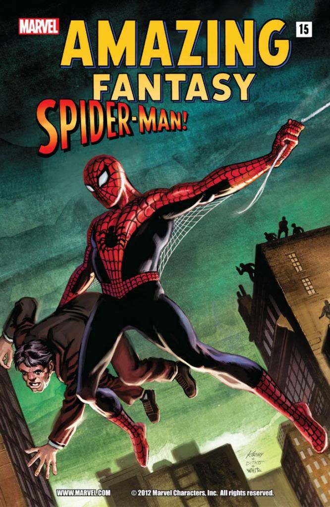
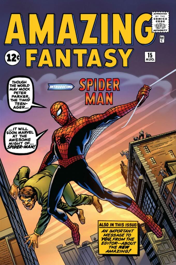
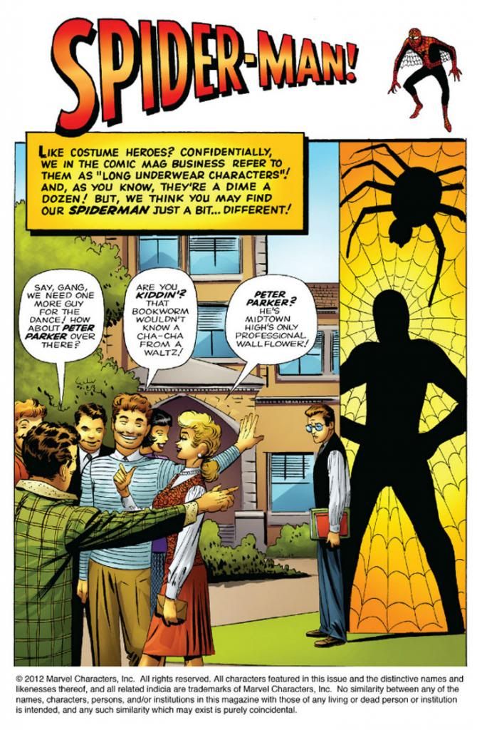
Spider-Man has gone through a lot of artists over the decades, and while his costume basics have remained the same, some artists have taken it upon themselves to tweak the details. For some people, the Todd McFarlane version of Spider-Man is their favorite. Huge eyes, lots of weblines on the red parts, really exaggerated insect-like poses and fingers that resemble circumcised penises and feet made out of garden spades. Some may be into the black costumed Spider-Man. Or the Ultimate Spider-Man. Or that guy who dresses like Spider-Man and climbs skyscrapers. Whatever your taste, Spider-Man has been around long enough there's probably one for you, and that one is more than likely the one by whatever artist handled the character when you first got into him.
I'm pretty damned old, so my first Spidey crush was on what was probably a John Romita Spider-Man on a Mead Trapper-Keeper I had in elementary school back in the late 1970s. Given the era, it could also have been a John Buscema or Gil Kane drawing. Actually, it may not have been a Trapper Keeper at all, but a folder or even a notebook. There's a chance it's the one with the cover to Amazing Spider-Man #135 (which means Romita), but I remember it more as a collage of cover images, which means it could be any combination of artists.
Whichever one it was, and however vague my memory of its specifics, what I definitely remember is how it imprinted in my brain a certain vision of what the ideal Spider-Man looked like. After all, that Spidey matched up well with the Mego Spider-Man, the Spider-Man on the The Amazing Spider-Man TV series, the one on The Electric Company, the bodybuilder who dressed like Spider-Man at the mall we had our photos taken with and, most importantly, the Spider-Man still appearing in Marvel comics like The Amazing Spider-Man, Peter Parker the Spectacular Spider-Man, Spidey Super Stories and even in the Hostess Fruit Pie ads. Spider-Man de rigueur for the 1970s.
Then I learned of Steve Ditko from a Dr. Strange story collection. That he was the original Spidey artist meant I had to give his rendition careful consideration in light of its preeminence in Spider-Man history. Well, it didn't take long for Ditko's vision to take over my imagination. Here's a typical Ditko Spider-Man.
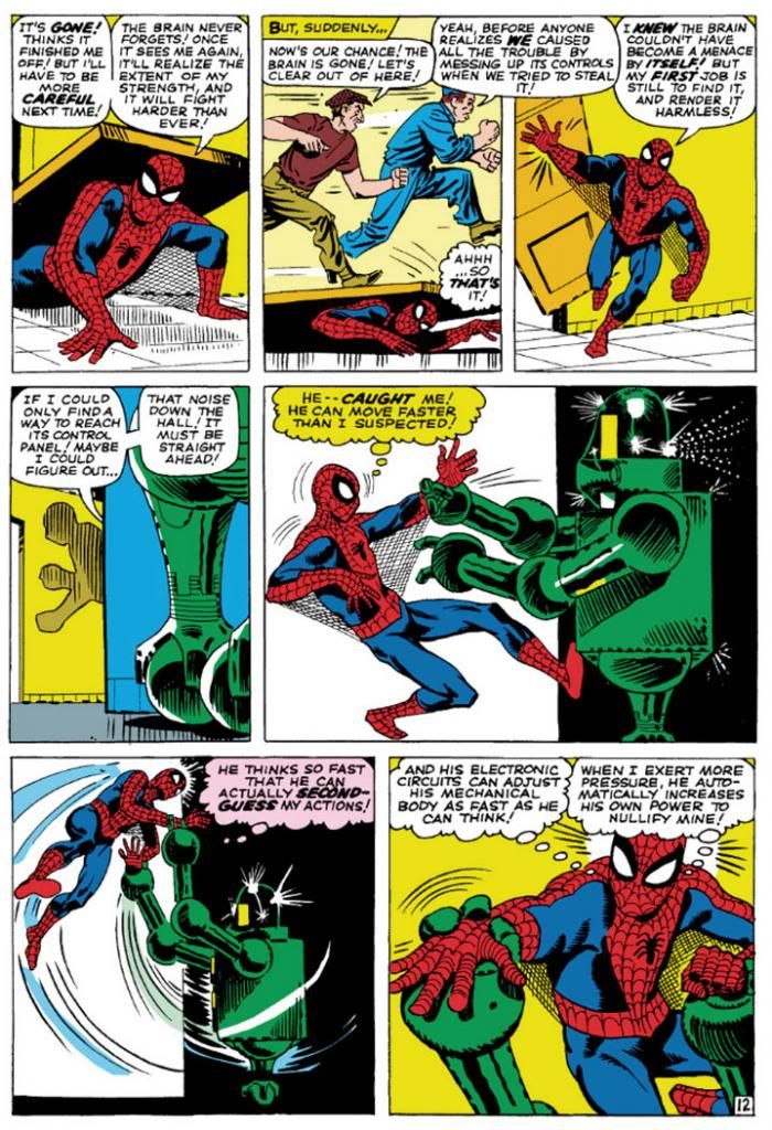 |
| Amazing Spider-Man #8 (January 1964) Art by Steve Ditko |
This is from Amazing Spider-Man #8 (January 1964), touted on the cover as a "Special 'Tribute to Teen-Agers' Issue!!" Since the character himself is a teen-ager, Ditko's Spider-Man is muscular in a youthful, long-distance-runner way, but isn't quite as classically proportioned as some later versions. While this isn't particularly a good example of it, Ditko also tends to put heavier shadows in the costume's blue areas, which makes me think his intention is for that part to be navy blue rather than the royal blue the subsequent Spideys sport, or even black. But given the way comic books treated colors back then, and with all the recoloring and touch-ups in the years since, it's hard to say. What we can see is Ditko favors larger eyes with heavier black outlines, to emphasize the insect-like aspect of Spidey's mask. He aso gives Spidey more underarm webbing than most artists-- and it runs from his belt all the way to his gloves!
Using the three-tier page format, Ditko
chops action into small increments, which makes sequences more movie-like and
easy to follow. But he also uses mostly
medium shots, which keeps the action at arm’s length. It’s simple storytelling at its finest, and
reduces events to something approaching the comic book version of documentary-like
as opposed to the heightened or epic. Spider-Man’s
powers may be the one fantastic element in a world Ditko means to represent our
own, but he’s hindered by the same things we deal with ourselves and so we
identify with him even if we’re not right in his face masking ourselves as
him. With his funky take on facial
expressions and body language—with his rough-hewn finishes few of Ditko’s people
are blatantly gorgeous—this makes Spidey’s adventures just a bit
larger-than-life rather than massive. There’s
our trod-upon hero (literally) coming out from under a door, in the confines of
some functional corridor rather than high above a cityscape.
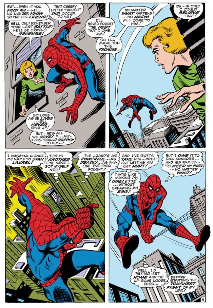
John Romita took over the title when Ditko left, but we'll look at him later because we're doing this in order of what I own. So keeping that in mind, here's John Buscema's version, inked by Jim Mooney, from a few years later. We have to acknowledge the influence of Romita's slight revision of the costume, but the rest is Buscema all the way.
 | |
| Amazing Spider-Man #76 (September 1969) Art by John Buscema and Jim Mooney |
Buscema’s Spider-Man (from an issue actually printed within my lifetime!) is muscled like some gorgeous Renaissance sculpture come to life, a full nine heroic heads tall. Spider-Man, not Spider-Teen. Buscema puts us inside the action and this time, the entire thing is made up of fantastic elements—other than the (fairly) realistic buildings, but even they’re skewed with deep perspective shots. By varying panel size and shape, changing point-of-view and enlarging the images so he can fit only four on a page, Buscema creates a heightened dynamism that’s at odds with Ditko’s reductionism. This isn’t to say one is right and one is wrong. They may represent differing philosophies or thought processes on what constitutes heroism. Or maybe Buscema just liked big takes. Both are totally valid approaches, but I like how Ditko's Spider struggles a bit more. On the other hand, Marvel tended to push Buscema’s powerful approach to storytelling on us through things like How to Draw Comics the Marvel Way. This had a huge influence on my tastes as a teenager.
I don't see any armpit webbing on this page, but that may be because Jim Mooney forgot to ink it. They include it on other pages, but it's subtler than Ditko's.
As much as I love both Ditko and Buscema, these days my preferred Spider-Man artist is his second penciller, none other than the aforementioned John Romita. Let's take a look at his Spidey.
 |
| Amazing Spider-Man #88 (September 1970) Art by John Romita and Mooney |
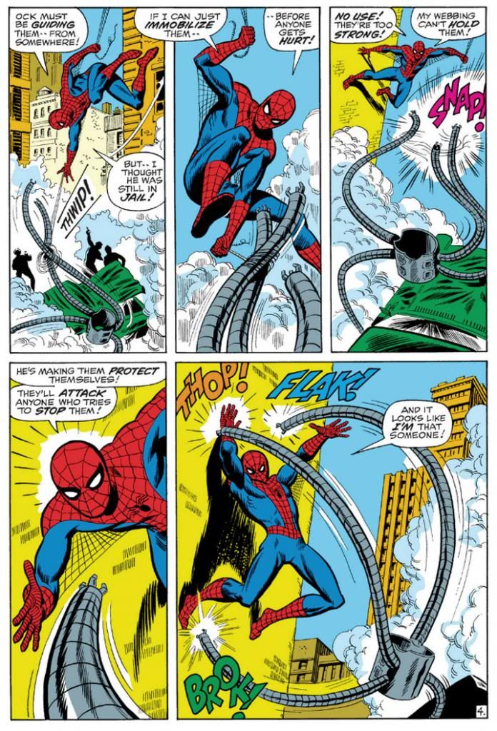
This is a clever sequence from the September 1970 story, "The Arms of Doctor Octopus!," where, true to its title, Spider-Man fights Doctor Octopus' arms. Only the arms. The good Doctor controls them from his prison cell. Romita's Spider-Man is slightly slenderer than Buscema's, but they share body language. Romita also brings us inside the action with this two-tier layout. In the Buscema page, we have three Spideys roughly the same size with a smaller one for variety. Romita gives us three Spidey sizes: small, medium and large. It's not quite as bombastic as Buscema's, but it's still bold. Romita's characters tend towards the pretty, maybe due to his romance comics background. I don't think anyone handled the soap opera stuff in Amazing Spider-Man better than Romita. Slick Mooney finishes keep some surface consistency with line weights and the treatment of Spidey's blue areas. I haven't seen the pencils for this page or the Buscema one, but I'm going to guess Mooney has a great deal to do with the near-identical eye and web pattern treatments. The color choices here interest me, but I'm not sure how much is due to the original colorist and what might have been changed in the years since. Anyway, it works. Since Doc Ock's arms are gray and wouldn't have popped in the foreground otherwise, notice how the buildings on the Buscema page are gray, but the colorist here used a lot of yellow and yellow-orange.
Also, THOP! FLAK! BROK! And the return of the armpit webbing. It's finer than Ditko's and only reaches Spidey's elbows.
While I've stated my preference for Romita, I wouldn't care to meet the fan who finds fault in Gil Kane's interpretation.
 |
| Amazing Spider-Man #121 (June 1973) Art by Gil Kane and Tony Mortellaro |
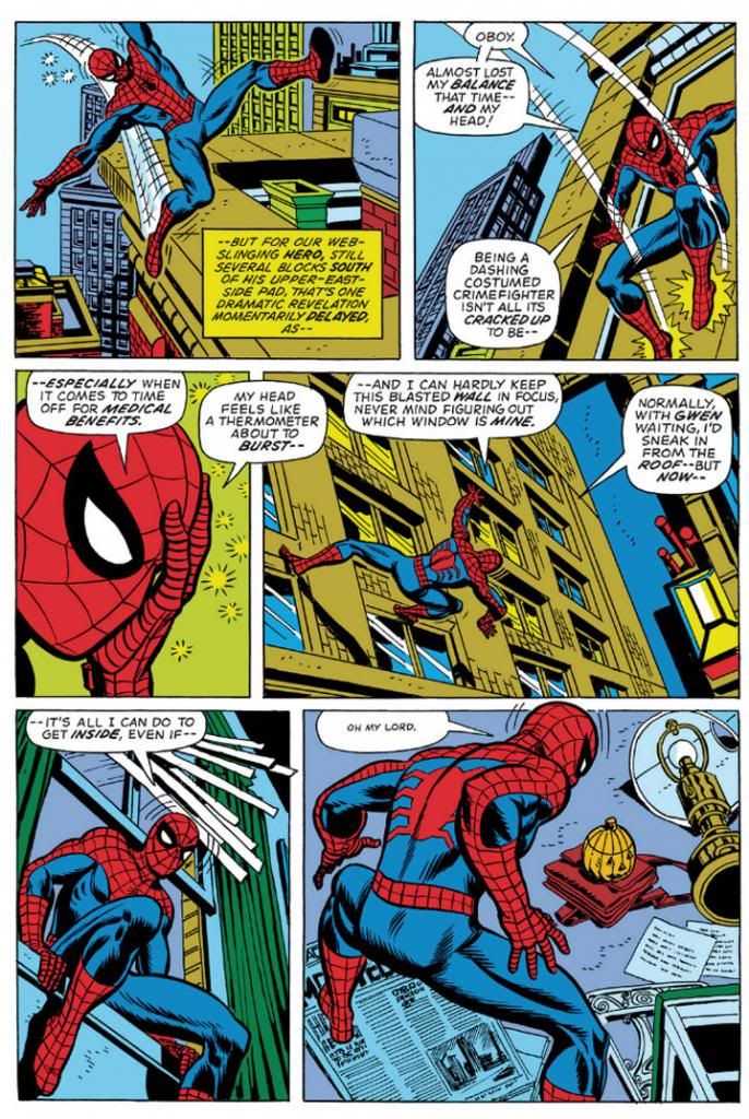
Here's our first extreme close-up! It appears in Amazing Spider-Man #121 (June 1973), in a story you may have heard of called "The Night Gwen Stacy Died." Not sure what happens in that one, and with an obscure title like that, your guess is as good as mine.
But I am pretty sure Ditko, Buscema and Romita all used close-ups before Kane. But Kane, like Ditko, excelled at facial expressions. Look at some of his cover work with those giant screaming heads. Kane puts extreme close-ups to effective use throughout this issue. Yeah, Peter Parker's face is hidden under a mask most of the time, but the idea's basically the same. This is an important little moment Kane chooses to emphasize with a cutaway to Spider-Man holding his head because it "feels like a thermometer is about to burst--" Spidey on this page isn't feeling well, and in his one high-flying moment of web-swinging, Kane gives him wonky body language, then confines him to wall-crawling and slipping in windows and crouching on newspapers. I like the last panel especially, with the high angle from-behind shot giving us both Spider-Man and the pumpkin bomb he's reacting to all in one shot. There's a nice use of a missing panel here, with Spidey on the windowsill cutting to Spidey in the room in such a way the omitted leap is implied. It's almost animated.
No armpit webbing.
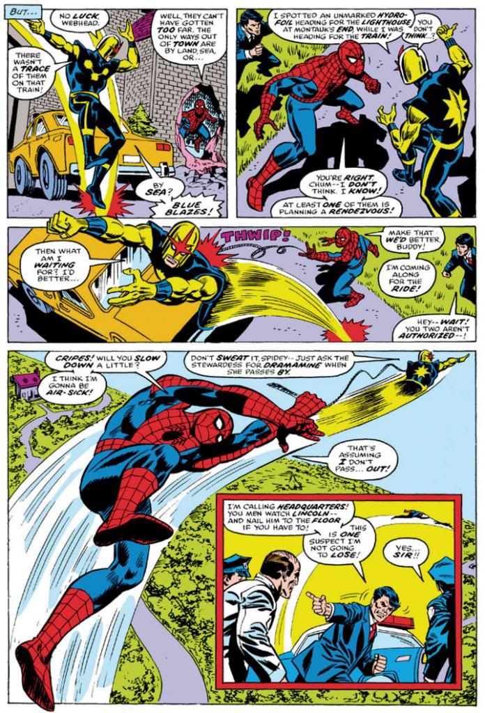
Ross Andru, who drew Amazing Spider-Man for five years (impressive!) gives us two superheroes for the price of one, but we're going to ignore Nova and his golden bullet-helmet.
 |
| Amazing Spider-Man #171 (August 1977) Art by Ross Andru and Mike Esposito |
Once again, we have medium shots and three panels in a row with high angle views, the last with a larger foreground Spider-Man inducing vertigo as Nova drags him through the air. And then an inset panel with the two of them so high they're tiny to the cops left behind on the ground. Andru's Spider-Man retains the crouching body language of Kane's, but is noticeably chunkier than any of the ones we've looked at previously. He's got the Ditko-style dark shadowing on his blue uniform areas (maybe inker Mike Esposito contributed that part), but again, none of the armpit webbing. Did Marvel abandon that look, or was that an Andru flourish? It's not as if the armpit webbing has any real function and it wouldn't have worked in the panel with the largest Spidey anyway-- it would have obscured his chest and been a challenging artistic exercise for Esposito, like when a penciller puts speedlines in front of an object. How do you look through those? Do they distort the background image? Just how much of that should remain for clarity's sake, or for simplicity?
Andru came over from DC where he worked on war comics and Wonder Woman. Can you see any of those elements informing his work here? I know he did a classic take on Wonder Woman and he's giving us a clean, house-style Spider-Man on these pages.
Oh, and the yellow sky in the inset panel. That was originally the work of Glynis Wein, who colored a pile of Marvel books. It reminds me of Harvey Comics. For some reason, colorists at Harvey seemed to love making the sky yellow. Here it makes a good depth contrast for the figures heavy on the blue side in the foreground. In fact, whoever colored this seems to have put some extra effort into popping figures by contrasting cool colors on top of warm (although you still have to put up with Nova's yellow arms). I'd love to see the original printed page to see how accurate Marvel has recreated Wein's colors here.
And there you have it. Ditko, Buscema, Romita, Kane and Andru. They're in my Spider-man Hall of Fame. Yeah, I like the way Ron Frenz and John Romita, Jr. and even John Byrne-- to name three more-- draw the character, but when I think Spidey, I think Ditko, Buscema, Romita, Kane and Andre. Their versions combine into my platonic ideal of Spider-Man.