Showing posts with label John Buscema. Show all posts

Wednesday, September 3, 2014

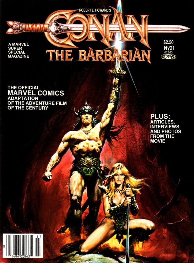
Marvel's Marvelous Movies #9: Conan the Barbarian (Marvel Super Special #21, August 1982)

John Milius and I are probably diametrical opposites politically (and in most other ways), but I have to admit I admire the hell out of him.  The guy simply fascinates me.  He's collaborated with people like George Lucas, Steven Spielberg, Robert Zemeckis and a fella name of Francis Ford Coppola on a little flick called Apocalypse Now.  Lucas based the John Milner character from American Graffiti on Milius, and he served as partial inspiration for Walter Sobchak in the Coen Brothers' Big Lebowski

On his own, Milius has made a number of romantic adventure films laced with a lot of his personal philosophy, which is somewhere to the right of right wing.  He's got kind of a sketchy commercial record, but he's never bored me with his movies.  At its best, his work achieves a kind of powerful macho poetry and beauty, and I find myself exalted by themes and moments I wouldn't ordinarily celebrate.  The Wind and the Lion, Big Wednesday and Rough Riders come to mind. 

Sometimes his movies are just sort of silly.  Red Dawn

Or poetic and silly at the same time.  Which brings us to Conan the Barbarian (Marvel Super Special #21, August 1982). 

Other than the rough outlines of its fantasy setting and few names and incidents here and there, this movie has little  to do with Robert E. Howard's most famous creation.  Milius and co-screenwriter Oliver Stone (yes, THAT Oliver Stone; Milius doesn't seem to let ideology affect his choice in collaborators, which is another reason I respect him) reinvent Conan to suit their revenge story and also because of Arnold Schwarzenegger, in just his second dramatic role (his first being as Hercules in a low-budget comedy with Arnold Stang), didn't have the acting chops to carry the film's narrative.  This reduces the title barbarian himself to kind of a passive meathead thoroughly out-charismaed by his partner-in-crime and lover Valeria, played with scene-stealing verve by Sandahl Bergman.
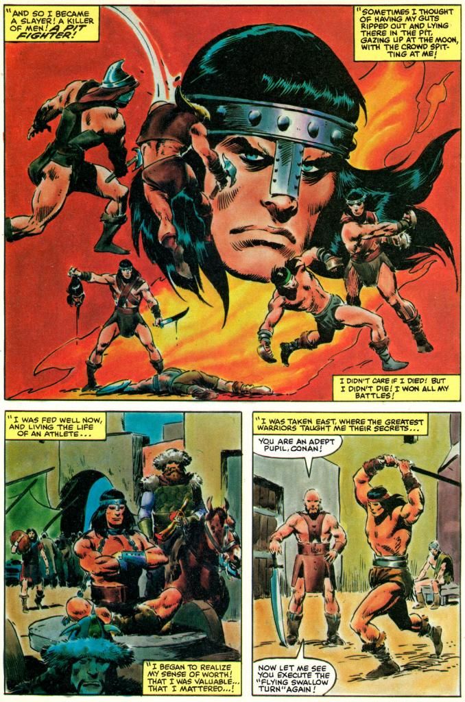


Script:  Michael Fleisher/Story and art: John Buscema

But Arnold as Conan-- Schwarzenegger, not Stang-- probably contributes the largest portion of the public's perception of the character.  Thick accent, not a lot to say, and most of that borrowed from Genghis Khan.  The rest more than likely comes from Marvel's comic book series starring Conan, which hews closer to Howard's version without quite getting it right, either.  And since Marvel was also in the business of adapting movies, their doing a Conan the Barbarian film comic was inevitable. 

Who better to adapt and draw it than John Buscema, the top Conan comic artist of the day?  As a geek, I tend to associate Buscema with the character almost as much as I do Robert E. Howard himself.  Buscema has Michael Fleisher provide the words for his adaptation, which may or may not have been a smart move.  I say this only because I wish we could have read something even more purely Buscema just to experience what his word choices and tone might have been like.  Together, Buscema and Fleisher reduce the naked sex and sexy naked parts and expurgate most of the gore to produce a newsstand-ready Conan magazine that's Marvel and Milius at the same time.
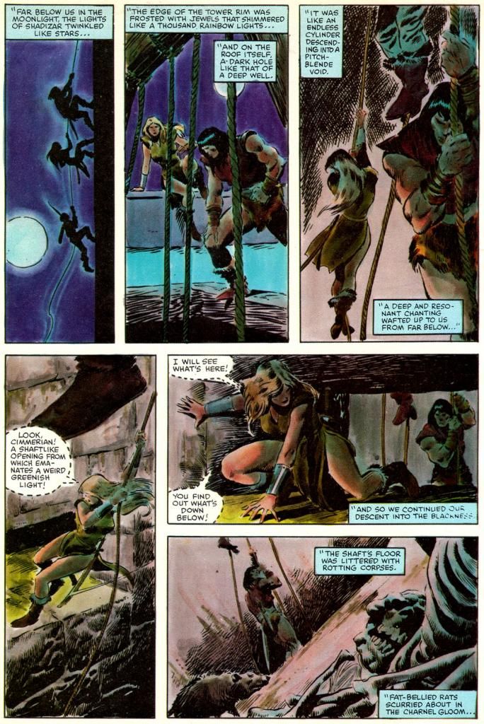
Script:  Michael Fleisher/Story and art: John Buscema

Buscema draws Conan how he was used to drawing him in the Marvel comics rather than try to depict him as Arnold.  In fact, Buscema makes no attempt to caricature anyone other than James Earl Jones as villainous Thulsa Doom.  And even his Doom is more or less a general likeness, aided by Jones' distinct look as the character. 

Doom is a mean guy with a Bettie Page hairdo and a pack of horseback raiders who follow him around in search of money and murder.  They slaughter everyone in Conan's village and then Doom hypnotizes Conan's mom and chops off her head.  The orphaned Conan spends a number of years pushing a stone wheel around until he's as big as a bodybuilder.  Sold as a gladiator, he learns swordplay and Nietschean philosophy while also providing stud services.  Freed, he sexes up a werewolf witch, meets pro surfer Gerry Lopez and soon learns Doom has reinvented himself as head of a cult that sells snake-worship franchises throughout the land.  Conan also meets Valeria, who doesn't dominate the story in the comic quite as much as she does in the movie.  Buscema draws Valeria as the standard Buscema beauty, with thick eyelashes and high cheekbones.  Like Bergman, she's statuesque and blond, but that's where the resemblance ends.

And that's really enough.  If I wanted the characters to look exactly like the actors, I'd just watch the movie again or look at some photos.  I love when an artist does caricatures or likenesses, but it's not always necessary.  If likeness is an artist's strength, then he or she should focus on that.  If not, then filling the pages with a lot of off-model faces poorly copied from stills and publicity material is simply a distraction.  Some can do both, but either way the storytelling is much more important.  Things like pacing and clarity of sequence.  Vigor.  You don't find many storytellers more vigorous than John Buscema in sword-and-sorcery mode.
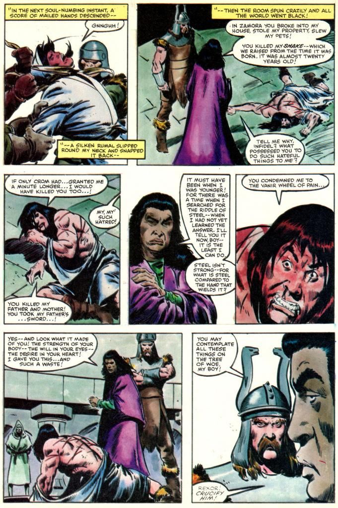
Script:  Michael Fleisher/Story and art: John Buscema

And in contrast with the disappointing Raiders of the Lost Ark, Buscema inks himself this time.  He's well within his comfort zone, and, as with Al Williamson on Empire Strikes Back, we've got an artist perfectly matched to the material.  Whoever made the decision to return to the painted color style of some of the earlier Super Specials needs singling out for praise, too.  D. Pedler (sorry, I don't know who this is, but I wish I did) and the legendary Lynn Varley do a sensational job here, giving Buscema's already gorgeous art a luminous quality, giving each location a rich look full of depth and atmosphere.  Snowy woods look cold, the barren wastes look hot and dry.  This Super Special is a visual treat with a richness a few of the preceding issues sorely needed.  The result?  It's classic Buscema Conan guest-starring in the Milius movie

The writing preserves many of the movie's best lines except for my favorite part, which is Conan's prayer, which it truncates to get to more action.  Conan's prayer is probably the most bad-ass prayer ever capture on film next to the ones for George Bailey at the beginning of It's a Wonderful Life

And I must quote the film here:

Crom, I have never prayed to you before. I have no tongue for it. No one, not even you, will remember if we were good men or bad. Why we fought, or why we died. All that matters is that two stood against many. That's what's important! Valor pleases you, Crom... so grant me one request. Grant me revenge! And if you do not listen, then to HELL with you!

Before we toddle off to Crom's mountain where we'll laugh at the four winds, here's a page with a funny panel a Buscema group I'm in on Facebook hashed over recently.  Look at the middle panel of the bottom tier:
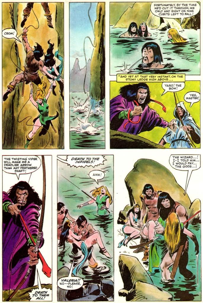

Script:  Michael Fleisher/Story and art: John Buscema

"Valeria!  No-- please no!" 

Neither Howard's nor Milius' Conans spend half a second begging like that.  Where the word balloon arrow points is to the rescued princess, but considering her ungrateful characterization the rest of the way (and the fact she didn't know who the hell Valeria even was) make me believe this is Conan speaking.  Hardly the stuff of the guy who tells his own god to grant him revenge or go to hell.

Who gets the blame for this?

Fuck it, Dude.  Let's go bowling.

Sunday, August 17, 2014

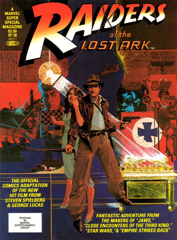
Marvel's Marvelous Movies #6: Raiders of the Lost Ark (Marvel Super Special #18, June 1981)

My friends and I were so in love with Raiders of the Lost Ark we went to the theater one day in a group, bought tickets for the first showing and stayed through the last.  My memory says we saw Raiders six times that day, but it may have been four.  I don’t remember feeling any viewer fatigue, just anticipation for each exciting sequence.  I knew what was going to happen and I was thrilled to see it again.  And again. 

Why didn’t they kick us out?

When I bought this at the convenience store where I generally bought comics back in those days, my overwhelming impression was disappointment with Marvel Super Special #18:  Raiders of the Lost Ark.  Maybe The Empire Strikes Back spoiled me by equaling or even surpassing its source material in many ways.  Raiders seemed lackluster, kind of a knock-off product more than a celebration.  Reading it again recently, I like it a bit more.

And that like is based largely on Walt Simonson's smart and witty writing.  I'm not sure what form of Raiders he was working from, some earlier version or the shooting script, but Simonson takes us through all the famous set pieces, condensing some to fit in as much of the film's action in swift strokes.  There's no swordsman in the bazaar, and Indy's fight with that bald brawler of a Nazi lacks the original's grisly denouement.  But even with the cuts, Simonson enriches our beloved archaeologist by filling us in on his wry thoughts.  It's fun to see Indy run away from the natives, but Simonson gives us a little mental wisecrack to go along with it.  Adapting isn't simply the cutting and pasting of the movie to fit on comic book pages.  It helps if the writer, like Simonson, also shows a flare for language.  Simonson does this not only with the quips and clever extrapolation of character, but also in the aftermath of the face-melting "wrath of God" sequence, where he drops a line that's reminiscent of Stephen King back when King was hungry, before he became a brand name.  This is the kind of thing I love in a comic book adaptation of a movie, rather than an action-only, surface approach.
 
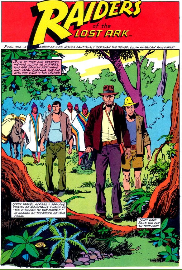
Script:  Walt Simonson/Pencils: John Buscema/Inks: Klaus Janson


Unfortunately, the art doesn't provide the same kick.  It was a big letdown when I opened this book outside the convenience store where I bought it despite its extravagant retail price, and I like it only slightly more these days.  Make no mistake-- I'm a huge John Buscema fan, and despite the results here, I'm convinced he was a prime choice for penciling Raiders.  If he'd had the time to do complete pencils or ink himself.

Here, Buscema provides breakdowns for Klaus Janson's finishes.  Right off I'm not loving it, because this is not one of my favorite team-ups.  Janson's inks superbly complement stylists like Simonson, and his work with Frank Miller is the stuff of comic book legend.  I've never cottoned to his work with Buscema, especially loose Buscema.  There's a clash of sensibilities and from that we don't get a charge of energy but simply awkwardness.  Alfredo Alcala or Rudy Nebres would take these same pages and turn them into something akin to classic adventure book or pulp magazine illos.  You'd lose a great deal of the Buscema surface while retaining the basic structure and it would look lush and refined, opulent like some of their crazy collaborations in Savage Sword of Conan.  These are some of the few times one of Marvel's black and white magazines even comes close to competing with the best of Warren's gorgeous books.

Buscema-Janson would work fine in the pages of The Amazing Spider-Man or on a Daredevil annual.  Here, the edgy, ultra-modern finishes turn what should be a visual treat into a rather generic 80s superhero comic.  From the opening splash where Indy and company just seem to be standing like mannequins in the jungle despite the best efforts of Simonson's captions, to the rather stark and uninvolving desert setting, there's a distinct lack of detail and texture.
 
Script:  Walt Simonson/Pencils: John Buscema/Inks: Klaus Janson

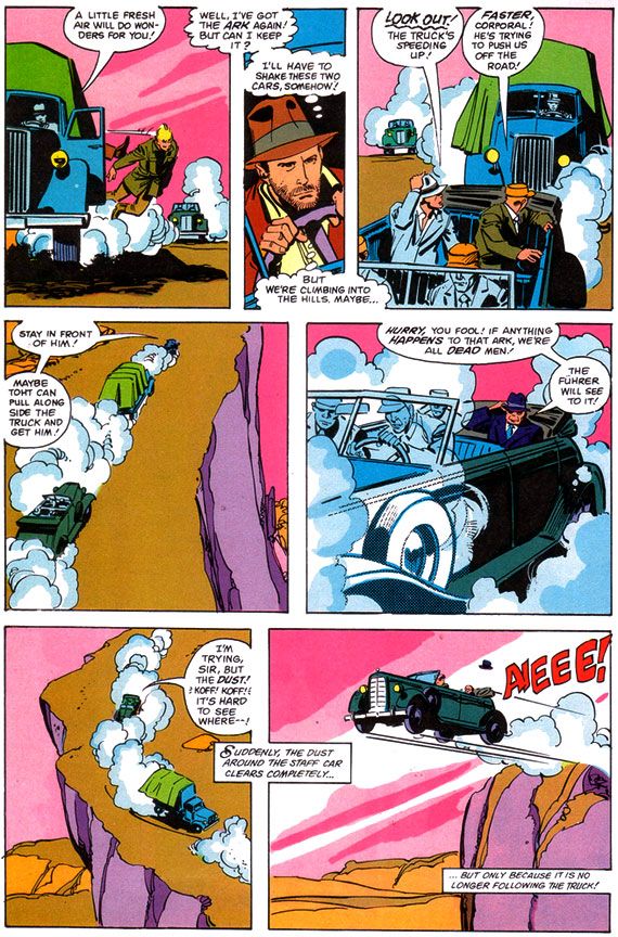
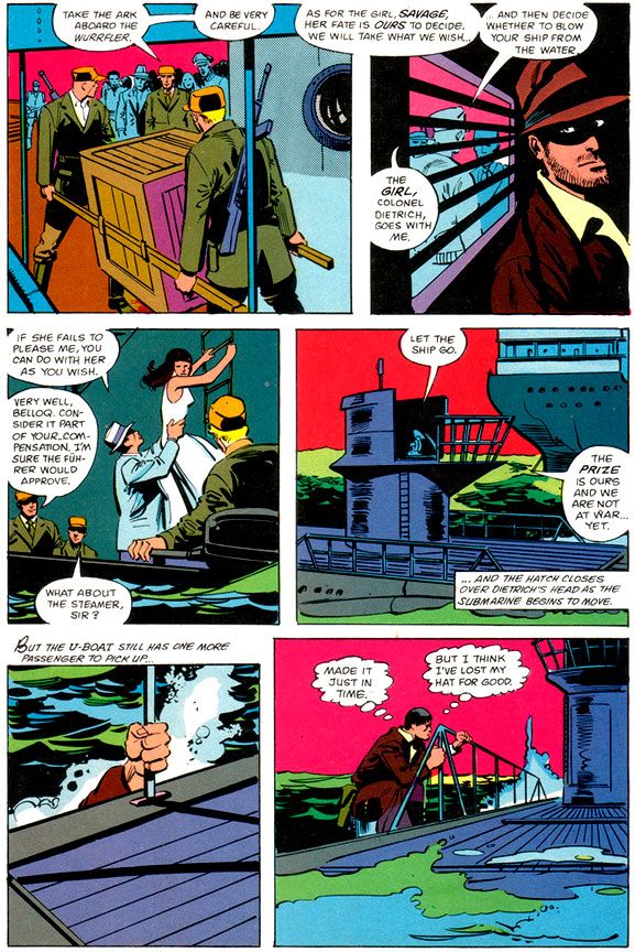
Janson’s edgy inks simply lack the retro, Saturday matinee feel a Raiders comic absolutely demands.  And when a scene calls for a little modest gore-- your odd impaled corpse here, your melting Nazi there-- Janson restrains himself and what we get is drab.  Other panels seem strangely empty, even unfinished, with little detailing.  Nazis wear uniforms devoid of badges, Captain Katanga's tramp steamer-- piratical in the film-- looks alarmingly clean.  Blacks indicate light sources but do nothing for mood. 

From what I understand, the people at Lucasfilm were pretty unhappy with this book as well. 

After all, when you watch the movie, you feel the love both George Lucas and Steven Spielberg share for old serials, B-movies and even A-movie adventures with guys like Errol Flynn, Tyrone Power and Douglas Fairbanks, Jr.  And classics like Casablanca and Treasure of the Sierra Madre with Humphrey Bogart.  They add a contemporary self-awareness to genre thrills and of course, this approach paid off in gold.  So much so, they ended up sparking a revival of the genre and I ended up watching all kinds of Raiders knock-offs in search of the same all-day thrills my friends and I stole from the Martin Four that summer day.  High Road to China, Romancing the Stone, TV's Tales of the Gold Monkey, Bring 'Em Back Alive, Rubiks the Amazing Cube, Jake and the Fatman, Mama's Family, Pink Lady and Jeff...

Instead of something similar, something recalling adventure strips by the likes of Noel Sickles, Roy Crane and Milt Caniff, we get flourish-free late 70s/early 80s Marvel finishes that evoke nothing of the visual qualities or romance of either Raiders or those old movies.  Where’s Charlton Heston or Cornel Wilde?  There’s barely even any Harrison Ford.  Marvel's Raiders has incident, but lacks atmosphere.
 
Script:  Walt Simonson/Pencils: John Buscema/Inks: Klaus Janson


I’m left wondering what might have been if someone said, “Let’s do this in the spirit of the film.  There’s no way we can get Milton Caniff himself, but let’s at least see if Alex Toth or Doug Wildey might want to take a crack at it.”  Imagine the opening sequence with Toth's black-spotting and way with draping figures in heavy, moody shadows and evoking time and place.  Toth probably would have turned Marvel down flat because of Indy’s rather ambiguous morality (or for some other reason peculiar to Toth’s outlook), but Wildey could have done something approximating the romanticism of classic adventure strips in his own style.  Gray Morrow also would have gotten it.  Marvel would later waste him on their Sheena adaptation, of all things, but a Raiders by Morrow with this Simonson script have been an instant classic.

And what about Al Williamson?  There was a guy who could draw jungles and deserts.  What about Howard Chaykin, who provides a wonderful painted Bob Peak-style cover?
 
Script:  Walt Simonson/Pencils: John Buscema/Inks: Klaus Janson


Ultimately, however, I'm going to blame the book's lack of visual flare less on the artists and more on Marvel double-dipping on the artwork.  My best guess is Buscema and Janson drew this based on the idea this would be printed as a regular monthly (check out Gene Day's killer Paul Gulacy-esque cover on Raiders monthly #1 for yet another example of how this comic should have rocked us), and when it came time to run the art larger for the Super Special format, it didn't translate.  And Marvel cheaped out on the color job, too.  These aren't the dreamy modeled or airbrushed tones we'd gotten used to in many of the previous Super Specials, even on movies that were outright stinkers.   Jaws 2, Meteor and even poor Xanadu got lush painterly coloring.  These colors read clean and they provide some nice contrast between foreground and background, but they're obviously meant to grace the garbage paper Marvel's books came printed on.  A little heavy on the purples, pinks and magentas.  A lot of Marvel monthlies around this time looked similar.  

This should have looked different.  Yes, I praised Janson's work with Dave Cockrum on their adaptation of Star Trek the Motion Picture (Marvel Super Special #15), and that had monthly book coloring and ran as regular format comic as well.  But there the art is dense and detailed and provides a lot more of its own depth and atmosphere.  The same is true of the Archie Goodwin/Williamson/Carlos Garzon Empire Strikes Back.  Those books manage to feel deluxe when this feels knocked out in a hurry.

Reading it today, I find Raiders isn't as bad as I remembered.  It's probably even better than I'm making out here, and I'm sure you can find its defenders online without much effort.  It’s just we're talking a comic book based on Raiders of the Lost Ark.  And it's a visual bore when it really cries out for some deluxe treatment or a little pre-production product conceptualizing.  You know, "Hey, this material is pure joy!  Here's our chance to do our own version of Terry and the Pirates!"

Wednesday, June 18, 2014

Marvel's Marvelous Movie Adaptations #1: An overview of those colorful Marvel Super Specials!

Before they started putting out their graphic novels and Epic Illustrated magazine, the Super Special series was Marvel’s most visually arresting product.  Their black and white magazines usually featured attractively lurid covers by Bob Larkin, Earl Norem and, occasionally, guys like Neal Adams and Grey Morrow.  But face it—the interiors varied wildly in quality from the knock-out gorgeous or even thrillingly bizarre (John Buscema, Alfredo Alcala, Rudy Nebres, Mike Ploog, Tom Sutton) to the serviceable and even the slap-dash (I won’t name names, but I have my suspects). 

The Super Specials, on the other hand, featured fully-painted color jobs, at least on many of the earlier issues.  Regular monthly comics came printed cheaply on grayish newsprint.  But a Super Special came on slick, white paper.  A Super Special was more than a comic.  It was an event unto itself.  It was super.  And special.  There'd be a painted cover, or one featuring photos or artwork from whatever movie the comic was adapted from.  It would have a full-length comic book story and then a few breathlessly informative articles or interviews related to the magazine's subject matter.  All this... and a higher price tag! 

The very first Marvel Super Special, which was officially a Marvel Comics Super Special, stars rock group Kiss and word on the street is the group contributed some of their blood to be mixed in with the ink.  It's hard to get more super or special than actual rock star bodily fluids inside your comic!  But no thanks.  The second issue features tried-and-true fan favorite Conan in adventures too epic for his regular monthly.

Then Marvel adapted Close Encounters of the Third Kind, the first of many Marvel Super Special film adaptations.  A Wiki check shows Close Encounters penciller Walt Simonson complaining about working on that book.  Worst experience of his career.  If so, I sympathize, but you can’t tell he was unhappy by looking at the finished product.  He and Klaus Janson turned in a spectacular effort, making the story work in a Marvelized format even though the conflict is largely internal—Roy Neary thinks he’s going crazy for most of the movie before he figures it all out and goes UFO-hunting—and co-stars every lightbulb in California.  They invented so many ways of depicting lighting effects I’m surprised they didn’t go blind from staring at them too long.  This was the first Marvel Super Special I bought, and it came to me via mail order.  It would not be the last, as these magazines quickly became one of my favorite Marvel purchases.

And this is where we come in.  Marvel’s other movie adaptations.  Jaws 2 swam up next, accompanied by a musical motif ripped off from Stravinsky.  This one was the first Super Special drawn by Tomb of Dracula team supreme Gene Colan and Tom Palmer.  They’d do a few more, each time absolutely rocking the results.  Colan had already done underwater horror in black and white for Warren Publications, but here Palmer adds vivid colors that make the book both gorier than you might expect in a comic and, strangely enough, also more attractive.  Jaws 2 is one of those shitty movies that are actually pretty fun, eschewing the Steven Spielberg original’s emphasis on characterization and suspense for schlocky, unintentionally hilarious setpieces (the shark eats a helicopter!) that do nothing to help its ludicrous premise—essentially shark-shaped lightning striking twice.  While not nearly as dire as subsequent films in the series, the movie suffers from diminishing returns.  The comic book holds things together by simply giving the material a more lavish treatment than it deserves.  I would have loved to see the same team go back and re-tell the first film.  That’s a real missed opportunity for a matched set.

While the Super Specials had already given us a bowdlerized Beatles biography, their adaptation of the infamous BeeGees-starring musical flop Sgt. Pepper’s Lonely Hearts Club Band never saw print.  This meant Marvel’s next offering was actually of a TV movie that similarly cribbed from a superior source and suffered from comparisons.  We knew it as Battlestar Galactica.  I had the Marvel Treasury Edition because it was huge and therefore caught my notice.  This one has art by Ernie Colon of Richie Rich and Jackie Jokers fame, and while his linework is looser than the Colan/Palmer stuff, and the colors flat rather than richly painted, it’s an energetic retelling.  It differs from the televised movie in some respects.  A villain gets a bloody comeuppance here, which would make his reappearance a bit… er… unlikely.  And yet there he was, on our TV screens every Sunday evening until ABC punched not only his ticket but everyone’s via cancellation.  And broke my heart.

The next film adaptation to see print?  Crappy sci-fi disaster film Meteor, a major flop with Sean Connery as an astronomer fighting an oncoming… well, you know.  A meteor.  What else?  The movie, which co-stars an unhappy Natalie Wood, forces Brian Keith to speak with a fake Russian accent (a few years after playing a small-town cop comedically contending with “invading” commie submariners in The Russians Are Coming, the Russians Are Coming, and not long before using this accent again for one of those WWIII TV movies the kids used to love so much back in the 1980s), with Henry Fonda as the President, putting it kindly, is complete dogshit.  On your shoe, after you stepped in it.  The comic, with Colan/Palmer art, is not.  In fact, it’s quite a visual treat.  There’s even a double-page spread of a massive tidal wave destroying Hong Kong.  Palmer not only handpainted the colors, but there’s also what appear to be Craft-Tint tones involved as well.  I’m not sure what their lead-time was for the artwork, but nothing looks rushed, especially towards the end when the meteor unleashes hell on New York.  Once again the Marvel comic proves better than the film on which it’s based.

From here out the Super Specials would consist almost entirely of movie material, with one exception-- Tarzan of the Apes.  Because they generally went for blockbusters and had to prepare the comics in advance of the films’ release dates, Marvel took on hits and misses alike. 
 
The adaptations of misses are a lot more fun than the ones of hits as far as I’m concerned.  How could you not love mondo-strange-o comics like Xanadu (#17, Summer 1980), Annie (#23, Summer 1982, with Win Mortimer pencils and lots of crossed eyes courtesy the Vinnie Colletta inks, no less), Rock & Rule (#25, 1983 with art consisting of stills from the movie itself)?  And sometimes the results would be miracles both major and minor, like Marvel’s lovely Dragonslayer (#20 , 1981), the storybook-like Santa Claus: The Movie (#39, 1985, richly drawn by Frank Springer and adapting one of the lousiest movies ever made) and the beautiful Labyrinth (#40, October 1986, with breakdowns by John Buscema and finishes by Romeo Tanghal, an unlikely pairing on this fairy tale material and killing on it). 
 
And then there’s Bill Sienkiewicz’s Dune (#36, 1984), the perfect meshing of artist and subject matter.  Space princesses, screaming magical messiahs, bloated barons with skin diseases and desert warriors dressed in skin-tight black rubber are visuals tailor made for Sienkiewicz’s “Neal Adams drops acid and hangs out with Ralph Steadman too much” artwork with its heavy blacks.  And giant penis monsters.  I mean worms.  Yeah.  Shai-hulud.  Those spice worms look nothing like a bunch of dicks springing up out of the sand.  Sure.  Seinkiewicz brilliantly translates into two dimensions the general weirdness of David Lynch’s fever-dream take on Frank Herbert’s novel.  And you get the added benefit of not suffering through the pacing problems created by trying to chop a huge novel down into a manageable running time, from not being able to tell all the spaceships are obviously teeny-tiny miniatures and not having to endure the repetitive, whispered voiceovers.  And dumb additions like the “weirding modules.”

Occasonally, though, Marvel would adapt a hit and blow it.  Raiders of the Lost Ark (#18, 1981).  What the hell happened there?  John Buscema and Klaus Janson provide curiously unfinished-looing and flat artwork, with none of the film’s retro-romance.  Dull, off-model colors add nothing to the art and the final product is lackluster at best.

That’s not to say the rest of the hits aren’t pretty sweet.  There are three Al Williamson/Carlos Garzon jobs—The Empire Strikes Back (#16, Spring 1980 and my personal choice for best movie adaptation of all time), Blade Runner (#22, September 1982) and Return of the Jedi (#27, 1983).  Much like with Seinkiewicz and Dune, Williamson was the perfect choice to adapt the second and third Star Wars films.  He seems an odd choice for Ridley Scott’s downbeat sci-fi noir, but he, Garzon, Dan Green and Ralph Reese generate all the film-accurate rainy cityscapes you could hope for, even if a number of panels seem a bit too photo reference-heavy and static.  They reproduce the film’s atmosphere to a startling degree, sort of making up for that lack in the Raiders book.  Should have put them on that one, too. 
 
Buscema pencils and inks himself on the two Conan movie adaptations, too, both for John Milius’ Conan the Barbarian (#21, 1982) and the lighter, less boob-filled Conan the Destroyer (#35, 1984).  He doesn’t try to make his barbarian look anything like Arnold Schwarzeneggar, which is a good thing.  Although the Destroyer Conan sports Arnold’s headband.  You can never go wrong with Buscema inking himself on a Conan story, whether or not you appreciate Milius’ heavy-handed philosophizing and libertarian politics (I actually kinda dig it, even if I don’t agree with it) or director Richard Fleischer’s duller, less edgy and politicized take.

I’ve skipped around a lot.  What about the rest?  Well, there are two crappy and then crappier Roger Moore-era James Bond flicks (For Your Eyes Only achieves mediocrity by pairing otherwise appropriate Howard Chaykin with a disinterested Vince Colletta and then dumping a dull, standard monthly-comic-type color job on the results, totally wasting the format’s color possibilities); the tragically doomed Dark Crystal; another Indiana Jones flick with improved art but a sillier story; a nicely cartooned version of The Muppets Take Manhattan; desultory passes at clunkers like Krull, The Last Starfighter and 2010; the ahead-of-its-time Buckaroo Banzai (#33, 1984), all hip and tongue-in-cheek, makes a bow and turns immediately into a cult film; and Marvel even attempted both Sheena (#34, 1984, decent artwork by great Gray Morrow wasted on dreck) and Red Sonja (#38, 1985, a worthy effort by Louise Simonson and Mary Wilshire, with surprisingly deft Colletta inks, doomed from the start by its source material but finally sunk by the decision to go the cheap route yet again with a standard color palette).

The best, however, they saved for last.  The final Marvel Super Special, lucky #41 (November 1986) adapts George Lucas’ long-neglected masterwork Howard the Duck.  No knock on writer Danny Fingeroth or artist Kyle Baker, but this comic fairly cried out for some Gene Colan or Val Mayerik artwork.  Only they could have possibly salvaged this one. 
 
It has an appropriate cover date, though, doesn’t it?  November, towards the end of fall.  An inbetween time, a neither-nor time, a waiting time.  The happy Halloween graveyard ghost-dance past, the joys of Christmas, Hanukah, Kwanzaa and New Year’s yet to come.  Despite Thanksgiving, which I really conflate with the Christmas holidays, November is a dull, gray month.  Too bleak to be tedious, too tedious to be fun.  The first cold rains come, and we’re given our initial glimpse of the dying of the year and the bleak winter that comes after our holiday revelry.  That’s all that November means to me.  The promise that, after the gifts and pretty lights, winter will be hard.  Long and hard and dead.  And with this, with the arrival of Howard, our symbol of the death of everything summer-bright in the world, Marvel Super Special was no more.
 
What I'm hoping to do with this series is take on each of these books, probably in order, and try to find some nice things to say about them.  We've already looked at two of these in detail, so we don't have to worry about them again!  Whew!  Some of the rest will be easy, even if the movies they're based on were complete stinkers.  Some won't be so easy.  But therein lies what I hope will be the fun.

Wednesday, May 7, 2014

On John Buscema and learning about art...

Did you have that old How to Draw Comics the Marvel Way book with all the examples from various Marvel comics and most especially from John Buscema?  Stan Lee's text made drawing comics the Marvel way seem easy, a lark.  Buscema's super-assured drawings and those from guys like Jack Kirby and Gene Colan told a different story.  Still, How to Draw Comics the Marvel Way is a nice introductory text on drawing comics with the necessary basics artists should still be using no matter how up-to-date their rendering style is.  Take your funkiest, latest stylist and give him or her a solid grounding in fundamentals of figure construction, panel composition, storytelling and layout and you'd have the post-Image artist to steal my cold, shriveled heart.

As a member of a couple of fan pages for Buscema and Kirby frequented by actual comic book-making professionals in the industry, I get intermediate to advanced lessons in comic book drawing almost every single day.  That-- and some encouragement along those lines-- has gotten me back into drawing in a major way.  I spent my Golden Week holidays off from work drawing six or more hours a day, but even before then I was putting in at least two hours after work and more on weekends.  Yesterday, I drew for about 8 hours without a break.  Then, in my punchiness, I accidentally posted some of my crap to one of those fan pages.  Luckily for me, the 12 hour time difference meant few, if any, saw it before I deleted it. 

Very embarrassing.

Sometimes I wonder when I watch some amateur singing competition on TV is the participants have ever actually heard themselves sing.  Yeah, some people can really belt a tune, but most of us are middling singers at best and some are downright tone-deaf and horrible.  And yet they seem convinced their screeching is the equivalent of Whitney Houston's voice in its prime, or at least Beyoncé's.  When I sing, I can hear that I'm sharp or flat or just can't reach that note.  Apparently, some people cannot do this and so they audition for American Idol and we get a viral video sensation on the Internet the next day.

I'm at the same level with my drawing that I am with my singing.  I can look at a drawing after I've made it and know it's inadequate.  I can even tell in what way it is.  I do a lot of my inking in Adobe Illustrator because I can get a clean, slick look and make adjustments until it looks mostly like the amazing image I had in my mind when I set out to draw it.  It never matches it exactly.  My imagination is much more talented than my actual eyes and hand.  But what I see is still amateur hour at best.  The karaoke box crooner version of what I'd like it to be.

The other day, I saw a John Buscema drawing of a pirate.  Just a single figure doing nothing more than standing there with a sword in his hand.  Buscema had inked it himself, very heavily, too.  Man, it put my best efforts to shame.  If I make a drawing with 10,000 lines, 10 of them might be as good as a Buscema line but they're covered up by the Bryan lines that aren't where they're supposed to be or lack polish or energy or skill.  Whatever it is Buscema had that I lack.

I'll be honest with you-- it was so good and made my art look so pathetic by comparison, I wanted to pull my teeth out.  I didn't know what I wanted to do.  Head back up river and pull a fade-away into the jungle again.  Only the jungle looks like John Buscema drew it, or Al Williamson and that would just be too much to bear.

"But who is crazy enough to compare himself or herself to one of the greats like John Buscema?" you ask.  "Few can ever achieve at that level.  There are hugely popular and successful artists who don't even rate sharpening Big John's pencils.  Why do that to yourself?"

It's not even the Buscema comparison.  Because yeah, you're right-- doing that is completely insane.  But think about the crappiest professional artist whose work you've ever seen in a printed comic book, and I am not even up to that level yet.  Even Larry X. Lameartist doing a monthly job on The Slipshod Costumedfools can draw circles around me.

This isn't false modesty or just some self-evisceration because I want people to feel sorry for me.  I'm telling you the way it is.  If I were a comic book editor and I saw work identical to what I'm doing now, I'd have to tell that hopeful exactly the same thing:  "You are not ready for prime time."  John Buscema drew the comic book adaptation of Stanley Kubrick's Spartacus for Dell Comics before he lit up different books at Marvel and contributed his expertise to how to do it their way and even that Spartacus job-- as crude as it is compared to prime Buscema-- has that thing I don't see in my drawings.

It's frustrating.  I'm not even aiming at that kind of pro career, to blow people away as the next John Buscema.  Those kinds of dreams are for kids.  I'd just love to do a job or two at some low level whatever, or get into the illustration game.  Make a buck for myself, make a buck for someone else.  But I wonder if I've wasted a lot of developing years.  When I was a kid and I was almost as good as I am now, I felt satisfied and allowed myself to coast on raw talent.  I should have been working as hard then as I am now, but I didn't understand the necessity.  Someone-- I think it was Ken Griffey, Jr., said if you want to be a pro ballplayer (and this is true for any level of the game), you need to hit at least 500 balls a day.  I should have been doing the art equivalent of that.

Instead, I bought the Porsche 911 with the quadrophonic Blaupunkt, topped in AA ball and made the Sports Illustrated list of all-time draft busts.

Actually, I wish I had done even that much!

Well, regrets are for losers.  I made my choices and they seemed like the way to go at the time.  Looking back, if I was wrong, that's still hindsight speaking.  All I can do is do what I can now.  Draw as much as possible, study the greats and the not-so-greats, take advice from wherever I can get it and keep trying to make the next drawing better than the last.  If nothing else, I've learned to have a huge amount of respect for even the lowliest, least loved line-maker working in comics, whoever that person may be.

Anyway, don't think when I post drawings here I have the feeling I'm blowing everyone away with my powerful stuff.  I've got nothing to hide, no ego whatsoever when it comes to art these days.  I like putting it out there as ugly or clumsy as it is.  It may sound like I'm down on myself, but actually, my art amuses me.  I do think it's kind of funny.  And it's a kick knowing I'm putting these nutty images out there where they're living a life beyond whatever I intended for them.

Wednesday, December 11, 2013

Heroes on buildings and differing looks/Fighting some tentacles/webbing some crooks/These are few of my favorite Spidey things (artists)...

Editor's Note:  I've really neglected Spider-Man in this blog, and I apologize for that.  I'm about to make up for it with one giant post!  Here we go!

Spider-Man has gone through a lot of artists over the decades, and while his costume basics have remained the same, some artists have taken it upon themselves to tweak the details.  For some people, the Todd McFarlane version of Spider-Man is their favorite.  Huge eyes, lots of weblines on the red parts, really exaggerated insect-like poses and fingers that resemble circumcised penises and feet made out of garden spades.  Some may be into the black costumed Spider-Man.  Or the Ultimate Spider-Man.  Or that guy who dresses like Spider-Man and climbs skyscrapers.  Whatever your taste, Spider-Man has been around long enough there's probably one for you, and that one is more than likely the one by whatever artist handled the character when you first got into him.

I'm pretty damned old, so my first Spidey crush was on what was probably a John Romita Spider-Man on a Mead Trapper-Keeper I had in elementary school back in the late 1970s.  Given the era, it could also have been a John Buscema or Gil Kane drawing.  Actually, it may not have been a Trapper Keeper at all, but a folder or even a notebook.  There's a chance it's the one with the cover to Amazing Spider-Man #135 (which means Romita), but I remember it more as a collage of cover images, which means it could be any combination of artists.

Whichever one it was, and however vague my memory of its specifics, what I definitely remember is how it imprinted in my brain a certain vision of what the ideal Spider-Man looked like.  After all, that Spidey matched up well with the Mego Spider-Man, the Spider-Man on the The Amazing Spider-Man TV series, the one on The Electric Company, the bodybuilder who dressed like Spider-Man at the mall we had our photos taken with and, most importantly, the Spider-Man still appearing in Marvel comics like The Amazing Spider-Man, Peter Parker the Spectacular Spider-Man, Spidey Super Stories and even in the Hostess Fruit Pie ads.  Spider-Man de rigueur for the 1970s.

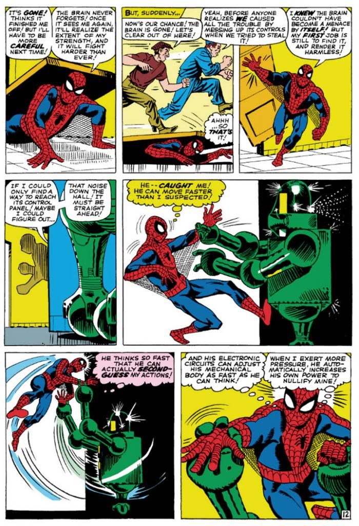
Then I learned of Steve Ditko from a Dr. Strange story collection. That he was the original Spidey artist meant I had to give his rendition careful consideration in light of its preeminence in Spider-Man history.  Well, it didn't take long for Ditko's vision to take over my imagination.  Here's a typical Ditko Spider-Man.

Amazing Spider-Man #8 (January 1964) Art by Steve Ditko

This is from Amazing Spider-Man #8 (January 1964), touted on the cover as a "Special 'Tribute to Teen-Agers' Issue!!"  Since the character himself is a teen-ager, Ditko's Spider-Man is muscular in a youthful, long-distance-runner way, but isn't quite as classically proportioned as some later versions.  While this isn't particularly a good example of it, Ditko also tends to put heavier shadows in the costume's blue areas, which makes me think his intention is for that part to be navy blue rather than the royal blue the subsequent Spideys sport, or even black.  But given the way comic books treated colors back then, and with all the recoloring and touch-ups in the years since, it's hard to say.  What we can see is Ditko favors larger eyes with heavier black outlines, to emphasize the insect-like aspect of Spidey's mask.  He aso gives Spidey more underarm webbing than most artists-- and it runs from his belt all the way to his gloves!

Using the three-tier page format, Ditko chops action into small increments, which makes sequences more movie-like and easy to follow.  But he also uses mostly medium shots, which keeps the action at arm’s length.  It’s simple storytelling at its finest, and reduces events to something approaching the comic book version of documentary-like as opposed to the heightened or epic.  Spider-Man’s powers may be the one fantastic element in a world Ditko means to represent our own, but he’s hindered by the same things we deal with ourselves and so we identify with him even if we’re not right in his face masking ourselves as him.  With his funky take on facial expressions and body language—with his rough-hewn finishes few of Ditko’s people are blatantly gorgeous—this makes Spidey’s adventures just a bit larger-than-life rather than massive.  There’s our trod-upon hero (literally) coming out from under a door, in the confines of some functional corridor rather than high above a cityscape.

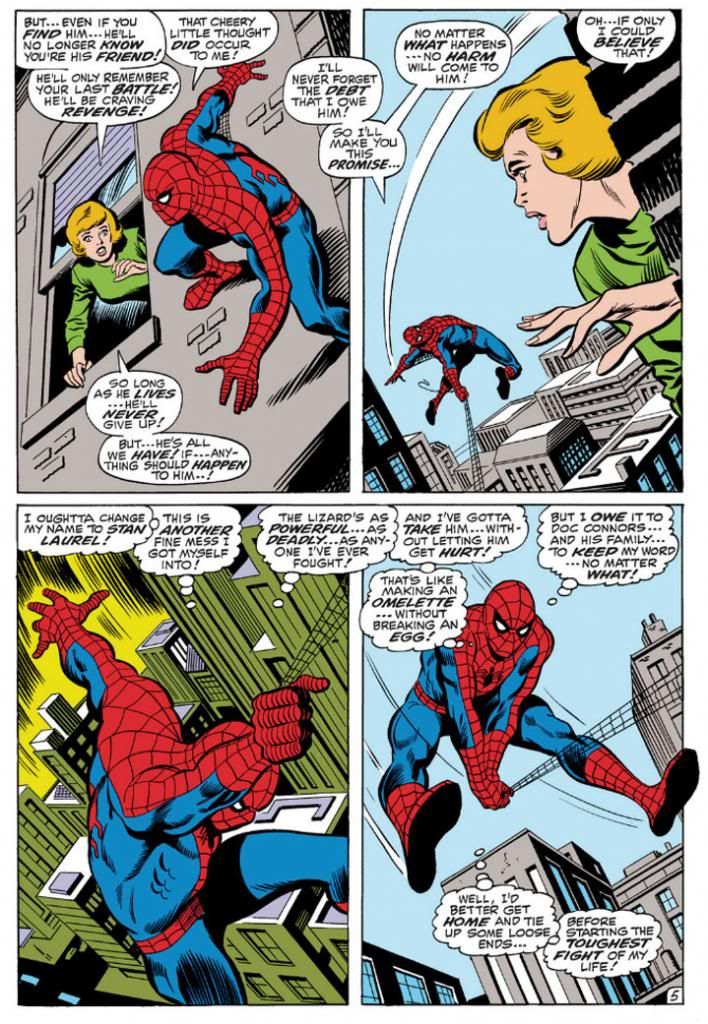
John Romita took over the title when Ditko left, but we'll look at him later because we're doing this in order of what I own.  So keeping that in mind, here's John Buscema's version, inked by Jim Mooney, from a few years later.  We have to acknowledge the influence of Romita's slight revision of the costume, but the rest is Buscema all the way.

Amazing Spider-Man #76 (September 1969) Art by John Buscema and Jim Mooney

Buscema’s Spider-Man (from an issue actually printed within my lifetime!) is muscled like some gorgeous Renaissance sculpture come to life, a full nine heroic heads tall.  Spider-Man, not Spider-Teen.  Buscema puts us inside the action and this time, the entire thing is made up of fantastic elements—other than the (fairly) realistic buildings, but even they’re skewed with deep perspective shots.  By varying panel size and shape, changing point-of-view and enlarging the images so he can fit only four on a page, Buscema creates a heightened dynamism that’s at odds with Ditko’s reductionism.  This isn’t to say one is right and one is wrong.  They may represent differing philosophies or thought processes on what constitutes heroism.  Or maybe Buscema just liked big takes.  Both are totally valid approaches, but I like how Ditko's Spider struggles a bit more.  On the other hand, Marvel tended to push Buscema’s powerful approach to storytelling on us through things like How to Draw Comics the Marvel Way.  This had a huge influence on my tastes as a teenager.
 
I don't see any armpit webbing on this page, but that may be because Jim Mooney forgot to ink it.  They include it on other pages, but it's subtler than Ditko's.
 
As much as I love both Ditko and Buscema, these days my preferred Spider-Man artist is his second penciller, none other than the aforementioned John Romita.  Let's take a look at his Spidey.

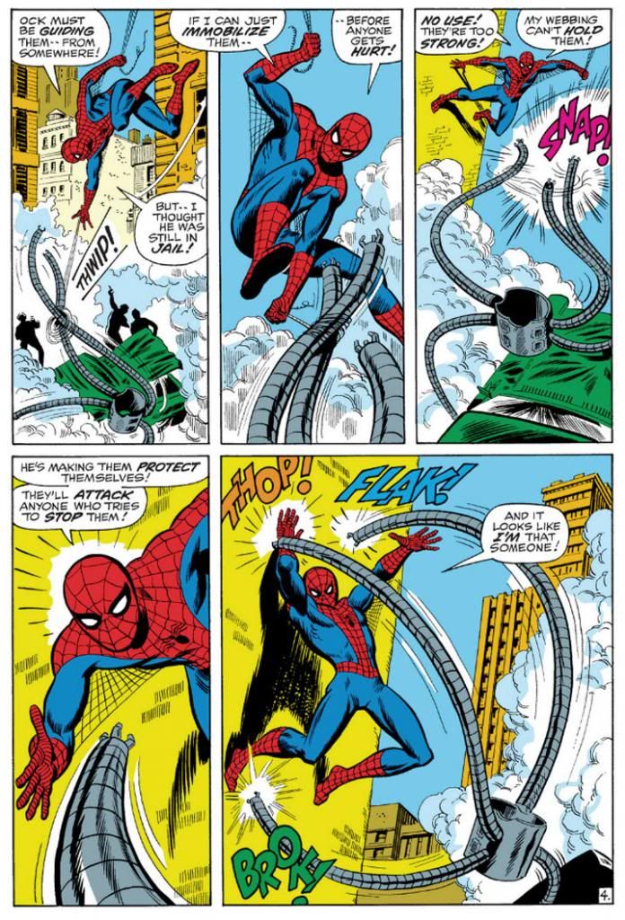
Amazing Spider-Man #88 (September 1970) Art by John Romita and Mooney

This is a clever sequence from the September 1970 story, "The Arms of Doctor Octopus!," where, true to its title, Spider-Man fights Doctor Octopus' arms.  Only the arms.  The good Doctor controls them from his prison cell.  Romita's Spider-Man is slightly slenderer than Buscema's, but they share body language.  Romita also brings us inside the action with this two-tier layout.  In the Buscema page, we have three Spideys roughly the same size with a smaller one for variety.  Romita gives us three Spidey sizes:  small, medium and large.  It's not quite as bombastic as Buscema's, but it's still bold.  Romita's characters tend towards the pretty, maybe due to his romance comics background.  I don't think anyone handled the soap opera stuff in Amazing Spider-Man better than Romita.  Slick Mooney finishes keep some surface consistency with line weights and the treatment of Spidey's blue areas.  I haven't seen the pencils for this page or the Buscema one, but I'm going to guess Mooney has a great deal to do with the near-identical eye and web pattern treatments.  The color choices here interest me, but I'm not sure how much is due to the original colorist and what might have been changed in the years since.  Anyway, it works.  Since Doc Ock's arms are gray and wouldn't have popped in the foreground otherwise, notice how the buildings on the Buscema page are gray, but the colorist here used a lot of yellow and yellow-orange.

Also, THOP!  FLAK!  BROK!  And the return of the armpit webbing.  It's finer than Ditko's and only reaches Spidey's elbows.

While I've stated my preference for Romita, I wouldn't care to meet the fan who finds fault in Gil Kane's interpretation.

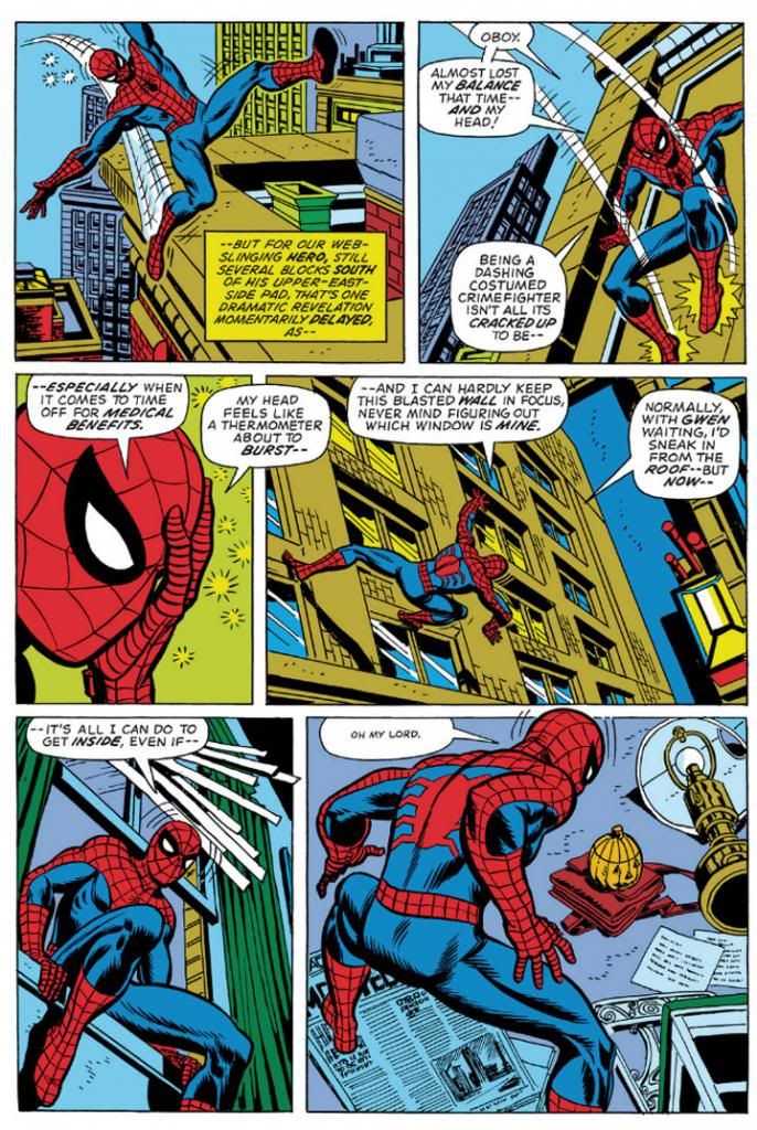
Amazing Spider-Man #121 (June 1973) Art by Gil Kane and Tony Mortellaro

Here's our first extreme close-up!  It appears in Amazing Spider-Man #121 (June 1973), in a story you may have heard of called "The Night Gwen Stacy Died."  Not sure what happens in that one, and with an obscure title like that, your guess is as good as mine.

But I am pretty sure Ditko, Buscema and Romita all used close-ups before Kane.  But Kane, like Ditko, excelled at facial expressions.  Look at some of his cover work with those giant screaming heads.  Kane puts extreme close-ups to effective use throughout this issue.  Yeah, Peter Parker's face is hidden under a mask most of the time, but the idea's basically the same.  This is an important little moment Kane chooses to emphasize with a cutaway to Spider-Man holding his head because it "feels like a thermometer is about to burst--"  Spidey on this page isn't feeling well, and in his one high-flying moment of web-swinging, Kane gives him wonky body language, then confines him to wall-crawling and slipping in windows and crouching on newspapers.  I like the last panel especially, with the high angle from-behind shot giving us both Spider-Man and the pumpkin bomb he's reacting to all in one shot.  There's a nice use of a missing panel here, with Spidey on the windowsill cutting to Spidey in the room in such a way the omitted leap is implied.  It's almost animated.

No armpit webbing.

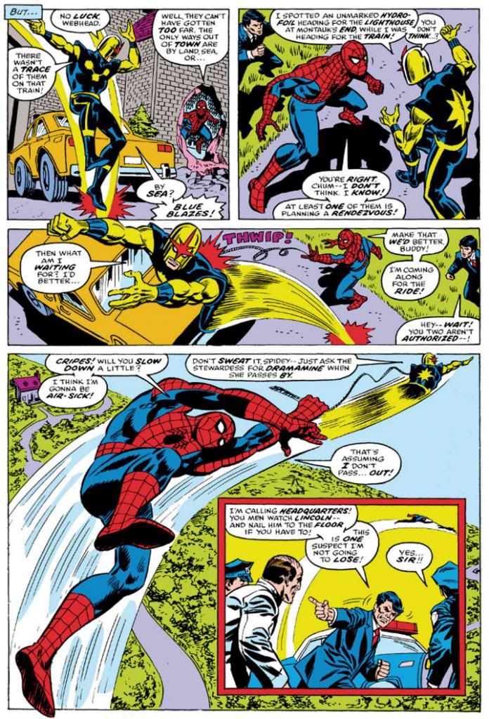
Ross Andru, who drew Amazing Spider-Man for five years (impressive!) gives us two superheroes for the price of one, but we're going to ignore Nova and his golden bullet-helmet.

Amazing Spider-Man #171 (August 1977) Art by Ross Andru and Mike Esposito

Once again, we have medium shots and three panels in a row with high angle views, the last with a larger foreground Spider-Man inducing vertigo as Nova drags him through the air.  And then an inset panel with the two of them so high they're tiny to the cops left behind on the ground.  Andru's Spider-Man retains the crouching body language of Kane's, but is noticeably chunkier than any of the ones we've looked at previously.  He's got the Ditko-style dark shadowing on his blue uniform areas (maybe inker Mike Esposito contributed that part), but again, none of the armpit webbing.  Did Marvel abandon that look, or was that an Andru flourish?  It's not as if the armpit webbing has any real function and it wouldn't have worked in the panel with the largest Spidey anyway-- it would have obscured his chest and been a challenging artistic exercise for Esposito, like when a penciller puts speedlines in front of an object.  How do you look through those?  Do they distort the background image?  Just how much of that should remain for clarity's sake, or for simplicity?

Andru came over from DC where he worked on war comics and Wonder Woman.  Can you see any of those elements informing his work here?  I know he did a classic take on Wonder Woman and he's giving us a clean, house-style Spider-Man on these pages.

Oh, and the yellow sky in the inset panel.  That was originally the work of Glynis Wein, who colored a pile of Marvel books.  It reminds me of Harvey Comics.  For some reason, colorists at Harvey seemed to love making the sky yellow.  Here it makes a good depth contrast for the figures heavy on the blue side in the foreground. In fact, whoever colored this seems to have put some extra effort into popping figures by contrasting cool colors on top of warm (although you still have to put up with Nova's yellow arms).  I'd love to see the original printed page to see how accurate Marvel has recreated Wein's colors here.

And there you have it.  Ditko, Buscema, Romita, Kane and Andru.  They're in my Spider-man Hall of Fame.  Yeah, I like the way Ron Frenz and John Romita, Jr. and even John Byrne-- to name three more-- draw the character, but when I think Spidey, I think Ditko, Buscema, Romita, Kane and Andre.  Their versions combine into my platonic ideal of Spider-Man.

Tuesday, October 15, 2013

October is Spookey Month: Tomb of Dracula #7 introduces Edith Harker

We all know how Quincy Harker's daughter Edith meets her doom-- staked by her own father in Tomb of Dracula #12, "Night of the Screaming House" (September 1973).  But how did she find her way into the pages of Tomb of Dracula in the first place?  It happens in #7 (March 1973) "Night of the Death Stalkers," (lotta "nights" going on here) with her father making his debut a page or two later.

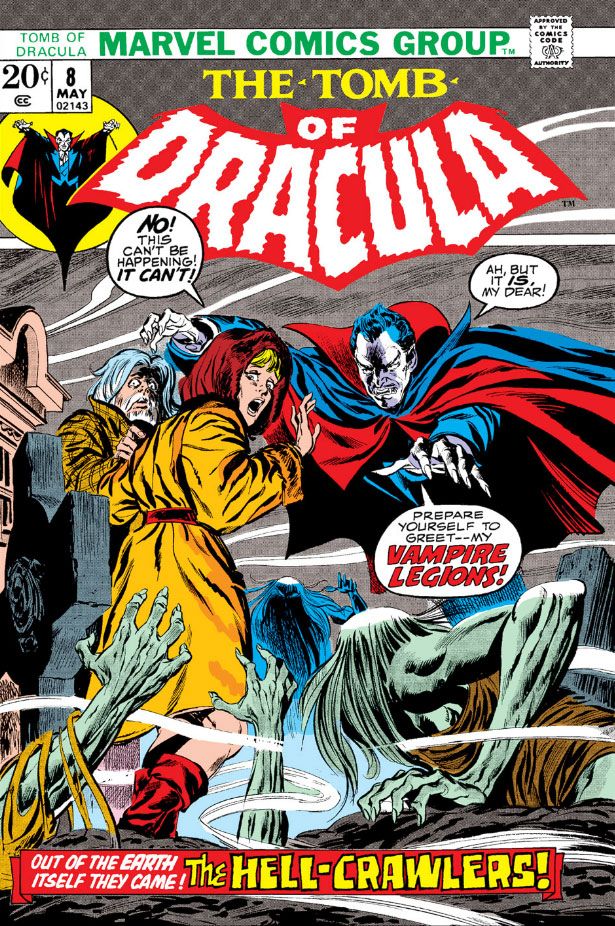
Let's look at the cover before we get into the story.  Doesn't Dracula have a fun sense of humor here?  This is some clever copy and it hooks me immediately.  The drawing is by Larry Lieber, Stan Lee's little brother.  It gives readers a fairly accurate depiction of the story inside.  It's not nearly as dynamic as some of the series' Gil Kane covers, but Kane was one of those "gold standard" cover artists and it's not really fair to compare anyone to him.  And yet I just did, didn't I?  What I like about Lieber's cover, however, is he makes Dracula look a lot like Hammer Studios' own Christopher Lee, the finest of all screen Draculas (and tallest).  I'm going to assume Lieber agrees with me and that in itself is more than enough to recommend this cover.  I'm in favor of Gene Colan's "casting" of Jack Palance as powerhouse, intensely masculine Dracula inside the pages, but the more sinisterly refined Lee played Dracula for a longer period and emerged with dignity intact despite some increasingly silly material like Dracula, A.D. 1972 and Satanic Rites of Dracula, both of which provide prototypes for Tomb of Dracula.  You know, Dracula in the modern age, tooling around London and swingin' hippies and mods and all that.  So Lee is also very appropriate.  Anyway, the cover does its job competently if not spectacularly, but it's still fun.  The issue preceding this one had a Neal Adams cover, by the way!

Take a deep breath, because here... we... go...

In this issue, Rachel van Helsing introduces her pal Frank Drake to the Harkers and they form a vampire-fighting association the likes of which the world had never seen.  Well, not really.  It's a group similar to the one Bram Stoker came up with in his original novel, the one that started this whole Dracula business.  I've always liked vampire-fighting groups, and Tomb of Dracula's is far and away my favorite because everyone is a bit edgy and damaged.  While Marv Wolfman's core cast coalesces, their enemy, the famed count himself, self-styled Lord of the Undead, is busy making new friends of his own.  Because Tomb of Dracula #7 has a lot more going for it than just the first appearance of Edith Harker and her dad.  It also has one of Dracula's most sinister plans-- hypnotizing a bunch of kids into killers.  Kids, killers.  They both start with the letter k, and lemme tell you, there are some kids out there who would just as soon slit your throat as look at you even without a vampire master giving them hypnotic orders.  Slit your throat, then enjoy delicious Honeycombs cereal as a part of any complete breakfast.

Dracula's logic for this is while Harker and company would stop at nothing to kill vampires, they're not about to murder children, not even to save their own lives.  Turns out he's right.

This set-up reminds me of Village of the Damned, that truly disquieting film where time stops in a quaint village and nine months later a cadre of identical blonde babies arrive.  They grow up into sinister children who delight in murder via telepathy and wearing blonde wigs.  It's also reminiscent of those Simon-Kirby kid gangs of yore.  The killer Boy Commandos in Tomb don't wear wigs and they don't engage in any witty repartee, but they do sport some eerie glowing eyes as they silently and relentlessly pursue our heroes.  They do such a good job of it, the story stretches into Tomb of Dracula #8 (April 1973), which has a John Buscema cover.

Getting back to Edith.  Since we've already covered Edith's final moments, let's take a look at her first.


I'm going to assume she works at the chemist (that's "pharmacy" or "drugstore" to us colonials) Colan draws her leaving.  Gosh, it sure is cold.  I hope she gets home all right...


Oops!  No such luck.  Yes, she is the book's jeopardy queen.  Still, a bash in the face is better than a bite on the neck when you're dealing with the undead, and it's Edith Harker's good luck to have come face-to-face with the boss of them all and come away with only a bruise.  Dracula seems kind of a quitter here, though, doesn't he?  Edith's wearing one measly little cross.  Where is Dracula's amazing hypnotic gaze to make her take it off so he can feed on her?  It takes him about two seconds to enthrall those kids.

Speaking of which, here they are:


It looks as though someone at Marvel did a really clumsy art touch-up on Dracula's head in the fourth panel.  The face is Colan/Palmer, but the wonky perspective on the forehead (the widow's peak is turned a few degrees from where it should be both vertically and horizontally and there's no foreshortening despite the slightly low-angle view of Dracula's head) and the hair texture look completely alien.  Why?  Maybe the page passed through the inking and lettering stages with the top balloon coming out too large and covering too much of Dracula.  The editor decided we needed more of Dracula's head in there, which meant reducing the balloon and getting someone on staff to touch up the missing areas.  Just speculating about a hypothesis, but it also looks as if someone mistook Dracula's left hand for one of the background trees and colored it brown as a result.

Here's one of the most disturbing aspects of vampire lore-- the corruption of innocence.  Stoker used this is a major theme in his novel, and Wolfman picks up on it.  In Stoker's book, Dracula's first victim is the virginal Lucy Westenra, the ideal of proper young womanhood in the Victorian Age.  By the time Dracula is through with her, she's feeding on babies in a parody of nurturing motherhood.  Wolfman's Dracula will stop at nothing in his quest for power or whatever he holds as his ultimate goal and a bunch of boys become his weapons.  They're very effective, surprisingly so.  They chase Frank and company right out into the night and trap them in an old-fashioned car and there's not a thing anyone can do about it.

In fact, the hypno-kids do such a fine job of taking Dracula's enemies out of the fight, he finally has a little leisure time on his hands.  The next issue (nicely inked by Ernie Chan-- credited as Chua thanks to a bureaucratic screw-up on his immigration documents) sees Dracula using this free time to recruit some even more sinister allies, a lot of moldy vampires.  I think he should have stuck with kids.  Imagine Dracula getting himself on TV, perhaps taking one of those horror movie host jobs, or showing up at a station where they do one locally and beaming his powers across a wider area, ensnaring hundreds, perhaps thousands, of children and turning them against the adults.  Kind of like Halloween 3, but without that Silver Shamrock rhyme to get into your mind and stay.  And stay.  AND STAY.

And here's where it turns out I owe Edith Harker something of an apology.  She first appears as a typical damsel in distress, and goes out that way as well.  But she gets to come to the rescue herself at least once before Dracula and dear old dad put an end to her once and for all.

And here she is:


You go, Edith!  Sorry they didn't get your hair color right in this, your shining moment.

Wednesday, March 27, 2013

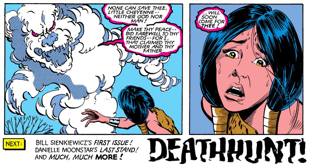
Dani Moonstar, the Early Years 3! Mutants in Rivalry

By the time the first year of The New Mutants drew to a close, Dani Moonstar had assumed leadership of the team.  Co-leadership, but come on, obviously Sam Guthrie was a mere figurehead, there to rubberstamp Dani's decisions and give the others a sense of false security that they were in anything other than a benevolent dictatorship headed by the Coolest Comic Character Ever Created.

Unfortunately, the comic itself had become lethargic, with lackluster plots and art to match.  While it had once promised to become the platonic ideal of a Chris Claremont book-- ostensibly empowered teen girls repeatedly finding themselves bound and gagged and forced to wear skimpy costumes, a couple well-meaning but vaguely dim-witted dudes, all of them awash in a frothy mix of soap opera-ish personal drama, mundane daily events and superheroic adventure complete with overwrought dialogue filling each panel with dense word-walls-- The New Mutants had become simply generic, a timid tag-along to its older, wiser sibling, Uncanny X-Men.

Dani had earned her starring role in what was supposed to be an ensemble book by defeating all comers-- her creators, teammates, the Hellfire Club, an alien insect, a space empress, a Mr. T rip-off, holdovers from the Roman Empire, some kind of soul-sucking witch who wanted to adopt her as an apprentice.  All had challenged Dani's supremacy and all had fallen before her strength of character and force of will.  While writer Claremont made a few efforts to re-establish the team dynamic, Dani was having none of it.  Until Claremont presented her with her most dangerous foe.

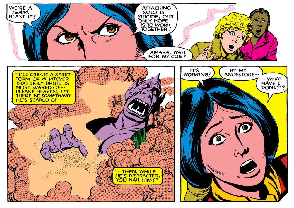
Chris Claremont, script/Sal Buscema, Tom Mandrake, art (The New Mutants #14,  April 1984)

Illyana "Magik" Rasputin had been around for a few years as a minor X-Men character, little sister to metal man Colossus.  In fact, she made her first, albeit nameless, appearance in Giant-Size X-Men #1 (April 1975), the legendary issue that showed the world international stereotypes could be forged into a top-selling comic book fighting force.  The first time we see Illyana, she's practically an infant, and Soviet agricultural technology being what it was at the height of the Cold War, her big bro has to use his mutant powers to save her from a runaway tractor on their collective farm.  This could not have happened at a privately-owned farm here in the Free World.  Our tractors are the flawless product of a capitalist system, where the invisible hand of the free market has already weighed and rejected any farm machinery that doesn't work exactly as advertised.  Illyana survives her brush with the ineptly-manufactured product of a flawed, atheistic political system only to grow up into a young woman best described as...

Semi-evil.

Chris Claremont, script/Sal Buscema, Tom Mandrake, art (The New Mutants #14,  April 1984)

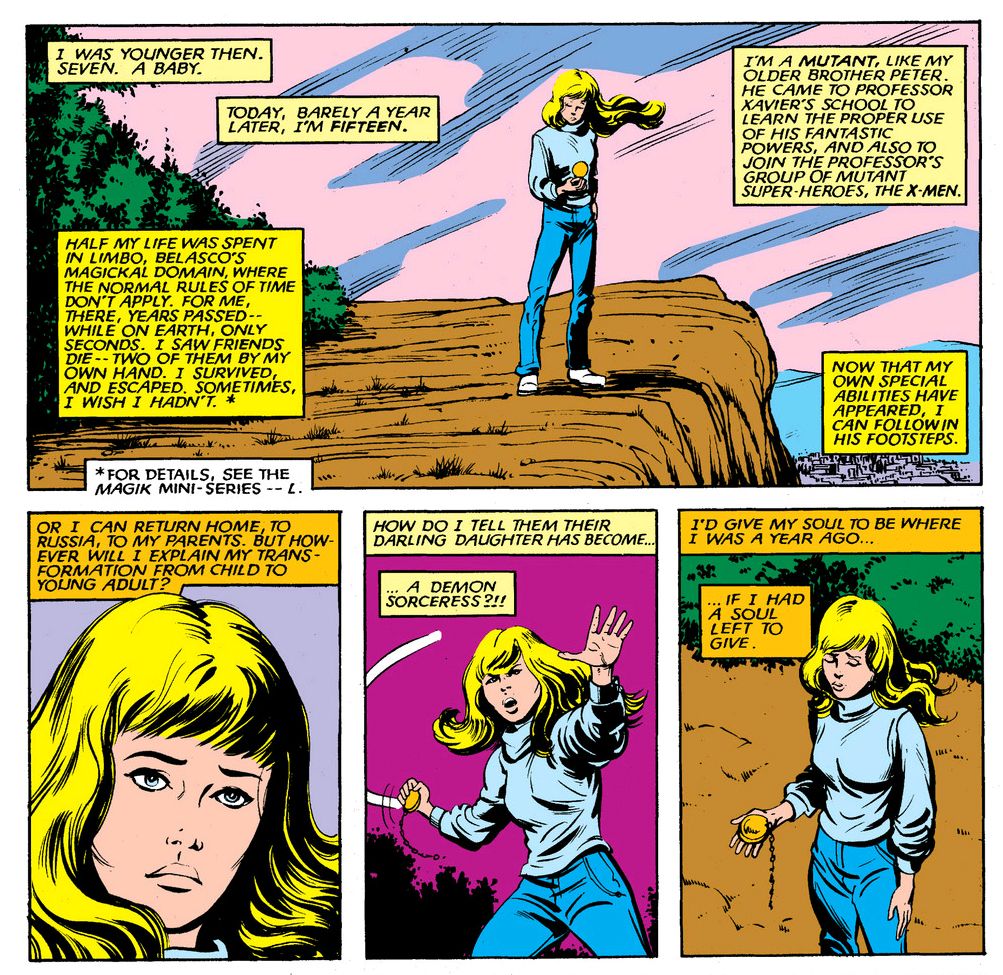
Claremont's crafty plan to undermine Dani and wrest control of his comic from her originates in Uncanny X-Men #160 (August 1982), where Claremont and art team Brent Anderson and Bob Wiacek have a demon named Belasco spirit the child away to a timeless limbo called, conveniently if unimaginatively, Limbo.  At the end of the issue, Illyana pops back in, only now she's thirteen years old and she's not only a mutant, but also a demonic sorcerous with a magical sword that manifests itself from time to time.  Flash-forward two years and, with Dani putting pressure on editor Louise Jones to have her book re-named Moonstar and the Other Mutants, Claremont knew it was time to take decisive action.  He tossed Illyana, now code-named Magik, into The New Mutants and instantly changed the book's power structure.

While no scheme or villain the increasingly desperate creative team could devise would force Dani completely into the background, she would now have to learn to share the spotlight with Magik, who appears to have been especially beloved by Claremont, possibly because she embodied a number of his characteristic tropes of this era-- a young girl with vaguely BDSM leanings, a penchant for transformations and inner turmoil lending itself to verbose internal monologues.  Plus frequent opportunities to indulge himself in baroque adjectives like "eldritch" and the creation of portmanteau words like "Darkchild" and "Soulsword."

Chris Claremont, script/Sal Buscema, Tom Mandrake, art (The New Mutants #14,  April 1984)

Not one to underestimate Dani, Claremont and Jones knew they had to do more than simply foist Magik off on the New Mutants.  They had to further enhance Magik's position as prime Dani-challenger.  Rather than dole out Illyana's Limbo experience through the occasional flashback or multi-panel thought bubble reverie, Claremont teamed with artists John Buscema, Ron Frenz, Sal Buscema and Tom Palmer to produce Storm and Illyana: Magik, a four-issue mini-series, from December 1983 to March 1984.  Wow, Marvel was really pushing Magik on their readers, weren't they?  What Dani did organically by inhabiting the book with her own innate awesomeness, Magik would do through corporate strategy.  Top that, Dani!

In fact, under the aegis of Claremont and with the approval of Marvel's upper echelon-- specifically, editor-in-chief Jim Shooter, who feared Dani might supplant the Amazing Spider-Man as the company's flagship character and force them to produce a whole slew of new promotional materials as well as wreck their deal with toy manufacturer Mattel (the company licensing Marvel's heroes for a line of action figures and play-sets based on Shooter's Marvel Super Heroes Secret Wars title, due to hit the shelves in May of that year)-- Magik gets to do something Dani never could: she actually narrates her very first The New Mutants issue, #14 (April 1984), in a story called "Do You Believe in Magik?" (Marvel certainly did!) which is all about how her twisted minions journey to Xavier's school to steal her back. Claremont and Sal Buscema even gift Magik with those solo pages once accorded to Dani.  Oh, you know Dani felt the sting.

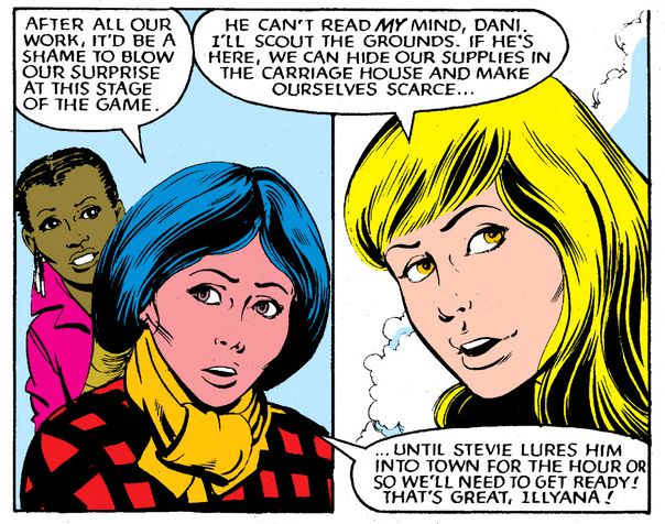
So, how did Dani handle this upstart?  Actually, the career-savvy Dani was smart enough to cozy up to Magik almost from the start, quickly becoming her partner in crime.  Mild crimes, like planning a party for Professor X and trying to figure out how to surprise a guy who can read your merest thoughts.  And adding Magik to the group proved to be a move of pure Claremontian genius, because it was at this point The New Mutants began to develop its own voice, becoming darker and more mysterious.

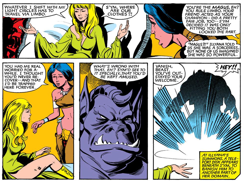
Much as the artistic tension between Paul McCartney and John Lennon fueled some of the Beatles' finest albums, the strange dichotomy between the straight-forward Dani and the shadow-motivated Magik recharged Claremont's creative batteries.  The first pairing between these visual and philosophical opposites comes during the Mutants' multi-part battle with Emma Frost's Hellion team (caused by that snobby Kitty Pryde) in The New Mutants #15-17 (May-July 1984).  While this kind of story-- where the stakes are nothing more than deciding which fake philosophy will triumph while people wearing different-colored clothes clash meaninglessly-- never impressed me, it does provide us with a glimpse of better things to come when Magik takes Dani to her personal hell-dimension and introduces her to leather vest and ass-less chaps.

Chris Claremont, script/Sal Buscema, Tom Mandrake, art (The New Mutants #16,  June 1984)

Oh, and S'ym, one of those Claremont touches where he pays homage to whatever comic book he happened to be a fan of at the time because the world of comics in the Eighties was just one big, happy family of like-minded creatives making fabulous art.  So you'd see a poster featuring certain properties hanging in Kitty Pryde's room, or one of Dani's friends would gushingly mention a sci-fi/fantasy writer you just know Claremont had dinner with on a regular basis or at least hung out with after hours at some comic convention or another and you'd go, "Wow!  Even though I'm a dork, I'm validated because a fictional teen who has amazing adventures across space and time also likes the same weird things I love that everyone in my real life thinks are a waste of time!"

I mock, but I really have to thank Claremont sincerely for that because it did keep me going during those lonely, masturbatory years.

What point was I making?  Oh yeah.  S'ym.  S'ym is Magik's demon assistant, but his name is curiously similar to a particular Canadian independent comic book creator's and he just happens to somewhat resemble that creator's famous aardvarkian-barbarian creation right down to his vest.  His lurid interest in "amusing" Dani is probably reminiscent as well, but it's been years since I last read anything about earth pigs.

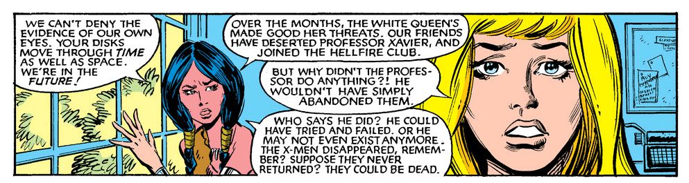
Chris Claremont, script/Sal Buscema, Kim DeMulder, art (The New Mutants #17,  July 1984)

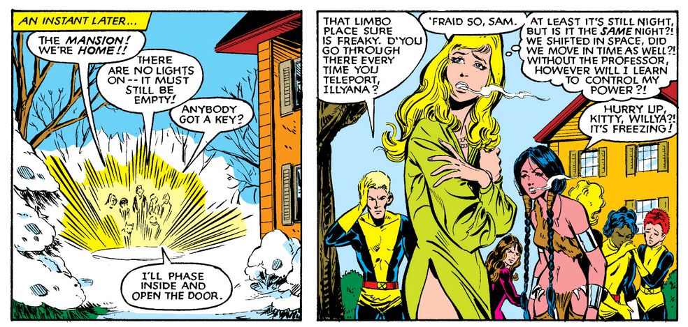
Well, whatever his inspirations, the now fully-engaged Claremont has both girls work together to save the team this time (from a nasty future in which they've become Hellions) for almost two full issues.  And throughout, Dani refrained from plunging her knife into Magik's semi-evil heart and Magik didn't transform Dani into a toadstool and sit on her.  Progress of a sort, I guess.

Chris Claremont, script/Sal Buscema, Kim DeMulder, art (The New Mutants #17,  July 1984)

 Speaking of progress, the success of the Magik-gambit led Claremont to inaugurate phase two of his plan.  This involved the arrival of Bill Sienkiewicz on art duties, and would see The New Mutants become more consistently interesting and genre-expanding than the book it spun-off from.  Which in turn benefitted Dani, because without Magik giving Claremont the impetus to start experimenting and moving away from stale Uncanny X-Men cast-off plots and toy line team-ups, Dani might not have achieved her greatest victory, over a plot element introduced way back in the very first issue and all but forgotten since.

Which would very nearly prove Dani's untimely death, leaving Magik the undisputed lead character.

Chris Claremont, script/Sal Buscema, Kim DeMulder, art (The New Mutants #17,  July 1984)

Thursday, October 18, 2012

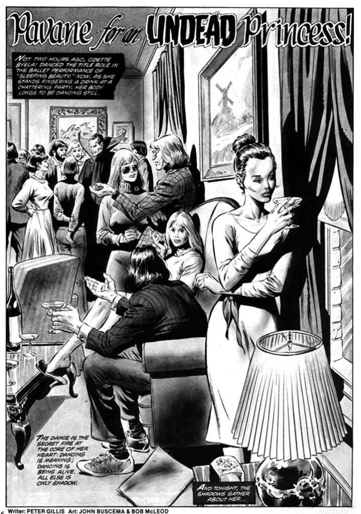
October is Spookey Month: "Pavane for an Undead Princess!" (Tomb of Dracula Magazine #5, June 1980)

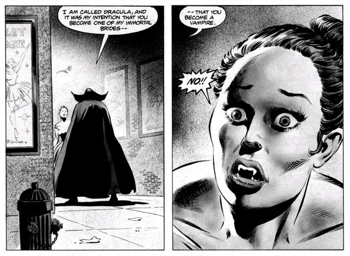
If it takes a soul to appreciate music truly and deeply, what happens when a prima ballerina, whose very being is dance and music, becomes a vampire?  That's the question brilliantly asked and answered in "Pavane for an Undead Princess!," which, despite its flaws remains a short, tragic gem.  Peter Gillis's story reminds me of a vampire Black Swan and I can easily see Natalie Portman essaying the starring role of Odette.

Yes, the ballerina character's name is Odette.

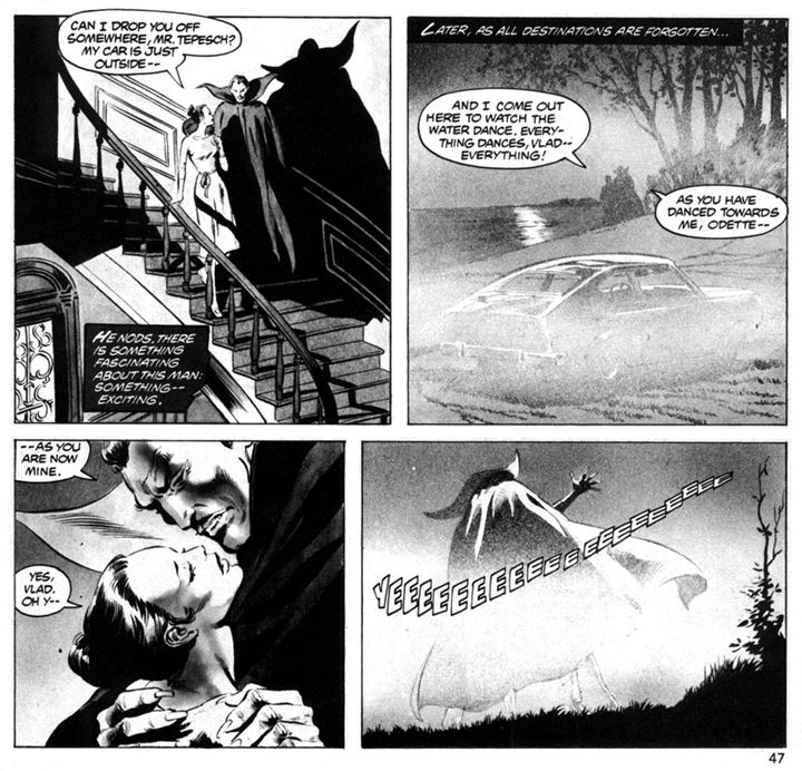
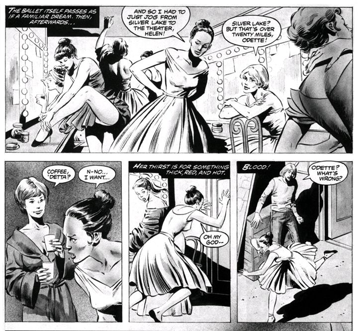
Odette, as Gillis tells us, lives to dance.  We first see her standing aloof against a windowsill, gazing moodily into the night.  She's not a snob or some sort of arrogant pseudo-princess.  It's that she can't even enjoy an after-party with her snooty artsy friends because her muscles "long to be dancing still."  Then she makes the mistake of leaving the party with a cloaked gentleman calling himself Vladimir Tepesch.  If only she'd spent more time watching In Search Of... and less time mastering her art, she might have avoided her fate-- waking up later in the woods with her car missing and having to run 20 miles back to the theater where Greg, the poor man's Alexander Godunov (who had defected from the USSR just a year before this story saw publication), gapes at her and wants to know where she's been for three whole days.  Remember those three days in case you ever find yourself in Odette's pointe shoes-- in classic vampire lore, the vampire's resurrection mocks Christ's; Gillis knows his stuff.

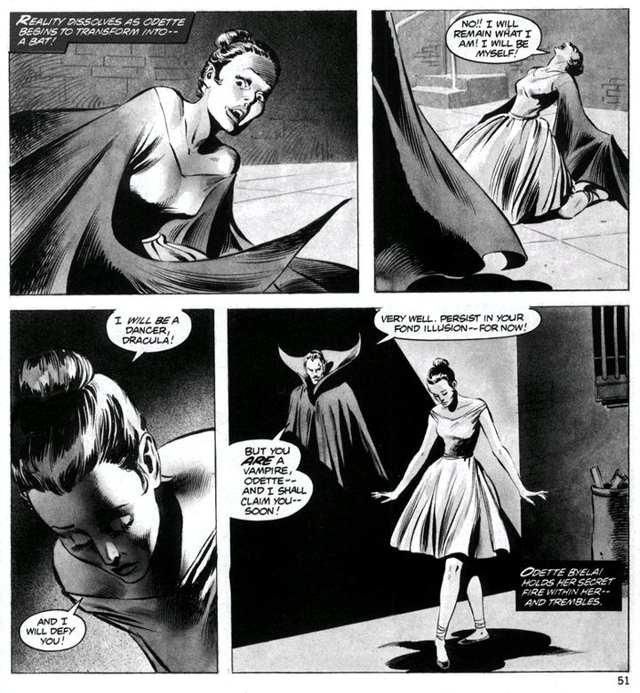
Anyway, Odette learns she's undead.  She refuses to accept it even when Dracula transforms her partially into a bat.  No, she has to spend her nights dancing rather than skulking around in the shadows sucking blood.  I'll have you know Isadora Duncan simply adored skulking and sucking.  But not our Odette.  She goes on an extended dance tour, then returns to her apartment and throws herself into practice, only to discover as a soulless monster she no longer has an ear for her favorite composers.  First Prokofiev, then Tchaikovsky devolve into "NOISE!  NOISE!  NOISE!!"  This is the kind of reaction that puts a bit of a crimp in your dance career.  Odette reminds me of some friends of mine who, when they turned 30, suddenly told me they couldn't relate to any of the new music and were becoming interested in blues and soft jazz.  In other words, "I'm old now, so I hate music."

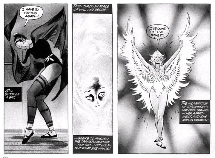
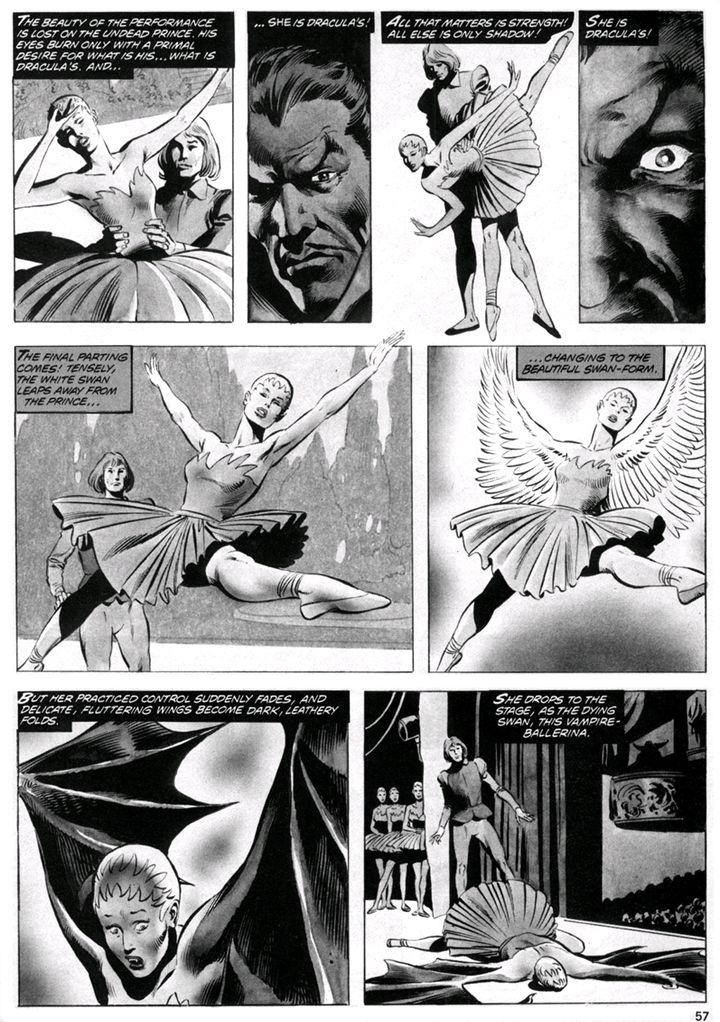
Actually, I'm a little puzzled as to how Odette was able to perform to their music for weeks before this breakdown.  Maybe this particular symptom of being a vampire takes a few weeks to present.  We never find out, but that's a relatively minor plot hole we have no time to investigate because Gillis quickly covers for himself with a brilliant inspiration, possibly the source image for the entire story:  Odette finds she can use her vampiric powers to morph not only into a bat but also into a half-swan... or even a full one.  She gets Anatoly (sounds like a Commie name if you ask me), her company's choreographer, to help her reconfigure great ballets into showcases for her amazing new abilities, but she can't escape the vampiric curse and it all ends pretty much the way Black Swan ended but with more self-impaling and none of the self-pleasuring.

And it also requires us to ignore that losing the spirit of music thing again, but maybe Odette comes up with some way to compensate.  Earplugs and strictly counted beats or whatever.  It's not as if music is all that important to dance, anyway.

While the page count reduces Gillis to telling rather than showing Odette's obsession with dance and her posthumous performance rebirth-- first a collage-like panel and later, after she starts using her metamorphic powers, a single panel with just the ballet titles-- the prima ballerina's plight still moves.  She's truly done nothing to bring this curse upon herself and then she's propelled along a tragic path similar to the characters she danced during life, damning herself in a moment of weakness and rage.  And ol' Dracula is a complete bastard.  He cares only for beauty only so much as he can possess it, but his touch inevitably corrupts and destroys.  Like the parasite he is, he'll move on to other victims.  But Odette loses more than her soul, and even her ultimate triumph is couched in death and her sad isolation from that which she loves most.

John Buscema provides his usual sold storytelling, largely confining his layouts to the three-tier format.  Each page is a little miracle of panel-to-panel continuity, but the real star here is Bob McLeod.

If I remember correctly, Buscema usually worked pretty loose and left a lot for the inkers to finish.  As a result, this art job looks a lot more like McLeod's solo work than a strictly Buscema job might, or one inked by Tom Palmer, Ernie Chua or even Big John's preferred partner, his brother Sal.  I've always admired McLeod's work on his solo efforts, and his figure construction and detail work-- such as how he deals with cheeks-- was always a bit Buscema-esque anyway, so they make a fine team here.  I don't know how much of the black-spotting Buscema indicated in his pencils, but McLeod's use of dark shadows pooling around the characters or climbing the walls behind them works wonders in creating a subtle menacing mood.  Dracula himself seems to loom out of darkness or carry his own shadows with him wherever he goes throughout this story, setting him somewhat apart as a malevolent force crawling up from Odette's own id as the vampire's power over her grows and distorts her life's work.  McLeod also lays down gray tones and creates lighting effects during Odette's transformations with what appears to be airbrush.  Reading some of these later Marvel mags, a lot of inkers seem to have been enchanted with the airbrush for tonal work as opposed to doing the traditional ink washes.  I wonder if there's some Richard Corben influence going on there, or if the airbrush lent itself to faster turnaround times, or perhaps a little of both.

Bob Mackie vampire.
Whatever the reason, the end result is lovely to look at.  A minor classic.  Kind of like that ballet I wrote back in 1994, Who's Watching the Kids, based on the 1978 NBC television comedy starring Caren Kaye, Linda Goodfriend and Scott Baio-- where Jim Belushi made his national debut.  I myself danced the Belushi role.  We would have taken it to larger venues but I pulled a calf muscle and we had to cancel the final performance.  After that, funding for the arts just dried up and it was back to working retail.  Now I'm prepping a ballet based on the Kaye-starring sitcom classic It's Your Move, where she played a scheming Jason Bateman's mom opposite Married With Children's David Garrison as her love interest.  La danse, c'est le mouvement, et le mouvement!