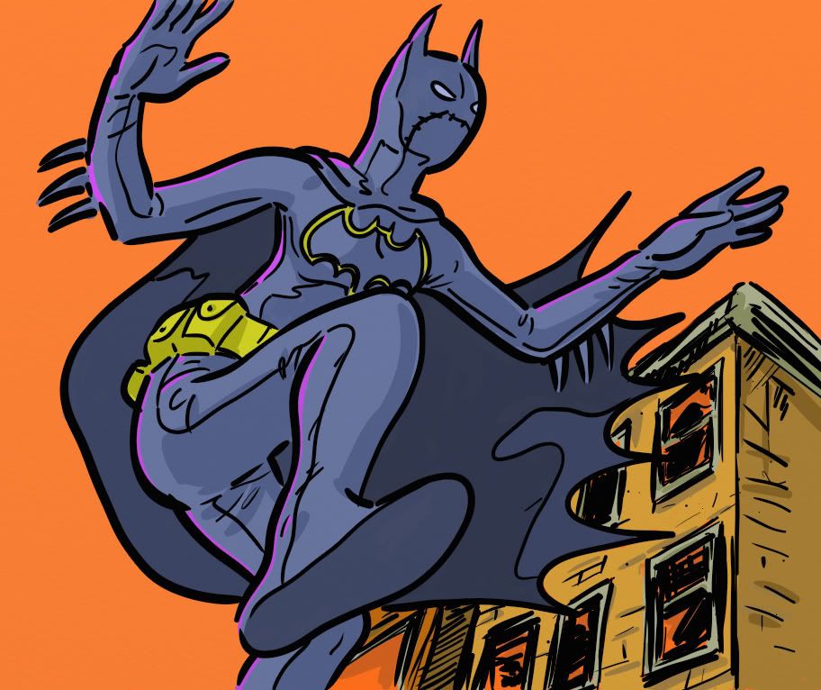
Here's yet another sloppy exercise from my sketchbook. Drawn in a flash, laboriously colored because I had this weird idea to make the sky orange and see what happened. There's no balance to this composition, Batgirl's pose is as awkward as her figure construction and just when you thought it couldn't be any more rushed, I hurried on the buildings behind Cass.
But you know what? Cass seems to inhabit a "real" space because the linework somewhat matches and the buildings have a rough hewn solidity about them I find lacking in a lot of today's comics. Case in point: Dark Horse's Free Comic Book Day Doctor Solar Man of the Atom/Magnus Robot Fighter giveaway from 2010. The backgrounds in the Magnus story work well with the foreground elements to create a seamless whole. But the Doctor Solar story looks sterile and the surfaces lack texture; it hurts the believability of the setting and made the art seem half-finished.
Then again, I tend to prefer artsy artists with looser finishes like Alex Toth, Joh Kubert, Guy Davis and Kojima Goseki to the slick finishes a lot of pros use today. Or if it's slick, I like it skewed a little towards the cartoony a la Jaime Hernandez. Anything warm and inviting. Appeal is at least as important as mechanical technique. Probably more so.

No comments:
Post a Comment