
I'm not going to complain about anyone here. There aren't any inkers whose work on Kirby I absolutely reject. I can think of good things to say about all of them, lots of positives. But like anyone, I have my own favorites. The ones that ring my bell more than others. And I don't think my choices are particularly avant garde. But since I have a blog and a big mouth, I'm going to share them with you right now.
Mike Royer is my top Kirby inker. This isn't any big surprise. He's a top pick of a lot of Kirby fans. It's not enough simply to show fidelity to the pencil lines. A lot of pros and amateurs can run ink over Kirby's pencils and come out with passable finishes. But simple tracing in ink can flatten forms sometimes kills the energy and Kirby, if anything, is all about kinetics and energy. While Royer is very true to Kirby's lines, I think he gets the intent right, and his own top-notch drawings skills means he understands the roundness of physical form and can fix little things where Kirby goes astray.
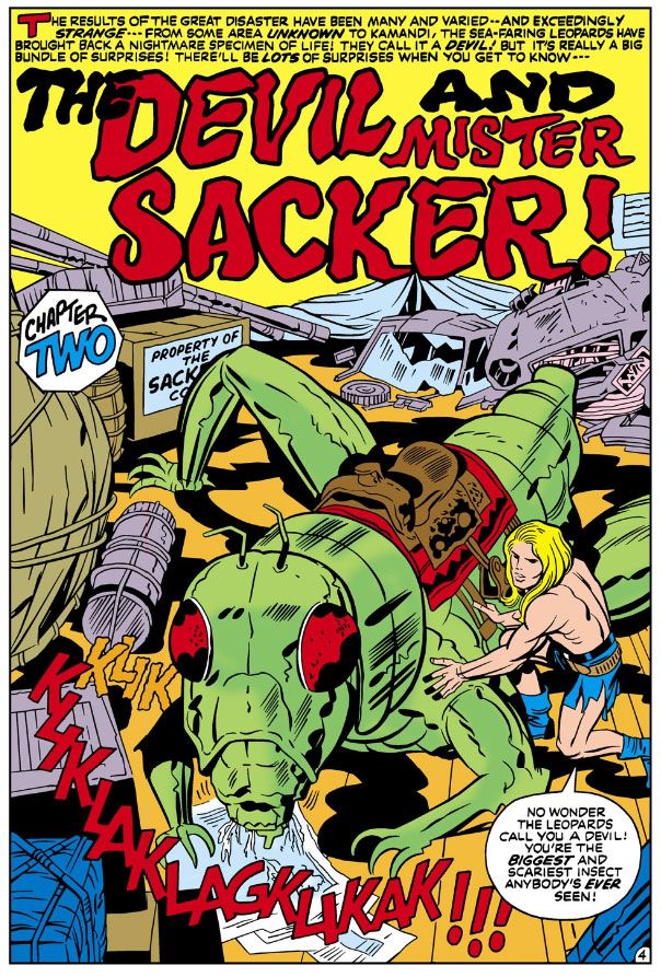 |
| Kamandi #12 (December 1973) by Kirby and Royer |
And face it, Kirby's take on anatomy is peculiar to Kirby. It approaches the abstract at times, with flattened s-forms standing in for all kinds of muscle shapes and drapery folds. Royer has the ability to make sense of it and give us something that's very Kirby on one hand, and very "readable" on the other. I've seen some complaints about his lettering-- especially the bold, display "fonts"-- but I dig that stuff the most. It all goes together into a complete package, very of its time but, as a result, timeless in that it's not faddish.
My second favorite is a little bit of an oddball choice, ever so slightly. It's Chic Stone. While Joe Sinnott slots in at #2 for a lot of people who also put Royer at #1 (and Giacoia is also a popular second choice), I find Chic Stone's cartoony interpretation of Kirby's pencils to have the most of that elusive concept we call "appeal" of any Kirby inker. Stone's inks bring out the pop art fun inherent in Kirby's mid-60s Fantastic Four work. He, like Royer (and Sinnott and Giacoia), could actually draw on his own, so he's not simply tracing the lines.
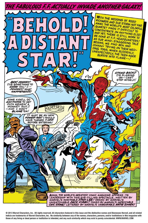 |
| Fantastic Four #37 (April 1975) by Kirby and Stone |
It's not that I find him "better" than Sinnott or Giacoia and I'm not trying to argue anyone out of those as their choices. It's that my sense of aesthetics responds more joyously to Stone's interpreting Kirby through an almost animation-art lens. So we get these thick contour lines and finer details within them, and large, open areas for color. Stone is a master of creating depth of field this way. It's not as slick or as pretty as Sinnott, but that only adds to its charm. Sinnott inked my single favorite Fantastic Four issue, which is #51 with the classic "This Man, This Monster" story, but Stone inked my favorite extended run of issues. Again, while the Stone look places the work very much in its mid-60s timeframe, it's successful both as a historical document and as something that exists outside of time.
Like a Sean Connery Bond flick (which, along with this era's Marvel comics, are the epitome of 60s cool), or the Beatles or anything from Motown. These are things to which artists return every generation or so for inspiration. Each time they do, they energize their own works with the good feelings associated with these classics. Jack Kirby is that guy for comics, especially with Stone finishes.
3 comments:
Nice. I agree about Royer!
Thanks! It's been interesting reading everyone's choices there and I was pleasantly surprised at the amount of Chic Stone support. The John Buscema fans have some interesting opinions on his inkers, too. I don't really share the majority view there, but that's fine, too!
Sinnott always seemed way too cartoonish to me, he made Kirby's characters muscles look like balloons and the faces looked like something out of the Not Brand Echh comic books. Way too clean for my tastes. Chic Stone and Vince Colletta were my favorite Kirby inkers, but I quit reading after Jack left Marvel.
Post a Comment