Showing posts with label Bob Larkin. Show all posts

Sunday, July 6, 2014

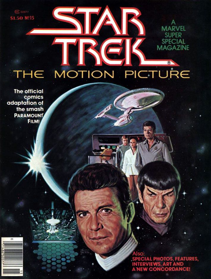
Marvel's Marvelous Movies #3: Star Trek: the Motion Picture (December 1979)

I'm going to tell you upfront this was one of my favorite individual comic book stories when I was 11 years old.  I have no idea how many times I read it.  The following year, Marvel's Empire Strikes Back adaptation would knock this one (and just about every other comic I'd ever read and loved prior to encountering Al Williamson) down a spot or two on my personal hit parade, but I still have a deep and abiding love for Marvel Super Special #15.  I'd been a Star Trek TV show fan for as long as I could remember, and this was in the wilderness years of the 1970s.  Back then, you had to find Trek at odd hours on some local station.  Ours came out of Tallahassee on Saturday afternoons, subject to atmospheric interference.  When your station dropped whatever Trek syndication package they'd licensed, you lost touch with the crew until they popped up somewhere else within antenna range.  In the interim, you could read the James Blish short story collections with episode adaptations, and the often silly Gold Key comics.  Or collect and play with the Mego action figures.  That was as Treky as we got before 1979's Star Trek: the Motion Picture came out and relaunched the franchise as a movie series.

It almost didn't.  The movie, directed by two-time Academy Award winner Robert Wise and based on a premise written by series creator Gene Roddenberry, made money, but it was expensive to produce and wasn't as big a hit as Paramount had hoped for.  It certainly looked fantastic, with a sleeker, updated Enterprise and everyone in pajamas for a sweet slumber party atmosphere.  But it suffers from endless shots of the Enterprise slowly drifting along set to repetitive music cues and people staring in awe at light shows.  It's like watching the audience at Laser Floyd: Dark Side of the Moon.  The film allows its characters to ask existential questions, but when it comes to answering them, the result is akin to a 2001: A Space Odyssey where, after boring you for more than two hours, Stanley Kubrick has the astronauts explain to each other (and the audience) exactly what the monolith represents and why it does what it does.  The cheaper, more action-oriented Star Trek II:  The Wrath of Khan turned out to be the franchise's salvation, not this glacially-paced epic.  But in 1979, for me, it was enough seeing Kirk, Spock, McCoy, Scotty, Uhura, Sulu and Chekov (along with Janice Rand, for cripe's sake!) back in action.

And, after watching this movie again on Blu-Ray recently, I've decided I'll take it with all of its flaws and dull stretches over either of the terminally stupid "reboot" flicks any day of the week.  Star Trek The Motion Picture at least has ideas and something to say about the basic human dilemma ("Is this all there is?  Is there nothing more?"), things it takes very seriously.  Can you imagine a major studio nowadays dropping this kind of money on a sci-fi flick starring a lot of middle-aged people and without any meta-humor or product placement?  There's not even a sky-diving sequence!  There's barely any sex!


But let's talk about the comic.

It must have been a daunting challenge to adapt into an entertaining comic a story that consists mostly of long sequences of nothing more than the Enterprise gliding over the giant V’Ger ship and then small groups of characters conversing about it in staff rooms and small corridors.  The comic really benefits from the deft way Marv Wolfman condenses scenes.  Wolfman ruthlessly edited down long scenes into a few panels, quickening the pace and generally tightening things up.  Wolfman uses his narrative captions-- always a strength of his writing-- to clarify character motivation and add descriptions and exposition to guide readers along.  We're engaged throughout.

For the art team, which consists of Dave Cockrum on pencils and Klaus Janson on inks, the problems are finding ways to make all the conversations work visually and reproducing the movie’s many, many special effects shots.  Cockrum, a master of crowded team compositions and action-packed superhero action, comes through with strong "acting" from the principals, downplaying the usual Marvel dynamics but upping the emotional content of various scenes.  His Commander Decker in particular comes alive with various angry faces and hand-chop poses emphasizing his frustration.  The likenesses are consistent throughout, a real plus when dealing with familiar, iconic characters.  The results aren't photographic, but Cockrum never confuses the readers.  Kirk has his poofy hair, McCoy his sharply arched eyebrows and drooping, lived-in face.  Of course Spock is easy to get right, but even more conventionally good-looking people like Uhura, Sulu and Chekov look pretty much the way you expect.  Every so often there's a dead face, but they never become a distraction.


What an ink job Janson provides, too.  While he and Walt Simonson outdid themselves on innovative lighting effects in Close Encounters, here he and colorist Marie Severin use color holds to reproduce Douglas Trumbull's lightning balls and wormholes.  This kind of stuff is easy to do these days with digital inking and coloring.  It's nothing to isolate an element and change the color channels to whatever you want.  But when Janson and Severin tackled Star Trek, they had to rely on acetate or vellum overlays.  It must have been a tedious, time-consuming process because they use one or more on practically every page.  The results are nothing less than astounding.


For all its pacing flaws, the film is effective at making space seem like an infinite frontier full of dangers.  It's not just that there are Klingons and V'Gers out there ready to zap unfortunate astronauts and Starfleet personnel.  Space itself is dark and perilous.  For one thing, the ships have to provide their own exterior lighting.  None of that Star Wars stuff where everything in space is brightly lit no matter how far away it is from an actual light source.  To the human mind, space appears largely empty, dark and vast.  Even the vaunted technology its space explorers count on for survival turns on them.  The transporter goes awry in a shocking incident and, later, the warp drive throws the ship into what the characters call a “wormhole.”  Contending with these, the Enterprise crew truly seems to be going boldly.  This isn't sailing along to some cute world where you find 1920s gangsters or the White Rabbit out of Lewis Carroll.  You could end up a data stream in a godlike machine's memory banks or transformed into a robotic copy of yourself with a lighted jewel embedded in your throat.  Or merge with the overmind into a stream of light.  Wolfman’s script reproduces each of these episodes faithfully and Cockrum, Janson and Severin provide some spectacular visuals to match them, with all the production design details faithfully reproduced.  Ultimately, this is an extremely accurate recreation of the film's look and mood, minus its shambolic tendencies.


The story also appeared in three monthly issues (Star Wars, a much shorter but action-oriented film, ran in four, which is further evidence of how Trek should have been pared down a bit) which led to a short-lived Marvel Star Trek comic.  I never read a single issue of that.  After all this time, I'm not sure why, especially considering how much I enjoyed this one.  Maybe it was enough for me Wolfman, Cockrum, Janson and Severin had already provided fabulous glimpse of what a Star Trek comic could be, one-upping its cinematic source material.  Too bad they didn't get a chance to take on Khan.


Looks like I forgot to talk about the Bob Larkin fully-painted cover.  That's just as well.  I'd have written a paragraph consisting only of superlatives.  I look at it kind of like Kirk, McCoy, Decker, Ilia and the rest gaze at Laser Floyd.

Thursday, November 28, 2013

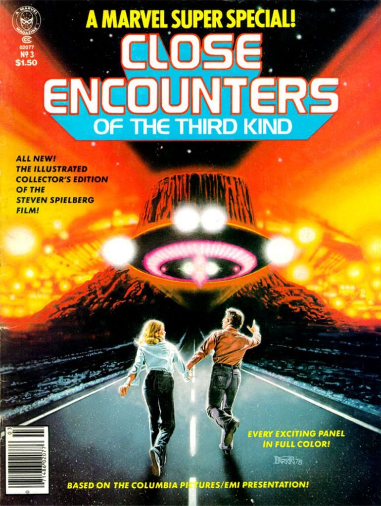
Close encounters of the mail order kind starring Marvel Super Special #3: Close Encounters of the Third Kind

Bob Larkin painted the cover for Marvel Super Special #3: Close Encounters of the Third Kind (1978) and it's typically gorgeous work.  Larkin worked in bold, vivid colors.  Larkin wasn't painterly or as dynamic as as his stable-mate, Earl Norem (they both contributed memorable covers to Marvel's Planet of the Apes black and white magazine).  Larkin favored a sharper finish, not quite photorealistic, but startlingly close enough for a kid in the 1970s who wanted to see what his favorite superheroes would look like if they came to life. 

I don't know who the key figures on this cover are.  Let's call them Not Quite Richard Dreyfuss and Sort of Melinda Dillon.  I seem to remember in those days you couldn't always get the licensing rights to do exact likenesses of actors, so Larkin flexed his screen-accurate art muscles on the UFOs and the cosmic light show around the Devil's Tower in the background, which they apparently could get the likeness rights to.  Just kidding.  Everyone knows the Devil's Tower is in the public domain.  No wait, actually I own it.  I'd forgotten momentarily, but I'm pretty sure I have the papers around here to prove it.  Please send my back payments, Mr. Spielberg and the new ownership of Marvel.  Thank you.

The point is, when you find a copy of Marvel Super Special #3 for yourself, you end up with this Bob Larkin painting that will knock out your eyeballs with its startling beauty even if he had to settle for brushing in a couple of stand-ins for the movie's real stars.  And inside the book, you get an Archie Goodwin adaptation of one of the prime 1970s blockbusters-- second in our youthful instant-classics pantheon in those days to a little flick called Star Wars (and Close Encounters is in every way the superior work of art even if its pop culture cachet has never equaled that of its cinematic big brother)-- over Walt Simonson pencils and Klaus Janson inks.

Script: Archie Goodwin/Pencils: Walter Simonson/Inks: Klaus Janson/Colors: Marie Severin

Think about that for a moment and ask yourself, "Was this magazine worth the $1.50 they charged for it back in 1978?"  Admittedly, it's a silly question we can only answer in the affirmative.  Resoundingly so.  I paid slightly more for mine and now I'm going to bore the hell out of you by telling why.  First, we have to time travel back to 1979 or 1980.  We either had Jimmy Carter or Ronald Reagan in the White House, or maybe in some alternate universe, both fused into a two-headed creature that could never come to an ideological agreement with itself, and so ran around in circles before collapsing exhausted in the Lincoln bedroom, panting and begging for an end to its misery. 

In our reality, this was before the direct market, or at least its earliest days, and before my town had anything resembling a comic book store.  We had to get our comics at bookstores, convenience stores, pharmacies and the occasional gas station.  None of those places would reliably stock oversized comic book magazines.  And back issues?  Back issues were what your big brothers or their friends gave you when they were finished with them, and my brothers and their buddies were all sports playing guys into muscle cars, funk music and girls, not comic books.  I once received a hand-me-down Weird War Tales from one of these cool dudes-- instead of a beating-- and it was one of the happiest days of my life.

Script: Goodwin/Pencils: Simonson/Inks: Janson/Colors: Severin
So I didn't even know a Close Encounters comic existed until almost a year or so after they printed it.  There used to be this mail order outfit called Heroes World.  Marvel eventually took them over, but in the 1970s and early 1980s, they put ads in comics for things like Mego action figures and those huge "Treasury Edition" magazines both Marvel and DC used to put out.  One day I was reading some comic or other-- probably Micronauts-- and my eyes landed on a list of Marvel Super Specials and there it was, a comic based on one of my favorite movies at the time. 

We didn't have DVDs or even VHS then, so the only way to repeat the experience of movies you loved when it left the theaters was to buy comic book adaptations, or novelizations (or the occasional Foto-Novel), then wait for ABC to buy the broadcast rights.  I already had scattered issues of Planet of the Apes, Star Wars, Battlestar Galactica and this huge King Kong magazine from either Gold Key or Whitman.  This meant I had to add Close Encounters to my film comic library.  You're looking at me as if I had a choice.  Trust me.  I didn't.  I can't remember how I got the money, or the exact price (although $2.25 plus shipping and handling comes to mind), but I do remember it took forever to come in the mail.  So long I assumed I'd been ripped off, which happened to kids sending money to companies that advertised in comic books from time to time.  Then it came in a cardboard envelope and I was not disappointed.  In fact, it not only impressed me as a story but it also changed the way I thought about comics.

First of all, it accurately recreated the movie experience in a way no film adaptation had for me before.  Star Wars was fun, Battlestar Galactica adequate.  Close Encounters topped both.

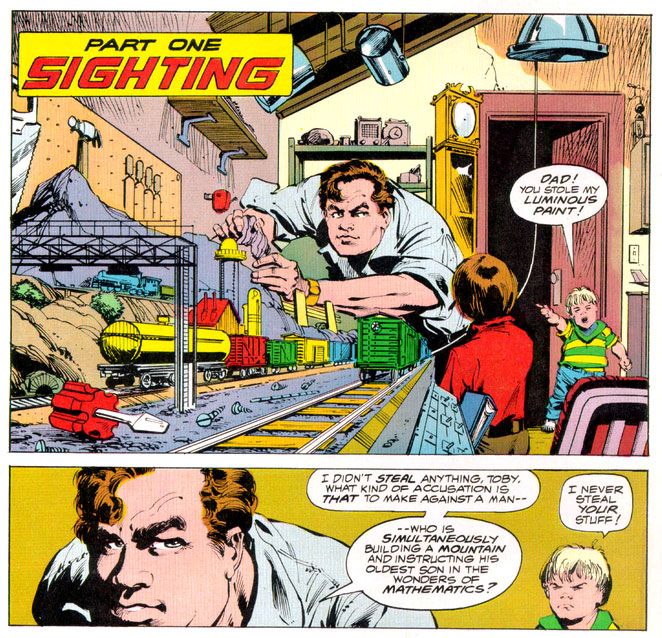
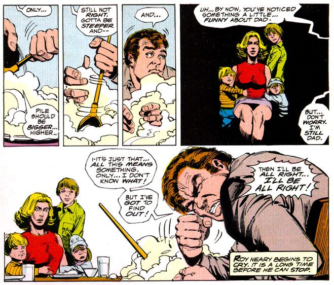
It didn't matter that the inside wasn't photo-realistic, or that we wouldn't have Dreyfuss, Dillon, Teri Garr or even Francois Truffaut going through their motions.  Despite Marvel's inability to score the license for the actors' likenesses, Simonson and Janson occasionally came litigiously close enough as far as I was concerned.  I can imagine other kids reeling in disappointment when they first laid eyes on the off-model Roy Neary carving his mashed potatoes into a lumpy hill while his stunned family looks on in panel designed specifically by Simonson to showcase their growing emotional distance from their troubled husband and father by isolating them in a flat black space.

I was relieved Simonson and Janson at least got his "type" right.  After all, George Tuska's Taylor in Planet of the Apes looked more like screen Hercules Steve Reeves than screen Ben-Hur Charlton Heston.  At least the comic book Dreyfuss wasn't nine heads tall with a physique out of a Renaissance fresco.  The Truffaut character, on the other hand?  I still don't know who that hawk-nosed guy resembles, but it's not the man who directed The 400 Blows.  But he is a relatively minor part of the story and on-panel just a few times in the comic, so I gave Simonson and Janson a pass there, too.

Script: Goodwin/Pencils: Simonson/Inks: Janson/Colors: Severin

As far as the other visual elements go, Simonson's panel layouts and sequential moments are some of his most cinematic storytelling in a career full of the stuff.  You can tell he was just as enthralled with the material as anyone buying this book would have been and he gives it his all, what one of my brothers' baseball coaches would have called "110 percent." I say it's more around 150 percent.  Simonson exaggerates body language a bit striving to match the film's emotional beats, but he also does these action-to-action panel sequences that transpose Spielberg's framing and pacing to a static page as well as any artist I've seen.  I wanted my usual superhero fare to duplicate these kinds of panel-to-panel action transitions as well, because it meant something closer to the way we perceive time than the usual dynamics and poses with speedlines.  This was my introduction to that sort of comic storytelling years before I ever heard of guys named Eisner, Krigstein, Steranko or Kojima.

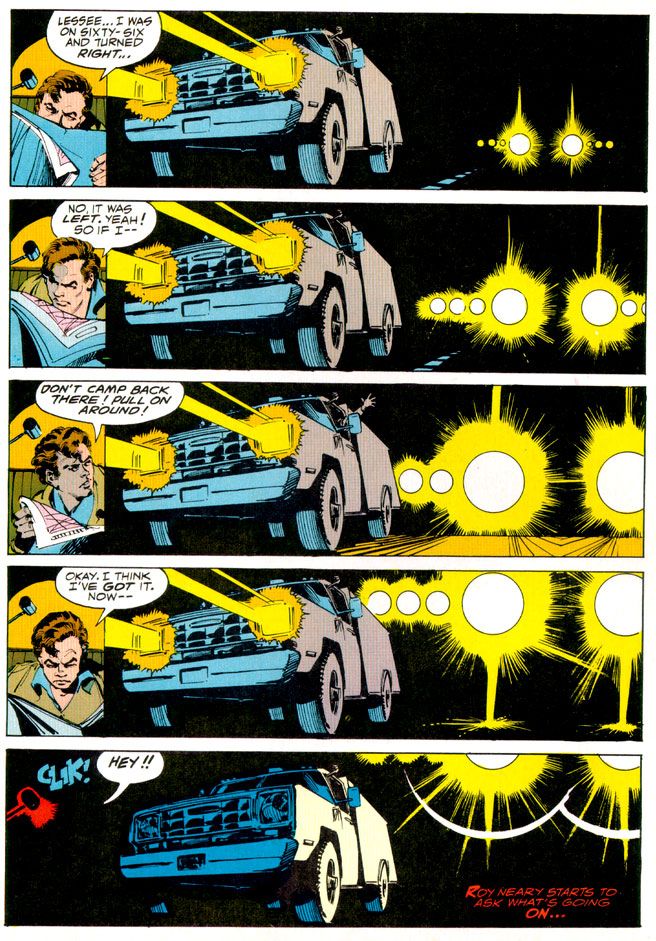
Sometimes I'm not so keen on Klaus Janson's heavy-handed inks, but he and Simonson are matched well here, and the way he treats lighting in this book hasn't been equaled, at least not in any comic I've seen.  This is of utmost importance when dealing with Close Encounters, because light is practically a character in the movie.  People mock J.J. Abrams and his supposed lens flare addiction, but Steven Spielberg had cinematographer Vilmos Zsigmond practically paint the screen with light, and Janson follows suit, especially in the climactic encounter where he manages to do something I would have considered possible-- make static drawings look not simply like dazzling lights, but moving ones as well.  Seriously.  Janson manages to mimic moving lights with inked lines.

In his afterward (which I read as often as I did the comic part), Goodwin cheerfully explains some of the concerns a writer has when adapting from one medium to another.  You don't get a soundtrack when you read a comic, so Simonson came up with all kinds of innovative ideas for full-bleed artwork and panel arrangements to try and capture a bit of the John Williams magic.  There's also a problem with timing jokes.  In the movie there's a funny bit involving gas masks and Goodwin and team duplicate it, eliciting almost as much laughter from me reading it as the movie did when I was watching it.  Goodwin also takes time to praise Marie Severin's coloring job, and it is indeed first rate.  She really shows what a colorist can do with the limited and flat palette available in those days.  And so Goodwin gave me my first lesson in writing for comics as a craft, and the kinds of things pencillers, inkers and colorist do as well. 

Up to that moment, I had been used to experiencing a comic as simply a thing unto itself.   Words, pictures, colors make a story as if by magic.  I knew artists' names because I loved to draw, and had a vague idea of what went on behind the scenes because I read Marvel's Bullpen Bulletins and the editor's messages in DC's books, too.  But in an essay probably shorter than the one you're reading now, Goodwin educated me on a writer's responsibilities and how the artists actually thought about what they were doing and planned images for effect.  I also learned the word "onomatopoeia."  A comic didn't just poof itself into existence.  People like Goodwin, Simonson, Janson, Larkin and Severin made them with their minds, their hands, their talents.  Knowing that didn't take away any of the wonder of reading a comic book.  It added to it. 

More than thirty years later, it still does-- no matter who the writer or artist or colorist is-- and I will always have Archie Goodwin to thank for that.

Tuesday, December 6, 2011

Boom! Studios is reprinting the classic Terror on the Planet of the Apes!


Finally, my demands have been met and I can release the hostages. Wait-- a gorilla sniper! KA-POW!  Damn you, Dr. Zaius! Thank God, I die a true human...  But... first... let me push... this button...

With the frivolity finished, I can announce the happiest comic book news I've heard in quite some time. BOOM! Studios, holders of the Planet of the Apes license from 20th Century Fox and publishers of fine Planet of the Apes comics since about April 2011, will reprint the rambling and mostly off-the-rails epic Terror on the Planet of the Apes by Doug Moench and Mike Ploog, plus contributions by other artists. The geniuses behind this decision at BOOM!  haven't set a release date, but if the cover image holds, it looks like they'll be using the old painted covers from the Marvel series as well. Time to introduce a whole new generation to the lurid charms of these images by Bob Larkin and Earl Norem.

This is what I've been begging for since I started comic book blogging.  The way Dark Horse has been publishing old Marvel/Curtis magazine material, I expected them to come through for me.  But it was BOOM! Studios all along.  I'm grateful to them for doing this, and to all the Apes fans who helped make it happen.

And now the bad news.  This series is going to be difficult for me to come by.  I had problems getting issues of BOOM!'s regular Planet of the Apes title when I lived in the States.  They're also publishing Betrayal of the Planet of the Apes, starring a young Dr. Zaius.  I'm dying to read this book!  How can I get my filthy, stinking paws on these Apes comics here in Japan?

I will not rest until I solve this problem!*

*Actually, I think they have international subscriptions.  And there's always EBay.