Tuesday, August 26, 2014
Marvel's Marvelous Movies #7: Why was there never a M*A*S*H comic book, or an E.T. adaptation?
M*A*S*H aired its final episode on February 28, 1983, less than a year after Steven Spielberg's E.T. the Extra-Terrestrial opened to boffo returns on the big screen. These were both cultural phenomena at the time and yet neither inspired any comic book spin-offs beyond parodies in MAD and Cracked magazines.
Granted, a M*A*S*H comic book doesn't seem likely. Then again, the show itself didn't seem very likely, either. A thirty-minute sitcom set during the Korean War, premiering on network television as the divisive Vietnam War ground to its disappointing, confidence-shattering denouement? Gee, I hope they fired the doofus who came up with that idea!
The series began doing its best to match its big screen inspiration, Robert Altman's groundbreaking satire (at least by CBS-acceptable standards), but eventually became more serio-comic. Its position as a mainstream TV show in a time before cable meant M*A*S*H could never be quite as searing as some of us might have liked (unlike the movie, which openly and mercilessly mocked American traditional values like religion, patriotism and football). But the show still gave us pause for reflection between the laugh-track outbursts with occasional episodes where the doctors work around the clock to avoid being drowned in an ever-rising tidal flow of wounded young men then collapse, exhausted, in their bunks; in its blood-spattered operating theater (no laugh track during those scenes, remember); and even in the way Hawkeye, Trapper John and later B.J., pursue boozing and pranks as a way of maintaining at least a semblance of humanity in an inhuman situation.
War has long been an American comics staple, but I can't imagine anyone at either DC or Marvel managing to strike the balance between pathos and chuckles M*A*S*H at its finest managed, though DC seems to have given it some serious consideration. Still, in a world where Gold Key gave kids an exploding, earth-killing H-Bomb in its Beneath the Planet of the Apes one-shot, and Marvel put out comic book adaptations of movie musicals, I'm still shocked we never got a Marvel Super Special or Treasury Edition version of "Goodbye, Farewell and Amen."
After all, there were M*A*S*H dolls, for the love of Hotlips!
Okay, so maybe a M*A*S*H comic is an even worse idea than a Xanadu comic. But you can't tell me E.T. the Extra-Terrestrial didn't deserve an adaptation. With Marvel doing versions of just about every sci-fi flick out there, including ones that seem to defy your usual comic book storytelling techniques like Close Encounters of the Third Kind, which relied largely on internal conflict rather than fisticuffs and required artists Walt Simonson and Klaus Janson to come up with a new visual vocabulary for depicting photographic light effects with black linework and negative space and ordinary comic book coloring, the lack of an E.T. adaptation leaves a massive gap in the parade of Super Specials in the late 1970s and early 1980s. Its as if the Snoopy balloon burst just before the Macy's Thanksgiving Day Parade took off and they didn't know what to do without it so they just marched along and left Willard Scott and Connie Chung to fill in with banter during the dead zone.
Given their performance on Close Encounters, I'm going to stick my neck out there and declare Simonson and Janson would have done a bang-up job on E.T.
I remember searching the spinner displays and magazine racks all over town in the months following E.T.'s June 11, 1982, release date.
Nothing.
E.T. dolls, E.T. records-- including one narrated by Michael Jackson The New Rolling Stone Record Guide (1983 edition) eventually gave 5 stars (indispensable)!-- E.T. bubble gum cards, E.T. storybooks and infamous video game cartridges. E.T. everything. Except a comic book.
So confused was I that I even attempted an E.T. adaptation of my own, written in faux-Marvelese. I managed to do the first two pages. The way I remember it, there was a large top tier panel with E.T.'s spaceship descending from a starry sky. The pencil fill depicting night just about broke me, but I persevered. Beneath that were a couple of panels with E.T. and his space exploring buddies collecting samples. I partially concealed them with foliage not because I felt incompetent to draw them (obviously I felt more than capable, considering the hubris of even attempting something this idiotically grandiose), but because I made the conscious decision to ape the film's opening gambit of mystery and wonder. Quick cut on the second page to the government researchers rushing up and scattering the aliens every which way. I can't remember if I added narrative captions, but I do remember maintaining the government operatives' anonymous menace by framing their figures in such a way the panel rule lines chopped off their heads and other identifying anatomy. And I think I had one of them tersely refer to the Peter Coyote character-- the head guy with the keys-- as merely "the Man." I got as far as painstakingly copying from photo reference the image of a forlorn E.T. gazing down at the city lights, right before the film introduces Elliott and family.
That's right. It took me two pages to blast through the first five to ten minutes of the movie and I'm pretty sure most of those panels if I found them now would consist of an arm or a leg against a field of smeared graphite, and then a really large dialogue balloon with something stupid in it. Archie Goodwin I was not.
Those pages stayed in the top drawer of my desk at home (always meant to do more when I found the time) until we moved to a new house and I tossed them while trying to dump as much crap as I could to avoid having to pack it. I'd give almost anything to have them back. Maybe I'd even finish the remaining 46 pages or so.
Wednesday, July 16, 2014
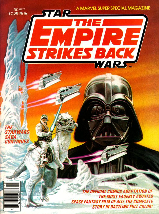
Marvel's Marvelous Movies #4: The Empire Strikes Back (Marvel Super Special #16, Spring 1980)
All of his EC and most Warren work came before I was even born, and our local newspaper tended more towards Beetle Bailey and Garfield than adventure strips. Or paper did run Alley Oop, Steve Canyon and Dick Tracy, the three non-gag strips they did choose to run, plus my dad got me into Gasoline Alley (not an adventure strip but still one with a narrative like those others). So I didn’t know anything about Secret Agent X-9, or, as it came to be called, Secret Agent Corrigan. Where would I have learned about Al Williamson? He didn't draw the Hulk or Spider-Man, for crying out loud!
So when this book hit, as far as 12-year-old me could tell, Al Williamson came into our banal world from some magical extra-dimensional wonderland where romantic adventure and heroic action were as part of life as blood itself and made this comic just for me.
Williamson’s art was more than a revelation. It was a rebirth.
| Script: Archie Goodwin/Art: Al Williamson and Carlos Garzon |
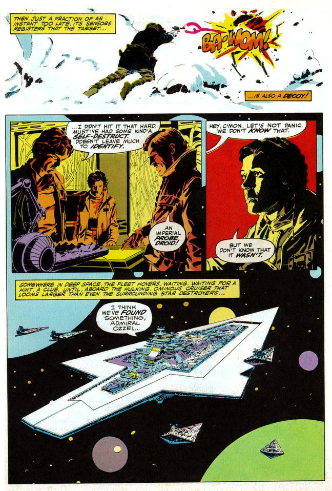
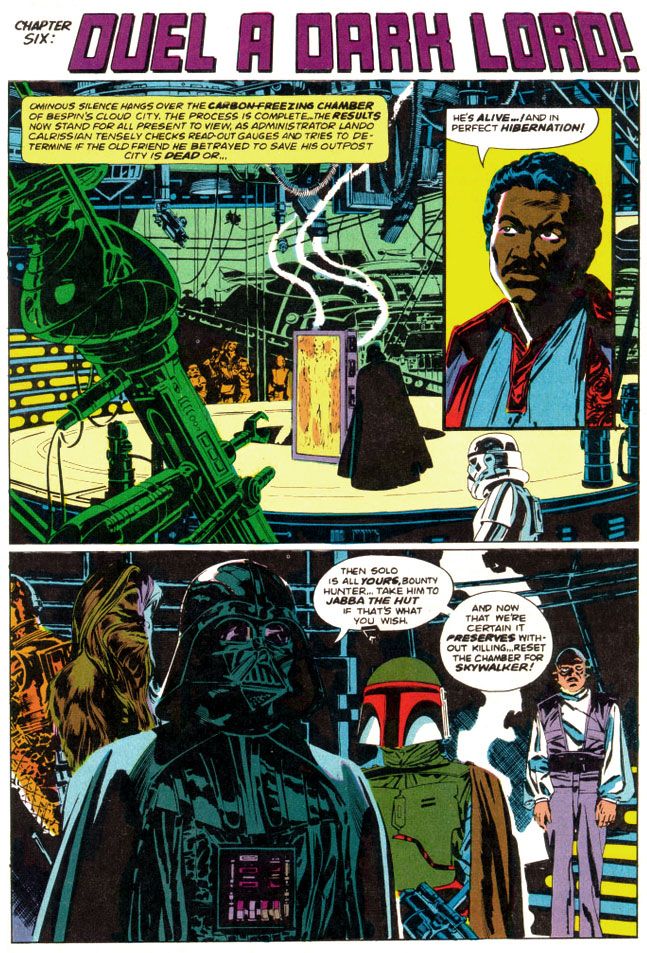
The man painted with ink. To create the effect of reflections on metal, Williamson used blobby black strokes of varying pressure. For atmosphere and depth in the backgrounds of different scenes, he used thin parallel lines for a sfumato-like effect. He spotted blacks throughout, emulating the film’s cinematography, as many scenes take place inside the frozen rebel base or the industrial back-rooms of Cloud City where light comes from computer screens or from behind machinery. He expanded on the film’s planetscapes and made them imaginatively otherworldly in a way location shooting on a glacier in Norway just couldn’t match (and Larkin wisely copies him on the cover). Obviously, Lucas couldn't spirit his cast and crew away to Hoth in another galaxy. But Williamson could and did.
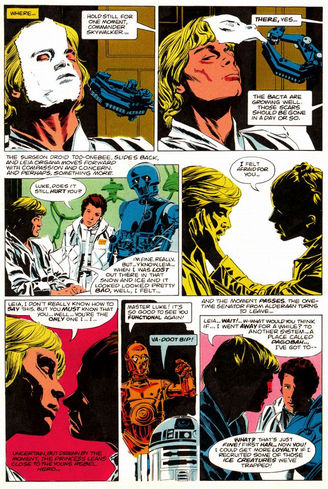
And best of all, not only did Williamson's star warriors look like the actual actors rather than their stunt doubles or stand-ins (as had the characters in many of Marvel’s previous movie adaptations, Star Trek the Motion Picture aside), but the way he posed them and placed them within all those wild environments exactingly duplicates mood and feel of the movie itself every time you read this comic.
I’d seen movie comics full of pretty art, some of which I've praised in this blog (and justly so; they're fantastically fun) with dazzling light effects and plenty with storytelling that perfunctorily or even adequately reproduced a movie’s action without that feel, without that authenticity of experience. Goodwin, Williamson and Garzon put all the genuine excitement of the real The Empire Strikes Back right in our hands, in the medium best suited for George Lucas’ epic. Star Wars came full circle back to the halcyon days of Flash Gordon in the funny pages, one of its prime inspirations.
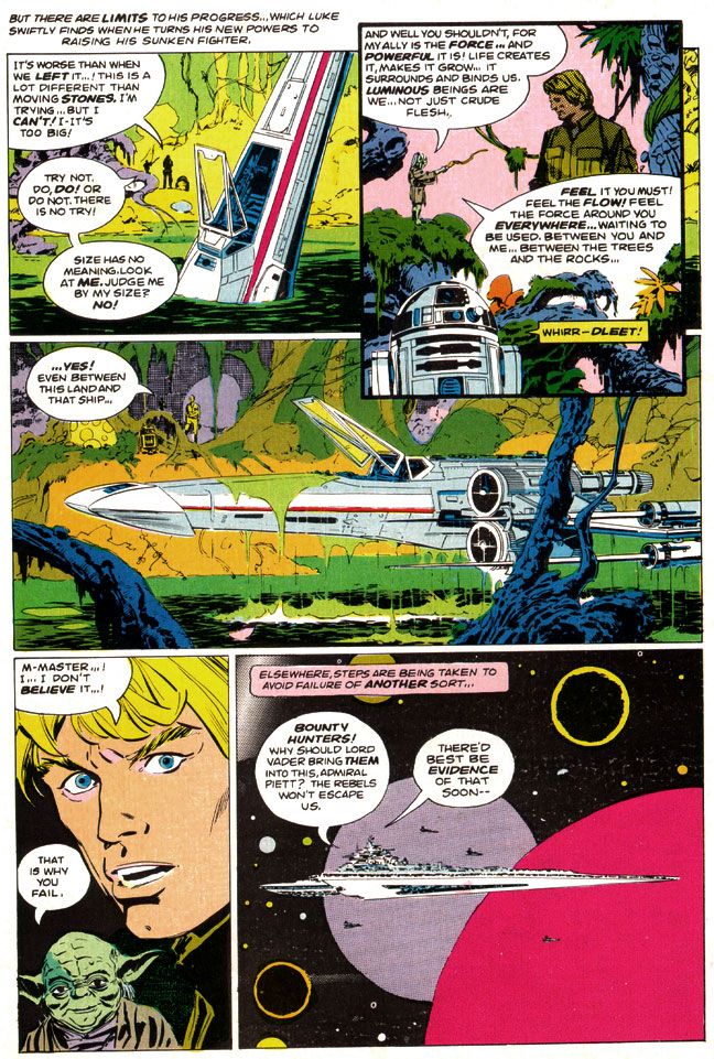
The only odd note-- and I find it charming and story-book like-- is Williamson's version of Yoda, who looks his familiar, chubby self in closeups and then becomes a tiny gnome-like creature with spindly legs in wide-angle shots. Williamson never quite figured out Yoda's scale, but at least he made everyone's favorite sentence-reversing Jedi puppet more ambulatory than even a genius performer like Frank Oz could holding him up from underneath the swamp sets. And more wizardly. Merlinesque.
| Script: Archie Goodwin/Art: Al Williamson and Carlos Garzon |
You can look at the artwork and see Williamson used quite a bit of photo reference. In lesser hands, this can freeze a comic story, especially when an artist chooses to draw from studio portrait shots rather than action scene stills. Williamson expertly blends these images onto the page so each is like a fabulous collage when looked at as a whole, but flow naturally when read panel-to-panel. Williamson gives us carefully crafted moments like the two-panel sequence where medical droid 2-1B pulls the pharmaceutical mask off Luke's wampa-ravaged face. He could have rendered it as a single panel, with all of 2-1B's dialogue carrying the action, but instead he chose to give it a bit of animation.
Notice I'm talking only about Williamson, but there's also Carlos Garzon. To be honest, I can't tell where one ends and the other begins. I just see this Williamson-esque art job that matches pretty much all the other ones I've seen. Many of which probably were in collaboration with Garzon. Anyway, whichever artist did whatever part of the artwork, it's seamless and I like it. So let's give Garzon his props, even if I'm too ignorant and unschooled in his contributions to point out any specific examples. There are probably other blogs for that. I should be reading them. So should you. Probably a better use of our comics-loving time, right? Let's go! Go! Go! Go!
Okay, he's gone. I'll join him after I finish gushing about The Empire Strikes Back like a dizzy fool drunk on love.
Oh, and at this point I should also make mention of Glynis Wein's superb coloring job. Wein used a screen-accurate palette that enhances the comic experience rather than making you smirk at oddball choices like the red lenses in Darth Vader's mask and the strange orange mottling in Chewbacca's fur from the first Marvel Star Wars comic. Wein would make entire figures two shades of orange to recreate the spacey glow of Rebel Alliance technology when our heroes conferred in control rooms and on spaceships, and apply appropriately chilly blue shadows to the snowy exteriors of Hoth or give the swamps of Dagobah a slimy look in greens and pale oranges. Wein's pastel planets and moons help give depth to the imagery of mighty space fleets lumbering along, but where her work really shines is during the light sabre duel between Darth Vader and Luke Skywalker. The film bathes their battle largely in oranges and blues, at least when the two fight in the "carbon freezing chamber" where Han Solo gets encased in a block of metal. Wein follows suit but she also adds some nice greens and yellows to make it work better in two dimensions.
| Script: Archie Goodwin/Art: Al Williamson and Carlos Garzon |
The very day I read The Empire Strikes Back, I immediately stopped copying every other artist and became simply a Williamson imitator, in as much as my clumsy hands could make me so. Any one of my comic book art idols represents an impossible standard to which an artist can hold himself or herself, but even more so with Williamson.
I doggedly spent the next three or four years laboriously filling sketchbook after sketchbook with really shitty Star Wars drawings, thinking all the time I was getting somewhere with my art. While I later found other artists to fail at emulating, whenever I had a sketchbook and a pen or brush, I’d still find myself pulling out some Williamson stuff and doodling away, futilely trying to match his supreme figure construction and posing, and lush, sinuous line quality. Even in my graphic design program days at the University of Georgia my professors would look at my homework and occasionally come across something that looked as if Al Williamson had drawn it with the brush held in his teeth, or sticking out of one ear.
| Script: Archie Goodwin/Art: Al Williamson and Carlos Garzon |
Even now, Williamson remains one of those go-to guys whose work I feel compelled to collect. Williamson, Alex Toth, Jack Kirby and Steve Rude. Whenever their stuff appears in purchasable form, I will be there. Right now Dark Horse keeps much of Williamson's Star Wars work with Goodwin in print both in paper form and digitally. With the license reverting to Marvel in the wake of Disney's massive Lucasfilm purchase and upcoming new trilogy, I'm not sure how long this will be the case. Fortunately, I've got it all.
And you know what? I’m not even a huge Star Wars nut anymore. The intense, religious-like fervor of its fans and the oversaturation of all things Star Wars on the Internet and on the shelves in book and toy stores across the world (and also the law of diminishing returns as it applies to the film story’s recent, tragic extension) have all tarnished the brand for me. And brand is the right word. McSkywalker, now serving number two billion.
But it seems all I have to do is pull out the Al Williamson The Empire Strikes Back and I’m 12 years old again and everything is suddenly wonderful in a way it had never been before, although there had certainly been wonderment. With Al Williamson, there's a purity to the work that ensures there will always be wonderment.
Thursday, November 28, 2013
Close encounters of the mail order kind starring Marvel Super Special #3: Close Encounters of the Third Kind
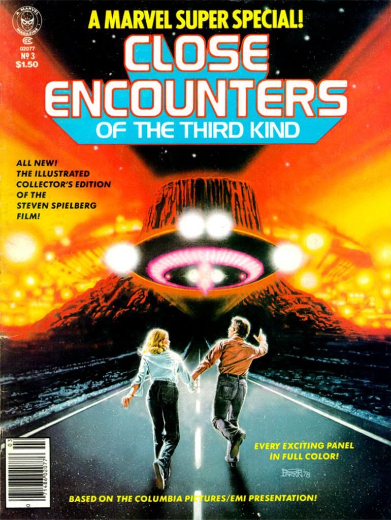
I don't know who the key figures on this cover are. Let's call them Not Quite Richard Dreyfuss and Sort of Melinda Dillon. I seem to remember in those days you couldn't always get the licensing rights to do exact likenesses of actors, so Larkin flexed his screen-accurate art muscles on the UFOs and the cosmic light show around the Devil's Tower in the background, which they apparently could get the likeness rights to. Just kidding. Everyone knows the Devil's Tower is in the public domain. No wait, actually I own it. I'd forgotten momentarily, but I'm pretty sure I have the papers around here to prove it. Please send my back payments, Mr. Spielberg and the new ownership of Marvel. Thank you.
The point is, when you find a copy of Marvel Super Special #3 for yourself, you end up with this Bob Larkin painting that will knock out your eyeballs with its startling beauty even if he had to settle for brushing in a couple of stand-ins for the movie's real stars. And inside the book, you get an Archie Goodwin adaptation of one of the prime 1970s blockbusters-- second in our youthful instant-classics pantheon in those days to a little flick called Star Wars (and Close Encounters is in every way the superior work of art even if its pop culture cachet has never equaled that of its cinematic big brother)-- over Walt Simonson pencils and Klaus Janson inks.
| Script: Archie Goodwin/Pencils: Walter Simonson/Inks: Klaus Janson/Colors: Marie Severin |
Think about that for a moment and ask yourself, "Was this magazine worth the $1.50 they charged for it back in 1978?" Admittedly, it's a silly question we can only answer in the affirmative. Resoundingly so. I paid slightly more for mine and now I'm going to bore the hell out of you by telling why. First, we have to time travel back to 1979 or 1980. We either had Jimmy Carter or Ronald Reagan in the White House, or maybe in some alternate universe, both fused into a two-headed creature that could never come to an ideological agreement with itself, and so ran around in circles before collapsing exhausted in the Lincoln bedroom, panting and begging for an end to its misery.
In our reality, this was before the direct market, or at least its earliest days, and before my town had anything resembling a comic book store. We had to get our comics at bookstores, convenience stores, pharmacies and the occasional gas station. None of those places would reliably stock oversized comic book magazines. And back issues? Back issues were what your big brothers or their friends gave you when they were finished with them, and my brothers and their buddies were all sports playing guys into muscle cars, funk music and girls, not comic books. I once received a hand-me-down Weird War Tales from one of these cool dudes-- instead of a beating-- and it was one of the happiest days of my life.
|
We didn't have DVDs or even VHS then, so the only way to repeat the experience of movies you loved when it left the theaters was to buy comic book adaptations, or novelizations (or the occasional Foto-Novel), then wait for ABC to buy the broadcast rights. I already had scattered issues of Planet of the Apes, Star Wars, Battlestar Galactica and this huge King Kong magazine from either Gold Key or Whitman. This meant I had to add Close Encounters to my film comic library. You're looking at me as if I had a choice. Trust me. I didn't. I can't remember how I got the money, or the exact price (although $2.25 plus shipping and handling comes to mind), but I do remember it took forever to come in the mail. So long I assumed I'd been ripped off, which happened to kids sending money to companies that advertised in comic books from time to time. Then it came in a cardboard envelope and I was not disappointed. In fact, it not only impressed me as a story but it also changed the way I thought about comics.
First of all, it accurately recreated the movie experience in a way no film adaptation had for me before. Star Wars was fun, Battlestar Galactica adequate. Close Encounters topped both.
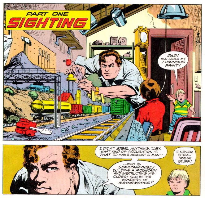
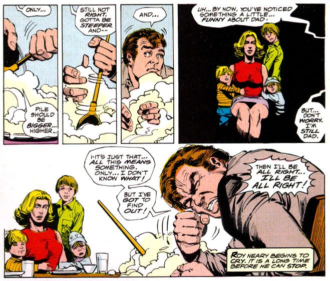
It didn't matter that the inside wasn't photo-realistic, or that we wouldn't have Dreyfuss, Dillon, Teri Garr or even Francois Truffaut going through their motions. Despite Marvel's inability to score the license for the actors' likenesses, Simonson and Janson occasionally came litigiously close enough as far as I was concerned. I can imagine other kids reeling in disappointment when they first laid eyes on the off-model Roy Neary carving his mashed potatoes into a lumpy hill while his stunned family looks on in panel designed specifically by Simonson to showcase their growing emotional distance from their troubled husband and father by isolating them in a flat black space.
I was relieved Simonson and Janson at least got his "type" right. After all, George Tuska's Taylor in Planet of the Apes looked more like screen Hercules Steve Reeves than screen Ben-Hur Charlton Heston. At least the comic book Dreyfuss wasn't nine heads tall with a physique out of a Renaissance fresco. The Truffaut character, on the other hand? I still don't know who that hawk-nosed guy resembles, but it's not the man who directed The 400 Blows. But he is a relatively minor part of the story and on-panel just a few times in the comic, so I gave Simonson and Janson a pass there, too.
| Script: Goodwin/Pencils: Simonson/Inks: Janson/Colors: Severin |
As far as the other visual elements go, Simonson's panel layouts and sequential moments are some of his most cinematic storytelling in a career full of the stuff. You can tell he was just as enthralled with the material as anyone buying this book would have been and he gives it his all, what one of my brothers' baseball coaches would have called "110 percent." I say it's more around 150 percent. Simonson exaggerates body language a bit striving to match the film's emotional beats, but he also does these action-to-action panel sequences that transpose Spielberg's framing and pacing to a static page as well as any artist I've seen. I wanted my usual superhero fare to duplicate these kinds of panel-to-panel action transitions as well, because it meant something closer to the way we perceive time than the usual dynamics and poses with speedlines. This was my introduction to that sort of comic storytelling years before I ever heard of guys named Eisner, Krigstein, Steranko or Kojima.
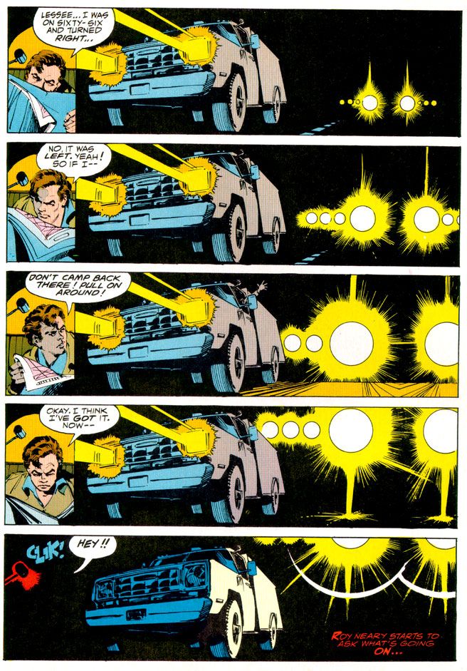
Sometimes I'm not so keen on Klaus Janson's heavy-handed inks, but he and Simonson are matched well here, and the way he treats lighting in this book hasn't been equaled, at least not in any comic I've seen. This is of utmost importance when dealing with Close Encounters, because light is practically a character in the movie. People mock J.J. Abrams and his supposed lens flare addiction, but Steven Spielberg had cinematographer Vilmos Zsigmond practically paint the screen with light, and Janson follows suit, especially in the climactic encounter where he manages to do something I would have considered possible-- make static drawings look not simply like dazzling lights, but moving ones as well. Seriously. Janson manages to mimic moving lights with inked lines.
In his afterward (which I read as often as I did the comic part), Goodwin cheerfully explains some of the concerns a writer has when adapting from one medium to another. You don't get a soundtrack when you read a comic, so Simonson came up with all kinds of innovative ideas for full-bleed artwork and panel arrangements to try and capture a bit of the John Williams magic. There's also a problem with timing jokes. In the movie there's a funny bit involving gas masks and Goodwin and team duplicate it, eliciting almost as much laughter from me reading it as the movie did when I was watching it. Goodwin also takes time to praise Marie Severin's coloring job, and it is indeed first rate. She really shows what a colorist can do with the limited and flat palette available in those days. And so Goodwin gave me my first lesson in writing for comics as a craft, and the kinds of things pencillers, inkers and colorist do as well.
Up to that moment, I had been used to experiencing a comic as simply a thing unto itself. Words, pictures, colors make a story as if by magic. I knew artists' names because I loved to draw, and had a vague idea of what went on behind the scenes because I read Marvel's Bullpen Bulletins and the editor's messages in DC's books, too. But in an essay probably shorter than the one you're reading now, Goodwin educated me on a writer's responsibilities and how the artists actually thought about what they were doing and planned images for effect. I also learned the word "onomatopoeia." A comic didn't just poof itself into existence. People like Goodwin, Simonson, Janson, Larkin and Severin made them with their minds, their hands, their talents. Knowing that didn't take away any of the wonder of reading a comic book. It added to it.
More than thirty years later, it still does-- no matter who the writer or artist or colorist is-- and I will always have Archie Goodwin to thank for that.
Friday, July 26, 2013
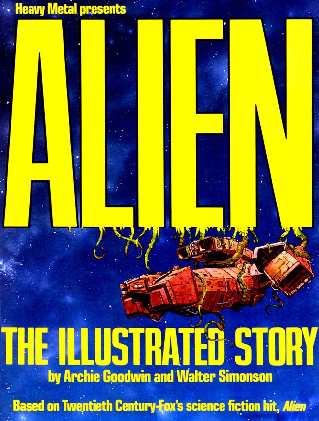
Let's take a moment to appreciate Alien: the Illustrated Story
Somehow its existence escaped me the first go-around-- and I've been a huge fan of Ridley Scott's sci-fi horror flick since I was approximately ten years old. I was a fan of it even before I was old enough actually to see it, mainly because one of my brothers saw it and liked it enough to buy a book about its production, which he passed on to me. And which thoroughly grossed me out and fascinated me at the same time. Even stranger, there were Alien action figures in the toy store at the mall. The point is, much like the unfortunate John Hurt character in the movie, I was exposed to the spore and it grew inside me. It wasn't until a couple of years later, on an appropriately stormy night while I was home alone that I was finally able to watch the film on HBO. It didn't scare me (and I'm easy to scare), but I enjoyed the horror elements and the funky, shabby-looking spaceship.
Years passed and I found out about Alien: The Illustrated Story, probably from one of the TwoMorrows magazines. Since I'm also a fan of both Goodwin and Simonson (but not Heavy Metal magazine itself or the Dark Horse series for some reason) I went to Ebay and there it was. Even though it was out of print at the time, I bought a nice, clean copy for a fairly cheap price. It's probably not mint, but then I bought it to read not to file away in some climate-controlled vault.
But what a book! It exceeded my expectations in every way.
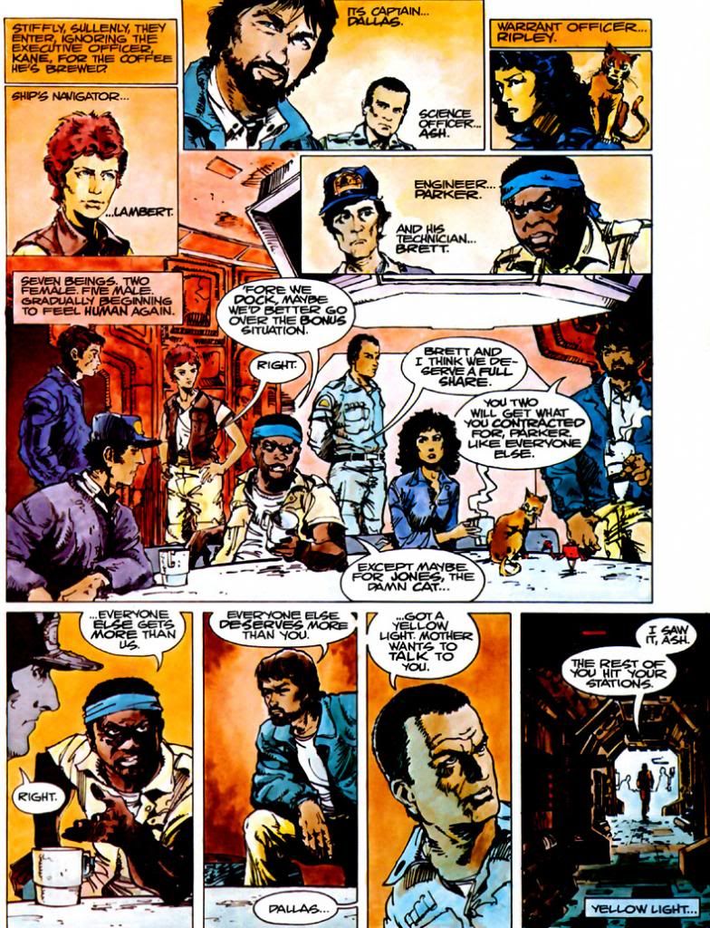
Goodwin confines himself largely to dialogue, with just a few tersely-worded captions here and there, most prominently on the first and last pages bookending the story. He provides just enough information to get us started, then smartly leaves Simonson to carry the narrative load. Simonson does an absolutely smashing job. It's obvious from the way he stages certain sequences and from the accurate costuming he had access to a lot of studio-provided material, but Simonson doesn't let himself get too involved with photo reference. If he had, it would have resulted in some dull storytelling. His likenesses are more along the lines of caricatures rather than portraits, which is another canny decision from a guy who flat-out knows how to play to his own strengths. Simonson has long had a loose approach to anatomy matched with a kind of abstract, angular take on shadows and wrinkles. More in the Noel Sickles-Milt Caniff school of impressionist-style cartooning rather than flashy photorealism. If you want photorealism, you might as well just use stills and do a fumetti book. You get Simonson for an illustrative approach.
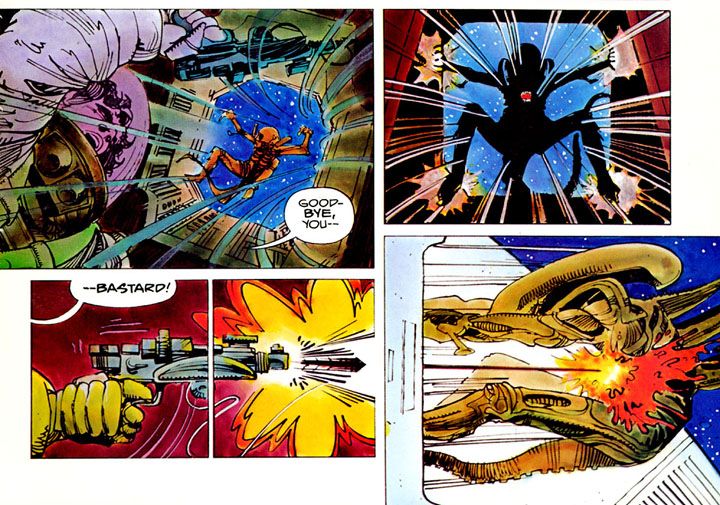
Because it follows the film very closely, there's a lot of talk in this book, with characters discussing the "bonus situation" and what to do about the alien. The movie has some memorable gore-- the chest-bursting scene, for example-- but for the most part it's a masterpiece of claustrophobic tension and production design. There's not a lot of comic book-style action. Rather than allow this to hamper his storytelling, Simonson finds ways to mimic Giger's "biomechanical" design sense with alienesque panel borders and then the occasional torrents of blood. It's some of his finest work, a little bit Moebius (a frequent Heavy Metal contributor who spent a short time working on the Alien film) and a touch Cam Kennedy, who was doing some fine work for Fleetway around this time and later did some of the most visually distinctive Dark Horse Star Wars comics.
Saturday, October 13, 2012
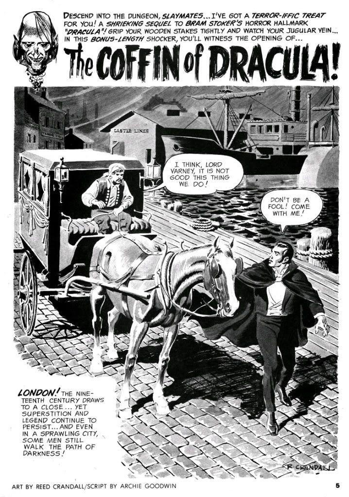
October is Spookey Month: "The Coffin of Dracula"
For Warren's Creepy magazine, Archie Goodwin and Reed Crandall created a two-part sequel centering on one Lord Varney (his name borrowed from one of Dracula's vampire antecedents) and his stupid misadventures with Dracula's coffin. Not that the story is stupid. It's not exactly a classic-- although Warren thought highly enough of it to reprint it in one of their best-of issues-- but Varney's the idiot here. What kind of fool buys Dracula's coffin and climbs into it? It's a bonehead move by an arrogant jackass and actually one of the most bizarre ways I've yet seen of contracting the dread disease we know as gingivitis. I mean, vampirism.
Seriously, if you must become a vampire, have the common decency to drink the blood of one of the undead. Get your own coffin. Sharing coffins isn't sanitary, anyway. And it's not true vampirism. It's more like possession at first. Varney can't even get that right. Man, I hate this Varney guy!
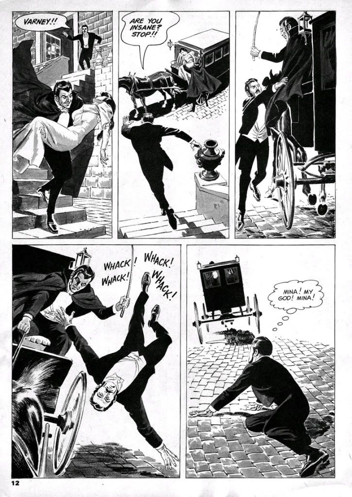
Part one clawed its way out of the crypt in time to anchor Creepy #8 (April 196), while part two coalesced from swirling ash in #9 (June 1966). Both segments are gorgeously illustrated by Crandall at the height of his artistic powers, "Coffin" plays like an overly abridged adaptation of the Stoker original, with Dracula more a presence than a character. Dopey, delusional Varney kidnaps Mina, Jonathan, van Helsing and Dr. Steward pursue him back to Whitby, one of the central settings in the novel and where Dracula began his reign of terror by vamping virginal young aristocrat Lucy Westenra. The heroes hope to kill a vampire left over from the novel and prevent Varney from truly becoming one of them. After that, they plan to save Mina. The plan doesn't sit too well with Harker, but he's too dim to argue with van Helsing's logic.
There's some decent violence and fully-rendered vampire-staking (tastefully sans outright gore), but Varney is a vamp-come-lately, a pale imitation of the great one and lacks charisma. Once fully vampirized, he doesn't even have any dialogue. Ultimately, gorgeous art or not, the story is mainly mild fun for fans of books like Alan Moore's League of Extraordinary Gentlemen, itself an extension of Dracula through the character Mina. If you finished Dracula and hoped for more story, then here's your chance and you don't have to know 19th and 20th century literary references and pop culture to fully appreciate it.
At least Moore picked up on the nascent feminist aspects of Mina, given that ultimate compliment by van Helsing in the book of having a "man's brain." The novel's Mina is a schoolteacher with a strong empiricist bias before she encounters the supernatural. Moore really ran with the notion and made her a lot steelier than Stoker's Mina, but Goodwin goes the opposite route and reduces Mina to your standard damsel in distress, kind of a dishrag. She barely has any dialogue, and none at all in the second part where we only see her unconscious before we follow Harker as he pursues Varney.
Well, Stoker puts Mina in jeopardy and in need of rescuing by men as well, but she does get in a few shots of her own, and because it's an epistolary novel, she at least had the privilege of speaking for herself. Goodwin shifts his focus exclusively to those menfolk, here rendered as a a dull crew of stick-up-their-asses types. When Varney kidnaps Mina, she disappears for the bulk of the story, which diminishes her plight. Goodwin does a wonderful job of recreating Abraham van Helsing's stilted Continental dialogue, though. Van Helsing is like a Dutch Yoda. "Friend Jonathan," indeed.
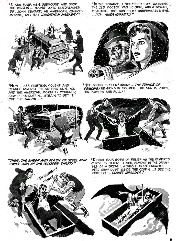
My favorite page is the collage-like recapitulation of Dracula's climax. I wish Goodwin and Crandall had done a full-fledged adaption of Stoker rather than this rehash, pretty as it is.
Poor Reed Crandall. While I immediately loved what I saw when I encountered his color jobs for EC in those early 1990s Gladstone reprints (I sorely miss those), his black and white art in the Creepy archives books from Dark Horse is a revelation. I can only describe it as beautiful, like those illustrated plates you encounter in ancient, heavy tomes from the darker corners of a library collection. Finely proportioned and posed figures, beautiful contour lines and modeling, depth of field, absolute control and mastery of individual panels and the page as a whole. And yet he seems to have been in competition with Wally Wood for "most tragic former EC great." Alcohol dependency and failing eyesight robbed him of his talent and sent his output into a shockingly steep decline in quality, so much so his last few jobs seem more the work of a talented amateur trying to do a Crandall impression. Reading them is like viewing a slow motion film of a ship sinking with a man still visible on the deck. On the other hand, he did leave behind an impressive body of work, especially in these early issues of Creepy.
And now it's time for one of my all-time favorite videos starring Spookey:
Monday, May 16, 2011
Star Wars/Nothing but Star Wars/Trying to forget/Those Star Wars of love...
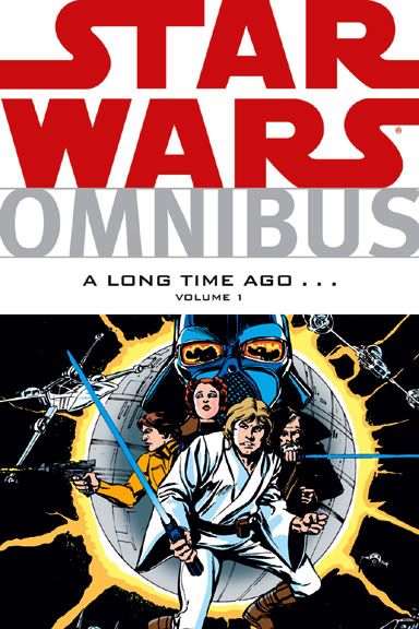
Perhaps their purpose is to cull us from the Warsian fan-herd; after all, if you don't like Jar Jar Binks and his slapstick antics, perhaps the Star Wars universe isn't meant for you. You can't blame it all on George Lucas and the legendary decision he made to retain the merchandising rights to his cinematic creation. I doubt Lucas's involvement with the comic went much beyond cashing whatever checks Marvel sent his way, yet nowhere will you find a more impressive hive of fun and villainy than in these ancient comics as reprinted by Dark Horse in their Star Wars Omnibus A Long Time Ago.... Volume 1 collection.
Good lord, just typing that wore me out. Let's check out a few of the various Roy Thomas and Archie Goodwin contributions to the Star Wars cast.
Who are you to judge? Crimson Jack will beat you to death with his mighty lumberjack beard.
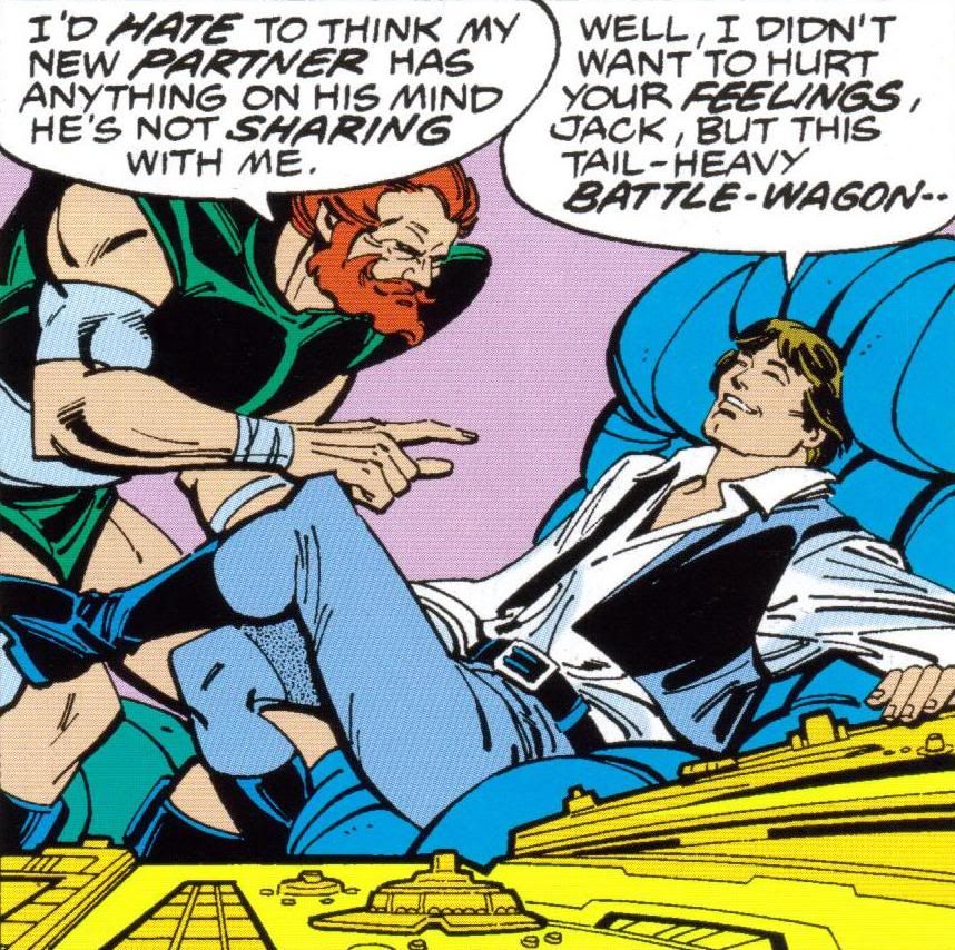
Crimson Jack (first appearance Star Wars #7): A red-haired, bearded bear of a man, a space pirate who struts about wearing what appears to be a dance leotard or some kind of body suit, plus folded down buccaneer boots. With his physique, his crew of hearty cutthroats and an entire Imperial Star Destroyer at his command, are you going to mock his sartorial choices? I'm sure not. When Han Solo leaves the Rebels to return to Tatooine and pay off Jabba the Hutt (remember that reward he got in the first movie-- a reward so large, he had to load it onto the Millenium Falcon in several crates?), it doesn't take Crimson Jack long to show up and rob Solo. What a humiliation. All that money, lost to a guy who wears Danskins.
Han Solo what the five fingers said to the face. All because she suddenly feels
sexual attraction for the first time after being raised by a pack of violent criminals.
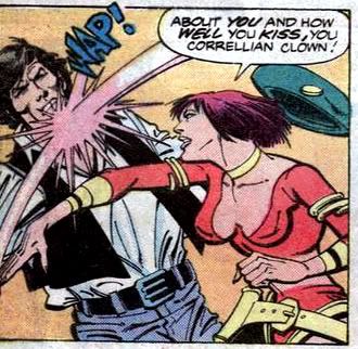
Jolli (first appearance Star Wars #7): Crimson Jack's right-hand woman, Jolli is equally as scantily clad. She favors a big green beret, a yellow choker and a red two-piece bikini. Plus a couple of blasters in yellow holsters strapped to her hips. With her quick temper and itchy trigger finger-- plus purple pageboy haircut-- Jolli makes a formidable foe for Princess Leia and Han Solo. At first eager to kill Han, Jolli finds herself conflicted between feelings of murderous rage towards the entire male gender and desire for that one roguish Corellian in particular thanks to an offhand remark by Leia regarding Solo's kissing prowess. This leads to an amazing scene where Crimson Jack has to stop Jolli from killing her fellow crewmembers, because as she says, "Just because a person talks about something doesn't mean she's ready to go at it!" Poor Jolli. Her sexual awakening comes surrounded by a bunch of crusty, unsympathetic space jerks and they're all she has to unburden herself to! She's so embarrassed explaining her outburst, she slaps Solo.
nursing our parts/We know every part by heart... Han Solo enters the
Friz Freleng Zone.
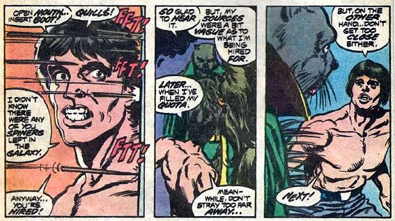
Hedji (Star Wars #8): Solo's first recruit for his mission to save a small village from bandits is Hedji, a tall purple porcupine with buck-teeth. Hedji can shoot his quills with deadly accuracy, much like James Coburn and his switchblade in The Magnificent Seven. I remember when I was 9 years old, sitting in the darkened theater marveling at the science fantasy world unreeling before my wide eyes and thinking, "What this story needs are more anthropomorphic woodland creatures right out of Looney Tunes and Merry Melodies." Little did I know we'd get not one but two of them in short order, thanks to comic scripter Roy Thomas!
Jaxxon (Star Wars #8): A green bipedal bunny of the "lepus carnivorus" species. Others have already described him at length, so I don't need to go into him here except to note writer Archie Goodwin later gave him a couple of foils named Dafi and Fud.
obviously a Howard Chaykin-designed character.
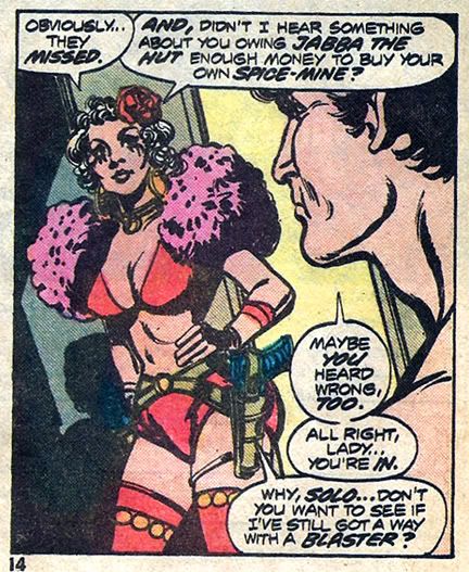
Amaiza (Star Wars #8): It seems every woman in the Star Wars universe not named Leia goes around flashing flesh. Amaiza is the former leader of the Black Hole Gang and wears a red bra with pink fur shoulder trim and matching panties along with red thigh-high heeled boots. With a rose in her silver hair, Amaiza is another woman-- like Jolli and Leia-- with whom one definitely should not trifle. She wields twin blasters and a sharp tongue, the latter of which leads to one of the more memorable quips in the book, courtesy writer Thomas. When Solo asks her, "Did anybody ever tell you that you talk too much?" the wickedly witty Amaiza replies, "One guy... once. Last I heard, his widow was living it up on Bestine with his death benefits." And she apparently has cat eyes for some reason.
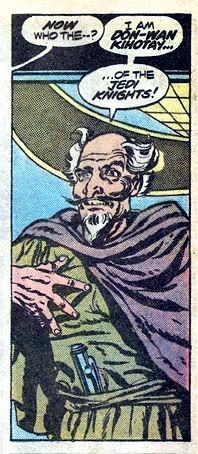
Don-Wan Kihotay (Star Wars #8): Thomas loves to borrow stories and characters from other sources, many of which are actually appropriate to whatever story he's telling. Don-Wan Kihotay is an obvious swipe of Miguel de Cervantes's famous literary creation, plugged into the plot from Shichinin no Samurai by way of The Magnificent Seven. Thankfully, he's fully clothed, first in Jedi robes and later in what appears to be a suit of 15th century European jousting armor, complete with a lance. With his bald head, disheveled gray hair and long van dyke beard, he's the very image of classic portrayals of Don Quixote.
very mistake the first time I read Star Wars #8 and #9 as a child... and it infuriated me!
Freckles? The wrong costume? No chin dimple? Who is this guy? Now I know. Adding
to the confusion, his real first appearance is in Star Wars #7 where he's a middle-aged
Asian man wearing green monk's robes!
Jimm, the "Starkiller Kid" (Star Wars #7/#8): Jimm is a young farmer who looks like a freckle-faced Luke Skywalker wearing a bucket hat with goggles. He's even stolen Luke's farmboy outfit of a karate gi, trousers and puttees. Jimm has such a Luke Skywalker obsession, he's nicknamed himself after Luke's original surname. It's a good name, so Thomas must have figured he might as well get some use out of it. He's young and inexperienced and reminds me of the Schofield Kid from Clint Eastwood's masterful Western Unforgiven, but really the impetuous kid character is timeless. There's one in Shichinin no Samurai, and then there's Luke himself. In #10, Jimm drops the Luke-pants for a woman's white one-piece swimsuit with a wrap-around bodice and some matching motorcycle boots. Later arrested for impersonating Luke and defrauding a Manhattan art dealer and his wife out of thousands of dollars.
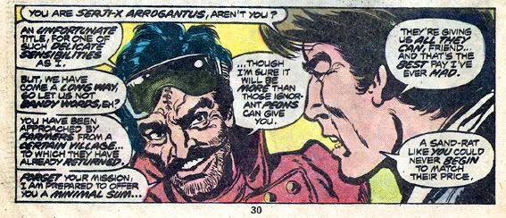
Serji-X Arrogantus (Star Wars #8): The bandit leader Solo and his ragtag group must defeat in order to save Jimm's village. This is a guy with a luxurious mane of jet-black hair and a magnificent handlebar mustache. Plus stitches running in a nasty slashed line down the middle of his forehead, although those vanish by the time he makes his second appearance. The Arrogantuses were always known for their fast healing. As villainous as he is arrogant (hence his surname), Sergi-X sports a double-breasted leather jacket with puffy shoulders and a sunburst emblem on the chest. He also slings a couple of space six-shooters he keeps in a wide, double-holstered gunbelt. Then for some reason, he accessorizes with actual spurs on his cowboy boots. Despite looking like an escapee from a spaghetti western, Serji-X leads the Cloud Riders, a gang of vicious desperadoes. He provides some generic menace and survives about as long as he deserves.
Merri (Star Wars #9): A blond teenaged girl who-- because, once again, her name isn't Leia-- runs around her imperiled village wearing nothing more than a bikini swimsuit. Han, who is probably twice her age, acts more than a little creepy around Merri, gazing at her and declaring, "Maybe this is a place worth saving after all." Turns out she's Jimm's girlfriend, and views Solo as more or less a grandfatherly presence in her life. She does thank him for "[B]ringing out the man in the Star-Killer "Kid!" Han rides off on a bantha, moping but consoling himself for his near-miss at sex offender status by musing that he "got a little feeling of what it's like-- --to be a Jedi Knight!"
Governor Quarg (Star Wars #12): The obese ruler of a ship-dwelling society of scavengers on a water planet. He wears what appears to be a WWII-surplus army helmet complete with camo-netting, a ragged Napoleonic-era field marshal's jacket and an ermine-trimmed king's robe.
Valance (Star Wars #16): A bounty hunter with wavy brown hair going gray just above his ears and a weathered, lived-in looking face. He runs around in a bulky suit of blue armor emblazoned with a small white skull on the right chest. A nasty customer created by Archie Goodwin and illustrator Walt Simonson, Valance turns out to be a cyborg-- his secret revealed in in the final panel of his debut story, a gruesome portait of a man with torn skin hanging down over one of those T800 Terminator endoskeleton thingies. He's a tough guy, but he makes the same mistake a lot of readers probably did: at first glance, he mistakes Jimm the Starkiller Kid for Luke Skywalker. Only a true jerk would do such a thing!
Commander Strom (Star Wars #18): The Imperials were always very Nazi-like and Strom makes it official-- he's basically a refugee from a 1940s war movie, complete with a German word for a surname. He's got an Erich von Stroheim-type bald head and the stiff Prussian attitude of a true stereotype. But what more could you ask of your basic Imperial officer antagonist? All he has to do is show up, sneer a bit and strut around in his jackboots. Practically writes himself!
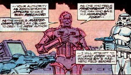
Senator Greyshade (Star Wars #18): An older, still quite virile-looking gentleman, his iron-gray hair cut and combed into 1970s winged style, with a pencil-thin mustache for extra sexiness. He likes to parade about in an orange space leisure-suit with a high-collared black vest. But instead of a disco medallion and an open-front tunic with chest hair spilling out, Senator Greyshade goes the more dignified route of donning simply a gold sunburst at his collar, which is alternately crew- or turtle-necked depending on which panel you're looking at on any given page. Make up your mind, Greyshade! Princess Leia's former senate rival, Greyshade now runs a giant orbiting gambling resort known as The Wheel. Since his casinos provide the Empire a great deal of revenue, Greyshade feels confident enough to insult Commander Strom openly, mocking him as a "military man... and a fool!"
his own conscience. He claimed it helped him "make decisions and work my way
through difficult thought problems. As opposed to drinking myself into a stupor like you
loser meatbags."
Master-Com (Star Wars #18): Senator Greyshade's personal assistant, a brawny-looking droid. Master-Com is the ambulatory control system of The Wheel itself. He and Greyshade are such good pals, it freaks out a bunch of stormtroopers and they react... violently. Doesn't much matter to Master-Com; he's got a lot of spare bodies lying around The Wheel.
Jorman Thoad (Star Wars #25): A heavset bald man in a blue tunic and red cape and the personality of a flamboyant used car dealer-- fitting, since he's a used spaceship dealer. Different galaxy, same thing. He trades ships with Luke and Leia on the planet Centares, allowing them to ditch Senator Greyshade's yacht (something tells me the Senator won't be needing it anymore anyway), then tells them some important information. His most significant physical trait is that his head looks about to pop, like a big pink zit. Thoad really should have that checked out.
Baron Tagge (Star Wars #25): A wealthy galactic entrepreneur and asshole-for-all-seasons, Tagge (with his severe widow's peak hairstyle and triangular chin decoration-- a substitute for the goatee he can't grow?) loves to practice with a lightsaber. Why does he do this? Because Darth Vader blinded him. Now Tagge has to wear a pair of Devo glasses to hide his eerie iris-less eyes. When we first meet him, Tagge is using his mining operations as a cover for his combat strikes against the Rebel base on Yavin IV. And why does he do this? For the petty motivation of showing up Darth Vader. Well, maybe making a fool of the guy who took your sight isn't such a petty excuse for acting like a fascist goon. Just don't let Luke Skywalker anywhere near your-- TOO LATE!
Skinker (Star Wars #27): Yet another bald bad guy! I'm beginning to think Goodwin and Infantino have it in for us hair-impaired people. Perhaps jealousy because we are indeed quite sexy. Skinker is one of those guys who was either unfortunately and presciently named by his parents, or else came by his creepy handle after a lifetime of double-dealing and shady activities. But what he lacks up top, he's cultivated on his chin-- some kind of silver fringe that makes him look as if he's been eating the tinsel out of the Christmas decorations box. Skinker runs a scrap yard on a backwater planet, but also works for Valance. Every time Valance comes into a little money, he pops over to Skinker's, buys whatever droids the guy has lying around-- then blasts them. The man loves to blast droids, and Skinker doesn't seem to mind; Valance pays the going rate and it saves the junkman from having to fix them up. I call that win-win.
Tuesday, May 10, 2011
Star Wars Omnibus: A Long Time Ago.... Volume 1: A Comic Review
Publisher: Dark Horse Writers: Roy Thomas, Don Glut, Archie Goodwin, Mary Jo Duffy Artists: Howard Chaykin, Carmine Infantino, Alan Kupperberg, Herb Trimpe, Allen Milgrom, Walt Simonson, Steve Leialoha, Rick Hoberg, Bill Wray, Frank Springer, Tom Palmer, Bob Wiacek, Terry Austin and Gene Day
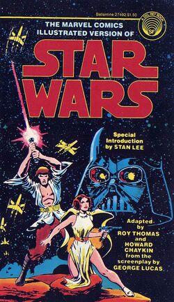
Despite being-- like most of my friends-- a complete freak about all things Star Wars in the late 1970s, I rarely bought the Marvel comic series unless they were doing an adaptation of one of the movies. I'm pretty sure the only complete storyline I owned from this title was a small black and white paperback of the first six movie-based issues from Ballantine, which I began coloring with Crayolas and markers. My impressions of the Marvel version of George Lucas's creation are strobe-like glimpses of random moments in any given plot. Who's this guy who wasn't in the movie? How did Luke get to this planet? Where's Darth Vader? Why is Han hanging out with a giant green bunny, who's something of an asshole to boot?
Face it, few of these early stories are classics. This volume showcases Roy Thomas's skills in adaptation and pastiche, but also his taste for the silly. He immediately casts Han Solo into the Takashi Shimura role in a comic book version Kurosawa’s classic film Shichinin no Samurai (That's The Seven Samurai to you and me, Russ), with Han and Chewie recruiting some fighters to help space-villagers fight space-bandits. Or maybe it's The Magnificent Seven, but with a porcupine guy instead of James Coburn's knife fighter. Considering how much Lucas borrowed from Kurosawa, Thomas has the right idea. But he can't resist introducing Bugs Bunny into the mix. Meet Jaxxon, the infamous green rabbit. Roughly as popular as the reviled Jar Jar Binks, but mercifully obscurer, Jaxxon never got any screen time in the prequels or any of the spin-off animated series, and neither Kenner nor Hasbro ever produced him as an action figure.
Other Thomas touches include Don-Wan Kihotay, a straight lift of Miguel de Cervantes’s famous creation and a villain named Serji-X Arrogantus, apparently an affectionate parody of artist Sergio Aragones, complete with Aragones's magnificent black mustache. What kind of name is Arrogantus? I know the various Darths often chose wicked-sounding surnames-- Sidious, Maul, Vader-- in order to frighten. But what else could someone named Arrogantus become other than a throwaway creep in a hastily written comic book? What kind of family could he have come from? Still, Thomas's script for the movie adaptation is filled with punchy descriptions and clever ideas like the explosion that destroyed the Death Star taking days to burn and providing a spectacular if temporary tombstone marker for Grand Moff Tarkin's great failure. If George S. Patton was right and fixed fortifications are monuments to the stupidity of man, so then are giant space stations with unshielded exhaust ports.
Plus I have to give him credit for another cool idea. At issue #6's conclusion, Thomas corrects one of George Lucas's most egregious mistakes (prior to conceiving and producing the prequel trilogy, that is) and prefigures MTV’s efforts by twenty years when he mentions in a caption that, yes, Chewbacca will also receive a medal. Hayden Christensen and Natalie Portman, unfortunately, are beyond repair.
Second scripter Archie Goodwin's settings and situations owe more to Flash Gordon, with an appropriately swashbuckling feel. Goodwin has Luke visit an all-water planet to hang out with a young Kevin Costner (inspiring Costner's notorious 1995 flop Waterworld) and sends the whole gang to an orbiting satellite of casinos that would make Futurama's Bender drool if he were programmed for that sort of thing. And so it goes for the rest of this volume. Star Wars characters sort of cut and pasted into comic book plots lifted from all the familiar sources.
Since there were no “Expanded Universe” tales or overall continuity to these adventures back in 1977, the Marvel writers were free to make up all kinds of wild characters, planets and situations. Besides the ridiculous Jaxxon and the amusing Serji-X, there's a cool and conflicted bounty hunter named Valance with a hideous secret, bald Yul Brynner impersonator Commander Strom (an evil Imperial officer), roguish Senator Greyshade and his pal, the chunky droid Master-Com. My favorites are Crimson Jack, the pirate king who commands a stolen Star Destroyer, and his first mate Jolli, the tragic, man-hating ass-kicker with a purple pageboy haircut and a cute green beret. These two repeatedly bedevil Han Solo.
Howard Chaykin’s art in the first issue is shaky and rushed, but things improve rapidly with fine ink work from Steve Liealoha and Tom Palmer. As a kid, my favorite was the issue featuring the Death Star attack. Assisting Chaykin are Rick Hoberg and a pre-Ren and Stimpy/fine art Bill Wray-- as the X-Wings and TIE fighters zip and zing (and explode), the ink team goes nuts with the feathering and cross hatching. They also fix Chaykin’s likenesses so Han looks more like Harrison Ford and Luke looks less like a middle-aged Kirk Douglas with a California surfer cut. I used to love the artists' depictions of the reflections in the rebel pilots’ goggles and the final panel of all the heroes together at the awards ceremony.
Most of the art in this volume is by the legendary Carmine Infantino, inked with an almost mechanical cleanness by Terry Austin and then more organically by Gene Day and Bob Wiacek. I did not dig Mr. Infantino’s angular, stylized faces and heroically proportioned figures (Han and Luke put Arnold Schwarzeneggar to shame) when I was a 10 year old, but his art has aged much better than most of the stories it supports. If you can get past such bizarre scenes as Han and Chewie floating around in space and Chewie’s orange monkey face, you’ll find page after page of vigorous storytelling. While his facial expressions and body poses aren't subtle, Infantino excels at putting figures into motion and depicting action, and both Thomas and Goodwin make sure he has plenty of that to draw. Fisticuffs and light sabre battles abound, plus giant sea monters and space dogfights. All those spaceships must have been real bastards to draw, too, but Infantino and the rest don't scrimp on the machinery and planetary vistas. Like Chaykin before him, Infantino goes “off-model” quite often, but his art here is dynamic and fun. That's what matters most. I’d rather see artists like Chaykin and Infantino adapting a property to their strengths rather than relying on tons of photo reference and ending up with a lot of static tableaux. Al Williamson (who apparently did use a lot of photo reference and even traced them at times) and Michael Golden were more natural fits for Star Wars, but I’ve really come to appreciate Infantino’s Marvel-ized approach as well.
While this reprint volume’s dimensions are smaller than the original comics, it’s attractively designed, impressively fat and reproduces the original colors by Marie Severin, among others. I paid less than 17 dollars for my copy via Amazon.com, which means with 27 issues, more than 500 pages-- and considering just how enjoyable these wacky, more than likely out-of-continuity stories are-- this Omnibus book is a bargain. I’d love it if Dark Horse got the rights to publish some of Marvel’s other licensed properties if they did them exactly like this. Come to think of it, Dark Horse is an amazing source of classy reprints—they’ve got old Gold Key titles, Nexus, Creepy and Eerie coming out in expensive hardcover formats as well as fat black and white collections of Savage Sword of Conan. And these chunky little Star Wars books that will make you want to pull out your vintage Kenner toys and head to the backyard.
Or create a custom Jaxxon action figure.
Monday, April 18, 2011
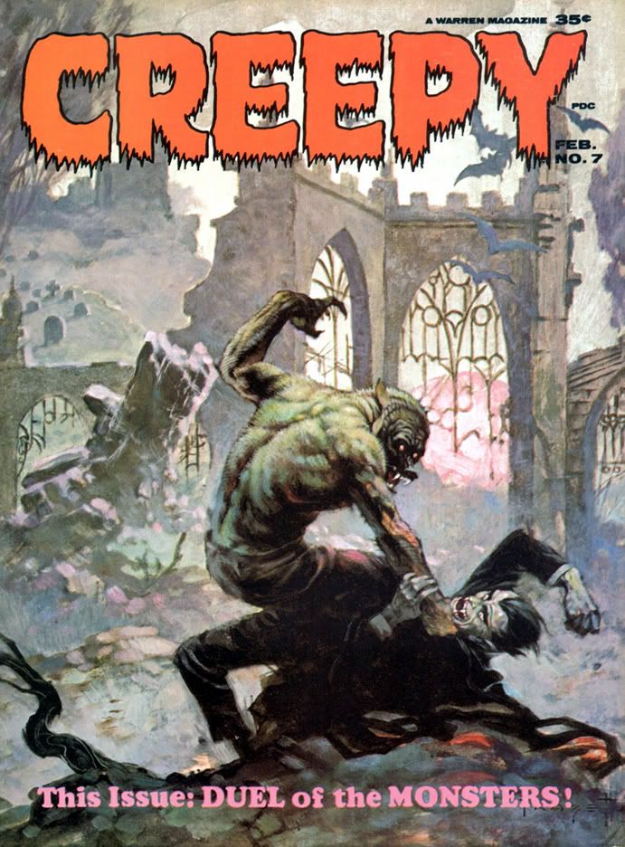
Creepy #7: Comic Nirvana has been achieved!
If only they could've put aside their differences!
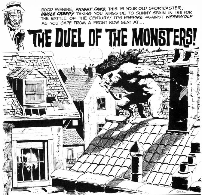
Even the Creepy logo is wonderful. Lurid red, oozing, dripping typeface. But what lurks inside? Do Wolfman and Dracula actually fight? Kind of. The lead story is "The Duel of the Monsters" by editor Archie Goodwin, with some sweet, sweet Angelo Torres art. The half-splash features a rooftop werewolf on the prowl-- what a hook!-- and we're already involved in the story.
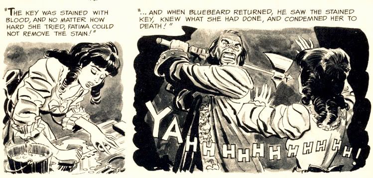
The second story is "Image of Bluebird," by Bill Pearson. It's about Monica and Brian, newlyweds who move to an isolated house deep in the woods. Thanks to some grisly murders, Monica becomes convinced she's married a Bluebeard. No, not a pirate. His beard was black. The infamous Bluebeard, killer of wives. Joe Orlando does all he can to make her suspicions valid with his ambiguous portrayal of Brian. One moment he's literally sweeping Monica off her feet, the next he's brandishing a knife and looking positively demonic. Fortunately for Monica, it's all a case of mistaken identity. Brian, however, is not so lucky. Pearson's crafted a tightly plotted tale and Orlando provides some fun moments with axes and one truly spectacular panel where a character screams "AAAAARRRRGGHH!" with a knife sticking out of his chest. Hard to go wrong with bloody stabbings.
Wow. When I read Creepy #7 the first time, I just could not get over what I was seeing on each page. Even though the writing quality is a bit up and down, the stories are never less than fun. And it's difficult to imagine a more beautifully illustrated comic than this. Pure joy in print form.
Thursday, March 31, 2011
And a Gene in Every One: A Look at Some Gene Colan Horror Stories
What the heck am I babbling about?
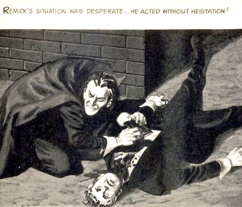
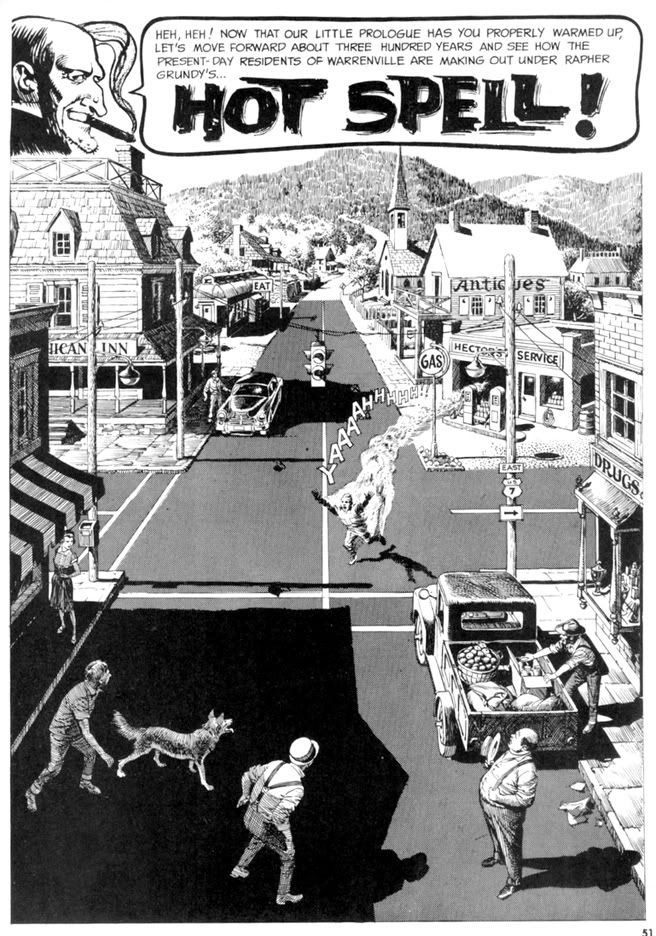
Colan has always been a master of extreme foreshortening, able to twist and turn the human figure in any direction. Very useful because he isn't the kind of artist who draws simple eye-level panel compositions. No, he likes to use high "camera" positions or his patented "worm's eye view" low angle shot. And then he breaks up the page with all kinds of crazy panel shapes, the results frequently looking like shards of broken glass arranged on the paper. Tom Palmer laid down some impressive inks on Colan's Tomb of Dracula pages, but here in Eerie, we get unfiltered Colan with his characteristic heavy shadowing-- but also marvelous ink washes where he creates an illusion of value and depth with just a few well-chosen gray tones.
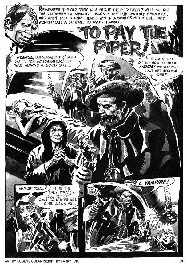
His first Eerie story is a twisted retelling of the old Pied Piper legend, "To Pay the Piper," which substitutes vampires for rats. This time, the cheapskate villagers are as familiar with the story as we are, so they resort to outright murder so they don't have to pay, only to suffer yet another twist involving werewolves. The final panel-- the punchline-- is a bit too crowded to be fully effective (or as horrific as it should be) but the story's creepy European setting prefigures Colan's depictions of Marvel Universe Transylvania.
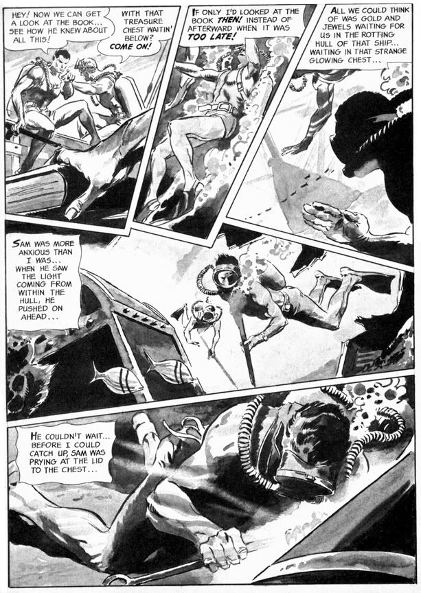
More original is "Full Fathom Fright" (Eerie #3), this time with a script by Archie Goodwin that allows Colan to go bonkers with the fractured panel shapes. This story goes from the booby hatch to Davy Jones' Locker as we first see a mental patient throwing a monster hissy fit, then learn all about the undersea misadventure that made him that way. Goodwin puts Colan's storytelling and rendering skills to their fullest. The undersea sequence is particularly nice, with Colan creating a real sense of weightlessness, with deep water shadows and lighting effects. And the final gag panel with its Lovecraftian conclusion is nice and large and much more effective this time.
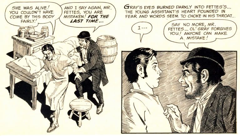
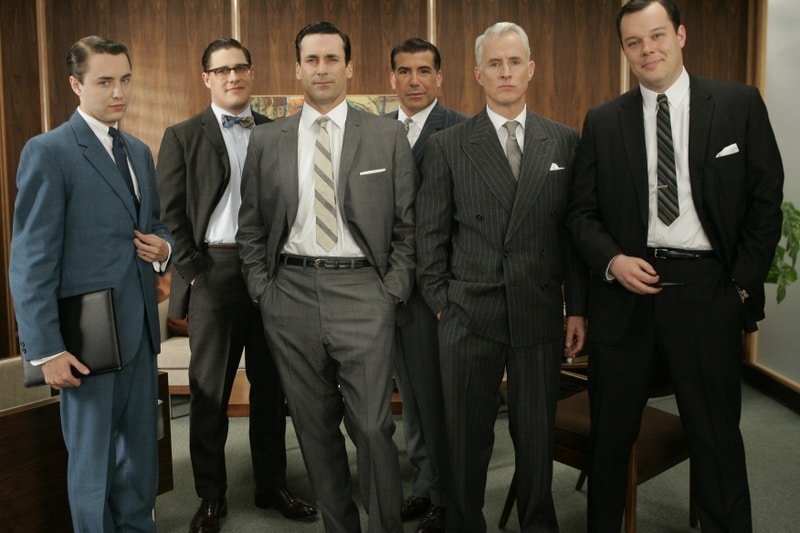
The final story, "A Matter of Routine" (Eerie #5) seems a little rushed. The figures are simpler and the ink washes read a bit flatter than in the previous shorts. It's kind of a nightmare version of the Mad Men era-- a fedora-wearing flannel-suited commuter type (he's even got a 1960s George Grizzard buzz cut) gets off his afternoon train, slips the key in the door at home and steps quite literally into Hell itself. Goodwin's narrative captions are in breathless second person: "You fall to the scorched black cinders of earth, your only escape route banished..." and the denouement is an extremely lame "Was it all a daydream or do I dare open this door after all?" type cop-out. Not the finest work by either gentleman, but still an interesting cultural relic of a bygone era.
It also features axes.