Showing posts with label Marie Severin. Show all posts

Friday, October 17, 2014

October is Spookey Month: How EC ruined America's pasttime in Haunt of Fear #19 (May-June 1953)

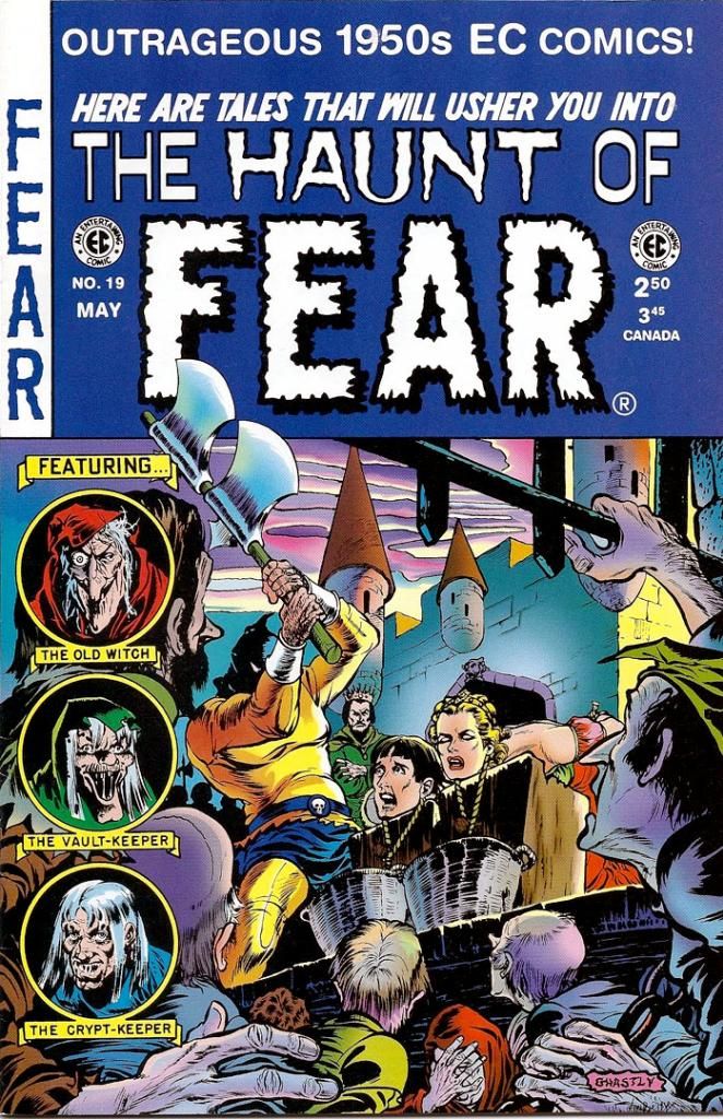
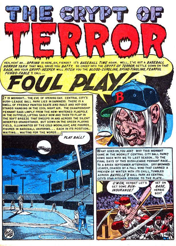
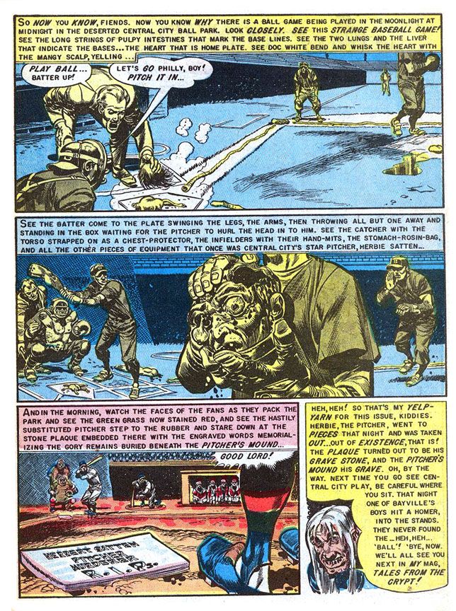
No, they didn't ruin baseball.  That's just me trying to have a little fun and shake things up a bit.  If anything, they made baseball better!  But EC did get itself into hot water with the government over "Foul Play," a story appearing in Haunt of Fear #19 (May-June 1953).  Dr. Frederic Wertham used it as an example of horror comic nastiness in his book Seduction of the Innocent and then did it again during his afternoon session testimony to the 1954 Senate Subcommittee Hearing on Juvenile Delinquency

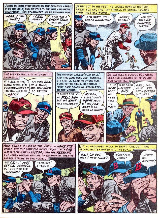
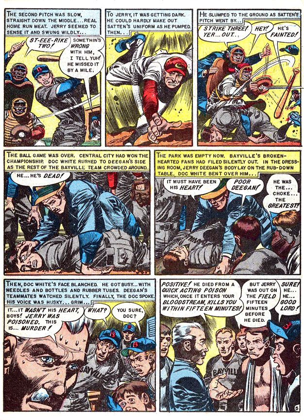
The story is about Central City's Herb Satten, an unscrupulous pitcher who wants to help his team win the pennant by murdering the Bayville's star second baseman, Jerry Deegan.  After all, this Deegan slugger led the league in home runs all season and he's up the next inning in a tight game.  It stretches credulity a bit.  Satten kills Deegan by poisoning his spikes, then allowing himself to get hit with an inside pitch so he can get on first, attempt a steal then slide spikes-high and slash his victim.  He's thrown out and it looks like a bonehead play, but it all works out. Satten kills his man and Central City wins.  This leads to the pitcher's grisly comeuppance the night before the next season's opening day.

And one of the all-time great gross-out scenes in horror comics history.  The murdered man's teammates literally rip Satten apart late one night and use his body parts to play a moonlit intrasquad game.  Complete with a complicit umpire.  That also stretches believability, but not so far as the poor pitcher's intestines, which serve as foul lines up the first and third base paths.  The grisliest detail is the catcher's using the Satten's chest as his own chest protector.  You wanna wear part of a human body even if he is a sorry murdering cheat?  What is this, the Ed Gein League?

They also incriminate themselves by burying him under the pitcher's mound and inscribing the rubber there with "Herbert Satten.  Pitcher.  Murderer.  R.I.P."

Rest in pieces, baby.  Rest in pieces.

Writer:  Al Feldstein/Artist: Jack Davis

Well, they were angry ballplayers and probably didn't think through the consequences.  The ironic thing about "Foul Play" is, it may have been notorious at the time but the guy who drew it is one of the nicest, most gentlemanly people you'll ever have the privilege of meeting.  If you're so lucky.  I had a chance to phone interview him way back in 1996 for a class project and I came away in such a good mood because he was so jolly and generous.  He answered even my stupidest questions with patience and good cheer.

Writer:  Al Feldstein/Artist: Jack Davis


I'm talking Jack Davis, the dean of American caricaturists.  This story is right in his wheelhouse, so to speak.  Davis is a master of sports cartooning, able to twist his loose-limbed figures into whatever pose necessary to show the physicality of sports.  Baseball, basketball, football, late night murder, these are things Davis visualizes so well.  Obviously made a huge impact on Dr. Wertham and the guys up on Capitol Hill, huh?

Writer:  Al Feldstein/Artist: Jack Davis

I loved Davis' work before I ever read this story (although I'd heard rumors of it for years and they always chilled me to the bone).  He drew magazine covers, movie posters.  His art came into our house on television in the form of character designs for the Jackson 5ive Saturday morning cartoon.  As a University of Georgia graduate, I've seen dozens, if not hundreds, of Davis-drawn Bulldog athletes in motion, with his characteristic lanky body language and large, articulated hands.  Gorgeously rendered in loose, appealing brushstrokes and then watercolored to pop from the page of whatever book, calendar or postcard they adorn.  His 1950s horror work benefits from the Davis approach, one that exaggerates reality for comic effect.  So when you see a Davis severed head, it's not grotesque no matter how decayed it might be.  It's sick... but in a tasteful way.

Writer:  Al Feldstein/Artist: Jack Davis

The Senate Subcommittee Hearing people must not have felt that way, although I believe William Gaines explained it quite well in his testimony.  This is gore in just the right amount.  There's nothing gratuitous about it, but it has to have impact.  If you'll notice, too, colorist Marie Severin gives those panels a blue-yellow complementary color scheme rather than one that emphasizes its fleshy or bloody qualities.  This makes it explicit without going over the top.  Not for the squeamish, certainly.  But it's right in my wheelhouse, too.  Jack Davis is an American treasure, baby.  And so is Marie Severin.  No doubt about that. 

Sunday, July 6, 2014

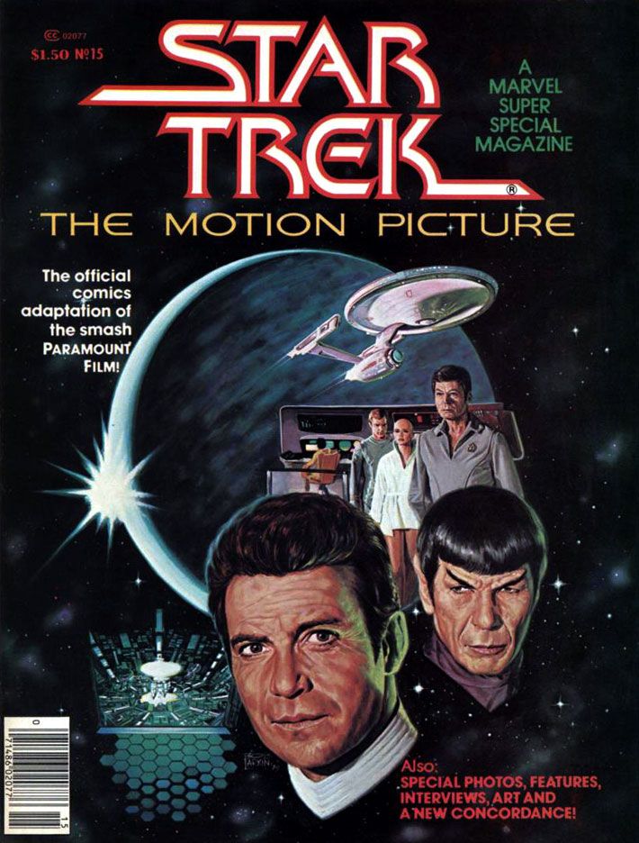
Marvel's Marvelous Movies #3: Star Trek: the Motion Picture (December 1979)

I'm going to tell you upfront this was one of my favorite individual comic book stories when I was 11 years old.  I have no idea how many times I read it.  The following year, Marvel's Empire Strikes Back adaptation would knock this one (and just about every other comic I'd ever read and loved prior to encountering Al Williamson) down a spot or two on my personal hit parade, but I still have a deep and abiding love for Marvel Super Special #15.  I'd been a Star Trek TV show fan for as long as I could remember, and this was in the wilderness years of the 1970s.  Back then, you had to find Trek at odd hours on some local station.  Ours came out of Tallahassee on Saturday afternoons, subject to atmospheric interference.  When your station dropped whatever Trek syndication package they'd licensed, you lost touch with the crew until they popped up somewhere else within antenna range.  In the interim, you could read the James Blish short story collections with episode adaptations, and the often silly Gold Key comics.  Or collect and play with the Mego action figures.  That was as Treky as we got before 1979's Star Trek: the Motion Picture came out and relaunched the franchise as a movie series.

It almost didn't.  The movie, directed by two-time Academy Award winner Robert Wise and based on a premise written by series creator Gene Roddenberry, made money, but it was expensive to produce and wasn't as big a hit as Paramount had hoped for.  It certainly looked fantastic, with a sleeker, updated Enterprise and everyone in pajamas for a sweet slumber party atmosphere.  But it suffers from endless shots of the Enterprise slowly drifting along set to repetitive music cues and people staring in awe at light shows.  It's like watching the audience at Laser Floyd: Dark Side of the Moon.  The film allows its characters to ask existential questions, but when it comes to answering them, the result is akin to a 2001: A Space Odyssey where, after boring you for more than two hours, Stanley Kubrick has the astronauts explain to each other (and the audience) exactly what the monolith represents and why it does what it does.  The cheaper, more action-oriented Star Trek II:  The Wrath of Khan turned out to be the franchise's salvation, not this glacially-paced epic.  But in 1979, for me, it was enough seeing Kirk, Spock, McCoy, Scotty, Uhura, Sulu and Chekov (along with Janice Rand, for cripe's sake!) back in action.

And, after watching this movie again on Blu-Ray recently, I've decided I'll take it with all of its flaws and dull stretches over either of the terminally stupid "reboot" flicks any day of the week.  Star Trek The Motion Picture at least has ideas and something to say about the basic human dilemma ("Is this all there is?  Is there nothing more?"), things it takes very seriously.  Can you imagine a major studio nowadays dropping this kind of money on a sci-fi flick starring a lot of middle-aged people and without any meta-humor or product placement?  There's not even a sky-diving sequence!  There's barely any sex!


But let's talk about the comic.

It must have been a daunting challenge to adapt into an entertaining comic a story that consists mostly of long sequences of nothing more than the Enterprise gliding over the giant V’Ger ship and then small groups of characters conversing about it in staff rooms and small corridors.  The comic really benefits from the deft way Marv Wolfman condenses scenes.  Wolfman ruthlessly edited down long scenes into a few panels, quickening the pace and generally tightening things up.  Wolfman uses his narrative captions-- always a strength of his writing-- to clarify character motivation and add descriptions and exposition to guide readers along.  We're engaged throughout.

For the art team, which consists of Dave Cockrum on pencils and Klaus Janson on inks, the problems are finding ways to make all the conversations work visually and reproducing the movie’s many, many special effects shots.  Cockrum, a master of crowded team compositions and action-packed superhero action, comes through with strong "acting" from the principals, downplaying the usual Marvel dynamics but upping the emotional content of various scenes.  His Commander Decker in particular comes alive with various angry faces and hand-chop poses emphasizing his frustration.  The likenesses are consistent throughout, a real plus when dealing with familiar, iconic characters.  The results aren't photographic, but Cockrum never confuses the readers.  Kirk has his poofy hair, McCoy his sharply arched eyebrows and drooping, lived-in face.  Of course Spock is easy to get right, but even more conventionally good-looking people like Uhura, Sulu and Chekov look pretty much the way you expect.  Every so often there's a dead face, but they never become a distraction.


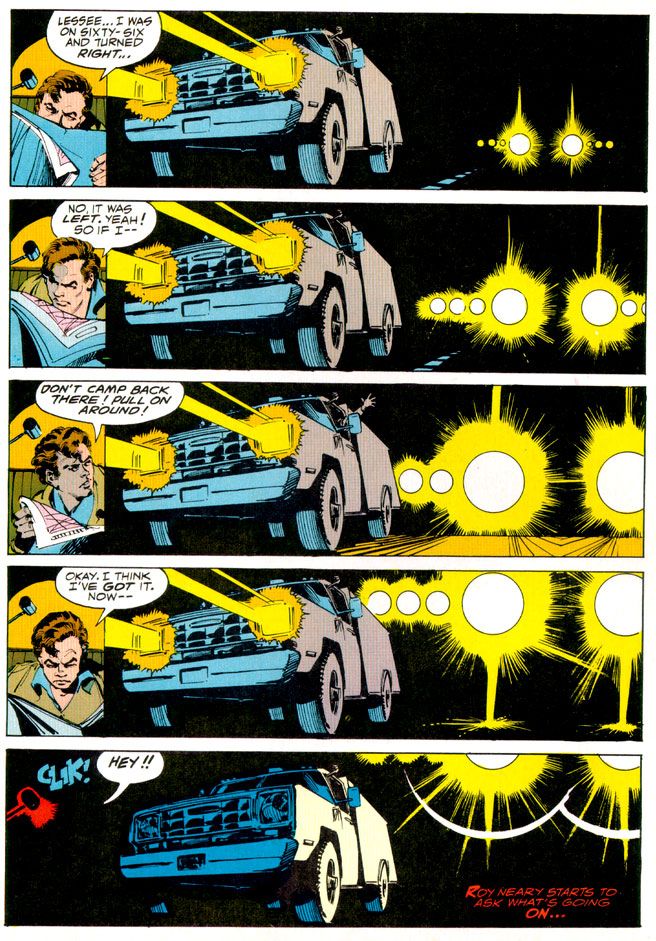
What an ink job Janson provides, too.  While he and Walt Simonson outdid themselves on innovative lighting effects in Close Encounters, here he and colorist Marie Severin use color holds to reproduce Douglas Trumbull's lightning balls and wormholes.  This kind of stuff is easy to do these days with digital inking and coloring.  It's nothing to isolate an element and change the color channels to whatever you want.  But when Janson and Severin tackled Star Trek, they had to rely on acetate or vellum overlays.  It must have been a tedious, time-consuming process because they use one or more on practically every page.  The results are nothing less than astounding.


For all its pacing flaws, the film is effective at making space seem like an infinite frontier full of dangers.  It's not just that there are Klingons and V'Gers out there ready to zap unfortunate astronauts and Starfleet personnel.  Space itself is dark and perilous.  For one thing, the ships have to provide their own exterior lighting.  None of that Star Wars stuff where everything in space is brightly lit no matter how far away it is from an actual light source.  To the human mind, space appears largely empty, dark and vast.  Even the vaunted technology its space explorers count on for survival turns on them.  The transporter goes awry in a shocking incident and, later, the warp drive throws the ship into what the characters call a “wormhole.”  Contending with these, the Enterprise crew truly seems to be going boldly.  This isn't sailing along to some cute world where you find 1920s gangsters or the White Rabbit out of Lewis Carroll.  You could end up a data stream in a godlike machine's memory banks or transformed into a robotic copy of yourself with a lighted jewel embedded in your throat.  Or merge with the overmind into a stream of light.  Wolfman’s script reproduces each of these episodes faithfully and Cockrum, Janson and Severin provide some spectacular visuals to match them, with all the production design details faithfully reproduced.  Ultimately, this is an extremely accurate recreation of the film's look and mood, minus its shambolic tendencies.


The story also appeared in three monthly issues (Star Wars, a much shorter but action-oriented film, ran in four, which is further evidence of how Trek should have been pared down a bit) which led to a short-lived Marvel Star Trek comic.  I never read a single issue of that.  After all this time, I'm not sure why, especially considering how much I enjoyed this one.  Maybe it was enough for me Wolfman, Cockrum, Janson and Severin had already provided fabulous glimpse of what a Star Trek comic could be, one-upping its cinematic source material.  Too bad they didn't get a chance to take on Khan.


Looks like I forgot to talk about the Bob Larkin fully-painted cover.  That's just as well.  I'd have written a paragraph consisting only of superlatives.  I look at it kind of like Kirk, McCoy, Decker, Ilia and the rest gaze at Laser Floyd.

Wednesday, December 4, 2013

The Worm of Thrace That Makes Things Worse or the Art by Marie Severin That Makes Everything Better

First we're going to talk about 1981's Dragonslayer and the Marie Severin-illustrated comic book based on it, and then I'm going to tell you why I'm including Eddie Deezen (who had nothing to do with the making of either) in this sentence

Dragonslayer is, I suppose, a cult favorite these days.  Maybe it was a little too obvious the spawn of Star Wars (naïve young man on a hero's quest, spunky love interest, old mentor, pre-dating George Lucas but owned by him after May 1977) ever to strike box office riches.  But ten of us like it.  We don't have any cultish rites as yet, but we're working all that out at our monthly meetings that always take place at the stroke of midnight during the new moon period. 

Dragonslayer has so many wonderful qualities, it's long overdue for nostalgia-hungry Internet people to brave its shadowy, flame-scorched lair and bring it forth into the dawn of its new age of popularity.  There are winning performances from Peter MacNicol (later one of the best things about Ghostbusters 2, and an absolute riot as an enthusiastically boneheaded camp counselor in Addams Family Values), Caitlin Clarke and, in the role of wise wizard, Sir Ralph Richardson (doing that Obi-Wan thing Star Wars made a requirement of older British actors in the 70s and 80s).  It has a powerful score by Alex North (a movie music master who also scored Stanley Kubrick's Spartacus and worked on the director's 2001: A Space Odyssey before Kubrick decided to use classical pieces).  Not the least among all these estimable qualities is its dragon, the mighty Vermithrax Pejorative, brought to fierce, fiery life by Phil Tippett and a lot of talented special effects geniuses at ILM through the magic of their "go motion" process and some full-sized body parts.  Vermithrax Pejorative is the movie dragon by which all others must be judged and found wanting.

The story takes place in the Dark Ages (which weren't really as dark as modern myth makes out; we prefer to call those days the early Middle Ages).  A kid named Galen is a sorcerer's apprentice and Urland, a nearby kingdom, has a nasty dragon infestation consisting of our friend Vermithrax and her babies.  The king there has instituted a lottery whereby they randomly choose a maiden to dress like a bride and feed the dragon.  As in, the dragon feeds on her.  A deputation from Urland comes to visit Galen's boss, the renowned wizard Ulrich.  A mouthy boy Valerian in the party turns out to be a spunky girl in disguise and it's not long before she and Galen are making goo-goo eyes at each other.  Eventually, the youngsters have to confront Vermithrax and put an end to the death and destruction even if it means also eliminating the last vestiges of magic and fun in the world.

Let's wait for a minute or two while pop culture rights itself and this movie gets the acclaim it deserves.  There.  Now Dragonslayer has ascended to its rightful place as one of the great films.

After striking riches Jed Clampett-style with its Star Wars adaptation, Marvel wasn't about to let any other comic company join in the fun and profit so they started licensing practically every sci-fi or fantasy movie out there and releasing them in deluxe magazine format they called the Marvel Super Special.  The bigger, prettier print jobs favored instant classics like my beloved Close Encounters of the Third Kind and the lushly beautiful Archie Goodwin-Al Williamson adaptation of The Empire Strikes Back


This also led to some really strange and wonderful comic freakshows like Marvel Super Special #17:  Xanadu, the Illustrated Story.  Imagine that-- a whimsical Olivia Newton-John musical as a comic book!  I guess having missed out on the Grease lucre really burned Marvel's collective bums.  Too bad Xanadu became a notorious flop as a film and an oddity of a comic book. 

Dragonslayer, on the other claw (whoa, steady there, boy, don't get too stupid too fast), was a natural choice to make into a comic.  For one thing, it has few, if any, song and dance numbers to translate into pen and ink and scattered prose.  And for another, witness Marvel's success with fantasy properties like Conan the Barbarian, Kull the Conqueror and Red Sonja.  Conan was making semi-regular appearances in Marvel Super Special and Marvel had previously devoted three whole issues to their homegrown Doug Moench fantasia Warriors of the Shadow Realm, also known as Weirdworld.

Denny O'Neil's charming script hits the proper story beats, as expected.  But what O'Neil also does so well is illuminate the film's underlying themes of changing ages.  He doesn't miss the subtle tragedy of both Ulrich and Vermithrax being the last of their respective kinds.

But here's the best part.  Marie Severin is an absolutely inspired choice for art duties on Dragonslayer.  Among her many scattered Marvel art jobs penciling and inking characters like Namor and Spider-Man, Severin had already provided interiors for Marvel's Kull comics, and covers for that series and Conan the Barbarian.  Strong prep for Dragonslayer.

This art is pure joy.  Maybe it's due to her humor comics background, but Marie Severin absolutely aces the "acting," which I find many artists ignore or else botch completely.  In comics, true masters of acting are rare.  Comic book artists tend to pose their characters in weird, inhuman ways with every muscle tensed rather than develop unique body language.  And blank expressions when nothing much is happening, or downcast eyes when characters feel sad, or clenched teeth with neck tendons and veins bulging to the point of bursting for every other emotion.  Big, simplistic takes on big, simplistic feelings.  There are action scenes and plenty of screams and curses in Dragonslayer, but there are also a lot of moments where quirky people simply talk to each other.  If the characters turn into blank-faced nothings seemingly reproduced from clothing store mannequins, readers miss out on the mood and character personalities.  An artist is responsible for this stuff, too, not just the punches and kicks.

On Dragonslayer, Severin takes time to draw individual expressions and well-observed poses for every character on the page and really brings them to life.  Especially vivid is the unearned cockiness Galen displays right before the king tosses him in a dungeon as a big phony.  But even the kids Galen entertains at a celebration each have unique facial expressions that tell us what they're thinking and enrich the moment.  Some are delighted, some are a bit more dubious.  Are they important?  Maybe not, but Severin apparently felt it was necessary to go above and beyond, and I applaud.


She also does a lot to build the world these people inhabit.  Aided by some ornate inking by John Tartaglione, Severin packs the pages with images that recreate in two dimensions the film's funky, lived-in production design.  Dragonslayer's Dark-- er-- early Middle Ages were not those of fairy tale or chivalrous legend, despite the scaly menace of Vermithrax and the magical story elements.  It's more like the one from Monty Python and the Holy Grail:  dirty and smoky, with tumble-down castles falling to ruin.  Especially spectacular are the pages inside Vermithrax's lair-- Severin colored the book as well, and the lighting effects she manages on these pages raise the room temperature.  You can almost feel the heat and smell the stink of burning oil and sulphur. 

The only flaw in her storytelling is she tends to minimize Vermithrax.  We get one massive head as the dragon glares at Galen but for the most part Severin confines the great beast to smaller panels.  A full-page panel of Vermithrax in flight, spewing flame, would have been perfection.  As if to make up for that, Severin and Tartaglione do a knock out job on Vermithrax's baby dragons.  Valerian calls them basilisks, but I prefer the term kittens.  Dragon young should be called kittens.  The artists render the dragon kittens in loving close up so we get to see every bump and scale. 

Anyway, it's a good looking book.  The Earl Norem triptych cover pretty much sums up the magic that is Dragonslayer.  Maybe if they'd used it as the movie's one sheet it might have fared better at the box office.  Or not.  Such visual riches shouldn't be hoarded and hidden away by dragons-- it needs a reprinting at once.  Casiordorus Rex demandeth it!  Snap to it, people!  Chop chop and lickety-split!  Handle it, Roy, handle it!  Handle it!   As long as there isn't a joyless, rote, CGI-heavy remake with Sam Worthington as Galen and Megan Fox as Valerian.  Or some CW Network refugees.  There's no way some sullen-faced former underwear models could compete with the charms of MacNicol and Clarke.

Okay, back to Eddie Deezen.  Dragonslayer director Matthew Robbins also directed 1978's Corvette Summer, the movie where Mark Hamill builds a custom Corvette Stingray only to lose it to a sleazy auto shop owner/car theft ringleader played by Kim Milford, who essayed lead schlub Billy Duncan in Laserblast, a low-budget sci-fi revenge flick (mocked impressively by Mystery Science Theater 3000 at the end of its seventh season).  Laserblast is where Eddie Deezen made his film debut. 

Marvel Super Special #4 The Beatles Story is a comic book biography of those four lads from Liverpool.  Eddie Deezen knows more about the Beatles than you and I put together ever will.  Eddie Deezen turned down a role in the Bill Murray-starring hit Meatballs for a part in the John Belushi-and-Dan Akyroyd-starring flop 1941.  Eddie Deezen voiced Mandark on Dexter's Laboratory


The Beatles, Marvel Comics, Laserblast, Corvette Summer, Dragonslayer, Dexter's Laboratory:  they all come around in the end to Eddie Deezen.  We like Eddie Deezen as much as we like Marie Severin.

Thursday, November 28, 2013

Close encounters of the mail order kind starring Marvel Super Special #3: Close Encounters of the Third Kind

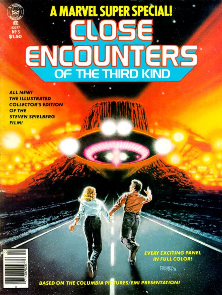
Bob Larkin painted the cover for Marvel Super Special #3: Close Encounters of the Third Kind (1978) and it's typically gorgeous work.  Larkin worked in bold, vivid colors.  Larkin wasn't painterly or as dynamic as as his stable-mate, Earl Norem (they both contributed memorable covers to Marvel's Planet of the Apes black and white magazine).  Larkin favored a sharper finish, not quite photorealistic, but startlingly close enough for a kid in the 1970s who wanted to see what his favorite superheroes would look like if they came to life. 

I don't know who the key figures on this cover are.  Let's call them Not Quite Richard Dreyfuss and Sort of Melinda Dillon.  I seem to remember in those days you couldn't always get the licensing rights to do exact likenesses of actors, so Larkin flexed his screen-accurate art muscles on the UFOs and the cosmic light show around the Devil's Tower in the background, which they apparently could get the likeness rights to.  Just kidding.  Everyone knows the Devil's Tower is in the public domain.  No wait, actually I own it.  I'd forgotten momentarily, but I'm pretty sure I have the papers around here to prove it.  Please send my back payments, Mr. Spielberg and the new ownership of Marvel.  Thank you.

The point is, when you find a copy of Marvel Super Special #3 for yourself, you end up with this Bob Larkin painting that will knock out your eyeballs with its startling beauty even if he had to settle for brushing in a couple of stand-ins for the movie's real stars.  And inside the book, you get an Archie Goodwin adaptation of one of the prime 1970s blockbusters-- second in our youthful instant-classics pantheon in those days to a little flick called Star Wars (and Close Encounters is in every way the superior work of art even if its pop culture cachet has never equaled that of its cinematic big brother)-- over Walt Simonson pencils and Klaus Janson inks.

Script: Archie Goodwin/Pencils: Walter Simonson/Inks: Klaus Janson/Colors: Marie Severin

Think about that for a moment and ask yourself, "Was this magazine worth the $1.50 they charged for it back in 1978?"  Admittedly, it's a silly question we can only answer in the affirmative.  Resoundingly so.  I paid slightly more for mine and now I'm going to bore the hell out of you by telling why.  First, we have to time travel back to 1979 or 1980.  We either had Jimmy Carter or Ronald Reagan in the White House, or maybe in some alternate universe, both fused into a two-headed creature that could never come to an ideological agreement with itself, and so ran around in circles before collapsing exhausted in the Lincoln bedroom, panting and begging for an end to its misery. 

In our reality, this was before the direct market, or at least its earliest days, and before my town had anything resembling a comic book store.  We had to get our comics at bookstores, convenience stores, pharmacies and the occasional gas station.  None of those places would reliably stock oversized comic book magazines.  And back issues?  Back issues were what your big brothers or their friends gave you when they were finished with them, and my brothers and their buddies were all sports playing guys into muscle cars, funk music and girls, not comic books.  I once received a hand-me-down Weird War Tales from one of these cool dudes-- instead of a beating-- and it was one of the happiest days of my life.

Script: Goodwin/Pencils: Simonson/Inks: Janson/Colors: Severin
So I didn't even know a Close Encounters comic existed until almost a year or so after they printed it.  There used to be this mail order outfit called Heroes World.  Marvel eventually took them over, but in the 1970s and early 1980s, they put ads in comics for things like Mego action figures and those huge "Treasury Edition" magazines both Marvel and DC used to put out.  One day I was reading some comic or other-- probably Micronauts-- and my eyes landed on a list of Marvel Super Specials and there it was, a comic based on one of my favorite movies at the time. 

We didn't have DVDs or even VHS then, so the only way to repeat the experience of movies you loved when it left the theaters was to buy comic book adaptations, or novelizations (or the occasional Foto-Novel), then wait for ABC to buy the broadcast rights.  I already had scattered issues of Planet of the Apes, Star Wars, Battlestar Galactica and this huge King Kong magazine from either Gold Key or Whitman.  This meant I had to add Close Encounters to my film comic library.  You're looking at me as if I had a choice.  Trust me.  I didn't.  I can't remember how I got the money, or the exact price (although $2.25 plus shipping and handling comes to mind), but I do remember it took forever to come in the mail.  So long I assumed I'd been ripped off, which happened to kids sending money to companies that advertised in comic books from time to time.  Then it came in a cardboard envelope and I was not disappointed.  In fact, it not only impressed me as a story but it also changed the way I thought about comics.

First of all, it accurately recreated the movie experience in a way no film adaptation had for me before.  Star Wars was fun, Battlestar Galactica adequate.  Close Encounters topped both.

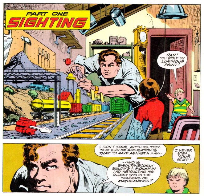
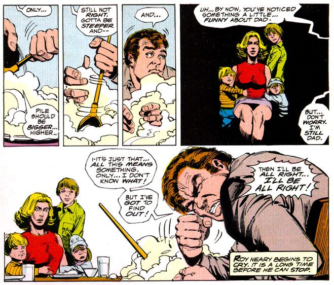
It didn't matter that the inside wasn't photo-realistic, or that we wouldn't have Dreyfuss, Dillon, Teri Garr or even Francois Truffaut going through their motions.  Despite Marvel's inability to score the license for the actors' likenesses, Simonson and Janson occasionally came litigiously close enough as far as I was concerned.  I can imagine other kids reeling in disappointment when they first laid eyes on the off-model Roy Neary carving his mashed potatoes into a lumpy hill while his stunned family looks on in panel designed specifically by Simonson to showcase their growing emotional distance from their troubled husband and father by isolating them in a flat black space.

I was relieved Simonson and Janson at least got his "type" right.  After all, George Tuska's Taylor in Planet of the Apes looked more like screen Hercules Steve Reeves than screen Ben-Hur Charlton Heston.  At least the comic book Dreyfuss wasn't nine heads tall with a physique out of a Renaissance fresco.  The Truffaut character, on the other hand?  I still don't know who that hawk-nosed guy resembles, but it's not the man who directed The 400 Blows.  But he is a relatively minor part of the story and on-panel just a few times in the comic, so I gave Simonson and Janson a pass there, too.

Script: Goodwin/Pencils: Simonson/Inks: Janson/Colors: Severin

As far as the other visual elements go, Simonson's panel layouts and sequential moments are some of his most cinematic storytelling in a career full of the stuff.  You can tell he was just as enthralled with the material as anyone buying this book would have been and he gives it his all, what one of my brothers' baseball coaches would have called "110 percent." I say it's more around 150 percent.  Simonson exaggerates body language a bit striving to match the film's emotional beats, but he also does these action-to-action panel sequences that transpose Spielberg's framing and pacing to a static page as well as any artist I've seen.  I wanted my usual superhero fare to duplicate these kinds of panel-to-panel action transitions as well, because it meant something closer to the way we perceive time than the usual dynamics and poses with speedlines.  This was my introduction to that sort of comic storytelling years before I ever heard of guys named Eisner, Krigstein, Steranko or Kojima.

Sometimes I'm not so keen on Klaus Janson's heavy-handed inks, but he and Simonson are matched well here, and the way he treats lighting in this book hasn't been equaled, at least not in any comic I've seen.  This is of utmost importance when dealing with Close Encounters, because light is practically a character in the movie.  People mock J.J. Abrams and his supposed lens flare addiction, but Steven Spielberg had cinematographer Vilmos Zsigmond practically paint the screen with light, and Janson follows suit, especially in the climactic encounter where he manages to do something I would have considered possible-- make static drawings look not simply like dazzling lights, but moving ones as well.  Seriously.  Janson manages to mimic moving lights with inked lines.

In his afterward (which I read as often as I did the comic part), Goodwin cheerfully explains some of the concerns a writer has when adapting from one medium to another.  You don't get a soundtrack when you read a comic, so Simonson came up with all kinds of innovative ideas for full-bleed artwork and panel arrangements to try and capture a bit of the John Williams magic.  There's also a problem with timing jokes.  In the movie there's a funny bit involving gas masks and Goodwin and team duplicate it, eliciting almost as much laughter from me reading it as the movie did when I was watching it.  Goodwin also takes time to praise Marie Severin's coloring job, and it is indeed first rate.  She really shows what a colorist can do with the limited and flat palette available in those days.  And so Goodwin gave me my first lesson in writing for comics as a craft, and the kinds of things pencillers, inkers and colorist do as well. 

Up to that moment, I had been used to experiencing a comic as simply a thing unto itself.   Words, pictures, colors make a story as if by magic.  I knew artists' names because I loved to draw, and had a vague idea of what went on behind the scenes because I read Marvel's Bullpen Bulletins and the editor's messages in DC's books, too.  But in an essay probably shorter than the one you're reading now, Goodwin educated me on a writer's responsibilities and how the artists actually thought about what they were doing and planned images for effect.  I also learned the word "onomatopoeia."  A comic didn't just poof itself into existence.  People like Goodwin, Simonson, Janson, Larkin and Severin made them with their minds, their hands, their talents.  Knowing that didn't take away any of the wonder of reading a comic book.  It added to it. 

More than thirty years later, it still does-- no matter who the writer or artist or colorist is-- and I will always have Archie Goodwin to thank for that.

Friday, February 10, 2012

Dark Horse celebrates women in comics with a sale!


It's super appropriate because if there's anything women love more than shopping, it's shopping for 50% off items! Right, ladies?

Oh lord, I'm so, so very sorry for that.  Sincerely sorry.  I haven't had much sleep lately and I'm starting to hallucinate. I blame a severe serotonin deficiency. And while my lame attempt at ironic humor has more than likely undermined any serious point I wanted to make here let me just say how much I truly respect and admire all the women who make comics. From Marie Severin to Jan Duursema, Lynda Barry to Mariko and Jillian Tamaki, Rumiko Takahashi to Ai Yazawa and Kate Beaton, Misako Rocks!, Sana Takeda, Chika Umino and many, many more-- your work just knocks me out. It thrills me. It makes me happy.  You're the best!*

This is how my train of thought has been working lately.  As my reader no doubt knows, I've been really getting into Creepy magazine which features some of the early editing work of Louise Simonson who went on to shepherd the books that made me the insanely obsessed comic book fan I am today, namely Uncanny X-Men and especially The New Mutants. As such, it's difficult to overestimate Simonson's impact on my pop culture-lovin' life. This extends even to her hair, which apparently made a cameo appearance atop character Maddy Prior in Uncanny X-Men #168, thanks to artist Paul Smith. And via Simonson's The New Mutants I just started enjoying the amazing artwork of both Mary Wilshire and June Brigman.  I would have sooner, but they worked on that book after I'd given up comics in favor of being a rock star.

And we see how well that's worked out for me!

To connect this back to Dark Horse, it's mainly due to Dark Horse's Creepy reprints I owe this belated recognition of some prime movers in my comics consciousness. Dark Horse is the once and future home of my all-time favorite series, Nexus. When I discovered Nexus, the editor of record was the amazing Anina Bennett, whose letter column replies to all sorts of controversies never failed to impress me with her candor, intellect and willingness to mix it up. I always felt confident Mike Baron and Steve Rude were in good hands with Bennett. And she's a creator in her own right, too.

And even though Dark Horse rejected my own little effort at getting into print, that's one comic book company that hasn't disappointed me.  From Nexus to Hellboy and points in between, they just keep rocking great product.  Publisher Mike Richardson even returned the Nexus rights to Baron and Rude.  Think about that during all this talk of boycott and petition signing.  A comics publisher that returns rights to comic creators.

* I'm the worst!