I don't write a great deal about Hellboy, because I tend to think of it and its related titles as "new" comics. That's how fresh it is. But the first issue came out way back in March, 1994, which is well within the timeframe for this particular nostalgia-leaning blog. And I'm a big fan of the property and a lot of the people who've worked on it, creator Mike Mignola foremost among them. Man, I dig that cat's art and the weird pacing and tone of his writing.
Mignola is the reason I picked up a Hellboy book in the first place-- and it was the Seed of Destruction collection. At the time, I really didn't care what the story was about or the characters in it. I just wanted to look at Mignola's drawings.
Mignola first entered my particular radar through his work on the Topps comic book adaptation of Francis Ford Coppola's overwrought vampire flick Bram Stoker's Dracula. I picked it up out of curiosity because I'd enjoyed the movie in a campy kind of way and I've always appreciated a Dracula story, any Dracula story. I didn't realize I was actually about to encounter a new artist with whose work I'd become obsessed in the way I had with people like Jack Kirby, Joe Kubert, Al Williamson, Alex Toth and Mark Schultz over the years. The comic book, written by Roy Thomas and drawn by Mignola and inker John Nyberg, blew the movie away, not the least reason being you don't have to deal with the hammy acting and outrageously bad accents when you read it. Hooked on Mignola from that point, I started copying his art and looking for his other comics. But I went about it in a kind of leisurely fashion, because I didn't buy Seed of Destruction until probably around 1999 or 2000...
And wow, oh wow, when I finally got around to it, I found it was full of stuff that fired up the endorphin-receptors in my brain for a full-on rush of pleasure and good feelings. And from then on, I had to buy every single Hellboy and Hellboy-related comic book I could get my hands on. Nowadays there are so many to choose from, too. The cast has grown over the years and there are spin-offs and off-shoots and even "other world" type, out-of-continuity stories. Two movies, a cartoon. Toys. Other people are involved in the writing and drawing of Hellboy and his friends, but it's still Mignola's world. He has the knack of choosing the best and most appropriate collaborators, too. There are stories I've enjoyed more than others, but I can't think of one that's a real misfire or mistake. Twenty years of quality entertainment.
I think this is the ideal model for how to handle comic book characters, creators and publications. Kudos to Dark Horse for letting Mignola run with this and not trying to screw it up and put their imprint on it the way some other companies might have. When you think of what could have happened to Hellboy if Mignola had been more successful pitching it to a certain other company before landing at Dark Horse... YIKES.
I should have blown up this blog with a major Hellboy write-up back in March, and I should definitely write more about the 1990s-era Hellboy books here. And post some art from them because it's so damned cool to look at.

Monday, May 12, 2014


The New Mutants and my artistic misadventures up to now...

This unfinished sketch began its life as just a dull portrait of Dani Moonstar (AKA the Greatest Comic Character Ever Created) I did months ago, possibly in ArtRage Studio or Sketchbook Pro. Yesterday, feeling kind of feisty, I opened it up in Manga Studio and penciled over it and, I believe, fixed one or two things that used to bother me about it.
For some reason, I felt a Hulk appropriate to the story and once I added the Jade Giant, obviously we needed a cringing Sam Guthrie doing a sort of Archie comics fear pose on the right. Such was my thought process at about 7pm, the end of a full day of drawing and self-directed art study which began around 630am. By the time I started coloring it, I was physically exhausted. I only got this far and decided to call it quits, but at that point I'd discovered oil painting and I played around with a digital piece I did a couple of years back of a screaming Captain Kirk being left behind in deep space by the Enterprise.
Yesterday's efforts included the writing, lettering and laying out of a story I call, "The Legend of Billy Jack versus Bruce Lee." I also drew Conan attacking Mickey Mouse, an image I've been toying with for the past month. The idea I could make the Conan figure look a bit like a John Buscema drawing wrecked me. Then I discovered my own line and had to re-draw it in a more personal way. In blue pencil just for fun.
I find I've developed some measure of precision to go along with the speed I've long had. I also have a tremendous amount of self-discipline where I can keep myself drawing for hours, minus a couple of rest breaks here and there, and push through blocks and frustrations to keep putting down lines. What I lack are basic storytelling skills and an appealing aesthetic quality. I don't have a particular "way" to draw eyes, or a characteristic approach to shadows and highlights. What I seek is a natural way of drawing, without getting hung up on ideas like "style."
But at the same time, I want something I can reproduce consistently that looks attractive in case people might actually come to desire my art in some financially remunerative way. The way to do this is simply to do this. Then do it again. And again. Do it a million times if necessary, or even more.
I wish I had all day every day to devote to art, but I also have to do my regular day job. So for now, I'll be getting up at 5am to draw for two hours and then maybe 4 hours on a Saturday and a Sunday each as long as my wife is cool with it. I mean, she's pretty darned important to me!
Anyway, as I've no doubt mentioned here, many years ago I had this idea I could write a 48-page graphic novel or the first two issues of an ongoing series, a kind of "slice of life" thing partially inspired by the existence of Love and Rockets, Ghost World and even Peter Bagge's Hate. Visually, I wanted it to resemble classic romance comics, but with the clothes and hairstyles all up-to-date. Then I thought, "Hey, why don't you try to draw it in as close an approximation to Alex Toth's style as you can?"
I guess I kind of had in mind Mark Schultz's first Xenozoic Tales story, titled "Xenozoic!," which he drew as an extended Wally Wood riff. Well, I quickly learned I was in no way Alex Toth or Mark Schultz. But by that time, I'd already written the whole thing. I did it Sergio Aragones-style, with the entire 48 pages thumbnailed, complete with dialogue.
Realizing I'd set the bar impossibly high for someone whose last lengthy sequential work was a three-page Jurassic Park parody done in 1993, I decided to limit myself to just writing it and getting someone else to draw it. I typed it up in what I think is standard script format, completed the forms and documents and sent the whole mess to Dark Horse Comics, the only place taking those kinds of unsolicited submissions at the time. That it then disappeared without a trace into their slush pile and then, no doubt, into a recycling bin where it eventually became an ingredient in someone's computer desk or a Blo Pop stick (I hope the latter!) let me know my writer's skill level and commercial instincts!
Rejection is just part of aspiration. I don't save them because I'm not sentimental and I have little or no ego, but I've since received some actual rejection letters for short stories I've written. That's more fun that silence, and from them I gained a feeling of accomplishment. The thing is, you can't give up. Ever. So even though I was in the process of changing from a low-paying graphic design career to a higher-paying English teaching one, I carried the layouts and script with me to Japan where I worked on them from time to time. When I bought Manga Studio 5 with my new-found education riches, the first thing I did was lay out the first half as a single comic book issue and letter it, editing and fine-tuning the dialogue throughout. Soon I'll do the other half and complete the story. I know how it ends and how to get there. I know what everyone says and does and why.
I drew here and there, but largely just spent my time bouncing around between my adopted hometown and Tokyo, checking out rock shows and living the life of a language mercenary. This left little time for the kind of dedicated study of art I'm making now. And why am I doing this? Encouragement from a pro who sent me a message on Facebook and asked me directly why I wasn't drawing. Why I had never gone for it. I thought about that for while and after I had thought about it long enough, I realized I had to start drawing again on a regular basis. I couldn't let my skills rust anymore. I then went to work drawing every single day and recently, I've been spending longer hours at it. I'm improving faster than I ever thought possible. And it's been pretty fun despite smashing headfirst into the upper limits of my capabilities, which aren't as high as I'd like.
There are some hugely talented people out there who can blow my wheels off! I mean, WOW!
Then, this past weekend, I decided that so-called graphic novel needed some new thought and a new beginning. I came up with a kind of one-page prelude to set the scene and one of the character conflicts. This leads into my original opening sequence but enables me to show, rather than tell, and opens up the possibility for more natural, less expository, dialogue from the two co-leads. They're half of a quartet of characters whose adventures and misadventures drive the story. This made me re-think another scene near the beginning that will no serve to sharpen the book's main dilemma, the one shared by all four people.
And with that, I must go teach an English conversation class. So I'm out!
Wednesday, May 7, 2014
Today's Xi'an Coy Manh and a word or two about Manga Studio 5...
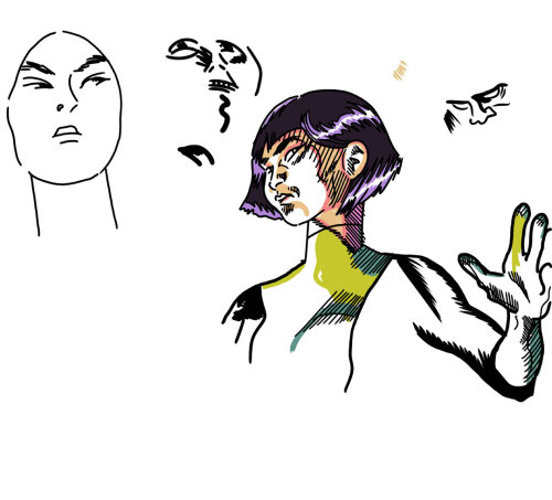
Oh, sorry. From the sublime (Steve Rude) to the ridiculous (me). This is Xi'an Coy Manh, a particular comic book character favorite of mine. As you're no doubt aware (and sick of hearing about), I've been spending hours upon hours drawing lately. Mostly teaching myself to ink.
What makes it easy to get lost in art is a little program known as Manga Studio 5. It's not cheap, but when you consider the tools you get with it, it's more than worth the asking price. Yeah, I even splurged and bought the professional level version.
The absolute best feature is the one where you can lay down a perspective ruler and draw lines that "snap" to it. You can do 1-, 2- and 3-point perspective. You still have to understand the theory to make it work properly, but Manga Studio has taken a lot of tediousness out of working in perspective. World-building is a joy. It always was, at least in the imagining stages, but then you had to make grids or find vanishing points, which is like brick-laying or putting in a concrete carport on a steamy August day in south Georgia (both of which I helped my dad do when I was a kid). Now you can just fiddle with some levers and away you go. New York City in a few minutes for Spider-Man to go a-swingin' through, or some alien megalopolis worthy of those magicians over at ILM. I recommend you do a rough sketch first, though. That helps clarify where all those levers and points go!
Another fun feature is the poseable figure/character creator thing. The proportions are a little odd and the anatomy is kind of blobby and unformed. If you make a bulky, hulky, sulky superhero with green skin and torn-up purple pants, for example, the muscle masses are not accurate at all. So it's not going to work as a lazy person's substitute for real-world observation and study, but as a lazy person's shortcut to throwing together scenes and keeping everyone the same size relative to each other, it works excellently. You can put 3D mannequins on your page, manipulate their poses and body parts (make massive heads, hands or feet, giants and little people) in just about any way you can think of, move a camera around to capture the angle you want, then click a 3-point perspective ruler based on your "camera angle" and draw away like a happy clown who likes to draw.
By the way, one thing it does is completely take away an artist's excuses for not including hands and feet in a drawing. No more demure hands-behind-the-back poses with conveniently placed boxes on the floor. Put those hands into intricate Dr. Strange spell-weaving configurations and prop at least one of those feet proudly up upon that box.
Manga Studio 5 also contains several 3D environments in which you can place your people. They're very manga-centric. Japanese high school classroom and typical Japanese residential neighborhood, for example. But with some clever adaptation, you can make them work for just about anyplace. There are even some poseable manga figures to stick in there, high school kids in uniforms. If you really want to, you could simply make up stories about them.
Finally, the most technical part. Lettering and panel borders. You can create word balloons and pointers, and toss your words all over the book before you ever draw a line. This is handy, because if you place your word balloons properly, that's less panel area you have to draw, which further saves a hurried artist time. And really, you should be planning your page layouts with the word balloons in mind for maximum readability. And Manga Studio 5 provides some manga page layouts with pre-ruled panels, but you can use the program's tools to make your own. I made a standard, old school three-tier, 9-panel layout I use a lot because I love the retro page design.
In two days, I laid out the panels and did all the lettering for a full 24-page comic book, approximately one-half of a graphic novel I hope to complete someday before I die. I started doing the actual drawings and ran into some limitations Manga Studio cannot help me with at all. But that's not a program flaw. That's my own problem I have to work on, and Manga Studio is helping me.
All of that sounds complicated (or exciting if you're more of an optimist, I suppose), but if you've used Painter, Sketchbook Pro, ArtRage Studio or Photoshop, it's easy to get started. The learning curve isn't really that steep if you're not intimidated by all the menus.
But there are some frustrations involved with the program itself and not just my inability to draw up to the impossible standards I've set for myself. The built-in drawing, painting and coloring tools-- the pens, pencils and brushes-- are okay. Just okay. You can do quite a lot with them, but they just don't mimic closely enough what it's like to make lines or blobs with real pencils, pens or brushes. I find this changes my "feel" and forces me into drawing in ways that aren't natural to me. I've never been a very skilled inker, which is why I tend to do my inks in Illustrator. But I long for the feathered look of a classic inker rather than the overly mechanical finishes I end up doing there.
Well, an incredibly talented illustrator named Ray Frenden has solved a lot of that by producing for a modest price practically every inking tool you could ever want, from Rapidograph pens to Pigma pens to ink nibs to brushes galore. Plus watercolor and oil painting brushes. The other day, I bought the equivalent of thousands of dollars worth of art supplies for about 15 bucks. Import them into Manga Studio and you've got everything you need to draw with and no excuses not to use them.
And this drawing is one of the results. It looks as close to something I might have drawn in my sketchbook there's practically no difference and yet it took less than half the time and didn't smear. The hand is wobbly, and I've forgotten what tool I used. Probably a Pigma pen. The hatched lines are definitely Pigma, as are the color areas. Then I switched to an ink nib Frenden calls "The Natural" and did those other faces and the strange feathered areas on Xi'an's arm.
I've been having a ball playing around with Manga Studio 5 and Frenden's art tools. I don't fear inking in Manga Studio anymore. In fact, I can hardly wait to get home from work every day to jump in and try different things. My skill level frustrates me, but with the handy ctrl-z function my most egregious mistakes disappear.
I mean the rendering ones. The underlying structural problems remain. But I'm working on those! Maybe one day we'll see some results.
A big bundle of classic Steve Rude Nexus pages hit Heritage Auctions!
Oh wow. Oh wow. Oh wow, oh wow, oh wow! I love to gush about my favorite artists here. Steve Rude is one of them. According to the email I just got, Rude is offering a huge bundle of absolutely gorgeous vintage Nexus pages-- including some from as far back as the Capital Comics days-- for sale from Heritage Auctions. You've been looking at a lot of my fumbling attempts at art, and I appreciate it. To reward your patience, here's a link to Rude's pages.
This both thrills and frustrates me. It's long been a dream of mine to have an original Steve Rude art page. Or a commission. My finances are a little complicated by a little thing we like to call the Pacific Ocean at the moment. It's too involved to explain and also... you know... personal. So this auction couldn't come at a more inconvenient time for my participation. Well, that's not true. It could have come back when I was flat broke and living from beer to beer. I'm just frustrated by my theoretical ability to pay versus the reality of the situation. But don't let that stop you. Buy some of those pages!
Actually, original art collecting interests me. I've encountered people who've owned prime Jack Kirby pages and traded them away. What would you trade a Jack Kirby page away for? The only thing I can think of that's worth it would be another Jack Kirby page. And some collectors own entire books. That's amazing. The most mind-boggling stories are the ones where the collector met the Kirbys in person and picked through all these pages and bought up a bundle of them for fifty bucks a pop. Can you imagine that? You couldn't buy one of Kirby's cigar ashes for fifty bucks these days!
Anyway, original art. It's expensive. It looks really cool, though. The printed books just do not do the actual artwork any kind of justice.
Oh, that's right-- I do own some original art. I own a couple of Alley Oop dailies. Just the pencils. They're on vellum and they are beautiful. My grandfather lived near the guy who was drawing Alley Oop at the time and told him I was a comic fan and that was the result. We've been meaning to have them framed for the longest time. I wish I hadn't been such an asshole kid or I would have written the artist a huge thank you letter. Instead I did nothing. I am so, so very sorry for that lapse now.
Yes, at one time I was a huge Alley Oop fan. I suppose I still am, but I haven't seen a strip in years.
This both thrills and frustrates me. It's long been a dream of mine to have an original Steve Rude art page. Or a commission. My finances are a little complicated by a little thing we like to call the Pacific Ocean at the moment. It's too involved to explain and also... you know... personal. So this auction couldn't come at a more inconvenient time for my participation. Well, that's not true. It could have come back when I was flat broke and living from beer to beer. I'm just frustrated by my theoretical ability to pay versus the reality of the situation. But don't let that stop you. Buy some of those pages!
Actually, original art collecting interests me. I've encountered people who've owned prime Jack Kirby pages and traded them away. What would you trade a Jack Kirby page away for? The only thing I can think of that's worth it would be another Jack Kirby page. And some collectors own entire books. That's amazing. The most mind-boggling stories are the ones where the collector met the Kirbys in person and picked through all these pages and bought up a bundle of them for fifty bucks a pop. Can you imagine that? You couldn't buy one of Kirby's cigar ashes for fifty bucks these days!
Anyway, original art. It's expensive. It looks really cool, though. The printed books just do not do the actual artwork any kind of justice.
Oh, that's right-- I do own some original art. I own a couple of Alley Oop dailies. Just the pencils. They're on vellum and they are beautiful. My grandfather lived near the guy who was drawing Alley Oop at the time and told him I was a comic fan and that was the result. We've been meaning to have them framed for the longest time. I wish I hadn't been such an asshole kid or I would have written the artist a huge thank you letter. Instead I did nothing. I am so, so very sorry for that lapse now.
Yes, at one time I was a huge Alley Oop fan. I suppose I still am, but I haven't seen a strip in years.
On John Buscema and learning about art...
Did you have that old How to Draw Comics the Marvel Way book with all the examples from various Marvel comics and most especially from John Buscema? Stan Lee's text made drawing comics the Marvel way seem easy, a lark. Buscema's super-assured drawings and those from guys like Jack Kirby and Gene Colan told a different story. Still, How to Draw Comics the Marvel Way is a nice introductory text on drawing comics with the necessary basics artists should still be using no matter how up-to-date their rendering style is. Take your funkiest, latest stylist and give him or her a solid grounding in fundamentals of figure construction, panel composition, storytelling and layout and you'd have the post-Image artist to steal my cold, shriveled heart.
As a member of a couple of fan pages for Buscema and Kirby frequented by actual comic book-making professionals in the industry, I get intermediate to advanced lessons in comic book drawing almost every single day. That-- and some encouragement along those lines-- has gotten me back into drawing in a major way. I spent my Golden Week holidays off from work drawing six or more hours a day, but even before then I was putting in at least two hours after work and more on weekends. Yesterday, I drew for about 8 hours without a break. Then, in my punchiness, I accidentally posted some of my crap to one of those fan pages. Luckily for me, the 12 hour time difference meant few, if any, saw it before I deleted it.
Very embarrassing.
Sometimes I wonder when I watch some amateur singing competition on TV is the participants have ever actually heard themselves sing. Yeah, some people can really belt a tune, but most of us are middling singers at best and some are downright tone-deaf and horrible. And yet they seem convinced their screeching is the equivalent of Whitney Houston's voice in its prime, or at least Beyoncé's. When I sing, I can hear that I'm sharp or flat or just can't reach that note. Apparently, some people cannot do this and so they audition for American Idol and we get a viral video sensation on the Internet the next day.
I'm at the same level with my drawing that I am with my singing. I can look at a drawing after I've made it and know it's inadequate. I can even tell in what way it is. I do a lot of my inking in Adobe Illustrator because I can get a clean, slick look and make adjustments until it looks mostly like the amazing image I had in my mind when I set out to draw it. It never matches it exactly. My imagination is much more talented than my actual eyes and hand. But what I see is still amateur hour at best. The karaoke box crooner version of what I'd like it to be.
The other day, I saw a John Buscema drawing of a pirate. Just a single figure doing nothing more than standing there with a sword in his hand. Buscema had inked it himself, very heavily, too. Man, it put my best efforts to shame. If I make a drawing with 10,000 lines, 10 of them might be as good as a Buscema line but they're covered up by the Bryan lines that aren't where they're supposed to be or lack polish or energy or skill. Whatever it is Buscema had that I lack.
I'll be honest with you-- it was so good and made my art look so pathetic by comparison, I wanted to pull my teeth out. I didn't know what I wanted to do. Head back up river and pull a fade-away into the jungle again. Only the jungle looks like John Buscema drew it, or Al Williamson and that would just be too much to bear.
"But who is crazy enough to compare himself or herself to one of the greats like John Buscema?" you ask. "Few can ever achieve at that level. There are hugely popular and successful artists who don't even rate sharpening Big John's pencils. Why do that to yourself?"
It's not even the Buscema comparison. Because yeah, you're right-- doing that is completely insane. But think about the crappiest professional artist whose work you've ever seen in a printed comic book, and I am not even up to that level yet. Even Larry X. Lameartist doing a monthly job on The Slipshod Costumedfools can draw circles around me.
This isn't false modesty or just some self-evisceration because I want people to feel sorry for me. I'm telling you the way it is. If I were a comic book editor and I saw work identical to what I'm doing now, I'd have to tell that hopeful exactly the same thing: "You are not ready for prime time." John Buscema drew the comic book adaptation of Stanley Kubrick's Spartacus for Dell Comics before he lit up different books at Marvel and contributed his expertise to how to do it their way and even that Spartacus job-- as crude as it is compared to prime Buscema-- has that thing I don't see in my drawings.
It's frustrating. I'm not even aiming at that kind of pro career, to blow people away as the next John Buscema. Those kinds of dreams are for kids. I'd just love to do a job or two at some low level whatever, or get into the illustration game. Make a buck for myself, make a buck for someone else. But I wonder if I've wasted a lot of developing years. When I was a kid and I was almost as good as I am now, I felt satisfied and allowed myself to coast on raw talent. I should have been working as hard then as I am now, but I didn't understand the necessity. Someone-- I think it was Ken Griffey, Jr., said if you want to be a pro ballplayer (and this is true for any level of the game), you need to hit at least 500 balls a day. I should have been doing the art equivalent of that.
Instead, I bought the Porsche 911 with the quadrophonic Blaupunkt, topped in AA ball and made the Sports Illustrated list of all-time draft busts.
Actually, I wish I had done even that much!
Well, regrets are for losers. I made my choices and they seemed like the way to go at the time. Looking back, if I was wrong, that's still hindsight speaking. All I can do is do what I can now. Draw as much as possible, study the greats and the not-so-greats, take advice from wherever I can get it and keep trying to make the next drawing better than the last. If nothing else, I've learned to have a huge amount of respect for even the lowliest, least loved line-maker working in comics, whoever that person may be.
Anyway, don't think when I post drawings here I have the feeling I'm blowing everyone away with my powerful stuff. I've got nothing to hide, no ego whatsoever when it comes to art these days. I like putting it out there as ugly or clumsy as it is. It may sound like I'm down on myself, but actually, my art amuses me. I do think it's kind of funny. And it's a kick knowing I'm putting these nutty images out there where they're living a life beyond whatever I intended for them.
As a member of a couple of fan pages for Buscema and Kirby frequented by actual comic book-making professionals in the industry, I get intermediate to advanced lessons in comic book drawing almost every single day. That-- and some encouragement along those lines-- has gotten me back into drawing in a major way. I spent my Golden Week holidays off from work drawing six or more hours a day, but even before then I was putting in at least two hours after work and more on weekends. Yesterday, I drew for about 8 hours without a break. Then, in my punchiness, I accidentally posted some of my crap to one of those fan pages. Luckily for me, the 12 hour time difference meant few, if any, saw it before I deleted it.
Very embarrassing.
Sometimes I wonder when I watch some amateur singing competition on TV is the participants have ever actually heard themselves sing. Yeah, some people can really belt a tune, but most of us are middling singers at best and some are downright tone-deaf and horrible. And yet they seem convinced their screeching is the equivalent of Whitney Houston's voice in its prime, or at least Beyoncé's. When I sing, I can hear that I'm sharp or flat or just can't reach that note. Apparently, some people cannot do this and so they audition for American Idol and we get a viral video sensation on the Internet the next day.
I'm at the same level with my drawing that I am with my singing. I can look at a drawing after I've made it and know it's inadequate. I can even tell in what way it is. I do a lot of my inking in Adobe Illustrator because I can get a clean, slick look and make adjustments until it looks mostly like the amazing image I had in my mind when I set out to draw it. It never matches it exactly. My imagination is much more talented than my actual eyes and hand. But what I see is still amateur hour at best. The karaoke box crooner version of what I'd like it to be.
The other day, I saw a John Buscema drawing of a pirate. Just a single figure doing nothing more than standing there with a sword in his hand. Buscema had inked it himself, very heavily, too. Man, it put my best efforts to shame. If I make a drawing with 10,000 lines, 10 of them might be as good as a Buscema line but they're covered up by the Bryan lines that aren't where they're supposed to be or lack polish or energy or skill. Whatever it is Buscema had that I lack.
I'll be honest with you-- it was so good and made my art look so pathetic by comparison, I wanted to pull my teeth out. I didn't know what I wanted to do. Head back up river and pull a fade-away into the jungle again. Only the jungle looks like John Buscema drew it, or Al Williamson and that would just be too much to bear.
"But who is crazy enough to compare himself or herself to one of the greats like John Buscema?" you ask. "Few can ever achieve at that level. There are hugely popular and successful artists who don't even rate sharpening Big John's pencils. Why do that to yourself?"
It's not even the Buscema comparison. Because yeah, you're right-- doing that is completely insane. But think about the crappiest professional artist whose work you've ever seen in a printed comic book, and I am not even up to that level yet. Even Larry X. Lameartist doing a monthly job on The Slipshod Costumedfools can draw circles around me.
This isn't false modesty or just some self-evisceration because I want people to feel sorry for me. I'm telling you the way it is. If I were a comic book editor and I saw work identical to what I'm doing now, I'd have to tell that hopeful exactly the same thing: "You are not ready for prime time." John Buscema drew the comic book adaptation of Stanley Kubrick's Spartacus for Dell Comics before he lit up different books at Marvel and contributed his expertise to how to do it their way and even that Spartacus job-- as crude as it is compared to prime Buscema-- has that thing I don't see in my drawings.
It's frustrating. I'm not even aiming at that kind of pro career, to blow people away as the next John Buscema. Those kinds of dreams are for kids. I'd just love to do a job or two at some low level whatever, or get into the illustration game. Make a buck for myself, make a buck for someone else. But I wonder if I've wasted a lot of developing years. When I was a kid and I was almost as good as I am now, I felt satisfied and allowed myself to coast on raw talent. I should have been working as hard then as I am now, but I didn't understand the necessity. Someone-- I think it was Ken Griffey, Jr., said if you want to be a pro ballplayer (and this is true for any level of the game), you need to hit at least 500 balls a day. I should have been doing the art equivalent of that.
Instead, I bought the Porsche 911 with the quadrophonic Blaupunkt, topped in AA ball and made the Sports Illustrated list of all-time draft busts.
Actually, I wish I had done even that much!
Well, regrets are for losers. I made my choices and they seemed like the way to go at the time. Looking back, if I was wrong, that's still hindsight speaking. All I can do is do what I can now. Draw as much as possible, study the greats and the not-so-greats, take advice from wherever I can get it and keep trying to make the next drawing better than the last. If nothing else, I've learned to have a huge amount of respect for even the lowliest, least loved line-maker working in comics, whoever that person may be.
Anyway, don't think when I post drawings here I have the feeling I'm blowing everyone away with my powerful stuff. I've got nothing to hide, no ego whatsoever when it comes to art these days. I like putting it out there as ugly or clumsy as it is. It may sound like I'm down on myself, but actually, my art amuses me. I do think it's kind of funny. And it's a kick knowing I'm putting these nutty images out there where they're living a life beyond whatever I intended for them.
Saturday, May 3, 2014
A full color look at the New Mutants if they had somehow appeared on Saturday morning TV circa 1972...

Or something like that. I would have loved a New Mutants cartoon in the 80s. I used to watch that Mr. T cartoon and kind of squint at it and imagine it was Dani and company, only with Mr. T.
Thursday, May 1, 2014
Captain Kirk on NBC...
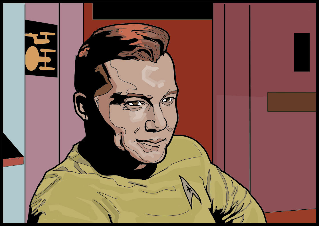
You know, "The following program is brought to you in living color on NBC." I don't think I'm any great shakes as an artist or renderer, but I do like my coloring abilities. Not so much the shapes there, but the choices. They may not be exactly accurate, but they're very rich and interesting to look at.
Don't you agree Kirk's shirt is a strange and fascinating garment? I think the originals were made of velour, which gives them a thickness and surface texture that comes across as particularly Star Trekian on TV. Nothing wrinkles exactly like a Starfleet uniform tunic. Now that we have Blu-Ray, we can see the nap more in early episodes. The third season seems to have substituted some other material for velour. Also, Kirk's tunic is longer and more tapered to his body. His hair is a little longer, too.
But the point of all this blather is what the heck color was Kirk's shirt in the first two seasons? We like to say "gold," but it's kind of a greenish-gold that sometimes appears yellower and sometimes a kind of off-green (if I can be permitted to create such a thing). The cartoon series gave him a yellow-orange shirt. I've seen art with that corrected to something closer to the live action color, but those never look quite as charming to me. My Mego Kirk definitely had a shirt much closer to yellow.
I read somewhere the Kirk shirt (and by extension, the Chekov and Sulu shirts as well) is actually a color known as tenne. This is an orange-brown that can go so far as to be quite yellow. It worries me. I'm a worrywart about color.
It's probably better to be like the colorists at Gold Key. In the early issues of their Star Trek series, they simplified their lives by making everyone's shirts green, except Spock's.
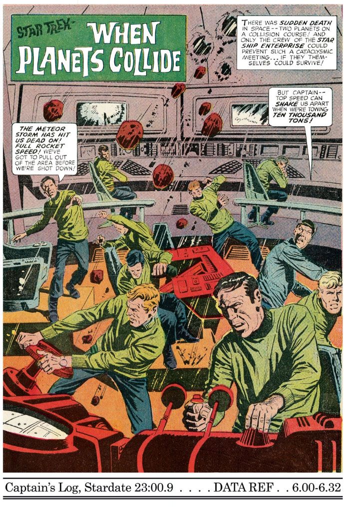 |
| Star Trek #6 (December 1969), art by Alberto Giolitto |
Subscribe to:
Posts (Atom)