Showing posts with label Jack Kirby. Show all posts

Wednesday, October 29, 2014

October is Spookey Month: Someone's rockin' list of the "10 Most Frightening Horror Comics Ever!"

I know nothing of this Herald Scotland site, but I salute the good (or foul, depending on your perspective and whether or not you go through life talking like one of EC Comics' horror hosts) taste of Graphic Content writer Teddy Jamieson.  Not only does Jamieson quote Halloween III: Season of the Witch, but he manages to include Junji Ito's horror masterwork Uzumaki on the list.  At Paste Magazine you can read a similar 13 item list called "13 Terrifying Modern Horror Comics," which I saw posted by Fantagraphics on Facebook earlier this week.  That one is very Western comic-centric and the choices more conventional than Jamieson's, but they overlap, too.  I admire Jamieson for having the guts to lead off the list with a most personal choice.  He also puts Jack Chick tracts on his list.  I remember coming across those from time to time when I was a kid and he's right.  They're scary!  At least they were when the threat of hell or running into a hippie mocking my religious beliefs with a dismissive "HAW HAW!" were the worst things I could imagine.

Personal choice is appropriate because our most frightening comic is the one that affects us most regardless of its wider reputation.  I found myself exposed to a great many shitty horror comics when I was a kid and quite a few managed to genuinely frighten me even with crude art and strained writing. 

Sometimes even genre doesn't matter.

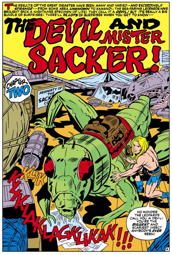
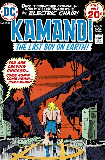
Jack Kirby scared the snot and the buggers out of me with his chilling final image in Kamandi #20 of our long-haired hero alone on a ruined pier.  I mean utterly alone, overlooking what I assumed at the time to be a monster-haunted Lake Michigan.  No one to help him, not the indifferent gulls circling overhead, certainly not the angry gorillas ravaging the robotic theme park Kamandi had just escaped.  No humans, just robots going through the motions of 1920s-era Chicago gangland clichés.  Poor lonely Kamandi.  The imagery was bleak, the closing copy promised more horrors to come.  Shudder!

Another story that gave me the willies was "Evolution's Nightmare" in Marvel/Curtis Planet of the Apes #5.  It opens with humans and gorillas fighting El Cid-style in a desert wasteland, then ends with radioactivity-devolved apes and men duking it out with rocks and clubs in a bomb-ruined San Francisco.  They even kill the two main characters (who spent the intervening pages painfully learning tolerance) before grunting and screaming in mindless hate at each other from atop wrecked cars full of skeletons and across piles of shattered asphalt.  Doug Moench's depressing narrative captions inform us everything moves in circles and those circles stink.  Artist Ed Hannigan's (Jim Mooney inks, by the way) double-page spread of piles of dead warriors with their eyes lifelessly open only added to the lingering fear instilled in me by this creepy story.

Obviously, neither of those two are horror stories.  They're both rough-house science-fiction adventures.  You can find horror-like frights anywhere.  In a plot twist in an otherwise innocuous superhero book, gazing at you from a house ad in a humor comic, jumping out at you from behind a brick wall on a sunny street in Riverdale, USA.

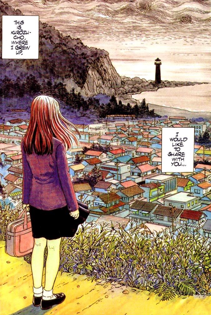
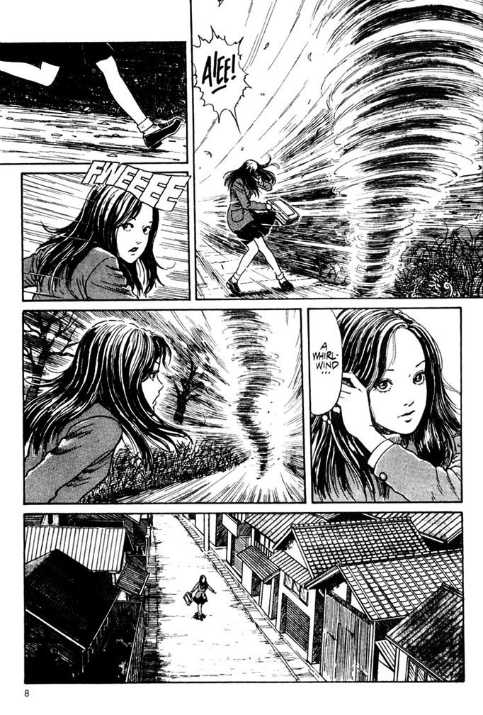
Or in an actual horror comic.  Like Uzumaki.  Serialized in Big Comic Spirits (it's a seinen manga, or dude's comic, so be careful opening that link) from 1998 to 1999, Ito's Uzumaki is the greatest horror story ever published in comic book form.  I'm comparing it to everything from Charles Burns' Black Hole, which made Fantagraphics' list (and is a moody, troubling work in its own right) to EC and every horror comic in between.  Out of all the fright fun I've had reading horror comics, only Uzumaki gave me feeling of truly dreading the next development in a story in my life.  Of doom.  Or of being genuinely grossed out by so many drawings in one place.  Uzumaki's dreamlike inevitability remains after you close the book having followed its main characters deep into the heart of ancient fears.

Uzumaki tickles your fright bone the way a cold wind from across the dry grass of graveyard might gooseflesh your arms.  Bruised clouds passing overhead like witches, their shadows falling around like concentrated night, on the move, looking for you.  Dead leaves hissing at you along the curb.  Hurrying you homeward where you face a dark, empty house where the rooms echo only with your voice.

Story and art by Junji Ito

And the soft footsteps of another.  Though nobody else is home.

Here's something that's not frightening.  It's a performance by Hamamatsu's own Spookey!

Sunday, September 28, 2014

A little bit on the Disney/Marvel-Jack Kirby settlement...

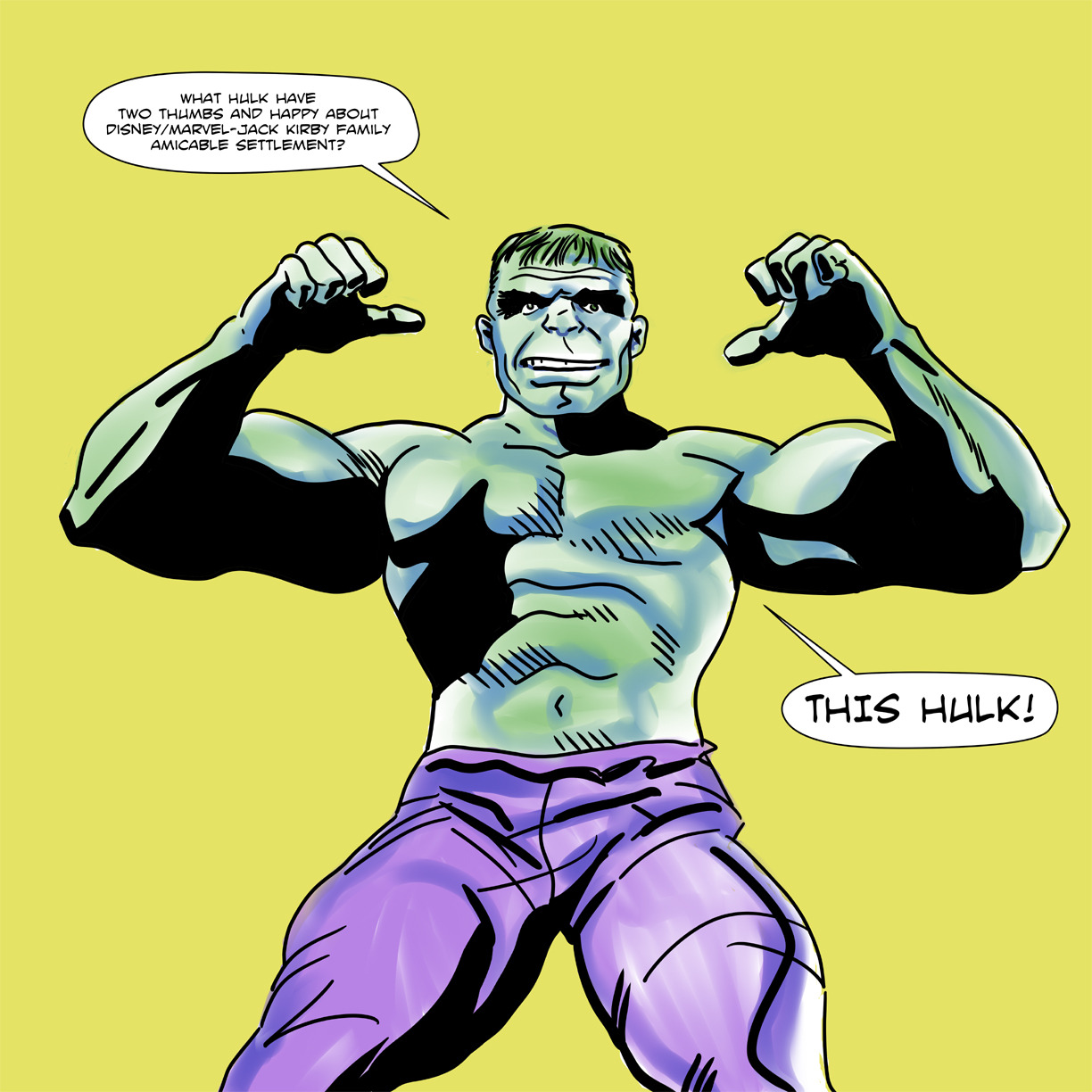
I spent a great deal of time over the weekend on Facebook reading Kurt Busiek's responses to another Jack Kirby fan's skepticism over the Disney/Marvel-Jack Kirby family amicable settlement.  I couldn't read the fan's comments (he earned a block for excessive negativity a while back), only Busiek's replies.  Which were lengthy and not in the least combative.  He just explained-- much more patiently than I ever could, and certainly more cogently-- why the fan was badly mistaken this is somehow a bad thing.  Or at the very least why someone with zero stakes involved would get upset about it when both Disney/Marvel and the Kirby family, with major stakes involved, both seem so pleased with the outcome.

Late in the game another fan added some commentary.  Busiek jousted with him as well and knocked him off his horse more than once.  Each time the game fan remounted and took up his lance, only to have it blunted and knocked aside no matter what attack he chose.  Greedy heirs*.  WHACK.  Stick to a contract, even a lousy one.  WHOMP.  Copyright law was meant to do something else.  KRACK.  If I pay you to build a house...  THUMP.

The last I saw before averting my eyes the fan was hurtling himself down the tilting lane, this time without even a horse.  The horse had long since retired to the clubhouse for some hot toddies and a massage.  I believe the fan had armed himself with the only weapon he had left in his arsenal, a wet noodle, which he was waving around while shouting, "Now we'll never have a New Gods movie!" 

I just couldn't watch any longer.

So I started drawing.  I drew all day and into the night.  I drew that lousy Hulk you see below.  That version is number four of four.  The first three suffered fates more ignominious than the naysaying arguments in the Facebook thread.  When you consider how many outright shitty drawings I've posted here over the last few months or even years, you can imagine just how bad something must be if I don't even try to post it.  Pretty bad.

But what's pretty good is this settlement between Disney/Marvel and Jack Kirby's family.  I can't see anything negative about it for either party, cannot fathom why anyone would naysay it.  I see it as a major win-win situation for both the big corporation and the little family that could.  The Kirbys get to enjoy some of the fruits of Jack Kirby's decades-long labor, Disney/Marvel can add the Kirbys to their marketing plans for all their future movie and multi-media extravaganzas along with Stan Lee. 

After all, Kirby's fantastic creations aren't the only things marketable here.  The man himself is an amazing story of unrelenting creativity and hard work spanning generations.  The guy co-created Captain America with Joe Simon then went off and fought in the last good war, for Thor's sake.  You want to show him off, and Stan, too:  "Look at what these plucky, grandfatherly guys did for all of us.  Enjoy their work and buy a lot of our licensed stuff, which we will produce at a record-breaking pace, relatively guilt-free for a change."

Disney/Marvel may be paying out to his family, but they're going to cash in on this, too.  I've never been opposed to that.  I just wanted the guy who made that possible for them to get a little more than the kick in the pants he got way back when.  Since he's not around anymore, giving it to his children and grandchildren is the best of all possible things.  If you can't grasp that, you are an alien to me.  Or I am to you.  Norin Radd, at your service.

Settling like this makes good business sense.  And it feels good to this fan, too.  Thanks to this and the things I've heard about Marvel's relationship with Bill Mantlo (the guy who made that little Guardians of the Galaxy movie possible in the first place), I have warm, gooshy feelings about Disney/Marvel I've never had before!

*In the interest of accuracy, if not engaging storytelling and myth-making, this point may have come from someone else, in another thread or even on another site entirely.

Marvel-Kirby...


I did this crappy drawing yesterday to celebrate the best comic book-related news story to come our way in decades.

Thursday, August 28, 2014

Happy Jack Kirby Day!


August 28th, Jack Kirby's birthday.  It should be a national holiday.

Wednesday, May 7, 2014

A big bundle of classic Steve Rude Nexus pages hit Heritage Auctions!

Oh wow.  Oh wow.  Oh wow, oh wow, oh wow!  I love to gush about my favorite artists here.  Steve Rude is one of them.  According to the email I just got, Rude is offering a huge bundle of absolutely gorgeous vintage Nexus pages-- including some from as far back as the Capital Comics days-- for sale from Heritage Auctions.  You've been looking at a lot of my fumbling attempts at art, and I appreciate it.  To reward your patience, here's a link to Rude's pages.

This both thrills and frustrates me.  It's long been a dream of mine to have an original Steve Rude art page.  Or a commission. My finances are a little complicated by a little thing we like to call the Pacific Ocean at the moment.  It's too involved to explain and also... you know... personal.  So this auction couldn't come at a more inconvenient time for my participation.  Well, that's not true.  It could have come back when I was flat broke and living from beer to beer.  I'm just frustrated by my theoretical ability to pay versus the reality of the situation.  But don't let that stop you.  Buy some of those pages!

Actually, original art collecting interests me.  I've encountered people who've owned prime Jack Kirby pages and traded them away.  What would you trade a Jack Kirby page away for?  The only thing I can think of that's worth it would be another Jack Kirby page.  And some collectors own entire books.  That's amazing.  The most mind-boggling stories are the ones where the collector met the Kirbys in person and picked through all these pages and bought up a bundle of them for fifty bucks a pop.  Can you imagine that?  You couldn't buy one of Kirby's cigar ashes for fifty bucks these days!

Anyway, original art.  It's expensive.  It looks really cool, though.  The printed books just do not do the actual artwork any kind of justice.

Oh, that's right-- I do own some original art.  I own a couple of Alley Oop dailies.  Just the pencils.  They're on vellum and they are beautiful.  My grandfather lived near the guy who was drawing Alley Oop at the time and told him I was a comic fan and that was the result.  We've been meaning to have them framed for the longest time.  I wish I hadn't been such an asshole kid or I would have written the artist a huge thank you letter.  Instead I did nothing.  I am so, so very sorry for that lapse now.

Yes, at one time I was a huge Alley Oop fan.  I suppose I still am, but I haven't seen a strip in years.

Tuesday, April 29, 2014

IDW's got this crazy New Gods Artist's Edition coming out...

Have you seen this monster?  I'll bet it weighs twenty or thirty pounds!  If you're as big a Jack Kirby nut as I am (and some of you are bigger Kirby nuts because I've talked to you or read your online postings), you're going to want this.  Not only does it have Kirby's New Gods stories from issues 1-8 printed from the originals as if they are the originals (notes and paste-ups and corrections and all that secret stuff revealed), it's got fold-outs in full color.  Fold-outs of concept paintings and maps

I never imagined the Jack Kirby New Gods Artist's Edition was going to be cheap by any means.  It's not.  It's $125.00.  But it has to be worth it, because from what I've seen so far, the book isn't just full of treasures; it has the potential of being a treasure itself!

Sunday, March 30, 2014

A little Jack Kirby juxtapositioning in Silver Star #1 (February 1983)

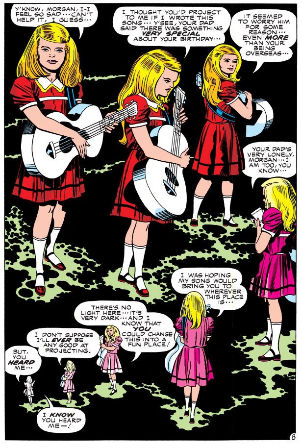
Here is a very cinematic scene where Jack Kirby uses juxtapositioning for emotional effect you can read in Silver Star #1 (February 1983).  One can easily visualize it as a movie, complete with an actual song on the soundtrack, which is appropriate since Silver Star began as a screenplay with artwork attached in hopes of selling it to Hollywood.  I won't show you the entire thing, just the framing pages and one from the middle.  That should be enough to get across the point. 

And, I hope, cause you to buy this book.

Kirby starts with a panel-free backgroundless sequence as Tracy Coleman, a young girl with a guitar, prepares to play a birthday song she’s written.  By dispensing with both panels and backgrounds Kirby liberates this moment from the more concrete reality of the narrative-driven panel-bordered pages.  This takes place outside time, within the mental realm, and Kirby uses his imaginary camera's eye to circle the girl in a dreamy, clockwise direction and a slow zoom to close-up, and careful placement of word balloons and a kind of sparkly path to direct the reader sequentially.  The in-story reason for all these effects is Tracy isn't simply performing a song, she's also “reaching out,” or attempting telepathic contact with Morgan Miller, the titular character.  Kirby allows the readers to float ever closer to Tracy's face as if we're a ghostly presence, zooming in there in the lower right-hand corner in order to set up a spatial change with the turn of the page.
 
Kirby with Mike Royer

On the next page, we are back in the "real world," where the sequence is ordered by the traditional black panel borders and white gutter spaces.  Here we discover Morgan is in combat in Vietnam, fighting the very battle where he'll win the medal that provides him with his superhero codename and this comic its title.  Conventional narrative boxes contain the girl’s words, a simple celebratory verse.  Juxtapositioning this song and its simple, straight-forward celebration of birth and life with dynamic visuals of chaotic violence and death allows Kirby to achieve an emotional effect, with the song functioning as a critique of the adult world and its adherence to destruction.

This is the comic book equivalent of Carl Foreman's use of sentimental Christmas songs on the soundtrack while GIs are trucked through the snow to witness a prisoner’s execution by firing squad in his 1963 war film The Victors.  The tragic commentary is similar, but Kirby isn’t exploiting sentimentality to make a cynical point.  The contrast here is in complete sincerity, the girl’s wistful song representing the purity of love as only an innocent can express it, the combat displaying the worst of which we’re capable of once experienced in the ways of the world.
 
Kirby/Royer

This kind of "flesh-against-steel" pitched battle imagery strikes me as more WWII than Vietnam, though, the sort of desperate combat action Kirby was intimately acquainted with from his service as a scout in the 5th Infantry Division in 1944.  I’m not sure how often American troops came up against North Vietnamese armor in Vietnam.  I did some research today and could only find some scant references to our tanks blasting a couple of PT-76s (a Soviet-built amphibious tank) and a BTR-50 at Ben Het in early March 1969.  The enemy tanks in Silver Star appear to be a Kirby-version of the Soviet T-34, a WWII-era design which the NVA had in stock.  There’s a reason Kirby deploys enemy armor and it has to do with genetic mutation and superhuman strength, which we see as the fighting reaches its climax:  it's scary and effective!  In his most desperate moment, Morgan Miller experiences a battlefield transformation into something more than human.

I can't help but wonder if the scene where he tosses a T-34 as if it were a football had its origin in some of Kirby's own fantasies born while facing down Wehrmacht tanks.  GIs probably wished they could turn into nigh-invulnerable superman in times like that.

Note the wild special effects in the fourth panel as Morgan's mutational powers activate themselves.  This is the Kirby equivalent of solarized photographic imagery of the sort we've seen during the "psychedelic" mind-warp climax to Stanley Kubrick's 2001:  A Space Odyssey.  Only in Kirby's usage, the cosmos that create an evolutionary leap are contained within the individual, rather than as an external force.  It's worth noting Kirby adapted Kubrick's film for Marvel a few years prior to working on Silver Star.

Afterwards, Kirby cuts back to Tracy and her borderless dark space, the area of the mind.  We drift away from her, circling clockwise once more but slowly zooming out as she shrinks away in the left-hand corner to end the sequence.

Kirby/Royer

That in itself is unusual, since we're used to reading comics in a Z-pattern, left-to-right and this is an S.  The top tier proceeds along the expected direction, but then Kirby reverses flow for the lower tier.  Ending the page on the left is counter to our long-established Western reading mode.  It only adds to the dreamlike unreality of the framing pages, but Kirby keeps things under control and avoids confusion.  It's very easy to follow this flow.

Image Comics has made Jack Kirby's original Silver Star six-issue series available on Comixology.  I believe there's a print version as well.  While I had a few issues of Captain Victory and his Galactic Rangers, for some reason I don't think I ever bought Silver Star.  Very odd, since I enjoyed Captain Victory and was a big supporter of everything Pacific put out back in the 1980s.  It probably had something to do with economics, since these comics were one dollar at a time when others were half that price.  And also the ephemerality of comic book shops in my hometown.  Two came and went in just about the time it takes you to finish reading this sentence!

Thursday, March 27, 2014

Dude, let somebody else do the work for a change: Ken Parille on Jack Kirby and Alex Nino courtesy TCJ!

At The Comics Journal, Ken Parille contrasts the way Nick Cardy presents the story "The Burners" on his cover to Weird Mystery Tales #3 (November-December 1972) to its actual Jack Kirby written and drawn contents, then discusses Alex Nino's faces in the story "Captain Fear," from Adventure Comics #425 (December 1972-January 1973).  I've never read either of those tales, but the whole of the early 1970s DC output fascinates me.  From Kirby's Fourth World work to the gorgeous horror anthologies often featuring stories and art by some of my favorite creators not named Kirby, this era is a rich source of blogging material.  This is the kind of thing I enjoy reading.  And writing. 

 But since Parille has already done so, and quite well, why not just link to it here and go back to drawing silly pictures of Spider-Man?

Tuesday, March 25, 2014

What's the earliest comic book you can remember owning?

Joe Kubert, August 1974
Memory.  Unless you have eidetic memory, don't trust yours, especially when it comes to tracing formative events from your early childhood.  This week I started thinking back to the first comic I could remember owning and once I started doing a little digging both in my brain and online, I came to a conclusion that's shaken my understanding of myself as a lifelong comic book fan.

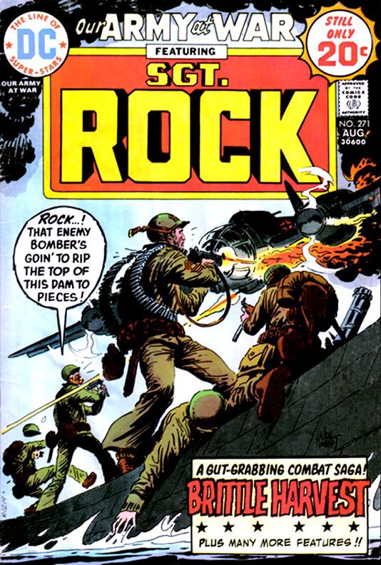
For years, I've had this persistent memory I learned to read from DC's Our Army at War #271, a book with art by the incomparable Russ Heath and a story by the inimitable Robert Kanigher. In the autobiographical film I constantly project in my mind, DC published it when I was three or four and there, on its pages, heretofore ignored ink marks inside the balloons coalesced into words, which formed into sentences and from there, the world of literacy opened to me.  Then I looked Our Army at War #271 up online and learned it has a cover date of August 1974, a mere month before I started first grade.  I was already six years old, and, according to family lore, I had already been reading for quite a while at that point.

So maybe Robert Kanigher didn't teach me mah letters, but I thought there was still a decent chance his story "Brittle Harvest," the book's Sgt. Rock-starring lead, truly was the first bit of fiction I read that didn't star a persistent weirdo with a fixation on oddly-colored breakfast foods.

But maybe it wasn't...


Jack Kirby/D. Bruce Berry, August 1974
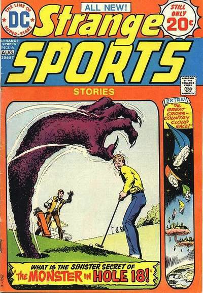
Because I also owned Kamandi #20 and Strange Sports Stories #6.  I could have sworn both of those came out a year or two later.  This week, I discovered DC published them that very same August.  August 1974 was a good month for me as far as comics go.

How did I manage to obtain three comics when my income consisted entirely of spare change I found under the sofa cushions or dove for in the deep end of the local Elks' Club pool?  Gifts, maybe.  I can't imagine what fool would give me three comics at the same time.  One, yeah.  Two is stretching it.  Three invites rumors of decadence, of profligate spending on a scale unheard of in our little clan during the Ford administration days of energy crisis and Whip Inflation Now. 

Or else I somehow managed to collect enough pennies to buy them myself.  Yet, I have trouble imagining any scenario involving either of my parents allowing me such an extravagance.  Again, one comic, maybe two if I'd been especially well-behaved.  Three would be, in my mom's words when I bought a second aluminum baseball bat during my "athletic" period years later when I actually had a job and income of my own, "Ostentatious."  My parents, both products of hardscrabble Depression-era childhoods, instilled in me a financial caution I maintain even now that I'm as rich as the guy on the Monopoly game box.  Even with their permission, buying three comics at the same time back then would have given me the same guilty feelings I get now whenever I pick up a new Rolls or sports franchise.

Whether from false memories of learning to read or from inspiring a lifelong love of Jack Kirby's work, each of these comics has stuck with me in ways I've learned are as foggy and treacherous as some jagged coast in an old sea story.  I once again own both Our Army at War and Kamandi, so I've read them recently.  In this way I've corrected a number of misconceptions I carried for years about their stories.

A physical copy of Strange Sports Stories, on the other hand, remains elusive and, therefore, its contents a jumbled mishmash of mistaken impressions. 

The cover is easy to find online, though.  Let's take a look and see what recollections it inspires.  Wow!  It's by Nick Cardy!  What a treat!  I've really underestimated myself all these years.  Kid me really had good taste in cover artists.


Nick Cardy, August 1974

Let's look at the cover copy.  Interesting story titles.  I thought so at the time, but I may have been alone there, since this was actually the final book in the series.  Another one of those failed DC experiments.

"The Monster in Hole 18!" inspires a vision of someone being pulled through the hole into an alternate dimension, his body grotesquely thinned and stretched in the process, leaving his midsection resembling a great noodle.  At least during the transition.  I'm pretty sure he came out the other side in whatever state for him passes as normal. 

I may be conflating this with the events of "The Great Cross-Country Cloud Race," which I believe is about a couple of young guys seriously into boating who travel into another universe where people race through the skies in little sailboats made from solidified clouds.  Perhaps these guys were the ones who went through a physically distorting transportation process of some kind. 

The cover suggests the book contains just two stories.  So why do I feel so strongly there was a third?  One about a young guy who injures his arm in such a way he can throw baseballs at ridiculous velocity, gets signed by a major league team and pitches in a game against a New York Yankees-type powerhouse club before crashing his expensive sports car and losing his magical pitching ability when the doctor re-sets his arm.  The same accident injures his hip, and there's a little matter of drop-kicking a football...

Jerry Grandenetti/Creig Flessel, July 1973
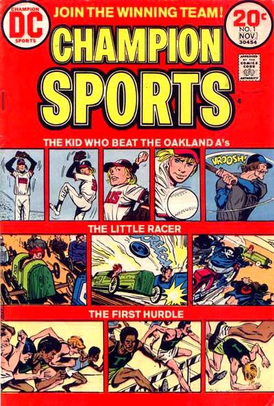
Let me see what I can find out about this.  Hey!  It turns out there is such a story, but it isn't in Strange Sports Stories #6.  We find it instead in Champion Sports #1. 

And it isn't the New York Yankees he pitches against and wins.  It's the Oakland A's.

That brings back a whole lot of memories!  The A's of the early 1970s featured a potent line-up centered around a hard-slugging clean-up hitter by the name of Reggie Jackson, and a pitching rotation starring Vida Blue, Ken Holtzman and Catfish Hunter (Rollie Fingers was on the team, too), each of whom won 20 or more games in 1973.  They beat the New York Mets in the World Series that year. 

My family hated those guys and their evil mustaches because we were National League fans and my oldest brother, a catcher himself, idolized Johnny Bench.  This meant we were Cincinnati Reds boosters, and they lost in the Series to the A's the previous year.  It didn't matter that my uncle had caught for the A's when they were the Kansas City Athletics and personally knew and greatly respected Hunter.

So, in fact, the story is called "The Kid Who Beat the Oakland A's," and I've just learned it's written by the great Joe Simon, drawn by the nifty Jerry Grandenetti, with inks by Creig Flessel.

And you can read it in all its glory on Diversions of the Groovy Kind, a super-cool website that's one of my favorites.  The Groovy Agent must be one of those people with eidetic memory.  He knows it all, baby.  He took the comic's tag line to heart and joined the winning team!

The "kid" is David Wexler, a would-be writer and sports nut.  He ends up enjoying a brief career in the Major Leagues, not as stellar as Catfish Hunter's or Vida Blue's, but still something to be proud of, especially the climactic event, which is spoiled by the title.  The most telling detail, though, is the caption towards the end, when the kid's swelled head leads to his comeuppance:  "You may have read about that game... What you didn't hear about was the dumb, wild things I did off the diamond."  It's a single sentence Simon uses to introduce the off-the-field aspect of big time sports, and gives the story a gritty background verisimilitude to help put across its rather improbable premise.  Shades of Jim Bouton's Ball Four (1970) and the stuff the newspapers didn't print about Mickey Mantle.

Which reminds me!  I could tell you a rather funny story involving my dad, my uncles, Mantle and Joe Pepitone down at spring training in Florida.  Maybe one day I will, but for now let me just tell you my dad swore me to secrecy and I've already told you too much.

What about the other stories?  Well, "The Little Racer" is about a soapbox derby kid who gets run over by a one-percenter motorcycle gang who then help him rebuild his racer with stolen parts.  He ends up with quite a hotrod, but his innate honesty causes him to revert back to his green wooden crate for the final race, which he loses but fairly and squarely.  Then the cycle dudes stomp him good, the same way the Hell's Angels did Hunter S. Thompson when they learned they weren't getting any of the money from the book he wrote about them.  Okay, I made that last one up.  The story thing, not the Hunter S. Thompson thing, which really happened.  The comic may or may not have a happier ending.  But even though our theme today is how crappy my memory is, I feel confident about its other details.

On the other hand, "The Last Hurdle" brings absolutely nothing to mind.  I'm guessing it has to do with at least one hurdle.  Perhaps a final one of some kind.  Literal?  Symbolic?  Shambolic?

No, that's this blog.

This has been a day for shocking revelations, hasn't it?  Let's conclude this mess with two more.

First, in December of 1997, the FBI investigated the possible theft of the artwork from this very comic, along with hundreds or even thousands of other pages.  The entire sequence of events found near the bottom of the document makes for some interesting (if difficult due to formatting and spelling errors) reading.  My oh my!  The things you uncover when you take a memory trip.  I'm completely flabbergasted.

And second, the answer to that nagging question that provides this post's title.  Champion Sports #1.  Look at this:  it has cover date of November 1973, same year the A's won their second World Series.  Diversions of the Groovy Kind puts its actual release date as July, which means, depending on their own street dates, it hit the stands more than a year earlier than Our Army at War #271, Kamandi #20 or Strange Sports Stories #6.

Champion Sports #1.  I was five years old when I read it.  It's now the earliest comic I can remember owning!

Wednesday, March 12, 2014

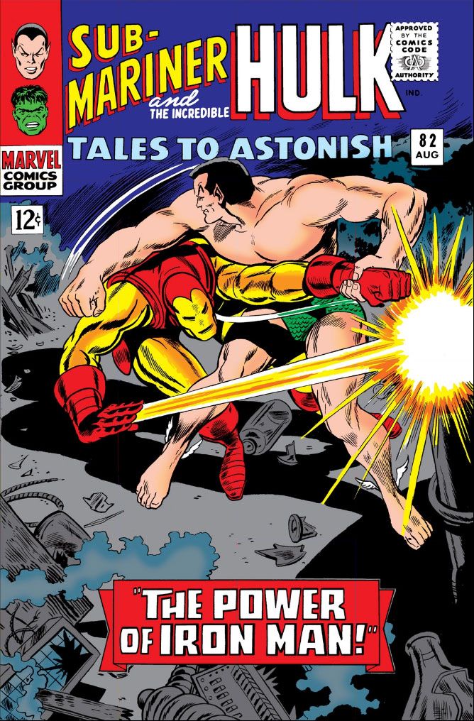
Tales to Astonish #82 (August 1966): I bought this for Gene the Dean, found Jack the King!

Tales to Astonish #82 (August 1966)  Pencils: Gene Colan,
Inks: Dick Ayers (according to Comic Vine) 
Well, that was a pleasant surprise!  I recently bought a digital handful of Marvel Comics superhero books by Gene Colan.  Some people were talking about him on Facebook the other day and I suddenly developed a hunger for his work.  And also for one of those old Marathon bars, but you can't buy those on Comixology. 

Anyway, my appetites aside, Gene Colan is one of my top five or six all-tme art heroes, a guy I've tried to imitate in my own art however futilely.  While I own a DC hardcover full of Batman stories by Colan, and I know he was responsible for a storied run on Daredevil, I tend to think of Colan as more of a horror artist because of his stellar art on Marvel's Tomb of Dracula and for Warren Publications.  After reading all that jazz from people way more knowledgeable than I about this stuff, I decided it was time to fill a gap in my education and study up on his superhero work.

Well, I already knew Colan for a horror master.  Love his moody, shadowy imagery and the extreme figure foreshortening because he chose very unusual "camera" angles.  He was incredibly cinematic, with a strong feel for intense drama and noir-ish lighting.  So I was really looking forward to reading this and seeing how he put that to use in one of those two-character long-underwear dust-ups printed before I was born.   I opened to the splash, scanned the credits to see who inked it (inking interests me lately) and got a surprise.  After the cover, there are only two pages of Colan in this book!  But we're not going to complain because after those two pages it's none other than Jack Kirby the rest of the way.
 
Tales to Astonish #82 (August 1966) has a Stan Lee plot and a Roy Thomas script, and it's a continuation of a fight started in another title, which is easy to confuse with this one, especially since their numbering runs so close together.  I'm talking about Tales of Suspense #80, which also has Lee's and Kirby's famous "He Who Holds the Cosmic Cube!"  I say it's famous because it's a Captain America story I read many years ago in the book Captain America: Sentinal of Liberty.  All the stories in that book are famous because Stan Lee says so.

Anyway, Captain America isn't in this.  It's just Iron-Man and Namor.  Their story starts over there, continues here in this one, then goes of into another comic.  I haven't had time to sit down and really give Tales to Astonish #82  a reading, but just from staring at the art, this story, called "The Power of Iron Man!," is a frenzy.  Just two characters duking it out.  I have no idea why, don't really care all that much.  I'm downloading it into the Comixology iPhone app as I type this, so I'll read it in those scant free moments I'm not shaking the earth and building a better future or whatever the hell it is I do.  I don't really wax nostalgic over things like two characters having a fight, or that this is "the first real inter-book crossover."  I'm more interested in the artwork by Colan and Kirby.

Despite Dick Ayers' inking, it would be obvious we've got two very different pencillers even if we haven't read the helpful credit boxes on the splash page which tell us Colan came down with the flu and Kirby had to take over.  I wonder if that's really the case, or if this is one of those cute jokey things Stan and Roy liked to use as an easy explanation for some other chain of events they didn't want us to know.  Seems likely enough, much more so than Kirby drawing the book then asking who the Sub-mariner is, but that's the claim here, too.

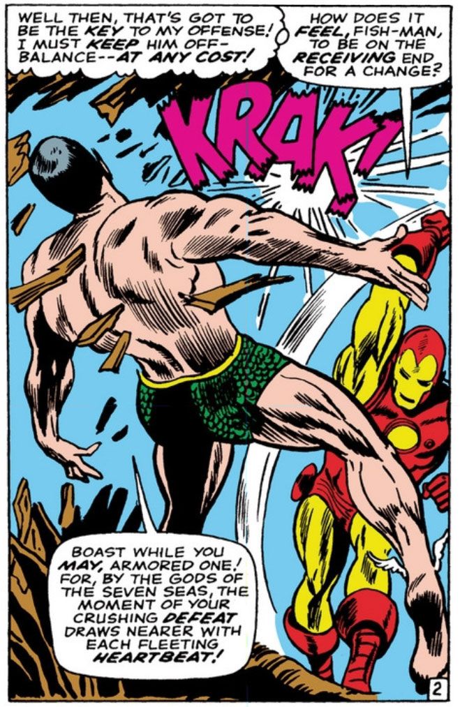
Here's where Iron Man hits Namor the Sub-Mariner so hard they both turn from Gene Colan figures...

Script:  Roy Thomas, Pencils:  Gene Colan, Inks: Dick Ayers
... into Jack Kirby figures:

Thomas, Pencils: Jack Kirby, Inks:  Ayers

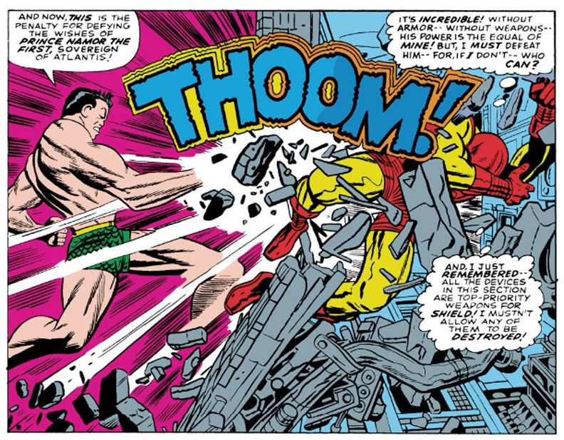
Jagged purple "KRAK!" is the sound of metal-clad fist striking flesh and bone chin.  Earthquake-like yellow and blue "THOOM!" is what happens when fish-guy knocks armor-guy through a wall. 

In the Colan panel, notice how Iron-Man's weight is planted on that front foot.  Most of his body is moving towards Namor in the foreground because he's put everything into one massive hay-maker of a blow, which landed a split-second or so before Colan "photographed" this moment.  Even though he's still able to talk, Namor is flying upwards and backwards with his right foot dangling loosely.  This is follow-through, the impact completed, an interesting split-second between the moments of collision and release and much closer to the latter so the figures are opening up, becoming loose-limbed and extended, although I imagine Iron-Man's left thigh is clenched because he's planted that foot and is stopping his forward momentum with it.

Now look at Kirby's panel.  This isn't follow-through.  This is the exact moment of impact.  Namor has punched Iron-Man with a more compact body-blow.  Notice the rigidity of Kirby's figure drawing here.  Namor lowers and draws in his chin, which means his chest and abdominal muscles are clenched, tense.  He's still performing the action itself.  In Colan's, taking place nano-seconds after the action, we see Iron-Man's fist.  In Kirby's, at the moment of impact, Namor's fist has vanished in a white starburst.  And Kirby either gives us two time differentials here or else that punch is so powerful, the transfer of kinetic energy has already thrust Iron-Man through the wall in exact moment Namor landed it!  It seems impossible, two states at one time, but there you have it.  Also, like Namor before him, Iron-Man flies backwards from blow, but Kirby puts his upper body into a kind of defensive posture, arm raised to protect his face, while the other arm goes limp and he appears to be drawing his legs up so that he can land in a ball on the other side.  Or the fetal position.

Colan's is kind of athletic and even graceful, Kirby's is as hard and bone-shattering as two cars in a head-on collision.

These panels come a couple of pages apart.  I just wanted to show you one of Namor's answering blows because it wouldn't have been fair to give Iron Man two consecutive shots.  The art switch is just this abrupt, though.  You get that Iron Man punch at the end of one page-- and I find very entertaining Thomas's characterization of Namor as the kind of cool customer who can fall backwards after a sock to the jaw and still find it in himself to make a sneering speech about how Iron Man's "crushing defeat draws nearer with each fleeting heartbeat"-- then the very next page starts with a Kirby-drawn panel of Iron Man shooting his "repulsor rays" right at us, the readers! 

What gives?  Aim those things elsewhere, buddy!

Since I was born a generation later than the kids who bought these issues new off the stands, stories like these were hard to find unless they popped up as a back-up feature in an annual or else in one of those hardcover collections at the library.   The ones that were constantly checked-out and never available.  Or that Sentinel of Liberty book I was just telling you about, which I bought at Waldenbooks at our mall along with one about Dr. Strange. 

We didn't have all the archive reprints and essentials and, of course, digital comics had yet to be invented.  I didn't have the disposable income to buy swanky back issues, and I probably wouldn't have been inclined to even if I did.  There were always new comics to buy.  And living in a small southern town, I was largely isolated from fandom at large and things like fanzines and mailing lists.

This means I don't have an encyclopedic knowledge of storylines predating my interest in comics, nor do I know a whole lot about the inner workings of Marvel or DC or who drew or wrote what when or where.  It also means every time I go on a Gene Colan or Jack Kirby rampage, I'm liable to find stuff completely new to me.  I like that.  The joy of discovery!  The joy of turning a page drawn by Gene Colan and finding the next one drawn by Jack Kirby!

Oh, and there's a Bill Everett-pencilled Hulk story as the back-up feature, and that looks pretty cool, too.

Sunday, March 9, 2014

Dying is easy, inking is hard.

Okay, so I told you cool cats about the Jack Kirby FB page full of Kirby-loving fans and professionals.  You're probably a member of it now, just as I am.  Over the weekend, the first big brouhaha broke out there over people posting their inked versions of Kirby originals.  Details, smetails, we don't need to rehash the details.  I don't plan to post anything I've touched there.  That's too close to "While I have a few pros on the line here, take a look at me, give me a job!" for my taste.  The Mighty Kirby Try-Out Book.  Seriously, I think for a lot of the non-pro posters, they're doing it more from love for Kirby than any sinister, ulterior motives but I can't help the little twitch I get from it.  I fully admit this is more than likely projection on my part, but I don't want anyone to get that same idea from anything I might post there, which is yet another reason to keep my art to myself when hanging out in that crowd.

But of course as an artist, I'm curious about what it felt like to ink Jack Kirby.  And with all the pencil postings there, how could I resist giving it a go?  I couldn't and I've learned a lot from spending a big chunk of my Sunday afternoon trying to ink Jack Kirby.  The first thing I learned is I stink at inking.  Whether it's over my own pencils, or those of Jack Kirby or Jack Tatum*, it doesn't matter.  I am no inker.  Which leads me to the second thing I've learned, which is people who can ink deserve our respect and gratitude for the work they do.  Inking is a difficult job.  It requires a lot of mental effort.  A lot of thoughtfulness.  Careful consideration of not just thick and thin lines but form and lighting and mood.  And reproduction.  It helps if you're familiar with pre-press.  Only in the last do I have any measure of experience and I'm rapidly forgetting all I used to know.

*The Assassin.  I doubt he ever drew a picture in his life.

Thursday, March 6, 2014

Mike Royer and Chic Stone: My two favorite Jack Kirby inkers...

Someone asked Kirby fans their favorite inkers.  You know the usual suspects:  Joe Sinnott, Frank Giacoia, Mike Royer, Wally Wood.  I always enjoy reading those names.  They evoke the wonder and joy of discovery that comes when you're a youngster reading comics and the credits begin to mean something to you.  The writers and artists become characters in your imagination just like the superheroes whose stories they tell.  Many people gave very thoughtful, insightful responses, and there are few things more pleasing to me than people talking about art they love and giving reasons why they love it.  It puts me in a good mood.

I'm not going to complain about anyone here.  There aren't any inkers whose work on Kirby I absolutely reject.  I can think of good things to say about all of them, lots of positives.  But like anyone, I have my own favorites.  The ones that ring my bell more than others.  And I don't think my choices are particularly avant garde.  But since I have a blog and a big mouth, I'm going to share them with you right now.

Mike Royer is my top Kirby inker.  This isn't any big surprise.  He's a top pick of a lot of Kirby fans.  It's not enough simply to show fidelity to the pencil lines.  A lot of pros and amateurs can run ink over Kirby's pencils and come out with passable finishes.  But simple tracing in ink can flatten forms sometimes kills the energy and Kirby, if anything, is all about kinetics and energy.  While Royer is very true to Kirby's lines, I think he gets the intent right, and his own top-notch drawings skills means he understands the roundness of physical form and can fix little things where Kirby goes astray.


Kamandi #12 (December 1973) by Kirby and Royer
 
And face it, Kirby's take on anatomy is peculiar to Kirby.  It approaches the abstract at times, with flattened s-forms standing in for all kinds of muscle shapes and drapery folds.  Royer has the ability to make sense of it and give us something that's very Kirby on one hand, and very "readable" on the other.  I've seen some complaints about his lettering-- especially the bold, display "fonts"-- but I dig that stuff the most.  It all goes together into a complete package, very of its time but, as a result, timeless in that it's not faddish.

My second favorite is a little bit of an oddball choice, ever so slightly.  It's Chic Stone.  While Joe Sinnott slots in at #2 for a lot of people who also put Royer at #1 (and Giacoia is also a popular second choice), I find Chic Stone's cartoony interpretation of Kirby's pencils to have the most of that elusive concept we call "appeal" of any Kirby inker.  Stone's inks bring out the pop art fun inherent in Kirby's mid-60s Fantastic Four work.  He, like Royer (and Sinnott and Giacoia), could actually draw on his own, so he's not simply tracing the lines.


Fantastic Four #37 (April 1975) by Kirby and Stone

It's not that I find him "better" than Sinnott or Giacoia and I'm not trying to argue anyone out of those as their choices.  It's that my sense of aesthetics responds more joyously to Stone's interpreting Kirby through an almost animation-art lens.  So we get these thick contour lines and finer details within them, and large, open areas for color.  Stone is a master of creating depth of field this way.  It's not as slick or as pretty as Sinnott, but that only adds to its charm.  Sinnott inked my single favorite Fantastic Four issue, which is #51 with the classic "This Man, This Monster" story, but Stone inked my favorite extended run of issues.  Again, while the Stone look places the work very much in its mid-60s timeframe, it's successful both as a historical document and as something that exists outside of time. 

Like a Sean Connery Bond flick (which, along with this era's Marvel comics, are the epitome of 60s cool), or the Beatles or anything from Motown.  These are things to which artists return every generation or so for inspiration.  Each time they do, they energize their own works with the good feelings associated with these classics.  Jack Kirby is that guy for comics, especially with Stone finishes.

Friday, February 28, 2014

Now, call me foolish, call me irresponsible, but it seems to me that there's a new Jack Kirby community on Facebook...

I joined the newest Jack Kirby fan page on Facebook.  It's called simply "Jack Kirby!" and so far, so good.  I'm a little hesitant to engage fully because of my bad experience with the last Jack Kirby fan page I joined.  This one has a lot of big name professionals actively posting there and so far I've learned a great deal about page sizes and blue line pencils versus graphite.

Okay, I already knew a lot about page sizes and pencils, but it's exactly this kind of shop talk I crave.  You know, rather than a lot of insults and guys tenaciously and even furiously arguing minutia as if they were part of the UN Security Council and the Soviets had just put nuclear missiles in Cuba.  I don't know, maybe some people crave exactly that kind of interaction, but for me that stuff smells of locker rooms and sausage parties.  No thanks.

The brief on this page promises "no BS," and I hope that holds.  I want to look at Jack Kirby's art and glean a positive vibe from people discussing its merits-- or even the occasional mistake or odd element-- in a spirit of fun.  And I want to learn of the craft from people who know what they're talking about.  I can get more than my fill of ignorance right here, reading my own blog!

Friday, January 24, 2014

Kirby's Kustoms! A selection of Jack Kirby's creative conveyances...

Jack Kirby created so many wonderful characters in his long career, but he also came up with all sorts of wild contraptions to get those characters to and from their adventures.  Your typical Kirby vehicle is somewhat outlandish, certainly futuristic, but also surprisingly plausible at a glance, as if he generated detailed plans before inserting them into his stories.  You're likely to find jet fans, air intakes and plexiglass cockpits along with all kinds of valves and pipes.  A Kirby vehicle is as instantly recognizable as one of his muscular, almost steel-like heroes.

Let's start with a one of his first from the fabled Fantastic Four comic.  Whatever happened to that?  Are they still publishing it?  Anyway, here we go--

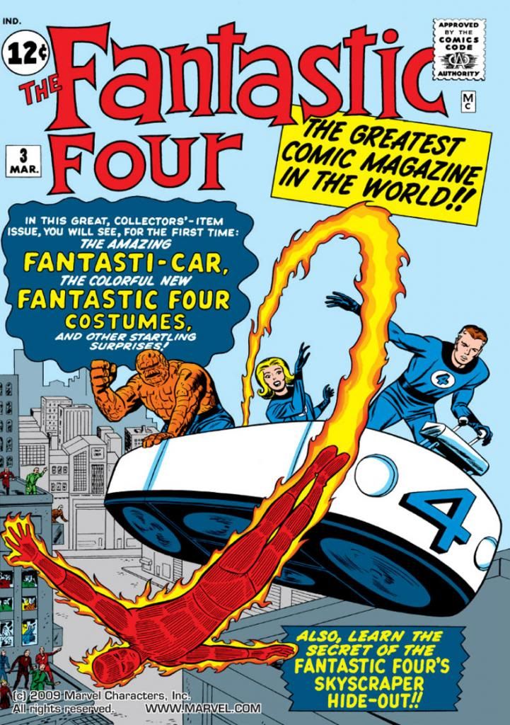
Fantastic Four #3 (March 1962), inks by Dick Ayers

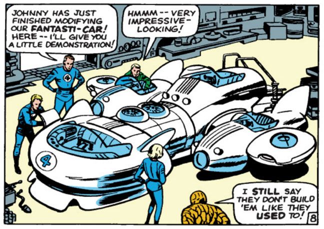
The Fantasti-Car!  The Fantasti-Car debuts in Fantastic Four #3 (March 1962), which also saw the adventuresome quartet donning their blue costumes for the first time.  Like those plain but functional-appearing duds, the Fantasti-Car is a simple design, just a tub with headlights for safety and what appear to be four fans underneath for generating lift.  I'm not sure how Reed Richards controls pitch and yaw or generates forward thrust in this version of the Fantasti-Car, but I'm sure Kirby could have explained it if I'd been around in 1962 to ask him.  Unfortunately, this isn't the most visually impressive design, and I'm guessing Kirby must have been a little dissatisfied with it, because about a year later, the Fantastic Four upgrade to a hotter version.

Fantastic Four #12 (March 1963), words by Stan Lee, inks by Dick Ayers

Yeah!  That's more like it!  The Fantasti-Car, Mark II made its debut in Fantastic Four #12 (March 1963).  This one has aerodynamic styling and possibly a much greater range.  Ignore Ben Grimm's little griping remark.  Some people just aren't pleased with anything.  The Fantastic Four use this Fantasti-Car to travel cross-country and take on the Hulk.  But what about ocean-hopping, when the team needs to cross hemispheres, date lines and other such geographic demarcations?

That's where this baby comes in--

Fantastic Four #21 (December 1963),  words by Lee, inks by George Roussos

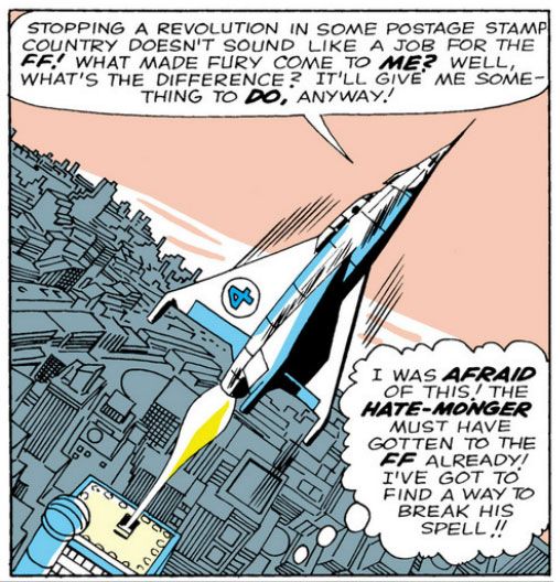
The Pogo Plane.  The Pogo Plane previously appeared in issue #3, but it really gets to strut its strato-stuff here as the FF prepare to face the Hate-Monger in Fantastic Four #21 (December 1963).  Kirby gives this aircraft a state-of-the-art appearance (at least for the 1960s), like something the USAF or NASA might have been toying around with in the early days of space exploration.  The X-51 or  the Lifting Body.  Man In Space Soonest.  The Flying Flapjack.  The Apollo Applications Program.  Somebody stop me or I'll go on forever.  I love aviation history!

This could be a wild, right-off-the-drawing-board design lifted from a Popular Mechanics article of the time.  It's got huge stabilizing fins and even flaps.  Plus it's a tail-landing VTOL aircraft.  That's "vertical take-off and landing," to you and me, Russ.  I'm no aeronautical engineer, but Reed Richards has that skill set among his many, and you can imagine he saw this one through from the initial design phase to wind-tunnel testing with a scale model to prototype production to flight test with none other than Ben Grimm at the controls.

Now that we're on the topic of his piloting skills, here's a little Ben Grimm-related aside-- Ben generally plays the fool with his gruff street-style patois, but he's actually vastly intelligent himself, the kind of guy who would have made the Mercury Seven if he'd actually existed.  Ben was a highly-regarded test pilot with a fighter background before he became a superheroic freak, which means he's got quite the expertise in engineering.  Tom Wolfe in his book The Right Stuff describes how Ben's closest real-world analog Chuck Yeager (no mean engineer himself) influenced not only aviation history but also how pilots of the era spoke-- I don't know if it's true or not, but Wolfe makes a hilarious and compelling case for airline pilots of the time doing their cockpit announcements in pseudo-West Virginia drawls in imitation of the man at flying's apex.  I can imagine in the Marvel world the same thing happening, only with pilots shouting, "It's clobberin' time!" when pushing the outside of that o' envelope, or making reference to their Aunt Petunias in put-on Brooklyn accents. 

If not for that fateful rocket flight...

Coming up next is a stripped-down sport model--

Fantastic Four #45 (December 1965),  words by Lee, inks by Joe Sinnott

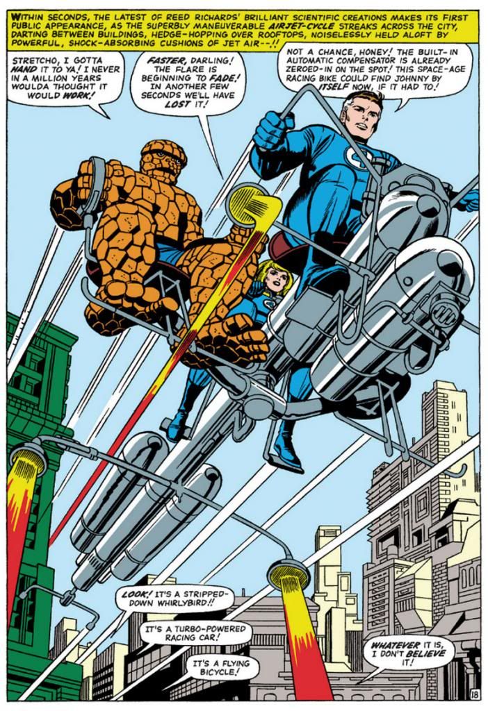
The Airjet-Cycle.  This one has neat nozzles and tanks, but it's mostly just pipes and doesn't really look capable of lifting Reed alone, much less Ben and Sue as well.  Not the most practical of earthly designs, although it looks like something NASA might have considered for lunar mobility.  Leaves the passengers kind of exposed and vulnerable, too-- I love the look of sheer embarrassment on the Thing's ever-lovin', blue-eyed face as he holds on for his very life.   The Airjet-Cycle probably comes in handy for jetting to the supermarket, or getting little Franklin to school when he misses the bus.  Not as spectacular as either the Fantasti-Car or the Pogo Plane, the Airjet-Cycle nevertheless makes further appearances in Fantastic Four #46 (January 1966), #48 (March 1966) and #57 (December 1966), to name three.  The Avengers also use a version.  You can look it up.  I did!

And now--

Fantastic Four #50 (May 1966), words by Lee, inks by Sinnott

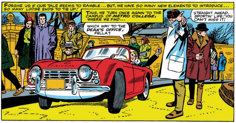
Oops!  A ringer!  Don't ever think Jack Kirby couldn't bring things down to earth (relatively speaking-- Johnny's got one unearthly ride there) and draw realistic cars.  This one reminds me of the classic 1967 film The Graduate, directed by Mike Nichols.  Dustin Hoffman actually drives a 1966 Alfa Romeo Spider 1600 "Duetto" in that movie, but Johnny Storm here has a 1966 Triumph GT6.  Yeah, a Spitfire might have been more appropriate for the Human Torch, but Triumph introduced the GT6 the year Marvel published Fantastic Four #50 (May 1966), so leave it to Johnny to pick up the latest thing in sports cars.  Maybe he's auditioning for a part in The Undergraduate.

Let's leave behind the fast and the furious for the slow and reliable--

Kamandi #1 (November 1972), words by Jack Kirby, inks by Mike Royer

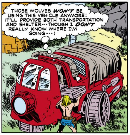
We're also ditching one comic company for another.  Just as Kirby and family left New York for California and Marvel for DC, in the first issue of his eponymous book (November 1972), Kamandi leaves his bunker home in this utilitarian military contraption with a very interesting outboard wheel arrangement.  They're heavy duty wheels, too.  Probably made of some kind of metal or composite alloy for years of wear.  Shovels clamped to the side, weatherproof tarp over the back.  This is a very appropriate get-about for Kamandi, and just the kind of thing you'd expect to find at a former military outpost.

Even after the Great Disaster, off-roading offers thrills and spectacle.  Witness--

Kamandi #6 (June 1973), words by Kirby, inks by Royer

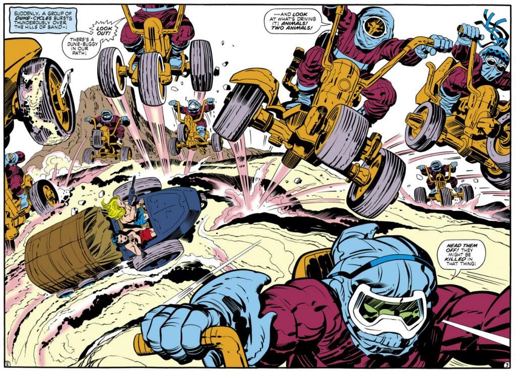
As you can see, Kirby anticipated the ATV craze.  For a while there in south Georgia, you couldn't take a drive without a three- or four-wheeler loaded with people in camouflage barreling out in front of your car from a side road or a trailer park entrance.  In fact, you still can't.  They're a menace, I tell you, and in this panel from Kamandi #6 (June 1973), you can see why.  Kamandi and his tragic girlfriend Flower have found yet another hard-working cargo carrier to explore the world, but suddenly they're capsized by a gang of three-wheeling lions!  They're huge, too.  Look how they dwarf Kamandi and Flower in their little cart.  These hot-doggin' felines think they own the dunes.  They're wrong.

Because there's one vehicle that's gonna shut 'em down, just like that little Cobra from a long ago Rip Chords song--

Jimmy Olsen #133 (October 1970), words by Kirby, inks by Vince Colletta

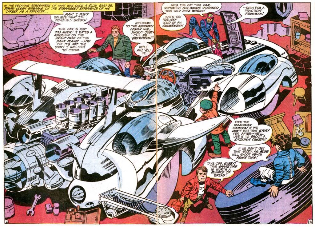
The best is last, but not for long!  In this spectacular image from Superman's Pal, Jimmy Olsen #133 (October 1970), we first greet the Whiz Wagon, custom-built by the Newsboy Legion just in time to explore the Wild Area with a certain cub reporter.  Or photographer.  Whatever the hell job it was Olsen did when he wasn't driving Perry White to distraction.  Look at the rear spoiler and those crazy intake pipes.  Is that a hint of a jet turbine beneath them?  Looking like the love child of the second Fantasti-Car and Speed Racer's fabulous Mach 5 by way of a maternity ward in the deepest, darkest, most top secret ward of Area 51, there's almost nothing the Whiz Wagon can't do.  The Newsboy Legion uses it to roar down the highway, chase after the Mountain of Judgment with the Hairies from the Habitat, fly, even travel underwater.  This is the ultimate in Kirby vehicle design. 

The Whiz Wagon by itself is an amazing visual, but Kirby doesn't simply fill two pages with a car and call it a day.  He loads this spread with details to help you believe in this phantasmagorical creation.  There's the spare tire with Newsboy Gabby perched on it (where do they buy those?), Flipper-Dipper and the forward cargo-hatch, plus tools galore and even some kind of liquid draining away in the background.  Hydraulic fluid?  Oil?  Tears from other artists who saw this and realized they'd never create anything even half so cool?

Wednesday, January 8, 2014

Kamandi #20 (August 1974): This is the image that made me a Kirby fan for life!


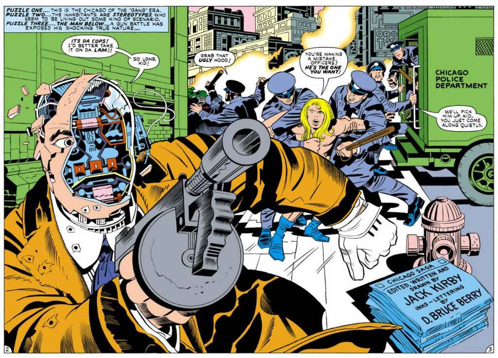
Here's a double-page spread from Kamandi #20 (August 1974), the first Kirby comic I ever owned.  I've already talked about that issue at some length here, and I'm sure you were fascinated by my commentary.  It's here again because a black and white version popped up on Facebook and I was struck by its personal significance to me as a comics fan, and also because a big name professional clued everyone into something peculiar about it.  Can you guess what it is?

That's right!  Perspective!

Did you notice how nutty the perspective is in this drawing?  Despite having studied art at a major university (I learned nothing because I'm an idiot), I never particularly gave it much thought until that pro pointed it out.  As he also commented, despite the crazy perspective (or maybe even because of it), the image still works.  Unless you make a living drawing this stuff everyday, or you're a lot smarter than I am, you probably wouldn't give two farts whether or not Kirby gets all the receding lines going to the correct vanishing points or not.  And even if you do give those two farts, the important thing is whether or not this image has impact and makes story sense.  It does!

What we glean from it, the most important information Kirby provides, is the shocking revelation that this tommy gun toting mobster is a robot.  With such a wild and wooly concatenation of figures and a startling storytelling moment, the focal points are that robot face and Kamandi's reaction.  This moment takes place during a police riot, which provides not only context but also a lot of energy and movement, like a similarly staged fight scene in a movie.  Spartacus, for example.

Notice how you're reading from left to right, so your eye goes right from the gangster's shattered visage to Kamandi's wide-eyed reaction.  The barrel of the machine gun, despite ostensibly being aimed somewhere over the reader's shoulder (involving YOU in the danger!), also serves to point to Kamandi.  The foreground is an eyeballed one-point perspective.  The lines on the green building on the left do not go to the same vanishing point as the ones on the paddy wagon on the right.  But they do serve to draw the eye back to Kamandi, creating a zoom effect within a single panel.  And check out the angle on that sidewalk.  Where is it heading?  The background mob hides its destination, but if we follow it, we'll actually end about halfway up one of those buildings in the distant background, the ones Kirby partially obscures with flames-- and which are drawn in two-point perspective!

I'd also suggest the faked perspective adds to the drunken, dreamlike quality here, on a subconscious level for the average reader (like me).  Kamandi, with his long, feminine blonde hair, is reminiscent of Alice from the Lewis Carroll stories, or at least the various Sir John Tenniel-derived versions that form our mental impression of her.  Carroll played games with language, math and logic in his prose, and Kirby does something similar with his visuals.  Kamandi, like Alice, takes an at-times rather nasty, almost psychedelic, trip through a land of talking animals, where reason and rational thought are overturned or inverted in favor of nonsense.  So it's appropriate for vanishing points and perspective planes to play tricks on our perception.  Kirby helps it along by having the figures relate to each other proportionally and because they seem to be standing on roughly the same plane.  Their environment may be illogical, but they, for the most part, are not.

The end result is a magnificent expressionist image that conveys dynamic action and provides more thrills than any six Hollywood summer blockbusters you could name.  It's also just a really cool picture.

And it's the coolness of it all that made me love Jack Kirby's work.  That, and the talking gorillas.

Sunday, January 5, 2014

Everything old is new again or ten things I'm excited about in 2014!

1.  Barbarella.  Humanoids, Inc. will publish a brand-new English language version of Jean-Claude Forest's sexy 1960s space adventure featuring the coolest 1960s space adventurer with updated and modernized whatchamallits by Kelly Sue DeConnick.  Dialogue?  Worldview?  I don't care.  Her adventures have been out of print in English for some time now, which is kind of ridiculous when you consider her pop culture significance.  There wouldn't be a Vampirella without Barbarella, and possibly not even a Red Sonja series.  As a character, Barbarella kicks much ass.  Despite her reputation as a sex kitten, in today's terms, she has what you would call "agency."  Therefore, she's a sextacularly retro space ace for today's on the go post-modern libertine!  Or something like that.

2.  Teen Titans.  With the publication of the long-awaited volume two in the Teen Titans DC archives hardcover series, it's just a matter of time before individual issues pop up on Comixology.  And this means more Wonder Girl with art by Nick Cardy.

3.  Pepper.  Last week I bought an Archie Comics digital exclusive containing 100 pages of gorgeous Dan DeCarlo-drawn pre-"ears for hats" She's Josie comics, which led me to discover the star's witty erstwhile best pal Pepper.  Pepper didn't make the transition to rock stardom with Josie and Melody, and that's a real shame because she's super cool with her cynical attitude and wild cat-framed glasses.  Those would have been so appropriate for the band.  Don't get me wrong-- Valerie is great.  But why couldn't the Pussycats perform as a quartet?  You know, Pepper on bass?  She could have been their Kim Deal, for crying out loud!  Anyway, 2014 is the year I bore you to tears celebrating Pepper.

4. X-Men.  Marvel has been dropping John Byrne-drawn issues on Comixology like they're on fire (that cliché worries me-- is this a good quality or a bad quality for something to have?), which means we're about one or two away from having a complete run available stretching from the initial Dave Cockrum issues (glorious) all the way to the celebrated "Days of Future Past" storyline that's being adapted into the latest film in the X-Men movie franchise (as my wife says, "I don't give a shit about that," but you might, so there!).  They'll probably get to the second Dave Cockrum run, which suffers from lackluster scripting but looms large in the early days of my initial fandom because those were the ones I bought in convenience stores and newsstands as Marvel published them.  I subscribed during the Paul Smith days, which saw Chris Claremont return to form.  Those should be on Comixology this year, too.

5. Fantastic Four #51.  Marvel and Comixology have every issue of Jack Kirby's legendary company-building stint on Fantastic Four through #50, which is the overall narrative's natural climax.  But it's in its anti-climax Kirby and Stan Lee produced the humanistic "This Man, This Monster," which is as close to superhero comic perfection as you are ever likely to find.  Kirby and Lee turned out a few solid stories and even some classics after this, but this is Marvel's 1960s apogee.

6. Samurai Executioner Omnibus.  Dark Horse is putting out a single book containing 798 pages of ultra-violent samurai slashing action from masters Kazuo Koike and Goseki Kojima.  A guy named Frank Miller would mine their stuff for his own reputation in the 1980s, but this is the 1972-76 original from a couple of legitimate geniuses.  Their Lone Wolf and Cub is essential, but Samurai Executioner is pretty darn close to necessary, with plenty of cinematic, evocative storytelling at its finest.  Oh, and it's only $19.99 for something that provides a meatier reading experience (as in the meat that Yamada Asaemon carves from his foes) than its equivalent in monetary (if not aesthetic)value-- about 5 flimsy 32-page issues of any given new monthly from Marvel or DC that will take you about 5 minutes to read and forget.  Okay, I admit I'm being unfair.  But even the best current series from either of the Big Two cannot hope to measure up to this work and you're paying less per page for it.  This should be the Event Comic of the Year.  Trust me-- you will never forget Yamada Asaemon.

7.  Lone Wolf and Cub Omnibus Volume 4.  Speaking of... here it is.  As I wrote above, these are essential.  Everything I gushed about with Samurai Executioner goes double for these.  This one is 696 pages for $19.99 and it's simply one of the greatest comics ever published.  I will be purchasing all of these in 2014.

8. The EC Archives:  Vault of Horror Volume 3.  Dark Horse does it again!  This is a very pricey book, but it's the continuation of Dark Horse's deluxe reprints of EC classics.  The Archives series started at Gemstone (I own several of them as well), but hit a rough patch.  Dark Horse re-launched the series in October 2013 with Tales from the Crypt Volume 4.  Fantagraphics is putting out books spotlighting individual artists (and those are beautiful), but here's your chance to see their work in context, with colors recreated from Marie Severin's originals.  Volume 1 of their Weird Fantasy reprints follows in April.  I'm more of a horror and Weird Science freak when it comes to EC, but any of these archives would be a welcome addition to my library.  And yours.

9. Warren horror.  Yeah, I know I'm going to sound like a Dark Horse shill, but they consistently put out products I love!  They're not only giving us EC and influential manga, but they're also continuing their long-running Creepy and Eerie Archives series this year.  I received Creepy Archives 10 for Christmas, and I'm certain 2014 will see me adding to my collection.

10. New discoveries of amazingly cool old stuff.  Like Pepper up there.  A couple of weeks ago, I had no inkling she even existed.  My knowledge of comics doesn't extend much farther than the ones I read when they were new and the artists and writers I grew up admiring, so I'm discovering wonders almost daily.  Certainly there are Jack Kirby stories out there and more I haven't read that I'm looking forward to uncovering and sharing with you, the reader of this blog!

Note:  Oh yeah, there are some new comics coming out this year that I'm also looking forward to.  Fantagraphics has Love and Rockets books coming out and their reprinting of Takako Shimura's heartbreaking Wandering Son.  Plus a whole lot more from Dark Horse, Image and even Marvel and DC I'll be checking out.  And there's a slight chance for some more Nana-related artwork from Ai Yazawa.  She revisited "Junko's Place" last year and apparently produced a Christmas card for Cookie magazine.  And even if we don't see new Nana, my big wish for Ms. Yazawa in 2014 (and in the future) is recovery, health and happiness.

Sunday, November 10, 2013

Part Two: "Kirby’s Unfinished Opera" by Gary Chapin (another guest essay!)

(Here's the second part of Gary Chapin's epic look at Jack Kirby's Fourth World...er... epic.  Part one is here.  You're really going to enjoy this!)

Now’s the Time

Mark Evanier, in the closing essay for Volume 3 of the Kirby’s Fourth World Omnibus, points out the critical reaction to Kirby’s treatment of Deadman. Kirby, said this critic (I paraphrase), clearly did not get the Neal Adams Memo. Graceful lines, art school realism, and noir subtlety “were” the way of “now.” Kirby represented “the past.” Adams and company represented the future. This is a point of view I would have heartily, and stupidly, embraced at the time.  “The future” is not a fixed point, however. And even the present is a bit slippery.  My “now” is different from your “now.” There’s a joke that says, “The golden age of music is 12.” My golden age of Kirby is 45. This is my “now.”

But Then Was Not

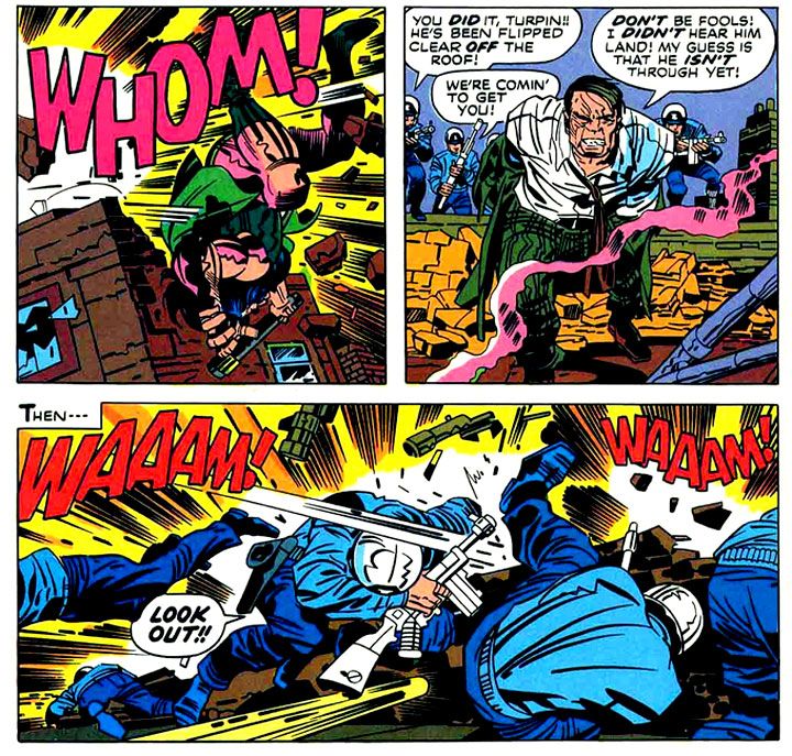
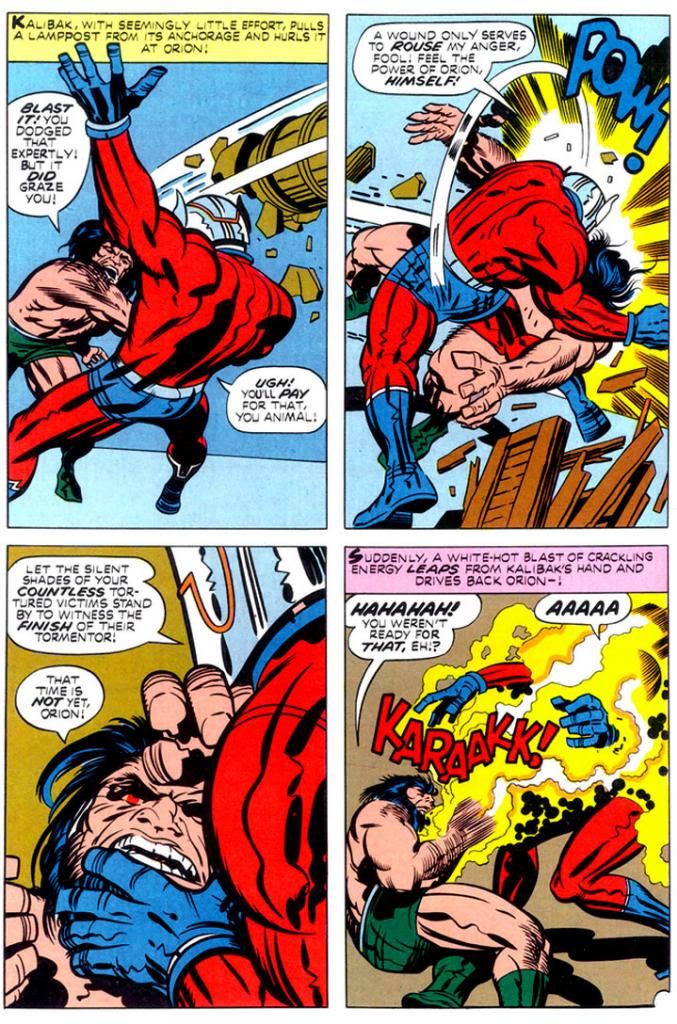
After around a year, the wheels came off the bus (or super cycle) of the Fourth World. Sales dipped, and books were canceled. The remarkable achievements that were “The Pact” (New Gods #7) and “Himon” (Mister Miracle #9) and “The Death Wish of Terrible Turpin” (New Gods #8) were not seen as masterpieces at the time.  The combat between Orion and Kalibak in the Turpin story will remind you what sort of glory can be found in a slugfest. 

New Gods #7, March 1972 (Jack Kirby with inks by Mike Royer)
 
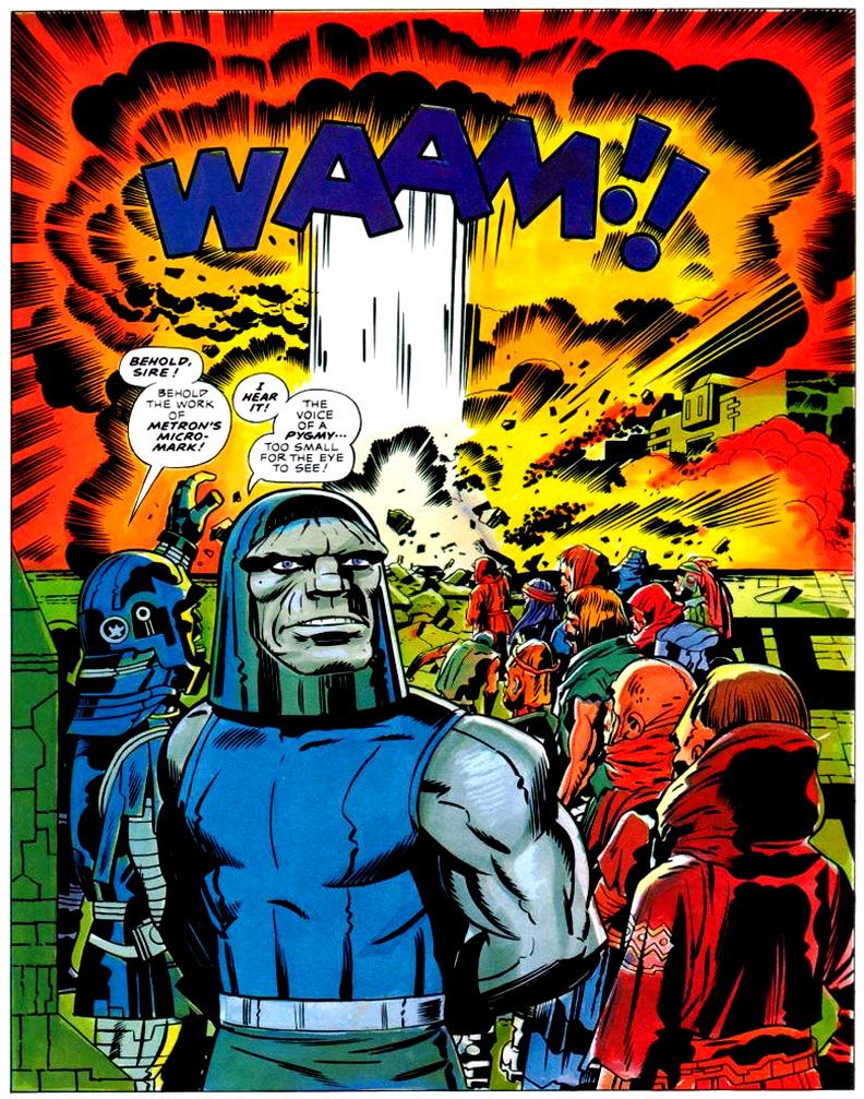
But then it ended. The last issue of the New Gods (“Darkseid and Sons,” #11) was, in fact, brilliant (the run from #7 through the end is worth everyone’s time). The story didn’t end as Kirby wanted it to, but it was a very effective stopping point with a lot of “What?? What just happened???” moments. It was very satisfying. The end of the Forever People was much more of a mess, possibly because their action was always peripheral to the New Genesis/Apokolips story being told in NG and Miracle.  “The Kids” end up stranded on a paradise planet in a faraway dimension when the Pursuer’s lance blows up, “destroying” the Infinity Man. While it technically makes sense, the pretext is as weak as it sounds.

Mister Miracle lasts a bit longer than the other two, but when the Big Story falls away, it becomes a series of one-off monster stories. This didn’t have to be a problem. Kirby spent the ‘50s being the master of one-off monster stories.

New Gods #8, May 1972 (Jack Kirby with inks by Mike Royer)

According to Evanier’s essay, though, Kirby was feeling demoralized and his heart wasn’t quite in it. You only have to notice that one of the stories begins with Miracle and Barda stumbling on a “haunted” house while walking in the woods near their house. Yeah, time for a new direction (which took him to the Demon, Kamandi, et many al., so one can’t entirely complain).

The Problem with Endings

Kirby’s vision from the beginning of the Fourth World was an enclosed story that reached through a number of books and ended in a Fourth World Ragnarok, closing the book on these characters for good. I don’t know how he ever thought that was going to happen. 

New Gods #11, November 1972 (Kirby with inks by Mike Royer)
 
It seems almost quaint, looking back from the other side of the graphic novel naissance, but in 1972, DC Comics was not going to let Kirby develop amazing properties – which is what he was brought in for – and then have them succumb to irrevocable destruction.

This may have been the one place where Kirby – a man preternaturally in synch with comic book aesthetic – may have had an ambition for something that can never exist in the superhero-comic book medium: an ending. This wasn’t a function of the times Kirby was writing in, but a function of the medium. Just consider the New Gods. We’ve had The Hunger Dogs, Kirby’s own imperfect – but beautiful! – attempt at an ending. We’ve had Death of the New Gods. We’ve had Final Crisis, where Darkseid is “finally” killed. 
 
Wait, who was that who was featured in the new Justice League 23.1?
 
To butcher Fitzgerald, “There are no last acts in comic book superhero lives.” Even characters who are never brought back, are constantly being brought up (e.g., Jor-El, Gwen Stacy). I wouldn’t be the first to suggest that while Crisis of This, That, and the Other Thing had all the hallmarks of a Ragnarok, they lacked the one key element:  the end of the world. They weren’t resetting the DC universe, they were resetting the DC stylebook.

DC Graphic Novel #4: The Hunger Dogs, January 1985 (Kirby with inks by D. Bruce Berry)

I think Kirby really wanted the end of the world for his characters. He had the Wagnerian urge. But like so many great creators he was an inventor, not a destroyer. He began things. He began great things. And not a single one of them – not Cap, not the FF, not the New Gods – has ended. And even if they fall into a space where they seem to have ended – books get cancelled – there is always a new issue coming down the line.

But this is not the problem with endings. The problem with endings is that our experience of the work is shaped by “how things turn out.” Forget how things turned out. These are astonishingly rich stories, executed to a ridiculously high degree; the creation of a visual aesthetic that’s analogous to Tolkien’s linguistic aesthetic. This will always be true, no matter how things turn out. Kirby could not achieve his operatic ambition, but that’s irrelevant. I love these books.

Gary Chapin usually blogs about French accordion music over at www.accordeonaire.blogspot.com.