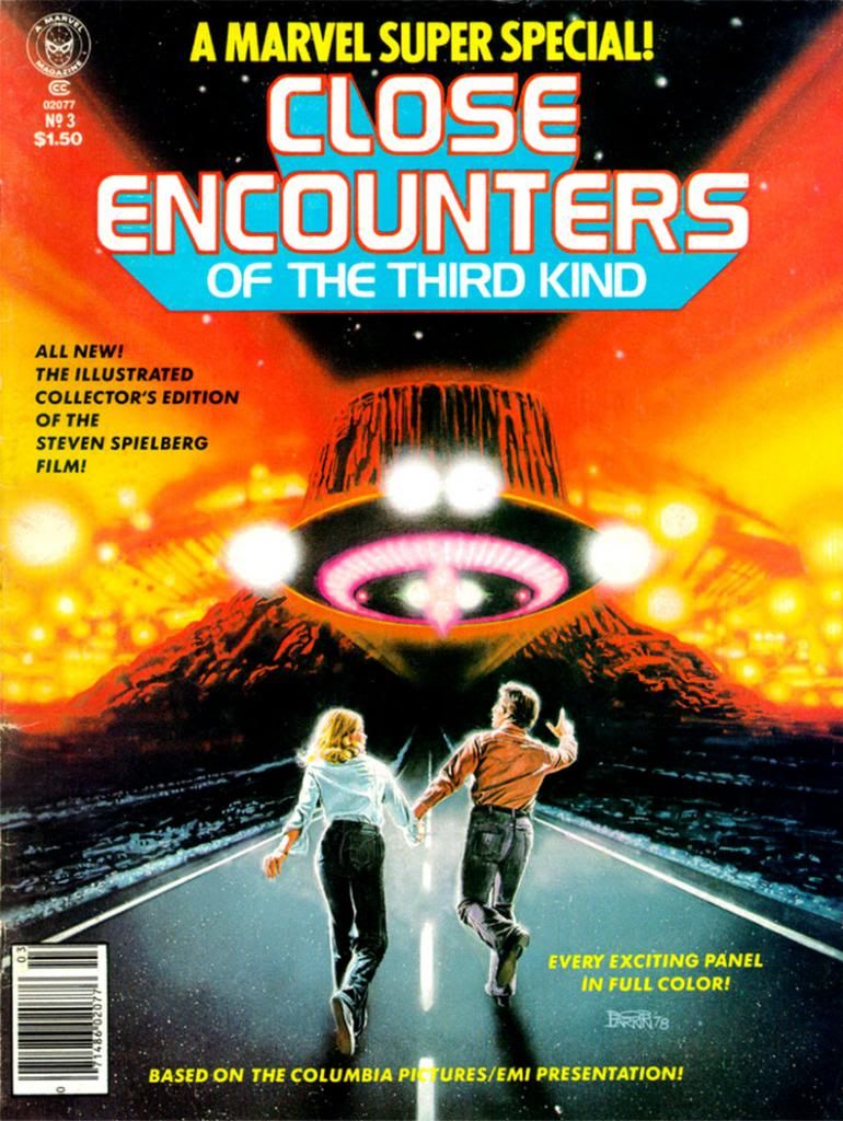
I don't know who the key figures on this cover are. Let's call them Not Quite Richard Dreyfuss and Sort of Melinda Dillon. I seem to remember in those days you couldn't always get the licensing rights to do exact likenesses of actors, so Larkin flexed his screen-accurate art muscles on the UFOs and the cosmic light show around the Devil's Tower in the background, which they apparently could get the likeness rights to. Just kidding. Everyone knows the Devil's Tower is in the public domain. No wait, actually I own it. I'd forgotten momentarily, but I'm pretty sure I have the papers around here to prove it. Please send my back payments, Mr. Spielberg and the new ownership of Marvel. Thank you.
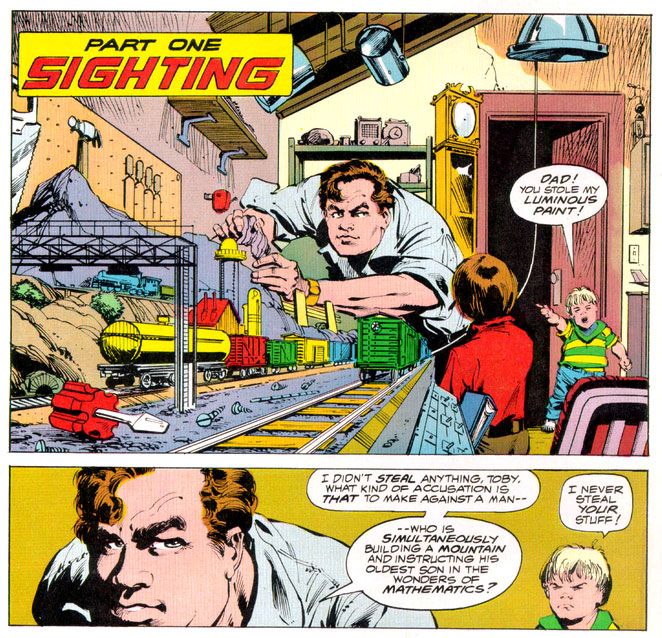
The point is, when you find a copy of Marvel Super Special #3 for yourself, you end up with this Bob Larkin painting that will knock out your eyeballs with its startling beauty even if he had to settle for brushing in a couple of stand-ins for the movie's real stars. And inside the book, you get an Archie Goodwin adaptation of one of the prime 1970s blockbusters-- second in our youthful instant-classics pantheon in those days to a little flick called Star Wars (and Close Encounters is in every way the superior work of art even if its pop culture cachet has never equaled that of its cinematic big brother)-- over Walt Simonson pencils and Klaus Janson inks.
 |
| Script: Archie Goodwin/Pencils: Walter Simonson/Inks: Klaus Janson/Colors: Marie Severin |
Think about that for a moment and ask yourself, "Was this magazine worth the $1.50 they charged for it back in 1978?" Admittedly, it's a silly question we can only answer in the affirmative. Resoundingly so. I paid slightly more for mine and now I'm going to bore the hell out of you by telling why. First, we have to time travel back to 1979 or 1980. We either had Jimmy Carter or Ronald Reagan in the White House, or maybe in some alternate universe, both fused into a two-headed creature that could never come to an ideological agreement with itself, and so ran around in circles before collapsing exhausted in the Lincoln bedroom, panting and begging for an end to its misery.
In our reality, this was before the direct market, or at least its earliest days, and before my town had anything resembling a comic book store. We had to get our comics at bookstores, convenience stores, pharmacies and the occasional gas station. None of those places would reliably stock oversized comic book magazines. And back issues? Back issues were what your big brothers or their friends gave you when they were finished with them, and my brothers and their buddies were all sports playing guys into muscle cars, funk music and girls, not comic books. I once received a hand-me-down Weird War Tales from one of these cool dudes-- instead of a beating-- and it was one of the happiest days of my life.
 | ||
|
We didn't have DVDs or even VHS then, so the only way to repeat the experience of movies you loved when it left the theaters was to buy comic book adaptations, or novelizations (or the occasional Foto-Novel), then wait for ABC to buy the broadcast rights. I already had scattered issues of Planet of the Apes, Star Wars, Battlestar Galactica and this huge King Kong magazine from either Gold Key or Whitman. This meant I had to add Close Encounters to my film comic library. You're looking at me as if I had a choice. Trust me. I didn't. I can't remember how I got the money, or the exact price (although $2.25 plus shipping and handling comes to mind), but I do remember it took forever to come in the mail. So long I assumed I'd been ripped off, which happened to kids sending money to companies that advertised in comic books from time to time. Then it came in a cardboard envelope and I was not disappointed. In fact, it not only impressed me as a story but it also changed the way I thought about comics.
First of all, it accurately recreated the movie experience in a way no film adaptation had for me before. Star Wars was fun, Battlestar Galactica adequate. Close Encounters topped both.
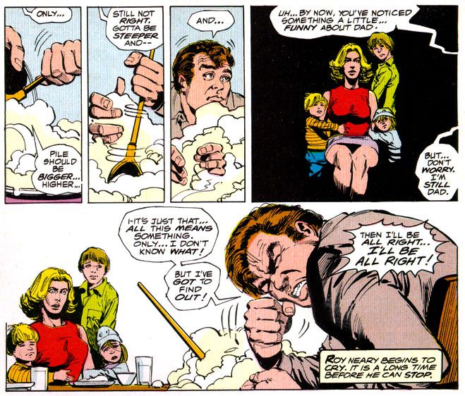
It didn't matter that the inside wasn't photo-realistic, or that we wouldn't have Dreyfuss, Dillon, Teri Garr or even Francois Truffaut going through their motions. Despite Marvel's inability to score the license for the actors' likenesses, Simonson and Janson occasionally came litigiously close enough as far as I was concerned. I can imagine other kids reeling in disappointment when they first laid eyes on the off-model Roy Neary carving his mashed potatoes into a lumpy hill while his stunned family looks on in panel designed specifically by Simonson to showcase their growing emotional distance from their troubled husband and father by isolating them in a flat black space.
I was relieved Simonson and Janson at least got his "type" right. After all, George Tuska's Taylor in Planet of the Apes looked more like screen Hercules Steve Reeves than screen Ben-Hur Charlton Heston. At least the comic book Dreyfuss wasn't nine heads tall with a physique out of a Renaissance fresco. The Truffaut character, on the other hand? I still don't know who that hawk-nosed guy resembles, but it's not the man who directed The 400 Blows. But he is a relatively minor part of the story and on-panel just a few times in the comic, so I gave Simonson and Janson a pass there, too.
 |
| Script: Goodwin/Pencils: Simonson/Inks: Janson/Colors: Severin |
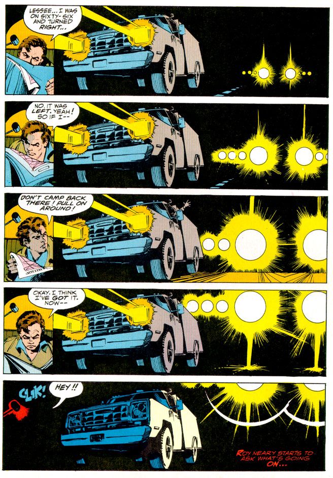
As far as the other visual elements go, Simonson's panel layouts and sequential moments are some of his most cinematic storytelling in a career full of the stuff. You can tell he was just as enthralled with the material as anyone buying this book would have been and he gives it his all, what one of my brothers' baseball coaches would have called "110 percent." I say it's more around 150 percent. Simonson exaggerates body language a bit striving to match the film's emotional beats, but he also does these action-to-action panel sequences that transpose Spielberg's framing and pacing to a static page as well as any artist I've seen. I wanted my usual superhero fare to duplicate these kinds of panel-to-panel action transitions as well, because it meant something closer to the way we perceive time than the usual dynamics and poses with speedlines. This was my introduction to that sort of comic storytelling years before I ever heard of guys named Eisner, Krigstein, Steranko or Kojima.
Sometimes I'm not so keen on Klaus Janson's heavy-handed inks, but he and Simonson are matched well here, and the way he treats lighting in this book hasn't been equaled, at least not in any comic I've seen. This is of utmost importance when dealing with Close Encounters, because light is practically a character in the movie. People mock J.J. Abrams and his supposed lens flare addiction, but Steven Spielberg had cinematographer Vilmos Zsigmond practically paint the screen with light, and Janson follows suit, especially in the climactic encounter where he manages to do something I would have considered possible-- make static drawings look not simply like dazzling lights, but moving ones as well. Seriously. Janson manages to mimic moving lights with inked lines.
In his afterward (which I read as often as I did the comic part), Goodwin cheerfully explains some of the concerns a writer has when adapting from one medium to another. You don't get a soundtrack when you read a comic, so Simonson came up with all kinds of innovative ideas for full-bleed artwork and panel arrangements to try and capture a bit of the John Williams magic. There's also a problem with timing jokes. In the movie there's a funny bit involving gas masks and Goodwin and team duplicate it, eliciting almost as much laughter from me reading it as the movie did when I was watching it. Goodwin also takes time to praise Marie Severin's coloring job, and it is indeed first rate. She really shows what a colorist can do with the limited and flat palette available in those days. And so Goodwin gave me my first lesson in writing for comics as a craft, and the kinds of things pencillers, inkers and colorist do as well.
Up to that moment, I had been used to experiencing a comic as simply a thing unto itself. Words, pictures, colors make a story as if by magic. I knew artists' names because I loved to draw, and had a vague idea of what went on behind the scenes because I read Marvel's Bullpen Bulletins and the editor's messages in DC's books, too. But in an essay probably shorter than the one you're reading now, Goodwin educated me on a writer's responsibilities and how the artists actually thought about what they were doing and planned images for effect. I also learned the word "onomatopoeia." A comic didn't just poof itself into existence. People like Goodwin, Simonson, Janson, Larkin and Severin made them with their minds, their hands, their talents. Knowing that didn't take away any of the wonder of reading a comic book. It added to it.
More than thirty years later, it still does-- no matter who the writer or artist or colorist is-- and I will always have Archie Goodwin to thank for that.


No comments:
Post a Comment