Showing posts with label Joe Orlando. Show all posts

Friday, October 7, 2011

2nd Annual Spookey Month: DC's Witching Hour trio


I'm not sure if EC started the tradition of having horror anthology books hosted by recurring characters but by the late 60s and early 70s, it was a pretty well established trope.  The Crypt-Keeper is perhaps the most famous of all, immortalized by HBO's Tales from the Crypt series.  The EC original looked somewhat more human, but the TV version had that crazy cackle, a warm, infectious laugh, as gleeful as a Christmas morn.  In the comics, the Crypt-Keeper and his fellow hosts the Vault-Keeper and the Old Witch directly address readers and are playful rivals, sometimes more interesting than the stories they introduce.  Warren Publications had as their presenters Uncle Creepy and Cousin Eerie.  They queasily look like the results of several generations of inbreeding within some old money family sliding into decadence and disrepute; the Crypt-Keeper and friends seemed positively savory next to those two geeks.  Gold Key had caricatures of real people for their comics; Rod Serling appeared in comics based on his Twilight Zone TV show while Boris Karloff headlined his own title, Boris Karloff Tales of Mystery.
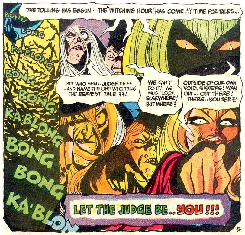

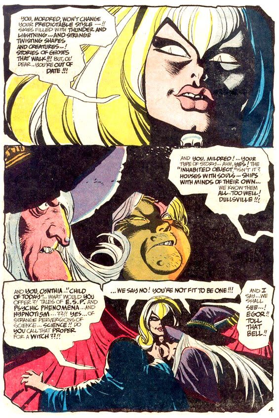
EC and Warren alumnus Joe Orlando outdid them all as an editor with DC, teaming up with Dick Giordano, Bill Draut and Gerry Conway among many others to give horror fans such memorable hosts as Cain and Abel, the ultimate pair of sibling rivals, and their books House of Mystery and House of Secrets, Eve from Secrets of Sinister House... and... Lucien the Librarian.  My favorites, however, are from the Giordano-edited The Witching Hour:  the three witches, Mordred, Mildred and Cynthia.  I'm not sure who gets credit for creating them.  Possibly William Shakespeare, although his three "weird sisters" are uniformly hideous, described in Macbeth as "withered," "wild in their attire," and, most alarmingly:

You should be women,
And yet your beards forbid me to interpret
That you are so.


Mordred and Mildred come closest to the Shakespearian example.  They're fairly standard witches, complete with a pointy hat and a hooded cloak, stringy hair and appropriately old school ideas about what constitutes a horror tale.  Cynthia, however, gives the Bard a middle-finger salute.  She's the very model of a modern major witch, a little Samantha Stevens and a whole lotta love.  With the pouty face of a Bridget Bardot-- albeit with slitted cat-pupils-- and the voluptuous figure of a Sophia Lauren, Cynthia slinks around in a skin-tight black dress, a skull-shaped brooch at her throat.  She speaks in groovy 60s slang-- she'd probably call each issue of The Witching Hour a "scare-in"-- and her bag is telling far out, contemporary stories that swing like a pendulum do.

The Witching Hour host segments have a distinct narrative flair all their own, each issue opening with some comedic vignette.  Cynthia taunts the older witches, they respond in kind.  Cynthia usually comes off best, with an Addams Family-esque joie de mourir.  She's just more likable than her companions, too.  While Mildred and Mordred gnash their teeth and verbally abuse the help, Cynthia poses vivaciously for the readers, a smile on her fleshy lips.  Given the choice between two witches who seem constantly pissed and one who's on a cool trip, daddy-o, which would you choose?  I'm turning on, tuning in and dropping dead with Cynthia.

Alex Toth's Cynthia has a strange widow's peak that appears to have consumed her pointy eyebrows, huge feline eyes, lashes heavy with mascara, bee-stung lips and a square-ish jaw with a pronounced chin dimple.  Here's a splash page from The Witching Hour #8 (1970) where Toth has her introduce a story in a novel way:
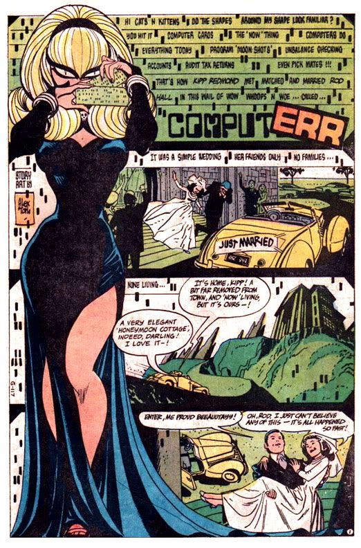

I love her cheeky, playful pose.  Lots of personality in that drawing!  The page layout is innovative for the time, Cynthia providing a visual frame for the first three panels and black gutters instead of the traditional white.  It may be technologically dated now, but even the computer-style typeface was a little ahead of its time.  The story is credited to Toth, but the DC Showcase reprint lists none other than Sergio Aragones as the writer.  Maybe Toth plotted and Aragones scripted.  If you're a Toth fan, the early issues of The Witching Hour are a treasure trove of his work, which makes the DC Showcase volume indispensable.

 This is from Neal Adams's framing sequence for the same issue, also written by Aragones-- who was apparently on fire that month:
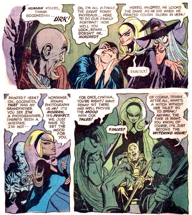

Adams makes his Witches look uncannily like Toth's.  That's one of Adams's most amazing artistic abilities-- mimickry.  You probably read the Batman story guest-starring Enemy Ace where Adams made the pilot look exactly as if Joe Kubert himself had drawn him.

Gray Morrow's Cynthia from #10 (1970) is more naturalistic than Toth's, but no less alluring:
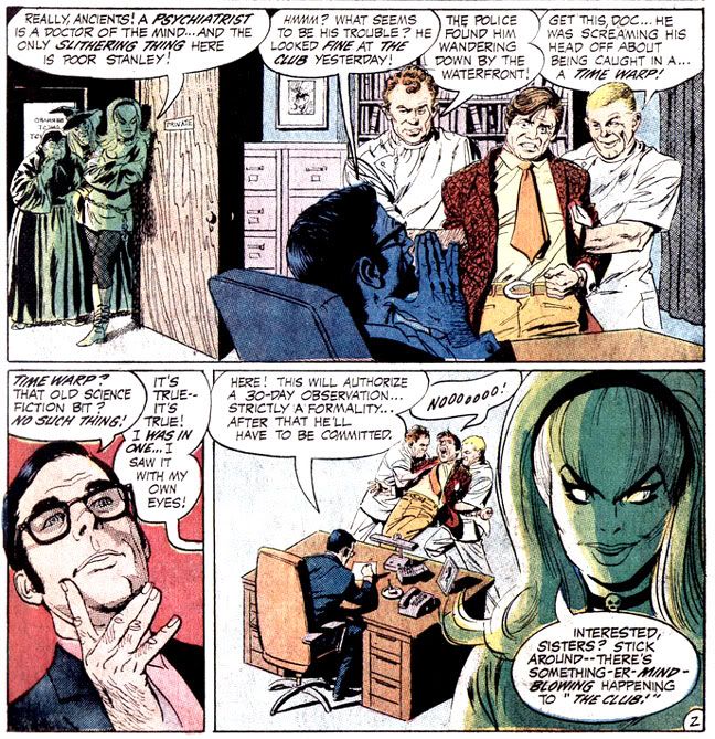

 Morrow is rare among The Witching Hour artists in that he gets Cynthia out of her long Morticia dress and into a mod mini-dress, patterned tights and go-go boots.  In a later issue, she sports a purple bodysuit, but Morrow was there first, drawing inspiration from the psychedelic fashions of the time.  He interprets her eyebrows as separate entities from her hairline, too.

  Other artists interpret her in various shades of sinister beauty, but Mildred and Mordred look pretty much the same throughout.  Like the other horror titles, The Witching Hour distinguished itself as the gorgeously appointed home of a number of DC's Filipino artists.  Guys like Tony DeZuniga, Alex Nino, Alfredo Alcala, Nestor Redondo and others made their way to the United States where they flooded DC's horror titles with incredibly rendered work.

Here's a nice Alcala Mordred from #27:
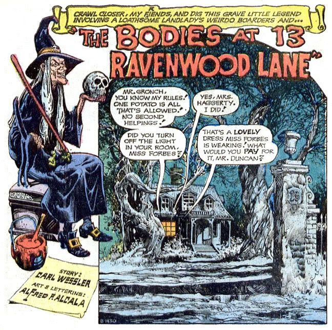

Very atmospheric and Halloween-appropriate.  The buckle-shoed witch, a creepy nightscape, even a skull and the number 13.

And a Gerry Talaoc Cynthia from #28:
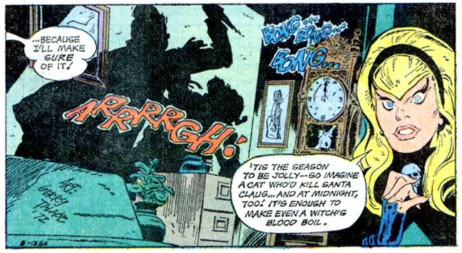

She looks a little surprised.  Probably because she's talking about Santa Claus in my Halloween-themed blog entry.

From the same issue, another holiday image, this time with Mildred courtesy of Ruben Yandoc:
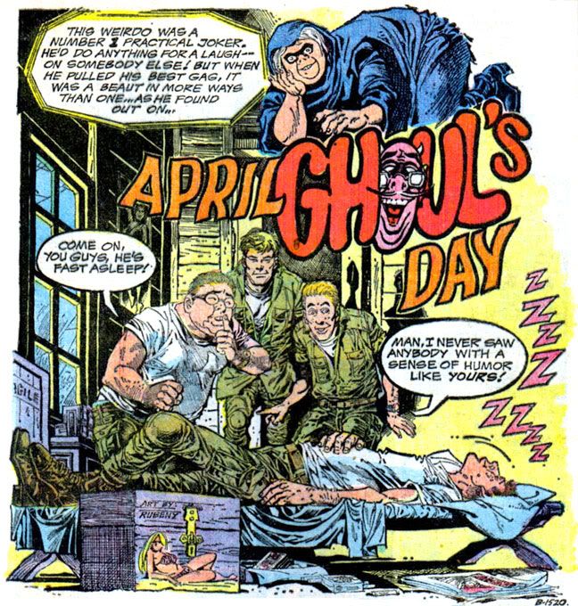

It's strange to think these three once headlined their own book and had their own little adventures.  Once these horror anthologies ran their course, Mordred, Mildred and Cynthia spent some time with Cain and Abel and then fell into the clutches of Neil Gaiman, who worked them into the supporting cast of his The Sandman series.  I have to give him credit for keeping them alive.  Gaiman didn't do just that; he also added a lot of symbolism and mythology to the trio-- Erinyes, the Furies, maiden, mother, crone, the Kindly Ones and all that clever, clever stuff that probably didn't occur even to Shakespeare when he was writing his play.  I'm only familiar with any of it from the tidbits of Greek mythology my art history professor offered when she desperately tried to fill my head with knowledge of amphora and statuary.

This is more my speed:


But why should these three play supporting roles when they're such powerful female characters, so fascinating unto themselves?  All that literary and folkloric synthesis is interesting, but it seems more an exercise in author self-aggrandizement-- I should know since I'm the ruler of that junk-- rather than a true continuation of their narrative.  I prefer the witches as stars of their own book, telling their quirky stories rather than as members of the background ensemble within some other character's story, no matter how dazzlingly the author enfolds them with the plot.

I'd love to see them headlining another anthology book, mocking each other, talking directly to the readers and demanding our attention.  Cynthia could be updated for the current generation, a little auto-tuned to the post-modern vibe, destroying hipsters and Facebook moguls.  Mordred might draw inspiration from Japanese horror comics and movies-- just like Hollywood!-- while keeping up her interest in ghosts and phantoms.  She could probably teach all these ghost hunting fool on cable TV a thing or three.  And Mildred might find some common ground with tech-savvy forever up-to-date Cynthia by coming up with stories about possessed iPods and Blackberries.

Or not.  And now... more Japanese rock from Spookey! Yes, I've posted this one before, but it's directly related to Halloween and it's awesome:

Monday, April 18, 2011

Creepy #7: Comic Nirvana has been achieved!

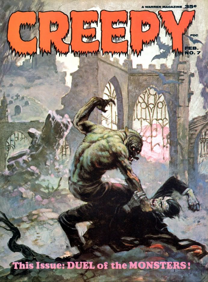
Let's take a moment and appreciate the wonderful thing known as Creepy #7, published in 1965, back before even I was born. The levels of artistry and fun register off the scale with this one. It starts with this the Frank Frazetta painted cover. There is nothing more you could ask of a horror comic cover. The Universal Studios-style Wolfman versus Dracula. If you're anything of a horror comic aficionado or just a fan of great funnybook art, I defy you to resist this cover's allure. Frazetta's color palette here is amazingly controlled. Cool neutrals dominate, contrasted with subdued warm reds along Dracula's cape. Wolfman's back is incredible-- gray flecked with brown and green, with subtle blue and pinkish underlighting. It's early morning light. At first glance it may seem as if Wolfman is kicking Dracula's ass, but check out the wounds on that hairy arm, visible through the misty sfumato characteristic of Frazetta's paintings-- these monsters have doomed themselves.

If only they could've put aside their differences!

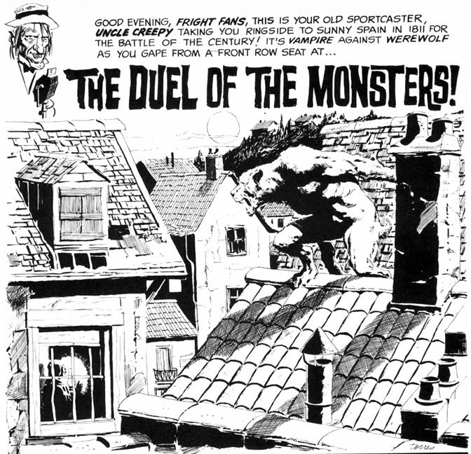
Even the Creepy logo is wonderful. Lurid red, oozing, dripping typeface. But what lurks inside? Do Wolfman and Dracula actually fight? Kind of. The lead story is "The Duel of the Monsters" by editor Archie Goodwin, with some sweet, sweet Angelo Torres art. The half-splash features a rooftop werewolf on the prowl-- what a hook!-- and we're already involved in the story.

Goodwin's story delivers. It's 1811 Spain, and the vampire is a sergeant on the city's night watch who uses his position to cover his murderous un-lifestyle. When competition rears its furry, fanged head in the form of a werewolf, the sergeant will stop at nothing to destroy the interloper. He soon identifies his prime suspect, but things go badly for the vampire. The twist ending is a little abrupt, but appropriately nasty. Torres's art at this time is sometimes difficult to differentiate from Al Williamson's, which is a high compliment indeed. Here he creates plenty of mood and atmosphere with sophisticated lighting effects, but doesn't allow the story's nocturnal setting to obscure his storytelling or draftsmanship.

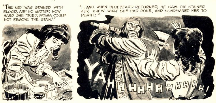
The second story is "Image of Bluebird," by Bill Pearson. It's about Monica and Brian, newlyweds who move to an isolated house deep in the woods. Thanks to some grisly murders, Monica becomes convinced she's married a Bluebeard. No, not a pirate. His beard was black. The infamous Bluebeard, killer of wives. Joe Orlando does all he can to make her suspicions valid with his ambiguous portrayal of Brian. One moment he's literally sweeping Monica off her feet, the next he's brandishing a knife and looking positively demonic. Fortunately for Monica, it's all a case of mistaken identity. Brian, however, is not so lucky. Pearson's crafted a tightly plotted tale and Orlando provides some fun moments with axes and one truly spectacular panel where a character screams "AAAAARRRRGGHH!" with a knife sticking out of his chest. Hard to go wrong with bloody stabbings.

For you folklore fans, there's the beautifully Frazetta-illustrated "Creepy's Loathsome Lore!" Here we learn that people not only turn into wolves but also into tigers, jaguars and foxes. According to Uncle Creepy (and Frank Frazetta), "Both China and Japan abound with legends of fox-women... beautiful girls said to entice male victims, then change into a snarling, attacking fox!" And dress like Vampirella while doing so, apparently. I'm not so sure about China and its legends, but I'm pretty sure kitsune never dressed this way in Japan. Still, this little info page tantalizes with the thought of what the Warren staffers might have done if they'd tapped into Japanese horror stories like the kuchisake-onna or rokurokubi instead of constantly drawing on pulp fiction versions of voodoo curses and 19th century European settings.

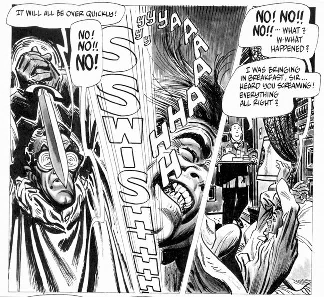
Then it's time for Alex Toth and Archie Goodwin's "Rude Awakening," one of those stories where the protagonist keeps slipping in and out of horrific nightmares until he can no longer separate fantasy from reality. And by the end of this , neither can we. It's the weakest story in the issue, and suffers from an over-familiar concept, a variation on the old wheezy "Coachman's Warning" tale, substituting the more menacing figure of a knife-wielding geek in glasses for the coachman. Rod Serling did his own take with a modern setting in a Twilight Zone episode called "Twenty-Two," which aired way back in 1961. Toth evidences a fine control with ink washes, and something about Goodwin's script really inspired him to lay down the lines because he isn't working in his more characteristic minimalist mode. A few of the faces are exaggerated and comical-- almost as if Toth were experimenting with a Jack Davis-inspired style.

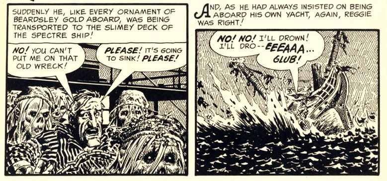
Eando Binder and John Severin invite us to "Drink Deep" with a very EC-esque story of a rich jerk (is there any other kind in horror comics?) who treats everyone like shit (do they do anything but?) but makes the mistake of doing so on a yacht richly appointed with gold stolen by his pirate ancestor. If horror comics have taught us anything, it's being a jerk leads to ironic comeuppance at the hands of the undead. What's fun about this story-- besides the rotten seamen who stagger around, no doubt leaving a trail of salty slime all over the yacht's hardwood decks-- is seeing Severin's slightly caricatured figures in the service of terror rather than humor. I first encountered John Severin as the key artist for Cracked magazine, where he drew their parodies of things like the 1976 King Kong remake starring Jeff Bridges, Charles Grodin and Jessica Lange, plus Rick Baker in an ape suit. Here he employs slightly exaggerated facial expressions and that distinctly Severin-ish cross-hatching to wonderful effect, elevating a somewhat predictable (but no less fun) tale.

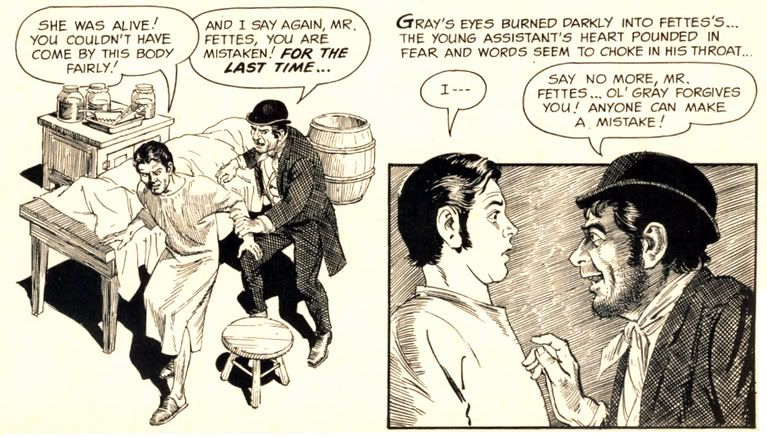
Goodwin and Reed Crandall score with their adaptation of Robert Louis Stevenson's "The Body Snatcher." I haven't read the original, but Crandall's etching-like linework is ideal for the story's setting. It has a "Classics Illustrated" feel to it, very ornate and a joy to behold. Goodwin's script affords Crandall the chance to try all kinds of lighting effects, like the radiating lines around a single candle and the slanting streaks of rain on a gloomy evening. Mr. Gray is a thoroughly repulsive fellow, but you're left wondering just who is worse-- the loudmouthed body snatcher who provides goods a little too fresh for his clients, or the doctors themselves.

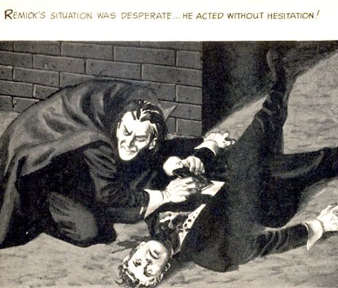
"Blood of Krylon" has a goofy title, but a killer concept. What do you do if you're a vampire in a future where the entire surface is now covered with ultra-modern skyscrapers and law-enforcement agencies use infallible robots to control crime? You take off for the space colonies in search of fresh prey, that's what. But you'd better study up on extrasolar planets-- particularly their rotational periods. The vampire thought of everything in this story except that. Yes, the ending is quite predictable (but it's a fun ride getting there) and I'm not sure why our future vampire has to dress like a Dracula reject complete with high-collared cloak, but Gray Morrow's creamy art truly impresses. These aren't ink drawings with just washes, but fully realized monochromatic paintings.

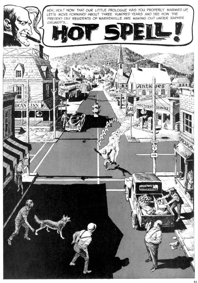
But the best is last. The most visually spectacular story in the magazine is "Hot Spell," written by Goodwin and once again illustrated by Crandall. It begins with a wash-painted flashback to "17th century New England," where warlock Rapher Grundy meets his flaming death at the hands of some pissed-off Puritans. Never mind that the preferred method of executing witches was hanging-- a good old fashioned burning at the stake provides more time for Grundy to scream, "My curse is on this village!! Let each generation feel it and suffer!" Then comes the splash page:

Kind of heartwarming, huh? Unless you're that guy in the intersection. He's warm all over. It doesn't take long for the townsfolk to pin the blame on the newcomer-- some kind of Bohemian artist type. You know, the kind of Commie degenerate who goes around sporting an untucked polo shirt, pinstriped pants and... gasp... pennyloafers! Goodwin's script foreshadows some of the themes Stephen King would work with in some of his short stories and the novel Salem's Lot. The evil we do lives on, hidden behind the banal facade of small town life and all that. It may be good enough for John Mellencamp, but Goodwin finds finds prejudice and urge to mob violence just below the seemingly tranquil surface of this particular one-pick up truck burg. And no little pink houses, as far as I can tell. Crandall's fine-lined art makes it certainly a pretty how town with up so floating many bells down! It also gives the fisticuffs and destruction an ironic Norman Rockwell feel. The comeuppance is a bit abrupt and too literal, but who can argue with a story as gorgeously drawn as this?

Wow. When I read Creepy #7 the first time, I just could not get over what I was seeing on each page. Even though the writing quality is a bit up and down, the stories are never less than fun. And it's difficult to imagine a more beautifully illustrated comic than this. Pure joy in print form.