Showing posts with label Reed Crandall. Show all posts

Saturday, October 13, 2012

October is Spookey Month: "The Coffin of Dracula"

Dracula didn't really cry out for a sequel, but for over a century now Bram Stoker's vampire character has proven so appealing writers have been unable to leave the poor, exhausted bastard  undead, the end result being he's so ingrained in our pop culture his image has even been used to sell chocolatey breakfast cereal.  You can imagine, if you will, his staked, beheaded bones lying in his coffin still somewhere in the mountains of Transylvania, just as he was at the end of the original novel.  Or you allow any of the later incarnations where the vampire comes back to unlife into your personal Dracula canon.  Or you can be like me and just separate them all and not really care if one is a continuation or a side story or parody or whatever.

For Warren's Creepy magazine, Archie Goodwin and Reed Crandall created a two-part sequel centering on one Lord Varney (his name borrowed from one of Dracula's vampire antecedents) and his stupid misadventures with Dracula's coffin.  Not that the story is stupid.  It's not exactly a classic-- although Warren thought highly enough of it to reprint it in one of their best-of issues-- but Varney's the idiot here.  What kind of fool buys Dracula's coffin and climbs into it?  It's a bonehead move by an arrogant jackass and actually one of the most bizarre ways I've yet seen of contracting the dread disease we know as gingivitis.  I mean, vampirism.

Seriously, if you must become a vampire, have the common decency to drink the blood of one of the undead.  Get your own coffin.  Sharing coffins isn't sanitary, anyway.  And it's not true vampirism.  It's more like possession at first.  Varney can't even get that right.  Man, I hate this Varney guy!
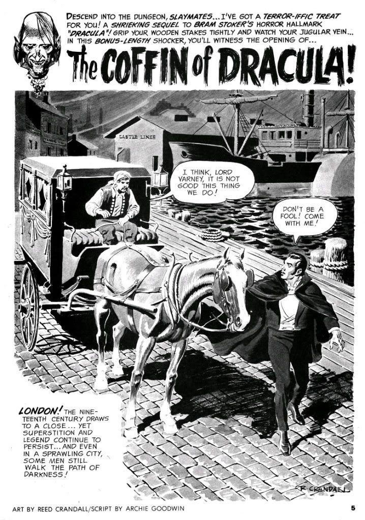

Part one clawed its way out of the crypt in time to anchor Creepy #8 (April 196), while part two coalesced from swirling ash in #9 (June 1966).  Both segments are gorgeously illustrated by Crandall at the height of his artistic powers, "Coffin" plays like an overly abridged adaptation of the Stoker original, with Dracula more a presence than a character.  Dopey, delusional Varney kidnaps Mina, Jonathan, van Helsing and Dr. Steward pursue him back to Whitby, one of the central settings in the novel and where Dracula began his reign of terror by vamping virginal young aristocrat Lucy Westenra.  The heroes hope to kill a vampire left over from the novel and prevent Varney from truly becoming one of them.  After that, they plan to save Mina.  The plan doesn't sit too well with Harker, but he's too dim to argue with van Helsing's logic.

There's some decent violence and fully-rendered vampire-staking (tastefully sans outright gore), but Varney is a vamp-come-lately, a pale imitation of the great one and lacks charisma.  Once fully vampirized, he doesn't even have any dialogue.  Ultimately, gorgeous art or not, the story is mainly mild fun for fans of books like Alan Moore's League of Extraordinary Gentlemen, itself an extension of Dracula through the character Mina.  If you finished Dracula and hoped for more story, then here's your chance and you don't have to know 19th and 20th century literary references and pop culture to fully appreciate it.
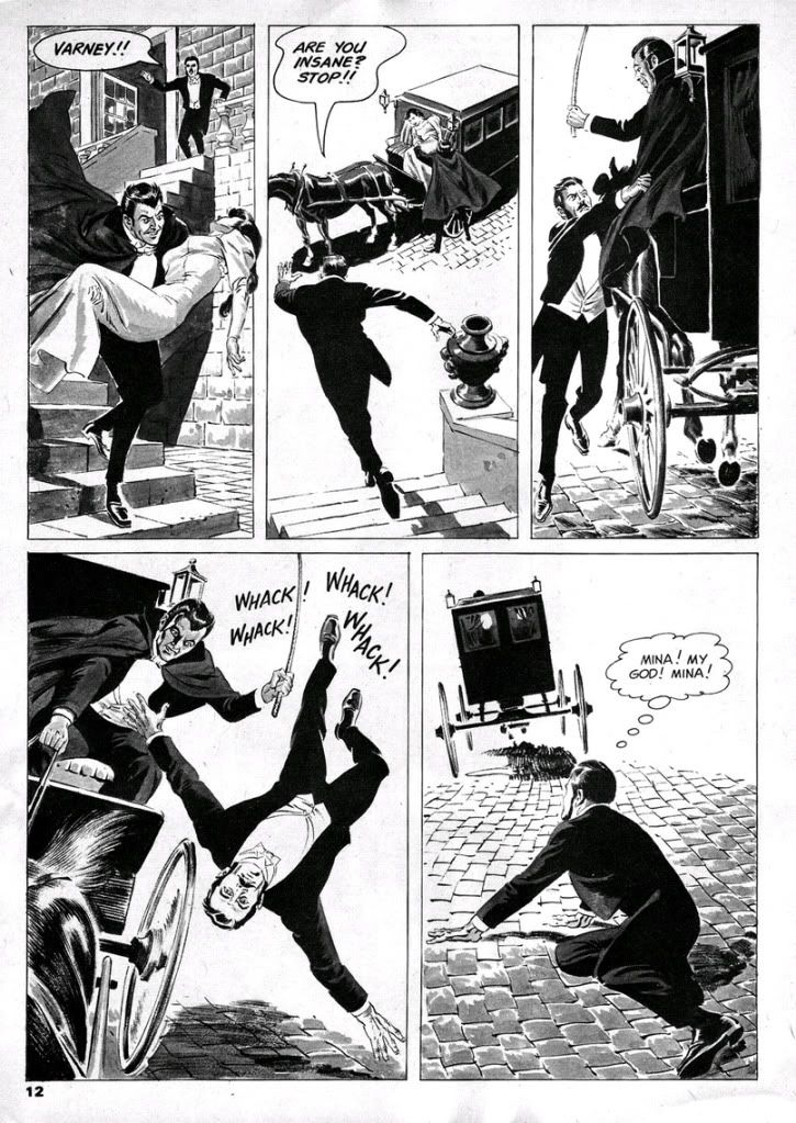

At least Moore picked up on the nascent feminist aspects of Mina, given that ultimate compliment by van Helsing in the book of having a "man's brain."  The novel's Mina is a schoolteacher with a strong empiricist bias before she encounters the supernatural.  Moore really ran with the notion and made her a lot steelier than Stoker's Mina, but Goodwin goes the opposite route and reduces Mina to your standard damsel in distress, kind of a dishrag.  She barely has any dialogue, and none at all in the second part where we only see her unconscious before we follow Harker as he pursues Varney.

Well, Stoker puts Mina in jeopardy and in need of rescuing by men as well, but she does get in a few shots of her own, and because it's an epistolary novel, she at least had the privilege of speaking for herself.  Goodwin shifts his focus exclusively to those menfolk, here rendered as a a dull crew of stick-up-their-asses types.  When Varney kidnaps Mina, she disappears for the bulk of the story, which diminishes her plight.  Goodwin does a wonderful job of recreating Abraham van Helsing's stilted Continental dialogue, though.  Van Helsing is like a Dutch Yoda.  "Friend Jonathan," indeed.
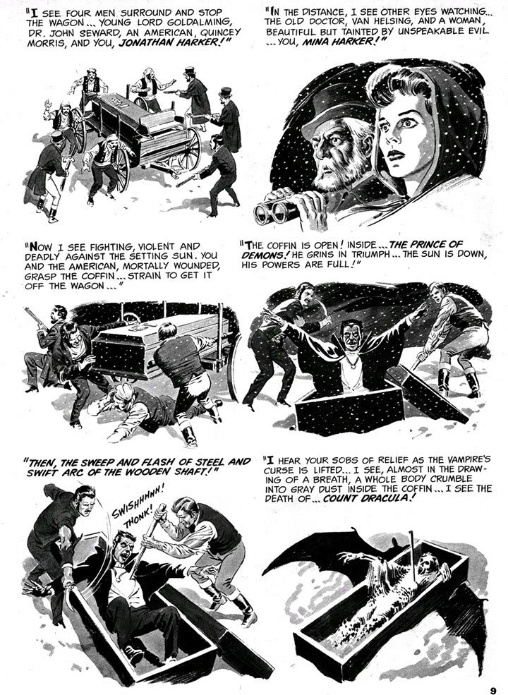

 My favorite page is the collage-like recapitulation of Dracula's climax.  I wish Goodwin and Crandall had done a full-fledged adaption of Stoker rather than this rehash, pretty as it is.

Poor Reed Crandall.  While I immediately loved what I saw when I encountered his color jobs for EC in those early 1990s Gladstone reprints (I sorely miss those), his black and white art in the Creepy archives books from Dark Horse is a revelation.  I can only describe it as beautiful, like those illustrated plates you encounter in ancient, heavy tomes from the darker corners of a library collection.  Finely proportioned and posed figures, beautiful contour lines and modeling, depth of field, absolute control and mastery of individual panels and the page as a whole.  And yet he seems to have been in competition with Wally Wood for "most tragic former EC great."  Alcohol dependency and failing eyesight robbed him of his talent and sent his output into a shockingly steep decline in quality, so much so his last few jobs seem more the work of a talented amateur trying to do a Crandall impression.  Reading them is like viewing a slow motion film of a ship sinking with a man still visible on the deck.  On the other hand, he did leave behind an impressive body of work, especially in these early issues of Creepy.

And now it's time for one of my all-time favorite videos starring Spookey:


Monday, April 18, 2011

Creepy #7: Comic Nirvana has been achieved!

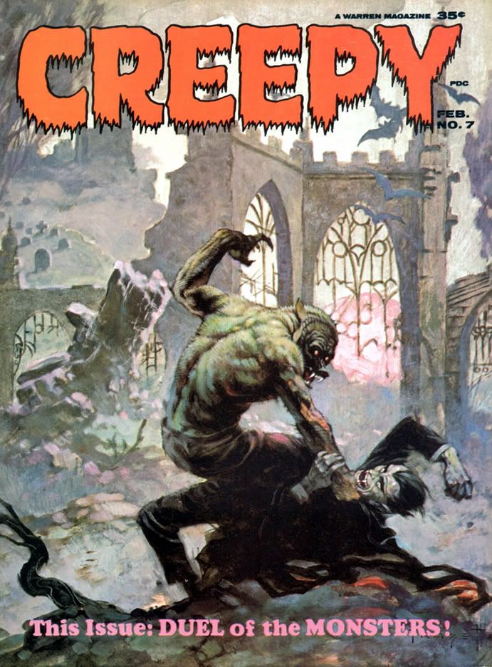
Let's take a moment and appreciate the wonderful thing known as Creepy #7, published in 1965, back before even I was born. The levels of artistry and fun register off the scale with this one. It starts with this the Frank Frazetta painted cover. There is nothing more you could ask of a horror comic cover. The Universal Studios-style Wolfman versus Dracula. If you're anything of a horror comic aficionado or just a fan of great funnybook art, I defy you to resist this cover's allure. Frazetta's color palette here is amazingly controlled. Cool neutrals dominate, contrasted with subdued warm reds along Dracula's cape. Wolfman's back is incredible-- gray flecked with brown and green, with subtle blue and pinkish underlighting. It's early morning light. At first glance it may seem as if Wolfman is kicking Dracula's ass, but check out the wounds on that hairy arm, visible through the misty sfumato characteristic of Frazetta's paintings-- these monsters have doomed themselves.

If only they could've put aside their differences!

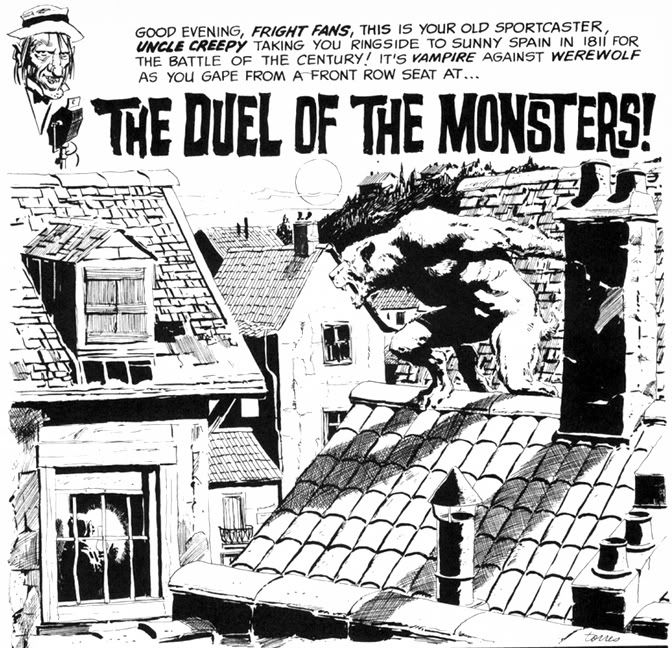
Even the Creepy logo is wonderful. Lurid red, oozing, dripping typeface. But what lurks inside? Do Wolfman and Dracula actually fight? Kind of. The lead story is "The Duel of the Monsters" by editor Archie Goodwin, with some sweet, sweet Angelo Torres art. The half-splash features a rooftop werewolf on the prowl-- what a hook!-- and we're already involved in the story.

Goodwin's story delivers. It's 1811 Spain, and the vampire is a sergeant on the city's night watch who uses his position to cover his murderous un-lifestyle. When competition rears its furry, fanged head in the form of a werewolf, the sergeant will stop at nothing to destroy the interloper. He soon identifies his prime suspect, but things go badly for the vampire. The twist ending is a little abrupt, but appropriately nasty. Torres's art at this time is sometimes difficult to differentiate from Al Williamson's, which is a high compliment indeed. Here he creates plenty of mood and atmosphere with sophisticated lighting effects, but doesn't allow the story's nocturnal setting to obscure his storytelling or draftsmanship.

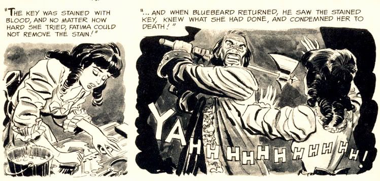
The second story is "Image of Bluebird," by Bill Pearson. It's about Monica and Brian, newlyweds who move to an isolated house deep in the woods. Thanks to some grisly murders, Monica becomes convinced she's married a Bluebeard. No, not a pirate. His beard was black. The infamous Bluebeard, killer of wives. Joe Orlando does all he can to make her suspicions valid with his ambiguous portrayal of Brian. One moment he's literally sweeping Monica off her feet, the next he's brandishing a knife and looking positively demonic. Fortunately for Monica, it's all a case of mistaken identity. Brian, however, is not so lucky. Pearson's crafted a tightly plotted tale and Orlando provides some fun moments with axes and one truly spectacular panel where a character screams "AAAAARRRRGGHH!" with a knife sticking out of his chest. Hard to go wrong with bloody stabbings.

For you folklore fans, there's the beautifully Frazetta-illustrated "Creepy's Loathsome Lore!" Here we learn that people not only turn into wolves but also into tigers, jaguars and foxes. According to Uncle Creepy (and Frank Frazetta), "Both China and Japan abound with legends of fox-women... beautiful girls said to entice male victims, then change into a snarling, attacking fox!" And dress like Vampirella while doing so, apparently. I'm not so sure about China and its legends, but I'm pretty sure kitsune never dressed this way in Japan. Still, this little info page tantalizes with the thought of what the Warren staffers might have done if they'd tapped into Japanese horror stories like the kuchisake-onna or rokurokubi instead of constantly drawing on pulp fiction versions of voodoo curses and 19th century European settings.

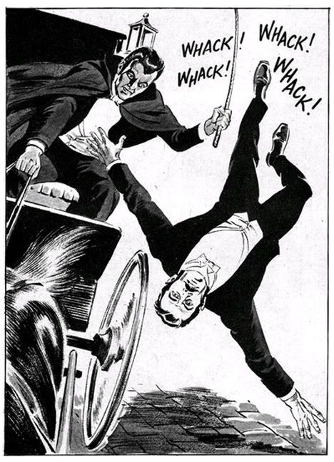
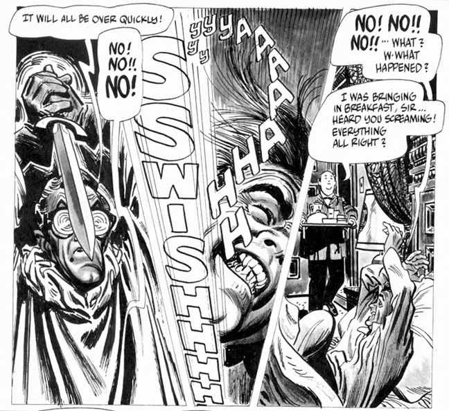
Then it's time for Alex Toth and Archie Goodwin's "Rude Awakening," one of those stories where the protagonist keeps slipping in and out of horrific nightmares until he can no longer separate fantasy from reality. And by the end of this , neither can we. It's the weakest story in the issue, and suffers from an over-familiar concept, a variation on the old wheezy "Coachman's Warning" tale, substituting the more menacing figure of a knife-wielding geek in glasses for the coachman. Rod Serling did his own take with a modern setting in a Twilight Zone episode called "Twenty-Two," which aired way back in 1961. Toth evidences a fine control with ink washes, and something about Goodwin's script really inspired him to lay down the lines because he isn't working in his more characteristic minimalist mode. A few of the faces are exaggerated and comical-- almost as if Toth were experimenting with a Jack Davis-inspired style.

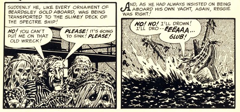
Eando Binder and John Severin invite us to "Drink Deep" with a very EC-esque story of a rich jerk (is there any other kind in horror comics?) who treats everyone like shit (do they do anything but?) but makes the mistake of doing so on a yacht richly appointed with gold stolen by his pirate ancestor. If horror comics have taught us anything, it's being a jerk leads to ironic comeuppance at the hands of the undead. What's fun about this story-- besides the rotten seamen who stagger around, no doubt leaving a trail of salty slime all over the yacht's hardwood decks-- is seeing Severin's slightly caricatured figures in the service of terror rather than humor. I first encountered John Severin as the key artist for Cracked magazine, where he drew their parodies of things like the 1976 King Kong remake starring Jeff Bridges, Charles Grodin and Jessica Lange, plus Rick Baker in an ape suit. Here he employs slightly exaggerated facial expressions and that distinctly Severin-ish cross-hatching to wonderful effect, elevating a somewhat predictable (but no less fun) tale.

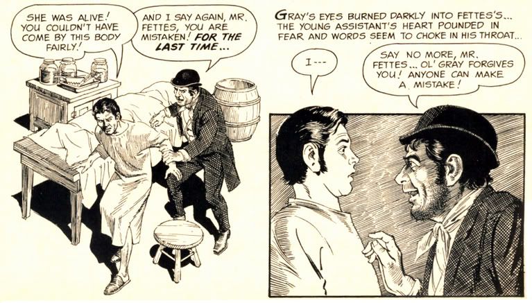
Goodwin and Reed Crandall score with their adaptation of Robert Louis Stevenson's "The Body Snatcher." I haven't read the original, but Crandall's etching-like linework is ideal for the story's setting. It has a "Classics Illustrated" feel to it, very ornate and a joy to behold. Goodwin's script affords Crandall the chance to try all kinds of lighting effects, like the radiating lines around a single candle and the slanting streaks of rain on a gloomy evening. Mr. Gray is a thoroughly repulsive fellow, but you're left wondering just who is worse-- the loudmouthed body snatcher who provides goods a little too fresh for his clients, or the doctors themselves.

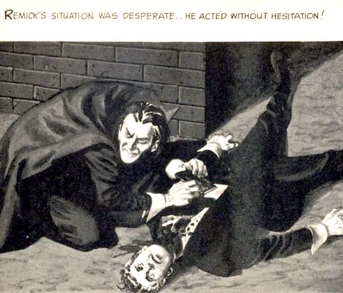
"Blood of Krylon" has a goofy title, but a killer concept. What do you do if you're a vampire in a future where the entire surface is now covered with ultra-modern skyscrapers and law-enforcement agencies use infallible robots to control crime? You take off for the space colonies in search of fresh prey, that's what. But you'd better study up on extrasolar planets-- particularly their rotational periods. The vampire thought of everything in this story except that. Yes, the ending is quite predictable (but it's a fun ride getting there) and I'm not sure why our future vampire has to dress like a Dracula reject complete with high-collared cloak, but Gray Morrow's creamy art truly impresses. These aren't ink drawings with just washes, but fully realized monochromatic paintings.

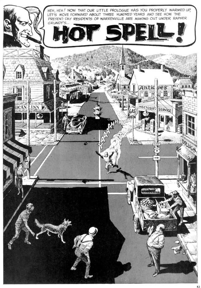
But the best is last. The most visually spectacular story in the magazine is "Hot Spell," written by Goodwin and once again illustrated by Crandall. It begins with a wash-painted flashback to "17th century New England," where warlock Rapher Grundy meets his flaming death at the hands of some pissed-off Puritans. Never mind that the preferred method of executing witches was hanging-- a good old fashioned burning at the stake provides more time for Grundy to scream, "My curse is on this village!! Let each generation feel it and suffer!" Then comes the splash page:

Kind of heartwarming, huh? Unless you're that guy in the intersection. He's warm all over. It doesn't take long for the townsfolk to pin the blame on the newcomer-- some kind of Bohemian artist type. You know, the kind of Commie degenerate who goes around sporting an untucked polo shirt, pinstriped pants and... gasp... pennyloafers! Goodwin's script foreshadows some of the themes Stephen King would work with in some of his short stories and the novel Salem's Lot. The evil we do lives on, hidden behind the banal facade of small town life and all that. It may be good enough for John Mellencamp, but Goodwin finds finds prejudice and urge to mob violence just below the seemingly tranquil surface of this particular one-pick up truck burg. And no little pink houses, as far as I can tell. Crandall's fine-lined art makes it certainly a pretty how town with up so floating many bells down! It also gives the fisticuffs and destruction an ironic Norman Rockwell feel. The comeuppance is a bit abrupt and too literal, but who can argue with a story as gorgeously drawn as this?

Wow. When I read Creepy #7 the first time, I just could not get over what I was seeing on each page. Even though the writing quality is a bit up and down, the stories are never less than fun. And it's difficult to imagine a more beautifully illustrated comic than this. Pure joy in print form.