Alex Toth produced some treasures for Dell. There's his work on The Land Unknown (you can see a gorgeous, richly textured page from that story at The Comics Journal, illustrating their interview with Dean Mullaney and Bruce Canwell); Walt Disney's Darby O'Gill and the Little People (one of my favorite comics ever and a page from which you can find at the TwoMorrows site along with an interview with Toth himself that appeared in Comic Book Artist #10); Clint and Mac; the John Wayne airplane flick The Wings of Eagles; and the charming No Time for Sergeants, a film which starred Andy Griffith. You remember Griffith. He would later play Sheriff Andy Taylor on his own program for Danny Thomas Productions, the same studio that made The Real McCoys. Those comics are all worth tracking down.
I have no idea how Alex Toth felt about drawing Walter Brennan's bucolic sitcom misadventures, but I don't imagine it was a dream job for him by any means. "Wild Wheels," the lead story in The Real McCoys (Dell Four Color Comics #1071, January-March 1960), the first issue, does feature elements that would play to his strengths. Real human beings doing relatively realistic things, plus all kinds of cars. I know Toth liked to work a bit on the minimalist side, or essentialist, if you prefer. The drawing is in what you leave out, simplify, simplify, simplify, edit yourself ruthlessly. Well, Toth the hell out of these drawings!
Let's take a closer look at a few pages.
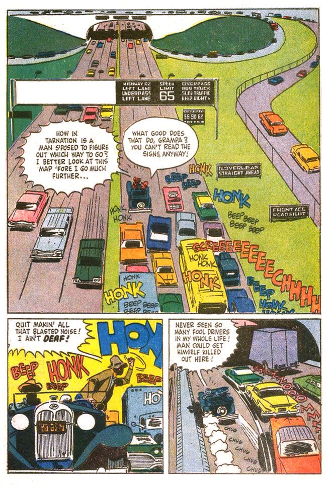
Here's, from near the start of "Wild Wheels," we see a Toth interpretation of a Walter Brennan-caused traffic jam (oh, you crazy Grampa!) on a busy freeway. Toth, probably exceeding in a single image the entire The Real McCoys shooting budget for half a season's worth of episode production, turns the top two tiers of the page into one large panel. Toth may not have been giving the art his all, but this page is a shows some of the storytelling techniques he uses to overcome the limitations of the Dell six-panel page format. The eye enters the image at the usual spot, top lefthand corner where Toth places a concrete overpass in stark white, kind of crushes the cars driving along top of it, then leads us down the on-ramp (backwards!) to the busy middle-ground where suddenly we have dialogue balloons and sound effects.
This gives us time to absorb the situation-- the same way a TV show or film might use an establishing shot, then pan along it before introducing the main characters, which Toth does when he starts to speed up the pace and inserts action by cramming all the truly important stuff in the center of the page, in the area that would be the second two-panel tier (although the large balloons break into the top tier area), and just before quick-cutting the action in the two bottom panels.
It also means Toth can fill a page with a minimum of actual drawing. To that end, Toth leaves the grassy median and shoulders as open areas to be filled with green. No Tothian dabs of ink spotted here or there to suggest detail. While I'm in favor of leaving out visual noise, the rendering here feels unfinished.
There are a lot of cars, though, on the lower half of the page. At first, given the overhead angle and one-point perspective, the backed-up cars become an almost abstract suggestion of the typical American automobile, brightly colored rectangles lacking wheels. As we find ourselves in the middle of the action, with a more grounded viewpoint, Toth adds sparse detailing to the vehicles, resolving them a bit more with tailfins and brakelights, but leaving the troublesome in-perspective work of the oval tires simply suggested through quick brushstrokes underneath. Maybe we'd like to see those tires and hubcaps all worked out in proper perspective, but with Toth, even a shortcut like these inky blobs work as undercarriage shadows, as opposed to something a wannabe like I would do, where you'd see it just as ink. Grampa's jalopy with its old-fashioned rounded shapes and circular headlights contrasts sharply with the ultra-modern boxes around it.
The fist-shaking pose isn't particularly original, but I love the skewed "beeps" and "honks," which invoke different volume levels and pitch. One big blue "honk," probably from a truck, a smaller red one no doubt from a car. "Beep" is probably one of those Volkswagen VWs. The hot yellow background contrasts with the cooler blue/gray fore- and mid-ground elements to give this panel a frenetic energy even though everyone's just kind of sitting there because of Grampa. The last panel has a great sense of movement, with the two-point perspective animating the cars into the tunnel, along with the speedlines and exhaust puffs from Grampa's car, which is badly in need of an emissions inspection. The purple-gray highway and the light purple truck passing into shadow and the orange sky-- complementary colors-- also create deep-focus depth, and allow the primary-colored cars to pop.
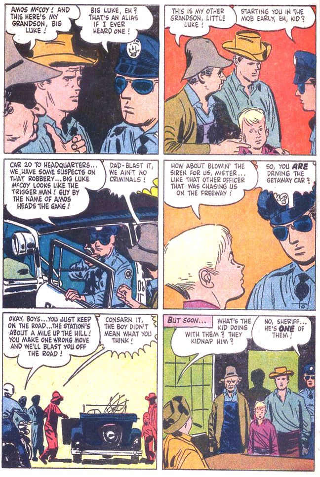
Other pages throughout show Toth rushed this one. It's not even so much just the uninvolving groups of figures and lack of backgrounds. The linework itself shows a certain lack of precision that comes from slapping down ink in a hurry. It's especially evident on this page, where the cop wears some misshapen sunglasses on his indistinct face and poor Richard Crenna looks as if he's in for some serious sinus problems.
Yawn. The script is uninspired. In case you haven't figured it out, the guys take a fishing trip, but end up mistaken for criminals. I don't know how idiosyncratic the TV show was, but this is the generic kind of thing you could plug any characters from any property into. Even ramrod Rowdy Yates on a horse instead of a junk car. There's a half-hearted attempt at slapstick, but it's borrowed-- the ol' "fish hooks catch each other under the boat" gag used in one of Our Gang's later, lesser MGM shorts, "Three Smart Guys." If you're going to steal gags to liven up a dead story why steal from a stinker? Or maybe they took it from another source. It seems mighty familiar. As if unimpressed himself, Toth doesn't bother with a lot of drawing of nature during this interlude, either. Pine trees that are simply suggested with dabs of angular ink jut from horizontal lines indicating a landscape, but it's curiously under-grown.
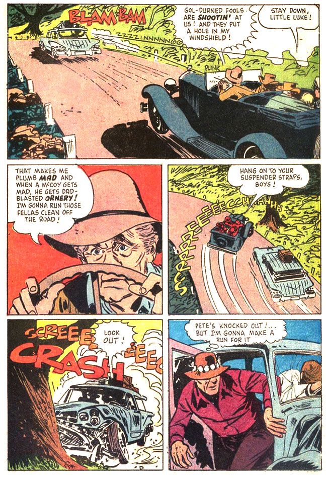
Eventually, just before the readers put down The Real McCoys to re-read Darby O'Gill or else fall asleep, Grampa and family end up involved in a car chase complete with winding mountain roads and desperate bank robbers blasting away. Only during this sequence does Toth finally seem fully engaged with the material. Again, this is probably more expensive-looking than The Real McCoys ever got on TV, but how should I know? If I were going to write a script for even something like One Day at a Time for Toth to illustrate, I'd make damn sure I stuck a car chase in there at some point.
Here's a page that makes The Real McCoys as exciting as an episode of The Untouchables.
Do you buy Grampa's ancient car being able to pull off such a wicked, professional pursuit-driver level maneuver? One wonders why the bank robbers didn't blast away at the McCoys as they passed. This all seems like a plot contrivance, but Toth does some fine work here. If you look at the third panel, with that improbable stunt, you see the tree the car crashes into in the fourth panel. The tree doesn't just pop out of nowhere. Toth thinks the action through. Excellent placement of sound effects and dialogue, too. It helps set the chronology of the sequence, compressing three distinct moments-- immediate pre-crash break-squealing, a character reaction and then the crash itself-- into one effective panel. Nice Billy Jack hat on that guy in the fifth panel.
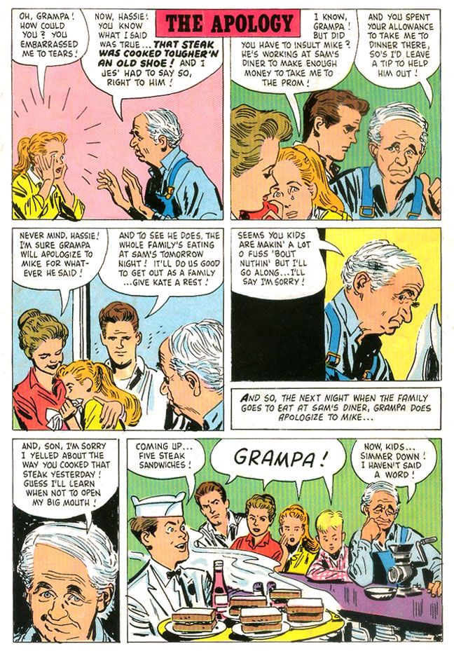
But even on some of the more inert pages, there are still little touches of Tothian brilliance. There's some nice facial acting on Grampa in "The Apology," a one-page gag story that appears on the comic's back cover. I absolutely love the wry expression in the fifth panel in particular.
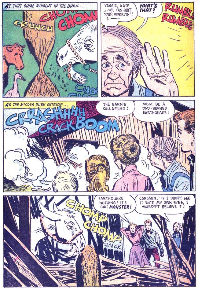
Oh, the second story is about a goat that eats the McCoys' barn. It's not exactly prime Toth, either, but it's the only place you'll ever see him draw a goat eating a barn.
I love the cow and goose in the first panel. The cow in particular wears a dismayed "What the hell?" expression, as if she can't quite process what she's seeing. I hope they weren't injured when the barn collapsed!

No comments:
Post a Comment