Saturday, June 7, 2014

Flash Thompson's swingin' send-off party!

Oh, wow. Sorry I haven't been chatting up the old comics lately. I'm making one of my own and it's taking all my free time. I take a break from it only to work my day job and sleep. I eat at the drawing table (so to speak; I draw on one of those razzly-dazzly Cintiq monitors these days) just like one of those old school guys who made comics back in the day and then died of alcoholism-related complications well before their natural times. Cheerful, ain't it?

Well, here's something that will certainly lighten the mood. Remember when Flash Thompson went off to fight the Vietnam War and everyone at his party looked incredibly mod and gorgeous and they all thought it was a wonderful, happy, pleasant thing he was doing, with no negatives about it whatsoever? It happened in Amazing Spider-Man #47 (April 1967).

Here’s a largely cheerful story about a bunch of friends putting on a going-away party for Flash Thompson, who is leaving for the service, possibly to fight in a war in a jungle that pointedly avoids even the suggestion such a thing might be in any way, shape or form at least the slightest bit controversial or even worrisome.  Of course, given the time, the implication is Flash has been drafted, but the closest we get to acknowledging that is a few issues back when Pete says something about Flash’s “induction notice,” a term less loaded than “draft notice.”  Not a soul even whispers Vietnam or Southeast Asia, and no one seems to think Flash is going to have anything other than a simply fine ol’ time.  Of course, criticizing at Stan Lee and Marvel Comics for not taking sides over Vietnam or making an issue of it is kind of like condemning The Beverly Hillbillies for not doing an episode where Jethro gets drafted, loses a foot and joins an anti-war rally in Washington while banker Milburn Drysdale talks the Clampett family into investing in a napalm factory.

On the other hand, despite what you might have read otherwise in the book Spider-Man Chronicle: Celebrating 50 Years of Web-Slinging, this issue isn’t even as topical as the April 8, 1965 episode of The Munsters where Herman tries out for the majors and Leo Durocher cracks, “I don’t know whether to sign him with the Dodgers or send him to Vietnam.”  Harry’s “Only don’t bother looking for the goalposts!” joke when another guest compares the jungle to a football field does seem eerily and cleverly prescient now that we have more than forty years of hindsight on the matter, though.  And Spidey does at last obliquely reference the potential dangers of war to callow young men when he wonders in the final panel why he keeps thinking of Flash in the past tense when the guy hasn’t even left yet and will probably come through all right.  “He'll make it-- somehow! good guys always win,” he muses, before adding a little ambiguity with the tag question, “Don’t they?”

I don’t think Lee was or is particularly interested in politics, and certainly not in wading into a political Big Muddy and more than likely drowning his company there.  He didn’t mind using the Commies as bloodthirsty villains and outright creeps whenever possible, but who at the time gave a rip what a communist thought about comic books?  If they even read comics when they weren’t murdering babies, knocking over Asian dominoes or stealing our space secrets, they probably stole them off the racks anyway, and that did nothing but harm to Marvel’s bottom line.
 
Plus, there probably wasn’t a lot of readership overlap between Marvel’s magazines and The New York Review ofBooks where in February of that year Noam Chomsky published “The Responsibilityof Intellectuals.” And Dr. Martin Luther King told 3,000 people at Riverside Church in New York City that the civil rights and anti-war movements were essentially the same struggle and condemned the war in Vietnam as US imperialism in the same month Marvel cover-dated Amazing Spider-Man #47.  Check out Time magazine's reaction, and the Washington Post's.  You know, those bastions of liberal thought.  Not so surprising when you consider a Gallup poll the same month showed 50% of respondents believed our escalation in Vietnam was not a mistake versus 37% who thought it was.  The believers were down from 59% the previous year, but still represented a significant majority over the skeptics.  This is a little different than outright support for the war, but risking controversy by directly addressing Vietnam and its complexities and uncertainties wasn’t going to sell Spider-Man to the middle Americans buying this stuff for their kids and still largely assured we were doing the right thing halfway across the world.

Lee had books to move, and Warren Publishing’s Blazing Combat had recently addressed the war directly with distinct disapproval and quickly folded.  In the course of entertaining the heck out of us—its primary purpose—this story acknowledges in the vaguest and safest of terms what couldn’t be ignored and takes no sides.  No more, no less. 

In fact-- YOWZAAA! Look at Gwen Stacy's knockout outfit!
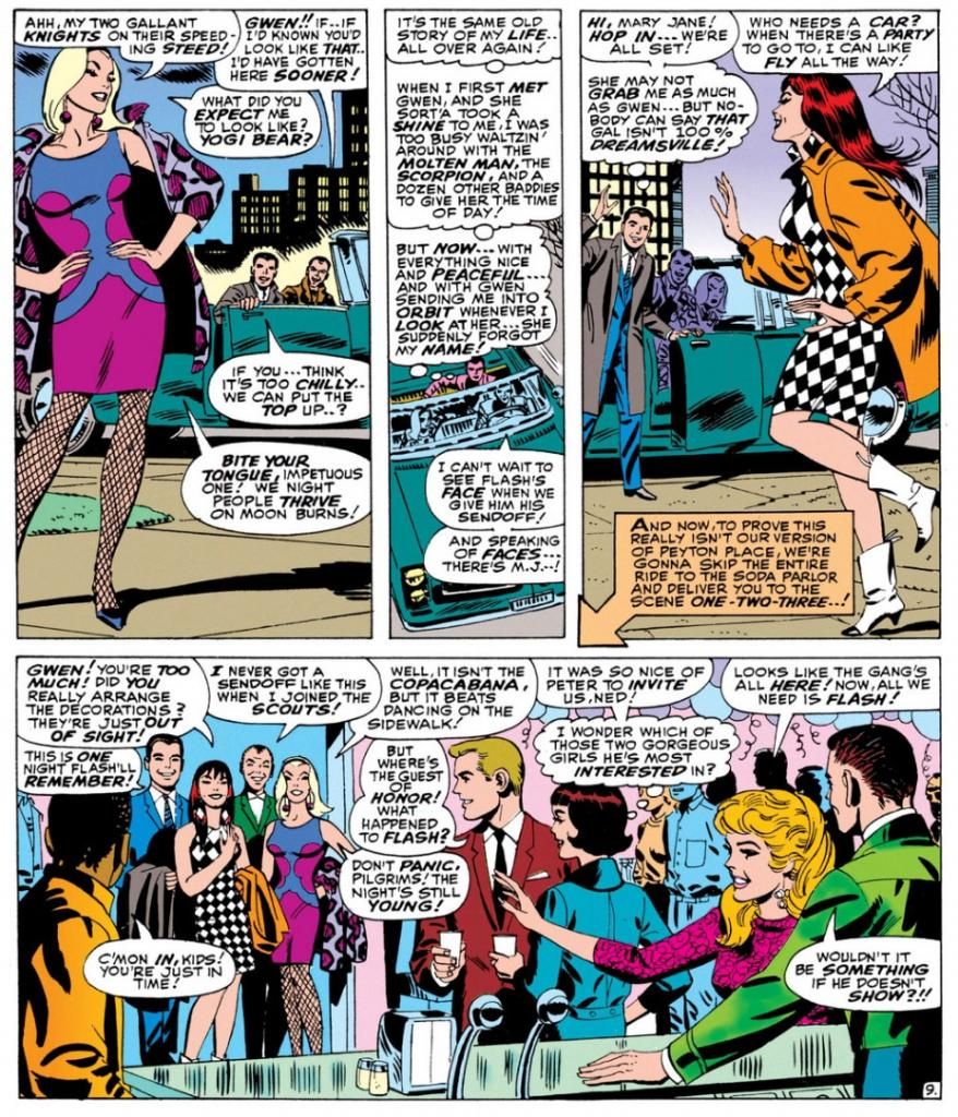

Script:  Stan Lee, Art: John Romita

I don't know who designed it.  Dormammu of Beverly Hills?  Purple and blue abstract design, with fishnets and a animal-print coat in decidedly unnatural hues of... purple again.  Jazzy John Romita was the perfect guy for this soapy stuff and he visualizes Gwen as the height of mid-60s cool.  It doesn't get any better, does it?

Yes it does!  Because here comes Mary Jane Watson in an op-art inspired checkerboard dress and some wild white boots with contrast black toes.  Shame about the orange coat, but she quickly dumps it once they hit the shindig.


Pretty much everyone there is a sharpie.  Smart jackets and ties for the gents, ultra-modern flips and bobs for the ladies.  The guest of honor, Flash Thompson himself, sports a brown coat with a black tee for an athletically casual take on dressing up.  That guy on the left of the top panel has a Beach Boys-looking striped shirt, possibly by Gant.  The only guy who looks anachronistic is poor Harry Osborn, with his green bowtie and jacket like something he borrowed from Barney Fife down in Mayberry, NC.  And he's supposed to be a rich boy.  He looks as if he popped in from a 1949 issue of Archie's Pep Comics.  He's even got Jughead's plate of hamburgers.
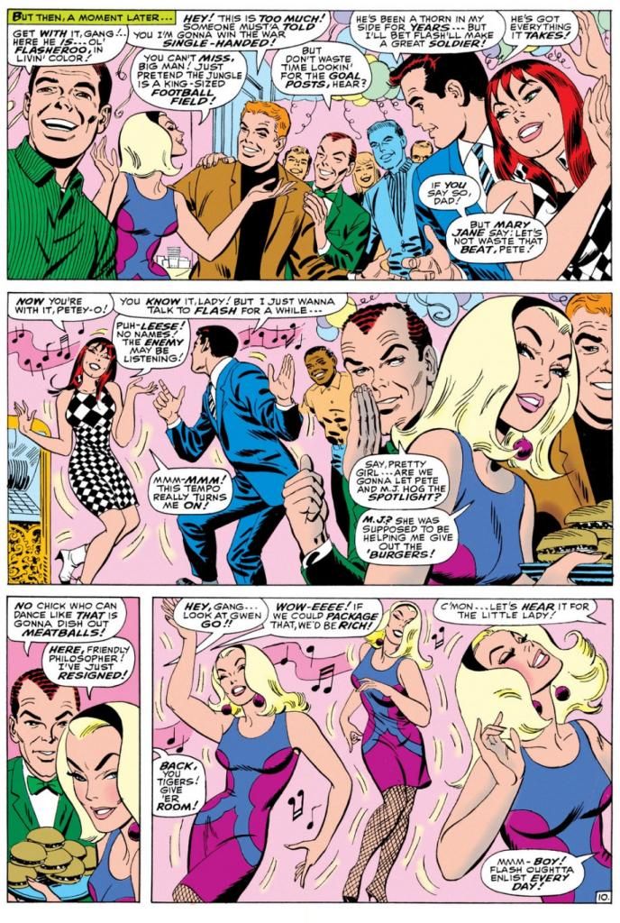
Script:  Stan Lee, Art: John Romita

Gwen steals the show-- much to Mary Jane's displeasure-- with a dance that rivals the one Audrey Horne would do a generation or so later on the premiere episode of Twin Peaks.  All eyes on Gwen.  Stan's blatantly sexist catcalls crack me up.  These are just a few, but they run all through this part of the comic, with Harry and Pete congratulating themselves on having such beauties for girlfriends and Pete secretly leering at Gwen every chance he gets.

Don't you wonder what music Gwen's dancing to?  This was right as pop was going psychedelic and becoming undanceable, and I doubt anyone wriggled and swayed to folk songs or protest tunes.  If this were a TV show of the time, it would be some outdated-sounding jazzy stuff the network squares thought of as "close enough to that rock junk no one will be able to tell the difference anyway." 

You know, like when Opie needs a little background noise while sweeping the courthouse floor for his dad and flips on a little white transistor radio and upbeat guitar noodling comes blaring out.  Then Ope starts doing some kind of frantic moves with his broom still in hand says, "Gee, Pa, isn't this the most?"  And Andy's like, "The most WHAT?"  But because he's pretty open-minded for a Southern sheriff of the day, he and Helen Crump end up championing the fresh-faced kids at the high school who want to add a couple of the exact same generic rock tunes to the annual play instead of doing the same old "founding of Mayberry" junk the older teachers favor.

Anyway, beautifully drawn, hilariously written bit of scene-setting before the issue's bad guy makes an appearance.  Kraven the Hunter.  You know what?  Who really gives a rip about that jackass when you've got these kinds of lovely John Romita pages to look at?  Interestingly, Romita is doing a Steve Ditko impression throughout, and even Kraven's face in a few panels looks more Ditko than Romita.  Artistic continuity, and at times Romita's line looks so impressively close to the guy's who he's imitating, it's almost as if Ditko himself inked this book.

Well, it's a fine book and I wish Lee and Romita had spent even more time just hanging out with the kids.  But I guess the readers came for the action, but I'm more in love with the soap opera/character-building sequences during this era.  I'd hang out with all of these characters even without the superheroic spider-bite antics.  We don't even have to talk politics.

Thursday, June 5, 2014

Here's a negative review of Genius, Animated: The Cartoon Work of Alex Toth (not by me)

I don't know how I feel about this, mainly due to not having read the book in question.  But I do own the first two volumes, and I've enjoyed the heck out of those.  Does the reviewer have some solid points about them?  More than likely.  Do they paint Alex Toth in kind of a bad light?  Probably.  But at the same time, as this review notes, Dean Mullaney and Bruce Canwell wrote these books with the cooperation and support of the Toth family.  Maybe something can be overly critical and yet overly sentimental about its subject at the same time.  My slow brain needs time to process and comprehend the reviewer's definitions of cartoonist and illustrator, too.  And you know what?  You know what this review has done, which is probably opposite its intended effect?

I wasn't particularly planning to get this volume despite having enjoyed the others simply because I'm not as into Toth's animation work as I am his comics.  Now I think I will, simply because it has that color Dune Patrol presentation art.  As with the first two, it's full of stuff like that, examples of Toth's art that make the cover price bearable, even if this reviewer quibbles with the actual choices (and I tend to agree with those points now that he's broached them).  You could spend one hundred thousand words telling me a book is the shittiest thing in human existence, then show me a few gorgeous Toth drawings included in it, and I'll start salivating to own it like I'm a starving dog.

The comment attached is something you definitely need to check out for its link to a fascinating and poignant online comic by Dylan Williams about his longterm via mail relationship with Toth himself.  I wish I'd thought of mailing my art to Toth for the privilege of pissing him off and having him rip me a new asshole.  The closest to that experience I've come is when I made the mistake of expressing a mild enjoyment of both Toth's and Iwao Takamoto's (and, I suppose, Doug Wildey's, though I didn't know it at the time) animation designs to John Kricfalusi on his superb blog.  Kricfalusi didn't take my opinion seriously enough to blow his stack like he has with others, and like Toth did with guys like William Stout and Steve Rude, both of whom-- along with Kricfalusi, for that matter-- occupy the rare artistic elevations cats like I will never climb to.  He just brusquely dismissed me as the fool I am with a comment about how dumb it is to like their "little flesh-colored eyes."  His silence on the art I dared show him spoke plenty, too.  I'd rather be told I suck, though.  Receiving a black eye, even a figurative one, is better than being wussy enough in your skills a pro won't even fight you.  Imagine what Toth would have written to me.  I get goosebumps just thinking about it!

Anyway, getting back to the art choices in this Toth series.  Adding non-Toth stuff without proper attribution is certainly problematic.  That just seems kind of goofy, doesn't it?  I love Wildey almost as much as I do Toth, but I don't want him as a substitute when what I'm really in search of perpetually are complete Toth stories rather than excerpts.

That points out just how neglected up until now Toth has been, perhaps because of the artist's mercurial nature.  The reviewer mentions some of the few good books of Toth art out there, and they're absolutely indispensable.  If you can get them.  I own both Setting the Standard (which seems to be slipping out of print if the listing on Amazon is any indication) and the Zorro volumes (it may be going out of print now, too), and like the reviewer, I prefer them to these because they're collections of Toth's sequential work, with complete stories.  The first volume of Enrique Sanchez Abuli's Torpedo has two gorgeous period tales by Toth (plus Jordi Bernet as a bonus), so that one is a must, too.  But far too many books where his art exists are either out of print or inconveniently feature Toth folded in with a lot of other artists because he did so many short stories for anthologies.  There's no DC Universe by Alex Toth out there with every single thing he did for that company, in the same style of their Neal Adams books or the Gene Colan Batman one.  There's no big collection of his Dell work-- something titled Alex Toth in Hollywood with everything he did for Dell would be my pick for Book of the Year in whatever year some far-thinking publisher chose to put it out.  Oh my stars, there was!  Not one, but two volumes.  Now try to track one down and possess it, though!  Might as well dig for diamonds in your backyard.  And, most frustrating of all, Bravo for Adventure isn't in print anywhere!

Anyway, I'm pretty happy with these giant books because they give me back some of the sketches and examples of Toth I left back in the States when I moved to Japan and for the complete stories they do contain.  But what we really and truly need are some dedicated Toth volumes of just his stories.  Toth's DC Horrors, Toth in Space, Toth Goes to the Movies, Toth at War, Creepy and Eerie Present Alex Toth.

We need more Toth, publishers!  Let's snap it up and get on the ball here!

Friday, May 16, 2014

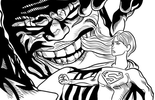
Supergirl versus Darkseid revisited...


As part of my on-going self-education in comic book art making, I re-inked this image of Supergirl standing up to a symbolically over-sized Darkseid.  The inspiration comes from all of those classic comic book covers where the villain looms over the heroes in exaggerated scale.  The massive clutching hand as a frequent image.
 
I absolutely hated the way I drew the hair the first time around.  I like this slightly more.  Supergirl's face doesn't hold together as well as I'd like and I should have left her chest/torso well enough alone.  I am just not an inker.  Too fidgety, too indecisive, too forgetful of basic elements like light sources.  Actually, Supergirl here is the light source, another symbolic element.  But that doesn't explain the weird shadows on her cape.
 
A determined, heroic Supergirl.  That's what I like.  She'll keep fighting against all odds.
 
Overall it almost looks like an actual piece of comic book artwork.  It shows just enough progress to keep me chugging along, working towards who knows what end.

Comixology has 45 old school Uncanny X-Men issues on sale for .99 each right now...

I can't help shilling for Comixology from time to time.  But sometimes I have to.  I really, really do.  I mean, I run a blog largely dedicated to old comics-- which I liberally define as "anything published prior to the year 2000"-- and a big part of that includes yakking at length about Uncanny X-Men back when Chris Claremont was writing it and Wolverine was but a hairy, beer-swilling pup.  Or whatever it is you call baby wolverines.  Right now they're selling 45 classic issues of Uncanny X-Men for .99 each.  I already bought them all for 1.99 apiece, and I considered that a bargain at the time.  If you haven't experienced the foundation of practically everything people love about Marvel Comics these days, this is your big chance to catch up.

The art is outstanding throughout, with Dave Cockrum and John Byrne pencilling most of the issues and a few guest art teams here and there.  And wow, beyond the visual treats, these are fun comics to read.  They're occasionally goofy, but they have all the theatrics and high drama you could possibly want in a superhero comic, with in-depth characterization of even the least-loved and lowliest of cast-offs.  You know, like Banshee.  Poor guy.  And the long-simmering "Dark Phoenix" storyline is one of those seminal comic book events, an era-defining tale, as is "Days of Future Past," which seems to have inspired a movie recently with a lot of familiar characters.  Where have we seen them before?

Anyway, Marvel can't seem to leave this stuff alone.  They must have retold all of Claremont's stories more times than DC has redone "Crisis on Infinite Earths."  Even Marvel movie guru Joss Whedon couldn't resist dipping into the Claremont well when he wrote his own much-lauded run not so long ago.

Wednesday, May 14, 2014

Curt Swan: Even his name is cool...

I miss Curt Swan.  Diversions of the Groovy Kind has a look at The Amazing World of DC Comics #7 (July 1975), with a Curt Swan interview and lots of sweet Swan artwork.  I was seven years old when that came out, and I never read it.  I'm trying to remember who my Superman artist of record was in those days.

Oh yeah, it was Curt Swan!

Curt Swan was THE Superman artist for me, the way I thought Walt Disney drew all those movie cartoons.  Sorry, Joe Shuster.  I know you were the original, so it should have been you, but you were long gone by the time I started reading.  And when I started reading, as far as I was concerned, you couldn't have a Superman unless he was drawn by Swan.  Later I got into Superman reprint books and discovered Wayne Boring, Al Plastino and Neal Adams, and while I liked and still do like their versions of Superman-- there's something really appealing about the beefy, barrel-torsoed Boring Supes-- practically every new Superman or Action Comics I bought had the familiar-looking Swan Superman.  So Swan Superman simply WAS Superman for me.

Swan had a way of drawing facial expressions that impressed younger me.  Like Superman eating the defunct kryptonite, or posing as Clark Kent doing his day job and making one of Steve Lombard's pranks backfire, startling and humiliating the would-be bully into making a really amusing facial expression, which Swan and whatever inker was handling the book that month rendered in characteristically clean, readable linework.

And I don't know if Swan took a lot of artistic shortcuts, because I don't know much-- if anything-- about his drawing methods.  I have a feeling he didn't, because his characters inhabited a solid, believable world.  Sure, it was generally neater and more squared-away than our own, but if Superman or Lois Lane happened to be tackling pollution as a social issue in that story, Swan would make that pollution look like the loveliest pollution you ever did see.  Municipalities across the land would be proud to fester in Swan-rendered pollution.  The Daily Planet offices, the Metropolis skyline, the studios of Galaxy Broadcasting, some alien spaceship-- whatever it was, Swan gave it all a solidity and reality.  He simply drew the hell out of it, without a lot of fuss and muss and fidgety crap and visual noise.  Swan didn't have to hide anything with flash because he could just flat-out draw, man, draw.

In the DC Comics interview, Swan says, "As the Superman character evolved, Mort [Weisenger] felt, at the time, that we should get a little more humanistic qualities into him.  We wanted people to relate to him better."  Swan was certainly successful at that.  From those facial expressions, to the body language, to the backgrounds, to the stories themselves, he worked on a Superman who had a down-to-earth quality about him.  Like a real dude, with real feelings, despite his godlike abilities.  When pro writers (and fans) say things about Superman being unrelatable because he's all-powerful, or boring because he can't be challenged, I get the feeling they never read a Superman story drawn by Curt Swan.

Also, it's pretty cool to watch the Swan Superman evolve from the early 60s into the 70s.  First he has that tall forehead, the slightly receding hairline of an older guy.  Even Superboy looks like he needs a little Minoxodil, or soon will.  By the time Clark Kent is anchoring the nightly news at Galaxy, his spit-curl has become a more full-bodied wave and his hair is creeping down over his ears.  But what doesn't change in all that time is the basic appeal of Curt Swan's art.  If you can look at it and not feel uplifted, then you are reading the wrong blog.

Well, you might be doing that anyway.  Go read Diversions of the Groovy Kind, you nut!

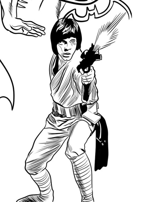
Look! It's Luke! (and then I gush about Al Williamson)


I tried giving this drawing an Al Williamson feel.  I didn't succeed, but why would I even try such a thing given the gap in our skill levels?  I'll tell you... at length...
 
So many wonderful artists have worked on the Star Wars property over the years.  Start with the movie posters themselves, painted by the likes of Tom Chantrell, Tom Jung (with droids by one of my faves, Nick Cardy), the Brothers Hildebrandt and Drew Struzan.  There are others, but those pop into my head at the moment.  And in the comics and comic strips we’ve seen art from Howard Chaykin, Russ Manning, Carmine Infantino, Michael Golden, Cam Kennedy, Jan Duursema, Chris Sprouse, Alfredo Alcala, Dave Gibbons, P. Craig Russell and many more I can’t think of right now.

They’ve all contributed mightily to George Lucas’ universe, but the guy who best captured the spirit of the enterprise (crossover!) is Al Williamson.  Probably because he was the most naturally in-tune artist for Star Wars.  Influenced as it was by the works of Alex Raymond and film serials, Star Wars was perfect for Al Williamson, the foremost artist coming out of the Raymond tradition, and himself a big fan of the same serials.

Williamson didn’t do photo-realism.  He just treated Star Wars as it was meant to be treated, as if it was a classic old comic strip itself, and he gave it a lush, rich, illustrative look with his mastery of figure drawing, black-spotting and linework.  His Star Wars strips and comics are gorgeously drawn versions of the films, timeless and classic at the same time.  No one needs to go back and fix the special effects or add creatures and background elements.  The Williamson Star Wars universe is fully-realized and already perfect.  Idealized, even.  In many respects I find it superior to the films themselves.

Whenever I try to draw Star Wars characters, I can’t help but turn into the 12-year-old kid I was when I bought the Marvel paperback adaptation of Empire Strikes Back and first saw Williamson’s art and then had to copy it as best he could, line-for-line.  Williamson’s art exerted that kind of magical appeal immediately.  There’s no way I can overemphasize its impact on my sense of comic book aesthetics.  Earlier that day I had one idea about what I wanted to see and how I wanted to draw, I read Empire Strikes Back and by that night I had a new idea.  I enjoyed the more sketchy approach from Chaykin with its rushed energy and the slick, stylized caricatures of Infantino (especially when cleanly inked by Terry Austin), but Williamson finally gave me the Star Wars comic I had been longing for and hadn’t even known it.  I was, like many kids my age, already a confirmed Star Wars fanatic, but Williamson, more than the toys and novelizations and eventual TV movies and cartoons and very nearly as much as the films themselves, cemented my love for this stuff.

Shoot, Williamson gave me the COMIC I’d been longing for without knowing it.  I already liked Joe Kubert, Jack Kirby, Alex Toth and Alcala, and my appreciation of their work possibly primed me for Williamson.  But I might have been locked into a Neal Adams/John Byrne kind of mindset as the “correct” approach, bar none, had I not encountered Williamson and had I not been more of a sci-fi/fantasy fan than a superhero fan (actually, I was more into comedy than any of those, but you don’t see a lot of comic books based on sketch comedy or SCTV). 

From Star Wars, Williamson (and Jack Davis to an extent) also provided my entry point to the world of comic artists like Wally Wood, Frank Frazetta, George Evans, Joe Orlando, Reed Crandall, Roy Krenkel, Angelo Torres, Gray Morrow, then further into the past with Raymond and Hal Foster and all the way back to the present with Mark Schultz.

Now I know there’s not one true approach to drawing.  It take less time to point out the artist I think who are doing it wrong than it does to list the ones I think do it right because there are so few of the former and so many of the latter.  On any given day I might be more Kirby-oriented or more Tothian in my thinking, I never get tired of Steve Rude, spent last week imitating John Buscema while trying to teach myself to ink, love Adams, dig on some Byrne, think Michael Golden needed to do a long run on Star Wars himself, find Walt Simonson’s work looking better and better all the time, Bob McLeod remains a big influence and I am in love with the beauty of Colleen Doran’s characters.  I’m way into Mike Mignola, Paul Pope, Bruce Timm and Mike Allred, probably too much so for my own good.  Misako Rocks! just kills me, as do Matt Groening, Peter Bagge and Evan Dorkin.  John Severin, Nick Cardy, Los Bros Hernandez, Lynda Barry, check, check and check!  Oh, and let's not forget Rumiko Takahashi, Goseki Kojima, Ai Yazawa and Junji Ito.  And, as I said, all those other Star Wars artists who aren’t Al Williamson have done sterling work, stuff I also admire.

It’s just when it comes to Star Wars, they’re various planets and moons and satellites while Williamson is the bright center of the galaxy and when you see his take on it, you’re no longer on the planet it’s farthest from.  You’re right there with him, in the middle of adventure and magic and everything fun and good in the world of comics.

Why the devil am I thinking about Jackie Jokers all of a sudden?

A few minutes ago, I was doodling tiny vampires (with such clever names as "Count Drapula" and "Count Dropula") when the name "Ears" Muldoon suddenly popped into my mind and I made the association to the old Harvey Comics character Jackie Jokers.  If I'm remembering correctly, which I highly doubt, I once owned an issue of Richie Rich or possibly Richie Rich and Jackie Jokers where Jackie Jokers performed in a parody of Star Trek where an actor named "Ears" Muldoon played the Mr. Spock stand-in.  If this is so, his nickname suggests he won the role because he actually possessed pointed ears in real life.

Some kind of mutant, I guess.

Jackie Jokers was a child comedian who was pals with Richie and company, and huge star in his own right within their fictional world.  His friends delighted in his hijinks and gave him unconditional fan support despite the rather creaky nature of his humor.  Bad puns and lame plays on words.  Kind of like what you get here.  With his black bowlcut hair and elfin eyes, Jackie looked a lot like the Paul McCartney caricature from the TV cartoon show The Beatles, which, apparently, was some kind of Monkees rip-off popular among pre-teens back in the 1960s.  Why was Jackie such a big deal, able to reduce all comers to helpless laughter despite his weak material?  Well, his father, Jerry Jokers, was also a famous comedian, and I can only assume Jackie largely owed his career to show-biz nepotism.  I'm going to grant his otherwise mystifying ability to get honest laughs on his own because his world also includes friendly ghosts and good little witches with magical powers.

I know I owned the comic (a quick Google search reveals it most likely to be Richie Rich and Jackie Jokers #26 from April 1978, although the cover doesn't spark much of anything in my memory) where Jackie and friends parody Star Wars as "Star Bores."  Pretty clever, eh?  Jackie takes the Han Solo role, with Richie as Luke.  I forget who plays Darth Vader.  Maybe Cadbury.  The mild humor of these mags must have been aimed at kids even younger than the 10 years old I was when I read this.  At that age, I'd already been exposed to Mad Magazine, Cracked, Saturday Night Live, Richard Pryor stand-up and Mel Brooks movies.  Jackie's jokes really could not help but pale by comparison, and even Li'l Archie indulged in barf humor occasionally. 

So I'm fairly certain I found the artwork superior to the scripts even then.  Looking at odd panels online to refresh what's left of my memory, I definitely do now.  Very appealing art by the great Ernie Colon, a guy who could draw anything from superheroes to sword-and-sorcery to horror to a graphic novel adaptation of the 9/11 Commission Report.  Jackie Jokers is also superior to Richie Rich in that he wears what almost appear to be clothes an actual human being might wear.  A turtleneck shirt and a sport jacket.  That's pretty snazzy stuff.  My mom dressed me that way for Easter Sunday when I was 5 and I thought I was a funny guy even then.  A regular Mason Reese or Rodney Allen Rippy.  While Richie and his father sport unnatural, triangular bangs parted in the middle, Jackie at least has that then-stylish Beatles cut.

Or Monkees.

How strange the avenues down which our minds lead us when we draw vampires.  It would be neat if I could track down some of these comics and write about them in a more informed way rather than just making up a lot of crazy crap off the top of my head.  Someone reprint the Jackie Jokers stories, stat!