
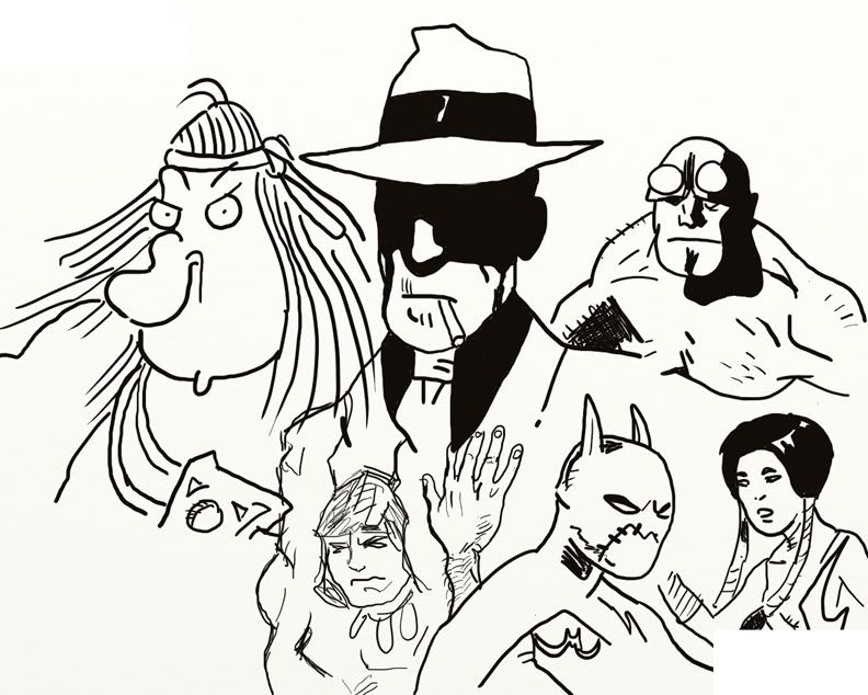
Groo #1/Hellboy #1: I love the "#1 for $1.00" books. I mean, paying a buck for a comic is a pure kick, even if the books are just reprints. I haven't read an issue of Groo in years, but have many fond memories of the series, which apparently destroyed as many publishers as Groo has ships. Of course the always-brillian Sergio Aragones provides the story and art, abetted by Stan Sakai, creator of Usagi Yojimbo and former Jack Kirby pal Mark Evanier. This book reprints the 1998 Dark Horse premiere of everyone's favorite nincompoopish barbarian-- no, not Conan. The simple story holds up quite well. It's a treat to see Aragones's artwork, especially in sequential form. His panels are bursting with figures and action and Evanier's rhyming script is playful. The biggest problem is, the story sets up the mystery of why formerly stupid Groo has suddenly become something of a genius, and if there's no "#2 for $1.00," we'll never know why!
Hellboy has a script by John Byrne, and while it lacks the quirkiness of Mignola's own writing, it's still punchy and energetic. The first person present-tense narration is wholly unnecessary (although I'll admit it wasn't as cliche and tiresome in 1994 as it is now, though), but Byrne and Mignola provide ample proof of concept-- Hellboy is hands-down own of my favorite comic book characters. I love when Hellboy kills a hideous frog-creature and snaps, "Well... that's all for you!" Mignola's art isn't as stylized and geometric as it's become in the years since, but it's instantly recognizable--lots of black, page layouts with panels that work almost in any order, little Mignola-esque peculiarities like the wealth of 19th century photographs in ornate frames decorating the backgrounds of ominous Victorian sitting rooms. Oh, and more weathered stone carvings than you're likely to find anywhere outside the British Museum.
Two bucks for these two books is sweet bargain. You can do without a couple Wendy's Super Value Menu items; feed your brain instead.
The Complete Torpedo 1 is not for the squeamish. It's pretty violent and the emotions on display are crude, as is the character Torpedo himself. Sanchez Abuli's anti-hero is a nasty killer-for-hire during the mob days of the 1930s and fittingly, he's pretty amoral. Alex Toth handled the art on the first two stories, then bowed out when he realized he wasn't a match for Arbuli's cheerful cynicism. But the stories are pulpy, briskly paced and expertly plotted. Toth and Bernet do wonders with simple black and white compositions and period details. Arbuli doesn't try to make Torpedo particularly likable or excuse him. He's a horrible bastard.
Our Army at War Featuring Sgt. Rock #1 is not only a one-shot, it's the one DC book I'll probably buy this year. I picked it up for two reasons: 1) a Joe Kubert cover and 2) Sgt. Rock. As exciting as it is to see Kubert drawing Rock, the results are pretty disappointing. The story by Mike Martz splits its plot between WWII action featuring Rock as a supporting character and present-day Afghanistan where a team of GI Joe-like mercenaries help a group of American soldiers do... something. It's really too fragmentary to tell what. The WWII soldiers talk about a "major initiative" and a village, but when the action starts, the village vanishes, while the modern day soldiers suddenly rappel from helicopters with no little clue as to how they got there. And while Bob Kanigher's Sgt. Rock was ridiculously super-competent as a soldier (he once shot down a Stuka with a rifle grenade), his modern-day counterparts are even more over-the-top and jarring in a comic told in this supposedly naturalistic, modern-day fashion using all-too-recent real world events as a plot device. Especially when they're called "Captain Duncan and his Gods of War," and a narrative caption assures us they're as "real as it gets..." Duncan is approximately 8 feet tall, by the way. Artist Victor Ibanez has a nice clean line, it's not particularly suited to the material, something reinforced by Kubert's impressionistic cover. His research could be a little better, too-- the helmets the WWII soldiers wear look really strange, with the proportions of the toy plastic ones we had as kids in my neighborhood. I know Kubert's soldiers look even less accurate, but his work is muscular, with a feel of movement and energy; it captures the violence and butchery of combat in a way Ibanez's static panels can't match. The ending packs an emotional punch, even if the actual story events are somewhat obscured by Ibanez's poor panel-to-panel flow and the script's abrupt timeframe shifts. I'd rather read a prose account about the War on Terror, thanks, or some old school Sgt. Rocks.
The Walking Dead #74, 75, 76: Rick has become the constable of a walled township, but his inability to adjust and heavy-handed ways lead to conflict. It seems our boy has become almost as much a danger to the survivors as the hungry corpses staggering around outside. As always, Robert Kirkman puts much more emphasis on character than horror and the result is compulsively, addictively readable. And when someone does fall-- either to a zombie or a murderous human-- you feel it. It matters. Here, Kirkman gives Rick a dilemma that tests his survival skills and traumatized psyche to their limits-- after the end of the world, we may not all become brothers and sisters living in communal bliss; some of the evils that were cancers eating away at the old society will persist and fester in the new. How does a man so used to violent solutions they've become reflex deal with this? And what if his methods present a greater evil and he's now a threat to peace and security? Charlie Adlard's loose combination of expressionism and realism and his sure-footed storytelling guide readers through an almost cinematic experience. Adlard is a vastly underrated artist and should be recognized as one of the medium's leading storytellers. At once! Cliff Rathburn's gray tones add mood, giving the book a look reminiscent of George Romero's first zombie flick. Very appropriate.
Stephen King The Stand: Hardcases #2, 5: I have mixed feelings about Stephen King, but I have enjoyed a few of his earlier books. The Stand is one I re-read every once in a while, when I'm in the mood to destroy the world. Marvel's adaptation reads a bit like a Cliff's Notes version, hitting all the familiar plot points and introducing all the expected characters-- Trashcan Man, Lloyd Henried, Bruce Spring-- er-- Larry Underwood and the like, and putting them in motion. But it lacks the emotional resonance of King's novel. The characters aren't doing or saying these things because of their inner workings, but because the machinations of the adaptation require them to. It's all too mechanical. Still, there's more for King fans here than the fairly decent 1994 TV adaptation. Mike Perkins's art hews close to photorealism and photo referencing-- sometimes unfortunately so as certain characters can appear inadvertantly grotesque and the poor acting of the models sometimes shows through a bit too accurately in the facial expressions and awkward posing. This also gives certain panels a staged, sedentary look. Laura Martin's colors are vivid and naturalistic if a little too "sky blue/grass green." They make the pages pop, though.
2 comments:
Ey!! You totally hit with your review about the art of "Our Army At War" book. This is my very first ime I draw WW2 or simply war stuff.
I really should have to take more care abour these helmets, and doing a more dinamic characters and stuff. But I'm on my way of learning and, man, you have to know that they don't give us all the time we would like to do it better.
I hope I'll do it fine next time.
Thanks ,
Victor Ibañez
Wow! Thanks for stopping by and commenting. And to balance out things a little I will tell you I dug the line quality and the figure work a great deal in terms of proportion and anatomy. The facial expressions were very effective, too. in the close-ups. The big 9/11 double page splash was startling and very well-done. You pulled off some really difficult perspective shots and I think if I'd run across your art on another title I probably would have had more positive things to say. I'd really like to see more of your work with other genres because I do like this kind of clean line stuff. That's definitely one thing I came away with-- put this guy on some more titles and let's see what he can really do. I'll be looking out for your byline. Especially since you dropped me such a nice comment-- I get maybe one a year!
Post a Comment