Thursday, March 31, 2011

And a Gene in Every One: A Look at Some Gene Colan Horror Stories

One of the neatest surprises about Dark Horse's Eerie Volume One hardcover archive monstrosity is how many Gene Colan stories it contains. I hadn't realized Colan did any work for Warren Publications. I mean, I knew he had to have done something before Tomb of Dracula at Marvel. He obviously didn't just magically appear out of nowhere, or descend in a silver orb-like spacecraft from another planet or emerge from some pocket dimension, hand Stan Lee some samples, lift his Rayban Wayfarers and say, "Dig this and dig it good, Daddy-O, I wanna draw Dracula for you cats."

What the heck am I babbling about?

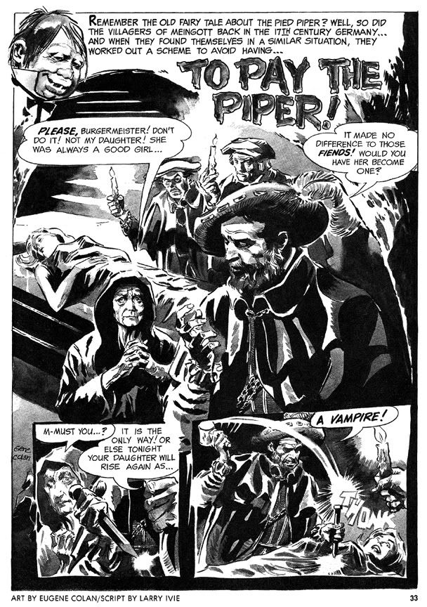
Colan has always been a master of extreme foreshortening, able to twist and turn the human figure in any direction. Very useful because he isn't the kind of artist who draws simple eye-level panel compositions. No, he likes to use high "camera" positions or his patented "worm's eye view" low angle shot. And then he breaks up the page with all kinds of crazy panel shapes, the results frequently looking like shards of broken glass arranged on the paper. Tom Palmer laid down some impressive inks on Colan's Tomb of Dracula pages, but here in Eerie, we get unfiltered Colan with his characteristic heavy shadowing-- but also marvelous ink washes where he creates an illusion of value and depth with just a few well-chosen gray tones.

His first Eerie story is a twisted retelling of the old Pied Piper legend, "To Pay the Piper," which substitutes vampires for rats. This time, the cheapskate villagers are as familiar with the story as we are, so they resort to outright murder so they don't have to pay, only to suffer yet another twist involving werewolves. The final panel-- the punchline-- is a bit too crowded to be fully effective (or as horrific as it should be) but the story's creepy European setting prefigures Colan's depictions of Marvel Universe Transylvania.

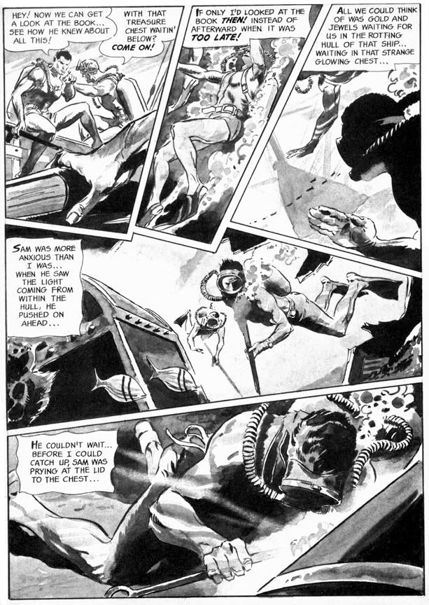
More original is "Full Fathom Fright" (Eerie #3), this time with a script by Archie Goodwin that allows Colan to go bonkers with the fractured panel shapes. This story goes from the booby hatch to Davy Jones' Locker as we first see a mental patient throwing a monster hissy fit, then learn all about the undersea misadventure that made him that way. Goodwin puts Colan's storytelling and rendering skills to their fullest. The undersea sequence is particularly nice, with Colan creating a real sense of weightlessness, with deep water shadows and lighting effects. And the final gag panel with its Lovecraftian conclusion is nice and large and much more effective this time.
Eerie #4 features "Hatchet Man," a grisly Goodwin-Colan take on that horror comic evergreen, the deranged axe murderer. As opposed to the polite, mild-mannered axe murderer, I suppose. What is it about geeks with axes that so fascinates horror writers and readers? The blunt simplicity of the weapon? We've seen it a billion times on EC covers alone, but for some reason we never quite grow tired of these Lizzie Borden-style "forty whacks" antics. This effective little story has an obvious psychological element that's slightly reminiscent of the movie Psycho but features some startling action sequences where Colan chops the action itself into wedge-shaped panels that showcase his ability to depict bodies in motion and in pieces. And if you ever wanted to see Bob Newhart totally lose his shit and go on a killing rampage, then this is the story for you.

The final story, "A Matter of Routine" (Eerie #5) seems a little rushed. The figures are simpler and the ink washes read a bit flatter than in the previous shorts. It's kind of a nightmare version of the Mad Men era-- a fedora-wearing flannel-suited commuter type (he's even got a 1960s George Grizzard buzz cut) gets off his afternoon train, slips the key in the door at home and steps quite literally into Hell itself. Goodwin's narrative captions are in breathless second person: "You fall to the scorched black cinders of earth, your only escape route banished..." and the denouement is an extremely lame "Was it all a daydream or do I dare open this door after all?" type cop-out. Not the finest work by either gentleman, but still an interesting cultural relic of a bygone era.

It also features axes.

Wednesday, March 30, 2011

Alex Toth and the Pie

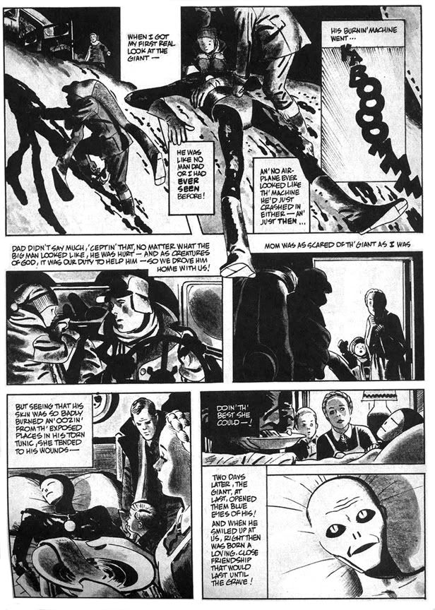
In 1977, Alex Toth illustrated "Daddy and the Pie," from a Bill DuBay script. It appeared in Warren Publications' UFO and Alien Comix #1, dated January 1978. People were going crazy for all this space alien stuff about that time. Probably had something to do with Star Wars and Close Encounters of the Third Kind setting box office records. Or maybe it was because Zontarr, ambassador from the planet Horvis VII, was all over TV in the mid-70s during his futile campaign to convince the people of earth to give up their dangerous nuclear weapons programs-- which threatened galactic civilization-- and his more successful efforts to popularize John Travolta via the sitcom Welcome Back, Kotter and disco music. Poor Ambassador Zontarr. Today he teaches political science at a community college and smokes way too much pot.

"Daddy and the Pie" hearkens back to those message stories EC used to run where they'd sucker you in with gloriously drawn gore and freaky octopus-like creatures then teach you some kind of life lesson, like in that one tale about the little mutant girl who was so misunderstood. "Daddy and the Pie" also has a distinct Ray Bradbury feel in its mix of small town nostalgia, the melancholy truth of just how crappy we humans can be to each other and science fiction. The moralizing doesn't overwhelm the plot, thanks in no small part to Toth's beautiful drawings. He evokes a sense of mystery and wonder on each page, and the heavy use of blacks along with ink washes make this one of his finest pieces. I was all set to write enthusiatically about how brilliant DuBay is for having the boy narrate the story in a kind of naive voice and how that contrasts with the action to give us a more complete understanding of what really happened with Daddy and the Pie-- then I re-read it and realized the narration is pretty spot-on, with Toth's images merely amplifying DuBay's script.

Oh well. DuBay does tell the story from the boy's limited perspective and it's a script worthy of Toth's best efforts. The kid learns that heroism isn't beating up bad guys the way the two-fisted ruffians in the movie serials and radio adventures do. It's also quietly helping others and accepting them for who they are. Just doing the right thing and asking nothing in return.

He learns this not only because of the Pie's influence on his life, but also because the example his father sets. As DuBay has him tell us, "I was lucky to have two heroes all my own... ...Two of the biggest, bravest legends ever to walk God's green earth. Daddy and the Pie." Children need parents they can look up to in the absence of saintly blue aliens. When kids inevitably encounter various forms of hate and prejudice they need strong role models within their own families to teach them open-mindedness and acceptance of differences.

Ultimately, however, "Daddy and the Pie" also reminds me of that Kenny Rogers song, "The Coward of the County." Some people-- and blue giants from other worlds-- can only be pushed so far before they have to give up pacifism and counter aggression with mysterious glowing orbs that focus mental power to wreak retribution. DuBay and Toth wisely keep the action offscreen, making us imagine its horrors, rather than fully depicting and and possibly glorifying it in the way comics and films frequently do. The Pie is fully benign but he, like the less evolved people who finally drive him to reaction, is capable of destructive acts. In some ways his sacrifice and victory in the town is the most human moment in the story. By not showing it-- by confining it to a couple of small, dark panels with flame on the horizon and ominous "BOOM! BLAAMM! KA-BAAMMM! BOOM!" sound effects, DuBay and Toth tell us this is also the least heroic thing the Pie does. This capacity for meeting violence with violence-- even when justified-- is perhaps a universal failing of all sentient beings. That we even bother to try and overcome this is a much more heroic act than burning down a town, even if it is full of bigots.

This story is also similar thematically and in plot to the 1953 Western classic Shane, starring Alan Ladd.

Monday, March 28, 2011

Do you ever think about Fred Hembeck?

I do. Actually, I have off and on over the years. To me, Fred Hembeck has always been something of a mystery. Who is this guy? Where did he come from? Why does he draw knees as circles with spirals within them? I'd see a Fred Hembeck cartoon in some comic book-related publication, have a little chuckle, ask myself these questions...

Then forget to find the answers.

Well, no more. Just the other day I was reading my ragged, torn copy of Comic Book Artist #11 ("Celebrating the Art & Life of Alex Toth!") and I encountered none other than... HEMBECK! Yes, that Hembeck. Hembeck caricatures himself interviewing Dr. Bruce Gordon, otherwise known as Eclipso. We in the biz like to call it the "ol' interview shtick." Hembeck perfected it. In a typical Hembeck strip, he has the subject answer questions in character, yet very much aware of his or her existence as a fictional construct. In this case, Dr. Gordon complains about how Alex Toth drew him in contrast to how his original artist Lee Elias did.

It's very meta. I believe it's an approach that somehow melted into my consciousness over the years due to these infrequent exposures to Hembeck. Only I've taken it a few steps further, or made it even more dada. My versions of various comic book heroes are self-aware in a Hembeckian way but sport personalities almost diametrically opposite of their in-story characterizations. One major difference between the two of us is Hembeck has such a deep knowledge of comic book lore-- characters, alter-egos, continuity changes, storylines, creators-- the Watcher probably uses him as a fact checker, while I usually get things wrong no matter how many times I consult back issues or artists' websites.

And yet only recently did I bother to research Fred Hembeck on the web. From his website, I learned Hembeck started his Dateline:@#$% stip in 1977. Which means I've been aware of Hembeck since I was about 9 years old. And he doesn't always do the "ol' interview shtick," as evidenced by this strip narrated by Peter "The Amazing Spider-Man" Parker all about Betty Brant. And even when he does, there's no mistaking Hembeck's affectionate yet absurdist take on superheroic history.

Which brings me to my final point. Or only point. What I enjoy about Fred Hembeck is he has what I consider the perfect attitude towards comics-- they're to have fun with. Yeah, there are all those graphic novels that tell serious and deep stories in all kinds of artistic ways. I love those. But the superhero, romance, crime and horror comics that many of us started off with were colorful, cool and frequently silly. Even in our favorite stories of cosmic grandeur, there's an enjoyable element of the ridiculous. Stakes are high, emotions are operatic, costumes are garish and impractical. Sometimes you can almost see the creators winking at us, as if to say, "Kid, even I can't believe the wacky stuff we're pulling here!"

Hembeck often points out the more ludicrous elements or uses the same finger to poke into plot holes, but he does so with love. He makes me enjoy these old comics all the more for his pulling off of masks to reveal the goofy, somewhat dazed characters beneath, characters who sometimes get as irked at how they're drawn or written as we fans do. Characters who grit their teeth and weather poorly constructed storylines and stumble through botched plot points with the same awareness of just how shabby things can be that we have as readers. That they're trapped within the stories makes it all the funnier when they complain to Hembeck.

So yes, I think of Fred Hembeck. I'm happy I finally-- after almost 30 years of thinking about Hembeck-- learned a little bit about his career.

Saturday, March 26, 2011

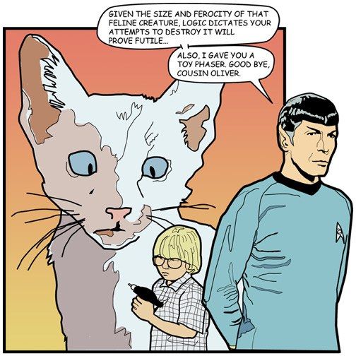
Happy Birthday Leonard Nimoy!


Whoa! I almost missed the second Star Trek birthday this month! I feel terrible about that, too, because I'm not only a William Shatner fan, but also a big Leonard Nimoy booster. Nimoy, for lack of a better word, is simply awesome.


One thing I've always loved about Nimoy as Mr. Spock is his portrayal of Spock's boundless curiosity. Nimoy's Spock isn't devoid of emotions; he just keeps them tamped down. There's always the sense no matter how bizarre the phenomenon the Enterprise encounters, Spock secretly enjoys it as a learning experience. Giant amoeba? Abraham Lincoln? Planet where the Roman Empire never fell? Spock loves it all deep down inside. And all that comes to the surface is that raised eyebrow and an understated, "Fascinating."

Happy birthday, Mr. Nimoy!

Let's go nuts for the Superfriends!


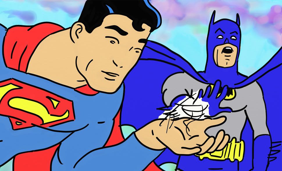
From the sublime-- Steve Rude, Syd Shores and Jack Kirby-- back to the ridiculous again. Here's Hanna-Barbera Batman trying to stop an awkwardly drawn animation-style Superman from... talking to/inhaling/talking to a scribble he holds in his palm.

The scribble came first (pen test), then I decided I'd have Superman holding it. And when he came out looking vaguely like Superfriends Superman (much to my surprise), I decided to swipe a Toth Batman head and stick it on a totally original body to produce this awkward scene. Drawing time: less than 5 minutes. Coloring time: all freakin' afternoon, baby!

Friday, March 25, 2011

Steve Rude talks process

There are a lot of art books about comic book artists. Most of them-- even the very best ones-- tend to dwell on biography, which is not something I'm all that interested in. Unless it's Jack Kirby who grew up in a rough part of New York City, co-created Captain America and then fought in WWII and then partnered with Stan Lee to invent almost the entire Marvel Universe. Even if his line had been insurance sales, Kirby would've still had a pretty incredible life.

What I want to know more about from my favorite artists are their process and tools. How do the greats make the art we love to look at so much and what do they use to make it? One of the great moments of my life was when I got to talk shop with another Jack-- none other than Jack Davis. He let me in on the kind of paper he uses, the brushes and little insightful tidbits such as how his initial sketches are a lot of "scribble-scrabble." That kind of info can be hard to find, probably because most books on comic book artists aren't written by artists but by fans who experience the work from an audience's perspective. Recently, Steve Rude completed a commission to recreate the splash to Captain America #34 from way back in 1944.

According to the Dude, the original is by Kirby himself, but the The Jack Kirby Museum website blog attributes it to Syd Shores. I have no idea what the truth is. Maybe it's Shores working over a Kirby layout. Or vice versa. The Museum says it was done "well after S[imon] & K[irby] departed Timely," and I have no reason to doubt their expertise-- but do you want to tell Steve Rude he's mistaken? I sure as hell don't!

Artist controversy aside, what's important here is Rude didn't merely copy the splash. He zoomed in the plane of vision, tightening the composition, and he gave it more depth of field. In Shore's original, everything takes place along the same plane, which flattens the perspective. Rude pushes the background farther back in layers. This means his version isn't as jumbled and frenetic, but no less action-packed. He also changed Bucky's pose from running along beside Captain America to leaping from the sky above him. Rude's colors are more naturalistic rather than the crude yet vibrant primary-and-secondary color scheme the original comic uses. Yellow sky, Nazis in yellow or green uniforms with purple helmets!

The resulting painting is fun. It captures the spirit of early Captain America without being a mechanical recreation. Whoever commissioned it is getting a beauty. And the rest of us are lucky enough to have been able to follow along as Rude posted his initial sketches, washes and the finished piece as he completed them. He's also posted a short step-by-step on working on this painting as well, complete with a mention of Alex Ross-- who, as Rude notes, "has made a career working in this method."

This is the kind of stuff that fascinates me. Rude goes into his thought process-- the things that go on inside the mind before an artist even touches pencil to paper. He had the original, but he says he's not one of those guys "who get off on this historical stuff." And besides, the image in his head and the one from the comic didn't quite jibe. So he gathered up all the photo reference he would need for uniforms, weaponry and the like. Then Rude started drawing.

Here's where Ross and Albert Dorne enter the story and I abruptly die and float away to art heaven.

The finished artwork looks like this
.

Thursday, March 24, 2011

Conut the Bubbleheadian

Know, O prince, that between the years when the oceans drank Atlantis and the gleaming cities, and the years of the rise of the Sons of Aryas, there was an Age undreamed of, when Dark Horse Comics published a title called Conan the Cimmerian and proud artist Joseph Michael Linsner painted its shining covers. Hither came Joel, bald-headed, sullen-eyed, pen in hand, a comics blogger, a doofus, a dork, with gigantic melancholies and miniscule abilities, to tread the jeweled artwork of the Earth under his sneakered feet.

I like Linsner's covers. It's also very cool Dark Horse has been using painted covers on their Conan books. Some of the more recent ones have been reminiscent of Earl Norem's work on The Savage Sword of Conan and those Curtis/Marvel black and white magazines-- you know, the ones that frightened me so badly as a child I rarely slept for fear of zombies or vampires or soldier apes climbing out from under my bed and feeding me to enormous mutant frogs.

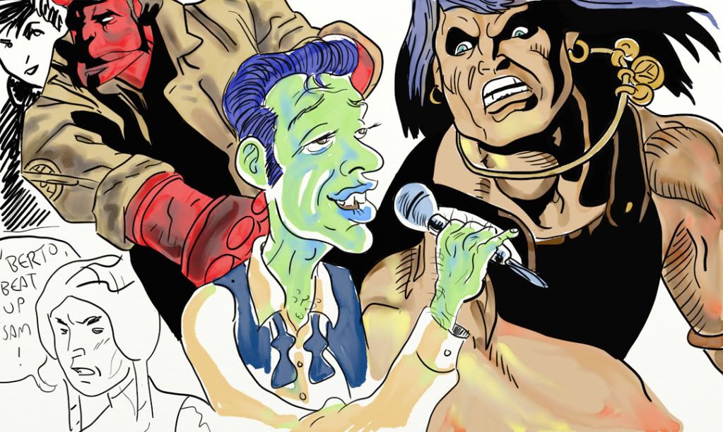
Anyway, I tried to give this Conan a Gil Kane flavor rather than simply besmirch Linsner. Why offend one artist when you can desecrate the legacy of another at the same time? The Hellboy is from the recent Hellboy: The Sleeping and the Dead #2, where you can satisfy yourself if you've ever wondered what Hellboy would look like if Warren Publishing had printed it as a four color insert in a mid-1970s issue of Creepy or Eerie and had Alex Toth or Grey Morrow do the artwork. Yes, it's every bit as awesome as that description. Well, almost. It's still pretty darned good, though. More Scott Hampton, please.

He's not fighting the ghost of Hopey Glass. She's just there. Once again, Dani Moonstar makes an appearance and invites violence upon Sam Guthrie. I just made up that lounge singer. Out of my imagination.