Showing posts with label Gene Colan. Show all posts

Tuesday, July 1, 2014

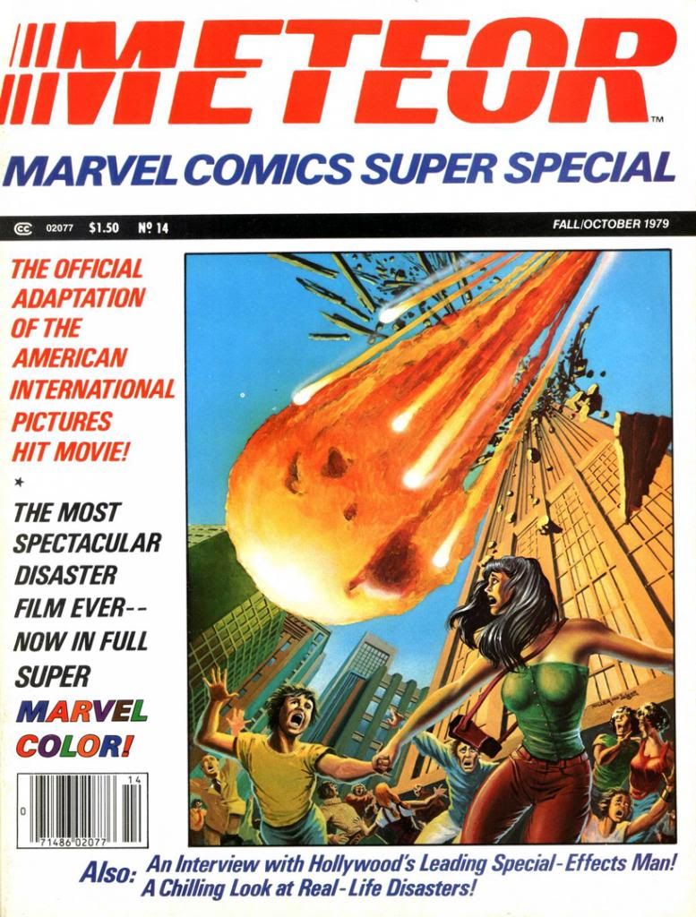
Marvel's Marvelous Movies #2: Meteor (August 1979)

Let me start by pointing out the obvious:  Meteor shares its basic idea with Armageddon (and also Deep Impact, but screw Deep Impact for taking this material seriously, right?), but mercifully lacks both Aerosmith and dopey worship of bonehead machismo.  In both films, a giant meteor heads towards earth, and we have to blast it with nuclear weapons before it gets here.  In Armageddon, Bruce Willis, Ben Affleck and Steve Buscemi go up in a spaceship to do it themselves while Liv Tyler watches all teary-eyed from NASA headquarters, while in Meteor Sean Connery stands around a lot of blinking computers while we do try to blast the meteor by remote control.  Despite the differing approaches to meteor-smashing, the results of both are exactly the same—a really shitty movie.  But while audiences spent good money to indulge themselves in the Steven Tyler-enhanced stupidity of Armageddon, a generation before they found better things to do back in 1979 than see Meteor.  Which, once again, is a truly shitty movie.  Bad script, inept direction, a floundering cast, financial failure.  Damaged American International Pictures and possibly helped lead to the company’s demise, although they did release a few more films after Meteor bellyflopped.

Script:  Ralph Macchio/Pencils:  Gene Colan/Inks and colors:  Tom Palmer

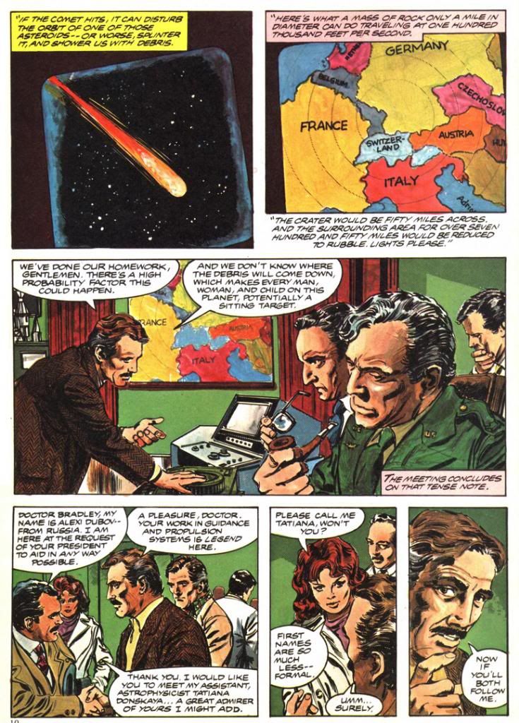
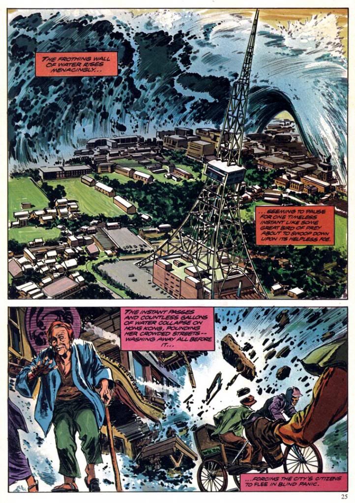
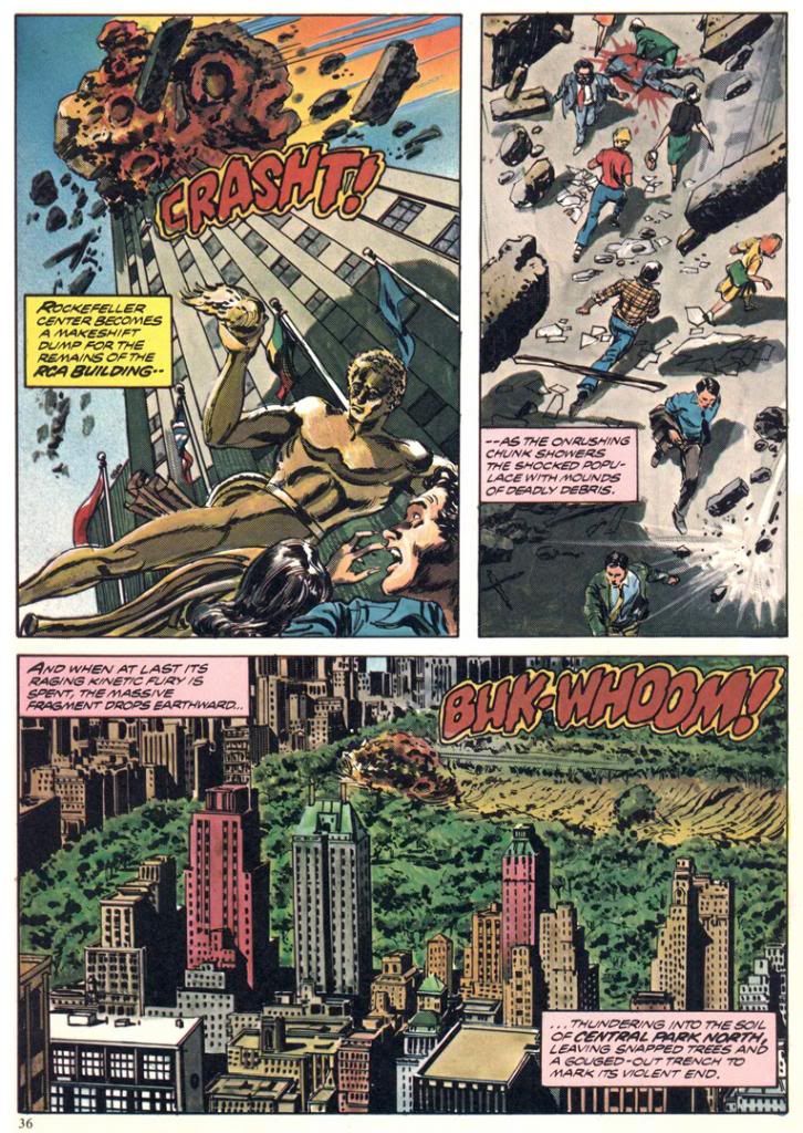
But something good did arise out the ashes.  Marvel Comics adapted Meteor for one of their Marvel Super Specials, and its genius editors assigned Gene Colan and Tom Palmer to draw it.  What Colan and Palmer turned in is nothing short of amazing.  Far from rush it even though they must have known the movie they were working on was a major turkey, they seem to have taken extreme care with the artwork, which includes globe-trotting scene changes from a Hong King suburb to New York City to a doomed Swiss ski resort and back again, detailed backgrounds in the computer command center, a double-page spread of a tsunami threatening Hawaii and another engulfing Hong Kong and—most spectacularly—two pages of rocks blasting and gouging Manhattan itself.  The detail, the realism, the scope.  It's also more than a little disturbing when you associate it with real world events from the years since, but I can’t help but think the movie Meteor might have been a Star Wars-sized blockbuster if only it had looked even half as good as what Colan and Palmer pull off in the comic.

 
Script:  Ralph Macchio/Pencils:  Gene Colan/Inks and colors:  Tom Palmer

The script is by Ralph Macchio (the comics guy, not the Karate Kid), and it’s serviceable.  He had to work from the dumb-ass movie screenplay and there’s only so much you can do with something like that.  Let’s just say he keeps the rocks rolling and benefits from this being a comic book, where our expectations for plot mechanics, dialogue and characterization are a fair bit lower than they are even for schlocky disaster films.  Occasionally, I can’t help but detect a little tongue-in-cheek tone, especially in the panel based on a scene where the movie obviously went for pathos and found only derisive laughter.


Script:  Ralph Macchio/Pencils:  Gene Colan/Inks and colors:  Tom Palmer

Also, you have to consider this is the kind of story where the falling rocks manage to obliterate a familiar ski resort and then Hong Kong, a place most of the intended middle American audience had a vague awareness of as important or large, but still far enough away they could glean a kicky thrill from it before having to confront the horror of something bad happening to their own country.  Gasp!  Not here!  Not in America, where everything of any real importance lives!  You know, the same way terrorists or Mayan disasters always scorch picturesque landmarks in Paris or Tokyo before they come after God’s Country.

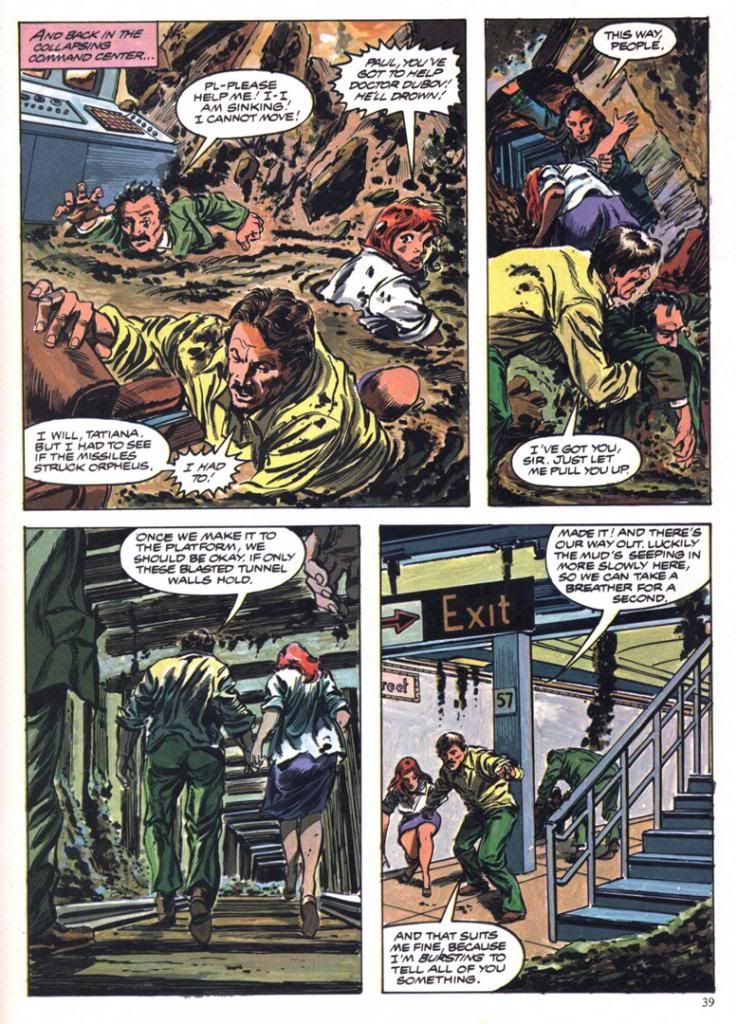
Which eventually happens here.  New York City is where the bombardment climaxes, although for some reason the story confines its heroes to the same underground lair they've been stuck in throughout most of the running time and subjects them to-- of all things-- a mud bath.  When you consider how the film could have directly involved them in some of the skyscraper smashings or had them out rescuing small children and their pets then you go a long way towards explaining why Meteor flopped so badly.

Script:  Ralph Macchio/Pencils:  Gene Colan/Inks and colors:  Tom Palmer
That dramatic misstep and a lack of Darth Vader, I suppose.  By the time AIP started pissing away their fortunes on this dreck and Macchio, Colan and Palmer put their all into elevating it into sequential brilliance, the Allen era had come and gone and people no longer wanted soap opera interrupted by earthquakes, floods and other sundry acts of God.  They wanted space aliens and all kinds of crazy critters zipping about on interplanetary errands complete with laser beams and Vulcan ears.  A year later and we'd all be gaga over Yoda and a year after that, a little guy named E.T.  Meteor and its ilk would be relegated to afternoon showings on HBO, which is probably where I saw it.


Script:  Ralph Macchio/Pencils:  Gene Colan/Inks and colors:  Tom Palmer

But that isn't the weirdest thing about Meteor or its superior comic adaptation.  The weirdest thing about Meteor is the inside masthead credits Earl Norem for the cover painting, but one look at it and you know it’s not Norem.  A Norem painting would have put this book over the top as one of those lost classics.  Instead, we get something that looks more like a painting a precociously talented high school kid or community college art student would do in gouache or thin acrylics and then a quick pass with the class’ airbrush.  It’s flat and awkward and it’s boldly signed by people other than Earl Norem.  I know who they are, but mercy and niceness prevents me from naming them.  Still, poor Earl Norem.  He must have felt a bit like Enrico Palazzo did in The Naked Gun as he watched a disguised Frank Drebin sing "The Star-Spangled Banner" on TV, credited as Palazzo.  I have no idea how this editorial mistake happened.  Maybe they just lifted a pasted-up masthead from another magazine and forgot to replace Norem’s name.  Norem couldn’t do something this flat and lifeless even if he had a single lunch break to hack it out.

Wednesday, June 18, 2014

Marvel's Marvelous Movie Adaptations #1: An overview of those colorful Marvel Super Specials!

Before they started putting out their graphic novels and Epic Illustrated magazine, the Super Special series was Marvel’s most visually arresting product.  Their black and white magazines usually featured attractively lurid covers by Bob Larkin, Earl Norem and, occasionally, guys like Neal Adams and Grey Morrow.  But face it—the interiors varied wildly in quality from the knock-out gorgeous or even thrillingly bizarre (John Buscema, Alfredo Alcala, Rudy Nebres, Mike Ploog, Tom Sutton) to the serviceable and even the slap-dash (I won’t name names, but I have my suspects). 

The Super Specials, on the other hand, featured fully-painted color jobs, at least on many of the earlier issues.  Regular monthly comics came printed cheaply on grayish newsprint.  But a Super Special came on slick, white paper.  A Super Special was more than a comic.  It was an event unto itself.  It was super.  And special.  There'd be a painted cover, or one featuring photos or artwork from whatever movie the comic was adapted from.  It would have a full-length comic book story and then a few breathlessly informative articles or interviews related to the magazine's subject matter.  All this... and a higher price tag! 

The very first Marvel Super Special, which was officially a Marvel Comics Super Special, stars rock group Kiss and word on the street is the group contributed some of their blood to be mixed in with the ink.  It's hard to get more super or special than actual rock star bodily fluids inside your comic!  But no thanks.  The second issue features tried-and-true fan favorite Conan in adventures too epic for his regular monthly.

Then Marvel adapted Close Encounters of the Third Kind, the first of many Marvel Super Special film adaptations.  A Wiki check shows Close Encounters penciller Walt Simonson complaining about working on that book.  Worst experience of his career.  If so, I sympathize, but you can’t tell he was unhappy by looking at the finished product.  He and Klaus Janson turned in a spectacular effort, making the story work in a Marvelized format even though the conflict is largely internal—Roy Neary thinks he’s going crazy for most of the movie before he figures it all out and goes UFO-hunting—and co-stars every lightbulb in California.  They invented so many ways of depicting lighting effects I’m surprised they didn’t go blind from staring at them too long.  This was the first Marvel Super Special I bought, and it came to me via mail order.  It would not be the last, as these magazines quickly became one of my favorite Marvel purchases.

And this is where we come in.  Marvel’s other movie adaptations.  Jaws 2 swam up next, accompanied by a musical motif ripped off from Stravinsky.  This one was the first Super Special drawn by Tomb of Dracula team supreme Gene Colan and Tom Palmer.  They’d do a few more, each time absolutely rocking the results.  Colan had already done underwater horror in black and white for Warren Publications, but here Palmer adds vivid colors that make the book both gorier than you might expect in a comic and, strangely enough, also more attractive.  Jaws 2 is one of those shitty movies that are actually pretty fun, eschewing the Steven Spielberg original’s emphasis on characterization and suspense for schlocky, unintentionally hilarious setpieces (the shark eats a helicopter!) that do nothing to help its ludicrous premise—essentially shark-shaped lightning striking twice.  While not nearly as dire as subsequent films in the series, the movie suffers from diminishing returns.  The comic book holds things together by simply giving the material a more lavish treatment than it deserves.  I would have loved to see the same team go back and re-tell the first film.  That’s a real missed opportunity for a matched set.

While the Super Specials had already given us a bowdlerized Beatles biography, their adaptation of the infamous BeeGees-starring musical flop Sgt. Pepper’s Lonely Hearts Club Band never saw print.  This meant Marvel’s next offering was actually of a TV movie that similarly cribbed from a superior source and suffered from comparisons.  We knew it as Battlestar Galactica.  I had the Marvel Treasury Edition because it was huge and therefore caught my notice.  This one has art by Ernie Colon of Richie Rich and Jackie Jokers fame, and while his linework is looser than the Colan/Palmer stuff, and the colors flat rather than richly painted, it’s an energetic retelling.  It differs from the televised movie in some respects.  A villain gets a bloody comeuppance here, which would make his reappearance a bit… er… unlikely.  And yet there he was, on our TV screens every Sunday evening until ABC punched not only his ticket but everyone’s via cancellation.  And broke my heart.

The next film adaptation to see print?  Crappy sci-fi disaster film Meteor, a major flop with Sean Connery as an astronomer fighting an oncoming… well, you know.  A meteor.  What else?  The movie, which co-stars an unhappy Natalie Wood, forces Brian Keith to speak with a fake Russian accent (a few years after playing a small-town cop comedically contending with “invading” commie submariners in The Russians Are Coming, the Russians Are Coming, and not long before using this accent again for one of those WWIII TV movies the kids used to love so much back in the 1980s), with Henry Fonda as the President, putting it kindly, is complete dogshit.  On your shoe, after you stepped in it.  The comic, with Colan/Palmer art, is not.  In fact, it’s quite a visual treat.  There’s even a double-page spread of a massive tidal wave destroying Hong Kong.  Palmer not only handpainted the colors, but there’s also what appear to be Craft-Tint tones involved as well.  I’m not sure what their lead-time was for the artwork, but nothing looks rushed, especially towards the end when the meteor unleashes hell on New York.  Once again the Marvel comic proves better than the film on which it’s based.

From here out the Super Specials would consist almost entirely of movie material, with one exception-- Tarzan of the Apes.  Because they generally went for blockbusters and had to prepare the comics in advance of the films’ release dates, Marvel took on hits and misses alike. 
 
The adaptations of misses are a lot more fun than the ones of hits as far as I’m concerned.  How could you not love mondo-strange-o comics like Xanadu (#17, Summer 1980), Annie (#23, Summer 1982, with Win Mortimer pencils and lots of crossed eyes courtesy the Vinnie Colletta inks, no less), Rock & Rule (#25, 1983 with art consisting of stills from the movie itself)?  And sometimes the results would be miracles both major and minor, like Marvel’s lovely Dragonslayer (#20 , 1981), the storybook-like Santa Claus: The Movie (#39, 1985, richly drawn by Frank Springer and adapting one of the lousiest movies ever made) and the beautiful Labyrinth (#40, October 1986, with breakdowns by John Buscema and finishes by Romeo Tanghal, an unlikely pairing on this fairy tale material and killing on it). 
 
And then there’s Bill Sienkiewicz’s Dune (#36, 1984), the perfect meshing of artist and subject matter.  Space princesses, screaming magical messiahs, bloated barons with skin diseases and desert warriors dressed in skin-tight black rubber are visuals tailor made for Sienkiewicz’s “Neal Adams drops acid and hangs out with Ralph Steadman too much” artwork with its heavy blacks.  And giant penis monsters.  I mean worms.  Yeah.  Shai-hulud.  Those spice worms look nothing like a bunch of dicks springing up out of the sand.  Sure.  Seinkiewicz brilliantly translates into two dimensions the general weirdness of David Lynch’s fever-dream take on Frank Herbert’s novel.  And you get the added benefit of not suffering through the pacing problems created by trying to chop a huge novel down into a manageable running time, from not being able to tell all the spaceships are obviously teeny-tiny miniatures and not having to endure the repetitive, whispered voiceovers.  And dumb additions like the “weirding modules.”

Occasonally, though, Marvel would adapt a hit and blow it.  Raiders of the Lost Ark (#18, 1981).  What the hell happened there?  John Buscema and Klaus Janson provide curiously unfinished-looing and flat artwork, with none of the film’s retro-romance.  Dull, off-model colors add nothing to the art and the final product is lackluster at best.

That’s not to say the rest of the hits aren’t pretty sweet.  There are three Al Williamson/Carlos Garzon jobs—The Empire Strikes Back (#16, Spring 1980 and my personal choice for best movie adaptation of all time), Blade Runner (#22, September 1982) and Return of the Jedi (#27, 1983).  Much like with Seinkiewicz and Dune, Williamson was the perfect choice to adapt the second and third Star Wars films.  He seems an odd choice for Ridley Scott’s downbeat sci-fi noir, but he, Garzon, Dan Green and Ralph Reese generate all the film-accurate rainy cityscapes you could hope for, even if a number of panels seem a bit too photo reference-heavy and static.  They reproduce the film’s atmosphere to a startling degree, sort of making up for that lack in the Raiders book.  Should have put them on that one, too. 
 
Buscema pencils and inks himself on the two Conan movie adaptations, too, both for John Milius’ Conan the Barbarian (#21, 1982) and the lighter, less boob-filled Conan the Destroyer (#35, 1984).  He doesn’t try to make his barbarian look anything like Arnold Schwarzeneggar, which is a good thing.  Although the Destroyer Conan sports Arnold’s headband.  You can never go wrong with Buscema inking himself on a Conan story, whether or not you appreciate Milius’ heavy-handed philosophizing and libertarian politics (I actually kinda dig it, even if I don’t agree with it) or director Richard Fleischer’s duller, less edgy and politicized take.

I’ve skipped around a lot.  What about the rest?  Well, there are two crappy and then crappier Roger Moore-era James Bond flicks (For Your Eyes Only achieves mediocrity by pairing otherwise appropriate Howard Chaykin with a disinterested Vince Colletta and then dumping a dull, standard monthly-comic-type color job on the results, totally wasting the format’s color possibilities); the tragically doomed Dark Crystal; another Indiana Jones flick with improved art but a sillier story; a nicely cartooned version of The Muppets Take Manhattan; desultory passes at clunkers like Krull, The Last Starfighter and 2010; the ahead-of-its-time Buckaroo Banzai (#33, 1984), all hip and tongue-in-cheek, makes a bow and turns immediately into a cult film; and Marvel even attempted both Sheena (#34, 1984, decent artwork by great Gray Morrow wasted on dreck) and Red Sonja (#38, 1985, a worthy effort by Louise Simonson and Mary Wilshire, with surprisingly deft Colletta inks, doomed from the start by its source material but finally sunk by the decision to go the cheap route yet again with a standard color palette).

The best, however, they saved for last.  The final Marvel Super Special, lucky #41 (November 1986) adapts George Lucas’ long-neglected masterwork Howard the Duck.  No knock on writer Danny Fingeroth or artist Kyle Baker, but this comic fairly cried out for some Gene Colan or Val Mayerik artwork.  Only they could have possibly salvaged this one. 
 
It has an appropriate cover date, though, doesn’t it?  November, towards the end of fall.  An inbetween time, a neither-nor time, a waiting time.  The happy Halloween graveyard ghost-dance past, the joys of Christmas, Hanukah, Kwanzaa and New Year’s yet to come.  Despite Thanksgiving, which I really conflate with the Christmas holidays, November is a dull, gray month.  Too bleak to be tedious, too tedious to be fun.  The first cold rains come, and we’re given our initial glimpse of the dying of the year and the bleak winter that comes after our holiday revelry.  That’s all that November means to me.  The promise that, after the gifts and pretty lights, winter will be hard.  Long and hard and dead.  And with this, with the arrival of Howard, our symbol of the death of everything summer-bright in the world, Marvel Super Special was no more.
 
What I'm hoping to do with this series is take on each of these books, probably in order, and try to find some nice things to say about them.  We've already looked at two of these in detail, so we don't have to worry about them again!  Whew!  Some of the rest will be easy, even if the movies they're based on were complete stinkers.  Some won't be so easy.  But therein lies what I hope will be the fun.

Wednesday, March 12, 2014

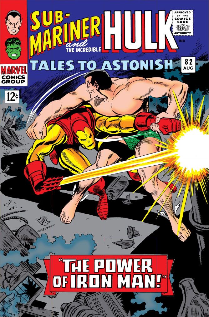
Tales to Astonish #82 (August 1966): I bought this for Gene the Dean, found Jack the King!

Tales to Astonish #82 (August 1966)  Pencils: Gene Colan,
Inks: Dick Ayers (according to Comic Vine) 
Well, that was a pleasant surprise!  I recently bought a digital handful of Marvel Comics superhero books by Gene Colan.  Some people were talking about him on Facebook the other day and I suddenly developed a hunger for his work.  And also for one of those old Marathon bars, but you can't buy those on Comixology. 

Anyway, my appetites aside, Gene Colan is one of my top five or six all-tme art heroes, a guy I've tried to imitate in my own art however futilely.  While I own a DC hardcover full of Batman stories by Colan, and I know he was responsible for a storied run on Daredevil, I tend to think of Colan as more of a horror artist because of his stellar art on Marvel's Tomb of Dracula and for Warren Publications.  After reading all that jazz from people way more knowledgeable than I about this stuff, I decided it was time to fill a gap in my education and study up on his superhero work.

Well, I already knew Colan for a horror master.  Love his moody, shadowy imagery and the extreme figure foreshortening because he chose very unusual "camera" angles.  He was incredibly cinematic, with a strong feel for intense drama and noir-ish lighting.  So I was really looking forward to reading this and seeing how he put that to use in one of those two-character long-underwear dust-ups printed before I was born.   I opened to the splash, scanned the credits to see who inked it (inking interests me lately) and got a surprise.  After the cover, there are only two pages of Colan in this book!  But we're not going to complain because after those two pages it's none other than Jack Kirby the rest of the way.
 
Tales to Astonish #82 (August 1966) has a Stan Lee plot and a Roy Thomas script, and it's a continuation of a fight started in another title, which is easy to confuse with this one, especially since their numbering runs so close together.  I'm talking about Tales of Suspense #80, which also has Lee's and Kirby's famous "He Who Holds the Cosmic Cube!"  I say it's famous because it's a Captain America story I read many years ago in the book Captain America: Sentinal of Liberty.  All the stories in that book are famous because Stan Lee says so.

Anyway, Captain America isn't in this.  It's just Iron-Man and Namor.  Their story starts over there, continues here in this one, then goes of into another comic.  I haven't had time to sit down and really give Tales to Astonish #82  a reading, but just from staring at the art, this story, called "The Power of Iron Man!," is a frenzy.  Just two characters duking it out.  I have no idea why, don't really care all that much.  I'm downloading it into the Comixology iPhone app as I type this, so I'll read it in those scant free moments I'm not shaking the earth and building a better future or whatever the hell it is I do.  I don't really wax nostalgic over things like two characters having a fight, or that this is "the first real inter-book crossover."  I'm more interested in the artwork by Colan and Kirby.

Despite Dick Ayers' inking, it would be obvious we've got two very different pencillers even if we haven't read the helpful credit boxes on the splash page which tell us Colan came down with the flu and Kirby had to take over.  I wonder if that's really the case, or if this is one of those cute jokey things Stan and Roy liked to use as an easy explanation for some other chain of events they didn't want us to know.  Seems likely enough, much more so than Kirby drawing the book then asking who the Sub-mariner is, but that's the claim here, too.

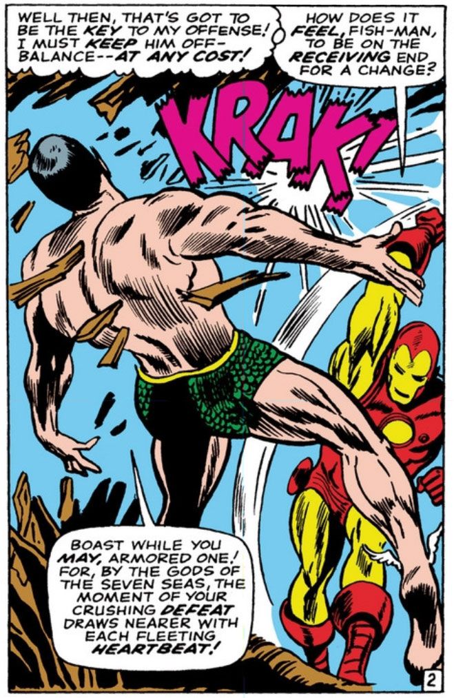
Here's where Iron Man hits Namor the Sub-Mariner so hard they both turn from Gene Colan figures...

Script:  Roy Thomas, Pencils:  Gene Colan, Inks: Dick Ayers
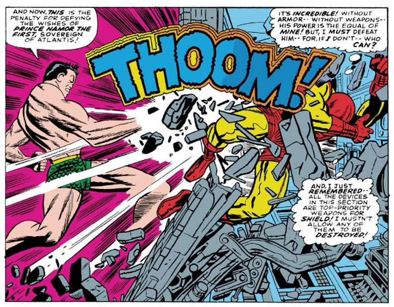
... into Jack Kirby figures:

Thomas, Pencils: Jack Kirby, Inks:  Ayers

Jagged purple "KRAK!" is the sound of metal-clad fist striking flesh and bone chin.  Earthquake-like yellow and blue "THOOM!" is what happens when fish-guy knocks armor-guy through a wall. 

In the Colan panel, notice how Iron-Man's weight is planted on that front foot.  Most of his body is moving towards Namor in the foreground because he's put everything into one massive hay-maker of a blow, which landed a split-second or so before Colan "photographed" this moment.  Even though he's still able to talk, Namor is flying upwards and backwards with his right foot dangling loosely.  This is follow-through, the impact completed, an interesting split-second between the moments of collision and release and much closer to the latter so the figures are opening up, becoming loose-limbed and extended, although I imagine Iron-Man's left thigh is clenched because he's planted that foot and is stopping his forward momentum with it.

Now look at Kirby's panel.  This isn't follow-through.  This is the exact moment of impact.  Namor has punched Iron-Man with a more compact body-blow.  Notice the rigidity of Kirby's figure drawing here.  Namor lowers and draws in his chin, which means his chest and abdominal muscles are clenched, tense.  He's still performing the action itself.  In Colan's, taking place nano-seconds after the action, we see Iron-Man's fist.  In Kirby's, at the moment of impact, Namor's fist has vanished in a white starburst.  And Kirby either gives us two time differentials here or else that punch is so powerful, the transfer of kinetic energy has already thrust Iron-Man through the wall in exact moment Namor landed it!  It seems impossible, two states at one time, but there you have it.  Also, like Namor before him, Iron-Man flies backwards from blow, but Kirby puts his upper body into a kind of defensive posture, arm raised to protect his face, while the other arm goes limp and he appears to be drawing his legs up so that he can land in a ball on the other side.  Or the fetal position.

Colan's is kind of athletic and even graceful, Kirby's is as hard and bone-shattering as two cars in a head-on collision.

These panels come a couple of pages apart.  I just wanted to show you one of Namor's answering blows because it wouldn't have been fair to give Iron Man two consecutive shots.  The art switch is just this abrupt, though.  You get that Iron Man punch at the end of one page-- and I find very entertaining Thomas's characterization of Namor as the kind of cool customer who can fall backwards after a sock to the jaw and still find it in himself to make a sneering speech about how Iron Man's "crushing defeat draws nearer with each fleeting heartbeat"-- then the very next page starts with a Kirby-drawn panel of Iron Man shooting his "repulsor rays" right at us, the readers! 

What gives?  Aim those things elsewhere, buddy!

Since I was born a generation later than the kids who bought these issues new off the stands, stories like these were hard to find unless they popped up as a back-up feature in an annual or else in one of those hardcover collections at the library.   The ones that were constantly checked-out and never available.  Or that Sentinel of Liberty book I was just telling you about, which I bought at Waldenbooks at our mall along with one about Dr. Strange. 

We didn't have all the archive reprints and essentials and, of course, digital comics had yet to be invented.  I didn't have the disposable income to buy swanky back issues, and I probably wouldn't have been inclined to even if I did.  There were always new comics to buy.  And living in a small southern town, I was largely isolated from fandom at large and things like fanzines and mailing lists.

This means I don't have an encyclopedic knowledge of storylines predating my interest in comics, nor do I know a whole lot about the inner workings of Marvel or DC or who drew or wrote what when or where.  It also means every time I go on a Gene Colan or Jack Kirby rampage, I'm liable to find stuff completely new to me.  I like that.  The joy of discovery!  The joy of turning a page drawn by Gene Colan and finding the next one drawn by Jack Kirby!

Oh, and there's a Bill Everett-pencilled Hulk story as the back-up feature, and that looks pretty cool, too.

Tuesday, October 15, 2013

October is Spookey Month: Tomb of Dracula #7 introduces Edith Harker

We all know how Quincy Harker's daughter Edith meets her doom-- staked by her own father in Tomb of Dracula #12, "Night of the Screaming House" (September 1973).  But how did she find her way into the pages of Tomb of Dracula in the first place?  It happens in #7 (March 1973) "Night of the Death Stalkers," (lotta "nights" going on here) with her father making his debut a page or two later.

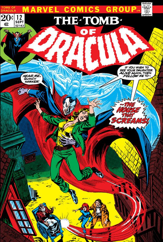
Let's look at the cover before we get into the story.  Doesn't Dracula have a fun sense of humor here?  This is some clever copy and it hooks me immediately.  The drawing is by Larry Lieber, Stan Lee's little brother.  It gives readers a fairly accurate depiction of the story inside.  It's not nearly as dynamic as some of the series' Gil Kane covers, but Kane was one of those "gold standard" cover artists and it's not really fair to compare anyone to him.  And yet I just did, didn't I?  What I like about Lieber's cover, however, is he makes Dracula look a lot like Hammer Studios' own Christopher Lee, the finest of all screen Draculas (and tallest).  I'm going to assume Lieber agrees with me and that in itself is more than enough to recommend this cover.  I'm in favor of Gene Colan's "casting" of Jack Palance as powerhouse, intensely masculine Dracula inside the pages, but the more sinisterly refined Lee played Dracula for a longer period and emerged with dignity intact despite some increasingly silly material like Dracula, A.D. 1972 and Satanic Rites of Dracula, both of which provide prototypes for Tomb of Dracula.  You know, Dracula in the modern age, tooling around London and swingin' hippies and mods and all that.  So Lee is also very appropriate.  Anyway, the cover does its job competently if not spectacularly, but it's still fun.  The issue preceding this one had a Neal Adams cover, by the way!

Take a deep breath, because here... we... go...

In this issue, Rachel van Helsing introduces her pal Frank Drake to the Harkers and they form a vampire-fighting association the likes of which the world had never seen.  Well, not really.  It's a group similar to the one Bram Stoker came up with in his original novel, the one that started this whole Dracula business.  I've always liked vampire-fighting groups, and Tomb of Dracula's is far and away my favorite because everyone is a bit edgy and damaged.  While Marv Wolfman's core cast coalesces, their enemy, the famed count himself, self-styled Lord of the Undead, is busy making new friends of his own.  Because Tomb of Dracula #7 has a lot more going for it than just the first appearance of Edith Harker and her dad.  It also has one of Dracula's most sinister plans-- hypnotizing a bunch of kids into killers.  Kids, killers.  They both start with the letter k, and lemme tell you, there are some kids out there who would just as soon slit your throat as look at you even without a vampire master giving them hypnotic orders.  Slit your throat, then enjoy delicious Honeycombs cereal as a part of any complete breakfast.

Dracula's logic for this is while Harker and company would stop at nothing to kill vampires, they're not about to murder children, not even to save their own lives.  Turns out he's right.

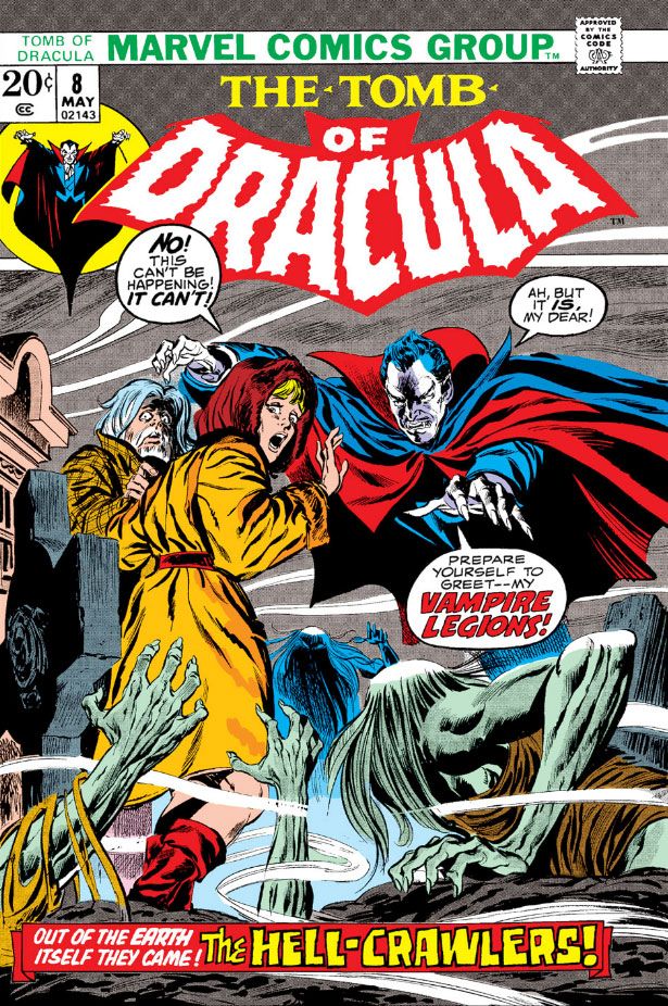
This set-up reminds me of Village of the Damned, that truly disquieting film where time stops in a quaint village and nine months later a cadre of identical blonde babies arrive.  They grow up into sinister children who delight in murder via telepathy and wearing blonde wigs.  It's also reminiscent of those Simon-Kirby kid gangs of yore.  The killer Boy Commandos in Tomb don't wear wigs and they don't engage in any witty repartee, but they do sport some eerie glowing eyes as they silently and relentlessly pursue our heroes.  They do such a good job of it, the story stretches into Tomb of Dracula #8 (April 1973), which has a John Buscema cover.

Getting back to Edith.  Since we've already covered Edith's final moments, let's take a look at her first.


I'm going to assume she works at the chemist (that's "pharmacy" or "drugstore" to us colonials) Colan draws her leaving.  Gosh, it sure is cold.  I hope she gets home all right...


Oops!  No such luck.  Yes, she is the book's jeopardy queen.  Still, a bash in the face is better than a bite on the neck when you're dealing with the undead, and it's Edith Harker's good luck to have come face-to-face with the boss of them all and come away with only a bruise.  Dracula seems kind of a quitter here, though, doesn't he?  Edith's wearing one measly little cross.  Where is Dracula's amazing hypnotic gaze to make her take it off so he can feed on her?  It takes him about two seconds to enthrall those kids.

Speaking of which, here they are:


It looks as though someone at Marvel did a really clumsy art touch-up on Dracula's head in the fourth panel.  The face is Colan/Palmer, but the wonky perspective on the forehead (the widow's peak is turned a few degrees from where it should be both vertically and horizontally and there's no foreshortening despite the slightly low-angle view of Dracula's head) and the hair texture look completely alien.  Why?  Maybe the page passed through the inking and lettering stages with the top balloon coming out too large and covering too much of Dracula.  The editor decided we needed more of Dracula's head in there, which meant reducing the balloon and getting someone on staff to touch up the missing areas.  Just speculating about a hypothesis, but it also looks as if someone mistook Dracula's left hand for one of the background trees and colored it brown as a result.

Here's one of the most disturbing aspects of vampire lore-- the corruption of innocence.  Stoker used this is a major theme in his novel, and Wolfman picks up on it.  In Stoker's book, Dracula's first victim is the virginal Lucy Westenra, the ideal of proper young womanhood in the Victorian Age.  By the time Dracula is through with her, she's feeding on babies in a parody of nurturing motherhood.  Wolfman's Dracula will stop at nothing in his quest for power or whatever he holds as his ultimate goal and a bunch of boys become his weapons.  They're very effective, surprisingly so.  They chase Frank and company right out into the night and trap them in an old-fashioned car and there's not a thing anyone can do about it.

In fact, the hypno-kids do such a fine job of taking Dracula's enemies out of the fight, he finally has a little leisure time on his hands.  The next issue (nicely inked by Ernie Chan-- credited as Chua thanks to a bureaucratic screw-up on his immigration documents) sees Dracula using this free time to recruit some even more sinister allies, a lot of moldy vampires.  I think he should have stuck with kids.  Imagine Dracula getting himself on TV, perhaps taking one of those horror movie host jobs, or showing up at a station where they do one locally and beaming his powers across a wider area, ensnaring hundreds, perhaps thousands, of children and turning them against the adults.  Kind of like Halloween 3, but without that Silver Shamrock rhyme to get into your mind and stay.  And stay.  AND STAY.

And here's where it turns out I owe Edith Harker something of an apology.  She first appears as a typical damsel in distress, and goes out that way as well.  But she gets to come to the rescue herself at least once before Dracula and dear old dad put an end to her once and for all.

And here she is:


You go, Edith!  Sorry they didn't get your hair color right in this, your shining moment.

Friday, October 11, 2013

October is Spookey Month: Tomb of Dracula #12 teaches us most accidents happen at home

Is it controversial to say Tomb of Dracula was Marvel's best comic of the 1970s?  It has some strong competition from Conan the Barbarian where Barry Windsor-Smith displayed exponential artistic growth; from X-Men/The Uncanny X-Men with Chris Claremont, Dave Cockrum and then John Byrne creating a mythos that won all those Eagle Awards and underpins the entire Marvel universe to this day; and from Howard the Duck where Steve Gerber and artists like Frank Brunner, Val Mayerik and Gene Colan inspired Marvel's first movie adaptation (an infamously lousy one, but still a big budget, George Lucas-produced film released to theaters in the belief it would be a big hit). 

Those are all fine series, and I've enjoyed each of them.  But Tomb is just something else entirely.  Tomb is like wow times wowee for a little "wowee-wow-wow." Tomb took an exhausted public domain property-- good ol' Count Dracula, star of dozens of movies, TV shows and comic books in one form or another-- and gave it a compelling, new un-life.  Writer Marv Wolfman's melodramatic prose perfectly matches Gene Colan's shadowy visuals, the two elements working in tandem like peanut butter and chocolate in a Reese's.  When Marvel finally teamed Colan with inker Tom Palmer, the two produced what I will argue was consistently the most breathtakingly beautiful color monthly of the entire decade.


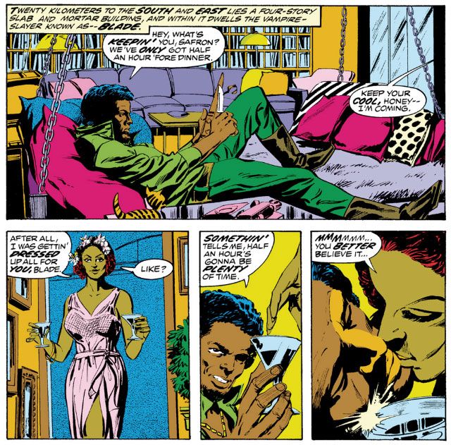
Operating on the fringes of the Marvel universe, Tomb functions as a sequel and expansion of Bram Stoker's novel.  In fact, lead good guy Frank Drake is a descendant of Dracula himself, his last name an Americanized version of the original.  Quincy Harker comes right out of the original book, the first born child of Jonathan and Mina (nee Murray) Harker, conceived and born after the novel's main events and named after one of Dracula's victims, the Harkers' courageous American cowboy friend Quincy Morris.  Wolfman casts Harker in the Dr. Van Helsing role.  More troubled than his Stokerian prototype, Harker rides around in a weaponized wheelchair the likes of which James Bond's pal Q would envy, and he uses it to save himself and others several times throughout the stories.  His hardboiled protégé (and later, Drake's lover), Rachel van Helsing, is the grand-daughter of the Stoker character.  Both Taj Nital, devoted companion to Rachel, and-- most significantly-- Blade, the ultra-cool, Blaxploitation-style member of the group, are wholly original.  At least I don't remember Stoker having watched Shaft, Super Fly or Hammer, but he could very well have despite having died about 60 years before the birth of the film genre.


Every October, I turn to Tomb of Dracula and it helps put me in that spooky, haunted Halloween mood.  It has its funky idiosyncrasies-- too many scenes where Rachel, Frank and Blade confront Dracula and all they do is trade arch insults and a whole lotta plots where Dracula almost dies, only to escape at the last moment.  After all, how many times can our vamp-slaying crew almost destroy Dracula before they start to seem completely incompetent to the point they lose our sympathies and incur our scorn, like that bumbling Gilligan?  Tomb of Dracula ends rather abruptly with issue #70 before it has a chance to devolve into self-parody, but even when things turn silly as they occasionally do, the overall atmosphere remains one of effectively updated gothic horror, and there are still plenty of genuinely creepy moments to restore our faith.  Which finally brings us to tonight's topic, Tomb of Dracula #12 (September 1973) and a little story we like to call "Night of the Screaming House."  Because that's what Marv Wolfman named it.

Oh, on the Frank Brunner-illustrated cover, Dracula calls it the "House that Screams," but you should never believe anything the king of the vampires tells you.  He has his own agenda and will lie when it suits him.

Okay, forget Dracula before... er... remembering him again.  Because Wolfman and Colan throw us right into the action with the main characters locked in a ferocious show-down with none other than Dracula, who has caught himself a delicious dinner, but can't catch a moment to eat in peace.  It's not a holdover from a cliffhanger ending to the previous issue (in which Dracula fought some motorcycle guys who aren't quite as menacing as the Sons of Anarchy bunch, although they do their best).  It's more like, "Open the book, here we are!"

Unfortunately one of them, Harker's daughter Edith, is ill-equipped for the life of a fearless vampire hunter.  Edith Harker was simply born to find herself in jeopardy.  Wolfman and Colan introduce her to the series that way in Tomb #7 (March 1973), and in "Screaming House" (as its friends call it; the rest of you must refer to it in full, with an honorific of your choice), she really finds herself in a mess, the likes of which no heart-felt talk with Sheriff Andy Taylor, Mrs. Garret or Mr. Belvedere can solve.  After a lot of posturing on both sides and some ineffectual hand-to-hand, Dracula spirits Edith away to a shabby old house so he can toy with his adversaries rather than just kill them outright.

With his mastery of vertigo-inducing camera angles, Colan expertly depicts the abduction, which is quite alarming as Dracula transforms only partially into his bat-form.  This emphasizes his otherworldly aspects by making him a grotesque hybrid creature, plus it gives him enough strength to carry Edith through the air.  He needs those membranous arm-wings to do two things at once.

And the titular screaming house is foe unto itself.  It's full of rotten floorboards that give way at inopportune times and Dracula's hidden away traps of his own, like the black widow cages he slips around the corner beneath Frank Drake's feet at one point.  The good guys split up to cover more ground and render themselves even less effective against Dracula and it all comes to a tragic conclusion.


While the story itself is pretty straightforward, at least compared to later issues (which would feature adversaries such as a Communist Chinese brain in an aquarium, Dracula's hated vampire daughter, a faceless dead man and, later, his own weirdo son, an angelic/demonic pretty boy calling himself Janus) it has some important character development.

Once he plunges his cast into Dracula's fun house, Wolfman depicts Drake as scared almost out of his wits to the point of stuttering as he speaks.  And yet the guy still pushes on alone.  While Drake is in a state of transition from callow rich jerk to bumbling vampire avenger to intrepid daredevil hero, it helps reinforce the danger Dracula personifies.  Remember, when you go against a vampire it's not just your life that's in hazard; it's your very soul.  And with Dracula the series anti-hero, there's always the chance over-familiarity with the character and his motivations will weaken his menace and turn him into just another ineffective Marvel villain fond of soliloquys in the dark.  This is especially true if the characters in the book come to view him as ho-hum.


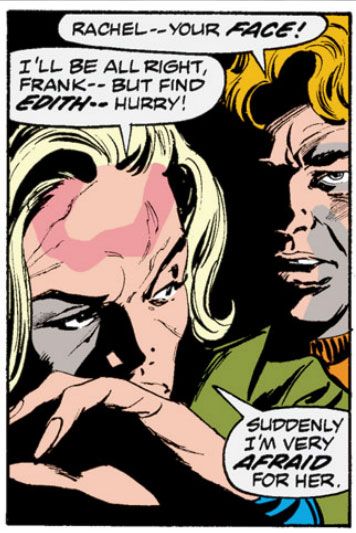
Another important character point is the scarring of Rachel's face.  Bats, released by Dracula, attack the group and Rachel gets a makeover.  These scars become part of her character and eventually symbolize the hardening of her spirit.  So important are these scars, when Wolfman and Colan resurrect Rachel years later in their Tomb of Dracula miniseries, it's through a kind of possession that involves a brand-new character tearing at her own face until she resembles Rachel and loses her own identity.


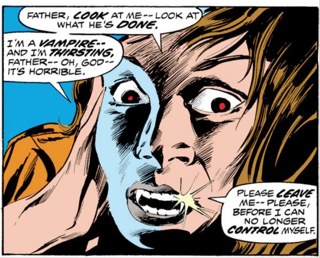
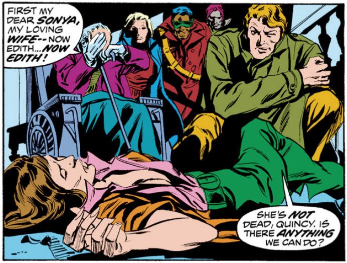
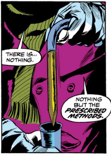
The final and most poignant element is Edith's fate and the matter-of-fact way Quincy deals with it.  While Frank reacts with very human but misguided compassion and hopefulness, Quincy Harker knows from experience there is only one thing to do.  Wolfman could easily cop out at this point and offer a last-minute reprieve in the form of some never-before-heard-of cure, but no.  Instead, he sacrifices a character to the betterment of the story.  It's a moment reminiscent of the scene from Stephen King's 1976 novel 'Salem's Lot where protagonist Ben Mears is forced to drive a stake through Susan Norton's (his vampirized girlfriend) heart.  King changes viewpoint characters throughout his story, spending a great deal of time and care making readers empathize with Susan by allowing them to see events from her perspective.  Her loss in the narrative gains impact because we think of her loss as tragic unto itself rather than merely something that incites Ben's actions towards the climax.


Wolfman hasn't had enough time to do as much for Edith.  Because her fictional career ends so abruptly, she remains something of a punching bag of a character.  And yet, Harker's coldly pragmatic method of dealing with her is chilling.  This is what separates a true horror story from an adventure that uses horror trappings.  Horror forces characters into painful choices, the loss of sanity, of limbs, of life, of loved ones.

Friday, October 5, 2012

October is Spookey Month: "Tomb of Dracula," a Halloween reading suggestion


Marv Wolfman, Gene Colan, Tom Palmer, Tomb of Dracula #31 (April 1975)

 Your perfect Halloween reading is Marvel’s Tomb of Dracula by Marv Wolfman and Gene Colan.  I’m a Halloween traditionalist.  As far its denizens go, I tend to avoid all slashers other than Michael Myers (or is he more of a stabber?) and stick with the classics—werewolves, ghosts, mummies, witches and vampires.  And vampires don’t come any better than the main man himself, Vlad Dracula.  Forget those Varneys, Ruthvens, Yorbas, Mamuwaldes and all those other pretenders to the throne.  Barlow?  A clown.

But when you want the true Lord of the Undead, there’s no other choice for choosy consumers.  You want Dracula.  He’s packed with vitamins, stays crunchy in milk and has a taste that can’t be beat.  Kids and moms agree-- the wholesome goodnesss of Dracula is part of your complete breakfast.  And Wolfman’s purple prose funny book serial is the third finest Dracula tale after Bram Stoker’s novel and the Hammer Films series starring the greatest of the screen Dracs, Christopher Lee.

It’s got gothic elements and touches of Robert Bloch and Richard Matheson, and occasionally Sax Rohmer by way of Ian Fleming.  Disembodied Communist brains?  If the series unfortunately takes place in the Marvel universe at large—Johnny Storm, the Kree Empire and vampires have no business co-existing, sorry (although we might make a case in favor of a Fin Fang Foom crossover)—Wolfman wisely and largely keeps the colorful longjohns crowd at bay,  beyond a brief visit by Brother Voodoo and a tete-a-tete with earth’s Sorcerer Supreme Dr. Strange.  Chris Claremont’s tales in the Giant-Size issues tend to draw on H.P. Lovecraft as well.  They’re okay, not really Claremont’s finest—the man mastered mutants, not vampires—but then again, he didn’t have the benefit of Gene Colan handling the art.

Colan made his horror bones—so to speak—drawing some memorable ink-washed Creepy tales for Warren, but he made his mark at Marvel pencilling Daredevil and Captain America.  Tomb of Dracula, however, is the man’s masterpiece.  Tomb was an assignment he sought, and he was right to do so.  While his superhero work showcases his ability to depict bodies in motion, Tomb proves him a master at distorting them through foreshortening.  Constrained from showing gore by the Comics Code, and due to the talky nature of a lot of scenes-- vampire hunting requires planning while sitting around coffee tables-- Colan would choose the most difficult angles, then stretch page design to its outer limits by framing them with panels of odd shape, or going for collage-like effects.  But always under control, always moving the reader's eyes across the page in a way that makes sense and lends to a clean reading experience.  Actually, reading a Colan Dracula page is like reading a movie.  

His chiascuro style—heavy on shadows and mood—finds its ideal match in the sinuous ink line of Tom Palmer.  Through Palmer's finishes, Colan’s art coalesces further into the kind of dark beauty that also prints well on the cheap newsprint comics companies used in those days.  When you find them in black and white in an Essential Tomb of Dracula or one of the slick collections in full color, you see just how endlessly attractive and rewarding of close study these pages truly are.  

Palmer interprets Colan's shaded modeling with parallel feathering and cross-hatching to create a feeling of form, depth of field, added clarity and emphasis.  At times he seems less an inker than an extension of Colan’s artistic consciousness.  There are other pencil-ink teams where the partners’ sensibilities mesh so well.  Neal Adams and Dick Giordano, George Perez and Romeo Tanghal, Jack Kirby and Mike Royer, John Byrne and Terry Austin, Steve Rude and Gary Martin.  But Colan and Palmer made Tomb of Dracula Marvel’s most consistently gorgeous book of the 1970s.

Wolfman takes a novelistic approach to his cast of characters, especially lead Frank Drake.  When we first meet Drake in Tomb #1 (April 1972), he's a cjaded, shallow rich boy who's squandered his fortune.  Only Castle Dracula remains, but betrayal by a close friend leads to Dracula's resurrection and sets the series in motion.  Drake is at times selfish, mule-headed, morose and self-reproaching.  When he moves to embrace outright heroism, he does so in about as jerky a way a person could, alienating his friends.  The quest to stop Dracula changes him over the course of his adventures.  The same can be said of  Rachel van Helsing, whose character transformation finds stark symbolism in facial scars she eventually acquires, marring forever her icy blonde beauty.

Like many open-ended narratives, Tomb seems content to spin its stories out, changing direction abruptly, introducing new characters like shlubby Harold H. Harold, the hacky writer, and Blade, the half-vampire vampire hunter who proved popular enough to inspire a Wesley Snipes-starring movie franchise and a syndicated TV series, then following them down twisting story paths until things conclude rather abruptly in Tomb # 70 (August 1979)-- which was supposed to be a three-issue arc, but ended up mutilated into a double-sized single issue thanks to a Jim Shooter decision.  The stitched-together seams show badly, but the series ends up having a strange Victorian serialized novel feel, which is appropriate for vampires.

Dracula himself would go on to appear ever more ridiculously in issues of The Uncanny X-Men and ---, a kind of supernatural Dr. Doom, every new iteration watering down Wolfman's indelible characterization of a proud, misanthropic anti-hero until Drac becomes just another super-villain in the Mighty Marvel manner.  He even fights Apocalypse at one point.  Sheesh.  But during the run of his own title, Wolfman, Colan and Palmer found majesty in a character who suffers from being overly familiar to the point he's inspired parody and mockery.  Besides Dracula himself, obviously Blade is still kicking around.  I'm not sure what's up with Frank Drake, although he resurfaced in 1991 for a four-issue Epic miniseries also called Tomb of Dracula, where we find him trying to put the past behind, only to have the infamous vampire reappear.  Wolfman deliberately ignores all the Drac appearances in between, having the vampire lord reappear at precisely the same place he apparently perished in that last issue of Tomb.

I, for one, applaud that choice.

Which is why every October I find myself brushing away the cobwebs, creeping down the stone steps weeping condensation, the darkness breathing chill air like a dying man… and opening the tomb.  This Halloween, if you haven’t already, you should, too.

Monday, October 3, 2011

Dracula: Marvel's Merriest Misanthrope (2nd Annual Spookey Month)

My favorite Marvel monster by far is Dracula, Lord of Vampires.  Not because of his redeeming qualities; he doesn't have any.  Dracula is far too hateful to identify with, or to like as a person.  Every so often, writer Marv Wolfman attempted to establish a little sympathy for Dracula.

Dracula loses his powers, he eviscerates himself in his blog, he drinks too much and cries at a sad clown movie. Then you remember he also murdered his wife, alienated his daughter and son, drove a young woman to suicide through emotional abuse, bullies anyone he perceives as weaker than himself-- nearly everyone-- and murders without remorse in order to feed his vampiric blood-thirst.  And that's in between long monologues where he tells you how great he used to be when he was alive, and how awesome he is even now that he's dead.   But he does exude charisma as star of his own comic.  He's sickly fascinating, like the snake that kills you or a YouTube video of a car crash.  You can't take your eyes off him, even while you deplore his very existence.

In Bram Stoker's novel, Dracula is the antagonist and what we learn of him comes second-hand from various diaries and letters; for Marvel's Tomb of Dracula series, Wolfman cleverly reversed the formula and Marvel ended up with a comic that exhaustively examined the sociopathic tendencies of its lead character, a completely reprehensible killer whose egotism buries the needle on the ego-ometer, easily topping 10,000 kilo-Trumps.  Imagine a Fantastic Four where they not only fight Dr. Doom every single issue, but the writers seem more interested in him than in the good guys.

At least Victor von Doom has a kind of tragic nobility resulting from his being more misguided than actively evil.  Despite his protests to the contrary, Dracula's nobility drizzled away with his blood the moment he died, only to have a kind of nihilism replace it.  But just like Dr. Doom as infamously written by Brian Michael Bendis, Dracula loves to put people down.  Let's look at some of Dracula's insults, shall we?  And then we'll cleanse ourselves through the healing power of music.

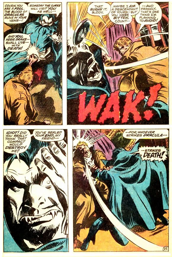
Dracula's hate is universal, but there is no one among the masses he hates more than Frank Drake, his descendent.  Drake's very existence is an insult to Dracula, so he repays the poor schlub at every opportunity.  It starts as early as Tomb of Dracula #1 (1972).


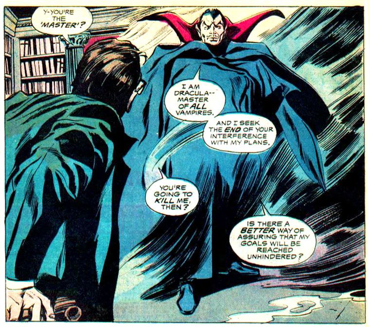
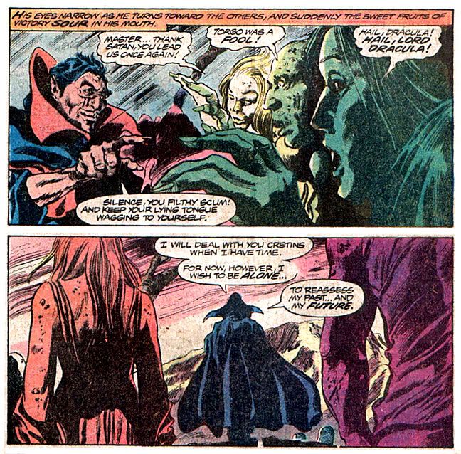
Dracula relies heavily on old favorites such as "fool" and "idiot."  "Scum" seems to be his favorite epithet, though.  All through the series, it's "scum this" and "scum that."  While he's not shy about expressing his displeasure with humanity, he's also something of a culinary critic, a skill he displays in #9 (1973).


It's amazing a guy who died hundreds of years before the invention of indoor plumbing knows enough to dump stew into a sink.  On the other hand, depending on how greasy or oily it was, that might not have been the best idea.  What am I saying?  Of course Dracula would want to clog your pipes!

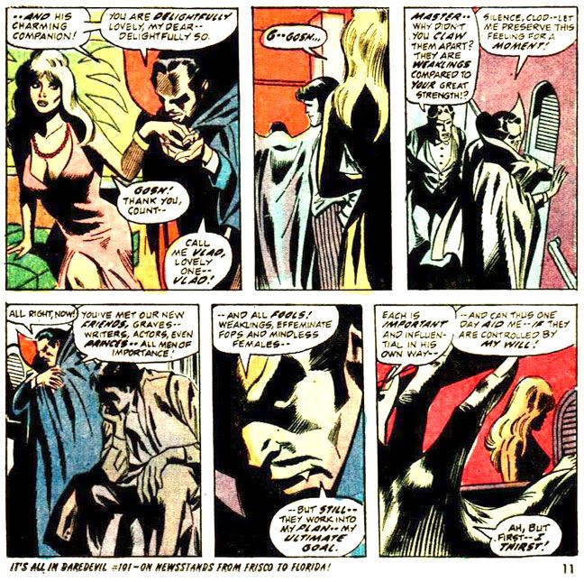
Occasionally, Dracula gets a little more clever with his insults.  After charming a group of hoity-toity ship passengers, he suddenly shows his true colors in this scene from #10 (1973).


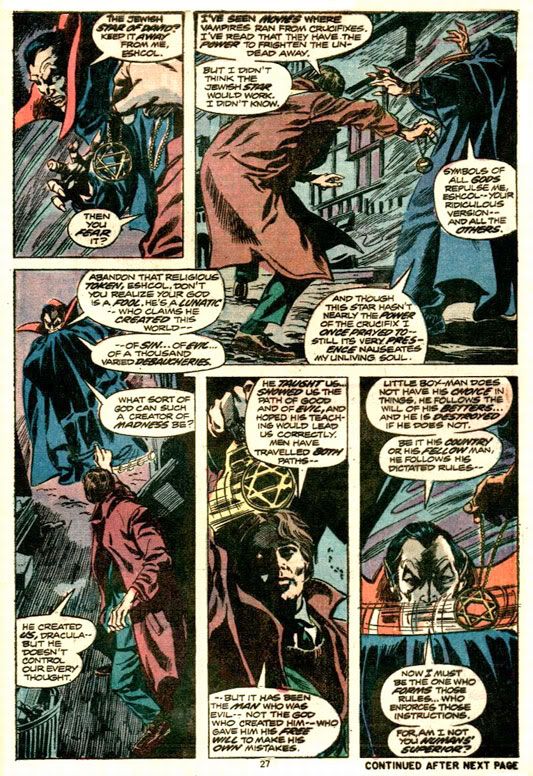
Well, he does call them fools before working a bit more baroque than usual.  If you want a torrent of angry verbiage from Dracula, few topics get him worked up like religion.  As a foul undead creature aligned with Satan, Dracula-- as you might imagine-- isn't too keen on God, as we see in this tender, sensitive moment from #27 (1974).


Even after months of hanging out among us mortals, he's not shy about expressing his dislike for people.  In #29 (1975), he really lets his feelings show.


Comparing us to vegetables is kind of odd, since Dracula is a hardcore carnivore who love nothing better than reducing all of humanity to docile food stock.  Dracula never orders salads in restaurants.  He's also not content to decry food, deities and people.  In #60 (1977), we also learn that Dracula has it in for inanimate objects.


Yes, even chairs aren't safe from Dracula's wrath.  But given his towering ego, Dracula must reserve praise for himself, right?  He has to be a narcissist-- the kind of guy who would gaze lovingly into a mirror and practice his various smiles, if he still had a reflection.  Yeah, I thought so too, until I read #66 (1978).


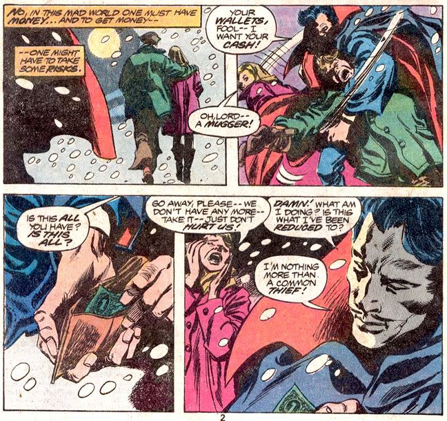
Well, this is after he's had a huge argument with none other than Satan (later determined to be lame-o wannabe Mephisto, which is a major cop-out on Marvel's part), who removed Dracula's powers and reverted him to mortality but left him with his snazzy cape.  Later, however, we learn there are few things Dracula despises more than his fellow vampires.  Check out this heartwarming moment from #70 (1979).


Tomb of Dracula #70 was a double-sized issue abruptly ending with his death, and so Dracula disappeared from the Marvel universe for a year or two.  Like his Hammer Studios counterpart, the comic book vampire kept returning from each seemingly final destruction.  While Wolfman and company wisely kept Dracula's involvement with Marvel's costumed heroes to a minimum-- with genre-appropriate appearances from Brother Voodoo, Dr. Strange and Werewolf by Night-- other writers would try to fold the character into the mainstream superhero continuity.  This resulted in incredibly silly moments such as Dracula trying to vampirize Storm of the X-Men.

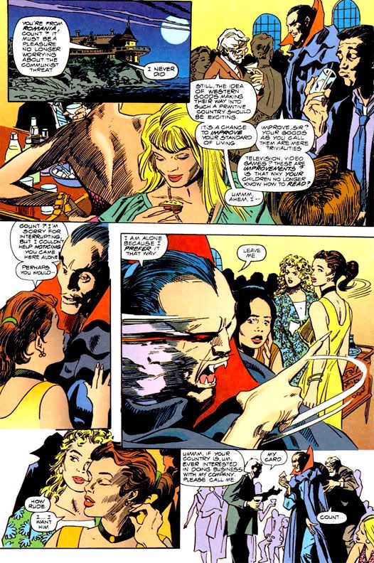
Possibly sensing the ridiculous nature of such tales, the powers-that-be at Marvel had Dr. Strange eliminate all vampires via something called the Montesi Formula.  No more vampires.  Just mutants and spider-people, please, and metallic guys who fly around on surfboards.  But Dracula was and remains too good a public domain villain not to use even if you're just going to have him battle super-people in their colorful underwear and/or BDSM outfits.  In 1991, Wolfman and original series artist Gene Colan teamed up with inker Al Williamson for Tomb of Dracula:  Day of Blood!  Night of Redemption! which sees Dracula returning from the grave and ignoring all that X-Men nonsense between the final issue of his own series and the first of the new.

And he's no happier with humanity, although he has learned to express himself with a bit more eloquence.  Gone are the generic references to "scum" and "cretins," replaced by a more definitive explanation of Dracula's misanthropy.


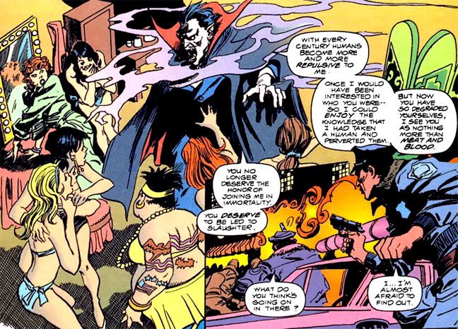
Well, that's what Dracula gets for hanging out in a seedy strip club.  Of course you're going to learn cynicism when you choose only to see the worst society has to offer.  Dracula responds by tearing off a security guard's face-- Colan and Williamson make it look like a rubber Halloween mask trailing red streamers-- then slaughtering the club's dancers.  See those cops in the last panel?  They come upon a crime scene so horrifying it affects even their jaded sensibilities.  One of them vomits.  But what about the hoi-poloi?  I'm sure Dracula, having been ruler of Transylvania in his younger days, would find the upper crust more suitable company.


 Guess not.  Once again, he doesn't just offer a tongue lashing.  When one young woman makes a pass at him, Dracula responds by casually murdering her and throwing her body off an ocean-side cliff where she goes SPLAT! on the rocks below.

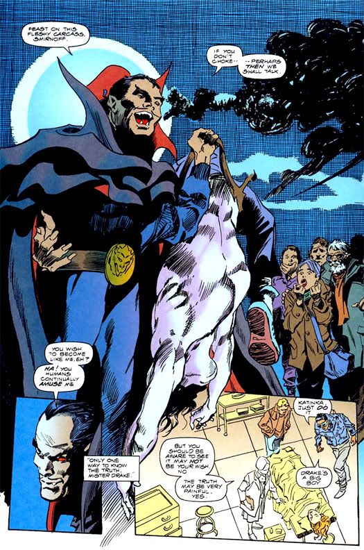
One of the worst things you can do is try to use Dracula for your own means, even if it helps him in the short term.  Here he mocks Dr. Smirnoff, a college professor whose dalliance with the supernatural has resulted in his torso becoming transparent.  Smirnoff wants Dracula to turn him into a vampire so he can avoid a Lovecraftian doom, but Dracula prefers to string him along and humiliate him at every opportunity.


I'm not sure when Dracula gave up his suit and tie for this pro wrestler's attire, but he's apparently won the Intercontinental Tag-Team Championship, if I'm recognizing that belt buckle.  Later, Dracula adds injury to insult when he pokes out Smirnoff's eyes and rips off his head.


At least Dracula's finally learned to loosen up and enjoy himself.  Let's do the same!  Once again, it's Hamamatsu's completely awesome Spookey!

Friday, June 24, 2011

Gene Colan 1926-2011

Gene Colan, one of my favorite comic artists passed away yesterday. I remember buying How to Draw Comics the Marvel Way way back when I was an artsy little kid with dreams of one day drawing comic books. The John Buscema and Jack Kirby examples inside were pretty snazzy, but what really fired my desire to draw were the little panels from what appeared to be some kind of horror comic. They were weirdly fascinating, like nothing else in the book-- dramatic low angle shots with figures that weren't quite as idealized as Kirby's and Buscema's, closer to realistic proportions despite the dynamic posing, their clothes all wrinkled and shadowed with heavy blacks. Atmospheric, even at tiny reproduction size.

I later learned these were from Tomb of Dracula, drawn by Colan and inked by Tom Palmer. From then on, I was a dedicated follower of Gene Colan's work, even when his penciled art elevated substandard writing. The pull, the appeal of a Gene Colan art job was just that strong. When I picture Colan's art in my mind, I imagine his freely distorted his figures, the challenging perspectives, amazingly rich ink washes he laid on his work for Warren's Creepy and Eerie magazines and inventive page layouts with panels like shards of a broken mirror. He was a master of shadow, of mood and atmosphere.

There are a lot of artists whose work I totally adore, but only a handful I'd give anything to draw exactly like. Gene Colan is one of those and always will be. A tremendous talent. A legendary artist. Thanks, Mr. Colan.

Thursday, March 31, 2011

And a Gene in Every One: A Look at Some Gene Colan Horror Stories

One of the neatest surprises about Dark Horse's Eerie Volume One hardcover archive monstrosity is how many Gene Colan stories it contains. I hadn't realized Colan did any work for Warren Publications. I mean, I knew he had to have done something before Tomb of Dracula at Marvel. He obviously didn't just magically appear out of nowhere, or descend in a silver orb-like spacecraft from another planet or emerge from some pocket dimension, hand Stan Lee some samples, lift his Rayban Wayfarers and say, "Dig this and dig it good, Daddy-O, I wanna draw Dracula for you cats."

What the heck am I babbling about?

Colan has always been a master of extreme foreshortening, able to twist and turn the human figure in any direction. Very useful because he isn't the kind of artist who draws simple eye-level panel compositions. No, he likes to use high "camera" positions or his patented "worm's eye view" low angle shot. And then he breaks up the page with all kinds of crazy panel shapes, the results frequently looking like shards of broken glass arranged on the paper. Tom Palmer laid down some impressive inks on Colan's Tomb of Dracula pages, but here in Eerie, we get unfiltered Colan with his characteristic heavy shadowing-- but also marvelous ink washes where he creates an illusion of value and depth with just a few well-chosen gray tones.
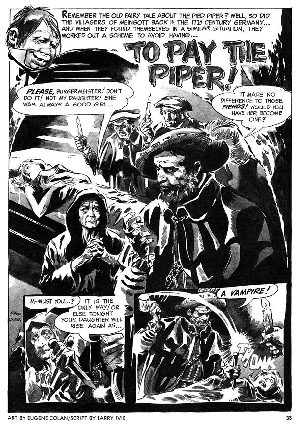
His first Eerie story is a twisted retelling of the old Pied Piper legend, "To Pay the Piper," which substitutes vampires for rats. This time, the cheapskate villagers are as familiar with the story as we are, so they resort to outright murder so they don't have to pay, only to suffer yet another twist involving werewolves. The final panel-- the punchline-- is a bit too crowded to be fully effective (or as horrific as it should be) but the story's creepy European setting prefigures Colan's depictions of Marvel Universe Transylvania.
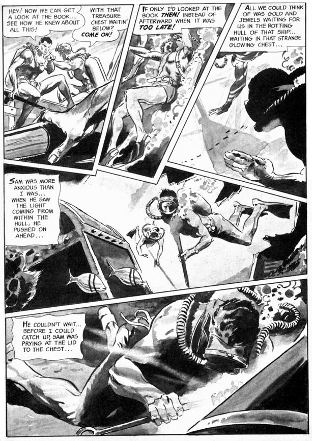
More original is "Full Fathom Fright" (Eerie #3), this time with a script by Archie Goodwin that allows Colan to go bonkers with the fractured panel shapes. This story goes from the booby hatch to Davy Jones' Locker as we first see a mental patient throwing a monster hissy fit, then learn all about the undersea misadventure that made him that way. Goodwin puts Colan's storytelling and rendering skills to their fullest. The undersea sequence is particularly nice, with Colan creating a real sense of weightlessness, with deep water shadows and lighting effects. And the final gag panel with its Lovecraftian conclusion is nice and large and much more effective this time.
Eerie #4 features "Hatchet Man," a grisly Goodwin-Colan take on that horror comic evergreen, the deranged axe murderer. As opposed to the polite, mild-mannered axe murderer, I suppose. What is it about geeks with axes that so fascinates horror writers and readers? The blunt simplicity of the weapon? We've seen it a billion times on EC covers alone, but for some reason we never quite grow tired of these Lizzie Borden-style "forty whacks" antics. This effective little story has an obvious psychological element that's slightly reminiscent of the movie Psycho but features some startling action sequences where Colan chops the action itself into wedge-shaped panels that showcase his ability to depict bodies in motion and in pieces. And if you ever wanted to see Bob Newhart totally lose his shit and go on a killing rampage, then this is the story for you.

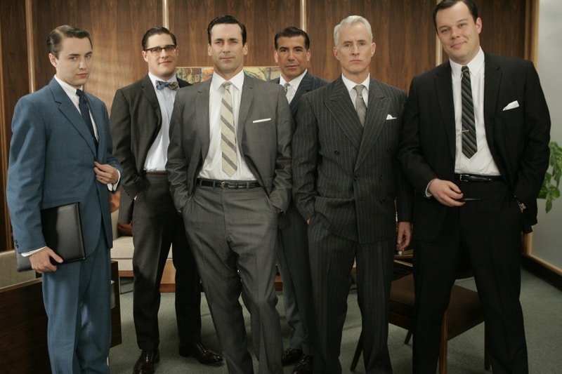
The final story, "A Matter of Routine" (Eerie #5) seems a little rushed. The figures are simpler and the ink washes read a bit flatter than in the previous shorts. It's kind of a nightmare version of the Mad Men era-- a fedora-wearing flannel-suited commuter type (he's even got a 1960s George Grizzard buzz cut) gets off his afternoon train, slips the key in the door at home and steps quite literally into Hell itself. Goodwin's narrative captions are in breathless second person: "You fall to the scorched black cinders of earth, your only escape route banished..." and the denouement is an extremely lame "Was it all a daydream or do I dare open this door after all?" type cop-out. Not the finest work by either gentleman, but still an interesting cultural relic of a bygone era.

It also features axes.