Friday, August 30, 2013

Fantastic Four #29: It's not just Yancy Street that needs help!

Yancy Street is in a bad way, with young hoodlums tossing garbage at our friends, the Fantastic Four.  The heroes have only come to help.  This is how it begins on Yancy Street, but before it's over the FF have wandered all the way to the moon where they fight cosmonaut apes produced by the dastardly Red Ghost, a dome-headed, long-haired mad scientist of the Commie persuasion.  More important than that to Marvel history, it's in Fantastic Four #29 (August 1964) our adventuresome quartet meets the Watcher, who has a dome head of his own.

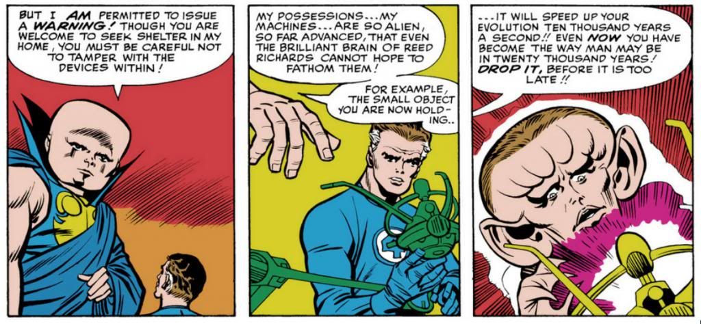
It doesn't take the ever-curious Reed Richards to run afoul of the Watcher's outlandishly futuristic devices, the likes of which no sane species would create outside of a Marvel comic.  Like this little baby:


Whoops!  Turn that off right now, Reed!  Is it just me, or does the Watcher look like Orson Welles with a shaved head in the first panel?

Sorry.  Forget that noise.  Look at how Jack Kirby views the future of human evolution in the third frame.  Since our brains are responsible for most of what we've accomplished, they will enlarge along with our skulls-- and our ears?  It's a little throwaway gag to establish how far above humanity the Watcher and his people are.  And it's just like Reed to pick something up out of scientific curiosity and activate it, damn the consequences.

But no, it's not Yancy Street that needs your help.  Comic creators do, too.  That's why I finally got off my butt and donated to the Heroes Initiative in the name of Kirby4Heroes, the fund-raising campaign run by Jack Kirby's granddaughter Jillian, who explains it in this video courtesy of Nerdist.


What I did-- and I still don't think it was nearly enough-- was donate a bit more than the amount I've spent this year on Fantastic Four comics at the Comixology site.  Comixology sells them for 1.99, and as far as I know, the Kirbys get nothing from this.  So while it's well and good to honor Jack Kirby's accomplishments and legacy by reading his works, I felt I really needed to do something for the campaign run by an actual Kirby to help Hero Initiative aid artists and writers whose stories I've also enjoyed.  People like John Ostrander, Bill Mantlo and one of my super-faves, Russ Heath.  This is going to be an annual thing for me from now on, every August 28th.

Thursday, August 29, 2013

So how did you spend your Jack Kirby Day?

Maybe this has been building for a while and I'm just now noticing it, but it seems there was a lot more Jack Kirby celebration this week than in the past.  This isn't timely merely because it would have been his 96th birthday.  Currently, the Kirby influence rules at the box office where movies featuring his creations are all the rage.  This is why it is important now more than ever to make sure people recognize the guy who made all this entertainment possible, the mighty creative mind and spirit that willed this into existence.  It's the least we can do as fans of his work when it looks as if his family will not share even in a small way in the billions of dollars Kirby has earned for media corporations that jerked him around.

But let's not give into bitterness.  Let's take a little look at the festivities instead and honor our favorite comic book creator!  Here goes...

Time ran a nice appreciation of Kirby online last week (avoid the comments after the first two, though), this week MTV celebrated his work and even the A.V. Club website added a "beginner's guide to the King of Comics, Jack Kirby."  I'd love to link you to those, but I'm writing this at work and I can only dare so much.

My Facebook feed lit up with Kirby messages.  The best, I think, was and is the Kirby4Heroes Hero Initiative campaign.  Run by Kirby's family, this organization posted some of his art and asked comic book readers to donate to the Hero Initiative.  The charity drive also featured something called "Wake Up and Draw," where pros woke up and drew a lot of wonderful Kirby-inspired art.

Which I admit I have not done, but I will as soon as I get home tonight.  Despite this deplorable lapse on my part, the outpouring of Kirby love was a joy to witness.  Of course, my sudden realization here is more than likely a case of confirmation bias, since I recently added a lot of pro-Kirby feeds to my social media.  It stands to reason they'd be popping on August 28th.

On this blog, just about every day is Jack Kirby Day.

Wednesday, August 28, 2013

Fantastic Four #37: You want us to do what?!!

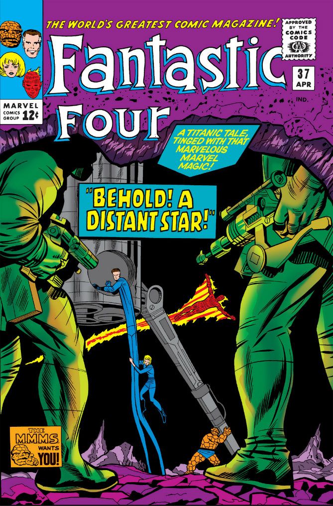
Here's a Jack Kirby gem from the Chic Stone era-- Fantastic Four #37 (April 1965), "Behold!  A Distant Star!"  It starts with Johnny Storm burning off his tuxedo.  Why is he wearing a tuxedo?  Because Reed Richards and Sue Storm are getting married, that's why.  The Fantastic Four are right in the middle of preparing for the single most important nuptial event in Marvel universe history, and the groom suddenly takes it in his head to fly them to the Skrull homeworld to fight the whole planet.

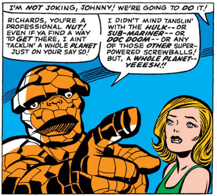
This is a book filled with wedding plans and power rays (Reed:  "To put it simply, it's a variation of a power amplifier!  It draws energy from an unknown source from somewhere beyond the confines of our solar system, and converts it into raw, usable power!"  To which the Thing replies: "Thanks a heap for puttin' it simply!  Now how about sayin' it in English?") and alien vistas full of creatures that would give Commander Hoek and Cadet Stimpy nightmares.  And it has a moment where the Thing aptly sums up just what's wrong about Reed's plan.

Take it away, Thing:

 
Despite the Thing's completely sane objections, off they go to the Skrull planet in another solar system. Faster than light travel is nothing for the Fantastic Four these days, or for us readers. We're starting to take Reed's inventive genius for granted at this point.

But let's never take Kirby's for granted.  I may not be giving Stan Lee his due here (the dialogue between the team members crackles with wit) but that's probably because of Kirby's art in this issue, which makes me feel drunk.  Drunk in a good way, right when the buzz is taking hold and you feel funny and energetic, ready to dance.  The visuals pretty much run the FF gamut, the family drama (it's not everyday two superheroes have a wedding rehearsal) and then the pan-galactic, realized in one of Kirby's collages.  There are elements of tongue-in-cheek and operatic drama and Kirby gets to draw both tuxedos and space finery, design interstellar starcraft for two species and then a lot of alien flora and fauna.  This is evidence of a man truly feeling the material.  The earliest issues are timid compared to the full-blown Kirby... well, Kirbyness we find in "Behold!"

It's not just that collage.  There's a scene where a Skrull monologues and Kirby cuts to an exterior view so he can draw freakish space critters running across a planetary landscape.  It's weird, man.  Weird and wonderful.  Stan the Man must have cackled with glee when he saw that page.  I know I did.

YEEESH!!

Happy Jack Kirby Day!

It's Jack Kirby's birthday (he would have been 96!), which, around here, is a major holiday.  For me, anyway.  And if I have my way, one day it will be a holiday for everyone.  I don't care if it becomes a national holiday with government offices and schools closed or anything like that.  I'd just love to buy a calendar and see August 28th labeled Jack Kirby Day.

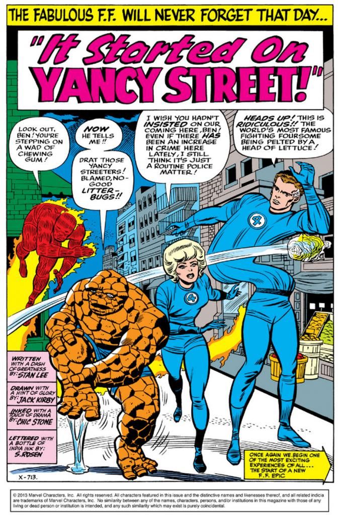
And maybe some parades in his honor or fireworks shows.  Here's a favorite splash page of mine, from the classic Fantastic Four #29 (August 1964).


I'd tell you the credits right here, but they're already in the artwork!

This color recreation is probably pretty close to the originals.  Some of it is a bit too intense, but I'm happy they didn't try to model a lot of shadows and light effects on the figures.  But what I like best about this isn't the Thing having stepped in gum (although that is a nice touch); it's the way Mr. Fantastic plants his feet on the concrete and then uses just his torso to dodge the tossed garbage.  There's a strong contrast between Reed's sturdy, pre-Vietnam-America-can-do legs and his swirling mid-section that draws my eyes.  I keep imagining Mr. Fantastic's texture as sometimes like taffy, and at others, like in this instance, almost a liquid.

And there's Sue Storm, the Invisible Girl, in the center, saying something completely sensible.  Call the police, not the superheroes.  It's not fear talking.  Sue isn't playing the dithery, do-nothing citizen trying to stay out of trouble at all costs.  Sue's objection has to do with prioritization.  She knows the team has more important things to worry about, like communism and Dr. Doom.  She probably also has practical concerns.  While I'm sure she'd agree the crime rate on Yancy Street is something of a concern, and it's admirable the FF want to pitch in, what can they realistically do about it?  Burn the Yancy Street Gang to death?  Bully them with the Thing's strength?  Build a community center with the wealth generated by Reed Richards' patents?  Psssh.  This isn't for the Fantastic Four to bother themselves over.  It's more a Spider-Man-level situation.

But I agree with Sue.  What's truly needed is police involvement.  Those lazy bums.

Monday, August 26, 2013

The Amazing Re-colored Spider-Man!

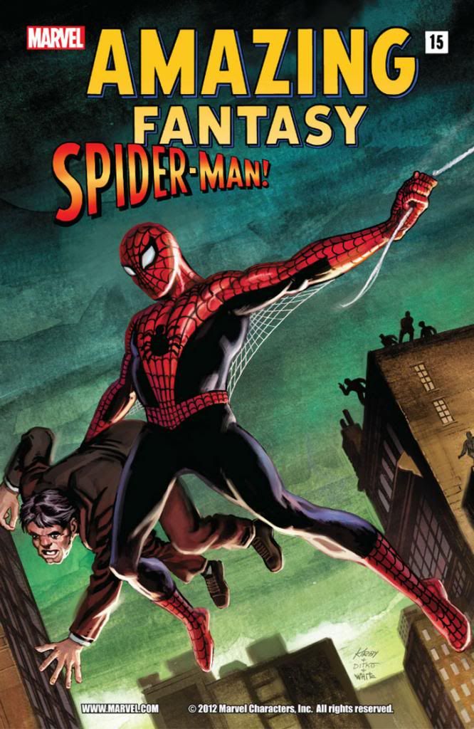
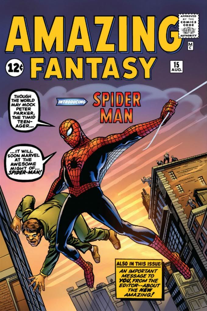
Here's the book that started it all. Sort of. While Fantastic Four was the book that inaugurated the "Marvel Age" of comics, Spider-Man was the character that became the company's Mickey Mouse. As we all know, Spidey bowed in Amazing Fantasy #15 (August 1962), which had formerly been titled Amazing Adult Fantasy, which sounds like a shop that sells sex toys and latex lingerie. Weirdly, #15 wasn't merely the debut of Spider-Man; it was also the final issue. The Amazing Spider-Man came next and ran for decades until Marvel killed it in favor of whatever it is they're doing now. I don't know, I don't wanna know. I do know this...


Painted Amazing Fantasy, huh? What about the original line work?


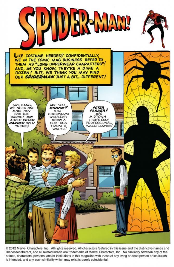
Recolored, by gum!  Did they do the same for the interior art?


Yep!  This isn't the worst recoloring job I've seen, but it's a bit too intense and the computer-generated smoothness of the gradients and color modeling (to create an illusion of roundness and depth) doesn't mesh with Steve Ditko's rough hewn finishes.  Ditko's treatment of anatomy was expressionistic and unique.  He wasn't trying to recreate the world in any kind of photorealistic way.  It's better to just leave it alone rather than try to interpret it with a lot of extra tones where you can only conflict with it or else muddy it up.  We also don't really need some latter-day color artist's impression of an artistic treatment of foliage in the trees.  Big open areas were good enough for Ditko; they're good enough for you.

On the other hand, just because something was originally printed with 100% magenta/100% yellow* to make red, or 100% red (depending on the inks used-- I worked for a newspaper that ran cyan, magenta, yellow and blue in its four-color printing process, but some substitute true red in there, and you have to adjust accordingly) doesn't mean the reprint has to follow suit.  When Marvel's reprints do that, on glossy, slick paper, the end results are often hideous, from the early days when color palettes relied largely on primary and secondary colors and even on material from the mid- to late-1980s, when the company's colorists apparently had a love affair with magenta, purple and big untouched areas.

The old schoolers needed that intensity because the paper was low-grade newsprint.  The press workers don't seem to have put much effort into registering the plates, so you ended up with floating reds or yellows or blues and characters with apparent milk mustaches.  Or pages that looked as if they were intended to be read with 3D glasses.  The paper wasn't even white.  It was slightly gray, and it yellowed or browned pretty quickly in direct sunlight.  Marvel covers from the time tend to flake or chip, as well.  These comics weren't intended as museum pieces or to compete visually with National Geographic.  Steve Ditko probably had no idea people would still be reading this book more than fifty years after he drew it, much less on archival paper or digitally.  Who could have foreseen that?

Well, now that we're reading comics on computers we're free from all those limitations.  But companies with deep back catalogs need to balance the sweet nostalgia of the historical with the flaw-fixing capabilities of modern technology.  Use naturalistic colors if you want, but mostly just try not to compete with what better artists than yourself did.  If you can't match the artist's intent, at least try not to compete with it or obliterate it.  You can make it look brand new to a certain extent, but above all, color restoration has to preserve the clarity of the original artwork.  Don't cover it up with a lot of extraneous visual noise or someone else's interpretation of anatomy or form.

Especially avoid going nuts like with some of the Neal Adams reprints I've seen in recent years where digital painting on top of the original inks has just covered them or rendered almost all the values the same--  some of those went from gorgeous to absolute mud.

*My original 50/50 formulation would have made "pure" orange, not red.  That's what being out of the game for over a decade will do to ya...

Tuesday, August 20, 2013

The mental powers of Liana and Jason... and Xi'an Coy Manh!

The other day I bought the digital version of Colleen Doran's remastered A Distant Soil: The Gathering. I read the first ten or so pages, just enough to get interested. It reminds me of what Chris Claremont was doing with the X-Men around the same time, especially the Marvel Graphic Novel #5: God Loves, Man Kills (November 1982) which introduced some darker, more mature elements. Specifically, kids getting killed for being mutants. Right at the start, too.  This kind of stuff-- and gorier-- happens all the time in the regular monthlies these days, but back then it was startling.

At least it was for me.

By now we're all pretty familiar with the "teens with powers in the hands of sinister researchers" trope.  I'm wondering if good ol' Stephen King isn't the father or at least godfather of this theme in comics.  It wouldn't take much reconfiguring to work Firestarter (1980) into Uncanny X-Men continuity.  And then there's his earlier telekinetic horror classic Carrie (1974) with its epistolary elements for added realism.  I read that for the first time this year and it gave me a strong sense of deja vu.  If only Professor X had detected Carrie White with his Cerebro a lot of kids could have been saved.  Even some jerky ones.  And we shouldn't forget Tia and Tony from Alexander Key's 1968 novel Escape to Witch Mountain, which I first encountered via Disney's sunnier 1975 film adaptation.

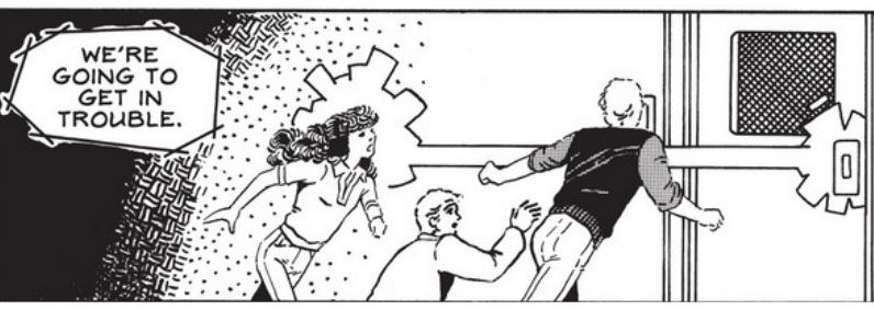
When people are working on stories with this element, there are bound to be some similarities.  Why am I telling you all this?  Because right at the beginning of A Distant Soil, I came across this scene:

 
And this one:
 
 
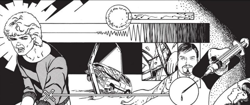
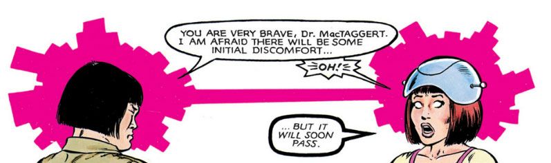
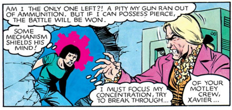
Which immediately reminded me of this, from Marvel Graphic Novel #4: The New Mutants (September 1982):
 
 
And this:
 

Liana and Jason, Colleen Doran's leads, aren't possessing anyone in the same manner as Xi'an Coy Manh as drawn by Bob McLeod, but I'm sure Xi'an would be pleased with how Doran depicts whatever it is they're doing here.  Actually, this early in the story I'm not exactly sure what kind of powers Doran's siblings possess.  They have telekinesis, but the I haven't seen what they can do to the fullest as yet.  I'm looking forward to finding out. 

What's the point of this?  That there are only so many ways to depict mental powers visually and have it read on a comic book page.  McLeod and Doran could just as easily have used the black dots Kirby favored for energy bolts and the movement of water or curvy or dotted lines.  Instead they both hit upon this weird radiating rectangles device and it looks cool as all get out.  And it's just pleasing to me to make a lot of little connections between things.  Magical kids, evil laboratories.  Feeling different or special, identifying with characters who are different and special.  Beautiful artwork in black and white or in color.  Xi'an Coy Manh in just about anything.  After just a few pages of A Distant Soil I'm even more surprised I wasn't all over this back when it first appeared.  It's apparently right in my wheelhouse.

The nutty things you learn when you're a comic book fan: Gil Kane inked with markers

Lately Gil Kane has been on my mind.  I've always liked Kane's art.  Very distinctive anatomy, instantly recognizable unless deliberately inked not to be so.  Few things I love more in comics than a Kane self-inked cover.  Today I learned he inked a lot of his own late-period work with markers.  So a number of different blogs tell me, anyway.

It makes me respect Kane even more.  When you check out the lines-- the actual strokes-- on the printed covers there's little that indicates he worked with markers.  Maybe a little bit of same-width quality in the diagonal lines he used sometimes for tone.  Or maybe I just never really considered the tools Kane used for his finishes, which are crisp and altogether pleasing to the eye.  If I ink with a marker, it looks like a fool used a marker.  Lengthy moves, such as the curve along a character's thigh, for example, sometimes appear shaky or are too obviously made up of two arcs poorly joined.  With Gil Kane, the same areas just look...

Gil Kane-ish.