Showing posts with label costumes. Show all posts
Wednesday, October 31, 2012
October is Spookey Month: Let Doug Moench and Richard Corben show you how to trick-or-treat!
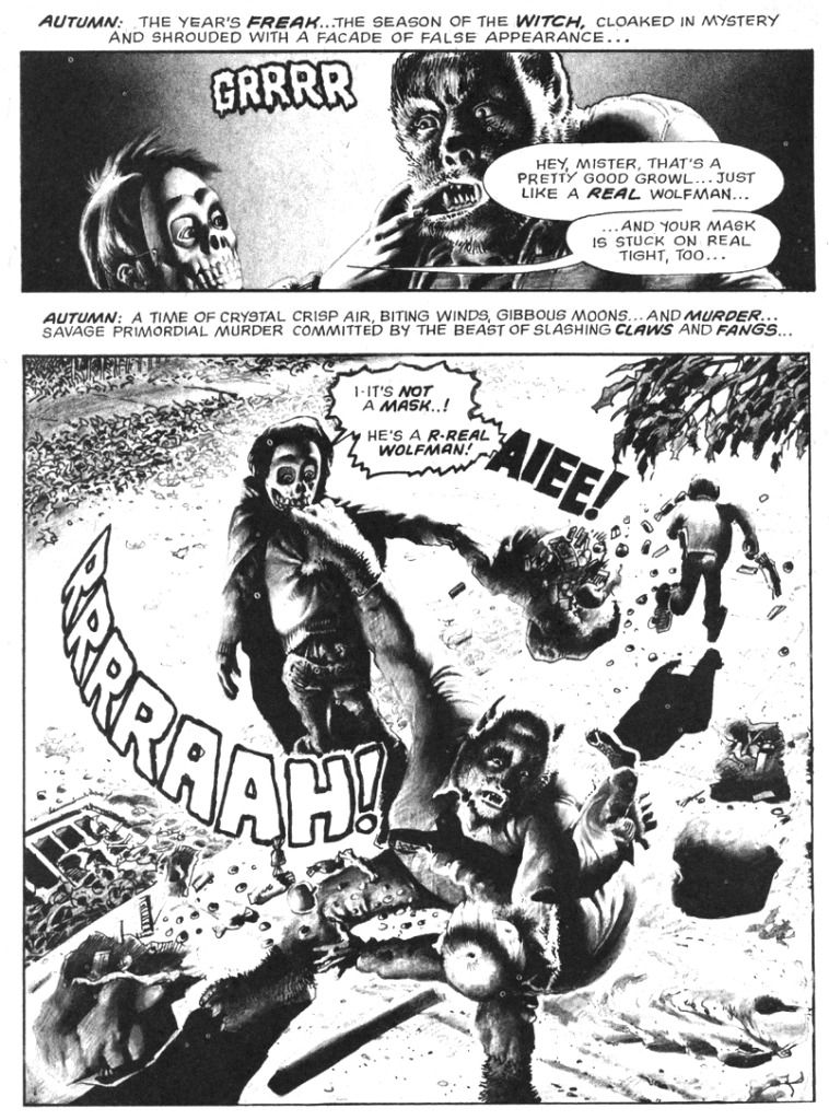
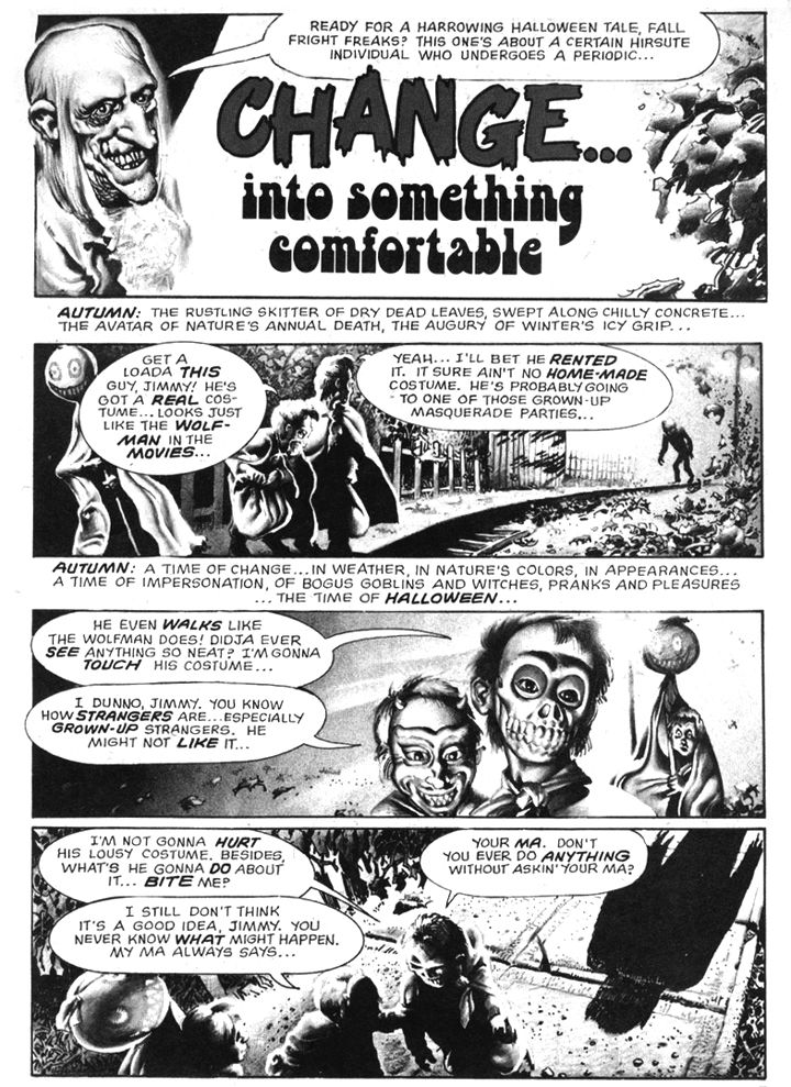
Yes, Halloween is a fun holiday, but you should exercise at least a little caution when out trick-or-treating. Go in a group, wear a costume with reflective tape so motorists can spot you, go only to well-lit houses. And most importantly-- don't pull on a werewolf's lip. These are a few simple safety tips brought to you by Doug Moench and Richard Corben in their horror-comedy classic, "Change... into Something Comfortable," which appeared in Creepy #58 (December 1973), a "special Halloween horror issue" (so it says right there on the cover). While I didn't particulary enjoy "The Slipped Mickey Click-Flick," I'm a huge fan of this little seasonal-flavored gem.
It starts with a real werewolf ripping some smart ass kids to shreds and ends with a sweet twist I find both irresistible and hilarious. I mean if you've ever wondered what creatures of the night disguise themselves as on Halloween, here's your chance to find out. "Comfortable" is sort of a companion piece to Corben's even more hilarious "Lycanklutz" from Creepy #56 (September 1973). That earlier full-color romp features a somewhat luckier werewolf in a medieval setting with some surprisingly anachronistic products available for sale. By contrast, our contemporary, kid-killing monster in "Comfortable" strays into EC territory with tragic results. I could have hit you with "Lycanklutz," but this one is all about Halloween and disguises and has those melodramatic Moench narrative captions. You can read it in the Dark Horse Creepy Archive Volume Twelve.
Come to think of it, you can read them both in that book.
Monday, September 19, 2011
Adventure Comics #412: Supergirl's Jumpsuit Space Adventure
I'm kind of on an Art Saaf kick lately. When I was a kid or a punk teen, I wouldn't have appreciated his work, because I was into people who rendered the heck out of everything, or put a lot of flash on the page. Sure, I had taste-- I was into Joe Kubert, Gene Colan and Al Williamson, after all. But as I've matured, I've come to love these journeyman old dudes who may not have blown readers away, but could draw anything the writer asked for. Despite Mark Evanier's opinion that "No one drew the female figure in action better than Artie Saaf," Saaf's art is most definitely not spectacular; he wasn't a Neal Adams, a Nestor Redondo, a Jose Luis Garcia-Lopez, or a Nick Cardy. He was a guy who started working when comics were young and put in his time at the drawing board doing everything from capes to war to romance. It's just solid, believable work with well-rendered anatomy and storytelling clarity of a kind mainstream-- superhero-- comics have largely abandoned.
There's not a line present that isn't justified, zero visual noise. The vehicles might be faked and the space costumes a bit on the goofy side, but it's got a warmth and appeal to it a lot of today's superficial, super-slick digitally-finished art doesn't with all its photo-real bells and whistles. Saaf's art has become timelessly retro in a way I'm not sure our current crop of superhero scribblers ever will. But that's for tomorrow's nostalgics to decide.
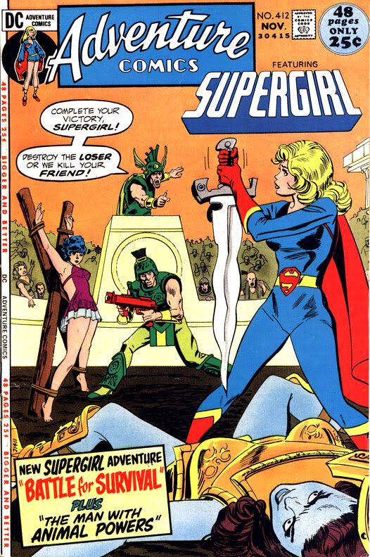
Adventure #412 features Supergirl starring in "The Battle for Survival," with Saaf's pencils inked by Bob Oksner-- who contributed the dramatic and somewhat suggestive cover. It came out in 1971and features a cheerful, positive-minded Supergirl living in San Francisco. As Linda Danvers, Supergirl works for a TV station where her immediate superior, Geoff, is a red-haired guy with the ultra-hip sartorial style and mustache of a low-rent Ron Burgundy-- and who gently sexually harasses her at every opportunity. Supergirl shrugs it off as "corny" humor. I suppose you can't expect more from a guy who wears a polka-dotted ascot.
The story, written by John Albano, is nutty in its conception. Someone disguised as Supergirl is committing crimes, and it turns out it's all a mad scheme to find out if Supergirl really is all she's cracked up to be. This is important, because there's a planet with one of the stupidest ways yet conceived of choosing a ruler-- single combat between champions chosen by the various political contenders.
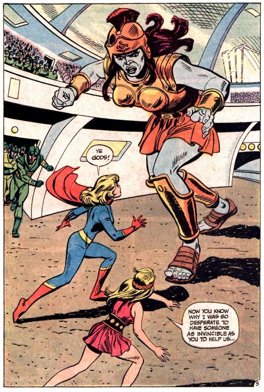
So Glynix, who wants to keep her throne, comes to Earth and causes all sorts of trouble to test Supergirl and blackmail her into fighting as her champion against a blue-skinned giant in orange armor. Why Glynix-- who claims to be in a great hurry-- couldn't have simply asked Supergirl to help her rather than waste a lot of time wreaking havoc isn't addressed. I imagine it has a lot to do with the necessity for DC comics of that era to have a story hook of some kind, and a lot of action. A reasonable request just wouldn't cut it.
And we wouldn't get to see Saaf's drawings of Supergirl snuffing explosive capsules with her hands. Whether or not Saaf was the best at depicting women in action is debatable, but he certainly makes a case for himself here. Even the opening splash page with ordinary human being Nasthalthia Luthor (I have to love her because she's only doing this job for her own evil purposes but she works hard at it; there's a character we're going to have to talk about later) tells us this is an artist well within his comfort zone drawing the female body moving, turning, running. Punching space giants and single-handedly defeating armies armed with laser rifles, which are two wonderful things Supergirl does later, before flying all the way back to Earth under her own power, then declaring to herself, "Home at last! And am I bushed!" There aren't any Escher Girls here.
Glynix and her people can make capsule explosives powerful enough to flatten cities and laser cannons, but still resort to fighting with the knives they wear on their belts. And the main villain has a pointy goatee and a sun symbol on his tunic, both of which seem to be de rigueur for would-be space tyrants.
As you can see, Supergirl wears a modest bodysuit throughout. Glynix, disguised as Supergirl, wears a 1960s Mod minidress, but the real thing goes about covered completely from neck to feet, her Super-logo reduced to a mere belt buckle. It's a boring costume. The one she's wearing in her latest title is more visually appealing. It's not perfect-- I'm not sold on the wrap collar, red diaper-panel or the knee cut-outs in her thigh-high boots, but at least she's not flying around looking like a Britney Spears clone anymore.
The only thing I'm not too keen on is the feminine version of Superman's spit curl Saaf sticks Supergirl with. The rest of her hair is in a kind of contemporary flip (kind of like Mary Tyler Moore's at the time, which is fitting given Supergirl's civilian job), but the bangs curl around like a cream horn, making it look like she's wearing a pastry for a toupee.
There's not a line present that isn't justified, zero visual noise. The vehicles might be faked and the space costumes a bit on the goofy side, but it's got a warmth and appeal to it a lot of today's superficial, super-slick digitally-finished art doesn't with all its photo-real bells and whistles. Saaf's art has become timelessly retro in a way I'm not sure our current crop of superhero scribblers ever will. But that's for tomorrow's nostalgics to decide.
Adventure #412 features Supergirl starring in "The Battle for Survival," with Saaf's pencils inked by Bob Oksner-- who contributed the dramatic and somewhat suggestive cover. It came out in 1971and features a cheerful, positive-minded Supergirl living in San Francisco. As Linda Danvers, Supergirl works for a TV station where her immediate superior, Geoff, is a red-haired guy with the ultra-hip sartorial style and mustache of a low-rent Ron Burgundy-- and who gently sexually harasses her at every opportunity. Supergirl shrugs it off as "corny" humor. I suppose you can't expect more from a guy who wears a polka-dotted ascot.
The story, written by John Albano, is nutty in its conception. Someone disguised as Supergirl is committing crimes, and it turns out it's all a mad scheme to find out if Supergirl really is all she's cracked up to be. This is important, because there's a planet with one of the stupidest ways yet conceived of choosing a ruler-- single combat between champions chosen by the various political contenders.
So Glynix, who wants to keep her throne, comes to Earth and causes all sorts of trouble to test Supergirl and blackmail her into fighting as her champion against a blue-skinned giant in orange armor. Why Glynix-- who claims to be in a great hurry-- couldn't have simply asked Supergirl to help her rather than waste a lot of time wreaking havoc isn't addressed. I imagine it has a lot to do with the necessity for DC comics of that era to have a story hook of some kind, and a lot of action. A reasonable request just wouldn't cut it.
And we wouldn't get to see Saaf's drawings of Supergirl snuffing explosive capsules with her hands. Whether or not Saaf was the best at depicting women in action is debatable, but he certainly makes a case for himself here. Even the opening splash page with ordinary human being Nasthalthia Luthor (I have to love her because she's only doing this job for her own evil purposes but she works hard at it; there's a character we're going to have to talk about later) tells us this is an artist well within his comfort zone drawing the female body moving, turning, running. Punching space giants and single-handedly defeating armies armed with laser rifles, which are two wonderful things Supergirl does later, before flying all the way back to Earth under her own power, then declaring to herself, "Home at last! And am I bushed!" There aren't any Escher Girls here.
Glynix and her people can make capsule explosives powerful enough to flatten cities and laser cannons, but still resort to fighting with the knives they wear on their belts. And the main villain has a pointy goatee and a sun symbol on his tunic, both of which seem to be de rigueur for would-be space tyrants.
As you can see, Supergirl wears a modest bodysuit throughout. Glynix, disguised as Supergirl, wears a 1960s Mod minidress, but the real thing goes about covered completely from neck to feet, her Super-logo reduced to a mere belt buckle. It's a boring costume. The one she's wearing in her latest title is more visually appealing. It's not perfect-- I'm not sold on the wrap collar, red diaper-panel or the knee cut-outs in her thigh-high boots, but at least she's not flying around looking like a Britney Spears clone anymore.
The only thing I'm not too keen on is the feminine version of Superman's spit curl Saaf sticks Supergirl with. The rest of her hair is in a kind of contemporary flip (kind of like Mary Tyler Moore's at the time, which is fitting given Supergirl's civilian job), but the bangs curl around like a cream horn, making it look like she's wearing a pastry for a toupee.
Thursday, September 1, 2011
The Henry Cavill-Zack Snyder Superman Suit
Well, there they are, at last. Some clearer-- though not better-- photos of Henry Cavill cavorting in character as Superman, the first and greatest superhero of them all. I haven't checked out everyone else's opinions on the Superman suit for the upcoming Man of Steel movie because I don't want mine diluted or influenced in any way. Here we go!
I don't hate it. In fact, I like it better than the one Superman's going to be sporting in the funnybooks from now on. But I can't really say I'm in love with it, either.
The photo from the MTV Splash Page site where Cavill is walking towards a couple of other actors portraying what I assume are villains makes him look fairly ridiculous, probably because crew members are standing around him in civilian duds and the scene appears to be staged in a strip mall parking lot where one of the stores is being renovated. Not very heroic or godlike. Just a dude in a rubber suit, possibly going to grab a pack of smokes out of his Ford Fiesta while entertaining at a children's party in a Chuck E. Cheese.
Then there's the capeless one, the one where Cavill is air-punching. It affords a better look at some of the suit's detailing. The little markings around his hips. What are they supposed to be? Kryptonian athletic wear branding? Kal-Adidas? K-Nike? I kind of like it without the cape, though. If you're going to change the traditional look, why not go all the way and really change it? I have the feeling he'll be wearing the cape for filming, though. No point in wearing it during blocking or all the other between-scenes stuff they have to do for huge movies. And small ones, as well.
These photos really don't do it justice. They look so crappy, so poorly light-balanced and composed, I might have taken them. We haven't seen the suit in motion, we haven't seen how Zack Snyder is going to frame these shots, or how they'll light them and we haven't seen how Cavill is going to carry himself as Superman. The body language and film photography will go a long way towards determining whether or not this suit helps Superman fly, or becomes his kryptonite necklace.
There you have it. The great traditionalist doesn't hate the new suit and suggests they could have taken it further. Surprised? I know I am. I'm going to be interested to read a few blogs about the suit now. It will be a while before I can catch up with you guys, though. The Snyder factor more than likely means I'll be giving this flick a miss in the theaters and catching it on cable a couple of years. And then I'll update you on whether or not this suit really works.
I have to leave you now. No hard feelings. We all have our little faults. Mine's in California. Oh, but before I go...
The Daily Mail site has some shots where someone-- possibly connected to these "MDCU" people-- has used a little Adobe Photoshop to add color and a badly rendered cape to these photos, plus the red pants. It amazes me how obsessed with Superman's red pants these sites are. Superman goes commando. Superman's underwear. Superman's Junk Protection (as if he needs any). What's wrong with these people? Why no love for the spit-curl? That's missing, too!
I don't hate it. In fact, I like it better than the one Superman's going to be sporting in the funnybooks from now on. But I can't really say I'm in love with it, either.
The photo from the MTV Splash Page site where Cavill is walking towards a couple of other actors portraying what I assume are villains makes him look fairly ridiculous, probably because crew members are standing around him in civilian duds and the scene appears to be staged in a strip mall parking lot where one of the stores is being renovated. Not very heroic or godlike. Just a dude in a rubber suit, possibly going to grab a pack of smokes out of his Ford Fiesta while entertaining at a children's party in a Chuck E. Cheese.
Then there's the capeless one, the one where Cavill is air-punching. It affords a better look at some of the suit's detailing. The little markings around his hips. What are they supposed to be? Kryptonian athletic wear branding? Kal-Adidas? K-Nike? I kind of like it without the cape, though. If you're going to change the traditional look, why not go all the way and really change it? I have the feeling he'll be wearing the cape for filming, though. No point in wearing it during blocking or all the other between-scenes stuff they have to do for huge movies. And small ones, as well.
These photos really don't do it justice. They look so crappy, so poorly light-balanced and composed, I might have taken them. We haven't seen the suit in motion, we haven't seen how Zack Snyder is going to frame these shots, or how they'll light them and we haven't seen how Cavill is going to carry himself as Superman. The body language and film photography will go a long way towards determining whether or not this suit helps Superman fly, or becomes his kryptonite necklace.
There you have it. The great traditionalist doesn't hate the new suit and suggests they could have taken it further. Surprised? I know I am. I'm going to be interested to read a few blogs about the suit now. It will be a while before I can catch up with you guys, though. The Snyder factor more than likely means I'll be giving this flick a miss in the theaters and catching it on cable a couple of years. And then I'll update you on whether or not this suit really works.
I have to leave you now. No hard feelings. We all have our little faults. Mine's in California. Oh, but before I go...
The Daily Mail site has some shots where someone-- possibly connected to these "MDCU" people-- has used a little Adobe Photoshop to add color and a badly rendered cape to these photos, plus the red pants. It amazes me how obsessed with Superman's red pants these sites are. Superman goes commando. Superman's underwear. Superman's Junk Protection (as if he needs any). What's wrong with these people? Why no love for the spit-curl? That's missing, too!
Labels:
costumes,
Henry Cavill,
superheroes,
Superman,
Zack Snyder
Sunday, August 7, 2011
Is this the first Cassandra Cain as Black Bat cosplay ever?
Well, is it? I'm a fan of well-done cosplay. For that matter, I'm also a fan of crappily-done cosplay. But I'd rather praise the cosplayers who get it right and creatively embody the characters they portray than make fun of those who choose poorly. Let's praise, shall we?
These two look fantastic and obviously I couldn't be more thrilled with this person's decision to go as Black Bat. She looks better than most of the comic book depictions I've seen so far. The Robin's snazzy, too. The photo description lists Damian Wayne among its tags, so I'm going to guess this young woman is portraying that particular version-- but I prefer her in the role to the hateful little comic book character.
My suggestion to DC? Kill off the comic kid right at the start of your relaunch, loosely base the new Robin on this cosplayer, and then do a team-up book featuring her as a neophyte hero being mentored by Cass. Obviously, I'd buy it.
These two look fantastic and obviously I couldn't be more thrilled with this person's decision to go as Black Bat. She looks better than most of the comic book depictions I've seen so far. The Robin's snazzy, too. The photo description lists Damian Wayne among its tags, so I'm going to guess this young woman is portraying that particular version-- but I prefer her in the role to the hateful little comic book character.
My suggestion to DC? Kill off the comic kid right at the start of your relaunch, loosely base the new Robin on this cosplayer, and then do a team-up book featuring her as a neophyte hero being mentored by Cass. Obviously, I'd buy it.
Saturday, June 11, 2011
Let's look at the relaunched Superman and discuss him why don't we already?
Sorry about that headline. I've been watching a lot of Futurama lately so I'm in a Dr. Zoidberg frame of mind. The DC relaunch may wind up being a sales failure, but from one perspective it's already a success-- people are talking about DC comics. Everywhere I go people ask me, "You're an idiot. What do you think about DC's crazy new relaunch plans?" And I'm all too happy to tell them the random assemblage of observations that pass for my opinion about things.
Like Superman. Do you remember how in Pulp Fiction how Mia Wallace tells Vincent Vega about "Elvis people" and "Beatles people" then doesn't ask him which he prefers because he's "definitely an Elvis man?" No, you don't. It was a deleted scene. Are you a Pulp Fiction fan? Oh, then I'm sorry, you've seen it. Of course you remember it.
I'm a Beatles person. But there are also "Superman people" and "Batman people." I'm a Cassandra Cain person, but I'm also mostly a Superman person. Superman represents humanity at its finest, even if he's not-- strictly speaking-- a human being. Superman is symbolic of our optimism. Batman represents humanity having its worst day. He's the personification of our pessimism. I choose optimism over pessimism every time. Almost every time. To be honest, DC makes it very difficult sometimes. But just as Vincent Vega is trying to listen, I'm trying to see the upside to DC's relaunch.
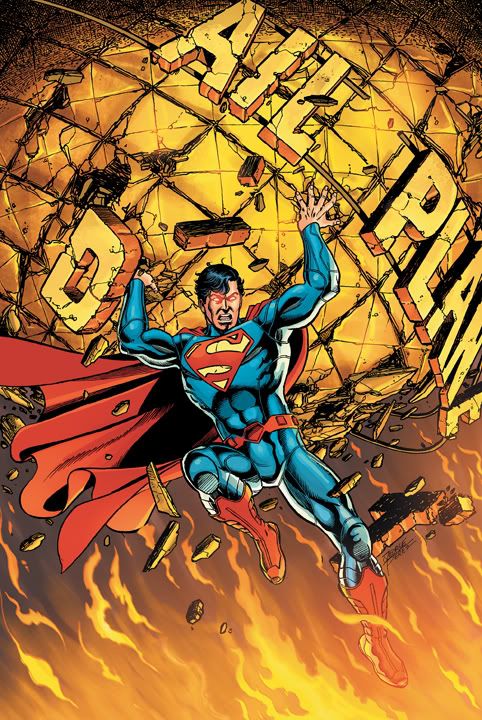
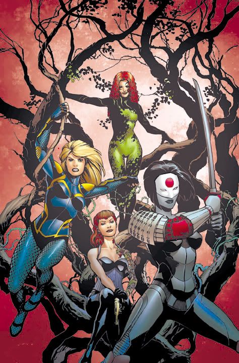
They've already impressed me with the new Katana costume, enough so I'm going to sample Birds of Prey to see if her characterization matches it. Let's see if DC's biggest, brightest, most important character will have a similar effect. Here's my take on these initial images of the costume redesigns for Superman and his Super-Family. First up-- Rags Morales.
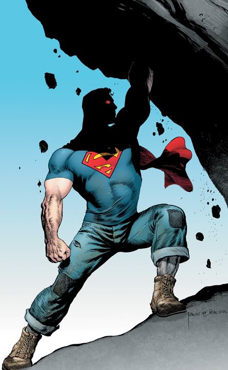
Morales will be illustrating Grant Morrison's scripts for the new Action Comics #1. DC's The Source blog says, "Superman defends a world that doesn’t trust their first Super Hero."
And I can see why. This Superman looks like a brute, reminiscent of the more primal Superman from his earliest appearances in Action Comics when he seemed a little wild and dangerous. I'm not sure what to make of a hairy-armed Superman wearing an officially licensed crewneck Superman t-shirt and a towel for a cape a la Marvin of Superfriends fame. Something has happened to him and his distressed jeans from American Eagle and it's pissed him off enough he's going to totally destroy that giant rock.
Dramatic artwork. Don't you want to know why he's killing that rock and why it's angered him so much his eyes have turned a glowing heat-vision red? As much as I hate, hate, HATE Identity Crisis and think it's a poorly conceived and plotted piece of crap, it's still a gorgeously rendered piece of crap. But then I've always liked Rags Morales's art, going all the way back to his work on Black Condor and Turok. The cape is a silly touch here given Superman's hipster street clothes, but Morales has nailed the character's strength and powerful presence.
Let's see what legendary artist George Perez is up to. I admire Morales, but I love me some George Perez!
Oh. How unfortunate.
Perez will write Superman: The Man of Tomorrow, Today #1, with art by Jesus Merino. Perez gives us a Superman in full-on "I hate my job at the Daily Planet" mode and sticks him in a super-lame costume. Maybe Lois Lane and Jimmy Olsen mocked his new super-suit so hard, the Man of Steel finally snapped. The cybernetic lines in Superman's top make it look like clothing rather than the traditional man-with his-torso-and-legs-painted-blue look. That part is fine.
But the belt with square studs and those armored boots/greaves? Totally unnecessary and quite ugly. Perez's art is every bit as dynamic and cleanly detailed as ever-- he's one of those rare artists who's managed to maintain a peak well past all expectations, and he was pretty solid even early in his career-- but this revamped costume needs to be revamped already. Keep the shirt, rework the belt, loose those horrible, horrible boots that would've embarrassed even the beefcakey cast of an old Italian gladiator movie! Mr. Perez, with all due respect, if you're attempting to give Superman's footwear a high-tech look to match the rest of his leotards, go check out some athletic shoes or ski boots or something, anything; don't dig out one of your old jobs for Marvel back in the 70s. It looks like Superman stole them off some second-string Iron Man villain.
On second thought, there's such a mismatch between Superman's top and bottoms, maybe someone-- was it you, Dan Didio?-- used the old Mighty Men & Monster Maker toy to design this and forced it on Perez.
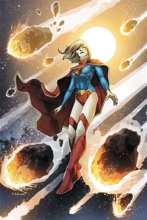
Let's look away from this accident scene to Mahmud Asrar's pleasant surprise.
Way to go, DC! For too long the bare middrift has been the visual cliche signifying "this is a teenaged girl" character. Aybar's Supergirl drawing gives her an otherworldly, dignified appearance. What? No navel ring or lower back tattoo? The new Supergirl costume with its long sleeves, shawl/cape arrangement and stylish over-the-knee boots actually covers more girl than I'm used to in my DC comics. I can't get over a Supergirl wearing more clothing than an Olympic gymnast and not looking like Lindsay Lohan in the middle of a 2-week coke and booze binge.
I applaud the attempt at updating the Superman logo, but this design isn't working. It needs to be tweaked ever so slightly because it looks like someone stuck the shield-shape around some tiger-stripes. Resolve the "S" inside and you'll have it. And speaking of the shield, echoing it that closely in front in that yellow accent piece is overkill. That would work better as an oval reminiscent of her cousin's old belt buckle or even a rectangle. One of Supergirl's lesser known powers is making impossible boots work without the help of spray-on adhesive. The open knee look is an interesting but ultimately unwieldy and distracting attempt to build visual interest.
It may sound as though I just ripped it apart, but this is far more successful than the new Superman costume and it's a massive improvement over Supergirl's previous look. I might have some nits to pick with its detailing, but I love the overall concept.
I'm just not sure how Supergirl will be portrayed by writers Michael Green and Mike Johnson in their Supergirl #1, but DC promises, "Supergirl’s got the unpredictable behavior of a teenager, the same powers as Superman and none of his affection for the people of Earth." Well, many teenagers are cheerful and hard-working, DC, with a passion for learning and volunteering. But I suppose that kind of Supergirl won't appeal to today's edgy comic fan obsessed with all things Twilight, Gossip Girl, Hellcats and MTV's Skins. Come on, I'm just teasing.
Everyone knows all teenagers hate to be helpful and cheerful. It's angst or GTFO! All I ask is that the new writers refrain from using any variation of the phrase "trying to find her place in the world" when giving interviews. Thanking you in advance, sirs.
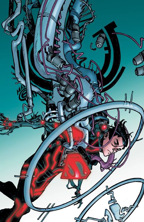
What's next? Oh yeah, this guy.
This is the first image from one of DC's more surprising experiments-- Superboy in the Shell: Fly Alone Complex by Japanese comics master Masamune Shirow. In this wild departure, Superboy is actually a bit of sentient code inside a computer matrix in some far-flung cyber-future where the traditional DC superheroes may or may not have existed. And there's nudity, lots and lots of it. Plus violence as Superboy passes between his virtual world and what may or may not be the real one to battle international terrorists and code-hackers. Shirow explores themes of technology gone amok and transhumanism, as well as more personal issues such as sexuality, identity, friendship, trust and what's for lunch.
This is the one Superman character I really couldn't care less about. Superboy? Is this the clone of Superman again? Bleeccccchhh. I have no idea who drew this, but Superboy #1 will be written by Scott Lobdell with art by R.B. Silva and Rob Lean with apparently some Shirow-ian influences. It's a cool image, and definitely a departure but this is one book I could only get interested in if it were actually by Shirow. Sorry, fellas. Hope plenty of fans feel differently!
Like Superman. Do you remember how in Pulp Fiction how Mia Wallace tells Vincent Vega about "Elvis people" and "Beatles people" then doesn't ask him which he prefers because he's "definitely an Elvis man?" No, you don't. It was a deleted scene. Are you a Pulp Fiction fan? Oh, then I'm sorry, you've seen it. Of course you remember it.
I'm a Beatles person. But there are also "Superman people" and "Batman people." I'm a Cassandra Cain person, but I'm also mostly a Superman person. Superman represents humanity at its finest, even if he's not-- strictly speaking-- a human being. Superman is symbolic of our optimism. Batman represents humanity having its worst day. He's the personification of our pessimism. I choose optimism over pessimism every time. Almost every time. To be honest, DC makes it very difficult sometimes. But just as Vincent Vega is trying to listen, I'm trying to see the upside to DC's relaunch.
They've already impressed me with the new Katana costume, enough so I'm going to sample Birds of Prey to see if her characterization matches it. Let's see if DC's biggest, brightest, most important character will have a similar effect. Here's my take on these initial images of the costume redesigns for Superman and his Super-Family. First up-- Rags Morales.
And I can see why. This Superman looks like a brute, reminiscent of the more primal Superman from his earliest appearances in Action Comics when he seemed a little wild and dangerous. I'm not sure what to make of a hairy-armed Superman wearing an officially licensed crewneck Superman t-shirt and a towel for a cape a la Marvin of Superfriends fame. Something has happened to him and his distressed jeans from American Eagle and it's pissed him off enough he's going to totally destroy that giant rock.
Dramatic artwork. Don't you want to know why he's killing that rock and why it's angered him so much his eyes have turned a glowing heat-vision red? As much as I hate, hate, HATE Identity Crisis and think it's a poorly conceived and plotted piece of crap, it's still a gorgeously rendered piece of crap. But then I've always liked Rags Morales's art, going all the way back to his work on Black Condor and Turok. The cape is a silly touch here given Superman's hipster street clothes, but Morales has nailed the character's strength and powerful presence.
Let's see what legendary artist George Perez is up to. I admire Morales, but I love me some George Perez!
Perez will write Superman: The Man of Tomorrow, Today #1, with art by Jesus Merino. Perez gives us a Superman in full-on "I hate my job at the Daily Planet" mode and sticks him in a super-lame costume. Maybe Lois Lane and Jimmy Olsen mocked his new super-suit so hard, the Man of Steel finally snapped. The cybernetic lines in Superman's top make it look like clothing rather than the traditional man-with his-torso-and-legs-painted-blue look. That part is fine.
But the belt with square studs and those armored boots/greaves? Totally unnecessary and quite ugly. Perez's art is every bit as dynamic and cleanly detailed as ever-- he's one of those rare artists who's managed to maintain a peak well past all expectations, and he was pretty solid even early in his career-- but this revamped costume needs to be revamped already. Keep the shirt, rework the belt, loose those horrible, horrible boots that would've embarrassed even the beefcakey cast of an old Italian gladiator movie! Mr. Perez, with all due respect, if you're attempting to give Superman's footwear a high-tech look to match the rest of his leotards, go check out some athletic shoes or ski boots or something, anything; don't dig out one of your old jobs for Marvel back in the 70s. It looks like Superman stole them off some second-string Iron Man villain.
On second thought, there's such a mismatch between Superman's top and bottoms, maybe someone-- was it you, Dan Didio?-- used the old Mighty Men & Monster Maker toy to design this and forced it on Perez.
Let's look away from this accident scene to Mahmud Asrar's pleasant surprise.
I applaud the attempt at updating the Superman logo, but this design isn't working. It needs to be tweaked ever so slightly because it looks like someone stuck the shield-shape around some tiger-stripes. Resolve the "S" inside and you'll have it. And speaking of the shield, echoing it that closely in front in that yellow accent piece is overkill. That would work better as an oval reminiscent of her cousin's old belt buckle or even a rectangle. One of Supergirl's lesser known powers is making impossible boots work without the help of spray-on adhesive. The open knee look is an interesting but ultimately unwieldy and distracting attempt to build visual interest.
It may sound as though I just ripped it apart, but this is far more successful than the new Superman costume and it's a massive improvement over Supergirl's previous look. I might have some nits to pick with its detailing, but I love the overall concept.
I'm just not sure how Supergirl will be portrayed by writers Michael Green and Mike Johnson in their Supergirl #1, but DC promises, "Supergirl’s got the unpredictable behavior of a teenager, the same powers as Superman and none of his affection for the people of Earth." Well, many teenagers are cheerful and hard-working, DC, with a passion for learning and volunteering. But I suppose that kind of Supergirl won't appeal to today's edgy comic fan obsessed with all things Twilight, Gossip Girl, Hellcats and MTV's Skins. Come on, I'm just teasing.
Everyone knows all teenagers hate to be helpful and cheerful. It's angst or GTFO! All I ask is that the new writers refrain from using any variation of the phrase "trying to find her place in the world" when giving interviews. Thanking you in advance, sirs.
What's next? Oh yeah, this guy.
This is the one Superman character I really couldn't care less about. Superboy? Is this the clone of Superman again? Bleeccccchhh. I have no idea who drew this, but Superboy #1 will be written by Scott Lobdell with art by R.B. Silva and Rob Lean with apparently some Shirow-ian influences. It's a cool image, and definitely a departure but this is one book I could only get interested in if it were actually by Shirow. Sorry, fellas. Hope plenty of fans feel differently!
Labels:
costumes,
DC Comics,
DC relaunch,
George Perez,
Grant Morrison,
Rags Morales,
Superboy,
Supergirl,
Superman
Thursday, June 9, 2011
Katana's new look
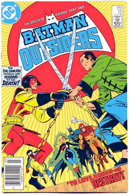
Jim Aparo, bless his heart, never quite got the katana. His version of Katana's namesake weapon-- which she apparently nicked from Elric of Melnibone-- usually looked like a scimitar straightened straightened by some gifted yet demented blacksmith. And Katana's costume was less samurai and more Indonesian, with a side of McDonald's and some Genghis Khan for dessert. Actually, now that I'm on a roll, she looked like one of Ming the Merciless's soldiers from the 1980 Flash Gordon flick. Or maybe she was angling for Ming's job all along.
The recent Wonder Woman design looks like a random assemblage of clothes meant for a motorcycle mama on her way to Sturgis and cluttered up with handmade jewelry from one of those stores that also sells dreamcatchers and tie-dyed shirts. No theme, nothing really tying it together other than bad taste. Katana's, by contrast, features authentic touches with the shoulder and wrist guards, sleek lines, interesting mask and elbow pads giving it a splash of color. Her gray face-- make-up?-- is reminiscent of a Noh mask. You look at it and you instantly get who she is and what she's all about. Okay, I admit ogling artifacts in glass cases certainly didn't make me an expert on Sengoku jidai arms and armor, but I like to think I know a bad ass when I see her. And baby, this new Katana is one of those.
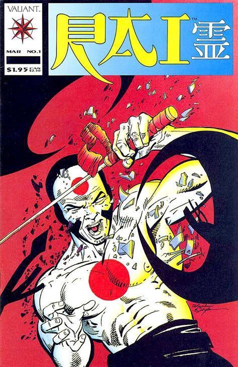
She also reminds me a little of this guy:
Subscribe to:
Posts (Atom)